PairTradingSignalsPair Trading Signals (PTS)
This indicator implements a mean-reversion strategy for pairs trading, focusing on divergences between the chart's primary symbol (e.g., QQQ for tech exposure) and a user-specified inverse or correlated secondary symbol (default: SPY for broad market proxy). It generates long-only entry and exit signals on the primary asset based on statistical deviations in their relative pricing, without requiring short positions or direct trading of the secondary symbol.
Core Concepts
Pairs Mean Reversion: The strategy exploits temporary mispricings in cointegrated assets. When the primary asset becomes "cheap" relative to the secondary (oversold spread), it enters a long position expecting convergence. Exits occur when the spread reverts to neutral or overbought levels.
Spread & Z-Score: The raw spread is calculated as Primary Close - (Hedge Ratio × Secondary Close), with a fixed hedge ratio of 1.5 to approximate relative volatility (e.g., beta adjustment). This is normalized to a Z-score over a lookback period, measuring deviations in standard deviations from the historical mean. Bounds (default ±2.0) define oversold/overbought thresholds—common in statistical arbitrage for 95% confidence intervals assuming normality.
ATR-Based Risk Controls: Entry levels incorporate Average True Range (ATR, default 14-period RMA smoothing) to set dynamic take-profit (TP = Entry + Upper Bound × ATR) and stop-loss (SL = Entry - |Lower Bound| × ATR) levels, scaling to volatility.
Signal Logic
Buy (Long Entry): Triggers when the Z-score crosses above the lower bound (-2.0) after entering an oversold state (Z < lower bound). This signals undervaluation of the primary relative to the secondary.
Sell (Exit): Triggers when the Z-score crosses below the upper bound (2.0) after entering an overbought state (Z > upper bound). Optional strict TP/SL enforcement closes positions at predefined levels.
Signals appear as labeled shapes (green BUY below bar, red SELL above). Short horizontal boxes mark TP (green) and SL (red) for visual reference.
Backtesting & Performance Metrics
Simulation Period: Trades only within user-defined start/end dates (default: Jan 2020–Dec 2030).
Position Sizing: Fixed allocation based on initial capital × entry percentage (default 100%), capped by available equity to enforce risk limits. Supports full compounding if desired via code tweak.
Metrics Table: Displays net profit, ROI (including/excluding unrealized P&L), win rate, trade counts, closed capital, total equity, and open position details (shares or current value). Recent trades logged in a separate table.
Equity Floor: Prevents capital from going below zero, simulating real-world drawdown limits.
Usage Guidelines
Symbol Setup: Apply to the primary asset's chart (e.g., QQQ). Set "Inverse Ticker" to a negatively or positively correlated pair (e.g., SPY for market hedge).
Parameter Tuning: Increase lookback (20+) for smoother signals; widen bounds (±3.0) for fewer, higher-conviction trades. Lower entry % reduces risk.
Best Practices: Use on daily/4H timeframes for swing trades. Combine with overall market trend filters. Backtest across regimes (e.g., bull/bear) to validate.
Limitations: Assumes mean reversion holds; performs poorly in trending divergences. No commissions/slippage modeled—adjust initial capital accordingly.
This approach draws from classic pairs trading literature (e.g., Gatev et al.'s distance method), adapted for single-asset execution via Z-score thresholds. For optimal results, ensure the pair exhibits cointegration (test via Engle-Granger if customizing).
在腳本中搜尋"spy"
Volatility Adjusted Relative Strength (VARS) - Histogram OptionI’ve developed a new version of VARS that includes an option to toggle it into a histogram view. I recommend using a single neutral color rather than the conventional “red below 0, green above 0” scheme — because true RS analysis shouldn’t rely on color cues. The focus should be on the immediacy and persistence of RS itself to capture that initial breakout move as the most optimal RRR entry. This also provides clearer insight and visualization into how RS functions (both traditional and VARS) since RS is a static EOD metric derived from a defined timeframe.
I want to emphasize again that VARS is useful to identify low-risk entries, with relative strength calibrated to the volatility of the reference index (in this case, AMEX:SPY ). It is not used to determine my exits — those should be governed by a strict, non-discretionary framework for partial profit-taking and final exit of a position.

Portfolio Simulator & BacktesterMulti-asset portfolio simulator with different metrics and ratios, DCA modeling, and rebalancing strategies.
Core Features
Portfolio Construction
Up to 5 assets with customizable weights (must total 100%)
Support for any tradable symbol: stocks, ETFs, crypto, indices, commodities
Real-time validation of allocations
Dollar Cost Averaging
Monthly or Quarterly contributions
Applies to both portfolio and benchmark for fair comparison
Model real-world investing behavior
Rebalancing
Four strategies: None, Monthly, Quarterly, Yearly
Automatic rebalancing to target weights
Transaction cost modeling (customizable fee %)
Key Metrics Table
CAGR: Annualized compound return (S&P 500 avg: ~10%)
Alpha: Excess return vs. benchmark (positive = outperformance)
Sharpe Ratio: Return per unit of risk (>1.0 is good, >2.0 excellent)
Sortino Ratio: Like Sharpe but only penalizes downside (better metric)
Calmar Ratio: CAGR / Max Drawdown (>1.0 good, >2.0 excellent)
Max Drawdown: Largest peak-to-trough decline
Win Rate: % of positive days (doesn't indicate profitability)
Visualization
Dual-chart comparison - Portfolio vs. Benchmark
Dollar or percentage view toggle
Customizable colors and line width
Two tables: Statistics + Asset Allocation
Adjustable table position and text size
🚀 Quick Start Guide
Enter 1-5 ticker symbols (e.g., SPY, QQQ, TLT, GLD, BTCUSD)
Make sure percentage weights total 100%
Choose date range (ensure chart shows full period - zoom out!)
Configure DCA and rebalancing (optional)
Select benchmark (default: SPX)
Analyze results in statistics table
💡 Pro Tips
Chart data matters: Load SPY or your longest-history asset as main chart
If you select an asset that was not available for the selected period, the chart will not show up! E.g. BTCUSD data: Only available from ~2017 onwards.
Transaction fees: 0.1% default (adjust to match your broker)
⚠️ Important Notes
Requires visible chart data (zoom out to show full date range)
Limited by each asset's historical data availability
Transaction fees and costs are modeled, but taxes/slippage are not
Past performance ≠ future results
Use for research and education only, not financial advice
Let me know if you have any suggestions to improve this simulator.

Market Sentiment Trend Gauge [LevelUp]Market Sentiment Trend Gauge simplifies technical analysis by mathematically combining momentum, trend direction, volatility position, and comparison against a market benchmark, into a single trend score from -100 to +100. Displayed in a separate pane below your chart, it resolves conflicting signals from RSI, moving averages, Bollinger Bands, and market correlations, providing clear insights into trend direction, strength, and relative performance.
THE PROBLEM MARKET SENTIMENT TREND GAUGE (MSTG) SOLVES
Traditional indicators often produce conflicting signals, such as RSI showing overbought while prices rise or moving averages indicating an uptrend despite market underperformance. MSTG creates a weighted composite score to answer: "What's the overall bias for this asset?"
KEY COMPONENTS AND WEIGHTINGS
The trend score combines
▪ Momentum (25%): Normalized 14-period RSI, capped at ±100.
▪ Trend Direction (35%): 10/21-period EMA relationships,
▪ Volatility Position (20%): Price position, 20-period Bollinger Bands, capped at ±100.
▪ Market Comparison (20%): Daily performance vs. SPY benchmark, capped at ±100.
Final score = Weighted sum, smoothed with 5-period EMA.
INTERPRETING THE MSTG CHART
Trend Score Ranges and Colors
▪ Bright Green (>+30): Strong bullish; ideal for long entries.
▪ Light Green (+10 to +30): Weak bullish; cautiously favorable.
▪ Gray (-10 to +10): Neutral; avoid directional trades.
▪ Light Red (-10 to -30): Weak bearish; exercise caution.
▪ Bright Red (<-30): Strong bearish; high-risk for longs, consider shorts.
Reference Lines
▪ Zero Line (Gray): Separates bullish/bearish; crossovers signal trend changes.
▪ ±30 Lines (Dotted, Green/Red): Thresholds for strong trends.
▪ ±60 Lines (Dashed, Green/Red): Extreme strength zones (not overbought/oversold); manage risk (tighten stops, partial profits) but trends may persist.
Background Colors
▪ Green Tint (>+20): Bullish environment; favorable for longs.
▪ Red Tint (<-20): Bearish environment; caution for longs.
▪ Light Gray Tint (-20 to +20): Neutral/range-bound; wait for signals.
Extreme Readings vs. Traditional Signals
MSTG ±60 indicates maximum alignment of all factors, not reversals (unlike RSI >70/<30). Use for risk management, not automatic exits. Strong trends can sustain extremes; breakdowns occur below +30 or above -30.
INFORMATION TABLE INTERPRETATION
Trend Score Symbols
▲▲ >+30 strong bullish
▲ +10 to +30
● -10 to +10 neutral
▼ -30 to -10
▼▼ <-30 strong bearish
Colors: Green (positive), White (neutral), Red (negative).
Momentum Score
+40 to +100 strong bullish
0 to +40 moderate bullish
-40 to 0 moderate bearish
-100 to -40 strong bearish
Market vs. Stock
▪ Green: Stock outperforming market
▪ Red: Stock underperforming market
Example Interpretations:
-0.45% / +1.23% (Green): Market down, stock up = Strong relative strength
+2.10% / +1.50% (Red): Both rising, but stock lagging = Relative weakness
-1.20% / -0.80% (Green): Both falling, but stock declining less = Defensive strength
UNDERSTANDING EXTREME READINGS VS TRADITIONAL OVERBOUGHT/OVERSOLD
⚠️ Critical distinctions
Traditional Overbought/Oversold Signals:
▪ Single indicator (like RSI >70 or <30) showing momentum excess
▪ Often suggests immediate reversal or pullback expected
▪ Based on "price moved too far, too fast" concept
MSTG Extreme Readings (±60):
▪ Composite alignment of 4 different factors (momentum, trend, volatility, relative strength)
▪ Indicates maximum strength in current direction
▪ NOT a reversal signal - means "all systems extremely bullish/bearish"
Key Differences:
▪ RSI >70: "Price got ahead of itself, expect pullback"
▪ MSTG >+60: "Everything is extremely bullish right now"
▪ Strong trends can maintain extreme MSTG readings during major moves
▪ Breakdowns happen when MSTG falls below +30, not at +60
Proper Usage of Extreme Readings:
▪ Risk Management: Tighten stops, take partial profits
▪ Position Sizing: Reduce new position sizes at extremes
▪ Trend Continuation: Watch for sustained extreme readings in strong markets
▪ Exit Signals: Look for breakdown below +30, not reversal from +60
TRADING WITH MSTG
Quick Assessment
1. Check trend symbol for direction.
2. Confirm momentum strength.
3. Note relative performance color.
Examples:
▲▲ 55.2 (Green), Momentum +28.4, Outperforming: Strong buy setup.
▼ -18.6 (Red), Momentum -43.2, Underperforming: Defensive positioning.
Entry Conditions
▪ Long: stock outperforming market
- Score >+30 (bright green)
- Sustained green background
- ▲▲ symbol,
▪ Short: stock underperforming market
- Score <-30 (bright red)
- Sustained red background
- ▼▼ symbol
Avoid Trading When:
▪ Gray zone (-10 to +10).
▪ Rapid color changes or frequent zero-line crosses (choppy market).
▪ Gray background (range-bound).
Risk Management:
▪ Stop Loss: Exit on zero-line crossover against position.
▪ Take Profit: Partial at ±60 for risk control.
▪ Position Sizing: Larger when signals align; smaller in extremes or mixed conditions.
KEY ADVANTAGES
▪ Unified View: Weighted composite reduces noise and conflicts.
▪ Visual Clarity: 5-color system with gradients for rapid recognition.
▪ Market Context: Relative strength vs. SPY identifies leaders/laggards.
▪ Flexibility: Works across timeframes (1-min to weekly); customizable table.
▪ Noise Reduction: EMA smoothing minimizes false signals.
EXAMPLES
Strong Bull: Trend Score 71.9, Momentum Score 76.9
Neutral: Trend Score 0.1, Momentum Score -9.2
Strong Bear: Trend Score -51.7, Momentum Score -51.5
PERFORMANCE AND LIMITATIONS
Strengths: Trend identification, noise reduction, relative performance versus market.
Limitations: Lags at turning points, less effective in extreme volatility or non-trending markets.
Recommendations: View on multiple timeframes, combine with price action and fundamentals.

BDH Multi‑Timeframe Dashboard 📊 BDH Multi-Timeframe Dashboard (4H, D, W, M)
The Buy Don’t Hold (BDH) Screener is inspired by the book Buy—Don’t Hold by Leslie N. Masonson. It is designed to rotate into the strongest ETFs during bullish phases while stepping aside in weak markets.
✅ How It Works
The screener evaluates three filters across multiple timeframes (4H, Daily, Weekly, Monthly):
Price > 100-DMA
Price Rising (close > lookback)
MACD > Signal
Each timeframe earns a PASS if at least 2 out of 3 conditions are met.
🖥️ Features
Multi-timeframe dashboard table with green/red checks
🚀 Strategy Application
Scan for ETFs with multi-timeframe PASS signals
Buy the strongest performers
Rotate out when an ETF falls out of strength ranking
This rotation method is designed to historically outperform passive SPY holding by maintaining exposure only to strong, trending ETFs
📌 ETFs Watchlist (copy-paste ready)
Use this watch list for screening :
ARKF, ARKG, ARKK, ARKQ, ARKW, ASHR, BATT, BLCN, BLOK, CLOU, CQQQ, EEM, EMQQ, ESPO, HACK, IBUY, ICVT, IWM, IZRL, KWEB, MDY, OGIG, PBW, PRNT, QCLN, QQQ, REMX, SMH, SOCL, SPY, TAN, TLT, URA, VB, XBI, XHB, XLC, XLE, XLF, XLY, XOP, XRT
✨ With this dashboard, traders can quickly identify ETFs that meet the BDH conditions across multiple timeframes, helping them follow a disciplined rotation strategy.
RFSIRFSI (Relative Force Strength Index) is a technical indicator that measures the relative strength of an asset compared to a benchmark (default: SPY - S&P 500 ETF). It helps identify performance divergences and generate entry/exit signals based on crossovers.
RFSI (Relative Force Strength Index) est un indicateur technique qui mesure la force relative d'un actif par rapport à un benchmark (par défaut : SPY - ETF S&P 500). Il permet d'identifier les divergences de performance et de générer des signaux d'entrée/sortie basés sur des croisements.

DynamoSent DynamoSent Pro+ — Professional Listing (Preview)
— Adaptive Macro Sentiment (v6)
— Export, Adaptive Lookback, Confidence, Boxes, Heatmap + Dynamic OB/OS
Preview / Experimental build. I’m actively refining this tool—your feedback is gold.
If you spot edge cases, want new presets, or have market-specific ideas, please comment or DM me on TradingView.
⸻
What it is
DynamoSent Pro+ is an adaptive, non-repainting macro sentiment engine that compresses VIX, DXY and a price-based activity proxy (e.g., SPX/sector ETF/your symbol) into a 0–100 sentiment line. It scales context by volatility (ATR%) and can self-calibrate with rolling quantile OB/OS. On top of that, it adds confidence scoring, a plain-English Context Coach, MTF agreement, exportable sentiment for other indicators, and a clean Light/Dark UI.
Why it’s different
• Adaptive lookback tracks regime changes: when volatility rises, we lengthen context; when it falls, we shorten—less whipsaw, more relevance.
• Dynamic OB/OS (quantiles) self-calibrates to each instrument’s distribution—no arbitrary 30/70 lines.
• MTF agreement + Confidence gate reduce false positives by highlighting alignment across timeframes.
• Exportable output: hidden plot “DynamoSent Export” can be selected as input.source in your other Pine scripts.
• Non-repainting rigor: all request.security() calls use lookahead_off + gaps_on; signals wait for bar close.
Key visuals
• Sentiment line (0–100), OB/OS zones (static or dynamic), optional TF1/TF2 overlays.
• Regime boxes (Overbought / Oversold / Neutral) that update live without repaint.
• Info Panel with confidence heat, regime, trend arrow, MTF readout, and Coach sentence.
• Session heat (Asia/EU/US) to match intraday behavior.
• Light/Dark theme switch in Inputs (auto-contrasted labels & headers).
⸻
How to use (examples & recipes)
1) EURUSD (swing / intraday blend)
• Preset: EURUSD 1H Swing
• Chart: 1H; TF1=1H, TF2=4H (default).
• Proxies: Defaults work (VIX=D, DXY=60, Proxy=D).
• Dynamic OB/OS: ON at 20/80; Confidence ≥ 55–60.
• Playbook:
• When sentiment crosses above 50 + margin with Δ ≥ signalK and MTF agreement ≥ 0.5, treat as trend breakout.
• In Oversold with rising Coach & TF agreement, take fade longs back toward mid-range.
• Alerts: Enable Breakout Long/Short and Fade; keep cooldown 8–12 bars.
2) SPY (daytrading)
• Preset: SPY 15m Daytrade; Chart: 15m.
• VIX (D) matters more; preset weights already favor it.
• Start with static 30/70; later try dynamic 25/75 for adaptive thresholds.
• Use Coach: in US session, when it says “Overbought + MTF agree → sell rallies / chase breakouts”, lean momentum-continuation after pullbacks.
3) BTCUSD (crypto, 24/7)
• Preset: BTCUSD 1H; Chart: 1H.
• DXY and BTC.D inform macro tone; keep Carry-forward ON to bridge sparse ticks.
• Prefer Dynamic OB/OS (15/85) for wider swings.
• Fade signals on weekend chop; Breakout when Confidence > 60 and MTF ≥ 1.0.
4) XAUUSD (gold, macro blend)
• Preset: XAUUSD 4H; Chart: 4H.
• Weights tilt to DXY and US10Y (handled by preset).
• Coach + MTF helps separate trend legs from news pops.
⸻
Best practices
• Theme: Switch Light/Dark in Inputs; the panel adapts contrast automatically.
• Export: In another script → Source → DynamoSent Pro+ → DynamoSent Export. Build your own filters/strategies atop the same sentiment.
• Dynamic vs Static OB/OS:
• Static 30/70: fast, universal baseline.
• Dynamic (quantiles): instrument-aware; use 20/80 (default) or 15/85 for choppy markets.
• Confidence gate: Start at 50–60% to filter noise; raise when you want only A-grade setups.
• Adaptive Lookback: Keep ON. For ultra-liquid indices, you can switch it OFF and set a fixed lookback.
⸻
Non-repainting & safety notes
• All request.security() calls use lookahead=barmerge.lookahead_off and gaps=barmerge.gaps_on.
• No forward references; signals & regime flips are confirmed on bar close.
• History-dependent funcs (ta.change, ta.percentile_linear_interpolation, etc.) are computed each bar (not conditionally).
• Adaptive lookback is clamped ≥ 1 to avoid lowest/highest errors.
• Missing-data warning triggers only when all proxies are NA for a streak; carry-forward can bridge small gaps without repaint.
⸻
Known limits & tips
• If a proxy symbol isn’t available on your plan/exchange, you’ll see the NA warning: choose a different symbol via Symbol Search, or keep Carry-forward ON (it defaults to neutral where needed).
• Intraday VIX is sparse—using Daily is intentional.
• Dynamic OB/OS needs enough history (see dynLenFloor). On short histories it gracefully falls back to static levels.
Thanks for trying the preview. Your comments drive the roadmap—presets, new proxies, extra alerts, and integrations.

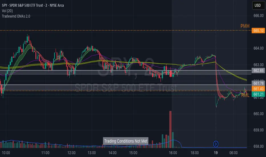
Tradewind EMAs + ConditionsTradewind EMAs + Conditions
Overview
The Tradewind EMAs + Conditions indicator is a powerful tool designed for traders who want to monitor key price levels and trend signals on a single chart. It combines a Trading Conditions monitor that identifies significant price breakouts based on prior day and premarket levels with an EMA Ribbons system that visualizes multiple Exponential Moving Averages (EMAs) for trend analysis.This indicator is tailored for day traders, particularly those using fast-paced setups to capitalize on short-term trends and breakouts, with customizable visual elements to suit individual preferences.
Features
1. Trading Conditions Monitor
Purpose: Identifies when the price breaks out of key levels on a 15-minute chart, considering the prior day's high/low (PDH/PDL) and the premarket high/low (PMH/PML), aligning with @team2trading's focus on key levels for trend identification.
Logic:
Monitors the most recent closed 15-minute bar to detect crosses above PDH/PMH (bullish) or below PDL/PML (bearish).
Ensures the price is outside the premarket band (above PMH or below PML) at the 15-minute close.
Optionally requires the current day's premarket session to be complete for stricter signal validation.
Display: Shows a customizable banner with the text "Trading Conditions Met" (green background) or "Trading Conditions Not Met" (gray background).
Alerts: Includes an alert condition that triggers when trading conditions are met, allowing notifications for breakouts.
2. EMA Ribbons
Purpose: Visualizes multiple EMAs to confirm trend direction and strength, directly supporting use of the primary 13, 48, and 200 EMAs for trend analysis and pullback entries.
Components:
Fast EMAs (EMA1 and EMA2): Default lengths of 8 and 13, with dynamic coloring (green for bullish when EMA1 > EMA2, red for bearish when EMA1 < EMA2).
Intermediate EMA (EMA3): Default length of 48, with a user-defined color.
Slow EMAs (EMA4 and EMA5): Default lengths of 200 and 220, with a user-defined color.
Cloud Fills: Displays editable cloud fills between EMA1/EMA2 and EMA4/EMA5 to highlight trend strength and crossovers.
Visualization: Each EMA is plotted as a line, with customizable colors and lengths, and clouds provide a clear visual of trend direction.
3. Customization Options
Premarket Session: Define the premarket session time (default: 04:00–09:30, exchange time) to calculate PMH/PML.
Premarket Strictness: Toggle to require the current day's premarket to be complete for signal validation.
Banner Position: Choose from five positions (Top Right, Bottom Right, Middle Right, Bottom Center, Middle Left) to place the trading conditions banner.
Banner Size: Select Small (1x1), Medium (2x1), or Large (3x2) for the banner's dimensions.
EMA Settings: Adjust the lengths and colors of all five EMAs and their respective cloud fills to match your trading style.
4. 2-Minute Trading Strategy Support
Purpose: Enhances the indicator for 2-minute trading strategy, which focuses on identifying trends, entering on pullbacks to EMAs, and using key levels for high-probability trades on a 2-minute chart.
How It Works:
Objective: The strategy aims to identify trending stocks and enter trades on pullbacks to the 13 or 48 EMA, using the 2-minute timeframe for entries and exits. The indicator's EMAs (default 8, 13, 48, 200, 220)
Trend Identification:
EMA Alignment: The indicator's EMA ribbons confirm trend direction. A bullish trend is signaled when the price is above the 200 EMA and the 13 EMA crosses above the 48 EMA (green cloud for EMA1/EMA2). A bearish trend occurs when the price is below the 200 EMA and the 13 EMA crosses below the 48 EMA (red cloud). Flat EMAs indicate choppy conditions, where no trades are taken.
Key Levels: The indicator plots PDH/PDL and PMH/PML, which uses to gauge trend strength. Breakouts or retests of these levels (shown by the "Trading Conditions Met" banner) confirm momentum for trade entries.
Entry Rules: On a 2-minute chart, enter trades on pullbacks to the 13 or 48 EMA when the "Trading Conditions Met" banner confirms a breakout above PDH/PMH (long) or below PDL/PML (short). Use candlestick patterns (e.g., bull/bear flags, top/bottom wicks) or level retests for additional confirmation.
Trade Management: Trail stops using the 13 EMA to lock in profits, scaling out when the price extends far from the 13 EMA to protect gains. The slow EMAs (200, 220) help identify potential reversal zones or longer-term trend context.
Risk Management: The indicator's breakout logic provides clear risk levels (e.g., a candle close below the entry EMA for longs or above for shorts), aligning with @team2trading's low-risk, high-reward approach.
Best Practices: Apply the indicator on a 2-minute chart for stocks like AMEX:SPY , NASDAQ:QQQ , or $IWM. Set alerts for "Trading Conditions Met" to catch breakouts in real-time. Adjust EMA lengths (e.g., set EMA1 to 13 and EMA2 to 48) to match the strategy exactly if preferred.
How to Use
Add to Chart: Apply the indicator to a 2-minute or 15-minute TradingView chart for optimal use with 2-minute strategy or breakout monitoring.
Configure Settings:
Adjust the premarket session, EMA lengths, colors, banner position, and size in the settings panel.
Enable the "Only consider today's premarket" option for stricter breakout signals.
Monitor Signals:
Watch the banner for "Trading Conditions Met" to identify breakout opportunities on the 2-minute chart.
Use the EMA ribbons and clouds to confirm trend direction and enter on pullbacks to the 13 or 48 EMA.
Set Alerts: Create alerts for the "Trading Conditions Met" condition to receive notifications for potential trade setups.
Settings
Trading Conditions:
Premarket Session: Set the time range for premarket data.
Only consider today's premarket: Enable for stricter signal logic.
Banner Settings:
Table Position: Select the banner's chart location.
Table Size: Choose the banner's size.
Fast EMAs: Set lengths and colors for EMA1, EMA2, and their cloud.
Intermediate EMA: Set length and color for EMA3.
Slow EMAs: Set lengths and colors for EMA4, EMA5, and their cloud.
Notes
The indicator is overlay-based, ensuring seamless integration with your price chart.
While the trading conditions logic uses 15-minute bar data, it can be monitored on a 2-minute chart for faster execution.
EMA Ribbons, with clouds highlighting crossover zones, are ideal for confirming trends and pullbacks in the 2-minute strategy.
Use the customizable banner to avoid chart clutter and position it for optimal visibility.
Credits
Developed by Tradewind Group. Combining breakout logic with EMA-based trend visualization, with direct inspiration from @team2trading's 2-minute trading strategy for identifying trends and low-risk entries.
[DEM] Relative Strength Signal (With Backtesting) Relative Strength Signal (With Backtesting) is a momentum indicator that generates trading signals based on when an asset reaches its highest or lowest relative strength compared to the SPY benchmark over a 20-period lookback window. The indicator calculates relative strength by dividing the current asset's price by SPY's price, then triggers buy signals when this ratio hits a 20-period high (indicating maximum outperformance) and sell signals when it reaches a 20-period low (indicating maximum underperformance). To prevent signal clustering and improve practical utility, the indicator includes a built-in filter that requires a minimum number of bars (default 20) to pass between signals of the same type, ensuring adequate spacing for meaningful trade opportunities. The system includes comprehensive backtesting functionality that tracks signal accuracy, average returns, and signal frequency over time, displaying these performance metrics in a detailed statistics table to help traders evaluate the effectiveness of trading on relative strength extremes versus the broader market.

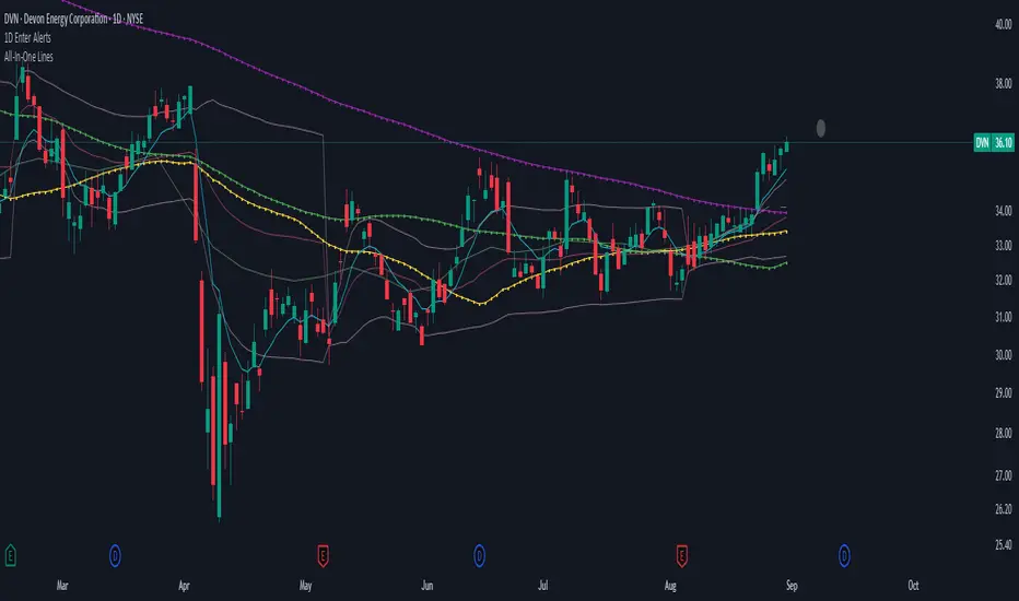
1D Enter AlertsThis is only a remaining of an experiment. I had real swing enter alerts, but it just made more sense to use classic TradingView alerts for horizontal / trendline / SMA breaks.
(Btw you can set up a horizontal alert in TradingView just by hovering the mouse on the chart so it's at the price point you aim for, and pressing "Alt + A").
Once this horizontal alert triggered I would usually wait for confirmation of the move on the 5m. If it's f. e. a break of an SMA and I'm not convinced yet, I might wait until end of the day. For exactly that purpose the following alert comes in handy:
"X Candle Close":
Is triggered 15m before market close - good reminder to check a stock again to see whether a resistance / support break was valid - and the stock should be entered as a swing, or maybe whether it should be closed as a loss.
"Z Trend Change: UP" + "Z Trend Change: DOWN":
Same as on 5m Exit Alert: meant to be only applied on SPY, and to have it set up to never end!
Criteria:
SPY broke through daily EMA 8 or daily SMA today, indicating an important short-term change on the daily chart.
Is triggered 15m before market close
More infos: www.reddit.com
5m Exit AlertsThese can help a lot with Daytrading if you don't have a price target in mind when there's no clear resistance / support nearby, and you don't trust the market enough to hold it as a swing trade.
Keep in mind that its main purpose is to give you a "warning" that it might be good to look at your screen, instead of guaranteeing you "now is the best time to exit". You won't reach high winning stats by blindly following this alert.
"A Exit LONG":
(I'm using letters instead of numbers for all Exit alerts to make sure I don't accidentally confuse Enter and Exit alerts).
There are 4 conditions that might trigger it. The reasons show up in the exit alert message (unfortunately only as a number, since alert messages can't have "dynamic text" in TradingView), and can also be displayed as symbols in the chart (see image above - make sure to enable "Show Signals" in the indicator settings first though).
Here are the conditions sorted from best to worst:
Technical reversal: Bearish Hammer candle with Volume > 2 * avg volume (of last 30 candles), when 5m candle closed. Reversal very likely. This is usually the best time to take your gains for the rest of the day.
EMA 3/8 cross: standard 5m EMA 3/8 cross, indicating a trend reversal, or at least a pullback. Can also be helpful to detect double tops / double bottoms.
Trailing Stop Loss: Crossed below 30m EMA 8, 5m candle closed. This is a "fallback" alert in case EMA 3 was already below EMA 8 before you set up the alert. It's not unlikely that the stock might go further down to VWAP, so depending on the chart and market this might be a good opportunity to save the gains you have left.
"Final" Stop Loss: Crossed below VWAP. Usually not a good sign. If you entered around VWAP your losses shouldn't be big yet, but if you plan on holding the stock the Daily chart and market outlook should better be quite convincing, and you wouldn't have needed to use this alert in the first place.
Keep in mind these work of course best if you picked a "good" stock: clear movement, tidy price action, high volume. Otherwise alerts are more likely to be triggered redundantly.
Always consider how the market and stock looks like, then decide whether to exit or not! Usually it makes sense to wait a bit to see f. e. whether the stock bounces off the 30m EMA 8, and it's just a pullback.
"B Enter SHORT":
Similar, but for shorts...
"C 1m Scalp LONG" + "D 1m Scalp SHORT":
Simple Scalping alert for EMA 3/8 cross on a 1m chart - but without needing to use a 1m chart to set it up!
Unfortunately it's not as accurate as manually setting this alert up on a 1m chart. It might be an advantage though that it sometimes is triggered 1-2 min later, since this means there are less redundant triggerings.
It can be useful esp. on high momentum trades, but I honestly haven't used it in a looong while.
"X Candle Close":
same as in 5m Entry indicator: triggered when 5m candle is confirmed
"Z Trend Change: UP" + "Z Trend Change: DOWN":
This one is meant to be used only on SPY: It alerts you when SPY is changing its trending direction, which might mean entering or closing existing trades.
I have therefore set it up to never end (by setting it to "Once Per Bar Close" in the alert settings).
It's based on DMI positive or negative being > 25. I had it based on VWAP at the beginning, but there were days where it was triggered every 5 minutes...
More infos: www.reddit.com

Multi-Asset Trend Background [SwissAlgo]Multi-Asset Trend Background
---------------------------------------------------------
Purpose
This indicator colors the chart background green (uptrend) or red (downtrend) to show the broad phases of a selected asset or ratio (for example SP500, or Gold), regardless of the current ticker on the chart (for example BTC).
The aim is not to generate signals, but to show when the selected asset (such as SP500 or Gold) was in a sustained uptrend or downtrend, so you can compare another chart (for example BTC) against that backdrop.
It helps frame price action in context, highlighting how macro drivers often align with or diverge from other markets.
From mid-2016 to late-2017, the SP500 was in a clear uptrend — Bitcoin rallied strongly in the same period, showing alignment between equities and crypto risk-taking.
When Gold trended higher, the SP500 often weakened, reflecting their tendency to move inversely in longer cycles.
As HYG/TLT turned down in early 2020, QQQ also struggled — illustrating how credit risk appetite is linked to equity performance.
During periods of DXY strength, Gold frequently showed the opposite trend, consistent with the historical dollar–gold relationship.
When RSP/SPY trended down, rallies in the S&P 500 were driven by a narrow group of large-cap stocks, while a rising ratio indicated broad market participation.
---------------------------------------------------------
Why it May Help You
Provides context for asset correlations.
Helps identify whether a chart is moving with or against its macro environment.
Useful for cycle mapping and historical study of market phases.
Filters noise and emphasizes established trends rather than short swings.
---------------------------------------------------------
How it Works
You select an asset or ratio from a dropdown.
The script calculates a mid-term moving average, then measures its slope, slope change, and slope acceleration to quantify the trend’s direction and consistency.
A longer-term moving average filter defines whether the long-term backdrop is bullish or bearish.
Background Coloring rules:
Green = slope strongly positive in line with long-term uptrend, or downtrend showing constructive reversal signs.
Red = slope strongly negative in line with long-term downtrend, or uptrend showing weakening slope.
No shading = neutral or mixed conditions.
This slope-based approach avoids the limitations of simple MA crosses, aiming to capture broad, consistent trend phases across different assets, with a mid/long-term view.
---------------------------------------------------------
Assets You Can Select
EQUITIES – good reference to gauge risk appetite in financial markets
SP500 = broad benchmark. Uptrend = strength in US equities signalling risk-on conditions; downtrend = weakness, risk-off market phase.
NASDAQ = tech and growth stocks. Uptrend = technology/growth leadership, risk appetite; downtrend = tech underperformance and fading risk appetite.
DOW = industrial and value stocks. Uptrend = industrial/value strength/economic strength; downtrend = weakness in traditional sectors and potential economic downturn.
RUSSELL2000 = small caps. Uptrend = typical in risk-on environments and FOMO; downtrend = small-cap underperformance, "flight to safety".
COMMODITIES – proxies for inflation, industry, and safe-haven demand.
GOLD = safe-haven. Uptrend = defensive demand rising/risk-off/inflation fears; downtrend = weaker demand for safety.
SILVER = partly industrial, partly safe-haven. Uptrend = stronger industrial cycle, or precious metals demand and risk appetite.
COPPER = industrial barometer. Uptrend = stronger industrial activity; downtrend = economic slowdown concerns.
CRUDE OIL = energy prices. Uptrend = rising energy/inflation pressures; downtrend = weaker demand or supply relief.
NATURAL GAS = volatile energy prices. Uptrend = higher energy costs and inflation pressure; downtrend = easing energy conditions.
BONDS / FX – monetary policy, credit, and risk appetite signals.
TLT = long-term US bonds. Uptrend = falling yields (bond demand)/flight to safety; downtrend = rising yields (risk on)
HYG = high-yield credit. Uptrend = strong credit appetite; downtrend = risk aversion in credit markets.
DXY = US dollar index. Uptrend = dollar strength (weaker EUR, GBP, SEK, etc); downtrend = dollar weakness.
USDJPY = carry trade proxy. Uptrend = stronger USD vs JPY (risk appetite); downtrend = JPY strength (risk-off).
CHFUSD = Swiss franc. Uptrend = franc strength (defensive flow); downtrend = franc weakness.
YIELD INVERSION = US10Y–US02Y. Uptrend = curve steepening; downtrend = inversion deepening (higher recession risk).
HOME BUILDERS = US housing sector. Uptrend = housing sector strength (risk on); downtrend = weakness (risk off).
EURUSD = euro vs dollar. Uptrend = euro strength (risk appetite); downtrend = euro weakness (risk aversion).
CRYPTO – digital asset benchmarks.
BITCOIN = digital gold. Uptrend = BTC strength; downtrend = BTC weakness.
CRYPTO_TOTAL = entire crypto market cap. Uptrend = broad crypto growth; downtrend = contraction.
CRYPTO_ALTS = altcoin market cap. Uptrend = altcoin expansion (often “alt season”); downtrend = contraction.
RATIOS – relative measures to extract macro signals.
COPPER/BTC = compares industrial cycle vs Bitcoin cycle. Uptrend = copper outperforming BTC; downtrend = BTC outperforming copper. Seems aligned with BTC macro tops and bottoms in the mid/long run.
RSP/SPY = market breadth (equal-weight vs cap-weighted). Uptrend = strong broad participation in market growth; downtrend = narrow leadership (fewer stocks leading the growth).
PCE/CPI = Fed’s inflation measure (PCE) vs consumer perceived inflation (CPI). Uptrend = PCE rising faster than CPI; downtrend = CPI running hotter than PCE. Fluctuates around 1; values above 1 may indicate hawkish Fed stands, values < 1 may indicate more dovish Fed stands.
HYG/TLT = credit vs bonds. Uptrend = risk appetite (high-yield outperforming long-term
treasury bonds); downtrend = risk aversion.
GOLD/SILVER = defensive vs cyclical metals. Uptrend = gold outperforming (risk-off tilt); downtrend = silver outperforming (risk-on tilt).
EURUSD/BTC = fiat vs crypto. Uptrend = EUR strengthening vs BTC; downtrend = BTC strengthening vs EUR. In general, the BTC trend is aligned EUR/USD trend.
---------------------------------------------------------
Limitations
Trend detection may lag by design to reduce noise.
Ratios rely on the availability and session rules of their components.
Background colors update on bar close; intra-bar values may differ.
Parameters are fixed and may not suit all assets equally.
---------------------------------------------------------
Disclaimer
This script is for educational and research purposes only. It does not provide financial advice or trade recommendations. Historical trend alignment does not guarantee future outcomes. Use with additional independent analysis.

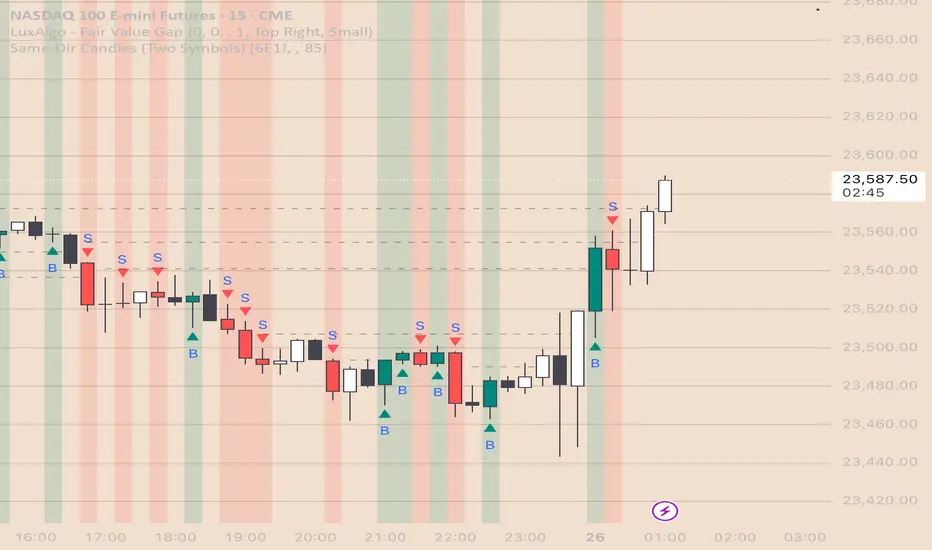
Same-Direction Candles (Two Symbols)Same-Direction Candles (Two Symbols)
What it does
Highlights bars on your chart when two symbols print the same candle direction on the chosen timeframe:
Both Bullish → one color
Both Bearish → another color
Great for spotting synchronous moves (e.g., NQ & ES, QQQ & SPY), or confirming risk-on/risk-off with an inverse asset (e.g., NQ vs DXY with inversion).
How it works
For each bar, the script checks whether close > open (bullish), close < open (bearish), or equal (doji) for:
The chart’s symbol
A second symbol pulled via request.security() (optionally on a different timeframe)
If both symbols are bullish, it paints Bull color; if both are bearish, it paints Bear color. Dojis can be ignored.
Inputs
Second symbol: Ticker to compare (e.g., CME_MINI:ES1!, NASDAQ:QQQ, TVC:DXY).
Second symbol timeframe: Leave blank to use the chart’s TF, or set a specific one (e.g., 5, 15, D).
Invert second symbol direction?: Flips the second symbol’s candle direction (useful for inversely related assets like DXY vs indices).
Ignore doji candles: Skip highlights when either candle is neutral (open == close).
Coloring options: Toggle bar coloring and/or background shading; pick colors; set background transparency.
Alerts
Three alert conditions:
Both Bullish
Both Bearish
Both Same Direction (bullish or bearish)
Create alerts from the Add Alert dialog after adding the script.
Use cases
Index confluence: NQ & ES moving in lockstep
ETF confirmation: QQQ & SPY agreement
FX/Index risk signals: Invert DXY against NQ/ES to see when equity strength aligns with dollar weakness
Tips
For mixed timeframes (e.g., chart on 1m, ES on 5m), set Second symbol timeframe to the higher TF to reduce noise.
Keep Ignore dojis on for cleaner signals.
Combine with your own entry rules (structure, FVGs, liquidity sweeps).
Notes
Works on any symbol/timeframe supported by TradingView.
Overlay script; no strategy/entries/exits are executed.
Past performance ≠ future results; for education only.
Version: 1.0 – initial release (bar/background highlights, doji filter, inversion, multi-TF support, alerts).
All Time High & All Time Low + 52-Week (ATH & ATL) | by Octopu$🚀 All Time High & All Time Low (ATH & ATL) + 52-Week with % and $ Info| by Octopu$
What is a 52-week, ATH or ATL?
52-Week High
The highest price a stock has traded at in the past 52 weeks (Approx. 1 year).
Acts like a “short-term ATH.” Many traders and investors use it as a momentum signal — breaking above it shows strength. Often used by screeners (“Stocks near 52-week high”).
IF a Ticker highest price in the last year is $500, and it’s currently trading at $555, it just made a new 52-week high (but not necessarily an all-time high).
52-Week Low
The lowest price a stock has traded at in the past 52 weeks (Approx. 1 year).
Acts like a “short-term ATL.” Traders watch it for breakdowns, and long-term investors watch it for potential bargains/buy the dip. Also important for risk management and Stop Losses.
IF a Ticker lowest price in the last year was $100, and it falls to $88, it just made a new 52-week low (but not necessarily an all-time low).
ATH (All-Time High)
The highest price a stock (or index, crypto, etc...) has EVER reached in its entire trading history.
Shows maximum bullish strength. When price breaks to a new ATH, there is no overhead resistance → often leads to strong momentum rallies. Also used as a psychological level in case of resistance/breakout.
ATL (All-Time Low)
The lowest price a stock (or asset) has EVER traded at since it began trading.
Reflects maximum bearish weakness. Breaking below the ATL is dangerous (no historical support below). Often associated with companies in crisis or risk of delisting. Or simply crashers or faders, whatever slang you may call it. Generally heavily shorted.
EXAMPLE:
AMEX:SPY
www.tradingview.com
This indicator however should not be used as a standalone tool.
(The combination of factors relies on your own knowledge about Confluence Factors along with your Due Diligence)
This indicator is not an advice to buy or sell securities in any form.
ANY Ticker. ANY Timeframe.
Features:
• 52-Week High
• 52-Week Low
• ALL Time High
• ALL Time Low
• $ Value Difference (of Current Price)
• % Percentage Difference (of Current Price)
Options:
• Customization
• Toggles
Notes:
v1.0
Indicator release.
Changes and updates can come in the future for additional functionalities or per requests. Follow and Stay Tuned!
Did you like it? Please Support and Shoot me a message! I'd appreciate if you dropped by to say thanks! Thank you.
- Octopu$
🐙

CandelaCharts - Macro Sentiment Index 📝 Overview
The Macro Sentiment Index (MSI) is a multi-asset, rules-based indicator designed to quantify global market risk appetite by aggregating signals from a diversified basket of financial instruments across equities, fixed income, commodities, currencies, volatility, and macroeconomic data.
Developed under the CandelaCharts framework, MSI transforms complex intermarket dynamics into a single, interpretable sentiment score. It reflects the collective behavior of institutional and retail investors, central bank policies, liquidity conditions, and macroeconomic trends.
Rather than relying on a single data source, the index combines over 30 components grouped into five core categories:
Risk-On Assets
Risk-Off / Defensive Assets
Macro & Interest Rate Indicators
Central Bank & Policy Proxies
Sentiment Ratios & Cross-Asset Signals
Each component is standardized using z-score normalization over a user-defined lookback period, weighted based on empirical significance, and aggregated into a composite sentiment score.
The final output oscillates around a neutral baseline (0), with positive values indicating risk-on conditions and negative values signaling risk-off sentiment.
📦 Features
Multi-Dimensional Inputs: Integrates equities, bonds, commodities, volatility, FX, yield curves, policy, macro, sector rotations, and sentiment ratios for holistic market breadth.
Adaptive Scoring System: Converts inputs into z-scores over a lookback window, normalizes directionality, and highlights relative strength/weakness in real time.
Weighted Aggregation: Users assign custom weights (0.1–3.0) to inputs, enabling fine-tuning for regimes or strategies. The index is a weighted average of component scores.
Smoothing & Visualization Modes: Apply SMA, EMA, RMA, or VWMA with custom length. Display as line, histogram, area, or columns with neutral, overbought, and oversold zones.
Correlation Monitoring: On-chart table tracks rolling correlations (default 20 periods) between asset prices and MSI, detecting divergences and regime changes.
Customizable UI: Personalize fonts, text size, branding, and color schemes for bullish/bearish phases and MA line visualization.
⚙️ Settings
Lookback: Define how far back the indicator evaluates data
MA (Moving Average): When enabled, overlays a moving default disabled
MA Smoothing: Applies a secondary smoothing layer
Correlation: Defines the period over which correlation is measured
Mode: Determines the visual layout style
Equity Benchmarks: SPY, QQQ, IWM, EEM
Fixed Income: TLT, HYG, LQD, SHY
Commodities: Gold (GC), Copper (HG), Oil (CL), BCOM
Volatility: VIX, VVIX, MOVE, SKEW
FX Pairs: USD/JPY, USD/CHF, AUD/JPY, DXY
Yield Curves: 10Y-2Y Spread (TYX), 10Y-5Y (TNX-FEDFUNDS)
Monetary Policy: SOFR, ED, FF futures
Global Macro: BDIY, M2, TED Spread, Put/Call Ratio
Sector Rotation: XLU/XLY, XLY/XLP
Sentiment Ratios: SPY/TLT, HYG/LQD, BTC/Gold, Copper/Gold, etc
⚡️ Showcase
Default Mode
Area Mode
Smoothing Moving Average
📒 Usage
Interpreting the Index
Above 0: Net risk-on sentiment - (Markets favor growth, liquidity, and speculative assets)
Below 0: Net risk-off sentiment - (Flight to safety, rising volatility, defensive positioning)
Above +1: Extreme risk-on / complacency - (Potential overheating or topping pattern)
Below −1: Extreme risk-off / fear - (Stress, capitulation, or strong defensive rotation)
🚨 Alerts
The indicator does not provide any alerts!
⚠️ Disclaimer
These tools are exclusively available on the TradingView platform.
Our charting tools are intended solely for informational and educational purposes and should not be regarded as financial, investment, or trading advice. They are not designed to predict market movements or offer specific recommendations. Users should be aware that past performance is not indicative of future results and should not rely on these tools for financial decisions. By using these charting tools, the purchaser agrees that the seller and creator hold no responsibility for any decisions made based on information provided by the tools. The purchaser assumes full responsibility and liability for any actions taken and their consequences, including potential financial losses or investment outcomes that may result from the use of these products.
By purchasing, the customer acknowledges and accepts that neither the seller nor the creator is liable for any undesired outcomes stemming from the development, sale, or use of these products. Additionally, the purchaser agrees to indemnify the seller from any liability. If invited through the Friends and Family Program, the purchaser understands that any provided discount code applies only to the initial purchase of Candela's subscription. The purchaser is responsible for canceling or requesting cancellation of their subscription if they choose not to continue at the full retail price. In the event the purchaser no longer wishes to use the products, they must unsubscribe from the membership service, if applicable.
We do not offer reimbursements, refunds, or chargebacks. Once these Terms are accepted at the time of purchase, no reimbursements, refunds, or chargebacks will be issued under any circumstances.
By continuing to use these charting tools, the user confirms their understanding and acceptance of these Terms as outlined in this disclaimer.
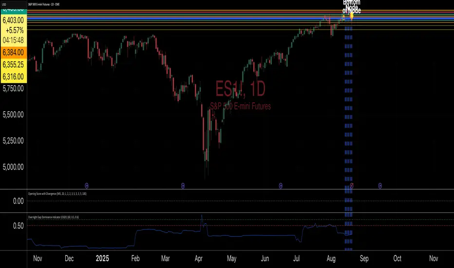
Overnight Gap Dominance Indicator (OGDI)The Overnight Gap Dominance Indicator (OGDI) measures the relative volatility of overnight price gaps versus intraday price movements for a given security, such as SPY or SPX. It uses a rolling standard deviation of absolute overnight percentage changes divided by the standard deviation of absolute intraday percentage changes over a customizable window. This helps traders identify periods where overnight gaps predominate, suggesting potential opportunities for strategies leveraging extended market moves.
Instructions
A
pply the indicator to your TradingView chart for the desired security (e.g., SPY or SPX).
Adjust the "Rolling Window" input to set the lookback period (default: 60 bars).
Modify the "1DTE Threshold" and "2DTE+ Threshold" inputs to tailor the levels at which you switch from 0DTE to 1DTE or multi-DTE strategies (default: 0.5 and 0.6).
Observe the OGDI line: values above the 1DTE threshold suggest favoring 1DTE strategies, while values above the 2DTE+ threshold indicate multi-DTE strategies may be more effective.
Use in conjunction with low VIX environments and uptrend legs for optimal results.
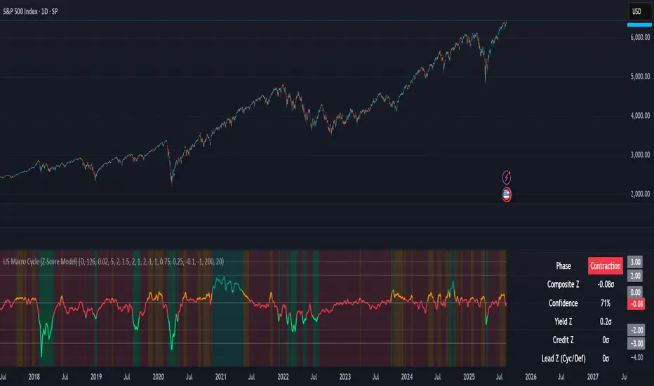
US Macro Cycle (Z-Score Model)US Macro Cycle (Z-Score Model)
This indicator tracks the US economic cycle in real time using a weighted composite of seven macro and market-based indicators, each converted into a rolling Z-score for comparability. The model identifies the current phase of the cycle — Expansion, Peak, Contraction, or Recovery — and suggests sector tilts based on historical performance in each phase.
Core Components:
Yield Curve (10y–2y): Positive & steepening = growth; inverted = slowdown risk.
Credit Spreads (HYG/LQD): Tightening = risk-on; widening = risk-off.
Sector Leadership (Cyclicals vs. Defensives): Measures market leadership regime.
Copper/Gold Ratio: Higher copper = growth signal; higher gold = defensive.
SPY vs. 200-day MA: Equity trend strength.
SPY/IEF Ratio: Stocks vs. bonds relative strength.
VIX (Inverted): Low/falling volatility = supportive; high/rising = risk-off.
Methodology:
Each series is transformed into a rolling Z-score over the selected lookback period (optionally using median/MAD for robustness and winsorization to clip outliers).
Z-scores are combined using user-defined weights and normalized.
The smoothed composite is compared against phase thresholds to classify the macro environment.
Features:
Customizable Weights: Emphasize the indicators most relevant to your strategy.
Adjustable Thresholds: Fine-tune cycle phase definitions.
Background Coloring: Visual cue for the current phase.
Summary Table: Displays composite Z, confidence %, and individual Z-scores.
Alerts: Trigger when the phase changes, with details on the composite score and recommended tilt.
Use Cases:
Align sector rotation or relative strength strategies with the macro backdrop.
Identify favorable or defensive phases for tactical allocation.
Monitor macro turning points to manage portfolio risk.
It's doesn't fill nan gaps so there is quite a bit of zeroes, non-repainting.
Dynamic 5DMA/EMA with Color for Multiple Products🔹 Dynamic 5DMA/EMA with Slope-Based Coloring (All Timeframes)
This indicator plots a dynamic 5-period moving average that adapts intelligently to your chart's timeframe and product type — giving you a clean, slope-sensitive visual edge across intraday, daily, and weekly views.
✅ Key Features:
📈 Dynamic MA Length Scaling:
On intraday timeframes, the MA adjusts for your selected market session (RTH, ETH, VIX, or Futures), calculating a true 5-day average based on actual session length — not just a flat bar count.
🔄 Automatic Timeframe Detection:
Daily Chart: Uses standard 5DMA or 5EMA.
Weekly Chart: Applies a true 5-week MA.
Intraday Charts: Converts 5 days into bar-length equivalent dynamically.
🎨 Color-Coded Slope Logic:
Green = Rising MA (bullish slope)
Red = Falling MA (bearish slope)
Neutral slope = previous color held for visual continuity
No more guessing — direction is instantly clear.
⚠️ Built-In Slope Flip Alerts:
Set alerts when the slope of the MA turns up or down. Ideal for timing pullback entries or exits across any product.
⚙️ Session Settings for Proper Scaling:
Choose your product's market structure to ensure accurate 5-day conversion on intraday charts:
Stocks - RTH: 390 mins/day
Stocks - ETH: 780 mins/day
VIX: 855 mins/day
Futures: 1440 mins/day
This ensures the MA reflects 5 full trading days, regardless of session irregularities or bar interval.
📌 Why Use This Indicator?
Most MAs misrepresent trend direction on intraday charts because they assume static daily bar counts. This tool corrects that, then adds slope-based coloring to give you a fast, visual read on short-term momentum. Whether you’re swing trading SPY, scalping VIX, or position trading futures, this indicator keeps your view aligned with how institutions see moving averages across timeframes.
🔧 Best For:
VIX & volatility traders
Short-term SPY/SPX traders
Swing traders who value clean setups
Anyone wanting a true 5-day trend anchor on any chart
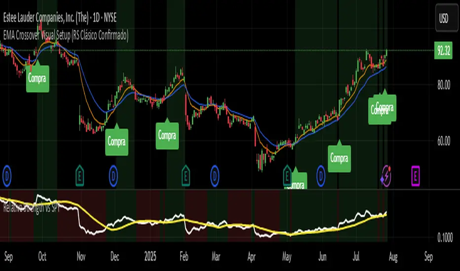
EMA Crossover Visual Setup (RS Clásico Confirmado)Overview
This script is designed to visually highlight classic swing trading setups based on the crossover of exponential moving averages (EMAs), with additional confirmation using Relative Strength (RS) compared to a benchmark asset (e.g., SPY).
The goal is to identify bullish momentum shifts that align both with technical structure (EMA crossover) and relative outperformance, helping traders focus on strong stocks in strong markets.
Logic
A signal is triggered when the following conditions are met:
The fast EMA (e.g., 10) crosses above the slow EMA (e.g., 20).
The closing price is above a third EMA (e.g., 50) to confirm bullish structure.
The asset's Relative Strength (RS) versus a benchmark is confirmed manually, based on an RSI comparison (not calculated inside the script).
The script is meant to be used alongside manual RS confirmation, using a secondary chart or overlay of the RS ratio.
Features
Visual labels and markers for clean charting of valid entry setups
Fully customizable EMA lengths
Optional highlighting of candle patterns near entry
Ideal for use with top-down analysis and watchlist filtering
Suggested Use
Works best on daily and 4H charts for swing trading setups
Combine with volume and price action analysis for higher probability trades
Use manual RS validation: confirm that the RSI of the selected stock is stronger than the RSI of SPY (or any benchmark of your choice)
Notes
This script does not execute trades or include stop loss/take profit logic, as it is intended for discretionary traders who want to visually scan for opportunities.
It also does not calculate RS internally, allowing flexibility in how you define strength (RS line, RSI comparison, or price ratio).
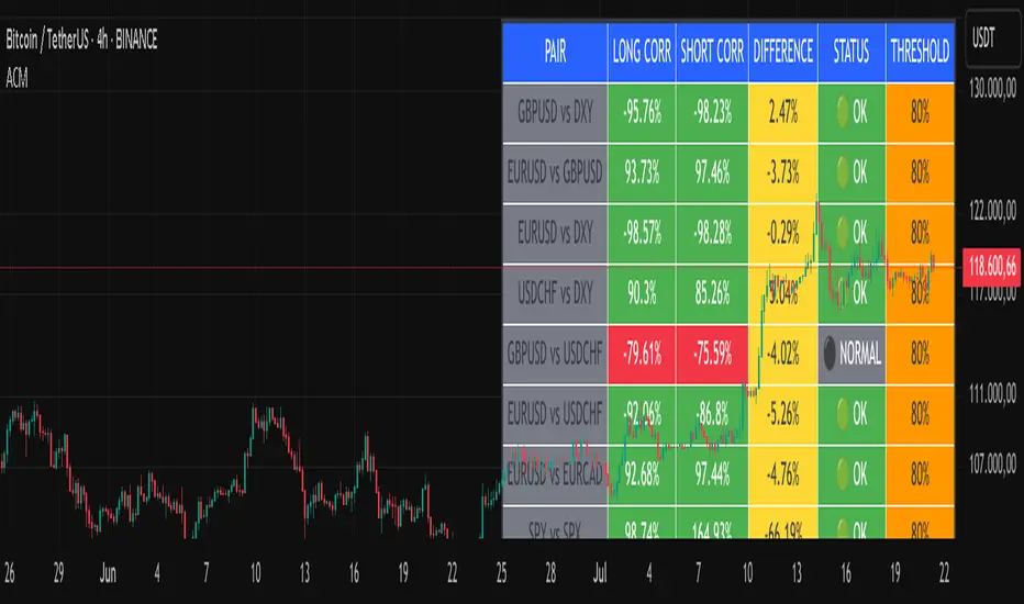
Advanced Correlation Monitor📊 Advanced Correlation Monitor - Pine Script v6
🎯 What does this indicator do?
Monitors real-time correlations between 13 different asset pairs and alerts you when historically strong correlations break, indicating potential trading opportunities or changes in market dynamics.
🚀 Key Features
✨ Multi-Market Monitoring
7 Forex Pairs (GBPUSD/DXY, EURUSD/GBPUSD, etc.)
6 Index/Stock Pairs (SPY/S&P500, DAX/NASDAQ, TSLA/NVDA, etc.)
Fully configurable - change any pair from inputs
📈 Dual Correlation Analysis
Long Period (90 bars): Identifies historically strong correlations
Short Period (6 bars): Detects recent breakdowns
Pearson Correlation using Pine Script v6 native functions
🎨 Intuitive Visualization
Real-time table with 6 information columns
Color coding: Green (correlated), Red (broken), Gray (normal)
Visual states: 🟢 OK, 🔴 BROKEN, ⚫ NORMAL
🚨 Smart Alert System
Only alerts previously correlated pairs (>80% historical)
Detects breakdowns when short correlation <80%
Consolidated alert with all affected pairs
🛠️ Flexible Configuration
Adjustable Parameters:
📅 Periods: Long (30-500), Short (2-50)
🎯 Threshold: 50%-99% (default 80%)
🎨 Table: Configurable position and size
📊 Symbols: All pairs are configurable
Default Pairs:
FOREX: INDICES/STOCKS:
- GBPUSD vs DXY • SPY vs S&P500
- EURUSD vs GBPUSD • DAX vs S&P500
- EURUSD vs DXY • DAX vs NASDAQ
- USDCHF vs DXY • TSLA vs NVDA
- GBPUSD vs USDCHF • MSFT vs NVDA
- EURUSD vs USDCHF • AAPL vs NVDA
- EURUSD vs EURCAD
💡 Practical Use Cases
🔄 Pairs Trading
Detects when strong correlations break for:
Statistical arbitrage
Mean reversion trading
Divergence opportunities
🛡️ Risk Management
Identifies when "safe" assets start moving independently:
Portfolio diversification
Smart hedging
Regime change detection
📊 Market Analysis
Understand underlying market structure:
Forex/DXY correlations
Tech sector rotation
Regional market disconnection
🎓 Results Interpretation
Reading Example:
EURUSD vs DXY: -98.57% → -98.27% | 🟢 OK
└─ Perfect negative correlation maintained (EUR rises when DXY falls)
TSLA vs NVDA: 78.12% → 0% | ⚫ NORMAL
└─ Lost tech correlation (divergence opportunity)
Trading Signals:
🟢 → 🔴: Broken correlation = Possible opportunity
Large difference: Indicates correlation tension
Multiple breaks: Market regime change
BitDoctor Risk Appetite DashboardBitDoctor Risk Appetite Dashboard
The BitDoctor Risk Appetite Dashboard is a powerful tool for gauging market sentiment and risk appetite across major asset classes. It combines equity, credit, emerging markets, interest rates, and crypto signals into a single dashboard, giving traders a clear view of current market dynamics.
What it does:
- Calculates momentum for each key asset using a 14-day rate of change.
- Normalizes each signal and plots a composite Risk Appetite Strength Index (RASI) on the chart.
- Displays a dashboard table showing the momentum of each component in percentage terms alongside the composite RASI.
How to use it:
The plotted RASI line shows overall risk appetite:
- Positive readings suggest a stronger risk-on environment.
- Negative readings indicate risk-off sentiment.
The dashboard table (top-right corner by default) displays two columns:
- Asset : The tracked asset symbol.
- Momentum : The current 14-day rate of change as a percentage.
Interpreting the table:
Each row represents a component of market risk sentiment:
- SPY : US equities.
- HYG : High yield bonds (credit risk appetite).
- EEM : Emerging markets.
- 1/UST10Y : Inverted 10-year Treasury yield (lower yields support risk appetite).
- ETH : Ethereum (crypto risk proxy).
- RASI : The average of the above signals, indicating overall market risk appetite.
Higher positive values in the table suggest rising momentum in that asset, which contributes positively to the composite RASI. Conversely, negative values signal declining momentum. You can use these individual readings to see which sectors are driving the current risk sentiment and to time entries and exits accordingly.
Customization:
The indicator allows you to adjust the table's background color, text color, text size, cell padding, and position so it remains readable and unobtrusive regardless of your chart theme.
Use the BitDoctor Risk Appetite Dashboard as part of a broader analysis to align your trades with prevailing risk conditions. It is not a standalone trading signal but a context tool to support better decision-making.
Why these assets were chosen:
The dashboard uses a carefully selected mix of widely-followed proxies for global risk sentiment:
- SPY : Represents large-cap US equity market performance, a key barometer of investor confidence.
- HYG : Tracks high-yield corporate bonds, reflecting credit risk appetite in fixed income markets.
- EEM : Captures emerging market equities, which are highly sensitive to global risk-on/off dynamics.
- 1/UST10Y : The inverse of the US 10-year Treasury yield, as falling yields often accompany risk-on moves and vice versa.
- ETH : Ethereum as a representative crypto asset, offering insight into speculative risk appetite in digital assets.
This mix provides a comprehensive view of sentiment across traditional and alternative markets, making the dashboard a robust tool for gauging overall risk appetite.

Rolling Log Returns [BackQuant]Rolling Log Returns
The Rolling Log Returns indicator is a versatile tool designed to help traders, quants, and data-driven analysts evaluate the dynamics of price changes using logarithmic return analysis. Widely adopted in quantitative finance, log returns offer several mathematical and statistical advantages over simple returns, making them ideal for backtesting, portfolio optimization, volatility modeling, and risk management.
What Are Log Returns?
In quantitative finance, logarithmic returns are defined as:
ln(Pₜ / Pₜ₋₁)
or for rolling periods:
ln(Pₜ / Pₜ₋ₙ)
where P represents price and n is the rolling lookback window.
Log returns are preferred because:
They are time additive : returns over multiple periods can be summed.
They allow for easier statistical modeling , especially when assuming normally distributed returns.
They behave symmetrically for gains and losses, unlike arithmetic returns.
They normalize percentage changes, making cross-asset or cross-timeframe comparisons more consistent.
Indicator Overview
The Rolling Log Returns indicator computes log returns either on a standard (1-period) basis or using a rolling lookback period , allowing users to adapt it to short-term trading or long-term trend analysis.
It also supports a comparison series , enabling traders to compare the return structure of the main charted asset to another instrument (e.g., SPY, BTC, etc.).
Core Features
✅ Return Modes :
Normal Log Returns : Measures ln(price / price ), ideal for day-to-day return analysis.
Rolling Log Returns : Measures ln(price / price ), highlighting price drift over longer horizons.
✅ Comparison Support :
Compare log returns of the primary instrument to another symbol (like an index or ETF).
Useful for relative performance and market regime analysis .
✅ Moving Averages of Returns :
Smooth noisy return series with customizable MA types: SMA, EMA, WMA, RMA, and Linear Regression.
Applicable to both primary and comparison series.
✅ Conditional Coloring :
Returns > 0 are colored green ; returns < 0 are red .
Comparison series gets its own unique color scheme.
✅ Extreme Return Detection :
Highlight unusually large price moves using upper/lower thresholds.
Visually flags abnormal volatility events such as earnings surprises or macroeconomic shocks.
Quantitative Use Cases
🔍 Return Distribution Analysis :
Gain insight into the statistical properties of asset returns (e.g., skewness, kurtosis, tail behavior).
📉 Risk Management :
Use historical return outliers to define drawdown expectations, stress tests, or VaR simulations.
🔁 Strategy Backtesting :
Apply rolling log returns to momentum or mean-reversion models where compounding and consistent scaling matter.
📊 Market Regime Detection :
Identify periods of consistent overperformance/underperformance relative to a benchmark asset.
📈 Signal Engineering :
Incorporate return deltas, moving average crossover of returns, or threshold-based triggers into machine learning pipelines or rule-based systems.
Recommended Settings
Use Normal mode for high-frequency trading signals.
Use Rolling mode for swing or trend-following strategies.
Compare vs. a broad market index (e.g., SPY or QQQ ) to extract relative strength insights.
Set upper and lower thresholds around ±5% for spotting major volatility days.
Conclusion
The Rolling Log Returns indicator transforms raw price action into a statistically sound return series—equipping traders with a professional-grade lens into market behavior. Whether you're conducting exploratory data analysis, building factor models, or visually scanning for outliers, this indicator integrates seamlessly into a modern quant's toolbox.
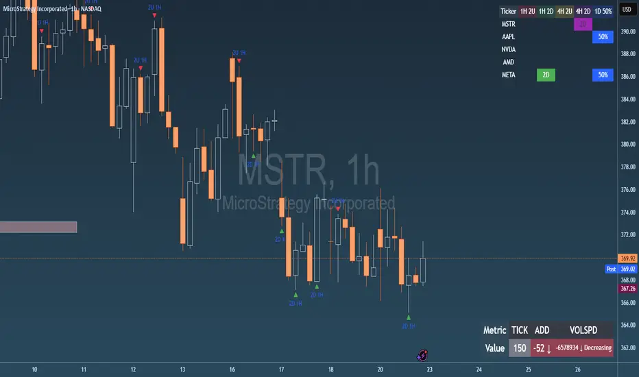
Failed 2U/2D + 50% Retrace Scanner📈 Multi-Ticker Failed 2U/2D Scanner with Daily Retrace & Market Breadth Table
This TradingView indicator is a multi-symbol price action scanner designed to catch high-probability reversal signals using The Strat’s failed 2U/2D patterns and daily 50% retrace logic, while also displaying market breadth metrics ( USI:TICK and USI:ADD ) for context.
Monitored Symbols:
SPY, SPX, QQQ, IWM, NVDA, AMD, AAPL, META, MSTR
🔍 Detection Logic
1. Failed 2U / Failed 2D Setups
Failed 2U: Price breaks above the previous candle’s high but closes back below the open → Bearish reversal
Failed 2D: Price breaks below the previous candle’s low but closes back above the open → Bullish reversal
Timeframes Monitored:
🕐 1-Hour (1H)
⏰ 4-Hour (4H)
2. Daily 50% Candle Retrace
Checks if price has retraced 50% or more of the previous day’s candle body
Highlights potential trend exhaustion or reversal confluence
3. Market Breadth Metrics (Display Only)
USI:TICK : Measures real-time NYSE up vs. down ticks
USI:ADD : Advance-Decline Line (net advancing stocks)
Not used in signal logic — just displayed in the table for overall market context
🖼️ Visual Elements
✅ Chart Markers
🔺 Red/Green Arrows for 1H Failed 2U/2D
🟨 Yellow Squares for 4H Failed 2U/2D
Visual markers are plotted directly on the relevant candles
📊 Signal Table
Lists all 9 tickers in rows
Columns for:
1H Signal
4H Signal
Daily 50% Retrace
USI:TICK Value
USI:ADD Value
Color-Coded Cells:
🔴 Red = Failed 2U
🟢 Green = Failed 2D
⚠️ Highlight if 50% Daily Retrace condition is true
🟦 Neutral-colored cells for TICK/ADD numeric display
🔔 Alerts
Hardcoded alerts fire when:
A 1H or 4H Failed 2U/2D is detected
The Daily 50% retrace condition is met
Each alert is labeled clearly by symbol and timeframe:
"META 4H Failed 2D"
"AAPL Daily 50% Retrace"
🎯 Use Case
Built for:
Reversal traders using The Strat
Swing or intraday traders watching hourly setups
Traders wanting quick visual context on market breadth without relying on it for confirmation
Monitoring multiple tickers in one clean view
This is scan 2
Add scan 1 for spx, spy, iwm, qqq, aapl
This indicator is not financial advice. Use the alerts to check out chart and when tickers trigger.