Relative Strength Index (OSC)Hello everyone, I'm sorry that the previous open-source version was hidden due to the house rules, I've re-edited the description and re-posted it
(1) Indicator introduction
This is RSI indicator with original divergence algorithm
This indicator is plotted on the RSI and can display the divergence locations and corresponding divergence intensity
The tolerance of N Klines at the top or bottom positions for price and indicator is supported, which is set by the "Tolerant Kline Number"
Support the display of divergence intensity, that is, the REG/HID value displayed on the label, which is less than 0. The smaller the intensity value, the more obvious divergence
Support the filtering of divergence intensity, which is set by "Cov Threshold". The divergence that REG/HID divergence intensity greater than this value will be ignored
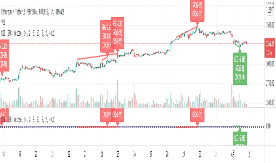
In the label, REG indicates regular top/bottom divergence while HID indicates hidden top/bottom divergence
In the label, SRC(x-y) indicates a divergence occurred from the x-th kline to the y-th kline
In the label, OSC(x-y) indicates a divergence occurred from the indicator corresponding to the x-th kline to the y-th kline
(2) Parameter introduction
- RSI Settings
Source: The source to calculate RSI, close by default
RSI Length: The length of RSI, 14 by default
- RSI Divergence
Pivot Lookback Right: Number of K-line bars recalling the pivot top/bottom point to the right
Pivot Lookback Left: Number of K-line bars recalling the pivot top/bottom point to the left
Max of Lookback Range: Maximum number of retracing K-line bars to find the pivot top/bottom point
Min of Lookback Range: Minimum number of retracing K-line bars to find the pivot top/bottom point
Tolerant Kline Number: Maximum tolerance in indexing top/bottom points of Klines and indicators
Cov Threshold: Divergence intensity, which is less than 0. The smaller the intensity value, the more obvious divergence
Plot Bullish: Whether to draw regular bullish divergence label
Plot Hidden Bullish: Whether to draw hidden bullish divergence label
Plot Bearish: Whether to draw regular bearish divergence label
Plot Hidden Bearish: Whether to draw hidden bearish divergence label
Happy trading and enjoy your life!
————————————————————————————————————————
各位朋友大家好,很抱歉之前的开源版本因为规则原因被隐藏,我已经重新编辑了说明并重新发布
(1) 指标说明
该指标绘制于 RSI 上,并在对应位置显示背离点以及背离程度
支持顶底位置 N 根K线的容差,由 Tolerant Kline Number 参数设置
支持背离强度的显示,即标签上显示的 REG/HID 值,该值小于 0,且越小说明背离程度越大
支持背离强度的过滤,由 Cov Threshold 参数设置, REG/HID 值大于这个值的背离会被忽略
标签中,REG 表示常规顶/低背离,而 HID 表示隐藏顶/底背离
标签中,SRC(x-y) 表示从当前第 x 根 bar 开始到第 y 跟 bar 出现背离
标签中,OSC(x-y) 表示从当前第 x 根 bar 所对应的指标开始到第 y 跟 bar 所对应的指标出现背离
(2) 参数说明
- RSI Settings
Source: 计算 RSI 指标的 source,默认为 close
RSI Length: 计算 RSI 指标的长度,默认为 14
- RSI Divergence
Pivot Lookback Right: 枢纽顶/底点往右回顾的 K线 bar 数量
Pivot Lookback Left: 枢纽顶/底点往左回顾的 K线 bar 数量
Max of Lookback Range: 回寻找枢纽顶/底点的最大回溯 K线 bar 数量
Min of Lookback Range: 回寻找枢纽顶/底点的最小回溯 K线 bar 数量
Tolerant Kline Number: K线和指标的顶/底点索引的最大误差
Cov Threshold: 背离程度,该值小于 0,且越小说明背离程度越大
Plot Bullish: 是否绘制常规底背离提示
Plot Hidden Bullish: 是否绘制隐藏底背离提示
Plot Bearish: 是否绘制常规顶背离提示
Plot Hidden Bearish: 是否绘制隐藏顶背离提示
祝大家交易愉快
在腳本中搜尋"top"
Relative Strength Index (SRC)Hello everyone, I'm sorry that the previous open-source version was hidden due to the house rules, I've re-edited the description and re-posted it
(1) Indicator introduction
This is RSI indicator with original divergence algorithm
This indicator is plotted on the klines and can display the divergence locations and corresponding divergence intensity
The tolerance of N Klines at the top or bottom positions for price and indicator is supported, which is set by the "Tolerant Kline Number"
Support the display of divergence intensity, that is, the REG/HID value displayed on the label, which is less than 0. The smaller the intensity value, the more obvious divergence
Support the filtering of divergence intensity, which is set by "Cov Threshold". The divergence that REG/HID divergence intensity greater than this value will be ignored
In the label, REG indicates regular top/bottom divergence while HID indicates hidden top/bottom divergence
In the label, SRC(x-y) indicates a divergence occurred from the x-th kline to the y-th kline
In the label, OSC(x-y) indicates a divergence occurred from the indicator corresponding to the x-th kline to the y-th kline
(2) Parameter introduction
- RSI Settings
Source: The source to calculate RSI, close by default
RSI Length: The length of RSI, 14 by default
- RSI Divergence
Pivot Lookback Right: Number of K-line bars recalling the pivot top/bottom point to the right
Pivot Lookback Left: Number of K-line bars recalling the pivot top/bottom point to the left
Max of Lookback Range: Maximum number of retracing K-line bars to find the pivot top/bottom point
Min of Lookback Range: Minimum number of retracing K-line bars to find the pivot top/bottom point
Tolerant Kline Number: Maximum tolerance in indexing top/bottom points of Klines and indicators
Cov Threshold: Divergence intensity, which is less than 0. The smaller the intensity value, the more obvious divergence
Plot Bullish: Whether to draw regular bullish divergence label
Plot Hidden Bullish: Whether to draw hidden bullish divergence label
Plot Bearish: Whether to draw regular bearish divergence label
Plot Hidden Bearish: Whether to draw hidden bearish divergence label
Happy trading and enjoy your life!
————————————————————————————————————————
各位朋友大家好,很抱歉之前的开源版本因为规则原因被隐藏,我已经重新编辑了说明并重新发布
(1) 指标说明
该指标绘制于 K线 上,并在对应位置显示背离点以及背离程度
支持顶底位置 N 根K线的容差,由 Tolerant Kline Number 参数设置
支持背离强度的显示,即标签上显示的 REG/HID 值,该值小于 0,且越小说明背离程度越大
支持背离强度的过滤,由 Cov Threshold 参数设置, REG/HID 值大于这个值的背离会被忽略
标签中,REG 表示常规顶/低背离,而 HID 表示隐藏顶/底背离
标签中,SRC(x-y) 表示从当前第 x 根 bar 开始到第 y 跟 bar 出现背离
标签中,OSC(x-y) 表示从当前第 x 根 bar 所对应的指标开始到第 y 跟 bar 所对应的指标出现背离
(2) 参数说明
- RSI Settings
Source: 计算 RSI 指标的 source,默认为 close
RSI Length: 计算 RSI 指标的长度,默认为 14
- RSI Divergence
Pivot Lookback Right: 枢纽顶/底点往右回顾的 K线 bar 数量
Pivot Lookback Left: 枢纽顶/底点往左回顾的 K线 bar 数量
Max of Lookback Range: 回寻找枢纽顶/底点的最大回溯 K线 bar 数量
Min of Lookback Range: 回寻找枢纽顶/底点的最小回溯 K线 bar 数量
Tolerant Kline Number: K线和指标的顶/底点索引的最大误差
Cov Threshold: 背离程度,该值小于 0,且越小说明背离程度越大
Plot Bullish: 是否绘制常规底背离提示
Plot Hidden Bullish: 是否绘制隐藏底背离提示
Plot Bearish: 是否绘制常规顶背离提示
Plot Hidden Bearish: 是否绘制隐藏顶背离提示
祝大家交易愉快

On Balance Volume wi Normalization (OSC)Hello everyone, I'm sorry that the previous open-source version was hidden due to the house rules, I've re-edited the description and re-posted it
(1) Indicator introduction
This indicator is a normalized OBV that never dulls and has a better divergence accuracy than RSI
This indicator is plotted on the Normalized OBV and can display the divergence locations and corresponding divergence intensity
The tolerance of N Klines at the top or bottom positions for price and indicator is supported, which is set by the "Tolerant Kline Number"
Support the display of divergence intensity, that is, the REG/HID value displayed on the label, which is less than 0. The smaller the intensity value, the more obvious divergence
Support the filtering of divergence intensity, which is set by "Cov Threshold". The divergence that REG/HID divergence intensity greater than this value will be ignored
In the label, REG indicates regular top/bottom divergence while HID indicates hidden top/bottom divergence
In the label, SRC(x-y) indicates a divergence occurred from the x-th kline to the y-th kline
In the label, OSC(x-y) indicates a divergence occurred from the indicator corresponding to the x-th kline to the y-th kline
(2) Parameter introduction
- Normalized On Balance Volume
MA Type: Type of moving average for calculating the normalized OBV, default is SMA
MA Period: Period of moving average of normalized OBV, which is SMA14 by default
NOBV Sigma: Upper and lower range of normalized OBV
- Normalized On Balance Volume Divergence
Pivot Lookback Right: Number of K-line bars recalling the pivot top/bottom point to the right
Pivot Lookback Left: Number of K-line bars recalling the pivot top/bottom point to the left
Max of Lookback Range: Maximum number of retracing K-line bars to find the pivot top/bottom point
Min of Lookback Range: Minimum number of retracing K-line bars to find the pivot top/bottom point
Tolerant Kline Number: Maximum tolerance in indexing top/bottom points of Klines and indicators
Cov Threshold: Divergence intensity, which is less than 0. The smaller the intensity value, the more obvious divergence
Plot Bullish: Whether to draw regular bullish divergence label
Plot Hidden Bullish: Whether to draw hidden bullish divergence label
Plot Bearish: Whether to draw regular bearish divergence label
Plot Hidden Bearish: Whether to draw hidden bearish divergence label
Happy trading and enjoy your life!
————————————————————————————————————————
各位朋友大家好,很抱歉之前的开源版本因为规则原因被隐藏,我已经重新编辑了说明并重新发布
(1) 指标说明
该指标是 OBV 的归一化版本,永不钝化,背离准确率高于 RSI
该指标绘制于 归一化OBV 上,并在对应位置显示背离点以及背离程度
支持顶底位置 N 根K线的容差,由 Tolerant Kline Number 参数设置
支持背离强度的显示,即标签上显示的 REG/HID 值,该值小于 0,且越小说明背离程度越大
支持背离强度的过滤,由 Cov Threshold 参数设置, REG/HID 值大于这个值的背离会被忽略
标签中,REG 表示常规顶/低背离,而 HID 表示隐藏顶/底背离
标签中,SRC(x-y) 表示从当前第 x 根 bar 开始到第 y 跟 bar 出现背离
标签中,OSC(x-y) 表示从当前第 x 根 bar 所对应的指标开始到第 y 跟 bar 所对应的指标出现背离
(2) 参数说明
- Normalized On Balance Volume
MA Type: 计算归一化 OBV 的移动平均的类型,默认为 SMA
MA Period: 计算归一化 OBV 的移动平均的周期,默认为 SMA14
NOBV Sigma: 归一化 OBV 的过滤区间
- Normalized On Balance Volume Divergence
Pivot Lookback Right: 枢纽顶/底点往右回顾的 K线 bar 数量
Pivot Lookback Left: 枢纽顶/底点往左回顾的 K线 bar 数量
Max of Lookback Range: 回寻找枢纽顶/底点的最大回溯 K线 bar 数量
Min of Lookback Range: 回寻找枢纽顶/底点的最小回溯 K线 bar 数量
Tolerant Kline Number: K线和指标的顶/底点索引的最大误差
Cov Threshold: 背离程度,该值小于 0,且越小说明背离程度越大
Plot Bullish: 是否绘制常规底背离提示
Plot Hidden Bullish: 是否绘制隐藏底背离提示
Plot Bearish: 是否绘制常规顶背离提示
Plot Hidden Bearish: 是否绘制隐藏顶背离提示
祝大家交易愉快

On Balance Volume wi Normalization (SRC)Hello everyone, I'm sorry that the previous open-source version was hidden due to the house rules, I've re-edited the description and re-posted it
(1) Indicator introduction
This indicator is a normalized OBV that never dulls and has a better divergence accuracy than RSI
This indicator is plotted on the klines and can display the divergence locations and corresponding divergence intensity
The tolerance of N Klines at the top or bottom positions for price and indicator is supported, which is set by the "Tolerant Kline Number"
Support the display of divergence intensity, that is, the REG/HID value displayed on the label, which is less than 0. The smaller the intensity value, the more obvious divergence
Support the filtering of divergence intensity, which is set by "Cov Threshold". The divergence that REG/HID divergence intensity greater than this value will be ignored
In the label, REG indicates regular top/bottom divergence while HID indicates hidden top/bottom divergence
In the label, SRC(x-y) indicates a divergence occurred from the x-th kline to the y-th kline
In the label, OSC(x-y) indicates a divergence occurred from the indicator corresponding to the x-th kline to the y-th kline
(2) Parameter introduction
- Normalized On Balance Volume
MA Type: Type of moving average for calculating the normalized OBV, default is SMA
MA Period: Period of moving average of normalized OBV, which is SMA14 by default
NOBV Sigma: Upper and lower range of normalized OBV, but the function is reserved
- Normalized On Balance Volume Divergence
Pivot Lookback Right: Number of K-line bars recalling the pivot top/bottom point to the right
Pivot Lookback Left: Number of K-line bars recalling the pivot top/bottom point to the left
Max of Lookback Range: Maximum number of retracing K-line bars to find the pivot top/bottom point
Min of Lookback Range: Minimum number of retracing K-line bars to find the pivot top/bottom point
Tolerant Kline Number: Maximum tolerance in indexing top/bottom points of Klines and indicators
Cov Threshold: Divergence intensity, which is less than 0. The smaller the intensity value, the more obvious divergence
Plot Bullish: Whether to draw regular bullish divergence label
Plot Hidden Bullish: Whether to draw hidden bullish divergence label
Plot Bearish: Whether to draw regular bearish divergence label
Plot Hidden Bearish: Whether to draw hidden bearish divergence label
Happy trading and enjoy your life!
————————————————————————————————————————
各位朋友大家好,很抱歉之前的开源版本因为规则原因被隐藏,我已经重新编辑了说明并重新发布
(1) 指标说明
该指标是 OBV 的归一化版本,永不钝化,背离准确率高于 RSI
该指标绘制于 K线 上,并在对应位置显示背离点以及背离程度
支持顶底位置 N 根K线的容差,由 Tolerant Kline Number 参数设置
支持背离强度的显示,即标签上显示的 REG/HID 值,该值小于 0,且越小说明背离程度越大
支持背离强度的过滤,由 Cov Threshold 参数设置, REG/HID 值大于这个值的背离会被忽略
标签中,REG 表示常规顶/低背离,而 HID 表示隐藏顶/底背离
标签中,SRC(x-y) 表示从当前第 x 根 bar 开始到第 y 跟 bar 出现背离
标签中,OSC(x-y) 表示从当前第 x 根 bar 所对应的指标开始到第 y 跟 bar 所对应的指标出现背离
(2) 参数说明
- Normalized On Balance Volume
MA Type: 计算归一化 OBV 的移动平均的类型,默认为 SMA
MA Period: 计算归一化 OBV 的移动平均的周期,默认为 SMA14
NOBV Sigma: 归一化 OBV 的过滤区间,其功能暂时保留
- Normalized On Balance Volume Divergence
Pivot Lookback Right: 枢纽顶/底点往右回顾的 K线 bar 数量
Pivot Lookback Left: 枢纽顶/底点往左回顾的 K线 bar 数量
Max of Lookback Range: 回寻找枢纽顶/底点的最大回溯 K线 bar 数量
Min of Lookback Range: 回寻找枢纽顶/底点的最小回溯 K线 bar 数量
Tolerant Kline Number: K线和指标的顶/底点索引的最大误差
Cov Threshold: 背离程度,该值小于 0,且越小说明背离程度越大
Plot Bullish: 是否绘制常规底背离提示
Plot Hidden Bullish: 是否绘制隐藏底背离提示
Plot Bearish: 是否绘制常规顶背离提示
Plot Hidden Bearish: 是否绘制隐藏顶背离提示
祝大家交易愉快

All OB + FVG + Overlap Zones + Alerts (v6 safe)//@version=6
indicator(
"All OB + FVG + Overlap Zones + Alerts (v6 safe)",
overlay = true
)
// === USER INPUTS ===
maxBarsBack = input.int(500, "Max Bars Back to Display OB/FVG", minval = 1)
extendBars = input.int(10, "Extend OB/FVG Boxes Forward", minval = 1)
// === COLORS ===
bullOBColor = color.rgb(139, 0, 0) // Deep Red
bearOBColor = color.rgb(75, 0, 130) // Deep Purple
bullFVGColor = color.rgb(0, 100, 0) // Deep Green
bearFVGColor = color.rgb(184, 134, 11) // Deep Yellow
overlapColor = color.rgb(0, 255, 255) // Cyan for OB+FVG overlap
// === HELPER FUNCTION ===
inRange(offset) =>
bar_index - offset >= last_bar_index - maxBarsBack
// === ORDER BLOCK LOGIC ===
bullOB = close < open and close > open
bearOB = close > open and close < open
// === COLOR OB CANDLE ===
barcolor(
bullOB and inRange(1) ? bullOBColor :
bearOB and inRange(1) ? bearOBColor :
na,
offset = -1
)
// === DRAW EXTENDED OB BOXES ===
if bullOB and inRange(1)
box.new(
left = bar_index - 1,
right = bar_index - 1 + extendBars,
top = high ,
bottom = low ,
bgcolor = color.new(bullOBColor, 70),
border_color = bullOBColor
)
if bearOB and inRange(1)
box.new(
left = bar_index - 1,
right = bar_index - 1 + extendBars,
top = high ,
bottom = low ,
bgcolor = color.new(bearOBColor, 70),
border_color = bearOBColor
)
// === FVG LOGIC (3-candle imbalance) ===
bullFVGFormed = low > high
bearFVGFormed = high < low
// === DRAW FVG BOXES AND STORE TOP/BOTTOM ===
var float bullFVGTop = array.new_float()
var float bullFVGBot = array.new_float()
var float bearFVGTop = array.new_float()
var float bearFVGBot = array.new_float()
var box bullFVGBoxes = array.new_box()
var box bearFVGBoxes = array.new_box()
if bullFVGFormed and inRange(2)
fvgBox = box.new(
left = bar_index - 2,
right = bar_index - 2 + extendBars,
top = low,
bottom = high ,
bgcolor = color.new(bullFVGColor, 80),
border_color = bullFVGColor
)
array.push(bullFVGBoxes, fvgBox)
array.push(bullFVGTop, low)
array.push(bullFVGBot, high )
if bearFVGFormed and inRange(2)
fvgBox = box.new(
left = bar_index - 2,
right = bar_index - 2 + extendBars,
top = high,
bottom = low ,
bgcolor = color.new(bearFVGColor, 80),
border_color = bearFVGColor
)
array.push(bearFVGBoxes, fvgBox)
array.push(bearFVGTop, high)
array.push(bearFVGBot, low )
// === CHECK AND HIGHLIGHT OB + FVG OVERLAPS ===
var float overlapLevelsTop = array.new_float()
var float overlapLevelsBot = array.new_float()
if bullOB and inRange(1) and array.size(bullFVGBoxes) > 0
for i = 0 to array.size(bullFVGBoxes) - 1
obTop = high
obBot = low
fvgTop = array.get(bullFVGTop, i)
fvgBot = array.get(bullFVGBot, i)
overlapTop = math.min(obTop, fvgTop)
overlapBot = math.max(obBot, fvgBot)
if overlapTop > overlapBot
box.new(
left = bar_index - 1,
right = bar_index - 1 + extendBars,
top = overlapTop,
bottom = overlapBot,
bgcolor = color.new(overlapColor, 80),
border_color = overlapColor
)
array.push(overlapLevelsTop, overlapTop)
array.push(overlapLevelsBot, overlapBot)
if bearOB and inRange(1) and array.size(bearFVGBoxes) > 0
for i = 0 to array.size(bearFVGBoxes) - 1
obTop = high
obBot = low
fvgTop = array.get(bearFVGTop, i)
fvgBot = array.get(bearFVGBot, i)
overlapTop = math.min(obTop, fvgTop)
overlapBot = math.max(obBot, fvgBot)
if overlapTop > overlapBot
box.new(
left = bar_index - 1,
right = bar_index - 1 + extendBars,
top = overlapTop,
bottom = overlapBot,
bgcolor = color.new(overlapColor, 80),
border_color = overlapColor
)
array.push(overlapLevelsTop, overlapTop)
array.push(overlapLevelsBot, overlapBot)
// === ALERT CONDITIONS ===
overlapAlert = false
for i = 0 to array.size(overlapLevelsTop) - 1
if close <= array.get(overlapLevelsTop, i) and close >= array.get(overlapLevelsBot, i)
overlapAlert := true
// === ALERTCONDITION (v6 compatible) ===
alertcondition(overlapAlert, "OB + FVG Overlap", "⚡ Price entered an OB + FVG overlap zone! ⚡")
alertcondition(bullOB, "Bullish OB Formed", "🔴 Bullish OB formed!")
alertcondition(bearOB, "Bearish OB Formed", "🟣 Bearish OB formed!")

FADE GIGA CANDLE STRAT# 🔥 FADE GIGA CANDLE STRATEGY
## Overview
The **Fade Giga Candle Strategy** is a contrarian trading indicator designed to identify extreme price movements (called "Giga Candles") and predict mean reversion opportunities. This strategy is specifically optimized for Polymarket's 15-minute crypto prediction markets (BTC, ETH, SOL, XRP) but can be applied to any timeframe.
**Core Concept:** When price makes an unusually large move with extreme RSI and high volume, it often reverses in the next period. This indicator detects those moments and signals to "fade" (bet against) the move.
---
## 📊 What Does It Do?
### Signal Generation
- **FADE BEARISH (📉)**: Detects massive green candles → Predicts price will go DOWN next
- **FADE BULLISH (📈)**: Detects massive red candles → Predicts price will go UP next
### Real-Time Stats
- Win Rate tracking
- Total Return calculation
- Expected Value (EV) analysis
- Breakeven threshold display (57.14% for 75% win / 100% loss structure)
### Visual Alerts
- Chart labels showing predictions
- Background highlighting on signal candles
- Stats table in top-right corner
- RSI indicator with overbought/oversold zones
---
## ⚙️ How It Works
### 1. Giga Candle Detection
The indicator analyzes the last 500 candles and identifies "Giga Candles" based on:
- **Body Size Percentile** (default 93rd): Only the top 7% largest candles qualify
- **Minimum Body %** (default 0.5%): Filters out noise on small moves
### 2. Confirmation Filters
Before generating a signal, the indicator checks:
**RSI Filter (Optional)**
- RSI must be ≥70 (overbought) OR ≤30 (oversold)
- Indicates price is at an extreme level
**Volume Filter (Optional)**
- Current volume must be ≥1.5x the 20-period average
- Confirms the move has conviction
### 3. Fade Logic
```
IF Giga Green Candle + RSI Extreme + High Volume
→ FADE BEARISH (predict DOWN)
IF Giga Red Candle + RSI Extreme + High Volume
→ FADE BULLISH (predict UP)
```
---
## 🎛️ Settings & Parameters
### Giga Candle Detection
| Parameter | Default | Range | Description |
|-----------|---------|-------|-------------|
| **Giga Candle Percentile** | 93.0 | 80-99 | Top X% of candles by body size. 93 = only top 7% qualify as "giga" |
| **Min Body % (Safety)** | 0.5 | 0.1-2.0 | Minimum body size as % of price. Prevents false signals on low volatility |
### RSI Filter
| Parameter | Default | Range | Description |
|-----------|---------|-------|-------------|
| **Use RSI Filter** | ON | ON/OFF | Require RSI to be extreme before signaling |
| **RSI Length** | 14 | 5-50 | Period for RSI calculation |
| **RSI Overbought** | 70 | 60-85 | Threshold for overbought condition |
| **RSI Oversold** | 30 | 15-40 | Threshold for oversold condition |
### Volume Filter
| Parameter | Default | Range | Description |
|-----------|---------|-------|-------------|
| **Use Volume Filter** | ON | ON/OFF | Require high volume before signaling |
| **Volume SMA Length** | 20 | 10-50 | Period for average volume calculation |
| **Volume Multiplier** | 1.5 | 1.0-3.0 | Current volume must be X times the average |
### Display Options
- **Show Signal Labels**: Display prediction labels on chart
- **Highlight Signal Candles**: Background color on signal bars
- **Show Stats Table**: Performance statistics in top-right
- **Enable Alerts**: Push notifications when signals occur
---
## 🚀 How to Use
### For Polymarket Trading (Recommended)
1. **Set timeframe to 15 minutes** (matches Polymarket market duration)
2. **Apply to BTC, ETH, SOL, or XRP charts**
3. **Wait for signal:**
- 📉 FADE BEARISH → Buy "DOWN" on Polymarket
- 📈 FADE BULLISH → Buy "UP" on Polymarket
4. **Hold until market resolves** (15 minutes)
5. **Track your performance** using the stats table
### For Regular Trading
1. Use on any liquid crypto market
2. When signal appears, consider entering a mean-reversion trade
3. Set stop-loss at 100% of entry (built into expected value calculation)
4. Take profit at 75% gain (matches the 57.14% breakeven math)
### Understanding the Stats Table
**Win Rate**: Your prediction accuracy percentage
- **Target: >57.14%** (breakeven for 75% win / 100% loss structure)
- Green if profitable, red if unprofitable
**Expected Value (EV)**: Average % return per trade
- **Positive EV** = Strategy is profitable long-term
- **Negative EV** = Strategy is losing long-term
- Formula: `(WinRate% × 75) - (LossRate% × 100)`
**Total Return**: Cumulative % gain/loss across all signals
---
## 📈 Interpretation Guide
### Strong Signals
✅ Large giga candle (top 3-5%)
✅ RSI >75 or <25 (very extreme)
✅ Volume >2x average
✅ Signal appears after sustained trend
✅ Win rate >60% in recent trades
### Weak Signals (Consider Skipping)
⚠️ Borderline giga candle (barely above threshold)
⚠️ RSI only slightly extreme (71 or 29)
⚠️ Volume just meets minimum (1.5x)
⚠️ Signal appears during choppy/sideways market
⚠️ Win rate <50% in recent trades
---
## 💡 Pro Tips
### 1. Timeframe Matters
- **15-min**: Best for Polymarket, captures intraday exhaustion
- **1-hour**: Better for swing trading
- **5-min**: Too noisy, not recommended
### 2. Market Context
- Works best in **trending markets** that overextend
- Less effective in **tight ranges** (consolidation)
- Avoid during **low liquidity** hours (weekends, holidays)
### 3. Filter Tuning
**More Aggressive (More Signals)**
- Lower Giga Percentile (90th)
- Disable RSI filter
- Lower volume multiplier (1.2x)
**More Conservative (Fewer, Higher Quality)**
- Raise Giga Percentile (95th)
- Tighter RSI thresholds (75/25)
- Higher volume multiplier (2.0x)
### 4. Bankroll Management
- **Never bet >5% of capital** on a single signal
- Maintain 20+ bet bankroll minimum
- Use Kelly Criterion: `Bet% = (WinRate - LossRate) / 2`
- Example: 60% win rate → Bet ~10% of bankroll
### 5. Track Your Performance
- Monitor the stats table actively
- If win rate drops below 55% for 20+ trades, **stop trading**
- If EV goes negative, **reassess filters or market conditions**
- Keep a trading journal outside the indicator
---
## ⚠️ Risk Disclosure
### Important Warnings
1. **Past performance ≠ future results**: Backtested win rates may not hold in live trading
2. **Market conditions change**: Strategy may stop working if market dynamics shift
3. **Gambler's ruin risk**: Even profitable strategies can lose multiple trades in a row
4. **Polymarket specific**:
- Carries smart contract risk
- Subject to liquidity constraints
- Markets can resolve unexpectedly
5. **Not financial advice**: This is an educational tool, not a recommendation to trade
### Best Practices
- Start with **small position sizes** to test
- Track at least **50 signals** before evaluating performance
- Consider **paper trading** first (simulated trades)
- Never trade with money you can't afford to lose
- Understand the **57.14% breakeven** requirement
---
## 🔧 Troubleshooting
### "No signals appearing"
- Check if filters are too strict (try disabling RSI/Volume filters temporarily)
- Reduce Giga Percentile to 90th
- Ensure sufficient chart history loaded (>500 candles)
### "Too many signals"
- Increase Giga Percentile to 95th
- Enable both RSI and Volume filters
- Raise volume multiplier to 2.0x
### "Win rate seems low"
- Check if you're trading during low liquidity periods
- Verify you're using 15-min timeframe for Polymarket
- Consider market is in tight consolidation (strategy works best in trends)
---
## 📚 Technical Details
### Calculations
- **Body Size**: `|close - open|`
- **Body %**: `(bodySize / open) × 100`
- **Giga Threshold**: `percentile_nearest_rank(last 500 candles, 93rd)`
- **RSI**: Standard 14-period RSI
- **Volume Ratio**: `current_volume / SMA(volume, 20)`
### Performance Tracking
- Checks if previous signal was correct after 1 bar
- Win = +75% to total return
- Loss = -100% to total return
- Win Rate = `(correct_predictions / total_signals) × 100`
---
## 🎯 Ideal Use Cases
### ✅ Perfect For:
- Polymarket 15-minute crypto prediction markets
- Mean-reversion trading on liquid crypto pairs
- Contrarian traders who fade extremes
- Systematic traders who follow rules-based signals
### ❌ Not Ideal For:
- Trend-following strategies (this is contrarian)
- Low volatility assets (needs large moves)
- Illiquid markets (won't have "giga" candles)
- Sub-5-minute scalping (too much noise)
---
## 📞 Support & Updates
**Version**: 6.0
**Last Updated**: January 2025
**Compatible With**: TradingView Pine Script v6
### Feedback Welcome
If you find this indicator useful or have suggestions for improvement, please:
- ⭐ Leave a rating
- 💬 Comment with your results
- 🚀 Share your settings for different markets
**Good luck, and trade responsibly!** 🎯
---
## Quick Start Checklist
- Set timeframe to 15 minutes
- Load BTC, ETH, SOL, or XRP chart
- Verify stats table shows in top-right
- Enable alerts for signal notifications
- Start with paper trading to validate
- Track at least 20 signals before going live
- Never bet more than 5% of bankroll per trade
- Monitor win rate and stop if <55%
**Remember: The goal is >57.14% win rate for profitability!**

Neeson Crypto Cycle - Super Enhanced EditionThe "Neeson Crypto Cycle - Super Enhanced Edition": A Philosophical and Practical Framework for Market Analysis
Originality & Core Philosophy
Most trading indicators focus on a single domain: pure price action, a specific economic theory, or a handful of technical oscillators. The "Neeson Crypto Cycle" breaks this paradigm. Its fundamental originality lies not in inventing one new mathematical formula, but in architecting a multi-dimensional, multi-timeframe convergence framework. It operates on a core philosophical premise: financial markets are Complex Adaptive Systems (CAS) influenced by a symphony of concurrent cycles. These cycles range from mathematical and technical ones visible on the chart, to fundamental economic rhythms, down to collective human psychology and even speculative meta-patterns.
The script is built as a "dashboard of dashboards," attempting to quantify and visualize these disparate layers on a single pane. It does not claim predictive certainty but aims to provide a holistic situational awareness, allowing the trader to identify when multiple, unrelated cycles from different domains align (convergence) or conflict (divergence).
What It Does & How It Achieves It
The indicator functions as a comprehensive market-phase and sentiment analysis engine implemented directly on the TradingView chart. It is an overlay indicator that provides visual plots, background coloring, signal labels, and, most notably, extensive multi-table data panels.
Its implementation can be broken down into several operational layers:
1. The Core Technical Cycle Layer:
This is the foundational price-based engine. It simultaneously tracks multiple proprietary cyclical models derived from moving average crossovers with non-standard periods believed to capture crypto-specific rhythms.
CCT Pi Cycle: Uses the interaction between a 150-period EMA / 471-period SMA pair (for "bottom" identification) and a 111-period SMA / (350-period SMA * 2) pair (for "top" identification). It identifies golden/death crosses within these specific pairs.
Atlantean Signals: A variant using similar periods (471, 150, 350, 111) but with different multipliers (e.g., 0.745) and crossover logic to define "Market Bottom," "Bull Market Start," and "Market Top" events.
Bitcoin Cycle: Based on the interaction between a 116-period SMA and a doubled 365-period SMA.
Golden Pi Cycle: Another variant using SMAs of 111, 350, 150, and 471 periods.
These are not just four random moving average systems; they are distinct models targeting different aspects of the purported "Pi-based" and long-term cyclicality in Bitcoin's price history. The script visually plots these lines and labels their crossover events.
2. The Market Phase & Structural Context Layer:
Background Coloring: It dynamically colors the chart background (blue for "Bottom to Top" phase, orange for "Top to Bottom" phase) based on the sequential logic of Atlantean signals, providing immediate visual context for the perceived market regime.
Halving Event Annotations: It marks key historical and projected Bitcoin halving dates with vertical lines and labels, anchoring price action to this fundamental supply schedule.
3. The Quantitative Dashboard Layer (Technical & On-Chain):
This is where the script transitions from chart plotting to an information system. It renders multiple fixed tables on the chart (bottom-left, bottom-center, bottom-right) only on the last bar.
Technical Sentiment Dashboard (Right): A massive table aggregating over a dozen classic and advanced technical indicators (RSI, MACD, Bollinger Bands, Stochastic, ADX, Ichimoku, Parabolic SAR, Fibonacci levels, etc.). For each, it shows a calculated Status (e.g., "Overbought"), a numeric Value, and a concise Advice (e.g., "Sell"). It then groups these into "Cycle Indicators" (status of the core models above) and "Risk Management" metrics (Max Drawdown, Sharpe Ratio simulation, volatility).
Synthetic On-Chain Metrics Dashboard (Center): Since TradingView cannot pull real on-chain data, the script ingeniously simulates 80 different on-chain metrics (NVT, MVRV, Hash Rate, Exchange Flows, HODL Waves, S2F, etc.) by deriving them from price and volume data. Each metric displays a name, a simulated value, a signal ("Overvalued"), and a color code. This provides a proxy for the fundamental/network health narrative.
Multi-Cycle Systems Dashboard (Left): This table transcends traditional finance, cataloging the status of various long-wave cycles:
Economic Cycles: Kondratieff (50-60yr), Kuznets (15-25yr), Juglar (7-11yr), Kitchin (3-5yr), etc., each with a hardcoded current phase (e.g., "Recession (2020-2030)"), impact, and advice.
Speculative & Novel Cycles: Lunar, Seasonal, Commodity Super, Debt, and Innovation cycles.
Esoteric Systems: A full celestial (astrological) positioning of planets and a Four Pillars of Destiny (Bazi) reading, each with assigned market "impact" and "advice."
4. The Synthesis & Alert Layer:
Comprehensive Statistics: The right dashboard concludes with a tally of "Bullish vs. Bearish Signals" from across all technical and cycle indicators, generating an "Overall Sentiment" score.
Alert System: It creates TradingView alert conditions for every major crossover event from the core cycle models (CCT, Atlantean, Bitcoin, Golden Pi), allowing for automated notifications.
Underlying Calculation Logic & Rationale
The logic is built on convergence and weighted evidence. The creator's hypothesis appears to be that significant market turning points are rarely signaled by one indicator in isolation. Instead, they occur when:
Multiple Price-Based Cycle Models Align: When the CCT, Atlantean, and Bitcoin cycles all approach a "bottom" or "top" signal near the same time, the probability of a true phase change is considered higher.
Technical Conditions Match the Cycle Phase: A "Bull Market Start" signal is more credible if accompanied by oversold RSI/Stochastic, bullish MACD, and money flowing in (rising OBV).
The Macro Backdrop Supports the Narrative: The script hardcodes a specific macroeconomic worldview (e.g., "Tightening Credit Cycle," "AI Revolution Tech Cycle") to remind the user of the broader environment the price cycles are operating within.
Awareness of "Non-Rational" Drivers: By including astrological and Bazi elements, the script acknowledges that market narratives and crowd psychology can sometimes be influenced by or framed within these non-traditional systems. It doesn't necessarily predict with them but tracks them as potential sentiment catalysts.
The calculations for technical indicators are standard. The novelty is in their collective presentation and the synthetic creation of supporting data realms (on-chain, economic, esoteric) to form a complete, albeit highly speculative, "universe" of market-influencing factors.
How to Use It: A Practical Guide
This is not a "set and forget" system that generates simple buy/sell arrows. It is a decision-support and research tool.
Market Phase Identification: First, look at the background color and the status of the core cycle models in the right dashboard. Are you in a blue "Bottom to Top" phase? Check if the Atlantean "Bull Market Start" is active. This sets your primary bias.
Seeking Convergent Signals: Before acting on a cycle signal, cross-reference it with the Technical Sentiment dashboard. For example, an Atlantean "Market Top" signal is stronger if the RSI and Stochastic also show "Overbought," the MACD is "Bearish," and the Fear & Greed Index is in "Extreme Greed." Look for clusters of agreement.
Context from Other Dimensions: Check the On-Chain dashboard. Does the synthetic data suggest the network is "Overheated" or "Undervalued"? Check the Economic Cycle table. Does the perceived long-wave phase (e.g., "Kondratieff Recession") support a risk-on or risk-off stance? This provides narrative context for your trade thesis.
Risk Management Integration: Before sizing a position, check the Risk Management section. What is the current "Max Drawdown" and "Volatility Risk"? The dashboard suggests position sizing ("Light," "Medium," "Heavy") based on this.
Utilizing Alerts: Set alerts for the key cycle crossovers (CCT, Atlantean, etc.). When an alert triggers, it's your cue to open the chart and perform the full multi-dimensional convergence analysis described above, rather than acting on the alert alone.
In essence, the "Neeson Crypto Cycle" is a conceptual trading terminal. It posits that the modern trader, especially in crypto, must synthesize information from technicals, fundamentals, macroeconomics, and market psychology. By attempting to model all these facets in one place—even through estimation and simulation—it aims to give the user a structured framework for asking the right questions about the current state of the market, rather than providing simplistic, one-dimensional answers. Its value is in the breadth of its perspective and the discipline of multi-factor confirmation it encourages.

Multi Cycles Predictive System ML - GBM IntegratedMulti-Cycle Predictive System: The Gradient Boosting Machine (GBM) Revolution
Introduction: The Death of Static Analysis
The financial markets are not static; they are a living, breathing, and chaotic system. Yet, for decades, traders have relied on static indicators—using the same RSI settings, the same MACD parameters, and the same Moving Averages regardless of whether the market is trending, chopping, or crashing.
The Multi-Cycle Predictive System (MCPS) represents a paradigm shift. It is not just an indicator; it is an Adaptive Machine Learning Engine running directly on your chart.
By integrating a fully functional Gradient Boosting Machine (GBM), this script does not guess—it learns. It monitors 13 distinct algorithmic models, calculates their real-time accuracy against future price action, and dynamically reallocates influence to the "winning" models using gradient descent.
This is Survival of the Fittest applied to technical analysis.
1. The Core Engine: Gradient Boosting & Adaptive Learning
At the heart of the MCPS is a custom-coded Gradient Boosting Machine. While most "ML" scripts on TradingView simply average a few indicators, this system replicates the architecture of advanced data science models.
How the GBM Works:
Ensemble Prediction: The system aggregates signals from 13 different mathematical models.
Residual Calculation: It compares the ensemble's previous predictions against the actual price movement (Price Return) to calculate the error (Residual).
Gradient Descent: It calculates the gradient of the loss function. We utilize a Huber Loss Gradient, which is robust against outliers (market spikes), ensuring the model doesn't overreact to volatility.
Weight Optimization: Using a configurable learning rate, the system updates the weights of each sub-algorithm. Models that predicted correctly gain weight; models that failed lose influence.
Softmax Normalization: Finally, weights are passed through a Softmax function (with Temperature control) to convert them into probabilities that sum to 1.0.
The "Winner-Takes-All" Philosophy
A common failure in ensemble systems is "Signal Dilution"—where good signals are drowned out by bad ones.
The MCPS solves this with Aggressive Weight Concentration:
Top 3 Logic: The script identifies the top 3 performing algorithms based on historical accuracy.
The 90% Rule: It forces the system to allocate up to 90% of the total decision weight to these top 3 performers.
Result: If Ehlers and Schaff are reading the market correctly, but MACD is failing, MACD is effectively silenced. The system listens only to the winners.
2. The 13 Algorithmic Pillars
The MCPS draws from a diverse library of Digital Signal Processing (DSP), Statistical, and Momentum algorithms. It does not rely on simple moving averages.
Ehlers Bandpass Filter: Isolates the dominant cycle in price data, removing trend and noise.
Zero-Lag EMA (ZLEMA): Reduces lag to near-zero to track momentum shifts instantly.
Coppock Curve: A classic long-term momentum indicator, modified here for adaptive responsiveness.
Detrended Price Oscillator (DPO): Eliminates the trend to identify short-term cycles.
Schaff Trend Cycle (STC): A double-smoothed stochastic of the MACD, excellent for identifying cycle turns.
Fisher Transform: Converts price into a Gaussian normal distribution to pinpoint turning points.
MESA Adaptive: Uses Maximum Entropy Spectral Analysis to detect the current dominant cycle period.
Goertzel Algorithm: A DSP technique used to identify the magnitude of specific frequency components in the price wave.
Hilbert Transform: Extracts the instantaneous amplitude and phase of the price action.
Autocorrelation: Measures the similarity between the price series and a lagged version of itself to detect periodicity.
Singular Spectrum Analysis (SSA): Decomposes the time series into trend, seasonal, and noise components (Simplified).
Wavelet Transform: Analyzes data at different scales (frequencies) simultaneously.
Empirical Mode Decomposition (EMD): Splits data into Intrinsic Mode Functions (IMFs) to isolate pure cycles.
3. The Dashboard: Total Transparency
Black-box algorithms are dangerous. You need to know why a signal is being generated. The MCPS features two detailed dashboards (tables) located at the bottom of your screen.
The Weight & Accuracy Table (Bottom Right)
This is your "Under the Hood" view. It displays:
Algorithm: The name of the model.
Accuracy: The rolling historical accuracy of that specific model over the lookback period (e.g., 58.2%).
Weight: The current influence that model has on the final signal. Watch this change in real-time. You will see the system "giving up" on bad models and "betting heavy" on good ones.
Prob/Sig: The raw probability and directional signal (Up/Down).
The GBM Stats Table (Bottom Left)
Tracks the health of the Machine Learning engine:
Iterations: How many learning cycles have occurred.
Entropy: A measure of market confusion. High entropy means weights are spread out (models disagree). Low entropy means the models are aligned.
Top 3 Weight: Shows how concentrated the decision power is. If this is >80%, the system is highly confident in specific models.
Confidence & Agreement: Statistical measures of the signal strength.
4. How to Trade with MCPS
This system outputs a single, composite Cycle Line (oscillating between -1 and 1) and a background Regime Color.
Strategy A: The Zero-Cross (Trend Reversal)
Bullish: When the Cycle Line crosses above 0. This indicates that the weighted average of the top-performing algorithms has shifted to a net-positive expectation.
Bearish: When the Cycle Line crosses below 0.
Strategy B: Probability Extremes (Mean Reversion)
Strong Buy: When the Cycle Line drops below -0.5 (Oversold) and turns up. This indicates a high-probability cycle bottom.
Strong Sell: When the Cycle Line rises above +0.5 (Overbought) and turns down.
Strategy C: Regime Filtering
The background color changes based on the aggregate consensus:
Green/Lime: Bullish Regime. Look primarily for Long entries. Ignore weak sell signals.
Red/Orange: Bearish Regime. Look primarily for Short entries.
Gray: Neutral/Choppy. Reduce position size or wait.
5. Configuration & GBM Settings
The script is highly customizable for advanced users who want to tune the Machine Learning hyperparameters.
Prediction Horizon: How many days into the future are we trying to predict? (Default: 3).
Accuracy Lookback: How far back does the model check to calculate "Accuracy"?
GBM Learning Rate: Controls how fast the model adapts.
High (0.2+): Adapts instantly to new market conditions but may be "jumpy."
Low (0.05): Very stable, long-term adaptation.
Temperature: Controls the "Softmax" function. Higher temperatures allow for softer, more distributed weights. Lower temperatures force a "Winner Takes All" outcome.
Max Top 3 Weight: The cap on how much power the top 3 models can hold (Default: 90%).
6. Technical Nuances (For the Geeks)
Huber Gradient: We use Huber loss rather than MSE (Mean Squared Error) for the gradient descent. This is crucial for financial time series because price spikes (outliers) can destroy the learning process of standard ML models. Huber loss transitions from quadratic to linear error, making the model robust.
Regularization: L2 Regularization is applied to prevent overfitting, ensuring the model doesn't just memorize past noise.
Memory Decay: The model has a "fading memory." Recent accuracy is weighted more heavily than accuracy from 200 bars ago, allowing the system to detect Regime Shifts (e.g., transitioning from a trending market to a ranging market).
Disclaimer:
This tool is a sophisticated analytical instrument, not a crystal ball. Machine Learning attempts to optimize probabilities based on historical patterns, but no algorithm can predict black swan events or fundamental news shocks. Always use proper risk management.
The "Warmup Period" is required. The script needs to process 50 bars of history before the GBM engine initializes and produces signals.
Author's Note:
I built the MCPS because I was tired of indicators that stopped working when the market "personality" changed. By integrating GBM, this script adapts to the market's personality in real-time. If the market is cycling, Ehlers and Goertzel take over. If the market is trending, Coppock and ZLEMA take the lead. You don't have to choose—the math chooses for you.
Please leave a boost and a comment if you find this helpful!

BTC - ALSI: Altcoin Season Index (Dynamic Eras)Title: BTC - ALSI: Altcoin Season Index (Dynamic Eras)
Overview & Philosophy
The Altcoin Season Index (ALSI) is a quantitative tool designed to answer the most critical question in crypto capital rotation: "Is it time to hold Bitcoin, or is it time to take risks on Altcoins?"
Most "Altseason" indicators suffer from Survivor Bias or Obsolescence. They either track a static list of coins that includes "dead" assets from previous cycles (ghosts of 2017), or they break completely when major tokens collapse (like LUNA or FTT).
This indicator solves this by using a Time-Varying Basket. The indicator automatically adjusts its reference list of Top 20 coins based on historical eras. This ensures the index tracks the winners of the moment—capturing the DeFi summer of 2020, the NFT craze of 2021, and the AI/Meme narratives of 2024/2025.
Methodology
The indicator calculates the percentage of the Top 20 Altcoins that are outperforming Bitcoin over a rolling window (Default: 90 Days).
The "Win" Count: For every major Altcoin performing better than BTC, the index adds a point.
Dynamic Eras: The basket of coins changes depending on the date:
2020 Era (DeFi Summer): Tracks the "Blue Chips" of the DeFi revolution like UNI, LINK, DOT, and early movers like VET and FIL.
2021 Era (Layer 1 Wars): Tracks the explosion of alternative smart contract platforms, adding winners like SOL, AVAX, MATIC, and ALGO.
2022 Era (The Survivors): Filters for resilience during the Bear Market, solidifying the status of established assets like SHIB and ATOM.
2023 Era (Infrastructure & Scale): Captures the rise of "Next-Gen" tech leading into the pre-halving year, introducing TON, APT (Aptos), and ARB (Arbitrum).
2024/25 Era (AI & Speed): Tracks the current Super-Cycle leaders, focusing on the AI narrative (TAO, RNDR), High-Performance L1s (SUI), and modern Memes (PEPE).
Chart Analysis & Strategy ( The "Alpha" )
As seen in the chart above, there is a strong correlation between ALSI Peaks and local tops in TOTAL3 (The Crypto Market Cap excluding BTC & ETH).
The Entry (Rotation): When the indicator rises above the neutral 50 line, it signals that capital is beginning to rotate out of Bitcoin and into Altcoins. This has historically been a strong confirmation signal to increase exposure to high-beta assets.
The Exit (Saturation): When the indicator hits 100 (or sustains in the Red Zone > 75), it means every single Altcoin is beating Bitcoin. Historically, this extreme exuberance often marks a local top in the TOTAL3 chart. This is the zone where smart money typically sells into strength, rather than opening new positions.
How to Read the Visuals
🚀 Altcoin Season (Red Zone > 75): Strong Altcoin dominance. The market is "Risk On."
🛡️ Bitcoin Season (Blue Zone < 25): Bitcoin dominance. Alts are bleeding against BTC. Historically, this is a defensive zone to hold BTC or Stablecoins.
Data Dashboard: A status table in the bottom-right corner displays the live Index Value, current Regime, and a System Check to ensure all 20 data feeds are active.
Settings
Lookback Period: Default 90 Days. Lowering this (e.g., to 30) makes the index faster but noisier.
Thresholds: Adjustable zones for Altcoin Season (Default: 75) and Bitcoin Season (Default: 25).
Credits & Attribution
This open-source indicator is built on the shoulders of giants. I acknowledge the original creators of the concept and the pioneers of its implementation on TradingView:
Original Concept: BlockchainCenter.net. - They established the industry standard definition: 75% of the Top 50 coins outperforming Bitcoin over 90 days = Altseason..
TradingView Implementation: Adam_Nguyen - He implemented the "Dynamic Era" logic (updating the coin list annually) on TradingView. Our code structure for the time-based switching is inspired by his methodology. See also his implementation in the chart. ( Altcoin Season Index - Adam) .
Comparison: Why use ALSI | RM?
While inspired by the above, ALSI introduces three key improvements:
Open Source: Unlike other popular TradingView versions (which are closed-source), this script is fully transparent. You can see exactly which coins are triggering the signal.
Sanitized History (Anti-Fragile): Historical Top 20 snapshots are not blindly used. "Dead" coins (like LUNA and FTT) from previous eras are manually filtered out. A raw index would crash during the Terra/FTX collapses, giving a false "Bitcoin Season" signal purely due to bad actors. The curated list preserves the integrity of the market structure signal.
Narrative Relevance: The 2024/25 basket was updated to include TAO (Bittensor) and RNDR, ensuring the index captures the dominant AI narrative, rather than tracking fading assets from the previous cycle.
You can compare the ALSI indicator with other available tradingview indicators in the chart: Different indicators for the same idea are shown in the 3 Pane window below the BTC and Total3 chart, whereas ALSI is the top pane indicator.
Important Note on Coin Selection Baskets are highly curated: Dead/irrelevant coins (FTT, LUNA, BSV) are excluded for clean signals. This prevents historical breaks and ensures Era T5 captures current narratives (AI, Memes) via TAO/RNDR. See above. Users are free to adjust the source code to test their own baskets.
Disclaimer
This script is for research and educational purposes only. Past correlations between ALSI and TOTAL3 do not guarantee future results. Market regimes can change, and "Altseasons" can be cut short by macro events.
Tags
bitcoin, btc, altseason, dominance, total3, rotation, cycle, index, alsi, Rob Maths

VV Moving Average Convergence Divergence # VMACDv3 - Volume-Weighted MACD with A/D Divergence Detection
## Overview
**VMACDv3** (Volume-Weighted Moving Average Convergence Divergence Version 3) is a momentum indicator that applies volume-weighting to traditional MACD calculations on price, while using the Accumulation/Distribution (A/D) line for divergence detection. This hybrid approach combines volume-weighted price momentum with volume distribution analysis for comprehensive market insight.
## Key Features
- **Volume-Weighted Price MACD**: Traditional MACD calculation on price but weighted by volume for earlier signals
- **A/D Divergence Detection**: Identifies when A/D trend diverges from MACD momentum
- **Volume Strength Filtering**: Distinguishes high-volume confirmations from low-volume noise
- **Color-Coded Histogram**: 4-color system showing momentum direction and volume strength
- **Real-Time Alerts**: Background colors and alert conditions for bullish/bearish divergences
## Difference from ACCDv3
| Aspect | VMACDv3 | ACCDv3 |
|--------|---------|---------|
| **MACD Input** | **Price (Close)** | **A/D Line** |
| **Volume Weighting** | Applied to price | Applied to A/D line |
| **Primary Signal** | Volume-weighted price momentum | Volume distribution momentum |
| **Use Case** | Price momentum with volume confirmation | Volume flow and accumulation/distribution |
| **Sensitivity** | More responsive to price changes | More responsive to volume patterns |
| **Best For** | Trend following, breakouts | Volume analysis, smart money tracking |
**Key Insight**: VMACDv3 shows *where price is going* with volume weight, while ACCDv3 shows *where volume is accumulating/distributing*.
## Components
### 1. Volume-Weighted MACD on Price
Unlike standard MACD that uses simple price EMAs, VMACDv3 weights each price by its corresponding volume:
```
Fast Line = EMA(Price × Volume, 12) / EMA(Volume, 12)
Slow Line = EMA(Price × Volume, 26) / EMA(Volume, 26)
MACD = Fast Line - Slow Line
```
**Benefits of Volume Weighting**:
- High-volume price movements have greater impact
- Filters out low-volume noise and false moves
- Provides earlier trend change signals
- Better reflects institutional activity
### 2. Accumulation/Distribution (A/D) Line
Used for divergence detection, measuring buying/selling pressure:
```
A/D = Σ ((2 × Close - Low - High) / (High - Low)) × Volume
```
- **Rising A/D**: Accumulation (buying pressure)
- **Falling A/D**: Distribution (selling pressure)
- **Doji Handling**: When High = Low, contribution is zero
### 3. Signal Lines
- **MACD Line** (Blue, #2962FF): The fast-slow difference showing momentum
- **Signal Line** (Orange, #FF6D00): EMA or SMA smoothing of MACD
- **Zero Line**: Reference for bullish (above) vs bearish (below) bias
### 4. Histogram Color System
The histogram uses 4 distinct colors based on **direction** and **volume strength**:
| Condition | Color | Meaning |
|-----------|-------|---------|
| Rising + High Volume | **Dark Green** (#1B5E20) | Strong bullish momentum with volume confirmation |
| Rising + Low Volume | **Light Teal** (#26A69A) | Bullish momentum but weak volume (less reliable) |
| Falling + High Volume | **Dark Red** (#B71C1C) | Strong bearish momentum with volume confirmation |
| Falling + Low Volume | **Light Pink** (#FFCDD2) | Bearish momentum but weak volume (less reliable) |
Additional shading:
- **Light Cyan** (#B2DFDB): Positive but not rising (momentum stalling)
- **Bright Red** (#FF5252): Negative and accelerating down
### 5. Divergence Detection
VMACDv3 compares A/D trend against volume-weighted price MACD:
#### Bullish Divergence (Green Background)
- **Condition**: A/D is trending up BUT MACD is negative and trending down
- **Interpretation**: Volume is accumulating while price momentum appears weak
- **Signal**: Smart money accumulation, potential bullish reversal
- **Action**: Look for long entries, especially at support levels
#### Bearish Divergence (Red Background)
- **Condition**: A/D is trending down BUT MACD is positive and trending up
- **Interpretation**: Volume is distributing while price momentum appears strong
- **Signal**: Smart money distribution, potential bearish reversal
- **Action**: Consider exits, avoid new longs, watch for breakdown
## Parameters
| Parameter | Default | Range | Description |
|-----------|---------|-------|-------------|
| **Source** | Close | OHLC/HLC3/etc | Price source for MACD calculation |
| **Fast Length** | 12 | 1-50 | Period for fast EMA (shorter = more sensitive) |
| **Slow Length** | 26 | 1-100 | Period for slow EMA (longer = smoother) |
| **Signal Smoothing** | 9 | 1-50 | Period for signal line (MACD smoothing) |
| **Signal Line MA Type** | EMA | SMA/EMA | Moving average type for signal calculation |
| **Volume MA Length** | 20 | 5-100 | Period for volume average (strength filter) |
## Usage Guide
### Reading the Indicator
1. **MACD Lines (Blue & Orange)**
- **Blue Line (MACD)**: Volume-weighted price momentum
- **Orange Line (Signal)**: Smoothed trend of MACD
- **Crossovers**: Blue crosses above orange = bullish, below = bearish
- **Distance**: Wider gap = stronger momentum
- **Zero Line Position**: Above = bullish bias, below = bearish bias
2. **Histogram Colors**
- **Dark Green (#1B5E20)**: Strong bullish move with high volume - **most reliable buy signal**
- **Light Teal (#26A69A)**: Bullish but low volume - wait for confirmation
- **Dark Red (#B71C1C)**: Strong bearish move with high volume - **most reliable sell signal**
- **Light Pink (#FFCDD2)**: Bearish but low volume - may be temporary dip
3. **Background Divergence Alerts**
- **Green Background**: A/D accumulating while price weak - potential bottom
- **Red Background**: A/D distributing while price strong - potential top
- Most powerful at key support/resistance levels
### Trading Strategies
#### Strategy 1: Volume-Confirmed Trend Following
1. Wait for MACD to cross above zero line
2. Look for **dark green** histogram bars (high volume confirmation)
3. Enter long on second consecutive dark green bar
4. Hold while histogram remains green
5. Exit when histogram turns light green or red appears
6. Set stop below recent swing low
**Example**:
```
Price: 26,400 → 26,450 (rising)
MACD: -50 → +20 (crosses zero)
Histogram: Light teal → Dark green → Dark green
Volume: 50k → 75k → 90k (increasing)
```
#### Strategy 2: Divergence Reversal Trading
1. Identify divergence background (green = bullish, red = bearish)
2. Confirm with price structure (support/resistance, chart patterns)
3. Wait for MACD to cross signal line in divergence direction
4. Enter on first **dark colored** histogram bar after divergence
5. Set stop beyond divergence area
6. Target previous swing high/low
**Example - Bullish Divergence**:
```
Price: Making lower lows (26,350 → 26,300 → 26,250)
A/D: Rising (accumulation)
MACD: Below zero but starting to curve up
Background: Green shading appears
Entry: MACD crosses signal line + dark green bar
Stop: Below 26,230
Target: 26,450 (previous high)
```
#### Strategy 3: Momentum Scalping
1. Trade only in direction of MACD zero line (above = long, below = short)
2. Enter on dark colored bars only
3. Exit on first light colored bar or opposite color
4. Quick in and out (1-5 minute holds)
5. Tight stops (0.2-0.5% depending on instrument)
#### Strategy 4: Histogram Pattern Trading
**V-Bottom Reversal (Bullish)**:
- Red histogram bars start rising (becoming less negative)
- Forms "V" shape at the bottom
- Transitions to light red → light teal → **dark green**
- Entry: First dark green bar
- Signal: Momentum reversal with volume
**Λ-Top Reversal (Bearish)**:
- Green histogram bars start falling (becoming less positive)
- Forms inverted "V" at the top
- Transitions to light green → light pink → **dark red**
- Entry: First dark red bar
- Signal: Momentum exhaustion with volume
### Multi-Timeframe Analysis
**Recommended Approach**:
1. **Higher Timeframe (15m/1h)**: Identify overall trend direction
2. **Trading Timeframe (5m)**: Time entries using VMACDv3 signals
3. **Lower Timeframe (1m)**: Fine-tune entry prices
**Example Setup**:
```
15-minute: MACD above zero (bullish bias)
5-minute: Dark green histogram appears after pullback
1-minute: Enter on break of recent high with volume
```
### Volume Strength Interpretation
The volume filter compares current volume to 20-period average:
- **Volume > Average**: Dark colors (green/red) - high confidence signals
- **Volume < Average**: Light colors (teal/pink) - lower confidence signals
**Trading Rules**:
- ✓ **Aggressive**: Take all dark colored signals
- ✓ **Conservative**: Only take dark colors that follow 2+ light colors of same type
- ✗ **Avoid**: Trading light colored signals during high volatility
- ✗ **Avoid**: Ignoring volume context during news events
## Technical Details
### Volume-Weighted Calculation
```pine
// Volume-weighted fast EMA
fast_ma = ta.ema(src * volume, fast_length) / ta.ema(volume, fast_length)
// Volume-weighted slow EMA
slow_ma = ta.ema(src * volume, slow_length) / ta.ema(volume, slow_length)
// MACD is the difference
macd = fast_ma - slow_ma
// Signal line smoothing
signal = ta.ema(macd, signal_length) // or ta.sma() if SMA selected
// Histogram
hist = macd - signal
```
### Divergence Detection Logic
```pine
// A/D trending up if above its 5-period SMA
ad_trend = ad > ta.sma(ad, 5)
// MACD trending up if above zero
macd_trend = macd > 0
// Divergence when trends oppose each other
divergence = ad_trend != macd_trend
// Specific conditions for alerts
bullish_divergence = ad_trend and not macd_trend and macd < 0
bearish_divergence = not ad_trend and macd_trend and macd > 0
```
### Histogram Coloring Logic
```pine
hist_color = (hist >= 0
? (hist < hist
? (vol_strength ? #1B5E20 : #26A69A) // Rising: dark/light green
: #B2DFDB) // Positive but falling: cyan
: (hist < hist
? (vol_strength ? #B71C1C : #FFCDD2) // Rising (less negative): dark/light red
: #FF5252)) // Falling more: bright red
```
## Alerts
Built-in alert conditions for divergence detection:
### Bullish Divergence Alert
- **Trigger**: A/D trending up, MACD negative and trending down
- **Message**: "Bullish Divergence: A/D trending up but MACD trending down"
- **Use Case**: Potential reversal or continuation after pullback
- **Action**: Look for long entry setups
### Bearish Divergence Alert
- **Trigger**: A/D trending down, MACD positive and trending up
- **Message**: "Bearish Divergence: A/D trending down but MACD trending up"
- **Use Case**: Potential top or trend reversal
- **Action**: Consider exits or short entries
### Setting Up Alerts
1. Click "Create Alert" in TradingView
2. Condition: Select "VMACDv3"
3. Choose alert type: "Bullish Divergence" or "Bearish Divergence"
4. Configure: Email, SMS, webhook, or popup
5. Set frequency: "Once Per Bar Close" recommended
## Comparison Tables
### VMACDv3 vs Standard MACD
| Feature | Standard MACD | VMACDv3 |
|---------|---------------|---------|
| **Price Weighting** | Equal weight all bars | Volume-weighted |
| **Sensitivity** | Fixed | Adaptive to volume |
| **False Signals** | More during low volume | Fewer (volume filter) |
| **Divergence** | Price vs MACD | A/D vs MACD |
| **Volume Analysis** | None | Built-in |
| **Color System** | 2 colors | 4+ colors |
| **Best For** | Simple trend following | Volume-confirmed trading |
### VMACDv3 vs ACCDv3
| Aspect | VMACDv3 | ACCDv3 |
|--------|---------|--------|
| **Focus** | Price momentum | Volume distribution |
| **Reactivity** | Faster to price moves | Faster to volume shifts |
| **Best Markets** | Trending, breakouts | Accumulation/distribution phases |
| **Signal Type** | Where price + volume going | Where smart money positioning |
| **Divergence Meaning** | Volume vs price disagreement | A/D vs momentum disagreement |
| **Use Together?** | ✓ Yes, complementary | ✓ Yes, different perspectives |
## Example Trading Scenarios
### Scenario 1: Strong Bullish Breakout
```
Time: 9:30 AM (market open)
Price: Breaks above 26,400 resistance
MACD: Crosses above zero line
Histogram: Dark green bars (#1B5E20)
Volume: 2x average (150k vs 75k avg)
A/D: Rising (no divergence)
Action: Enter long at 26,405
Stop: 26,380 (below breakout)
Target 1: 26,450 (risk:reward 1:2)
Target 2: 26,500 (risk:reward 1:4)
Result: High probability setup with volume confirmation
```
### Scenario 2: False Breakout (Avoided)
```
Time: 2:30 PM (slow period)
Price: Breaks above 26,400 resistance
MACD: Slightly positive
Histogram: Light teal bars (#26A69A)
Volume: 0.5x average (40k vs 75k avg)
A/D: Flat/declining
Action: Avoid trade
Reason: Low volume, no conviction, potential false breakout
Outcome: Price reverses back below 26,400 within 10 minutes
Saved: Avoided losing trade due to volume filter
```
### Scenario 3: Bullish Divergence Bottom
```
Time: 11:00 AM
Price: Making lower lows (26,350 → 26,300 → 26,280)
MACD: Below zero but curving upward
Histogram: Red bars getting shorter (V-bottom forming)
Background: Green shading (divergence alert)
A/D: Rising despite price falling
Volume: Increasing on down bars
Setup:
1. Divergence appears at 26,280 (green background)
2. Wait for MACD to cross signal line
3. First dark green bar appears at 26,290
4. Enter long: 26,295 (next bar open)
5. Stop: 26,265 (below divergence low)
6. Target: 26,350 (previous swing high)
Result: +55 points (30 point risk, 1.8:1 reward)
Key: Divergence + volume confirmation = high probability reversal
```
### Scenario 4: Bearish Divergence Top
```
Time: 1:45 PM
Price: Making higher highs (26,500 → 26,520 → 26,540)
MACD: Positive but flattening
Histogram: Green bars getting shorter (Λ-top forming)
Background: Red shading (bearish divergence)
A/D: Declining despite rising price
Volume: Decreasing on up bars
Setup:
1. Bearish divergence at 26,540 (red background)
2. MACD crosses below signal line
3. First dark red bar appears at 26,535
4. Enter short: 26,530
5. Stop: 26,555 (above divergence high)
6. Target: 26,475 (support level)
Result: +55 points (25 point risk, 2.2:1 reward)
Key: Distribution while price rising = smart money exiting
```
### Scenario 5: V-Bottom Reversal
```
Downtrend in progress
MACD: Deep below zero (-150)
Histogram: Series of dark red bars
Pattern Development:
Bar 1: Dark red, hist = -80, falling
Bar 2: Dark red, hist = -95, falling
Bar 3: Dark red, hist = -100, falling (extreme)
Bar 4: Light pink, hist = -98, rising!
Bar 5: Light pink, hist = -90, rising
Bar 6: Light teal, hist = -75, rising (crosses to positive momentum)
Bar 7: Dark green, hist = -55, rising + volume
Action: Enter long on Bar 7
Reason: V-bottom confirmed with volume
Stop: Below Bar 3 low
Target: Zero line on histogram (mean reversion)
```
## Best Practices
### Entry Rules
✓ **Wait for dark colors**: High-volume confirmation is key
✓ **Confirm divergences**: Use with price support/resistance
✓ **Trade with zero line**: Long above, short below for best odds
✓ **Multiple timeframes**: Align 1m, 5m, 15m signals
✓ **Watch for patterns**: V-bottoms and Λ-tops are reliable
### Exit Rules
✓ **Partial profits**: Take 50% at first target
✓ **Trail stops**: Use histogram color changes
✓ **Respect signals**: Exit on opposite dark color
✓ **Time stops**: Close positions before major news
✓ **End of day**: Square up before close
### Avoid
✗ **Don't chase light colors**: Low volume = low confidence
✗ **Don't ignore divergence**: Early warning system
✗ **Don't overtrade**: Wait for clear setups
✗ **Don't fight the trend**: Zero line dictates bias
✗ **Don't skip stops**: Always use risk management
## Risk Management
### Position Sizing
- **Dark green/red signals**: 1-2% account risk
- **Light signals**: 0.5% account risk or skip
- **Divergence plays**: 1% account risk (higher uncertainty)
- **Multiple confirmations**: Up to 2% account risk
### Stop Loss Placement
- **Trend trades**: Below/above recent swing (20-30 points typical)
- **Breakout trades**: Below/above breakout level (15-25 points)
- **Divergence trades**: Beyond divergence extreme (25-40 points)
- **Scalp trades**: Tight stops at 10-15 points
### Profit Targets
- **Minimum**: 1.5:1 reward to risk ratio
- **Scalps**: 15-25 points (quick in/out)
- **Swing**: 50-100 points (hold through pullbacks)
- **Runners**: Trail with histogram color changes
## Timeframe Recommendations
| Timeframe | Trading Style | Typical Hold | Advantages | Challenges |
|-----------|---------------|--------------|------------|------------|
| **1-minute** | Scalping | 1-5 minutes | Fast profits, many setups | Noisy, high false signals |
| **5-minute** | Intraday | 15-60 minutes | Balance of speed/clarity | Still requires quick decisions |
| **15-minute** | Swing | 1-4 hours | Clearer trends, less noise | Fewer opportunities |
| **1-hour** | Position | 4-24 hours | Strong signals, less monitoring | Wider stops required |
**Recommendation**: Start with 5-minute for best balance of signal quality and opportunity frequency.
## Combining with Other Indicators
### VMACDv3 + ACCDv3
- **Use**: Confirm volume flow with price momentum
- **Signal**: Both showing dark green = highest conviction long
- **Divergence**: VMACDv3 bullish + ACCDv3 bearish = examine price action
### VMACDv3 + RSI
- **Use**: Overbought/oversold with momentum confirmation
- **Signal**: RSI < 30 + dark green VMACD = strong reversal
- **Caution**: RSI > 70 + light green VMACD = potential false breakout
### VMACDv3 + Elder Impulse
- **Use**: Bar coloring + histogram confirmation
- **Signal**: Green Elder bars + dark green VMACD = aligned momentum
- **Exit**: Blue Elder bars + light colors = momentum stalling
## Limitations
- **Requires volume data**: Will not work on instruments without volume feed
- **Lagging indicator**: MACD inherently follows price (2-3 bar delay)
- **Consolidation noise**: Generates false signals in tight ranges
- **Gap handling**: Large gaps can distort volume-weighted values
- **Not standalone**: Should combine with price action and support/resistance
## Troubleshooting
**Problem**: Too many light colored signals
**Solution**: Increase Volume MA Length to 30-40 for stricter filtering
**Problem**: Missing entries due to waiting for dark colors
**Solution**: Lower Volume MA Length to 10-15 for more signals (accept lower quality)
**Problem**: Divergences not appearing
**Solution**: Verify volume data available; check if A/D line is calculating
**Problem**: Histogram colors not changing
**Solution**: Ensure real-time data feed; refresh indicator
## Version History
- **v3**: Removed traditional MACD, using volume-weighted MACD on price with A/D divergence
- **v2**: Added A/D divergence detection, volume strength filtering, enhanced histogram colors
- **v1**: Basic volume-weighted MACD on price
## Related Indicators
**Companion Tools**:
- **ACCDv3**: Volume-weighted MACD on A/D line (distribution focus)
- **RSIv2**: RSI with A/D divergence detection
- **DMI**: Directional Movement Index with A/D divergence
- **Elder Impulse**: Bar coloring system using volume-weighted MACD
**Use Together**: VMACDv3 (momentum) + ACCDv3 (distribution) + Elder Impulse (bar colors) = complete volume-based trading system
---
*This indicator is for educational purposes. Past performance does not guarantee future results. Always practice proper risk management and never risk more than you can afford to lose.*

Morning ORB FVG Trigger✅ Overview
Morning ORB FVG Trigger is a complete intraday trading framework built around:
A Morning Opening Range Breakout (ORB)
The first Fair Value Gap (FVG) after that breakout
Strict risk management and position sizing
Optional HTF trend filter (Daily / Weekly / Monthly)
Optional Daily ATR filter to avoid extreme days
The script is designed for futures / indices / FX on intraday charts up to 15 minutes and for traders who want a clean, mechanical entry framework with clear risk.
🧠 Core idea
Define a morning opening range (e.g. 09:30–09:45).
Wait for a clean breakout above/below that range.
After the breakout, wait for the first FVG in breakout direction,
confirmed by the next candle (no immediate full reclaim).
Use a chosen stop logic + R:R factor to build risk/reward boxes.
Calculate position size based on your account risk.
(Optional) Only take trades:
In the direction of the HTF EMA trend (D/W/M).
On days where the morning range is within a band of the Daily ATR.
You can also disable all signals/boxes and use the script just as a visual ORB tool.
⏰ 1. ORB / Morning Range
Inputs (Main section)
Morning Range Session
Time window of the opening range in exchange time
Example: 09:30–09:45 for a 15-minute ORB.
You can type custom ranges (e.g. 09:30–09:35 for a 5-minute ORB).
Risk/Reward (TP factor)
Multiplier for the take-profit distance relative to the stop.
2.0 = TP is 2× the stop distance
1.5 = TP is 1.5× the stop distance
Show ORB range
If enabled, draws:
ORB high/low lines
ORB labels (e.g. 15min ORB high / low)
Optional midline
Extend ORB lines to the right (bars)
How many bars to extend the ORB high/low horizontally beyond the ORB itself.
Trade box width (bars)
Horizontal width (in bars) of:
Red risk box (entry–stop)
Green reward box (entry–TP)
Implementation details
The ORB is always calculated on 1-minute data internally, so it stays precise even on 5m/15m charts.
The script only works on intraday timeframes up to 15 minutes.
📦 2. FVG Block
Group: “FVG”
Threshold %
Minimum size of an FVG in % of price.
0 = every FVG
Higher values = only larger gaps
Auto threshold (from volatility)
If enabled, the minimum FVG size is derived from historical volatility
instead of a fixed percentage.
Allow breakout FVG partly inside ORB
Off (default): the FVG must lie fully outside the ORB.
On: the breakout FVG itself may still overlap the ORB a bit,
as long as it is the first one attached to the breakout move.
Enable FVG entry signals, boxes & alerts
On: full system – FVG detection, entry labels, risk/TP boxes, alerts.
Off: no entries, no risk/TP boxes, no alerts.
You only get the ORB and (optionally) the HTF dashboard, so you can trade your own setups.
Entry mode
Entry mode (Mid / Edge / NextOpen)
Mid – Entry at the midpoint of the FVG.
Edge – Long at the upper FVG edge, short at the lower FVG edge.
NextOpen – No limit order in the gap. Entry is placed at the next bar open after FVG confirmation.
Edge offset (ticks)
Additional offset for Edge entries:
Long:
+ticks = a bit above the FVG (more conservative)
-ticks = deeper into the FVG (more aggressive)
Short:
+ticks = a bit below the FVG
-ticks = deeper into the FVG
FVG detection logic
Uses a LuxAlgo-style 3-candle FVG pattern (gap between candle 1 and 3).
Only one FVG is taken: the first valid FVG after the ORB breakout in breakup direction.
The FVG candle is the middle bar; the script:
Detects the FVG on the previous bar.
Waits for the current bar to confirm it:
Bullish: current low must stay above the lower FVG boundary
Bearish: current high must stay below the upper FVG boundary
Only then an entry signal is generated.
🛑 3. Stop Logic
Group: “Stop Logic”
Stop mode (PrevBar / Pivot / FVG Candle)
PrevBar – Stop at the low/high of the candle before the FVG
(tight/aggressive).
FVG Candle – Stop at the low/high of the FVG candle itself
(medium).
Pivot – Stop at the most recent swing high/low
using pivotLeft / pivotRight pivots (more conservative).
Ticks (stop buffer)
Offset (in ticks) from the selected stop level.
> 0 = further away (more room, more risk)
< 0 = closer (tighter stop)
Pivot left / Pivot right
Number of candles left/right to define a swing high/low
when using Pivot stop mode.
Typical intraday values: 2–3.
The script also sanity-checks the stop:
if the calculated stop would be invalid (e.g. above entry in a long), it moves it by a minimal distance (2 ticks) to keep a valid risk.
📈 4. HTF Trend Filter (Daily / Weekly / Monthly)
Group: “HTF Trend Filter”
Enable HTF trend filter
If enabled, trades are only allowed:
Long when at least 2 of D/W/M closes are above their EMA
Short when at least 2 of D/W/M closes are below their EMA
EMA length (D/W/M)
EMA length for all three higher timeframes (Daily, Weekly, Monthly).
This helps focus entries in the direction of the dominant higher-timeframe trend.
📊 5. ATR Filter (Daily)
Group: “ATR Filter (Daily)”
Use daily ATR filter
If enabled, the height of the ORB (ORB high – ORB low) must be within
a band of the Daily ATR to allow any signals.
Daily ATR length
ATR period on the Daily timeframe.
Min ORB size vs ATR
Lower bound:
Example: 0.3 → ORB must be at least 0.3 × Daily ATR
0.0 = no minimum.
Max ORB size vs ATR
Upper bound:
Example: 1.5 → ORB must be ≤ 1.5 × Daily ATR
0.0 = no maximum.
If the ORB is too small (choppy) or too large (exhausted move), no breakout or FVG signal will be generated on that day.
🧭 6. HTF Dashboard & Signal Labels
Group: “HTF Trend Dashboard”
Show HTF dashboard
Draws a small label at the top of the chart showing:
HTF Trend (EMA X)
D: UP/FLAT/DOWN
W: UP/FLAT/DOWN
M: UP/FLAT/DOWN
Dashboard position
Top Right, Top Center, Top Left – places the dashboard at the top.
Over Risk Info – no top dashboard; instead, the HTF trend info is shown as a label near the risk box when a new signal appears.
Lookback (bars) for top anchor
How many bars to use to determine the top price level for dashboard placement.
Show HTF trend above risk box on signal
Only relevant if Dashboard position = Over Risk Info.
When enabled, a small HTF label appears near the risk box for each new trade.
Signal label vertical offset (ticks)
Vertical spacing between risk info label and HTF label.
Minimum spacing HTF/Risk (ticks)
Ensures a minimum vertical distance so the two labels don’t overlap.
HTF signal label X offset (bars)
Horizontal offset (left/right) relative to the risk info label.
⏳ 7. ORB–FVG Filters (Session & Time Window)
Group: “ORB FVG Filter”
Only same session day
If enabled, FVG entries are only allowed on the same calendar day
as the ORB. When the date changes, all state & drawings are reset.
Limit hours after ORB
Enables a time window after the ORB end.
Trading window after ORB (hours)
Length of that window in hours.
Example: 2.0 → FVG signals only in the first 2 hours after ORB end.
💰 8. Risk Management & Position Sizing
Group: “Risk Management”
Calculate position size
If enabled, the script computes suggested mini and micro contract size for you.
Account size
Your trading account size (in account currency).
Risk mode
Percent – risk is a % of account size (Account risk %).
Fixed amount – risk is a fixed dollar amount (Fixed risk ($)).
Account risk %
Risk per trade as a percentage of account size (e.g. 1.0 for 1%).
Fixed risk ($)
Fixed risk per trade in dollars when using Fixed amount mode.
Micro factor (vs mini)
How much a micro contract is worth relative to a mini.
Example:
0.1 → one micro moves 1/10 of one mini.
Risk Info label
For each new trade, a label is shown above the boxes with:
Stop distance in price and $ risk per mini
Max risk allowed for the trade
Suggested mini and micro size
Text like:
Suggested: 2 mini
Suggested: 5 micro
or Suggested: no trade
This makes the script especially useful for prop-firm rules or strict risk discipline.
🎨 9. Visual Style (Boxes, Labels, ORB Lines)
Group: “Box & Label Style (Trade)”
Label font size (Very small, Small, Normal, Large)
Entry label BG / text color
Stop label BG / text color
TP label BG / text color
Risk info BG / text color
Risk box color (entry–stop zone)
Reward box color (entry–TP zone)
Group: “ORB Style”
ORB high line color
ORB low line color
ORB line width
ORB label font size
ORB label background color
ORB label text color
Show ORB midline
ORB midline color / width / style (Solid / Dashed / Dotted)
⚠️ 10. Alerts
Group: “Alerts”
The script defines three alert conditions:
Long entry FVG breakout
Triggered when a new long signal appears.
Short entry FVG breakout
Triggered when a new short signal appears.
FVG entry (long/short)
Generic alert for any new signal (long or short).
To use them:
Add the indicator to the chart.
Open the Alerts dialog → “Condition”.
Select this script and one of the alert conditions.
Set your preferred expiration and notification settings.
Alerts only fire when Enable FVG entry signals, boxes & alerts is on.
🧩 11. How the trading logic flows (summary)
Build ORB on 1-minute data during the selected session.
Optionally reject the day if ORB is outside the ATR bounds.
Wait for a breakout (close above high or below low), respecting HTF trend filter.
After breakout, look for the first valid FVG in that direction:
Outside the ORB (unless breakout FVG allowed inside)
Confirmed by the next candle (no full reclaim)
Once confirmed:
Compute entry, stop, target.
Draw risk/reward boxes and all labels.
Optionally show HTF signal label over the risk info.
Trigger alerts if enabled.
If you disable FVG signals, only steps 1–3 (plus dashboard) are effectively active.
⚠️ 12. Notes & Disclaimer
Script is intended for intraday trading up to 15-minute timeframes.
All signals are mechanical and do not guarantee profitability.
Always backtest and forward-test on your own data before risking real money.
This script is for educational purposes only and is not financial advice.
🚀 Quick-start guide
Add the script to your chart
Use an intraday timeframe ≤ 15 minutes (1m, 3m, 5m, 15m).
Works best on liquid indices, futures, FX and large-cap stocks.
Set the Morning Range
In “Morning Range Session” choose the exchange’s opening window.
Examples
US index futures (CME): 08:30–08:45 or 08:30–08:35
US stocks (NYSE/Nasdaq): 09:30–09:45 or 09:30–09:35
The ORB is always calculated on 1-minute data internally, so the range stays accurate on higher intraday charts.
Keep the default filters at first
HTF Trend Filter: ON
EMA length = 20
This will only allow trades in the direction of the dominant D/W/M trend.
ATR Filter: OFF (optional; you can enable later once you’re comfortable).
Use the full trade system
In the FVG group leave
“Enable FVG entry signals, boxes & alerts” = ON
Entry mode: Mid
Stop mode: FVG Candle or PrevBar
Risk/Reward: 2.0 as a starting point.
Set your risk
Turn on “Calculate position size”.
Enter your Account size and choose either:
Risk mode = Percent (e.g. 1.0 = 1% per trade), or
Risk mode = Fixed amount (e.g. $250 per trade).
The risk info label will show:
Stop distance in price and $/contract
Max allowed risk
Suggested mini and micro contract size.
Enable alerts (optional)
Open the Alerts dialog → Condition: this script.
Choose one of:
Long entry FVG breakout
Short entry FVG breakout
FVG entry (long/short)
Choose “Once per bar” or “Once per bar close”, and your preferred notification type.
Replay & journal
Use the TradingView bar replay tool to step through past days.
Focus on:
How the ORB defines the structure.
How the first confirmed FVG outside the ORB behaves.
Whether the risk/TP levels fit your own style and product.
🎛 Recommended settings & profiles
These are starting points, not rules. Always adapt to the instrument and your own risk tolerance.
1. Conservative / Trend-following
Timeframe: 5m or 15m
Morning Range Session: 15-minute ORB around the cash or futures open
FVG
Threshold %: 0.05–0.1 (filter out very small gaps)
Auto threshold: OFF (keep it simple)
Allow breakout FVG partly inside ORB: OFF
Enable FVG entry signals/boxes/alerts: ON
Entry mode: Mid
Stop Logic
Stop mode: Pivot
Pivot left/right: 2–3
Stop buffer: +1–2 ticks
HTF Trend Filter
Enabled: ON
EMA length: 20
ATR Filter
Enabled: ON
Daily ATR length: 14
Min ORB vs ATR: 0.3–0.4
Max ORB vs ATR: 1.2–1.5
Risk Management
Risk mode: Percent
Account risk: 0.5–1.0%
Idea: Only trade when the higher-timeframe trend supports the move and the opening range is of a “normal” size for the current volatility.
2. Balanced / Intraday directional
Timeframe: 3m or 5m
FVG
Threshold %: 0.02–0.05
Auto threshold: ON (lets the script adapt to volatility)
Allow breakout FVG partly inside ORB: ON
(first breakout FVG may partly sit inside the ORB)
Entry mode: Edge
Edge offset (ticks): 0 or +1
Stop Logic
Stop mode: FVG Candle
Stop buffer: 0–1 ticks
HTF Trend Filter
Enabled: ON
ATR Filter
Enabled: OFF (optional)
Risk Management
Risk mode: Percent
Account risk: 1.0–1.5% (if this fits your plan)
Idea: Slightly more aggressive entries at the gap edge, still aligned with HTF trend, but with more flexibility on ATR.
3. Aggressive / Scalping around the ORB
Timeframe: 1m or 3m
FVG
Threshold %: 0.0–0.02
Auto threshold: ON
Allow breakout FVG partly inside ORB: ON
Entry mode: NextOpen or Edge with a negative offset (deeper into the gap)
Stop Logic
Stop mode: PrevBar
Stop buffer: 0 or -1 tick
HTF Trend Filter
Enabled: OFF (or ON but treat as soft guidance)
ATR Filter
Enabled: OFF
Risk Management
Risk mode: Percent
Account risk: lower, e.g. 0.25–0.5% per trade
Idea: More trades and tighter stops. Best for experienced traders who understand the limitations of scalping and whipsaw risk.
Final reminder
All of these are templates, not guarantees:
Always check how the system behaves on your market and session.
Start on replay and demo before trading real money.
Adjust filters (HTF, ATR, thresholds) until the signals fit your personal approach.

Super momentum DBSISuper momentum DBSI: The Ultimate Guide
1. What is this Indicator?
The Super momentum DBSI is a "Consensus Engine." Instead of relying on a single line (like an RSI) to tell you where the market is going, this tool calculates 33 distinct technical indicators simultaneously for every single candle.
It treats the market like a democracy. It asks 33 mathematical "voters" (Momentum, Trend, Volume, Volatility) if they are Bullish or Bearish.
If 30 out of 33 say "Buy," the score is high (Yellow), and the trend is extremely strong.
If only 15 say "Buy," the score is low (Teal), and the trend is weak or choppy.
2. Visual Guide: How to Read the Numbers
The Scores
Top Number (Bears): Represents Selling Pressure.
Bottom Number (Bulls): Represents Buying Pressure.
The Colors (The Traffic Lights)
The colors are your primary signal. They tell you who is currently winning the war.
🟡 YELLOW (Dominance):
This indicates the Winning Side.
If the Bottom Number is Yellow, Bulls are in control.
If the Top Number is Yellow, Bears are in control.
🔴 RED (Weakness):
This appears on the Top. It means Bears are present but losing.
🔵 TEAL (Weakness):
This appears on the Bottom. It means Bulls are present but losing.
3. Trading Strategy
Scenario A: The "Strong Buy" (Long Entry)
The Setup: You are looking for a shift in momentum where Buyers overwhelm Sellers.
Watch the Bottom Number: Wait for it to turn Yellow.
Confirm Strength: Ensure the score is above 15 and rising (e.g., 12 → 18 → 22).
Check the Top: The Top Number should be Red and low (below 10).
Trigger: Enter on the candle close.
Scenario B: The "Strong Sell" (Short Entry)
The Setup: You are looking for Sellers to crush the Buyers.
Watch the Top Number: Wait for it to turn Yellow.
Confirm Strength: Ensure the score is above 15 and rising.
Check the Bottom: The Bottom Number should be Teal and low.
Trigger: Enter on the candle close.
Scenario C: The "No Trade Zone" (Choppy Market)
The Setup: The market is confused.
Visual: Top is Red, Bottom is Teal.
Meaning: NOBODY IS WINNING. There is no Yellow number.
Action: Do not trade. This usually happens during lunch hours, weekends, or right before big news. This filter alone will save you from many false breakouts.
4. What is Inside? (The 33 Indicators)
To give you confidence in the signals, here is exactly what the script is checking:
Group 1: Momentum (Oscillators)
Detects if price is moving fast.
RSI (Relative Strength Index)
CCI (Commodity Channel Index)
Stochastic
Williams %R
Momentum
Rate of Change (ROC)
Ultimate Oscillator
Awesome Oscillator
True Strength Index (TSI)
Stoch RSI
TRIX
Chande Momentum Oscillator
Group 2: Trend Direction
Detects the general path of the market.
13. MACD
14. Parabolic SAR
15. SuperTrend
16. ALMA (Moving Average)
17. Aroon
18. ADX (Directional Movement)
19. Coppock Curve
20. Ichimoku Conversion Line
21. Hull Moving Average
Group 3: Price Action
Detects where price is relative to averages.
22. Price vs EMA 20
23. Price vs EMA 50
24. Price vs EMA 200
Group 4: Volume & Force
Detects if there is money behind the move.
25. Money Flow Index (MFI)
26. On Balance Volume (OBV)
27. Chaikin Money Flow (CMF)
28. VWAP (Intraday)
29. Elder Force Index
30. Ease of Movement
Group 5: Volatility
Detects if price is pushing the outer limits.
31. Bollinger Bands
32. Keltner Channels
33. Donchian Channels
5. Pro Tips for Success
Don't Catch Knives: If the Bear score (Top) is Yellow and 25+, do not try to buy the dip. Wait for the Yellow score to break.
Exit Early: If you are Long and the Yellow Bull score drops from 28 to 15 in one candle, TAKE PROFIT. The momentum has died.
Use Higher Timeframes: This indicator works best on 15m, 1H, and 4H charts. On the 1m chart, it may be too volatile.

chart Pattern & Candle sticks Strategy# **XAUUSD Pattern & Candle Strategy - Complete Description**
## **Overview**
This Pine Script indicator is a comprehensive multi-factor trading system specifically designed for **XAUUSD (Gold) scalping and swing trading**. It combines classical technical analysis methods including candlestick patterns, chart patterns, moving averages, and volume analysis to generate high-probability buy/sell signals with automatic stop-loss and take-profit levels.
***
## **Core Components**
### **1. Moving Average System (Triple MA)**
**Purpose:** Identifies trend direction and momentum
- **Fast MA (20-period)** - Short-term price action
- **Medium MA (50-period)** - Intermediate trend
- **Slow MA (200-period)** - Long-term trend direction
**How it works:**
- **Bullish alignment**: MA20 > MA50 > MA200 (all pointing up)
- **Bearish alignment**: MA20 < MA50 < MA200 (all pointing down)
- **Crossover signals**: When Fast MA crosses Medium MA, it triggers buy/sell signals
- **Choice of SMA or EMA**: Adjustable based on preference
**Visual indicators:**
- Blue line = Fast MA
- Orange line = Medium MA
- Light red line = Slow MA
- Green background tint = Bullish trend
- Red background tint = Bearish trend
---
### **2. Candlestick Pattern Recognition (13 Patterns)**
**Purpose:** Identifies reversal and continuation signals based on price action
#### **Bullish Patterns (Signal potential upward moves):**
1. **Hammer** 🔨
- Long lower wick (2x body size)
- Small body at top
- Indicates rejection of lower prices (buyers stepping in)
- Best at support levels
2. **Inverted Hammer**
- Long upper wick
- Small body at bottom
- Shows buying pressure despite initial selling
3. **Bullish Engulfing** 📈
- Green candle completely engulfs previous red candle
- Strong reversal signal
- Body must be 1.2x larger than previous
4. **Morning Star** ⭐
- 3-candle pattern
- Red candle → Small indecision candle → Large green candle
- Powerful reversal at bottoms
5. **Piercing Line** ⚡
- Green candle closes above 50% of previous red candle
- Indicates strong buying interest
6. **Bullish Marubozu**
- Almost no wicks (95% body)
- Very strong bullish momentum
- Body must be 1.3x average size
#### **Bearish Patterns (Signal potential downward moves):**
7. **Shooting Star** 💫
- Long upper wick
- Small body at bottom
- Indicates rejection of higher prices (sellers in control)
- Best at resistance levels
8. **Hanging Man**
- Similar to hammer but appears at top
- Warning of potential reversal down
9. **Bearish Engulfing** 📉
- Red candle completely engulfs previous green candle
- Strong reversal signal
10. **Evening Star** 🌙
- 3-candle pattern (opposite of Morning Star)
- Green → Small → Large red candle
- Powerful top reversal
11. **Dark Cloud Cover** ☁️
- Red candle closes below 50% of previous green candle
- Indicates strong selling pressure
12. **Bearish Marubozu**
- Almost no wicks, pure red body
- Very strong bearish momentum
#### **Neutral Pattern:**
13. **Doji**
- Open and close nearly equal (tiny body)
- Indicates indecision
- Often precedes major moves
**Detection Logic:**
- Compares body size, wick ratios, and position relative to previous candles
- Uses 14-period average body size as reference
- All patterns validated against volume confirmation
***
### **3. Chart Pattern Recognition**
**Purpose:** Identifies major support/resistance and reversal patterns
#### **Patterns Detected:**
**Double Bottom** 📊 (Bullish)
- Two lows at approximately same level
- Indicates strong support
- Breakout above neckline triggers buy signal
- Most reliable at major support zones
**Double Top** 📊 (Bearish)
- Two highs at approximately same level
- Indicates strong resistance
- Breakdown below neckline triggers sell signal
- Most reliable at major resistance zones
**Support & Resistance Levels**
- Automatically plots recent pivot highs (resistance)
- Automatically plots recent pivot lows (support)
- Uses 3-bar strength for validation
- Levels shown as dashed horizontal lines
**Price Action Patterns**
- **Uptrend detection**: Higher highs + higher lows
- **Downtrend detection**: Lower highs + lower lows
- Confirms overall market structure
***
### **4. Volume Analysis**
**Purpose:** Confirms signal strength and filters false signals
**Metrics tracked:**
- **Volume MA (20-period)**: Baseline average volume
- **High volume threshold**: 1.5x the volume average
- **Volume increase**: Current volume > previous 2 bars
**How it's used:**
- All buy/sell signals **require volume confirmation**
- High volume = institutional participation
- Low volume signals are filtered out
- Prevents whipsaw trades during quiet periods
**Visual indicator:**
- Dashboard shows "High" volume in orange when active
- "Normal" shown in gray during low volume
***
### **5. Signal Generation Logic**
**BUY SIGNALS triggered when ANY of these occur:**
1. **Candlestick + Volume**
- Bullish candle pattern detected
- High volume confirmation
- Price above Fast MA
2. **MA Crossover + Volume**
- Fast MA crosses above Medium MA
- High volume confirmation
3. **Double Bottom Breakout**
- Price breaks above support level
- Volume confirmation present
4. **Trend Continuation**
- Uptrend structure intact (higher highs/lows)
- All MAs in bullish alignment
- Price above Fast MA
- Volume confirmation
**SELL SIGNALS triggered when ANY of these occur:**
1. **Candlestick + Volume**
- Bearish candle pattern detected
- High volume confirmation
- Price below Fast MA
2. **MA Crossunder + Volume**
- Fast MA crosses below Medium MA
- High volume confirmation
3. **Double Top Breakdown**
- Price breaks below resistance level
- Volume confirmation present
4. **Trend Continuation**
- Downtrend structure intact (lower highs/lows)
- All MAs in bearish alignment
- Price below Fast MA
- Volume confirmation
***
### **6. Risk Management System**
**Automatic Stop Loss Calculation:**
- Based on ATR (Average True Range) - 14 periods
- **Formula**: Entry price ± (ATR × SL Multiplier)
- **Default multiplier**: 1.5 (adjustable)
- Adapts to market volatility automatically
**Automatic Take Profit Calculation:**
- **Formula**: Entry price ± (ATR × TP Multiplier)
- **Default multiplier**: 2.5 (adjustable)
- **Default Risk:Reward ratio**: 1:1.67
- Higher TP multiplier = more aggressive targets
**Position Management:**
- Tracks ONE position at a time (no pyramiding)
- Automatically closes position when:
- Stop loss is hit
- Take profit is reached
- Opposite MA crossover occurs
- Prevents revenge trading and over-leveraging
**Visual Representation:**
- **Red horizontal line** = Stop Loss level
- **Green horizontal line** = Take Profit level
- Lines remain on chart while position is active
- Automatically disappear when position closes
***
### **7. Visual Elements**
**On-Chart Displays:**
1. **Moving Average Lines**
- Fast MA (Blue, thick)
- Medium MA (Orange, thick)
- Slow MA (Red, thin)
2. **Support/Resistance**
- Green crosses = Support levels
- Red crosses = Resistance levels
3. **Buy/Sell Arrows**
- Large GREEN "BUY" label below bars
- Large RED "SELL" label above bars
4. **Pattern Labels** (Small markers)
- "Hammer", "Bull Engulf", "Morning Star" (green, below bars)
- "Shooting Star", "Bear Engulf", "Evening Star" (red, above bars)
- "Double Bottom" / "Double Top" (blue/orange)
5. **Signal Detail Labels** (Medium size)
- Shows signal reason (e.g., "Bullish Candle", "MA Cross Up")
- Displays Entry, SL, and TP prices
- Color-coded (green for long, red for short)
6. **Background Coloring**
- Light green tint = Bullish MA alignment
- Light red tint = Bearish MA alignment
***
### **8. Information Dashboard**
**Top-right corner table showing:**
| Metric | Description |
|--------|-------------|
| **Position** | Current trade status (LONG/SHORT/None) |
| **MA Trend** | Overall trend direction (Bullish/Bearish/Neutral) |
| **Volume** | Current volume status (High/Normal) |
| **Pattern** | Last detected candlestick pattern |
| **ATR** | Current volatility measurement |
**Purpose:**
- Quick at-a-glance market assessment
- Real-time position tracking
- No need to check multiple indicators
***
### **9. Alert System**
**Complete alert coverage for:**
✅ **Entry Alerts**
- "Buy Signal" - Triggers when buy conditions met
- "Sell Signal" - Triggers when sell conditions met
✅ **Exit Alerts**
- "Long TP Hit" - Take profit reached on long position
- "Long SL Hit" - Stop loss triggered on long position
- "Short TP Hit" - Take profit reached on short position
- "Short SL Hit" - Stop loss triggered on short position
**How to use:**
1. Click "Create Alert" button
2. Select desired alert from dropdown
3. Set notification method (popup, email, SMS, webhook)
4. Never miss a trade opportunity
***
## **Recommended Settings**
### **For Scalping (Quick trades):**
- **Timeframe**: 5-minute
- **Fast MA**: 9
- **Medium MA**: 21
- **Slow MA**: 50
- **SL Multiplier**: 1.0
- **TP Multiplier**: 2.0
- **Volume Threshold**: 1.5x
### **For Swing Trading (Longer holds):**
- **Timeframe**: 1-hour or 4-hour
- **Fast MA**: 20
- **Medium MA**: 50
- **Slow MA**: 200
- **SL Multiplier**: 2.0
- **TP Multiplier**: 3.0
- **Volume Threshold**: 1.3x
### **Best Trading Hours for XAUUSD:**
- **Asian Session**: 00:00 - 08:00 GMT (lower volatility)
- **London Session**: 08:00 - 16:00 GMT (high volatility) ⭐
- **New York Session**: 13:00 - 21:00 GMT (highest volume) ⭐
- **London-NY Overlap**: 13:00 - 16:00 GMT (BEST for scalping) 🔥
***
## **How to Use This Strategy**
### **Step 1: Setup**
1. Open TradingView
2. Load XAUUSD chart
3. Select timeframe (5m, 15m, 1H, or 4H)
4. Add indicator from Pine Editor
5. Adjust settings based on your trading style
### **Step 2: Wait for Signals**
- Watch for GREEN "BUY" or RED "SELL" labels
- Check the signal reason in the detail label
- Verify dashboard shows favorable conditions
- Confirm volume is "High" (not required but preferred)
### **Step 3: Enter Trade**
- Enter at market or limit order near signal price
- Note the displayed Entry, SL, and TP prices
- Set your broker's SL/TP to match indicator levels
### **Step 4: Manage Position**
- Watch for SL/TP lines on chart
- Monitor dashboard for trend changes
- Exit manually if opposite MA crossover occurs
- Let SL/TP do their job (don't move them!)
### **Step 5: Review & Learn**
- Track win rate over 20+ trades
- Adjust multipliers if needed
- Note which patterns work best for you
- Refine entry timing
***
## **Key Advantages**
✅ **Multi-confirmation approach** - Reduces false signals significantly
✅ **Automatic risk management** - No manual calculation needed
✅ **Adapts to volatility** - ATR-based SL/TP adjusts to market conditions
✅ **Volume filtered** - Ensures institutional participation
✅ **Visual clarity** - Easy to understand at a glance
✅ **Complete alert system** - Never miss opportunities
✅ **Pattern education** - Learn patterns as they appear
✅ **Works on all timeframes** - Scalping to swing trading
***
## **Limitations & Considerations**
⚠️ **Not a holy grail** - No strategy wins 100% of trades
⚠️ **Requires practice** - Demo trade first to understand signals
⚠️ **Market conditions matter** - Works best in trending or volatile markets
⚠️ **News events** - Avoid trading during major economic releases
⚠️ **Slippage on 5m** - Fast markets may have execution delays
⚠️ **Pattern subjectivity** - Some patterns may trigger differently than expected
***
## **Risk Management Rules**
1. **Never risk more than 1-2% per trade**
2. **Maximum 3 positions per day** (avoid overtrading)
3. **Don't trade during major news** (NFP, FOMC, etc.)
4. **Use proper position sizing** (0.01 lot per $100 for micro accounts)
5. **Keep trade journal** (track patterns, win rate, mistakes)
6. **Stop trading after 3 consecutive losses** (psychological reset)
7. **Don't move stop loss further away** (accept losses)
8. **Take partial profits** at 1:1 R:R if desired
***
## **Expected Performance**
**Realistic expectations:**
- **Win rate**: 50-65% (depending on market conditions and timeframe)
- **Risk:Reward**: 1:1.67 default (adjustable to 1:2 or 1:3)
- **Signals per day**: 3-8 on 5m, 1-3 on 1H
- **Best months**: High volatility periods (news events, economic uncertainty)
- **Drawdowns**: Expect 3-5 losing trades in a row occasionally
***
## **Customization Options**
All inputs are adjustable in settings panel:
**Moving Averages:**
- Type (SMA or EMA)
- All three period lengths
**Volume:**
- Volume MA length
- High volume multiplier threshold
**Chart Patterns:**
- Pattern strength (bars for pivot detection)
- Show/hide pattern labels
**Risk Management:**
- ATR period
- Stop loss multiplier
- Take profit multiplier
**Display:**
- Toggle pattern labels
- Customize colors (in code)
***
## **Conclusion**
This is a **professional-grade, multi-factor trading system** that combines the best of classical technical analysis with modern risk management. It's designed to give clear, actionable signals while automatically handling the complex calculations of stop loss and take profit levels.
**Best suited for traders who:**
- Understand basic technical analysis
- Can follow rules consistently
- Prefer systematic approach over gut feeling
- Want visual confirmation before entering trades
- Value proper risk management
**Start with demo trading** for at least 20-30 trades to understand how the signals work in different market conditions. Once comfortable and profitable on demo, transition to live trading with minimal risk per trade.
Happy trading! 📈🎯

SExI - Super Exhaustion Indicator [Da_Prof]As we know, the RSI can remain at "overbought" or "oversold" levels for long periods of time while the price continues in that direction. The SExI (Super Exhaustion Indicator) is an indicator designed to help detect exhaustion of strong moves.
The SExI is a combination of the RSI and "upper" Aroon. For the indicator to trigger, the RSI has to be above or below a top/bottom trigger line when the Aroon has had a set number of drives up or down correspondingly. An Aroon top drive is defined as the Aroon hitting 100% on the current candle when the previous candle was below 100%. An Aroon bottom drive is defined as the Aroon hitting 0% on the current candle when the previous candle was above 0%. Consecutive top or bottom drives are counted and exhaustion triggers when these drives hit a setpoint (default is 5 drives = the Aroon exhaustion trigger). When Aroon exhaustion is triggered and the RSI is correspondingly above/below a trigger line, the overall indicator signals exhaustion. There are two lines for bottoms and tops, one each for a "normal" trigger and and an "extreme" trigger.
The Aroon drives are visualized at the top and bottom of the indicator. The RSI is plotted as a line that crosses top and bottom trigger lines. There are extreme trigger values for both the bottom and top exhaustion triggers.
--Da_Prof

ATAI Volume Pressure Analyzer V 1.0 — Pure Up/DownATAI Volume Pressure Analyzer V 1.0 — Pure Up/Down
Overview
Volume is a foundational tool for understanding the supply–demand balance. Classic charts show only total volume and don’t tell us what portion came from buying (Up) versus selling (Down). The ATAI Volume Pressure Analyzer fills that gap. Built on Pine Script v6, it scans a lower timeframe to estimate Up/Down volume for each host‑timeframe candle, and presents “volume pressure” in a compact HUD table that’s comparable across symbols and timeframes.
1) Architecture & Global Settings
Global Period (P, bars)
A single global input P defines the computation window. All measures—host‑TF volume moving averages and the half‑window segment sums—use this length. Default: 55.
Timeframe Handling
The core of the indicator is estimating Up/Down volume using lower‑timeframe data. You can set a custom lower timeframe, or rely on auto‑selection:
◉ Second charts → 1S
◉ Intraday → 1 minute
◉ Daily → 5 minutes
◉ Otherwise → 60 minutes
Lower TFs give more precise estimates but shorter history; higher TFs approximate buy/sell splits but provide longer history. As a rule of thumb, scan thin symbols at 5–15m, and liquid symbols at 1m.
2) Up/Down Volume & Derived Series
The script uses TradingView’s library function tvta.requestUpAndDownVolume(lowerTf) to obtain three values:
◉ Up volume (buyers)
◉ Down volume (sellers)
◉ Delta (Up − Down)
From these we define:
◉ TF_buy = |Up volume|
◉ TF_sell = |Down volume|
◉ TF_tot = TF_buy + TF_sell
◉ TF_delta = TF_buy − TF_sell
A positive TF_delta indicates buyer dominance; a negative value indicates selling pressure. To smooth noise, simple moving averages of TF_buy and TF_sell are computed over P and used as baselines.
3) Key Performance Indicators (KPIs)
Half‑window segmentation
To track momentum shifts, the P‑bar window is split in half:
◉ C→B: the older half
◉ B→A: the newer half (toward the current bar)
For each half, the script sums buy, sell, and delta. Comparing the two halves reveals strengthening/weakening pressure. Example: if AtoB_delta < CtoB_delta, recent buying pressure has faded.
[ 4) HUD (Table) Display /i]
Colors & Appearance
Two main color inputs define the theme: a primary color and a negative color (used when Δ is negative). The panel background uses a translucent version of the primary color; borders use the solid primary color. Text defaults to the primary color and flips to the negative color when a block’s Δ is negative.
Layout
The HUD is a 4×5 table updated on the last bar of each candle:
◉ Row 1 (Meta): indicator name, P length, lower TF, host TF
◉ Row 2 (Host TF): current ↑Buy, ↓Sell, ΔDelta; plus Σ total and SMA(↑/↓)
◉ Row 3 (Segments): C→B and B→A blocks with ↑/↓/Δ
◉ Rows 4–5: reserved for advanced modules (Wings, α/β, OB/OS, Top
5) Advanced Modules
5.1 Wings
“Wings” visualize volume‑driven movement over C→B (left wing) and B→A (right wing) with top/bottom lines and a filled band. Slopes are ATR‑per‑bar normalized for cross‑symbol/TF comparability and converted to angles (degrees). Coloring mirrors HUD sign logic with a near‑zero threshold (default ~3°):
◉ Both lines rising → blue (bullish)
◉ Both falling → red (bearish)
◉ Mixed/near‑zero → gray
Left wing reflects the origin of the recent move; right wing reflects the current state.
5.2 α / β at Point B
We compute the oriented angle between the two wings at the midpoint B:
β is the bottom‑arc angle; α = 360° − β is the top‑arc angle.
◉ Large α (>180°) or small β (<180°) flags meaningful imbalance.
◉ Intuition: large α suggests potential selling pressure; small β implies fragile support. HUD cells highlight these conditions.
5.3 OB/OS Spike
OverBought/OverSold (OB/OS) labels appear when directional volume spikes align with a 7‑oscillator vote (RSI, Stoch, %R, CCI, MFI, DeMarker, StochRSI).
◉ OB label (red): unusually high sell volume + enough OB votes
◉ OS label (teal): unusually high buy volume + enough OS votes
Minimum votes and sync window are user‑configurable; dotted connectors can link labels to the candle wick.
5.4 Top3 Volume Peaks
Within the P window the script ranks the top three BUY peaks (B1–B3) and top three SELL peaks (S1–S3).
◉ B1 and S1 are drawn as horizontal resistance (at B1 High) and support (at S1 Low) zones with adjustable thickness (ticks/percent/ATR).
◉ The HUD dedicates six cells to show ↑/↓/Δ for each rank, and prints the exact High (B1) and Low (S1) inline in their cells.
6) Reading the HUD — A Quick Checklist
◉ Meta: Confirm P and both timeframes (host & lower).
◉ Host TF block: Compare current ↑/↓/Δ against their SMAs.
◉ Segments: Contrast C→B vs B→A deltas to gauge momentum change.
◉ Wings: Right‑wing color/angle = now; left wing = recent origin.
◉ α / β: Look for α > 180° or β < 180° as imbalance cues.
◉ OB/OS: Note labels, color (red/teal), and the vote count.
◉Top3: Keep B1 (resistance) and S1 (support) on your radar.
Use these together to sketch scenarios and invalidation levels; never rely on a single signal in isolation.
[ 7) Example Highlights (What the table conveys) /i]
◉ Row 1 shows the indicator name, the analysis length P (default 55), and both TFs used for computation and display.
◉ B1 / S1 blocks summarize each side’s peak within the window, with Δ indicating buyer/seller dominance at that peak and inline price (B1 High / S1 Low) for actionable levels.
◉ Angle cells for each wing report the top/bottom line angles vs. the horizontal, reflecting the directional posture.
◉ Ranks B2/B3 and S2/S3 extend context beyond the top peak on each side.
◉ α / β cells quantify the orientation gap at B; changes reflect shifting buyer/seller influence on trend strength.
Together these visuals often reveal whether the “wings” resemble a strong, upward‑tilted arm supported by buyer volume—but always corroborate with your broader toolkit
8) Practical Tips & Tuning
◉ Choose P by market structure. For daily charts, 34–89 bars often works well.
◉ Lower TF choice: Thin symbols → 5–15m; liquid symbols → 1m.
◉ Near‑zero angle: In noisy markets, consider 5–7° instead of 3°.
◉ OB/OS votes: Daily charts often work with 3–4 votes; lower TFs may prefer 4–5.
◉ Zone thickness: Tie B1/S1 zone thickness to ATR so it scales with volatility.
◉ Colors: Feel free to theme the primary/negative colors; keep Δ<0 mapped to the negative color for readability.
Combine with price action: Use this indicator alongside structure, trendlines, and other tools for stronger decisions.
Technical Notes
Pine Script v6.
◉ Up/Down split via TradingView/ta library call requestUpAndDownVolume(lowerTf).
◉ HUD‑first design; drawings for Wings/αβ/OBOS/Top3 align with the same sign/threshold logic used in the table.
Disclaimer: This indicator is provided solely for educational and analytical purposes. It does not constitute financial advice, nor is it a recommendation to buy or sell any security. Always conduct your own research and use multiple tools before making trading decisions.

Thrax - Pullback based short side scalping⯁ This indicator is built for short trades only.
⤞ Pullback based scalping is a strategy where a trader anticipates a pullback and makes a quick scalp in this pullback. This strategy usually works in a ranging market as probability of pullbacks occurrence in ranging market is quite high.
⤞ The strategy is built by first determining a possible candidate price levels having high chance of pullbacks. This is determined by finding out multiple rejection point and creating a zone around this price. A rejection is considered to be valid only if it comes to this zone after going down by a minimum pullback percentage. Once the price has gone down by this minimum pullback percentage multiple times and reaches the zone again chances of pullback goes high and an indication on chart for the same is given.
⯁ Inputs
⤞ Zone-Top : This input parameter determines the upper range for the price zone.
⤞ Zone bottom : This input parameter determines the lower range for price zone.
⤞ Minimum Pullback : This input parameter determines the minimum pullback percentage required for valid rejection. Below is the recommended settings
⤞ Lookback : lookback period before resetting all the variables
⬦Below is the recommended settings across timeframes
⤞ 15-min : lookback – 24, Pullback – 2, Zone Top Size %– 0.4, Zone Bottom Size % – 0.2
⤞ 5-min : lookback – 50, pullback – 1% - 1.5%, Zone Top Size %– 0.4, Zone Bottom Size % – 0.2
⤞ 1-min : lookback – 100, pullback – 1%, Zone Top Size %– 0.4, Zone Bottom Size % – 0.2
⤞ Anything > 30-min : lookback – 11, pullback – 3%, Zone Top Size %– 0.4, Zone Bottom Size % – 0.2
✵ This indicator gives early pullback detection which can be used in below ways
1. To take short trades in the pullback.
2. To use this to exit an existing position in the next few candles as pullback may be incoming.
📌 Kindly note, it’s not necessary that pullback will happen at the exact point given on the chart. Instead, the indictor gives you early signals for the pullback
⯁ Trade Steup
1. Wait for pullback signal to occur on the chart.
2. Once the pullback warning has been displayed on the chart, you can either straight away enter the short position or wait for next 2-4 candles for initial sign of actual pullback to occurrence.
3. Once you have initiated short trade, since this is pullback-based strategy, a quick scalp should be made and closed as price may resume it’s original direction. If you have risk appetite you can stay in the trade longer and trial the stops if price keeps pulling back.
4. You can zone top as your stop, usually zone top + some% should be used as stop where ‘some %’ is based on your risk appetite.
5. It’s important to note that this indicator gives early sings of pullback so you may actually wait for 2-3 candles post ‘Pullback warning’ occurs on the chart before entering short trade.
Engulfing Patterns & Inside Bar at NWOGEngulfing Patterns & Inside Bar at NWOG:
This indicator is designed to detect and display specific candlestick patterns (Bearish Engulfing, Bullish Engulfing, and Inside Bar) when they occur at the New Week Open Gap (NWOG). The indicator provides tiny dots plotted at the top of the candle for each detected pattern, keeping the chart clean and minimal. Below is a detailed description of the logic and components:
Candlestick Patterns Detected:
Bearish Engulfing:
A Bearish Engulfing pattern occurs when:
The current candle’s high is above the previous candle’s high.
The current candle’s close is below the previous candle’s low.
This pattern signals a potential downtrend and is marked by a red dot at the top of the candle.
Bullish Engulfing:
A Bullish Engulfing pattern occurs when:
The current candle’s low is below the previous candle’s low.
The current candle’s close is above the previous candle’s high.
This pattern signals a potential uptrend and is marked by a green dot at the top of the candle.
Inside Bar:
An Inside Bar pattern occurs when:
The current candle’s high is lower than the previous candle’s high.
The current candle’s low is higher than the previous candle’s low.
This pattern indicates a period of consolidation and possible breakout or breakdown, and is marked by a blue dot at the top of the candle.
New Week Open Gap (NWOG) Condition:
The patterns (Bearish Engulfing, Bullish Engulfing, and Inside Bar) are only considered valid if the candles occur within or touch the range of the New Week Open Gap (NWOG).
The NWOG is defined as the gap between:
The Friday close (previous week’s closing price).
The Monday open (current week’s opening price).
If the signal patterns (Bullish Engulfing, Bearish Engulfing, Inside Bar) align with the NWOG, a tiny dot is plotted at the top of the candle where the pattern occurs.
Visual Representation:
Red Dots: Indicate Bearish Engulfing signals that occur at the NWOG.
Green Dots: Indicate Bullish Engulfing signals that occur at the NWOG.
Blue Dots: Indicate Inside Bar Breakdown signals that occur at the NWOG.
Each dot is plotted as a tiny circle at the top of the candle, ensuring the chart remains minimal and clean without cluttering the view.
Key Features:
Minimal and Clean: The indicator only plots tiny dots at the top of the candles for the detected signals. No additional lines, labels, or other visual elements clutter the chart.
Customizable Signal Colors: Users can customize the colors for each signal type (Bearish Engulfing, Bullish Engulfing, and Inside Bar).
Alerts: Alerts are included for all detected patterns (Bullish Engulfing, Bearish Engulfing, Inside Bar) at the NWOG.
Alerts:
Bearish Engulfing Detected: Alerts when a Bearish Engulfing pattern occurs at the NWOG.
Bullish Engulfing Detected: Alerts when a Bullish Engulfing pattern occurs at the NWOG.
Inside Bar Breakdown Detected: Alerts when an Inside Bar Breakdown pattern occurs at the NWOG.
This indicator is helpful for traders who want to focus on clean, easy-to-spot patterns and trade based on market conditions near the New Week Open Gap (NWOG). The tiny dots ensure that only relevant signals are displayed without any distractions.
Trading IQ - ICT LibraryLibrary "ICTlibrary"
Used to calculate various ICT related price levels and strategies. An ongoing project.
Hello Coders!
This library is meant for sourcing ICT related concepts. While some functions might generate more output than you require, you can specify "Lite Mode" as "true" in applicable functions to slim down necessary inputs.
isLastBar(userTF)
Identifies the last bar on the chart before a timeframe change
Parameters:
userTF (simple int) : the timeframe you wish to calculate the last bar for, must be converted to integer using 'timeframe.in_seconds()'
Returns: bool true if bar on chart is last bar of higher TF, dalse if bar on chart is not last bar of higher TF
necessaryData(atrTF)
returns necessaryData UDT for historical data access
Parameters:
atrTF (float) : user-selected timeframe ATR value.
Returns: logZ. log return Z score, used for calculating order blocks.
method gradBoxes(gradientBoxes, idColor, timeStart, bottom, top, rightCoordinate)
creates neon like effect for box drawings
Namespace types: array
Parameters:
gradientBoxes (array) : an array.new() to store the gradient boxes
idColor (color)
timeStart (int) : left point of box
bottom (float) : bottom of box price point
top (float) : top of box price point
rightCoordinate (int) : right point of box
Returns: void
checkIfTraded(tradeName)
checks if recent trade is of specific name
Parameters:
tradeName (string)
Returns: bool true if recent trade id matches target name, false otherwise
checkIfClosed(tradeName)
checks if recent closed trade is of specific name
Parameters:
tradeName (string)
Returns: bool true if recent closed trade id matches target name, false otherwise
IQZZ(atrMult, finalTF)
custom ZZ to quickly determine market direction.
Parameters:
atrMult (float) : an atr multiplier used to determine the required price move for a ZZ direction change
finalTF (string) : the timeframe used for the atr calcuation
Returns: dir market direction. Up => 1, down => -1
method drawBos(id, startPoint, getKeyPointTime, getKeyPointPrice, col, showBOS, isUp)
calculates and draws Break Of Structure
Namespace types: array
Parameters:
id (array)
startPoint (chart.point)
getKeyPointTime (int) : the actual time of startPoint, simplystartPoint.time
getKeyPointPrice (float) : the actual time of startPoint, simplystartPoint.price
col (color) : color of the BoS line / label
showBOS (bool) : whether to show label/line. This function still calculates internally for other ICT related concepts even if not drawn.
isUp (bool) : whether BoS happened during price increase or price decrease.
Returns: void
method drawMSS(id, startPoint, getKeyPointTime, getKeyPointPrice, col, showMSS, isUp, upRejections, dnRejections, highArr, lowArr, timeArr, closeArr, openArr, atrTFarr, upRejectionsPrices, dnRejectionsPrices)
calculates and draws Market Structure Shift. This data is also used to calculate Rejection Blocks.
Namespace types: array
Parameters:
id (array)
startPoint (chart.point)
getKeyPointTime (int) : the actual time of startPoint, simplystartPoint.time
getKeyPointPrice (float) : the actual time of startPoint, simplystartPoint.price
col (color) : color of the MSS line / label
showMSS (bool) : whether to show label/line. This function still calculates internally for other ICT related concepts even if not drawn.
isUp (bool) : whether MSS happened during price increase or price decrease.
upRejections (array)
dnRejections (array)
highArr (array) : array containing historical highs, should be taken from the UDT "necessaryData" defined above
lowArr (array) : array containing historical lows, should be taken from the UDT "necessaryData" defined above
timeArr (array) : array containing historical times, should be taken from the UDT "necessaryData" defined above
closeArr (array) : array containing historical closes, should be taken from the UDT "necessaryData" defined above
openArr (array) : array containing historical opens, should be taken from the UDT "necessaryData" defined above
atrTFarr (array) : array containing historical atr values (of user-selected TF), should be taken from the UDT "necessaryData" defined above
upRejectionsPrices (array) : array containing up rejections prices. Is sorted and used to determine selective looping for invalidations.
dnRejectionsPrices (array) : array containing down rejections prices. Is sorted and used to determine selective looping for invalidations.
Returns: void
method getTime(id, compare, timeArr)
gets time of inputted price (compare) in an array of data
this is useful when the user-selected timeframe for ICT concepts is greater than the chart's timeframe
Namespace types: array
Parameters:
id (array) : the array of data to search through, to find which index has the same value as "compare"
compare (float) : the target data point to find in the array
timeArr (array) : array of historical times
Returns: the time that the data point in the array was recorded
method OB(id, highArr, signArr, lowArr, timeArr, sign)
store bullish orderblock data
Namespace types: array
Parameters:
id (array)
highArr (array) : array of historical highs
signArr (array) : array of historical price direction "math.sign(close - open)"
lowArr (array) : array of historical lows
timeArr (array) : array of historical times
sign (int) : orderblock direction, -1 => bullish, 1 => bearish
Returns: void
OTEstrat(OTEstart, future, closeArr, highArr, lowArr, timeArr, longOTEPT, longOTESL, longOTElevel, shortOTEPT, shortOTESL, shortOTElevel, structureDirection, oteLongs, atrTF, oteShorts)
executes the OTE strategy
Parameters:
OTEstart (chart.point)
future (int) : future time point for drawings
closeArr (array) : array of historical closes
highArr (array) : array of historical highs
lowArr (array) : array of historical lows
timeArr (array) : array of historical times
longOTEPT (string) : user-selected long OTE profit target, please create an input.string() for this using the example below
longOTESL (int) : user-selected long OTE stop loss, please create an input.string() for this using the example below
longOTElevel (float) : long entry price of selected retracement ratio for OTE
shortOTEPT (string) : user-selected short OTE profit target, please create an input.string() for this using the example below
shortOTESL (int) : user-selected short OTE stop loss, please create an input.string() for this using the example below
shortOTElevel (float) : short entry price of selected retracement ratio for OTE
structureDirection (string) : current market structure direction, this should be "Up" or "Down". This is used to cancel pending orders if market structure changes
oteLongs (bool) : input.bool() for whether OTE longs can be executed
atrTF (float) : atr of the user-seleceted TF
oteShorts (bool) : input.bool() for whether OTE shorts can be executed
@exampleInputs
oteLongs = input.bool(defval = false, title = "OTE Longs", group = "Optimal Trade Entry")
longOTElevel = input.float(defval = 0.79, title = "Long Entry Retracement Level", options = , group = "Optimal Trade Entry")
longOTEPT = input.string(defval = "-0.5", title = "Long TP", options = , group = "Optimal Trade Entry")
longOTESL = input.int(defval = 0, title = "How Many Ticks Below Swing Low For Stop Loss", group = "Optimal Trade Entry")
oteShorts = input.bool(defval = false, title = "OTE Shorts", group = "Optimal Trade Entry")
shortOTElevel = input.float(defval = 0.79, title = "Short Entry Retracement Level", options = , group = "Optimal Trade Entry")
shortOTEPT = input.string(defval = "-0.5", title = "Short TP", options = , group = "Optimal Trade Entry")
shortOTESL = input.int(defval = 0, title = "How Many Ticks Above Swing Low For Stop Loss", group = "Optimal Trade Entry")
Returns: void (0)
displacement(logZ, atrTFreg, highArr, timeArr, lowArr, upDispShow, dnDispShow, masterCoords, labelLevels, dispUpcol, rightCoordinate, dispDncol, noBorders)
calculates and draws dispacements
Parameters:
logZ (float) : log return of current price, used to determine a "significant price move" for a displacement
atrTFreg (float) : atr of user-seleceted timeframe
highArr (array) : array of historical highs
timeArr (array) : array of historical times
lowArr (array) : array of historical lows
upDispShow (int) : amount of historical upside displacements to show
dnDispShow (int) : amount of historical downside displacements to show
masterCoords (map) : a map to push the most recent displacement prices into, useful for having key levels in one data structure
labelLevels (string) : used to determine label placement for the displacement, can be inside box, outside box, or none, example below
dispUpcol (color) : upside displacement color
rightCoordinate (int) : future time for displacement drawing, best is "last_bar_time"
dispDncol (color) : downside displacement color
noBorders (bool) : input.bool() to remove box borders, example below
@exampleInputs
labelLevels = input.string(defval = "Inside" , title = "Box Label Placement", options = )
noBorders = input.bool(defval = false, title = "No Borders On Levels")
Returns: void
method getStrongLow(id, startIndex, timeArr, lowArr, strongLowPoints)
unshift strong low data to array id
Namespace types: array
Parameters:
id (array)
startIndex (int) : the starting index for the timeArr array of the UDT "necessaryData".
this point should start from at least 1 pivot prior to find the low before an upside BoS
timeArr (array) : array of historical times
lowArr (array) : array of historical lows
strongLowPoints (array) : array of strong low prices. Used to retrieve highest strong low price and see if need for
removal of invalidated strong lows
Returns: void
method getStrongHigh(id, startIndex, timeArr, highArr, strongHighPoints)
unshift strong high data to array id
Namespace types: array
Parameters:
id (array)
startIndex (int) : the starting index for the timeArr array of the UDT "necessaryData".
this point should start from at least 1 pivot prior to find the high before a downside BoS
timeArr (array) : array of historical times
highArr (array) : array of historical highs
strongHighPoints (array)
Returns: void
equalLevels(highArr, lowArr, timeArr, rightCoordinate, equalHighsCol, equalLowsCol, liteMode)
used to calculate recent equal highs or equal lows
Parameters:
highArr (array) : array of historical highs
lowArr (array) : array of historical lows
timeArr (array) : array of historical times
rightCoordinate (int) : a future time (right for boxes, x2 for lines)
equalHighsCol (color) : user-selected color for equal highs drawings
equalLowsCol (color) : user-selected color for equal lows drawings
liteMode (bool) : optional for a lite mode version of an ICT strategy. For more control over drawings leave as "True", "False" will apply neon effects
Returns: void
quickTime(timeString)
used to quickly determine if a user-inputted time range is currently active in NYT time
Parameters:
timeString (string) : a time range
Returns: true if session is active, false if session is inactive
macros(showMacros, noBorders)
used to calculate and draw session macros
Parameters:
showMacros (bool) : an input.bool() or simple bool to determine whether to activate the function
noBorders (bool) : an input.bool() to determine whether the box anchored to the session should have borders
Returns: void
po3(tf, left, right, show)
use to calculate HTF po3 candle
@tip only call this function on "barstate.islast"
Parameters:
tf (simple string)
left (int) : the left point of the candle, calculated as bar_index + left,
right (int) : :the right point of the candle, calculated as bar_index + right,
show (bool) : input.bool() whether to show the po3 candle or not
Returns: void
silverBullet(silverBulletStratLong, silverBulletStratShort, future, userTF, H, L, H2, L2, noBorders, silverBulletLongTP, historicalPoints, historicalData, silverBulletLongSL, silverBulletShortTP, silverBulletShortSL)
used to execute the Silver Bullet Strategy
Parameters:
silverBulletStratLong (simple bool)
silverBulletStratShort (simple bool)
future (int) : a future time, used for drawings, example "last_bar_time"
userTF (simple int)
H (float) : the high price of the user-selected TF
L (float) : the low price of the user-selected TF
H2 (float) : the high price of the user-selected TF
L2 (float) : the low price of the user-selected TF
noBorders (bool) : an input.bool() used to remove the borders from box drawings
silverBulletLongTP (series silverBulletLevels)
historicalPoints (array)
historicalData (necessaryData)
silverBulletLongSL (series silverBulletLevels)
silverBulletShortTP (series silverBulletLevels)
silverBulletShortSL (series silverBulletLevels)
Returns: void
method invalidFVGcheck(FVGarr, upFVGpricesSorted, dnFVGpricesSorted)
check if existing FVGs are still valid
Namespace types: array
Parameters:
FVGarr (array)
upFVGpricesSorted (array) : an array of bullish FVG prices, used to selective search through FVG array to remove invalidated levels
dnFVGpricesSorted (array) : an array of bearish FVG prices, used to selective search through FVG array to remove invalidated levels
Returns: void (0)
method drawFVG(counter, FVGshow, FVGname, FVGcol, data, masterCoords, labelLevels, borderTransp, liteMode, rightCoordinate)
draws FVGs on last bar
Namespace types: map
Parameters:
counter (map) : a counter, as map, keeping count of the number of FVGs drawn, makes sure that there aren't more FVGs drawn
than int FVGshow
FVGshow (int) : the number of FVGs to show. There should be a bullish FVG show and bearish FVG show. This function "drawFVG" is used separately
for bearish FVG and bullish FVG.
FVGname (string) : the name of the FVG, "FVG Up" or "FVG Down"
FVGcol (color) : desired FVG color
data (FVG)
masterCoords (map) : a map containing the names and price points of key levels. Used to define price ranges.
labelLevels (string) : an input.string with options "Inside", "Outside", "Remove". Determines whether FVG labels should be inside box, outside,
or na.
borderTransp (int)
liteMode (bool)
rightCoordinate (int) : the right coordinate of any drawings. Must be a time point.
Returns: void
invalidBlockCheck(bullishOBbox, bearishOBbox, userTF)
check if existing order blocks are still valid
Parameters:
bullishOBbox (array) : an array declared using the UDT orderBlock that contains bullish order block related data
bearishOBbox (array) : an array declared using the UDT orderBlock that contains bearish order block related data
userTF (simple int)
Returns: void (0)
method lastBarRejections(id, rejectionColor, idShow, rejectionString, labelLevels, borderTransp, liteMode, rightCoordinate, masterCoords)
draws rejectionBlocks on last bar
Namespace types: array
Parameters:
id (array) : the array, an array of rejection block data declared using the UDT rejection block
rejectionColor (color) : the desired color of the rejection box
idShow (int)
rejectionString (string) : the desired name of the rejection blocks
labelLevels (string) : an input.string() to determine if labels for the block should be inside the box, outside, or none.
borderTransp (int)
liteMode (bool) : an input.bool(). True = neon effect, false = no neon.
rightCoordinate (int) : atime for the right coordinate of the box
masterCoords (map) : a map that stores the price of key levels and assigns them a name, used to determine price ranges
Returns: void
method OBdraw(id, OBshow, BBshow, OBcol, BBcol, bullishString, bearishString, isBullish, labelLevels, borderTransp, liteMode, rightCoordinate, masterCoords)
draws orderblocks and breaker blocks for data stored in UDT array()
Namespace types: array
Parameters:
id (array) : the array, an array of order block data declared using the UDT orderblock
OBshow (int) : the number of order blocks to show
BBshow (int) : the number of breaker blocks to show
OBcol (color) : color of order blocks
BBcol (color) : color of breaker blocks
bullishString (string) : the title of bullish blocks, which is a regular bullish orderblock or a bearish orderblock that's converted to breakerblock
bearishString (string) : the title of bearish blocks, which is a regular bearish orderblock or a bullish orderblock that's converted to breakerblock
isBullish (bool) : whether the array contains bullish orderblocks or bearish orderblocks. If bullish orderblocks,
the array will naturally contain bearish BB, and if bearish OB, the array will naturally contain bullish BB
labelLevels (string) : an input.string() to determine if labels for the block should be inside the box, outside, or none.
borderTransp (int)
liteMode (bool) : an input.bool(). True = neon effect, false = no neon.
rightCoordinate (int) : atime for the right coordinate of the box
masterCoords (map) : a map that stores the price of key levels and assigns them a name, used to determine price ranges
Returns: void
FVG
UDT for FVG calcualtions
Fields:
H (series float) : high price of user-selected timeframe
L (series float) : low price of user-selected timeframe
direction (series string) : FVG direction => "Up" or "Down"
T (series int) : => time of bar on user-selected timeframe where FVG was created
fvgLabel (series label) : optional label for FVG
fvgLineTop (series line) : optional line for top of FVG
fvgLineBot (series line) : optional line for bottom of FVG
fvgBox (series box) : optional box for FVG
labelLine
quickly pair a line and label together as UDT
Fields:
lin (series line) : Line you wish to pair with label
lab (series label) : Label you wish to pair with line
orderBlock
UDT for order block calculations
Fields:
orderBlockData (array) : array containing order block x and y points
orderBlockBox (series box) : optional order block box
vioCount (series int) : = 0 violation count of the order block. 0 = Order Block, 1 = Breaker Block
traded (series bool)
status (series string) : = "OB" status == "OB" => Level is order block. status == "BB" => Level is breaker block.
orderBlockLab (series label) : options label for the order block / breaker block.
strongPoints
UDT for strong highs and strong lows
Fields:
price (series float) : price of the strong high or strong low
timeAtprice (series int) : time of the strong high or strong low
strongPointLabel (series label) : optional label for strong point
strongPointLine (series line) : optional line for strong point
overlayLine (series line) : optional lines for strong point to enhance visibility
overlayLine2 (series line) : optional lines for strong point to enhance visibility
displacement
UDT for dispacements
Fields:
highPrice (series float) : high price of displacement
lowPrice (series float) : low price of displacement
timeAtPrice (series int) : time of bar where displacement occurred
displacementBox (series box) : optional box to draw displacement
displacementLab (series label) : optional label for displacement
po3data
UDT for po3 calculations
Fields:
dHigh (series float) : higher timeframe high price
dLow (series float) : higher timeframe low price
dOpen (series float) : higher timeframe open price
dClose (series float) : higher timeframe close price
po3box (series box) : box to draw po3 candle body
po3line (array) : line array to draw po3 wicks
po3Labels (array) : label array to label price points of po3 candle
macros
UDT for session macros
Fields:
sessions (array) : Array of sessions, you can populate this array using the "quickTime" function located above "export macros".
prices (matrix) : Matrix of session data -> open, high, low, close, time
sessionTimes (array) : Array of session names. Pairs with array sessions.
sessionLines (matrix) : Optional array for sesion drawings.
OTEtimes
UDT for data storage and drawings associated with OTE strategy
Fields:
upTimes (array) : time of highest point before trade is taken
dnTimes (array) : time of lowest point before trade is taken
tpLineLong (series line) : line to mark tp level long
tpLabelLong (series label) : label to mark tp level long
slLineLong (series line) : line to mark sl level long
slLabelLong (series label) : label to mark sl level long
tpLineShort (series line) : line to mark tp level short
tpLabelShort (series label) : label to mark tp level short
slLineShort (series line) : line to mark sl level short
slLabelShort (series label) : label to mark sl level short
sweeps
UDT for data storage and drawings associated with liquidity sweeps
Fields:
upSweeps (matrix) : matrix containing liquidity sweep price points and time points for up sweeps
dnSweeps (matrix) : matrix containing liquidity sweep price points and time points for down sweeps
upSweepDrawings (array) : optional up sweep box array. Pair the size of this array with the rows or columns,
dnSweepDrawings (array) : optional up sweep box array. Pair the size of this array with the rows or columns,
raidExitDrawings
UDT for drawings associated with the Liquidity Raid Strategy
Fields:
tpLine (series line) : tp line for the liquidity raid entry
tpLabel (series label) : tp label for the liquidity raid entry
slLine (series line) : sl line for the liquidity raid entry
slLabel (series label) : sl label for the liquidity raid entry
m2022
UDT for data storage and drawings associated with the Model 2022 Strategy
Fields:
mTime (series int) : time of the FVG where entry limit order is placed
mIndex (series int) : array index of FVG where entry limit order is placed. This requires an array of FVG data, which is defined above.
mEntryDistance (series float) : the distance of the FVG to the 50% range. M2022 looks for the fvg closest to 50% mark of range.
mEntry (series float) : the entry price for the most eligible fvg
fvgHigh (series float) : the high point of the eligible fvg
fvgLow (series float) : the low point of the eligible fvg
longFVGentryBox (series box) : long FVG box, used to draw the eligible FVG
shortFVGentryBox (series box) : short FVG box, used to draw the eligible FVG
line50P (series line) : line used to mark 50% of the range
line100P (series line) : line used to mark 100% (top) of the range
line0P (series line) : line used to mark 0% (bottom) of the range
label50P (series label) : label used to mark 50% of the range
label100P (series label) : label used to mark 100% (top) of the range
label0P (series label) : label used to mark 0% (bottom) of the range
sweepData (array)
silverBullet
UDT for data storage and drawings associated with the Silver Bullet Strategy
Fields:
session (series bool)
sessionStr (series string) : name of the session for silver bullet
sessionBias (series string)
sessionHigh (series float) : = high high of session // use math.max(silverBullet.sessionHigh, high)
sessionLow (series float) : = low low of session // use math.min(silverBullet.sessionLow, low)
sessionFVG (series float) : if applicable, the FVG created during the session
sessionFVGdraw (series box) : if applicable, draw the FVG created during the session
traded (series bool)
tp (series float) : tp of trade entered at the session FVG
sl (series float) : sl of trade entered at the session FVG
sessionDraw (series box) : optional draw session with box
sessionDrawLabel (series label) : optional label session with label
silverBulletDrawings
UDT for trade exit drawings associated with the Silver Bullet Strategy
Fields:
tpLine (series line) : tp line drawing for strategy
tpLabel (series label) : tp label drawing for strategy
slLine (series line) : sl line drawing for strategy
slLabel (series label) : sl label drawing for strategy
unicornModel
UDT for data storage and drawings associated with the Unicorn Model Strategy
Fields:
hPoint (chart.point)
hPoint2 (chart.point)
hPoint3 (chart.point)
breakerBlock (series box) : used to draw the breaker block required for the Unicorn Model
FVG (series box) : used to draw the FVG required for the Unicorn model
topBlock (series float) : price of top of breaker block, can be used to detail trade entry
botBlock (series float) : price of bottom of breaker block, can be used to detail trade entry
startBlock (series int) : start time of the breaker block, used to set the "left = " param for the box
includes (array) : used to store the time of the breaker block, or FVG, or the chart point sequence that setup the Unicorn Model.
entry (series float) : // eligible entry price, for longs"math.max(topBlock, FVG.get_top())",
tpLine (series line) : optional line to mark PT
tpLabel (series label) : optional label to mark PT
slLine (series line) : optional line to mark SL
slLabel (series label) : optional label to mark SL
rejectionBlocks
UDT for data storage and drawings associated with rejection blocks
Fields:
rejectionPoint (chart.point)
bodyPrice (series float) : candle body price closest to the rejection point, for "Up" rejections => math.max(open, close),
rejectionBox (series box) : optional box drawing of the rejection block
rejectionLabel (series label) : optional label for the rejection block
equalLevelsDraw
UDT for data storage and drawings associated with equal highs / equal lows
Fields:
connector (series line) : single line placed at the first high or low, y = avgerage of distinguished equal highs/lows
connectorLab (series label) : optional label to be placed at the highs or lows
levels (array) : array containing the equal highs or lows prices
times (array) : array containing the equal highs or lows individual times
startTime (series int) : the time of the first high or low that forms a sequence of equal highs or lows
radiate (array) : options label to "radiate" the label in connector lab. Can be used for anything
necessaryData
UDT for data storage of historical price points.
Fields:
highArr (array) : array containing historical high points
lowArr (array) : array containing historical low points
timeArr (array) : array containing historical time points
logArr (array) : array containing historical log returns
signArr (array) : array containing historical price directions
closeArr (array) : array containing historical close points
binaryTimeArr (array) : array containing historical time points, uses "push" instead of "unshift" to allow for binary search
binaryCloseArr (array) : array containing historical close points, uses "push" instead of "unshift" to allow the correct
binaryOpenArr (array) : array containing historical optn points, uses "push" instead of "unshift" to allow the correct
atrTFarr (array) : array containing historical user-selected TF atr points
openArr (array) : array containing historical open points

True Trend Average BandsThis is the indicator I am most proud of. After reading Glenn Neely's book "Mastering Eliott Waves" / "Neowave" and chatting with @timwest who got acknowledged by Neely, we came up with the idea of an moving average which does calculate the real average price since a trend started. Addionally I adapted a method from Neely Neowave and Tim Wests TimeAtMode to not force a timeframe on a chart but instead let the charts data decide which timeframe to use, to then calculate the real average price since the trend started.
It took me a while to get this right and coded, so take a moment and dive deeper and you might learn something new.
We assume that the price is in multiple trends on multiple timeframes, this is caused by short term traders, long term traders and investors who trade on different timeframes. To find out in which timeframe the important trends are, we have to look out for significant lows and highs. Then we change the timeframe in the chart to a value so that we have 10 to 20 bars since the significant low/high. While new bars are printed, and we reach more than 20 bars, we have to switch to a higher timeframe so we have 10 to 20 bars again. In the chart you see two significant trends: a downtrend on the 3 week timeframe and an uptrend from the 2 month timeframe. Based on the logic I have described, these are the two important timeframes to watch right now for the spx (there is another uptrend in the yearly chart, which is not shown here).
Now that we understand how to find the important timeframes, let's look what the magic in this script is that tells us the real average price since a trend started.
I developed a new type of moving average, which includes only the prices since a trend started. The difference to the regular sma is that it will not include prices which happened before the significant low or high happened. For example, if a top happened in a market 10 days ago, the regular sma20 would be calculated by 10 bars which happened before the top and 10 bars which happened after the top. If we want to know the average price of the last 10 bars we manually have to change the ma20 to the ma10 which is annoying manual work, additionally even if we use the ma10 in this case, and we look at yesterday's bar the ma10 will include 9 bars from after the top and one bar before the top, so the ma10 would only show the real average price for the current bar which is not what we want.
To come up with a solution to this problem, the True Trend Average searches for the lowest/highest bar in a given period (20 bars). Then starts to calculate the average value since the low/high. For example: if the price reaches a new 20 day high and then trades below it, the day of the high will be the sma1, the day after it's the sma2, ... up to the maximum look back length.
This way, we always know what the average price would have been if someone sold/bought a little bit every bar of his investment since the high/low.
Why is this even important? Let's assume we missed selling the top or buying the low, and think it would have been at least better to buy/sell a little bit since the new trend started. Once the price reaches the true trend average again, we can buy/sell, and it would be as good as selling/buying a little bit every day. We find prices to buy the dip and sell the bounce, which are as good as scaling in/out.
There is a lot more we can learn from these price levels but I think it is better to let you figure out yourself what you can learn from the information given by this indicator. Think about how market participants who accumulate or distribute feel when prices are above or below certain levels.
Now that we understand this new type of moving average, let's look into the lines we see in the chart:
The upper red band line shows the true trend average high price since the last significant top within 20 bars.
The lower red band line shows the true trend average hl2 price since the last significant top within 20 bars.
The lower green band line shows the true trend average low price since the last significant low within 20 bars.
The upper green band line shows the true trend average hl2 price since the last significant low within 20 bars.
The centerline is the average between the upper red band and the lower green band.
The teal lines show 1 standard deviation from the outer bands.
Before today only a few people had access to this indicator, now that it is public and open source, I am curious if you will find it useful and what you will do with it. Please share your findings.
/edit: The chart only shows the 3week timeframe so here are the other two trends from the 2month and 1year timeframe

USD Liquidity Conditions Index Swing Stock Strategy Original credits goes to @ElDoggo22 www.tradingview.com
I looked in the post created by him, of USD liquidity and I have noticed that if you are going to apply a percentile top and bottom to it, can become an interesting swing strategy for US Stocks.
So in this case I decided to create a 99th percentile for top and 4th percentile for bot with a big length, preferably 100+ candles, for this example i took 150.
Rules for entry :
Long : either bot or top lines are ascending
We exit long either the top line is descending, or we have sudden cross of the moving average with both top and bot within the same candle
Short: we enter short when we have a sudden cross down of the moving average with both top and bot within the same candle
We exit short when we have a cross over of the moving average with both top and bot within the same candle ( or we have a long entry condition)
If there are qny questions, please let me know !

Fractal Breakout Strategy (by ChartArt)This long only strategy determines the price of the last fractal top and enters a trade when the price breaks above the last fractal top. The strategy also calculates the average price of the last fractal tops to get the trend direction. The strategy exits the long trade, when the average of the fractal tops is falling (when the trend is lower highs as measured by fractals). And the user can manually set a time delay of this exit condition. The default setting is a long strategy exit always 3 bars after the long entry condition appeared.
In addition as gimmicks the fractals tops can be highlighted (the default is blue) and a line can be drawn based on the fractal tops.This fractal top line is colored by the fractal top average trend in combination with the fractal breakout condition.
This strategy works better on higher time-frames (weekly and monthly), but it also works on the daily and some other time-frames. This strategy does not repaint, no repainting.
P.S. I thank Tradingview user barracuda who helped me with the time based exit condition code. And user RicardoSantos for coding the definition of the fractal top, which he uses in his " Fractals" scripts.
All trading involves high risk; past performance is not necessarily indicative of future results. Hypothetical or simulated performance results have certain inherent limitations. Unlike an actual performance record, simulated results do not represent actual trading. Also, since the trades have not actually been executed, the results may have under- or over-compensated for the impact, if any, of certain market factors, such as lack of liquidity. Simulated trading programs in general are also subject to the fact that they are designed with the benefit of hindsight. No representation is being made that any account will or is likely to achieve profits or losses similar to those shown.

VSA Trading SystemMaster Reference Guide
📚 TABLE OF CONTENTS
PART 1: Core VSA Framework & Philosophy
PART 2: Volume Analysis Deep Dive
PART 3: Key VSA Setups (Complete)
PART 4: Wyckoff Accumulation & Distribution
PART 5: Multi-Timeframe Analysis
PART 6: Candle & Spread Analysis
PART 7: Entry, Stop Loss & Take Profit Rules
PART 8: Position Sizing & Risk Management
PART 9: Complete Trade Checklists
PART 10: Common Mistakes & Quick Reference
PART 11: Trade Journal Template
PART 1: CORE VSA FRAMEWORK & PHILOSOPHY
The Foundation Principle
╔════════════════════════════════════════════════════════════════╗
║ VSA FOUNDATION PRINCIPLE ║
╠════════════════════════════════════════════════════════════════╣
║ ║
║ "Smart Money leaves footprints in VOLUME" ║
║ ║
║ • Institutions cannot hide their activity ║
║ • Large orders create volume anomalies ║
║ • Price can lie, but volume confirms truth ║
║ • Volume is the FUEL, Price is the VEHICLE ║
║ • No fuel = No real move ║
║ ║
╚════════════════════════════════════════════════════════════════╝
The Golden Rule: Effort vs. Result
┌─────────────────────────────────────────────────────────────┐
│ HARMONY = TREND CONTINUATION │
│ ANOMALY = TREND REVERSAL │
└─────────────────────────────────────────────────────────────┘
Volume-Price Harmony Matrix
Price Action Volume Signal Interpretation
Rising ↑ Rising ↑ ✅ STRONG BULLISH Healthy uptrend, buyers in control
Rising ↑ Falling ↓ ⚠️ WEAK BULLISH Fuel running out, reversal near
Falling ↓ Rising ↑ ✅ STRONG BEARISH Aggressive selling, downtrend healthy
Falling ↓ Falling ↓ ⚠️ WEAK BEARISH Sellers exhausted, bottom forming
Effort vs. Result Complete Matrix
╔══════════════════════════════════════════════════════════════════╗
║ EFFORT VS RESULT MATRIX ║
╠═══════════════╦══════════════════╦════════════════════════════════╣
║ EFFORT ║ RESULT ║ INTERPRETATION ║
║ (Volume) ║ (Price Move) ║ ║
╠═══════════════╬══════════════════╬════════════════════════════════╣
║ ║ ║ ║
║ HIGH Volume ║ WIDE Spread ║ ✅ Normal - Trend healthy ║
║ ║ ║ ║
╠═══════════════╬══════════════════╬════════════════════════════════╣
║ ║ ║ ║
║ HIGH Volume ║ NARROW Spread ║ ⚠️ Absorption - Reversal soon ║
║ ║ ║ ║
╠═══════════════╬══════════════════╬════════════════════════════════╣
║ ║ ║ ║
║ LOW Volume ║ WIDE Spread ║ ⚠️ Fake move - Will reverse ║
║ ║ ║ ║
╠═══════════════╬══════════════════╬════════════════════════════════╣
║ ║ ║ ║
║ LOW Volume ║ NARROW Spread ║ 😐 No interest - Wait ║
║ ║ ║ ║
╚═══════════════╩══════════════════╩════════════════════════════════╝
PART 2: VOLUME ANALYSIS DEEP DIVE
Volume Classification (Compare to 20-period MA):
━━━━━━━━━━━━━━━━━━━━━━━━━━━━━━━━━━━━━━━━━━━━━━━━━━━
ULTRA HIGH ▓▓▓▓▓▓▓▓▓▓▓▓▓▓▓▓ (>200% of 20-period average)
→ Major institutional activity
→ Potential climax or absorption
HIGH ▓▓▓▓▓▓▓▓▓▓▓▓ (150-200% of average)
→ Significant interest
→ Breakout/breakdown confirmation
ABOVE AVERAGE ▓▓▓▓▓▓▓▓▓ (100-150% of average)
→ Healthy trend participation
→ Normal directional moves
AVERAGE ▓▓▓▓▓▓ (80-120% of average)
→ Baseline activity
→ Consolidation periods
LOW ▓▓▓ (50-80% of average)
→ Lack of interest
→ Test bars, pullbacks
ULTRA LOW ▓ (<50% of average)
→ No participation
→ Holiday/pre-news quiet
Volume Bar Colors & Meanings
┌─────────────────────────────────────────────────────────────┐
│ VOLUME BAR ANALYSIS │
├─────────────────────────────────────────────────────────────┤
│ │
│ GREEN Volume Bar (Buying Volume Dominant) │
│ ▓▓▓▓▓▓▓▓▓ │
│ + Green Candle = Healthy Buying │
│ + Red Candle = Possible Accumulation (watch for reversal) │
│ │
├─────────────────────────────────────────────────────────────┤
│ │
│ RED Volume Bar (Selling Volume Dominant) │
│ ░░░░░░░░░ │
│ + Red Candle = Healthy Selling │
│ + Green Candle = Possible Distribution (watch for drop) │
│ │
└─────────────────────────────────────────────────────────────┘
Volume Context Analysis
┌─────────────────────────────────────────────────────────────────┐
│ CONTEXT IS EVERYTHING │
├─────────────────────────────────────────────────────────────────┤
│ │
│ Same high volume candle means DIFFERENT things: │
│ │
│ AT SUPPORT: AT RESISTANCE: │
│ ┌─────────────┐ ┌─────────────┐ │
│ │ High Volume │ │ High Volume │ │
│ │ Small Body │ │ Small Body │ │
│ │ = BUYING │ │ = SELLING │ │
│ │ (Bullish) │ │ (Bearish) │ │
│ └─────────────┘ └─────────────┘ │
│ │
│ IN UPTREND: IN DOWNTREND: │
│ ┌─────────────┐ ┌─────────────┐ │
│ │ High Volume │ │ High Volume │ │
│ │ Small Body │ │ Small Body │ │
│ │ = Potential │ │ = Potential │ │
│ │ TOP │ │ BOTTOM │ │
│ └─────────────┘ └─────────────┘ │
│ │
└─────────────────────────────────────────────────────────────────┘
Volume Spike Interpretation
SCENARIO 1: Volume Spike at Support
─────────────────────────────────────
│
↓ ← Price drops to support
═════════════ Support Line
▼
▓▓▓▓▓▓▓▓▓▓▓▓ ← ULTRA HIGH Volume
→ INTERPRETATION: Absorption/Accumulation
→ ACTION: Prepare for LONG entry after confirmation
─────────────────────────────────────
SCENARIO 2: Volume Spike at Resistance
─────────────────────────────────────
▓▓▓▓▓▓▓▓▓▓▓▓ ← ULTRA HIGH Volume
▲
═════════════ Resistance Line
↑ ← Price rises to resistance
│
→ INTERPRETATION: Churning/Distribution
→ ACTION: Prepare for SHORT entry OR exit longs
─────────────────────────────────────
SCENARIO 3: Volume Spike on Breakout
─────────────────────────────────────
↗ ← Price breaks out
═════════════════════════════ Resistance
│
▓▓▓▓▓▓▓▓▓ ← HIGH Volume on breakout
→ INTERPRETATION: Valid Breakout
→ ACTION: ENTER in breakout direction
─────────────────────────────────────
SCENARIO 4: Low Volume on Breakout
─────────────────────────────────────
↗ ← Price breaks out
═════════════════════════════ Resistance
│
▓▓ ← LOW Volume on breakout
→ INTERPRETATION: FAKE Breakout
→ ACTION: DO NOT ENTER, wait for failure
─────────────────────────────────────
Recommended Volume Indicators
ESSENTIAL INDICATORS:
━━━━━━━━━━━━━━━━━━━━━━━━━━━━━━━━━━━━━━━
1. STANDARD VOLUME
└─ Basic but essential
└─ Color-coded by candle direction
2. VOLUME MOVING AVERAGE (20-period)
└─ Shows average volume
└─ Helps identify "high" vs "low" volume
└─ CRITICAL: Only consider signals where Volume > 1.5x MA
└─ Ultra High = Volume > 2x MA
3. VOLUME WEIGHTED AVERAGE PRICE (VWAP)
└─ Intraday fair value
└─ Institutional reference point
OPTIONAL BUT USEFUL:
━━━━━━━━━━━━━━━━━━━━━
• On-Balance Volume (OBV) - Cumulative flow, good for divergences
• Accumulation/Distribution Line - Money flow direction
• Volume Profile - Price levels with most volume
• Money Flow Index - Volume-weighted RSI
PART 3: KEY VSA SETUPS (COMPLETE)
Setup 1: Test No Supply (Bullish)
VISUAL:
Prior Uptrend
↗
↗
↗
↗
↗
↗ ┌───┐
↗ │ R │ ← Small RED candle (Test)
↗ └───┘
↗ │
↗ │ LOW VOLUME
↗ │
↗ ══════╧══════
COMPLETE CHECKLIST:
□ Existing uptrend (HH + HL pattern)
□ Small pullback candle (red/bearish)
□ Volume BELOW average (ideally <70% of 20-MA)
□ Volume LESS than previous 2 bars
□ Spread (range) is NARROW
□ Candle closes near its high (upper half)
□ Doesn't break previous swing low
□ Wicks are small (no heavy selling)
ENTRY TRIGGER:
→ Next candle closes green above test candle high
→ Volume on entry candle is average or above
STOP LOSS:
→ Below the test candle low
→ OR below the previous swing low
WHY IT WORKS:
Smart money "tests" to see if sellers remain.
Low volume = No sellers left = Safe to push higher
Setup 2: Test No Demand (Bearish)
VISUAL:
┌───┐
│ G │ ← Small GREEN candle (Test)
└───┘
│ LOW VOLUME
↗ │
↗ ══════════╧══════
↗ ↘
↗ ↘
↘
↘ Downtrend continues
COMPLETE CHECKLIST:
□ UP bar (close > open) - Green candle
□ Volume LESS than previous 2 bars
□ Volume BELOW average (ideally <70% of 20-MA)
□ Spread (range) is NARROW
□ Close in MIDDLE or LOW of bar
□ Located at resistance OR after uptrend
□ Price struggling to make new highs
ENTRY TRIGGER:
→ Next candle closes red below test candle low
STOP LOSS:
→ Above the test candle high
WHY IT WORKS:
Buyers tried but professionals not interested.
Low volume = No demand = Prepare for drop
Setup 3: Spring (Bull Trap Reversal)
VISUAL:
Support Line
═══════════════════════════════
↓↗ ← Spring (false breakdown + quick recovery)
Spring
(Bear Trap)
Price Chart:
════════════════════ Support
↓
↓ ← Break below support
▼
SPRING ← Ultra low point
↗
↗ ← Quick recovery above support
════════════════════
↗
↗ ← Uptrend begins
Volume Pattern:
On Spring: ▓▓▓ (Can be high or low)
On Test: ▓ (Must be LOW)
On Breakout: ▓▓▓▓▓▓▓ (High)
CHECKLIST:
□ Price dipped below support (Spring)
□ Quickly reversed back above support
□ Pullback test shows LOW VOLUME
□ Test candle doesn't break spring low
ENTRY:
→ Enter LONG on low volume test after spring
→ OR enter when price closes above spring high
STOP LOSS:
→ Below the spring low
Setup 4: Upthrust (Bear Trap Reversal)
VISUAL:
↑ False breakout above resistance
═══════════════════════════════ Resistance
↗↓ ← Upthrust (break above + fail)
Upthrust
(Bull Trap)
Price Chart:
↗
↗ ← Price rises
════════════════════ Resistance
↗
UPTHRUST ← Ultra high point (false break)
↓
↓ ← Quick rejection below resistance
════════════════════
↓
↘ ← Downtrend begins
Volume Pattern:
On Upthrust: ▓▓▓▓▓ (Often high - sucking in buyers)
On Test: ▓ (Must be LOW)
On Breakdown: ▓▓▓▓▓▓▓ (High)
CHECKLIST:
□ Price broke ABOVE resistance
□ Quickly FAILED and fell back below
□ Pullback test (rally) shows LOW VOLUME
□ Test candle doesn't break upthrust high
ENTRY:
→ Enter SHORT on low volume test after upthrust
→ OR enter when price closes below upthrust low
STOP LOSS:
→ Above the upthrust high
Setup 5: Absorption (Churning)
BEARISH ABSORPTION (Distribution at Top):
━━━━━━━━━━━━━━━━━━━━━━━━━━━━━━━━━━━━━━━
Price: ──────────────── Resistance
│ ▲ │
│ █ │ ← Small GREEN body
│ ▼ │ (buyers trying to push up)
─────┴───┴─────
Volume: ▓▓▓▓▓▓▓▓▓▓▓▓▓▓▓▓ ← MASSIVE (>200% average)
COMPLETE CHECKLIST:
□ Small/Medium GREEN candle
□ Volume > 2x average
□ Close in MIDDLE or LOWER half of candle
□ Located at resistance OR after extended uptrend
□ Price NOT making significant new highs despite volume
INTERPRETATION:
• Price tries to go up
• Huge volume BUT small price movement
• Where did all that buying go?
• Answer: Institutions ABSORBED it by selling
CONFIRMATION:
□ Next candle should be RED
RESULT: Expect price drop
═══════════════════════════════════════════════════
BULLISH ABSORPTION (Accumulation at Bottom):
━━━━━━━━━━━━━━━━━━━━━━━━━━━━━━━━━━━━━━━━━━━
│ ▼ │
│ █ │ ← Small RED body
│ ▲ │ (sellers trying to push down)
─────┴───┴─────
Price: ──────────────── Support
Volume: ▓▓▓▓▓▓▓▓▓▓▓▓▓▓▓▓ ← MASSIVE (>200% average)
COMPLETE CHECKLIST:
□ Small/Medium RED candle
□ Volume > 2x average
□ Close in MIDDLE or UPPER half of candle
□ Located at support OR after extended downtrend
□ Price NOT making significant new lows despite volume
INTERPRETATION:
• Price tries to go down
• Huge volume BUT small price movement
• Where did all that selling go?
• Answer: Institutions ABSORBED it by buying
CONFIRMATION:
□ Next candle should be GREEN
RESULT: Expect price rise
Setup 6: Climactic Action
BUYING CLIMAX (Marks the TOP):
━━━━━━━━━━━━━━━━━━━━━━━━━━━━━━
▲
/│\ ← WIDEST candle in uptrend
/ │ \ + Close near HIGH
/ │ \
/ │ \
▓▓▓▓▓▓▓▓▓▓▓▓▓ ← HIGHEST volume in uptrend
CHARACTERISTICS:
□ Widest spread (range) in the trend
□ Highest volume in the trend
□ Usually closes near the high
□ Euphoria/FOMO buying
□ Professionals SELLING to public
→ Signals END of Uptrend
→ Distribution phase begins
→ DO NOT BUY - Wait for short setup
═══════════════════════════════════════════
SELLING CLIMAX (Marks the BOTTOM):
━━━━━━━━━━━━━━━━━━━━━━━━━━━━━━━━━━
\ │ /
\ │ /
\ │ /
\│/ ← WIDEST candle in downtrend
▼ + Often closes OFF the lows
▓▓▓▓▓▓▓▓▓▓▓▓▓ ← HIGHEST volume in downtrend
CHARACTERISTICS:
□ Widest spread (range) in the trend
□ Highest volume in the trend
□ Often closes in middle or upper half (key difference!)
□ Panic selling
□ Professionals BUYING from public
→ Signals END of Downtrend
→ Accumulation phase begins
→ DO NOT SELL - Wait for long setup after TEST
Setup 7: Stopping Volume
STOPPING VOLUME (Bottom Formation):
━━━━━━━━━━━━━━━━━━━━━━━━━━━━━━━━━━━
Price falling...
↓
↓
↓
┌───────────┐
│ ███████ │ ← Wide spread DOWN bar
│ ███████ │ BUT closes OFF the lows
│ │ │ (Close in UPPER half - KEY!)
└─────│─────┘
│
▓▓▓▓▓▓▓▓▓▓▓▓▓▓ ← ULTRA HIGH volume
CHECKLIST:
□ Downtrend in progress
□ Wide spread (large range) candle
□ Ultra high volume (>200% of average)
□ Closes in UPPER HALF of the bar (critical!)
□ May have long lower wick
INTERPRETATION:
→ Professionals absorbing all selling
→ Supply being removed from market
NEXT STEPS:
→ Expect sideways consolidation
→ Wait for LOW VOLUME TEST before entry
→ Do NOT enter immediately - wait for confirmation
Setup 8: Breakout Confirmation
VALID BREAKOUT: FAKE BREAKOUT:
─────────────── ───────────────
│ ↑ HIGH VOLUME │ ↑ LOW VOLUME
─────│───────── ─────│─────────
│ │
▓▓▓▓▓▓▓▓▓ (Volume >150% avg) ▓▓▓ (Volume <100% avg)
✅ ENTER TRADE ❌ DO NOT ENTER
(Wait for failure/retest)
VALID BREAKOUT CHECKLIST:
□ Price closes ABOVE resistance (for long) or BELOW support (for short)
□ Volume > 150% of 20-period average
□ Candle closes near the extreme (high for long, low for short)
□ Preferably preceded by low volume consolidation
□ Higher timeframes support the direction
ENTRY:
→ Enter on close of breakout candle
→ OR enter on low volume retest of breakout level
STOP LOSS:
→ Below breakout level (for longs)
→ Above breakout level (for shorts)
PART 4: WYCKOFF ACCUMULATION & DISTRIBUTION
WYCKOFF ACCUMULATION
Price:
│
│ PS SC
│ ↘ ↓
│ ↘ ↓ AR
│ ↘ ↓ ↗
│ ↘ ↓ ↗ ST
│ ↓↗──────────┐ LPS
│ PHASE A │ PHASE B │ ↘ ↗ SOS
│ │ │ ↘ ↗ ↗
│ │ │ ↓ ↗
│ │ │ SPRING↗
│ │ PHASE C│ │↗ PHASE D
│ │ │ ↗
└────────────┴─────────┴────┴──────────→
PHASE DEFINITIONS:
━━━━━━━━━━━━━━━━━━
PHASE A - Stopping the Downtrend:
PS = Preliminary Support (first buying appears)
SC = Selling Climax (panic selling absorbed - HIGH volume)
AR = Automatic Rally (dead cat bounce)
ST = Secondary Test (retest of SC lows - lower volume than SC)
PHASE B - Building the Cause:
→ Sideways accumulation
→ Volume generally decreasing
→ Multiple tests of support and resistance
→ "Backing up to the creek" patterns
PHASE C - The Test:
SPRING = False breakdown below support (bear trap)
→ Can be high or low volume
→ Key: Quick recovery above support
TEST = Low volume retest after spring (CRITICAL ENTRY POINT)
PHASE D - Markup Begins:
SOS = Sign of Strength (strong rally with high volume)
LPS = Last Point of Support (final low volume pullback)
→ This is the LAST safe entry before markup
PHASE E - Markup (Not shown):
→ Strong uptrend with increasing volume
→ Higher highs and higher lows
VOLUME PATTERN:
━━━━━━━━━━━━━━━
▓▓▓▓▓▓ ▓▓ ▓▓ ▓▓▓▓▓
(High) (Lower) (Low on) (High on
at SC during Spring SOS)
Phase B Test
Key Accumulation Entry Point
ENTRY CHECKLIST - THE SPRING + TEST:
━━━━━━━━━━━━━━━━━━━━━━━━━━━━━━━━━━━━━
□ Phase A complete (SC and AR visible)
□ Phase B complete (sideways range established)
□ Spring occurred (price dipped below support)
□ Price quickly recovered above support
□ Test pullback has LOW VOLUME (critical!)
□ Test doesn't break spring low
ENTRY TRIGGER:
→ Enter LONG after low volume test
→ OR enter on break above spring high with volume
STOP LOSS:
→ Below spring low
TARGET:
→ Measure the range (support to resistance)
→ Project that distance above resistance
Wyckoff Distribution Schematic--
WYCKOFF DISTRIBUTION
Price:
│ PSY
│ ↗ BC
│ ↗ ↗ ↘
│ PHASE D ↗ ↗ ↘ UTAD
│ ↘ ↗ ↗ ↘ ↗↘
│ ↘ ↗ ↗────────↘↗ ↘
│ ↘ ↗ │ PHASE B │ ↘ SOW
│ ↘ ↗ │ │ ↘
│ ↘ │ PHASE C │ ↘
│ LPSY │ │ ↘
│ │ │ ↘
└────────────────┴─────────┴─────────→
PHASE DEFINITIONS:
━━━━━━━━━━━━━━━━━━
PHASE A - Stopping the Uptrend:
PSY = Preliminary Supply (first selling appears)
BC = Buying Climax (euphoric buying absorbed - HIGH volume)
AR = Automatic Reaction (first drop)
ST = Secondary Test (retest of BC highs - lower volume than BC)
PHASE B - Building the Cause:
→ Sideways distribution
→ Volume patterns show supply entering on rallies
→ Multiple tests of support and resistance
PHASE C - The Test:
UTAD = Upthrust After Distribution (false breakout above resistance)
→ Bull trap
→ Often high volume (sucking in late buyers)
TEST = Low volume retest after upthrust (ENTRY POINT FOR SHORTS)
PHASE D - Markdown Begins:
SOW = Sign of Weakness (strong drop with high volume)
LPSY = Last Point of Supply (final low volume rally)
→ This is the LAST safe short entry before markdown
PHASE E - Markdown (Not shown):
→ Strong downtrend with increasing volume
→ Lower highs and lower lows
PART 5: MULTI-TIMEFRAME ANALYSIS
The 4-Step Alignment Process
╔════════════════════════════════════════════════════════════════╗
║ 4-HOUR CHART (MACRO VIEW) ║
╠════════════════════════════════════════════════════════════════╣
║ ║
║ PURPOSE: Determine the PRIMARY trend direction ║
║ ║
║ ANALYZE: ║
║ □ Overall trend (Uptrend/Downtrend/Range) ║
║ □ Major support/resistance levels ║
║ □ Volume trend (increasing/decreasing with price) ║
║ □ Any divergences forming (Price↑ Volume↓ = warning) ║
║ □ Look for Accumulation/Distribution phases ║
║ ║
║ SIGNALS TO NOTE: ║
║ • Climax volume at extremes ║
║ • Trend line breaks ║
║ • Higher timeframe absorption patterns ║
║ ║
║ RULE: Only trade in the direction of 4H trend ║
║ ║
╚════════════════════════════════════════════════════════════════╝
↓ ALIGNED?
╔════════════════════════════════════════════════════════════════╗
║ 1-HOUR CHART (STRUCTURE) ║
╠════════════════════════════════════════════════════════════════╣
║ ║
║ PURPOSE: Confirm trend and identify key levels ║
║ ║
║ ANALYZE: ║
║ □ Trend alignment with 4H ║
║ □ Key swing highs and lows ║
║ □ Support/resistance zones ║
║ □ Moving average positions (if used) ║
║ □ Current Wyckoff phase ║
║ □ Volume pattern on recent moves ║
║ ║
║ SIGNALS TO NOTE: ║
║ • Structure breaks (BOS - Break of Structure) ║
║ • Change of character (CHoCH) ║
║ • Volume spikes at key levels ║
║ ║
║ RULE: Structure must support trade direction ║
║ ║
╚════════════════════════════════════════════════════════════════╝
↓ ALIGNED?
╔════════════════════════════════════════════════════════════════╗
║ 30-MIN CHART (SETUP) ║
╠════════════════════════════════════════════════════════════════╣
║ ║
║ PURPOSE: Identify specific trade setups ║
║ ║
║ ANALYZE: ║
║ □ Pullback/rally quality ║
║ □ Is pullback volume DECREASING? (Required for entry) ║
║ □ Approach to key levels ║
║ □ VSA patterns forming ║
║ □ Price action quality ║
║ ║
║ SIGNALS TO NOTE: ║
║ • Test patterns (No Supply/No Demand) ║
║ • Absorption at levels ║
║ • Volume drying up on counter-moves ║
║ ║
║ RULE: Wait for low volume pullback before entry ║
║ ║
╚════════════════════════════════════════════════════════════════╝
↓ ALIGNED?
╔════════════════════════════════════════════════════════════════╗
║ 15-MIN CHART (ENTRY TRIGGER) ║
╠════════════════════════════════════════════════════════════════╣
║ ║
║ PURPOSE: Precise entry timing ║
║ ║
║ ANALYZE: ║
║ □ Entry trigger candle forming ║
║ □ Volume on trigger candle ║
║ □ Exact stop loss placement ║
║ □ Immediate support/resistance ║
║ ║
║ ENTRY TRIGGERS (Need one): ║
║ • Test No Supply / Test No Demand ║
║ • Spring/Upthrust + Test ║
║ • Absorption + Confirmation candle ║
║ • Breakout with High Volume ║
║ ║
║ CRITICAL RULE: Wait for candle CLOSE before entering ║
║ ║
╚════════════════════════════════════════════════════════════════╝
↓ ALL ALIGNED?
═══════════════════════════
✅ EXECUTE TRADE
═══════════════════════════
PART 6: CANDLE & SPREAD ANALYSIS
Candle Close Position Analysis
WHERE DOES THE CANDLE CLOSE?
Strong Bullish: Neutral: Bearish:
┌─────────┐ ┌─────────┐ ┌─────────┐
│ ████████│ ← Close │ │ │ │ │
│ ████████│ at TOP │ │ │ ← Close │ │ │
│ ████████│ (Upper │ ████ │ MIDDLE │ │ │
│ │ │ third) │ ████ │ │ ████████│ ← Close
│ │ │ │ │ │ │ ████████│ BOTTOM
└─────────┘ └─────────┘ └─────────┘
✅ Buyers won ⚠️ Struggle ❌ Sellers won
decisively (indecision) decisively
APPLICATION RULES:
━━━━━━━━━━━━━━━━━━
□ Close in UPPER 1/3 + High Volume = Strong Buying
□ Close in LOWER 1/3 + High Volume = Strong Selling
□ Close in MIDDLE + High Volume = Battle (Wait for clarity)
FOR ABSORPTION SIGNALS:
□ Bearish Absorption: Green candle closes in MIDDLE or LOWER half
□ Bullish Absorption: Red candle closes in MIDDLE or UPPER half
Spread (Range) Analysis-
SPREAD = High - Low of Candle
┌──────────────────────────────────────────────────────────────┐
│ SPREAD ANALYSIS │
├──────────────────────────────────────────────────────────────┤
│ │
│ WIDE SPREAD + HIGH VOLUME: │
│ ┌─────────────────────┐ │
│ │ │ │ │
│ │ ███████████ │ → HEALTHY momentum │
│ │ ███████████ │ → Trend continuation │
│ │ │ │ → Strong commitment │
│ └─────────────────────┘ │
│ ▓▓▓▓▓▓▓▓▓▓▓▓▓▓▓▓▓▓▓▓▓ │
│ │
├──────────────────────────────────────────────────────────────┤
│ │
│ NARROW SPREAD + HIGH VOLUME: │
│ ┌───────────┐ │
│ │ ████ │ ← Small body │
│ │ ████ │ │
│ └───────────┘ → ABSORPTION warning! │
│ ▓▓▓▓▓▓▓▓▓▓▓▓ → Effort with no result │
│ → Expect reversal │
│ │
├──────────────────────────────────────────────────────────────┤
│ │
│ WIDE SPREAD + LOW VOLUME: │
│ ┌─────────────────────┐ │
│ │ │ │ │
│ │ ███████████ │ → FAKE MOVE warning! │
│ │ ███████████ │ → No commitment │
│ │ │ │ → Will likely reverse │
│ └─────────────────────┘ │
│ ▓▓▓ │
│ │
├──────────────────────────────────────────────────────────────┤
│ │
│ NARROW SPREAD + LOW VOLUME: │
│ ┌───────────┐ │
│ │ ████ │ → No interest │
│ │ ████ │ → Consolidation │
│ └───────────┘ → WAIT for signal │
│ ▓▓ │
│ │
└──────────────────────────────────────────────────────────────┘
PART 7: ENTRY, STOP LOSS & TAKE PROFIT RULES
╔═══════════════════════════════════════════════════════════════╗
║ LONG ENTRY CRITERIA ║
╠═══════════════════════════════════════════════════════════════╣
║ ║
║ MULTI-TIMEFRAME CHECK: ║
║ ──────────────────── ║
║ □ 4H: Uptrend + Rising Volume (or no bearish divergence) ║
║ □ 1H: Uptrend + Price holding above support ║
║ □ 30M: Pullback with DECREASING volume ║
║ □ 15M: Entry trigger present ║
║ ║
║ VOLUME CONFIRMATION: ║
║ ─────────────────── ║
║ □ Pullback candles have LOW volume ║
║ □ No bearish absorption at highs ║
║ □ Prior trend showed harmony (price↑ + volume↑) ║
║ □ Volume compared to 20-MA (signal volume significant?) ║
║ ║
║ CANDLE CONFIRMATION: ║
║ ─────────────────── ║
║ □ Entry candle closes in upper half ║
║ □ No abnormally wide spread with low volume (fake move) ║
║ □ Test candle had appropriate close position ║
║ ║
║ ENTRY TRIGGERS (Any One): ║
║ ──────────────────────── ║
║ ○ Test No Supply confirmed (low vol red, next green) ║
║ ○ Spring + Low Volume Test ║
║ ○ Breakout with High Volume (>150% of average) ║
║ ○ Bullish Absorption at support + green confirmation ║
║ ○ Stopping volume + Test ║
║ ║
║ WAIT FOR CANDLE CLOSE BEFORE ENTERING! ║
║ ║
╚═══════════════════════════════════════════════════════════════╝
Short Entry Criteria-
╔═══════════════════════════════════════════════════════════════╗
║ SHORT ENTRY CRITERIA ║
╠═══════════════════════════════════════════════════════════════╣
║ ║
║ MULTI-TIMEFRAME CHECK: ║
║ ──────────────────── ║
║ □ 4H: Downtrend OR Bearish Divergence (price↑ volume↓) ║
║ □ 1H: Lower Highs forming OR at resistance ║
║ □ 30M: Rally with DECREASING volume ║
║ □ 15M: Entry trigger present ║
║ ║
║ VOLUME CONFIRMATION: ║
║ ─────────────────── ║
║ □ Rally candles have LOW volume ║
║ □ No bullish absorption at lows ║
║ □ Bearish Absorption visible at resistance ║
║ □ Anomaly present (price↑ but volume↓) ║
║ ║
║ CANDLE CONFIRMATION: ║
║ ─────────────────── ║
║ □ Entry candle closes in lower half ║
║ □ No abnormally wide spread with low volume (fake move) ║
║ □ Test candle had appropriate close position ║
║ ║
║ ENTRY TRIGGERS (Any One): ║
║ ──────────────────────── ║
║ ○ Test No Demand confirmed (low vol green, next red) ║
║ ○ Upthrust + Low Volume Test ║
║ ○ Sign of Weakness (SOW) - Big red + High Volume ║
║ ○ Breakdown with High Volume (>150% of average) ║
║ ○ Bearish Absorption at resistance + red confirmation ║
║ ║
║ WAIT FOR CANDLE CLOSE BEFORE ENTERING! ║
║ ║
╚═══════════════════════════════════════════════════════════════╝
Stop Loss Placement Rules-
╔════════════════════════════════════════════════════════════╗
║ STOP LOSS PLACEMENT RULES ║
╠════════════════════════════════════════════════════════════╣
║ ║
║ FOR LONG TRADES: ║
║ ───────────────── ║
║ Option A: Below the TEST candle low ║
║ Option B: Below the Spring low (if Spring setup) ║
║ Option C: Below support zone + ATR buffer ║
║ ║
║ BUFFER FORMULA: ║
║ SL = Support Level - (0.5 × ATR of entry timeframe) ║
║ ║
║ VISUAL: ║
║ ─────────────────────────────── Support/Demand Zone ║
║ ← Entry Point ║
║ ║
║ ─────────────────────────────── SL: Below Support ║
║ │← 1-2% below zone OR below spring low ║
║ ║
╠════════════════════════════════════════════════════════════╣
║ ║
║ FOR SHORT TRADES: ║
║ ────────────────── ║
║ Option A: Above the TEST candle high ║
║ Option B: Above the Upthrust high (if Upthrust setup) ║
║ Option C: Above resistance zone + ATR buffer ║
║ ║
║ BUFFER FORMULA: ║
║ SL = Resistance Level + (0.5 × ATR of entry timeframe) ║
║ ║
║ VISUAL: ║
║ │← SL: Above resistance/recent high ║
║ ─────────────────────────────── Resistance Zone ║
║ ← Entry Point (Short) ║
║ ║
╚════════════════════════════════════════════════════════════╝
Take Profit Rules-
╔════════════════════════════════════════════════════════════╗
║ TAKE PROFIT RULES ║
╠════════════════════════════════════════════════════════════╣
║ ║
║ MINIMUM RISK:REWARD = 1:2 ║
║ ║
║ TP LEVELS (Based on Structure): ║
║ ──────────────────────────── ║
║ TP1: First resistance/support level = Aim for 1R ║
║ TP2: Second resistance/support level = Aim for 2R ║
║ TP3: Major level OR measured move = Aim for 3R+ ║
║ ║
║ SCALING OUT METHOD: ║
║ ───────────────────── ║
║ □ TP1 (33-40%): Close first portion at 1R ║
║ → Move SL to breakeven after TP1 hit ║
║ ║
║ □ TP2 (33-40%): Close second portion at 2R ║
║ → Trail SL to 1R profit level ║
║ ║
║ □ TP3 (20-34%): Close final portion at 3R or trail ║
║ → Use trailing stop below each new swing ║
║ ║
║ TRAILING STOP METHOD: ║
║ ────────────────────────────── ║
║ Longs: Trail SL below each new Higher Low ║
║ Shorts: Trail SL above each new Lower High ║
║ ║
║ VISUAL (Long Trade): ║
║ ║
║ TP3 ─────────────── (Major Resistance: 3R) ║
║ ║
║ TP2 ─────────────── (Next Resistance: 2R) ║
║ ║
║ TP1 ─────────────── (First Resistance: 1R) ║
║ ║
║ ENTRY ────────────── ║
║ ║
║ SL ───────────────── ║
║ ║
╠════════════════════════════════════════════════════════════╣
║ ║
║ EXIT ON VSA WEAKNESS SIGNALS: ║
║ ───────────────────────────── ║
║ Exit immediately if you see: ║
║ □ Climactic volume against your position ║
║ □ Absorption candle against your position ║
║ □ Break of structure on entry timeframe ║
║ □ Test No Demand (if long) or Test No Supply (if short) ║
║ ║
╚════════════════════════════════════════════════════════════╝
PART 8: POSITION SIZING & RISK MANAGEMENT
Position Size Calculator-
╔════════════════════════════════════════════════════════════════╗
║ POSITION SIZE CALCULATOR ║
╠════════════════════════════════════════════════════════════════╣
║ ║
║ STEP 1: Define Account Risk ║
║ ───────────────────────────── ║
║ Account Size: $__________ ║
║ Risk Per Trade: ____% (Recommended: 1-2%) ║
║ Dollar Risk: $__________ (Account × Risk%) ║
║ ║
║ STEP 2: Define Trade Risk ║
║ ──────────────────────── ║
║ Entry Price: $__________ ║
║ Stop Loss: $__________ ║
║ Risk Per Unit: $__________ (Entry - SL, absolute value) ║
║ ║
║ STEP 3: Calculate Position ║
║ ───────────────────────── ║
║ ║
║ Dollar Risk ║
║ Position Size = ───────────────── ║
║ Risk Per Unit ║
║ ║
║ ═══════════════════════════════════════════════════════════ ║
║ EXAMPLE: ║
║ ═══════════════════════════════════════════════════════════ ║
║ ║
║ Account: $10,000 ║
║ Risk: 1% = $100 ║
║ Entry: $50.00 ║
║ Stop Loss: $48.00 ║
║ Risk Per Share: $2.00 ║
║ ║
║ Position Size = $100 ÷ $2.00 = 50 shares ║
║ ║
╚════════════════════════════════════════════════════════════════╝
Risk Management Rules-
╔════════════════════════════════════════════════════════════╗
║ RISK MANAGEMENT RULES ║
╠════════════════════════════════════════════════════════════╣
║ ║
║ CAPITAL PROTECTION: ║
║ ─────────────────── ║
║ □ Never risk more than 1-2% per trade ║
║ □ Maximum 3 trades open at same time ║
║ □ Maximum 5% total portfolio risk at any time ║
║ □ Reduce size by 50% after 2 consecutive losses ║
║ □ Stop trading after 3 consecutive losses (review) ║
║ ║
║ CORRELATION AWARENESS: ║
║ ────────────────────── ║
║ □ Don't take same-direction trades in correlated pairs ║
║ □ Treat correlated positions as single larger position ║
║ ║
║ DRAWDOWN RULES: ║
║ ─────────────── ║
║ □ 5% daily drawdown = Stop trading for the day ║
║ □ 10% weekly drawdown = Review and reduce size ║
║ □ 20% monthly drawdown = Pause and full strategy review ║
║ ║
╚════════════════════════════════════════════════════════════╝
Position Scaling Strategy-
ENTRY SCALING (Building Position):
━━━━━━━━━━━━━━━━━━━━━━━━━━━━━━━━━━━━━━━
┌─────────────────────────────────────┐
│ │
│ Initial Entry: 50% of position │
│ First Add: 25% of position │
│ Second Add: 25% of position │
│ │
│ Add ONLY when: │
│ • Price moves in your favor │
│ • Volume confirms the move │
│ • Move SL to breakeven first │
│ • New VSA confirmation present │
│ │
└─────────────────────────────────────┘
EXIT SCALING (Taking Profits):
━━━━━━━━━━━━━━━━━━━━━━━━━━━━━━━━
┌─────────────────────────────────────┐
│ │
│ TP1 (1R): Close 40% of position │
│ → Move SL to breakeven │
│ │
│ TP2 (2R): Close 40% of position │
│ → Trail SL to 1R │
│ │
│ TP3 (3R+): Close remaining 20% │
│ → Trail or let run │
│ │
└─────────────────────────────────────┘
PART 9: COMPLETE TRADE CHECKLISTS
Pre-Trade Validation Checklist-
╔════════════════════════════════════════════════════════════════════╗
║ COMPLETE VSA TRADE CHECKLIST ║
╠════════════════════════════════════════════════════════════════════╣
║ ║
║ TRADE TYPE: □ LONG □ SHORT ║
║ DATE: ___________ PAIR/ASSET: ___________ ║
║ ║
║ ═══════════════════════════════════════════════════════════════ ║
║ SECTION A: MULTI-TIMEFRAME ALIGNMENT (Must have 4/4) ║
║ ═══════════════════════════════════════════════════════════════ ║
║ ║
║ 4H CHART: ║
║ □ Trend aligned with trade direction ║
║ □ Volume confirms trend (harmony) ║
║ □ No major resistance/support blocking immediately ║
║ □ No bearish/bullish divergence against trade ║
║ ║
║ 1H CHART: ║
║ □ Trend aligned with trade direction ║
║ □ Structure intact (HH/HL for long, LH/LL for short) ║
║ □ Key level identified and respected ║
║ □ Wyckoff phase supports trade ║
║ ║
║ 30M CHART: ║
║ □ Trend aligned with trade direction ║
║ □ Pullback/Rally has DECREASING volume (LOW volume) ║
║ □ Near support zone (long) or resistance zone (short) ║
║ □ VSA setup forming ║
║ ║
║ 15M CHART: ║
║ □ Entry signal clearly present ║
║ □ Volume confirming the signal ║
║ □ Candle close position supports trade ║
║ □ Waiting for candle CLOSE before entry ║
║ ║
║ ═══════════════════════════════════════════════════════════════ ║
║ SECTION B: VOLUME ANALYSIS (Must have 4/4) ║
║ ═══════════════════════════════════════════════════════════════ ║
║ ║
║ □ Volume compared to 20-MA (is signal volume significant?) ║
║ □ Volume and Price in Harmony OR Clear reversal signal ║
║ □ Pullback/Rally has LOW volume (below average) ║
║ □ No absorption signals against trade direction ║
║ ║
║ ═══════════════════════════════════════════════════════════════ ║
║ SECTION C: CANDLE/SPREAD ANALYSIS (Must have 3/3) ║
║ ═══════════════════════════════════════════════════════════════ ║
║ ║
║ □ Spread (range) appropriate for the signal ║
║ □ Close position supports trade direction ║
║ □ No wide spread + low volume moves (fake move warning) ║
║ ║
║ ═══════════════════════════════════════════════════════════════ ║
║ SECTION D: ENTRY SIGNAL (Must have 1 confirmed) ║
║ ═══════════════════════════════════════════════════════════════ ║
║ ║
║ □ Test No Supply / Test No Demand ║
║ □ Spring / Upthrust + Low Volume Test ║
║ □ Absorption at key level + Confirmation candle ║
║ □ Breakout with High Volume (>150% average) ║
║ □ Stopping Volume + Test ║
║ ║
║ ═══════════════════════════════════════════════════════════════ ║
║ SECTION E: RISK MANAGEMENT (Must have 5/5) ║
║ ═══════════════════════════════════════════════════════════════ ║
║ ║
║ □ Risk ≤ 1-2% of account ║
║ □ Risk:Reward ≥ 1:2 ║
║ □ Stop Loss placed at logical structure level ║
║ □ Position size calculated correctly ║
║ □ Not during major news event (checked economic calendar) ║
║ ║
║ Entry Price: _______________ ║
║ Stop Loss: _______________ ║
║ Risk Per Unit: _______________ ║
║ Position Size: _______________ ║
║ TP1 (1R): _______________ ║
║ TP2 (2R): _______________ ║
║ TP3 (3R): _______________ ║
║ ║
║ ═══════════════════════════════════════════════════════════════ ║
║ SECTION F: FINAL CONFIRMATION ║
║ ═══════════════════════════════════════════════════════════════ ║
║ ║
║ □ Wait for candle CLOSE (don't enter mid-candle) ║
║ □ Check spread/slippage acceptable ║
║ □ Trade noted in journal before entering ║
║ ║
║ ════════════════════════════════════════════════════════════ ║
║ MINIMUM REQUIREMENTS: ║
║ • Section A: 4/4 timeframes aligned ║
║ • Section B: 4/4 volume checks passed ║
║ • Section C: 3/3 candle checks passed ║
║ • Section D: 1+ entry signal confirmed ║
║ • Section E: 5/5 risk checks passed ║
║ • Section F: All final checks done ║
║ ║
║ TOTAL: 17+ checks must be YES to execute ║
║ ════════════════════════════════════════════════════════════ ║
║ ║
║ ════════════════════════════ ║
║ ✅ EXECUTE TRADE ║
║ ════════════════════════════ ║
║ ║
╚════════════════════════════════════════════════════════════════════╝
Quick Decision Flowchart-
┌─────────────────┐
│ POTENTIAL │
│ TRADE SPOTTED │
└────────┬────────┘
│
▼
┌──────────────────────────┐
│ Is 4H trend in your │
│ trade direction? │
└──────────────┬───────────┘
│ │
YES NO
│ │
▼ ▼
┌──────────────┐ ┌─────────────┐
│ Check 1H │ │ NO TRADE │
│ alignment │ │ ─────── │
└──────┬───────┘ └─────────────┘
│
ALIGNED?
│ │
YES NO → NO TRADE
│
▼
┌───────────────────┐
│ Is 30M showing │
│ LOW VOLUME │
│ pullback/rally? │
└─────────┬─────────┘
│
YES │ NO
│ │
│ ▼
│ ┌────────────┐
│ │ WAIT │
│ │ for setup │
│ └────────────┘
│
▼
┌───────────────────┐
│ VSA Signal on │
│ 15M Chart? │
│ (Candle CLOSED?) │
└─────────┬─────────┘
│
YES │ NO → WAIT
│
▼
┌───────────────────┐
│ R:R at least 1:2? │
└─────────┬─────────┘
│
YES │ NO → NO TRADE
│
▼
┌───────────────────┐
│ Risk ≤ 2% of │
│ account? │
└─────────┬─────────┘
│
YES │ NO → REDUCE SIZE
│
▼
┌───────────────────┐
│ Major news │
│ within 30 min? │
└─────────┬─────────┘
│
NO │ YES → WAIT
│
▼
╔═════════════════════╗
║ EXECUTE TRADE ║
║ ═══════════════ ║
║ • Set Entry ║
║ • Set Stop Loss ║
║ • Set Targets ║
║ • Log in Journal ║
╚═════════════════════╝
PART 10: COMMON MISTAKES & QUICK REFERENCE
Top 10 VSA Mistakes to Avoid-
╔════════════════════════════════════════════════════════════╗
║ TOP 10 VSA MISTAKES ║
╠════════════════════════════════════════════════════════════╣
║ ║
║ 1. ❌ Analyzing volume in ISOLATION ║
║ ✅ Always combine volume + price + location + context ║
║ ║
║ 2. ❌ Entering on HIGH volume pullback ║
║ ✅ Only enter on LOW volume pullback (Test) ║
║ ║
║ 3. ❌ Ignoring the CLOSE position of candle ║
║ ✅ Where it closes matters as much as volume ║
║ ║
║ 4. ❌ Trading VSA signals against higher TF trend ║
║ ✅ Always align with 4H/1H direction first ║
║ ║
║ 5. ❌ Chasing breakouts without volume confirmation ║
║ ✅ Wait for high volume OR don't enter ║
║ ║
║ 6. ❌ Entering during NEWS events ║
║ ✅ Volume is distorted during news - wait 30min ║
║ ║
║ 7. ❌ Misreading climax volume as continuation ║
║ ✅ Recognize climax = potential reversal ║
║ ║
║ 8. ❌ Not waiting for TEST confirmation ║
║ ✅ Wait for Spring/Upthrust to be TESTED (low volume) ║
║ ║
║ 9. ❌ Ignoring spread (candle range) ║
║ ✅ Wide spread + Low volume = FAKE MOVE warning ║
║ ║
║ 10. ❌ Not using relative volume ║
║ ✅ Compare to 20-period volume MA ║
║ ║
╚════════════════════════════════════════════════════════════╝
Critical Rules - Never Break These-
╔═══════════════════════════════════════════════════════════════╗
║ NEVER BREAK THESE RULES ║
╠═══════════════════════════════════════════════════════════════╣
║ ║
║ 1. NEVER enter without volume confirmation ║
║ ║
║ 2. NEVER trade against the higher timeframe trend ║
║ ║
║ 3. NEVER chase breakouts with low volume ║
║ ║
║ 4. ALWAYS wait for the TEST after accumulation/distribution ║
║ ║
║ 5. ALWAYS use stop loss - no exceptions ║
║ ║
║ 6. ALWAYS confirm 4H → 1H → 30M → 15M alignment ║
║ ║
║ 7. ALWAYS wait for candle CLOSE before entering ║
║ ║
║ 8. When Volume and Price DIVERGE → Expect REVERSAL ║
║ ║
║ 9. High Volume + Small Candle = Smart Money Activity ║
║ ║
║ 10. Low Volume on Pullback = Healthy Trend (entry zone) ║
║ ║
║ 11. High Volume on Pullback = Warning Sign (don't enter) ║
║ ║
║ 12. NEVER risk more than 2% on any single trade ║
║ ║
╚═══════════════════════════════════════════════════════════════╝
PART 11: TRADE JOURNAL TEMPLATE
Trade Journal Entry--
╔════════════════════════════════════════════════════════════════════╗
║ TRADE JOURNAL ║
╠════════════════════════════════════════════════════════════════════╣
║ ║
║ TRADE #: _____ DATE: ___________ TIME: ___________ ║
║ ║
║ PAIR/ASSET: _______________ DIRECTION: □ LONG □ SHORT ║
║ ║
║ ═══════════════════════════════════════════════════════════════ ║
║ PRE-TRADE ANALYSIS ║
║ ═══════════════════════════════════════════════════════════════ ║
║ ║
║ TIMEFRAME ALIGNMENT: ║
║ 4H: _____________________________________________ ║
║ 1H: _____________________________________________ ║
║ 30M: ____________________________________________ ║
║ 15M: ____________________________________________ ║
║ ║
║ VSA SETUP TYPE: ________________________________ ║
║ ║
║ VOLUME OBSERVATION: ____________________________ ║
║ _________________________________________________ ║
║ ║
║ CANDLE/SPREAD NOTES: ___________________________ ║
║ _________________________________________________ ║
║ ║
║ ═══════════════════════════════════════════════════════════════ ║
║ TRADE PARAMETERS ║
║ ═══════════════════════════════════════════════════════════════ ║
║ ║
║ Entry Price: _______________ ║
║ Stop Loss: _______________ ║
║ Position Size: _______________ ║
║ Risk Amount: $_____________ (____% of account) ║
║ ║
║ TP1: _______________ (1R) ║
║ TP2: _______________ (2R) ║
║ TP3: _______________ (3R) ║
║ ║
║ ═══════════════════════════════════════════════════════════════ ║
║ POST-TRADE ANALYSIS ║
║ ═══════════════════════════════════════════════════════════════ ║
║ ║
║ RESULT: □ WIN □ LOSS □ BREAKEVEN ║
║ ║
║ Exit Price: _______________ ║
║ P&L: $_____________ (____R) ║
║ ║
║ WHAT WENT WELL: ║
║ _________________________________________________ ║
║ _________________________________________________ ║
║ ║
║ WHAT COULD IMPROVE: ║
║ _________________________________________________ ║
║ _________________________________________________ ║
║ ║
║ DID I FOLLOW MY RULES? □ YES □ NO ║
║ If NO, which rule was broken? _____________________ ║
║ ║
║ SCREENSHOT SAVED: □ YES ║
║ ║
║ LESSONS LEARNED: ║
║ _________________________________________________ ║
║ _________________________________________________ ║
║ _________________________________________________ ║
║ ║
╚════════════════════════════════════════════════════════════════════╝
Weekly Review Template-
╔════════════════════════════════════════════════════════════════════╗
║ WEEKLY REVIEW ║
╠════════════════════════════════════════════════════════════════════╣
║ ║
║ WEEK OF: _______________ ║
║ ║
║ STATISTICS: ║
║ ─────────── ║
║ Total Trades: _____ ║
║ Wins: _____ (____%) ║
║ Losses: _____ (____%) ║
║ Breakeven: _____ ║
║ Total R Gained/Lost: _____R ║
║ P&L: $_____ ║
║ ║
║ BEST TRADE THIS WEEK: ║
║ Setup: ______________ R Gained: _____R ║
║ Why it worked: ____________________________________ ║
║ ║
║ WORST TRADE THIS WEEK: ║
║ Setup: ______________ R Lost: _____R ║
║ Why it failed: ____________________________________ ║
║ ║
║ RULES FOLLOWED: _____% ║
║ RULES BROKEN: _____% ║
║ ║
║ PATTERNS NOTICED: ║
║ _________________________________________________ ║
║ _________________________________________________ ║
║ ║
║ GOALS FOR NEXT WEEK: ║
║ 1. _______________________________________________ ║
║ 2. _______________________________________________ ║
║ 3. _______________________________________________ ║
║ ║
╚════════════════════════════════════════════════════════════════════╝
FINAL SUMMARY
╔════════════════════════════════════════════════════════════════╗
║ THE VSA TRADING PROCESS ║
╠════════════════════════════════════════════════════════════════╣
║ ║
║ 1. SCAN for volume anomalies on charts ║
║ ║
║ 2. IDENTIFY the pattern (Test, Absorption, Spring, etc.) ║
║ ║
║ 3. CONFIRM across multiple timeframes (4H → 1H → 30M → 15M) ║
║ ║
║ 4. ANALYZE candle close position and spread ║
║ ║
║ 5. WAIT for trigger (don't anticipate, react to confirmation) ║
║ ║
║ 6. CALCULATE position size based on stop distance ║
║ ║
║ 7. EXECUTE with predefined entry, stop, and targets ║
║

Trap longs - Hamza Naveed// This source code is subject to the terms of the Mozilla Public License 2.0 at mozilla.org
//@version=5
indicator("Trap Longs - Hamza Naveed", max_labels_count = 500, overlay = false, format = format.volume)
g1 = '📊 Net Positions '
g2 = '📈 Moving Averages (VWMA/EMA) '
g3 = '⚙️ Additional Settings '
g4 = '🎚️ Profile '
g5 = '🖥️ Statistics '
g6 = '⚖️ Divergences'
// User inputs - General settings
dtype = input.string('Net Positions', 'Type', options = )
disp = input.string('Candles', 'Display as', options = )
cumu = input.string('Full Data', 'Cumulation', options = )
denom = input.string('Quote Currency', 'Quoted in', options = )
// User inputs - Data Source Settings
binance = input.bool(true, 'Binance USDT.P', inline = 'src')
binance2 = input.bool(true, 'Binance USD.P', inline = 'src')
binance3 = input.bool(true, 'Binance BUSD.P', inline = 'src2')
bitmex = input.bool(true, 'BitMEX USD.P', inline = 'src2')
bitmex2 = input.bool(true, 'BitMEX USDT.P ', inline = 'src3')
kraken = input.bool(true, 'Kraken USD.P', inline = 'src3')
// User inputs - Net Positions
showL = input.bool(true, 'NET LONGS ►', group = g1, inline='l')
showS = input.bool(false, 'NET SHORTS ►', group = g1, inline='s')
showD = input.bool(false, 'NET DELTA ►', group = g1, inline='d')
showR = input.bool(false, 'NET RATIO ►', group = g1, inline='r')
pcolL = input.color(#a5d6a7, '', group = g1, inline = 'l')
ncolL = input.color(#f77c80, '', group = g1, inline = 'l')
lcolL = input.color(#a5d6a7, '━', group = g1, inline = 'l')
pcolS = input.color(#a5d6a7, '', group = g1, inline = 's')
ncolS = input.color(#f77c80, '', group = g1, inline = 's')
lcolS = input.color(#faa1a4, '━', group = g1, inline = 's')
pcolD = input.color(#a5d6a7, '', group = g1, inline = 'd')
ncolD = input.color(#f77c80, '', group = g1, inline = 'd')
lcolD = input.color(#90bff9, '━', group = g1, inline = 'd')
pcolR = input.color(#a5d6a7, '', group = g1, inline = 'r')
ncolR = input.color(#f77c80, '', group = g1, inline = 'r')
lcolR = input.color(#f9d690, '━', group = g1, inline = 'r')
// User inputs - Net Positions EMAs
mat = input.string('VWMA', 'Type', options= , group=g2)
emaL = input.bool(false, 'LONGS ', group=g2, inline='emal')
emaS = input.bool(false, 'SHORTS ', group=g2, inline='emas')
emaD = input.bool(false, 'DELTA ',group=g2, inline='emad')
emaR = input.bool(false, 'RATIO ',group=g2, inline='emar')
emaLl = input.int(100, '', group=g2, inline='emal')
emaSl = input.int(100, '', group=g2, inline='emas')
emaDl = input.int(100, '', group=g2, inline='emad')
emaRl = input.int(100, '', group=g2, inline='emar')
emaLc = input.color(color.rgb(165, 214, 167, 60), '', group=g2, inline='emal')
emaSc = input.color(color.rgb(250, 161, 164, 60), '', group=g2, inline='emas')
emaDc = input.color(color.rgb(144, 191, 249, 60), '', group=g2, inline='emad')
emaRc = input.color(color.rgb(249, 214, 144, 60), '', group=g2, inline='emar')
// User inputs - Additional settings
volhm = input.bool(false, 'Volume HM', group=g3, inline='vol')
volc2 = input.color(color.rgb(49, 121, 245),'', group=g3, inline = 'vol')
offs = input.int (10, 'Label Offset', group=g3)
length = input.int (14, 'Position RSI Length', group=g3)
vlbl = input.bool(true, 'Value Labels', group=g3, inline='lv')
nlbl = input.bool(true, 'Data Labels', group=g3, inline='lv')
wick = input.bool(false, 'Show Candle Wicks', group=g3)
// User inputs - Profile settings
prof = input.bool (false, 'Generate a profile', group=g4)
profsrc = input.string('Net Longs', 'Profile Data', options = , group=g4)
vapct = input.float (70, 'Value Area %', minval = 5, maxval = 95, group = g4)
ori = input.string("Left", 'Position', options = , group = g4)
profSize = input.int (2, 'Node Size', minval = 1, group = g4)
rows = input.int (40, 'Rows', minval = 6, maxval = 500, step = 25, group = g4) - 1
vancol = input.color (color.new(color.blue, 75), 'Node Colors ', group = g4, inline = 'nc')
nvancol = input.color (color.new(color.gray, 75), '━', group = g4, inline = 'nc')
poc = input.bool (false, 'POC', group = g4, inline = 'POC'),
poccol = input.color (color.new(color.red, 50), ' ', group = g4, inline = "POC")
val = input.bool (false, 'VA', group = g4, inline = "VA")
vafill = input.color (color.new(color.blue, 95), ' ', group = g4, inline = 'VA')
// User inputs - Statistics
stats = input.bool(false, 'Show Stats', group = g5)
chg_b = input.int(50, 'Bars Back', group = g5)
tablevpos = input.string('Horizontal', 'Orientation', options= , group = g5)
tablepos = input.string('Bottom Center', 'Position', options= , group = g5)
stat_oi = input.bool(true, 'OI ━', group = g5, inline = 'oi')
stat_nl = input.bool(true, 'NL ━', group = g5, inline = 'nl')
stat_ns = input.bool(true, 'NS ━', group = g5, inline = 'ns')
stat_nd = input.bool(true, 'ND ━', group = g5, inline = 'nd')
stat_oi_c = input.bool(true, 'OI Change ━', group = g5, inline = 'oi')
stat_nl_c = input.bool(true, 'NL Change ━', group = g5, inline = 'nl')
stat_ns_c = input.bool(true, 'NS Change ━', group = g5, inline = 'ns')
stat_nd_c = input.bool(true, 'ND Change ━', group = g5, inline = 'nd')
stat_oi_r = input.bool(true, 'OI RSI', group = g5, inline = 'oi')
stat_nl_r = input.bool(true, 'NL RSI', group = g5, inline = 'nl')
stat_ns_r = input.bool(true, 'NS RSI', group = g5, inline = 'ns')
stat_nd_r = input.bool(true, 'ND RSI', group = g5, inline = 'nd')
// User inputs - Divergence Finder
showdiv = input.bool(false, 'Divergence finder', group = g6)
divsrc = input.string('Net Longs', 'Source', options = , group=g6)
pivotDistance = input.int(5, 'Maximum Distance', minval=0, group=g6)
leftPivot = input.int(8, 'Lookback Bars Left', minval=1, group=g6)
rightPivot = input.int(8, 'Lookback Bars Right', minval=1, group=g6)
pHH_npLH = input.bool(true, 'Price HH + Data LH', group = g6, inline='div1')
pLH_npHH = input.bool(true, 'Price LH + Data HH', group = g6, inline='div2')
pLL_npHL = input.bool(true, 'Price LL + Data HL ', group = g6, inline='div3')
pHL_npLL = input.bool(true, 'Price HL + Data LL ', group = g6, inline='div4')
pHH_npLHcol = input.color(color.red, '', group = g6, inline='div1')
pLH_npHHcol = input.color(color.red, '', group = g6, inline='div2')
pLL_npHLcol = input.color(color.green, '', group = g6, inline='div3')
pHL_npLLcol = input.color(color.green, '', group = g6, inline='div4')
// Getting OI data
mex = syminfo.basecurrency=='BTC' ? 'XBT' : string(syminfo.basecurrency)
= request.security('BINANCE' + ":" + string(syminfo.basecurrency) + 'USDT.P_OI', timeframe.period, [close-close , close], ignore_invalid_symbol = true)
= request.security('BINANCE' + ":" + string(syminfo.basecurrency) + 'USD.P_OI', timeframe.period, [close-close , close], ignore_invalid_symbol = true)
= request.security('BINANCE' + ":" + string(syminfo.basecurrency) + 'BUSD.P_OI', timeframe.period, [close-close , close], ignore_invalid_symbol = true)
= request.security('BITMEX' + ":" + mex + 'USD.P_OI', timeframe.period, [close-close , close], ignore_invalid_symbol = true)
= request.security('BITMEX' + ":" + mex + 'USDT.P_OI', timeframe.period, [close-close , close], ignore_invalid_symbol = true)
= request.security('KRAKEN' + ":" + string(syminfo.basecurrency) + 'USD.P_OI', timeframe.period, [close-close , close], ignore_invalid_symbol = true)
deltaOI = (binance ? nz(oid1,0) : 0) + (binance2 ? nz(oid2,0)/close : 0) + (binance3 ? nz(oid3,0) : 0) + (bitmex ? nz(oid4,0)/close : 0) + (bitmex2 ? nz(oid5,0)/close : 0) + (kraken ? nz(oid6,0)/close : 0)
OI = (binance ? nz(oi1,0) : 0) + (binance2 ? nz(oi2,0)/close : 0) + (binance3 ? nz(oi3,0) : 0) + (bitmex ? nz(oi4,0)/close : 0) + (bitmex2 ? nz(oi5,0)/close : 0) + (kraken ? nz(oi6,0)/close : 0)
// Conditions for positions entering and exiting
priceUP = close>open
priceDOWN = close0
oiDOWN = deltaOI<0
newlongs = oiUP and priceUP
rektlongs = oiDOWN and priceDOWN
newshorts = oiUP and priceDOWN
rektshorts = oiDOWN and priceUP
// Visible range
vrc = cumu=='Visible Range' ? time > chart.left_visible_bar_time and time <= chart.right_visible_bar_time : true
// Cumulation of positions entering and exiting
longs_entering = ta.cum(newlongs and vrc ? (denom=='Base Currency' ? deltaOI : deltaOI * close) : 0)
longs_exiting = ta.cum(rektlongs and vrc ? (denom=='Base Currency' ? deltaOI : deltaOI * close) : 0)
shorts_entering = ta.cum(newshorts and vrc ? (denom=='Base Currency' ? deltaOI : deltaOI * close) : 0)
shorts_exiting = ta.cum(rektshorts and vrc ? (denom=='Base Currency' ? deltaOI : deltaOI * close) : 0)
// Output data
net_longs = longs_entering - math.abs(longs_exiting)
net_shorts = shorts_entering - math.abs(shorts_exiting)
net_delta = net_longs - net_shorts
net_ratio = net_longs / net_shorts
// Calculating Relative Strength
longs_strength = ta.rsi(net_longs, length)
shorts_strength = ta.rsi(net_shorts, length)
delta_strength = ta.rsi(net_delta, length)
ratio_strength = ta.rsi(net_ratio, length)
oi_strength = ta.rsi(OI, length)
// Calculating candle OHLC
src = dtype=='Net Positions' ? net_longs : longs_strength
OpenL = wick ? ta.sma(src , 2) : src
HighL = ta.highest(src, 1)
LowL = ta.lowest(src, 1)
CloseL = wick ? ta.sma(src, 2) : src
src2 = dtype=='Net Positions' ? net_shorts : shorts_strength
OpenS = wick ? ta.sma(src2 , 2) : src2
HighS = ta.highest(src2, 1)
LowS = ta.lowest(src2, 1)
CloseS = wick ? ta.sma(src2, 2) : src2
src3 = dtype=='Net Positions' ? net_delta : delta_strength
OpenD = wick ? ta.sma(src3 , 2) : src3
HighD = ta.highest(src3, 1)
LowD = ta.lowest(src3, 1)
CloseD = wick ? ta.sma(src3, 2) : src3
src4 = dtype=='Net Positions' ? net_ratio : ratio_strength
OpenR = wick ? ta.sma(src4 , 2) : src4
HighR = ta.highest(src4, 1)
LowR = ta.lowest(src4, 1)
CloseR = wick ? ta.sma(src4, 2) : src4
// Calculating EMAs
Lema = mat=='EMA' ? ta.ema(src, emaLl) : ta.vwma(src, emaLl)
Sema = mat=='EMA' ? ta.ema(src2, emaSl) : ta.vwma(src2, emaSl)
Dema = mat=='EMA' ? ta.ema(src3, emaDl) : ta.vwma(src3, emaDl)
Rema = mat=='EMA' ? ta.ema(src4, emaRl) : ta.vwma(src4, emaRl)
// Conditions
lcondL = showL and (disp=='Line' or disp=='Columns'), ccondL = showL and disp=='Candles'
lcondS = showS and (disp=='Line' or disp=='Columns'), ccondS = showS and disp=='Candles'
lcondD = showD and (disp=='Line' or disp=='Columns'), ccondD = showD and disp=='Candles'
lcondR = showR and (disp=='Line' or disp=='Columns'), ccondR = showR and disp=='Candles'
// Plotting Lines
plot(lcondL ? src : na, title="Net Longs", color=disp=='Line' ? lcolL : (net_longs >0 ? pcolL : ncolL), linewidth=1, style = disp=='Line' ? plot.style_line : disp=='Columns' ? plot.style_columns : na, editable = false)
plot(lcondS ? src2 : na, title="Net Shorts", color=disp=='Line' ? lcolS : (net_shorts >0 ? pcolS : ncolS), linewidth=1, style = disp=='Line' ? plot.style_line : disp=='Columns' ? plot.style_columns : na, editable = false)
plot(lcondD ? src3 : na, title="Net Shorts", color=disp=='Line' ? lcolD : (net_delta >0 ? pcolD : ncolD), linewidth=1, style = disp=='Line' ? plot.style_line : disp=='Columns' ? plot.style_columns : na, editable = false)
plot(lcondR ? src4 : na, title="Net Ratio", color=disp=='Line' ? lcolR : (net_ratio >0 ? pcolR : ncolR), linewidth=1, style = disp=='Line' ? plot.style_line : disp=='Columns' ? plot.style_columns : na, editable = false)
// Plotting Candles
plotcandle(ccondL ? OpenL : na, ccondL ? HighL : na, ccondL ? LowL : na, ccondL ? CloseL : na, "Longs", CloseL>OpenL ? pcolL : ncolL, CloseL>OpenL ? pcolL : ncolL, false, bordercolor = CloseL>OpenL ? pcolL : ncolL)
plotcandle(ccondS ? OpenS : na, ccondS ? HighS : na, ccondS ? LowS : na, ccondS ? CloseS : na, "Shorts", CloseS>OpenS ? pcolS : ncolS, CloseS>OpenS ? pcolS : ncolS, false, bordercolor = CloseS>OpenS ? pcolS : ncolS)
plotcandle(ccondD ? OpenD : na, ccondD ? HighD : na, ccondD ? LowD : na, ccondD ? CloseD : na, "Delta", CloseD>OpenD ? pcolD : ncolD, CloseD>OpenD ? pcolD : ncolD, false, bordercolor = CloseD>OpenD ? pcolD : ncolD)
plotcandle(ccondR ? OpenR : na, ccondR ? HighR : na, ccondR ? LowR : na, ccondR ? CloseR : na, "Ratio", CloseR>OpenR ? pcolR : ncolR, CloseR>OpenR ? pcolR : ncolR, false, bordercolor = CloseR>OpenR ? pcolR : ncolR)
// Plotting EMAs
plot(emaL ? Lema : na, color=emaLc, editable = false)
plot(emaS ? Sema : na, color=emaSc, editable = false)
plot(emaD ? Dema : na, color=emaDc, editable = false)
plot(emaR ? Rema : na, color=emaRc, editable = false)
// Plotting Relative Strength
plot(dtype=='Position RSI' ? 100 : na, color=color.rgb(120, 123, 134, 90), title = 'RSI 100')
plot(dtype=='Position RSI' ? 70 : na, color=color.rgb(120, 123, 134, 72), title = 'RSI 70')
plot(dtype=='Position RSI' ? 50 : na, color=color.rgb(120, 123, 134, 90), title = 'RSI 50')
plot(dtype=='Position RSI' ? 30 : na, color=color.rgb(120, 123, 134, 72), title = 'RSI 30')
plot(dtype=='Position RSI' ? 0 : na, color=color.rgb(120, 123, 134, 90), title = 'RSI 0')
// Volume Heatmap
vol = volume
volmax = ta.highest(volume, 50)
col = color.from_gradient(volume, 0, volmax, chart.bg_color, volc2)
plotshape(time>chart.left_visible_bar_time and volhm, style=shape.square, size=size.normal,location = location.bottom, color=col, editable = false)
// Labels
if vlbl and disp=='Candles'
vLlabel = showL ? label.new(bar_index, CloseL>OpenL ? HighL : LowL, newlongs or rektlongs ? str.tostring(deltaOI, format.volume) : na, size = size.auto, color=color.rgb(255, 255, 255, 100), textcolor = chart.fg_color, style = CloseL>OpenL ? label.style_label_down : label.style_label_up) : na
vSlabel = showS ? label.new(bar_index, CloseS>OpenS ? HighS : LowS, newshorts or rektshorts ? str.tostring(deltaOI, format.volume) : na, size = size.auto, color=color.rgb(255, 255, 255, 100), textcolor = chart.fg_color, style = CloseS>OpenS ? label.style_label_down : label.style_label_up) : na
vDlabel = showD ? label.new(bar_index, CloseD>OpenD ? HighD : LowD, str.tostring(deltaOI, format.volume), size = size.auto, color=color.rgb(255, 255, 255, 100), textcolor = chart.fg_color, style = CloseD>OpenD ? label.style_label_down : label.style_label_up) : na
vRlabel = showR ? label.new(bar_index, CloseR>OpenR ? HighR : LowR, str.tostring(deltaOI, format.volume), size = size.auto, color=color.rgb(255, 255, 255, 100), textcolor = chart.fg_color, style = CloseR>OpenR ? label.style_label_down : label.style_label_up) : na
if nlbl and disp!='Columns'
Llabel = showL ? label.new(bar_index+offs, src, 'NET LONGS', size = size.tiny, color=lcolL, textcolor = color.black, style = label.style_label_left) : na
Slabel = showS ? label.new(bar_index+offs, src2, 'NET SHORTS', size = size.tiny, color=lcolS, textcolor = color.black, style = label.style_label_left) : na
Dlabel = showD ? label.new(bar_index+offs, src3, 'NET DELTA', size = size.tiny, color=lcolD, textcolor = color.black, style = label.style_label_left) : na
Rlabel = showR ? label.new(bar_index+offs, src4, 'NET RATIO', size = size.tiny, color=lcolR, textcolor = color.black, style = label.style_label_left) : na
label.delete(Llabel )
label.delete(Slabel )
label.delete(Dlabel )
label.delete(Rlabel )
// Generating a profile - Code from @KioseffTrading's "Profile Any Indicator" script (used with their permission)
srcp = profsrc=='Net Longs' ? src : profsrc=='Net Shorts' ? src2 : profsrc=='Net Delta' ? src3 : src4
var int timeArray = array.new_int()
var float dist = array.new_float()
var int x2 = array.new_int(rows + 1, 5)
var vh = matrix.new(1, 1)
array.unshift(timeArray, math.round(time))
if prof and time >= chart.left_visible_bar_time and time <= chart.right_visible_bar_time
matrix.add_col(vh)
matrix.set(vh, 0, matrix.columns(vh) - 1, srcp)
if prof and barstate.islast
= switch ori
"Left" =>
=>
calc = (matrix.max(vh) - matrix.min(vh)) / (rows + 1)
for i = 0 to rows
array.push(dist, matrix.min(vh) + (i * calc))
for i = 1 to matrix.columns(vh) - 1
for x = 0 to array.size(dist) - 1
if matrix.get(vh, 0, i) >= matrix.get(vh, 0, i - 1)
if array.get(dist, x) >= matrix.get(vh, 0, i - 1) and array.get(dist, x) <= matrix.get(vh, 0, i)
array.set(x2, x, array.get(x2, x) + profSize)
else
if array.get(dist, x) >= matrix.get(vh, 0, i) and array.get(dist, x) <= matrix.get(vh, 0, i - 1)
array.set(x2, x, array.get(x2, x) + profSize)
boc = array.new_box()
for i = 1 to rows
right = array.get(timeArray, n + array.get(x2, i))
if ori == "Left"
switch math.sign(n - array.get(x2, i))
-1 => right := chart.right_visible_bar_time
=> right := array.get(timeArray, n - array.get(x2, i))
array.push(boc, box.new(pos, array.get(dist, i - 1),
right, array.get(dist, i), xloc = xloc.bar_time, border_color =
nvancol, bgcolor = nvancol
))
if i == rows
array.push(boc, box.new(pos, array.get(dist, array.size(dist) - 1),
right, array.get(dist, array.size(dist) - 1) + calc, xloc = xloc.bar_time, border_color =
nvancol, bgcolor = nvancol
))
array.shift(x2), nx = array.indexof(x2, array.max(x2))
nz = nx - 1, nz2 = 0, nz3 = 0, nz4 = 0
for i = 0 to array.size(x2) - 1
if nz > -1 and nx <= array.size(x2) - 1
switch array.get(x2, nx) >= array.get(x2, nz)
true => nz2 += array.get(x2, nx), nx += 1
=> nz2 += array.get(x2, nz), nz -= 1
else if nz <= -1
nz2 += array.get(x2, nx), nx += 1
else if nx >= array.size(x2)
nz2 += array.get(x2, nz), nz -= 1
if nz2 >= array.sum(x2) * (vapct / 100)
nz3 := nx <= array.size(x2) - 1 ? nx : array.size(x2) - 1, nz4 := nz <= -1 ? 0 : nz
break
for i = nz3 to nz4
box.set_border_color(array.get(boc, i), vancol)
box.set_bgcolor(array.get(boc, i), vancol)
if poc
var pocL = line(na)
y = math.avg(box.get_top(array.get(boc, array.indexof(x2, array.max(x2)))), box.get_bottom(array.get(boc, array.indexof(x2, array.max(x2)))))
if na(pocL)
pocL := line.new(chart.left_visible_bar_time, y, chart.right_visible_bar_time, y, xloc = xloc.bar_time, color = poccol, width = 1)
else
line.set_xy1(pocL, chart.left_visible_bar_time, y)
line.set_xy2(pocL, chart.right_visible_bar_time, y)
if val
var vaup = line(na), var vadn = line(na)
ydn = box.get_bottom(array.get(boc, nz3)), yup = box.get_top(array.get(boc, nz4))
if na(vaup)
vadn := line.new(chart.left_visible_bar_time, ydn, chart.right_visible_bar_time, ydn, xloc = xloc.bar_time, color = vancol, width = 1)
vaup := line.new(chart.left_visible_bar_time, yup, chart.right_visible_bar_time, yup, xloc = xloc.bar_time, color = vancol, width = 1)
else
line.set_xy1(vadn, chart.left_visible_bar_time, ydn), line.set_xy2(vadn, chart.right_visible_bar_time, ydn)
line.set_xy1(vaup, chart.left_visible_bar_time, yup), line.set_xy2(vaup, chart.right_visible_bar_time, yup)
linefill.new(vadn, vaup, vafill)
//Generating tables for Stats
switchpos(tablepos) =>
switch tablepos
'Top Left' => position.top_left
'Top Center' => position.top_center
'Top Right' => position.top_right
'Bottom Left' => position.bottom_left
'Bottom Center' => position.bottom_center
'Bottom right' => position.bottom_right
dataTable = table.new(switchpos(tablepos), columns=15, rows=15, bgcolor=color.rgb(120, 123, 134, 56))
fill_rows(cond, txt, c, r) =>
if cond
table.cell(table_id=dataTable, column = tablevpos=='Horizontal' ? c : 0, row = tablevpos=='Horizontal' ? 0 : r, text = txt, height=0, text_color=color.white, text_halign=text.align_center, text_valign= text.align_center)
if barstate.islast and stats and dtype!='Position RSI'
txt = ' •𝗢𝗜: ' + (denom=='Quote Currency' ? '$' : '') + str.tostring(denom=='Base Currency' ? OI : OI*close, format = format.volume) + ' ' + (denom=='Base Currency' ? str.tostring(string(syminfo.basecurrency)) : '')
txt2 = ' •𝗡𝗟: ' + (denom=='Quote Currency' ? '$' : '') + str.tostring(net_longs, format = format.volume) + ' ' + (denom=='Base Currency' ? str.tostring(string(syminfo.basecurrency)) : '')
txt3 = ' •𝗡𝗦: ' + (denom=='Quote Currency' ? '$' : '') + str.tostring(net_shorts, format = format.volume) + ' ' + (denom=='Base Currency' ? str.tostring(string(syminfo.basecurrency)) : '')
txt4 = ' •𝗡𝗗: ' + (denom=='Quote Currency' ? '$' : '') + str.tostring(net_delta, format = format.volume) + ' ' + (denom=='Base Currency' ? str.tostring(string(syminfo.basecurrency)) : '')
txt5 = ' •𝗢𝗜𝗖: ' + (denom=='Quote Currency' ? '$' : '') + str.tostring(denom=='Base Currency' ? OI-OI : (OI-OI ) * close, format = format.volume) + ' ' + (denom=='Base Currency' ? str.tostring(string(syminfo.basecurrency)) : '')
txt6 = ' •𝗡𝗟𝗖: ' + (denom=='Quote Currency' ? '$' : '') + str.tostring(net_longs - net_longs , format = format.volume) + ' ' + (denom=='Base Currency' ? str.tostring(string(syminfo.basecurrency)) : '')
txt7 = ' •𝗡𝗦𝗖: ' + (denom=='Quote Currency' ? '$' : '') + str.tostring(net_shorts - net_shorts , format = format.volume) + ' ' + (denom=='Base Currency' ? str.tostring(string(syminfo.basecurrency)) : '')
txt8 = ' •𝗡𝗗𝗖: ' + (denom=='Quote Currency' ? '$' : '') + str.tostring(net_delta - net_delta , format = format.volume) + ' ' + (denom=='Base Currency' ? str.tostring(string(syminfo.basecurrency)) : '')
txt9 = ' •𝗢𝗜 𝗥𝗦𝗜: ' + str.tostring(math.round(oi_strength,1))
txt10 = ' •𝗡𝗟 𝗥𝗦𝗜: ' + str.tostring(math.round(longs_strength,1))
txt11 = ' •𝗡𝗦 𝗥𝗦𝗜: ' + str.tostring(math.round(shorts_strength, 1))
txt12 = ' •𝗡𝗗 𝗥𝗦𝗜: ' + str.tostring(math.round(delta_strength, 1))
fill_rows(stat_oi, txt, 0, 0)
fill_rows(stat_nl, txt2, 1, 1)
fill_rows(stat_ns, txt3, 2, 2)
fill_rows(stat_nd, txt4, 3, 3)
fill_rows(stat_oi_c, txt5, 4, 4)
fill_rows(stat_nl_c, txt6, 5, 5)
fill_rows(stat_ns_c, txt7, 6, 6)
fill_rows(stat_nd_c, txt8, 7, 7)
fill_rows(stat_oi_r, txt9, 8, 8)
fill_rows(stat_nl_r, txt10, 9, 9)
fill_rows(stat_ns_r, txt11, 10, 10)
fill_rows(stat_nd_r, txt12, 11, 11)
// Divergence Finder
switchdivsrc(divsrc) =>
switch divsrc
'Net Longs' => src
'Net Shorts' => src2
'Net Delta' => src3
'Net Ratio' => src4
np = switchdivsrc(divsrc)
var priceHigh = array.new_float(0), var priceLow = array.new_float(0)
var priceHighIndex = array.new_int (0), var priceLowIndex = array.new_int (0)
var npHigh = array.new_float(0), var npLow = array.new_float(0)
var npHighIndex = array.new_int (0), var npLowIndex = array.new_int (0)
var priceHighTrend = 0, var priceLowTrend = 0
var npHighTrend = 0, var npLowTrend = 0
bool closeRecentHighs = false, bool closeOldHighs = false
bool closeHighs = false, bool closeRecentLows = false
bool closeOldLows = false, bool closeLows = false
curPriceHigh = ta.pivothigh(close, leftPivot, rightPivot)
curPriceLow = ta.pivotlow (close, leftPivot, rightPivot)
curnpHigh = ta.pivothigh(np, leftPivot, rightPivot)
curnpLow = ta.pivotlow (np, leftPivot, rightPivot)
if not na(curPriceHigh)
array.push(priceHigh, curPriceHigh)
array.push(priceHighIndex, bar_index-rightPivot)
if not na(curPriceLow)
array.push(priceLow, curPriceLow)
array.push(priceLowIndex, bar_index-rightPivot)
if not na(curnpHigh)
array.push(npHigh, curnpHigh)
array.push(npHighIndex, bar_index-rightPivot)
if not na(curnpLow)
array.push(npLow, curnpLow)
array.push(npLowIndex, bar_index-rightPivot)
if showdiv
if array.size(priceHigh) >= 2 and not na(curPriceHigh)
if array.get(priceHigh, array.size(priceHigh)-1) >= array.get(priceHigh, array.size(priceHigh)-2)
priceHighTrend := 1
else
priceHighTrend := -1
if array.size(priceLow) >= 2 and not na(curPriceLow)
if array.get(priceLow, array.size(priceLow)-1) >= array.get(priceLow, array.size(priceLow)-2)
priceLowTrend := 1
else
priceLowTrend := -1
if array.size(npHigh) >= 2 and not na(curnpHigh)
if array.get(npHigh, array.size(npHigh)-1) >= array.get(npHigh, array.size(npHigh)-2)
npHighTrend := 1
else
npHighTrend := -1
if array.size(npLow) >= 2 and not na(curnpLow)
if array.get(npLow, array.size(npLow)-1) >= array.get(npLow, array.size(npLow)-2)
npLowTrend := 1
else
npLowTrend := -1
if array.size(priceHighIndex) >= 2 and array.size(npHighIndex) >=2
closeRecentHighs := math.abs(array.get(priceHighIndex, array.size(priceHighIndex)-1) - array.get(npHighIndex, array.size(npHighIndex)-1)) <= pivotDistance
closeOldHighs := math.abs(array.get(priceHighIndex, array.size(priceHighIndex)-2) - array.get(npHighIndex, array.size(npHighIndex)-2)) <= pivotDistance
closeHighs := closeRecentHighs and closeOldHighs
if array.size(priceLowIndex) >= 2 and array.size(npLowIndex) >=2
closeRecentLows := math.abs(array.get(priceLowIndex, array.size(priceLowIndex)-1) - array.get(npLowIndex, array.size(npLowIndex)-1)) <= pivotDistance
closeOldLows := math.abs(array.get(priceLowIndex, array.size(priceLowIndex)-2) - array.get(npLowIndex, array.size(npLowIndex)-2)) <= pivotDistance
closeLows := closeRecentLows and closeOldLows
bool uptrendExhuastion = closeHighs and priceHighTrend > 0 and npHighTrend < 0 and (not na(curnpHigh) or not na(curPriceHigh))
bool uptrendAbsorption = closeHighs and priceHighTrend < 0 and npHighTrend > 0 and (not na(curnpHigh) or not na(curPriceHigh))
bool downtrendExhuastion = closeLows and priceLowTrend < 0 and npLowTrend > 0 and (not na(curnpLow) or not na(curPriceLow))
bool downtrendAbsorption = closeLows and priceLowTrend > 0 and npLowTrend < 0 and (not na(curnpLow) or not na(curPriceLow))
drawDiv(time1, price1, time2, price2, type) =>
dcol = type == 'Uptrend Exhuastion' ? pHH_npLHcol : type == 'Uptrend Absorption' ? pLH_npHHcol : type == 'Downtrend Exhaustion' ? pLL_npHLcol : type == 'Downtrend Absorption' ? pHL_npLLcol : na
line.new(x1=time1, y1=price1, x2=time2, y2=price2, color=dcol, width=1)
if uptrendAbsorption or uptrendExhuastion and showdiv
highTime1 = array.get(npHighIndex, array.size(npHighIndex)-1)
highPrice1 = array.get(npHigh, array.size(npHigh)-1)
highTime2 = array.get(npHighIndex, array.size(npHighIndex)-2)
highPrice2 = array.get(npHigh, array.size(npHigh)-2)
if uptrendExhuastion and pHH_npLH
drawDiv(highTime1, highPrice1, highTime2, highPrice2, 'Uptrend Exhuastion')
if uptrendAbsorption and pLH_npHH
drawDiv(highTime1, highPrice1, highTime2, highPrice2, 'Uptrend Absorption')
if downtrendAbsorption or downtrendExhuastion and showdiv
lowTime1 = array.get(npLowIndex, array.size(npLowIndex)-1)
lowPrice1 = array.get(npLow, array.size(npLow)-1)
lowTime2 = array.get(npLowIndex, array.size(npLowIndex)-2)
lowPrice2 = array.get(npLow, array.size(npLow)-2)
if downtrendExhuastion and pLL_npHL
drawDiv(lowTime1, lowPrice1, lowTime2, lowPrice2, 'Downtrend Exhuastion')
if downtrendAbsorption and pHL_npLL
drawDiv(lowTime1, lowPrice1, lowTime2, lowPrice2, 'Downtrend Absorption')
