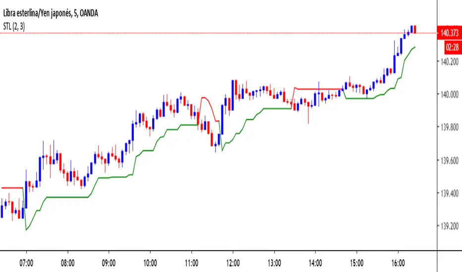
Super Trend LineThe classic and simple Super Trend Line. Enjoy it and have a nice trading
Hashtag_binary ;D
在腳本中搜尋"trend"
Super trend fractalsThanks to just uncle for his script
So I took the super trend VPT and hybrid it with just uncle fractals system of RSI , seems nice

G-Channel Trend DetectionHere we are demonstrating a different approach to trend analysis using AlexGrover's G-Channel. Using this method of trend detection, we will consider the asset bullish if it breaks through the upward bounds of the channel at any time, and consider it bearish once it breaks downwards.
We have also simplified coloring: If we're in an uptrend, we're only drawing from the upwards part of the channel to the midline. And if we're in a downtrend we're only drawing from the downward part of the channel to the midline.
Created by AlexGrover

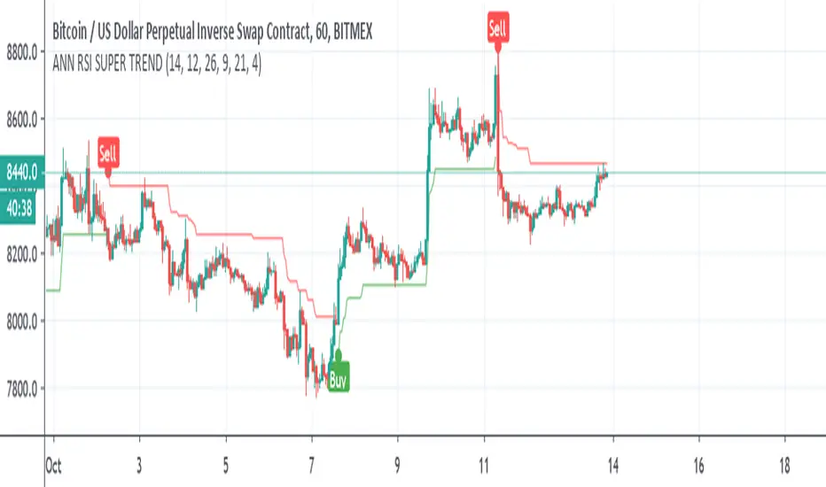
ANN RSI SUPER TRENDSo I was bored and I made this Hybrid
ANN taken from
and alex super trend ,
instead of normal ATR for the supertrend I use RSI and the ANN combination
alerts included
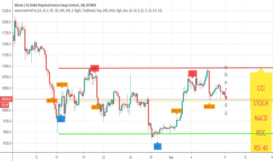
wave trend mtf v1This Lazy Bear wave trend in MTF version with take profit and stop loss rebuy
you can change the MTF using the security call
and many nice option to see insid3e
so you can play with it, modify it or make it better
Super trend VPTSo this is Hybrid of VPT and Super trend
buy and sell with alerts included (red and green cross)

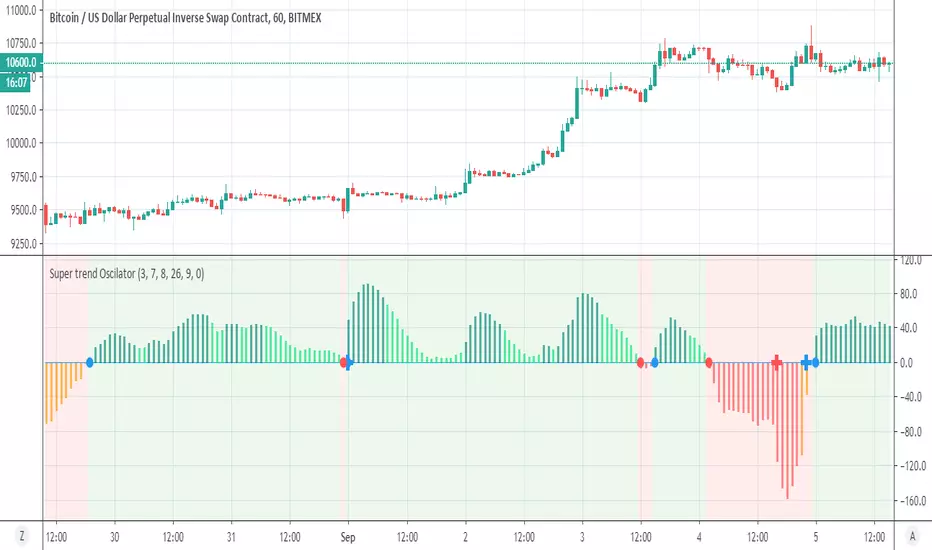
Super trend OscilatorSo what is this ?
This is a super trend just look different
the entery and exit of the regular super trend that we all know are mark by blue cross =entry, red cross= exit
the oscillator entry point are marked by blue and red circles
in this way we can enter more early and exit more early as we can use combination of either to find best spots
alerts included for each
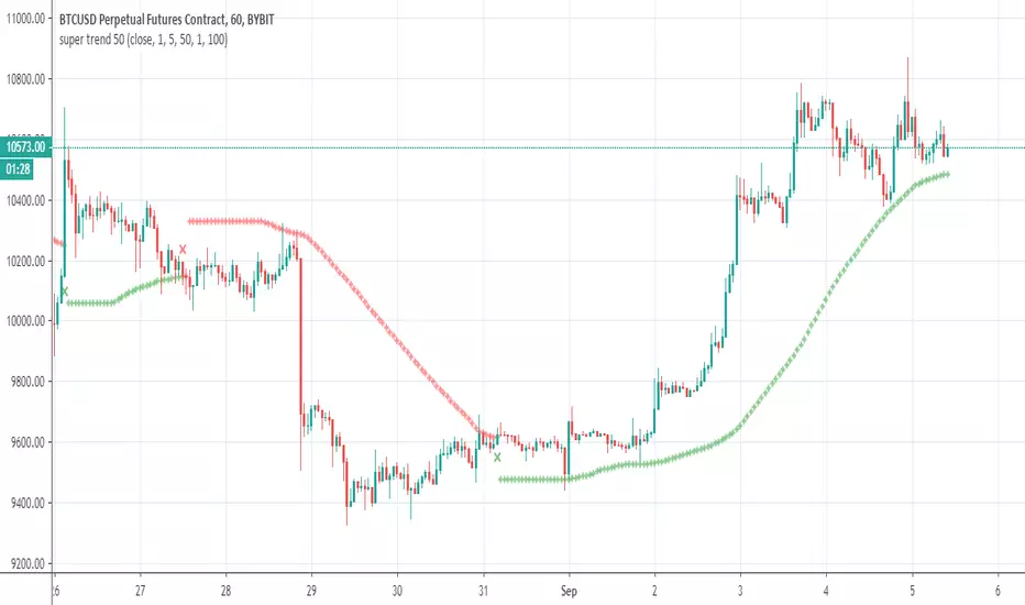
super trend 50So how this super trend is different?
answer is simple =instead to use the source as close we use modified sma at length of 50 (length of curve)
by this way we can make it to act little different
the rest is just to find best setting for each case
alerts inside
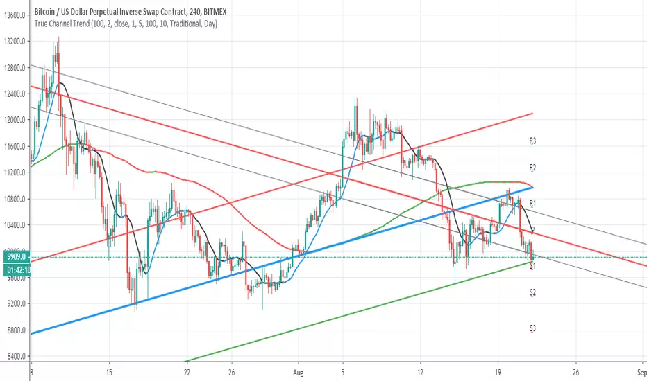
True Channel TrendSo I make hybrid using Alex Grover and follow the trend line script
I think it more accurate this way to show channels of trends
The length of the curve set to 100 , you can make it smaller if you want to see smaller channels for analysis
here on daily chart you can see how accurate it show the trend reverse from march to bullish trend
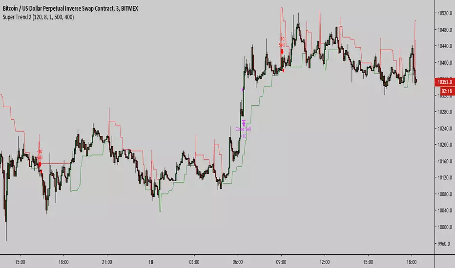
Super Trend 3Super Trend 3 Strategy migrates the version 2 script to a version 3 script to eliminate repainting.
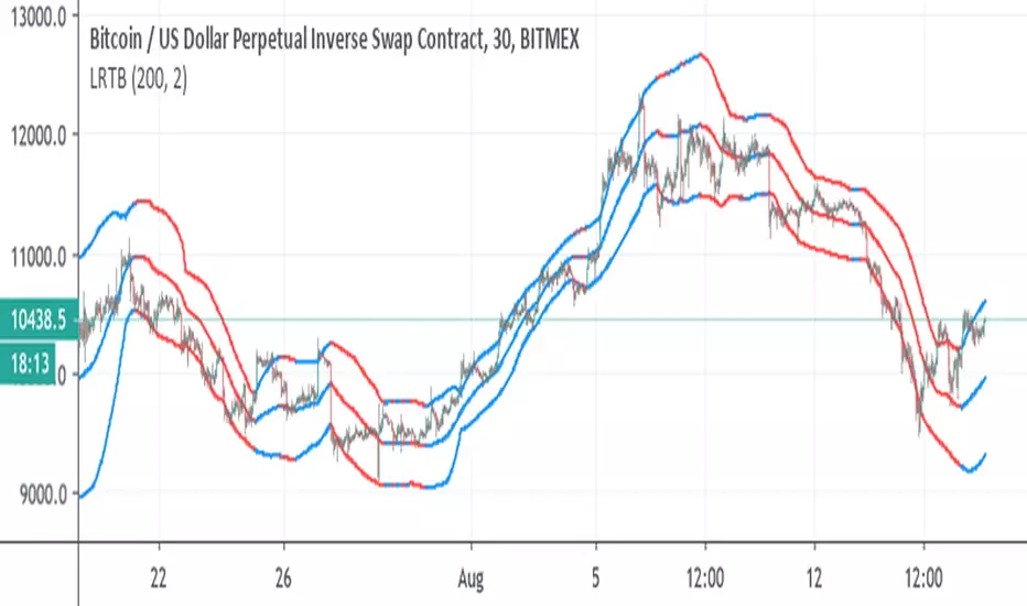
Linear Regression Trend bandscode from linear regression used
So it just to make bands from it
uptrend blue color , down trend red color
I suggest you try to fix length to best optimum ( I put it on 200, but other length may be better)
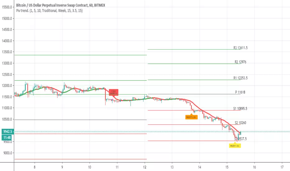
Pivot trend pivots taken from
the system is based on cross up or down of the trend line of weekly pivot point
exit is by % 3.5 and 15% (you can change it to your liking
rebuy at 15% loss
this is sill crude system so user need to refine setting to make it work best for him
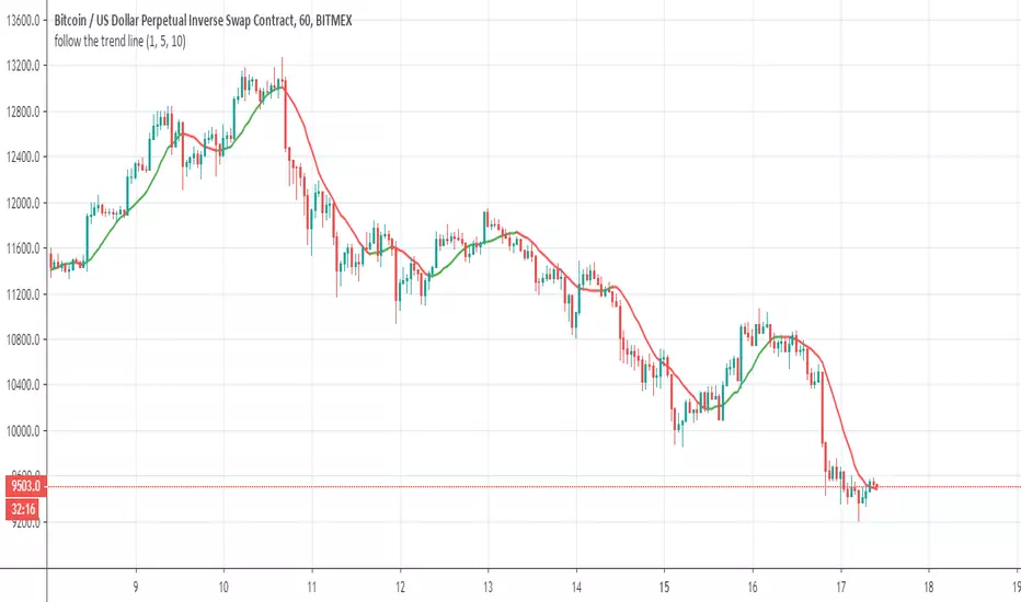
follow the trend lineOk this indicator give us the direction of trend
So all you need is to follow the color (red =bearish) ,green=bullish and if the direction going up (bullish) down =bearish
So it make life easy to see if you are in bullish or bearish trends
Oko's Trend MA'sFirstly, thanks to Dejabrew for his great video on finding trend viua MA's, it is his YT video which taught me which ma's to use for this, checkhim out: Dejabrewtrading on YT
200ma, 72ma, 12ma
Best with 1d and 4h
for a 100% confirmed bullish uptrend look for:-
a) price above all 3 ma's
b) from bottom to top in the order: 200, 72,12

Moving Averages - Cross / Trend 5 x Moving Averages that will show you trend bias for a coin ( green bull / yellow undecides / red bearish )
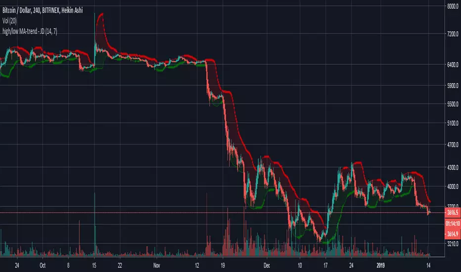
high/low MA-trend - JDShort script for trend indication taking a moving average of the highs and the lows seperately.
Lookback period for the highs/lows can be altered.
Ema length can be altered.
JD.
Noro's Trend SMA Strategy v1.3Trade strategy which uses only 2 SMA .
The slow SMA (blue) is used for definition of a trend
The fast SMA (red) is used for an entrance to the transaction
Recomended:
For H1
For crypto/fiat
Fast SMA Period = 5
Slow SMA Period = 20
In the new version 1.3
- priceChannel
In the new version 1.2
- profit became more
- the risk became less
- strategy waits for 2 candles of lonely color

Noro's Trend SMA Strategy v1.2Trade strategy which uses only 2 SMA .
The slow SMA (blue) is used for definition of a trend
The fast SMA (red) is used for an entrance to the transaction
Recomended:
For H1
For crypto/fiat
Fast SMA Period = 5
Slow SMA Period = 30
In the new version 1.2
- profit became more
- the risk became less
- strategy waits for 2 candles of lonely color

Noro's Trend SMA Strategy v1.1Trade strategy which uses only 2 SMA .
The slow SMA (blue) is used for definition of a trend
The fast SMA (red) is used for an entrance to the transaction
For H1
For crypto/fiat
In the new version 1.1
- profit became more
- the risk became less
- strategy considers color of a candle

Noro's Trend SMA StrategyTrade strategy which uses only 2 SMA.
The slow SMA (blue) is used for definition of a trend
The fast SMA (red) is used for an entrance to the transaction
For H1


SILA trend indicator v1.0My new indicator "SILA 1.0".
BestMA + BarColor + WOW = SILA 1.0 (3 in 1)
For:
1MN, 1W, 1D
Any pair
Background:
lime background = uptrend
red background = downtrend
NA color background = 50/50
Lines
0 lines = no trend
1 upper line = weak downtrend
2 upper lines = normal downtrend
3 upper lines = strong downtrend
1 lower lines = weak uptrend
2 lower lines = normal uptrend
3 lower lines = strong uptrend
