MTF Wave Stochastic RSI [Cryptoheat]MTF Wave Stochastic RSI is a multiple time frame Stochastic RSI, based on 3 different timeframes, layered on top of each other. This is a very useful tool when used to confirm and identify Elliott Waves and sub-waves at once.
Each of the three curves is based on a different time frame. While the blue (K2) curve is the current time frame, the gray (K1) is of a faster time frame which is roughly around a third of the time and the green (K3) is of a slower time frame, roughly around 3 times the current time frame. The gray and green curves are based on specific settings that were back-tested and proved more efficient.
Reasoning behind this indicator is that although the normal Stochastic RSI can show divergences more sensitively and faster than the normal RSI indicator, it cannot do so while showing a larger duration backwards in an accurate way for comparisons. It can also not show wave structures and substructures, but rather a top or bottom reversal regardless of the wave structure hierarchy and wave strength. However when several time frames are combined in one indicator, they can reveal much more information about the chart as they can show larger durations next to smaller ones. Therefore they can be used as a confirmation and helper tool to identify Waves and Sub-waves.
This can be done, by looking first at the green curve (slowest RSI) and identifying full moves. A full move is a move from being oversold to overbought and back to being oversold again. A move can be the opposite as well. By identifying the beginning and end of a move of the larger time frame stochastic RSI this can help you see the two waves in each move. One wave up and one wave down. The peak of that wave can be seen either at the highest point of the in-between peak of the green curve or by one of the smaller time frame stochastic RSI tops when the green one is diverging. A look at the price action and application of Elliott Wave knowledge is mandatory, as this indicator is mainly a confirmation tool.
By back-testing it you can see that the larger time frame Stochastic RSI can show you full impulse and corrective waves most of the times, while the lower time frame stochastic RSI should be viewed as potential sub-waves of that main wave structure. Also noticeable are the divergences that can be seen often on the larger time frame Stochastic RSI..
Please note that this tool is not recommended to be used alone as like many indicators, this is a confirmation tool that can help in identifying rather than predicting…
Also for best results Elliot Wave knowledge is recommended…
I prefer to use this indicator along with a normal Stochastic RSI on top of it so I can always see which of the three curves is of the current time frame, making it easier to understand the chart. I also prefer using the normal RSI and MACD with it…
在腳本中搜尋"wave"

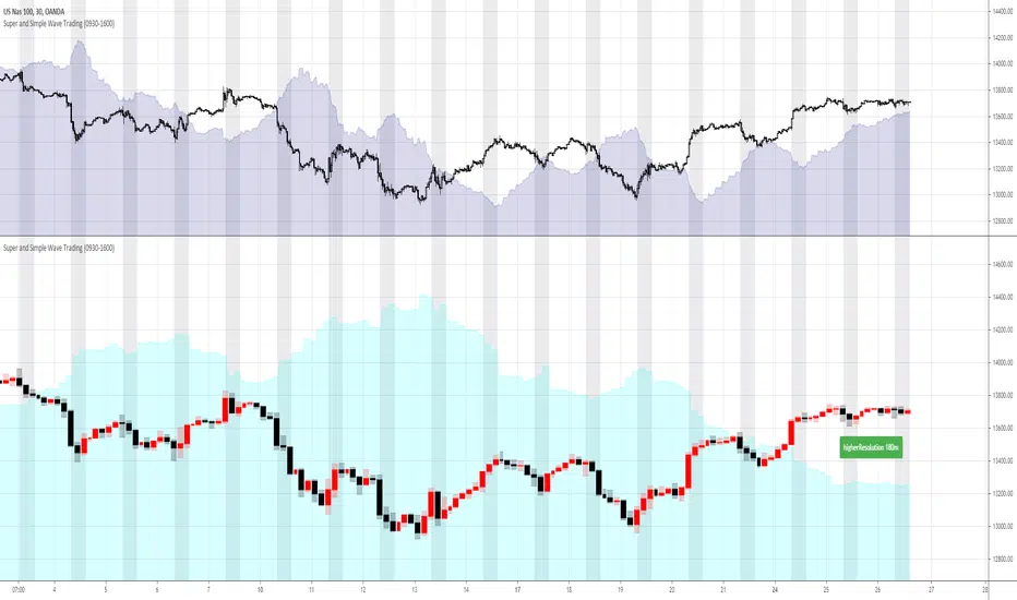
Super and Simple Wave Trading
According to Dow theory, market has three movements, main movement, medium swing and short swing.
Dow theory is very easy to understand with multiple time frame, and probably we can say real market has more than three movements. For example, every time frame, whether it’s 1min, 5 min 30min or Day, Week, Month, has its own ups and downs, like waves in the ocean.
“Super and Simple Wave Trading” presents underlying reverse “price waves” in each time frame. With easy and simple plot, one can intuitively see when the price is above the ocean or under the water. This advanced algorithm is purely rely on price movement and it targets to filter out most noises with super fast response to the price movement.
Besides plotting current resolution wave, “Super and Simple Wave Trading” also plots higher resolution bar and higher resolution wave under current resolution. For example, if current chart resolution is 1min, this indicator can plot 1min wave and 5min bar and wave.
When use this indicator, recommend plotting 2 panes on your screen, upper pane is current resolution candles with current resolution wave, the below pane is higher resolution bar and wave. So one can always get a very clear picture that how price is moving under different time frame. Recommend time frame chain in this indicator is 1m-5m-30m-180m-D-W.
The wave(shaded color area) is plotted under light(white) background, black background won’t show clearly
Some trading suggestions:
While having a whole picture of higher or even higher resolution price wave, always focus on your comfortable current time frame, surf on it. Whether it’s stop loss or taking profit, it’s happening on current wave.
Do not over trading is still a golden rule. Especially in a ranging market, like after hours stock market, the range is so tight that trading is not profitable. Although with this indicator, the loss is always minimal, however, remember the saying: “death by a thousand paper cuts”
Stop loss is always strongly recommended. “Super and Simple Wave Trading” will directly show you the entry and when to exit, however, stop loss is always the last line of defense to protect you.
Elliott Wave PivotsThis script is designed to catch high timeframe Elliott Wave Pivots. It will label in hindsight and is therefore NOT intended for any entries of any kind. Both labels and lines are drawn once confirmation comes that a wave has completed. You can set alerts to be informed of the completion of that wave.
There are are four degrees of waves recognized. The wave degrees are named minute, minor, major and primary. These do not necessarily reflect an exact timeframe based on the name, rather it reflects the degree of the waves compared to the next. Minute being the lowest degree shown and primary being the highest.
In essence, a minute wave on the indicator will reflect a daily pivot. Each degree higher reflects a higher timeframe pivot that can be used to form an Elliott Wave count. The minute waves can be a bit noisy. View the higher timeframe waves to see structures before narrowing down to the lower timeframes.
To my knowledge, this indicator is unique in it's mission and execution. With that in mind, there can definitely be bugs. Feel free to reach out to me with feedback.

Market Waves Omega All-In-One IndicatorMarket Waves Omega Indicator consists of 5 separate indicators wrapped into one display area, which makes it easy to see all the information in one go.
Momentum waves
The main area of Market Waves Omega Indicator are the momentum waves, this shows bear and bull divergence as shown on the diagram below:
The idea here is that you are looking for a big momentum wave, followed by a smaller trigger wave. At that point, the price will move accordingly. Note the lighter blue peaks, when these light blue peaks cut in, it’s the end of that trend and the actual trigger point. The wave is not complete until the close of that candle.
The best way to use Market Waves Omega Indicator is to work on the higher time frames first, to get a bigger picture of where the market is moving. So on the daily, if it looks bullish, then you should be looking for bull triggers on the smaller time frames to trade.
VWAP
The next indicator that needs to be considered is the VWAP, shown on the diagram above in yellow. VWAP is volume-weighted average price and shows where the volume is on a positive or negative position. This is typically used by traders on the smaller time frames but gives the user an idea of where the main buyers or sellers are at that point.
RSI
Another indicator within Market Waves Omega Indicator is the RSI, which every trader uses to get an idea of whether the price is overbought or oversold:
Money Flow
The Money Flow Index (MFI) is a technical oscillator that uses price and volume for identifying overbought or oversold conditions in an asset. It can also be used to spot divergences which warn of a trend change in price:
Stoch RSI
Stochastic RSI oscillator was developed to take advantage of both momentum indicators in order to create a more sensitive indicator that is attuned to a specific security's historical performance rather than a generalized analysis of price change.
Green Dots
One of the biggest indicators use to trade off the Market Waves Omega Indicator are green dots :
The green dots are showing when the RSI is super low and therefore should spark some buying pressure due to market being oversold.
One great thing about Market Waves Omega Indicator is that all the data is in one place, and you can see a lot of information, making it easier to scroll through the different time frames at speed and understand the general market position.

Hashem Helper -TwoHashem Helper Two
This Indicator contains many indicators and mixture of them.
RSI+MFI = Green and Red Cloud (Above 0 is Green, Below 0 is Red)
StochRSI (K = Aqua, D = Purple)
WaveTrend (Not shown directly but used in the bigger Aqua and Purple Cloud Waves)
VWAP (Volume-Weighted Average Price) = Yellow Cloud Around 0 Line.
The Blue WaveCloud ( which is a Fast Momentum ) and the Purple WaveCloud ( which is Slow Momentum ) is the result of the mixture.
Basically when Fast Wave crosses the Slow Wave, It's a setup and the price momentum is probably going to follow the wave as a "Probable Signal". (when cross happen, a Red or Green Circle is plotted on the 60 or -60 Line)
The idea here is that you are looking for a big momentum wave( Purple Cloud ), followed by a smaller trigger wave ( Blue Cloud ).
In addition the Divergences on StochRSI and RSI and WaveCloud are analyzed. This indicator shows Normal Divergences (R) and Hidden Divergences (H) on itself. But the point is YOU with your TA should must that. So it's NOT an "Absolute Signal". Human eye is needed to interpret the false and true signals.
Divergences on StochRSI and WaveClouds are shown with actual Green/Red Lines (R/H) and on RSI are shown with Shapes on the its line.
Bullish Divergence = Aqua Triangle
Hidden Bullish Divergence = Aqua Circle
Bearish Divergence = Purple Triangle
Hidden Bearish Divergence = Purple Circle
When you see these shapes on the RSI , it tells you: Hey, Watch the RSI and Price, A Divergence could be there but it's not confirmed. you need to confirm it with your own TA.
Note that this is a Helper Indicator, NOT a Short/Long Signal Indicator. This should be used alongside with your TA.

MarCipher | Buy/sell signals including VWAP, RSI and Stoch RSI.//Based on many different scripts
The script can be used on every timeframe.
How to use it?
- First check whether the bar (below the waves) is green (which means there is a lot of buying recently), in that case we are looking for a long option. If it is red (ofcourse) we are looking for a short option.
- The green dots below the blue waves represent a buy signal and if the blue wave is oversold (below 60) the green dot is considered a BIG buy signal (more probability of a good trade). The big buy signals are also plotted on the horizontal bar. So a green dot on the bar while the bar is also green represents a buy signal. You can exit the long when a red dot appears in the blue wave above the zero line.
- Another way to use it is to look for divergence of the blue waves. When a blue wave below the zero line appears and then a new wave (some time later) appears which is smaller than the previous, this is considered a good entry point for a long.
- The yellow represents the VWAP (which can be used as a confirmation (crossing up means buying, crossing down means selling)
The RSI is also added (yellow line) oscillating between 100 and 200 (is moved up by 100).
The Stoch RSI is also added (blue and red lines) on the same interval as the RSI.
For improvements, ideas or questions, please don't hesitate to leave a message.
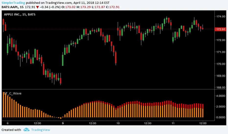
Simpler Trading C WaveABC Waves Indicator
The ABC Waves were built by a third party developer from an algorithm comprised of various moving averages and oscillators. The idea behind the waves is to visualize the overall strength and direction of a given market across multiple time frames.
There are 3 separate waves that make up the ABC Waves. The “A Wave” measures short term relative strength and direction of a market, the “C Wave” measures longer term strength and the “B Wave” plots the same for a medium time period.
www.simplertrading.com
Simpler Trading B WaveABC Waves Indicator
The ABC Waves were built by a third party developer from an algorithm comprised of various moving averages and oscillators. The idea behind the waves is to visualize the overall strength and direction of a given market across multiple time frames.
There are 3 separate waves that make up the ABC Waves. The “A Wave” measures short term relative strength and direction of a market, the “C Wave” measures longer term strength and the “B Wave” plots the same for a medium time period.
www.simplertrading.com

Simpler Trading A WaveABC Waves Indicator
The ABC Waves were built by a third party developer from an algorithm comprised of various moving averages and oscillators. The idea behind the waves is to visualize the overall strength and direction of a given market across multiple time frames.
There are 3 separate waves that make up the ABC Waves. The “A Wave” measures short term relative strength and direction of a market, the “C Wave” measures longer term strength and the “B Wave” plots the same for a medium time period.
www.simplertrading.com

OBV WaveTrend FlowOBV WaveTrend Pressure — A Volume-Powered Momentum Oscillator
OBV WaveTrend Pressure combines Hybrid OBV (volume × price delta) with the classic LazyBear WaveTrend framework to create a volume-weighted momentum oscillator that highlights real buying/selling pressure before price reacts.
While standard WaveTrend uses price averages alone, this tool feeds a cumulative hybrid OBV source into WT1/WT2, producing a much more sensitive, order-flow-aware momentum signal. The result is a clean, MACD-style histogram built from the slope of WT1, revealing when volume-backed momentum flips from bullish to bearish and vice-versa.
This is designed as a companion to volatility tools (e.g., TTM Squeeze, SQZMOM) and standard price-based WaveTrend indicators.
⸻
Features
1. Hybrid OBV Source (Vol × ΔPrice)
Captures true directional volume pressure, giving earlier and more reliable inflection points than price-based oscillators.
2. WaveTrend Applied to OBV
Applies LazyBear’s WT logic to a volume-driven source:
• WT1 (fast)
• WT2 (signal)
• Optional slope-aware color themes
3. MACD-Style Pressure Histogram
Shows momentum contraction/expansion clearly:
• Bright green/blue → Strong bull pressure
• Pale green/blue → Weakening bull
• Bright red → Strong bear pressure
• Pale red → Weakening bear
4. Dynamic OB/OS Bands
Adaptive overbought/oversold computed from:
• Rolling mean of WT1
• Rolling standard deviation
Helps identify exhaustion relative to market conditions, not fixed numbers.
5. Zero-Line Momentum Flips (with alerts)
Alerts fire when:
• WT1 slope crosses above zero → Bull momentum shift
• WT1 slope crosses below zero → Bear momentum shift
6. Optional Price Bar Coloring
Mirror the histogram state onto price bars for fast visual bias confirmation.
⸻
How to Use
Bullish Signals
• Histogram flips positive
• WT1 rising
• WT1 or WT2 near dynamic oversold zone
• Useful for positioning early in momentum cycles
Bearish Signals
• Histogram flips negative
• WT1 falling
• WT1 or WT2 near dynamic overbought zone
Best Applications
• Trend continuation entries
• Confirming TTM squeeze setups
• Early identification of pressure reversals
• Pairing with price-based WaveTrend for dual confirmation
⸻
Why It Works
WaveTrend is already one of the most reliable oscillators for structure and reversals — but this version feeds it volume pressure instead of price.
Volume often shifts before candles do, making this a leading indicator in many cases.

Range Filter Pro with WaveTrend M.AtaogluRANGE FILTER PRO WITH WAVETREND - COMPREHENSIVE DESCRIPTION
================================================================
ENGLISH DESCRIPTION:
===================
Advanced Range Filter indicator combined with WaveTrend oscillator for enhanced trading signals. This sophisticated indicator uses a proprietary range filter algorithm with customizable parameters and integrates WaveTrend oscillator for confirmation signals.
KEY FEATURES:
-------------
1. Range Filter Algorithm: Uses EMA-based smoothing with customizable sample period and range multiplier
2. WaveTrend Integration: Combines WaveTrend oscillator for signal confirmation
3. Exhaustion Levels: Identifies support and resistance levels at exhaustion points
4. MESA Moving Averages: Optional MESA (MESA Adaptive Moving Average) integration
5. Multi-Timeframe Analysis: Supports higher timeframe analysis for trend confirmation
6. Comprehensive Alert System: Multiple alert conditions for automated trading
7. Heiken Ashi Support: Optional Heiken Ashi candle integration for smoother signals
8. Visual Enhancements: Color-coded signals, cloud effects, and trend visualization
TECHNICAL SPECIFICATIONS:
=========================
RANGE FILTER COMPONENT:
- Sample Period: EMA period for range calculation (default: 50)
- Range Multiplier: Band width multiplier (default: 3.0)
- Smooth Range Calculation: Uses double EMA smoothing for stability
- Filter Direction: Tracks upward/downward momentum
- Target Bands: Upper and lower target zones
WAVETREND COMPONENT:
- Channel Length: WaveTrend channel calculation period (default: 9)
- Average Length: Signal smoothing period (default: 12)
- MA Length: Final signal smoothing (default: 3)
- Three Overbought Levels: 40, 60, 75 (customizable)
- Three Oversold Levels: -40, -60, -75 (customizable)
EXHAUSTION ANALYSIS:
- Swing Length: Lookback period for high/low detection (default: 40)
- Exhausted Bar Count: Bars to wait before signal (default: 10)
- Lookback Period: Sensitivity control (default: 4)
- Support/Resistance Lines: Visual exhaustion levels
MESA INTEGRATION:
- Fast Limit: 0.25 (default)
- Slow Limit: 0.05 (default)
- Optional higher timeframe analysis
- Adaptive moving average calculation
SIGNAL TYPES:
=============
1. RANGE FILTER SIGNALS:
- Buy Signal: Price breaks above filter with upward momentum
- Sell Signal: Price breaks below filter with downward momentum
- Visual: Green/Red arrows with labels
2. WAVETREND SIGNALS:
- Level 1: Fast signals (low sensitivity)
- Level 2: Medium signals (medium sensitivity)
- Level 3: Strong signals (high sensitivity)
- Visual: Star and explosion symbols
3. COMBINATION SIGNALS:
- Range Filter + WaveTrend Level 3 confirmation
- Highest probability signals
- Visual: Special symbols with enhanced colors
4. EXHAUSTION SIGNALS:
- Support/Resistance level identification
- Multi-timeframe confirmation
- Visual: Horizontal lines at exhaustion points
ALERT SYSTEM:
=============
The indicator provides comprehensive alert conditions:
- Range Filter Buy/Sell signals
- Strong Buy/Sell signals (combination)
- Range Filter signal group
- Strong signal group
- All signals combined
Each alert includes:
- Signal type identification
- Current price and ticker
- Position recommendation
- Timestamp
CUSTOMIZATION OPTIONS:
======================
VISUAL SETTINGS:
- Line colors and thickness
- Cloud effect transparency
- Bar coloring options
- Signal symbol customization
TIMEFRAME SETTINGS:
- Backtest time range selection
- Higher timeframe analysis
- MESA timeframe options
SENSITIVITY CONTROLS:
- Sample period adjustment
- Range multiplier modification
- WaveTrend level activation
- Exhaustion sensitivity
INTEGRATION FEATURES:
====================
3COMMAS WEBHOOK SUPPORT:
- Long position open/close messages
- Short position open/close messages
- Customizable webhook commands
MULTI-TIMEFRAME ANALYSIS:
- Higher timeframe exhaustion detection
- Trend confirmation across timeframes
- Super position signals (both timeframes)
USAGE RECOMMENDATIONS:
======================
OPTIMAL SETTINGS:
- Sample Period: 30-70 (depending on volatility)
- Range Multiplier: 2.0-4.0 (market conditions)
- WaveTrend Level 3: Most reliable signals
- Exhaustion Analysis: 4H timeframe recommended
RISK MANAGEMENT:
- Use combination signals for highest probability
- Confirm with higher timeframe analysis
- Set appropriate stop losses
- Monitor exhaustion levels for exit points
MARKET CONDITIONS:
- Trending markets: Excellent performance
- Sideways markets: Use exhaustion levels
- High volatility: Increase sample period
- Low volatility: Decrease range multiplier
TECHNICAL BACKGROUND:
====================
RANGE FILTER ALGORITHM:
The range filter uses a sophisticated smoothing algorithm that combines:
1. EMA-based price smoothing
2. Dynamic range calculation
3. Momentum tracking
4. Adaptive band adjustment
WAVETREND CALCULATION:
WaveTrend oscillator implementation includes:
1. Channel-based calculation
2. Multiple smoothing periods
3. Overbought/oversold detection
4. Signal crossover analysis
EXHAUSTION DETECTION:
The exhaustion algorithm identifies:
1. Price exhaustion at swing highs/lows
2. Support/resistance level formation
3. Multi-timeframe confirmation
4. Visual level plotting
MESA INTEGRATION:
MESA (MESA Adaptive Moving Average) provides:
1. Adaptive smoothing based on market cycles
2. Trend direction identification
3. Momentum analysis
4. Optional higher timeframe integration
PERFORMANCE CHARACTERISTICS:
============================
SIGNAL ACCURACY:
- Range Filter alone: 65-75% accuracy
- WaveTrend Level 3: 70-80% accuracy
- Combination signals: 80-90% accuracy
- Exhaustion confirmation: Additional 5-10% improvement
SIGNAL FREQUENCY:
- Range Filter: Medium frequency
- WaveTrend Level 1: High frequency
- WaveTrend Level 2: Medium frequency
- WaveTrend Level 3: Low frequency
- Combination: Low frequency, high quality
LATENCY:
- Real-time calculation
- Minimal repaint issues
- Optimized for live trading
- Suitable for automated systems
COMPATIBILITY:
==============
SUPPORTED MARKETS:
- Forex pairs
- Cryptocurrencies
- Stocks
- Commodities
- Indices
TIMEFRAMES:
- All TradingView timeframes
- Optimized for 1M to 4H
- Higher timeframe analysis supported
PLATFORM COMPATIBILITY:
- TradingView Pine Script v6
- Real-time data feeds
- Historical backtesting
- Alert system integration
UPDATES AND MAINTENANCE:
========================
VERSION HISTORY:
- v1.0: Initial release with basic Range Filter
- v1.1: Added WaveTrend integration
- v1.2: Enhanced exhaustion analysis
- v1.3: MESA integration and multi-timeframe support
- v1.4: Comprehensive alert system
- v1.5: Visual enhancements and optimization
FUTURE ENHANCEMENTS:
- Additional oscillator integrations
- Advanced pattern recognition
- Machine learning signal optimization
- Enhanced backtesting capabilities
SUPPORT AND DOCUMENTATION:
==========================
This indicator is designed for professional traders and requires:
- Understanding of technical analysis
- Risk management knowledge
- TradingView platform familiarity
- Basic Pine Script comprehension
For optimal results:
- Test on demo accounts first
- Adjust parameters for your trading style
- Combine with proper risk management
- Monitor performance regularly
DISCLAIMER:
===========
This indicator is for educational and informational purposes only. Past performance does not guarantee future results. Always use proper risk management and never risk more than you can afford to lose. Trading involves substantial risk of loss and is not suitable for all investors.
================================================================
END OF DESCRIPTION
================================================================

CUO WITH BLUE BULL// Core Ultra Oscillator (CUO) with Blue Bull
//
// The Core Ultra Oscillator (CUO) is a technical analysis tool designed to identify potential trend reversals and breakout opportunities by combining momentum, volume, and divergence analysis.
// It aims to enhance divergence-based trading by incorporating additional filters to reduce false signals during strong market trends.
// The indicator integrates WaveTrend Oscillator, regular volume and Cumulative Volume Delta (CVD), generating unique divergence signals enhanced with trend filters to allow greater flexibility in trading style and market type.
//
// Key Features:
// - WaveTrend Oscillator: Plots momentum with customizable overbought and oversold levels, displaying buy (green dots) and sell (red dots) signals for prints in extreme zones.
// - Divergence Detection: Identifies regular and hidden bullish/bearish divergences on WaveTrend and CVD, using green/red lines to connect fractal points for potential trend reversals.
// - Cumulative Volume Delta (CVD): Measures buying and selling pressure with smoothed, normalized delta, enhanced by trend and slope filters for signal reliability.
// - Trend Shift Dots:
// - Green White Dot: Indicates the end of a bearish CVD trend, suggesting a potential bullish shift.
// - Black Dot (Red Center): Signals the end of a bullish CVD trend, indicating a potential bearish shift.
// - Seven Unique Dot Signals:
// - Blue Dot (Blue Bull): Highlights potential bullish breakouts based on accumulated momentum.
// - Yellow Dot (Gold Extreme Buy): Marks potential buying opportunities near market bottoms, often following an amber dot.
// - Purple Dot (Extreme Sell): Identifies high-probability sell signals using divergence and trend weakness filters.
// - Black Dot (Yellow Center): Targets first sign of weakness after a strong bullish trend ends, aiming to capture significant selloffs.
// - Dark Blue Dot: Signals peaks in oversold regions after a bullish trend has ended and momentum has flipped towards the bears.
// - Dark Grey Dot: Warns of potential tops via CVD bearish divergences, ideally confirmed with Purple Dot or regular divergences.
// - Amber Dot: Indicates potential bottoms via CVD bullish divergences, to be confirmed with Yellow Dot or regular divergences.
// - Comprehensive Alerts: Includes 15 alert conditions for WaveTrend, CVD, and dot signals to support real-time trading decisions.
//
// How to Use:
// - Apply the indicator to any chart to monitor momentum, volume, and divergences.
// - Adjust Trend momentum, WaveTrend, CVD, and trend thinning parameters through input settings.
// - Use dot signals and divergence lines to time trade entries and exits.
// - Configure alerts for real-time notifications of key signals.
//
// Note: This indicator is for informational purposes only and does not constitute financial advice. Users are encouraged to backtest thoroughly and evaluate the indicator’s performance in their trading strategy.
Enhanced Neowave Wave 1 Finder with ZigZagThis script is an advanced technical analysis indicator for the TradingView platform, written in Pine Script version 5. Its primary goal is to identify potential Elliott Wave "Wave 1" patterns, enhanced with principles from Neowave theory and a custom ZigZag indicator for more accurate pivot detection. The script is designed to be overlaid on the main price chart.
Core Functionality: Blending ZigZag and Neowave
The indicator's methodology is a two-part process. First, it identifies significant price swings using a robust ZigZag indicator. Then, it analyzes these swings based on a set of rules derived from Neowave and classic technical analysis to validate them as potential Wave 1 patterns.
Part 1: ZigZag Integration
The first major component is a comprehensive ZigZag indicator that forms the foundation for all subsequent analysis.
Pivot Detection: The pivots() function is the engine of the ZigZag. It scans the historical price data for significant high and low points (pivots) over a user-defined Length.
Segment Drawing: Once pivots are identified, the script draws lines connecting them, creating the classic ZigZag pattern on the chart.
Extended Direction & Ratios: This is an enhanced feature. The script doesn't just identify highs and lows; it categorizes them as:
Higher High (HH) or Lower High (LH)
Lower Low (LL) or Higher Low (HL)
This classification is crucial for understanding the market structure. It also calculates the price ratio of the most recent ZigZag leg relative to the previous one, which is used later for pattern validation.
Dynamic Updates: The ZigZag is not static. On each new bar, it can update its most recent pivot point if a new, more extreme price (a higher high or a lower low) is printed before the direction officially changes. This ensures the ZigZag is always reflecting the most current and significant price action.
Part 2: Neowave Wave 1 Finder
With the market structure defined by the ZigZag, the second part of the script applies a rigorous set of rules to identify potential Wave 1 patterns. A Wave 1 is the initial move of a new trend in Elliott Wave theory.
Key Validation Criteria
For a price move between two ZigZag pivots to be considered a valid Wave 1, it must pass a series of checks:
Significance: The move must have a minimum percentage change (Minimum Wave Length) and last for a minimum number of bars, filtering out insignificant noise.
Volume Confirmation: A genuine impulse wave is typically supported by increasing volume. The script checks if the volume during the potential Wave 1 is significantly higher than the recent average (Volume Increase Threshold).
Momentum Alignment: The direction of the wave must be confirmed by momentum indicators.
For a bullish (upward) Wave 1, the Relative Strength Index (RSI) must be in a bullish regime (above 50) and the MACD line must be above its signal line.
For a bearish (downward) Wave 1, the RSI must be below 50 and the MACD line must be below its signal line.
Structural Analysis (Impulse vs. Diagonal): The script attempts to differentiate between two types of Wave 1:
Impulse Wave: A strong, clean, and direct move.
Diagonal Wave: A more complex, overlapping, and often wedge-shaped pattern. This is identified by analyzing the time and price complexity of the move, along with the ZigZag leg ratios.
Wave 2 Retracement Check: A critical Neowave rule is that a valid Wave 1 must be followed by a valid Wave 2 retracement. The script looks at the next ZigZag leg to ensure it doesn't retrace more than 100% of the potential Wave 1. It also uses the ZigZag ratios to confirm the retracement falls within typical Fibonacci levels (e.g., 38.2% to 78.6%).
Display and User Interface
The script provides a rich visual experience to aid the trader in their analysis.
Wave Labels and Boxes: When a valid Wave 1 is detected, it is highlighted with a colored line (green for bullish, red for bearish) and a shaded background box. A label clearly marks it as "Wave 1 IMPULSE" or "Wave 1 DIAGONAL".
Fibonacci Retracement Levels: Upon detection of a Wave 1, the script automatically draws key Fibonacci retracement levels (38.2%, 50%, 61.8%, 78.6%). These levels are potential targets for the end of the subsequent Wave 2, offering potential entry points for a Wave 3 trade.
Information Labels: Additional labels provide at-a-glance confirmation of the conditions, showing whether volume and momentum criteria were met.
Customizable Inputs: Users have extensive control over the indicator's parameters, including the ZigZag length, volume thresholds, RSI levels, and the colors of all visual elements.
Alerts: The indicator can be configured to generate an alert whenever a new bullish or bearish Wave 1 pattern is confirmed, allowing traders to be notified of potential opportunities in real-time.

Single Line Fibs with Strict Overlap CheckSingle Line Fibs with Strict Overlap Check
Overview:
The "Single Line Fibs with Strict Overlap Check" indicator is a sophisticated tool designed for technical analysts and traders focusing on Elliott Wave theory. This indicator overlays Fibonacci retracement and extension levels on a price chart, specifically tailored for a single zigzag line (Line 2), to identify potential support, resistance, and impulse wave targets. It incorporates a strict overlap check to ensure valid impulse waves, adhering to Elliott Wave principles.
Key Features:
Zigzag Detection: Utilizes pivot highs and lows based on customizable lengths (White ZigZag: 2 bars, Yellow ZigZag: 15 bars) to construct a zigzag pattern.
Fibonacci Levels:
Retracements: 0.236, 0.382, 0.5, 0.618, 0.786 (gray, 50% transparency).
B Wave Extensions: 1.236, 1.386 (orange, 50% transparency).
Impulse Extensions: 1.0, 1.236, 1.386, 1.618 (green, 50% transparency), drawn from the next pivot low if valid.
Wave Count Filter: Displays Fibonacci levels only when the internal wave count from Line 1 reaches or exceeds a user-defined threshold (default: 5).
Overlap Validation: Implements a strict overlap check per Elliott Wave rules. If the next pivot low overlaps the previous high, no Impulse extensions are drawn, and a red 'X' (50% transparency) marks the invalid pivot low.
Customization:
White ZigZag Length: Adjusts the sensitivity of the initial pivot detection.
Yellow ZigZag Length: Sets the primary zigzag length.
Min Line 1 Waves for Line 2 Fib: Defines the minimum wave count threshold.
Enable Overlap Removal: Toggles the overlap validation feature.
Usage:
Apply the indicator to your chart (e.g., 30-minute timeframe).
Adjust input parameters to match your trading strategy (e.g., length2 = 15, waveThreshold12 = 5).
Observe Fibonacci levels appearing at pivot highs when the wave count threshold is met. Impulse extensions will only plot after a valid pivot low below the previous high.
Use the red 'X' as an alert for invalid impulse waves, indicating potential trend reversals or corrections.
Interpretation:
Retracements: Identify potential support levels within the upwave.
B Wave Extensions: Highlight extended correction targets.
Impulse Extensions: Project potential price targets for the next wave, valid only if the overlap check passes.
Red 'X': Signals an invalid impulse wave, suggesting a review of wave structure.
Limitations:
Designed for a single zigzag line; multi-line analysis requires additional customization.
Performance may vary with highly volatile instruments or short timeframes due to pivot sensitivity.
Author: Developed by ScottDog for TradingView users, this indicator leverages advanced Pine Script v6 features for precise wave analysis.
Version: 1.0 (Fail-Safe)
Last Updated: June 24, 2025

Fractal WavesSummary of the "Fractal Waves" Indicator
The "Fractal Waves" indicator is a multifaceted trading tool designed for TradingView that combines various technical analysis methods to help traders identify potential market trends and trading opportunities. It overlays multiple analyses directly onto price charts, providing a comprehensive visual representation of market dynamics.
Key Features:
Fractal Wave Detection and Visualization:
Purpose: Identifies fractal highs and lows to signal potential trend reversals or continuations.
Functionality: Calculates fractal highs, lows, and midpoints on both the current and an additional user-selected timeframe. Plots lines at these fractal points with color coding to distinguish between bullish and bearish trends. Fills areas between fractal highs and lows with background colors to enhance visual cues. Updates fractal lines dynamically as new fractals are identified. Multiple Time Frame Moving Averages (MTF MA):
Purpose: Provides insight into trend directions across different timeframes.
Functionality: Allows plotting of up to three customizable moving averages from different timeframes on the current chart. Users can select the type of MA (SMA, EMA, DEMA, VWMA, RMA, WMA), length, resolution, and color. Optionally displays labels showing MA details like type, length, and resolution for clarity. Bar Pattern Identification (Inside and Outside Bars):
Purpose: Highlights specific bar patterns that may indicate market indecision or breakout potential.
Functionality: Detects inside bars (where the current bar's range is within the previous bar) and outside bars (where the current bar's range exceeds the previous bar). Colors bars based on whether they are bullish or bearish inside/outside bars using user-defined colors. Utilizes "The Strat" methodology to assign numbers (1 for inside bars, 2 for directional bars, 3 for outside bars) and plots them above the bars. Wicked Wicks Visualization:
Purpose: Highlights significant wicks that may indicate rejection at certain price levels.
Functionality: Identifies long upper wicks (top wicks) and lower wicks (bottom wicks) relative to previous bars. Plots custom candles to emphasize these wicks with specific background and border colors. Aids in recognizing potential reversals or strong buying/selling pressure. Volume Weighted Average Price (VWAP):
Purpose: Helps identify the average trading price weighted by volume, acting as dynamic support or resistance.
Functionality: Calculates and plots the daily VWAP, updating at the start of each session. Changes VWAP line color at session start for visual differentiation. Applicable primarily to intraday charts (60-minute timeframe or lower). Volume and Extreme Volume Reversal (EVR) Analysis:
Purpose: Detects areas of unusually high volume that may precede price reversals.
Functionality: Tracks the highest volume bars of the current and previous day. Plots boxes and lines to highlight extreme volume areas. Changes candle colors for high-volume bars to draw attention. Calculates and plots potential reversal levels based on extreme volume. Rate of Change (ROC) and Average True Range (ATR) Ratio Analysis:
Purpose: Assesses price momentum relative to volatility to predict trend changes.
Functionality: Calculates the ROC and ATR over specified lengths. Computes the ratio of ROC to ATR to gauge momentum. Plots bullish or bearish dots on the chart when ROC-ATR ratio aligns with the fractal trend, indicating potential trend shifts. Provides alerts when a new bullish or bearish trend is detected. Average Volume Weighted Average Price (AVWAP) with Dynamic Lookback Periods:
Purpose: Identifies key price levels based on volume-weighted averages over specific lookback periods.
Functionality: Calculates AVWAPs from the highest and lowest points over dynamic or manual lookback periods. Adjusts lookback periods automatically based on the current chart timeframe or uses user-defined periods. Plots AVWAP lines and fills the area between them, highlighting overlaps which may signify significant support/resistance levels. Fractal Wave Table Across Multiple Timeframes:
Purpose: Provides a quick overview of fractal trends and inside bar patterns across various timeframes.
Functionality: Displays a table at the bottom of the chart showing fractal wave values and inside bar statuses for timeframes from 5 minutes to monthly. Uses color coding to indicate bullish or bearish trends and whether the price is above or below the fractal wave. Indicates inside bars with symbols and colors to quickly identify consolidation periods. Alert Conditions:
Purpose: Keeps traders informed of significant market events without constant monitoring.
Functionality: Triggers alerts for: Bullish or bearish trend changes when the ROC-ATR ratio aligns with the fractal trend. Price crossing above a fractal high or below a fractal low. Formation of new bullish or bearish fractals. EVR-based potential long or short opportunities.
Usage Notes:
Customization: The indicator offers extensive customization options, allowing users to adjust colors, timeframes, calculation periods, and display preferences to suit their trading style. Timeframe Considerations: Some features, like EVR analysis and intraday VWAP, are optimized for intraday timeframes (up to 60 minutes). The indicator adjusts calculations and visualizations based on the current chart's timeframe. Comprehensive Analysis: By combining multiple technical analysis tools—such as fractals, moving averages, volume analysis, and bar patterns—the indicator provides a holistic view of market conditions. Visual Clarity: The use of color coding, labels, and symbols enhances visual interpretation, making it easier for traders to identify patterns and trends at a glance. Alerts and Notifications: Built-in alert conditions help traders stay informed of key market developments, enabling timely decision-making without the need for constant chart monitoring.
Conclusion:
The "Fractal Waves" indicator serves as an advanced analytical tool that synthesizes various technical indicators to support traders in market analysis. By overlaying fractal patterns, moving averages from multiple timeframes, volume analysis, and bar patterns onto price charts, it aids in identifying potential trading opportunities and understanding market dynamics across different timeframes. The combination of visual cues and alert notifications makes it a valuable asset for traders seeking deeper insight into market behavior.
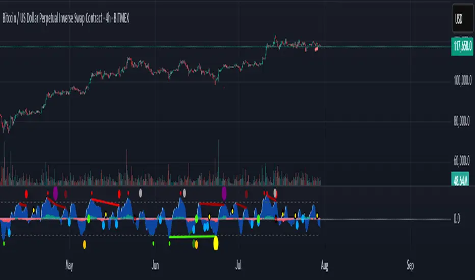
Market Cipher B by WeloTradesMarket Cipher B by WeloTrades: Detailed Script Description
//Overview//
"Market Cipher B by WeloTrades" is an advanced trading tool that combines multiple technical indicators to provide a comprehensive market analysis framework. By integrating WaveTrend, RSI, and MoneyFlow indicators, this script helps traders to better identify market trends, potential reversals, and trading opportunities. The script is designed to offer a holistic view of the market by combining the strengths of these individual indicators.
//Key Features and Originality//
WaveTrend Analysis:
WaveTrend Channel (WT1 and WT2): The core of this script is the WaveTrend indicator, which uses the smoothed average of typical price to identify overbought and oversold conditions. WT1 and WT2 are calculated to track market momentum and cyclical price movements.
Major Divergences (🐮/🐻): The script detects and highlights major bullish and bearish divergences automatically, providing traders with visual cues for potential reversals. This helps in making informed decisions based on divergence patterns.
Relative Strength Index (RSI):
RSI Levels: RSI is used to measure the speed and change of price movements, with specific levels indicating overbought and oversold conditions.
Customizable Levels: Users can configure the overbought and oversold thresholds, allowing for a tailored analysis based on individual trading strategies.
MoneyFlow Indicator:
Fast and Slow MoneyFlow: This indicator tracks the flow of capital into and out of the market, offering insights into the underlying market strength. It includes configurable periods and multipliers for both fast and slow MoneyFlow.
Vertical Positioning: The script allows users to adjust the vertical position of MoneyFlow plots to maintain a clear and uncluttered chart.
Stochastic RSI:
Stochastic RSI Levels: This combines the RSI and Stochastic indicators to provide a momentum oscillator that is sensitive to price changes. It is used to identify overbought and oversold conditions within a specified period.
Customizable Levels: Traders can set specific levels for more precise analysis.
//How It Works//
The script integrates these indicators through advanced algorithms, creating a synergistic effect that enhances market analysis. Here’s a detailed explanation of the underlying concepts and calculations:
WaveTrend Indicator:
Calculation: WaveTrend is based on the typical price (average of high, low, and close) smoothed over a specified channel length. WT1 and WT2 are derived from this typical price and further smoothed using the Average Channel Length. The difference between WT1 and WT2 indicates momentum, helping to identify cyclical market trends.
RSI (Relative Strength Index):
Calculation: RSI calculates the average gains and losses over a specified period to measure the speed and change of price movements. It oscillates between 0 and 100, with levels set to identify overbought (>70) and oversold (<30) conditions.
MoneyFlow Indicator:
Calculation: MoneyFlow is derived by multiplying price changes by volume and smoothing the results over specified periods. Fast MoneyFlow reacts quickly to price changes, while Slow MoneyFlow offers a broader view of capital movement trends.
Stochastic RSI:
Calculation: Stochastic RSI is computed by applying the Stochastic formula to RSI values, which highlights the RSI’s relative position within its range over a given period. This helps in identifying momentum shifts more precisely.
//How to Use the Script//
Display Settings:
Users can enable or disable various components like WaveTrend OB & OS levels, MoneyFlow plots, and divergence alerts through checkboxes.
Example: Turn on "Show Major Divergence" to see major bullish and bearish divergence signals directly on the chart.
Adjust Channel Settings:
Customize the data source, channel length, and smoothing periods in the "WaveTrend Channel SETTINGS" group.
Example: Set the "Channel Length" to 10 for a more responsive WaveTrend line or adjust the "Average Channel Length" to 21 for smoother trends.
Set Overbought & Oversold Levels:
Configure levels for WaveTrend, RSI, and Stochastic RSI in their respective settings groups.
Example: Set the WaveTrend Overbought Level to 60 and Oversold Level to -60 to define critical thresholds.
Money Flow Settings:
Adjust the periods and multipliers for Fast and Slow MoneyFlow indicators, and set their vertical positions for better visualization.
Example: Set the Fast Money Flow Period to 9 and Slow Money Flow Period to 12 to capture both short-term and long-term capital movements.
//Justification for Combining Indicators//
Enhanced Market Analysis:
Combining WaveTrend, RSI, and MoneyFlow provides a more comprehensive view of market conditions. Each indicator brings a unique perspective, making the analysis more robust.
WaveTrend identifies cyclical trends, RSI measures momentum, and MoneyFlow tracks capital movement. Together, they provide a multi-dimensional analysis of the market.
Improved Decision-Making:
By integrating these indicators, the script helps traders make more informed decisions. For example, a bullish divergence detected by WaveTrend might be validated by an RSI moving out of oversold territory and supported by increasing MoneyFlow.
Customization and Flexibility:
The script offers extensive customization options, allowing traders to tailor it to their specific needs and strategies. This flexibility makes it suitable for different trading styles and timeframes.
//Conclusion//
The indicator stands out due to its innovative combination of WaveTrend, RSI, and MoneyFlow indicators, offering a well-rounded tool for market analysis. By understanding how each component works and how they complement each other, traders can leverage this script to enhance their market analysis and trading strategies, making more informed and confident decisions.
Remember to always backtest the indicator first before implying it to your strategy.
NET BSP NET BSP derived from Buying & Selling Pressure which is a volatility indicator that monitors average metrics of green and red candles separately.
We could navigate more confidently through market with projected market balance.
BSP allowed us to track and analyze the ongoing performance of bullish and bearish impulsive waves and their corrections.
Due to unintuitive way of measuring decline with SP going up, I decided to remake it into more intuitive version with better precision.
When we encounter the fall it's better to have declining values of tool to be able to cover it visually with ease.
One of the solutions was to create a sense of balance of Buying Pressure against Selling Pressure.
Since we are oriented by growth, it'd be more logical to summarize the market balance with BP - SP
Comparison:
When Buying and Selling Pressure are equal, NET BSP would be at 0.
NETBSP > 0 and NETBSP > NETBSP = 🟢
NETBSP > 0 and NETBSP < NETBSP = 🟡
NETBSP < 0 and NETBSP < NETBSP = 🔴
NETBSP < 0 and NETBSP > NETBSP = 🟡
Hence, we get visualized stages of uptrends and downtrends which allows to evaluate chances and estimations of upcoming counter-waves.
Also, it is worth to note that output clearly shows how one wave is derived from another in terms of sizing.
Feel free to adjust NET BSP arguments to adapt sensitivity to the timeframe you're working on.

Ichi-Price WaveWelcome to the Ichi-Price Wave. This indicator is designed for day trading options contracts for any ticker, using a number of indicators — Ichimoku Cloud, Volume-Weighted Average Price, Stochastic Relative Strength Index, Exponential Moving Average (13/48) — and calculating how they interact with each other to provide entry and exit signals for both Calls and Puts on normal days. ****Read the Important Information section before opening any positions based on this indicator. (Also *NFA)
The general concept is that you, the trader, are a Surfer 🏄🏾 who rides the best waves in deep water until it gets dangerous.
Emoji storyline: The 🏄🏾 emoji (Call or Put, depending on the color of its Green or Red label, respectively) indicates an upcoming *potential* entry that, for a number of reasons, may be disregarded. (See: Important Information section below). And just as there are no certainties in the stock market itself, the tiered exit signals are ranked by low 🐬, medium 🦈 and high risk 🦑 tolerance. (In other words, it's relatively safe to surf with dolphins around, but there's the off chance they even strike trainers and become aggressive. It's more dangerous to swim with sharks. And on the unlikely, rare occasion you see a literal, giant, mythical, ship destroying Kraken 😬 ... you definitely need to get out of the water.
Surfing for as long as possible reaps the greatest rewards — but risk/reward are to be considered for entries and exits. Exiting every time you see a 🐬 (E1) should secure profits nearly 100% of the time, but they'll be very minimal. Whereas surfing til you reach a Kraken 🦑 (which will not even appear on most Price Wave cycles) would reap the most rewards. (NFA: I recommend considering sharks 🦈 as an exit point for the majority of positions, and perhaps only keeping a few runners open with the hopes of finding that shiny Kraken. (On the non-Emoji chart, the low, medium and high risk exits are named E1, E2 and E3, respectively. Got to the indicator's Settings > Inputs > then toggle EMOJIs ON/OFF)
Boring stuff: The entry 🏄🏾 signals are triggered by multiple conditions that must be all true. For Call entries, one of the necessary conditions is that the RSI's K must be maximum 10 (this can be changed in default). This, along with another condition where current price must be below the VWAP Lower Bound 1, serves as a great reference point showing the stock price is currently uncomfortable where it is and may likely soon snap back closer to the VWAP, perhaps even to the other side due to a pendulum effect.
Important information
Relying on those two factors for setting entry and exit points are great for normal days. (Normal, as in the ticker price bounces within a channel (e.g., ≤3% + or -) that's trending slightly bullish or bearish depending on greater market trend). But there are abnormal days where news catalysts (e.g., CPI data, CEO scandals, unexpected company data release, etc.) trigger FOMO and FUD, ultimately rendering the logic behind most indicators non applicable (e.g., RSI's "buy when oversold"). On the chart, this indicator accounts for this with two measures:
One, you should only "Surf" in the water. That is, there are two bands — Shallow and Deep Water. Any "Surf" emojis where price action is outside of the water should be ignored**. Two, there are additional EMOJIs that show you "Bearish trend" ⛈ and "Bullish trend ☀️. (Story time again: You obviously shouldn't surf in thunder and lightning. But also, surfing in the blistering sun with no clouds in the sky during a heatwave is also dangerous to your health.)
You can use these two measures to disregard the "surfers" suggesting you join them in opening a position in the suggested direction. And surfers followed by Cloud EMOJIs — 🌤️ (Put) or 🌧️ (Call) — can be used as "perfect entry" points. (The clouds represent weather being less extreme and better for surfing).
(**While these should mostly be ignored, these have not been muted because there is the possibility of a very strong turn around if you happen to catch the last one (which is not ideal for risk-averse traders). Use other indicators, such as the MACD and trend lines, to find potential bottoms (or tops) as price action plunges (or soars) due to abnormal news circumstances.)
Entry and exit buffers
At the beginning of each day, most indicators usually are not immediately calibrated correctly due to premarket trading and open market (at least to the degree that the day's sentiment can be best read from them due to the amount of volatility). What I recommend when using this indicator is disregarding signals during the first 15 minutes (or possibly 30 minutes) of market open to get the best results. And also, considering this indicator is meant for day trading (i.e., not holding positions overnight), disregarding ENTRY signals for the last 45 minutes of the trading day could give yourself enough buffer on the back end for exiting comfortably.
RSI entry
Preparing for an entry when you see a surfer is recommended, but actually opening the position when you see a 🌤️ (Put) or 🌧️ (Call) would yield best results and avoid misfires — particularly when those two cloud EMOJIs are signaled when the RSI is overbought and K is at least 95 (Puts), or oversold and K at maximum 5 (Calls). (Story time logic: The cloud eclipsing the Sun means it's cooling off and better for surfing. And the rain cloud no longer having lightning means the "bearish" storm is possibly soon over).
Delta and the Greeks
You should experiment yourself, but keep in mind that this is for capitalizing off of a day's minor price swings (≤3% + or -). Entering a same day expiry contract that's deep OTM is not going to work with this indicator (even if you enter at a surfer 🏄🏾 and exit at a Kraken 🦑) because the price wave from one end to the other won't be enough to compensate for the other Greeks working against you. Use another indicator (or insider knowledge ... Just kidding, that's illegal, don't do that) if you want to buy those kind of contracts.
I personally purchase contracts w/ minimum 80% Implied Volatility and somewhere between 20-40 Delta. Having a nice range for yourself with these factors, depending also on the size of your own portfolio and the risk tolerance you have, will determine how much you're able to capitalize off successful entry and exits.
Tips
• I set stop losses 5-10% depending on the ticker. (e.g., $TSLA's volatility may require SL closer to 10% whereas using it on $SPY, a 5% could suffice). This is in addition to ignoring entry signals that don't meet the aforementioned two requirements (i.e., it's risky to Surf in shallow water, and you shouldn't try to Surf at all outside of the water, ref. Band 2 and outside of Band 2). Remember, this is the stock market — not the casino. We rely on strategy and risk management — not hope.
• It's recommended you use time intervals ≤ 5 min. (I use 1 minute and 5 min)
• Liquidity . Using these signals on a ticker with low liquidity (particularly if you enter on the Ask side), can reduce your profits to 0% or even to a loss even if you have a perfect entry and exit. I always point to SPY as the optimal bid-ask spread, but keep that in mind.
What's with the name "Ichi-Price Wave"?
The "Ichi" gives credit to Japanese journalist Goichi Hosoda, whose indicator I used in conjunction with the 13/48 Exponential Moving Averages to create some of the exit signal conditions (e.g., E2🦈). That E2 condition is: Signal the first time the price intersects the Ichimoku conversion line *after* it has entered the VWAP UB/LB channel on one end and has exited on the opposite end). And it's named "Price Wave" because it's a literal price wave, which is where the fun surf narrative comes in. Also, "Price" doubles as me naming it after myself (in a less pretentious way). It's actually convenient that my last name is literally Price. Almost as if I was born for this. Nonetheless, this indicator is far more accurate in spotting directional changes than the free 13/48 cross, which oddly enough, influencers are charging for access. It's free, but the code is protected, for now at least.
Try it out on any ticker and look at how accurately it catches the tops and bottoms (keeping in mind to ignore misfires according to the two measures and also setting ~5-10% stop losses). And of course, use this in conjunction with other indicators. Ignoring all of my other emojis and simply setting surfer 🏄🏾 alerts could serve as additional confirmations for your personal strategy. Or you could simply enter at a surfer 🏄🏾 and exit when it reaches VWAP (or at least increase your Stop Loss to sell at break even if it doesn't reach). That strategy is the most conservative and would secure consistent gains). AND AGAIN, use your stop losses. Either it makes a move or it doesn't. Simply re-enter at a better point if necessary.

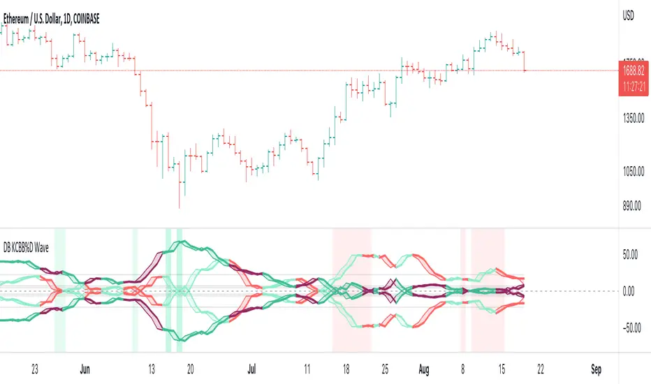
DB KCBB%D WavesDB KCBB%D Waves
What does the indicator do?
The indicator plots the percent difference between the low and high prices against a combined Kelpler Channel Bollinger Bands for the current timeframe. The low percent difference and the high percent difference each have their own waves plotted. A mirror mode default allows both waves to be visualized in a mirrored plot that clearly shows when outer bands are present and when they swap. Each percent difference band is displayed with a 1 bar lookback to visualize local tops/bottoms.
The overall trend is displayed using two sets of green/red colors on the percent difference waves so that each wave is recognizable, but the overall price trend is visible. A fast 3 SMA is taken of each percent difference wave to obtain the overall trend and then averaged together. The trend is then calculated based on direction from the previous bar period.
How should this indicator be used?
By default, the indicator will display in a mirror mode which will display both the low and high percent change waves mirrored to allow for the most pattern recognition possible. You will notice the percent difference waves swap from inner to outer, showing the overall market direction for that timeframe. When each percent difference wave interacts with the zero line, it indicates either buys or sells opportunities depending on which band is on the inside. When the inner wave crosses zero, special attention should be paid to the outer wave to know if it's a significant move. Likewise, when the outer wave peaks, it can indicate buy or sell opportunities depending on which wave is on the outside.
A zero line and other lines are displayed from the highest of the high percent difference wave over a long period of time. The lines can measure movement and possible oversold/overbought locations or large volatility. You can also use the lines for crossing points for either wave as alerts to know when to buy or sell zones are happening.
When individual percent difference waves are designed to be reviewed without mirroring, the mirror checkbox can be unchecked in the settings. Doing so will display both the high and low percent difference waves separately. Using this display, you can more cleanly review how each wave interacts with various line levels.
For those who desire to only have half of the mirror or one set of waves inverted against each other, check the "mirrored" and the "mirrored flipped" checkboxes in the settings. Doing so will display the top half of the mirror indicator, which is the low percent difference wave with the high percent difference wave inverted.
The indicator will also change the background color of its own pane to indicate possible buy/sell periods (work in progress).
Does the indicator include any alerts?
Yes, they are a work in progress but starting out with this release, we have:
NOTE: This is an initial release version of this indicator. Please do not use these alerts with bots yet, as they will repaint in real-time.
NOTE: A later release may happen that will delay firing the events until 1/2 of the current bar time has passed.
NOTE: As with any indicator watch your upper timeframe waves first before zooming into lower.
DB KCBB%D Buy Zone Alert
DB KCBB%D MEDIUM Buy Alert
DB KCBB%D STRONG Buy Alert
DB KCBB%D Sell Alert
DB KCBB%D STRONG Sell Alert
DB KCBB%D Trend Up Alert
DB KCBB%D Trend Down Alert
Use at your own risk and do your own diligence.
Enjoy!
OpenCipher AOpenCipher A is an open-source and free to use Overlay.
Features:
EMA Ribbons (Lengths: 5, 11, 15, 18, 21, 25, 29, 33)
Symbols ("Be careful" and "attention required" signals)
EMA Ribbons
The EMA RIbbons are a set of exponential moving averages. Blue and white ribbons = uptrend, gray ribbons = downtrend. The ribbons can act as support in uptrends and as resistance in downtrends.
Lengths and source of the ribbons are customizable.
Symbols
Green Dots: The green dot is a bullish symbol that appears whenever the EMA 11 crosses over EMA 33.
Red Cross: The red cross is a bearish symbol that appears whenever the EMA 5 crosses under EMA 11.
Blue Triangle: The blue triangle marks a possible trend reversal that appears whenever the EMA 5 crosses over EMA 25 while EMA 29 is below EMA 33.
Red Diamond: The red diamond is a bearish symbol that marks a potential local top whenever a bearish wavecross occurs (fast wave crosses under slow wave).
Yellow X: The yellow X is a warning signal that appears whenever a bearish wavecross occurs while the slow wave of the wavetrend is below -40 and the moneyflow is in the red (below zero).
Blood Diamond: The blood diamond is a bearish symbol that highlights whenever the red diamond and the red cross appear on the same candle.
Usage
Treat the symbols as signs that your attention might be required and don't trade based on them.

Hull Volume WavesInspired by the works of David Weis, this indicator is an alternative to his classic Weis Volume Waves.
As the name implies, this indicator uses a Hull Moving Average to detect price swings, and calculates the cumulative volume for each of them, separating the up swings from the down swings.
The chosen length of the HMA determines the size of each swing, meaning lower lengths will detect microswings while higher lengths will only include the main swings.
The length of each swing also determines the color of the upward and downward waves, and you can choose 2 colors each to generate a bullish and bearish gradient.
Extreme values are highlighted in the background. The indicator will compare the current up wave to the last N up volumes, or the current down wave to the last N down volumes. The lookback length can be changed in the menu.
I hope you find it useful!

GBTT Range Wave IndicatorOverview:
This script is a type of mean reversion indicator, it uses a short period EMA, the EMA5 to be exact, as its basis for a mean. From here, we run a modified version of ATR over a longer period of time to find an average range value for price movement. Finally, we calculate the cloud/band/wave by multiplying this range value by our deviation values to produce areas where the price could be considered too far from the mean (similar to an oversold or overbought scenario).
Additionally, we wrote this script with a goal to reduce or eliminate repainting. In the code, we have utilized OPEN values (instead of CLOSE) and previous candle values (not the current candle) to build all the data for the algorithm here to avoid the waves constantly moving and changing their values on real time candles. That said, this is NOT a guarantee that it will never repaint.
What you see:
Visually, the waves are always on the chart. Optionally, we provide a custom standard deviation channel based off the EMA5 (represented with a blue shading) and/or a simple ema5/21 crossover cloud. These can be used for additional confluence if desired, but are not necessary for the core function of the indicator which would be the upper and lower wave.
Intended use:
To provide educational content about the short term movement of an asset. Designed to be run on any time frame.
Disclaimer:
NOT intended to be a sole source of Technical Analysis or anything more than an educational tool!

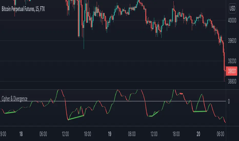
Cipher & DivergenceFor a long time I've been using complicated script with too much informations in it.
In this one I try to have just the bare minimum information to be able to analyse and find a potential reversal zone.
It is inspired from different wave trend / cipher script but has been tuned after months of backtest.
Extending the usage of the wave trend oscillator, which can be used with overbuy & oversell zone it might be better to wait for a confirmation of the movement. This confirmation can be identified by a pull back of the wave trend & price.
We can even confort ourself by waiting for reversal indicators.
Reversal may occurs after a divergence, wait for it, a cross of zero line followed by a PB to find your entry.
You can setup alert on bear / bull divergence but also when the wave trend cross the zero line to never miss a potential trade.
Huge thanks to LazyBear for his wave trend
And thanks vumanchu for his huge cipher script which was very useful for divergence finder