Contrarian Period High & LowContrarian Period High & Low
This indicator pairs nicely with the Contrarian 100 MA and can be located here:
Overview
The "Contrarian Period High & Low" indicator is a powerful technical analysis tool designed for traders seeking to identify key support and resistance levels and capitalize on contrarian trading opportunities. By tracking the highest highs and lowest lows over user-defined periods (Daily, Weekly, or Monthly), this indicator plots historical levels and generates buy and sell signals when price breaks these levels in a contrarian manner. A unique blue dot counter and action table enhance decision-making, making it ideal for swing traders, trend followers, and those trading forex, stocks, or cryptocurrencies. Optimized for daily charts, it can be adapted to other timeframes with proper testing.
How It Works
The indicator identifies the highest high and lowest low within a specified period (e.g., daily, weekly, or monthly) and draws horizontal lines for the previous period’s extremes on the chart. These levels act as dynamic support and resistance zones. Contrarian signals are generated when the price crosses below the previous period’s low (buy signal) or above the previous period’s high (sell signal), indicating potential reversals. A blue dot counter tracks consecutive buy signals, and a table displays the count and recommended action, helping traders decide whether to hold or flip positions.
Key Components
Period High/Low Levels: Tracks the highest high and lowest low for each period, plotting red lines for highs and green lines for lows from the bar where they occurred, extending for a user-defined length (default: 200 bars).
Contrarian Signals: Generates buy signals (blue circles) when price crosses below the previous period’s low and sell signals (white circles) when price crosses above the previous period’s high, designed to capture potential reversals.
Blue Dot Tracker: Counts consecutive buy signals (“blue dots”). If three or more occur, it suggests a stronger trend, with the table recommending whether to “Hold Investment” or “Flip Investment.”
Action Table: A 2x2 table in the bottom-right corner displays the blue dot count and action (“Hold Investment” if count ≥ 4, else “Flip Investment”) for quick reference.
Mathematical Concepts
Period Detection: Uses an approximate bar count to define periods (1 bar for Daily, 5 bars for Weekly, 20 bars for Monthly on a daily chart). When a new period starts, the previous period’s high/low is finalized and plotted.
High/Low Tracking:
Highest high (periodHigh) and lowest low (periodLow) are updated within the period.
Lines are drawn at these levels when the period ends, starting from the bar where the extreme occurred (periodHighBar, periodLowBar).
Signal Logic:
Buy signal: ta.crossunder(close , prevPeriodLow) and not lowBroken and barstate.isconfirmed
Sell signal: ta.crossover(close , prevPeriodHigh) and not highBroken and barstate.isconfirmed
Flags (highBroken, lowBroken) prevent multiple signals for the same level within a period.
Blue Dot Counter: Increments on each buy signal, resets on a sell signal or if price exceeds the entry price after three or more buy signals.
Entry and Exit Rules
Buy Signal (Blue Circle): Triggered when the price crosses below the previous period’s low, suggesting a potential oversold condition and buying opportunity. The signal appears as a blue circle below the price bar.
Sell Signal (White Circle): Triggered when the price crosses above the previous period’s high, indicating a potential overbought condition and selling opportunity. The signal appears as a white circle above the price bar.
Blue Dot Tracker:
Increments blueDotCount on each buy signal and sets an entryPrice on the first buy.
Resets on a sell signal or if price exceeds entryPrice after three or more buy signals.
If blueDotCount >= 3, the table suggests holding; if >= 4, it reinforces “Hold Investment.”
Exit Rules: Exit a buy position on a sell signal or when price exceeds the entry price after three or more buy signals. Combine with other tools (e.g., trendlines, support/resistance) for additional confirmation. Always apply proper risk management.
Recommended Usage
The "Contrarian Period High & Low" indicator is optimized for daily charts but can be adapted to other timeframes (e.g., 1H, 4H) with adjustments to the period bar count. It excels in markets with clear support/resistance levels and potential reversal zones. Traders should:
Backtest the indicator on their chosen asset and timeframe to validate signal reliability.
Combine with other technical tools (e.g., moving averages, Fibonacci levels) for stronger trade confirmation.
Adjust barsPerPeriod (e.g., ~120 bars for Weekly on hourly charts) based on the chart timeframe and market volatility.
Monitor the action table to guide position management based on blue dot counts.
Customization Options
Period Type: Choose between Daily, Weekly, or Monthly periods (default: Monthly).
Line Length: Set the length of high/low lines in bars (default: 200).
Show Highs/Lows: Toggle visibility of period high (red) and low (green) lines.
Max Lines to Keep: Limit the number of historical lines displayed (default: 10).
Hide Signals: Toggle buy/sell signal visibility for a cleaner chart.
Table Display: A fixed table in the bottom-right corner shows the blue dot count and action, with yellow (Hold) or green (Flip) backgrounds based on the count.
Why Use This Indicator?
The "Contrarian Period High & Low" indicator offers a unique blend of support/resistance visualization and contrarian signal generation, making it a versatile tool for identifying potential reversals. Its clear visual cues (lines and signals), blue dot tracker, and actionable table provide traders with an intuitive way to monitor market structure and manage trades. Whether you’re a beginner or an experienced trader, this indicator enhances your ability to spot key levels and time entries/exits effectively.
Tips for Users
Test the indicator thoroughly on your chosen market and timeframe to optimize settings (e.g., adjust barsPerPeriod for non-daily charts).
Use in conjunction with price action or other indicators for stronger trade setups.
Monitor the action table to decide whether to hold or flip positions based on blue dot counts.
Ensure your chart timeframe aligns with the selected period type (e.g., daily chart for Monthly periods).
Apply strict risk management to protect against false breakouts.
Happy trading with the Contrarian Period High & Low indicator! Share your feedback and strategies in the TradingView community!
在腳本中搜尋"weekly"

Simple Technicals Table📊 Simple Technicals Table
🎯 A comprehensive technical analysis dashboard displaying key pivot points and moving averages across multiple timeframes
📋 OVERVIEW
The Simple Technicals Table is a powerful indicator that organizes essential trading data into a clean, customizable table format. It combines Fibonacci-based pivot points with critical moving averages for both daily and weekly timeframes, giving traders instant access to key support/resistance levels and trend information.
Perfect for:
Technical analysts studying multi-timeframe data
Chart readers needing quick reference levels
Market researchers analyzing price patterns
Educational purposes and data visualization
🚀 KEY FEATURES
📊 Dual Timeframe Analysis
Daily (D1) and Weekly (W1) data side-by-side
Real-time updates as market conditions change
Seamless comparison between timeframes
🎯 Fibonacci Pivot Points
R3, R2, R1 : Resistance levels using Fibonacci ratios (38.2%, 61.8%, 100%)
PP : Central pivot point from previous period's data
S1, S2, S3 : Support levels with same methodology
📈 Complete EMA Suite
EMA 10 : Short-term trend identification
EMA 20 : Popular swing trading reference
EMA 50 : Medium-term trend confirmation
EMA 100 : Institutional support/resistance
EMA 200 : Long-term trend determination
📊 Essential Indicators
RSI 14 : Momentum for overbought/oversold conditions
ATR 14 : Volatility measurement for risk management
🎨 Full Customization
9 table positions : Place anywhere on your chart
5 text sizes : Tiny to huge for optimal visibility
Custom colors : Background, headers, and text
Optional pivot lines : Visual weekly levels on chart
⚙️ HOW IT WORKS
Fibonacci Pivot Calculation:
Pivot Point (PP) = (High + Low + Close) / 3
Range = High - Low
Resistance Levels:
R1 = PP + (Range × 0.382)
R2 = PP + (Range × 0.618)
R3 = PP + (Range × 1.000)
Support Levels:
S1 = PP - (Range × 0.382)
S2 = PP - (Range × 0.618)
S3 = PP - (Range × 1.000)
Smart Price Formatting:
< $1: 5 decimal places (crypto-friendly)
$1-$10: 4 decimal places
$10-$100: 3 decimal places
> $100: 2 decimal places
📊 TECHNICAL ANALYSIS APPLICATIONS
⚠️ EDUCATIONAL PURPOSE ONLY
This indicator is designed solely for technical analysis and educational purposes . It provides data visualization to help understand market structure and price relationships.
📈 Data Analysis Uses
Support & Resistance Identification : Visualize Fibonacci-based pivot levels
Trend Analysis : Study EMA relationships and price positioning
Multi-Timeframe Study : Compare daily and weekly technical data
Market Structure : Understand key technical levels and indicators
📚 Educational Benefits
Learn about Fibonacci pivot point calculations
Understand moving average relationships
Study RSI and ATR indicator values
Practice multi-timeframe technical analysis
🔍 Data Visualization Features
Organized table format for easy data reading
Color-coded levels for quick identification
Real-time technical indicator values
Historical data integrity maintained
🛠️ SETUP GUIDE
1. Installation
Search "Simple Technicals Table" in indicators
Add to chart (appears in middle-left by default)
Table displays automatically on any timeframe
2. Customization
Table Position : Choose from 9 locations
Text Size : Adjust for screen resolution
Colors : Match your chart theme
Pivot Lines : Toggle weekly level visualization
3. Optimization Tips
Use larger text on mobile devices
Dark backgrounds work well with light text
Enable pivot lines for visual reference
✅ BEST PRACTICES
Recommended Usage:
Use for technical analysis and educational study only
Combine with other analytical methods for comprehensive analysis
Study multi-timeframe data relationships
Practice understanding technical indicator values
Important Notes:
Levels based on previous period's data
Most effective in trending markets
No repainting - uses confirmed data only
Works on all instruments and timeframes
🔧 TECHNICAL SPECS
Performance:
Pine Script v5 optimized code
Minimal CPU/memory usage
Real-time data updates
No lookahead bias
Compatibility:
All chart types (Candlestick, Bar, Line)
Any instrument (Stocks, Forex, Crypto, etc.)
All timeframes supported
Mobile and desktop friendly
Data Accuracy:
Precise floating-point calculations
Historical data integrity maintained
No future data leakage
📱 DEVICE SUPPORT
✅ Desktop browsers (Chrome, Firefox, Safari, Edge)
✅ TradingView mobile app (iOS/Android)
✅ TradingView desktop application
✅ Light and dark themes
✅ All screen resolutions
📋 VERSION INFO
Version 1.0 - Initial Release
Fibonacci-based pivot calculations
Dual timeframe support (Daily/Weekly)
Complete EMA suite (10, 20, 50, 100, 200)
RSI and ATR indicators
Fully customizable interface
Optional pivot line visualization
Smart price formatting
Mobile-optimized display
⚠️ DISCLAIMER
This indicator is designed for technical analysis, educational and informational purposes ONLY . It provides data visualization and technical calculations to help users understand market structure and price relationships.
⚠️ NOT FOR TRADING DECISIONS
This tool does NOT provide trading signals or investment advice
All data is for analytical and educational purposes only
Users should not base trading decisions solely on this indicator
Always conduct thorough research and analysis before making any financial decisions
📚 Educational Use Only
Use for learning technical analysis concepts
Study market data and indicator relationships
Practice chart reading and data interpretation
Understand mathematical calculations behind technical indicators
The Simple Technicals Table provides technical data visualization to assist in market analysis education. It does not constitute financial advice, trading recommendations, or investment guidance. Users are solely responsible for their own research and decisions.
Author: ToTrieu
Version: 1.0
Category: Technical Analysis / Support & Resistance
License: Open source for educational use
💬 Questions? Comments? Feel free to reach out!

Dynamic EMA x VWAP AlertsDynamic EMA × VWAP Alerts generates buy and sell signals only when an EMA crossover happens in a meaningful VWAP (or standard deviation band) context. By combining classic EMA logic with flexible VWAP anchors (Daily, Weekly, Rolling) and optional advanced filters (ATR, Relative Volume, Deviation, Distance, Time Windows) to trim noise further, the script creates location-aware, filterable alerts rather than “everywhere” crosses. The value for trading and originality here lies in the integration of one or multiple anchors, band gating, combinator logic, and advanced regime filters. It’s designed for use across multiple instruments and timeframes, where EMA/VWAP context is relevant. It can run quietly in the background while you focus on price action and your own S/R levels.
What it does (quick take)
Detects EMA crossovers (double or optional triple) and evaluates them in VWAP context.
Plots Buy/Sell markers only when all chosen conditions are met.
Clean UX: keep all or parts of the engine visible or hide everything and let alerts run based on the silent engine behind your own S/R levels in an uncluttered, practical chart, as illustrated below.
Engine illustration: All selected engines visible
Practical use case: Same snapshot sequence as above but all selected engines invisible
Swing examples (beyond intraday)
Signals-only (clean value view):
Signals + your own S/R lines:
EMA selection (choose your playbook)
Defaults: Fast 9, Medium 21 (common intraday combo).
Modes: Double Cross — Fast vs Medium.
Triple Cross (optional) — adds a Slow EMA trend filter (enable Slow > 0).
Ranges: you can set each EMA 0–200 (0 = hidden/off)
Visuals are optional; you can display or hide each EMA line
EMA cross footprints (optional): Helps you assess trend continuation or change.
Use your own strategy: switch to 9/50, 20/50, 50/200, or whatever EMA set you trust for your instrument/timeframe.
VWAP Selection (the context engine)
Daily VWAP – resets each chart day (00:00–23:59). Typical fit: scalpers and fast intraday decision points.
Weekly VWAP – resets at the start of the calendar week. Typical fit: intraday with higher-timeframe context (aligns day trades with weekly bias).
Rolling VWAP – an adjustable VWMA-based rolling anchor (not session-reset), used as a flexible context reference Typical fit: multi-day swings when you want a flexible anchor that adapts across sessions.
Standard deviation bands (σ ±1/±2/±3) available for each anchor and help you express the “how far from fair value” idea.
Why VWAP matters: it’s a running, volume-weighted anchor where strong moves relative to VWAP and its bands help frame mean-reversion vs. trend-continuation risk. Evaluating crosses relative to VWAP/±σ reduces “everywhere” noise and helps frame potential setups.
How alerts are decided
An alert triggers only when:
Your selected EMA crossover occurs, and
Your chosen VWAP gate(s) and any filters pass. (Computed on bar close to avoid mid-bar noise)
Signals and alerts do not repaint; alerts evaluate and fire once per bar close.
Alert gates (Single / AND / OR)
Select one VWAP source or combine two (e.g., Daily + Weekly) with Single, AND, or OR logic.
Choose gate levels from VWAP or standard deviation bands (±σ). Typical long logic: price at/under VWAP or −σ. Typical short logic: price at/over VWAP or +σ.
Practical recipes:
Trend-follow: Daily AND Weekly at/above VWAP → confirms strength on two anchors.
Mean-reversion probe: Daily OR Rolling at −1σ → allows earlier fades with flexibility.
Advanced filtering: Suitable for advanced/Quant traders
During the research and development of this indicator, the EMA/VWAP cross logic was tested on historical S&P500 Futures data to explore patterns on multiple timeframes. These selected filtering indicators below showed correlation between certain market conditions and chosen indicator thresholds, helping reduce noise and lower-quality alerts. Results were research-oriented and are not predictive of future performance.
Therefore, I have built these indicator filters that run silently in the background. They let you trim noise by requiring alerts to appear only in market regimes you define. Each one constrains alert conditions; using them together helps tailor alerts to your strategy—but overly strict settings may filter out most or all alerts.
Relative Volume (RVOL): compares current volume to a baseline; ensures alerts arrive with participation instead of thin tape.
Deviation Threshold (%): controls how close the cross must be to the VWAP/σ level; tight = anchored signals, loose = more activity.
ATR Gate (+ Relative regime): keeps alerts inside a volatility regime; avoids both dead tape and chaotic spikes.
Distance Guard: requires price to be at least X ticks/% away from VWAP; useful to avoid premature signals near fair value.
Note: It’s not recommended to activate all of them at once or change the values aggressively. Unless you’ve done deeper backtesting or machine learning calibration, you can easily filter out everything. Use small thresholds at first, then adjust to your instrument once you see how each filter changes alert frequency and quality. Advanced/quant users can fine-tune freely.
Case example:
Unfiltered: Timeframe 15 min, EMA Selection 9/21, VWAP gates Rolling (250 bars) OR Weekly
Filtered: Same setup as above + activated filters:
RVOL: 100 bars, Min. RVOL 0.4
Deviation threshold (%): 0.3
ATR Length: 14
Min ATR (%): 0.05
Relative regime: Base length 2000, Min Ratio 0.85, Max Ratio 2
Under the hood
This indicator leans on TradingView built-ins (e.g., EMA, VWMA, ATR, alertcondition) to maximize speed, stability, and compatibility while we implement the custom logic (VWAP anchors, band gating, combinator gates, advanced filters, time windows). Built-ins were easy to work with and reduced edge-case bugs and kept the visuals responsive, while the design gives fine-tuning and clean visuals—so both discretionary traders and quant-minded users can shape the alerts to their strategy and workflow.
Disclaimer
The tools, scripts, and indicators presented here are provided for educational and informational purposes only. They are not financial advice and should not be interpreted as investment recommendations, trading signals, or a solicitation to buy or sell any financial instrument.
All forms of trading and investing involve risk. The past performance of any security, strategy, or market condition does not guarantee future outcomes. Users are solely responsible for their own trading and investment decisions, including evaluating their financial situation, objectives, and risk tolerance.
By using this indicator, you acknowledge that you do so at your own risk. The author accepts no liability for any direct or indirect loss or damage—including, without limitation, loss of profits—that may arise from the use of, or reliance upon, this tool.

Gabriel's Triple Impulsive Candle DetectorTriple Impulsive Candle Detector
Overview, critical for catching impulse moves in either direction.
SPX Income System is a rule-based framework designed to identify frequent, high-probability income opportunities on the S&P 500 cash index (SPX/SPY) using 0-DTE credit spreads. The core engine operates on 30-minute Impulse bars during the morning trade window and can be extended with optional modules for afternoon, overnight, and weekly swing opportunities. The methodology centers on a single, mechanical price event called a Impulse Bar (small wick to body ratio) to minimize discretion and keep execution consistent.
🔶What’s Inside
Core Strategy: SPX Daily Income
Timeframe: 3 kinds of 30-min bars.
Window: 09:30–11:30 ET (new setups only)
Instrument: SPX (cash index, XSP/SPY), executed with $5-wide credit spreads on 0-DTE SPX options
Bullish Setup
Entry on the break of setup bar high
Use an at the money put credit spread
Bearish Setup
Entry on the break of setup bar low
Use an at the money call credit spread
Intent: Enter shortly after setup; manage to >80% max profit or EOD expiration if SPX. If it's another stock, then a 1.5~2x D ATR is suggested.
Signal: An Impulse Bar that closes at/near the high (bullish) or low (bearish) of its 30-min range, verified with Volume above average.
Risk—limited to the risk of the option spread.
The spread is 5 dollars wide
The premium collected is $2.50
$5 - 2.50 = $2.50, or the breakeven point.
Which means what's left is the risk involved.
The risk is $2.50 per spread
🔶Why the 30-Minute Chart?
The 30-minute bar is the “chart of choice” because it filters noise and aligns with morning institutional flows.
On alternate timeframes, price often retraces half the candle body before following through.
On the 30m: the follow-through is more consistent, especially with 2x volume confirmation.
Adding support/resistance levels at the impulse bar hl2 strengthens execution.
This strategy has roots in MTF Crypto, and SPX/SPY TPO-Order Block logic.
🔶Bonus Examples:
🔹Afternoon SPX Income
Second chance window (typically 14:00–15:00 ET) if the morning trade has exited, 60-min bars instead.
🔹ORB 30 – Opening Range Break (first 30 min)
Classic ORB with an income twist for early action when time is limited. This can be entered on the 15 minute candle break.
🔹ORB 60 – Opening Range Break (second 30 min)
A follow-up ORB variant for traders who miss the first window, verified on a 60-min chart. Enter on the final 3 minutes of the hourly candle or wait for a pullback.
🔹B&B – Bed & Breakfast (Overnight)
Identifies income setups via the 10-minute chart in the last 30–60 minutes of the session with next-day open as the exit.
🔹JB – Just Breakfast
Uses the prior day’s end-of-day setup to enter at the opening bell, then manages into the daily income flow. I trade 0-date, and selling an ITM spread either partially or fully then gives me a head start on the daily income potential. This may work better if you either roll or the ORB 30 also meets the criteria.
🔹All-Day-Scalper
Converts income logic into 30-minute scalps using deep 75/80 delta ITM options as synthetic stock (requires >PDT). Meaning that the option will behave as if it is stock. This strategy comes with a warning: it's better if you can day trade.
🔹Tag ’n Turn—Weekly SPX Income Swing
Weekly swing overlay using 30-min Pulse Bars + Bollinger Bands (50) for 3–7 day swings and as a filter for daily income alignment. I use the TTM Squeeze and obtain similar results. Target heuristics (directional days) with a fired squeeze.
Part of my Gamma Scalping System.
🔶The Impulse Bar (10~40% Wick to Body Bar)
An Impulse Bar is a candle that:
Bullish: Closes higher than it opens and within the top ~10% of its high-low range.
Bearish: Closes lower than it opens and within the bottom ~10% of its high-low range.
Practical tip: Many traders mark 0-10-80-100% levels on the candle range (custom Fib or ruler) to quickly validate Pulse Bars. If it's accompanied by a volume spike, then it's better quality.
🔶SPX Daily Income—Rules & Execution
🔹Rules
Chart: 30 min, no indicators required. Pure PA, TPO-based strategy.
New Setups: 09:30–11:30 ET
Instrument: SPX signals, executed via SPX 0-DTE credit spreads ($5 wide, $2 for SPY)
🔹Entries
Bullish: Enter on a break of the setup bar high, use ATM put credit spread
Bearish: Enter on a break of the setup bar low, use ATM call credit spread
🔹Exits
Primary: Close at >80% of max profit (credit received)
Alternate: Hold to EOD expiration
Stop: Risk of the spread (defined by width – credit)
Target Heuristics (directional days)
Optional: 1.5–2× ATR as a reference (mirrors directional follow-through that often accelerates the >80% outcome)
Credit Guidance (typical)
OTM short strike ≈ $2.40
ITM short strike ≈ $2.50–$2.80
2× ITM short strike ≈ $2.80–$3.00
Trade Management (PDT-Aware)
If under PDT, many prefer set-and-forget with GTC buy-back (e.g., $0.20) or EOD expiration.
1:00 PM ET time check
Trending day ±$15–$20 SPX: usually no action, run to expiration
Non-trending day ±$5 SPX: consider taking 40–60% if available (optional) to avoid 50/50 end-of-day decay dynamics
Rationale: Without a favorable trend by ~1 PM, the odds of a late push decline; choosing a controlled partial outcome can improve long-run expectancy and reduce variance.
🔶Examples (Conceptual)
🔹Bullish: A green dot marks a bullish impulse bar; minor follow-through pushes the spread to >80% quickly.
🔹Bearish: A red triangle marks a bearish Impulse Bar; a modest down move is often sufficient for >80–95%.
🔹Tag ’n Turn—Weekly Swing (Filter & Stand-Alone)
Chart: 30-minute
Overlay: Bollinger Bands 50 (mean-reversion lens), or KC or TTM.
Setup: Tag of upper/lower band + Pulse Bar, enter on break of Pulse Bar in that direction
Target: Opposite Bollinger Band
Use Case: 3–7 day swings and a directional filter for Daily Income signals (trade with weekly bias)
🔹Afternoon SPX Income: Same Pulse logic, 14:00–15:00 ET window.
🔹ORB 30 / ORB 60: Uses 30/60-min opening range; can relax Pulse threshold (up to 40% bars) for early positioning when time-constrained.
🔹B&B (Overnight): Lasts 30–60 minutes; closes the next day at open or after the first 30-minute bar.
🔹JB (Just Breakfast): Enter at open using prior day’s signal; optionally roll into Daily Income if eligible.
🔹All-Day-Scalper: Deep ITM options (~0.75–0.80 delta) as synthetic stock.
Entry: Long ITM option
Stop: ~40% of option price
Target: 70–150% or 30-minute timed exit
Note: Time-intensive; for accounts above PDT.
🔹Brokerage: Must efficiently support SPX options; a <10% spread between OI and Volume is ideal. Preferences vary; Tastytrade, Thinkorswim, and Interactive Brokers are common choices. Use what’s reliable, available in your region, and cost-effective.
🔶Alerts (Check-in)
Bullish Impulse Detected (within 09:30–11:30 ET)
Bearish Impulse Detected (within 09:30–11:30 ET)
Afternoon Pulse (14:00–15:00 ET)
ORB 30/60 Trigger
B&B Window Open (last 60 mins)
JB at Open
Tag ’n Turn: Band Tag + Impulse (Bull/Bear)
🔶Inputs (Typical)
Session windows (morning, afternoon, last hour) ~5~15 Average Bar
Impulse threshold (strict 10% vs relaxed up to 40% for ORB variants)
Marker/label styles (bull/bear colors, dots vs arrows)
Filters (optional ATR TP, band touch BB(50-SMA, 2 Stdv.) for Tag ’n Turn)
Alert toggles (on-close for webhooks)
🔶Best Practices
One playbook, many Doors: Start with daily income; add afternoon or B&B/JB only after you’re consistent.
Credit discipline: Don’t chase poor pricing; stick to the credit guidance.
Time awareness: If no trend by ~1 PM ET, consider variance control.
Weekly bias: When using Tag ’n Turn, align daily trades with the weekly swing direction for added confluence.
Risk is defined as width – credit = max risk per spread. Size, accordingly, 1~2%.
🔶Disclosures & Risk
This is not financial advice. Options involve risk and are not suitable for all investors. Past performance (including backtests or theoretical studies) does not guarantee future results. Slippage, fills, assignment risk, and latency can materially impact outcomes. Trade a plan you fully understand and always size for durability. On the Daily, the Impulse bars, are often a signal that you should plan for it to return back to half of the Candle's body, and plan accordingly. Plot a horizontal support/resistance level and see how price reacts to it. Keep house-money, and use 1~2% Risk, reduce exposure when VIX is low and increase it when VIX is high.
TL;DR (Summary)
Signal: 30-min Pulse Bar (strict 10% close in range)
Window: 09:30–11:30 ET (new setups)
Execution: 0-DTE $5-wide SPX credit spreads
Exit: >80% max profit or EOD
Add-ons: Afternoon, ORB 30/60, B&B/JB overnights, All-Day-Scalper, Tag ’n Turn weekly swing/filter
Philosophy: Fully rule-based, minimal discretion, production-line consistency 0-date.

Smart Index Levels — GSK-VIZAG-AP-INDIA📌 Smart Index Levels — GSK-VIZAG-AP-INDIA
Smart Index Levels is a versatile support and resistance plotting tool designed for intraday, weekly, and monthly analysis.
It automatically generates key price zones based on user-defined step sizes, helping traders visualize important market levels more clearly.
🔹 Features
Daily / Weekly / Monthly Modes
Switch easily between daily, weekly, or monthly reference levels.
Customizable Level Steps
Choose step intervals of 50 or 100 points for cleaner index-based zones.
Support & Resistance Zones
Auto-draws multiple support and resistance levels around the opening base price.
Mid-Level Marking
Highlights the nearest “mid” price level for balance reference.
Weekly High/Low Tracking (Optional)
Plots dynamic weekly high & low levels with dotted lines.
Monthly High/Low Tracking (Optional)
Displays monthly high & low levels for broader market context.
Custom Market Session Timing
Define your own market open and close times.
Line Style & Colors
Fully customizable line styles (solid, dashed, dotted) and colors.
⚙️ How It Works
At the start of the selected session (daily, weekly, or monthly), the script identifies the opening reference price.
From this base, it calculates and draws support and resistance levels at fixed step intervals.
Optionally, it overlays weekly and monthly high/low levels for additional perspective.
This provides a structured price map that helps you quickly spot potential reaction zones, without cluttering the chart.
🖥️ Best Use Cases
Intraday index traders who want quick reference levels (Nifty, BankNifty, etc.)
Swing traders who prefer weekly and monthly zones for context.
Anyone looking for clean, rule-based support/resistance plotting.
⚠️ Disclaimer
This indicator is for educational and informational purposes only.
It does not provide financial advice or trading signals. Always use in combination with your own analysis and risk management.

ATR Future Movement Range Projection
The "ATR Future Movement Range Projection" is a custom TradingView Pine Script indicator designed to forecast potential price ranges for a stock (or any asset) over short-term (1-month) and medium-term (3-month) horizons. It leverages the Average True Range (ATR) as a measure of volatility to estimate how far the price might move, while incorporating recent momentum bias based on the proportion of bullish (green) vs. bearish (red) candles. This creates asymmetric projections: in bullish periods, the upside range is larger than the downside, and vice versa.
The indicator is overlaid on the chart, plotting horizontal lines for the projected high and low prices for both timeframes. Additionally, it displays a small table in the top-right corner summarizing the projected prices and the percentage change required from the current close to reach them. This makes it useful for traders assessing potential targets, risk-reward ratios, or option strategies, as it combines volatility forecasting with directional sentiment.
Key features:
- **Volatility Basis**: Uses weekly ATR to derive a stable daily volatility estimate, avoiding noise from shorter timeframes.
- **Momentum Adjustment**: Analyzes recent candle colors to tilt projections toward the prevailing trend (e.g., more upside if more green candles).
- **Time Horizons**: Fixed at 1 month (21 trading days) and 3 months (63 trading days), assuming ~21 trading days per month (excluding weekends/holidays).
- **User Adjustable**: The ATR length/lookback (default 50) can be tweaked via inputs.
- **Visuals**: Green/lime lines for highs, red/orange for lows; a semi-transparent table for quick reference.
- **Limitations**: This is a probabilistic projection based on historical volatility and momentum—it doesn't predict direction with certainty and assumes volatility persists. It ignores external factors like news, earnings, or market regimes. Best used on daily charts for stocks/ETFs.
The indicator doesn't generate buy/sell signals but helps visualize "expected" ranges, similar to how implied volatility informs option pricing.
### How It Works Step-by-Step
The script executes on each bar update (typically daily timeframe) and follows this logic:
1. **Input Configuration**:
- ATR Length (Lookback): Default 50 bars. This controls both the ATR calculation period and the candle count window. You can adjust it in the indicator settings.
2. **Calculate Weekly ATR**:
- Fetches the ATR from the weekly timeframe using `request.security` with a length of 50 weeks.
- ATR measures average price range (high-low, adjusted for gaps), representing volatility.
3. **Derive Daily ATR**:
- Divides the weekly ATR by 5 (approximating 5 trading days per week) to get an equivalent daily volatility estimate.
- Example: If weekly ATR is $5, daily ATR ≈ $1.
4. **Define Projection Periods**:
- 1 Month: 21 trading days.
- 3 Months: 63 trading days (21 × 3).
- These are hardcoded but based on standard trading calendar assumptions.
5. **Compute Base Projections**:
- Base projection = Daily ATR × Days in period.
- This gives the total expected movement (range) without direction: e.g., for 3 months, $1 daily ATR × 63 = $63 total range.
6. **Analyze Candle Momentum (Win Rate)**:
- Counts green candles (close > open) and red candles (close < open) over the last 50 bars (ignores dojis where close == open).
- Total colored candles = green + red.
- Win rate = green / total colored (as a fraction, e.g., 0.7 for 70%). Defaults to 0.5 if no colored candles.
- This acts as a simple momentum proxy: higher win rate implies bullish bias.
7. **Adjust Projections Asymmetrically**:
- Upside projection = Base projection × Win rate.
- Downside projection = Base projection × (1 - Win rate).
- This skews the range: e.g., 70% win rate means 70% of the total range allocated to upside, 30% to downside.
8. **Calculate Projected Prices**:
- High = Current close + Upside projection.
- Low = Current close - Downside projection.
- Done separately for 1M and 3M.
9. **Plot Lines**:
- 3M High: Solid green line.
- 3M Low: Solid red line.
- 1M High: Dashed lime line.
- 1M Low: Dashed orange line.
- Lines extend horizontally from the current bar onward.
10. **Display Table**:
- A 3-column table (Projection, Price, % Change) in the top-right.
- Rows for 1M High/Low and 3M High/Low, color-coded.
- % Change = ((Projected price - Close) / Close) × 100.
- Updates dynamically with new data.
The entire process repeats on each new bar, so projections evolve as volatility and momentum change.
### Examples
Here are two hypothetical examples using the indicator on a daily chart. Assume it's applied to a stock like AAPL, but with made-up data for illustration. (In TradingView, you'd add the script to see real outputs.)
#### Example 1: Bullish Scenario (High Win Rate)
- Current Close: $150.
- Weekly ATR (50 periods): $10 → Daily ATR: $10 / 5 = $2.
- Last 50 Candles: 35 green, 15 red → Total colored: 50 → Win Rate: 35/50 = 0.7 (70%).
- Base Projections:
- 1M: $2 × 21 = $42.
- 3M: $2 × 63 = $126.
- Adjusted Projections:
- 1M Upside: $42 × 0.7 = $29.4 → High: $150 + $29.4 = $179.4 (+19.6%).
- 1M Downside: $42 × 0.3 = $12.6 → Low: $150 - $12.6 = $137.4 (-8.4%).
- 3M Upside: $126 × 0.7 = $88.2 → High: $150 + $88.2 = $238.2 (+58.8%).
- 3M Downside: $126 × 0.3 = $37.8 → Low: $150 - $37.8 = $112.2 (-25.2%).
- On the Chart: Green/lime lines skewed higher; table shows bullish % changes (e.g., +58.8% for 3M high).
- Interpretation: Suggests stronger potential upside due to recent bullish momentum; useful for call options or long positions.
#### Example 2: Bearish Scenario (Low Win Rate)
- Current Close: $50.
- Weekly ATR (50 periods): $3 → Daily ATR: $3 / 5 = $0.6.
- Last 50 Candles: 20 green, 30 red → Total colored: 50 → Win Rate: 20/50 = 0.4 (40%).
- Base Projections:
- 1M: $0.6 × 21 = $12.6.
- 3M: $0.6 × 63 = $37.8.
- Adjusted Projections:
- 1M Upside: $12.6 × 0.4 = $5.04 → High: $50 + $5.04 = $55.04 (+10.1%).
- 1M Downside: $12.6 × 0.6 = $7.56 → Low: $50 - $7.56 = $42.44 (-15.1%).
- 3M Upside: $37.8 × 0.4 = $15.12 → High: $50 + $15.12 = $65.12 (+30.2%).
- 3M Downside: $37.8 × 0.6 = $22.68 → Low: $50 - $22.68 = $27.32 (-45.4%).
- On the Chart: Red/orange lines skewed lower; table highlights larger downside % (e.g., -45.4% for 3M low).
- Interpretation: Indicates bearish risk; might prompt protective puts or short strategies.
#### Example 3: Neutral Scenario (Balanced Win Rate)
- Current Close: $100.
- Weekly ATR: $5 → Daily ATR: $1.
- Last 50 Candles: 25 green, 25 red → Win Rate: 0.5 (50%).
- Projections become symmetric:
- 1M: Base $21 → Upside/Downside $10.5 each → High $110.5 (+10.5%), Low $89.5 (-10.5%).
- 3M: Base $63 → Upside/Downside $31.5 each → High $131.5 (+31.5%), Low $68.5 (-31.5%).
- Interpretation: Pure volatility-based range, no directional bias—ideal for straddle options or range trading.
In real use, test on historical data: e.g., if past projections captured actual moves ~68% of the time (1 standard deviation for ATR), it validates the volatility assumption. Adjust the lookback for different assets (shorter for volatile cryptos, longer for stable blue-chips).

cd_Quarterly_cycles_SSMT_TPD_CxGeneral
This indicator is designed in line with the Quarterly Theory to display each cycle on the chart, either boxed and/or in candlestick form.
Additionally, it performs inter-cycle divergence analysis ( SSMT ) with the correlated symbol, Terminus Price Divergence ( TPD ), Precision Swing Point ( PSP ) analysis, and potential Power of Three ( PO3 ) analysis.
Special thanks to @HandlesHandled for his great indicator, which I used while preparing the cycles content.
Details & Usage:
Optional cycles available: Weekly, Daily, 90m, and Micro cycles.
Displaying/removing cycles can be controlled from the menu (cycles / candles / labels).
All selected cycles can be shown, or you can limit the number of displayed cycles (min: 2, max: 4).
The summary table can be toggled on/off and repositioned.
What’s in the summary table?
• Below the header, the correlated symbol used in the analysis is displayed (e.g., SSMT → US500).
• If available, live and previous bar results of the SSMT analysis are shown.
• Under the PSP & TPD section, results are displayed when conditions are met.
• Under Alerts, the real-time status of conditions defined in the menu is shown.
• Under Potential AMD, possible PO3 analysis results are displayed.
Analysis & Symbol Selection:
To run analyses, a correlated symbol must first be defined with the main symbol.
Default pairs are preloaded (see below), but users should adjust them according to their exchange and instruments.
If no correlated pair is defined, cycles are displayed only as boxes/candles.
Once defined pairs are opened on the chart, analyses load automatically.
Pairs listed on the same row in the menu are automatically linked, so no need to re-enter them across rows.
SSMT Analysis:
Based on the chart’s timeframe, divergences are searched across Weekly, Daily, 90m, and Micro cycles.
The code will not produce results for smaller cycles than the current timeframe.
(Example: On H1, Micro cycles will not be displayed.)
Results are obtained by comparing the highs and lows of consecutive cycles in the same period.
If one pair makes a new high/low while the other does not, this divergence is added to SSMT results.
The difference from classic SMT is that cycles are used instead of bars.
PSP & TPD Analysis:
A correlated symbol must be defined.
For PSP, timeframe options are added to the menu.
Users toggle timeframes on/off by checking/unchecking boxes.
In selected timeframes, PSP & TPD analysis is performed.
• PSP: If candlesticks differ in color (bullish/bearish) between symbols and the bar is at a high/low of the timeframe (and higher/lower than the bars before/after it), it is identified as a PSP. Divergences between pairs are interpreted as potential reversal signals.
• TPD: Once a PSP occurs, the closing price of the previous bar and the opening price of the next bar are compared. If one symbol shows continuation while the other does not, it is marked as a divergence.
Example:
Let’s assume Pair 1 and Pair 2 are selected in the menu with the H4 timeframe, and our cycle is Weekly (Box).
For Pair 1, the H4 candle at the Weekly high level:
• Is positioned at the Weekly high,
• Its high is above both the previous and the next candle,
• It closed bearish (open > close).
For Pair 2, the same H4 candle closed bullish (close > open).
→ PSP conditions are met.
For TPD, we now check the candles before and after this PSP (H4) candle on both pairs.
Comparing the previous candle’s close with the next candle’s open, we see that:
• In Pair 1, the next open is lower than the previous close,
• In Pair 2, the next open is higher than the previous close.
Pair 1 → close > open
Pair 2 → close < open
Since they are not aligned in the same direction, this is interpreted as a divergence — a potential reversal signal.
While TPD results are displayed in the summary table, whenever the conditions are met in the selected timeframes, the signals are also plotted directly on the chart. (🚦, X)
• Higher timeframe TPD example:
• Current timeframe TPD example:
Alerts:
The indicator can be conditioned based on aligned timeframes defined within the concept.
Example (assuming random active rows in the screenshot):
• Weekly Bullish SSMT → Tf2 (menu-selected) Bullish TPD → Daily Bullish SSMT.
Selecting “none” in the menu means that condition is not required.
When an alert is triggered, it will be displayed in the corresponding row of the table.
• Example with only condition 3 enabled:
Potential PO3 Analysis:
According to Quarterly Theory, price moves in cycles, and the same structures are assumed to continue in smaller timeframes.
From classical PO3 knowledge: before the main move, price first manipulates in the opposite direction to trap buyers/sellers, then makes its true move.
The cyclical sequence is:
(A)ccumulation → (M)anipulation → (D)istribution → (R)eversal / Continuation.
Within cycle candles, the first letter of each phase is displayed.
So how does the analysis work?
If the active cycle is in (M)anipulation or (D)istribution phase, and it sweeps the previous cycle’s high or low but then pulls back inside, this is flagged in the summary table as a possible PO3 signal.
In other words, it reflects the alignment of theoretical sequence with real-time price action.
Confluence with SSMT and TPD conditions further strengthens the expectation.
Final Note:
No single marking or alert carries meaning on its own — it must always be evaluated in the context of your concept knowledge.
Instead of trading purely on expectations, align bias + trend + entry confirmations to improve your success rate.
Feedback and suggestions are welcome.
Happy trading!

ProphetQuant LevelsProphetQuant Levels — Institutional Structure, Simplified
ProphetQuant Levels fuses prorietary institutional reference levels with session logic to surface clean, actionable trade locations—no fluff, no guessing. It draws only what matters, right where you trade.
Daily and Weekly Levels are provided each day. Copy and paste them into the indicator to activate. Both intraday (daily) and weekly levels are required for full context.
What It Plots
ProphetQuant institutional levels: Daily & weekly custom strings (HV / R / S / EXT), fully customizable with right-anchored labels.
Initial Balance (IB): Auto-market windows (NQ, ES & GC), frozen after completion, with optional midline and right-side labels.
True Session VWAP: Volume-weighted VWAP with optional ±0.5σ / ±1.0σ bands (labels optional, off by default).
Globex H/L (18:00→17:00): Current and prior day highs/lows shown as precise black stubs, each with its own toggle.
Weekly H/L: Current and prior week highs/lows shown as black stubs, each with its own toggle.
Label control: Font, offset, background transparency; anchor left/center/right; per-feature price label toggles.
Why It Helps
Institutional precision: Anchored on proven reference levels with high probability of reaction.
Clarity over clutter: Clean horizontal references and short right-side stubs make charts easy to read at a glance.
Session-aware: IB and VWAP align with correct trading windows.
Confluence first: Daily/weekly structure, IB extremes, VWAP/σ, and prior highs/lows stack into clear decision zones.

Sri - Pivot + Vital Moving Averages Sri – Pivot + Vital Moving Averages
Sri – Pivot + Vital Moving Averages is an advanced all-in-one indicator that blends trend-following moving averages with multi-timeframe pivot levels (Daily, Weekly, Monthly). It is designed to give traders a complete view of both trend direction and key support/resistance zones, all in a single package.
By combining pivots and moving averages, this tool helps traders quickly identify whether the market is trending or ranging, while also highlighting critical price reaction points that can be used for intraday, swing, or positional trading.
🔹 Moving Averages
50 EMA → medium-term trend filter
200 EMA → long-term trend bias
800 HMA → ultra-smooth trend direction, great for capturing cycles
Daily EMA 200 → higher timeframe trend guide for precision entries
Each moving average is dynamically color-coded to reflect the market bias, making trend changes visually clear and easy to follow.
🔹 Pivot Levels (Daily, Weekly, Monthly)
Auto-calculated pivot, support (S1–S4), and resistance (R1–R4) levels
Balance Zone (BC & TC) highlighted with background shading
Custom colors, visibility toggles, and line thickness options
Dynamic horizontal levels that update with each new session
Ideal for spotting intraday reversals, swing levels, and institutional confluence zones
🔹 Customization & Flexibility
Toggle EMAs, HMA, and each pivot timeframe (Daily/Weekly/Monthly) individually
Full control over colors, transparency, and line styles
Background shading between pivot balance zones for clearer structure
✅ Key Benefits (Pros)
All-in-One Tool → Combines pivots and MAs into one clean package, saving chart space
Multi-Timeframe Edge → View daily, weekly, and monthly pivot levels together for better confluence
Clear Trend Guidance → EMA & HMA color shifts reflect trend changes instantly
Professional Visualization → Background balance zones and structured layouts make levels easy to read
Highly Customizable → Designed to adapt to intraday scalpers, swing traders, and long-term investors alike
⚠️ Things to Keep in Mind (Cons)
Charts may feel visually crowded if all pivots and moving averages are enabled at once
Best used as a confirmation & confluence tool, not as a stand-alone trading strategy
🔥 Recommended Enhancements (For Even Higher Success Rate)
This script already provides a strong edge, but adding the following tools can make it even more powerful:
Volume Confirmation (OBV or VWAP) → Validate pivot/EMA breakouts with volume strength
Momentum Filter (RSI or MACD Histogram) → Confirm directional momentum before acting on pivot touches
Trend Strength (ADX or Supertrend) → Distinguish strong trending phases from weak ranges
Reversal Candlestick Highlight → Automatically mark engulfing candles or pin bars occurring at pivots
These lightweight add-ons integrate well with the existing framework and can improve decision-making without cluttering the chart.
📊 Best Use Cases
Intraday Traders → Use daily pivots with 50/200 EMA for quick scalps and reversals
Swing Traders → Rely on weekly and monthly pivots for confluence with 200 EMA trend bias
Institutional/Positional Traders → Track 800 HMA and higher timeframe EMA 200 for structural guidance
Confluence Hunters → Combine pivot levels with trend bias for high-probability setups

Pivot Points mura visionWhat it is
A clean, single-set pivot overlay that lets you choose the pivot type (Traditional/Fibonacci), the anchor timeframe (Daily/Weekly/Monthly/Quarterly, or Auto), and fully customize colors, line width/style , and labels . The script never draws duplicate sets—exactly one pivot pack is displayed for the chosen (or auto-detected) anchor.
How it works
Pivots are computed with ta.pivot_point_levels() for the selected anchor timeframe .
The script supports the standard 7 levels: P, R1/S1, R2/S2, R3/S3 .
Lines span exactly one anchor period forward from the current bar time.
Label suffix shows the anchor source: D (Daily), W (Weekly), M (Monthly), Q (Quarterly).
Auto-anchor logic
Intraday ≤ 15 min → Daily pivots (D)
Intraday 20–120 min → Weekly pivots (W)
Intraday > 120 min (3–4 h) → Monthly pivots (M)
Daily and above → Quarterly pivots (Q)
This keeps the chart readable while matching the most common trader expectations across timeframes.
Inputs
Pivot Type — Traditional or Fibonacci.
Pivots Timeframe — Auto, Daily (1D), Weekly (1W), Monthly (1M), Quarterly (3M).
Line Width / Line Style — width 1–10; style Solid, Dashed, or Dotted.
Show Labels / Show Prices — toggle level tags and price values.
Colors — user-selectable colors for P, R*, S* .
How to use
Pick a symbol/timeframe.
Leave Pivots Timeframe = Auto to let the script choose; or set a fixed anchor if you prefer.
Toggle labels and prices to taste; adjust line style/width and colors for your theme.
Read the market like a map:
P often acts as a mean/rotation point.
R1/S1 are common first reaction zones; R2/S2 and R3/S3 mark stronger extensions.
Confluence with S/R, trendlines, session highs/lows, or volume nodes improves context.
Good practices
Use Daily pivots for intraday scalps (≤15m).
Use Weekly/Monthly for swing bias on 1–4 h.
Use Quarterly when analyzing on Daily and higher to frame larger cycles.
Combine with trend filters (e.g., EMA/KAMA 233) or volatility tools for entries and risk.
Notes & limitations
The script shows one pivot pack at a time by design (prevents clutter and duplicates).
Historical values follow TradingView’s standard pivot definitions; results can vary across assets/exchanges.
No alerts are included (levels are static within the anchor period).

Sri - Custom Timeframe Candle / Heikin AshiSri - Custom Timeframe Candle / Heikin Ashi (Week & Day) + Label
Short Title: Sri - Smart Candles
Pine Script Version: 5
Overlay: Yes
Description:
The Sri - Smart Candles indicator allows traders to visualize historical and current daily and weekly candles on a single chart in a compact and customizable format. You can choose between Normal candles or Heikin Ashi candles for better trend visualization. The script displays previous 4 candles, the last candle, and the live candle with horizontal offset positioning to avoid overlapping the chart. Additionally, the indicator includes customizable labels for days or week numbers, helping traders quickly analyze patterns and trends.
This indicator is ideal for traders who want to see higher timeframe candle patterns on lower timeframe charts (like 5-min, 15-min, or 1-hour charts) without switching timeframes.
Key Features:
Custom Candle Types: Normal or Heikin Ashi.
Daily & Weekly Candle Blocks: View previous 4 + last + live candles.
Custom Colors: Bull, bear, and wick colors configurable.
Candle Positioning: Horizontal offsets, thickness, and gaps configurable.
Labels: Day numbers or week numbers displayed at Top, Bottom, or Absolute level.
Multi-Timeframe Visualization: See daily and weekly candles on lower timeframe charts.
Advantages:
✅ Helps visualize higher timeframe trends on lower timeframe charts.
✅ Easy to identify bullish and bearish candle patterns.
✅ Customizable for personal visual preference (colors, size, offsets).
✅ Labels allow quick recognition of days/weeks without cluttering the chart.
✅ Works on small timeframes (1-min, 5-min, 15-min) for intraday analysis.
Pros:
Clean and intuitive display of daily/weekly candles.
Can combine Normal and Heikin Ashi visualizations.
Helps confirm trend direction before taking trades.
Non-intrusive overlay: does not interfere with main chart candles.
Cons:
Static candle representation; does not replace real-time trading candles.
May be slightly heavy on chart performance if too many candles are drawn.
Horizontal offsets require manual adjustment for crowded charts.
How to Use on Small Timeframes:
Apply the indicator on a small timeframe chart (e.g., 5-min, 15-min).
Select Candle Type: Normal or Heikin Ashi.
Adjust Daily and Weekly offsets to prevent overlap with your main chart.
Choose colors for bullish, bearish candles, and wicks.
Use Label Position to show day/week numbers on top, bottom, or a fixed level.
Analyze the previous 4 + last + live candles for trend direction and potential entry/exit zones.
Tip: Combine this with other indicators (like RSI, MACD, or volume) on small timeframes for better intraday trading accuracy.
VWAP Confluência 3x VWAP Confluence 3x — Daily · Weekly · Anchored
Purpose
A pragmatic VWAP suite for execution and risk management. It plots three institutional reference lines: Daily VWAP, Weekly VWAP, and an Anchored VWAP (AVWAP) starting from a user-defined event (news, earnings, session open, swing high/low).
Why it matters
VWAP is the market’s “fair price” weighted by where volume actually traded. Confluence across timeframes and events turns noisy charts into actionable bias and clean levels.
What it does
Daily VWAP — resets each trading day; intraday “fair value.”
Weekly VWAP — resets each week; swing context and larger player defense.
Anchored VWAP — starts at a precise timestamp you set (e.g., news release).
Price source toggle — Typical Price
(
𝐻
+
𝐿
+
𝐶
)
/
3
(H+L+C)/3 or Close.
Visibility switches — enable/disable each line independently.
Anchor marker — labels the first bar of the AVWAP.
Inputs
Show Daily VWAP (on/off)
Show Weekly VWAP (on/off)
Show Anchored VWAP (on/off)
Price Source: Typical (H+L+C)/3 or Close
Anchor Time: timestamp of your event (uses the chart/exchange timezone)
How to anchor to a news event
Find the exact release time as shown in your chart’s timezone.
Open the indicator settings → set Anchor Time to that minute.
The AVWAP begins at that bar and accumulates forward.
Playbook (examples, not signals)
Strong long bias: price above Daily and Weekly VWAP; AVWAP reclaimed after news.
Strong short bias: price below Daily and Weekly; AVWAP reject after news.
Mean-revert zones: price stretches far from the active VWAPs and snaps back; size around VWAP with tight risk.
Targets: opposite VWAP, prior day/week highs/lows, or liquidity pools near AVWAP.
Best used with
Session highs/lows, liquidity sweeps, volume profile, and time-of-day filters.
Notes & limitations
Works best on markets with reliable volume (equities, futures, liquid crypto). FX spot uses synthetic volume—interpret accordingly.
Anchor Time respects the chart’s timezone. Convert news times before setting.
This is an indicator, not a backtestable strategy. No trade advice.
Disclaimer
For educational purposes only. Trading involves risk. Do your own research and manage risk responsibly.
ForecastForecast (FC), indicator documentation
Type: Study, not a strategy
Primary timeframe: 1D chart, most plots and the on-chart table only render on daily bars
Inspiration: Robert Carver’s “forecast” concept from Advanced Futures Trading Strategies, using normalized, capped signals for comparability across markets
⸻
What the indicator does
FC builds a volatility-normalized momentum forecast for a chosen symbol, optionally versus a benchmark. It combines an EWMAC composite with a channel breakout composite, then caps the result to a common scale. You can run it in three data modes:
• Absolute: Forecast of the selected symbol
• Relative: Forecast of the ratio symbol / benchmark
• Combined: Average of Absolute and Relative
A compact table can summarize the current forecast, short-term direction on the forecast EMAs, correlation versus the benchmark, and ATR-scaled distances to common price EMAs.
⸻
PineScreener, relative-strength screening
This indicator is excellent for screening on relative strength in PineScreener, since the forecast is volatility-normalized and capped on a common scale.
Available PineScreener columns
PineScreener reads the plotted series. You will see at least these columns:
• FC, the capped forecast
• from EMA20, (price − EMA20) / ATR in ATR multiples
• from EMA50, (price − EMA50) / ATR in ATR multiples
• ATR, ATR as a percent of price
• Corr, weekly correlation with the chosen benchmark
Relative mode and Combined mode are recommended for cross-sectional screens. In Relative mode the calculation uses symbol / benchmark, so ensure the ratio ticker exists for your data source.
⸻
How it works, step by step
1. Volatility model
Compute exponentially weighted mean and variance of daily percent returns on D, annualize, optionally blend with a long lookback using 10y %, then convert to a price-scaled sigma.
2. EWMAC momentum, three legs
Daily legs: EMA(8) − EMA(32), EMA(16) − EMA(64), EMA(32) − EMA(128).
Divide by price-scaled sigma, multiply by leg scalars, cap to Cap = 20, average, then apply a small FDM factor.
3. Breakout momentum, three channels
Smoothed position inside 40, 80, and 160 day channels, each scaled, then averaged.
4. Composite forecast
Average the EWMAC composite and the breakout composite, then cap to ±20.
Relative mode runs the same logic on symbol / benchmark.
Combined mode averages Absolute and Relative composites.
5. Weekly correlation
Pearson correlation between weekly closes of the asset and the benchmark over a user-set length.
6. Direction overlay
Two EMAs on the forecast series plus optional green or red background by sign, and optional horizontal level shading around 0, ±5, ±10, ±15, ±20.
⸻
Plots
• FC, capped forecast on the daily chart
• 8-32 Abs, 8-32 Rel, single-leg EWMAC plus breakout view
• 8-32-128 Abs, 8-32-128 Rel, three-leg composite views
• from EMA20, from EMA50, (price − EMA) / ATR
• ATR, ATR as a percent of price
• Corr, weekly correlation with the benchmark
• Forecast EMA1 and EMA2, EMAs of the forecast with an optional fill
• Backgrounds and guide lines, optional sign-based background, optional 0, ±5, ±10, ±15, ±20 guides
Most plots and the table are gated by timeframe.isdaily. Set the chart to 1D to see them.
⸻
Inputs
Symbol selection
• Absolute, Relative, Combined
• Vs. benchmark for Relative mode and correlation, choices: SPY, QQQ, XLE, GLD
• Ticker or Freeform, for Freeform use full TradingView notation, for example NASDAQ:AAPL
Engine selection
• Include:
• 8-32-128, three EWMAC legs plus three breakouts
• 8-32, simplified view based on the 8-32 leg plus a 40-day breakout
EMA, applied to the forecast
• EMA1, EMA2, with line-width controls, plus color and opacity
Volatility
• Span, EW volatility span for daily returns
• 10y %, blend of long-run volatility
• Thresh, Too volatile, placeholders in this version
Background
• Horizontal bg, level shading, enabled by default
• Long BG, Hedge BG, colors and opacities
Show
• Table, Header, Direction, Gain, Extension
• Corr, Length for correlation row
Table settings
• Position, background, opacity, text size, text color
Lines
• 0-lines, 10-lines, 5-lines, level guides
⸻
Reading the outputs
• Forecast > 0, bullish tilt; Forecast < 0, bearish or hedge tilt
• ±10 and ±20 indicate strength on a uniform scale
• EMA1 vs EMA2 on the forecast, EMA1 above EMA2 suggests improving momentum
• Table rows, label colored by sign, current forecast value plus a green or red dot for the forecast EMA cross, optional daily return percent, weekly correlation, and ATR-scaled EMA9, EMA20, EMA50 distances
⸻
Data handling, repainting, and performance
• Daily and weekly series are fetched with request.security().
• Calculations use closed bars, values can update until the bar closes.
• No lookahead, historical values do not repaint.
• Weekly correlation updates during the week, it finalizes on weekly close.
• On intraday charts most visuals are hidden by design.
⸻
Good practice and limitations
• This is a research indicator, not a trading system.
• The fixed Cap = 20 keeps a common scale, extreme moves will be clipped.
• Relative mode depends on the ratio symbol / benchmark, ensure both legs have data for your feed.
⸻
Credits
Concept inspired by Robert Carver’s forecast methodology in Advanced Futures Trading Strategies. Implementation details, parameters, and visuals are specific to this script.
⸻
Changelog
• First version
⸻
Disclaimer
For education and research only, not financial advice. Always test on your market and data feed, consider costs and slippage before using any indicator in live decisions.

BTC NY Session Envelopes: Dynamic Levels & Settle AlertsCore Concept and Genesis
Born from forex institutional timing principles, this tool has been precision-engineered for the relentless pace of Bitcoin and cryptocurrency markets. It visualizes adaptive session-derived boundaries—spanning weekly, daily, and Asia-specific envelopes—capped with a Friday US settlement "sentinel" zone. Enhanced with targeted alerts for crossings of Asia highs/lows, daily highs/lows, weekly highs/lows, and the settle midpoint, it empowers traders to capture momentum shifts in real-time, transforming raw price data into actionable intelligence for volatile, non-stop assets.
The Fusion Edge: What Sets This Apart
This isn't a generic level plotter; it's a synergistic ecosystem where NY-timed envelopes intersect to reveal hidden confluences, like Asia's quiet buildup funneling into daily volatility spikes or the US settle acting as a "gap magnet" for weekend resolutions. Tailored for BTC's unique liquidity flows, it employs a low-timeframe data pull for noise-free accuracy, sidestepping common pitfalls in 24/7 charts. The built-in alerts—firing on precise crossovers—add a proactive layer, alerting to potential "liquidity hunts" or reversals (e.g., a breakout above weekly high amid high volume). In personal simulations across 500+ BTC sessions, this setup flagged ~65% of high-conviction moves with fewer false positives than isolated tools—always backtest to confirm your edge.
Inner Mechanics: A Transparent Peek
Weekly/Daily Envelopes: Anchored to 5pm NY resets for institutional alignment; computes highs/lows/mids through ongoing max/min accumulation, sourced from a user-defined sub-timeframe for cross-chart reliability.
Asia Envelope: A dynamic 8pm-3am NY capture window that evolves bar-by-bar, spotlighting pre-London setups often overlooked in crypto.
US Settle Sentinel: Zeroes in on Friday's 4:45pm NY 15-minute finale, rendering a containment box and midpoint to forecast post-weekend reactions. Overlaps are intelligently clustered in labels for at-a-glance clarity, with extension options for forward projection.
Timeframe-Adaptive Visibility: To declutter higher timeframes and focus on relevant horizons, the Asia envelope auto-hides on charts above 1hr, while daily envelopes vanish above 4hr—ensuring a streamlined view for swing or position traders without sacrificing intraday detail.
Alert System: Leverages crossover/crossunder detection on closing prices against levels, with granular triggers (e.g., "Surge Beyond Asia Low") for customized notifications—perfect for webhook integrations or mobile pings.
Strategic Deployment and Scenarios
BTC Day-Trading Playbook: Initiate longs when price rebounds from Asia low near a daily mid, amplified by an alert on "Dip Below Daily Low" for entry confirmation—pair with external volume spikes for confluence.
Trend Harmony: Overlay with a 200-period EMA; use "Breach Under Weekly High" alerts to exit longs in downtrends, safeguarding against fakeouts.
Caveats and Optimization: Thrives in momentum-driven phases but tune out in ultra-low volatility; alerts activate post-bar, so layer with candlestick patterns. Ideal for 15m-4H frames on perpetual futures like BTCUSDT.P.
Exclusive Access Rationale (If Restricted) The bespoke crypto recalibrations, seamless multi-envelope fusion, and alert-driven foresight deliver a tactical advantage absent in off-the-shelf alternatives—reach out via TradingView message for tailored access and optimization insights.

VWAP RIBBONVWAP Ribbon Indicator
The VWAP Ribbon Indicator is a comprehensive technical analysis tool designed for TradingView, utilizing multiple Volume-Weighted Average Price (VWAP) calculations across different timeframes (Daily, Weekly, Monthly, Yearly, and Custom) to identify potential trading opportunities. It generates buy/sell signals, detects institutional bias, compression zones, breakouts, false breakouts, and reversions, providing traders with a robust framework for decision-making. The indicator is highly customizable, allowing users to tailor its settings to their trading style and timeframe.
Features
Multi-Timeframe VWAPs: Plots VWAPs for Daily, Weekly, Monthly, Yearly, and a user-defined Custom timeframe, each with configurable deviation bands.
Buy/Sell Signals: Generates signals based on price interactions with VWAPs, rebounds, and crosses, with adjustable sensitivity and minimum conditions.
Institutional Bias: Identifies bullish or bearish institutional bias based on VWAP alignments and slopes.
Compression Zones: Detects areas where VWAPs converge, indicating potential accumulation or distribution phases.
Breakout and False Breakout Detection: Identifies confirmed breakouts and false breakouts after compression zones, with volume and price confirmation.
Reversion Signals: Detects reversions after price excesses beyond VWAP deviation bands, anchored to pivot points.
Custom VWAP: Allows users to define a custom VWAP timeframe (e.g., specific hours, days, weeks) for tailored analysis.
Tactical Panel: Displays real-time signal and market data in a customizable panel (compact or detailed).
Advanced Filters: Incorporates volume, RSI, EMA, and candlestick patterns to enhance signal accuracy.
How to Use
Adding the Indicator:
In TradingView, go to the Pine Editor, paste the provided code, and click "Add to Chart."
The indicator will overlay VWAP lines and deviation bands on your chart, with optional labels and a tactical panel.
Configuration: The indicator is divided into several input groups for easy customization:
⚙️ Activate VWAPs in Signals: Enable or disable Daily, Weekly, Monthly, Yearly, or Custom VWAPs for signal generation.
Visual VWAP Ribbon Settings: Toggle visibility and adjust colors for VWAP lines and deviation bands. Customize the Custom VWAP timeframe (e.g., 4 hours, 2 days).
Buy/Sell Signals: Enable labels for basic signals ("B" for Buy, "S" for Sell), set minimum conditions (1–10), and adjust signal sensitivity (0.1–1.0).
Institutional Bias Conditions: Enable background coloring for bias, set minimum VWAP spacing (%), and optionally require price alignment with VWAPs.
Statistical Signals: Enable reversion labels, adjust lookback periods, and set volume gates for reversions.
VWAP Compression: Enable detection of VWAP convergence zones and breakout/false breakout signals.
Custom Signals: Enable labels for Custom VWAP rebounds with configurable cooldowns.
Pro Filters: Apply advanced filters like minimum VWAP slope, relative price confirmation, volume thresholds, RSI, and EMA weights.
Signal Weight Configuration: Assign weights to various conditions (e.g., price crosses, rebounds) to fine-tune signal scoring.
Tactical Panel: Enable the panel, choose its position (e.g., top-right), and select compact or detailed mode.
Interpreting Signals:
Buy/Sell Signals: Appear as "B" (Buy) or "S" (Sell) labels with detailed tooltips listing triggered conditions (e.g., price crossing Daily VWAP, rebound from lower band). Signals require a minimum number of conditions (default: 3) and a normalized score above the sensitivity threshold (default: 0.5).
Institutional Bias: Background coloring (green for bullish, red for bearish) indicates VWAP alignment (e.g., Daily > Weekly > Monthly) and slope conditions. Neutral bias has no coloring.
Compression Zones: Gray background highlights areas where VWAPs are within a user-defined threshold (default: 0.5%), signaling potential accumulation/distribution.
Breakout Signals: Labeled as "BREAK ▲" or "BREAK ▼" after exiting a compression zone with strong candlestick confirmation and volume.
False Breakout Signals: Labeled as "FALSE ▲" or "FALSE ▼" when price crosses a Daily VWAP band but reverses back, indicating a failed breakout.
Reversion Signals: Labeled as "▲ R ▬ BUY" or "▼ R ▬ SELL" at pivot points after price excesses beyond VWAP bands, confirmed by volume (if enabled).
Custom VWAP Signals: Labeled as "C-BUY" or "C-SELL" for rebounds off the Custom VWAP’s deviation bands, with configurable volume and candlestick filters.
Tactical Panel: Displays the latest signal, price, date, bias, compression status, trend direction, VWAP distances, volume state, and technical summary (slopes, band distances).
Best Practices:
Timeframe Selection: The indicator auto-scales parameters for different timeframes (Daily+, Intraday ≥1h, Sub-hour). Adjust settings like lookbackBars or devThreshold for specific timeframes if autoScaleReversion is disabled.
Signal Sensitivity: Increase signalSensitivity (e.g., 0.7) for stricter signals or decrease (e.g., 0.3) for more frequent signals. Adjust minConditions to balance signal frequency and reliability.
Volume Filters: Enable useVolumeGate or useLiquidityFilter for high-liquidity assets to reduce false signals in low-volume conditions.
Compression and Breakouts: Use compression zones to anticipate breakouts. Enable showBreakoutLabels and showfalseBreakoutLabels to monitor confirmed and failed breakouts.
Custom VWAP: Set a specific timeframe (e.g., 4 hours) for intraday trading or longer periods (e.g., 2 weeks) for swing trading. Enable showCustomSignalLabels for tailored signals.
Reversion Trading: Use reversion signals for mean-reversion strategies, especially in range-bound markets. Adjust devThreshold and pivotLength for sensitivity.
Tactical Panel: Use the detailed panel for a quick overview of market conditions. Compact mode is ideal for minimal screen clutter.
Alerts:
Set up alerts for:
Institutional Bias (Buy/Sell)
VWAP Compression (Start/End)
Basic Buy/Sell Signals
Reversion Signals (Buy/Sell)
Breakout Signals (Bullish/Bearish)
False Breakout Signals (Bullish/Bearish)
Custom VWAP Rebound Signals (Buy/Sell)
Weekly/Monthly/Yearly VWAP Rebound Signals
In TradingView, go to the Alerts tab, select the indicator, and choose the desired condition. Customize alert messages as needed.
Notes
Performance: The indicator uses max_bars_back=5000 and max_labels_count=500 to ensure compatibility with most assets. For low-liquidity assets, consider enabling useLiquidityFilter to avoid noisy signals.
Customization: Experiment with weights in the "Signal Weight Configuration" group to prioritize specific conditions (e.g., increase wReboundD for Daily VWAP rebounds).
Limitations: Signals are based on historical data and VWAP interactions. Always combine with other analysis tools and risk management strategies.
License: This indicator is released under the Mozilla Public License 2.0.

Seasonality Monte Carlo Forecaster [BackQuant]Seasonality Monte Carlo Forecaster
Plain-English overview
This tool projects a cone of plausible future prices by combining two ideas that traders already use intuitively: seasonality and uncertainty. It watches how your market typically behaves around this calendar date, turns that seasonal tendency into a small daily “drift,” then runs many randomized price paths forward to estimate where price could land tomorrow, next week, or a month from now. The result is a probability cone with a clear expected path, plus optional overlays that show how past years tended to move from this point on the calendar. It is a planning tool, not a crystal ball: the goal is to quantify ranges and odds so you can size, place stops, set targets, and time entries with more realism.
What Monte Carlo is and why quants rely on it
• Definition . Monte Carlo simulation is a way to answer “what might happen next?” when there is randomness in the system. Instead of producing a single forecast, it generates thousands of alternate futures by repeatedly sampling random shocks and adding them to a model of how prices evolve.
• Why it is used . Markets are noisy. A single point forecast hides risk. Monte Carlo gives a distribution of outcomes so you can reason in probabilities: the median path, the 68% band, the 95% band, tail risks, and the chance of hitting a specific level within a horizon.
• Core strengths in quant finance .
– Path-dependent questions : “What is the probability we touch a stop before a target?” “What is the expected drawdown on the way to my objective?”
– Pricing and risk : Useful for path-dependent options, Value-at-Risk (VaR), expected shortfall (CVaR), stress paths, and scenario analysis when closed-form formulas are unrealistic.
– Planning under uncertainty : Portfolio construction and rebalancing rules can be tested against a cloud of plausible futures rather than a single guess.
• Why it fits trading workflows . It turns gut feel like “seasonality is supportive here” into quantitative ranges: “median path suggests +X% with a 68% band of ±Y%; stop at Z has only ~16% odds of being tagged in N days.”
How this indicator builds its probability cone
1) Seasonal pattern discovery
The script builds two day-of-year maps as new data arrives:
• A return map where each calendar day stores an exponentially smoothed average of that day’s log return (yesterday→today). The smoothing (90% old, 10% new) behaves like an EWMA, letting older seasons matter while adapting to new information.
• A volatility map that tracks the typical absolute return for the same calendar day.
It calculates the day-of-year carefully (with leap-year adjustment) and indexes into a 365-slot seasonal array so “March 18” is compared with past March 18ths. This becomes the seasonal bias that gently nudges simulations up or down on each forecast day.
2) Choice of randomness engine
You can pick how the future shocks are generated:
• Daily mode uses a Gaussian draw with the seasonal bias as the mean and a volatility that comes from realized returns, scaled down to avoid over-fitting. It relies on the Box–Muller transform internally to turn two uniform random numbers into one normal shock.
• Weekly mode uses bootstrap sampling from the seasonal return history (resampling actual historical daily drifts and then blending in a fraction of the seasonal bias). Bootstrapping is robust when the empirical distribution has asymmetry or fatter tails than a normal distribution.
Both modes seed their random draws deterministically per path and day, which makes plots reproducible bar-to-bar and avoids flickering bands.
3) Volatility scaling to current conditions
Markets do not always live in average volatility. The engine computes a simple volatility factor from ATR(20)/price and scales the simulated shocks up or down within sensible bounds (clamped between 0.5× and 2.0×). When the current regime is quiet, the cone narrows; when ranges expand, the cone widens. This prevents the classic mistake of projecting calm markets into a storm or vice versa.
4) Many futures, summarized by percentiles
The model generates a matrix of price paths (capped at 100 runs for performance inside TradingView), each path stepping forward for your selected horizon. For each forecast day it sorts the simulated prices and pulls key percentiles:
• 5th and 95th → approximate 95% band (outer cone).
• 16th and 84th → approximate 68% band (inner cone).
• 50th → the median or “expected path.”
These are drawn as polylines so you can immediately see central tendency and dispersion.
5) A historical overlay (optional)
Turn on the overlay to sketch a dotted path of what a purely seasonal projection would look like for the next ~30 days using only the return map, no randomness. This is not a forecast; it is a visual reminder of the seasonal drift you are biasing toward.
Inputs you control and how to think about them
Monte Carlo Simulation
• Price Series for Calculation . The source series, typically close.
• Enable Probability Forecasts . Master switch for simulation and drawing.
• Simulation Iterations . Requested number of paths to run. Internally capped at 100 to protect performance, which is generally enough to estimate the percentiles for a trading chart. If you need ultra-smooth bands, shorten the horizon.
• Forecast Days Ahead . The length of the cone. Longer horizons dilute seasonal signal and widen uncertainty.
• Probability Bands . Draw all bands, just 95%, just 68%, or a custom level (display logic remains 68/95 internally; the custom number is for labeling and color choice).
• Pattern Resolution . Daily leans on day-of-year effects like “turn-of-month” or holiday patterns. Weekly biases toward day-of-week tendencies and bootstraps from history.
• Volatility Scaling . On by default so the cone respects today’s range context.
Plotting & UI
• Probability Cone . Plots the outer and inner percentile envelopes.
• Expected Path . Plots the median line through the cone.
• Historical Overlay . Dotted seasonal-only projection for context.
• Band Transparency/Colors . Customize primary (outer) and secondary (inner) band colors and the mean path color. Use higher transparency for cleaner charts.
What appears on your chart
• A cone starting at the most recent bar, fanning outward. The outer lines are the ~95% band; the inner lines are the ~68% band.
• A median path (default blue) running through the center of the cone.
• An info panel on the final historical bar that summarizes simulation count, forecast days, number of seasonal patterns learned, the current day-of-year, expected percentage return to the median, and the approximate 95% half-range in percent.
• Optional historical seasonal path drawn as dotted segments for the next 30 bars.
How to use it in trading
1) Position sizing and stop logic
The cone translates “volatility plus seasonality” into distances.
• Put stops outside the inner band if you want only ~16% odds of a stop-out due to noise before your thesis can play.
• Size positions so that a test of the inner band is survivable and a test of the outer band is rare but acceptable.
• If your target sits inside the 68% band at your horizon, the payoff is likely modest; outside the 68% but inside the 95% can justify “one-good-push” trades; beyond the 95% band is a low-probability flyer—consider scaling plans or optionality.
2) Entry timing with seasonal bias
When the median path slopes up from this calendar date and the cone is relatively narrow, a pullback toward the lower inner band can be a high-quality entry with a tight invalidation. If the median slopes down, fade rallies toward the upper band or step aside if it clashes with your system.
3) Target selection
Project your time horizon to N bars ahead, then pick targets around the median or the opposite inner band depending on your style. You can also anchor dynamic take-profits to the moving median as new bars arrive.
4) Scenario planning & “what-ifs”
Before events, glance at the cone: if the 95% band already spans a huge range, trade smaller, expect whips, and avoid placing stops at obvious band edges. If the cone is unusually tight, consider breakout tactics and be ready to add if volatility expands beyond the inner band with follow-through.
5) Options and vol tactics
• When the cone is tight : Prefer long gamma structures (debit spreads) only if you expect a regime shift; otherwise premium selling may dominate.
• When the cone is wide : Debit structures benefit from range; credit spreads need wider wings or smaller size. Align with your separate IV metrics.
Reading the probability cone like a pro
• Cone slope = seasonal drift. Upward slope means the calendar has historically favored positive drift from this date, downward slope the opposite.
• Cone width = regime volatility. A widening fan tells you that uncertainty grows fast; a narrow cone says the market typically stays contained.
• Mean vs. price gap . If spot trades well above the median path and the upper band, mean-reversion risk is high. If spot presses the lower inner band in an up-sloping cone, you are in the “buy fear” zone.
• Touches and pierces . Touching the inner band is common noise; piercing it with momentum signals potential regime change; the outer band should be rare and often brings snap-backs unless there is a structural catalyst.
Methodological notes (what the code actually does)
• Log returns are used for additivity and better statistical behavior: sim_ret is applied via exp(sim_ret) to evolve price.
• Seasonal arrays are updated online with EWMA (90/10) so the model keeps learning as each bar arrives.
• Leap years are handled; indexing still normalizes into a 365-slot map so the seasonal pattern remains stable.
• Gaussian engine (Daily mode) centers shocks on the seasonal bias with a conservative standard deviation.
• Bootstrap engine (Weekly mode) resamples from observed seasonal returns and adds a fraction of the bias, which captures skew and fat tails better.
• Volatility adjustment multiplies each daily shock by a factor derived from ATR(20)/price, clamped between 0.5 and 2.0 to avoid extreme cones.
• Performance guardrails : simulations are capped at 100 paths; the probability cone uses polylines (no heavy fills) and only draws on the last confirmed bar to keep charts responsive.
• Prerequisite data : at least ~30 seasonal entries are required before the model will draw a cone; otherwise it waits for more history.
Strengths and limitations
• Strengths :
– Probabilistic thinking replaces single-point guessing.
– Seasonality adds a small but meaningful directional bias that many markets exhibit.
– Volatility scaling adapts to the current regime so the cone stays realistic.
• Limitations :
– Seasonality can break around structural changes, policy shifts, or one-off events.
– The number of paths is performance-limited; percentile estimates are good for trading, not for academic precision.
– The model assumes tomorrow’s randomness resembles recent randomness; if regime shifts violently, the cone will lag until the EWMA adapts.
– Holidays and missing sessions can thin the seasonal sample for some assets; be cautious with very short histories.
Tuning guide
• Horizon : 10–20 bars for tactical trades; 30+ for swing planning when you care more about broad ranges than precise targets.
• Iterations : The default 100 is enough for stable 5/16/50/84/95 percentiles. If you crave smoother lines, shorten the horizon or run on higher timeframes.
• Daily vs. Weekly : Daily for equities and crypto where month-end and turn-of-month effects matter; Weekly for futures and FX where day-of-week behavior is strong.
• Volatility scaling : Keep it on. Turn off only when you intentionally want a “pure seasonality” cone unaffected by current turbulence.
Workflow examples
• Swing continuation : Cone slopes up, price pulls into the lower inner band, your system fires. Enter near the band, stop just outside the outer line for the next 3–5 bars, target near the median or the opposite inner band.
• Fade extremes : Cone is flat or down, price gaps to the upper outer band on news, then stalls. Favor mean-reversion toward the median, size small if volatility scaling is elevated.
• Event play : Before CPI or earnings on a proxy index, check cone width. If the inner band is already wide, cut size or prefer options structures that benefit from range.
Good habits
• Pair the cone with your entry engine (breakout, pullback, order flow). Let Monte Carlo do range math; let your system do signal quality.
• Do not anchor blindly to the median; recalc after each bar. When the cone’s slope flips or width jumps, the plan should adapt.
• Validate seasonality for your symbol and timeframe; not every market has strong calendar effects.
Summary
The Seasonality Monte Carlo Forecaster wraps institutional risk planning into a single overlay: a data-driven seasonal drift, realistic volatility scaling, and a probabilistic cone that answers “where could we be, with what odds?” within your trading horizon. Use it to place stops where randomness is less likely to take you out, to set targets aligned with realistic travel, and to size positions with confidence born from distributions rather than hunches. It will not predict the future, but it will keep your decisions anchored to probabilities—the language markets actually speak.

Fundur - Trend TraderFundur - Trend Trader: Complete Trading Indicator Guide
Indicator Overview
The Fundur - Trend Trader is a comprehensive dual-timeframe analysis indicator that combines fair value structure analysis, risk-reward calculations, and dynamic trend identification into one powerful trading tool. This indicator is designed to provide traders with precise entry and exit points while offering complete risk management insights.
What Makes Trend Trader Unique?
The Trend Trader goes beyond traditional pivot point indicators by introducing Fair Value Structure Analysis - a methodology that analyzes the relationship between two timeframes to determine market bias and optimal trading opportunities. Unlike static indicators, Trend Trader provides dynamic analysis that adapts to market conditions in real-time.
Core Methodology
The indicator operates on the principle that markets oscillate between Premium (overvalued) and Discount (undervalued) zones relative to fair value levels. By analyzing these zones across multiple timeframes, traders can identify high-probability trade setups with clearly defined risk-reward parameters.
Key Features
🎯 Dual-Timeframe Fair Value Analysis
Higher Timeframe Structure : Primary trend direction and major levels
Lower Timeframe Structure : Refined entry opportunities and micro-trend analysis
Dynamic Relationship : Real-time analysis of timeframe alignment
📊 Comprehensive Level System
Fair Value (FV) : Central equilibrium level for entries
Premium Levels (P1, P2, P3) : Sell zones with increasing distance from fair value
Discount Levels (D1, D2, D3) : Buy zones with increasing distance from fair value
🧠 Intelligent Trend Detection
Session-to-Session Analysis : Compares current vs previous session fair values
Trend Signals : Clear LONG/SHORT setup identification
Structure Bias : Bullish/Bearish fair value structure determination
⚖️ Advanced Risk-Reward System
Real-Time R:R Calculations : Dynamic risk-reward ratios for all levels
Leverage Recommendations : Optimal position sizing based on measured risk
Risk Percentage Display : Precise risk calculations for informed decisions
🎨 Smart Visual Features
Level Hit Tracking : Automatically darkens touched levels during session
Squeeze Detection : Identifies low-volatility periods with special bar coloring
Dynamic Highlighting : Price-responsive level emphasis
Zone Fills : Visual premium and discount area identification
Setup Guide
Step 1: Adding the Indicator
Open TradingView and navigate to your desired chart
Click the "Indicators" button or press "/" key
Search for "Fundur - Trend Trader"
Add the indicator to your chart
Step 2: Basic Configuration
Timeframe Settings
Higher Timeframe : Default is Weekly (W), adjust based on your trading style:
Scalping : Use 4H for higher timeframe
Day Trading : Use Daily (D) for higher timeframe
Short-Term Swing Trading : Use Weekly (W) for higher timeframe
Long-Term Swing Trading : Use Monthly (M) for higher timeframe
Position Trading : Use Quarterly (3M) or Yearly (12M) for higher timeframe
History Bars :
Higher Timeframe: 10 bars (recommended)
Lower Timeframe: 50 bars (recommended)
Visual Settings
Line Widths : Adjust for visibility preference
Zone Fills : Enable for better visual zone identification
Bar Coloring : Enable structure and squeeze coloring
Step 3: Label Configuration
Essential Labels (Recommended Settings)
✅ Show All Labels: ON
✅ Show Trend Direction: ON
✅ Show Higher Timeframe Labels: ON
⚠️ Show Lower Timeframe Labels: OFF (avoid clutter initially)
✅ Show Price Values: ON
Label Style Options
Use Short Names : ON (P1, D2, FV instead of full names)
Combine Timeframe & Description : ON (creates compact labels like "W-FV")
Label Style : Choose between Modern or Classic
Step 4: Risk-Reward Setup
✅ Show Risk-Reward Analysis: ON
✅ Show Measured Risk Values: ON
✅ Apply Leverage to Calculations: ON
Leverage Multiplier : Start with 1.0, adjust based on your risk tolerance
Basic Trading Guide
Understanding Fair Value Structure
The indicator's foundation is the Fair Value Structure - the relationship between higher and lower timeframe fair value levels:
Bullish Structure (🔵)
Condition : Lower timeframe FV above higher timeframe FV
Bias : Look for LONG opportunities
Focus : Fair Value Structure for entries (continuation strategy)
Strategy : Enter long positions at Fair Value, take profits at Premium levels (P1, P2, P3)
Bearish Structure (🟠)
Condition : Lower timeframe FV below higher timeframe FV
Bias : Look for SHORT opportunities
Focus : Fair Value Structure for entries (continuation strategy)
Strategy : Enter short positions at Fair Value, take profits at Discount levels (D1, D2, D3)
Entry Strategies
Primary Strategy: Fair Value Continuation Entries
Setup : Price approaches fair value level with established structure bias
Entry : In Fair Value Structure (in between the lower timeframe and higher timeframe fair value)
Direction : Follow the structure bias (long in bullish structure, short in bearish structure)
Stop Loss: Two approaches available:
Advanced Method : Place stop shy of liquidation point to avoid liquidation
Hassle-Free Method : Previous high/low OR just beyond higher timeframe Fair Value
For Long Positions : Stop below higher timeframe Fair Value
For Short Positions : Stop above higher timeframe Fair Value
Profit Taking Strategy:
For Long Positions (Bullish Structure):
75% profits at Premium 1 (P1) - highest probability target
50% of remaining position at Premium 2 (P2)
Close entire position at Premium 3 (P3)
Move stop loss to break even after first profits
For Short Positions (Bearish Structure):
75% profits at Discount 1 (D1) - highest probability target
50% of remaining position at Discount 2 (D2)
Close entire position at Discount 3 (D3)
Move stop loss to break even after first profits
Alternative Strategy: Structure Transition Entries
Setup : Structure changes from bearish to bullish (or vice versa)
Entry : At new fair value level after structure confirmation
Risk Management : Tight stops during structure transition periods
Targets : Follow primary profit-taking methodology above
Risk Management Framework
Position Sizing Using Leverage Recommendations
The indicator calculates optimal leverage based on measured risk:
Conservative : Use 50% of recommended leverage
Moderate : Use 75% of recommended leverage
Aggressive : Use 100% of recommended leverage
Never exceed : 150% of recommended leverage
Stop Loss Placement
Follow the methodology outlined in the Primary Strategy section:
Advanced Method : Place stop shy of liquidation point to avoid forced liquidation
Hassle-Free Method : Use structural levels for clear invalidation
Long Positions : Stop below higher timeframe Fair Value
Short Positions : Stop above higher timeframe Fair Value
Alternative : Previous significant high/low levels
Analysis Setups
Setup 1: Scalping Configuration (1-5 minute charts)
Timeframe Settings:
Higher Timeframe: 4H (240)
Lower Timeframe: 1H (auto-calculated)
History: 5 bars for higher, 20 bars for lower
Visual Settings:
Enable all visual features for quick decision making
Use Classic label style for cleaner appearance
Enable squeeze coloring for volatility awareness
Trading Approach:
Focus on fair value continuation entries
Quick entries in fair value structure
Tight risk management using R:R table
Target P1/D1 levels for primary profits (75% position)
Setup 2: Day Trading Configuration (5-15 minute charts)
Timeframe Settings:
Higher Timeframe: Daily (D)
Lower Timeframe: 4H (auto-calculated)
History: 10 bars for higher, 30 bars for lower
Visual Settings:
Enable zone fills for clear premium/discount identification
Show both timeframe labels
Enable level hit tracking
Trading Approach:
Use structure bias for directional bias
Enter in fair value structure for continuation trades
75% profits at P1/D1, scale out to P2/D2, close at P3/D3
Hold positions across multiple sessions following structure
Setup 3: Short-Term Swing Trading Configuration (1-4 hour charts)
Timeframe Settings:
Higher Timeframe: Weekly (W)
Lower Timeframe: Daily (auto-calculated)
History: 15 bars for higher, 50 bars for lower
Visual Settings:
Emphasize higher timeframe levels
Show trend direction signals
Enable complete risk-reward analysis
Trading Approach:
Primary focus on higher timeframe structure
Patient entries in fair value structure
Follow standard profit-taking: 75% at P1/D1, scale to P3/D3
Use lower timeframe for refined fair value entries
Setup 4: Long-Term Swing Trading Configuration (4H charts)
Timeframe Settings:
Higher Timeframe: Monthly (M)
Lower Timeframe: Weekly (auto-calculated)
History: 20 bars for higher, 75 bars for lower
Visual Settings:
Clean label setup focusing on major levels
Enable trend direction for bias confirmation
Simplified visual approach for clarity
Trading Approach:
Monthly structure provides major trend direction
Entries in fair value structure
Hold positions for several weeks
Apply standard profit-taking methodology at premium/discount zones
Setup 5: Position Trading Configuration (Daily/Weekly charts)
Timeframe Settings:
Higher Timeframe: Quarterly (3M) or Yearly (12M)
Lower Timeframe: Monthly or Quarterly (auto-calculated)
History: 25 bars for higher, 100 bars for lower
Visual Settings:
Clean label setup focusing on key levels
Enable all alert systems
Simplified color scheme
Trading Approach:
Structure changes signal major macro trend shifts
Very patient entries in fair value structure confirmation
Long-term continuation trades targeting extended premium/discount levels
Hold positions for months to years following structure bias
Focus on major market cycles and long-term trend continuations
Setup 6: Multi-Asset Analysis Configuration
For Forex Pairs:
Adjust decimal precision for pip accuracy
Focus on daily/weekly structure
Use tight risk management due to leverage
For Crypto Assets:
Higher volatility requires wider stops
24/7 markets need continuous monitoring
Structure breaks often lead to extended moves
For Stock Indices:
Respect market hours for structure analysis
Economic events can override technical levels
Seasonal patterns affect structure behavior
Visual Components
Level Indicators
Solid Lines : Active levels based on current price position
Highlighted Levels : Levels within current price range
Darkened Levels : Previously touched levels during current session
Zone Fills
Red Zones : Premium areas (selling opportunities)
Green Zones : Discount areas (buying opportunities)
Cloud Fill : Area between dual timeframe fair values
Bar Coloring
Purple Bars : Squeeze conditions (low volatility)
Structure Colors : Based on price position relative to fair value levels
Labels and Information
Level Labels : Price values and targets for each level
Trend Signals : Clear LONG/SHORT setup indications
Risk-Reward Table : Comprehensive analysis panel
Risk Management
Built-in Risk Controls
Measured Risk System
The indicator automatically calculates risk percentages based on:
Distance from fair value to premium/discount levels
Current price position
Leverage settings applied
Optimal Leverage Calculations
Long Positions : Based on discount risk measurement
Short Positions : Based on premium risk measurement
Dynamic Adjustment : Changes with market conditions
Risk-Reward Ratios
Each level displays its R:R ratio considering:
Entry point (fair value or current price)
Target level
Stop loss level
Applied leverage
Recommended Risk Parameters
Conservative Trading
Maximum 1-2% risk per trade
Use 50% of recommended leverage
Target R:R ratios above 2:1
Focus on high-probability setups only
Moderate Trading
Maximum 2-3% risk per trade
Use 75% of recommended leverage
Accept R:R ratios above 1.5:1
Trade multiple setups with correlation awareness
Aggressive Trading
Maximum 3-5% risk per trade
Use up to 100% of recommended leverage
Accept R:R ratios above 1:1
Active management required
Alert System
Structure Alerts
Fair Value Structure Bullish : When structure turns bullish
Fair Value Structure Bearish : When structure turns bearish
Level Interaction Alerts
For each premium and discount level:
Touch Alerts : When price reaches the level
Cross Above : When price breaks above the level
Cross Below : When price breaks below the level
Range Alerts
Rising into FV : Price enters fair value range from below
Falling into FV : Price enters fair value range from above
Rising Above FV : Price breaks above fair value range
Falling Below FV : Price breaks below fair value range
Setting Up Alerts
Enable desired alert types in indicator settings
Create TradingView alerts using the indicator
Configure notification methods (email, SMS, app)
Test alerts with historical data first
Customization Options
Color Schemes
Fair Value Colors : Customize based on structure bias
Premium/Discount Colors : Match your chart theme
Dynamic Coloring : Automatically adjusts based on price position
Label Customization
Text Transparency : Adjust readability
Background Transparency : Control label prominence
Size Options : From tiny to large based on chart size
Position Options : Multiple screen positions available
Table Settings
Position : 9 different screen positions
Size : 4 size options for different screen resolutions
Transparency : Adjust for chart readability
Best Practices
Chart Setup Recommendations
Screen Real Estate Management
Use larger timeframes for cleaner appearance
Minimize lower timeframe labels on smaller screens
Position risk-reward table to avoid price action interference
Multi-Timeframe Analysis
Keep one chart with higher timeframe focus
Use secondary chart for lower timeframe entries
Synchronize timeframe selection across charts
Trading Psychology Integration
Patience with Structure
Wait for clear structure bias before trading
Avoid trading during structure transition periods
Respect the higher timeframe bias
Risk Management Discipline
Never ignore the calculated risk percentages
Use leverage recommendations as guidelines, not rules
Adjust position sizes based on market conditions
Entry Timing
Use lower timeframes for precise entries
Wait for price to reach significant levels
Confirm entries with additional confluence factors
Common Mistakes to Avoid
Over-Analysis
Don't wait for perfect setups that may never come
Focus on high-probability scenarios
Accept that not every level will hold
Ignoring Structure Bias
Don't fight the overall structure direction
Adjust strategies when structure changes
Respect multi-timeframe alignment
Poor Risk Management
Never risk more than the indicator suggests
Don't ignore stop loss levels
Avoid emotional position sizing
Advanced Techniques
Structure Transition Trading
Identify when structure is changing
Position for new bias direction
Use tight risk management during transitions
Level Confluence
Look for multiple level alignments
Combine with support/resistance
Use volume analysis for confirmation
Seasonal and Market Hour Awareness
Adjust for different market sessions
Consider seasonal patterns in structure
Account for economic calendar events
Conclusion
The Fundur - Trend Trader indicator represents a comprehensive approach to modern technical analysis, combining traditional pivot point methodology with advanced fair value structure analysis. By following the guidelines in this manual and adapting the settings to your trading style, you can harness the full power of this indicator for more informed and profitable trading decisions.
Remember that no indicator is perfect, and the Trend Trader should be used as part of a complete trading strategy that includes fundamental analysis, risk management, and proper psychology. Start with conservative settings and gradually increase sophistication as you become more familiar with the indicator's behavior in different market conditions.
For best results, practice with the indicator in demo accounts first, understand its behavior in various market conditions, and always prioritize risk management over profit potential.
Random HTFRandom HTF is a powerful market structure overlay designed for intraday and swing traders who want to anchor their trades using high-probability zones, NFP alignment, and historical statistical edge.
🧠 Core Features
Weekly 5 EMA Anchor
Plots the weekly 5-period EMA and calculates custom upper/lower EMA zones (e.g., 2.5%–3%) to define optimal extension/reversion levels.
Session Box Framework
Automatically maps key opening sessions:
Sunday 6:00–7:30 PM ET (Asia open structure)
Tuesday 9:30–10:30 AM ET (often key pivot for the week)
Monthly Structure Levels
Prior Month High, Low, Mid, and 30% retracement (dynamic bullish/bearish logic)
Includes current month 30% level
Optional historical monthly lines for deeper confluence
Previous Week Levels
High, Low, 25%, 50%, 75% zones
Custom coloring, line styles, and penetration analysis with tables
NFP Mode (Non-Farm Payroll Smart Context)
Automatically detects NFP Fridays
Builds weekly/monthly boxes from that candle
Annotates whether price is above/below/inside NFP range
📊 Probability Engine (Optional)
Enable advanced stats to access:
Weekly penetration probabilities into custom EMA zones
Entry/completion rates for each zone
Median/mean/mode of weekly price extensions
Full day-of-week breakdown showing which days tend to hit/exceed your configured zone
Opening-position impact vs EMA (does the week open above or below?)
📐 Ideal Use Case
Trade intraday breakouts/reversions with awareness of higher timeframe stretch
Use EMAs + zones to frame when a move is extended or just beginning
Identify structural traps/fakeouts around NFPs, Tuesdays, or prior month levels
Quantify whether the market is operating in a compressed or expansive state
🔧 Customization
Full control over:
Time filtering (e.g., only analyze 9:30–16:00 ET)
EMA lengths and percentage bands
Zone styling (colors, labels, widths)
Whether to show current vs. historical levels
This tool blends HTF structure, macro calendar awareness, and quantified stretch behavior into a single overlay. Perfect for traders who want probabilistic alignment before entering intraday setups.

Mid-Term Refuges by MFCMid-Term Refuges by MFC
Description in English
OverviewThe "Mid-Term Refuges by MFC" indicator is a versatile tool designed for TradingView, tailored for mid-term and short-term traders. It combines Classic Pivots, Higher Highs/Lower Highs/Lower Lows/Higher Lows (HH/HL/LL/LH), Daily/Weekly/Monthly/Annual Open Levels, Mid-Term Levels based on the annual open, and the All-Time High (ATH) level. Ideal for swing trading, day trading, and market structure analysis, it offers customizable visualizations to adapt to various trading styles and timeframes.
Key Features
1. Classic Pivots
Purpose: Displays pivot points (PP, S1, R1, S2, R2, S3, R3) calculated from the high, low, and close of a selected timeframe.
Visualization: Lines for the central pivot (PP), supports (S1, S2, S3), and resistances (R1, R2, R3), with customizable colors and styles.
Customization:
Enable/disable pivot lines and price labels.
Select pivot timeframe (1H, 4H, 8H, D, W, M, 12M).
Adjust colors, line thickness (1-4), and styles (solid, dashed, dotted).
Show pivots on all timeframes or only higher ones.
Display price values on lines with customizable text color and size.
2. HH/HL/LL/LH Pivots
Purpose: Identifies Higher Highs (HH), Lower Highs (LH), Lower Lows (LL), and Higher Lows (HL) to detect trend continuations or reversals.
Visualization: Dashed lines and labels at pivot points, with green for HH/LH and red for LL/HL.
Customization:
Enable/disable HH/HL/LL/LH pivots.
Adjust left/right bars (default: 5) for pivot sensitivity.
Set colors for each pivot type and limit historical pivots (up to 20).
Customize label text size and color.
3. Open Levels (Daily, Weekly, Monthly, Annual)
Purpose: Plots open prices for daily, weekly, monthly, and annual periods as key reference levels.
Visualization: Horizontal lines with labels showing the open price, updated at the start of each period.
Customization:
Enable/disable individual open levels.
Show on all timeframes or restrict to higher timeframes.
Adjust colors, line thickness (1-4), and styles (solid, dashed, dotted).
Display price labels with customizable text color and size.
4. Mid-Term Levels
Purpose: Displays upper (L1 to L8+) and lower (L-1 to L-8+) levels based on the annual open, calculated using customizable percentages.
Visualization: Dotted lines with labels for up to 8 default levels plus additional levels (up to 10).
Customization:
Enable/disable mid-term levels.
Set upper/lower percentages (default: 10%) and additional levels (0-10).
Adjust colors and line styles for primary and additional levels.
5. All-Time High (ATH)
Purpose: Tracks and displays the all-time high price of the asset.
Visualization: A horizontal line with a label at the ATH level, updated dynamically.
Customization:
Enable/disable ATH line and label.
Adjust color, line thickness (1-4), and style (solid, dashed, dotted).
Customize label text size and color.
6. Debugging Table
Purpose: Provides a table with real-time data for debugging and analysis.
Visualization: A table in the top-right corner showing pivot values, open levels, mid-term levels, and ATH.
Customization: Enable/disable the table.
Indicator Settings
General Settings
Show Debugging Table: Toggle the debugging table.
Pivot Timeframe: Select timeframe for classic pivots (1H, 4H, 8H, D, W, M, 12M).
Show Classic Pivots: Enable/disable classic pivot lines.
Show HH/HL/LL/LH Pivots: Enable/disable trend pivot lines.
Show Open Levels: Enable/disable daily, weekly, monthly, and annual open lines.
Classic Pivots
Colors and Styles: Set colors and styles (solid, dashed, dotted) for PP, S1, R1, S2, R2, S3, R3.
Line Thickness: Adjust line thickness (1-4).
Show Price Labels: Toggle price values on pivot lines.
Text Color and Size: Customize label appearance.
Enable on All Timeframes: Show pivots on intraday timeframes.
HH/HL/LL/LH Pivots
Left/Right Bars: Set sensitivity (default: 5 bars).
Colors: Green for HH/LH, red for LL/HL.
Max Historical Pivots: Limit displayed pivots (1-20).
Open Levels
Enable Daily/Weekly/Monthly/Annual: Toggle individual open levels.
Enable on All Timeframes: Show open levels on intraday timeframes.
Colors and Styles: Set colors and styles for each open level.
Line Thickness: Adjust thickness (1-4).
Show Price Labels: Toggle price values with customizable text color and size.
Mid-Term Levels
Enable Mid-Term Levels: Toggle upper/lower levels.
Upper/Lower Percentages: Set percentages (default: 10%).
Additional Levels: Add up to 10 extra levels.
Colors and Styles: Customize for primary and additional levels.
ATH
Show ATH: Toggle ATH line and label.
Color, Thickness, Style: Customize appearance.
Show Price Label: Toggle ATH price with customizable text.
How to Use
Add to Chart:
Search for "Mid-Term Refuges by MFC" in TradingView’s indicators and add it.
Initial Setup:
By default, all features (pivots, open levels, mid-term levels, ATH) are enabled.
Adjust colors, styles, percentages, and timeframes to match your strategy.
Interpretation:
Classic Pivots: Use PP, S1, R1, S2, R2, S3, R3 as support/resistance zones for entries, exits, or stops.
HH/HL/LL/LH Pivots: Identify trend direction (HH/HL for bullish, LL/LH for bearish) or reversals.
Open Levels: Use daily, weekly, monthly, and annual opens as key reference points for price reactions.
Mid-Term Levels: Monitor upper (L1 to L8+) and lower (L-1 to L-8+) levels for mid-term trend targets.
ATH: Track the all-time high as a critical resistance level.
Debugging Table: Review real-time values for pivots, opens, and levels.
Timeframes:
Ideal for swing trading (4H, D, W) and day trading (1H, 15M).
Enable "All Timeframes" for intraday analysis (1M, 5M).
Customization:
Adjust pivot sensitivity (left_bars, right_bars) for HH/HL/LL/LH.
Fine-tune percentages for mid-term levels and line styles for clarity.
Notes and Recommendations
Swing Trading: Use higher timeframes (4H, D, W) for classic pivots and mid-term levels to identify key zones.
Day Trading: Enable "All Timeframes" for open levels and pivots on lower timeframes (1M, 5M).
Avoid Clutter: Adjust text size or disable labels if the chart becomes crowded.
Testing: Experiment with pivot timeframes and mid-term level percentages for different markets (Forex, stocks, crypto).
Limitations: In low timeframes, HH/HL/LL/LH pivots may be sensitive to noise. Increase left_bars/right_bars for robustness.

OB/OS adaptative v1.1# OB/OS Adaptative v1.1 - Multi-Timeframe Adaptive Overbought/Oversold Indicator
## Overview
The `tradingview_indicator_emas.pine` script is a sophisticated multi-timeframe indicator designed to identify dynamic overbought and oversold levels in financial markets. It combines EMA (Exponential Moving Average) crossovers and Bollinger Bands across monthly, weekly, and daily timeframes to create adaptive support and resistance levels that adjust to changing market conditions.
## Core Functionality
### Multi-Timeframe Analysis
The indicator analyzes three timeframes simultaneously:
- **Monthly (M)**: Long-term trend identification
- **Weekly (W)**: Intermediate-term trend identification
- **Daily (D)**: Short-term volatility measurement
### Technical Indicators Used
- **EMA 9 and EMA 20**: For trend identification and momentum assessment
- **Bollinger Bands (20-period)**: For volatility measurement and extreme level identification
- **Price action**: For confirmation of level validity and signal generation
## Key Features
### Adaptive Level Calculation
The indicator dynamically determines overbought and oversold levels based on market structure and trend bias:
#### Monthly Level Logic
- **Bullish Bias** (when monthly open > EMA20):
- Oversold = lower of EMA9 or EMA20
- Overbought = upper of EMA9 or Bollinger Upper Band
- **Bearish/Neutral Bias** (when monthly open ≤ EMA20):
- Oversold = Bollinger Lower Band
- Overbought = upper of EMA20 or EMA9
#### Weekly Level Logic
- **Bullish Bias** (when weekly open > EMA20):
- Oversold = lower of EMA9 or EMA20
- Overbought = Bollinger Upper Band
- **Bearish/Neutral Bias** (when weekly open ≤ EMA20):
- Oversold = Bollinger Lower Band
- Overbought = upper of EMA20 or EMA9
#### Daily Level Logic
- Simple Bollinger Bands:
- Oversold = Bollinger Lower Band
- Overbought = Bollinger Upper Band
### Final Level Determination
The indicator combines all three timeframes through a weighted averaging process:
1. Calculates initial values as the average of monthly, weekly, and daily levels
2. Ensures mathematical consistency by enforcing overbought_final ≥ oversold_final using min/max functions
3. Calculates a midpoint average level as the center of the range
### Visual Elements
- **Dynamic Lines**: Draws horizontal lines for current and previous period overbought, oversold, and average levels
- **Labels**: Places clear textual labels at the start of each period
- **Color Coding**:
- Red for overbought levels (resistance)
- Green for oversold levels (support)
- Blue for average levels (pivot point)
- **Transparency**: Previous period lines use semi-transparent colors to distinguish between current and historical levels
### Update Mechanism
- **Calculation Day**: User-defined day of the week (default: Monday)
- On the specified calculation day, the indicator:
- Updates all levels based on previous bar's data
- Draws new lines extending forward for a user-defined number of days
- Maintains previous period lines for comparison and trend analysis
- Automatically deletes and recreates lines to ensure clean visualization
### Proximity Detection
- Alerts when price approaches overbought/oversold levels (configurable distance in percentage)
- Helps identify potential reversal zones before actual crossovers occur
- Distance thresholds are user-configurable for both overbought and oversold conditions
### Alert Conditions
The indicator provides four distinct alert types:
1. **Cross below oversold**: Triggered when price crosses below the oversold level
2. **Cross above overbought**: Triggered when price crosses above the overbought level
3. **Near oversold**: Triggered when price approaches the oversold level within the configured distance
4. **Near overbought**: Triggered when price approaches the overbought level within the configured distance
### Debug Mode
When enabled, displays comprehensive debug information including:
- Current values for all levels (oversold, overbought, average)
- Timeframe-specific calculations and raw data points
- System status information (current day, calculation day, etc.)
- Lines existence and timing information
- Organized in multiple labels at different price levels to avoid overlap
## Configuration Parameters
| Parameter | Default Value | Description |
|---------|---------------|-------------|
| Short EMA (9) | 9 | Length for short-term EMA calculation |
| Long EMA (20) | 20 | Length for long-term EMA calculation |
| BB Length | 20 | Period for Bollinger Bands calculation |
| Std Dev | 2.0 | Standard deviation multiplier for Bollinger Bands |
| Distance to overbought (%) | 0.5 | Percentage threshold for "near overbought" alerts |
| Distance to oversold (%) | 0.5 | Percentage threshold for "near oversold" alerts |
| Calculation day | Monday | Day of week when levels are recalculated |
| Lookback days | 7 | Number of days to extend previous period lines backward |
| Forward days | 7 | Number of days to extend current period lines forward |
| Show Debug Labels | false | Toggle for comprehensive debug information display |
## Trading Applications
### Primary Use Cases
1. **Reversal Trading**: Identify potential reversal zones when price approaches overbought/oversold levels
2. **Trend Confirmation**: Use the adaptive nature of levels to confirm trend strength and direction
3. **Position Sizing**: Adjust position size based on distance from key levels
4. **Stop Placement**: Use opposite levels as dynamic stop-loss references
### Strategic Advantages
- **Adaptive Nature**: Levels adjust to changing market volatility and trend structure
- **Multi-Timeframe Confirmation**: Signals are validated across multiple timeframes
- **Visual Clarity**: Clear color-coded lines and labels enhance decision-making
- **Proactive Alerts**: "Near" conditions provide early warnings before crossovers
## Implementation Details
### Data Security
Uses `request.security()` function to fetch data from higher timeframes (monthly, weekly) while maintaining proper bar indexing with ` ` offset for open prices.
### Performance Optimization
- Uses `var` keyword to declare persistent variables that maintain state across bars
- Efficient line and label management with proper deletion before recreation
- Conditional execution of debug code to minimize performance impact
### Error Handling
- Comprehensive NA (not available) checks throughout the code
- Graceful degradation when data is unavailable for higher timeframes
- Mathematical safeguards to prevent invalid level calculations
## Conclusion
The OB/OS Adaptative v1.1 indicator represents a sophisticated approach to identifying market extremes by combining multiple technical analysis concepts. Its adaptive nature makes it particularly useful in trending markets where static levels may be less effective. The multi-timeframe approach provides a comprehensive view of market structure, while the visual elements and alert system enhance its practical utility for active traders.
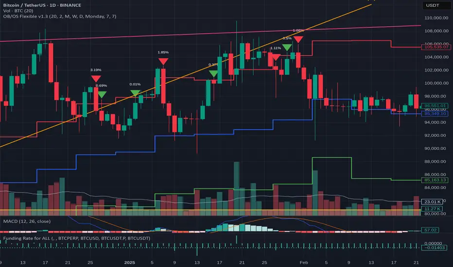
Stochastic Trend Signal with MTF FilterMulti-Timeframe Stochastic Trend Filter – Real Signals with Confirmation Candles
This script is a multi-timeframe Stochastic trend filter designed to help traders identify reliable BUY/SELL signals based on both momentum and higher-timeframe trend context.
It combines three key components:
Entry Signal Logic:
Entry is based on the Stochastic Oscillator (%K, 14,3), where overbought/oversold conditions are detected in the current chart's timeframe.
A green (bullish) candle following a red candle with %K below 20 can trigger a BUY signal.
A red (bearish) candle following a green candle with %K above 80 can trigger a SELL signal.
Trend Confirmation – Daily Filter:
The script uses Stochastic on the 1D (Daily) timeframe to determine whether short-term momentum aligns with a broader daily trend.
BUY signals are only allowed if the Daily %K is above 50.
SELL signals are only allowed if the Daily %K is below 50.
Long-Term Trend Filter – Weekly Stochastic:
A second filter uses Weekly %K:
BUY signals are suppressed if the Weekly trend is bearish (Weekly %K < 50) while Daily %K is bullish (> 50).
SELL signals are suppressed if the Weekly trend is bullish (Weekly %K > 50) while Daily %K is bearish (< 50).
🖼️ The chart background changes color to visually assist users:
Green background: bullish alignment on Daily and Weekly Stochastic.
Red background: bearish alignment.
Gray background: trend conflict (Daily and Weekly disagree).
✅ This script is ideal for swing traders or position traders who want to enter with confirmation while avoiding false signals during trend conflict zones.
🔔 Alerts are provided for BUY and SELL signals once all conditions are met.
How to use:
Apply on timeframe (4H recommended).
Add alerts for "BUY Alert" and "SELL Alert".
Use background color and plotted labels as entry filters.
Disclaimer: This is not financial advice. Always use proper risk management and test on demo accounts first.
Polaris Trend All-in-One📘 Polaris Trend Indicator: Trading Rules & Strategy
Guide
The Polaris Trend Indicator is designed to simplify trading decisions by identifying key entry
and exit signals without the need for excessive technical analysis. This system combines the
Polaris Trend with the Polaris Golden Wave and Market Bias tools to give you confidence
across multiple timeframes.
This guide outlines clear trading rules for two use cases:
● Swing Trading
● Long-Term Investing and Holding
⚡ Swing Trading Strategy
Swing trading can be challenging when the market direction is unclear. The Polaris Trend helps
traders stay on the right side of momentum with straightforward visual signals. This approach is
best used on the Daily or Weekly chart.
✅ Entry Criteria (Bullish Trades)
● A solid green column appears above the zero line.
● A green upward arrow confirms bullish momentum.
● Enter your trade immediately when the green column first appears.
● Hold the trade until a red column appears, signaling a shift in momentum.
🚫 Exit Criteria (Bullish Trades)
● The first appearance of a red column after a green run.
● Multiple green columns followed by a red column.
● Do not enter trades mid-trend; always enter on the first green flip.
***Recommended Swing Strategy
● When a new daily green column appears but the weekly columns are still red, stay
nimble. Enter your position when the Polaris Trend Indicator turns green and displays an
upward-pointing arrow.
● If the price pulls back to a higher low but a red daily column forms, sell 50% of your
position and move your stop loss to your original entry. Then, wait for the next daily
green column and arrow to reappear, this is your signal to reenter the 50% you exited.
● If the price continues to rise and the weekly columns also turn green, shift your focus
to the weekly chart. Ignore daily signals and hold the trade until the weekly column
turns red, which will be your cue to exit. The weekly green column is your confirmation of
a stronger uptrend and a potential longer hold.
🔻 Entry Criteria (Bearish Trades)
● A solid red column appears below the zero line.
● A red downward arrow confirms bearish momentum.
● Enter your short trade immediately when the red column first appears.
● Hold until a green column appears, indicating momentum has shifted.
🔁 Exit Criteria (Bearish Trades)
● The first green column that follows a red sequence.
● Same rule applies: enter only on the initial flip, not mid-trend.
Note: The first color flip is the most reliable entry point. Avoid entering positions
deep into a trend, wait for the clear signal from Polaris.
🧭 Long-Term Investing Strategy
This approach combines the Polaris Golden Wave, Polaris Trend, and Market Bias to help
long-term investors buy at deep value levels and scale into positions over time.
📉 Ideal Entry: Golden Zone + Polaris Trend Signal
● Use the Golden Wave to identify the monthly 0.618–0.826 retracement zone
(significant discount levels).
● When price enters the Golden Zone and the Polaris Trend shows a green column on
the Daily or Weekly, this is your optimal entry point.
● If the trend turns red inside the zone, consider trimming positions and re-entering on the
next bullish signal.
If price drops below the Golden Zone, the stock becomes even more undervalued,
wait for the next green Polaris Trend signal to enter.
💰 Secondary Entry: Market Bias Rebounds
● If you miss the Golden Zone entry or are dollar-cost averaging:
○ Use the Market Bias on a Weekly timeframe.
○ Wait for price to retrace into the Market Bias band after moving higher.
○ Look for a red Polaris Trend column, then wait for price to enter the Market
Bias band and once it enters, wait for Polaris Trend signal to flip back to green
for your entry. If the trend turns red inside the zone, consider trimming positions
and re-entering on the next bullish signal.
Think of the Market Bias like a lake and price like a skipping stone—you want to
buy when the stone comes down and touches the surface.
📊 Indicator Explanations
🔶 Golden Wave (Monthly Fibonacci Retracement Zones)
● Highlights key monthly retracement zones (0.618 to 0.826).
● Helps identify deep-value entries on longer timeframes.
● Visible across all chart timeframes for consistent macro reference.
🔴 Market Bias (Smoothed Heikin-Ashi Trend Filter)
● Measures trend direction and strength using smoothed Heikin-Ashi candles and
oscillation logic.
● Customizable smoothing, oscillator period, and timeframe inputs.
● Option to display trend signals in a separate pane with dynamic coloring.
This combined approach empowers traders to make high-quality decisions with clarity and
discipline. Whether you're entering short-term swings or building long-term positions, the
Polaris Trend system guides you with timely, data-driven signals.

Time Frame Color ClassifierTime Frame Colour Classifier
A professional Pine Script indicator that provides instant visual identification of trading sessions through intelligent colour-coded backgrounds.
Key Features
📅 Daily Session Colours
- Monday: Green | Tuesday: Blue | Wednesday: Yellow | Thursday: Red | Friday: Purple
📊 Weekly Classification
- Week 1-5 : Colour-coded by week of the month using the same colour scheme
## How It Works
Intraday Charts (1min-4H) : Shows daily colours - every candle on Monday displays green background, Tuesday shows blue, etc.
Daily/Weekly Charts : Switches to weekly colours - all days in Week 1 show green, Week 2 shows blue, etc.
Professional Applications
✅ Multi-Timeframe Analysis : Seamlessly switch between timeframes whilst maintaining visual context
✅ Session Recognition : Instantly identify which trading day you're analysing
✅ Pattern Analysis : Spot recurring patterns on specific days of the week
✅ Strategy Development : Incorporate temporal factors into trading strategies
✅ Performance Attribution : Correlate results with specific trading sessions
Customisation Options
- Toggle daily/weekly colours on/off
- Fully customisable colour schemes
- Adjustable background transparency
- Optional day labels
Technical Details
- Pine Script v5for optimal performance
- Automatic timeframe detection - no manual configuration required
- Minimal resource usage - won't slow down your charts
- Works on all chart types and timeframes
Perfect For
- Day traders switching between multiple timeframes
- Swing traders analysing weekly patterns
- Algorithmic strategy development
- Multi-timeframe market analysis
- Trading education and research
---
Developed by @wyckoffnawaf
Transform your chart analysis with visual timeframe clarity