VIX Contango OscillatorVIX Contango Oscillator as outlined in the following blog post
vixcontango.wordpress.com
By Daniel Xu
在腳本中搜尋"同花顺软件+美国+VIX+恐慌指数+行情代码"

VIX EMA/SMA divergence Here is a simple indicator that implements the idea in an article titled "The VIX is Very Predictable"
Read the indicator's script comments for the article location.
Published in tandem with this post
If you improve it please let me know.

VIX HeatmapVIX HeatMap
Instructions:
- To be used with the S&P500 index (ES, SPX, SPY, any S&P ETF) as that's the input from where the CBOE calculates and measures the VIX. Can also be used with the Dow Jones, Nasdaq, & Nasdaq100.
Description:
- Expected Implied Volatility regime simplified & visualized. Know if we are in a high, medium, or low volatility regime, instantly.
- Ranges from Hot to Cold: The hotter the heat-map, the higher the implied volatility and fear & vice versa.
- The VIX HeatMap, color-maps important VIX levels (7 in this case) in measuring volatility for day trading & swing trading.
Using the VIX HeatMap:
- A LOW level volatility environment: Represented by "cooler" colors (Blue & White) depicts that the level of volatility and fear is low. Percentage moves on the index level are going to be tame and less volatile more often than not. Low fear = low perceived risk.
- A MEDIUM level volatility environment: Represented by "warmer" colors (Green & Yellow) depicts that the markets are transitioning from a calmer period or from a more fearful period. Market volatility here will be higher and provide more volatile swings in price.
- A HIGH level volatility environment: Represented by "hotter" colors (Orange, Red, & Purple) depicts that the markets are very fearful at the moment and will have big swings in both directions. Historically, extreme VIX levels tend to coincide with bottoms but are in no way predictive of the exact timing as the volatile moves can continue for an extended period of time.
- Transitioning between the 7 VIX Zones: Each and every one of these specific VIX zone levels is important.
1. Extreme low: <16
2. Low: 16 to 20
3. Normal: 20 to 24
4. Medium: 24 to 28
5. Med-High: 28 to 32
6. High: 32 to 36
7. Extreme high: >36
- These VIX levels in particular measure volatility changes that have a major impact on switching between smaller time frames and measuring depths of a sell move and vice versa. Each level also behaves as its own support & resistance level in terms of taking a bit of effort to switch regimes, and aids in identifying and measuring the potential depth of pullbacks in bull markets and bounces in bear markets to reveal reversal points.
- Examples of VIX level supports depicted on the chart marked with arrows. From left to right:
1. March 10th: Markets jumped 2 volatility levels in 2 days. The fluctuations from blue to yellow to green where a sign that price action would reverse from the selloff.
2. March 28th: As soon as we move from green to the blue VIX level (<20), markets began to rally and only ended when the volatility level moved sub VIX 16 (white).
3. May 4th & 24th: Next we see the 2 dips where volatility levels went from blue to green (VIX > 20), marked bottoms and reversed higher.
4. June 1st: We see a change in VIX regime yet again into lower VIX level and markets rocket higher.
Knowing the current VIX regime is a very important tool and aid in trading, now easily visualized.

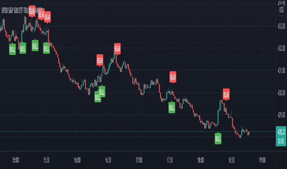
VIX Volatility Trend Analysis With Signals - Stocks OnlyVIX VOLATILITY TREND ANALYSIS CLOUD WITH BULLISH & BEARISH SIGNALS - STOCKS ONLY
This indicator is a visual aid that shows you the bullish or bearish trend of VIX market volatility so you can see the VIX trend without switching charts. When volatility goes up, most stocks go down and vice versa. When the cloud turns green, it is a bullish sign. When the cloud turns red, it is a bearish sign.
This indicator is meant for stocks with a lot of price action and volatility, so for best results, use it on charts that move similar to the S&P 500 or other similar charts.
This indicator uses real time data from the stock market overall, so it should only be used on stocks and will only give a few signals during after hours. It does work ok for crypto, but will not give signals when the US stock market is closed.
**HOW TO USE**
When the VIX Volatility Index trend changes direction, it will give a green or red line on the chart depending on which way the VIX is now trending. The cloud will also change color depending on which way the VIX is trending. Use this to determine overall market volatility and place trades in the direction that the indicator is showing. Do not use this by itself as sometimes markets won’t react perfectly to the overall market volatility. It should only be used as a secondary confirmation in your trading/trend analysis.
For more signals with earlier entries, go into settings and reduce the number. 10-100 is best for scalping. For less signals with later entries, change the number to a higher value. Use 100-500 for swing trades. Can go higher for long swing trades. Our favorite settings are 20, 60, 100, 500 and 1000.
***MARKETS***
This indicator should only be used on the US stock markets as signals are given based on the VIX volatility index which measures volatility of the US Stock Markets.
***TIMEFRAMES***
This indicator works on all time frames, but after hours will not change much at all due to the markets being closed.
**INVERSE CHARTS**
If you are using this on an inverse ETF and the signals are showing backwards, please comment with what chart it is and I will configure the indicator to give the correct signals. I have included over 50 inverse ETFs into the code to show the correct signals on inverse charts, but I'm sure there are some that I have missed so feel free to let me know and I will update the script with the requested tickers.
***TIPS***
Try using numerous indicators of ours on your chart so you can instantly see the bullish or bearish trend of multiple indicators in real time without having to analyze the data. Some of our favorites are our Auto Fibonacci, Directional Movement Index, Volume Profile with buy & sell pressure, Auto Support And Resistance, Vix Scalper and Money Flow Index in combination with this Vix Trend Analysis. They all have real time Bullish and Bearish labels as well so you can immediately understand each indicator's trend.

VIX Reversal Scalper by Trend Friend - Stocks OnlyVIX REVERSAL SCALPER BY TREND FRIEND - STOCKS ONLY
This indicator is built for scalping, but can be used for swing trades by adjusting the signal settings to a higher number.
This indicator is meant for stocks with a lot of price action and volatility, so for best results, use it on charts that move similar to the S&P 500 or other similar charts.
This indicator uses real time data from the stock market overall, so it should only be used on stocks and will only give a few signals during after hours. It does work ok for crypto, but will not give signals when the US stock market is closed.
**HOW TO USE**
When the VIX Volatility Index trend changes direction, it will give a bull or bear signal on the chart depending on which way the VIX is now trending. Follow these when price is near support/resistance or fibonacci levels.
For more signals with earlier entries, go into settings and reduce the number. 10-100 is best for scalping. For less signals with later entries, change the number to a higher value. Use 100-500 for swing trades. Can go higher for long swing trades.
***MARKETS***
This indicator should only be used on the US stock markets as signals are given based on the VIX volatility index which measures volatility of the US Stock Markets.
***TIMEFRAMES***
This indicator works on all time frames.
**NOTE**
Repainting does happen but it is seldom. If I get enough requests to remove repainting I will, but since it is built for early entries, preventing it from repainting will make the signals show up later than normal.
Due to various factors, this indicator might not give exit signals every time it should, so be sure to watch the price action for entries/exits and don't rely solely on this indicator.
**INVERSE CHARTS**
If you are using this on an inverse ETF and the signals are showing backwards, please comment with what chart it is and I will configure the indicator to give the correct signals. I have included over 50 inverse ETFs into the code to show the correct signals on inverse charts, but I'm sure there are some that I have missed so feel free to let me know and I will update the script with the requested tickers.
***TIPS***
Try using numerous indicators of ours on your chart so you can instantly see the bullish or bearish trend of multiple indicators in real time without having to analyze the data. Some of our favorites are our Auto Fibonacci, Directional Movement Index, Volume Profile, Auto Support And Resistance and Money Flow Index in combination with this Vix Reversal Scalper. They all have real time Bullish and Bearish labels as well so you can immediately understand each indicator's trend.
VIX Term Roll OscillatorMy implementtion of VIX term roll Oscillator according to the articles below
seekingalpha.com
vixcontango.wordpress.com
Hope it helps!
Daniel
VIX: Backwardation Vs ContangoVIX: Backwardation Vs Contango
Quickly visualize Contango vs Backwardation in the S&P 500 Volatility Index by plotting the prices of the futures contracts over the next 9 months
Note: indicator does not map to time axis in the same way as price; it simply plots the progression of contract months out into the future; left to right; so timeframe DOESN'T MATTER for this plot
TO UPDATE(every few months recommended): in REQUEST CONTRACTS section, delete old contracts (top) and add new ones (bottom). Then in PLOTTING section, Delete old contract labels (bottom); add new contract labels (top); adjust the X in 'bar_index-(X+_historical)' numbers accordingly
This is one of several similar indicators: Meats | Metals | Grains | VIX
Tips:
-Right click and reset chart if you can't see the plot; or if you have trouble with the scaling.
-Right click and pin to Scale A to plot on the same scale as price
--Added historical input: input days back in time; to see the historical shape of the Futures curve via selecting 'days back' snapshot
updated 15th June 2022
© twingall

VIX Contango 1VIX Contango 1 = 100* (VX2! - VX1!)/VX1!
Show when is VIX in contango or in backwardation. I compare the first two contracts.

VIX Fear Gauge (Inverse)Chris Moody did this VIX FIX and helped me inverse it so I could read it easier.. I love it and it works great

VIX Statistical Sentiment Index [Nasan]** THIS IS ONLY FOR US STOCK MARKET**
The indicator analyzes market sentiment by computing the Rate of Change (ROC) for the VIX and S&P 500, visualizing the data as histograms with conditional coloring. It measures the correlation between the VIX, the specific stock, and the S&P 500, displaying the results on the chart. The reliability measure combines these correlations, offering an overall assessment of data robustness. One can use this information to gauge the inverse relationship between VIX and S&P 500, the alignment of the specific stock with the market, and the overall reliability of the correlations for informed decision-making based on the inverse relationship of VIX and price movement.
**WHEN THE VIX ROC IS ABOVE ZERO (RED COLOR) AND RASING ONE CAN EXPECT THE PRICE TO MOVE DOWNWARDS, WHEN THE VIX ROC IS BELOW ZERO (GREEN)AND DECREASING ONE CAN EXPECT THE PRICE TO MOVE UPWARDS"
Understanding the VIX Concept:
The VIX, or Volatility Index, is a widely used indicator in finance that measures the market's expectation of volatility over the next 30 days. Here are key points about the VIX:
Fear Gauge:
Often referred to as the "fear gauge," the VIX tends to rise during periods of market uncertainty or fear and fall during calmer market conditions.
Inverse Relationship with Market:
The VIX typically has an inverse relationship with the stock market. When the stock market experiences a sell-off, the VIX tends to rise, indicating increased expected volatility.
Implied Volatility:
The VIX is derived from the prices of options on the S&P 500. It represents the market's expectations for future volatility and is often referred to as "implied volatility."
Contrarian Indicator:
Extremely high VIX levels may indicate oversold conditions, suggesting a potential market rebound. Conversely, very low VIX levels may signal complacency and a potential reversal.
VIX vs. SPX Correlation:
This correlation measures the strength and direction of the relationship between the VIX (Volatility Index) and the S&P 500 (SPX).
A negative correlation indicates an inverse relationship. When the VIX goes up, the SPX tends to go down, and vice versa.
The correlation value closer to -1 suggests a stronger inverse relationship between VIX and SPX.
Stock vs. SPX Correlation:
This correlation measures the strength and direction of the relationship between the closing price of the stock (retrieved using src1) and the S&P 500 (SPX).
This correlation helps assess how closely the stock's price movements align with the broader market represented by the S&P 500.
A positive correlation suggests that the stock tends to move in the same direction as the S&P 500, while a negative correlation indicates an opposite movement.
Reliability Measure:
Combines the squared values of the VIX vs. SPX and Stock vs. SPX correlations and takes the square root to create a reliability measure.
This measure provides an overall assessment of how reliable the correlation information is in guiding decision-making.
Interpretation:
A higher reliability measure implies that the correlations between VIX and SPX, as well as between the stock and SPX, are more robust and consistent.
One can use this reliability measure to gauge the confidence they can place in the correlations when making decisions about the specific stock based on VIX data and its correlation with the broader market.

VIX, ATR, and Volatility Indicatorhere what the indictor do !
The "VIX, ATR, and Volatility Indicator" combines the Volatility Index (VIX), Average True Range (ATR), and moving averages to provide insights into market volatility.
VIX (Volatility Index):
The VIX measures the expected volatility in the market over the next 30 days. A higher VIX value indicates increased market volatility, while a lower value suggests lower volatility.
ATR (Average True Range):
The ATR is a technical indicator that measures the average range between high and low prices over a specified period. It provides a sense of the market's volatility by considering price movements. Higher ATR values indicate greater volatility, while lower values indicate lower volatility.
Moving Averages:
The indicator calculates both an Exponential Moving Average (EMA) and Simple Moving Average (SMA) with a specific period (e.g., 50).
Moving averages smooth out price data to identify trends and potential areas of support or resistance.
Volatility Detection:
By comparing the current closing price to the EMA and SMA, the indicator determines if there is high volatility.
If the current closing price is higher than either the EMA or SMA, it indicates potential high volatility.
Visualization:
The VIX and ATR are typically plotted on the chart, providing a visual representation of market volatility and price range.
Additionally, markers or labels may be used to highlight periods of high volatility when the current price exceeds the moving averages.
what are the VIX and ATR
Volatility Index (VIX):
Monitor the VIX value from financial platforms or market data providers. A higher VIX value indicates increased market volatility, suggesting potential trading opportunities. Conversely, a lower VIX value indicates lower volatility, which may influence your trading strategy.
Average True Range (ATR):
Calculate the ATR manually or use charting platforms that provide ATR as an indicator.
Plot the ATR on your trading chart to visualize the range of price movements.
Determine suitable entry and exit points based on ATR values. For example, higher ATR values may indicate larger potential price swings, while lower ATR values may suggest a more stable market.
how it work
Fetching VIX Data:
The request.security function is used to fetch the daily VIX data from the "CBOE:VIX" symbol. It retrieves the closing price of the VIX for each day.
Calculating ATR:
The ta.atr function calculates the Average True Range (ATR) with a period of 14. ATR measures the average range between the high and low prices over the specified period, providing an indication of market volatility.
Calculating Moving Averages:
Two types of moving averages are calculated: Exponential Moving Average (EMA) and Simple Moving Average (SMA). Both moving averages are calculated using a period of 50, but you can adjust the period as needed.
The ta.ema function calculates the Exponential Moving Average, which places greater weight on recent prices.
The ta.sma function calculates the Simple Moving Average, which gives equal weight to all prices in the period.
Identifying High Volatility:
The indicator determines if there is high volatility by comparing the current closing price to both the EMA and SMA.
If the current closing price is higher than either the EMA or SMA, the isHighVolatility variable is set to true, indicating potential high volatility.
Plotting the Indicators:
The VIX and ATR are plotted using the plot function, assigning colors and line widths for visual differentiation.
The plotshape function is used to plot markers below the bars to indicate highly volatile periods. The isHighVolatility variable determines when the markers appear.

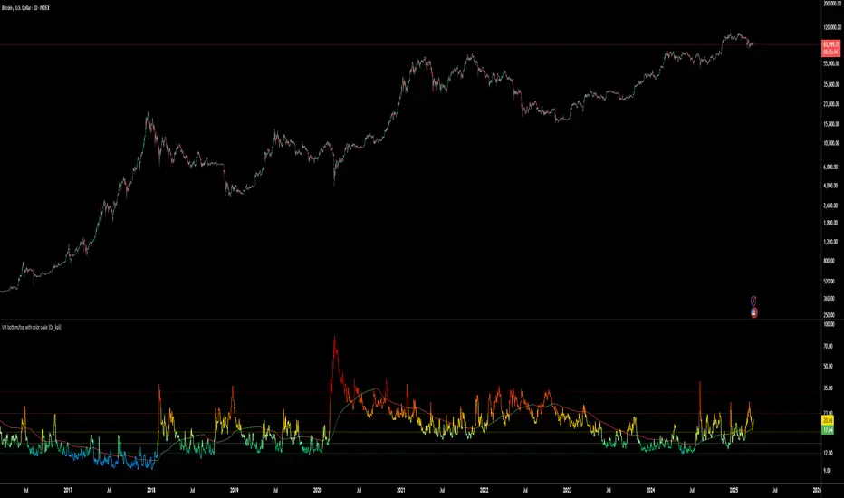
VIX bottom/top with color scale [Ox_kali]📊 Introduction
━━━━━━━━━━━━━━━━━━━━━━━━━━━━━━━━━━━━━━━━━━━
The “VIX Bottom/Top with Color Scale” script is designed to provide an intuitive, color-coded visualization of the VIX (Volatility Index), helping traders interpret market sentiment and volatility extremes in real time.
It segments the VIX into clear threshold zones, each associated with a specific market condition—ranging from fear to calm—using a dynamic color-coded system.
This script offers significant value for the following reasons:
Intuitive Risk Interpretation: Color-coded zones make it easy to interpret market sentiment at a glance.
Dynamic Trend Detection: A 200-period SMA of the VIX is plotted and dynamically colored based on trend direction.
Customization and Flexibility: All colors are editable in the parameters panel, grouped under “## Color parameters ##”.
Visual Clarity: Key thresholds are marked with horizontal lines for quick reference.
Practical Trading Tool: Helps identify high-risk and low-risk environments based on volatility levels.
🔍 Key Indicators
━━━━━━━━━━━━━━━━━━━━━━━━━━━━━━━━━━━━━━━━━━━
VIX (CBOE Volatility Index) : Measures market volatility and investor fear.
SMA 200 : Long-term trendline of the VIX, with color-coded direction (green = uptrend, red = downtrend).
Color-coded VIX Levels:
🔴 33+ → Something bad just happened
🟠 23–33 → Something bad is happening
🟡 17–23 → Something bad might happen
🟢 14–17 → Nothing bad is happening
✅ 12–14 → Nothing bad will ever happen
🔵 <12 → Something bad is going to happen
🧠 Originality and Purpose
━━━━━━━━━━━━━━━━━━━━━━━━━━━━━━━━━━━━━━━━━━━
Unlike traditional VIX indicators that only plot a line, this script enhances interpretation through visual segmentation and dynamic trend tracking.
It serves as a risk-awareness tool that transforms the VIX into a simple, emotional market map.
This is the first version of the script, and future updates may include alerts, background fills, and more advanced features.
⚙️ How It Works
━━━━━━━━━━━━━━━━━━━━━━━━━━━━━━━━━━━━━━━━━━━
The script maps the current VIX value to a range and applies the corresponding color.
It calculates a SMA 200 and colors it green or red depending on its slope.
It displays horizontal dotted lines at key thresholds (12, 14, 17, 23, 33).
All colors are configurable via input parameters under the group: "## Color parameters ##".
🧭 Indicator Visualization and Interpretation
━━━━━━━━━━━━━━━━━━━━━━━━━━━━━━━━━━━━━━━━━━━
The VIX line changes color based on market condition zones.
The SMA line shows long-term direction with dynamic color.
Horizontal threshold lines visually mark the transitions between volatility zones.
Ideal for quickly identifying periods of fear, caution, or stability.
🛠️ Script Parameters
━━━━━━━━━━━━━━━━━━━━━━━━━━━━━━━━━━━━━━━━━━━
Grouped under “## Color parameters ##”, the following elements are customizable:
🎨 VIX Zone Colors:
33+ → Red
23–33 → Orange
17–23 → Yellow
14–17 → Light Green
12–14 → Dark Green
<12 → Blue
📈 SMA Colors:
Uptrend → Green
Downtrend → Red
These settings allow users to match the script’s visuals to their preferred chart style or theme.
✅ Conclusion
━━━━━━━━━━━━━━━━━━━━━━━━━━━━━━━━━━━━━━━━━━━
The “VIX Bottom/Top with Color Scale” is a clean, powerful script designed to simplify how traders view volatility.
By combining long-term trend data with real-time color-coded sentiment analysis, this script becomes a go-to reference for managing risk, timing trades, or simply staying in tune with market mood.
🧪 Notes
━━━━━━━━━━━━━━━━━━━━━━━━━━━━━━━━━━━━━━━━━━━
This is version 1 of the script. More features such as alert conditions, background fill, and dashboard elements may be added soon. Feedback is welcome!
💡 Color code concept inspired by the original VIX interpretation chart by @nsquaredvalue on Twitter. Big thanks for the visual clarity! 💡
⚠️ Disclaimer
━━━━━━━━━━━━━━━━━━━━━━━━━━━━━━━━━━━━━━━━━━━
This script is a visual tool designed to assist in market analysis. It does not guarantee future performance and should be used in conjunction with proper risk management. Past performance is not indicative of future results.
VIX-Heatmap [CrossTrade]The "VIX-Heatmap" is a sophisticated and informative indicator designed for traders who want to integrate volatility analysis into their trading strategy, especially focusing on the market's fear gauge, the VIX (Volatility Index). This tool is not just about plotting numbers; it's about visualizing market sentiment in a more intuitive and impactful way.
Key Features and Customization Options:
1. Primary Functionality:
At its core, the VIX-Heatmap tracks the daily closing price of the VIX. It provides a clear, line-based visualization, with the line color set to black for stark contrast and easy visibility.
2. Segmented Volatility Levels:
The indicator allows users to set multiple VIX levels: Danger Zone (super low VIX level), and Levels 1 through 5. These levels are represented as horizontal lines on the chart, offering a structured view of different volatility thresholds.
3. Customizable Thresholds:
Traders can input their preferred values for each level, tailoring the indicator to fit their perception of market risk and volatility. This customization makes the tool versatile for different trading styles and market conditions.
4. Heatmap Visualization:
The chart's background color changes based on the VIX level, creating a "heatmap" effect. This visual representation allows traders to quickly gauge the current market sentiment. The color intensity varies from white (for extremely low VIX values) through various shades of red, increasing in intensity with higher VIX levels. This gradient provides an immediate visual cue of rising or falling market anxiety.
5. Interactive Display:
The indicator includes an interactive table display at the bottom center of the chart that shows the current VIX level in large, bold text, ensuring that it catches the trader's eye.
6. Optional Background Coloring:
Users have the option to enable or disable the heatmap feature. When enabled, the chart's background reflects the VIX level with the corresponding color, enhancing the visual impact of the data.
Applications and Benefits:
The VIX-Heatmap is ideal for traders who base their decisions not only on price movements but also on market sentiment and volatility. Its color-coded heatmap approach simplifies the interpretation of the VIX data, making it accessible even to those who may not be deeply familiar with volatility indices. By offering a quick visual summary of current market fear levels, it aids in making informed decisions, especially in times of market uncertainty.
In summary, the VIX-Heatmap transforms the traditional VIX data into an interactive, visually engaging, and easy-to-interpret format.

VIX Fix Double PleasureFULL README: github.com/samgozman/vix-fix-double-pleasure
The idea of an oscillator is quite simple. It is based on the popular VIX Fix oscillator, the purpose of which is to find local bottoms within the scope of trend movement. But in addition to the classic VIX fix, I built an oscillator opposite to it, which serves as a potential signal of the end of local growth.
Components
VIX Fix classic (red lines)
VIX Fix reversed (green lines)
Buy/sell signals (colored dots)
Parameters
VIXFix_length - defval: 22. Classic length for VIX fix
VIXFix_arraySize - defval: 22. The number of periods among which to look for lows and highs. If there are too many signals, reduce this value.
plotMarks - defval: true. Plot high/low marks
How it is calculated
VIX fix classic: (highest(close, VIXFix_length) - low) / highest(close, VIXFix_length) * -100
VIX fix reversed: (lowest(close, VIXFix_length) - high) / lowest(close, VIXFix_length) * -100
Signals
🟢 Buy signal if current "VIX fix classic" or "VIX Fix reversed" value is lowest from the last VIXFix_arraySize periods.
🔴 Sell signal if current "VIX fix classic" or "VIX Fix reversed" value is highest from the last VIXFix_arraySize periods.
General recommendations
I advise you not to use this oscillator for a short positions. Long only . It is recommended to set a long position by pyramiding.

Vix SpikeThis script calculates spikes Vix tops and bottoms. The Vix Market Bottom is calculated using CM_Williams_Vix_Fix Finds Market Bottoms (Chris Moody). The Vix Market Top is calculated as the inverse of CM Williams’ formula.
The highest Vix Bottom and the highest Vix Top are averaged (over the Highest Vix Lookback period).
Buys are signaled when the Vix Bottom line crosses below the Highest Vix Average.
Sells are signaled when the Vix Top line crosses below Highest Vix Average.
BINANCE:ETHUSDT 5 min
BYBIT:XRPUSD 5 min

VIX Monitor [Zero54]NSE:BANKNIFTY1!
This is a simple but invaluable tool for both day traders and positional traders. VIX is about market expectations of volatility
The VIX is a very good and sound measure of risk in the markets. It gives these stock traders who are in intraday trading and short term traders an idea of whether the volatility is going up or going down in the market. They can calibrate their strategy accordingly. When the volatility is likely to shoot up sharply, the intraday traders run the risk of stop losses getting triggered quickly. Hence they can either reduce their leverage or they can widen their stop losses accordingly.
Also if you notice VIX is a very good and reliable gauge of index movement. If you plot the VIX and the Nifty movement you will see a clear negative correlation in the charts itself. Markets typically tend to peak out when the VIX is bottoming out and the markets tend to bottom out when the VIX is peaking out. This is a useful input for index trades.
You can use this simple indicator to monitor VIX real time. You can use it for short time frame intraday and also multi-hour, multi-day charts. You can also plot a moving average to gauge the VIX trend.
Also is the ability to monitor, Nifty and BankNifty the same way you are able to monitor the VIX (as explained above). The overall market moves in correlation with these main Indexes. So if you are trading a specific counter, you can also keep an eye on the index to get an idea where the counter may be going next.
The source code is open, please feel to modify or re-use as you feel it’s necessary. Any changes, improvements, bugs, please let me know.
Please like/boost this indicator and also add your comments, if you find it useful.

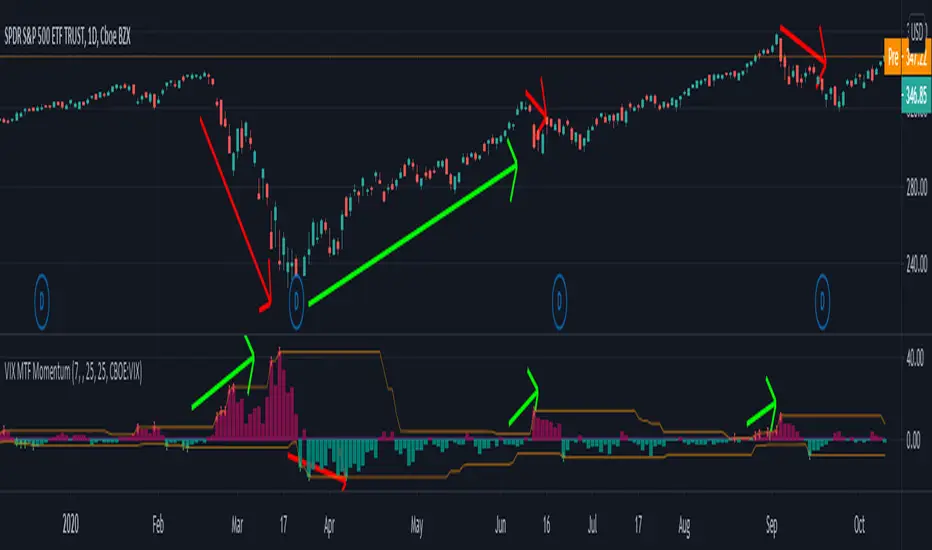
VIX MTF MomentumSweet little momentum gadget to track the VIX Index.
What is the VIX?
The CBOE S&P 500 Volatility Index (VIX) is known as the 'Fear Index' which can measure how worried traders are that the S&P 500 might suddenly drop within the next 30 days.
When the VIX starts moving higher, it is telling you that traders are getting nervous. When the VIX starts moving lower, it is telling you that traders are gaining confidence.
VIX calculation?
The Chicago Board of Options Exchange Market Volatility Index (VIX) is a measure of implied volatility (Of the S&P 500 securities options), based on the prices of a basket of S&P 500 Index options with 30 days to expiration.
How to use:
If VIX Momentum is above 0 (RED) traders are getting nervous.
If VIX Momentum is below 0 (GREEN) traders are gaining confidence.
Follow to get updates and new scripts: www.tradingview.com
VIX Bars [CrossTrade]In simple terms, this indicator colors your chart bars based on the VIX levels. We know that high volatility is unstainable and will naturally regress to a calmer market, therefore highlighting the bars where VIX is at extreme highs can sometimes indicate a market turning point. Consider pairing this indicator with my VIX Heatmap indicator for a complete picture of volatility.
Customizable VIX Levels: You can set your own thresholds for when the bars turn green or red. Green bars pop up when the VIX is above your set upper level (default is 30) - kind of like a heads-up that things might get bumpy. Red bars show up when the VIX dips below your lower threshold (default is 15), signaling calmer waters.
Optional Donchian Channel Filter: The Donchian Channel filter looks at the highest highs and lowest lows over your chosen period (default's 52 days) and only colors the bars if they match the filter's criteria. This adds an extra layer of confirmation that the colored bars at at a major high or low.
Visual Simplicity: The indicator keeps things visually straightforward. No cluttered screen, just colored bars telling you a story about market vibes. Alert come standard to signal those potential bottom or top bars based on the VIX being at your preferred extreme levels.
In essence, "VIX Bars" is like having a volatility radar on your chart. It doesn't make predictions, but it sure gives you a neat, color-coded heads-up on market sentiment. Great for adding an extra dimension to your analysis without getting all tangled up in complex indicators!

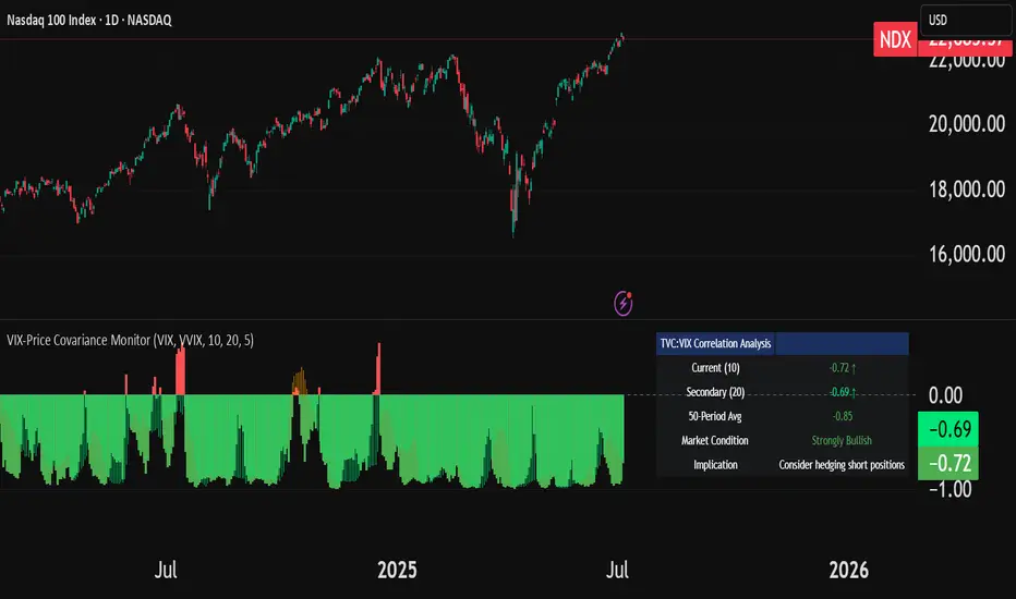
VIX-Price Covariance MonitorThe VIX-Price Covariance Monitor is a statistical tool that measures the evolving relationship between a security's price and volatility indices such as the VIX (or VVIX).
It can give indication of potential market reversal, as typically, volatility and the VIX increase before markets turn red,
This indicator calculates the Pearson correlation coefficient using the formula:
ρ(X,Y) = cov(X,Y) / (σₓ × σᵧ)
Where:
ρ is the correlation coefficient
cov(X,Y) is the covariance between price and the volatility index
σₓ and σᵧ are the standard deviations of price and the volatility index
Enjoy!
Features
Dual Correlation Periods: Analyze both short-term and long-term correlation trends simultaneously
Adaptive Color Coding: Correlation strength is visually represented through color intensity
Market Condition Assessment: Automatic interpretation of correlation values into actionable market insights
Leading/Lagging Analysis: Optional time-shift analysis to detect predictive relationships
Detailed Information Panel: Real-time statistics including current correlation values, historical averages, and trading implications
Interpretation
Positive Correlation (Red): Typically bearish for price, as rising VIX correlates with falling markets. This is what traders should be looking for.
Negative Correlation (Green): Typically bullish for price, as falling VIX correlates with rising markets
How to use it
Apply the indicator to any chart to see its correlation with the default VIX index
Adjust the correlation length to match your trading timeframe (shorter for day trading, longer for swing trading)
Enable the secondary correlation period to compare different timeframes simultaneously
For advanced analysis, enable the Leading/Lagging feature to detect if VIX changes precede or follow price movements
Use the information panel to quickly assess the current market condition and potential trading implications
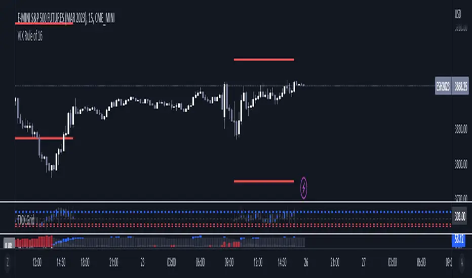
VIX Rule of 16There’s an interesting aspect of VIX that has to do with the number 16. (approximately the square root of the number of trading days in a year).
In any statistical model, 68.2% of price movement falls within one standard deviation (1 SD ). The rest falls into the “tails” outside of 1 SD .
When you divide any implied volatility (IV) reading (such as VIX ) by 16, the annualized number becomes a daily number
The essence of the “rule of 16.” Once you get it, you can do all sorts of tricks with it.
If the VIX is trading at 16, then one-third of the time, the market expects the S&P 500 Index (SPX) to trade up or down by more than 1% (because 16/16=1). A VIX at 32 suggests a move up or down of more than 2% a third of the time, and so on.
• VIX of 16 – 1/3 of the time the SPX will have a daily change of at least 1%
• VIX of 32 – 1/3 of the time the SPX will have a daily change of at least 2%
• VIX of 48 – 1/3 of the time the SPX will have a daily change of at least 3%
VIX reversion-Buschi
English:
A significant intraday reversion (commonly used: 3 points) on a high (over 20 points) S&P 500 Volatility Index (VIX) can be a sign of a market bottom, because there is the assumption that some of the "big guys" liquidated their options / insurances because the worst is over.
This indicator shows these reversions (3 points as default) when the VIX was over 20 points. The character "R" is then shown directly over the daily column, the VIX need not to be loaded explicitly.
Deutsch:
Eine deutliche Intraday-Umkehr (3 Punkte im Normalfall) bei einem hohen (über 20 Punkte) S&P 500 Volatility Index (VIX) kann ein Zeichen für eine Bodenbildung im Markt sein, weil möglicherweise einige "große Jungs" ihre Optionen / Versicherungen auflösen, weil das schlimmste vorbei ist.
Dieser Indikator zeigt diese Umkehr (Standardwert: 3 Punkte), wenn der VIX vorher über 20 Punkte lag. Der Buchstabe "R" wird dabei direkt über dem Tagesbalken angezeigt, wobei der VIX nicht explizit geladen werden muss.

VIX Implied MovesKey Features:
Three Timeframe Bands:
Daily: Blue bands showing ±1σ expected move
Weekly: Green bands showing ±1σ expected move
30-Day: Red bands showing ±1σ expected move
Calculation Methodology:
Uses VIX's annualized volatility converted to specific timeframes using square root of time rule
Trading day convention (252 days/year)
Band width = Price × (VIX/100) ÷ √(number of periods)
Visual Features:
Colored semi-transparent backgrounds between bands
Progressive line thickness (thinner for shorter timeframes)
Real-time updates as VIX and ES prices change
Example Calculation (VIX=20, ES=5000):
Daily move = 5000 × (20/100)/√252 ≈ ±63 points
Weekly move = 5000 × (20/100)/√50 ≈ ±141 points
Monthly move = 5000 × (20/100)/√21 ≈ ±218 points
This indicator helps visualize expected price ranges based on current volatility conditions, with wider bands indicating higher market uncertainty. The probabilistic ranges represent 68% confidence levels (1 standard deviation) derived from options pricing.

VIX Term StructureThis script allows users to visualize the state of the VIX Futures Term Structure. The user is able to select from five CBOE VIX Indices; VIX, VIX9D, VIX3M, VIX6M, and VIX1Y and the script will color the candles based on the price relationship between selected indices. Visit the CBOE website for more info on how the various VIX indices are calculated.
