Quadratic & Linear Time Series Regression [SS]Hey everyone,
Releasing the Quadratic/Linear Time Series regression indicator.
About the indicator:
Most of you will be familiar with the conventional linear regression trend boxes (see below):
This is an awesome feature in Tradingview and there are quite a few indicators that follow this same principle.
However, because of the exponential and cyclical nature of stocks, linear regression tends to not be the best fit for stock time series data. From my experience, stocks tend to fit better with quadratic (or curvlinear) regression, which there really isn't a lot of resources for.
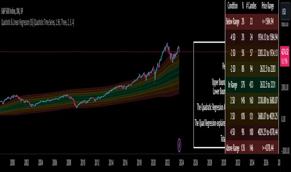
To put it into perspective, let's take SPX on the 1 month timeframe and plot a linear regression trend from 1930 till now:
You can see that its not really a great fit because of the exponential growth that SPX has endured since the 1930s. However, if we take a quadratic approach to the time series data, this is what we get:
This is a quadratic time series version, extended by up to 3 standard deviations. You can see that it is a bit more fitting.
Quadratic regression can also be helpful for looking at cycle patterns. For example, if we wanted to plot out how the S&P has performed from its COVID crash till now, this is how it would look using a linear regression approach:
But this is how it would look using the quadratic approach:
So which is better?
Both linear regression and quadratic regression are pivotal and important tools for traders. Sometimes, linear regression is more appropriate and others quadratic regression is more appropriate.
In general, if you are long dating your analysis and you want to see the trajectory of a ticker further back (over the course of say, 10 or 15 years), quadratic regression is likely going to be better for most stocks.
If you are looking for short term trades and short term trend assessments, linear regression is going to be the most appropriate.
The indicator will do both and it will fit the linear regression model to the data, which is different from other linreg indicators. Most will only find the start of the strongest trend and draw from there, this will fit the model to whatever period of time you wish, it just may not be that significant.
But, to keep it easy, the indicator will actually tell you which model will work better for the data you are selecting. You can see it in the example in the main chart, and here:
Here we see that the indicator indicates a better fit on the quadratic model.
And SPY during its recent uptrend:
For that, let's take a look at the Quadratic Vs the Linear, to see how they compare:
Quadratic:
Linear:
Functions:
You will see that you have 2 optional tables. The statistics table which shows you:
The R Squared to assess for Variance.
The Correlation to assess for the strength of the trend.
The Confidence interval which is set at a default of 1.96 but can be toggled to adjust for the confidence reading in the settings menu. (The confidence interval gives us a range of values that is likely to contain the true value of the coefficient with a certain level of confidence).
The strongest relationship (quadratic or linear).
Then there is the range table, which shows you the anticipated price ranges based on the distance in standard deviations from the mean.
The range table will also display to you how often a ticker has spent in each corresponding range, whether that be within the anticipated range, within 1 SD, 2 SD or 3 SD.
You can select up to 3 additional standard deviations to plot on the chart and you can manually select the 3 standard deviations you want to plot. Whether that be 1, 2, 3, or 1.5, 2.5 or 3.5, or any combination, you just enter the standard deviations in the settings menu and the indicator will adjust the price targets and plotted bands according to your preferences. It will also count the amount of time the ticker spent in that range based on your own selected standard deviation inputs.
Tips on Use:
This works best on the larger timeframes (1 hour and up), with RTH enabled.
The max lookback is 5,000 candles.
If you want to ascertain a longer term trend (over years to months), its best to adjust your chart timeframe to the weekly and/or monthly perspective.
And that's the indicator! Hopefully you all find it helpful.
Let me know your questions and suggestions below!
Safe trades to all!
在腳本中搜尋"文华财经tick价格"
Statistical Package for the Trading Sciences [SS]
This is SPTS.
It stands for Statistical Package for the Trading Sciences.
Its a play on SPSS (Statistical Package for the Social Sciences) by IBM (software that, prior to Pinescript, I would use on a daily basis for trading).
Let's preface this indicator first:
This isn't so much an indicator as it is a project. A passion project really.
This has been in the works for months and I still feel like its incomplete. But the plan here is to continue to add functionality to it and actually have the Pinecoding and Tradingview community contribute to it.
As a math based trader, I relied on Excel, SPSS and R constantly to plan my trades. Since learning a functional amount of Pinescript and coding a lot of what I do and what I relied on SPSS, Excel and R for, I use it perhaps maybe a few times a week.
This indicator, or package, has some of the key things I used Excel and SPSS for on a daily and weekly basis. This also adds a lot of, I would say, fairly complex math functionality to Pinescript. Because this is adding functionality not necessarily native to Pinescript, I have placed most, if not all, of the functionality into actual exportable functions. I have also set it up as a kind of library, with explanations and tips on how other coders can take these functions and implement them into other scripts.
The hope here is that other coders will take it, build upon it, improve it and hopefully share additional functionality that can be added into this package. Hence why I call it a project. Okay, let's get into an overview:
Current Functions of SPTS:
SPTS currently has the following functionality (further explanations will be offered below):
Ability to Perform a One-Tailed, Two-Tailed and Paired Sample T-Test, with corresponding P value.
Standard Pearson Correlation (with functionality to be able to calculate the Pearson Correlation between 2 arrays).
Quadratic (or Curvlinear) correlation assessments.
R squared Assessments.
Standard Linear Regression.
Multiple Regression of 2 independent variables.
Tests of Normality (with Kurtosis and Skewness) and recognition of up to 7 Different Distributions.
ARIMA Modeller (Sort of, more details below)
Okay, so let's go over each of them!
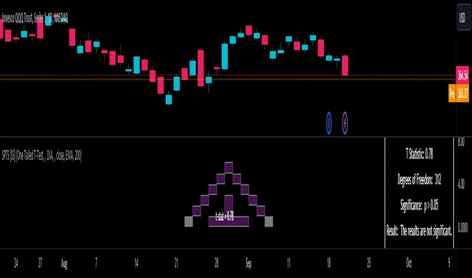
T-Tests
So traditionally, most correlation assessments on Pinescript are done with a generic Pearson Correlation using the "ta.correlation" argument. However, this is not always the best test to be used for correlations and determine effects. One approach to correlation assessments used frequently in economics is the T-Test assessment.
The t-test is a statistical hypothesis test used to determine if there is a significant difference between the means of two groups. It assesses whether the sample means are likely to have come from populations with the same mean. The test produces a t-statistic, which is then compared to a critical value from the t-distribution to determine statistical significance. Lower p-values indicate stronger evidence against the null hypothesis of equal means.
A significant t-test result, indicating the rejection of the null hypothesis, suggests that there is statistical evidence to support that there is a significant difference between the means of the two groups being compared. In practical terms, it means that the observed difference in sample means is unlikely to have occurred by random chance alone. Researchers typically interpret this as evidence that there is a real, meaningful difference between the groups being studied.
Some uses of the T-Test in finance include:
Risk Assessment: The t-test can be used to compare the risk profiles of different financial assets or portfolios. It helps investors assess whether the differences in returns or volatility are statistically significant.
Pairs Trading: Traders often apply the t-test when engaging in pairs trading, a strategy that involves trading two correlated securities. It helps determine when the price spread between the two assets is statistically significant and may revert to the mean.
Volatility Analysis: Traders and risk managers use t-tests to compare the volatility of different assets or portfolios, assessing whether one is significantly more or less volatile than another.
Market Efficiency Tests: Financial researchers use t-tests to test the Efficient Market Hypothesis by assessing whether stock price movements follow a random walk or if there are statistically significant deviations from it.
Value at Risk (VaR) Calculation: Risk managers use t-tests to calculate VaR, a measure of potential losses in a portfolio. It helps assess whether a portfolio's value is likely to fall below a certain threshold.
There are many other applications, but these are a few of the highlights. SPTS permits 3 different types of T-Test analyses, these being the One Tailed T-Test (if you want to test a single direction), two tailed T-Test (if you are unsure of which direction is significant) and a paired sample t-test.
Which T is the Right T?
Generally, a one-tailed t-test is used to determine if a sample mean is significantly greater than or less than a specified population mean, whereas a two-tailed t-test assesses if the sample mean is significantly different (either greater or less) from the population mean. In contrast, a paired sample t-test compares two sets of paired observations (e.g., before and after treatment) to assess if there's a significant difference in their means, typically used when the data points in each pair are related or dependent.
So which do you use? Well, it depends on what you want to know. As a general rule a one tailed t-test is sufficient and will help you pinpoint directionality of the relationship (that one ticker or economic indicator has a significant affect on another in a linear way).
A two tailed is more broad and looks for significance in either direction.
A paired sample t-test usually looks at identical groups to see if one group has a statistically different outcome. This is usually used in clinical trials to compare treatment interventions in identical groups. It's use in finance is somewhat limited, but it is invaluable when you want to compare equities that track the same thing (for example SPX vs SPY vs ES1!) or you want to test a hypothesis about an index and a leveraged share (for example, the relationship between FNGU and, say, MSFT or NVDA).
Statistical Significance
In general, with a t-test you would need to reference a T-Table to determine the statistical significance of the degree of Freedom and the T-Statistic.
However, because I wanted Pinescript to full fledge replace SPSS and Excel, I went ahead and threw the T-Table into an array, so that Pinescript can make the determination itself of the actual P value for a t-test, no cross referencing required :-).
Left tail (Significant):
Both tails (Significant):
Distributed throughout (insignificant):
As you can see in the images above, the t-test will also display a bell-curve analysis of where the significance falls (left tail, both tails or insignificant, distributed throughout).
That said, I have not included this function for the paired sample t-test because that is a bit more nuanced. But for the one and two tailed assessments, the indicator will provide you the P value.
Pearson Correlation Assessment
I don't think I need to go into too much detail on this one.
I have put in functionality to quickly calculate the Pearson Correlation of two array's, which is not currently possible with the "ta.correlation" function.
Quadratic (Curvlinear) Correlation
Not everything in life is linear, sometimes things are curved!
The Pearson Correlation is great for linear assessments, but tends to under-estimate the degree of the relationship in curved relationships. There currently is no native function to t-test for quadratic/curvlinear relationships, so I went ahead and created one.
You can see an example of how Quadratic and Pearson Correlations vary when you look at CME_MINI:ES1! against AMEX:DIA for the past 10 ish months:
Pearson Correlation:
Quadratic Correlation:
One or the other is not always the best, so it is important to check both!
R-Squared Assessments:
The R-squared value, or the square of the Pearson correlation coefficient (r), is used to measure the proportion of variance in one variable that can be explained by the linear relationship with another variable. It represents the goodness-of-fit of a linear regression model with a single predictor variable.
R-Squared is offered in 3 separate forms within this indicator. First, there is the generic R squared which is taking the square root of a Pearson Correlation assessment to assess the variance.
The next is the R-Squared which is calculated from an actual linear regression model done within the indicator.
The first is the R-Squared which is calculated from a multiple regression model done within the indicator.
Regardless of which R-Squared value you are using, the meaning is the same. R-Square assesses the variance between the variables under assessment and can offer an insight into the goodness of fit and the ability of the model to account for the degree of variance.
Here is the R Squared assessment of the SPX against the US Money Supply:
Standard Linear Regression
The indicator contains the ability to do a standard linear regression model. You can convert one ticker or economic indicator into a stock, ticker or other economic indicator. The indicator will provide you with all of the expected information from a linear regression model, including the coefficients, intercept, error assessments, correlation and R2 value.
Here is AAPL and MSFT as an example:
Multiple Regression
Oh man, this was something I really wanted in Pinescript, and now we have it!
I have created a function for multiple regression, which, if you export the function, will permit you to perform multiple regression on any variables available in Pinescript!
Using this functionality in the indicator, you will need to select 2, dependent variables and a single independent variable.
Here is an example of multiple regression for NASDAQ:AAPL using NASDAQ:MSFT and NASDAQ:NVDA :
And an example of SPX using the US Money Supply (M2) and AMEX:GLD :
Tests of Normality:
Many indicators perform a lot of functions on the assumption of normality, yet there are no indicators that actually test that assumption!
So, I have inputted a function to assess for normality. It uses the Kurtosis and Skewness to determine up to 7 different distribution types and it will explain the implication of the distribution. Here is an example of SP:SPX on the Monthly Perspective since 2010:
And NYSE:BA since the 60s:
And NVDA since 2015:
ARIMA Modeller
Okay, so let me disclose, this isn't a full fledge ARIMA modeller. I took some shortcuts.
True ARIMA modelling would involve decomposing the seasonality from the trend. I omitted this step for simplicity sake. Instead, you can select between using an EMA or SMA based approach, and it will perform an autogressive type analysis on the EMA or SMA.
I have tested it on lookback with results provided by SPSS and this actually works better than SPSS' ARIMA function. So I am actually kind of impressed.
You will need to input your parameters for the ARIMA model, I usually would do a 14, 21 and 50 day EMA of the close price, and it will forecast out that range over the length of the EMA.
So for example, if you select the EMA 50 on the daily, it will plot out the forecast for the next 50 days based on an autoregressive model created on the EMA 50. Here is how it looks on AMEX:SPY :
You can also elect to plot the upper and lower confidence bands:
Closing Remarks
So that is the indicator/package.
I do hope to continue expanding its functionality, but as of now, it does already have quite a lot of functionality.
I really hope you enjoy it and find it helpful. This. Has. Taken. AGES! No joke. Between referencing my old statistics textbooks, trying to remember how to calculate some of these things, and wanting to throw my computer against the wall because of errors in the code, this was a task, that's for sure. So I really hope you find some usefulness in it all and enjoy the ability to be able to do functions that previously could really only be done in external software.
As always, leave your comments, suggestions and feedback below!
Take care!
Cumulative Distribution of a Dataset [SS]This is the Cumulative Distribution of a Dataset indicator that also calculates the Kurtosis and Skewness for a selected dataset and determines the normality and distribution type.
What it does, in pragmatic terms?
In the most simplest terms, it calculates the cumulative distribution function (or CDF) of user-defined dataset.
The cumulative distribution function (CDF) is a concept used in statistics and probability to describe how the probability of a random variable taking on a certain value or less is distributed across the entire range of possible values. In simpler terms, you can conceptualize the CDF as this:
Imagine you have a list of data, such as test scores of students in a class. The CDF helps you answer questions like, "What's the probability that a randomly chosen student scored 80 or less on the test?"
Or in our case, say we are in a strong up or downtrend on a stock. The CDF can help us answer questions like "Based on this current xyz trend, what is the probability that a ticker will fall above X price or below Y price".
Within the indicator, you can manually assess a price of interest. Let's say, for NVDA, we want to know the probability NVDA goes above or below $450. We can enter $450 into the indicator and get this result:
Other functions:
Kurtosis and Skewness Functions:
In addition to calculating and plotting the CDF, we can also plot the kurtosis & Skewness.
This can help you look for outlier periods where the distribution of your dataset changed. It can potentially alert you to when a stock is behaving abnormally and when it is more stable and evenly distributed.
Tests of normality
The indicator will use the kurtosis and skewness to determine the normality of the dataset. The indicator is programmed to recognize up to 7 different distribution types and alert you to them and the implications they have in your overall assessment.
e.g. #1 AMC during short squeeze:
e.g. #2: BA during the COVID crash:
Plotting the standardized Z-Score of the Distribution Dataset
You can also standardize the dataset by converting it into Z-Score format:
Plot the raw, CDF results
Two values are plotting, the green and the red. The green represents the probability of a ticker going higher than the current value. The red represents the probability of a ticker going lower than the current value.
Limitations
There are some limitations of the indicator which I think are important to point out. They are:
The indicator cannot tell you timelines, it can only tell you the general probability that data within the dataset will fall above or below a certain value.
The indicator cannot take into account projected periods of consolidation. It is possible a ticker can remain in a consolidation phase for a very long time. This would have the effect of stabilizing the probability in one direction (if there was a lot of downside room, it can normalize the data out so that the extent of the downside probability is mitigated). Thus, its important to use judgement and other methods to assess the likelihood that a stock will pullback or continue up, based on the overall probability.
The indicator is only looking at an individual dataset.
Using this indicator, you have to omit a large amount of data and look at solely a confined dataset. In a way, this actually improves the accuracy, but can also be misleading, depending on the size and strength of the dataset being chosen. It is important to balance your choice of dataset time with such things as:
a) The strength of the uptrend or downtrend.
b) The length of the uptrend or downtrend.
c) The overall performance of the stock leading into the dataset time period
And that is the indicator in a nutshell.
Hopefully you find it helpful and interesting. Feel free to leave questions, comments and suggestions below.
Safe trades everyone and take care!

Momentum Probability Oscillator [SS]This is the momentum based probability indicator.
What it does?
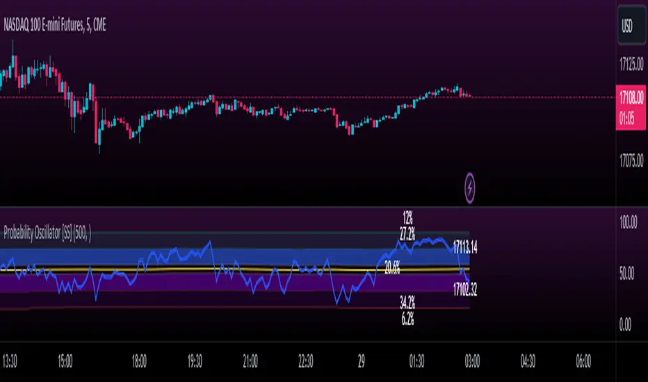
This takes the average of MFI, Stochastics and RSI and plots it out as an independent oscillator.
It then tracks bullish vs bearish instances. Bullish is defined as a greater move from open to high than open to low and inverse for bearish.
It stores this data and these averages and plots these levels as a graph.
The graph depicts the max bullish values at the top, the min bearish values at the bottom and the averages in between:
It will plot the average "threshold" value in yellow:
The threshold value is key. A ticker trading above the threshold is generally bullish. Below is bearish.
The threshold value frequently acts as support and resistance levels (see below):
Resistance:
Support:
The indicator also shows you the amount of time a ticker has spent in each region, over a defined lookback period (defaulted to 500):
When you see that cumulatively, more time has been spent in a bullish range or a bearish range, it can help you ascertain the prevailing sentiment at that time.
The indicator will also calculate the average price range based on the underlying oscillator value. It does this through use of ATR based techniques, as its not usually possible to calculate a price from an oscillator:
This is intended as a general reference and not a precise target, as it is using ATR as opposed to the actual technical value itself.
As this is an oscillator, you can use it to look for divergences as well. The advantage to having it formulated in this way is:
a) You get the power of all 3 indicators (stochastics, MFI and RSI) in one and
b) You are adding context to the underlying technical reading. The indicator is plotting out the average, max and min ranges for the selected ticker and performing assessments based on these ranges that add context to the current PA.
You also have the ability to see the specific technical levels associated with each specific technical indicator. If you open up the settings menu and select "Show Table", this will appear:
This will show you the exact values of each of the technicals the indicator is using in its range assessment.
And that is basically the bulk of the indicator!
I use this predominately on the smaller timeframes, especially when there is a lot of chop, to ascertain the overall sentiment.
I also will reference it on the 1 hour to see what the prevailing sentiment is and whether the stock is at an area of technical resistance or support. For example, here is what I referenced on SPY today:
QUICK NOTE:
It works best with RTH (regular trading hours) turned on and ETH (extended trading hours) turned off!
That's it!
Hopefully you like it and leave your comments and suggestions below!
MTF Evolving Weighted Composite Value Area🧾 Description:
This indicator calculates evolving value areas across 3 different timeframes/periods and combines them into one composite, multi-timeframe evolving value area - with each of the underlying timeframes' VAs assigned their own weighting/importance in the final calculation. Layered with extra smoothing options, this creates an informative and useful 'rolling value area' effect that can give you a better perspective on the value area across multiple periods at once as it develops - without total calculation resets at the onset of every new period.
Let's start with a simplified primer on value areas and then jump in to the new ideas this indicator introduces.
🤔 What is a value area?
Value areas are a tool used in market profile analysis to determine the range of prices that represents where most trading activity occurred during a specific time period, typically within a single 'bar' of a certain higher timeframe, such as the 4-hour, daily, or weekly. It helps traders understand the levels where the market finds value.
To calculate the value area, we look at the distribution of prices and trading volume. We determine a percentage, usually 70% or 80%, that represents the significant portion of trading volume. Then, we identify the price range that contains this percentage of trading volume, which becomes the value area.
Value areas are useful because they provide insights into market dynamics and potential support and resistance levels. They show where traders have been most active and where they find value, and traders can use this information to make better-informed decisions.
For example, if price is trading within the value area, it suggests that it's within a range where traders see value and are actively participating, which could indicate a balanced market. If the price moves above or below the value area, it may signal a potential shift in market sentiment or a breakout/breakdown from the established range.
By understanding the value area, traders can identify potential areas of supply and demand, determine levels of interest for buyers and sellers, and make decisions based on the market's perception of value.
📑 Limitations of traditional value areas
Static representation: Value areas are usually represented as static zones calculated after the fact. For example, after a daily period is completed, a typical 1D VA indicator will display the value area for the past period with static horizontal lines. This approach doesn't give you the power to see how the value area evolved, or developed, during the time period, as it is only displayed retroactively. It also doesn't give you the ability to view it as it evolves in real-time. This is why we chose to use an evolving value area representation, specifically borrowed from @sourcey's Value Area POC/VAH/VAL script function for calculating evolving VAs.
Rollover resets - no memory of past periods!: The traditional value area is calculated over a static period - it is calculated from the beginning of the period, for example a 1 day period, to the end, and that's the end of it. When the next daily period begins, the calculation resets, and has no memory of the preceding period. This limits the usefulness of the value area visual when viewed near the beginning of a new period before price and volume have been given ample time to define an area.
Hard to absorb all of that information: Value areas aren't generally meant to be a hardline representation of something extremely exact - they're based on a percentage of the area where traders appeared to find value over a certain time period. Most traders use them as a guide for support and resistance levels or finding an expected range. Traders typically overlay multiple VAs - sometimes requiring several instances of the same indicator to be applied - to represent the VA across multiple timeframes such as the 4H, 1D, or 1W. The chart quickly gets cluttered and it's not necessarily easy to understand the relationship between these multiple periods' VAs at a glance.
🧪 New concepts introduced in this indicator
With the evolving weighted composite value area we tried to address these limitations, and we think the result can be useful and intuitive for traders who want more dynamic and practical VAs for their everyday technical analysis.
⚖️ 1. A composite, weighted multi-timeframe VA
This indicator's value areas represent a combination or composite of the value areas calculated across multiple timeframes. The VAs calculated across each timeframe are then given a weighting percentage, which determines their contribution to the final 'weighted composite value area'.
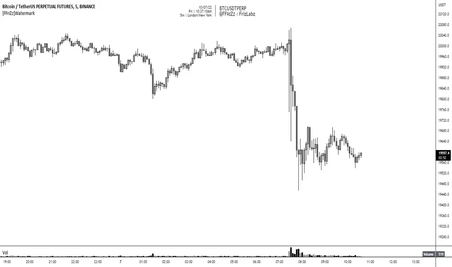
Pictured below: a 4H/1D/1W MTF evolving weighted composite VA on the BTCUSDT Perpetual Futures (Binance) 5 minute chart:
Traditionally, when traders wanted to get a view of where the majority of trading activity occurred over the past four hours, day, and week, they would need to apply three value area indicators (or sometimes one if it allows multiple custom timeframes), each set to a different period (4H, 1D, 1W). The chart gets cluttered quickly and the information is hard to absorb in one shot. Addressing this problem was the main impetus for creating this weighted composite process.
〰️ 2. Rolling and smoothed evolving VAs
Because the composite VA is calculated based on multiple period VAs, there is no one single point where the area calculation resets (unless all 3 selected timeframes happen to rollover on the same bar). This creates a 'rolling' effect that gives a sense of the progression of the VA as price transitions through the different underlying time periods, without the traditional 'jump' in calculations between periods.
Pictured below: a 1D/1W/1M MTF evolving weighted composite VA on the NQ futures 1H chart:
To help give even more of a sense of perspective and 'progression' of the VA, there are also smoothing options to even out the 'jumps' at period-rollover points.
✔️ What's it good for?
Smoothed, rolling, and evolving multi-timeframe VAs that give you a better real-time perspective of where traders are finding value across multiple time periods at once.
📎 References
1. @sourcey's Value Area POC/VAH/VAL script by adapting its f_poc(tf) function.
💠 Features:
A MTF evolving weighted composite value area based on 3 underlying VAs calculated across customizable timeframes
Aesthetic and flexible coloring and color theme styling options
Period-roller labels and options for ease-of-use and legibility
⚙️ Settings:
Calculation Decimal Resolution: This setting essentially determines how 'granular' the value area calculating process is. This value should be set to some multiple of the tick size/smallest decimal of the symbol's price chart. Eg. On BTCUSDT, the tick size/decimal is usually 0.1. So, you might use 0.5. On TSLA, the tick size is 0.01. You might use 0.05 or 0.25. Beware: if the resolution is too small, calculation will take too long and the script may timeout.
Show Me Suggested Resolutions: If enabled, a label will display in the bottom right of the chart with some suggested resolutions for the current chart.
Area Percentage: Set the displayed percentage of the calculated composite value area. Igor method = 70%; Daniel method: 68%.
Use a Color Theme: When this setting is enabled, all manual 'Bullish and Bearish Colors' are overridden. All plots will use the colors from your selected Color Theme - excepting those plots set to use the 'Single Color' coloring method.
Color Theme: When 'Use a Color Theme' is enabled, this setting allows you to select the color theme you wish to use.
Resistance Color: When 'Use a Color Theme' is disabled, this will set the 'resistance color' for the composite VA.
Support Color: When 'Use a Color Theme' is disabled, this will set the 'support color' for the composite VA.
Show Period Rollover Labels: When enabled, a label will show above or below the composite VA marking any underlying period rollovers with the label 'New __' (eg. 'New 4H', 'New 1D', 'New 1W').
Size: Sets the font size of the period rollover labels.
Show Period Rollover Lines: When enabled, a translucent vertical dashed line will be drawn across the composite VA when one of the underlying periods rolls over.
Fill Composite Value Area: When enabled, the composite VA will be filled with a gradient coloring from the support line to the resistance line using their respective colors.
Smooth: When enabled, a smoothing moving average will be applied to the composite value area.
Smoothing Period: Set the lookback period for the smoothing average.
Smoothing Type: Set the calculation type for the smoothing average. Options include: Exponential, Simple, Weighted, Volume-Weighted, and Hull.
Enable: Include/exclude a timeframe's VA in the composite VA calculation.
Timeframe: Set the timeframe for this specific underlying VA.
Weighting %: Set the weighting percentage or 'importance' of this timeframe's value area in calculating the composite VA. Beware! The sum of the weighting percentages across all enabled timeframes must ALWAYS add up to 100 in order for this indicator to work as designed.

Real Dominance//Due to incompliance with TV rules, I re-publish this indicator once again. Hope this time it's complaint.
Indicator shows dominance of main coin (BTC by default) after deduction of all stablecoins marketcaps and compares it to dominance that provides TradingView (BTC.D by default). The reason of writing this indicator is to deduct all stablecoins' caps from bitcoin dominance and show dominance without impact of other stablecoins. It means, that if crypto cap equals to, let's say 100, stablecoins' cap will be part of it (something between 10 and 20), but generally stablecoins are not crypto and it's caps are generally not limited, so we can't clearly see what is real dominance of BTC in compare with altcoins.
Notes:
1. dominance for timeframes lower than 1D could be calculated only on tariffs Pro+ or Premium (TV limitation)
2. you may change any and all tickers in indicator's setup menu
3. at the moment of publication (03.06.2023), TV doesn't offer market cap tickers for all stablecoins. Therefore in case it will be added in the future you may add it in the setup menu. There are placeholders for stablecoins that has market cap in amount of more than 5mil USD as of today.
Индикатор показывает доминацию главной монеты (по умолчанию BTC) за вычетом доли всех стейблкоинов в сравнении к доминации, которую показывает TradingView (по умолчанию BTC.D). Причиной написания данного индикатора является необходимость вычесть влияние стейблов на доминацию, так как важно смотреть доминацию именно в сравнении BTC/altcoins, и не учитывать стейблкойны, объем которых по большому счету не ограничен.
Особенности работы:
1. на тарифах кроме Pro+ и Premium, доминация может быть рассчитана только на дневном таймфрейме и выше (ограничения TradingView).
2. все тикеры, включая главную и сравниваемую монеты можно менять по желанию в настройках. Стиль линий настраивается на соответствующей вкладке в настройках.
3. к сожалению, на момент публикации индикатора (03.06.2023), TradingView предоставляет данные капитализации для ограниченного количества стейблкойнов. В настройки добавлены заглушки для последующего добавления других стейблкойнов. В список внесены монеты, капитализация которых на момент публикации индикатора составляла более 5 млн долларов.

Annualized Spot-Future DifferenceThe "Annualized Spot-Future Difference" indicator (ASFD) compares the closing prices of a futures contract and its underlying spot asset. It calculates the price difference between the two instruments and annualizes this difference to provide a standardized measure for comparison.
The indicator takes inputs for the futures ticker symbol and the spot ticker symbol, allowing flexibility in selecting the specific assets for analysis. Additionally, it allows the user to input the contract date, which represents the expiration date of the futures contract.
The ASFD indicator plots the annualized difference between the futures and spot prices. It calculates the price difference by subtracting the spot price from the futures price. To annualize this difference, it considers the remaining days to the contract expiration and scales the difference accordingly.
The annualized difference can provide insights into market expectations, as it reflects the market's perception of the future price movement of the underlying asset. A positive value indicates that the futures price is higher than the spot price, potentially suggesting bullish sentiment. Conversely, a negative value suggests bearish sentiment, with the futures price lower than the spot price.
Traders and analysts can utilize the ASFD indicator to identify potential opportunities for arbitrage or evaluate market sentiment regarding the underlying asset. By monitoring changes in the annualized difference over time, they can gain insights into market dynamics and make informed trading decisions.
It's important to note that the ASFD indicator relies on accurate and up-to-date pricing data for both the futures and spot assets. Traders should verify that the selected ticker symbols correspond to the desired instruments and ensure that the contract date aligns with the relevant futures contract expiration.
Overall, the ASFD indicator provides a quantitative measure of the annualized price difference between futures and spot assets, enabling traders and analysts to assess market expectations and identify potential trading opportunities.

Z-Score Candles with ReversalsIn the process of releasing some of my Z-Score based indicators. This is the Z-Score Candle indicator.
What it does:
This converts the current candles into a z-score based candle over a 14 period lookback (adjustable but recommended to leave at 14).
It plots out the overbought/oversold areas using colours and will lookback over a user defined period of time to identify previous areas of bullish and bearish reversals.
Why Z-Score Candles?
Before we get into how to use it, I think its important to discuss why converting candles to a Z-Score is advantageous.
When we convert candlesticks to Z-Score, we have the ability to view areas of natural mathematical support and resistance (I want to clarify, when I saw mathematical support and resistance, it is kind of a misnomer, it is not the same as technical support and resistance. Its a measure of the natural tendency of things to revert to their mean and not deviate to extreme poles of their mean for prolonged period of time, I use the term mathematical support and resistance as it is something most traders are familiar with and operates similarly).
This is particularly helpful during trends. For example, if we take a look at the following BA chart:
In the chart above, you can see that despite BA not being on technical support (that red line), the indicator identified math support (the support was identified by the indicator looking at BA's natural deviations from its mean and seeing that, at that particular point in time, BA had deviated to an area that traditionally leads to reversals to the upside).
If we look at another example:
We can see in the chart above that, despite BA making a new high on the day and "breaking out" of previous resistance, BA was at math resistance being 3.0 Standard Deviations from its trading mean at the time. Thus, necessitating the pullback you see in the chart.
How to use it:
The indicator can be used similar to RSI and Stochastics or any other oscillator based indicator. The difference is, you can actually see the price action in terms of its relationship to its mean. What the means, is the indicator displays the current price action in terms of the ticker's relationship to its current mean and average. This permits us to see areas of rejection and support in relation to its current distance from neutrality. We can also see the various positions of each of the ticker's values from the mean. For example, we can see where the open is in relation to the average, the high and the low vs simply looking at a single variable (usually the close price).
The indicator will also highlight areas where the ticker has deviated to extreme ends of its mean (defined at a Z-Score of +/- 3.0). The picture below is an example of a bearish extreme:
And a bullish extreme:
You can see in both cases a reversal resulted almost immediately.
Inputs:
In the chart above, you can see the 3 main input sections.
Z-Score Lookback: This determines the lookback length for the Z-Score. The recommendation is to leave at 14, especially if you are a day trader.
SMA Inputs: The SMA (The white line) can be toggled off and on. You can also change the source to the High, Low, Close and Open Z-Score. You can adjust the lookback length of the SMA to your liking to assess trends. It does not need to be the same input as the Z-Score.
Reversal Inputs: The reversal inputs determines the length of lookback for the indicator to determine the most extreme bearish and bullish deviation from its mean. It is defaulted at 75 but can be adjusted based on preference. For more frequent signals, you can reduce the lookback length but be prepared for false signals in that case. You can also toggle off the reversal labels if you do not want them.
Concluding remarks:
And that is the Z-Score Candle indicator in a nutshell. Pretty self explanatory otherwise. It is more tailored to day traders. It is not a tool I would necessarily use for longer-term outlooks. I would use a simple Z-Score based indicator for that. But for active day trading, this is very helpful. That said, it can be used to look at longer term outlooks as well, but there are more powerful Z-Score based indicators for that (you can check out my own Z-Score indicator or my recently released Z-Score Probability Indicator which is more tailored for bigger picture outlooks).
Hope you enjoy, as always leave your comments, suggestions and questions below!
Safe trades to all!

Biddles OIWAP-Price SpreadThis indicator is the companion to my OIWAP (Open Interested-Weighted Average price) open source indicator.
In observing the OIWAP, what seemed most interesting was the distance between price and OIWAP.
This indicator plots that spread in a histogram.
It seems when price is too high above all OIWAPs, it's locally overbought (sentiment is overly bullish), and vice versa when it's too far below all OIWAPs (sentiment is overly bearish).
But I think there are more unique observations to be made beyond that - I am still in discovery phase myself.
For example: Looking at the SPX while using the ticker override to display BINANCE:BTCUSDT.P OI-Price spread data.
It works on any asset that Tradingview has OI data for. But it's also interesting to view correlated assets by using ticker override in the indicator settings (open the correlated asset w/o OI data in your chart, then set ticker override to a symbol with OI data, like the SPX example above).
>> If you find any interesting observations using it, have suggestions for improving the script, etc., hit me up on Twitter!
>>> @thalamu_

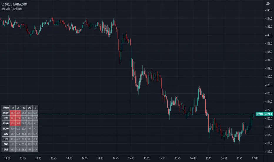
RSI MTF DashboardThis is an RSI dashboard, which allows you to see the current RSI value for five timeframes across up to 8 tickers of your choice. This is a useful tool to gauge momentum across multiple timeframes, where you would look to enter a buy with high RSI values across the timeframes (and vice versa for sell positions).
Conversely, some traders use RSI to identify potential areas for reversals, so you would look to buy with low RSI values (and vice versa for sell positions).
In the settings, please select which 5 timeframes you require. Then select which tickers you wish to see, and you will find a dashboard on your chart to show the RSI values. The dashboard can be highlighted when the RSI value shows bearish momentum (a value under 50, of your choice) and bullish momentum (a value over 50, again of your choice). These colours and values are fully customisable.
In the settings you can also select the location of the dashboard, as well as some colour and transparency settings to enable the best possible view on screen.
Stochastic RSI Strategy (with SMA and VWAP Filters)The strategy is designed to trade on the Stochastic RSI indicator crossover signals.
Below are all of the trading conditions:
-When the Stochastic RSI crosses above 30, a long position is entered.
-When the Stochastic RSI crosses below 70, a short position is entered.
-The strategy also includes two additional conditions for entry:
-Long entries must have a positive spread value between the 9 period simple moving average and the 21 period simple moving average.
-Short entries must have a negative spread value between the 9 period simple moving average and the 21 period simple moving average.
-Long entries must also be below the volume-weighted average price.
-Short entries must also be above the volume-weighted average price.
-The strategy includes stop loss and take profit orders for risk management:
-A stop loss of 20 ticks is placed for both long and short trades.
-A take profit of 25 ticks is placed for both long and short trades.

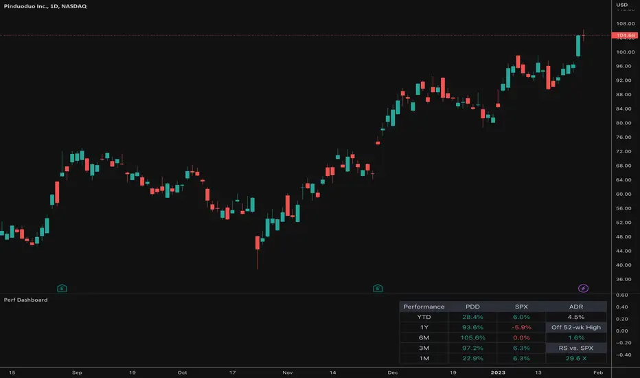
Relative Performance Dashboard v. 2This is a smaller and cleaner version of my previous Relative Performance table. It looks at the rate of change over 1M, 3M, 6M, 1YR & YTD and displays those for the current chart's ticker vs. an index/ticker of your choosing (SPX is default). I also have some fields for the ADR of the displayed chart, how far away the displayed chart is from 52-week highs, and a single number that compares the average relative strength of the displayed chart vs. the index. The way this average calculates is customizable by the user.
I like using this table next to an Earnings/Sales/Volume table that already exists by another user in the same pane and I designed this one so it can look just like that one to give a great view of the both fundamental and technical strength of your ticker in the same pane.
Keeping fundamental data independent from performance data allows you to still be able to see performance on things without fundamental data (i.e. ETFs, Indices, Crypto, etc.) as any script that uses fundamental data will not display when a chart that does not have fundamental data is displayed.
occ3aka weighted fair price
The ultimate price source for all your stuff, unless you go completely nuts.
The ultimate way to build line charts & do pattern trading, unless you go completely nuts.
Why occ3?
You need a one-point estimate for every bar, a typical price of every bar aye? But then you see that every bar has a different distribution of prices. You can drop a stat test on every bar and pick median, mean, or whatever. But that's still prone to error (imagine borderline cases).
Instead, you can transform the task into a geometric one and say, "I wanna find the center of mass of all dem ticks within a particular interval (a day, a week, a century)". But lol ofc you won't do it, so lets's estimate it:
1) a straight line from Open to Close more/less estimates a regression line if you woulda dropped regression on all the ticks within a given interval;
2) centroid always lies on regression line, so it's always in between the endpoints of regression line. So that's why (open + close) /2;
3) Then, you remember that sequence matters, + generally the volume is higher near the close, so...;
4) Voila, (open + close + close) / 3
Why "fair" price?
Take a daily bar:
1) High & low were the best prices to sell & buy;
2) Opening & closing auctions had acceptable prices, in exchange for the the biggest potential to transact serious volume;
3) "Fair" price, logically, is somewhere in between the acceptable prices;
4) Market is fractal => the same principles propagate everywhere;
4) No, POCs and VPOCs don't make much sense as fair prices.
Nothing else to say, really advise to use it as a line chart if you trade price patterns.

Trend and Momentum DashboardI created this indicator to tell me when it's time to trade (going long) and when it's time to wait (or going short).
You can enter up to 13 ticker (default is S&P500 and key market segments).
For each ticker, fibonacci levels are calculated and represented either in 5 color or 3 color mode as single lines.
(Thanks to eykpunter for the fibonacci level implementation. I'm using his code and modified it slightly).
Color coding (5 color mode) explanation:
blue = in uptrend area
light blue = in prudent buyers area
gray = in center area
light red = in prudent sellers area
red = in downtrend area
The topline is a combination of all ticker and shows if the market is either bullish or bearish (threshold adjustable in settings)
The bullish/bearish trend can also be used as background color. Alternatively the last bar in the selected time period is been highlighted.
How to use it:
The indicator works on all timeframes. Use the color coding explanation above to see the status of each asset.
a) You can evaluate "long" term trend using day or week timeframe. e.g. I'm usually trading only long and stay out of the market when it is not bullish (top line & background = blue). I'm also using it to know which segments/assets are currently "hot".
b) You can evaluate short term momentum (using 1h or lower timeframe) and see in which direction the market/assets are moving. e.g. I use this when the exchanges open to see how the day is going to move.
I've attached 3 examples in the screenshot - first is the default, in the second one I'm using different asset classes and the third one is for crypto.
Limitations:
There are security request limits as well as string limitations for the security calls in pine script, so I went to the maximum what is currently possible.
(No financial advise, for testing purposes only)
Entry helperHello traders,
This is a script I use daily as a scalper and it helps me a lot, maybe it can help you, this is why I am sharing it!
PART 1 - DESCRIPTION
This program is specifically designed to help scalpers but can be used for all types of trading but won't be as useful.
This script is what I call an entry helper as it calculates dynamically the position size, stop loss and take profit levels and more.
When scalping and placing market entry orders, the price can move significantely while you are calculating your position size according to your stop loss, capital, risk and especially close price that changes very quickly, this results in a risk that is not ideally controlled and personally was a source of frustration and stress. I wanted to enter my quantity and stop loss values as fast as possible and make the process easier.
This script automates the calculation of the position size, stop loss and take profit levels according the the users input and prints the data visibly on the screen so it is easy to copy by the trader. It allows the trader to be confident that his risk is as controlled as possible.
The script is easy to use and set up, this guide will help you if you have any difficulies or questions.
PART 2 - HOW TO USE THE SCRIPT
- SET THE CAPITAL SETTINGS
1 - Set your capital value in $
- SET THE TRADE SETTINGS
2 - Set your trade side (BUY or SELL)
3 - Set you desired risk in % of your capital
- ENTRY SETTINGS
4 - Set your entry from 2 different options
|MARKET| (default option)
This option will place the entry level at the last available price
|LIMIT|
This option allows you to input a fixed price level for the entry
- STOP LOSS SETTINGS
5 - Select your stop loss placement from 4 different options
|EXTREMA STOP LOSS| (default option)
This option will place the stop loss at the highest/lowest (extrema) price level within the last N candles
|ATR EXTREMA|
This option uses the same price level as the EXTREMA STOP LOSS but will add/soustract the last ATR value (calculated on the N last candles) multiplied by a coefficient that you input
|TICKS EXTREMA|
This option uses the same price level as the EXTREMA STOP LOSS but will add/soustract a number of ticks that you input
|PRICE LEVEL|
This option allows you to input a fixed price level for the stop loss
- TAKE PROFIT SETTINGS
6 - Select your take profit from 3 different options
|NONE| (default option)
This option will not display any take profit level, I have added this option as I don't have take profit targets
|RR|
This option uses a risk to reward ratio (reward/risk) that you input, it will automatically calculate the take profit level that corresponds
|PRICE LEVEL|
This option allows you to input a fixed price level for the take profit
- QUANTITY AND FEE SETTINGS
7 - Set the quantity settings, it represents the quantity in a lot (usually 100 000 in forex, 100 in stocks 1 for crypto currencies)
8 - Set the fee per quantity (turning lot)
- VISUAL SETTINGS
9 - Show or remove the tab
- TAB SETTINGS
10 - Select the data that you want to display in the tab (the tab will adapt automatically)
NOTES:
The vertical dashed line shows what candle has been used for the calculation of the stop loss, it allows you to visualize what candle the script has selected in case of an EXTREMA stop loss option.
I hope this helps you out! Any suggestions are welcome and I hope that the guide is clear enough.
Happy trading!

Portfolio_Tracking_TRThis is a portfolio tracker that will track individual, overall and daily profit/loss for up. You can set the size of your buys and price of your buys for accurate, up to date profit and loss data right on your chart. It works on all markets and timeframes.
Next we get into setting up your , order size and price. Each ticker lets you set which stock you bought, then set how much you purchased and then what price you purchased them at.
FEATURES
Top Section
The portfolio tracker has 2 sections. The top section shows each ticker in your portfolio individually with the following data:
- Ticker Name
- Weight of that asset compared to your total portfolio in %
- Current value of that position in TL
- Profit or loss value from purchase price in %
- Todays change in value from yesterday’s close in %
Bottom Section
The bottom section of the tracker will give you info for your portfolio as a whole. It has the following data:
- Total cost of your entire portfolio in TL
- Current value of your entire portfolio in TL
- Current profit or loss of your entire portfolio in TL
- Current profit or loss of your entire portfolio in %
- Todays change of your entire portfolio value compared to yesterday’s close in %
This indicator was compiled from FriendOfTheTrend's indicator named Portfolio Tracker For Stocks & Crypto.

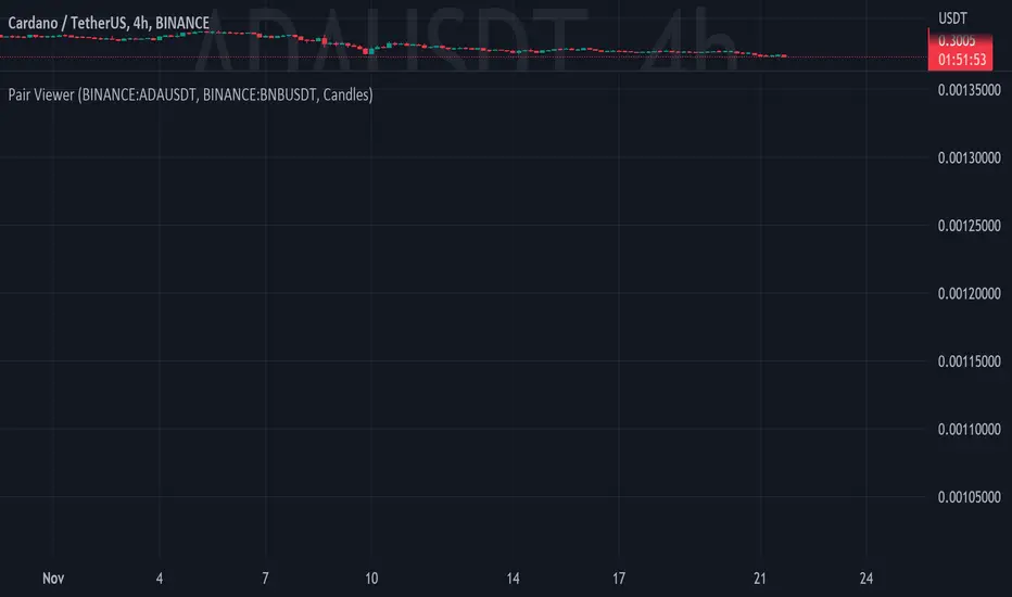
Pair ViewerPair-Trading is a recognized and widely used trading method, this indicator is a tool that allows via several display interfaces (2 at the moment) to see relative performance ratios of two assets.
The inputs are pretty simple to understand but here is the list of them :
- Ticker #1 : The first Asset's ticker // numerator of the ratio
- Ticker #2 : The second Asset's ticker // denominator of the ratio
- View as : Display Method
- Up Color : Color of positive candle (when close > open)
- Down Color : Color of negative candle (when close < open)
Of course, this indicator only shows stuff at the chart, it does NOT provide any investment advice.
Crypto Market Breadth [QuantVue]15 top crypto tickers of your choosing. Just input your 15 favorite crypto markets in the settings.
Showing breadth of market as a percentage change to gauge buyers/sellers strength.
You can check this on the last day of the week and compare each daily bar to see if buyers are increasing/decreasing or sellers increasing/decreasing bars.
A reading above +2 is bullish , below -2 is bearish momentum, between +2 and -2 neutral.
Works best on daily charts .
Hope you enjoy!
*this will also work with stock tickers!

text_utilsLibrary "text_utils"
a set of functions to handle placeholder in texts
add_placeholder(list, key, value)
add a placehodler key and value to a local list
Parameters:
list : - reference to a local string array containing all placeholders, add string list = array.new_string(0) to your code
key : - a string representing the placeholder in a text, e.g. '{ticker}'
value : - a string representing the value of the placeholder e.g. 'EURUSD'
Returns: void
add_placeholder(list, key, value, format)
add a placehodler key and value to a local list
Parameters:
list : - reference to a local string array containing all placeholders, add string list = array.new_string(0) to your code
key : - a string representing the placeholder in a text, e.g. '{ticker}'
value : - an integer value representing the value of the placeholder e.g. 10
format : - optional format string to be used when converting integer value to string, see str.format() for details, must contain '{0}'
Returns: void
add_placeholder(list, key, value, format)
add a placehodler key and value to a local list
Parameters:
list : - reference to a local string array containing all placeholders, add string list = array.new_string(0) to your code
key : - a string representing the placeholder in a text, e.g. '{ticker}'
value : - a float value representing the value of the placeholder e.g. 1.5
format : - optional format string to be used when converting float value to string, see str.format() for details, must contain '{0}'
Returns: void
replace_all_placeholder(list, text_to_covert)
replace all placeholder keys with their value in a given text
Parameters:
list : - reference to a local string array containing all placeholders
text_to_covert : - a text with placeholder keys before their are replaced by their values
Returns: text with all replaced placeholder keys
Strategy weekly results as numbers v1This script is based on an idea of monthly statistics that have been found across tradingview community scripts. This is an improved version with weekly results with the ability to define the size of every group (number of weeks within one group).
Initial setup of the strategy
1. Set the period to calculate the results between.
2. Set the statistic precision and group size.
3. Enable "Recalculate" → "On every tick" under the strategy "Properties" section.
The logic under the hood
1. Get the period between which to calculate the strategy.
2. Calculate the first day of the first week within the period.
3. Calculate the latest day of the latest week within the period.
4. Calculate the results of the selected period.
5. Group the values by the defined number of cells.
6. Calculate the summary of every group.
7. Render the table.
Please, be careful . To use this tool you will need to enable the "Recalculate" → "On every tick" option but it means that your strategy will be executed on every tick instead of bar close. It can cause unexpected results in your strategy behaviour.

Signs of the Times [LucF]█ OVERVIEW
This oscillator calculates the directional strength of bars using a primitive weighing mechanism based on a small number of what I consider to be fundamental properties of a bar. It does not consider the amplitude of price movements, so can be used as a complement to momentum-based oscillators. It thus belongs to the same family of indicators as my Bar Balance , Volume Ticks , Efficient work , Volume Buoyancy or my Delta Volume indicators.
█ CONCEPTS
The calculations underlying Signs of the Times (SOTT) use a simple, oft-explored concept: measure bar attributes, assign a weight to them, and aggregate results to provide an evaluation of a bar's directional strength. Bull and bear weights are added independently, then subtracted and divided by the maximum possible weight, so the final calculation looks like this:
(up - dn) / weightRange
SOTT has a zero centerline and oscillates between +1 and -1. Ten elementary properties are evaluated. Most carry a weight of one, a few are doubly weighted. All properties are evaluated using only the current bar's values or by comparing its values to those of the preceding bar. The bull conditions follow; their inverse applies to bear conditions:
Weight of 1
• Bar's close is greater than the bar's open (bar is considered to be of "up" polarity)
• Rising open
• Rising high
• Rising low
• Rising close
• Bar is up and its body size is greater than that of the previous bar
• Bar is up and its body size is greater than the combined size of wicks
Weight of 2
• Gap to the upside
• Efficient Work when it is positive
• Bar is up and volume is greater than that of the previous bar (this only kicks in if volume is actually available on the chart's data feed)
Except for the Efficient Work weight, which is a +1 to -1 float value multiplied by 2, all weights are discrete; either zero or the full weight of 1 or 2 is generated. This will cause any gap, for example, to generate a weight of +2 or -2, regardless of the gap's size. That is the reason why the oscillator is oblivious to the amplitude of price movements.
You can see the code used to calculate SOTT in my ta library 's `sott()` function.
█ HOW TO USE THE INDICATOR
No videos explain this indicator and none are planned; reading this description or the script's code is the only way to understand what Signs of the Times does.
Load the indicator on an active chart (see here if you don't know how).
The default configuration displays:
• An Arnaud-Legoux moving average of length 20 of the instant SOTT value. This is the signal line.
• A fill between the MA and the centerline.
• Levels at arbitrary values of +0.3 and -0.3.
• A channel between the signal line and its MA (a simple MA of length 20), which can be one of four colors:
• Bull (green): The signal line is above its MA.
• Strong bull (lime): The bull condition is fulfilled and the signal line is above the centerline.
• Bear (red): The signal line is below its MA.
• Strong bear (pink): The bear condition is fulfilled and the signal line is below the centerline.
The script's "Inputs" tab allows you to:
• Choose a higher timeframe to calculate the indicator's values. This can be useful to get a wider perspective of the indicator's values.
If you elect to use a higher timeframe, make sure that your chart's timeframe is always lower than the higher timeframe you specified,
as calculating on a timeframe lower than the chart's does not make much sense because the indicator is then displaying only the value of the last intrabar in the chart bar.
• Specify the type of MA used to produce the signal line. Use a length of 1 or the Data Window to see the instant value of SOTT. It is quite noisy, thus the need to average it.
• Specify the type of MA applied to the signal line. The idea here is to provide context to the signal.
• Control the display and colors of the lines and fills.
The first pane of this publication's chart shows the default setup. The second one shows only a monochrome signal line.
Using the "Style" tab of the indicator's settings, you can change the type and width of the lines, and the level values.
█ INTERPRETATION
Remember that Signs of the Times evaluates directional bar strength — not price movement. Its highs and lows do not reflect price, but the strength of chart bars. The fact that SOTT knows nothing of how far price moves or of trends is easy to forget. As such, I think SOTT is best used as a confirmation tool. Chart movements may appear to be easy to read when looking at historical bars, but when you have to make go-no-go decisions on the last bar, the landscape often becomes murkier. By providing a quantitative evaluation of the strength of the last few bars, which is not always easily discernible by simply looking at them, SOTT aims to help you decide if the short-term past favors the bets you are considering. Can SOTT predict the future? Of course not.
While SOTT uses completely different calculations than classical momentum oscillators, its profile shares many of their characteristics. This could lead one to infer that directional bar strength correlates with price movement, which could in turn lead one to conclude that indicators such as this one are useless, or that they can be useful tools to confirm momentum oscillators or other models of price movement. The call is, of course, up to you. You can try, for example, to compare a Wilder MA of SOTT to an RSI of the same length.
One key difference with momentum oscillators is that SOTT is much less sensitive to large price movements. The default Arnaud-Legoux MA used for the signal line makes it quite active; you can use a more quiet SMA or EMA if you prefer to tone it down.
In systems where it can be useful to only enter or exit on short-term strength, an average of SOTT values over the last 3 to 5 bars can be used as a more quiet filter than a momentum oscillator would.
█ NOTES
My publications often go through a long gestation period where I use them on my charts or in systems before deciding if they are worth a publication. With an incubation period of more than three years, Signs of the Times holds the record. The properties SOTT currently evaluates result from the systematic elimination of contaminants over that lengthy period of time. It was long because of my usual, slow gear, but also because I had to try countless combinations of conditions before realizing that, contrary to my intuition, best results were achieved by:
• Keeping the number of evaluated properties to the absolute minimum.
• Limiting the evaluation's scope to the current and preceding bar.
• Choosing properties that, in my view, were unmistakably indicative of bullish/bearish conditions.
Repainting
As most oscillators, the indicator provides live realtime values that will recalculate with chart updates. It will thus repaint in real time, but not on historical values. To learn more about repainting, see the Pine Script™ User Manual's page on the subject .
[FriZz]Watermark -- Watermark by FriZz | FrizLabz --
Lets you Customize a watermark how ever you would like
There are 4 Textboxes in the settings window 2 for your inputs
There's 1 with instructions/examples and 1 with Special Characters (there are tons more online)
-- The options you can type into Textbox 1 and 2 --
- Volume
- Open
- Close
- High
- Low
- Ticker [ Chart ticker ]
- Ticker2 [ Optional 2nd ticker that can be set in the settings will also display close ]
- TF
- Day
- Date
- Time
- Session
- SessionTime
-- Important --
These options need to be spelled and Case matched correctly or it will simply just display the word
You can add anything around a word or between two words you would like
If you want a new line simply press [ ENTER/RETURN ] and continue
-- Tooltip --
Tooltip appears when you mouse over the watermark
There are options to change the session times if you need too
The Sessions will be listed on the tooltip with Session times
I think that pretty much covers most of it if you have any questions or suggestions on this or anything else I've made
or if I missed a bug.. feel free to comment or DM me
Enjoy! - FriZz
Volume Weighted Reversal BandsThis is a vwap & vwma hybrid with upper & lower deviation bands that provide excellent price channels and reversal areas. It can be used on lower & higher timeframes, just increase the deviation % for higher timeframes. Try out the 1 minute timeframe with .5% deviation for great scalping levels.
Here is the calculation used for the main line.
(VWMA100 + VWMA500 + VWMA1000 + VWAP) / 4
So it combines 3 VWMAs with the VWAP and divides that number by 4 to give us a moving average. Then we add new levels above and below that moving average to get our channels. The channels are separated by the % deviation you choose in the settings. For tighter bands, lower the percentage deviation and for wider bands, increase the percentage deviation.
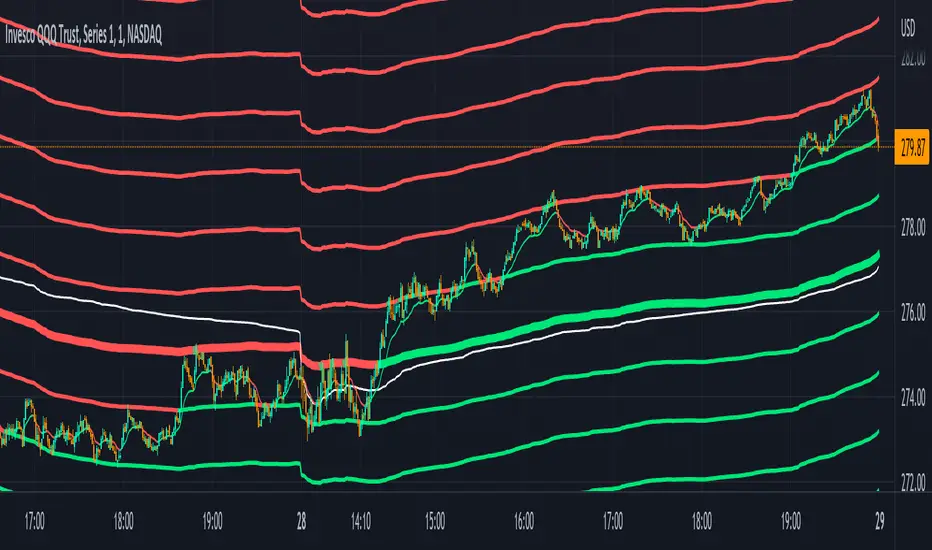
The fattest line in the middle is the main moving average and you can expect price to regularly return to this level. The thick lines are the main moving average plus or minus the percentage deviation you have set. There are 10 levels in each direction from the main moving average. The is also a thin short term moving average as well with a custom calculation. It takes 4 different length moving averages that are weighted and 4 more that are volume weighted and divides the total by 8.The lines will be green when price is above the line and red when price is below the line. The thin white line is the VWAP on its own.
These lines will act as dynamic support and resistance so you can scalp them back and forth. These levels work so well because they are volume weighted and the algos hedge their positions back and forth constantly.
For best results, use this indicator on tickers with the highest volume and trading action as the price will stick to these levels better when the big money players are hedging. Some great tickers for this indicator are APPL, SPY, BTC, ETH.
All colors and linewidths can be customized in the settings easily as well as turning off the VWAP or short moving average and adjusting the percentage deviation for the channels.
***MARKETS***
This indicator can be used on all markets, including stocks, crypto, futures and forex.
***TIMEFRAMES***
This indicator can be used on all timeframes.
***TIPS***
Try using numerous indicators of ours on your chart for extra confirmation. Our favorites to pair with these bands are the Scalper Ribbon and Trend Friend Signals. The 3 combined give you a lot of extra confirmation on whether the market is going to reverse at these levels.