Sector Rotation & Allocation StrategySector Rotation & Allocation Strategy
Overview This advanced indicator analyzes the relationship between Defensive and Cyclical sectors to identify market regimes and generate precise buy/sell signals. It automatically detects which asset you're viewing and provides tailored recommendations based on current sector rotation dynamics.
What It Does Identifies Market Regime – Determines if markets are in Risk-On (growth) or Risk-Off (defensive) mode Auto-Detects Your Asset – Classifies the current chart into one of 11 sectors Generates Trading Signals – Provides BUY/SELL signals based on sector alignment with market conditions Multi-Timeframe Analysis – Offers allocation recommendations from 1 week to 12 months Value Assessment – Scores each asset 0-100 to determine if it's a good trade NOW
How It Works
Market Regime Detection The indicator compares Defensive Sectors (Health Care, Consumer Staples, Utilities) against Cyclical Sectors (Technology, Financials, Energy, Industrials, Materials, Real Estate, Discretionary, Communication).
Risk-On Market (Green, >0): Cyclical sectors outperforming Economic growth expected Investors favoring growth stocks Action : Buy cyclicals, reduce defensives
Risk-Off Market (Red, <0): Defensive sectors outperforming Uncertainty or fear in markets Flight to safety occurring Action : Buy defensives, reduce cyclicals
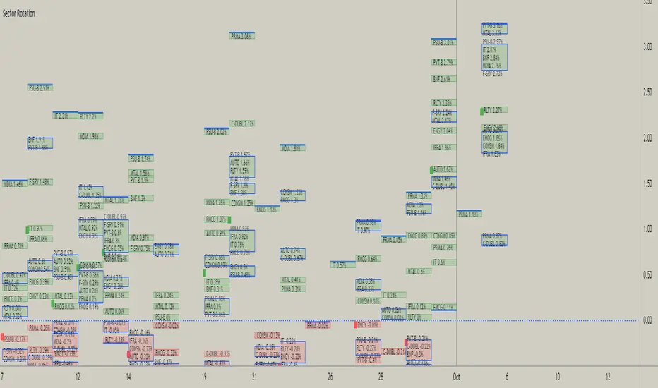
Understanding the Four Tables
1. MARKET REGIME (Top Left) Market Regime : Current state – RISK-ON or RISK-OFF Bias : Which sector type is favored right now Strength : STRONG/MODERATE/WEAK – conviction level Current Sector : Your asset's sector classification Signal : Trading recommendation for your specific asset
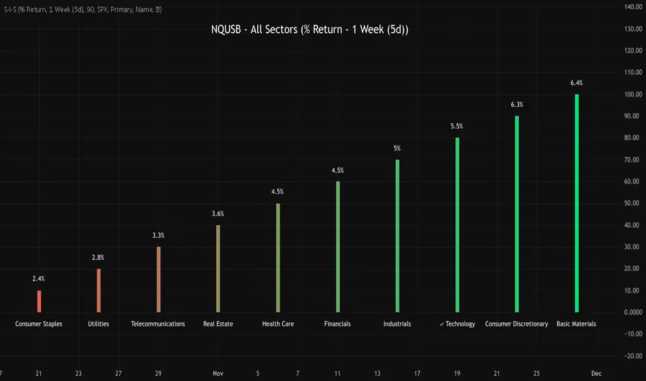
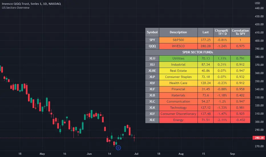
2. SECTOR RANKINGS (Top Right) Shows relative strength of all 11 sectors vs SPY benchmark. Rel Str : Percentage outperformance/underperformance vs market Signal : ✓ = Outperforming, ✗ = Underperforming, − = Neutral
3. ALLOCATION RECOMMENDATIONS (Bottom Center) Suggested portfolio allocation between Defensive and Cyclical sectors. 1 Week : Tactical – follows current regime closely (70/30 split) 1 Month : Near-term positioning (65/35 split) 3 Months : Medium-term allocation (60/40 split) 6 Months : Balanced approach (50/50 split) 12 Months : Strategic/Contrarian – assumes mean reversion (40/60 split)
4. ASSET ANALYSIS (Bottom Left) Sector : Auto-detected sector classification Value Rating : STRONG BUY / BUY / HOLD / REDUCE / AVOID Value Score : 0-100 numerical assessment Rel Strength : How this asset performs vs SPY Regime Fit : Is this asset aligned with current market regime?
Trading Signals Explained
BUY Signals Oscillator crosses above oversold (30) Asset's sector is gaining momentum Regime is favorable for that sector
SELL Signals Oscillator crosses below overbought (70) Asset's sector is losing momentum Regime is turning unfavorable for that sector
How Value Score Works (0-100)
Relative Strength (40 points max) : Asset outperforming SPY by 5%+ → 40 points Asset outperforming SPY by 2-5% → 30 points Asset outperforming SPY by 0-2% → 20 points Asset underperforming slightly → 10 points Asset underperforming significantly → 0 points
Sector Alignment (30 points max) : Defensive in Risk-Off OR Cyclical in Risk-On → 30 points Misaligned sector → 0 points Unclassified → 15 points
Momentum (30 points max) : RSI > 60 → 30 points RSI 50-60 → 20 points RSI 40-50 → 10 points RSI < 40 → 0 points
Interpretation : 80-100 : STRONG BUY – High conviction opportunity 65-79 : BUY – Favorable setup 45-64 : HOLD – No clear edge 30-44 : REDUCE – Unfavorable conditions 0-29 : AVOID – High risk of underperformance
Best Practices Use Daily Timeframe or Higher – More reliable signals Combine with Price Action – Confirm with support/resistance Monitor Regime Changes – Transitions offer the highest ROI Respect Risk Management – Always use stop losses Don't Fight the Regime – Buying defensives during Risk-On is low probability
Disclaimer This indicator is for educational and informational purposes only. Past performance does not guarantee future results. Conduct your own research before making investment decisions.
Version: 6.0 Author: @bigcitytom Last Updated: February 2026
Pine Script®指標