Statistics

Simplified Percentile ClusteringSimplified Percentile Clustering (SPC) is a clustering system for trend regime analysis.
Instead of relying on heavy iterative algorithms such as k-means, SPC takes a deterministic approach: it uses percentiles and running averages to form cluster centers directly from the data, producing smooth, interpretable market state segmentation that updates live with every bar.
Most clustering algorithms are designed for offline datasets, they require recomputation, multiple iterations, and fixed sample sizes.
SPC borrows from both statistical normalization and distance-based clustering theory , but simplifies them. Percentiles ensure that cluster centers are resistant to outliers , while the running mean provides a stable mid-point reference.
Unlike iterative methods, SPC’s centers evolve smoothly with time, ideal for charts that must update in real time without sudden reclassification noise.
SPC provides a simple yet powerful clustering heuristic that:
Runs continuously in a charting environment,
Remains interpretable and reproducible,
And allows traders to see how close the current market state is to transitioning between regimes.
Clustering by Percentiles
Traditional clustering methods find centers through iteration. SPC defines them deterministically using three simple statistics within a moving window:
Lower percentile (p_low) → captures the lower basin of feature values.
Upper percentile (p_high) → captures the upper basin.
Mean (mid) → represents the central tendency.
From these, SPC computes stable “centers”:
// K = 2 → two regimes (e.g., bullish / bearish)
=
// K = 3 → adds a neutral zone
=
These centers move gradually with the market, forming live regime boundaries without ever needing convergence steps.
Two clusters capture directional bias; three clusters add a neutral ‘range’ state.
Multi-Feature Fusion
While SPC can cluster a single feature such as RSI, CCI, Fisher Transform, DMI, Z-Score, or the price-to-MA ratio (MAR), its real strength lies in feature fusion. Each feature adds a unique lens to the clustering system. By toggling features on or off, traders can test how each dimension contributes to the regime structure.
In “Clusters” mode, SPC measures how far the current bar is from each cluster center across all enabled features, averages these distances, and assigns the bar to the nearest combined center. This effectively creates a multi-dimensional regime map , where each feature contributes equally to defining the overall market state.
The fusion distance is computed as:
dist := (rsi_d * on_off(use_rsi) + cci_d * on_off(use_cci) + fis_d * on_off(use_fis) + dmi_d * on_off(use_dmi) + zsc_d * on_off(use_zsc) + mar_d * on_off(use_mar)) / (on_off(use_rsi) + on_off(use_cci) + on_off(use_fis) + on_off(use_dmi) + on_off(use_zsc) + on_off(use_mar))
Because each feature can be standardized (Z-Score), the distances remain comparable across different scales.
Fusion mode combines multiple standardized features into a single smooth regime signal.
Visualizing Proximity - The Transition Gradient
Most indicators show binary or discrete conditions (e.g., bullish/bearish). SPC goes further, it quantifies how close the current value is to flipping into the next cluster.
It measures the distances to the two nearest cluster centers and interpolates between them:
rel_pos = min_dist / (min_dist + second_min_dist)
real_clust = cluster_val + (second_val - cluster_val) * rel_pos
This real_clust output forms a continuous line that moves smoothly between clusters:
Near 0.0 → firmly within the current regime
Around 0.5 → balanced between clusters (transition zone)
Near 1.0 → about to flip into the next regime
Smooth interpolation reveals when the market is close to a regime change.
How to Tune the Parameters
SPC includes intuitive parameters to adapt sensitivity and stability:
K Clusters (2–3): Defines the number of regimes. K = 2 for trend/range distinction, K = 3 for trend/neutral transitions.
Lookback: Determines the number of past bars used for percentile and mean calculations. Higher = smoother, more stable clusters. Lower = faster reaction to new trends.
Lower / Upper Percentiles: Define what counts as “low” and “high” states. Adjust to widen or tighten cluster ranges.
Shorter lookbacks react quickly to shifts; longer lookbacks smooth the clusters.
Visual Interpretation
In “Clusters” mode, SPC plots:
A colored histogram for each cluster (red, orange, green depending on K)
Horizontal guide lines separating cluster levels
Smooth proximity transitions between states
Each bar’s color also changes based on its assigned cluster, allowing quick recognition of when the market transitions between regimes.
Cluster bands visualize regime structure and transitions at a glance.
Practical Applications
Identify market regimes (bullish, neutral, bearish) in real time
Detect early transition phases before a trend flip occurs
Fuse multiple indicators into a single consistent signal
Engineer interpretable features for machine-learning research
Build adaptive filters or hybrid signals based on cluster proximity
Final Notes
Simplified Percentile Clustering (SPC) provides a balance between mathematical rigor and visual intuition. It replaces complex iterative algorithms with a clear, deterministic logic that any trader can understand, and yet retains the multidimensional insight of a fusion-based clustering system.
Use SPC to study how different indicators align, how regimes evolve, and how transitions emerge in real time. It’s not about predicting; it’s about seeing the structure of the market unfold.
Disclaimer
This indicator is intended for educational and analytical use.
It does not generate buy or sell signals.
Historical regime transitions are not indicative of future performance.
Always validate insights with independent analysis before making trading decisions.

ETH OHLC by tncylyvETH OHLC Projection Levels
📜 Indicator Description
This indicator projects key potential price levels for Ethereum (ETH) based on its historical price behavior. Using the opening price of a user-selected timeframe (4H, 1D, or 1W) as a baseline, it calculates and displays statistically-derived levels for potential "Manipulation" and "Distribution" phases of price action.
These projections are designed to provide traders with potential zones of interest for support, resistance, stop-loss placement, and take-profit targets for the current trading period.
________________________________________
🧠 Core Concepts Explained
The indicator is built on two key concepts derived from candlestick analysis:
• Manipulation: This represents the initial price movement that occurs against the candle's eventual primary direction.
o For a bullish candle, it's the extent of the lower wick (the move from Open down to Low).
o For a bearish candle, it's the extent of the upper wick (the move from Open up to High).
o The "M" levels on the chart project the average (mean and median) historical size of this manipulation wick, suggesting potential areas for liquidity grabs or stop hunts.
• Distribution: This represents the primary price movement in the direction of the candle's trend.
o For a bullish candle, it's the total move from Open to High.
o For a bearish candle, it's the total move from Open to Low.
o The "D" levels project the average (mean and median) historical range of this price expansion, suggesting potential targets for the period.
________________________________________
📊 Data & Methodology
It is important to note that the statistical ratios used for the projections are not calculated in real-time by the indicator itself.
These values have been pre-calculated through an extensive historical analysis performed in Python. The analysis used the complete historical ETH/USD price data from the Coinbase exchange to determine the mean and median ratios for both manipulation and distribution across the different timeframes. The resulting fixed values are then hard-coded into the script to ensure performance and consistency.
________________________________________
⚙️ How to Use It
At the beginning of each new period (e.g., at the start of a new day on the 1D timeframe), the indicator will draw a new set of horizontal lines and zones based on that period's opening price.
• The central dotted line represents the Opening Price for the selected timeframe.
• Manipulation Levels (+M / -M): These inner levels can be interpreted as potential reversal zones. Price may test these areas to trigger stops before moving in the primary direction for the session.
• Distribution Levels (+D / -D): These outer levels can be used as potential take-profit targets, representing the average historical price extension for a period.
• Mean vs. Median Zones: The script plots levels based on both the historical mean (average) and median (middle value). The shaded area between them creates a zone rather than a single price line, offering a more practical range for analysis.
________________________________________
🛠️ Settings and Features
• Projection Timeframe: Select the primary timeframe for the analysis (4H, 1D, or 1W). The historical data used for projections is specific to the chosen timeframe.
• Historical Periods to Show: Adjust how many past periods of data you want to see on your chart. A value of 1 will only show the projections for the current, active period.
• Timezone (UTC-4): The 4H calculations are based on a fixed UTC-4 timezone to align with specific, high-volume market sessions (e.g., New York open). This is not changeable to ensure data consistency.
• Visual Customization: You have full control over the appearance of the indicator.
o Toggle the visibility, colors, and line styles for the Open price line and each of the Manipulation/Distribution levels using their respective checkboxes and inputs.
o Enable or disable the shaded fills between the mean and median levels.
o Tip: To quickly hide all price labels at once, edit the "Label Color" setting and set its opacity to 100% (fully transparent).

BTC OHLC by tncylyvBTC OHLC Projection Levels
📜 Indicator Description
This indicator projects key potential price levels for Bitcoin (BTC) based on historical price behavior. Using the opening price of a user-selected timeframe (4H, 1D, or 1W) as a baseline, it calculates and displays statistically-derived levels for potential "Manipulation" and "Distribution" phases of price action.
These projections are designed to provide traders with potential zones of interest for support, resistance, stop-loss placement, and take-profit targets for the current trading period.
________________________________________
🧠 Core Concepts Explained
The indicator is built on two key concepts derived from candlestick analysis:
• Manipulation: This represents the initial price movement that occurs against the candle's eventual primary direction.
o For a bullish candle, it's the extent of the lower wick (the move from Open down to Low).
o For a bearish candle, it's the extent of the upper wick (the move from Open up to High).
o The "M" levels on the chart project the average (mean and median) historical size of this manipulation wick, suggesting potential areas for liquidity grabs or stop hunts.
• Distribution: This represents the primary price movement in the direction of the candle's trend.
o For a bullish candle, it's the total move from Open to High.
o For a bearish candle, it's the total move from Open to Low.
o The "D" levels project the average (mean and median) historical range of this price expansion, suggesting potential targets for the period.
________________________________________
📊 Data & Methodology
It is important to note that the statistical ratios used for the projections are not calculated in real-time by the indicator itself.
These values have been pre-calculated through an extensive historical analysis performed in Python. The analysis used the complete historical BTC/USD price data from the Coinbase exchange to determine the mean and median ratios for both manipulation and distribution across the different timeframes. The resulting fixed values are then hard-coded into the script to ensure performance and consistency.
________________________________________
⚙️ How to Use It
At the beginning of each new period (e.g., at the start of a new day on the 1D timeframe), the indicator will draw a new set of horizontal lines and zones based on that period's opening price.
• The central dotted line represents the Opening Price for the selected timeframe.
• Manipulation Levels (+M / -M): These inner levels can be interpreted as potential reversal zones. Price may test these areas to trigger stops before moving in the primary direction for the session.
• Distribution Levels (+D / -D): These outer levels can be used as potential take-profit targets, representing the average historical price extension for a period.
• Mean vs. Median Zones: The script plots levels based on both the historical mean (average) and median (middle value). The shaded area between them creates a zone rather than a single price line, offering a more practical range for analysis.
________________________________________
🛠️ Settings and Features
• Projection Timeframe: Select the primary timeframe for the analysis (4H, 1D, or 1W). The historical data used for projections is specific to the chosen timeframe.
• Historical Periods to Show: Adjust how many past periods of data you want to see on your chart. A value of 1 will only show the projections for the current, active period.
• Timezone (UTC-4): The 4H calculations are based on a fixed UTC-4 timezone to align with specific, high-volume market sessions (e.g., New York open). This is not changeable to ensure data consistency.
• Visual Customization: You have full control over the appearance of the indicator.
o Toggle the visibility, colors, and line styles for the Open price line and each of the Manipulation/Distribution levels using their respective checkboxes and inputs.
o Enable or disable the shaded fills between the mean and median levels.
o Tip: To quickly hide all price labels at once, edit the "Label Color" setting and set its opacity to 100% (fully transparent).

ATC v6ATC v6 Indicator: Automatic Session and Time Lines
Designed by Alfa Trade Club for TradingView users, ATC v6 is an advanced
indicator that automatically marks key session opens, closes, and specific times
of financial markets on your chart. This tool eliminates the need to manually track
critical trading hours, allowing you to easily analyze price action in relation to
these important timeframes.
Key Features
This indicator comes with a set of powerful features that provide the flexibility
and visual clarity traders need:
Multi-Time Zone Support: The indicator is based on the world’s three largest
financial market centers:
New York (America/New_York)
London (Europe/London)
Tokyo (Asia/Tokyo)
This allows you to accurately set the lines according to the local time of the
market you are trading.
Customizable Time Lines: Each time zone includes multiple predefined lines
(e.g., “NY Midnight,” “London Open,” “Tokyo Open”). Users can:
Enable or disable each line
Set any desired hour and minute
Assign distinct colors for clear visual separation
Pre-Session Function: This standout feature draws a dotted line a few
minutes before a main time you specify (e.g., the market open). This lets you see
the price level immediately before a key event.
Automatic Price Boxes: When the Pre-Session feature is active, the indicator
draws a colored box between the price at the pre-session moment and the price
at the main event. This box highlights the price range between the pre-
session and the main event, effectively visualizing the volatility at the
session open.
Forward-Extending Lines: All lines extend forward from the moment they are
drawn until the next day. This helps you track how these levels act as support or
resistance throughout the trading session.
Who Is It For?
Session-Focused Traders: Ideal for those tracking volatility during
London, New York, or Asian session opens.
Day Traders: Perfect for marking key economic data releases or daily
open/close levels.
Technical Analysts: A powerful tool for visually analyzing how opening
prices influence price behavior throughout the day.

EM Range (VIX1D PrevClose • Close & Hi/Lo, N-Day View)What this indicator does
This study projects a one-day expected move (EM) from the CBOE:VIX1D using a simple 1-σ model with 252 trading days. It visualizes the possible intraday range from three anchors and also gives a T+1 forecast using today’s real-time VIX1D:
• PrevClose ±σ (solid) – a symmetric bracket around yesterday’s close.
• Low → Upper (dashed) – the upper bound implied from today’s low.
• High → Lower (dashed) – the lower bound implied from today’s high.
• NextDay (solid, optional) – tomorrow’s expected bracket built from the current price using today’s VIX1D (intraday it updates; after the daily close it freezes to the daily close).
All ranges are plotted in points, not percentages.
How it’s computed
Let σ = (VIX1D/100)/sqrt(252) * multiplier.
• PrevClose bands: prevClose * (1 ± σ) using yesterday’s VIX1D close.
• Low → Upper: todayLow * (1 + σ) using yesterday’s VIX1D close.
• High → Lower: todayHigh * (1 − σ) using yesterday’s VIX1D close.
• NextDay (T+1): currentPrice * (1 ± σ_today) where σ_today uses today’s VIX1D (real-time via 15m/30m/60m fallbacks; after session close it uses the daily close).
What you’ll see on the chart
• Two solid lines (PrevClose ±σ), two dashed lines (from Low/High).
• Optional blue solid lines for NextDay ±σ (toggle).
• Lines are per-day segments (not infinite). Yesterday’s dashed lines are carried into today for quick context; other lines do not carry across days.
• Colors are fully configurable; defaults use a deep, high-contrast palette tuned for dark backgrounds.
N-Day history (no over-extension)
Use “Show last N days” to display previous sessions. Historical lines are drawn only within their own day (clean separation of regimes).
Compact table (top-right by default)
The on-chart table shows concise, single-line rows:
• VIX1D−1: yesterday’s VIX1D close | ±EM (points) from PrevClose
• VIX1D (RT): today’s real-time VIX1D | ±EM (points) from current price
• Prev ±σ: numeric around PrevClose
• L → Upper: today’s low and its implied upper bound
• H → Lower: today’s high and its implied lower bound
• NextDay: tomorrow’s implied from current price
• >±σ: count of daily closes that finished outside PrevClose ±σ over the last N−1 completed days (with up/down breakdown)
Inputs & options
• VIX1D symbol: default CBOE:VIX1D.
• σ multiplier: default 1.0 (try 0.5 / 1.5 / 2.0 based on your risk model).
• Show last N days: how many sessions to render (incl. today).
• Show NextDay lines (blue): on/off toggle.
• Line width and color pickers for each band type.
• Table position: top/bottom, left/right.
Works on…
• Any instrument priced in points (stocks, ETFs, futures incl. ES).
• Any timeframe. For the T+1 forecast, the price anchor is real-time on intraday charts; on higher timeframes it uses an intraday proxy (60-minute) intraday and switches to the daily close after session end.
Notes & good practice
• VIX1D is an implied daily move proxy; it’s not a guarantee. Treat bands as probabilistic, not absolute barriers.
• The outside-±σ close count is a quick sanity check on how often price exceeds the one-day expectation—useful for regime awareness and sizing.
• If your market isn’t well-described by VIX1D (e.g., non-US hours or crypto), consider substituting a more relevant vol index.
Disclaimer: This tool is for research/education only and is not financial advice. Always manage risk.

Aggregated Open Interest Multi-Exchange (USD)This indicator aggregates Open Interest (OI) data from multiple major cryptocurrency exchanges into a single unified view in USD, using data available on TradingView. It automatically adapts to the asset you're viewing on the chart.
Features:
Aggregates OI from 7 major exchanges: Binance, Bybit, OKX, Bitget, Deribit, HTX, and Coinbase
All values converted to USD - unlike native OI which shows contracts/coins
Uses only data available on TradingView platform
Automatically detects the asset from your chart (BTC, ETH, SOL, etc.)
True apples-to-apples comparison across exchanges
Displays as candlesticks showing OI open, high, low, and close
Toggle exchanges on/off individually
Handles different contract types per exchange automatically
Why USD conversion matters:
Traditional OI indicators show values in contracts or crypto units, making it difficult to compare across exchanges. This indicator converts everything to USD, giving you the real dollar value of open positions across all exchanges.
How it works:
Simply add the indicator to any crypto perpetual futures chart. It will automatically fetch and aggregate OI data from all supported exchanges for that asset using TradingView's built-in data feeds, converting everything to USD.
Supported Exchanges:
Binance, Bybit, Bitget, HTX: USDT perpetuals
Deribit: BTC/ETH use USD contracts, others use USDC
OKX: Contract-based (automatically converted)
Coinbase: USDC perpetuals
Perfect for traders who want a comprehensive view of total market Open Interest in USD across exchanges using reliable TradingView data.

RPT Position Sizer🎯 Purpose
This indicator is a position sizing and stop-loss calculator designed to help traders instantly determine:
How many shares/contracts to buy,
How much risk (₹) they are taking per trade,
How much capital will be deployed, and
The precise stop-loss price level based on user-defined parameters.
It displays all key values in a compact on-chart table (bottom-left corner) for quick trade planning.
💡 Use Case
Perfect for discretionary swing traders, systematic position traders, and risk managers who want instant visual feedback of trade sizing metrics directly on the chart — eliminating manual calculations and improving discipline.
⚙️ Key Features
Dynamic Inputs
Trading Capital (₹) — total available capital for trading.
RPT % — risk-per-trade as a percentage of total capital.
SL % — stop-loss distance in percent below CMP (Current Market Price).
CMP Source — can be linked to close, hl2, etc.
Rounding Style — round position size to Nearest, Floor, or Ceil.
Decimals Show — control number formatting precision in the table.
Core Calculations
SL Points: CMP × SL%
SL Price: CMP − SL Points
Risk Amount (₹): Capital × RPT%
Position Size: Risk ÷ SL Points
Capital Used: Position Size × CMP
Clean On-Chart Table Display
Displays:
Trading Capital
RPT %
Risk Amount (₹)
Position Size (shares/contracts)
Capital Required (₹)
Stop-Loss % & SL Price
The table uses a minimalistic white-on-black design with clear labeling and rupee formatting for quick reference.
Data Window Integration
Plots hidden values (Position Size, Risk Amount, SL Points, Capital Used) for use in TradingView’s Data Window—ideal for strategy testing and exporting values.

NQ Manipulation/Distribution Projections + Average RangeThis is not your typical OHLC indicator :)
Overview:
The Manipulation/Distribution Projections (OHLC Stats) indicator is a powerful tool designed to forecast potential price levels for various timeframes. It operates on a simple yet profound principle: price action within a single candle can be broken down into "manipulation" and "distribution" phases. By analyzing over 17 years of historical data for major assets in Python, this script calculates the average (mean) and typical (median) extent of these movements.
These statistical insights are then used to project key levels on your chart based on the current period's opening price, providing a statistically-grounded framework for potential support, resistance, and price targets.
Key Concepts Explained
The indicator's logic is based on how price wicks and bodies form relative to the opening price.
• Manipulation: This refers to the initial move that goes against the candle's eventual direction. For a bullish candle, it's the lower wick (the move from the open down to the low before reversing higher). For a bearish candle, it's the upper wick (the move from the open up to the high before selling off). It represents a "fake out" or a stop hunt.
• Distribution: This is the primary, directional move of the candle from the opening price. For a bullish candle, it's the distance from the open to the high. For a bearish candle, it's the distance from the open to the low. It represents the "real" intended direction of price for that period.
How It Works
This indicator does not calculate these ratios in real-time. Instead, it leverages a comprehensive statistical analysis performed externally in Python on over 17 years of OHLC data. This analysis determined the mean and median ratios for both Manipulation and Distribution movements across different timeframes and, for intraday periods, different times of day.
These pre-computed, static ratios are embedded directly into the script. When a new period begins (e.g., a new day on the Daily timeframe), the indicator:
1. Takes the opening price for that period.
2. Retrieves the corresponding pre-calculated Manipulation and Distribution ratios.
3. Applies these ratios to the opening price to project eight potential price levels:
o + / - Mean Distribution
o + / - Median Distribution
o + / - Mean Manipulation
o + / - Median Manipulation
This approach provides a stable, forward-looking set of levels for the entire duration of the trading period.
________________________________________
Features
• Statistically-Derived Projections: Plots eight key price levels based on historical tendencies, providing clear potential zones for entries, exits, and stop placement.
• Selectable Timeframe: Choose to view projections for the 1H, 4H, 1D, or 1W periods directly from the settings.
• Dynamic Stats Table: A powerful, on-chart dashboard that provides real-time context. For all four timeframes (1H, 4H, 1D, 1W), it shows:
o Position: Where the current price is relative to the projected zones (e.g., "In +Manip Zone," "Below -Dist").
o Range Completed: The percentage of the historical average range that the current period has already covered.
o Current & Average Range: The current high-to-low range in points vs. the historical average.
• Historical Context: You can display levels for previous periods to see how price has interacted with them in the past.
• Full Customization: Control the color, style, and visibility of every line, label, and fill to match your chart's theme.
________________________________________
How to Use
This indicator is versatile and can be integrated into various trading strategies.
• Identifying Targets & Reversal Zones: The Distribution levels (especially the zone between the median and mean) can serve as logical take-profit targets, as they represent a historical point of extension. Conversely, Manipulation levels can indicate areas where price might form a wick and reverse.
• Gauging Volatility: Use the Stats Table's "Range Completed" column to assess market conditions. If the 1D range is only 30% complete by mid-day, there may be room for significant expansion. If it's already at 150%, the market might be overextended and due for consolidation.
• Multi-Timeframe Confluence: Use the Stats Table to quickly check if the price on a lower timeframe (e.g., 1H) is approaching a significant level on a higher timeframe (e.g., 1D), adding more weight to that level.
• Defining Bias: If the price opens and holds above the Manipulation zones, it can signal a strong directional bias for the rest of the period.
________________________________________
Settings
• Projection Timeframe: The primary timeframe for which to calculate and display the levels.
• Historical Periods to Show: Set to 1 for only the current period, or increase to see how levels from past periods held up.
• Timezone: Set the timezone for accurate hourly calculations (defaults to America/New_York).
• Visuals: Customize the appearance of the projection lines, labels, and the shaded zones between mean and median levels.
• Stats Table: Enable/disable the table and configure its position, size, and colors.
________________________________________
Disclaimer: This indicator is for informational and educational purposes only. It does not constitute financial advice or a recommendation to buy or sell any asset. All trading involves risk, and past performance is not indicative of future results. Please do your own research and risk management.
Enjoy!

Yuki Leverage RR Calculator**YUKI LEVERAGE RR CALCULATOR**
A professional-grade risk/reward calculator for leveraged crypto or forex trades.
Instantly visualizes entry, stop loss, targets, leverage, and risk-to-reward ratios — helping you plan precise positions with confidence.
──────────────────────────────
**WHAT IT DOES**
Calculates position value, quantity, stop-loss price, liquidation estimate, and per-target profit.
Displays everything in an on-chart table with optional price tags and alerts.
──────────────────────────────
**KEY FEATURES**
• Long / Short toggle (only one active at a time)
• Leverage-aware position sizing based on Position Cost ($) and Leverage
• Dynamic Stop Loss: input % → auto price + $ risk
• Up to 3 Take-Profit Targets with scaling logic
• Instant R:R ratios per target
• Liquidation estimate (approximation only)
• ENTRY / SL / T1 / T2 / T3 / LIQ visual tags
• Dark/Light mode, adjustable table and tag size
• Built-in alerts for Targets and Stop Loss
──────────────────────────────
**INPUTS**
• Long or Short selection
• Entry Price, Stop Loss %
• Target 1 / Target 2 / Target 3 + Take Profit %
• Position Cost ($), Leverage
• Visual preferences: show/hide table, table corner, font size, tag offset, text size
──────────────────────────────
**TABLE OUTPUTS**
Position Info: Type, Entry, Position Cost, Leverage, Value
Risk Section: Stop Loss %, Stop Loss Price, Total Risk ($), Liquidation % & Price
Targets 1–3: Profit ($), R:R, Take Profit ($), Runner % or PnL
──────────────────────────────
**ALERTS**
• Target 1 Hit – when price crosses T1
• Target 2 Hit – when price crosses T2
• Target 3 Hit – when price crosses T3
• Stop Loss Hit – triggers based on direction
(Use TradingView Alerts → Condition → Indicator → select desired alert)
──────────────────────────────
**HOW TO USE**
1. Choose Long or Short
2. Enter Entry Price, Stop Loss %, Position Cost, and Leverage
3. Add Targets 1–3 with optional Take Profit %
4. Adjust visuals as desired
5. Monitor table + alerts for live trade planning
──────────────────────────────
**NOTES**
• Liquidation values are estimates only
• Fees, slippage, and funding not included
• Designed for educational and planning purposes
──────────────────────────────
⚠️ **DISCLAIMER**
For educational use only — not financial advice.
Trading leveraged products involves high risk of loss.
Always confirm calculations with your exchange and trade responsibly.
MORE - MTF Open Retest Extensions [Pro]Overview
MORE- MTF Open Retest Extensions highlights what price typically does after a higher-timeframe structure break (taking out the previous candle’s high or low) and before a potential retest of the current open.
It plots percentile extension levels (above/below the broken side) that quantify how far price has historically moved prior to an open retest if a retest occurs, giving traders objective context for stretch vs. common movement around structural breaks.
Key features
• Break-aware logic: MORE activates only after the current timeframe has broken the prior candle’s high/low. No break → no extensions.
• Open-retest probabilities: Displays the empirical likelihood of retesting the current open following a break, with sensitivity to when in the interval the break occurred (early/late breaks can behave differently).
• Pre-retest extension percentiles: Five percentile bands (e.g., 25/50/75/85/95) show how far price typically extends before any open retest on the broken side.
• Multi-timeframe dashboard: Monitor multiple reference timeframes (e.g., 1h → 12h) while viewing any chart timeframe. See which breaks are active and the highest percentile reached this interval.
• Filtering & display controls: Toggle historical zones, choose zones vs. lines (or both).
• Filtering with a threshold: User can enter a threshold for the historical probability so that the open, zones, levels and dashboard only show for timeframes above this user defined input. e.g. input of 70%, zone and levels will only be drawn when the historical data was greater than or equal to this level.
• Show selected timeframe or all untested opens the dashboard is showing as "Active"
• 2 Alert types: Set for a specific timeframe to alert an activate open for retest or set a percentile level to be crossed and alert on cross.
No signals, just context: MORE is a descriptive tool for structure and stretch—use it alongside your own strategy and risk framework.
Methodology (transparency)
• MORE uses embedded statistical datasets constructed from extensive historical price behavior across multiple timeframes.
• Each dataset represents conditional empirical outcomes —specifically, how far price extended beyond a prior candle’s high/low before retesting its open on the same timeframe.
• Percentiles and probabilities are calculated from these internal data arrays, ensuring the indicator runs deterministically on TradingView with no external data connections .
• The proprietary component lies in:
The way volatility and structure are normalized across timeframes;
How conditional breaks and open-retest windows are segmented; and
How percentile extension zones are blended into continuous statistical envelopes.
• These methods and datasets are unique to LevelLogic Indicators and are not replicated from any public or open-source scripts.
• Outputs summarize historical tendencies for educational context only — they are not predictive signals .
How to use
• Pick the reference timeframe (e.g., 1H, 2H, 4H, … 12H).
• Wait for a break of the prior candle’s high/low on that timeframe—MORE then plots the pre-retest extension percentiles on the broken side.
• Use the open-retest probability as context only; combine with your own entry/management rules.
• Optionally toggle historical view to study prior intervals and how far price usually stretched before any open retest.
• Consider alerts on percentile crosses if you want notifications when price enters statistically stretched areas.
Notes
Educational/analytical tool — no signals, no performance or outcome promises.
Historical tendencies change with regime; treat outputs as context, not advice.
Non-standard bars (e.g., Heikin Ashi/Renko) are for display only.
Credits
Developed by LevelLogic Indicators to provide clear, empirical context around breaks and open-retest behavior across multiple timeframes.
Invite-only script
Only users approved by the author can access this script. Request permission per the author’s instructions.

Z-Score Momentum | MisinkoMasterThe Z-Score Momentum is a new trend analysis indicator designed to catch reversals, and shifts in trends by comparing the "positive" and "negative" momentum by using the Z-Score.
This approach helps traders and investors get unique insight into the market of not just Crypto, but any market.
A deeper dive into the indicator
First, I want to cover the "Why?", as I believe it will ease of the part of the calculation to make it easier to understand, as by then you will understand how it fits the puzzle.
I had an attempt to create a momentum oscillator that would catch reversals and provide high tier accuracy while maintaining the main part => the speed.
I thought back to many concepts, divergences between averages?
- Did not work
Maybe a MACD rework?
- Did not work with what I tried :(
So I thought about statistics, Standard Deviation, Z-Score, Sharpe/Sortino/Omega ratio...
Wait, was that the Z-Score? I only tried the For Loop version of it :O
So on my way back from school I formulated a concept (originaly not like this but to that later) that would attempt to use the Z-Score as an accurate momentum oscillator.
Many ideas were falling out of the blue, but not many worked.
After almost giving up on this, and going to go back to developing my strategies, I tried one last thing:
What if we use divergences in the average, formulated like a Z-score?
Surprise-surprise, it worked!
Now to explain what I have been so passionately yapping about, and to connect the pieces of the puzzle once and for all:
The indicator compares the "strength" of the bullish/bearish factors (could be said differently, but this is my "speach bubble", and I think this describes it the best)
What could we use for the "bullish/bearish" factors?
How about high & low?
I mean, these are by definitions the highest and lowest points in price, which I decided to interpret as: The highest the bull & bear "factors" achieved that bar.
The problem here is comparison, I mean high will ALWAYS > low, unless the asset decided to unplug itself and stop moving, but otherwise that would be unfair.
Now if I use my Z-score, it will get higher while low is going up, which is the opposite of what I want, the bearish "factor" is weaker while we go up!
So I sat on my ret*rded a*s for 25 minutes, completly ignoring the fact the number "-1" exists.
Surprise surprise, multiplying the Z-Score of the low by -1 did what I wanted!
Now it reversed itself (magically). Now while the low keeps going down, the bear factor increases, and while it goes up the bear factor lowers.
This was btw still too noisy, so instead of the classic formula:
a = current value
b = average value
c = standard deviation of a
Z = (a-b)/c
I used:
a = average value over n/2 period
b = average value over n period
c = standard deviation of a
Z = (a-b)/c
And then compared the Z-Score of High to the Z-Score of Low by basic subtraction, which gives us final result and shows us the strength of trend, the direction of the trend, and possibly more, which I may have not found.
As always, this script is open source, so make sure to play around with it, you may uncover the treasure that I did not :)
Enjoy Gs!
IB range + Breakout fibsThe IB High / Low + Auto-Fib indicator automatically plots the Initial Balance range and a Fibonacci projection for each trading day.
Define your IB start and end times (e.g., 09:30–10:30).
The indicator marks the IB High and IB Low from that session and extends them to the session close.
It keeps the last N days visible for context.
When price breaks outside the IB range, it automatically plots a Fibonacci retracement/extension from the opposite IB side to the breakout, using levels 0, 0.236, 0.382, 0.5, 0.618, 0.88, 1.
The Fib updates dynamically as the breakout extends, and labels are neatly aligned on the right side of the chart for clarity.
Ideal for traders who monitor Initial Balance breaks, range expansions, and Fibonacci reaction levels throughout the trading session.

Portfolio Command Center📊 Portfolio Command Center — Real-Time Trading Portfolio Dashboard
Overview:
The Portfolio Command Center is an advanced management and tracking system designed for discretionary traders who manually plan their trades and want to monitor performance, exposure, and risk in real time — all directly on the chart.
Core Concept:
This tool transforms your TradingView chart into a live trading dashboard, allowing you to log your active trades, monitor their progress, calculate real-time P/L, and visualize your portfolio-wide risk exposure.
Analytical Framework:
The indicator uses a dynamic calculation engine that continuously analyzes the relationship between the current market price and your predefined trade parameters (entry, stop, and targets).
It measures Active Risk Exposure for each trade based on volatility and position size.
It aggregates results across all active trades to display real-time portfolio health metrics (balance, total profit/loss, and risk utilization).
A visual alert system highlights trades exceeding risk limits or reaching targets using color-coded cells.
Practical Purpose:
To help traders make objective decisions based on structured risk metrics rather than emotions. It serves as your personal trading command center, ensuring that every trade aligns with your predefined plan.
How to Use:
In settings, define your total portfolio balance and acceptable risk per trade.
Enter your trades manually (symbol, entry price, stop-loss, take-profit).
Monitor your performance instantly as the dashboard updates in real time.
Watch for color alerts indicating risk breaches or achieved targets.
Why is it closed-source?
The script is protected because it implements a proprietary algorithm for dynamic risk distribution and real-time performance calculation.
While the source code is private to safeguard the original methodology, the description provides a clear explanation of its purpose, concept, and use, allowing traders and moderators to understand its functionality effectively.

Risk sizing toolHelps you manage risk per trade accurately.
Automatically adjusts position size if the stop-loss or account constraints are exceeded.
Gives a clear visual summary directly on your stock chart.
Prevents taking trades that are too large relative to your account.
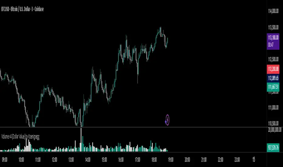
Volume v4 (Dollar Value) by Koenigsegg📊 Volume v3 (Dollar Value) by Koenigsegg
🎯 Purpose:
Volume v3 (Dollar Value) by Koenigsegg transforms traditional raw-unit volume into dollar-denominated volume, revealing how much money actually flows through each candle.
Instead of measuring how many coins or contracts were traded, this version calculates the total traded value = volume × average price (hlc3), allowing traders to visually assess capital intensity and market participation within each move.
⚙️ Core Features
- Converts raw volume into USD-based traded value for each candle.
- Color-coded bars show bullish (green/teal) vs. bearish (red) activity.
- Built-in SMA and SMMA overlays highlight sustained shifts in value flow.
- Designed for visual clarity to support momentum, exhaustion, and divergence studies.
📖 How to Read It
Rising Dollar Volume — indicates growing market participation and strong capital flow, often aligning with impulsive waves in trend direction.
Falling Dollar Volume — signals waning interest or reduced participation, potentially hinting at correction or exhaustion phases.
Comparing Legs — when price makes new highs/lows but dollar volume weakens, it can reveal divergences between price movement and actual capital commitment.
SMA / SMMA Lines — use them to identify longer-term accumulation or depletion of market activity, separating short bursts from sustained inflows or outflows.
The goal is to visualize the strength of market moves in terms of capital energy, not just tick activity. This distinction helps traders interpret whether a trend is being driven by genuine money flow or low-liquidity drift.
⚠️ Disclaimer
This script is provided for research and educational purposes only.
It does not constitute financial advice, investment recommendations, or trading signals.
Always conduct your own analysis and manage your own risk when trading live markets.
The author accepts no liability for financial losses incurred from use of this tool.
🧠 Credits
Developed and published by Koenigsegg.
Written in Pine Script® v6, fully compliant with TradingView’s House Rules for Pine Scripts.
Licensed under the Mozilla Public License 2.0.
HPAS – Historical Price Action StatisticsHPAS – Historical Price Action Statistics (v7)
A data-driven overview of weekday behavior: price, volatility, and volume.
1) OVERVIEW
HPAS analyzes how each weekday behaves across your selected history. It aggregates daily returns, intraday ranges, and volumes into a compact heatmap table and optionally plots daily range bands (historical & today) on the chart.
Note: All weekday statistics are calculated using UTC-based daily candles for consistent results across markets (especially 24/7 assets like crypto).
The goal is context and probabilities — not signals.
2) HOW IT WORKS
Collects daily bar stats: % gain/loss (close vs open), intraday range ((High−Low) ÷ Open × 100), and contracts (volume).
Groups data by weekday (Sun–Sat) and computes: win/loss frequencies, average and max moves, average intraday ranges, and average volume.
Note: “Weekday” refers to the calendar day in UTC time . This ensures consistency across all assets and exchanges, particularly for 24/7 markets like crypto.
Compares average weekday volume to the current 20-day average (% of 20D).
Displays results in a color-shaded table; optionally draws historical daily range bands plus today’s projection with optional smoothing.
3) INCLUDED FEATURES
Core metrics
Total → Gain / Loss (% of Days): How often the day closes above/below open.
Closing → Avg / Max: Average and largest daily % moves up/down.
Intrabar (optional) → Avg / Max: Typical and extreme intraday % ranges.
Contracts → Avg (K): Average daily volume (shown in thousands).
Contracts → %20D: Weekday’s average volume as % of the current 20-day average.
Visualization & UX
Heatmap coloring: lower values appear darker; higher values lighter.
Current weekday highlight with a left-side triangle.
Tooltips on headers explain what/why/how.
Dark/Light theme support; Colorblind-safe palette toggle (Okabe–Ito).
Projection Bands
Plots historical daily range bands and today’s projected band.
Optional smoothing (SMA) for cleaner band movement.
Band Smoothing Explained: Applies a simple moving average over recent projection values to reduce sudden jumps in the upper/lower bands.
Higher values make the range lines steadier but slower to react; lower values show more real-time variability.
4) USAGE TIPS
Context, not prediction: Use stats to frame expectations, not to force trades.
Cycle awareness: Compare long vs short date windows; behavior can shift across regimes.
Volume tells a story: Elevated %20D can hint at increased participation or attention on certain weekdays.
Targets & risk: Range bands provide realistic context for sizing stops/targets.
Accessibility: Enable Colorblind-safe mode if red/green contrast is hard to read.
5) INTERPRETATION GUIDE
% Gain / % Loss — Frequency of up/down closes. Higher % Gain suggests a bullish weekday bias.
Avg Gain / Avg Loss — Mean daily % move on green/red days. Gauges typical magnitude.
Max Gain / Max Loss — Largest observed daily % change. Sets an upper bound of past extremes.
Hi-Lo Avg / Max — Typical and extreme intraday % ranges. Context for expected volatility.
Contracts Avg (K) — Average daily volume in thousands. Participation proxy.
%20D — Volume vs current 20-day average. 100% = typical, >100% = above-normal, <100% = lighter-than-normal.
6) CREDITS
Inspired by the HPAS concept popularized by Krown Trading and The Caretaker.
Rebuilt and extended for clarity, accessibility, and practical context.
Version: v7 (October 2025)
License: Educational, non-commercial use
Key Inputs (snippet)
// Projection Bands
grpBands = “Projection Bands”
showBands = input.bool(true, “Show daily range bands (historical & today)”, group=grpBands)
smoothLen = input.int(1, “Band smoothing (days)”, minval=1, maxval=20, group=grpBands)

Cumulative Volume Delta Z Score [BackQuant]Cumulative Volume Delta Z Score
The Cumulative Volume Delta Z Score indicator is a sophisticated tool that combines the cumulative volume delta (CVD) with Z-Score normalization to provide traders with a clearer view of market dynamics. By analyzing volume imbalances and standardizing them through a Z-Score, this tool helps identify significant price movements and market trends while filtering out noise.
Core Concept of Cumulative Volume Delta (CVD)
Cumulative Volume Delta (CVD) is a popular indicator that tracks the net difference between buying and selling volume over time. CVD helps traders understand whether buying or selling pressure is dominating the market. Positive CVD signals buying pressure, while negative CVD indicates selling pressure.
The addition of Z-Score normalization to CVD makes it easier to evaluate whether current volume imbalances are unusual compared to past behavior. Z-Score helps in detecting extreme conditions by showing how far the current CVD is from its historical mean in terms of standard deviations.
Key Features
Cumulative Volume Delta (CVD): Tracks the net buying vs. selling volume, allowing traders to gauge the overall market sentiment.
Z-Score Normalization: Converts CVD into a standardized value to highlight extreme movements in volume that are statistically significant.
Divergence Detection: The indicator can spot bullish and bearish divergences between price and CVD, which can signal potential trend reversals.
Pivot-Based Divergence: Identifies price and CVD pivots, highlighting divergence patterns that are crucial for predicting price changes.
Trend Analysis: Colors bars according to trend direction, providing a visual indication of bullish or bearish conditions based on Z-Score.
How It Works
Cumulative Volume Delta (CVD): The CVD is calculated by summing the difference between buying and selling volume for each bar. It represents the net buying or selling pressure, giving insights into market sentiment.
Z-Score Normalization: The Z-Score is applied to the CVD to normalize its values, making it easier to compare current conditions with historical averages. A Z-Score greater than 0 indicates a bullish market, while a Z-Score less than 0 signals a bearish market.
Divergence Detection: The indicator detects regular and hidden bullish and bearish divergences between price and CVD. These divergences often precede trend reversals, offering traders a potential entry point.
Pivot-Based Analysis: The indicator uses pivot highs and lows in both price and CVD to identify divergence patterns. A bullish divergence occurs when price makes a lower low, but CVD fails to follow, suggesting weakening selling pressure. Conversely, a bearish divergence happens when price makes a higher high, but CVD doesn't confirm the move, indicating potential selling pressure.
Trend Coloring: The bars are colored based on the trend direction. Green bars indicate an uptrend (CVD is positive), and red bars indicate a downtrend (CVD is negative). This provides an easy-to-read visualization of market conditions.
Standard Deviation Levels: The indicator plots ±1σ, ±2σ, and ±3σ levels to indicate the degree of deviation from the average CVD. These levels act as thresholds for identifying extreme buying or selling pressure.
Customization Options
Anchor Timeframe: The user can define an anchor timeframe to aggregate the CVD, which can be customized based on the trader’s needs (e.g., daily, weekly, custom lower timeframes).
Z-Score Period: The period for calculating the Z-Score can be adjusted, allowing traders to fine-tune the indicator's sensitivity.
Divergence Detection: The tool offers controls to enable or disable divergence detection, with the ability to adjust the lookback periods for pivot detection.
Trend Coloring and Visuals: Traders can choose whether to color bars based on trend direction, display standard deviation levels, or visualize the data as a histogram or line plot.
Display Options: The indicator also allows for various display options, including showing the Z-Score values and divergence signals, with customizable colors and line widths.
Alerts and Signals
The Cumulative Volume Delta Z Score comes with pre-configured alert conditions for:
Z-Score Crossovers: Alerts are triggered when the Z-Score crosses the 0 line, indicating a potential trend reversal.
Shifting Trend: Alerts for when the Z-Score shifts direction, signaling a change in market sentiment.
Divergence Detection: Alerts for both regular and hidden bullish and bearish divergences, offering potential reversal signals.
Extreme Imbalances: Alerts when the Z-Score reaches extreme positive or negative levels, indicating overbought or oversold market conditions.
Applications in Trading
Trend Identification: Use the Z-Score to confirm bullish or bearish trends based on cumulative volume data, filtering out noise and false signals.
Reversal Signals: Divergences between price and CVD can help identify potential trend reversals, making it a powerful tool for swing traders.
Volume-Based Confirmation: The Z-Score allows traders to confirm price movements with volume data, providing more reliable signals compared to price action alone.
Divergence Strategy: Use the divergence signals to identify potential points of entry, particularly when regular or hidden divergences appear.
Volatility and Market Sentiment: The Z-Score provides insights into market volatility by measuring the deviation of CVD from its historical mean, helping to predict price movement strength.
The Cumulative Volume Delta Z Score is a powerful tool that combines volume analysis with statistical normalization. By focusing on volume imbalances and applying Z-Score normalization, this indicator provides clear, reliable signals for trend identification and potential reversals. It is especially useful for filtering out market noise and ensuring that trades are based on significant price movements driven by substantial volume changes.
This indicator is perfect for traders looking to add volume-based analysis to their strategy, offering a more robust and accurate way to gauge market sentiment and trend strength.

SEIZ - Statistical External & Internal Zones [Pro]Overview
SEIZ (Statistical External & Internal Zones) visualizes how far price typically travels beyond a prior candle’s range (external to previous candles high/low) or within it (internal to previous candles high/low).
It displays percentile thresholds that highlight when movement is statistically common vs. stretched relative to recent structure.
Key Features
• External zones: mark areas where price historically tends to extend beyond the previous range.
Example: a 50th external high percentile is a historically common extension above the prior candle range’s high; a 50th external low percentile is a historically common extension below the prior candle range’s low.
• Internal zones: mark areas where price historically tends to retrace while remaining inside the previous range.
Example: a 50th internal high percentile represents a historically common move that remained within the prior candle range on the high side; similarly for internal low.
• Auto-switching: When "enabled" the indicator will automatically switch to the correct internal or external zones. For example if the indicator is on the daily timeframe it will automatically show external high zones and levels if it has gone above the previous days high. It will then hide/filter out the internal high zones because price is no longer within the previous daily range.
• Multi-time-frame table: summarizes the most significant percentile reached on each enabled timeframe (e.g., 15m → 12h, 1D) with an interval-progress readout. For example if indicator is set to "Daily" it will show the highest level reached within the day under the "High" column, and the lowest level reached in the day under the "Low" column. The "Progress" column shows how much of the timeframe of that row has completed its candle/interval.
• Highly customizable settings:
- "Show Historic": When on will show current interval zones and as many previous intervals as possible
- "Show Intervals 2 Only": When on will show only the current and previous interval zones and levels.
- Choose between drawing lines for levels or zones or both. Customize colors and transparency of zones.
Methodology (transparency)
• SEIZ uses pre-computed, timeframe-specific percentile datasets that quantify typical extensions and retracements observed in historical data.
• The datasets are embedded in the script for deterministic plotting across timeframes; no external connections are used.
• Percentile values reflect empirical frequencies (not assumptions of a normal distribution).
• These levels do not have any prediction power over future price. They are a visual to compare historically where highs and lows most commonly formed for a time period with current price.
How to use
Choose the Timeframe to reference for zones.
Leave Auto external/internal zones filtering ON for regime-aware plotting.
Optional: enable percentile lines (25 / 50 / 75 / 85 / 95) and/or filled zones; adjust opacity and labels to taste.
Set alerts on percentile crosses to be notified when price reaches statistically rare areas.
Treat SEIZ as context; it does not generate entries or exits.
Notes
• Descriptive tool — no prediction or performance claims.
• Percentiles summarize historical behavior and can vary with market conditions.
• Source is protected to safeguard the proprietary construction of percentile datasets.
• Non-standard chart types (e.g., Heikin Ashi, Renko) are for display only.
Credits
Developed by LevelLogic Indicators to help interpret market structure through empirical percentile context.

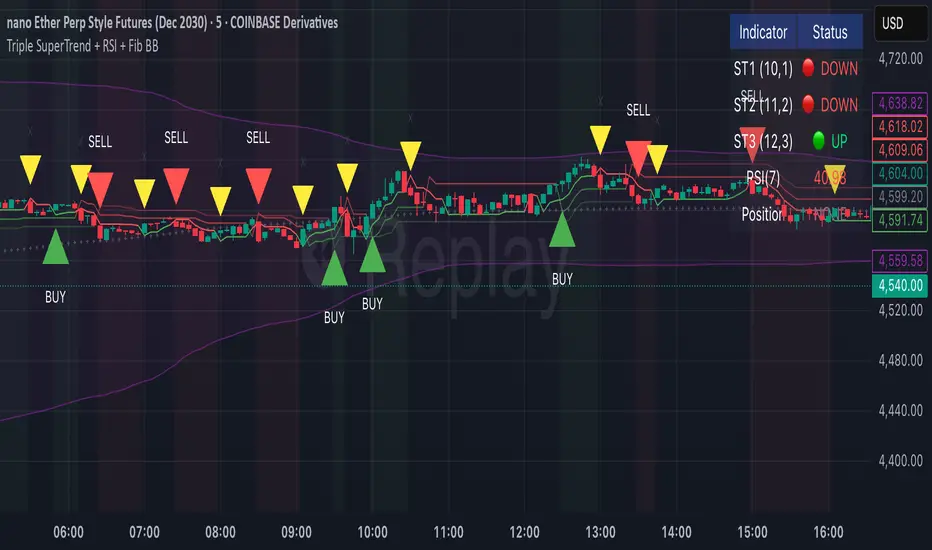
Triple SuperTrend + RSI + Fib BBTriple SuperTrend + RSI + Fibonacci Bollinger Bands Strategy
📊 Overview
This advanced trading strategy combines the power of three SuperTrend indicators with RSI confirmation and Fibonacci Bollinger Bands to generate high-probability trade signals. The strategy is designed to capture strong trending moves while filtering out false signals through multi-indicator confluence.
🔧 Core Components
Three SuperTrend Indicators
The strategy uses three SuperTrend indicators with progressively longer periods and multipliers:
SuperTrend 1: 10-period ATR, 1.0 multiplier (fastest, most sensitive)
SuperTrend 2: 11-period ATR, 2.0 multiplier (medium sensitivity)
SuperTrend 3: 12-period ATR, 3.0 multiplier (slowest, most stable)
This layered approach ensures that all three timeframe perspectives align before generating a signal, significantly reducing false entries.
RSI Confirmation (7-period)
The Relative Strength Index acts as a momentum filter:
Long signals require RSI > 50 (bullish momentum)
Short signals require RSI < 50 (bearish momentum)
This prevents entries during weak or divergent price action.
Fibonacci Bollinger Bands (200, 2.618)
Uses a 200-period Simple Moving Average with 2.618 standard deviation bands (Fibonacci ratio). These bands serve dual purposes:
Visual representation of price extremes
Automatic exit trigger when price reaches overextended levels
📈 Entry Logic
LONG Entry (BUY Signal)
A LONG position is opened when ALL of the following conditions are met simultaneously:
All three SuperTrend indicators turn green (bullish)
RSI(7) is above 50
This is the first bar where all conditions align (no repainting)
SHORT Entry (SELL Signal)
A SHORT position is opened when ALL of the following conditions are met simultaneously:
All three SuperTrend indicators turn red (bearish)
RSI(7) is below 50
This is the first bar where all conditions align (no repainting)
🚪 Exit Logic
Positions are automatically closed when ANY of these conditions occur:
SuperTrend Color Change: Any one of the three SuperTrend indicators changes direction
Fibonacci BB Touch: Price reaches or exceeds the upper or lower Fibonacci Bollinger Band (2.618 standard deviations)
This dual-exit approach protects profits by:
Exiting quickly when trend momentum shifts (SuperTrend change)
Taking profits at statistical price extremes (Fib BB touch)
🎨 Visual Features
Signal Arrows
Green Up Arrow (BUY): Appears below the bar when long entry conditions are met
Red Down Arrow (SELL): Appears above the bar when short entry conditions are met
Yellow Down Arrow (EXIT): Appears above the bar when exit conditions are met
Background Coloring
Light Green Tint: All three SuperTrends are bullish (uptrend environment)
Light Red Tint: All three SuperTrends are bearish (downtrend environment)
SuperTrend Lines
Three colored lines plotted with varying opacity:
Solid line (ST1): Most responsive to price changes
Semi-transparent (ST2): Medium-term trend
Most transparent (ST3): Long-term trend structure
Dashboard
Real-time information panel showing:
Individual SuperTrend status (UP/DOWN)
Current RSI value and color-coded status
Current position (LONG/SHORT/FLAT)
Net Profit/Loss
⚙️ Customizable Parameters
SuperTrend Settings
ATR periods for each SuperTrend (default: 10, 11, 12)
Multipliers for each SuperTrend (default: 1.0, 2.0, 3.0)
RSI Settings
RSI length (default: 7)
RSI source (default: close)
Fibonacci Bollinger Bands
BB length (default: 200)
BB multiplier (default: 2.618)
Strategy Options
Enable/disable long trades
Enable/disable short trades
Initial capital
Position sizing
Commission settings
💡 Strategy Philosophy
This strategy is built on the principle of confluence trading - waiting for multiple independent indicators to align before taking a position. By requiring three SuperTrend indicators AND RSI confirmation, the strategy filters out the majority of low-probability setups.
The multi-timeframe SuperTrend approach ensures that short-term, medium-term, and longer-term trends are all in agreement, which typically occurs during strong, sustainable price moves.
The exit strategy is equally important, using both trend-following logic (SuperTrend changes) and mean-reversion logic (Fibonacci BB touches) to adapt to different market conditions.
📊 Best Use Cases
Trending Markets: Works best in markets with clear directional bias
Higher Timeframes: Designed for 15-minute to daily charts
Volatile Assets: SuperTrend indicators excel in assets with clear trends
Swing Trading: Hold times typically range from hours to days
⚠️ Important Notes
No Repainting: All signals are confirmed and will not change on historical bars
One Signal Per Setup: The strategy prevents duplicate signals on consecutive bars
Exit Protection: Always exits before potentially taking an opposite position
Visual Clarity: All three SuperTrend lines are visible simultaneously for transparency
🎯 Recommended Settings
While default parameters are optimized for general use, consider:
Crypto/Volatile Markets: May benefit from slightly higher multipliers
Forex: Default settings work well for major pairs
Stocks: Consider longer BB periods (250-300) for daily charts
Lower Timeframes: Reduce all periods proportionally for scalping
📝 Alerts
Built-in alert conditions for:
BUY signal triggered
SELL signal triggered
EXIT signal triggered
Set up notifications to never miss a trade opportunity!
Disclaimer: This strategy is for educational and informational purposes only. Past performance does not guarantee future results. Always backtest thoroughly and practice proper risk management before live trading.
Background Trend Follower by exp3rtsThe Background Trend Follower indicator visually highlights the market’s daily directional bias using subtle background colors. It calculates the price change from the daily open and shades the chart background according to the current intraday momentum.
🟢 Green background → Price is significantly above the daily open (strong bullish trend)
🔴 Red background → Price is significantly below the daily open (strong bearish trend)
🟡 Yellow background → Price is trading near the daily open (neutral or consolidating phase)
The script automatically detects each new trading day.
It records the opening price at the start of the day.
As the session progresses, it continuously measures how far the current price has moved from that open.
When the move exceeds ±50 points (custom threshold), the background color adapts to reflect the trend strength.
Perfect for traders who want a quick visual sense of intraday bias — bullish, bearish, or neutral — without cluttering the chart with extra indicators.
HTF Live View - GSK-VIZAG-AP-INDIA📘 HTF Live View — GSK-VIZAG-AP-INDIA
🧩 Overview
The HTF Live View indicator provides a real-time visual representation of higher-timeframe (HTF) candle structures — such as 15min, 30min, 1H, 4H, and Daily — all derived directly from live 1-minute data.
This allows traders to see how higher timeframe candles are forming within the current session — without switching chart timeframes.
⚙️ Core Features
📊 Live Multi-Timeframe OHLC Tracking
Continuously calculates and displays Open, High, Low, and Close values for each key timeframe (15m, 30m, 1H, 4H, and Daily) based on the ongoing session.
⏱ Session-Aware Calculation
Automatically syncs with market hours defined by user-selected start and end times. Works across multiple timezones for global compatibility.
🕹 Visual Candle Representation
Draws mini-candles on the chart for each higher timeframe to represent their current body and wick — updated live.
Green body → bullish development
Red body → bearish development
📅 Informative Table Panel
Displays a summary table showing:
Timeframe label
Period (start–end time)
Live OHLC values
Color-coded close values
🌍 Timezone Support
Fully compatible with common regions such as Asia/Kolkata, New York, London, Tokyo, and Sydney.
🔧 User Inputs
Parameter Description
Market Start Hour/Minute Define session start time (default: 09:15)
Session End Hour/Minute Define market close (default: 15:30)
Timezone Select your preferred timezone for session alignment
💡 How It Works
The indicator uses a rolling OHLC calculation function that dynamically computes candle values based on elapsed session time.
Each timeframe (15m, 30m, 1H, 4H, and Daily) is built from 1-minute data to maintain precision even during intraday updates.
Both a visual representation (candles and wicks) and a data table (numeric summary) are displayed for clarity.
🧠 Use Cases
Monitor how HTF candles are forming live without switching chart intervals.
Understand intraday structure shifts (e.g., when 1H turns from red to green).
Confirm trend alignment across multiple timeframes visually.
Combine with your volume, delta, or liquidity tools for deeper confluence.
🪶 Signature
Developed by GSK-VIZAG-AP-INDIA
© prowelltraders — Educational and analytical use only.
⚠️ Disclaimer
This indicator is for educational and informational purposes only.
It does not provide financial advice or guaranteed trading results.
Always perform your own analysis before making investment decisions.
