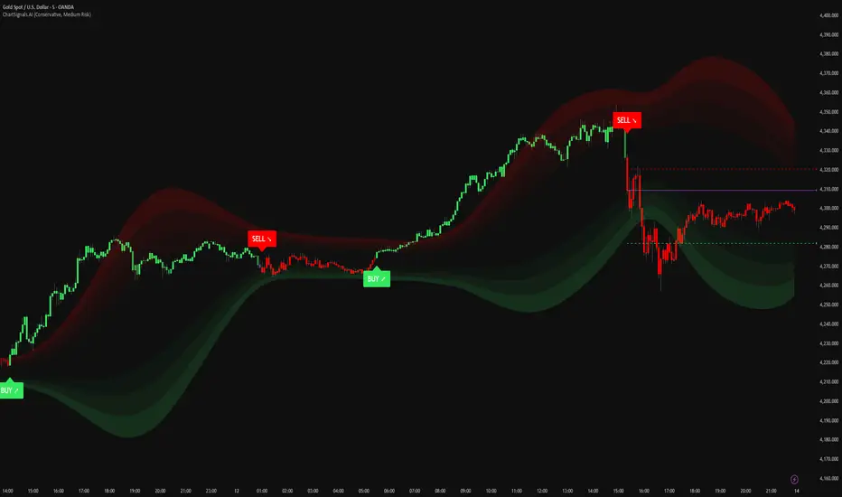
ChartSignals.AIChartSignals.AI is an overlay indicator designed to simplify chart reading by highlighting potential trade opportunities and providing optional visual context tools.
WHAT YOU’LL SEE
• Buy/Sell signals displayed directly on the chart
• Optional trade level guides (Entry / Take Profit / Stop Loss) to help structure a plan
• Optional trend and zone overlays to help interpret market conditions
• Optional key levels and breakout markers for additional context
• Dynamic candle coloring to help visualize momentum vs. quieter conditions
HOW TO USE (SIMPLE)
• Add ChartSignals.AI to your chart
• Choose a Signal Mode (controls how frequently signals appear)
• Enable/disable the optional overlays you want
• Use signals as chart assistance and confirm with your own analysis and risk management
ALERTS
This script includes alert conditions for:
• Buy, Sell, general signal notifications, and key level break events (when enabled).
DISCLAIMER
For educational and charting purposes only. Not financial advice. Trading involves risk and you are responsible for your own decisions.
成交量
Momentum Pulse Pro [MTF]# Momentum Pulse Pro
## What It Does
Detects when price momentum is stretched to extremes. The indicator analyzes momentum and highlights when the market is overextended — either too hot or too cold.
- **Green background** = Low momentum, potential bounce ahead
- **Red background** = High momentum, potential reversal ahead
- **Stronger color** = Stronger signal
## The Panel
Displays a Momentum Index from 0-100:
- **Below 30** = Stretched to the downside
- **30-70** = Neutral zone
- **Above 70** = Stretched to the upside
## How to Use
1. Wait for the background to change color
2. Stronger color = higher probability setup
3. Use as a filter for your strategy — don't trade it alone
## Settings
- **Colors** — Customize green/red
- **Transparency** — Background visibility
- **Confluence Intensity** — How fast color intensifies
- **Panel Position** — Move the info panel
## Alerts
- Momentum enters extreme zone
- Momentum strengthens or weakens inside extreme zone
## Good to Know
- Non-repainting
- Works on any market
- Best on 4H chart or lower

FTL Context Teaser - PublicFTL Context (Teaser) – Public
FTL Context (Teaser) is a visual market context layer designed to highlight periods of increased market risk and structural tension.
This script does NOT provide trading signals and is NOT intended for standalone trading decisions.
It serves as a contextual overlay only, helping traders visually identify when market conditions shift away from equilibrium.
The teaser version is intentionally limited and does not expose the underlying logic or decision framework.
Full functionality, advanced filters, and integrated decision logic are available in the invite-only FTL Context Layer (PRO).
📩 Contact / PRO access:
fairtradinglab@gmail.com
Educational & informational use only.

Navigator Triple VolumeNavigator Triple Volume (VWAP + Fixed VP + Flexible VP)
**Navigator Triple Volume** combines three of the most practical volume-based tools into one clean overlay:
1. **VWAP (anchored) with optional deviation bands**
2. **Fixed Volume Profile** (auto-building by anchor timeframe, with optional developing/current profile)
3. **Flexible Volume Profile** (manual start/end window for custom range analysis)
The goal is simple: give you **institutional-grade context**—where price is “fair,” where volume is accepted, and where the real inventory is sitting—without stacking multiple indicators.
1) Anchored VWAP + Bands
This script plots an **anchored VWAP** and optional **±1 and ±2 standard deviation bands** to help you gauge:
* “Fair value” (VWAP)
* Stretch/extension zones (deviation bands)
* Mean reversion vs. trend strength around VWAP
Anchor period options include **Daily, Week, Month, Quarter, Year**, and event-based anchors like **Earnings, Dividends, and Splits** (where supported).
2) Fixed Volume Profile
The Fixed VP automatically builds a **completed profile each time the anchor timeframe rolls over** (ex: Daily). It can also display the **current/developing profile** for the active anchor period.
Includes:
* **PoC (Point of Control)**
* **Value Area (VAH/VAL)** based on a configurable % (default 68%)
* Adjustable **rows (resolution)**, **profile width**, and **bar thickness**
3) Flexible Volume Profile
Flexible VP lets you define a **custom range** using a manual **Start Calculation** and **End Calculation** time selection. This is ideal for:
* Single swing legs
* News/event reactions
* Range breaks
* “From low to high” campaign profiling
Includes:
* PoC + Value Area levels
* Adjustable profile resolution and styling
How traders use it
* Use **VWAP** as the “fair value” magnet and trend filter
* Use **Fixed VP** to identify session/period acceptance and key reference levels
* Use **Flexible VP** to profile *your chosen range* and locate the true battleground: PoC, VAH, and VAL
When all three agree, it’s a high-confidence area for decision-making. When they disagree, it often signals transition or rotation.
Notes
* This indicator draws profiles using TradingView line objects and includes controls to manage performance and display preferences.
* Built for chart clarity: one script, three volume lenses.

Price Zones/Supply & DemandPrice Zones – Supply & Demand is an advanced indicator that automatically identifies key Supply, Demand, and Equilibrium zones based on volume distribution across price levels within a fixed lookback window.
The main purpose of this indicator is to provide structural price context, helping traders detect areas where an imbalance between buyers and sellers has historically occurred, and where price is more likely to react.
🔍 How it works
Fixed lookback analysis
The indicator analyzes a predefined number of historical bars to avoid repainting and ensure consistent and reliable behavior.
Volume distribution by price levels
The total price range within the lookback is divided into multiple segments (“Resolution”), measuring how much volume has been traded at each level.
Key zone detection
Supply Zone: Upper price area where a significant percentage of selling volume is concentrated.
Demand Zone: Lower price area with high concentration of buying volume.
Equilibrium: The midpoint of the analyzed range, representing balance between supply and demand.
Representative levels
Full zone area
Average price line of each zone
Always-visible midline for higher precision
Global equilibrium line
🎨 Visualization & styling
Multiple predefined visual themes (including the LionLabs preset).
Zones can be extended to the right to help project future price interaction.
Midlines and equilibrium lines are displayed using dashed styles for clarity.
Optional Supply / Demand labels with configurable size and transparency.
The visual design is clean, professional, and non-intrusive, suitable for any market or timeframe.
🚨 Built-in alert system
The indicator includes a full alert()-based alert system, including:
Close entering a Supply or Demand zone
First touch of a zone
Price crossing the Equilibrium level
Unified alert that triggers on any relevant event
Alerts can be configured to trigger only on bar close or in real time.
🧠 Who is this indicator for?
Traders using Supply & Demand zone analysis
Reversal, reaction, or confirmation-based strategies
As a context filter for discretionary or automated systems
Suitable for scalping, intraday, and swing trading
⚠️ Important note
This indicator does not generate buy or sell signals on its own. It is designed as a context and analysis tool and should be used alongside proper risk management and a well-defined trading strategy.

Navigator Volume Profil FixedLong Term Investing
Day Trading
Navigator Volume Profile Fixed (Fixed + Current Session)
**Navigator Volume Profile Fixed** plots a horizontal volume profile on your chart using a **fixed timeframe anchor** (ex: Daily) and optionally overlays a **live “current” profile** for the active session/period.
It’s designed to help you quickly see where volume is building (acceptance) vs. thinning out (rejection), and to identify the key reference levels traders watch most: **PoC, VAH, and VAL**.
### What it plots
**Fixed Volume Profile (anchored to a timeframe)**
Builds a completed profile each time the selected anchor timeframe rolls over (ex: each new day on a Daily anchor).
**Current Volume Profile (live)**
Continuously updates the developing profile for the current anchor period (optional toggle).
**Point of Control (PoC)**
Highlights the single price level with the highest traded volume.
**Value Area (VAH / VAL)**
Plots the Value Area boundaries using a configurable percentage (default **68%**), and visually differentiates the value area from the rest of the profile.
Key settings
* **Enable Fixed VP**: turn the fixed/anchored profile on/off
* **Timeframe Anchor**: choose the profile reset period (ex: 1D)
* **Show Current Fixed VP**: show/hide the developing (current) profile
* **Number of Rows**: controls profile resolution (price “bins”)
* **Profile Width (%)** and **Bar Thickness**: visual scaling controls
* **PoC + Value Area toggles**: show/hide PoC and VA boundaries
* **Extend PoC Line**: optionally extend the PoC into the future
How to use it (practical)
* Treat **PoC** as the most accepted price for the anchored period.
* Use **VAH/VAL** as reference boundaries for balance vs. imbalance.
* Compare **Fixed** vs **Current** profiles to see whether volume is migrating higher/lower during the session and where price is building acceptance.
**Note:** This script draws using TradingView line objects and is optimized to stay within platform limits while maintaining a clean profile display.

Titan VSA + SMC Prime (Professional Institutional System)Titan VSA + SMC Prime is a comprehensive, hybrid trading system designed to bridge the gap between Volume Spread Analysis (VSA) and Smart Money Concepts (SMC) By Sultan of Multan. This script is built for traders who want to identify institutional activity, spot liquidity traps, and trade in harmony with the "Smart Money."
Unlike standard indicators that repaint or lag, Titan Prime focuses on price action, structural shifts, and volume anomalies to generate high-probability setups.
🔥 Key Features
1. Smart Money Concepts (SMC) Suite
Market Structure: Automatically maps BOS (Break of Structure) and CHoCH (Change of Character) with real-time trend identification (Bullish/Bearish).
Institutional Zones: clearly plots Order Blocks (OB), Breaker Blocks (BB), Fair Value Gaps (FVG), and Supply/Demand Zones.
Mitigation Tracking: Zones are automatically marked as "Mitigated" or removed once price has tested them, keeping your chart clean.
Premium & Discount Zones: Automatically draws the Equilibrium (EQ) to help you sell in Premium and buy in Discount areas.
2. Advanced Liquidity & Traps
Liquidity Sweeps (⚔): Identifies when key Highs or Lows are swept to grab liquidity.
Inducement (IDM 🪤): Highlights short-term highs/lows that act as "traps" for retail traders before the real move occurs. This helps you avoid false breakouts.
3. Volume Spread Analysis (VSA) Engine
Volume Bar Coloring: Candles are color-coded based on volume intensity:
🟨 Yellow: Ultra High Volume (Institutional Activity).
⬜ Gray: Low Volume (Lack of interest).
VSA Signals: Automatically detects powerful VSA patterns including:
No Demand (ND) / No Supply (NS)
Stopping Volume & Climaxes (SC/BC)
UpThrusts (UT) & Springs
Effort to Rise / Fall
Absorption
4. The "Smart Entry" System
This is the core of the indicator. It does not spam signals. It waits for a specific institutional sequence:
Liquidity Sweep: Price grabs liquidity.
Displacement: Price reverses aggressively.
Retest: The system waits for a pullback to the Order Block or FVG.
Confirmation: Only then does it display a "RETEST COMPLETE ✅ - SMART ENTRY" label with suggested TP/SL levels.
5. Professional Dashboards
Trade Status Panel (Top-Right): Monitors active signals, Entry, Stop Loss, Take Profit, and VSA Trend Score.
SMC Status Panel (Bottom-Right): A live scanner showing the status of Supply/Demand, FVGs, Structure, and overall Market Bias at a glance.
How to Use
Identify Trend: Use the dashboard to check if the market structure is Bullish or Bearish.
Wait for Traps: Look for IDM or Liquidity Sweep (⚔) labels. Smart moves usually happen after these traps.
Entry Confirmation: Do not enter blindly. Wait for the "RETEST COMPLETE" label which confirms that price has respected a Smart Money Zone.
Confluence: The best trades occur when an SMC Zone aligns with a VSA Signal (e.g., A Buying Climax inside a Demand Zone).
Customization
Visual Control: Fully adjustable text sizes, colors, and box lengths to fit your charting style.
Zoom Stability: Labels and text are pinned to ensure they remain readable when zooming in or out.
Disclaimer
This tool is for educational and analytical purposes. Always manage your risk and do not rely solely on any single indicator for financial decisions.

FTL Context - Public TeaserFTL Context (Teaser) – Public
FTL Context (Teaser) is a visual market context layer designed to highlight periods of increased market risk and structural tension.
This script does NOT provide trading signals and is NOT intended for standalone trading decisions.
It serves as a contextual overlay only, helping traders visually identify when market conditions shift away from equilibrium.
The teaser version is intentionally limited and does not expose the underlying logic or decision framework.
Full functionality, advanced filters, and integrated decision logic are available in the invite-only FTL Context Layer (PRO).
Educational & informational use only.

FestX VSTFestX NY Session Volume Framework is a session-based momentum and liquidity indicator designed specifically for the New York market open.
The script focuses on time-based market behaviour, filtering signals to only occur at precise session transitions where institutional volume is statistically higher.
Core Concepts Used:
• Session Transition Logic
Signals are only evaluated when the New York trading session opens, eliminating noise from low-liquidity periods.
• Relative Volume Expansion
Instead of raw volume, the script compares current volume against a rolling average to detect abnormal participation at the session open.
• Directional Candle Validation
Entry bias is derived from the relationship between candle open and close at the session trigger, aligning trades with immediate momentum.
• Optional Session Range Context
The tool can be used alongside Asian session highs and lows to identify continuation or reversal behaviour after range compression.
What Makes This Script Different:
This indicator does not attempt to predict direction throughout the day.
It deliberately restricts signals to one specific institutional window, using volume expansion + price acceptance to confirm direction.
This design reduces overtrading and focuses traders on high-quality, time-based opportunities rather than constant signals.
Intended Use:
• NY session open traders
• Index and futures traders
• Traders seeking confirmation at session transitions
This script is not a traditional trend indicator or oscillator and is best used as a contextual decision tool, not a standalone signal generator.

INSTITUTIONAL MOMENTUM [@Ash_TheTrader]⚡ The Impulse Engine: Institutional Velocity & Smart Structure System
Subtitle/Short Description: Stop looking at just Open and Close. Visualize the speed of price action, detect institutional footprints, and trade off dynamic "living" market structure that flips and burns automatically. Developed by @Ash_TheTrader.
The Hidden Dimension of Price Action
Most traders look at a standard candlestick and see four data points: Open, High, Low, and Close.
But this hides the most critical information: The struggle.
Did the buyers step in aggressively in the first 5 minutes, pushing price to highs instantly? (Institutional buying)
Or did it take 59 minutes of slow, grinding effort to reach that high? (Retail exhaustion/Trap)
Standard candles look identical in both scenarios. The Impulse Engine, developed by @Ash_TheTrader, solves this by visualizing the "Speed of Price" (Velocity) directly onto your chart, combined with a state-of-the-art, dynamic market structure system.
It’s not just an indicator; it’s a complete market X-ray.
1. The Velocity Painter: See the Speed ⚡
The core of this system is the Velocity Engine. It looks "inside" your current timeframe bar (using lower timeframe data) to calculate how fast price traveled to its extremes.
It paints the bars based on institutional urgency, allowing you to ignore the noise and focus on the momentum.
The Visual Code:
⚡ NEON CYAN (Bullish Impulse) : Aggressive buying. Price ripped from the open to the high very quickly. This is where the smart money is stepping on the gas.
⚡ NEON MAGENTA (Bearish Impulse): Aggressive selling. Price crashed from the open to the low immediately.
💤 FADED GREY (Exhaustion/Trap): The "grind." Price took a long time to reach its extremes. These are often low-momentum environments or potential traps waiting to reverse.
STANDARD GREEN/RED: Normal market flow with no significant velocity extremes.
"Trade the Neon, Ignore the Grey." — @Ash_TheTrader
2. Smart Structure: "Living" Levels 🏗️
Old-school pivot indicators clutter your chart with endless historical lines that are no longer relevant. The Impulse Engine uses a "Living Structure" algorithm that manages the lifecycle of every support and resistance level.
It only shows you the two most relevant Resistance levels (R1, R2) above price, and the two most relevant Support levels (S1, S2) below price.
Risk-Based Classification:
You choose the structure based on your trading style in the settings:
Scalp Mode: Detects short-term, 5-bar swings. (Thin dotted lines).
Trend Mode: Detects standard trend swings (21-bar). (Dashed lines).
Major Swing: Detects deep, major structural points (60-bar). (Thick solid lines).
The "Flip & Burn" Mechanic (Viral Feature) 🔥
This is where the system gets smart. It understands market mechanics:
The Flip (Role Reversal): If a Resistance level is broken by a candle close, it automatically turns Gold and becomes Support (Flip). The same applies to Support turning into Resistance. You no longer need to guess if an old level will hold from the other side.
The Burn (Auto-Cleaning): If a "Flipped" level is broken again, the system recognizes it has lost its structural integrity. The line is instantly "burned" (removed from the chart).
This ensures your chart only ever shows levels that are active and respected.
3. Whale Signs: The Footprint of Big Money 🐋
Sometimes, velocity isn't enough. You need to see raw power.
The Whale Sign feature detects massive expansions in volatility. It flags any candle whose range is significantly larger (default 2x) than the average of the previous two candles.
💚 Green Triangle + $ (Below Bar): A massive bullish expansion candle. A "Wake Up" call for longs.
❤️ Red Triangle + $ (Above Bar): A massive bearish expansion candle. A warning sign for shorts.
These often precede sustained velocity moves.
4. The Pro HUD (Heads-Up Display) 💻
In the bottom right corner, the dynamic HUD gives you a real-time health check of the current candle.
Status Header: Instantly tells you if the current candle is IMPULSE, EXHAUSTION, or NORMAL.
Live Velocity %: The exact speed score. The text color changes to Neon during impulses and fades to grey during exhaustion.
Mode Info: Reminds you which risk setting you are currently using (e.g., Mode: ).
Signature: The official @Ash_TheTrader stamp of quality.
How to Trade With The Impulse Engine
This system is designed for confluence. Never trade a signal in isolation.
📈 Strategy 1 : The "Velocity Bounce" (Trend Continuation)
Ensure the market is trending (e.g., making higher highs).
Wait for price to pull back to a Smart Support level (Cyan dashed line or Gold "Flip" line).
Trigger: Look for a Neon Cyan Impulse Candle to form right off that support level. This confirms institutions are defending the structure with speed.
📉 Strategy 2: The "Whale Breakout"
Identify a consolidation zone below a Smart Resistance level.
Trigger: A Whale Sign ($) appears on a candle that successfully closes above the Resistance level.
Confirmation: The very next candle should ideally be a Neon Impulse candle continuing the move.
Conclusion
The markets are moved by aggression and speed. By obscuring this data, standard charts put you at a disadvantage.
The Impulse Engine brings this hidden data to the forefront, combining institutional velocity detection with smart, automated market structure that reacts to price just like a professional trader would.
Trade faster, trade smarter.
Developed by @Ash_TheTrader.
(Disclaimer: This tool is for informational purposes only and does not constitute financial advice. Always manage your risk.)

VLinerMarket R1"VLiner Market R1" is our debut volume analysis tool designed to provide traders with comprehensive market insights through basic volume analysis - Delta volume. Inspired by the principles of an Order-Flow Trader.
Further details:
Market R1 features a unique design approach that combines two powerful analytical components, Volume Oscillator and Delta Bubbles (tick-volume).
The VO tracks 15-minute candle momentum using white/orange color coding.
Whilst the Delta Bubbles track 30-minute candle buy/sell pressure.
Documents:
The full User's manual for the use and concepts of this indicator is available on MT Blue's website
: mtblue-nsg.com
R1 uses:
- Tick movement volume (not real data volume)
- A look-back system for *semi-stochastic oscillation (delta toning: white & orange part of the VO's line)
Slight concerns:
- Although it may seem to be an indicator trading tool; it is Not .
This indicator only provides visualization for educational purposes, and is strictly advised Not to be use for trading/investing executions.

IVX: Institutional Velocity X-Ray [Ash_TheTrader]The Intrabar Liquidity X-Ray: Seeing Institutional Speed Inside the Candle ⚡🐢
Stop getting trapped by standard candlesticks. It’s time to see how fast the money is actually moving.
A standard candlestick tells you four things: Open, High, Low, and Close. It’s the foundation of technical analysis.
But it hides the most important metric of all: Speed.
Two bullish 1-Hour candles can look identical on your chart. Both opened at $100 and closed at $105.
Candle A hit $105 in the first 5 minutes, then spent 55 minutes holding that level.
Candle B ground slowly upwards, finally hitting $105 in the 59th minute.
To a standard indicator, these candles are the same. To a professional trader, they are opposites. One shows aggressive, front-loaded institutional buying; the other shows weak, exhausted retail grinding.
As @Ash_TheTrader, I developed the Intrabar Liquidity X-Ray to solve this problem. It stops looking at the surface of the candle and looks inside it.
🧠 The Concept: Time-To-Form
This indicator uses advanced Pine Script technology to conduct an "X-Ray" scan of the bar you are looking at.
If you are on a 1-Hour chart, the script uses request.security_lower_tf to fetch the data of the 60 individual 1-minute bars hidden inside that single hour bar.
It then asks a critical question: How long did it take for this candle to achieve its ultimate High or Low?
In a Bullish candle, we measure the time it took to hit the specific minute of the bar's High.
In a Bearish candle, we measure the time it took to hit the specific minute of the bar's Low.
By measuring this "Time-To-Form," we can classify the intent behind the move.
⚡ The "Fast" Candle (Institutional Aggression)
When smart money wants to move an asset, they don't wait all day. They execute large block orders that move price rapidly to their desired level, and then they defend it.
The Signal: The indicator identifies a bar as "Fast" if it hits its High (for bulls) or Low (for bears) in the first 20% of the candle's duration.
The Visual: The bar turns Neon Cyan and is marked with a lightning bolt ⚡.
Interpretation by @Ash_TheTrader: This is urgent liquidity. Institutions are front-loading their orders. These levels are often strong zones of support or resistance on retests because the big players showed their hand early.
🐢 The "Slow" Candle (Retail Grind)
Conversely, when a move is driven by retail traders chasing price, or when a trend is exhausted, price struggles to make new extremes. It grinds slowly, taking the entire duration of the candle just to inch slightly higher or lower.
The Signal: The indicator identifies a bar as "Slow" if it takes more than 80% of the candle's duration to finally reach its High or Low.
The Visual: The bar turns Orange and is marked with a turtle 🐢 beneath it.
Interpretation by @Ash_TheTrader: This is "weak" movement. Even if the candle is green, if it took 58 minutes of a 60-minute bar just to make a new high, the buyers are exhausted. Be wary of reversals after seeing a cluster of 🐢 candles.
💻 Features and The Dashboard
To make this data actionable in real-time, I have engineered a clean Heads-Up Display (HUD) directly on the chart.
The On-Chart Dashboard: Located in the top right, the dashboard gives you the live stats of the current forming bar. It tells you exactly what percentage of the time has passed and whether the current structure is considered Institutional ⚡ or a Retail Grind 🐢.
Other Features:
Dual Polarity Logic: Works seamlessly for both bullish trends (tracking speed to Highs) and bearish trends (tracking speed to Lows).
Smart Volume Filtering: The indicator automatically ignores insignificant low-volume "noise" bars, only highlighting speed on candles with above-average volume.
Full Alert Capability: Set alerts for "Fast ⚡" detections to catch sudden institutional activity as it happens.
⚙️ Best Practices for Using This Tool
Because this tool looks inside a bar, it is designed to be used on Higher Timeframes.
Recommended Timeframes: 30-Minute, 1-Hour, 4-Hour, or Daily charts.
Do Not Use On: 1-Minute or 5-Minute charts. (You cannot effectively "X-Ray" a 1-minute bar using 1-minute data; the math doesn't work).
A Final Note from @Ash_TheTrader
Trading is about information asymmetry. The market hides the most valuable data beneath the surface of the Open and Close. Use the Intrabar Liquidity X-Ray to stop guessing the speed of the market and start seeing it.
Trade safe, trade smart.⚡

The Physics Engine [@Ash_TheTrader]🏛️ Welcome to the Physics of Finance
By @Ash_TheTrader
Traditional technical analysis often relies on "lagging" indicators. Tools like the RSI or moving averages tell you where price has been. While useful, they are like driving a car looking only in the rearview mirror.
The Kinematic Impulse Engine (KIE) is different. It is designed to be a leading indicator of momentum shifts.
It doesn't just look at price; it treats price action like a physical object moving through space to measure its Velocity (Speed), Acceleration (G-Force), and Mass (Volume). By understanding the physics behind a move, we can determine if a trend is a powerful impulse or an exhausted drift waiting to reverse.
⚛️ The Core Concept: Trading with G-Force
If you step on the gas pedal in a car, you feel pushed back into your seat. That is acceleration (positive G-Force). When you slam on the brakes, you are thrown forward. That is deceleration (negative G-Force).
The market works the same way.
Standard momentum indicators only measure speed. The KIE measures how fast that speed is changing.
The Problem with Standard Indicators: Price can be moving higher (high speed), but the rate at which it is moving higher is slowing down (deceleration). A standard indicator will still look bullish right up until the reversal happens.
The KIE Solution: The KIE detects that deceleration instantly, warning you that the "G-Force" pushing the price up has vanished, often before the price peaks.
🎨 Visual Decoder: Reading the Heatmap
We have eliminated the need to stare at complex oscillator lines below your chart. The KIE paints the candles directly based on their "Kinetic Energy."
1. Neon Cyan : The Impulse (High G-Force) 🚀
Physics State: High Velocity + Positive Acceleration.
Meaning: The market has "pedal to the metal." Buyers are aggressive, and the move is speeding up. This is where you want to be in a trade.
Signal: Look for the small triangles (🚀) marking the start of these impulse moves out of the noise.
2. Deep Purple : Exhaustion (Braking) 🛑
Physics State: High Velocity + Negative Acceleration (Deceleration).
Meaning: The car is still moving forward fast, but the driver has taken their foot off the gas or hit the brakes.
Signal: This is a massive warning sign. If you are long and candles turn purple, the trend is running on fumes. Expect consolidation or a reversal soon.
3. Dark Gray : Equilibrium (Chop) 💤
Physics State: Low Velocity.
Meaning: No significant energy present. The market is chopping sideways.
Signal: Stay out of the market or use range-bound strategies.
⚠️ Unique Feature: Gravity Divergence Detection
This is the most powerful feature of the Kinematic Impulse Engine. It detects when price action is defying the laws of physics.
Imagine throwing a ball into the air. As it reaches the very peak of its arc, it is still moving upward, but gravity is decelerating it rapidly just before it falls back down.
The KIE detects this exact moment in the market:
Gravity Sell Signal: Price makes a new high, but Acceleration (G-Force) crashes rapidly. The market is fighting gravity and will likely snap back.
If you see a "GRAVITY" label pop up on a Deep Purple candle at a high, take notice.
🧠 The Engine Room (Under the Hood)
For the technical traders, here is how @Ash_TheTrader designed the engine:
Relative Velocity: Price changes are normalized against Average True Range (ATR) volatility. A $10 move in Bitcoin is not the same as a $10 move in a penny stock; the KIE adjusts for this automatically.
Mass Integration (Volume Weighting): In physics, Force = Mass x Acceleration. The KIE optionally uses relative Volume as "Mass." A move backed by high volume has more "weight" and is harder to stop than a low-volume move.
The HUD: The on-screen dashboard gives you real-time readings of the current Velocity and raw G-Force metrics, along with an instant trend status summary.
🛡️ How to Use This in Your Trading
The Breakout Trader: Wait for gray candles (chop). Enter when the first Neon Cyan candle appears, ideally accompanied by an Impulse Triangle (🚀). Ride the cyan until it turns purple.
The Reversal Trader: Wait for an extended run of cyan candles. When the candles turn Deep Purple and you see a "GRAVITY" warning label, look for shorting opportunities as the momentum is exhausted.
Trade smart. Trade with physics.
Developed by @Ash_TheTrader

Ultimate Trading System - DMA/EMA + Volume + Chart PatternsOVERVIEW
Ultimate Trading System (UTS) is a comprehensive technical analysis tool that combines multiple analysis methods into one powerful
indicator. It detects market structure, identifies chart patterns, analyzes volume, and provides actionable trade recommendations.
FEATURES
17 MOVING AVERAGES
• 6 DMAs (Simple): 5, 10, 20, 50, 100, 200
• 11 EMAs (Exponential): 5, 8, 9, 12, 20, 21, 34, 50, 100, 180, 200
• Smart labels with price values
• Golden Cross / Death Cross detection
CHART PATTERN DETECTION
• Triangles: Ascending, Descending, Symmetrical
• Reversals: Head & Shoulders, Double Top, Double Bottom
• Continuation: Bull Flag, Bear Flag
• Confidence scores for each pattern
VOLUME ANALYSIS
• Relative volume vs 20-period average
• Volume trend detection (rising/falling)
• Bullish/Bearish divergence alerts
• Volume confirmation for signals
SMART ANALYSIS TABLE
• Real-time pattern detection
• Probability-based confidence scores
• Clear trade recommendations
• Volume status and divergence warnings
MARKET STRUCTURE DETECTION
• ACCUMULATION - Strong bullish setup
• DISTRIBUTION - Strong bearish setup
• BULL SETUP - Favorable long conditions
• BEAR SETUP - Favorable short conditions
• TRANSITION - Market changing direction
• CHOPPY - Avoid trading
HOW TO USE
1. Check the analysis table for current market bias
2. Look for pattern confirmations (Triangle, H&S, Double Top/Bottom)
3. Verify volume is confirming the move (not diverging)
4. Follow the ACTION recommendation
5. Use MA levels for support/resistance and stop placement
RECOMMENDATIONS
• 80%+ Confidence = Strong signal, consider entry
• 60-80% Confidence = Look for entries on pullbacks
• 40-60% Confidence = Wait for confirmation
• <40% Confidence = Avoid trading
SETTINGS
• Toggle individual MAs on/off
• Customize colors for each MA
• Adjust label offsets
• Set alert sensitivity (Conservative/Medium/Aggressive)
• Show/hide background colors and analysis table
ALERTS
Set alerts for:
• Strong Buy/Sell signals
• Chart pattern detection
• Volume divergences
• Golden/Death crosses
BEST USED ON
• Stocks, Forex, Crypto, Indices
• Timeframes: 5min to Daily
• Works on all markets

Visible Range / POC / Volume / SNR Detector PROVisible Range POC & Volume SNR Detector PRO
Visible Range POC & Volume SNR Detector PRO is a professional-grade volume-based market structure tool designed to identify institutional Support & Resistance zones, Point of Control (POC), and Value Areas directly from the visible chart range.
This indicator goes beyond traditional swing highs and lows by analyzing real traded volume, revealing where large players are active, where price finds fair value, and where high-probability reactions are most likely to occur.
🔍 Core Features
📊 Visible Range Volume Profile
🔹Builds a full Volume Profile using only the visible chart range
🔹Splits price into configurable precision bins for maximum accuracy
🔹Detects true volume clusters instead of subjective price levels
🎯 Point of Control (POC)
🔹 Automatically identifies the highest-volume price level
🔹Acts as a magnet price where market participants agree on value
🔹Fully customizable line style, width, and color
🔹 Optional label with timeframe + price + volume (K / M / B)
📦 Value Area (VAH / VAL)
* Calculates Value Area High & Low around the POC
* Default **70% volume range** (institutional standard)
* Optional Value Area fill for clear fair-value visualization
* Helps distinguish **range conditions vs trending moves**
🧱 Volume-Based Support & Resistance Zones
🔹Automatically detects high-impact S&R zones from volume behavior
🔹Zones are visually classified by strength:
🔹 🟢 Strong
🔹 🟡 Medium
🔹 🔴 Weak
🔹Clean box rendering with customizable borders:
🔹 Solid / Dashed / Dotted
🔹 Zones extend dynamically into the future for planning trades
🔄 Dynamic Flip Logic (PRO Standard)
🔹 Advanced Dynamic Flip system:
🔹 Support ➜ Resistance after a breakdown
🔹Resistance ➜ Support after a breakout
🔹 Reflects real market structure shifts
🔹Eliminates outdated static levels
🔁 True Retest & Zone Intelligence
🔹Each zone includes detailed contextual data:
🔹🔄 True Retest Count (price leaves zone and comes back)
🔹⏳ Zone Age (minutes / hours / days)
🔹💪 Strength Classification
🔹🔁 Flip Status
🔹⏱️ Timeframe
🔹💲 Exact price level
🔹All information is displayed in a single clean label.
🔔 Smart Alerts System
🔹Never miss key interactions:
🔹🟢 Touch Alert — price enters a zone
🔹⬇️⬆️ Break Alert — zone failure or breakout
🔹🔄 Retest Alert — classic break & retest setup
Alerts trigger on confirmed bars to reduce noise and false signals.
📋 Professional Dashboard
🔹At-a-glance market overview:
🔹Total Support & Resistance zones
🔹🎯 POC level
🔹📦 VA High / VA Low
🔹💪 Strong / Medium / Weak zone distribution
🔹📍 Nearest Support & Resistance
🔹📏 Distance to key levels
🔹 🎨 Auto / Dark / Light theme support
🔹 📐 Adjustable size & position

ADAPTIVE ICT MULTI-ZONEAdaptive ICT Multi-Zone
Why Another ICT Script?
Most public ICT zone scripts flood your chart with dozens of noisy, overlapping boxes that never get cleaned up, use fixed lookbacks that work on one asset and fail on another, and mark every tiny gap as “FVG” — turning the chart into a rainbow mess that’s impossible to trade.
ADAPTIVE ICT MULTI-ZONE is built differently:
Only the strongest, most recent zones pass the adaptive filter (default 3 bullish OB + 3 bearish OB + 3 FVG). No more chart clutter.
Fair Value Gaps are filtered by ATR (default ≥ 0.7 × ATR) and optional high-volume confirmation so you only see gaps that actually matter.
Order Blocks are true swing-based (pivot high/low).
Every zone automatically extends far to the right until price closes through it — you never miss a mitigation.
Zero repainting. Zero lag. Zero memory leaks. Runs perfectly on every time frame.
In short: while many ICT scripts are noisy toys, this one is a surgical tool that shows exactly what institutional desks are up to.
How to Trade It Best (Simple & Effective)
Wait for price to return to a freshly drawn zone (watch the newest ones — they have the highest probability).
Look for confluence:
Price inside a Bullish Order Block + bullish engulfing or strong volume → aggressive long.
Price inside a Bearish Order Block + bearish engulfing or strong volume → aggressive short.
Price sweeping into an FVG and instantly rejecting → high-probability reversal (especially if the FVG had high volume when created).
Use higher-timeframe bias: if the daily/4H zone aligns with your 15-min or 5-min zone → stack size.
Take partials at the opposite-side order block or next FVG. Let runners go to next liquidity zone.
That’s it.
This script doesn’t try to do everything. It does one thing — show you the exact institutional zones that actually get respected — and it does it cleaner and smarter.
Add it, delete every other OB/FVG script you own, and catch more accurate reversals.

ENIGMA PROENIGMA PRO: Multi-Strategy & Signal Verification System (Smart Signal Panel)
Description: Transform market chaos into clarity. Enigma combines 12 independent and powerful algorithms (based on Trend, Momentum, Volume, Reversal, and Squeeze) running in the background into a single control panel.
Instead of relying on a single indicator, rely on the "Consensus of Strategies". Enigma doesn't just say "BUY"; it shows exactly how many different strategies support this decision simultaneously.
Key Features:
🧩 12 Hidden Algorithms (T1-T12): HMA, Ichimoku, RSI, Volume, EMA, Stochastic, and more are constantly scanning in the background.
🎛 Signal Confirmation Mechanism: You decide the minimum number of strategies required to trigger an alarm. (e.g., "Notify me only if at least 3 strategies signal BUY").
📊 Live Control Panel: Instantly monitor which strategies are active via the dashboard in the top-right corner.
🎯 Precise Filtering: Pinpoint opportunities with Common Volume Threshold (RVol), Date Range, and Day-Based Scanning (e.g., Only Fridays) options.
🛡 Risk Management: Visualize automatic TP (Take Profit) and SL (Stop Loss) levels directly on the chart.
The only tool you need to decode the market cipher.
Turn off the noise, turn on Enigma.

VOLUME with DOUBLE MAA volume chart with dual moving averages. If you're looking for a volume chart with dual moving averages, this script is for you. By averaging the volume over two periods, you can discover more subtle relationships between price and volume.

SwiftEdge APEEXSwiftEdge Apeex – Volume-Weighted VWAP + Live POC + True Footprint-Precise Big Trades
This indicator combines three powerful and complementary tools used by professional traders:
1. Volume-Weighted EWMA VWAP with Dynamic Deviation Bands
A smooth, volume-weighted VWAP using an exponentially weighted moving average of variance. The deviation bands (1σ, 2σ, 3σ) dynamically expand and contract with actual market volatility — giving far more realistic support/resistance levels than fixed-percentage bands.
2. Session-Based Live Point of Control (POC)
The classic intraday POC (highest traded volume price) calculated from session start (default 09:00). Resets cleanly at your chosen session time.
3. True 1-Second Footprint-Precise Big Trade Bubbles
Unlike traditional volume spike indicators that only show "where the candle closed", this version uses real 1-second data to calculate the exact delta-weighted price where aggressive buying or selling actually occurred inside the bar.
- All levels from 1.2× to 8× average volume are shown
- Bubble size scales with significance (1.2× = tiny → 8× = huge)
- White outline on 5× and 8× for instant visual impact
- Yellow background highlights bars with significant volume
Why this combination works so well:
- VWAP + deviations give you the macro institutional reference levels
- POC shows where the market actually accepted the most volume
- The footprint-precise bubbles show you exactly where the smart money entered or absorbed — often many ticks away from the candle close
Best used on 1m to 1h timeframes on liquid futures (ES, NQ, CL) or crypto (BTC, ETH).
No lookahead. No repainting. Pure price + volume truth.

CVD Candle Divergence IndicatorThis indicator identifies potential reversal points by comparing the direction of price candles with the direction of cumulative volume delta (CVD) candles, while applying additional filters based on RSI behavior, volume strength, and candlestick wick structure.
It aims to highlight situations where price movement and volume delta disagree, which can signal fading momentum or absorption.
Core Concept
The script combines several independent conditions that must occur simultaneously before a signal is displayed on the chart. A signal appears only when all filters agree, reducing the number of low-quality or noise-based setups.
1. CVD Candle Direction
The indicator uses TradingView’s built-in function for volume delta candles. These candles summarize buying and selling aggression derived from lower-timeframe volume.
A CVD green candle indicates more buyer-initiated volume.
A CVD red candle indicates more seller-initiated volume.
The script looks for instances where price and CVD candles disagree:
Bullish signal: price candle is green while CVD candle is red
Bearish signal: price candle is red while CVD candle is green
This creates a form of divergence using volume delta instead of price highs and lows.
2. RSI Context Filter
Momentum is evaluated through RSI. Instead of relying only on standard overbought/oversold levels, the script also includes a recency filter based on the RSI midline (50 level).
RSI Threshold
Users can specify the RSI value required for bullish and bearish conditions.
Recency Filter
The indicator only allows signals if RSI has crossed the 50 level within a user-defined number of bars. This prevents signals during extended one-directional trends where divergence is less meaningful.
3. Volume Strength Filter
Signals are filtered through a volume-based requirement:
Current volume must exceed a moving average of volume multiplied by a user-defined factor.
This ensures that signals appear only during periods with sufficient participation and reduces noise during low-volume consolidation.
4. Wick-to-Body Ratio Filter
To incorporate price-action characteristics, the script evaluates the wick structure of each candle:
Bullish signals require a sufficiently large lower wick relative to the total candle range.
Bearish signals require a sufficiently large upper wick relative to the total candle range.
The wick percentage is fully configurable.
This adds a rejection or absorption component to the logic and prevents signals on weak or indecisive candles.
Signal Conditions
A bullish signal appears when all of the following are true:
Price candle is green
RSI is below the bullish threshold
CVD candle is red
Volume is above its threshold (if enabled)
RSI has interacted with the 50 level recently
Lower wick meets the wick-percentage requirement
A bearish signal requires the opposite conditions:
Price candle is red
RSI is above the bearish threshold
CVD candle is green
Volume is above its threshold (if enabled)
RSI recently interacted with the 50 level
Upper wick meets the wick-percentage requirement
Signals appear as arrows directly on the chart.
Use Cases
This indicator is intended for traders who work with:
Momentum shifts
Volume delta analysis
Candle structure-based confirmation
Reversal or exhaustion setups
Divergence concepts beyond price highs/lows
It does not predict market direction. Instead, it highlights areas where multiple conditions suggest a potential imbalance between price movement and volume delta.
I would strongly suggest to use this indicator only on timeframes 2-15m.
Here are a few examples:

GYD-VOLinesCalculate support and resistance lines through the volume of large-level cycles, so that when subsequent candlesticks reach these lines, they can serve as a reference for trading decisions! The larger the cycle, the better the support and resistance effect!
通过大级别周期的成交量计算出支撑阻力线,以便后续K线表达到这里的时候,为交易决策做参考!越大周期的线,撑压效果越好!

Liquidity Radar by DGTLiquidity Radar is an advanced indicator designed to uncover and visualize critical liquidity zones on the price chart. These zones mark areas where stop orders and limit orders are densely concentrated—price levels where large-scale liquidation events are more likely to occur. Such areas are often targeted by institutional players to spark volatility or to optimize trade execution.
The indicator dynamically draws horizontal levels that reflect real-time liquidity buildup based on volume and price activity. When multiple liquidation levels cluster near the same price, overlapping lines highlight zones of elevated liquidity—helping traders identify potential hotspots for price reactions, reversals, or volatility spikes.
KEY FEATURES
⯌ Magnet Zones
Clusters of liquidation levels may act as magnets for price, pulling market movement toward them. Traders often use these zones to forecast directional bias and identify high-probability setups.
⯌ Support/Resistance Zones
Densely packed liquidity often behaves as dynamic support or resistance. These zones can provide major players with optimal entry or exit points, potentially leading to sharp reactions or market reversals.
⯌ Rapid Move Zones
Areas with sparse liquidity levels often experience faster price movement, as fewer resting orders are available to absorb aggressive taker orders. These zones can lead to quick price sweeps and momentum surges.
INSIGHTS
What Happens After Price Reaches a High Liquidity Zone?
Liquidity is "Grabbed"
These zones are typically filled with stop-losses or resting orders. When price reaches them, large volumes are executed — often suddenly. This is known as a liquidity grab or stop hunt .
Increased Volatility
The execution of clustered orders often triggers bursts of volatility. This can result in large wicks, rapid price movements, or deceptive “fakeouts” around the zone.
Price Reaction Scenarios
Stall or Consolidation : After liquidity is grabbed, price may pause or range, especially if market participants are indecisive.
Reversal : If the liquidity grab flushes out weak hands, price may reverse sharply — often where institutional players are already positioned in the opposite direction.
Continuation : Sometimes, the zone acts as a launchpad — price consumes the liquidity and continues strongly in the same direction.
What Happens When Price Is Between Liquidity Zones?
Faster Price Moves
In areas with fewer clustered liquidity levels, price often moves quicker due to fewer resting orders absorbing aggressive taker orders, enabling market orders to push price rapidly through these zones.
Higher Probability of Market (Taker) Orders
Sparse liquidity encourages taker orders, which “take” liquidity instantly, causing sharp and sometimes unpredictable price swings.
Reduced Support or Resistance
The lack of dense liquidity means fewer natural price barriers, allowing price to sweep through these zones with less friction until it nears the next liquidity cluster.
Increased Volatility and Potential Whipsaws
Rapid movement in low liquidity zones can trigger stop losses or cause fakeouts, resulting in sudden volatility and quick reversals.
Opportunity for Breakouts or Trend Acceleration
Price breaking from a liquidity zone into a sparse area may gain momentum quickly, leading to strong directional moves or trend continuation.
Liquidity zones aren’t just price targets — they’re high-stakes decision points. Once tapped, they often serve as temporary barriers where price may reverse, stall, or continue, depending on the prevailing order flow and participant intent. In leveraged markets, liquidations play a crucial role in shaping price behavior and positioning. The Liquidity Levels indicator helps traders spot where these impactful moments are most likely to occur — enhancing both strategic edge and decision-making confidence.
LIMITATIONS
Due to a technical limitation in Pine Script, a maximum of 500 horizontal levels can be drawn. As a result, some historical liquidity levels from earlier bars may not appear on the chart.
DISCLAIMER
This script is intended for informational and educational purposes only. It does not constitute financial, investment, or trading advice. All trading decisions made based on its output are solely the responsibility of the user.
付費腳本

Multi Timeframe Signal DashboardShows 10 indicators across 6 timeframes (5M, 15M, 30M, 1H, 4H, 1D):
EMA 50/100 crossover
RSI (with oversold/overbought highlighting)
MACD
DMI (DI+/DI-)
Stochastic (with extremes)
CCI
Bollinger Bands
VWAP
EMA 200 Trend
Momentum
Each cell shows ▲ (bullish/green) or ▼ (bearish/red), with scores per row and column, plus an overall BUY/SELL/HOLD signal.
