Daily/Weekly FVG by KrisThis indicator is a Multi-Timeframe (MTF) tool designed to automatically identify and project Fair Value Gaps (Imbalances) from Daily and Weekly timeframes onto your current chart. It helps traders locate higher-timeframe Areas of Interest (POI) and liquidity voids without manually switching charts.
How it works:
The script utilizes `request.security` to fetch High and Low data from Daily and Weekly timeframes. It identifies a Fair Value Gap (FVG) based on the 3-candle formation logic where price moves inefficiently, leaving a gap between the wicks.
- Bullish FVG: Identified when the current Daily/Weekly Low is greater than the High of the candle from 2 periods ago.
- Bearish FVG: Identified when the current Daily/Weekly High is lower than the Low of the candle from 2 periods ago.
The indicator draws a box extending to the right to visualize the zone, along with a dotted midline which often acts as a sensitive support/resistance level.
Unique Feature: Smart Mitigation (Auto-Hide)
To keep your chart clean and focused on relevant data, the script includes a "Full Fill" logic. It continuously monitors price action relative to existing FVG boxes.
- If price completely crosses through a box (fully fills the gap), the indicator considers it "mitigated" and automatically hides the box and its midline (sets transparency to 100%).
- This ensures you only see "fresh" or unfilled gaps that are still relevant for trading.
Settings:
- TF Checkboxes (Daily/Weekly FVG): Toggle the visibility of Daily or Weekly gaps independently based on your analysis needs.
- Design Mode:
Colored: Uses classic Green (Bullish) and Red (Bearish) colors for easy trend identification.
Monochrome: Uses Gray tones for a minimalist look that reduces visual noise on the chart.
Usage:
Use these zones to identify potential reversal points or liquidity targets. Since these are higher-timeframe levels, they often carry more weight than intraday imbalances.
Z-VALUE

Auction Context Engine ( Value Area, VWAP & Regime)📌 Indicator Name
Auction Context Engine (Value Area, VWAP & Regime)
Short name: ACE Context
🧠 Description
Auction Context Engine (ACE) is a professional market context and structure indicator based on Auction Market Theory.It is designed to help traders understand where the market is positioned, not to generate trade signals.
ACE focuses on:
• Developing Value Area (VAH / VAL)
• Developing Point of Control (POC)
• Session VWAP positioning
• Volatility regime expansion
• Opening Range context
• Failed auction / trap detection
• Market bias and environment quality
This indicator provides context only and is intended to be used alongside a separate execution strategy or system.
🎯 What This Indicator Is
✔ A context engine
✔ A market structure filter
✔ A bias alignment tool
✔ A regime and environment classifier
❌ What This Indicator Is NOT
✘ Not a signal generator
✘ Not a buy/sell system
✘ Not a strategy
✘ Not a profitability promise
📊 How To Use
Use ACE to answer:
• Is price accepting or rejecting value?
• Is the market in balance or expansion?
• Is VWAP supporting or opposing price?
• Is this a breakout environment or a trap?
• Is volatility expanding?
• Is the market trending or ranging?
You may then use your own execution strategy aligned with this context.
🟢 Core Components
Developing Value Area
• VAH / VAL dynamically update through the session
• POC tracks highest traded volume area
VWAP Position
• Above VWAP = bullish bias
• Below VWAP = bearish bias
Opening Range Context
• Detects breakouts or balance after session open
Volatility Regime
• Identifies expansion vs normal conditions
Failed Auction Detection
• Highlights trap conditions near value extremes
Market Quality
• Strong / Mixed / Weak environment classification
Context Table
• Clean 1-column vertical dashboard with color-coded bias
🔵 Visual Elements
• Developing VAH, VAL, POC lines
• Session VWAP
• Small context dots when environment turns READY
• Compact professional context table
⚙️ Settings
• Value Area bin size
• Value area percentage
• Opening range duration
• Regime expansion factor
• Line colors and thickness
• Context table ON/OFF
• Context dots ON/OFF
🧩 Best Use Case
This indicator is ideal for:
• Intraday trading
• Index futures and equities
• Options context filtering
• Trend / range regime identification
• Professional discretionary traders
⚠️ Disclaimer
This script is provided for educational and informational purposes only.It does not constitute financial or investment advice.Trading involves risk. Always use proper risk management.

Adaptive RSIThe Adaptive RSI is a new version of the famous RSI that can adapt to environments and produce both Mean Reverting & Trend Following signals.
The Benefits
- Adaptive behaviour can allow fast entries while also filtering false signals
- Provides signals for both catching high/low value zones and trends
- Very good trend catching in trending environments
- Visualization provides Overbought/Oversold signal highlighting of more restrictive (diamonds) and less restrictive type (background), divergence between smoothed and basic RSI, Adaptive RSI values and bar coloring.
- Works well on BINANCE:BNBUSD
The Idea
The main idea is to give the RSI a more adaptive approach to do the market, so it can speed it up during potential oppurtunities and slow down during more dangerous environments.
This would theoreticly allow it to be a lot more versatile and provide a more accurate set of signals. On top of that, the adaptive approach could not only provide great entries but also exits when following the indicator mean-reverting style.
How it works
The indicator sets up 3 conditions, the more of them are true, the more aggressive approach will be chosen. This allows the indicator to shift speed, adapt to any environment and avoid too many false signals.
Then it uses a smoothing to improve accuracy, that is adaptive in the same way as the RSI itself.
It also has a option for a special ROC-weighted source, which however I do not recommend using unless you understand coding & know how it works.
Hope you enjoy Gs!
Please keep in mind no indicator is perfect and that every indicator has flaws

GOLD Dashboard: Realzins + DXY Filter (US10Y/T10YIE)The dashboard isn't a "signal generator," but a macro regime filter. It answers a single, core question:
Which direction do I currently have a structural advantage in gold—long, short, or neither?
I'll explain it to you clearly, practically, and without any theoretical baggage.

Dolar MEP Implicito de CEDEARs y ADRs**Implicit USD Exchange Rate from CEDEARs and ADRs**
This indicator calculates the implicit ARS/USD exchange rate using CEDEAR pairs traded on the Argentine stock exchange (BYMA). It compares the ARS price of a CEDEAR against its USD MEP version (D-suffix ticker) to derive the implicit dollar rate.
**How it works:**
Divide the ARS ticker price by the D-suffix ticker price. Example: AAPL / AAPLD = Implicit rate.
**Features:**
• Top 10 CEDEARs ranked by 30-day average volume
• AL30/AL30D bond benchmark as white reference line
• Filter: Top 5, Top 10, or All
• Custom ticker input field
• Info box with best buy and best sell rates
• Colored labels for each ticker
**Default Tickers:** PAMP, GGAL, AMZN, IBIT, GOOGL, NVDA, MELI, VIST, NFLX, GLD
**Usage:** Apply to any chart. Works independently of chart symbol.
**Disclaimer:** For informational and educational purposes only. Eco Valores S.A. does NOT provide investment advice. Consult a qualified financial advisor before investing.
Eco Valores S.A. - ALyC 109/CNV

Implicit Dolar MEPWhich stock or CEDEAR offers the best implied MEP dollar rate?
This indicator displays labels positioned at the level of the implied MEP dollar rate for the 10 equity instruments (stocks, CEDEARs and ETFs) with the highest trading volume in MEP dollars over the last month on the BYMA market.
The implied rate for each asset is calculated as the ratio between its price in ARS and its price in MEP dollars, for example:
GGAL / GGALD.
As a reference (benchmark), a white line is plotted representing the implied MEP dollar rate of the AL30 bond, calculated as AL30 / AL30D, which is the most liquid government bond in the BYMA market.
Settings
• The user may enter the ticker of any bi-currency instrument (fixed income or equity) to add its label to the chart.
Key information
An information box highlights:
• The asset with the most expensive implied dollar (Best SELL).
• The asset with the cheapest implied dollar (Best BUY).
Not an investment recommendation.
This information is provided for informational purposes only and does not constitute an offer, solicitation, or investment advice. Investment decisions are the sole responsibility of the investor.

Relative Value & Risk Analytics DashboardThis is your risk-adjusted alpha analysis tool - exactly what hedge fund and insurance company clients want to see.
Attractiveness Score | Composite score combining RV and Risk (0-100)
Relative Performance | vs Benchmark (SET/SPY), RS Ratio Trend, 52W Position, Spread Z-Score
Risk Metrics | Beta, Alpha, Sharpe, Sortino, Information Ratio, Volatility
Correlation | Benchmark Correlation, R-Squared, Regime Change Detection
Pair Trade | Peer Correlation, Pair Z-Score, Long/Short Signals
Factor Exposure | Momentum (1/3/6M), Mean Reversion Signal, Distance from SMA50
Drawdown | Current DD, Max DD, Recovery Needed, Ulcer Index, Calmar, VaR
Key Features:
Benchmark-Relative Analysis: Compare any stock vs SET Index or any other benchmark
Pair Trade Signals: Automatically generates long/short signals based on Z-score
Risk-Adjusted Returns: Sharpe, Sortino, Information Ratio - what your clients actually care about
Regime Change Detection: Alert when correlation dynamics shift
Drawdown Risk: VaR, Ulcer Index, Calmar Ratio for risk-conscious clients

FAIRPRICE_VWAP_RDFAIRPRICE_VWAP_RD
This script plots an **anchored VWAP (Volume Weighted Average Price)** that resets
based on the user-selected anchor period. It acts as a dynamic “fair value” line
that reflects where the market has actually transacted during the chosen period.
FEATURES
- Multiple anchor options: Session, Week, Month, Quarter, Year, Decade, Century,
Earnings, Dividends, or Splits.
- Intelligent handling of the “Session” anchor so it works correctly on both 1m
(resets each new day) and 1D (continuous, non-resetting VWAP).
- Manual VWAP calculation using cumulative(price * volume) and cumulative(volume),
ensuring the line is stable and works on all timeframes.
- Optional hiding of VWAP on daily or higher charts.
- Offset input for horizontal shifting if desired.
- VWAP provides a true “fair price” reference for trend, mean-reversion,
and institutional-level analysis.
PURPOSE
This indicator solves the common problem of VWAP behaving incorrectly on higher
timeframes, on synthetic data, or with unusual anchors. By implementing VWAP
manually and allowing flexible reset conditions, it functions reliably as
an institutional-style fair value benchmark across any timeframe.

ICT Fair Value Gap (FVG) Detector │ Auto-Mitigated │ 2025Accurate ICT / Smart Money Concepts Fair Value Gap (FVG) detector
Features:
• Detects both Bullish (-FVG) and Bearish (+FVG) using strict 3-candle rule
• Boxes automatically extend right until price mitigates them
• Boxes auto-delete when price closes inside the gap (true mitigation)
• No repainting – 100% reliable
• Clean, lightweight, and works on all markets & timeframes
• Fully customizable colors and transparency
How to use:
– Bullish FVG (green) = potential support / buy zone in uptrend
– Bearish FVG (red) = potential resistance / sell zone in downtrend
Exactly matches The Inner Circle Trader (ICT) methodology used by thousands of SMC traders in 2024–2025.
Enjoy and trade safe!

Market Extreme Zones IndexThe Market Extreme Zones Index is a new mean reversion (valuation) tool focused on catching long term oversold/overbought zones. Combining an enhanced RSI with a smoothed Z-score this indicator allows traders to find oppurtunities during highly oversold/overbought zones.
I will separate the explanation into the following parts:
1. How does it work?
2. Methodologies & Concepts
3. Use cases
How does it work?
The indicator attempts to catch highly unprobable events in either direction to capture reversal points over the long term. This is done by calculating the Z-Score of an enhanced RSI.
First we need to calculate the Enhanced RSI:
For this we need to calculate 2 additional lengths:
Length1 = user defined length
Length2 = Length1/2
Length3 = √Length
Now we need to calculate 3 different RSIs:
1st RSI => uses classic user defined source and classic user defined length.
2nd RSI => uses classic user defined source and Length 2.
3rd RSI => uses RSI 2 as source and Length 2
Now calculate the divergence:
RSI_base => 2nd RSI * 3 - 1st RSI - 3rd RSI
After this we need to calculate the median of the RSI_base over √Length and make a divergence of these 2:
RSI => RSI_base*2 - median
All that remains now is the Z-score calculations:
We need:
Average RSI value
Standard Deviation = a measure of how dispersed or spread out a set of data values are from their average
Z-score = (Current Value - Average Value) / Standard Deviation
After this we just smooth the Z-score with a Weighted Moving average with √Length
Methodology & Concepts
Mean Reversion Methodology:
The methodology behind mean reversion is the theory that asset prices will eventually return to their long-term average after deviating significantly, driven by the belief that extreme moves are temporary.
Z-Score Methodology:
A Z-score, or standard score, is a statistical measure that indicates how many standard deviations a data point is from the mean of a dataset. A positive z-score means the value is above the mean, a negative score means it's below, and a score of zero means the value is equal to the mean.
You might already be able to see where I am going with this:
Z-Score could be used for the extreme moves to capture reversal points.
By applying it to the RSI rather than the Price, we get a more accurate measurement that allow us to get a banger indicator.
Use Cases
Capturing reversal points
Trend Direction
- while the main use it for mean reversion, the values can indicate whether we are in an uptrend or a downtrend.
Advantages:
Visualization:
The indicator has many plots to ensure users can easily see what the indicator signals, such as highlighting extreme conditions with background colors.
Versatility:
This indicator works across multiple assets, including the S&P500 and more, so it is not only for crypto.
Final note:
No indicator alone is perfect.
Backtests are not indicative of future performance.
Hope you enjoy Gs!
Good luck!

PE Fair ValueIn short, it’s an automated fair value estimator based on the price-to-earnings model, with full manual control if TradingView’s fundamental data is missing.
Summary:
1. Lets the user choose the EPS source – either automatically from TradingView fundamentals (EPS TTM) or a manual value.
2. Attempts to fetch the stock’s P/E ratio (TTM) automatically; if unavailable, it uses a manual fallback P/E.
3. Calculates:
Actual P/E = current price ÷ EPS
Fair Value = EPS × chosen (auto/manual) P/E
Percentage difference between market price and fair value
4. Plots the fair-value line on the chart for visual comparison.
5. Displays a table in the top-right corner showing:
EPS used
Target P/E
Actual P/E
Fair value
Current price
Difference vs fair value (colored green or red)
6. Creates alerts when the stock is trading above or below the calculated fair value.
7. Also plots the current closing price for reference.

Ben's BTC Macro Fair Value OscillatorBen's BTC Macro Fair Value Oscillator
Overview
The **BTC Macro Fair Value Oscillator** is a non-crypto fair value framework that uses macro asset relationships (equities, dollar, gold) to estimate Bitcoin's "macro-driven fair value" and identify mean-reversion opportunities.
"Is BTC cheap or expensive right now?" on the 4 Hour Timeframe ONLY
### Key Features
✅ **Macro-driven**: Uses QQQ, DXY, XAUUSD instead of on-chain or crypto metrics
✅ **Dynamic weighting**: Assets weighted by rolling correlation strength
✅ **Mean-reversion signals**: Identifies when BTC is cheap/expensive vs macro
✅ **Validated parameters**: Optimized through 5-year backtest (Sharpe 6.7-9.9)
✅ **Visual transparency**: Live correlation panel, fair value bands, statistics
✅ **Non-repainting**: All calculations use confirmed historical data only
### What This Indicator Does
- Builds a **synthetic macro composite** from traditional assets
- Runs a **rolling regression** to predict BTC price from macro
- Calculates **deviation z-score** (how far BTC is from macro fair value)
- Generates **entry signals** when BTC is extremely cheap vs macro (dev < -2)
- Generates **exit signals** when BTC returns to fair value (dev > 0)
### What This Indicator Is NOT
❌ Not a high-frequency trading system (sparse signals by design)
❌ Not optimized for absolute returns (optimized for Sharpe ratio)
❌ Not suitable as standalone trading system (best as overlay/confirmation)
❌ Not predictive of short-term price movements (mean-reversion timeframe: days to weeks)
---
## Core Concept
### The Premise
Bitcoin doesn't trade in a vacuum. It's influenced by:
- **Risk appetite** (equities: QQQ, SPX)
- **Dollar strength** (DXY - inverse to risk assets)
- **Safe haven flows** (Gold: XAUUSD)
When macro conditions are "good for BTC" (risk-on, weak dollar, strong equities), BTC should trade higher. When macro conditions turn against it, BTC should trade lower.
### The Innovation
Instead of looking at BTC in isolation, this indicator:
1. **Measures how strongly** BTC currently correlates with each macro asset
2. **Builds a weighted composite** of those macro returns (the "D" driver)
3. **Regresses BTC price on D** to estimate "macro fair value"
4. **Tracks the deviation** between actual price and fair value
5. **Signals mean reversion** when deviation becomes extreme
### The Edge
The validated edge comes from:
- **Extreme deviations predict future returns** (dev < -2 → +1.67% over 12 bars)
- **Monotonic relationship** (more negative dev → higher forward returns)
- **Works out-of-sample** (test Sharpe +83-87% better than training)
- **Low correlation with buy & hold** (provides diversification value)
---
## Methodology
### Step 1: Macro Composite Driver D(t)
The indicator builds a weighted composite of macro asset returns:
**Process:**
1. Calculate **log returns** for BTC and each macro reference (QQQ, DXY, XAUUSD)
2. Compute **rolling correlation** between BTC and each reference over `corrLen` bars
3. **Weight each asset** by `|correlation|` if above `minCorrAbs` threshold, else 0
4. **Sign-adjust** weights (+1 for positive corr, -1 for negative) to handle inverse relationships
5. **Z-score normalize** each reference's returns over `fvWindow`
6. **Composite D(t)** = weighted sum of sign-adjusted z-scores
**Formula:**
```
For each reference i:
corr_i = correlation(BTC_returns, ref_i_returns, corrLen)
weight_i = |corr_i| if |corr_i| >= minCorrAbs else 0
sign_i = +1 if corr_i >= 0 else -1
z_i = (ref_i_returns - mean) / std
contrib_i = sign_i * z_i * weight_i
D(t) = sum(contrib_i) / sum(weight_i)
```
**Key Insight:** D(t) represents "how good macro conditions are for BTC right now" in a normalized, correlation-weighted way.
---
### Step 2: Fair Value Regression
Uses rolling linear regression to predict BTC price from D(t):
**Model:**
```
BTC_price(t) = α + β * D(t)
```
**Calculation (Pine Script approach):**
```
corr_CD = correlation(BTC_price, D, fvWindow)
sd_price = stdev(BTC_price, fvWindow)
sd_D = stdev(D, fvWindow)
cov = corr_CD * sd_price * sd_D
var_D = variance(D, fvWindow)
β = cov / var_D
α = mean(BTC_price) - β * mean(D)
fair_value(t) = α + β * D(t)
```
**Result:** A time-varying "macro fair value" line that adapts as correlations change.
---
### Step 3: Deviation Oscillator
Measures how far BTC price has deviated from fair value:
**Calculation:**
```
residual(t) = BTC_price(t) - fair_value(t)
residual_std = stdev(residual, normWindow)
deviation(t) = residual(t) / residual_std
```
**Interpretation:**
- `dev = 0` → BTC at fair value
- `dev = -2` → BTC is 2 standard deviations **cheap** vs macro
- `dev = +2` → BTC is 2 standard deviations **rich** vs macro
---
### Step 4: Signal Generation
**Long Entry:** `dev` crosses below `-2.0` (BTC extremely cheap vs macro)
**Long Exit:** `dev` crosses above `0.0` (BTC returns to fair value)
**No shorting** in default config (risk management choice - crypto volatility)
---
## How It Works
### Visual Components
#### 1. Price Chart (Main Panel)
**Fair Value Line (Orange):**
- The estimated "macro-driven fair value" for BTC
- Calculated from rolling regression on macro composite
**Fair Value Bands:**
- **±1σ** (light): 68% confidence zone
- **±2σ** (medium): 95% confidence zone
- **±3σ** (dark, dots): 99.7% confidence zone
**Entry/Exit Markers:**
- **Green "LONG" label** below bar: Entry signal (dev < -2)
- **Red "EXIT" label** above bar: Exit signal (dev > 0)
#### 2. Deviation Oscillator (Separate Pane)
**Line plot:**
- Shows current deviation z-score
- **Green** when dev < -2 (cheap)
- **Red** when dev > +2 (rich)
- **Gray** when neutral
**Histogram:**
- Visual representation of deviation magnitude
- Green bars = negative deviation (cheap)
- Red bars = positive deviation (rich)
**Threshold lines:**
- **Green dashed at -2.0**: Entry threshold
- **Red dashed at 0.0**: Exit threshold
- **Gray solid at 0**: Fair value line
#### 3. Correlation Panel (Top-Right)
Shows live correlation and weighting for each macro asset:
| Asset | Corr | Weight |
|-------|------|--------|
| QQQ | +0.45 | 0.45 |
| DXY | -0.32 | 0.32 |
| XAUUSD | +0.15 | 0.00 |
| Avg \|Corr\| | 0.31 | 0.77 |
**Reading:**
- **Corr**: Current rolling correlation with BTC (-1 to +1)
- **Weight**: How much this asset contributes to fair value (0 = excluded)
- **Avg |Corr|**: Average correlation strength (should be > 0.2 for reliable signals)
**Colors:**
- Green/Red corr = positive/negative correlation
- White weight = asset included, Gray = excluded (below minCorrAbs)
#### 4. Statistics Label (Bottom-Right)
```
━━━ BTC Macro FV ━━━
Dev: -2.34
Price: $103,192
FV: $110,500
Status: CHEAP ⬇
β: 103.52
```
**Fields:**
- **Dev**: Current deviation z-score
- **Price**: Current BTC close price
- **FV**: Current macro fair value estimate
- **Status**: CHEAP (< -2), RICH (> +2), or FAIR
- **β**: Current regression beta (sensitivity to macro)
---
## Installation & Setup
### TradingView Setup
1. Open TradingView and navigate to any **BTC chart** (BTCUSD, BTCUSDT, etc.)
2. Open **Pine Editor** (bottom panel)
3. Click **"+ New"** → **"Blank indicator"**
4. **Delete** all default code
5. **Copy** the entire Pine Script from `GHPT_optimized.pine`
6. **Paste** into the editor
7. Click **"Save"** and name it "BTC Macro Fair Value Oscillator"
8. Click **"Add to Chart"**
### Recommended Chart Settings
**Timeframe:** 4h (validated timeframe)
**Chart Type:** Candlestick or Heikin Ashi
**Overlay:** Yes (indicator plots on price chart + separate pane)
**Alternative Timeframes:**
- Daily: Works but slower signals
- 1h-2h: May work but not validated
- < 1h: Not recommended (too noisy)
### Symbol Requirements
**Primary:** BTC/USD or BTC/USDT on any exchange
**Macro References:** Automatically fetched
- QQQ (Nasdaq 100 ETF)
- DXY (US Dollar Index)
- XAUUSD (Gold spot)
**Data Requirements:**
- At least **90 bars** of history (warmup period)
- Premium TradingView recommended for full historical data
---
## Reading the Indicator
### Identifying Signals
#### Strong Long Signal (High Conviction)
- ✅ Deviation < -2.0 (extreme undervaluation)
- ✅ Avg |Corr| > 0.3 (strong macro relationships)
- ✅ Price touching or below -2σ band
- ✅ "LONG" label appears below bar
**Interpretation:** BTC is extremely cheap relative to macro conditions. Historical data shows +1.67% average return over next 12 bars (48 hours at 4h timeframe).
#### Moderate Long Signal (Lower Conviction)
- ⚠️ Deviation between -1.5 and -2.0
- ⚠️ Avg |Corr| between 0.2-0.3
- ⚠️ Price approaching -2σ band
**Interpretation:** BTC is cheap but not extreme. Consider as confirmation for other signals.
#### Exit Signal
- 🔴 Deviation crosses above 0 (returns to fair value)
- 🔴 "EXIT" label appears above bar
**Interpretation:** Mean reversion complete. Close long positions.
#### Strong Short/Avoid Signal
- 🔴 Deviation > +2.0 (extreme overvaluation)
- 🔴 Avg |Corr| > 0.3
- 🔴 Price touching or above +2σ band
**Interpretation:** BTC is expensive vs macro. Historical data shows -1.79% average return over next 12 bars. Consider exiting longs or reducing exposure.
### Regime Detection
**Strong Regime (Reliable Signals):**
- Avg |Corr| > 0.3
- Multiple assets weighted > 0
- Fair value line tracking price reasonably well
**Weak Regime (Unreliable Signals):**
- Avg |Corr| < 0.2
- Most weights = 0 (grayed out)
- Fair value line diverging wildly from price
- **Action:** Ignore signals until correlations strengthen

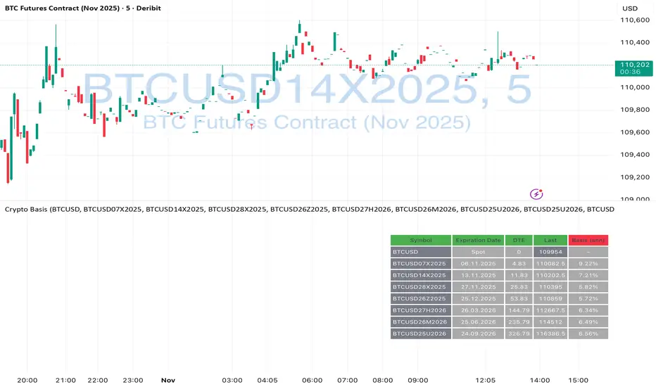
Crypto Futures Basis Tracker (Annualized)🧩 What is Basis Arbitrage
Basis arbitrage is a market-neutral trading strategy that exploits the price difference between a cryptocurrency’s spot and its futures markets.
When futures trade above spot (called contango), traders can buy spot and short futures, locking in a potential yield.
When futures trade below spot (backwardation), the reverse applies — short spot and go long futures.
The yield earned (or cost paid) by holding this position until expiry is called the basis. Expressing it as an annualized percentage allows comparison across different contract maturities.
⚙️ How the Indicator Works
This tool calculates the annualized basis for up to 10 cryptocurrency futures against a chosen spot price.
You select one spot symbol (e.g., BITSTAMP:BTCUSD) and up to 10 futures symbols (e.g., DERIBIT:BTCUSD07X2025, DERIBIT:BTCUSD14X2025, etc.).
The script automatically computes the days-to-expiry (DTE) and the annualized basis for each future.
A table displays for each contract: symbol, expiry date, DTE, last price, and annualized basis (%) — making it easy to compare the forward curve across maturities.
⚠️ Risks and Limitations
While basis arbitrage is often considered low-risk, it’s not risk-free:
Funding and financing costs can erode returns, especially when borrowing or using leverage.
Exchange or counterparty risk — if one leg of the trade fails (e.g., exchange default, margin liquidation), the hedge breaks.
Execution and timing risk — the basis can tighten or invert before both legs are opened.
Liquidity differences — thin futures may have large bid-ask spreads or slippage.
Use this indicator for analysis and monitoring, not as an automated trading signal.
Disclaimer: Please remember that past performance may not be indicative of future results. Due to various factors, including changing market conditions, the strategy may no longer perform as well as in historical backtesting. This post and the script don't provide any financial advice.
Purchasing Power vs Gold, Stocks, Real Estate, BTC (1971 = 100)Visual comparison of U.S. dollar purchasing power versus major assets since 1971, when the U.S. ended the gold standard. Each asset is normalized to 100 in 1971, showing how real value has shifted across gold, real estate, stocks, and Bitcoin over time.
Source: FRED (CPIAUCSL, SP500, MSPUS) • OANDA (XAUUSD) • TradingView (INDEX:BTCUSD/BLX)
Visualization by 3xplain

EV/FCFThis script in the 6 version of Pine brings you the most accurate multiple of "fundamental valuation" in my opinion. EV/FCF gives you a real metric of how profitable is the company in this exact moment and also if the company is overvaluated or undervaluated.

Intrinsic Value AnalyzerThe Intrinsic Value Analyzer is an all-in-one valuation tool that automatically calculates the fair value of a stock using industry-standard valuation techniques. It estimates intrinsic value through Discounted Cash Flow (DCF), Enterprise Value to Revenue (EV/REV), Enterprise Value to EBITDA (EV/EBITDA), and Price to Earnings (P/EPS). The model features adjustable parameters and a built-in alert system that notifies investors in real time when valuation multiples reach predefined thresholds. It also includes a comprehensive, color-coded table that compares the company’s historical average growth rates, valuation multiples, and financial ratios with the most recent values, helping investors quickly assess how current values align with historical averages.
The model calculates the historical Compounded Annual Growth Rates (CAGR) and average valuation multiples over the selected Lookback Period. It then projects Revenue, Earnings Before Interest, Taxes, Depreciation, and Amortization (EBITDA), Earnings per Share (EPS), and Free Cash Flow (FCF) for the selected Forecast Period and discounts their future values back to the present using the Weighted Average Cost of Capital (WACC) or the Cost of Equity. By default, the model automatically applies the historical averages displayed in the table as the growth forecasts and target multiples. These assumptions can be modified in the menu by entering custom REV-G, EBITDA-G, EPS-G, and FCF-G growth forecasts, as well as EV/REV, EV/EBITDA, and P/EPS target multiples. When new input values are entered, the model recalculates the fair value in real time, allowing users to see how changes in these assumptions affect the company’s fair value.
DCF = (Sum of (FCF × (1 + FCF-G) ^ t ÷ (1 + WACC) ^ t) for each year t until Forecast Period + ((FCF × (1 + FCF-G) ^ Forecast Period × (1 + LT Growth)) ÷ ((WACC - LT Growth) × (1 + WACC) ^ Forecast Period)) + Cash - Debt - Preferred Equity - Minority Interest) ÷ Shares Outstanding
EV/REV = ((Revenue × (1 + REV-G) ^ Forecast Period × EV/REV Target) ÷ (1 + WACC) ^ Forecast Period + Cash - Debt - Preferred Equity - Minority Interest) ÷ Shares Outstanding
EV/EBITDA = ((EBITDA × (1 + EBITDA-G) ^ Forecast Period × EV/EBITDA Target) ÷ (1 + WACC) ^ Forecast Period + Cash - Debt - Preferred Equity - Minority Interest) ÷ Shares Outstanding
P/EPS = (EPS × (1 + EPS-G) ^ Forecast Period × P/EPS Target) ÷ (1 + Cost of Equity) ^ Forecast Period
The discounted one-year average analyst price target (1Y PT) is also displayed alongside the valuation labels to provide an overview of consensus estimates. For the DCF model, the terminal long-term FCF growth rate (LT Growth) is based on the selected country to reflect expected long-term nominal GDP growth and can be modified in the menu. For metrics involving FCF, users can choose between reported FCF, calculated as Cash From Operations (CFO) - Capital Expenditures (CAPEX), or standardized FCF, calculated as Earnings Before Interest and Taxes (EBIT) × (1 - Average Tax Rate) + Depreciation and Amortization - Change in Net Working Capital - CAPEX. Historical average values displayed in the left column of the table are based on Fiscal Year (FY) data, while the latest values in the right column use the most recent Trailing Twelve Month (TTM) or Fiscal Quarter (FQ) data. The indicator displays color-coded price labels for each fair value estimate, showing the percentage upside or downside from the current price. Green indicates undervaluation, while red indicates overvaluation. The table follows a separate color logic:
REV-G, EBITDA-G, EPS-G, FCF-G = Green indicates positive annual growth when the CAGR is positive. Red indicates negative annual growth when the CAGR is negative.
EV/REV = Green indicates undervaluation when EV/REV ÷ REV-G is below 1. Red indicates overvaluation when EV/REV ÷ REV-G is above 2. Gray indicates fair value.
EV/EBITDA = Green indicates undervaluation when EV/EBITDA ÷ EBITDA-G is below 1. Red indicates overvaluation when EV/EBITDA ÷ EBITDA-G is above 2. Gray indicates fair value.
P/EPS = Green indicates undervaluation when P/EPS ÷ EPS-G is below 1. Red indicates overvaluation when P/EPS ÷ EPS-G is above 2. Gray indicates fair value.
EBITDA% = Green indicates profitable operations when the EBITDA margin is positive. Red indicates unprofitable operations when the EBITDA margin is negative.
FCF% = Green indicates strong cash conversion when FCF/EBITDA > 50%. Red indicates unsustainable FCF when FCF/EBITDA is negative. Gray indicates normal cash conversion.
ROIC = Green indicates value creation when ROIC > WACC. Red indicates value destruction when ROIC is negative. Gray indicates positive but insufficient returns.
ND/EBITDA = Green indicates low leverage when ND/EBITDA is below 1. Red indicates high leverage when ND/EBITDA is above 3. Gray indicates moderate leverage.
YIELD = Green indicates positive shareholder return when Shareholder Yield > 1%. Red indicates negative shareholder return when Shareholder Yield < -1%.
The Return on Invested Capital (ROIC) is calculated as EBIT × (1 - Average Tax Rate) ÷ (Average Debt + Average Equity - Average Cash). Shareholder Yield (YIELD) is calculated as the CAGR of Dividend Yield - Change in Shares Outstanding. The Weighted Average Cost of Capital (WACC) is displayed at the top left of the table and is derived from the current Market Cap (MC), Debt, Cost of Equity, and Cost of Debt. The Cost of Equity is calculated using the Equity Beta, Index Return, and Risk-Free Rate, which are based on the selected country. The Equity Beta (β) is calculated as the 5-year Blume-adjusted beta between the weekly logarithmic returns of the underlying stock and the selected country’s stock market index. For accurate calculations, it is recommended to use the stock ticker listed on the primary exchange corresponding to the company’s main index.
Cost of Debt = (Interest Expense on Debt ÷ Average Debt) × (1 - Average Tax Rate)
Cost of Equity = Risk-Free Rate + Equity Beta (β) × (Index Return - Risk-Free Rate)
WACC = (MC ÷ (MC + Debt)) × Cost of Equity + (Debt ÷ (MC + Debt)) × Cost of Debt
This indicator works best for operationally stable and profitable companies that are primarily valued based on fundamentals rather than speculative growth, such as those in the industrial, consumer, technology, and healthcare sectors. It is less suitable for early-stage, unprofitable, or highly cyclical companies, including energy, real estate, and financial institutions, as these often have irregular cash flows or distorted balance sheets. It is also worth noting that TradingView’s financial data provider, FactSet, standardizes financial data from official company filings to align with a consistent accounting framework. While this improves comparability across companies, industries, and countries, it may also result in differences from officially reported figures.
In summary, the Intrinsic Value Analyzer is a comprehensive valuation tool designed to help long-term investors estimate a company’s fair value while comparing historical averages with the latest values. Fair value estimates are driven by growth forecasts, target multiples, and discount rates, and should always be interpreted within the context of the underlying assumptions. By default, the model applies historical averages and current discount rates, which may not accurately reflect future conditions. Investors are therefore encouraged to adjust inputs in the menu to better understand how changes in these key assumptions influence the company’s fair value.

Quick Valuation V.1.0 (Ibo)This Pine Script indicator performs a Quick Discounted Cash Flow (DCF)-style Valuation to estimate the intrinsic value of a stock.
It calculates a projected Fair Value and a Margin of Safety based on user inputs or automatically pulled financial data from TradingView (like revenue, growth, margin, and exit P/E). It also automatically computes a Discount Rate using a modified CAPM model.
Key Features
Valuation Output: Calculates a target Fair Value and the resulting Margin of Safety.
Data Flexibility: Automatically pulls essential fundamentals (Revenue, Margins, Shares Outstanding, etc.) but allows the user to override any value (revenue, growth, P/E, shares, etc.) via the settings.
Automated Discount Rate: Calculates the Discount Rate (Cost of Equity) using the current 10-Year Real Yield and a computed or user-defined Beta.
Clear Display: Presents all input metrics, calculated values, and data sources (TradingView or User Input) in a neat table on the chart.

VIX Price BoxVIX Price Box (Customizable Colors)
This indicator displays the current VIX (CBOE Volatility Index) value in a fixed box on the top-right corner of the chart. It’s designed to give traders a quick, at-a-glance view of market volatility without needing to switch tickers.
Features
Pulls the live VIX price and updates automatically on every bar.
Displays the value inside a table box that stays fixed in the top-right corner.
Threshold-based coloring: the text color changes depending on whether the VIX is below, between, or above your chosen threshold levels.
5 built-in color modes:
Custom mode – choose your own colors for low, medium, and high volatility zones.
Adjustable threshold levels, background color, and frame color.
Use Cases
Monitor overall market risk sentiment while trading other instruments.
Identify periods of low vs. high volatility at a glance.
Pair with strategies that rely on volatility (options trading, hedging, breakout setups, etc.).
Futures Forward Price [NeoButane]In futures markets, the theoretical value of a futures contract can be derived from its underlying price and cost of carry. By baking in the costs and potential yields, the theoretical forward price then be used in basis against futures prices in place of the underlying spot price.
Usage
The script creates plots on the main chart and a separate window pane. Both are meant to be used to visualize dislocations in the market.
By using a futures vs. forward basis instead of futures vs. spot basis, discounts in the market are clearer.
Last month, the gold futures market GCZ2025 traded >1% above forward price when tariffs were announced and fell back in line once the tariffs were verbally retracted.
View roll spreads over a back-adjusted continuous chart. I guess. I don't think spread traders only look at one chart. This is as educational for me as it is you.
Configuration
The underlying reference needs to be changed to match the futures contract you are using.
The Risk-Free Rate defaults to FRED:SOFR. I found the contract month matched 3-Month SOFR Futures to be the closest for forward price.
Risk-Free Rate: The interest rate source for forward price.
Constant Risk-Free Rate: a static interest rate that can be used in advance of future changes in risk-free rate.
Underlying Reference: spot or index price. Some examples include TVC:SPX, TVC:GOLD, CRYPTO:BTCUSD, TVC:USOIL.
Forward Price Compounding: determines which formula to use. They're similar and become closer as the contract matures.
Alternative Contract: enable and select a futures contract to use it on a chart different than the main.
Storage Cost and Yield: for use with commodities. I haven't found a proper use for them yet but enabling is simple if you are able to.
The following are meant to be used with the continuous formula as they are compounded. However the rate sources don't differ much for the purpose of futures prices.
3-Month CME SOFR Futures
3-Month ICEEUR SONIA Futures
3-Month Osaka TONA Futures
The other rate sources are either meant for futures contracts shorter than quarterly such as monthly crypto futures or were meant to help myself understand how different rates would align with futures prices, like inflation.
What this script does
It uses the cost of carry formula to output the forward price (red line). The underlying reference (green line) is plotted alongside and a futures-derived reference (blue line) can be displayed to see how it looks next to the real reference price.
The data pane displays either the nominal difference or percentage difference between the real futures price and the calculated forward price.
Further reading
www.investopedia.com
www.cmegroup.com
www.oxfordenergy.org
www-2.rotman.utoronto.ca
www.cmegroup.com
3-month rate futures
www.cmegroup.com
www.ice.com
www.bankofengland.co.uk
www.jpx.co.jp
Volumatic Fair Value Gaps [BigBeluga]🔵 OVERVIEW
The Volumatic Fair Value Gaps indicator detects and plots size-filtered Fair Value Gaps (FVGs) and immediately analyzes the bullish vs. bearish volume composition inside each gap. When an FVG forms, the tool samples volume from a 10× lower timeframe , splits it into Buy and Sell components, and overlays two compact bars whose percentages always sum to 100%. Each gap also shows its total traded volume . A live dashboard (top-right) summarizes how many bullish and bearish FVGs are currently active and their cumulative volumes—offering a quick read on directional participation and trend pressure.
🔵 CONCEPTS
FVGs (Fair Value Gaps) : Imbalance zones between three consecutive candles where price “skips” trading. The script plots bullish and bearish gaps and extends them until mitigated.
Size Filtering : Only significant gaps (by relative size percentile) are drawn, reducing noise and emphasizing meaningful imbalances.
// Gap Filters
float diff = close > open ? (low - high ) / low * 100 : (low - high) / high *100
float sizeFVG = diff / ta.percentile_nearest_rank(diff, 1000, 100) * 100
bool filterFVG = sizeFVG > 15
Volume Decomposition : For each FVG, the indicator inspects a 10× lower timeframe and aggregates volume of bullish vs. bearish candles inside the gap’s span.
100% Split Bars : Two inline bars per FVG display the % Bull and % Bear shares; their total is always 100%.
Total Gap Volume : A numeric label at the right edge of the FVG shows the total traded volume associated with that gap.
Mitigation Logic : Gaps are removed when price closes through (or touches via high/low—user-selectable) the opposite boundary.
Dashboard Summary : Counts and sums the active bullish/bearish FVGs and their total volumes to gauge directional dominance.
🔵 FEATURES
Bullish & Bearish FVG plotting with independent color controls and visibility toggles.
Adaptive size filter (percentile-based) to keep only impactful gaps.
Lower-TF volume sampling at 10× faster resolution for more granular Buy/Sell breakdown.
Per-FVG volume bars : two horizontal bars showing Bull % and Bear % (sum = 100%).
Per-FVG total volume label displayed at the right end of the gap’s body.
Mitigation source option : choose close or high/low for removing/invalidating gaps.
Overlap control : older overlapped gaps are cleaned to avoid clutter.
Auto-extension : active gaps extend right until mitigated.
Dashboard : shows count of bullish/bearish gaps on chart and cumulative volume totals for each side.
Performance safeguards : caps the number of active FVG boxes to maintain responsiveness.
🔵 HOW TO USE
Turn on/off FVG types : Enable Bullish FVG and/or Bearish FVG depending on your focus.
Tune the filter : The script already filters by relative size; if you need fewer (stronger) signals, increase the percentile threshold in code or reduce the number of displayed boxes.
Choose mitigation source :
close — stricter; gap is removed when a closing price crosses the boundary.
high/low — more sensitive; a wick through the boundary mitigates the gap.
Read the per-FVG bars :
A higher Bull % inside a bullish gap suggests constructive demand backing the imbalance.
A higher Bear % inside a bearish gap suggests supply is enforcing the imbalance.
Use total gap volume : Larger totals imply more meaningful interest at that imbalance; confluence with structure/HTF levels increases relevance.
Watch the dashboard : If bullish counts and cumulative volume exceed bearish, market pressure is likely skewed upward (and vice versa). Combine with trend tools or market structure for entries/exits.
Optional: hide volume bars : Disable Volume Bars when you want a cleaner FVG map while keeping total volume labels and the dashboard.
🔵 CONCLUSION
Volumatic Fair Value Gaps blends precise FVG detection with lower-timeframe volume analytics to show not only where imbalances exist but also who powers them. The per-gap Bull/Bear % bars, total volume labels, and the cumulative dashboard together provide a fast, high-signal read on directional participation. Use the tool to prioritize higher-quality gaps, align with trend bias, and time mitigations or continuations with greater confidence.

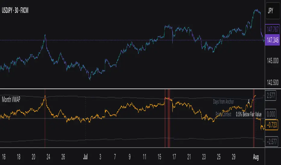
Monthly VWAPDescription
This indicator identifies potential mean reversion opportunities by tracking price deviations from monthly VWAP with dynamic volatility-adjusted thresholds.
Core Logic:
The indicator monitors when price moves significantly away from monthly VWAP and looks for potential reversal opportunities. It uses ATR-based dynamic thresholds that adapt to current market volatility, combined with volume confirmation to filter out weak signals.
Key Features:
Adaptive Thresholds: ATR-based bands that adjust to market volatility
Volume Confirmation: Requires average volume spike to validate signals
Monthly Reset: VWAP anchors reset each month for fresh reference levels
Visual Clarity: Color-coded deviation line with background highlights for active signals
Info Panel: Shows days from anchor and current price context vs fair value
Signal Generation:
Buy Signal: Price below monthly VWAP by threshold amount with elevated volume
Sell Signal: Price above monthly VWAP by threshold amount with elevated volume
Neutral: Price within threshold range or insufficient volume
Best Used For:
Mean reversion strategies in ranging markets
Identifying potential oversold/overbought conditions
Understanding price position relative to monthly fair value
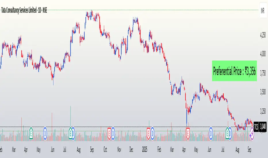
FuTech : Preferential Price📌 First Ever Indicator : FuTech : Preferential Price
💡 What if you could instantly know the Preferential Price — as if the company announced a preferential issue in today’s meeting surprisingly?
Normally, you’d be stuck with tedious valuation spreadsheets and SEBI formula checks 🧮📑…
✨ But not anymore — this tool does the hard work for you!
With just one click, it auto-calculates the Preferential Issue Floor Price under SEBI ICDR Regulations, 2018 - Regulation 164 (as amended), directly from your chart symbol.
✅ How it works ?
📅 Relevant Date = 30 days prior to either:
• Today’s date (default mode)
• Or your chosen EGM date (user input)
📊 For the Relevant Date, the indicator automatically computes:
• VWAP (90 trading days preceding Relevant Date)
• VWAP (10 trading days preceding Relevant Date)
🔎 As per SEBI Reg.164, the higher of these two VWAPs is selected as the Minimum Issue Price (Preferential Price).
💰 Price is neatly formatted in Indian style (e.g. ₹1,00,000).
✅ Key Features:
⚡ Auto-calculates from chart symbol — no manual entry.
🎛️ Option to input EGM date for accurate floor price compliance.
🎨 Fully customizable: text color, size, background, position.
🪄 Clean display → shows only the final Preferential Price (Reg.164).
📌 Usage:
This indicator is built for analysts, fund managers, and corporate professionals dealing with Preferential Allotment pricing compliance.
It ensures quick visibility of the floor price under SEBI ICDR rules, directly on your chart.
⚠️ Disclaimer:
📌 The calculated Preferential Price is an approximation based on SEBI ICDR Reg.164 methodology.
📊 Actual price determined by the company / merchant banker may vary slightly (±5) due to rounding, data source differences, or timing adjustments.
📅 Ensure to verify with official exchange data and SEBI filings before relying on these numbers.
📝 This tool is meant for analytical and educational purposes only, not a substitute for regulatory or professional advice.
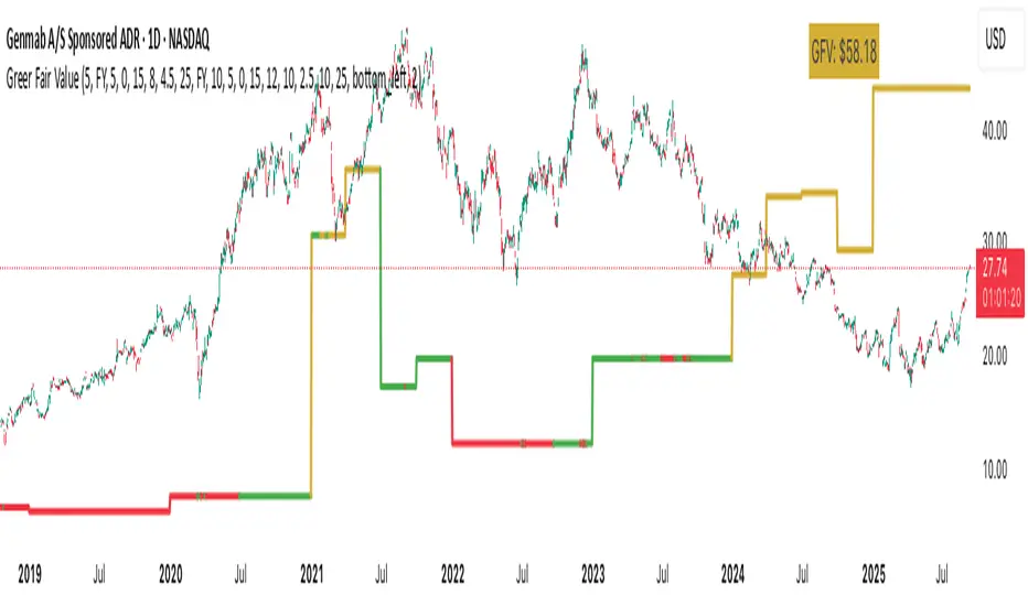
Greer Fair Value✅ Greer Fair Value
Greer Fair Value: Graham intrinsic value + Buffett-style DCF with auto EPS/FCF and auto growth (CAGR of FCF/share), defaulting to a simple GFV badge that color-codes opportunity at a glance.
📜 Full description
Greer Fair Value is inspired by the valuation frameworks of Benjamin Graham and Warren Buffett. It combines Graham’s rate-adjusted intrinsic value with a two-stage, per-share DCF. The script auto-populates EPS (TTM) and Free Cash Flow per share (FY/FQ/TTM) from request.financial(), and can auto-estimate the near-term growth rate (g₁) using the CAGR of FCF/share over a user-selected lookback (with sensible caps). All assumptions remain editable.
Default view: only the GFV badge is shown to keep charts clean.
Badge color logic:
Gold — both DCF and Graham fair values are above the current price
Green — exactly one of them is above the current price
Red — the current price is above both values
Show more detail (optional):
Toggle “Show Graham Lines” and/or “Show DCF Lines” to plot fair values (and optional MoS bands) over time.
Toggle “Show Dashboard” for a compact data table of assumptions and outputs.
Optional summary label can be enabled for a quick on-chart readout.
Inputs you can customize: EPS source/manual fallback, FCF/share source (FY/FQ/TTM), g₁ auto-CAGR lookback & caps, terminal growth gT, discount rate r, MoS levels, step-style plots, table position, and decimals.
Note: TradingView’s UI controls whether “Inputs/Values in Status Line” are shown. If you prefer a clean status line, open the indicator’s settings and uncheck those options, then Save as default.
Disclaimer: For educational/informational purposes only; not financial advice. Markets involve risk—do your own research.