PROTECTED SOURCE SCRIPT
已更新 EMA Price Distance
EMA Price Distance, EMAPD for short, is a trend following indicator that can help you predict how price is going to move, in respect to your EMA. It can give overbought and oversold signals, as well as ranging market and retracement signals. The indicator consists of three parts, the Difference Line, the Average Line, and the Histograms.

- The blue line is the Difference Line. It is calculated from difference between the close price and the EMA. An increasing Difference Line indicates price moving further away from the EMA.
- The purple line is the Average Line. It is calculated based on the average of the difference Line for a certain lookback period.
- The Histograms are the difference between the Difference Line and the Average Line
Some basic signals:
- The easiest signal to spot is when the Difference Line is further away from the Average Line than normal. This usually signifies a retracement in the near future.
- Another signal is when the histograms are making smaller peaks or troughs, approaching 0. Signifies that price is retracing towards EMA. This can also be seen when the Difference Line is below the Average Line
How to Use:
The first use case is to detect when the market is ranging. This can be seen when both lines near 0 like so:

Another use case, is to use the indicator to signify how strong the current trend is / how likely it is to continue. This is signified by the Difference Line and Average line making higher highs

We can see that as the trend continues, both lines increase in harmony.
EMAPD can also be used to give easy to see signs of retracement or reversal.

Here we can see that the Difference line made a lower high as well as crossed below the Average Line. Whether this is a retracement or reversal usually depends on how the long the trend has occurred. The longer, the more likely of a trend reversal
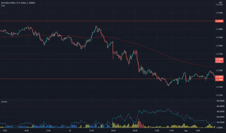
One of the best use cases is to keep you out of bad trades. This usually happens right before a trend starts, when the market is choppier. This is when you usually get a lot of fake outs and false signals.

Here are 2 examples of where someone trading Supply and Demand would've been kept out of a losing trade.
In the first purple oval, a supply zone is formed. As price re enters the zone, it would be tempting to go long but the EMAPD is creating lower lowers on the histograms, signifying that price is moving closer to its average instead of expanding. We also get the Difference Line to cross under the average line, signifying price is moving closer to the EMA than it has been recently. These signals tell us that price has a good chance to "re group" with the EMA, which it ends up doing.
This also kept us out of the second trade, signified by the second purple oval. Here, we can see the difference line creating lower lows, signaling that price is moving closer to the EMA.
- The blue line is the Difference Line. It is calculated from difference between the close price and the EMA. An increasing Difference Line indicates price moving further away from the EMA.
- The purple line is the Average Line. It is calculated based on the average of the difference Line for a certain lookback period.
- The Histograms are the difference between the Difference Line and the Average Line
Some basic signals:
- The easiest signal to spot is when the Difference Line is further away from the Average Line than normal. This usually signifies a retracement in the near future.
- Another signal is when the histograms are making smaller peaks or troughs, approaching 0. Signifies that price is retracing towards EMA. This can also be seen when the Difference Line is below the Average Line
How to Use:
The first use case is to detect when the market is ranging. This can be seen when both lines near 0 like so:
Another use case, is to use the indicator to signify how strong the current trend is / how likely it is to continue. This is signified by the Difference Line and Average line making higher highs
We can see that as the trend continues, both lines increase in harmony.
EMAPD can also be used to give easy to see signs of retracement or reversal.
Here we can see that the Difference line made a lower high as well as crossed below the Average Line. Whether this is a retracement or reversal usually depends on how the long the trend has occurred. The longer, the more likely of a trend reversal
One of the best use cases is to keep you out of bad trades. This usually happens right before a trend starts, when the market is choppier. This is when you usually get a lot of fake outs and false signals.
Here are 2 examples of where someone trading Supply and Demand would've been kept out of a losing trade.
In the first purple oval, a supply zone is formed. As price re enters the zone, it would be tempting to go long but the EMAPD is creating lower lowers on the histograms, signifying that price is moving closer to its average instead of expanding. We also get the Difference Line to cross under the average line, signifying price is moving closer to the EMA than it has been recently. These signals tell us that price has a good chance to "re group" with the EMA, which it ends up doing.
This also kept us out of the second trade, signified by the second purple oval. Here, we can see the difference line creating lower lows, signaling that price is moving closer to the EMA.
發行說明
- Added Support for Bollinger Bands - Made it easier to look at histograms
- Made it easier to spot when price is moving into overbought ranges
發行說明
- Added Support to showcase when price is ranging受保護腳本
此腳本以閉源形式發佈。 不過,您可以自由且不受任何限制地使用它 — 在此處了解更多資訊。
免責聲明
這些資訊和出版物並不意味著也不構成TradingView提供或認可的金融、投資、交易或其他類型的意見或建議。請在使用條款閱讀更多資訊。
受保護腳本
此腳本以閉源形式發佈。 不過,您可以自由且不受任何限制地使用它 — 在此處了解更多資訊。
免責聲明
這些資訊和出版物並不意味著也不構成TradingView提供或認可的金融、投資、交易或其他類型的意見或建議。請在使用條款閱讀更多資訊。