已更新
Cycle Spectrum Analyzer
Cycle Spectrum Indicator — Short Description
This indicator computes a visual Fourier cycle spectrum from the input price data to reveal the market’s dominant cyclical behaviour. The price series is first detrended using a Hodrick–Prescott filter, after which a specialized Fourier analysis variant extracts the cycle components.
The resulting spectrum displays peaks that represent the dominant cycles present in the data, where each peak’s cycle length and amplitude indicate the strength and duration of the underlying rhythm. The most significant peaks are ranked, highlighting the top cycles currently driving market movement. Each detected cycle also includes a phase value, describing the cycle’s position at the most recent bar (e.g., topping, bottoming, rising, falling).
The indicator can be used to:
Additional Explanation of the included visual example image
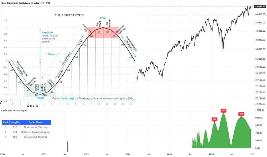
Left Area – The Theoretical “Perfect Cycle”
The left part of the illustration presents a theoretical, perfectly smooth sine-wave cycle. This serves as a reference model to explain the core cycle parameters:
Right Area – The Price Series Used for Analysis
On the right, the actual price chart (e.g., Dow Jones Industrial Average) is displayed. This is the dataset from which the Fourier cycle spectrum is computed.
At the bottom of this chart section, a purple bar indicates the amount of historical data included in the cycle analysis. Because Fourier-based methods depend strongly on sample size, this visual cue shows how far back the indicator collected and processed data before generating the spectrum.
Bottom Area – The Cycle Spectrum Output Pane
The lower pane contains the Cycle Spectrum Analyzer output:
Calculation Only at the Last Bar
The indicator performs its full Fourier-based cycle decomposition exclusively on the most recent bar. This ensures that the spectrum always reflects the current market state without repeatedly recalculating historical spectra. The result is an efficient, real-time snapshot of the dominant cycles influencing the price at the latest point in time.
Works on Any Symbol and Any Timeframe
Because the analysis operates directly on the provided price series, the indicator is compatible with all markets and all timeframes—stocks, indices, forex, crypto, futures, and intraday charts alike.
The detected cycle lengths always refer to the selected chart’s bar interval (e.g., 240-bar cycle on a 1h chart ≈ 240 hours; same cycle on a daily chart ≈ 240 days).
Adjustable Historical Lookback (Default: 1100 Bars)
The accuracy of cycle detection depends on the amount of historical data used. The indicator provides a parameter allowing you to specify how many past bars should be included in the Fourier calculation.
This indicator computes a visual Fourier cycle spectrum from the input price data to reveal the market’s dominant cyclical behaviour. The price series is first detrended using a Hodrick–Prescott filter, after which a specialized Fourier analysis variant extracts the cycle components.
The resulting spectrum displays peaks that represent the dominant cycles present in the data, where each peak’s cycle length and amplitude indicate the strength and duration of the underlying rhythm. The most significant peaks are ranked, highlighting the top cycles currently driving market movement. Each detected cycle also includes a phase value, describing the cycle’s position at the most recent bar (e.g., topping, bottoming, rising, falling).
The indicator can be used to:
- Identify the top 3 dominant cycles with their length and phase.
- Analyze the current market state by interpreting these phases.
- Feed the dominant cycle lengths—often half the primary cycle—into other technical indicators for improved parameter tuning.
- Project cycles forward to estimate upcoming turning points and anticipate potential trend shifts.
Additional Explanation of the included visual example image
Left Area – The Theoretical “Perfect Cycle”
The left part of the illustration presents a theoretical, perfectly smooth sine-wave cycle. This serves as a reference model to explain the core cycle parameters:
- Cycle Length – The full wavelength of one complete oscillation (from trough to trough or peak to peak).
- Phase – The current position within that cycle, expressed both numerically and as an easy-to-read text label such as Bottom_Departure, Uptrend_Neutral, Approaching Top, or Top_Departure.
Right Area – The Price Series Used for Analysis
On the right, the actual price chart (e.g., Dow Jones Industrial Average) is displayed. This is the dataset from which the Fourier cycle spectrum is computed.
At the bottom of this chart section, a purple bar indicates the amount of historical data included in the cycle analysis. Because Fourier-based methods depend strongly on sample size, this visual cue shows how far back the indicator collected and processed data before generating the spectrum.
Bottom Area – The Cycle Spectrum Output Pane
The lower pane contains the Cycle Spectrum Analyzer output:
- It displays the cycle spectrum at the most recent bar, where each green peak corresponds to a detected cycle.
- Peak height = amplitude (strength) of the cycle
- Peak position (horizontal) = dominant cycle length
- The largest peaks represent the strongest cycles currently present in the detrended price series.
- Rank (1 = strongest)
- Cycle Length (in bars)
- Phase Description (interpreting where that cycle is right now)
- Which cycles are strongest,
- How long they are,
- And whether they are currently bottoming, topping, rising, or falling.
Calculation Only at the Last Bar
The indicator performs its full Fourier-based cycle decomposition exclusively on the most recent bar. This ensures that the spectrum always reflects the current market state without repeatedly recalculating historical spectra. The result is an efficient, real-time snapshot of the dominant cycles influencing the price at the latest point in time.
Works on Any Symbol and Any Timeframe
Because the analysis operates directly on the provided price series, the indicator is compatible with all markets and all timeframes—stocks, indices, forex, crypto, futures, and intraday charts alike.
The detected cycle lengths always refer to the selected chart’s bar interval (e.g., 240-bar cycle on a 1h chart ≈ 240 hours; same cycle on a daily chart ≈ 240 days).
Adjustable Historical Lookback (Default: 1100 Bars)
The accuracy of cycle detection depends on the amount of historical data used. The indicator provides a parameter allowing you to specify how many past bars should be included in the Fourier calculation.
- Standard value: 1100 bars
- Increasing the lookback allows detection of longer cycles, but may dilute short-term characteristics.
- Decreasing it focuses on shorter and medium-term cycles, increasing responsiveness but reducing visibility of long-duration rhythms.
發行說明
minor plot adjustments發行說明
New Cycle ProjectionsThe Cycle Spectrum Analyzer now includes a new visualization option that projects the detected dominant cycles into the future. This makes it possible to identify upcoming windows where market tops or bottoms are more likely to occur—directly within the indicator panel.
The example chart above shows how the three dominant cycles synchronize at the current bar, highlighted by the red nowcast line. At that moment, all three cycles project a top in the same time window, and price accelerates upward directly into that projected turning point.
https://www.tradingview.com/x/ipz3DlSj/
The following chart illustrates 3 hours later how price behaved afterward, demonstrating how cycle synchronization successfully anticipated the timing of that market top.
https://www.tradingview.com/x/t7RcnaUb/
While this tool provides valuable insight into the time domain—an area where most price-based indicators offer little guidance—cycles should never be used as a standalone decision-making system. Instead, consider cycle projections as an additional layer of confirmation. Look for moments where your preferred technical analysis methods or price-based indicators align with synchronized cycle tops or bottoms. Such confluence often provides stronger, more reliable context for potential market turning points.
發行說明
Revised ImagesNew Cycle Projections
The Cycle Spectrum Analyzer now includes a new visualization option that projects the detected dominant cycles into the future. This makes it possible to identify upcoming windows where market tops or bottoms are more likely to occur—directly within the indicator panel.
The example chart above shows how the three dominant cycles synchronize at the current bar, highlighted by the red nowcast line. At that moment, all three cycles project a top in the same time window, and price accelerates upward directly into that projected turning point.
The following chart illustrates 3 hours later how price behaved afterward, demonstrating how cycle synchronization successfully anticipated the timing of that market top.
While this tool provides valuable insight into the time domain—an area where most price-based indicators offer little guidance—cycles should never be used as a standalone decision-making system. Instead, consider cycle projections as an additional layer of confirmation. Look for moments where your preferred technical analysis methods or price-based indicators align with synchronized cycle tops or bottoms. Such confluence often provides stronger, more reliable context for potential market turning points.
可在付費空間使用
此指標僅對Market Rhythm: Cycle-Tuned Indicator Suite訂閱用戶開放。加入訂閱即可訪問此指標以及StockMarketCycles的其他腳本。
Lars von Thienen
Join my blog and never miss an update:
stockmarketcycles.substack.com/subscribe
Join my blog and never miss an update:
stockmarketcycles.substack.com/subscribe
免責聲明
這些資訊和出版物並非旨在提供,也不構成TradingView提供或認可的任何形式的財務、投資、交易或其他類型的建議或推薦。請閱讀使用條款以了解更多資訊。