Enhanced Gann Time-Price SquaresEnhanced Gann Time-Price Squares Indicator
A comprehensive Pine Script indicator that identifies and visualizes W.D. Gann's time-price square formations on your charts. This tool helps traders spot potential market turning points where time and price movements align according to Gann's legendary market theories.
Key Features:
Automatic Square Detection - Identifies completed squares where price movement equals time movement
Future Projections - Shows forming squares with projected completion points
Pivot Integration - Automatically detects pivot highs/lows as square starting points
Visual Clarity - Clean box outlines with customizable colors and styles
Smart Filtering - Prevents overlapping squares and includes minimum move thresholds
Real-time Status - Information table showing current square formations
How to Use:
The indicator draws boxes when price moves from pivot points equal the time elapsed (number of bars). Green squares indicate upward movements, red squares show downward movements. Dashed lines show forming squares, while dotted lines project where they might complete.
Settings:
Adjust pivot sensitivity and minimum price moves
Customize tolerance for time-price matching
Toggle projections, labels, and visual elements
Fine-tune colors and line styles
Perfect for Gann theory practitioners and traders looking for time-based market analysis. The squares often coincide with significant support/resistance levels and potential reversal points.
Compatible with all timeframes and instruments.
More updates to follow
Forecasting

liq depth fvg/bprA script that draws liquidity depth boxes from the 9.30-10.00 am range which can prove decent areas to look for a reversal. It also draws in fvg and bpr levels which can help add confluence to a trade ideas. The 9.30 to 10.00 am range is highlighted by blue lines to assist in opening range trades as described by Casper SMC.

EVaR Indicator and Position SizingThe Problem:
Financial markets consistently show "fat-tailed" distributions where extreme events occur with higher frequency than predicted by normal distributions (Gaussian or even log-normal). These fat tails manifest in sudden price crashes, volatility spikes, and black swan events that traditional risk measures like volatility can underestimate. Standard deviation and conventional VaR calculations assume normally distributed returns, leaving traders vulnerable to severe drawdowns during market stress.
Cryptocurrencies and volatile instruments display particularly pronounced fat-tailed behavior, with extreme moves occurring 5-10 times more frequently than normal distribution models would predict. This reality demands a more sophisticated approach to risk measurement and position sizing.
The Solution: Entropic Value at Risk (EVAR)
EVaR addresses these limitations by incorporating principles from statistical mechanics and information theory through Tsallis entropy. This advanced approach captures the non-linear dependencies and power-law distributions characteristic of real financial markets.
Entropy is more adaptive than standard deviations and volatility measures.
I was inspired to create this indicator after reading the paper " The End of Mean-Variance? Tsallis Entropy Revolutionises Portfolio Optimisation in Cryptocurrencies " by by Sana Gaied Chortane and Kamel Naoui.
Key advantages of EVAR over traditional risk measures:
Superior tail risk capture: More accurately quantifies the probability of extreme market moves
Adaptability to market regimes: Self-calibrates to changing volatility environments
Non-parametric flexibility: Makes less assumptions about the underlying return distribution
Forward-looking risk assessment: Better anticipates potential market changes (just look at the charts :)
Mathematically, EVAR is defined as:
EVAR_α(X) = inf_{z>0} {z * log(1/α * M_X(1/z))}
Where the moment-generating function is calculated using q-exponentials rather than conventional exponentials, allowing precise modeling of fat-tailed behavior.
Technical Implementation
This indicator implements EVAR through a q-exponential approach from Tsallis statistics:
Returns Calculation: Price returns are calculated over the lookback period
Moment Generating Function: Approximated using q-exponentials to account for fat tails
EVAR Computation: Derived from the MGF and confidence parameter
Normalization: Scaled to for intuitive visualization
Position Sizing: Inversely modulated based on normalized EVAR
The q-parameter controls tail sensitivity—higher values (1.5-2.0) increase the weighting of extreme events in the calculation, making the model more conservative during potentially turbulent conditions.
Indicator Components
1. EVAR Risk Visualization
Dynamic EVAR Plot: Color-coded from red to green normalized risk measurement (0-1)
Risk Thresholds: Reference lines at 0.3, 0.5, and 0.7 delineating risk zones
2. Position Sizing Matrix
Risk Assessment: Current risk level and raw EVAR value
Position Recommendations: Percentage allocation, dollar value, and quantity
Stop Parameters: Mathematically derived stop price with percentage distance
Drawdown Projection: Maximum theoretical loss if stop is triggered
Interpretation and Application
The normalized EVAR reading provides a probabilistic risk assessment:
< 0.3: Low risk environment with minimal tail concerns
0.3-0.5: Moderate risk with standard tail behavior
0.5-0.7: Elevated risk with increased probability of significant moves
> 0.7: High risk environment with substantial tail risk present
Position sizing is automatically calculated using an inverse relationship to EVAR, contracting during high-risk periods and expanding during low-risk conditions. This is a counter-cyclical approach that ensures consistent risk exposure across varying market regimes, especially when the market is hyped or overheated.
Parameter Optimization
For optimal risk assessment across market conditions:
Lookback Period: Determines the historical window for risk calculation
Q Parameter: Controls tail sensitivity (higher values increase conservatism)
Confidence Level: Sets the statistical threshold for risk assessment
For cryptocurrencies and highly volatile instruments, a q-parameter between 1.5-2.0 typically provides the most accurate risk assessment because it helps capturing the fat-tailed behavior characteristic of these markets. You can also increase the q-parameter for more conservative approaches.
Practical Applications
Adaptive Risk Management: Quantify and respond to changing tail risk conditions
Volatility-Normalized Positioning: Maintain consistent exposure across market regimes
Black Swan Detection: Early identification of potential extreme market conditions
Portfolio Construction: Apply consistent risk-based sizing across diverse instruments
This indicator is my own approach to entropy-based risk measures as an alterative to volatility and standard deviations and it helps with fat-tailed markets.
Enjoy!

FULLY FUNCTIONAL INDICATOR TESTER🎯 Purpose:
A comprehensive strategy testing framework designed to evaluate custom indicators and trading signals with professional-grade risk management and signal detection capabilities.
✨ Key Features:
Multiple Signal Detection Methods - Value changes, crossovers, threshold-based triggers
Advanced Confluence Filtering - Multi-source confirmation system with lookback periods
Professional Risk Management - Static TP/SL, break-even functionality, position sizing
Custom Exit Signals - Independent exit logic for refined strategy testing
Visual Feedback System - Clear signal plots and real-time status monitoring
Flexible Input Sources - Connect any custom indicator or built-in study
🔧 How to Use:
Connect your indicator outputs to the Entry/Exit source inputs
Select appropriate signal detection method for your indicator type
Configure risk parameters (TP/SL/Break-even)
Enable confluence filters if needed for additional confirmation
Backtest and analyze results with built-in performance metrics
📈 Signal Detection Options:
Value Change: Detects when indicator values change
Crossover Above/Below: Traditional crossover signals
Threshold Triggers: Value-based entry/exit levels
⚙️ Technical Specifications:
Compatible with Pine Script v6
Overlay strategy with position tracking
Real-time performance monitoring table
Configurable margin requirements
Full backtesting compatibility
⚠️ Important Notes:
This is a testing framework - not financial advice
Always validate signals in demo environment first
Past performance does not guarantee future results
Use proper risk management in live trading
🔄 Updates:
Enhanced signal detection algorithms
Improved confluence logic
Added break-even functionality
Visual debugging tools
Perfect for traders and developers looking to systematically tes

EMA Shadow Trading_TixThis TradingView indicator, named "EMA Shadow Trading_Tix", combines Exponential Moving Averages (EMAs) with VWAP (Volume-Weighted Average Price) and a shadow fill between EMAs to help traders identify trends, momentum, and potential reversal zones. Below is a breakdown of its key functions:
1. EMA (Exponential Moving Average) Settings
The indicator allows customization of four EMAs with different lengths and colors:
EMA 1 (Default: 9, Green) – Short-term trend filter.
EMA 2 (Default: 21, Red) – Medium-term trend filter.
EMA 3 (Default: 50, Blue) – Mid-to-long-term trend filter.
EMA 4 (Default: 200, Orange) – Long-term trend filter (often used as a "bull/bear market" indicator).
Key Features:
Global EMA Source: All EMAs use the same source (default: close), ensuring consistency.
Toggle Visibility: Each EMA can be independently shown/hidden.
Precision Calculation: EMAs are rounded to the minimum tick size for accuracy.
Customizable Colors & Widths: Helps in distinguishing different EMAs easily.
How Traders Use EMAs:
Trend Identification:
If price is above all EMAs, the trend is bullish.
If price is below all EMAs, the trend is bearish.
Crossovers:
A shorter EMA crossing above a longer EMA (e.g., EMA 9 > EMA 21) suggests bullish momentum.
A shorter EMA crossing below a longer EMA (e.g., EMA 9 < EMA 21) suggests bearish momentum.
Dynamic Support/Resistance:
EMAs often act as support in uptrends and resistance in downtrends.
2. Shadow Fill Between EMA 1 & EMA 2
The indicator includes a colored fill (shadow) between EMA 1 (9-period) and EMA 2 (21-period) to enhance trend visualization.
How It Works:
Bullish Shadow (Green): Applies when EMA 1 > EMA 2, indicating a bullish trend.
Bearish Shadow (Red): Applies when EMA 1 < EMA 2, indicating a bearish trend.
Why It’s Useful:
Trend Confirmation: The shadow helps traders quickly assess whether the short-term trend is bullish or bearish.
Visual Clarity: The fill makes it easier to spot EMA crossovers and trend shifts.
3. VWAP (Volume-Weighted Average Price) Integration
The indicator includes an optional VWAP overlay, which is useful for intraday traders.
Key Features:
Customizable Anchor Periods: Options include Session, Week, Month, Quarter, Year, Decade, Century, Earnings, Dividends, Splits.
Hide on Higher Timeframes: Can be disabled on 1D or higher charts to avoid clutter.
Adjustable Color & Width: Default is purple, but users can change it.
How Traders Use VWAP:
Mean Reversion: Price tends to revert to VWAP.
Trend Confirmation:
Price above VWAP = Bullish bias.
Price below VWAP = Bearish bias.
Breakout/Rejection Signals: Strong moves away from VWAP may indicate continuation or exhaustion.
4. Practical Trading Applications
Trend-Following Strategy:
Long Entry: Price above all EMAs + EMA 1 > EMA 2 (green shadow). Optional: Price above VWAP for intraday trades.
Short Entry: Price below all EMAs + EMA 1 < EMA 2 (red shadow). Optional: Price below VWAP for intraday trades.
Mean Reversion Strategy:
Pullback to EMA 9/21/VWAP: Look for bounces near EMAs or VWAP in a strong trend.
Multi-Timeframe Confirmation:
Higher timeframe EMAs (50, 200) can be used to filter trades (e.g., only trade longs if price is above EMA 200).
Conclusion
This EMA Shadow Trading Indicator is a versatile tool that combines:
✔ Multiple EMAs for trend analysis
✔ Shadow fill for quick trend visualization
✔ VWAP integration for intraday trading
It is useful for swing traders, day traders, and investors looking for trend confirmation, momentum shifts, and dynamic support/resistance levels.

200 EMA Power Bounce Screenerthis indicator work on bullish reversal strategy. when stock is abov 200 ema and touch 200 ema for reversal. it will confirm that there is a revesal candle, stron support on 200 ema, primary trend is strong than secondary trand, have a strong volume, rsi cross 50 in upperside.


VEP - Volume Explosion Predictor💥 VEP - Volume Explosion Predictor
General Overview
The Volume Explosion Predictor (VEP) is an advanced indicator that analyzes volume peaks to predict when the next volume explosion might occur. Using statistical analysis on historical patterns, it provides accurate probabilities on moments of greater trading activity.
MAIN FEATURES
🎯 Intelligent volume peak detection
Automatically identifies significant volume peaks
Anti-consecutive filter to avoid redundant signals
Customizable threshold for detection sensitivity
📊 Advanced statistical analysis
Calculates the average distance between volume peaks
Monitors the number of sessions without peaks
Tracks the maximum historical range without activity
🔮 Predictive system
Dynamic probability: Calculates the probability of an imminent peak
Visual indicators: Background colors that change based on probability
Time forecasts: Estimates remaining sessions to the next peak
📈 Visual signals
Colored arrows: Green for bullish peaks, red for bearish peaks
Statistics table: Complete real-time overview
ALERT SYSTEM
🚨 Three Alert Levels
New Valid Volume Peak: New peak detected
Approaching Prediction: Increasing probability
High Peak Probability: High probability of explosion
HOW TO USE IT
📋 Recommended setup
Timeframe : Works on all timeframes but daily, weekly or monthly timeframe usage is recommended. In any case, it should always be used consistently with your time horizon
Markets : Stocks, crypto, forex, commodities
Threshold for volume peak realization : It's recommended to start with 2.0x (i.e., twice the volume average) for normal markets, 1.5x for more volatile markets. This parameter can be set in the settings as desired
🎨 Visual interpretation
Green Arrows : Peak during bullish candle
Red Arrows : Peak during bearish candle
Red Background : High probability (>90%) of new peak
Yellow Background : Medium probability (50-70%)
📊 STATISTICS TABLE
The table shows:
Total peaks analyzed
Average distance between peaks
Current sessions without peaks
Forecast remaining sessions
Percentage probability
Volume threshold needed for peak realization
STRATEGIC ADVANTAGES
🎯 For Day Traders
Anticipates moments of greater volatility for analysis, supporting the evaluation of trading setups and providing context on low volume periods
📈 For Swing Traders
Identifies high-probability volume patterns, supporting breakout analysis with volume and improving understanding of market timing
🔍 For Technical Analysts
Understands the stock's volume patterns.
Helps evaluate the historical market interest and supports quantitative research and analysis
OTHER THINGS TO KNOW...
A) Anti-Consecutive Algorithm : allows to avoid multiple and consecutive volume signals and peaks at close range
B) Statistical Validation : Uses standard deviation for accuracy
C) Memory Management : Limits historical data for optimal performance
D) Compatibility : Works with all TradingView chart types
⚠️ IMPORTANT DISCLAIMER
This indicator is exclusively a technical analysis tool for studying volume patterns. It does not provide investment advice, trading signals or entry/exit points. All trading decisions are at the complete discretion and responsibility of the user. Always use in combination with other technical and fundamental analysis and proper risk management.
DESCRIZIONE IN ITALIANO
💥 VEP - Volume Explosion Predictor
Panoramica Generale
Il Volume Explosion Predictor (VEP) è un indicatore avanzato che analizza i picchi di volume per prevedere quando potrebbe verificarsi la prossima esplosione di volume. Utilizzando analisi statistiche sui pattern storici, fornisce probabilità accurate sui momenti di maggiore attività di trading.
CARATTERISTICHE PRINCIPALI
🎯 Rilevamento intelligente dei picchi di volume
- Identifica automaticamente i picchi di volume significativi
- Filtro anti-consecutivo per evitare segnali ridondanti
- Soglia personalizzabile per la sensibilità del rilevamento
📊 Analisi statistica avanzata
Calcola la distanza media tra i picchi di volume
Monitora il numero di sessioni senza picchi
Traccia il range massimo storico senza attività
🔮 Sistema predittivo
Probabilità dinamica: Calcola la probabilità di un imminente picco
Indicatori visivi: Colori di sfondo che cambiano in base alla probabilità
Previsioni temporali: Stima delle sessioni rimanenti al prossimo picco
📈 Segnali visivi
1) Frecce colorate: Verdi per picchi rialzisti, rosse per ribassisti
2) Tabella statistiche: Panoramica completa in tempo reale
SISTEMA DI ALERT
🚨 Tre Livelli di Alert
1) New Valid Volume Peak: Nuovo picco rilevato
2) Approaching Prediction: Probabilità in aumento
3) High Peak Probability: Alta probabilità di esplosione
COME UTILIZZARLO
📋 Setup consigliato
- Timeframe : Funziona su tutti i timeframe ma è consigliabile un utilizzo su timeframe giornaliero, settimanale o mensile. In ogni caso va sempre utilizzato coerentemente con il proprio orizzonte temporale
- Mercati : Azioni, crypto, forex, commodities
- Limite affinché si realizzi il picco di volumi : Si consiglia di iniziare con 2.0x (ovvero due volte la media dei volumi) per mercati normali, 1.5x per mercati più volatili. Questo parametro può essere settato nelle impostazioni a proprio piacimento
🎨 Interpretazione visuale
Frecce Verdi : Picco durante candela rialzista
Frecce Rosse : Picco durante candela ribassista
Sfondo Rosso : Alta probabilità (>90%) di nuovo picco
Sfondo Giallo : Probabilità media (50-70%)
📊 TABELLA STATISTICHE
La tabella mostra:
1. Totale picchi analizzati
2. Distanza media tra picchi
3. Sessioni attuali senza picchi
4. Previsione sessioni rimanenti
5. Probabilità percentuale
6. Soglia volume necessaria affinché si realizzi il picco di volumi
VANTAGGI STRATEGICI
🎯 Per Day Traders
Anticipa i momenti di maggiore volatilità per analisi, supportando la valutazione dei setup di trading e fornendo al contempo un contesto sui periodi di basso volume
📈 Per Swing Traders
1. Identifica pattern di volume ad alta probabilità, supportando l'analisi dei breakout con volume e migliorando la comprensione dei tempi di mercato
🔍 Per Analisti Tecnici
Comprende i pattern di volume del titolo.
Aiuta a fare una valutazione dell'interesse storico del mercato ed è di supporto alla ricerca e analisi quantitativa
ALTRE COSE DA SAPERE...
A) Algoritmo Anti-Consecutivo : permette di evitare segnali e picchi di volume multipli e consecutivi multipli a distanza ravvicinata
B) Validazione Statistica : Utilizza deviazione standard per l'accuratezza
C) Gestione Memoria : Limita i dati storici per performance ottimali
D) Compatibilità : Funziona con tutti i tipi di grafico TradingView
⚠️ DISCLAIMER IMPORTANTE
Questo indicatore è esclusivamente uno strumento di analisi tecnica per lo studio dei pattern di volume. Non fornisce consigli di investimento, segnali di trading o punti di ingresso/uscita. Tutte le decisioni di trading sono a completa discrezione e responsabilità dell'utente. Utilizzare sempre in combinazione con altre analisi tecniche, fondamentali e una adeguata gestione del rischio.

GER40 Opening Range Breakout (Simple)✅ GER40 Opening Range Breakout Strategy — Trading Plan
🎯 Objective:
Capture early momentum after the Frankfurt open by trading breakouts of the initial 15-minute range.
📌 Rules Summary:
Instrument: GER40 (DAX40)
Timeframe: 5-minute or 15-minute chart
Session Focus: 08:00–10:00 CET
Opening Range: 08:00–08:15 CET
🛠 Entry Conditions:
Long entry: Price breaks above the 08:00–08:15 high with volume confirmation.
Short entry: Price breaks below the 08:00–08:15 low with volume confirmation.
Optional confirmation: RSI > 50 for long, RSI < 50 for short.

My Strategy: Uptrend Pullback ScreenerUptrend Pullback Screener. this will filter the stock who is in uptrend and ready to pullback from support.

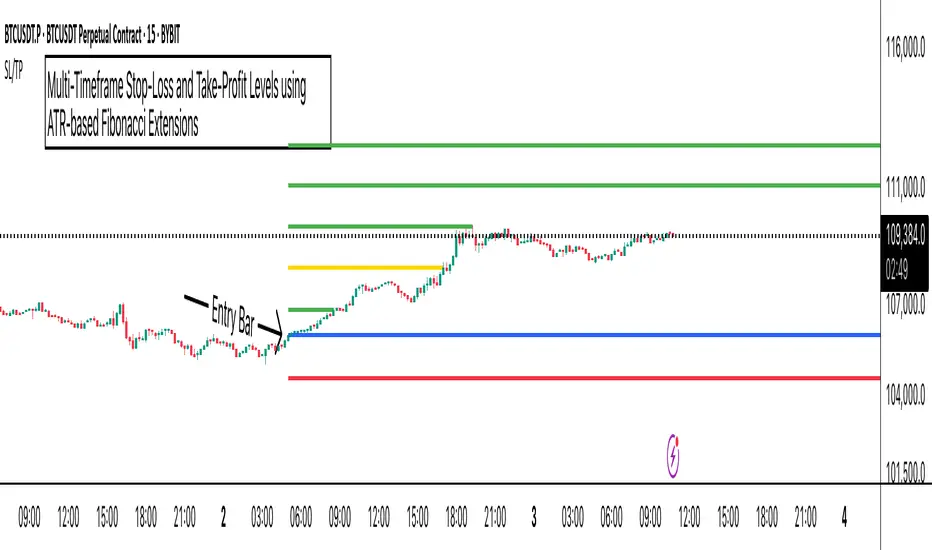
ATR Stop-Loss with Fibonacci Take-Profit [jpkxyz]ATR Stop-Loss with Fibonacci Take-Profit Indicator
This comprehensive indicator combines Average True Range (ATR) volatility analysis with Fibonacci extensions to create dynamic stop-loss and take-profit levels. It's designed to help traders set precise risk management levels and profit targets based on market volatility and mathematical ratios.
Two Operating Modes
Default Mode (Rolling Levels)
In default mode, the indicator continuously plots evolving stop-loss and take-profit levels based on real-time price action. These levels update dynamically as new bars form, creating rolling horizontal lines across the chart. I use this mode primarily to plot the rolling ATR-Level which I use to trail my Stop-Loss into profit.
Characteristics:
Levels recalculate with each new bar
All selected Fibonacci levels display simultaneously
Uses plot() functions with trackprice=true for price tracking
Custom Anchor Mode (Fixed Levels)
This is the primary mode for precision trading. You select a specific timestamp (typically your entry bar), and the indicator locks all calculations to that exact moment, creating fixed horizontal lines that represent your actual trade levels.
Characteristics:
Entry line (blue) marks your anchor point
Stop-loss calculated using ATR from the anchor bar
Fibonacci levels projected from entry-to-stop distance
Lines terminate when price breaks through them
Includes comprehensive alert system
Core Calculation Logic
ATR Stop-Loss Calculation:
Stop Loss = Entry Price ± (ATR × Multiplier)
Long positions: SL = Entry - (ATR × Multiplier)
Short positions: SL = Entry + (ATR × Multiplier)
ATR uses your chosen smoothing method (RMA, SMA, EMA, or WMA)
Default multiplier is 1.5, adjustable to your risk tolerance
Fibonacci Take-Profit Projection:
The distance from entry to stop-loss becomes the base unit (1.0) for Fibonacci extensions:
TP Level = Entry + (Entry-to-SL Distance × Fibonacci Ratio)
Available Fibonacci Levels:
Conservative: 0.618, 1.0, 1.618
Extended: 2.618, 3.618, 4.618
Complete range: 0.0 to 4.764 (23 levels total)
Multi-Timeframe Functionality
One of the indicator's most powerful features is timeframe flexibility. You can analyze on one timeframe while using stop-loss and take-profit calculations from another.
Best Practices:
Identify your entry point on execution timeframe
Enable "Custom Anchor" mode
Set anchor timestamp to your entry bar
Select appropriate analysis timeframe
Choose relevant Fibonacci levels
Enable alerts for automated notifications
Example Scenario:
Analyse trend on 4-hour chart
Execute entry on 5-minute chart for precision
Set custom anchor to your 5-minute entry bar
Configure timeframe setting to "4h" for swing-level targets
Select appropriate Fibonacci Extension levels
Result: Precise entry with larger timeframe risk management
Visual Intelligence System
Line Behaviour in Custom Anchor Mode:
Active levels: Lines extend to the right edge
Hit levels: Lines terminate at the breaking bar
Entry line: Always visible in blue
Stop-loss: Red line, terminates when hit
Take-profits: Green lines (1.618 level in gold for emphasis)
Customisation Options:
Line width (1-4 pixels)
Show/hide individual Fibonacci levels
ATR length and smoothing method
ATR multiplier for stop-loss distance
MACD + MA 2-Min Binary Options Strategy (Strategy Mode)📈 "MACD + MA Crossover Momentum Strategy" (2-Minute Expiry)
✅ Objective:
Catch short-term momentum in the direction of the trend confirmed by MACD crossover and MA alignment.
🧰 Strategy Setup
🕒 Chart Timeframe:
15-second or 30-second candles
(2-minute expiry = 4–8 candles ahead)
📊 Indicators:
EMA 5 (fast)
EMA 13 (slow)
MACD (12, 26, 9) – Standard settings
(Optional): Support/Resistance zones (manual or indicator)
🟩 Call (Buy) Conditions:
EMA 5 crosses above EMA 13
MACD Line crosses above the Signal Line (MACD crossover happens after or at the same time as EMA cross)
MACD histogram is increasing (momentum rising)
Price is above both EMAs, confirming trend strength
No major resistance or news in the next 2 minutes
🟨 Enter on the close of the confirmation candle. Set expiry: 2 minutes from entry.
🟥 Put (Sell) Conditions:
EMA 5 crosses below EMA 13
MACD Line crosses below Signal Line
MACD histogram is decreasing
Price is below both EMAs
No support zone or news in next 2 minutes
✅ Additional Entry Filters
Only trade in the direction of the higher timeframe trend (check 5-minute chart to confirm)
Avoid trading during low volume (e.g., lunch hours, between sessions)
Avoid entry right after a MACD crossover has been running for several candles (too late)
Use price action candles to confirm (e.g., engulfing, strong momentum bars)
🧠 Example Workflow (Call Trade):
You're watching GBP/USD on 30-sec candles.
EMA 5 just crosses above EMA 13.
MACD line crosses above signal, histogram increases.
Price is above both EMAs, showing strength.
Candle closes strong bullish.
➡️ Enter CALL with 2-minute expiry.

All SMAs Bullish/Bearish Screener (Visually Enhanced)Title: All SMAs Bullish/Bearish Screener Enhanced: Uncover Elite Trend Opportunities with Confidence & Clarity
Description:
Are you striving to master the art of trend-following, but often find yourself overwhelmed by market noise and ambiguous signals? Do you yearn for a trading edge that clearly identifies high-conviction opportunities and equips you with robust risk management principles? Look no further. The "All SMAs Bullish/Bearish Screener Enhanced" is your ultimate solution – a meticulously crafted Pine Script indicator designed to cut through the clutter, pinpointing stocks where the trend is undeniably strong, and providing you with the clarity you need to trade with confidence.
The Pinnacle of Confluence: Beyond Simple Averages
This is not just another moving average indicator. This is a sophisticated, multi-layered analytical engine built on the profound principle of Confluence. While our core strength lies in tracking a comprehensive suite of six critical Simple Moving Averages (5, 10, 20, 50, 100, and 200-period SMAs), this Enhanced version elevates signal reliability by integrating powerful, independent confirmation layers:
Momentum (Rate of Change - ROC): A true trend isn't just about direction; it's about the force and persistence of price movement. The Momentum filter ensures that the trend is backed by accelerating buying (for bullish signals) or selling (for bearish signals) pressure, validating its underlying strength.
Volume Confirmation: Smart money always leaves a trail. Significant price moves, especially trend continuations or reversals, demand genuine participation. This enhancement confirms that the "All SMAs" alignment is accompanied by above-average volume, signaling institutional conviction and differentiating authentic moves from mere whipsaws.
Relative Strength Index (RSI) Bias: The RSI helps gauge the health of the trend. For a bullish signal, we confirm RSI maintains a bullish bias (above 50), while for a bearish signal, we look for a bearish bias (below 50). This adds another layer of qualitative validation, ensuring the trend isn't overextended without confirmation.
When a stock's price is trading above ALL six critical SMAs, and is simultaneously confirmed by strong positive Momentum, robust Volume, and a bullish RSI bias, you are witnessing a powerful "STRONGLY BULLISH" signal. This rare alignment often precedes sustained upward moves and signifies a prime accumulation phase across all time horizons. Conversely, a "STRONGLY BEARISH" signal, where price is below ALL SMAs with compelling negative Momentum, validating Volume, and a bearish RSI bias, indicates significant distribution and potential for substantial downside.
Seamless Usage & Unmatched Visual Clarity:
Adding this script to your TradingView chart is simple, and its visual design has been meticulously optimized for maximum readability:
Easy Integration: Paste the script into your Pine Editor and click "Add to Chart."
Full Customization: All SMA lengths, RSI periods, Volume SMA periods, and Momentum periods are easily adjustable via user-friendly input settings, allowing you to fine-tune the strategy to your precise preferences.
Optimal Timeframes:
For identifying robust, actionable trends for swing and position trading, Daily (1D) and 4-Hour (240 min) timeframes are highly recommended. These capture significant market movements with reduced noise.
While the script functions on shorter timeframes (e.g., 15min, 60min), these are best reserved for highly active day traders seeking precise entry triggers within broader trends, as shorter timeframes are prone to increased volatility and noise.
Important Note on Candle Size: The width of candles on your chart is controlled by TradingView's platform settings and your zoom level, not directly by Pine Script. To make candles appear larger, simply zoom in horizontally on your chart or adjust the "Bar Spacing" in your Chart Settings (Right-click chart > Settings > Symbol Tab).
Crystal-Clear Visual Signals:
Subtle Background Hues: The chart background will subtly tint lime green for "STRONGLY BULLISH" and red for "STRONGLY BEARISH" conditions. This transparency ensures your underlying candles remain perfectly visible.
Distinct Moving Averages: SMAs are plotted with increased line thickness and a carefully chosen color palette for easy identification.
Precise Signal Triangles: Small, clean green triangles below the bar signify "STRONGLY BULLISH," while small red triangles above the bar mark "STRONGLY BEARISH" conditions. These are unobtrusive yet clear.
Dedicated Indicator Panes: RSI and Momentum plots, along with their key levels, now appear in their own separate, clean sub-panes below the main price chart, preventing clutter and allowing for focused analysis.
On-Chart Status Table: A prominent table in your chosen corner of the chart provides an immediate, plain-language update on the current trend status.
Real-Time Screener Power (via TradingView Alerts): This is your ultimate automation tool. Set up custom alerts for "Confirmed Bullish Trade" or "Confirmed Bearish Trade" conditions. Receive instant notifications (email, app, webhook) for any stock in your watchlist that meets these stringent, high-conviction criteria, allowing you to react swiftly to premium setups across the market without constant chart monitoring.
Mastering Risk & Rewards: The Trader's Edge
Finding a signal is only the first step. This script helps you trade intelligently by guiding your risk management:
Strategic Stop-Loss Placement: Your stop-loss is your capital protector. For a "STRONGLY BULLISH" trade, place it just below the most recent significant swing low (higher low). This is where the uptrend's structure is invalidated. For "STRONGLY BEARISH" trades, place it just above the most recent significant swing high (lower high). As an alternative, consider placing your stop just outside the 20-period SMA; a close beyond this mid-term average often signals a crucial shift. Always ensure your chosen stop-loss aligns with your strict risk-per-trade rules (e.g., risking no more than 1-2% of your capital per trade).
Disciplined Profit Booking: Don't just let winners turn into losers. Employ a strategy to capture gains:
Trailing Stop-Loss: As your trade moves into profit, dynamically move your stop-loss upwards (for longs) or downwards (for shorts). You can trail it by following subsequent swing lows/highs or by using a faster Moving Average like the 10 or 20-period SMA as a dynamic exit point if price closes beyond it. This allows you to ride extended trends while protecting accumulated gains.
Target Levels: Identify potential profit targets using traditional support/resistance levels, pivot points, or Fibonacci extensions. Consider taking partial profits at these key junctures to secure gains while letting a portion of your position run.
Loss of Confluence: A unique exit signal for this script is the breakdown of the "STRONGLY BULLISH" or "STRONGLY BEARISH" confluence itself. If the confirmation layers or even a few of the core SMAs are no longer aligned, it might be time to re-evaluate or exit, even if your hard stop hasn't been hit.
The "All SMAs Bullish/Bearish Screener Enhanced" is more than just code; it's a philosophy for disciplined trend trading. By combining comprehensive multi-factor confluence with intuitive visuals and robust risk management principles, you're equipped to make smarter, higher-conviction trading decisions. Add it to your favorites today and transform your approach to the markets!
#PineScript #TradingView #SMA #MovingAverage #TrendFollowing #StockScreener #TechnicalAnalysis #Bullish #Bearish #MarketScanner #Momentum #Volume #RSI #Confluence #TradingStrategy #Enhanced #Signals #Analysis #DayTrading #SwingTrading

SupertrendWill generate Good Signals but be remembered that you can only use when Breakout market is there

Vector CandlesSimple buy and sell alert on vectors. Works well on 4h. Standard settings are 70% candle must be body, with min 1.5 vol on the candle on 20 ma loopback.

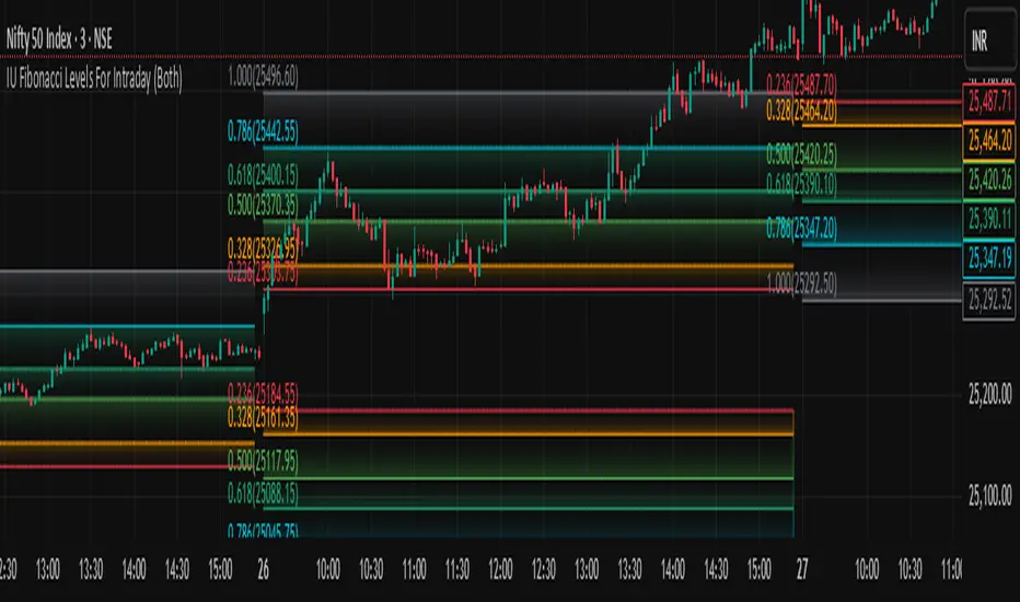
IU Fibonacci Levels For IntradayDESCRIPTION
This indicator draws intraday Fibonacci levels from the opening price of the day using percentage-based retracements. It helps traders identify potential intraday support and resistance zones derived from the day’s opening bias. The levels are dynamically calculated and displayed with optional labels and customizable colors, making it an effective tool for both breakout and mean-reversion intraday strategies.
USER INPUTS
Direction Of The Level
Choose whether to show Upside, Downside, or Both level sets based on your directional bias.
Show Labels of Levels
Option to enable or disable text labels displaying Fibonacci values and prices.
Individual Level Toggles & Colors
You can choose to show or hide each of the following Fibonacci levels and set their respective colors:
* 0.236
* 0.328
* 0.500
* 0.618
* 0.786
* 1.000
INDICATOR LOGIC
On the first bar of the session, the opening price is captured.
Fibonacci levels are then calculated above and below this open using percentage multipliers (for example, day\_open + (day\_open \* 0.236%) for the 0.236 level).
Depending on the selected direction, upside and/or downside levels are plotted.
Filled zones are drawn between levels to visually highlight key price zones.
Optionally, each level can be labeled with its Fibonacci value and price.
WHY IT IS UNIQUE
Unlike traditional swing-based Fibonacci retracements, this tool uses the day’s opening price as an anchor, specifically designed for intraday traders.
Allows traders to quickly visualize micro-support and resistance levels that adapt every day.
Highly customizable and easy to read, with filled level bands for better zone recognition.
Works independently of indicators like RSI, MACD, or moving averages – purely based on price action logic.
HOW USER CAN BENEFIT FROM IT
Spot precise intraday reversal zones or breakout regions.
Combine with price action or volume analysis for smarter entries.
Filter trades by choosing directional bias (Up Site, Down Site, or Both).
Set profit targets or stop-losses based on Fibonacci bands.
Works great for scalpers, day traders, and even short-term swing traders looking to align with opening price momentum.
Disclaimer
This indicator is not financial advice, it's for educational purposes only highlighting the power of coding( pine script) in TradingView, I am not a SEBI-registered advisor. Trading and investing involve risk, and you should consult with a qualified financial advisor before making any trading decisions. I do not guarantee profits or take responsibility for any losses you may incur.
Dynamic Sniper ProDynamic Sniper Pro - Binary Options Signal
Description:
Dynamic Sniper Pro is a powerful Pine Script v6 indicator designed for binary options trading. It combines Exponential Moving Averages (EMAs), Relative Strength Index (RSI), and an optional ATR filter to generate precise buy and sell signals. Ideal for short-term charts like 1-minute, this indicator helps traders spot trend reversals and breakouts with clear visual arrows. Tested on CAD/JPY, it recently delivered actionable signals during the morning session on July 01, 2025.
How It Works:
Buy Signal (Green Arrow): Triggered when the closing price exceeds both the 3-period Fast EMA and 8-period Slow EMA, RSI drops below the oversold level (default 40), and (if ATR filter is on) the price breaks above the Slow EMA + 0.15 * ATR. Enter a call option at the next candle open.
Sell Signal (Red Arrow): Triggered when the closing price falls below both EMAs, RSI rises above the overbought level (default 60), and (if ATR filter is on) the price breaks below the Slow EMA - 0.15 * ATR. Enter a put option at the next candle open.
Key Features:
Customizable parameters: Adjust EMA lengths, RSI periods, oversold/overbought levels, and ATR multiplier.
Optional ATR filter to reduce whipsaw entries.
Visual alerts with arrows and background highlights.
Compatible with any forex pair or timeframe—optimize for your strategy!
Settings:
Fast EMA Length: 3 (short-term trend)
Slow EMA Length: 8 (trend confirmation)
RSI Length: 14 (default smoothness)
Oversold Level: 40 (tweak for sensitivity)
Overbought Level: 60 (tweak for sensitivity)
Use ATR Filter: True (optional)
ATR Length: 14
ATR Multiplier: 0.3 (adjust for breakout strength)
Performance:
Backtesting on CAD/JPY 1-minute from 10:34–11:34 AM PDT on July 01, 2025, showed promising signal frequency. Results may vary—test on your preferred asset.
Tips:
Set alerts via the "Alerts" tab for real-time notifications.
Adjust oversold/overbought levels (e.g., 45/55) for fewer/more signals.
Best on volatile pairs like CAD/JPY or EUR/USD.
Disclaimer:
This indicator is for educational purposes only. Past performance is not indicative of future results. Use at your own risk, and consider market conditions and risk management.

JIYANS FVGJIYAN'S FVG is a powerful Fair Value Gap (FVG) indicator designed to help traders visually identify and track bullish and bearish imbalances across customizable timeframes. The script automatically detects FVGs based on market structure and plots them with shaded boxes and clear boundary lines on the chart.
Key Features:
Multi-Timeframe Detection: Select your preferred timeframe for FVG detection (e.g., H4, H1, M30).
Visual Clarity: Displays shaded gaps with customizable colors, upper and lower boundary lines, and optional midpoint lines for precise reference.
Dynamic Management: Automatically removes mitigated (filled) gaps to keep the chart clean and focused.
Labeling: Annotates each FVG with the selected timeframe for easy tracking.
Alerts: Built-in alerts notify you when a new FVG forms or when price touches the boundary of an existing unmitigated FVG.
This tool is perfect for traders who rely on price imbalances and fair value gaps to identify potential trading opportunities and key areas of interest.

Civan Ali'nin Sihirli Çizgisi🧙♂️ Civan Ali’s Magic Line
Sense the trends, don’t miss the moves!
This strategy is built on two magically effective foundations:
📏 Moving Averages (WMA 50 & 200) and
🧠 CCI signals powered by the IFT Combo filter.
How It Works
🔹 When price starts accelerating upward and the short-term average (WMA50) crosses above the long-term (WMA200), a potential long signal forms.
🔻 If it crosses downward, a short signal is considered.
But it doesn’t jump in immediately!
🎯 To avoid “noisy” market moves, the system uses an Inverse Fisher Transform (IFT) filter.
Only when momentum is truly strong does it allow trades.
Why It’s Different
✅ Detects trend direction
✅ Filters out weak signals
✅ Manages risk and profit intelligently
And while doing all that, it warns you with magical labels and emojis on the chart.
In short: It’s both effective and entertaining. 🎯

Session HL + Candles + AMD (Nephew_Sam_)Session HL + Candles + AMD (Nephew_Sam_)
This indicator marks out intraday sessions summarized into single candles, with an additional option to mark out the HL of each session. Perfect for understanding AMD within a glance (accumulation-manipulation-distribution)
Features:
Session High/Low lines with customizable colors and labels
Optional session candles displayed on the right side of the chart
Timezone support for global traders
Customizable bull/bear candle colors
Works on timeframes up to 1 hour
Perfect for:
Identifying session liquidity levels
Tracking session ranges and breakouts
Multi-timeframe session analysis
ICT methodology traders
Settings:
Choose your timezone for accurate session detection
Toggle session candles and HL lines independently
Customize colors, line styles, and labels
Set maximum timeframe (up to 1 hour)

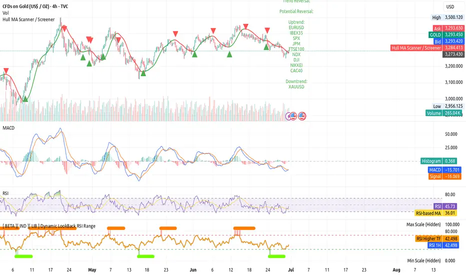
[ BETA ][ IND ][ LIB ] Dynamic LookBack RSI RangeGet visual confirmation with this indicator if the current range selected had been oversold or overbough in the latest n bars
Advanced Day Separator with Future ProjectionsThe general indicator works on historical data, meaning they develop after the fact. The same is for indicators that show day separation. I was always forced to manually draw in vertical lines for the upcoming week. This indicator I built solves that issue by projecting vertical day separations for the upcoming week. Enjoy! :-)

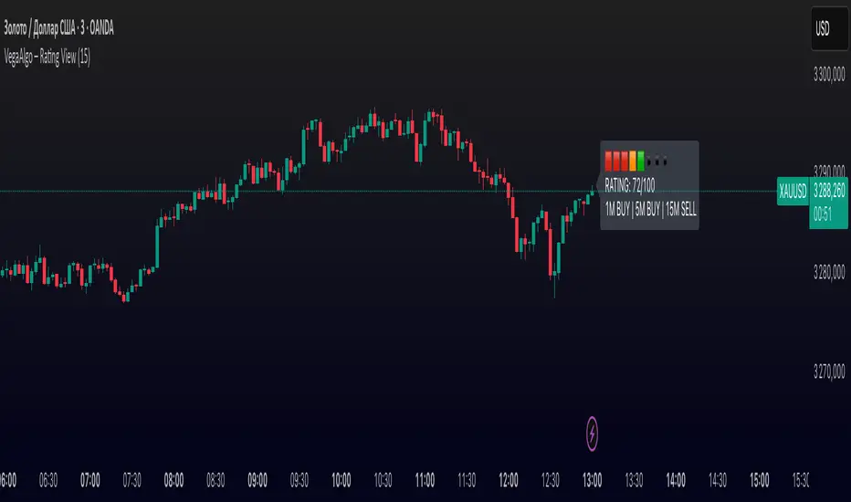
VegaAlgo – Rating ViewVegaAlgo – Rating View is a market condition analysis tool designed to evaluate the current price structure.
The indicator calculates a RATING (from 0 to 100) that reflects how clean, directional, and structured the recent price movement is. The rating is based on the number of price direction changes (from bullish to bearish candles and vice versa) within a selected period. Fewer direction changes indicate a clearer trend and result in a higher rating, while a choppy or highly volatile market leads to a lower score.
Additionally, the indicator provides directional signals on three key timeframes — 1M, 5M, and 15M, using a comparison of fast and slow moving averages. This allows traders to quickly assess the dominant trend both locally and across higher timeframes.
This script is intended for visual market analysis only and should not be considered financial advice.