OPEN-SOURCE SCRIPT
已更新 % Divergence of RSI
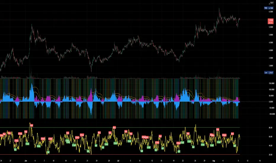
A simple script that plots the difference between the %ROC of price vs the %ROC of RSI, AKA the % of divergence. A simple way to analyze how strong a potential divergence is. Top reversals are above 0, bottom reversals are below. A value of 0 means price and RSI are changing by the same % value. So, if oscillator is moving up as price moves up, it means divergence is increasing. If oscillator moves down as price moves up, it means divergence is decreasing.
發行說明
Better default values.發行說明
Finalized? I probably uploaded this too early. Oh well...+ absolute value underlay
+ color highlights based on Bollinger Band.
+ purple > 0 is buy signal, blue > 0 is sell signal. ABS shown to more easily compare strength of all divergences.
+ best buys are when background highlighted blue or teal - in upper bollinger band range or broke out, stronger divergences!
+ BB crosses shown in orange and yellow like the respective lines
+ Crosses of 0 line highlighted in green and lime.
發行說明
better value and chart發行說明
fixed range開源腳本
本著TradingView的真正精神,此腳本的創建者將其開源,以便交易者可以查看和驗證其功能。向作者致敬!雖然您可以免費使用它,但請記住,重新發佈程式碼必須遵守我們的網站規則。
免責聲明
這些資訊和出版物並不意味著也不構成TradingView提供或認可的金融、投資、交易或其他類型的意見或建議。請在使用條款閱讀更多資訊。
開源腳本
本著TradingView的真正精神,此腳本的創建者將其開源,以便交易者可以查看和驗證其功能。向作者致敬!雖然您可以免費使用它,但請記住,重新發佈程式碼必須遵守我們的網站規則。
免責聲明
這些資訊和出版物並不意味著也不構成TradingView提供或認可的金融、投資、交易或其他類型的意見或建議。請在使用條款閱讀更多資訊。