OPEN-SOURCE SCRIPT
已更新 Wayne's Pivots

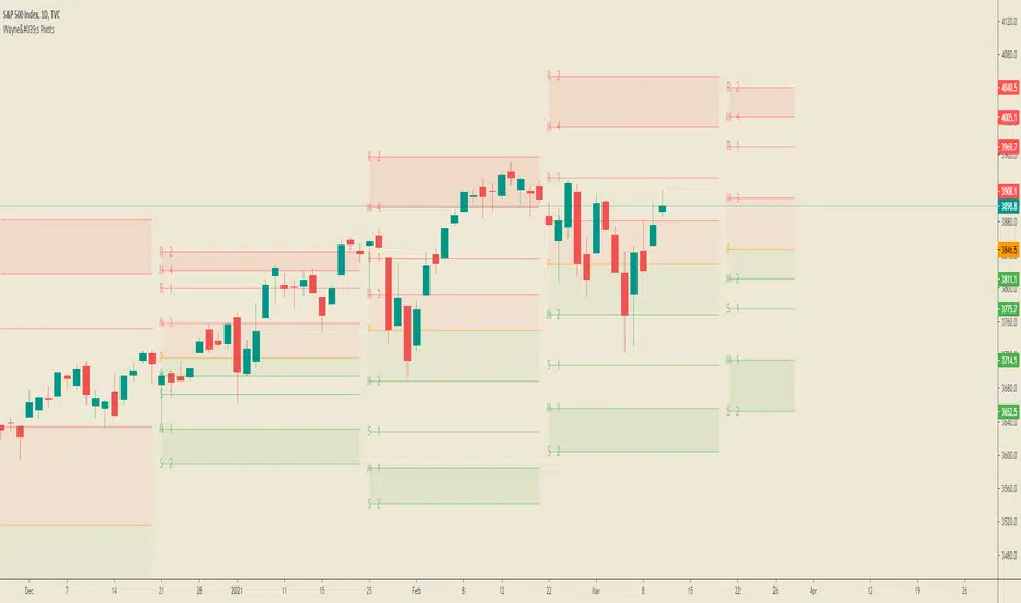
An indicator that forecasts the next period's pivots.
發行說明
- Added the predictive pivot point feature to the indicator.- Added easy to use resolution feature. Generate pivots for lower timeframes based on the on Daily, Weekly, and Monthly resolutions.
- Added options to change the highlighting for bullish, bearish, and OOP modes.
- Labels are now set to show up only on the next pivot.
- Plots used to replace lines so there's more historical pivots.
- Breaks added between lines and background coloring to create visual gaps.
發行說明
Update developed in collaborations by Josh Baus (@jsrbaus) and Wim Van Ertvelde (wimvanertvelde).Indicator Features:
- View the developing pivot points for the next trading period on your chart.
- Plots middle pivots between the traditional ones. These are labeled as M1 to M4.
- The indicator will automatically switch between daily, weekly, and monthly pivots depending on the timeframe.
- Customize the colors for the support, resistance, and central pivot lines independently of each other.
- Utilize the bullish bias, bearish bias, and OOP (Out Of Position) highlights to help you focus on your trading bias.
- Set the color and transparency for your bullish, bearish, and OOP biased highlights.
- Open source code for future contributions and private modifications.
Over time we hope to add more features and possibly include more collaborators to this indicator in the future.
How do I setup the indicator so it only shows daily, weekly, or monthly period pivot points without automatically changing?
In the settings under Time Frame select the 1 day, 1 week, or 1 month option depending on the pivot you want. If you want to go back to using the automated pivots, then set the Time Frame option to Same as Symbol.
How do I remove the labels on the pivot point levels like R2 and M1?
There's a checkbox called Show Levels for that directly under the Time Frame drop down box. Just check it off if you don't want the level labels.
Why is there text floating above my chart saying "Dayly Pivot" or "Weekly Pivot"?
Those labels tell you which resolution pivot points the indicator has selected to put on your chart. If you just want to turn off this text the go to the Styles tab and uncheck the Labels box.
發行說明
A new update was pushed for Pine today updating color inputs. This allowed me to not only clean up the code but add some new functionality to the indicator!Updates:
- Set any color and transparency to the central pivot, support, and resistance lines separately.
- Set any color and transparency to the labels for each of those lines separately.
- Removed old, commented out code that no longer serves being in the indicator.
- Updated the 'Show Levels' button to say 'Show Pivot Labels'.
- Updated indicator short title from 'Waynes Pivots' to 'Wayne's Pivots' just like the script's title.
I still read the comments, so if you have suggestions or questions just ask.
發行說明
This update adds new requested functions:- Pivot Point Bias Settings (Bullish, Bearish, Out of Position, Range, All)
- Select (or hide) and customize each individual pivot labels and levels to have on your chart.
The indicator has progressed a lot in this update. So much so that you can completely customize every line's and label's color and style. You can use the Pivot Point Bias presets, or you can customize all the colors and settings to create your own perfect Wayne's Pivot setup!
I'm very happy now with where the indicator currently is. It includes pretty much every feature I wanted when I originally started this project almost a year ago. If there's anything else I think of, you know I'll be back to add it.
(Like if I could add M0/S3 and M5/R3 pivot levels, but the indicator currently hit's TradingView's plotting limits. The only workaround currently for that is to create a separate indicator just for those pivots.)
The other two obvious, but minor, change is the color of the central pivot point has been changed from grey to orange. This way the indicator can be viewed with default settings on both light and dark background charts. The second color change is that the transparency on all pivot labels and levels has been decreased, so everything is just a "tad" stronger in color.
Other than that, let me know what else you guys want to see and I'll check it out.
開源腳本
In true TradingView spirit, the creator of this script has made it open-source, so that traders can review and verify its functionality. Kudos to the author! While you can use it for free, remember that republishing the code is subject to our House Rules.
Joe Baus, bausbenchmarks.com
免責聲明
The information and publications are not meant to be, and do not constitute, financial, investment, trading, or other types of advice or recommendations supplied or endorsed by TradingView. Read more in the Terms of Use.