mrD-Volume Profile HeatmapThis indicator combines advanced volume analysis with institutional-grade visualization techniques to provide traders with a comprehensive view of market structure and liquidity zones.
WHAT MAKES THIS UNIQUE:
• Proprietary bidirectional volume profiling algorithm that separates buying and selling pressure using VWAP deviation analysis, not standard volume bars
• Custom heatmap visualization engine with adaptive gradient calculation based on volume-weighted price distribution across multiple timeframes
• Integrated Weekly VWAP with hlc3 weighting for institutional reference levels
• Dynamic POC (Point of Control) detection with fixed-height text boxes for clarity
• Optimized rendering system that handles 500+ bars efficiently without lag
HOW IT WORKS:
The algorithm analyzes volume distribution at each price level within the lookback period, applying a proprietary weighting system that considers:
1. Volume-weighted average price (VWAP) deviation to classify volume as bullish/bearish
2. Price levels are binned into customizable rows (bins) for granular analysis
3. Volume bars extend bidirectionally: positive volume (green) extends left, negative volume (red) extends right
4. Heatmap overlay uses multi-level gradient mapping (6-color spectrum) to highlight high volume nodes
5. Weekly VWAP provides macro trend reference with session-based reset logic
VOLUME PROFILE MECHANICS:
• Calculates volume distribution across price levels using a grid-based binning system
• Each bin accumulates volume when the price touches that level
• Positive/negative classification based on VWAP position (above = bullish, below = bearish)
• POC automatically identifies the price level with maximum volume concentration
• Display shows volume intensity through color gradients and bar lengths
HEATMAP VISUALIZATION:
• Uses exponential gradient multiplier (default 1.9) for enhanced contrast
• Color transitions: Dark Blue (low volume) → Cyan → Green → Yellow (high volume)
• Transparency-adjusted overlays ensure chart readability
• Real-time updates as new volume data arrives
WEEKLY VWAP INTEGRATION:
• Resets at the start of each trading week (request.security logic)
• Uses hlc3 (typical price) as the volume-weighted source
• Provides institutional reference level for swing traders
• Yellow color (#FFEB3B) for easy identification
KEY PARAMETERS:
• Period: Lookback window for volume calculations (default: 500 bars)
• Bins: Number of price levels for volume distribution (default: 150 rows)
• Offset: Horizontal positioning of volume bars (default: 50)
• Heatmap Rows: Granularity of heatmap overlay (default: 250)
• POC displays actual volume numbers for transparency
TRADING APPLICATIONS:
→ Identify high-volume nodes as support/resistance zones
→ Detect liquidity clusters where institutional orders concentrate
→ Spot low-volume areas where price may move quickly (thin zones)
→ Use bidirectional volume to assess buying vs selling pressure
→ Combine with Weekly VWAP for multi-timeframe confluence
→ POC levels often act as price magnets (mean reversion targets)
TECHNICAL IMPLEMENTATION NOTES:
• Optimized for intraday to swing timeframes (1m to Daily charts)
• Volume calculations use session-based accumulation (no future data)
• Box rendering is limited to 500 objects for performance
• Gradient calculations use mathematical power functions for smooth transitions
• VWAP calculation follows institutional standard (volume-weighted hlc3)
RESTRICTIONS:
This is a proprietary algorithm. Redistribution, modification, or commercial use is strictly prohibited. The logic and methods contained herein are confidential and protected intellectual property.
═══════════════════════════════════════════
DISCLAIMER & RISK WARNING
This indicator is provided solely for educational and informational purposes. It is designed to help traders understand market structure, volume distribution, and price action analysis. This tool should be used as part of a comprehensive trading education program.
NOT FINANCIAL ADVICE:
The information and signals provided by this indicator DO NOT constitute financial advice, investment advice, trading advice, or any other sort of advice. You should not treat any of the indicators' content, outputs, or signals as such. Nothing contained in this indicator constitutes a solicitation, recommendation, endorsement, or offer to buy or sell any securities or other financial instruments in this or in any other jurisdiction.
NO GUARANTEED RESULTS:
Past performance is NOT indicative of future results. The historical backtesting results, volume patterns, and statistical data shown by this indicator do not guarantee future performance or success. Market conditions change constantly, and what worked in the past may not work in the future. Trading and investing involve substantial risk of loss.
MARKET VOLATILITY:
Financial markets are inherently volatile and unpredictable. Volume patterns, support/resistance levels, and other technical indicators can fail at any time. No indicator can predict market movements with certainty. Always use proper risk management and position sizing.
By using this indicator, you acknowledge that you have read, understood, and agree to this disclaimer in its entirety. If you do not agree with any part of this disclaimer, you should not use this indicator.
廣量指標

Crypto Intraday Scalper [Patterns + RSI + Volume + MTF + ADX]# Guide to Reading the Indicator (CIS Pro v2)
## 1. Operational Signals (The Labels)
- **GREEN Label "BUY"**:
**Meaning**: Entry for a Long position.
**Conditions**: Bullish candle pattern + Oversold RSI + High Volume + Bullish 1-hour trend + Sufficient Volatility.
- **RED Label "SELL"**:
**Meaning**: Entry for a Short position.
**Conditions**: Bearish candle pattern + Overbought RSI + High Volume + Bearish 1-hour trend + Sufficient Volatility.
- **No Label**: The market is in an uncertain phase, sideways movement, or filters (ADX/MTF) are blocking signals for protection.
## 2. Trend Lines (The Context)
- **Gray Line (EMA 200)**: This serves as the dividing line between bullish and bearish trends.
**Rule**: Seek Long positions only above the gray line; Short positions only below it.
- **Red/Green Step Line (Supertrend / Trailing Stop)**:
**Green (below the price)**: Strong bullish trend. Acts as dynamic support.
**Red (above the price)**: Strong bearish trend. Acts as dynamic resistance.
**Usage**: Use it for trade exits. If in a Long position and the line turns red, close the entire trade.
## 3. Price Levels (Targets and Supports)
- **Blue/Red/Green Dots (Pivot Points)**:
These are levels calculated from the previous day. The price tends to bounce at these points. Use them as final targets for taking profit.
- **Orange Line (VWAP)**:
This represents the "average price" for the day. If the price deviates too far, it often returns (elastic effect).
- **Dashed Lines (Appear after a signal)**:
**Red Dashed**: Suggested Stop Loss (based on ATR volatility).
**Green Dashed**: Suggested Take Profit (quick target).
## 4. The Table (Dashboard in the Top Right)
This provides reasons why you may not be receiving signals:
- **Trend (Current)**: The trend on your current chart.
- **Trend (MTF 60)**: The trend on the 1-hour chart. If these two conflict (e.g., Bullish vs. Bearish), no signals will appear.
- **ADX Volatility**: If RED (below 20), the market is flat—no trades. If GREEN, there is sufficient movement.
- **Volume Status**: Alerts if anomalous high volume is entering (High) or if conditions are calm.
## 🚀 Operational Summary
- Wait for the label.
- Quick Check: Is the price on the correct side of the gray line? Is the step line the right color?
- Enter the trade.
- Exit when the price hits the green dashed line (Quick Take Profit) **OR** when the price breaks the step line (Trailing Stop for longer trends).
What aspect of this indicator should we analyze next—perhaps integrating it with real-time ETH data or testing it via code execution for backtesting?

XAUUSD ULTIMATE+BB 🥇 [GOLD OPTIMIZED]🥇 XAUUSD ULTIMATE 100% - Best Gold Indicator
The most complete trading system for GOLD (XAUUSD) - 20+ indicators in ONE tool!
🔥 WHAT YOU GET:
✅ COMPLETE TRADING SYSTEM
- Buy/Sell signals with 0-100% confidence score
- Automatic SL/TP levels (optimized for gold)
- Real-time profit tracking in $ and %
- Clean visual interface with live dashboard
✅ POWERFUL FEATURES
- 📊 Bollinger Bands - Full visualization
- 📈 SuperTrend - Dynamic trend line
- 🎯 Divergence Detection - Early reversals
- 🕯️ Candlestick Patterns - Hammer, Engulfing, etc
- 💎 Order Blocks - Smart Money levels
- 🕐 Session Lines - London/NY high volatility periods
✅ SMART SIGNAL SYSTEM
- Multi-indicator confirmation (EMAs, RSI, MACD, Stochastic, ADX)
- Fast Entry Mode - Catches early moves
- Aggressive Mode - More signals
- Volume confirmation included
- Psychological levels ($50 increments)
✅ EASY TO USE
1. Add to XAUUSD chart
2. Adjust sensitivity (1-10)
3. Wait for BUY/SELL arrows
4. Follow displayed SL/TP levels
✅ ALERTS INCLUDED
- Buy/Sell signals
- Divergence alerts
- Profit targets (0.15%, 0.30%)
- Bollinger Band extremes
🎯 BEST FOR:
- Gold scalping (M5-M15)
- Day trading (M15-H1)
- All experience levels
⚙️ FULLY CUSTOMIZABLE
- Adjustable sensitivity
- Show/hide any feature
- Custom SL/TP multipliers
- Choose your trading style
💡 WHY IT'S THE BEST:
- Gold-specific optimization
- 20+ indicators working together
- Professional-grade accuracy
- Clean, easy-to-read interface
- Works in all market conditions

BankNifty - 2x Nifty Differencedifference between Banknifty near month future - 2x nifty near month future

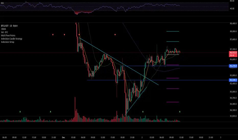
Indecision Candle Setup DetectorThis bot can Detect Indecision Candle and make alert
with this indicator you will not miss any setup Candle
ST - Relative StrengthST - Relative Strength plots the relative strength of the current stock versus a benchmark index. It divides the stock’s close by the index close on the same timeframe, and you can switch the benchmark to any index or symbol you prefer. This helps you quickly see whether the stock is outperforming or underperforming its chosen benchmark over time.
Bank Zone by TheRealWealthVision V2The Bank Zone indicator is designed to help traders identify key price areas where institutions, banks, and large market participants are likely active. It highlights potential zones of accumulation, distribution, liquidity grabs, and high-value reaction levels.
This tool automatically detects structural shifts, dynamic zones, and real-time market behavior to support more accurate decision-making. It is suitable for scalping, intraday trading, and swing trading across all markets including Forex, Indices, Crypto, Stocks, Commodities, and more.
Main Features
Automatic detection of potential institutional zones
Real-time dynamic updates
Clear visual highlights on the chart
Designed to work on all timeframes
Fully compatible with the latest TradingView Pine Script engine
Best For
Identifying high-probability reaction areas
Understanding where big players may enter or exit
Improving trade timing and precision
Building a cleaner, more structured market view
Important Notice
This indicator does not repaint historical zones improperly, does not generate unrealistic signals, and follows all TradingView guidelines for script behavior.

WMA SupertrendVWMA Supertrend for identifying good entry points
Divides the slow VWMA and fast VWMA and multiplies by the close price to give a mountain-style price showing possible entries.

📊 Volume Tension & Net Imbalance📊 Volume Tension & Net Imbalance (With Table + MultiLang + Alerts)
//
This indicator measures bullish vs. bearish pressure using volume-based tension and net imbalance.
It identifies accumulation zones, displays real-time market strength, trend direction, and triggers alerts on buildup entries.
Fully customizable table size, colors, and bilingual support (English/Russian).

Santo Graal Tendência🌟 Holy Grail Trend – Clarity in the Flow of the Market
Introducing Holy Grail Trend, a smart trend-following indicator designed for traders who want to ride strong moves while avoiding noise and false breakouts. By blending adaptive cycle analysis, smoothed momentum, and dynamic support/resistance logic, this tool highlights the true underlying trend—not just price noise.
Whether you're a swing trader, position trader, or intraday momentum seeker, Holy Grail Trend helps you stay aligned with the market’s dominant direction while filtering out choppy, sideways phases.
🔍 Key Features:
✅ Clean, color-coded trend visualization (bullish / bearish)
✅ Adaptive sensitivity based on current market cycle length
✅ Dynamic trend bands that adjust to volatility and price structure
✅ Minimal lag and no repainting — reliable in real-time
✅ Works across all assets and timeframes (forex, stocks, crypto, indices)
✅ Lightweight and chart-friendly
💡 How to Use:
Go long when the trend turns green and price is above the dynamic band
Go short when the trend turns red and price is below the band
Stay flat or reduce exposure during neutral (gray) or conflicting phases
The “Holy Grail” isn’t about chasing every move—it’s about trading with the tide, not against it. Combine this indicator with your risk management rules, and you’ll have a powerful ally in your trading journey.

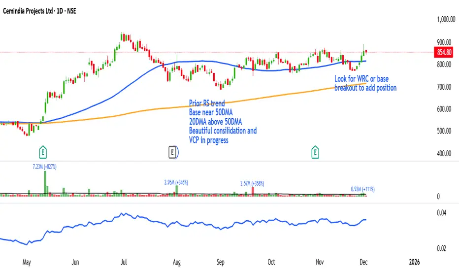
MarketCap & SectorThis indicator shows a quick fundamental snapshot for the current stock directly on the chart. It displays:
- Market Cap in ₹ crores (for example: 4,609.11 Cr)
- Market‑cap category based on size (Large‑cap, Mid‑cap, Small‑cap, or Micro‑cap)
- Sector and Industry of the company
- 1‑month average daily volume in a compact format (for example: 10.5M)
Use it to instantly see how big the company is, what segment of the market it belongs to, and how actively it trades, without opening any extra info panels or websites.

Elliott Wave Multi-Level (Micro/Main)**Title Suggestion:**
Elliott Wave Multi-Level Strategy (Micro/Main)
**Short Description (for TradingView):**
This strategy detects Elliott Waves on two levels — **Micro** (short-term swings) and **Main** (higher-level structures) — and uses them for fully automated long and short trading.
Main Impulse waves (1–5) and ABC corrections are identified using pivot logic, ATR-based movement filters, volume confirmation, and an optional EMA trend filter. Micro Impulse waves serve as confirmation for Main structures, creating a multi-level validation system that significantly reduces false signals.
Entries are taken either:
* **with the trend**, after confirmed Main Impulse waves, or
* optionally as **reversal trades** at the completion of ABC corrections.
Stop-loss and take-profit levels are dynamically calculated using ATR multipliers, allowing the strategy to adapt to different volatility environments. All parameters (pivots, filters, confirmations, risk settings) are fully customizable to fit various markets and timeframes (e.g., 1m–15m).

Harami Reversal Alerts BB Touch (Strict First Candle)Harami Reversal Alerts BB Touch (Strict First Candle)
Harami Reversal Alerts BB Touch (Strict First Candle)Harami Reversal Alerts BB Touch (Strict First Candle)Harami Reversal Alerts BB Touch (Strict First Candle)Harami Reversal Alerts BB Touch (Strict First Candle)Harami Reversal Alerts BB Touch (Strict First Candle)

MarketCap & Sector MarketCap & Sector Dashboard is a lightweight info panel that shows three key fundamentals for any NSE/BSE stock directly on your chart: current market capitalization (in crores), sector, and industry. It keeps this basic context always visible so you can quickly see how big the company is and where it sits in the market without leaving the price chart.

Keltner Hull Suite [QuantAlgo]🟢 Overview
The Keltner Hull Suite combines Hull Moving Average positioning with double-smoothed True Range banding to identify trend regimes and filter market noise. The indicator establishes upper and lower volatility bounds around the Hull MA, with the trend line conditionally updating only when price violates these boundaries. This mechanism distinguishes between genuine directional shifts and temporary price fluctuations, providing traders and investors with a systematic framework for trend identification that adapts to changing volatility conditions across multiple timeframes and asset classes.
🟢 How It Works
The calculation foundation begins with the Hull Moving Average, a weighted moving average designed to minimize lag while maintaining smoothness:
hullMA = ta.hma(priceSource, hullPeriod)
The indicator then calculates true range and applies dual exponential smoothing to create a volatility measure that responds more quickly to volatility changes than traditional ATR implementations while maintaining stability through the double-smoothing process:
tr = ta.tr(true)
smoothTR = ta.ema(tr, keltnerPeriod)
doubleSmooth = ta.ema(smoothTR, keltnerPeriod)
deviation = doubleSmooth * keltnerMultiplier
Dynamic support and resistance boundaries are constructed by applying the multiplier-scaled volatility deviation to the Hull MA, creating upper and lower bounds that expand during volatile periods and contract during consolidation:
upperBound = hullMA + deviation
lowerBound = hullMA - deviation
The trend line employs a conditional update mechanism that prevents premature trend reversals. The system maintains the current trend line until price action violates the respective boundary, at which point the trend line snaps to the violated bound:
if upperBound < trendLine
trendLine := upperBound
if lowerBound > trendLine
trendLine := lowerBound
Directional bias determination compares the current trend line value against its previous value, establishing bullish conditions when rising and bearish conditions when falling. Signal generation occurs on state transitions, triggering alerts when the trend state shifts from neutral or opposite direction:
trendUp = trendLine > trendLine
trendDown = trendLine < trendLine
longSignal = trendState == 1 and trendState != 1
shortSignal = trendState == -1 and trendState != -1
The visualization layer creates a trend band by plotting both the current trend line and a two-bar shifted version, with the area between them filled to create a visual channel that reinforces directional conviction.
🟢 How to Use This Indicator
▶ Long and Short Signals: The indicator generates long/buy signals when the trend state transitions to bullish (trend line begins rising) and short/sell signals when transitioning to bearish (trend line begins falling). These state changes represent structural shifts in momentum where price has broken through the adaptive volatility bands, confirming directional commitment.
▶ Trend Band Dynamics: The spacing between the main trend line and its shifted counterpart creates a visual band whose width reflects trend strength and momentum consistency. Expanding bands indicate accelerating directional movement and strong trend persistence, while contracting or flattening bands suggest decelerating momentum, potential trend exhaustion, or impending consolidation. Monitoring band width provides early warning of regime transitions from trending to range-bound conditions.
▶ Preconfigured Presets: Three optimized parameter sets accommodate different trading styles and timeframes. Default (14, 20, 2.0) provides balanced trend identification suitable for daily charts and swing trading, Fast Response (10, 14, 1.5) delivers aggressive signal generation optimized for intraday scalping and momentum trading on 1-15 minute timeframes, while Smooth Trend (18, 30, 2.5) offers conservative trend confirmation ideal for position trading on 4-hour to daily charts with enhanced noise filtration.
▶ Built-in Alerts: Three alert conditions enable automated monitoring - Bullish Trend Signal triggers on long setup confirmation, Bearish Trend Signal activates on short setup confirmation, and Trend Change alerts on any directional transition. These notifications allow you to respond to regime shifts without continuous chart monitoring.
▶ Color Customization: Five visual themes (Classic, Aqua, Cosmic, Ember, Neon, plus Custom) accommodate different chart backgrounds and display preferences, ensuring optimal contrast and visual clarity across trading environments.

NIFTY Weekly Option Seller DirectionalHere’s a straight description you can paste into the TradingView “Description” box and tweak if needed:
---
### NIFTY Weekly Option Seller – Regime + Score + Management (Single TF)
This indicator is built for **weekly option sellers** (primarily NIFTY) who want a **structured regime + scoring framework** to decide:
* Whether to trade **Iron Condor (IC)**, **Put Credit Spread (PCS)** or **Call Credit Spread (CCS)**
* How strong that regime is on the current timeframe (score 0–5)
* When to **DEFEND** existing positions and when to **HARVEST** profits
> **Note:** This is a **single timeframe** tool. The original system uses it on **4H and 1D separately**, then combines scores manually (e.g., using `min(4H, 1D)` for conviction and lot sizing).
---
## Core logic
The script classifies the market into 3 regimes:
* **IC (Iron Condor)** – range/mean-reversion conditions
* **PCS (Put Credit Spread)** – bullish/trend-up conditions
* **CCS (Call Credit Spread)** – bearish/trend-down conditions
For each regime, it builds a **0–5 score** using:
* **EMA stack (8/13/34)** – trend structure
* **ADX (custom DMI-based)** – trend strength vs range
* **Previous-day CPR** – in CPR vs break above/below
* **VWAP (session)** – near/far value
* **Camarilla H3/L3** – for IC context
* **RSI (14)** – used as a **brake**, not a primary signal
* **Daily trend / Daily ADX** – used as **hard gates**, not double-counted as extra points
Then:
* Scores for PCS / CCS / IC are **cross-penalised** (they pull each other down if conflicting)
* Final scores are **smoothed** (current + previous bar) to avoid jumpy signals
The **background colour** shows the current regime and conviction:
* Blue = IC
* Green = PCS
* Red = CCS
* Stronger tint = higher regime score
---
## Scoring details (per timeframe)
**PCS (uptrend, bullish credit spreads)**
* +2 if EMA(8) > EMA(13) > EMA(34)
* +1 if ADX > ADX_TREND
* +1 if close > CPR High
* +1 if close > VWAP
* RSI brake:
* If RSI < 50 → PCS capped at 2
* If RSI > 75 → PCS capped at 3
* Daily gating:
* If daily EMA stack is **not** uptrend → PCS capped at 2
**CCS (downtrend, bearish credit spreads)**
* +2 if EMA(8) < EMA(13) < EMA(34)
* +1 if ADX > ADX_TREND
* +1 if close < CPR Low
* +1 if close < VWAP
* RSI brake:
* If RSI > 50 → CCS capped at 2
* If RSI < 25 → CCS capped at 3
* Daily gating:
* If daily EMA stack is **not** downtrend → CCS capped at 2
**IC (range / mean-reversion)**
* +2 if ADX < ADX_RANGE (low trend)
* +1 if close inside CPR
* +1 if near VWAP
* +0.5 if inside Camarilla H3–L3
* +1 if daily ADX < ADX_RANGE (daily also range-like)
* +0.5 if RSI between 45 and 55 (classic balance zone)
* Daily gating:
* If daily ADX ≥ ADX_TREND → IC capped at 2 (no “strong IC” in strong trends)
**Cross-penalty & smoothing**
* Each regime’s raw score is reduced by **0.5 × max(other two scores)**
* Final IC / PCS / CCS scores are then **smoothed** with previous bar
* Scores are always clipped to ** **
---
## Regime selection
* If one regime has the highest score → that regime is selected.
* If there is a tie or close scores:
* When ADX is high, trend regimes (PCS/CCS) are preferred in the direction of the EMA stack.
* When ADX is low, IC is preferred.
The selected regime’s score is used for:
* Background colour intensity
* Minimum score gate for alerts
* Display in the info panel
---
## DEFEND / HARVEST / REGIME alerts
The script also defines **management signals** using ATR-based buffers and Camarilla breaks:
* **DEFEND**
* Price moving too close to short strikes (PCS/CCS/IC) relative to ATR, or
* Trend breaks through Camarilla with ADX strong
→ Suggests rolling away / widening / converting to reduce risk.
* **HARVEST**
* Price has moved far enough from your short strikes (in ATR multiples) and market is still range-compatible
→ Suggests booking profits / rolling closer / reducing risk.
* **REGIME CHANGED**
* Regime flips (IC ↔ PCS/CCS) with cooldown and minimum score gate
→ Suggests switching playbook (range vs trend) for new entries.
Each of these has a plotshape label plus an `alertcondition()` for TradingView alerts.
---
## UI / Panel
The **top-right panel** (optional) shows:
* Strategy + final regime score (IC / PCS / CCS, x/5)
* ADX / RSI values
* CPR status (Narrow / Normal / Wide + %)
* EMA Stack (Up / Down / Mixed) and EMA tightness
* VWAP proximity (Near / Away)
* Final **IC / PCS / CCS** scores (for this timeframe)
* H3/L3, H4/L4, CPR Low/High and VWAP levels (rounded)
These values are meant to be **read quickly at the decision time** (e.g. near the close of the 4H bar or daily bar).
---
## Intended workflow
1. Run the script on **4H** and **1D** charts separately.
2. For each timeframe, read the panel’s **IC / PCS / CCS scores** and regime.
3. Decide:
* Final regime (IC vs PCS vs CCS)
* Combined score (e.g. `AlignScore = min(Score_4H, Score_1D)`)
4. Map that combined score to **your own lot-size buckets** and trade rules.
5. During the life of the position, use **DEFEND / HARVEST / REGIME** alerts to adjust.
The script does **not** auto-calculate lot size or P&L. It focuses on giving a structured, consistent **market regime + strength + levels + management** layer for weekly option selling.
---
## Disclaimer
This is a discretionary **decision-support tool**, not a guarantee of profit or a replacement for risk management.
No performance is implied or promised. Always size positions and manage risk according to your own capital, rules, and regulations.

IBIT premium(vs NAV)This Pine Script calculates and plots the real-time trading premium or discount of the IBIT ETF relative to its official Net Asset Value (NAV).
It shows whether IBIT is trading above NAV (premium) or below NAV (discount) in percentage terms.
This version is accurate because it uses TradingView’s built-in ETF NAV financial data, rather than estimating BTC per share.
⸻
Key Data Sources Used
• Market Price:
The script pulls the live IBIT market price from NASDAQ:IBIT.
• Official NAV:
It retrieves the daily Net Asset Value (NAV) using TradingView’s financial data function and expands it across all intraday timeframes so it can be compared with real-time prices.
• Platform used: TradingView
⸻
How the Premium Is Calculated
The script uses the standard ETF premium formula:
\text{Premium (\%)} = \frac{\text{Market Price} - \text{NAV}}{\text{NAV}} \times 100
• Positive value → IBIT is trading at a premium
• Negative value → IBIT is trading at a discount
• Zero → IBIT is trading exactly at NAV
⸻
What the Chart Displays
• A real-time premium (%) line in a separate indicator panel
• A 0% reference line showing fair value
• ±1% and ±2% guide lines for abnormal deviation detection
• A live value label on the latest bar showing the exact current premium
⸻
Why This Script Is Accurate
• Uses official ETF NAV, not a BTC-per-share estimate
• NAV updates once per day, exactly as reported by the issuer
• Works on all timeframes (1-minute to daily)
• Shows true market mispricing, not synthetic BTC tracking error
⸻
How Traders Typically Use It
• Detect temporary dislocations between IBIT price and NAV
• Monitor liquidity stress during high volatility
• Validate whether IBIT is trading efficiently versus BTC
• Support ETF–BTC–Futures arbitrage analysis
⸻
Important Limitation
• NAV is only updated once per trading day
• During fast BTC moves, the premium may widen temporarily and normalize later via authorized participant (AP) arbitrage


US Market Breadth Rhythm OscillatorThis tool is a market-breadth oscillator built on the core concepts of Fosback’s Relative Breadth , enhanced with proprietary calculations, cyclic smoothing, and adaptive rhythm-based bands. Instead of reacting to price, the oscillator measures the internal “calmness” or “loudness” of the U.S. stock market by analyzing the relative imbalance between advancing and declining issues.
High oscillator readings indicate a calm, quiet internal market—a state where daily breadth fluctuations are small and orderly. These calm conditions frequently appear near market tops.
Low oscillator readings reflect a loud, volatile internal market—a period with strong breadth imbalances in either direction. Such “noisy” conditions are typically associated with market lows.
Usage and interpretation
The oscillator also features dynamic cyclic bands that breathe with market rhythm. These shifting upper and lower bands help highlight potential turning points:
A drop down through the upper band may suggest a developing market top.
A rise up through the lower band may signal a positive shift in market dynamics that often precedes an upswing.
Overall, this tool helps visually identify calm/top conditions, loud/bottom conditions, and possible shifts in market trend by combining enhanced Fosback breadth analysis with adaptive cyclic calculations.
It can be used to visualize potential market extremes and market exhaustions on US main indices. So pick a main US stock market index as price chart and add the market breadth rhythm based on the selected market internals.
However, it is not meant as swing trading system on its own. It is an oscillator which allows to identify extreme market internals which are often in alignment with major changes in trend of the price index.
Examples:
The top key image shows the indicator on a 2h Dow Jones Index price chart during the upswing phase from April to December 2025. The following image showcases the indicator for a longer period from 2022 to 2025 on a daily chart of the Dow Jones Index:
Parameter:
Select the market breadth sources that should be used for the calculation. You can choose between the following breadth sources:
Dow Jones
Nasdaq
New York Stock Exchange
Composite
The Composite selection will create all 3 series and create a merged composite US Breadth Rhythm indicator as result.
The arrows on the price chart visualize directly on the price chart when the indicator crosses below or above the dynamic bands.
Recommended usage:
Open an Dow Jones, Nasdaq, Russel 2000 or New York Stock Exchange Index. Use 1 Day, 4h or 2h timeframe. Add the indicator and choose the market breadth for oscillator readings.
Note:
This oscillator is calculated entirely from market breadth metrics, not from the chart’s price. You can select NASDAQ, Dow Jones, or NYSE breadth (advancers/decliners) as the internal data source.
付費腳本


Regime Detection Engine v2Executive Summary :
A proprietary market regime classification system combining three complementary quantitative methodologies to accurately identify bullish, bearish, consolidation, and transition phases.
Tripartite Architecture :
Advanced statistical modeling simulating the inference of hidden states through the observation of market manifestations. It integrates emission probabilities, transition matrices, and Bayesian persistence logic.
Probabilistic Engine :
A statistical model inferring the hidden state of the market via three observable dimensions:t
Normalized Returns
Structural Volatility
Volume Patterns
Multi-Factor :
Intelligent aggregation of seven technical dimensions into a robust consensus score, each providing a unique perspective on current market behavior.
Classification of 5 Regimes :
BULLISH, TRANSITION, CONSOLIDATION, TRANSITION, BEARISH
Confidence Score :
Each identified regime is accompanied by a confidence score (0-100%) measuring the consensus among the three drivers, allowing for exposure adjustments.
More details and user guide : cryptos-linking.github.io
