BTCUSD
Alert-QuarryLake Indicator Map - ATR Trend Following Strategy A lot of times I don't like my chart crowding with indicators, thus the reason for creating this script for my strategy QuarryLake.
This script also comes with alert.
Below is the explanation for QuarryLake
I have also updated the script in version 4.
This strategy consists of 3 indicators that I found works quite well together.
Keltner Channel, Waddah Attah Explosion, and Volatility Stop.
You can find WAE here
KC Period = 200
KCATR = 5
Vstop Period = 3
Vstop Mult = 1.5
Long when close > KC, close > Vstop, WAE trendUp
Short when close < KC, close < Vstop, WAE trendDown
Works well on BTCUSD XBTUSD, as well as other major liquid Pair.
Feel free to follow me on Twitter @Lancelot_Auger for more free Alpha.
Please acknowledge my effort by like and follow.
And lastly,
Save Hong Kong, the revolution of our times.

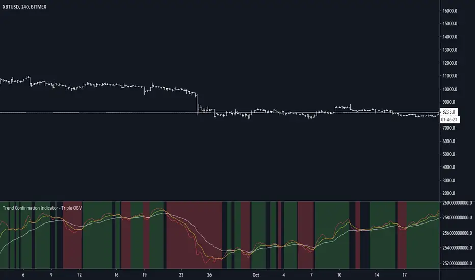
Trend Confirmation Indicator - Triple OBVDear all, you might wonder is there a confirmation indicator that has a high hit rate, is dependable, and could rely on the information it gives you when making a decision?
Here I present an indicator I developed specifically for cryptocurrency, in the minds of eliminating fakeouts and traps.
Trend is always invalid then there is a lack of volume, so by tracking the momentum of price direction & volume, we can have a ballpark about where the market is moving to.
On balance volume
obvshort = ema3
obvmedium = ema9
obvlong = ema26
This is a lagging indicator, which means it's not good at predicting reversal.
This is also the reason why
long signal = obvshort > obvmedium and obvshort > obvlong
shortsignal = obvshort < obvmedium and obvshort < obvlong
both without obvmedium >< obvlong
This indicator will not lie to you.
At last
Save Hong Kong, the revolution of our time.
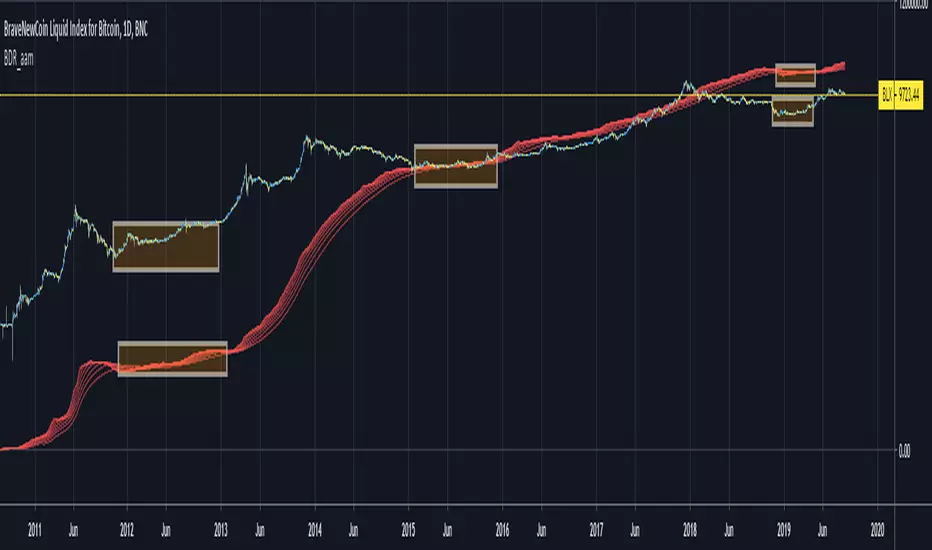
Bitcoin Difficulty Ribbon [aamonkey]This is another tool to find big cycle bottoms that is very unknown yet effective.
The Difficulty Ribbon speaks to the impact of miner selling pressure on Bitcoin`s price action.
When network difficulty reduces its rate of climb, miners are going out of business, leaving only the strong miners who proportionally need to sell less of their coins to remain operational, this leads to less sell pressure and more room for bullish price action.
The best times to buy Bitcoin are zones where the ribbon compresses.
The ribbon consists of simple moving averages of Bitcoin network difficulty so the rate of change of difficulty can be easily seen.
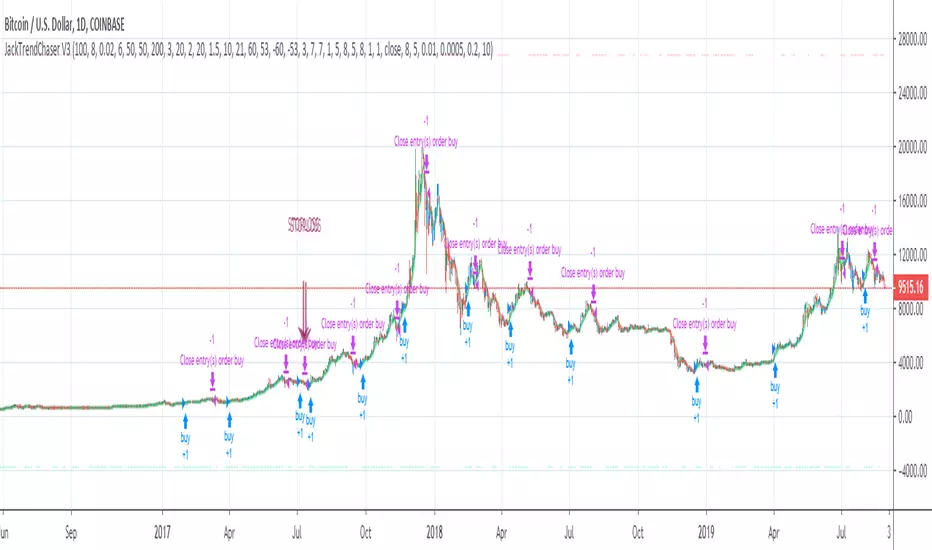
JackTrendChaser V4This is like V3 but with minor improvements - and this script is only protected which means that you are free to try it out!
I would love to know your thoughts on this so please try it out and get back to me :)
Link to V3:
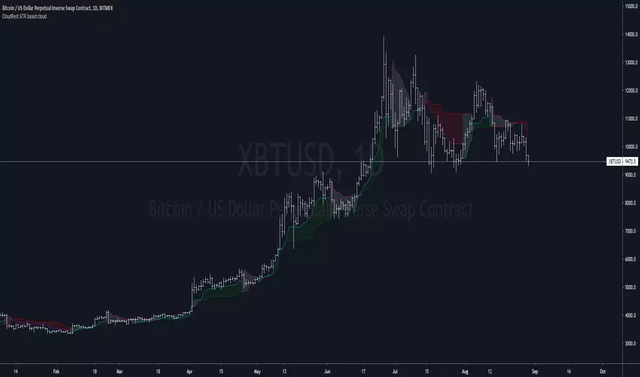
CloudRest ATR based cloudThis is an indicator I have been working on for the past 2 years, developed specifically for cryptocurrency.
It is primarily a trend following indicator with great success and it performs the best in 4hrs to the weekly chart.
There are two components of this indicator.
The baseline from Ichimoku cloud and volatility stop .
baseline period = 26
volatility stop = 1.5ATR, 3
You can view this as the main component of a trend following system but you will need other confirmation indicators to confirm your entry.
Feel free to modify the script for your own system.
Feel free to follow me on twitter @Lancelot_Auger
I will be posting more content in the future, stay tuned.
And lastly,
Free hong kong, the revolution of our time!

BullRider [JackTz] (strategy)Taking a new approach - I have noticed how all scripts have the same pattern (or issue) when it comes to a bear trend. The majority of scripts works just fine when in a bull trend but once the bears starts to overtake the shit hits the fan and the trades will mostly become negative.
To prevent this I tried to create a script that only trades during a bull run. This strategy is initially created for coins with a big marketcap and for daily timeframe. It works well on 4H timeframes for some coins as well though.
I have tested this through Bar Replay on daily and 4H BTC and it holds out! No repaint!
I will be adding a version for alerts soon.
Please try it out and let me know your thoughts and findings!
//Jack

AlphaTradeZone OscillatorAccurate momentum indicator with buy and sell alerts.
Applied to BTC price on 1h timeframe it's giving accurate price predictions.


BTC strategy for margin tradingAlmost identical to the one I published before, but this one includes short orders as well.
I didn't spend much time backtesting, so there may be a different set of parameters that gives better results. Please let me know if you find something!

Express - Strategy TesterWelcome to the Express - Strategy Tester.
This indicator is used for back-testing. Once you have found settings that you like, you can use my other published indicator "Express" to set alerts.
How to use: Apply to any chart, on any time frame. You will see LONG and SHORT signals on the chart. A LONG signal represents an entry/buy in, and a SHORT signal represents an exit/sell.
You can use the Express - Strategy Tester to scalp on low time frames such as the 5m, 15m, 30m etc. Or use it on higher time frames such as the 1hr, 2hr, 4hr.
You can use regular candles but Heikin Ashi are recommended for better accuracy.
When using Heikin Ashi, I have included a real price line which shows the actual price of the asset/chart at the close of each candle.
You cannot set alerts with this indicator!

Support / Resistance TradingDo not worry about drawing the correct support and resistance lines across any time frame. You can enter a long or short position on a major / minor line break out. Feel free to use my script.
Red & Orange - Major and Minor resistance lines.
Lime & Aqua - Major and Minor support lines.
For source code and more info, tip my BTC Jar: 1JddaKpkW4W1UmEuyK9oDUJLA46r1UK2aH

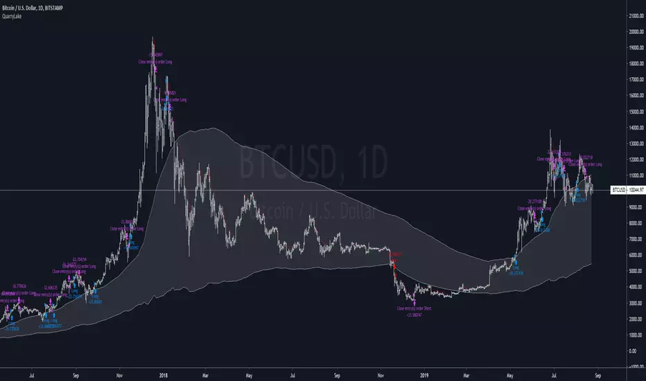
QuarryLake - An ATR base strategyThis strategy consists of 3 indicators that I found works quite well together.
Keltner Channel, Waddah Attah Explosion, and Volatility Stop.
You can find WAE here
KC Period = 200
KCATR = 5
Vstop Period = 3
Vstop Mult = 1.5
Long when close > KC, close > Vstop, WAE trendUp
Short when close < KC, close < Vstop, WAE trendDown
Works well on BTCUSD XBTUSD, as well as other major liquid Pair.
This strategy utilized a modified Kelly position sizing for BTCUSD Bitstamp, feel free to modify it to your needs.
More information can be found here dqydj.com
Feel free to follow me on Twitter @Lancelot_Auger for more free Alpha.
MACD Builder ProOur newest indicator, the MACD Builder Pro, gives traders the ability to build a MACD based on 7 different kinds of moving averages. The options include:
1.Standard MACD (EMA)
2.Hull Moving Average MACD
3.Volume Weighted MACD (VWMA)
4.Arnaud Legoux MACD (ALMA)
5.Double EMA MACD
6.MACD based on median
7. Simple Moving Average (SMA) MACD
Additionally, we've included countless plotting options for users to choose from. Users can choose to plot either the MACD or MACD Histogram in addition to the signal line. There is also an option to have the entry and exit signals displayed as green(entry) and red(exit) triangles for the entry and exit signals or red and green vertical highlight lines.
We've also provided the ability to fully customize the entry and exit conditions for the indicators trading logic. As mentioned, we've included over 7 different types of MACD indicators. But, we also included the ability to customize the lengths of the fast and slow Moving Averages used in the MACD calculation, as well as the length of the signal line. For entry conditions, the different options are:
1. MACD Histogram Above/Below Zero- Entry signals are generated when MACD Histogram crosses above the zero line into positive territory and exit signals come when the MACD Histogram crosses under the zero line into negative territory.
2. MACD Histogram Rising/Falling - Entry signals are generated when MACD Histogram first begins rising and exits when MACD Histogram first starts decreasing.
3. MACD Above/Below Zero - Entry signals are generated when MACD crosses above the zero line into positive territory and exit signals come when the MACD crosses under the zero line into negative territory.
4. MACD Rising/Falling - Entry signals are generated when MACD first begins rising and exits when MACD first starts decreasing.
As always, this script comes with pre-set alerts and we will be offering 3 day trials to anyone interested!
To check out more of our indicators head on over to our website : profitprogrammers.com

Dompeet Pompeet (Breakout bot)Dompeet Pompeet is my first attempt at a viable swingtrading algo.
It uses volatility and some trend analysis to enter trade when the market is about to breakout or break down. Having a trailing stop locks in profits and prevents runaway losses for low drawdown and 2:1 profit factor.
Settings to use:
BTCUSD or XBTUSD
4hr Timeframe or 2hr or 1hr (not shorter)
Bars window: 13, 16 or 20 bars
Moving average settings: 100/10 EMA to confirm trend
Trade the Trend - check on to only take trades long in a confirmed uptrend (vice versa short), otherwise it will attempt to buy and sell counter trend, which increases profits but also increases loss rate.
Trailing stop, values from 2-5% give the best results.
Take with a pinch of salt, there are some bugs in pine script which are difficult to track down but overall I'm pleased with the idea.

ExpressHow to use this indicator: This is an all-around indicator that is capable of being used on any chart. From 5m time frames up to 1 Day time frames.
There are BULL/BEAR signals which represent BUY/SELLS. You can set alerts with this indicator as well.
No back tester is currently provided with the Express.

MA-MTF-ALERT// Alerts based on SMA strategy
// Time frame 5M, 10M, 15M
// Created and based on Binance chart
// Working with comission
// No repaints
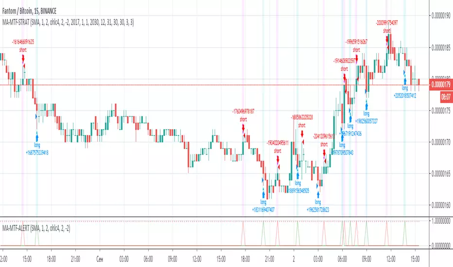
MA-MTF-STRAT// Strategy based on SMA
// Time frame 5M, 10M, 15M
// Created and based on Binance chart
// Working with comission
// No repaints

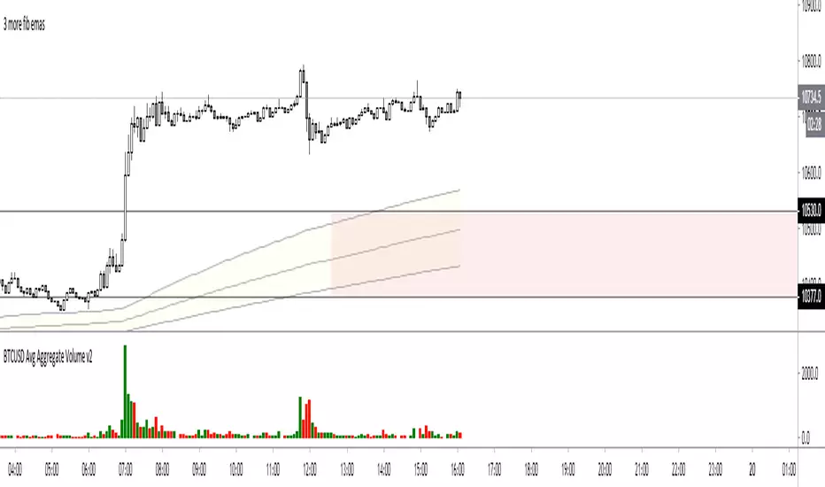
BTCUSD Avg Aggregate VolumeSimple script which gives an average volume for an aggregate of legit spot btcusd(t) exchange pairs based on user-selected period. Also including mex btc perp in there.
Includes:
Coinbase BTCUSD
Bitstamp BTCUSD
Bitfinex BTCUSD
Bitflyer BTCJPY
Binance BTCUSDT
Huobi BTCUSD
Bitmex XBTUSD
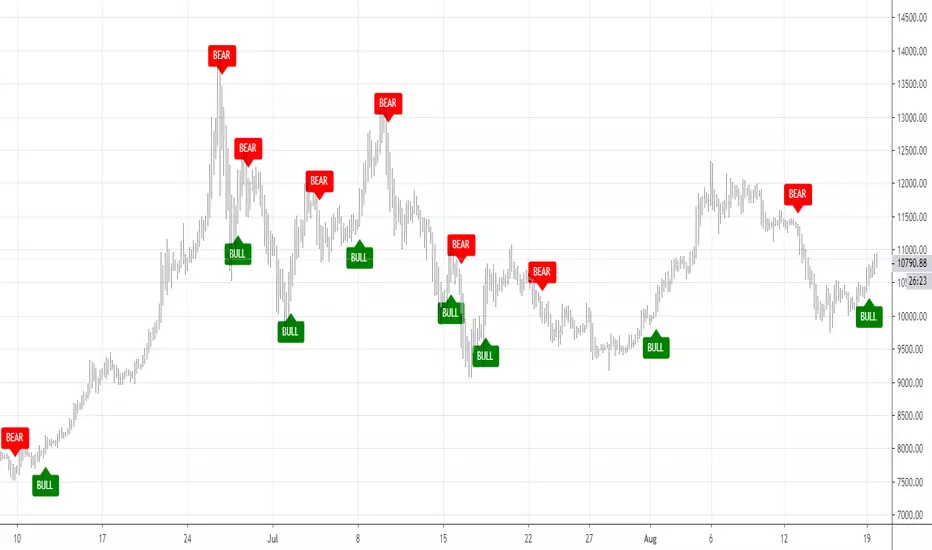
Classic MaverickWelcome to the Classic Maverick.
How to use: Apply to any chart, on any time frame. You will see BULL and BEAR signals on the chart. A BULL signal represents an entry/buy in, and a BEAR represents an exit/ sell.
You can use the Maverick to scalp on low time frames such as the 5m, 15m, 30m etc. Or use the Maverick on higher time frames such as the 1hr, 2hr, 4hr.
You can use regular candles but Heikin Ashi are recommended for better accuracy.
Settings alerts: You can easily set buy/sell alerts by selecting Maverick in the set alerts tab and selecting BULL for buy alerts and BEAR for sell alerts.

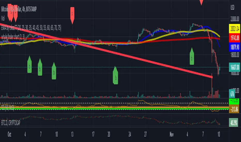
whale finder work very good on BTC 4hour chart
detect the hidden moves in the chart
it give a sell and buy signals and put it on the chart
do not get last candle signal till it close