Trend-Following Combo-SuperTrend, EMA, Aroon, DMI, Laguerre RSIThis is a trend-following indicator which condenses two SuperTrend indicators -- one based on analysis over a shorter period of time (1.5, 7), and one based on analysis over a longer period of time (1.65, 100) -- into a single indicator which appears on your chart only when both the shorter- and longer-term analysis indicates a "SuperTrend" in the same direction.
Additionally, potential trade entry indicators are displayed in the form of up and down arrows when (by default) three of the following five indicators suggest that the market is trending in the same direction as both the shorter- and longer-term SuperTrend indicators:
EMA Crossover (8, 15)
Aroon Indicator (8)
Aroon Oscillator (8)
Directional Movement Index (DI +/-) (8)
Laguerre RSI (13)
You may update the parameters of any of the indicators to match your own preferences.
Additionally, you may also adjust the "Threshold" of indicators that must be in agreement with the SuperTrend to show a potential trade entry arrow. Bear in mind that if you set the Indicator Threshold too low, you will see more frequent trade entry arrows, many of which will not be profitable if taken. Similarly, set this value too high, and you will see fewer trade entry arrows that may not appear until after most of the "juice" in the trend has evaporated. Ideal values for the threshold seem to be between 2-4, depending on the symbol you are trading.
The following image shows all of the indicators referenced above on a 5-minute chart of the SPY during a single trading day:
And, here is the same period of time showing only the Trend-Following Combo indicator with default settings:
This indicator would not have been possible save for work contributed by the following:
SuperTrend by Rajandran R
Aroon w/ crossovers highlighted by seiglerj
Aroon Oscillator by jcrewolinsky
Directional Movement Index by TradingView
Laguerre RSI (Self Adjusting Alpha with Fractals Energy) by everget
DMI

(JS)DMI BarsAlright - so this is my own version of John Carter's "10x Bars"... I have done multiple things that are different from his version so they are slightly different..
So first of all the main indicator is based off of the ADX and the DMI;
For those who aren't familiar with it, Directional Movement is what you'd pull up under "built-in's" from the indicators tab (if you want to check it out).
The standard interpretation of this however, is when the ADX is above 20 that suggests the trend is strong, whereas under 20 suggests it is weak.
Also, when the D+ is above the D- that suggests a bullish trend, and D- above D+ suggests a bearish trend.
These bars take away the need to have it at the bottom of your screen, and places the data on the bars on your chart instead.
=========================================================================================================================================
So here's what the colors stand for -
Yellow - The ADX is under 20, no strength in trend
Shades of green occur when the ADX is above 20 and there's a bullish trend (D+ higher than D-)
Bright Green (Lime) - Bullish trend, D+ above 30
Green - Bullish Trend
Yellow Green - Bullish trend, D+ below 15
Shades of red occur when the ADX is above 20 and there's a bearish trend (D- higher than D+)
Bright Red - Bearish trend, D- above 30
Red - Bearish Trend
Orange - Bearish trend, D- below 15
=========================================================================================================================================
I have also added multiple time frame labels (label script used is the one created by Ricardo Santos)
These labels are color coded the same as the bars/candles, and they appear off to the right of your screen using every built in time increment from TradingView.
The purpose is to show you in real time, and on any chart resolution, what the current trend is on every individual time frame.
So using just one single chart you'll see your current resolutions candles, but also on the labels you'll see:
1 Minute
3 Minute
5 Minute
15 Minute
30 Minute
45 Minute
1 Hour
2 Hour
3 Hour
4 Hour
Daily
Weekly
Monthly
There is an input I added that allows you to adjust where your labels appear on the side of your screen as well!
=========================================================================================================================================
Now onto the volume spike portion of the indicator. This will plot a blue dot under each bar that has a spike in volume which meets your specified criteria.
I have 500% as the default setting.
What that means is that this indicator looks back and gets the 50 bar volume average and then applies dots where volume is 500% above average.
=========================================================================================================================================
Now finally, the reversal arrows. This is another simple to understand concept that I first read in John Carter's book "Mastering the Trade" that he calls "HOLP/LOHP".
I have added the ability to change the look back period you'd like the indicator to watch for highs and lows on.
What that stands for is 'High of Low Period' and 'Low of High Period', and it is used like this-
Whenever a bar makes a new high the indicator watches the low on that highest bar. Then when a bar afterwards makes a lower low then the one on the high bar,
a reversal arrow is given. Apply this same concept in the other direction in for the highs on the lowest bars.
=========================================================================================================================================
Now, I didn't want to make a "set" or have a bunch of different indicators out there that are all intended for the same package, so I took the time to put them together,
and if there's a part of it you don't care for they can easily be turned off in the settings.
Enjoy!

Combo Strategy 123 Reversal & DMI & Moving Average This is combo strategies for get a cumulative signal.
First strategy
This System was created from the Book "How I Tripled My Money In The
Futures Market" by Ulf Jensen, Page 183. This is reverse type of strategies.
The strategy buys at market, if close price is higher than the previous close
during 2 days and the meaning of 9-days Stochastic Slow Oscillator is lower than 50.
The strategy sells at market, if close price is lower than the previous close price
during 2 days and the meaning of 9-days Stochastic Fast Oscillator is higher than 50.
Second strategy
The related article is copyrighted material from Stocks & Commodities Aug 2009
Combining DMI And Moving Average Trading System
WARNING:
- For purpose educate only
- This script to change bars colors.

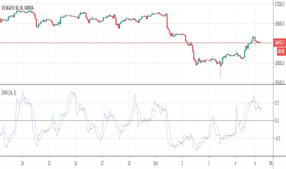
Directional Movement Quality IndexIndicator DMX (Bipolar DMI) is calculated using the standard indicator ADX. However, as compared to that, it displays data as an oscillator with a signal line, and has shorter delay.
DMX = (P-M) / (P+M)
Signal = MA(DMX, Signal period, Method)
where:
P - (+DI) ADX indicator line;
M - (-DI) ADX indicator line.
Source: www.mql5.com

ADX Free-The line control represents, if the ADX is greater than the line of 20, the price trend is considered strong, some people increase it to 25
-Dynamic adx color to better differentiate movements

Highly Optimized (Aroon, DMI, RWI)It is a highly optimized script for H4, D1. Backtests from (2016 - 2019, depending on the currency pair). Optimization still
going on.
Following alerts can be activated:
-
Buy-Signal (Baseline-Cross)!
Sell-Signal (Baseline-Cross)!
Buy Signal (Aroon)!
Sell Signal (Aroon)!
Buy Signal (DMI)!
Sell Signal (DMI)!
Buy Signal (RWI)!
Sell Signal (RWI)!
Can be used by the following pairs:
AUDCAD
AUDCHF
AUDJPY
AUDNZD
AUDSGD
AUDUSD
CADCHF
CADJPY
CHFJPY
CHFSGD
EURAUD
EURCAD
EURCHF
EURGBP
EURJPY
EURNZD
EURSGD
EURTRY
EURUSD
GBPAUD
GBPCAD
GBPCHF
GBPJPY
GBPNZD
GBPSGD
GBPUSD
NZDCAD
NZDCHF
NZDJPY
NZDUSD
SEKJPY
SGDJPY
USDCAD
USDCHF
USDCNH
USDJPY
USDSGD
USDTRY
XRPUSD
Price is 5€ per Month or 75€ lifetime. One week free for testing.


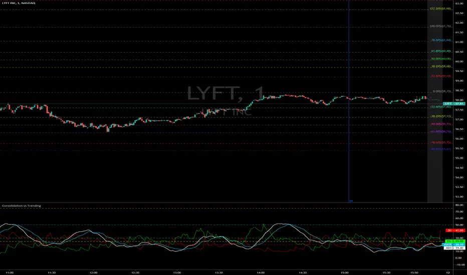
Consolidation vs Trending
ADX is used to quantify trend strength. ADX calculations are based on a moving average of price range expansion over a given period of time. The default setting is 14 bars, although other time periods can be used. ADX can be used on any trading vehicle such as stocks, mutual funds, exchange-traded funds and futures.
ADX is plotted as a single line with values ranging from a low of zero to a high of 100. ADX is non-directional; it registers trend strength whether price is trending up or down. The indicator is usually plotted in the same window as the two directional movement indicator (DMI) lines, from which ADX is derived.
When the +DMI is above the -DMI, prices are moving up, and ADX measures the strength of the uptrend. When the -DMI is above the +DMI, prices are moving down, and ADX measures the strength of the downtrend.
ADX values help traders identify the strongest and most profitable trends to trade. The values are also important for distinguishing between trending and non-trending conditions. Many traders will use ADX readings above 25 to suggest that the trend is strong enough for trend-trading strategies. Conversely, when ADX is below 25, many will avoid trend-trading strategies.
ADX Value Trend Strength
0-25 Absent or Weak Trend
25-50 Strong Trend
50-75 Very Strong Trend
75-100 Extremely Strong Trend
DMI ADXThis is the combination of ADX and DMI.
It will tell you about the trend strength.
In easy language Green is for bullish , red is for bearish ,and third line which is of blue and yellow will tell you about the trend strength doesn't matter in which direction. Blue will tell you that trend is getting strength and vice versa for yellow.
Keep an eye at crossovers.
New scripts r ready just doing some last testing will be out soon just wait for some more time :)
all the Scripts here will be free and always will be.
For my Indian friends a special surpriszzz is coming soon ;)
Hope you got my point.
Happy trading :)
15min Chart
1Hr chart

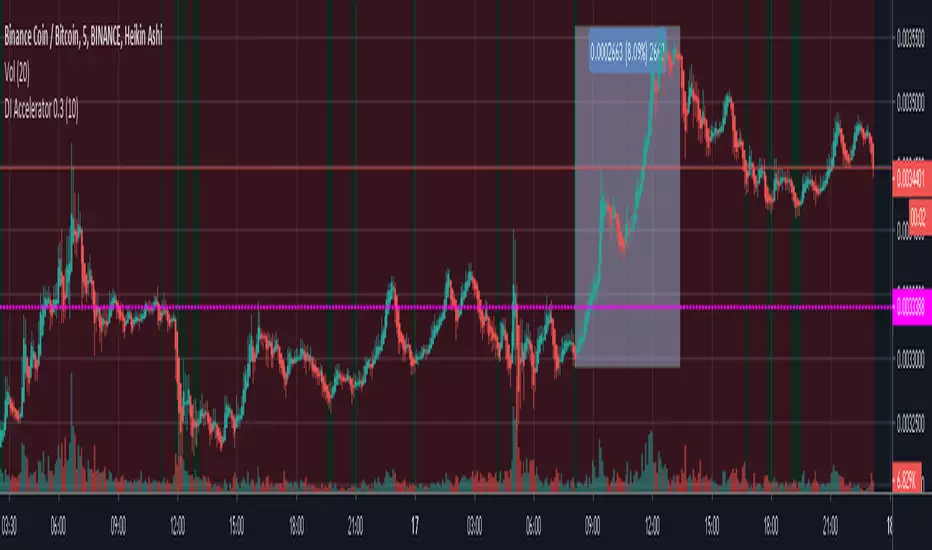
DMI + Accelerator Oscillator StrategyInvite Only Script
This script is based on a strategy using the Directional Movement Indicator and Accelerator Oscillator.
DI+ can be modified depending of short, medium or long term trade.
Green means buy zone
Red means do no enter zone.
This script is part of a strategy and Green doesn't mean you HAVE to buy.
People invited to use this script should know whether to enter or not.
DMISE ResonanceAn attempt to make a timeframe-resonating version of DMI Stochastic Extreme () using @alexgrovers Peak/Valley Estimation script () with Lazybear's MFI/RSI enclosed bollinger bands ()

RSI_DMI [ALionTrading] indicator / trading strategyThis BINANCE:BTCUSDT
This indicator uses RSI and adds it to +DI from the DMI indicator and plots the new value, when the value crosses the High line ==> Buy signal, close the trade based on EMA(20) value

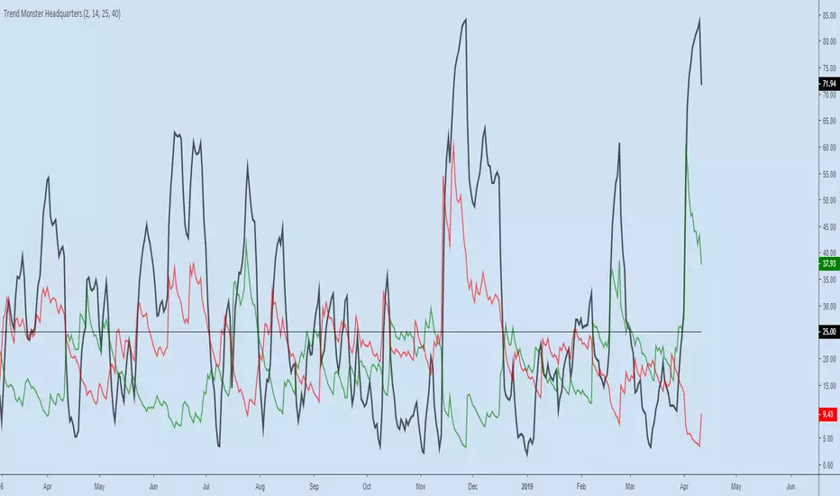
Trend Monster HeadquartersADX-DMI enhanced & modified for faster reaction
ADX (black line) above 80 = mega-trend peaked, reversal imminent, rare case scenario
ADX (black line) above 60 = trend topping out, reversal possible, depending on other indicators
ADX (black line) above 25 threshold = trend strenghening
DMI- (red line) - above 25 - bear trend strenghening
DMI+ (green line) - above 25 - bull trend strenghening
DMI- (red line) - coming off the bottom - bull trend weakening
DMI+ (green line) - coming off the bottom - bear trend weakening
Relative Strength Index + DMI DivergencesHi guys I combine RSI and DMI in one study with alerts when price is Overbought, Oversold. Buy and sell divergences in the DMI and strength of the trend in the background I hope its useful for you as its to me

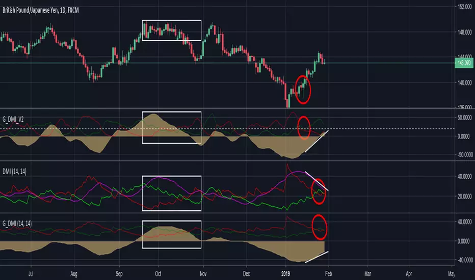
Geek's DMI V2A significant improvement over traditional DMI and an improvement over my previous DMI tweak.
Example: the red circle is the trend reversal area. Traditional DMI in the middle is slow & ADX in purple often confuses first time users.
My tweaked DMI at the bottom is basically a a slight visual modification of the middle ADX so both perform the same.
The white box shows that distribution is occuring at the topand the V2 DMI quickly shifts in reaction to price but old style DMI lags and missed 50% of the move.
For best results I suggest using this on the daily time frames with Heikin Ashi (even less false reads)
Give it a go and a like if this was useful to you.
DIOSC indicatorThe Diosc indicator based on DMI is the combined version of -DI and +DI. While +DI is above (the trend is up), +DI is used and in the other case -DI is used. In addition, 9-day EMA was added to the graph so that sell/buy points could be seen on the histogram. Both sell/buy points and divergence/convergence can be followed on the graph.
Temeli DMI üzerine kurulmuş Diosc göstergesi -DI ve +DI'ın birleştirilmiş halidir. Temel mantığı +DI yukarıda iken yani trend yukarı iken +DI, diğer durumda da -DI göz önüne alınarak grafik oluşturulmuştur. Ek olarak Al-Sat noktalarının histogram üzerinde görülebilmesi için de grafiğe 9 günlük EMA eklenmiştir. Grafik üzerinde hem Al-Sat noktaları takip edilebilir hem de uyuşmazlıklar takip edilebilir.

DMI Histogram & SRSI Crossover with ADX filteringUses DMI rendered as a histogram & overbought/sold SRSI crossovers to highlight areas of increased likelihood of reversal/signals.
This is the same as the DMI Histogram & SRSI found at the below link except that it uses ADX to filter trades and the DMI Thresholds are set to 0/-0 (optional if you want more aggressive filtering at a set threshold. Leave at zero if you only want to use ADX to filter).
Red dot above histogram - indicates overbought SRSI crossover occurred above the DMI threshold in an upward DMI and ADX > 25
Green dot below histogram - indicates oversold SRSI crossover occurred below the DMI threshold in a downward DMI and ADX > 25
Red plotted line is the ADX
DMI threshold can be adjusted to eliminate choppy low DMI crossovers (displayed as transparent red zone on the histogram). Set to 0 / -0 to display all SRSI crossovers for that DMI.
SRSI overbought/sold adjustable. Note : it has been offset to align with the histogram (-50 to 50 instead of the standard 0 to 100).
Other settings standard for SRSI etc.
Also ADX is displayed offset around the threshold and aligned with the horizontal 0 axis. So if you filter out trades where ADX < 25 then the ADX line will be plotted so values < 25 display below zero and vice versa. It makes it easier to visually identify the trend strength (when it passes over 0 it represents confirmed trend strength and the DMI/SRSI crossover signals will then display).
You can adjust the ADX threshold in the settings. Standard are usually 20 or 25(default).

Directional Movement Index Histogram & Stochastic RSIUses DMI rendered as a histogram & overbought/sold SRSI crossovers to highlight areas of increased likelihood of reversal.
Red dot above histogram - indicates overbought SRSI crossover occurred above the DMI threshold in an upward DMI
Green dot below histogram - indicates oversold SRSI crossover occurred below the DMI threshold in a downward DMI
DMI threshold can be adjusted to eliminate choppy low DMI crossovers (displayed as transparent red zone on the histogram). Set to 0 / -0 to display all SRSI crossovers for that DMI.
SRSI overbought/sold adjustable. Note : it has been offset to align with the histogram (-50 to 50 instead of the standard 0 to 100).
Other settings standard for SRSI etc.


DMI ADX TREND 2.0 (edit by GeertVD)Edit of the popular script by @TraderR0BERT
New features:
- horizontal colored areas, indication weak/medium/strong trend
- vertical bars, signaling trend/momentum changes
- DI+ vs DI- contraction/expansion histogram (to measure the DI volatility)

improved DmiThis is a new indicator that make the normal DMI better
insread of the ADX I put a volume indicator that have been transformed to be on regular scripts
with this it much more easy to spot the true buy and sell points by the DMI
have fun

