Educational

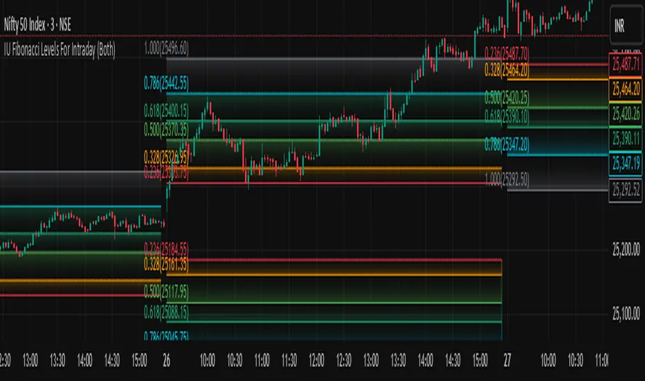
IU Fibonacci Levels For IntradayDESCRIPTION
This indicator draws intraday Fibonacci levels from the opening price of the day using percentage-based retracements. It helps traders identify potential intraday support and resistance zones derived from the day’s opening bias. The levels are dynamically calculated and displayed with optional labels and customizable colors, making it an effective tool for both breakout and mean-reversion intraday strategies.
USER INPUTS
Direction Of The Level
Choose whether to show Upside, Downside, or Both level sets based on your directional bias.
Show Labels of Levels
Option to enable or disable text labels displaying Fibonacci values and prices.
Individual Level Toggles & Colors
You can choose to show or hide each of the following Fibonacci levels and set their respective colors:
* 0.236
* 0.328
* 0.500
* 0.618
* 0.786
* 1.000
INDICATOR LOGIC
On the first bar of the session, the opening price is captured.
Fibonacci levels are then calculated above and below this open using percentage multipliers (for example, day\_open + (day\_open \* 0.236%) for the 0.236 level).
Depending on the selected direction, upside and/or downside levels are plotted.
Filled zones are drawn between levels to visually highlight key price zones.
Optionally, each level can be labeled with its Fibonacci value and price.
WHY IT IS UNIQUE
Unlike traditional swing-based Fibonacci retracements, this tool uses the day’s opening price as an anchor, specifically designed for intraday traders.
Allows traders to quickly visualize micro-support and resistance levels that adapt every day.
Highly customizable and easy to read, with filled level bands for better zone recognition.
Works independently of indicators like RSI, MACD, or moving averages – purely based on price action logic.
HOW USER CAN BENEFIT FROM IT
Spot precise intraday reversal zones or breakout regions.
Combine with price action or volume analysis for smarter entries.
Filter trades by choosing directional bias (Up Site, Down Site, or Both).
Set profit targets or stop-losses based on Fibonacci bands.
Works great for scalpers, day traders, and even short-term swing traders looking to align with opening price momentum.
Disclaimer
This indicator is not financial advice, it's for educational purposes only highlighting the power of coding( pine script) in TradingView, I am not a SEBI-registered advisor. Trading and investing involve risk, and you should consult with a qualified financial advisor before making any trading decisions. I do not guarantee profits or take responsibility for any losses you may incur.
Normalized EMA Cycle (NEC)Normalized EMA Cycle (NEC)
The Normalized EMA Cycle (NEC) is a versatile momentum and trend reversal tool designed to detect high-probability turning points and gauge the strength of price cycles.
It combines fast and slow Exponential Moving Averages (EMAs), dynamic normalization, and adaptive transparency to create clear, intuitive reversal signals on the chart.
🔹 How It Works
EMA Differencing
The NEC calculates the difference between a fast EMA and a slower EMA:
Fast EMA Length (default 6) captures short-term momentum.
Slow EMA Length (default 16) tracks broader trends.
The slope of this difference identifies accelerating or decelerating momentum.
Normalization to 0–100 Scale
The raw EMA difference is scaled relative to the recent Alpha Period range (default 6 bars).
This transforms the value into a normalized oscillator ranging between 0 and 100.
A 3-period Hull Moving Average (HMA) smooths this series to reduce noise.
Overbought and Oversold Thresholds
By default:
Overbought Level: 75
Oversold Level: 25
Crossovers of these levels are used to detect potential reversals.
Adaptive Alpha Adjustment
The normalized value is transformed into an “Alpha Schaff” line, dynamically shifting between price and normalized cycles.
This helps the model adjust to different volatility regimes.
Trend Reversal Logic
Bullish Reversal:
Normalized oscillator crosses above the Oversold Level.
EMA difference slope is positive.
Bearish Reversal:
Normalized oscillator crosses below the Overbought Level.
EMA difference slope is negative.
Additional confirmation comes when price crosses the Alpha Schaff line in the direction of momentum.
Dynamic Confidence Visualization
The indicator calculates a trend confidence score based on the normalized separation of the EMAs.
The transparency of reversal markers dynamically adjusts:
Strong trends = more opaque signals
Weak trends = more transparent signals
🔹 How to Use
✅ Entries
Long Signal: Aqua upward label appears below a bar.
Conditions:
Bullish reversal or price crossing above Alpha Schaff
Normalized slope is rising
Short Signal: Fuchsia downward label appears above a bar.
Conditions:
Bearish reversal or price crossing below Alpha Schaff
Normalized slope is falling
✅ Trend Strength
The less transparent the signal marker, the more significant the trend.
✅ Customization
Use the inputs to fine-tune sensitivity:
Shorter EMAs: Faster signals
Longer EMAs: Smoother trends
Alpha Period: Adjusts the lookback range for normalization
🟢 Best Practices
NEC is best used in combination with other trend confirmation tools (e.g., price structure, volume, or higher timeframe EMAs).
Avoid relying on signals in extremely low-volume or choppy ranges.
⚠️ Disclaimer
This script is intended for educational purposes only and does not constitute financial advice. Trading involves substantial risk, and you should consult your financial advisor before making any investment decisions.


JAN - OCT [old] Engulfing Pattern Strategyold engulfing that is bad and shouldnt be used and if you do use it, then proceed at your own pearl. and i have to keep making this description longer other it wont publish which is annoying so this is just words to make the description longer so i can publish


JIYANS FVGJIYAN'S FVG is a powerful Fair Value Gap (FVG) indicator designed to help traders visually identify and track bullish and bearish imbalances across customizable timeframes. The script automatically detects FVGs based on market structure and plots them with shaded boxes and clear boundary lines on the chart.
Key Features:
Multi-Timeframe Detection: Select your preferred timeframe for FVG detection (e.g., H4, H1, M30).
Visual Clarity: Displays shaded gaps with customizable colors, upper and lower boundary lines, and optional midpoint lines for precise reference.
Dynamic Management: Automatically removes mitigated (filled) gaps to keep the chart clean and focused.
Labeling: Annotates each FVG with the selected timeframe for easy tracking.
Alerts: Built-in alerts notify you when a new FVG forms or when price touches the boundary of an existing unmitigated FVG.
This tool is perfect for traders who rely on price imbalances and fair value gaps to identify potential trading opportunities and key areas of interest.

ETF Leverage VerificationDo leveraged ETFs really return what they promise?
Do they return the exact 2x or 3x? Or a slightly different multiple?
How much do they deviate from the promised leverage multiples?
Do these deviations impact investors in a positive or negative manner?
These are the questions that I want to answer with this indicator.
The ETF Leverage Verification indicator challenges the conventional understanding of leveraged ETFs by measuring how they actually perform versus their theoretical targets.
Instead of assuming leveraged ETFs perfectly track their target multiple, this indicator quantifies the real-world behavior by comparing the expected returns versus the actual results on every trading day.
Key Features
Measures actual versus expected performance of leveraged ETFs
Tracks deviation patterns across thousands of trading days
Identifies asymmetric behavior in up versus down markets
Quantifies beneficial "cushioning effect" during market declines
Provides statistical summary of performance patterns
Works with any leverage factor (2x, 3x, -1x, etc.)
Compatible with all leveraged ETFs (equity, bond, commodity, volatility)
How to Use the Indicator
Enter the Expected Leverage Factor (default: 2.0)
Select the Base Asset (underlying index, e.g., SPX)
Select the Leveraged Asset (leveraged ETF, e.g., SSO)
Understanding the Results
Green markers: Days when the ETF outperformed its expected multiple
Red markers: Days when the ETF underperformed its expected multiple
Data Table:
Positive Deviations: Count of days with better-than-expected performance
Negative Deviations: Count of days with worse-than-expected performance
Avg Deviation: Average magnitude of deviation from expected returns
Frequency Skew: Difference between beneficial deviations in down vs. up markets
Impact: Overall assessment of pattern benefit to investors
Summary Label:
Percentage of positive deviations in up and down markets
Total sample size for statistical significance
Key Patterns to Look For
Positive Deviation in Negative Days:
This occurs when a leveraged ETF falls less than expected during market declines. For example, if SPX falls 1% and a 2x ETF falls only 1.8% (instead of the expected 2%), this creates a +0.2% deviation. This pattern is beneficial as it provides downside protection.
Negative Deviation in Positive Days:
This happens when a leveraged ETF rises less than expected during market advances. For example, if SPX rises 1% and a 2x ETF rises only 1.9% (instead of the expected 2%), this creates a -0.1% deviation. This pattern reduces upside performance.
Frequency Skew:
The most critical metric that measures how much more frequently beneficial deviations occur in down markets compared to up markets. A higher positive skew indicates a stronger asymmetric pattern that helps long-term performance.
Mathematical Background
The indicator computes the deviation between expected and actual performance:
Deviation = Actual Return - Expected Return
Where:
Expected Return = Base Asset Return × Leverage Factor
The deviation is then categorized into four possible outcomes:
Positive deviation on positive market days
Negative deviation on positive market days
Positive deviation on negative market days
Negative deviation on negative market days
In short, more positive deviations are good for investors.
Please feel free to criticize. I'm happy to improve the indicator.

Weinstein Stage Analysis HelperA helper script to visualize the Weinstein Stages intuitively along with other factors like
- Relative Strength
- Volume (On Balance Volume)
- RoE
- P/E
- Growth Rate
- EPS Growth Rate

WMA cross with filtered Signals [Dr.K.C.Prakash]WMA cross with filtered Signals
📌 Description
This indicator is designed to generate trend-filtered Buy and Sell signals based on the crossover of two Weighted Moving Averages (WMAs), with confirmation from a long-term EMA trend filter.
It helps traders avoid false signals in choppy markets by trading only in the direction of the broader trend.
✅ Features
Fast WMA (?) and Slow WMA (?)
Core crossover logic for detecting local trend shifts.
EMA Trend Filter (?)
Confirms overall trend direction.
Buy signals only occur when price is above the EMA ? (uptrend).
Sell signals only occur when price is below the EMA ? (downtrend).
Signal Markers on Chart
BUY label below bar for valid bullish crossovers.
SELL label above bar for valid bearish crossunders.
EMA 200 Line
Clearly plotted to visualize the trend filter level.
Customizable Length Inputs
Users can adjust Fast WMA, Slow WMA, and EMA filter length.
Lines for both WMAs and the EMA trend filter.
Signal labels on valid Buy/Sell events.
✅ Use Cases
Trend-following traders who want cleaner entries.
Avoiding counter-trend signals.
Works on any timeframe (but EMA 200 is best for larger trend context).

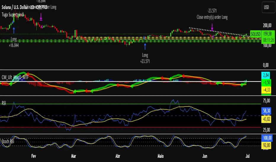
Tuga SupertrendDescription
This strategy uses the Supertrend indicator enhanced with commission and slippage filters to capture trends on the daily chart. It’s designed to work on any asset but is especially effective in markets with consistent movements.
Use the date inputs to set the backtest period (default: from January 1, 2018, through today, June 30, 2025).
The default input values are optimized for the daily chart. For other timeframes, adjust the parameters to suit the asset you’re testing.
Release Notes
June 30, 2025
• Updated default backtest period to end on June 30, 2025.
• Default commission adjusted to 0.1 %.
• Slippage set to 3 ticks.
• Default slippage set to 3 ticks.
• Simplified the strategy name to “Tuga Supertrend”.
Default Parameters
Parameter Default Value
Supertrend Period 10
Multiplier (Factor) 3
Commission 0.1 %
Slippage 3 ticks
Start Date January 1, 2018
End Date June 30, 2025
PH, PD High/LowWhen applied, this script draws the previous day's high and low lines. It also plots the open price of the current 1-hour and 4-hour candles. Additionally, it displays the high and low of the previous 1-hour and 4-hour candles. Please note that 4-hour lines are shown only on the 15-minute and 4-hour charts, while 1-hour lines are shown only on the 5-minute and 1-hour charts.

MTF Dashboard 9 Timeframes + Signals📊 MTF Dashboard — Multi-Timeframe Market Signal Matrix
Overview
The MTF Dashboard is an open-source Pine Script tool that enables traders to monitor key trend and momentum indicators across nine timeframes simultaneously—ranging from 1 minute to monthly—within a single unified view. This script is designed to support both discretionary and rules-based traders by improving efficiency in multi-timeframe analysis.
✅ Key Features
🔄 Multi-Timeframe Coverage
1m, 5m, 15m, 30m, 1H, 4H, 1D, 1W, 1M supported
Toggle individual timeframes on/off as per your trading style
📈 Built-in Technical Indicators
Trend Detection: Based on moving average (EMA) crossovers
Momentum Evaluation: Using Relative Strength Index (RSI)
MACD Status: Displays histogram trend
Volume Confirmation: Compares current volume to average
Confluence Rating: Optional logic combining indicator signals
🎨 Custom Dashboard Appearance
Supports light/dark chart modes
Adjustable panel positioning (Top/Bottom/Center Left/Right)
Multiple text size options
Color settings for bullish, bearish, and neutral signals
🔔 Optional Alerts
Alert conditions for confluence setups or trend changes (user must configure manually)
Use Cases
Identify trend alignment across short, medium, and long timeframes
Confirm entry or exit signals with high-confidence confluence
Detect early shifts in trend direction using EMA, RSI, MACD divergence
Quickly assess overall market sentiment in one glance
Limitations:
This script does not provide financial advice or guaranteed signals
Not intended for automatic trading or strategy backtesting
Users should interpret dashboard signals in the context of price structure and risk management
How to Use:
Add the script to your chart from your favorites
Open the settings panel:
Enable only the timeframes you want to analyze
Customize colors, position, and table layout
Optionally, right-click the script to configure alerts based on confluence or indicator changes
Technical Notes
EMA settings can be adjusted to match your trading system
Designed for visual clarity and performance with multiple timeframes enabled
Credits
This tool was developed to help the TradingView community simplify MTF analysis. Inspired by institutional-grade dashboards and adapted for manual charting use by retail traders.
Tags
#multi-timeframe #EMA #RSI #MACD #volume #confluence #dashboard #trend #momentum #open-source #pine-script #tradingview
License
Published as open-source under the TradingView community sharing model. Users are encouraged to modify, improve, and credit respectfully.

Contrarian RSIContrarian RSI Indicator
Pairs nicely with Contrarian 100 MA (optional hide/unhide buy/sell signals)
Description
The Contrarian RSI is a momentum-based technical indicator designed to identify potential reversal points in price action by combining a unique RSI calculation with a predictive range model inspired by the "Contrarian 5 Levels" logic. Unlike traditional RSI, which measures price momentum based solely on price changes, this indicator integrates a smoothed, weighted momentum calculation and predictive price ranges to generate contrarian signals. It is particularly suited for traders looking to capture reversals in trending or range-bound markets.
This indicator is versatile and can be used across various timeframes, though it performs best on higher timeframes (e.g., 1H, 4H, or Daily) due to reduced noise and more reliable signals. Lower timeframes may require additional testing and careful parameter tuning to optimize performance.
How It Works
The Contrarian RSI combines two primary components:
Predictive Ranges (5 Levels Logic): This calculates a smoothed price average that adapts to market volatility using an ATR-based mechanism. It helps identify significant price levels that act as potential support or resistance zones.
Contrarian RSI Calculation: A modified RSI calculation that uses weighted momentum from the predictive ranges to measure buying and selling pressure. The result is smoothed and paired with a user-defined moving average to generate clear signals.
The indicator generates buy (long) and sell (exit) signals based on crossovers and crossunders of user-defined overbought and oversold levels, making it ideal for contrarian trading strategies.
Calculation Overview
Predictive Ranges (5 Levels Logic):
Uses a custom function (pred_ranges) to calculate a dynamic price average (avg) based on the ATR (Average True Range) multiplied by a user-defined factor (mult).
The average adjusts only when the price moves beyond the ATR threshold, ensuring responsiveness to significant price changes while filtering out noise.
This calculation is performed on a user-specified timeframe (tf5Levels) for multi-timeframe analysis.
Contrarian RSI:
Compares consecutive predictive range values to calculate gains (g) and losses (l) over a user-defined period (crsiLength).
Applies a Gaussian weighting function (weight = math.exp(-math.pow(i / crsiLength, 2))) to prioritize recent price movements.
Computes a "wave ratio" (net_momentum / total_energy) to normalize momentum, which is then scaled to a 0–100 range (qrsi = 50 + 50 * wave_ratio).
Smooths the result with a 2-period EMA (qrsi_smoothed) for stability.
Moving Average:
Applies a user-selected moving average (SMA, EMA, WMA, SMMA, or VWMA) with a customizable length (maLength) to the smoothed RSI (qrsi_smoothed) to generate the final indicator value (qrsi_ma).
Signal Generation:
Long Entry: Triggered when qrsi_ma crosses above the oversold level (oversoldLevel, default: 1).
Long Exit: Triggered when qrsi_ma crosses below the overbought level (overboughtLevel, default: 99).
Entry and Exit Rules
Long Entry: Enter a long position when the Contrarian RSI (qrsi_ma) crosses above the oversold level (default: 1). This suggests the asset is potentially oversold and due for a reversal.
Long Exit: Exit the long position when the Contrarian RSI (qrsi_ma) crosses below the overbought level (default: 99), indicating a potential overbought condition and a reversal to the downside.
Customization: Adjust overboughtLevel and oversoldLevel to fine-tune sensitivity. Lower timeframes may benefit from tighter levels (e.g., 20 for oversold, 80 for overbought), while higher timeframes can use extreme levels (e.g., 1 and 99) for stronger reversals.
Timeframe Considerations
Higher Timeframes (Recommended): The indicator is optimized for higher timeframes (e.g., 1H, 4H, Daily) due to its reliance on predictive ranges and smoothed momentum, which perform best with less market noise. These timeframes typically yield more reliable reversal signals.
Lower Timeframes: The indicator can be used on lower timeframes (e.g., 5M, 15M), but signals may be noisier and require additional confirmation (e.g., from price action or other indicators). Extensive backtesting and parameter optimization (e.g., adjusting crsiLength, maLength, or mult) are recommended for lower timeframes.
Inputs
Contrarian RSI Length (crsiLength): Length for RSI momentum calculation (default: 5).
RSI MA Length (maLength): Length of the moving average applied to the RSI (default: 1, effectively no MA).
MA Type (maType): Choose from SMA, EMA, WMA, SMMA, or VWMA (default: SMA).
Overbought Level (overboughtLevel): Upper threshold for exit signals (default: 99).
Oversold Level (oversoldLevel): Lower threshold for entry signals (default: 1).
Plot Signals on Main Chart (plotOnChart): Toggle to display signals on the price chart or the indicator panel (default: false).
Plotted on Lower:
Plotted on Chart:
5 Levels Length (length5Levels): Length for predictive range calculation (default: 200).
Factor (mult): ATR multiplier for predictive ranges (default: 6.0).
5 Levels Timeframe (tf5Levels): Timeframe for predictive range calculation (default: chart timeframe).
Visuals
Contrarian RSI MA: Plotted as a yellow line, representing the smoothed Contrarian RSI with the applied moving average.
Overbought/Oversold Lines: Red line for overbought (default: 99) and green line for oversold (default: 1).
Signals: Blue circles for long entries, white circles for long exits. Signals can be plotted on the main chart (plotOnChart = true) or the indicator panel (plotOnChart = false).
Usage Notes
Use the indicator in conjunction with other tools (e.g., support/resistance, trendlines, or volume) to confirm signals.
Test extensively on your chosen timeframe and asset to optimize parameters like crsiLength, maLength, and mult.
Be cautious with lower timeframes, as false signals may occur due to market noise.
The indicator is designed for contrarian strategies, so it works best in markets with clear reversal patterns.
Disclaimer
This indicator is provided for educational and informational purposes only. Always conduct thorough backtesting and risk management before using any indicator in live trading. The author is not responsible for any financial losses incurred.

Steez's Timeframe TableSimple timeframe indicator which can assist with daily bias or draw on liquidity.
Shows all timeframes from 1 minute to 1 day.
Shows close time and if the candle is currently bearish or bullish.

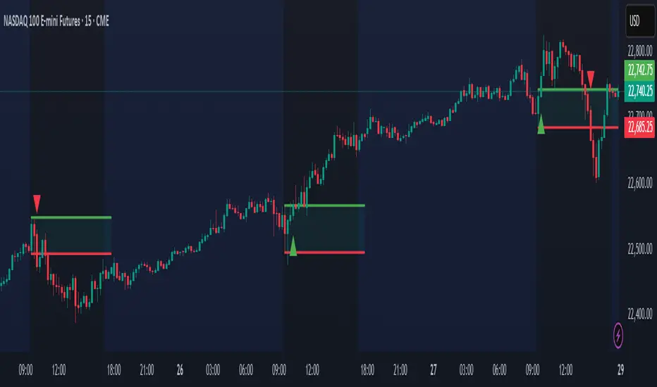
Open Range Breakout (ORB) with Alerts
🚀 ChartsAlgo – Open Range Breakout (ORB) with Alerts
The Open Range Breakout (ORB) Indicator by ChartsAlg is designed for intraday traders looking to capitalize on price movements after the market’s opening range. This tool is especially effective for futures (MNQ, MES) and high-volatility stocks or crypto where initial volatility sets the tone for the session.
This indicator identifies a user-defined opening range window, plots the high/low lines of that range, and visually alerts users when price breaks out above or below the range — with options to customize breakout repetitions, background fill, and alerts.
💡 What is an Open Range Breakout (ORB)?
The opening range represents the high and low established during the first few minutes of the trading session — usually 15 or 30 minutes. Many intraday strategies are based on the idea that breaking out of this initial range often signals strong momentum and trend continuation.
Traders often enter:
Long when price breaks above the range high.
Short when price breaks below the range low.
⚙️ How It Works
You define a session window (e.g., 09:30–09:45 EST).
The indicator tracks the high and low during this time.
Once the session ends, the high and low become your range breakout levels.
The indicator then:
Plots lines for visual clarity
Optionally fills background between the range
Triggers breakout signals if price crosses the levels
Provides alerts when breakouts occur
🛠️ Settings Breakdown
🔹 Session Settings
Range Session: Set your preferred window (e.g., 0930–0945). Can be premarket, first 30 mins, or any custom time.
Time zone: Use "America/New York" for EST (default) or change to "GMT+0" for international traders.
🔹 Breakout Settings
Bullish Breakout Signals: Number of allowed breakout alerts above the range.
Bearish Breakout Signals: Number of allowed breakout alerts below the range.
This prevents repeated alerts once breakout has been confirmed.
🔹 Display Settings
Show Background Fill: Fills area between high/low of the range for easier visual analysis.
Show Breakout Signals: Triangle markers plotted on the chart when breakouts happen.
Only Show Today’s Range: Keeps the chart clean by showing only the most current day’s range.
🔹 Color Settings
Range High/Low Line Colors: Choose any color for clarity.
Range Fill Color: Customize the highlight area for your chart style.
📊 Chart Features
Range High/Low Lines: Automatically plotted after range session ends.
Visual Fill Box: Optional background shading between the opening range.
Triangle Breakout Markers: Appear at the breakout candle.
Alerts: Can be used with TradingView’s alert system to notify you of breakouts in real-time.
🔔 Alerts
Two alert conditions are built in:
Bullish Breakout: Triggers when price breaks above the high of the range.
Bearish Breakout: Triggers when price breaks below the low of the range.
Example Alert Message:
📈 “Bullish Breakout above Open Range on AAPL!”
To activate:
Click “🔔 Alerts” on TradingView.
Set condition to this script.
Choose “ORB Breakout Up” or “ORB Breakout Down”.
Choose alert frequency and notification method.
⚠️ DISCLAIMER
ChartsAlgo tools are for informational and educational purposes only.
They are not financial advice or signals. Past performance does not guarantee future results. Use at your own risk and always implement solid risk management.
By using this indicator, you agree that you are solely responsible for any trades or decisions made based on the information provided.
Boxed EMA + Volume PanelBoxed EMA - where Numbers show the price distance from each EMA.
RVOL
VOL percentage + contraction
Average 50 day volume
todays volume

✅ 200 EMA + RSI Pullback + Volume Surge (Full Strategy)200 EMA Trend + RSI Pullback + Volume Surge Strategy (Advanced)
📖 Strategy Description:
This strategy is designed to identify high-probability entries in trending markets using a combination of trend-following and momentum re-entry principles. It works effectively for intraday and swing trading on equities, indices, and crypto.
🔍 Entry Logic:
✅ Long Entry Conditions:
Trend Confirmation:
Price must be above the 200 EMA, indicating a bullish trend.
RSI Pullback:
RSI must drop below a defined level (default 40), indicating a healthy pullback in an uptrend.
Volume Surge:
Current volume must be above 1.5× the 20-period average, confirming strong buying activity.
Entry Triggered on Candle Close:
Ensures reliable confirmation instead of premature entries.
Short Entry Conditions (reverse logic):
Price below the 200 EMA
RSI above threshold (default 60)
Volume surge
Entry only after candle close
Exit Conditions:
Take Profit (TP):
Book profits at 2% move (configurable).
Stop Loss (SL):
Protect capital at 1% loss (configurable).
Trailing Stop Loss (TSL):
Follows the price with a 1.5% trail to lock in profits.
Time-Based Exit:
Closes position automatically after a fixed number of candles (default: 5 bars).
Alerts:
Built-in alerts notify when a Long or Short setup is triggered, allowing traders to act or automate execution.
Best Used On:
Timeframes: 15-minute, 1-hour, or Daily
Markets: NIFTY, BANKNIFTY, RELIANCE, INFY, BTC/USD, ETH/USD
Styles: Intraday, Swing, Trend-followinG
Ideal For:
Traders who follow pullback entries in strong trends
Users looking for automated alerts and exits
Strategies requiring volume confirmation + trend bias

Multi Horizontal Lines 1000 Bars
This indicator is not my code, I have copied this from another user and extened the lines so they go back 1000 bars for back testing.
I use this indicator to trade Crude Oil and set the horizontal lines to 20 cents increments, 0.2 is 20 cents. You can change the horizontal lines to any price distance to suit your style of trading.
My idea is when price crosses over a horizontal line I will enter a trade long or short looking to secure 20 cents.

DaringBull Arvind MACD GAPS MA CrossoverTo generate buy and sell signals based on a combination of MACD crossover events and histogram behavior, particularly around the zero line. This is used to identify early momentum reversals for entry and exit points in the market.
📐 MACD Setup
Uses customizable MACD parameters (defaults: Fast = 12, Slow = 26, Signal = 9).
Calculates:
MACD Line
Signal Line
Histogram (difference between MACD and Signal)
✅ Buy Conditions
A buy signal is plotted when all three of the following occur:
MACD Line crosses above Signal Line (bullish crossover).
MACD Line is still below or near the zero line (< 0.05) – indicates early reversal from a bearish zone.
First green histogram bar appears (current bar is > 0 and previous was ≤ 0) – confirming momentum shift.
➡️ When these align, a blue circle is plotted below the price bar.
❌ Sell Conditions
A sell signal is plotted when all three of the following occur:
MACD Line crosses below Signal Line (bearish crossover).
MACD Line is still above or near the zero line (> -0.05) – indicates early weakness after a bullish move.
First red histogram bar appears (current bar is < 0 and previous was ≥ 0) – confirming loss of momentum.
➡️ When these align, a red circle is plotted above the price bar.
📊 Visualization
Buy/Sell markers appear on the price chart for visual entry/exit cues.
MACD line, Signal line, and Zero line are optionally plotted for deeper analysis.
📌 Key Insights
This script aims to enter trades early in trend reversals by using MACD in conjunction with histogram shifts near the zero line.
It's especially useful in gap trading, mean reversion, or breakout confirmation setups.
The optional plot toggle allows switching between overlay and non-overlay views.

MACD GAPS PivotLabels MAIt provides with dots where the MACD is either highest or lowest. Identify the gaps in the chart. Pivot labels are to read the numeric value of the candle high or low and an option to select moving averages

ALP AT + KAMA Crossover This indicator is a powerful combination of two adaptive trend-following concepts: the AlphaTrend by Kivanc Ozbilgic and the Kaufman's Adaptive Moving Average (KAMA), often credited to Perry Kaufman (with the specific implementation based on HPotter's interpretation of KAMA).
The primary goal of this indicator is to provide a robust trend detection and dynamic support/resistance system, adapting to market volatility.
How it Works:
AlphaTrend Component: The green/red line is the AlphaTrend. It dynamically adjusts to market volatility (using ATR) and momentum (using MFI or RSI, configurable). It provides faster signals for trend changes.
KAMA Component: The black line is the Kaufman's Adaptive Moving Average. KAMA is designed to filter out market noise during choppy periods and follow the price closely during trending periods, making it a smoother and more reliable long-term trend indicator.
Color-Coded Trend Zones: The AlphaTrend line is color-coded to visually represent the current market condition based on the price's position relative to both AlphaTrend and KAMA:
Strong Uptrend (Lime Green): Price is above both AlphaTrend and KAMA.
Strong Downtrend (Red): Price is below both AlphaTrend and KAMA.
Uptrend Uncertainty (Orange): Price is above KAMA but below AlphaTrend (suggests consolidation or weakening uptrend).
Downtrend Uncertainty (Blue): Price is below KAMA but above AlphaTrend (suggests consolidation or strengthening downtrend within a downtrend).
Gray: Default/unclassified state.
The underlying logic is based on:
Bullish Crossover (Potential Buy Signal): When the AlphaTrend line crosses above the KAMA line.
Bearish Crossover (Potential Sell Signal): When the AlphaTrend line crosses below the KAMA line.
These crossovers indicate a shift in the adaptive trend momentum.
Customization:
Users can customize various parameters in the indicator's settings, including:
AlphaTrend Multiplier and Common Period.
KAMA Lengths and Alpha values.
All the color codes for different trend zones and lines, allowing for full personalization of the visual output.
Disclaimer:
This indicator is for informational and educational purposes only and should not be considered as financial advice. Trading involves substantial risk, and past performance is not indicative of future results. Always conduct your own thorough research and analysis before making any trading or investment decisions. This indicator is NOT a buy/sell/hold recommendation. Use it as a tool to aid your analysis, not as a sole basis for your trades.

ADT MSI TableKey Features:
1. Market Smith Methodology
Composite Rating: Combines price and volume strength
Relative Strength Rating: Measures stock performance vs benchmark
Base Pattern Detection: Identifies consolidation patterns
Breakout Signals: Detects valid breakouts with volume confirmation
2. Indian Market Adaptations
INR Currency Formatting: Displays prices in ₹, Lakhs, and Crores
Indian Benchmarks: NIFTY, SENSEX, NIFTY500 options
Market Cap Display: Formatted in Indian currency standards
Trading Hours Compatibility: Works with NSE/BSE data
3. Comprehensive Data Table
Real-time Metrics: Current price, daily change, volume analysis
Technical Indicators: MA positions, RS rating, composite rating
Performance Tracking: 3M, 6M, 12M returns
Signal Generation: BUY/SELL/HOLD recommendations
4. Visual Elements
Multiple Moving Averages: 10, 20, 50, 200 period MAs
Support/Resistance Levels: Dynamic pivot-based levels
Volume Analysis: Color-coded volume bars with surge detection
Trend Background: Color-coded background based on trend strength
Breakout Markers: Visual signals for valid breakouts
5. Customizable Parameters
Adjustable Periods: All timeframes can be modified
Table Positioning: 9 different table positions
Alert System: Customizable breakout and volume alerts
Display Options: Toggle any component on/off
6. Indian Market Specific
No Errors: Fully compatible with Indian stock data
Proper Formatting: All values in Indian currency format
Market Hours: Optimized for Indian trading sessions
Volume Calculations: Adapted for Indian market volume patterns
