[iQ]PRO O.M.N.I. Singularity Oscillator+The PRO Ω_SINGULARITY+ is a next-generation momentum oscillator that applies principles of Fluid Dynamics and Physics to market data. It moves beyond traditional oscillators (like RSI or MACD) by incorporating "Laminar Flow" efficiency and "Volume Mass" to distinguish between high-quality trends and turbulent noise.
This tool is designed to solve the "False Signal" problem. A standard oscillator triggers simply because price moved. The Singularity Engine only triggers if the price movement possesses sufficient Mass (Volume) and Efficiency (Flow State) to sustain the trajectory.
Key Features & Methodology
Physics Core: Laminar Flow Detection:
Utilizes an Efficiency Ratio (ER) algorithm (similar to Kaufman's Adaptive logic) to measure the "cleanliness" of price movement.
Laminar Flow: Smooth, directional price action increases the Flow State multiplier.
Turbulence: Choppy, sideways price action reduces the multiplier, dampening signals during consolidation.
Mass-Energy Verification:
Integrates Volume as "Mass."
Phantom Mass Filter: Price moves on low volume are treated as "hollow" and are mathematically suppressed.
Heavy Mass: Moves supported by volume surges (> SMA 50) are amplified, signaling institutional participation.
The Singularity Wave (Signal Generation):
The core calculation is a modified Relative Vigor Index (RVI) derivative, smoothed with a Symmetrically Weighted Moving Average (SWMA).
This "Raw Energy" is then multiplied by the Flow State and Mass Factor.
Result: A signal that is hyper-sensitive during strong trends but flat/neutral during chop.
Anomaly Detection:
Zero-Point Breach: Standard zero-line crossovers indicate a shift in market polarity (Trend Reversal).
⚡ Hyper-Velocity Events: Specific thresholds (±0.2) that indicate an explosive release of energy (Momentum Breakout).
How to Use
Trend Confirmation: When the Singularity Wave (Area) is expanding and holding above the Signal Lag (White Line), the trend is robust.
Filtering Chop: If the oscillator is hovering near the "Event Horizon" (Zero Line) with low amplitude, the market is in a "Turbulent" state. Avoid entries.
Entry Triggers:
Triangle Up/Down: Polarity shift (Early Entry).
⚡ Lightning Bolt: High-momentum breakout (Confirmation Entry).
Divergence: As with all oscillators, divergence between Price and the Singularity Wave signals potential exhaustion.
2. Code Logic & Architecture Explanation
(A technical breakdown of the script's internal mechanics)
A. Physics Core: Laminar Flow (Efficiency Ratio)
The script begins by determining the quality of the trend using an Efficiency Ratio (ER).
Concept: It compares the net distance price traveled (change_abs) vs. the total path traveled (volatility_sum).
Math: ER = Net Change / Sum of Individual Changes.
If price moves in a straight line, ER ≈ 1.0 (Laminar Flow).
If price chops up and down but ends near the start, ER ≈ 0.0 (Turbulence).
Flow State: The ER is squared (math.pow) to punish noise even more severely, ensuring only the strongest trends register high values.
B. Mass-Energy Verification (Volume Weighting)
Standard oscillators ignore volume. This script forces volume to validate the move.
Baseline: Calculates a 50-period Simple Moving Average (vol_mean) of volume.
Mass Factor: Current Volume / Average Volume.
Clipping: The factor is capped at 3x (mass_factor := mass_factor > 3 ? 3 : mass_factor) to prevent a single massive volume spike (like news events) from distorting the chart for the rest of the day.
C. The Singularity Oscillator (The Fusion)
This section combines the components into the final signal.
Base Engine: It uses a calculation similar to the Relative Vigor Index (RVI), which compares Closing prices relative to the High-Low range.
numerator (Open vs Close) captures the directional momentum.
denominator (High vs Low) captures the trading range (volatility).
SWMA Smoothing: Symmetrically Weighted Moving Averages are used to smooth inputs before calculation to reduce lag.
The Omega Equation:
Ω=Raw Energy×Flow State×Mass Factor
This is the critical innovation. A signal requires Direction (Raw Energy) + Efficiency (Flow) + Volume (Mass) to be significant.
D. Signal Processing & Anomalies
Signal Line: An EMA (Exponential Moving Average) of the Omega signal provides a crossover trigger point.
Thresholds:
Zero Cross: The classic "Bull/Bear" divider.
Hyper-Velocity: Hardcoded thresholds (0.2 / -0.2) act as "Turbo" zones. If the weighted signal breaches these, it implies all three factors (Price, Efficiency, Volume) are peaking simultaneously.
E. Visualization Layer
Adaptive Coloring: The plot color changes not just on direction (Green/Red) but on intensity.
col_bull (Green) is used when the Wave is above the Signal Line (Accelerating).
color.new(col_bull, 50) (Faded Green) is used when the Wave is positive but below the Signal Line (Decelerating).
Visual Hierarchy: The "Singularity Wave" is an area plot for visibility, while the "Signal Lag" is a thin line for precision.
3. Recommended "Author's Instructions" (Readme)
WARNING: This indicator is NOT a standalone signal service. It is a Physics-Based Filter.
Do not trade every triangle blindly.
Do use this to confirm price action. If Price breaks resistance, but the Singularity Wave is flat (low Mass/Flow), the breakout is likely a trap (Fakeout).
Best Timeframes: 15m, 1H, 4H.
Asset Class: Optimized for High-Volume assets (Crypto Majors, Forex, Indices) where Volume Flow is reliable.
Expansion

BT AstroBT Astro Indicator — Quick Summary
BT Astro is a market context overlay that plots major astronomical timing cycles (planetary conjunctions + key time harmonics) directly on your chart to help you identify when markets are more likely to transition, accelerate, or stall .
This is not a buy/sell signal tool —it’s a timing + regime awareness layer designed to complement price/volume structure.
Key Features & Visuals
• Major Cycle Markers: clean vertical markers for high-impact events (ex: major conjunctions, eclipses)
• Toggle Controls: enable/disable event groups (ex: “Major Conjunctions”) to keep charts uncluttered
• Minimal Overlay: stays in the background—no forecasting lines, just time-based context
• Designed for Confluence: built to pair with regime/volatility/flow tools (not replace them)
How Traders Use It (Context, Not Entries)
• Timing Awareness: highlight windows where breakouts may follow through or fail more often
• Risk Adjustment: reduce size / tighten risk / stand down near major cycle windows; press only with confluence
• Regime Confirmation: use astro timing as a secondary “permission” layer when structure + flow already agree
• Discipline Filter: helps avoid forcing trades when time is misaligned, even if setups look good
Bottom Line
BT Astro does not predict direction. It adds a time-based caution/permission layer so you can trade your existing models with better context and cleaner decision-making.

Not only a Supertrend [by Oberlunar]Oberlunar’s Not only Supertrend is designed for traders who need something that stays reactive in fast regimes without collapsing when the tape turns discontinuous—volume gaps, microstructure noise, sudden volatility shocks.
The design goal is to approximate market regime dynamics by combining a probability-like regime score (a bounded Bayesian-style posterior from multiple evidence) with a measure of regime impulse (the Kalman-filtered step/change in evidence).
For ETF-like tapes, it models second-order behaviour: volatility expansion vs contraction, persistence of the expansion, and participation/flow confirmation proxies (via multi-broker OHLCV pressure dominance), to reduce sensitivity to transient spikes.
There is no type of lookahead bias or repaint:
More or less 2 R in a 10-minute chart...
The core signal is built around two regime proxies that are intentionally different, so they don’t fail in the same way when the tape gets stressed.
The first proxy looks at realised volatility computed from log-returns, then maps it into a rolling percentile range. Framing volatility this way keeps it scale-free and easier to compare across instruments and across very different volatility states, and it also helps avoid the typical warping you can get from raw ATR-like measures when the market produces abrupt jumps.
The second proxy focuses on Bollinger Band width, but not in absolute terms: it measures the width relative to its own EMA baseline, and then compresses that ratio through a logistic mapping. This keeps the regime evidence continuous, smoothly saturating, and far less prone to “threshold artefacts” where a tiny change flips the state.
Put together, these two pieces produce an “ expansion base ” and a “ contraction base ” that stay bounded and well-behaved, even when price action prints discontinuities.
Then, directional bias is handled as a soft prior that can lean the model without overpowering it. In practice, a weighted multi-timeframe RSI builds a probability-like prior over long versus short bias, so the engine can express partial conviction and gracefully reconcile conflicts across timeframes instead of forcing a single, binary view.
That separation matters in situations where directional edge and volatility regime edge are related but not the same thing. The design keeps them coupled—so strong direction can reinforce regime confidence—but it does not collapse them into one signal.
For that reason, the system works with four parallel channels— expansion-long, expansion-short, contraction-long, contraction-short —as continuous evidence streams. And when price breaks the Bollinger bands, it’s treated as a conditional boost to the relevant evidence instead of an absolute trigger, which helps reduce false positives during noisy, stop-run style breakouts.
You can use a not only Supertrend line style with signals...
...or just follow its planes and their breakout, such in the following example:
To keep the system resilient to gaps and one-bar anomalies, the raw evidence doesn’t go straight into decisions: it is first passed through an alpha–beta Kalman update. In practical terms, this acts as a lightweight state-space tracker that follows both the level of the evidence and its drift .
The level is your smoothed, probability-like regime proxy. The drift is the key ingredient for options, because it captures how quickly the regime is changing—what you can reasonably describe as the acceleration of the transition.
Crucially, the script doesn’t just compute that internally and forget it: it explicitly takes the step of the filtered state, normalises it, and uses it as a feature. That lets the engine distinguish between a regime that is high but basically flat, and a regime that is actively ramping. And because one-bar spikes can still happen, the step feature is bounded, so it can react to real transitions without overreacting to a single print.
The final confidence layer is produced with a Bayesian-style update that treats both the prior and the incoming evidence as **pseudo-counts in a Beta distribution**, and then uses the **posterior mean** as the final probability-like score. The prior is derived from the weighted multi-timeframe RSI: the script maps the weighted RSI into a smooth probability via a sigmoid (`rsiPriorLong`), and uses its complement for short bias (`rsiPriorShort`).
The likelihood is built per channel, and it is deliberately simple and bounded. For expansion, the likelihood combines the Bollinger expansion signal with the normalised Kalman step , using user-controlled weights. Contraction does the same with the corresponding contraction signals. Small conditional boosts are then applied when the price breaks the bands (or stays inside them), but these boosts remain incremental rather than flipping the state.
The two strength parameters, `kPrior` and `kLike`, control how “ sticky ” this posterior is. A higher `kPrior` makes the posterior lean more strongly on the RSI-based belief and therefore move more smoothly. A higher `kLike` gives more authority to the incoming evidence (BB regime + Kalman step), so the posterior adapts faster when conditions change.
In effect, this is a practical calibration layer: instead of stacking indicators and hoping they agree, the script converts each component into bounded evidence, fuses them into a single posterior mean, and exposes explicit controls for stability versus responsiveness—exactly the trade-off you typically care about when dealing with convex instruments, where you want confidence to be reactive, but not fragile.
Bands filled by expansion Bayesian posterior:
Because regime detection alone isn’t enough to avoid whipsaws, the script adds an adaptive “lane supertrend” layer. This supertrend layer is not built upon a classic ATR. Instead of operating on price distance, it operates on posterior imbalance : the engine computes a net score as the difference between bullish and bearish posteriors (`netE = postEL - postES` for expansion and `netC = postCL - postCS` for contraction), and that net is what drives direction.
Direction changes are then gated by an adaptive deadband .
In turn, the deadband is not fixed: it expands or contracts based on two things that already exist in the model— posterior confidence (e.g., `confE = max(postEL, postES)`) and regime intensity (e.g., `regE = volPct01`, and the complementary contraction regime). Those are mixed to produce `dbE` and `dbC`, which act like a hysteresis zone around neutrality.
When the posterior is indecisive and the regime is noisy, the deadband effectively widens, so small oscillations around zero don’t cause constant flips. When the posterior becomes decisive, the deadband tightens, and the direction logic becomes more responsive.
On top of that, flips are not allowed instantly: the script uses a flip-confirm counter that requires the net score to stay beyond the deadband for multiple bars before a direction switch is accepted. This prevents the engine from toggling on micro-oscillations and single-bar disturbances.
Visually, the “lane” is explicitly mapped into price space .
In detail, the script builds a lane geometry using ATR as a vertical scale, then projects the net posterior into the expansion and contraction band. With optional trailing enabled, the lane value is further “supertrend-like”, so what you see on the chart reads as a probabilistic supertrend line —a line whose position and persistence reflect posterior imbalance—rather than a raw volatility expression.
Finally, to address real-world tape issues (discontinuities, fragmented liquidity, venue noise), the script integrates a multi-broker Volumetric Dominance filter as an additional gate. It aggregates multi-broker OHLCV, derives a pressure-like proxy, and only allows certain triggers when cross-broker dominance is sufficiently aligned—so the system is less likely to react to isolated prints that aren’t supported by broader participation.
Once dominance is both directional and concentrated, the filter becomes a hard regime-consistency gate. If dominance is meaningfully bearish, the script blocks bullish expansion triggers and symmetrically blocks bearish expansion triggers when dominance is bullish. In other words, it’s not trying to “confirm” signals after the fact; it enforces a consistency constraint between volatility-expansion regime and cross-venue participation direction, specifically to reduce the exact kind of false positives that can wreck options entries: apparent volatility expansion occurring into opposing flow.
Thus, this is not only a Supertrend. It’s a bounded, smooth regime engine with an outlier-resistant “acceleration” step, a Bayesian-style posterior with tunable inertia, and a dominance gate that blocks expansion signals when multi-venue pressure points the other way.
It can still fail—no proxy fully captures the tape, and any filter can lag or miss abrupt turns—but I think it’s a framework worth exploring for more informed entries across assets: responsive in fast regimes, yet less fragile around gaps and volatility shocks.
Enjoy!
by Oberlunar 👁★

Volatility State Index [Interakktive]The Volatility State Index (VSI) classifies market volatility into three behavioral states: Expansion, Decay, and Transition. It answers one question visually: Is volatility supporting price movement, withdrawing, or unstable?
Unlike traditional volatility indicators that show levels or bands, VSI diagnoses the current volatility regime so traders can adapt their approach accordingly.
█ WHAT IT DOES
• Classifies volatility into three states: Expansion (teal), Decay (grey), Transition (amber)
• Measures volatility momentum as a percentage rate-of-change
• Applies stability filtering to detect unstable/choppy conditions
• Uses persistence logic to prevent state flickering
• Exports state data for use in alerts and strategies
█ WHAT IT DOES NOT DO
• NO buy/sell signals
• NO entry/exit recommendations
• NO alerts (v1 is diagnostic only)
• NO performance claims
This is a volatility diagnostic tool, not a trading system.
█ HOW IT WORKS
The VSI processes volatility through a five-stage pipeline:
STAGE 1 — Base Volatility
Calculates ATR as the foundation for volatility measurement.
STAGE 2 — Smoothing
Applies EMA smoothing to reduce noise in the volatility series.
STAGE 3 — Volatility Momentum
Computes the percentage rate-of-change of smoothed volatility:
Volatility Momentum (%) = ((Current ATR - Previous ATR) / Previous ATR) × 100
Positive values indicate expanding volatility; negative values indicate contracting volatility.
STAGE 4 — Stability Filter
Tracks how frequently volatility momentum changes direction. Frequent sign changes indicate unstable, choppy conditions.
Stability Score = 1 - (Average Flip Rate)
Low stability forces the Transition state regardless of momentum level.
STAGE 5 — State Classification
Combines momentum thresholds and stability to determine the final state:
• Expansion: Momentum ≥ +5% (default threshold)
• Decay: Momentum ≤ -5% (default threshold)
• Transition: Between thresholds OR low stability
A persistence filter requires states to hold for multiple bars before confirming, preventing visual noise.
█ INTERPRETATION
EXPANSION (Teal)
Volatility is increasing in a sustained way. Price moves are becoming larger.
What it suggests:
• Breakouts are more likely to follow through
• Stops may need wider placement
• Trend-following approaches tend to work better
• Mean-reversion weakens
DECAY (Grey)
Volatility is decreasing. Price is compressing into tighter ranges.
What it suggests:
• Breakouts are more likely to fail
• Ranges tend to hold
• Trend-following underperforms
• Mean-reversion strengthens
TRANSITION (Amber)
Volatility behavior is unclear or unstable. This is NOT neutral — it is uncertainty.
What it suggests:
• Mixed signals — one bar huge, next bar dead
• Higher whipsaw risk
• Reduced conviction in either direction
• Consider waiting for clarity
The key insight: Amber is a warning, not a middle ground. It appears when volatility cannot decide what it wants to do.
█ VISUAL DESIGN
The indicator uses a state-first histogram design:
• Histogram height shows volatility momentum percentage
• Histogram color shows the classified state
• Zero line provides visual anchor
• Optional momentum line for confirmation
• Optional background tint (default OFF for clean charts)
The visual hierarchy prioritizes instant state recognition. A trader should understand the volatility environment in under one second without reading numbers.
█ INPUTS
Core Settings
• ATR Length: Base volatility measurement period (default: 14)
• Smoothing Length: EMA smoothing applied to ATR (default: 10)
• Momentum Length: Rate-of-change lookback (default: 10)
State Classification
• Expansion Threshold (%): Momentum above this = Expansion (default: 5.0)
• Decay Threshold (%): Momentum below this = Decay (default: -5.0)
• Persistence Bars: Bars required to confirm state change (default: 3)
• Stability Lookback: Window for stability calculation (default: 20)
• Stability Threshold: Below this = forced Transition (default: 0.5)
Visual Settings
• Show State Histogram: Toggle main display (default: ON)
• Show Momentum Line: Thin confirmation line (default: OFF)
• Show Zero Line: Baseline reference (default: ON)
• Show Background Tint: Subtle state coloring (default: OFF)
█ DATA WINDOW EXPORTS
When enabled, the following values are exported:
• ATR (Raw)
• ATR (Smoothed)
• Volatility Momentum (%)
• Stability Score (0-1)
• State (-1/0/1): Decay = -1, Transition = 0, Expansion = 1
• Is Expansion (0/1)
• Is Decay (0/1)
• Is Transition (0/1)
These exports allow VSI to be used as a filter in Pine Script strategies or alert conditions.
█ ORIGINALITY
While ATR and volatility indicators are common, VSI is original because it:
1. Classifies volatility into behavioral states rather than showing raw levels
2. Applies momentum analysis to volatility itself (rate-of-change of ATR)
3. Uses stability filtering to detect genuinely unstable conditions
4. Implements persistence logic to prevent state flickering
5. Provides a state-first visual design optimized for instant recognition
VSI is state-first: it classifies volatility regimes (Expansion/Decay/Transition) rather than plotting volatility level alone, using momentum and stability to reduce false regime reads.
This is not a modified ATR or Bollinger Band — it is a volatility regime classifier.
█ SUITABLE MARKETS
Works on: Stocks, Futures, Forex, Crypto
Timeframes: All timeframes — state classification adapts accordingly
Best on: Instruments with consistent volatility patterns
█ RELATED
• Market Efficiency Ratio — measures price path efficiency
• Effort-Result Divergence — compares volume effort to price result
█ DISCLAIMER
This indicator is for educational purposes only. It does not constitute financial advice. Past performance does not guarantee future results. Always conduct your own analysis before making trading decisions.

ZynIQ Volatility Master Pro v2 - (Pro Plus Pack)Overview
ZynIQ Volatility Master Pro v2 analyses expansion and contraction in price behaviour using adaptive volatility logic. It highlights periods of compression, breakout potential and increased directional movement, helping traders understand when the market is shifting between quiet and active phases.
Key Features
• Multi-layer volatility modelling
• Adaptive compression and expansion detection
• Optional trend-aware volatility colouring
• Configurable sensitivity for different assets and timeframes
• Clean visual presentation designed for intraday and swing analysis
• Complements breakout, trend, structure and volume indicators
Use Cases
• Identifying contraction phases before expansion
• Filtering trades during low-volatility conditions
• Spotting volatility increases that accompany breakouts
• Combining volatility context with your other tools for confluence
Notes
This tool provides volatility context and regime awareness. It is not a trading system on its own. Use it with your preferred confirmation and risk management.

ZynIQ Core Pro Suite v2 - (Pro Plus Pack)Overview
ZynIQ Breakout Core Pro Suite v2 is an advanced breakout engine designed to analyse compression, expansion and directional bias with high precision. It incorporates multi-factor filtering, adaptive volatility logic and refined breakout mapping to highlight moments where the market transitions from contraction to expansion.
Key Features
• Adaptive breakout zones with refined volatility filters
• Direction-aware breakout confirmation
• Optional multi-stage filtering for higher-quality expansions
• Pullback and continuation gating to reduce noise
• Integrated structure awareness for more reliable triggers
• Clean labels and minimal chart clutter
• Optimised for intraday, swing and high-volatility markets
Use Cases
• Identifying structurally significant breakout points
• Avoiding false expansions during low-volatility phases
• Combining breakout logic with trend, structure or volume tools
• Mapping expansion phases after compression builds
Notes
This tool provides structural and volatility-aware breakout context. It is not a complete trading system. Use with your own confirmation tools and risk management.

ZynIQ Breakout Pro v2 - (Pro Pack)Overview
ZynIQ Breakout Pro v2 is an advanced breakout framework designed to identify high-quality expansion points from compression zones. It includes adaptive volatility filters, directional detection, optional confirmation logic and an integrated risk-mapping system for structured trade planning.
Key Features
• Adaptive breakout range detection with smart volatility filters
• Direction-aware breakout triggers
• Optional ADX or volatility conditions for confirmation
• Pullback gating to reduce low-quality continuation attempts
• Integrated Risk Helper for SL/TP structure
• Clean labels and minimal chart clutter
• Suitable for intraday and swing trading
Use Cases
• Identifying breakout moments with stronger confirmation
• Avoiding noise and clustering during choppy phases
• Structuring entries around expansion from compression
• Combining breakout signals with trend, momentum or volume tools
Notes
Breakout Pro v2 provides structural and volatility-aware breakout context. It is not a standalone trading system. Use with your own confirmation tools and risk management.

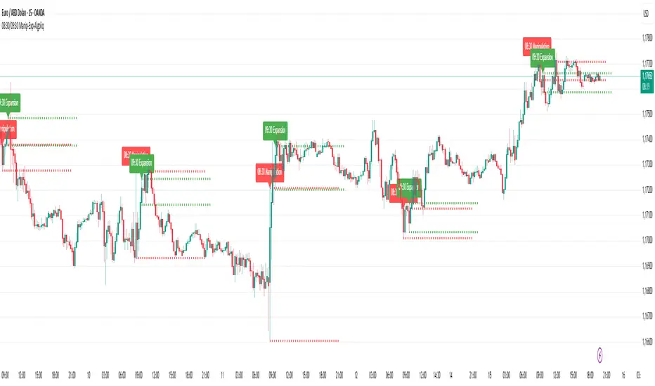
08:30 & 09:30 Manipulation-Expansion - AlgoliqDescription:
The 08:30 & 09:30 Manipulation-Expansion indicator identifies key market levels at two critical times during the trading session: 08:30 (Manipulation) and 09:30 (Expansion). It visually marks the high and low of these bars and provides real-time alerts when price breaks these levels.
Features:
08:30 Manipulation: Highlights high and low with dotted lines and a label. Alerts trigger when levels are broken.
09:30 Expansion: Highlights high and low with dotted lines and a label. Alerts trigger when levels are broken.
Customizable: Set hours, minutes, line colors, widths, and lengths to fit your trading style.
Alert System: Real-time notifications whenever price breaks key levels.
Usage:
Ideal for traders looking to monitor early session price action, detect potential manipulations, and plan breakout trades.
Market Structure [PRO][keypoems] - 100% rewritten engineMarket Structure — 100% rewritten engine
Successor to my earlier script Supply and Demand Areas Responsible and Origins . This version rebuilds the engine from scratch and adds HTF support, tap tracking, dealing ranges (“expansion legs”), and DB/DT pattern logic.
What it draws
Market‑structure zones built from protected high/low and confirmed BOS/MSS. Zones extend forward and remain on chart until 50% mitigation is wicked. Optional 30/50/70 levels.
Protected High/Low lines and Continuation High/Low levels; BOS and MSS lines are plotted at confirmation.
SNDR (Supply & Demand Responsible) areas for the counter‑trend swing that caused the BOS. The engine auto‑pivots (tries 3‑pivot then 1‑pivot) and extends each SNDR until 100% mitigation. First‑tap and second‑tap states are tracked and visually marked.
Zone Tap detection : when price first enters an unmitigated zone, leaves it, and then violates a continuation level, the script confirms the tap and draws a horizontal TAP line from the tap swing for future retests.
Dealing Ranges (Expansion legs) : created on BOS→MSS flips or opposite‑direction MSS. Each range is anchored at the protected level, tracks the current extreme, and marks 50% mitigation. A diagonal arrow plus a 50% line show live progress. An optional right‑hand visual stacks all unmitigated ranges as compact boxes with their 50% line.
Double Bottom / Double Top patterns : search starts at BOS/MSS events, confirms on neckline break, and draws an ATR‑buffered box and an extending neckline.
Valid pullback labels and candidate confirmation lines help verify swing sequence formation.
HTF support
Choose a higher timeframe in the Timeframe input to compute market structure on HTF while viewing a lower‑timeframe chart. The script uses request.security and only confirms using closed HTF candles, so zones, BOS/MSS, mitigations and taps match the native HTF chart.
How it works (brief)
Builds an alternating sequence of valid swings, tracks protected levels, and creates a zone on BOS; zones close or roll when MSS occurs.
Zone mitigation = wick through the zone’s 50%. SNDR mitigation = full breach (100%).
Tap logic requires: entry into the zone → exit → violation of a relevant continuation level; only then the TAP line is drawn.
Dealing ranges start from the protected level at BOS→MSS (or opposite MSS), track the current extreme, and flag mitigation at 50%.
DB/DT confirms only after a close through the neckline.
Notes
Origins from the prior script have not been ported to this engine yet.
Includes a performance switch (scan all zones vs. a recent subset) and an optional on‑chart debug table.
Visual tool for price‑action study; not a strategy and not financial advice.

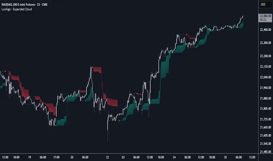
Expanded Cloud [LuxAlgo]The Expanded Cloud tool allows traders to identify and follow trends accurately. It is based on the well-known Donchian Channels, but with enhanced features.
It features a trailing cloud that expands with the price and a trading stats dashboard.
🔶 USAGE
The tool is super easy to use. Traders can identify bigger or smaller trends just by adjusting the length from the settings panel.
Trend identification is based on Donchian Channels. An uptrend is indicated when the cloud is located below the price, while a downtrend is indicated when the cloud is above it.
Dots signal the start of a new trend, and the width of the clouds identifies the strength of the price expansion. The wider the cloud, the bigger the move.
The expanded cloud, due to its visual, can also act as a trailing stop.
🔹 Trend Identification
As we can see in the chart above, different length values identify different trends on the same BTC daily chart. Larger values identify larger trends.
🔹 Cloud Expansion
From the settings panel, traders can adjust how the clouds expand based on the Expansion % parameter. It accepts values from 0 to 100, which controls how much of the expansion is taken into account. Higher values will make the cloud expand and get closer to the price faster.
When the cloud moves opposite to the direction of the indicated trend (e.g: the cloud decreases while being below the price), it is often indicative of the end of a retracement, and we can expect the price to move with the indicated trend.
The chart above shows the effect of different Expansion % values.
🔹 Dashboard
The trading statistics dashboard informs traders of key metrics derived from the tool. The following are notable:
PNL: Theoretical profit or loss from all trends identified by the tool in the right scale units.
EXPECT.: Expected value of each trade. It is derived from win rate and risk-to-reward metrics.
AVG: 1st TOUCH: The average number of bars from the beginning of a new trend until the price touches the cloud for the first time.
🔶 SETTINGS
Length: Length for trend detection
Expansion %: Percentage of price expansion for cloud formation
Source: Source of the data
🔹 Dashboard
Show Dashboard: Enable/disable the statistics dashboard
Location: Dashboard location
Size: Dashboard size
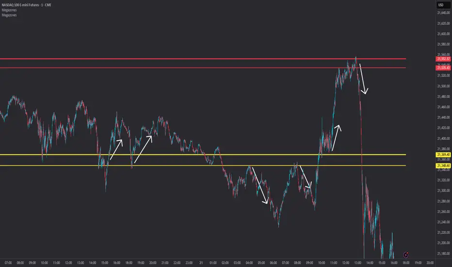
Megazones📦 Megazones — Auto-Expanding Range Detection
Megazones is a dynamic tool that detects price expansion ranges based on pivot structure. It automatically plots a pair of horizontal lines when both pivot highs and pivot lows are expanding — signaling directional strength and potential breakout zones.
🧠 How It Works:
- Pivot Detection: The script finds local highs/lows using a configurable Pivot Lookback length.
- Expansion Logic: It checks for consecutive higher highs and higher lows (configurable count).
- Zone Projection: When both expansions are detected, it draws a fading "zone" using two horizontal lines based on the latest pivot high and low.
⚙️ Settings:
- Pivot Lookback: How far left/right to confirm a pivot.
- Expansion Detection Window: How many bars back to keep pivots in memory.
- Min Expanding Highs/Lows: How many higher highs/lows must occur in a row to trigger zone detection.
🔍 Key Concept:
It identifies moments when the market is forming a structured expansion, where both higher highs and higher lows appear sequentially — suggesting potential breakout pressure or momentum continuation.
✅ Use Cases:
- Visual confirmation of building bullish structure.
- Anticipating breakout areas from clean expansion phases.
- Identifying trend-following continuation zones.
StockLeave Signal BarThe indicator identifies potential trade entries by highlighting expansion and reversal bars. These are defined by individual bar characteristics and refined by contextual factors such as price position relative to structural boundaries. The purpose is to locate bars that could indicate potential market initiation.
Expansion Bars
The expansion captures bars that breakout from a period of reduced volatility. These often initiate directional movement and are recognized using a two-part definition:
Range Expansion The current bar’s range must exceed the average range. This ensures the move is comparatively large and stands out from recent behavior.
Range Compression The bars before the expansion must be below a threshold of the average range. This confirms a low-volatility lead-up, strengthening the likelihood that the expansion has significance.
This script applies additional filters. A local breakout ensures price breaks the previous bar’s high or low. A strong close confirms directional intent by requiring the close near the bar’s extreme. Mean proximity checks that expansion starts near the mean price using a dynamic buffer relative to bar size. A directional filter blocks signals during extended directional runs. Consecutive suppression prevents multiple expansions to show in succession.
Reversal Bars
Reversal setups aim to identify potential turning points after price has reached a zone of imbalance or extension. These bars typically exhibit long tails and occur near structural boundaries such as the outer Keltner bands. Their design favors short-term price rejection and potential reversal.
Tail Dominance The wick must be at least twice the body and make up a significant portion of the bar’s total range, signaling strong rejection rather than indecision.
Close Location The close should be near the opposite end of the wick, near the low for bearish signals and near the high for bullish, confirming pressure in the reversal direction.
This script applies additional filters. Local extreme ensures the bar marks a local turning point to confirm reversals occur after extension, not within structure. Boundary proximity requires the bar to appear near the outer envelope, aligning bearish signals with the upper band and bullish with the lower, indicating price has reached an area of likely imbalance.
This section also incorporate snapback reversals, designed to capture failed extensions beyond structural boundaries. Unlike single-bar rejections, snapbacks use a two-bar sequence: a strong impulse bar that closes outside the envelope, followed by a reversal bar that closes back inside.
Alert Configuration
The Signal Bars indicator includes an alert function with two built-in conditions to help reduce screen time and focus attention when predefined conditions are met.
Expansion: Alerts when a bar meets all conditions for a valid expansion.
Reversal: Alerts when a bar meets the criteria for a pin bar or snapback reversal.
These are built into the indicator with the alertcondition() function and can be turned on whenever the indicator is applied to a chart. Each alert includes a default message that uses dynamic placeholders; {{ticker}} for the symbol and {{interval}} for the timeframe.
Create a new alert and select the condition “StockLeave Signal Bars.”
Then select from the two options: Expansion and Reversal.
For expansions, select “once per bar” to capture developing momentum.
For reversals, use “once per bar close” to confirm rejection setups.
Apply alerts across multiple timeframes to improve coverage. Lower timeframes are better suited for fast-moving markets, while higher timeframes work well in slower or more selective environments. This process only needs to be done once. The created alerts can then be toggled on or off from the Alerts panel as preferred, without requiring reconfiguration.
Applied Discretion
The indicator functions on fixed logic, but interpretation always takes precedence. Consider price action, structure, volatility, and broader market context. Most signals will not lead to trades; while many may appear in a session, only a select few will align with context and warrant execution based on discretion.

Volatility Price FlowCapitalize on market volatility with our new volatility price flow indicator. We have designed this indicator to process historical price movements and indicate when price may have reached exhaustion in the context of current volatility.
This is achieved by taking the price deviation from a user defined moving average, and applying a weighting to the deviations from the candle body and candle wick on both buy side and sell side, over a user defined period. The period of the base moving average, type of moving average and the period of the historical price deviations can all be modified. This creates a typical 'band' style indicator, though with a unique characteristic that the buy and sell side vary independently as well as the band expansion being based on weighted variables tied to the actual price changes, rather than just a standard deviation the moves uniformly.
Additionally, these bands can be merged with an anchored vwap - we do this so that the deviations of price from the moving average can include a more volume based approach to identifying potential pivots.
The end result is an indicator that reflects the current market price movements, identifies and capitalizes on impulsive or beginning moves to indicate potential tops / bottoms / reversals.
The signals are simple - anytime price closes within a band, having been outside the band, a signal is displayed. As a basic guide to setting the indicator up for the first time, we suggest reducing all of the multipliers to a value less than 1. Then gradually increase each one, until the signals reduce in quantity and improve in quality, starting with the price deviation multiplier, then the volatility multiplier and finally the expansion multiplier.
Last of all, alerts can be created based on the current chart timeframe and indicator settings, simply by adding an alert that uses the built in buy or sell signal.
Note: We cannot guarantee the accuracy of the signals provided, since the user creates the signals by modifying the settings, and as such we can take no responsibility for any trading losses incurred using the indicator and highly encourage all users to manage their risk and only risk what you can afford to lose.

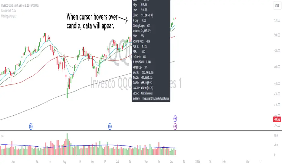
Candlestick DataCandlestick Data Indicator
The Candlestick Data indicator provides a comprehensive overview of key metrics for analyzing price action and volume in real-time. This overlay indicator displays essential candlestick data and calculations directly on your chart, offering an all-in-one toolkit for traders seeking in-depth insights.
Key Features:
Price Metrics: View the daily high, low, close, and percentage change.
Volume Insights: Analyze volume, relative volume, and volume buzz for breakout or consolidation signals.
Range Analysis: Includes closing range, distance from low of day (LoD), and percentage change in daily range expansion.
Advanced Metrics: Calculate ADR% (Average Daily Range %), ATR (Average True Range), and % from 52-week high.
Moving Averages: Supports up to four customizable moving averages (EMA or SMA) with distance from price.
Market Context: Displays the sector and industry group for the asset.
This indicator is fully customizable, allowing you to toggle on or off specific metrics to suit your trading style. Designed for active traders, it brings critical data to your fingertips, streamlining decision-making and enhancing analysis.
Perfect for momentum, swing, and day traders looking to gain a data-driven edge!
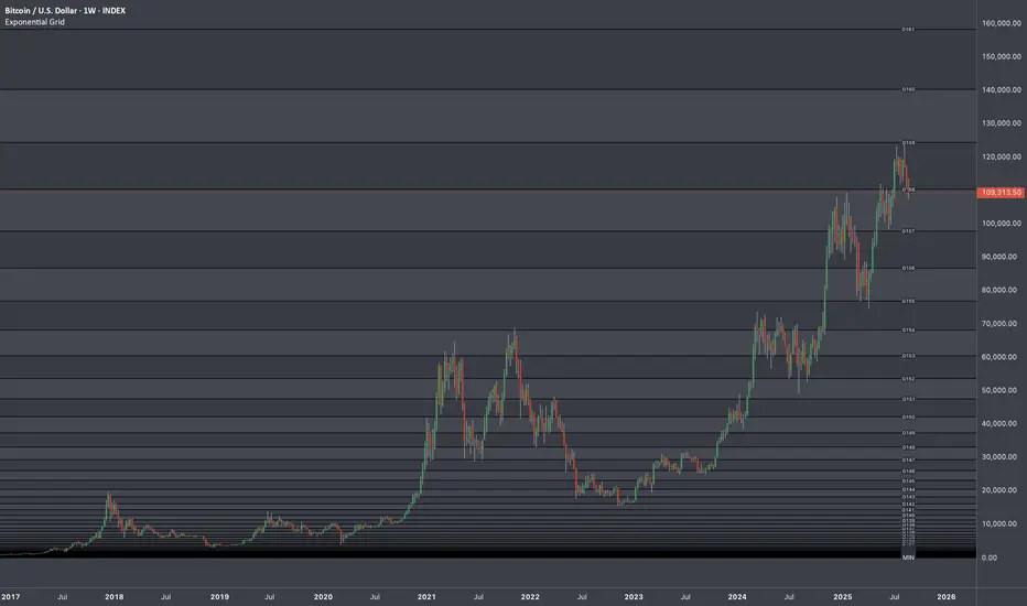
Exponential Grid [Phi, Pi, Euler]If you disagree with one of the EMH principles that price is too random, then by definition you must agree that historic price has deterministic function to a scenario ahead.
I personally believe that constants like phi, pi and e can mimic exponential growth of the price.
In this script, first grid is based on the Lowest price multiplied with self fraction of the constant.
For example:
If you are familiar with fib ratio 1.272, then you must know that it is 1.618 to the power of 0.5.
With default settings of exponent step 0.25
First grid = Lowest price x phi^0.25
Second grid = Lowest price x phi^0.25x2
Third grid = Lowest price x phi^0.25x3 and so on
The script will automatically find the lowest price and update the grid values.
Or you can set up your custom Lowest price manually if you feel like the All Time Low level loses its relevance value after long period.
There are 64 grids including Lowest price level. And it wasn't by a chance. Pine Script has a limitation of max 64 plots. Number of grids shown in the chart depends on the highest price. Once price breaks above ATH a couple of next grids will be plotted automatically. In most cases if everything is plotted, the chart appears squeezed and you'll need to zoom in to see it. Therefore, I adjusted it relatively to the scale of the chart for the comfort.
In some cases 64 plots aren't enough to cover the whole chart. For example, let's take a look at NVIDIA chart:
Since the price has started with 0.0333, it is way too small to cover all with default settings.
We are left with 2 choices:
Either Enable "Round"
OR increase Exponent Step (from 0.25 to 0.5 in the particular example below)
If you set constant to pi or e which is a bigger number than phi, expect the gaps to be bigger. To reduce it to a more gradual way of expansion you can decrease Exponent Step.
Master Pattern [UAlgo]🔶 Description:
"Master Pattern by UAlgo" aims to identify and visualize "Master Patterns" in price movements on financial charts, and focusing on detecting liquidity levels and sweeps. The indicator provides users with the ability to customize settings such as master pattern detection and detection flexibility, sensitivity to liquidity levels, and visualization preferences.
🔶 What is the Master Pattern ?
The Master Pattern is a framework built around understanding market cycles, which include three main phases: Contraction, Expansion, and Trend.
Contraction Phase: During this phase, the market fluctuates less and consolidates within a narrow range. Institutional trading volumes tend to be low and it is recommended to avoid trading entries during this period.
Expansion Phase: volatility increases and prices fluctuate greatly. Institutional traders begin to establish positions at this stage and may manipulate prices to attract retail traders to create liquidity for their own buy or sell targets.
Trend Phase: The final phase that completes the market cycle. Institutional traders started taking profits, causing the trend to reverse. This triggered panic among retail traders, leading to liquidations and stop-losses. This creates liquidity from which institutional traders can profit, while retail traders' positions are overvalued.
🔶 Key Features:
Pattern Detection : The indicator detects and visualizes contraction patterns in price movements, helping traders identify potential areas of price consolidation.
Also traders can choose between different modes (Strict, Normal, Relax) for obtaining master patterns, providing flexibility in pattern identification based on individual trading strategies and preferences.
The Value/Expansion Line : This value line is considered by institutional traders as a potential “Point of Origin” for future price movements.
An Application Example of the Master Pattern :
Select the Appropriate Timeframes: A significant separation between the higher timeframe (HTF) and the lower timeframe (LTF) is essential. For instance, combinations like 4H and 15M, 4H and 5M, or 1H and 1M. You can change this according to your own strategy.
Trade Based on Contraction Box, Value Line and Liquidity: When the HTF is above value, look for buying opportunities on your LTF below value. Conversely, when the HTF is below value, seek selling opportunities on your LTF above value. Sweeping liquidity in LTF is also an important parameter.
Also Value/Expansion Line can also be used as Support/Resistance zone,
Liquidity Levels : The indicator includes functionality to detect and display liquidity levels on the chart.
Dashboard Display : A customizable dashboard provides users with key information, including liquidity levels, master pattern values, and whether the current price is above or below Master Pattern's value lines.
Additionally, when liquidity is swept or the price rises above or falls below the value line. this information can be displayed on the dashboard.
Customizable Settings: Users can adjust parameters such as the pattern detection mode, sensitivity to liquidity levels, liquidity type (cumulative or individual for each swing), visualization preferences for master patterns, the position and font size of the dashboard.
🔶 Disclaimer:
Use with Caution: This indicator is provided for educational and informational purposes only and should not be considered as financial advice. Users should exercise caution and perform their own analysis before making trading decisions based on the indicator's signals.
Not Financial Advice: The information provided by this indicator does not constitute financial advice, and the creator (UAlgo) shall not be held responsible for any trading losses incurred as a result of using this indicator.
Backtesting Recommended: Traders are encouraged to backtest the indicator thoroughly on historical data before using it in live trading to assess its performance and suitability for their trading strategies.
Risk Management: Trading involves inherent risks, and users should implement proper risk management strategies, including but not limited to stop-loss orders and position sizing, to mitigate potential losses.
No Guarantees: The accuracy and reliability of the indicator's signals cannot be guaranteed, as they are based on historical price data and past performance may not be indicative of future results.

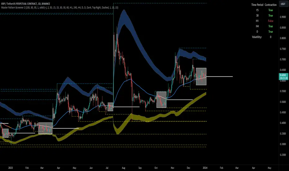
Forex Master Pattern Screener 2Overview
The Forex Master Pattern Screener 2 is based on the Master Pattern, which includes contraction, expansion, and trend phases. This indicator is designed to identify and visualize market volatility, market phases, multi-timeframe contractions, liquidity points, and pivot calculations. It provides a clear image of the market's expansion and contraction phases. It's based on an alternative form of technical analysis that reveals the psychological patterns of financial markets through three phases.
Unlike the other master pattern indicators that just use highs and lows and aren't as accurate for finding contractions, this one uses actual measures of volatility to find extremely low levels of volatility and has customizable parameters depending on what you want to do.
What is the Forex Master Pattern?
The Forex Master Pattern is a framework that revolves around understanding market cycles, comprising the three main phases: contraction, expansion, and trend.
Contraction Phase: During this phase, the market has low volatility and is consolidating within a narrow range. Institutional volume tends to be low, and it's suggested to avoid trade entries during this period.
Expansion Phase: Volatility starts to increase, and there start to be bigger moves in price. Institutional traders start accumulating positions in this phase, and they might manipulate prices to draw in retail traders, creating liquidity for their own buying or selling goals.
Trend Phase: This final phase completes the market cycle. Institutional traders begin taking profits, leading to a reversal. This triggers panic among retail traders, resulting in liquidations and stops. This generates liquidity for institutional traders to profit, leaving retail traders with overvalued positions.
Value Line:
The "value line" acts as the fair value zone or the neutral belief zone where buyers and sellers agree on fair value. It can be likened to the center of gravity and is created during contraction zones.
Applications:
Identifying these phases and understanding the value lines can help traders determine the market's general direction and make better trading decisions.
This isn't a strategy but a concept explaining market behavior, allowing traders to develop various strategies based on these principles
The contractions, which are based on volatility calculations, can help you find out when big moves will occur, known as expansions.
How traders can use this indicator
1. Identifying Market Phases:
Contraction Phase: Look for periods where the market has low volatility and is contracting, indicated by a narrow range and highlighted by the contraction box. During this phase, traders prepare for a breakout but usually avoid making new trades until a clearer trend emerges.
Expansion Phase: When the indicator signals an expansion, it suggests that the market is moving out of consolidation and may be beginning a new trend. Traders might look for entry points here, anticipating a continuation of the trend.
Trend Phase: As the market enters this phase, traders look for signs of sustained movement in one direction and consider positions that benefit from this trend.
2. Multi-Timeframe Analysis:
By looking at multiple timeframes, traders can get a broader view of the market. For instance, a contraction phase in a shorter timeframe within an expansion phase in a longer timeframe might suggest a pullback in an overall uptrend. This indicator comes with a MTF contraction screener that is customizable.
2. Fair Value Lines:
The fair value acts like a "center of gravity.". Traders could use this as a reference point for understanding market sentiment and potential reversal points. This indicator shows these values in the middle of the contraction boxes.
3. Volatility Analysis:
This indicator's volatility settings can help traders understand the market's current volatility state. High volatility indicates a more active market with larger, faster moves, while low volatility might suggest caution and tighter stop-losses or take-profits. If volatility is contracting, then an expansion is imminent. This indicator shows the volatility with percentile ranks in 0-100 values and also alerts you when volatility is contracting, aka the contraction phase.
Volatility Calculations:
This indicator uses a geometric standard deviation to measure volatility based on historical price data. This metric quantifies the variability of price changes over a specified lookback period and then computes a percentile rank within a defined sample period. This percentile calculation helps evaluate the current volatility compared to historical levels.
Based on the percentile rank, the indicator sets thresholds to determine whether the current volatility is within a range considered "contraction" or not. For example, if there are really low levels of volatility on the percentile rank, then there is currently a contraction phase. The indicator also compares the volatility value against a moving average, where values above the current moving average value signal the expansion phase.
Multi-Timeframe Analysis (MTF):
This indicator comes with a multi-timeframe table that shows contractions for 5 different timeframes, and the table is customizable.
Bands:
This indicator comes with bands that are constructed based on the statistical calculations of the standard deviation applied to the log-transformed closing prices. It is commonly assumed that the distribution of prices fits some type of right-skewed distribution. To remove most of the skewness, you can use a log transformation , which makes the distribution more symmetrical and easier to analyze, thus the use of these bands . These bands are in the 2 standard deviation range. You can use these bands to trade at extreme levels. The band parameter is based on the contraction volatility lookback, which is in the Volatility Model Settings tab.
Ways the bands could be used with the contractions:
1. Identifying Breakout trades:
Contraction Zones: These zones indicate periods of low volatility where the market is consolidating. There are usually narrow price ranges, which are considered a build-up phase before a significant price move in any direction.
Bands: When the contraction zone occurs, you might notice the bands tightening around the price on smaller lookback periods, reflecting the decreased volatility. A continuous widening of the bands could then signal the beginning of an expansion phase, indicating a potential breakout opportunity.
2. Enhancing Trade Timing:
Before the Breakout: During the contraction phase, the bands might move closer together, reflecting the lower volatility. You can monitor this phase closely and prepare for a potential expansion. The bands can provide additional confirmation; for instance, a price move toward one of the bands might show an extreme occurrence and might show what the direction of the breakout could be.
After the breakout: Once the price breaks out of the contraction zone and goes to the expansion phase, and if it coincides with the bands widening significantly, it could reinforce the strength and potential sustainability of the new trend, providing a clearer entry.
3. Price-touching bands during a contraction:
If the price repeatedly touches one of the bands during a contraction phase, it might suggest a buildup of pressure in that direction. For example, if the price is consistently touching the upper band even though the bands are narrow, it might suggest bullish pressure that could occur once the expansion phase begin.
4. Price at the band extreme levels during Expansion:
If the price is at the extreme levels of the bands once the expansion phase occurs, it might indicate unsustainable levels and a low probability of the price continuing beyond those levels. Potentially signaling that a reversal will occur. Some trades could use these extremes to place entries during the expansion phases.
Liquidity Levels:
This script comes with liquidity points, whose functionality goes towards identifying pivotal levels in price action, focusing on swing highs and swing lows in the market. These points represent areas where significant buying (for swing lows) or selling (for swing highs) activity has occurred, implying potential levels or resistance in the price movement.
These liquidity points, often identified as highs and lows, are points where market participants have shown interest in the past. These levels can act as psychological indications where traders might place orders, leading to increased trading activity when these levels are approached or breached. When used with the Forex Master Pattern phases, liquidity levels can enhance trades placed with this indicator. For instance, if the market is expanding and approaches a significant liquidity level, there might be a higher chance of a breakout or reversal, showing a possible entry or exit point.
Liquidity Levels in the Contraction Phase:
Accumulation and Distribution: During the contraction phase, liquidity levels can indicate where huge positions are likely accumulating or distributing quietly. If price is near a known liquidity level and in a contraction phase, it might suggest that a large market player is building a position in anticipation of the next move.
Breakout Points: Liquidity levels can also give clues about where price could go after the breakout from the contraction phase. A break above a liquidity level might indicate a strong move to come as the market overcomes significant selling pressure.
Liquidity Levels in Expansion Phase:
Direct Confirmation: As the expansion phase begins, breaking through liquidity levels can confirm the new trend's direction. If the price moves past these levels with huge volume, it might indicate that the market has enough momentum to continue the trend.
Target Areas: Liquidity levels can act as target areas during the expansion phase. Traders using this indicator could look to take profits if the price approaches these levels, possibly expecting a reaction from the market.
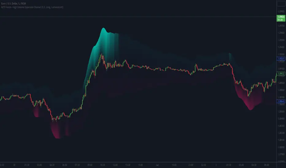
MTF Fusion - High Volume Expansion Channel [TradingIndicators]Exceptionally high volume and rapid price expansion are key markers of powerful moves, especially when they occur during a breakout or breakdown. The High Volume Expansion Channel (HVEC) uses our multi-timeframe fusion and price compression/expansion algorithms to look for high volume and rapid expansion from multiple higher timeframes at once. It uses this info to determine a high volume and expansion 'grade', and then encodes this result into a colored channel. This channel coloring varies in intensity based on how exceptionally high volume is and how rapidly price is expanding in either direction.
What is MTF Fusion?
Multi-Timeframe (MTF) Fusion is the process of combining calculations from multiple timeframes higher than the chart's into one 'fused' value or indicator. It is based on the idea that integrating data from higher timeframes can help us to better identify short-term trading opportunities within the context of long-term market trends.
How does it work?
Let's use the context of this indicator, which calculates a 'high volume and expansion grade' (let's call it HVEG), as an example to explain how MTF Fusion works and how you can perform it yourself.
Step 1: Selecting Higher Timeframes
The first step is to determine the appropriate higher timeframes to use for the fusion calculation. These timeframes should typically be chosen based on their ability to provide meaningful data and action which actively affect the price action of the smaller timeframe you're focused on. For example, if you are trading the 5 minute chart, you might select the 15 minute, 30 minute, and hourly timeframe as the higher timeframes you want to fuse in order to give you a more holistic view of the trends and action affecting you on the 5 minute. In this indicator, four higher timeframes are automatically selected depending on the timeframe of the chart it is applied to.
Step 2: Gathering Data and Calculations
Once the higher timeframes are identified, the next step is to calculate the data from these higher timeframes that will be used to calculate your fused values. In this indicator, for example, the HVEG value is calculated by determining the HVEG for all four higher timeframes.
Step 3: Fusing the Values From Higher Timeframes
The next step is to actually combine the values from these higher timeframes to obtain your 'fused' indicator values. The simplest approach to this is to simply average them. If you have calculated the HVEG value from three higher timeframes, you can, for example, calculate your 'multi-timeframe fused HVEG' as (HigherTF_HVEG_1 + HigherTF_HVEG_2 + HigherTF_HVEG_3) / 3.0.
Step 4: Visualization and Interpretation
Once the calculations are complete, the resulting fused indicator values are plotted on the chart. These values reflect the fusion of data from the multiple higher timeframes, giving a broader perspective on the market's behavior and potentially valuable insights without the need to manually consider values from each higher timeframe yourself.
What makes this script unique? Why is it closed source?
While the process described above is fairly unique and sounds simple, the truly important key lies in determining which higher timeframes to fuse together, and how to weight their values when calculating the fused end result in such a way that best leverages their relationship for useful TA.
This MTF Fusion indicator employs a smart, adaptive algorithm which automatically selects appropriate higher timeframes to use in fusion calculations depending on the timeframe of the chart it is applied to. It also uses a dynamic algorithm to adjust and weight the high volume and price expansion grade calculations depending on each higher timeframe's relationship to the chart timeframe. These algorithms are based on extensive testing and are the reason behind this script's closed source status.
Included Features
MTF Fusion high volume and expansion coloring
MTF Fusion ATR-based channel for visual effect
Channel width customization and explanatory labels
Pre-built color stylings
Options
Show Channel Lines: Show/hide the upper and lower lines of the channel
Fill Channel: Fill the channel with coloring depicting the current degree of high volume and rapid price expansion
Channel Width Multiplier: Sets the width of the ATR-based channel
Explanatory Labels: Show/hide explanatory labels describing the visuals
Lookback: Select how you want the degree of high volume expansion to be calculated (longer = long-term high volume and expansion, shorter = short-term high volume and expansion)
Pre-Built Color Styles: Use a pre-built color styling (uncheck to use your own colors)
Manual Color Styles: When pre-built color styles are disabled, use these color inputs to define your own
Hourly Ranges @joshuuuThis indicator creates a statistic to track the average range per hourly candle.
Distribution for bullish candles is the range between open to high.
Manipulation for bullish candles is the range between open to low.
Distribution for bearish candles is the range between open to low.
Manipulation for bearish candles is the range between open to high.
It has the option to filter specific days to see if price behaves differently depending of the day of the week. monday in the menu is 2, tuesday number 3, wednesday number 4, ...
It has the option to show the range in pips (for forex) or points (for indices).
One can use that data to find the hour with the biggest range to try to catch the greatest range.

ICT Macros [LuxAlgo]The ICT Macros indicator aims to highlight & classify ICT Macros, which are time intervals where algorithmic trading takes place to interact with existing liquidity or to create new liquidity.
🔶 SETTINGS
🔹 Macros
Macro Time options (such as '09:50 AM 10:10'): Enable specific macro display.
Top Line , Mid Line , Bottom Line and Extending Lines options: Controls the lines for the specific macro.
🔹 Macro Classification
Length : A length to detect Market Structure Brakes and classify macro type based on detection.
Swing Area : Swing or Liquidity Area selection, highest/lowest of the wick or the candle bodies.
Accumulation , Manipulation and Expansion color options for the classified macros.
🔹 Others
Macro Texts : Controls both the size and the visibility of the macro text.
Alert Macro Times in Advance (Minutes) : This option will plot a vertical line presenting the start of the next macro time. The line will not appear all the time, but it will be there based on remaining minutes specified in the option.
Daylight Saving Time (DST) : Adjust time appropriate to Daylight Saving Time of the specific region.
🔶 USAGE
A macro is a way to automate a task or procedure which you perform on a regular basis.
In the context of ICT's teachings, a macro is a small program or set of instructions that unfolds within an algorithm, which influences price movements in the market. These macros operate at specific times and can be related to price runs from one level to another or certain market behaviors during specific time intervals. They help traders anticipate market movements and potential setups during specific time intervals.
To trade these effectively, it is important to understand the time of day when certain macros come into play, and it is strongly advised to introduce the concept of liquidity in your analysis.
Macros can be classified into three categories where the Macro classification is calculated based on the Market Structure prior to macro and the Market Structure during the macro duration:
Manipulation Macro
Manipulation macros are characterized by liquidity being swept both on the buyside and sellside.
Expansion Macro
Expansion macros are characterized by liquidity being swept only on the buyside or sellside. Prices within these macros are highly correlated with the overall trend.
Accumulation Macro
Accumulation macros are characterized by an accumulation of liquidity. Prices within these macros tend to range.
The script returns the maximum/minimum price values reached during the macro interval alongside the average between the maximum/minimum and extends them until a new macro starts. These levels can act as supports and resistances.
🔶 DETAILS
All required data for the macro detection and classification is retrieved using 1 minute data sets, this includes candles as well as pivot/swing highs and lows. This approach guarantees the visually presented objects are same (same highs/lows) on higher timeframes as well as the macro classification remain same as it is in 1 min charts.
8 Macros can be displayed by the script (4 are enabled by default):
02:33 AM 03:00 London Macro
04:03 AM 04:30 London Macro
08:50 AM 09:10 New York Macro
09:50 AM 10:10 New York Macro
10:50 AM 11:10 New York Macro
11:50 AM 12:10 New York Launch Macro
13:10 PM 13:40 New York Macro
15:15 PM 15:45 New York Macro
🔶 ALERTS
When an alert is configured, the user will have the ability to be notified in advance of the next Macro time, where the value specified in 'Alert Macro Times in Advance (Minutes)' option indicates how early to be notified.
🔶 LIMITATIONS
The script is supported on 1 min, 3 mins and 5 mins charts.
🔶 RELATED SCRIPTS

Adaptive Momentum Channel - [Volume Filter]The Adaptive Momentum Channel with Volume Filter (Adaptive MCVF) is an indicator that utilizes an adaptive RSI to adjust its sensitivity based on the market conditions. The RSI component of the indicator calculates the standard deviation and mean deviation of RSI values and uses these to calculate the adaptive RSI. The volume filter component of the indicator filters the adaptive RSI based on the volume average, allowing the indicator to identify trend changes and filter out market noise.
The indicator plots the upper and lower bands of the Adaptive MCVF, which are calculated by taking the moving average of the filtered RSI and applying an offset based on the standard deviation. A fast moving average is also plotted, which can be used to identify short-term changes in the trend.
The Adaptive MCVF also includes a divergence identification feature, which can be used to identify potential trend changes. The indicator plots regular bullish and bearish divergences, as well as hidden bullish and bearish divergences.
This is a variant of my previous MCVF indicator, this one simply allows you to take the standard deviation of the momentum and use it to make the indicator a bit more adaptive!
I made it protected to hide the standard deviation math and the auto divergence code.
You can always use this indicator by pressing "favorite";)

Volume Channel - [With Volume Filter]The indicator calculates two volume-weighted moving averages (VWMA) using different lengths, and filters them based on a moving average of volume. The filtered VWMA values are then plotted on the chart as lines, representing the fast and slow moving averages. In addition, upper and lower bands are calculated based on the slow VWMA and plotted as lines on the chart.
The fast and slow VWMA lines can be used to identify trends in the market. When the fast VWMA is above the slow VWMA, it is an indication of an uptrend, and when the fast VWMA is below the slow VWMA, it is an indication of a downtrend. The position of the VWMA lines relative to the upper and lower bands can also be used to identify potential trade signals.
When the price is near the upper band, it indicates that the market is overbought, and when the price is near the lower band, it indicates that the market is oversold. Traders can use these signals to enter or exit trades.
The indicator also includes a volume filter, which means that the VWMA values are only calculated when the volume is above a certain moving average of volume. This helps to filter out noise in the market and provide more accurate signals.
Explanation for each parameter
vwmaLength1: This is the length of the fast volume-weighted moving average (VWMA) used in the calculation. The default value is 10, and it can be adjusted by the user.
vwmaLength2: This is the length of the slow volume-weighted moving average (VWMA) used in the calculation. The default value is 25, and it can be adjusted by the user.
bandLength: This is the length of the moving average used to calculate the upper and lower bands. The default value is 34, and it is not adjustable by the user.
volumeFilterLength: This is the length of the moving average of volume used as a filter for the VWMA calculation. The default value is 5, and it can be adjusted by the user.
src: This is the input source for the VWMA calculation. The default value is close, which means the indicator is using the closing price of each bar. However, the user can select a different input source by changing this parameter.
filteredVwma1: This is the filtered VWMA calculated based on the volume filter and the fast VWMA length. It is plotted as a line on the chart and can be used to identify short-term trends.
filteredVwma2: This is the filtered VWMA calculated based on the volume filter and the slow VWMA length. It is plotted as a line on the chart and can be used to identify long-term trends.
ma: This is the moving average of the filtered slow VWMA values, which is used to calculate the upper and lower bands. It is plotted as a line on the chart.
offs: This is the offset used to calculate the upper and lower bands. It is based on the standard deviation of the filtered slow VWMA values and is multiplied by 1.6185 * 3. It is plotted as a line on the chart.
up: This is the upper band calculated as the moving average plus the offset. It is plotted as a line on the chart and can be used to identify overbought conditions.
dn: This is the lower band calculated as the moving average minus the offset. It is plotted as a line on the chart and can be used to identify oversold conditions.

Matrix Momentum Expansion [IkkeOmar]The indicator consists of several features:
Candlestick chart: The indicator plots a candlestick chart based on the input parameters of the user. The candlesticks are colored blue or orange depending on whether the closing price is above or below the upper and lower bands.
Support and Resistance levels: The indicator also plots support and resistance levels based on the CCI (Commodity Channel Index) of the asset's price. These levels are dynamic and change based on the user's input parameters.
Momentum: The indicator calculates the momentum of the market based on the smoothed and standard deviation of the asset's price. It uses this momentum to calculate upper and lower bands that are plotted on the chart.
Warning signals: The indicator can also be used to identify potential warning signals. When the closing price of the asset moves above the upper band, it could indicate that the market is overbought and a potential reversal could occur. Conversely, when the closing price moves below the lower band, it could indicate that the market is oversold and a potential reversal could occur.
Contractions and expansions in the bands can provide important information to traders about potential price movements.
When the bands contract, it indicates that the market is experiencing low volatility and the price is likely to move sideways. During these periods, traders may look for other signals, such as support and resistance levels or price patterns, to determine potential entry and exit points.
On the other hand, when the bands expand, it indicates that the market is experiencing high volatility and the price is likely to move in a particular direction. Traders can use this information to identify potential trend reversals or continuation patterns. When the upper and lower bands move further apart, it indicates that the trend is becoming stronger, while when they move closer together, it indicates that the trend may be weakening.
When the price moves outside of the bands, it can also provide important information to traders. If the price moves above the upper band, it could indicate that the market is overbought and a potential reversal could occur. Conversely, if the price moves below the lower band, it could indicate that the market is oversold and a potential reversal could occur.
Very important note!
When you see contractions, please understand that it's a wonderful opportunity to pivot into position to catch a good trade because we will see an expansion after!
