Volume Profile: HVN, LVN & DeltaDescription field:
Volume Profile: HVN, LVN & Delta is a high-performance, optimized structural analysis tool designed to visualize the distribution of volume over price levels.
Unlike standard Volume Profile indicators that often suffer from "Loop takes too long" runtime errors on high resolutions, this script utilizes a mathematically optimized binning algorithm. This allows for a smooth loading experience even with high precision settings, providing deep insights into market structure without lagging the chart.
1. Key Concepts & Features
This indicator breaks down market data into several key components to help traders identify where value has been established and where price has been rejected.
Rolling Volume Profile: The profile is calculated based on a rolling window of bars (user-defined period). This ensures the data is always relevant to the current market context, dynamically updating as price moves.
HVN (High Volume Nodes): Displayed as colored zones, these represent prices where a significant amount of trading occurred.
Significance: These areas indicate market acceptance and often act as strong Support or Resistance (magnets).
LVN (Low Volume Nodes): Displayed as subtle gray strips, these are areas with very little volume (gaps in the profile).
Significance: These represent price rejection or rapid movement. Price often moves quickly through LVNs to reach the next HVN.
Delta Coloring: The profile bins are colored based on Delta (Buying Volume vs. Selling Volume).
Teal: Net Buying pressure in that price zone.
Maroon: Net Selling pressure.
Value Area (VA) & PoC:
PoC (Point of Control): The single price level with the highest volume.
VA (Value Area): The range where 70% (customizable) of the total volume occurred.
Structural Pivots: The script plots recent Pivot Highs and Lows, but filters them based on Volume. A pivot is only highlighted if it carries significant volume relative to the PoC, filtering out "noise" pivots.
Real-Time Dashboard: A compact panel displaying:
Distance from PoC, VAH, and VAL.
Net Delta for the period.
Current Trend status relative to the EMA 50.
2. How to Use This Indicator
This tool is designed for Auction Market Theory traders. Here are practical ways to interpret the signals:
A. Determining Trend State
Inside Value (Range Bound): When price is strictly between VAH (Value Area High) and VAL (Value Area Low), the market is in balance. Strategies often focus on mean reversion towards the PoC.
Outside Value (Imbalance): When price breaks and holds above VAH or below VAL, it signals a potential trend initiation or a search for new value.
B. Using HVN and LVN
HVN Defense: If price retraces to an HVN (High Volume Node), look for a reaction. Since fair value was established here previously, institutional orders often reside here.
LVN Acceleration: If price enters an LVN, expect increased volatility. Since there is little liquidity in these zones, price tends to "jump" through them until it finds the next HVN.
C. Delta Analysis
Look at the dashboard or the profile color. If price is rising but the Total Delta is negative (Red), it may indicate a "weak high" or absorption, suggesting a potential reversal.
3. Technical Optimization (Why this script?)
Calculating Volume Profiles on Pine Script is computationally expensive. Standard methods loop through every past bar for every price level, leading to timeouts.
This script solves this by:
Direct Indexing: Calculating the bin index mathematically rather than via search loops.
Smart Memory Management: Using explicit array clearing and garbage collection on the last bar.
Safety Breaks: Implementing fail-safes in the Value Area calculation to prevent infinite loops during flat markets.
4. Settings
Rolling Period: How far back the profile looks (Default: 150 bars).
Resolution: The vertical precision of the histogram (Default: 70). Note: Higher resolution = more detail but more CPU load.
HVN/LVN Thresholds: The percentage of PoC volume required to tag a zone as High or Low volume.
Pivot Vol Filter: Filters out weak pivot points that do not possess enough volume structure.
Disclaimer: This indicator is for educational and analytical purposes only. It does not provide financial advice.
Market

OffTheCharts SCOPEOffTheCharts SCOPE is a market structure and supply and demand analysis indicator designed to help traders read price objectively, identify meaningful areas of interest, and understand directional bias without clutter, prediction, or signal-based noise.
The indicator automatically maps supply zones, demand zones, trigger zones, break of structure events, and presents a live dashboard that summarizes current market context in real time. Its purpose is not to tell traders what to buy or sell, but to help them understand where price is reacting, where participation matters, and how structure is developing across timeframes.
Supply zones represent areas on the chart where selling pressure previously caused price to move down aggressively. These zones are identified from confirmed swing highs that occurred with sufficient market participation. When price revisits a supply zone, that area often behaves as resistance, meaning selling interest may return.
Demand zones represent areas on the chart where buying pressure previously caused price to move up aggressively. These zones are identified from confirmed swing lows that occurred with sufficient market participation. When price revisits a demand zone, that area often behaves as support, meaning buying interest may return.
Each supply and demand zone contains a Trigger Zone, abbreviated as TZ. The Trigger Zone is the midpoint of the zone. It is not a trade signal and not an entry trigger. The Trigger Zone exists as a reference level within the zone where reactions, acceptance, or rejection often become clearer. It helps define where the most meaningful decisions occur inside a zone rather than focusing only on the extreme edges.
Break of Structure, abbreviated as BOS, marks a confirmed structural change in the market. A bullish Break of Structure occurs when price breaks above a supply zone, indicating that prior selling pressure has been overcome. A bearish Break of Structure occurs when price breaks below a demand zone, indicating that prior buying pressure has failed. When a Break of Structure occurs, the original zone is removed and replaced by a fixed structure marker that stops at the exact bar where the break happened. This prevents zones from extending indefinitely after they are no longer valid.
Zones are filtered using Relative Volume, abbreviated as RVOL. Relative Volume compares the volume at the pivot candle where a zone is created to the average volume over a user-defined lookback period. If volume participation does not meet the minimum threshold, the zone is not drawn. This helps reduce noise and avoids zones formed during low participation or thin trading conditions. Zones that meet the Relative Volume threshold can optionally be tagged as High Volume, abbreviated as HV, to visually highlight areas formed during strong participation.
Each supply and demand zone is assigned a Strength score ranging from zero to one hundred. Strength is a quality metric, not a prediction. It is calculated using the relative volume at the time the zone was created, the number of times price has touched the zone, and the number of clean rejections away from the zone. Zones formed with higher participation and clean reactions tend to score higher. Zones that have been repeatedly touched or show weak follow-through tend to score lower.
The dashboard brings all of this information together into a single, real-time summary.
Bias displays the current directional context of the market based on the selected bias engine.
Confidence describes how complete that bias is based on available confirmations from structure, position, and break conditions.
Active Zone identifies which zone is currently most relevant to price. Priority is given to the zone price is currently inside. If price is not inside a zone, the nearest Trigger Zone is used instead. Active Zone displays whether Supply or Demand is active and includes the strength percentage of that zone.
Nearest Trigger Zone shows the distance from current price to the closest Trigger Zone. Distance can be displayed in points, ticks, or percentage depending on user preference.
The indicator includes two bias engines.
Classic Bias uses price position relative to Trigger Zones combined with basic market structure alignment. It is intended for general market context, directional awareness, and broader trend framing.
Sniper Bias is a stricter confirmation-based engine that follows an Anchor, Direction, and Break sequence. Anchor refers to where price is positioned relative to Trigger Zones. Direction refers to market structure based on higher highs and higher lows for bullish structure or lower highs and lower lows for bearish structure. Break refers to confirmation via a Break of Structure. When strict mode is enabled, all three conditions must be present for a bias to be considered confirmed.
The dashboard also displays whether price is currently inside a supply or demand zone, how many active zones are present, the current Relative Volume filter state, and the exact price levels of the most recent Trigger Zones.
How to use this indicator.
Begin by identifying supply and demand zones on your chart. Supply zones above price represent potential resistance areas. Demand zones below price represent potential support areas.
Next, use the dashboard to understand context. Review the current bias and confidence level. Identify which zone is marked as the Active Zone and note its strength. Observe how far price is from the nearest Trigger Zone.
Do not assume that a zone will automatically hold. Allow price to interact with the zone. Clean reactions, strong rejections, or confirmed Break of Structure events provide information about intent. Choppy or overlapping price action inside a zone suggests that patience is required.
Use the Trigger Zone as a reference level inside the zone. Reactions near the Trigger Zone often provide clearer information than reactions at the extreme edges alone.
This indicator is not designed to be used as a standalone trade signal. It is designed to provide structure, context, and situational awareness so trades can be planned with confirmation, risk management, and alignment with a broader strategy.
Settings guide.
Swing High and Swing Low Length controls how sensitive the indicator is when detecting pivots. Lower values produce more zones and more frequent structure changes. Higher values produce fewer zones that tend to be more significant.
ATR Length controls how volatility is measured. ATR stands for Average True Range. It measures how much price typically moves over a given period. In this indicator, ATR is used to scale zone width so zones adapt naturally to different market conditions. Higher ATR values result in wider zones. Lower ATR values result in narrower zones.
Zone Width controls how thick supply and demand zones are relative to ATR. Increasing this value creates wider zones. Decreasing it creates tighter zones.
Extend Right controls how far zones are visually projected into the future. This does not predict price movement. It only determines how long zones remain visible on the chart.
Relative Volume settings control how strict the participation filter is. A higher threshold requires stronger volume to create zones. A lower threshold allows more zones to appear.
Bias settings allow switching between Classic Bias and Sniper Bias. Sniper Bias can be used with strict confirmation enabled for higher-quality alignment.
Visual and dashboard settings allow customization of colors, layout, and displayed information without affecting core logic.
Trade design and intended use.
OffTheCharts SCOPE is designed primarily for intraday, short-term swing, and structure-based trading. It is well suited for traders who plan entries around support and resistance behavior, confirmation-based reversals, continuations, and break-and-retest scenarios. It can be used on lower timeframes for intraday context and on higher timeframes to define larger structural zones that guide execution on lower charts.
This indicator is not designed for high-frequency scalping, fully automated trading systems, or buy-and-hold portfolio management. It is a discretionary analysis tool intended to support decision-making, not replace it.
How to use OffTheCharts SCOPE in practice
A simple workflow is to first identify where price is trading relative to supply and demand zones. Next, check the dashboard to understand the current bias and confidence. Then observe how price behaves as it approaches or interacts with the Active Zone or Trigger Zone. Strong reactions, clean rejections, or confirmed Break of Structure events provide information about continuation or failure. Trades should be planned using confirmation, risk management, and alignment with your own strategy rather than assumption.
Notes on toggles and customization
Toggles and visual settings are provided for clarity and personal preference. Enabling or disabling visual features such as swing labels, zigzag lines, or dashboard elements does not change the underlying logic of zone creation or structure detection. Bias mode selection changes how directional context is evaluated but does not alter where zones or Trigger Zones are drawn.
Final notes and disclaimer.
This indicator is provided for educational and analytical purposes only. It does not provide buy or sell signals and does not constitute financial advice. All trading involves risk, including the potential loss of capital. Users are responsible for confirming analysis, managing risk, and following their own trading plans.
OffTheCharts SCOPE is built to emphasize structure, participation, and patience. Its goal is to help traders focus on where price matters and how the market is behaving, not to predict what price will do next.

QuantRX Market Structure Free V1QuantRX – Market Structure (Free V1)
QuantRX – Market Structure Free V1 is a price-action–driven indicator designed to help traders objectively identify market structure, trend shifts, and key inflection points using BOS (Break of Structure) and CHOCH (Change of Character) concepts.
This tool is built for traders who want clarity, consistency, and structure, without relying on lagging indicators.
What This Indicator Does
QuantRX analyzes price action to automatically detect:
Internal Market Structure (short-term structure)
Swing Market Structure (higher-timeframe structure)
Break of Structure (BOS)
Change of Character (CHOCH)
Higher Highs / Higher Lows
Lower Highs / Lower Lows
Bullish, Bearish, and Neutral conditions
All signals are plotted directly on the chart, allowing you to read the market in real time.
Core Concepts Explained
🔹 Break of Structure (BOS)
A BOS occurs when price breaks the most recent valid high or low in the direction of the current trend.
Bullish BOS = trend continuation
Bearish BOS = trend continuation
This is useful for:
Trend confirmation
Holding trades with confidence
Filtering counter-trend entries
🔹 Change of Character (CHOCH)
A CHOCH signals a potential trend reversal.
Bullish CHOCH = bearish structure may be failing
Bearish CHOCH = bullish structure may be failing
This is useful for:
Early reversal detection
Trade exits
Transitioning from bias to neutrality
How to Use QuantRX
1️⃣ Internal vs Swing Structure
Internal Structure
Best for:
Scalping
Intraday trading
Fine-tuning entries
Swing Structure
Best for:
Higher-timeframe bias
Trend direction
Trade management
You can enable either or both depending on your strategy.
2️⃣ Structure Filter
Choose whether the indicator displays:
All
Only BOS
Only CHOCH
This helps reduce clutter and focus on what matters most to your setup.
3️⃣ Swing High / Low Data
When enabled, the indicator displays:
Valid swing highs
Valid swing lows
This helps identify:
Liquidity zones
Structural invalidation points
Logical stop placements
4️⃣ History Control
Show Last (History) limits how many past structure points are displayed.
Keeps charts clean and performance optimized.
5️⃣ Cooldown Bars
Prevents excessive signals by enforcing a minimum number of bars between structure events.
This reduces:
Noise
Over-labeling
False positives in consolidation
6️⃣ Right-Edge Tags
Labels BOS and CHOCH near the most recent price, making it easy to see current structure without scrolling.
You can control:
Distance from price (X bars)
How many tags are kept on chart
7️⃣ Visual Bias Coloring
Optional background/label coloring reflects:
Bullish structure
Bearish structure
Neutral state
This provides instant context at a glance.
Best Practices
Always align internal structure with swing structure
Use CHOCH as a warning, not an entry by itself
Combine with:
Higher-timeframe bias
Liquidity concepts
Risk management rules
This indicator works best in trending markets, not tight ranges
Important Disclaimer
This indicator is provided for educational and informational purposes only.
It is not financial advice
It does not guarantee profits
Trading involves significant risk
You are fully responsible for your own trading decisions
By using this indicator, you agree that the creator is not responsible for any losses, damages, or outcomes resulting from its use.
Final Notes
QuantRX – Market Structure Free V1 is designed to give you structure, not signals.
It helps you read the market, not trade it for you.
Use it responsibly, manage risk, and trade with discipline.
— QuantRX

Trend Identifier - v1.0📈 Market Structure Trend Identifier
This indicator identifies market trend using confirmed swing structure, based on body-only price action rather than wicks. It automatically classifies swings into Higher Highs (HH), Higher Lows (HL), Lower Highs (LH), and Lower Lows (LL) and derives the current trend state from structure progression.
🔍 How it works
Tracks confirmed swing highs and lows using candle bodies
Labels structure as HH / HL / LH / LL in real time
Determines trend state:
UPTREND → HH + HL progression
DOWNTREND → LH + LL progression
RANGE → mixed or broken structure
Includes CHOCH (Change of Character) logic to invalidate trends when structure is broken
Displays the current trend state directly on the chart
🧠 Why body-based structure?
Using candle bodies filters out wick noise and false extremes, producing cleaner and more reliable structure signals, especially in volatile markets.
🧭 How to use
Use the trend state to align entries with structure
Combine with supply & demand, support & resistance, or momentum tools
Ideal for top-down analysis and execution filtering
⚠️ Notes
Designed for structure identification, not trade signals
Works on any market and timeframe
Non-repainting: swings are confirmed only after structure completion

Aegis S/R AI ZonesAegis SR AI Zones
Multi-Timeframe Smart S/R Zones & Key Structure Levels
Aegis SR AI Zones is a multi-timeframe decision-support indicator designed to help traders spot key support/resistance areas and a structural reference level on the same chart. It focuses your attention on high-value zones where price reactions are more likely to happen (rejection, support, consolidation, breakout or reclaim), supporting clearer structure reading and risk planning.
Who it’s for
Traders who want fast, clean S/R context
Trend / pullback / breakout traders who rely on structure reference levels
Multi-timeframe confluence traders who prefer disciplined, zone-based decisions
What you see
Zone (Band) : a horizontal area representing a key price range on each selected timeframe
Level : a horizontal reference level for structure context (strong vs weak side)
TF Tag : right-side labels (15m/30m/1h/4h/1D/1W) for quick MTF confluence checks
Color meaning (not trade signals)
Green : typically indicates price is on the relatively stronger side (bull-leaning context)
Red : typically indicates price is on the relatively weaker side (bear-leaning context)
Colors reflect structure context, not an entry button. Always confirm with price action, momentum/volatility, and higher-timeframe context.
Recommended confirmation tools
Structure: HH/HL, LL/LH, trendlines/channels, moving averages
Momentum: RSI/CCI/MACD
Volatility: ATR / volatility filters
Volume: Volume, VWAP (optional: volume profile)
Access (Invite-only)
This script is for personal learning/research and requires Invite-only access.
To request access, send your TradingView username (must match exactly) via Discord:
philipgb9271_03855
Aegis SR AI Zones(神盾·智能撑压域)
Multi-Timeframe 智能撑压区域 & 结构关键位可视化工具
--------------
一、简介
Aegis SR AI Zones(神盾·智能撑压域)是一款用于辅助识别 关键支撑/压力区域 与 结构参考价位 的多周期可视化指标。
它将多周期的重要“区域(Zone)”与“水平参考线(Level)”集中呈现在同一张图表上,帮助你在关键位置更高效地判断行情结构、识别潜在拐点/延续点,并规划更清晰的风险控制方案。
定位说明:
这是一款“决策辅助工具”,用来帮你更快地看到关键位置与结构状态;
它不是自动交易系统,也不是稳赚信号机。
二、适用人群
希望快速定位关键支撑/压力区域的交易者
做趋势/回踩/突破交易,需要结构参考位的人
喜欢多周期共振、分层决策与纪律化交易的人
希望减少追涨杀跌、把交易集中在关键位置附近的人
三、图表元素说明(你在图上会看到什么)
1)智能撑压区(Zone)
表现形式:水平“色块带/区间带”
含义:代表该周期下的一个关键价格区间(高价值决策区域)
用途:用于观察价格在该区域附近的“承接/受阻/震荡/突破/回收”等反应
2)结构参考线(Level)
表现形式:水平线(左右延伸)
含义:代表该周期下的重要结构参考价位
用途:帮助判断当前价格处于结构的强势侧还是弱势侧,为走势解读提供框架
3)周期标记(TF Tag)
表现形式:图表右侧的小文字(如 15m / 30m / 1h / 4h / 1D / 1W)
含义:告诉你该组 Zone + Level 来自哪个周期
用途:快速进行多周期共振判断,避免来回切周期找关键位
四、颜色含义(重要)
颜色用于表达“当前价格相对关键结构位置”的直观状态,用于辅助理解强弱,不等同于买卖信号。
绿色 :通常表示当前价格处于该周期结构的相对强势侧(偏多/偏强环境)。适合重点观察回踩确认、承接、趋势延续等场景。
红色 :通常表示当前价格处于该周期结构的相对弱势侧(偏空/偏弱环境)。适合重点观察压力受阻、转弱确认、跌破后的回抽等场景。
提醒:
颜色用于表达“结构状态”,不是“开仓按钮”。
请结合形态/动量/量能/大周期背景进行二次确认。
五、推荐搭配(更稳健、更少误判)
结构确认 :HH/HL、LL/LH、趋势线/通道、均线结构
动量确认 :RSI/CCI/MACD 等
波动确认 :ATR/波动率(避免低波动乱入场)
量能确认 :成交量、VWAP、(可选)成交量分布/VP
八、访问与授权(Invite-only)
本指标用于学习交流,需 Invite-only 授权使用。若你需要开通:
请提供你的 TradingView username (必须完全一致)
使用权限开通联系渠道(Discord)
Discord Username: philipgb9271_03855
Display name:光明儒雅

Aegis SR AI Zonesb]Aegis SR AI Zones
Multi-Timeframe Support/Resistance Zones & Key Structure Levels
Overview
Aegis SR AI Zones is a decision-support indicator that highlights multi-timeframe key price areas (zones) and a reference level to help traders focus on important locations where market reactions are more likely to occur.
It is designed for market-structure reading, pullback confirmation, breakout/fakeout context, and multi-timeframe confluence scanning.
What you see on the chart
SR Zone (Band) : A horizontal band representing a key price area on each selected timeframe.
Key Level : A horizontal reference level per timeframe for structure context.
TF Tag : Right-side timeframe label (15m / 30m / 1h / 4h / 1D / 1W) for fast confluence checks.
How to use (common workflows)
Reaction at key areas : Observe price action when price touches a zone/level.
Trend pullback confirmation : Zones can help identify higher-quality pullback areas.
Breakout vs fakeout context : Watch acceptance vs quick reclaim around key areas.
Multi-timeframe confluence : Overlapping zones/levels across timeframes often provide higher-value decision points.
Risk management reference : Use zones/levels as structure-based invalidation references (stops/targets/position sizing).
Important notice
For personal learning & research only.
This indicator is NOT financial advice and does not guarantee any results. Markets are risky. Always manage risk and make independent decisions. The author is not responsible for any trading outcomes.
Access (Invite-only)
This script is Invite-only . To request access, please send:
Your TradingView username
Your order/payment proof (if applicable)
--- 中文说明(可选) ---
概述
Aegis SR AI Zones 是一款用于辅助识别多周期关键位置的指标,通过在图表上展示多周期的关键区域(Zone)与参考水平线(Level),帮助你把注意力集中在更可能发生价格反应的区域,用于结构判断、趋势回踩确认、突破/假突破识别以及多周期共振分析。
图表元素
撑压区间(Zone) :每个周期对应的水平带状区域,用于提示关键价格范围。
参考水平线(Level) :每个周期的结构参考价位,辅助判断强弱位置。
周期标记(TF Tag) :右侧显示 15m/30m/1h/4h/1D/1W,便于快速多周期共振。
使用建议
关键位反应:价格触及 Zone/Level 时结合K线形态与波动变化观察。
趋势回踩确认:回踩关键区间的“守住/失守”可作为结构强弱参考。
突破/假突破:关注关键位附近的站稳或快速回收。
多周期共振:多个周期关键位重叠/聚集处通常更值得等待与决策。
风控辅助:Zone/Level 可作为结构破坏点参考,用于止损/止盈/仓位规划。
重要声明
仅供个人学习研究使用 ,不构成投资建议,不保证收益。请结合多方分析独立决策并做好风险控制,作者不对任何交易结果负责。

Cyber Pips Wave & Momentum SuiteCyber Pips Wave & Momentum Suite is an oscillator-based analysis indicator that combines WaveTrend-style momentum with divergence highlighting and additional momentum context.
It includes:
• Oscillator lines with customizable overbought/oversold zones
• Optional cross-based markers for momentum shifts
• Regular and hidden divergence detection (with optional strength filtering)
• Trend and volume confirmation filters to reduce low-quality signals
• Informational momentum labels for context
Notes:
• Outputs can update on the currently forming candle.
• Any display offsets (if enabled) affect visualization only and do not predict future bars.
This script is provided for charting and educational purposes only. It does not provide financial advice or performance guarantees.

Smart Structure SuiteSmart Structure Suite is an advanced market structure analysis indicator designed to provide clear structural context across multiple timeframes.
The indicator includes:
• Swing and internal market structure detection (BOS / CHoCH)
• Order blocks with volatility-based filtering
• Fair value gaps (FVG)
• Liquidity concepts such as equal highs/lows and liquidity grabs
• Premium, discount, and equilibrium zones based on active price ranges
• Optional higher-timeframe levels and trendlines
• Informational dashboard for directional bias and context
Multi-timeframe (MTF) analysis can be enabled optionally. When MTF is active, calculations may update on the currently forming candle, while historical values are based on confirmed data.
This script is intended for charting and educational purposes only. It does not provide trade signals, financial advice, or performance guarantees.

Opening Path Selector (EMA200 Context Tool)📝 Description
Opening Path Selector is a context-based indicator designed to help traders quickly identify which asset may offer the cleanest directional path at the market open.
This tool does not generate entry or exit signals.
Its purpose is to reduce decision fatigue during the first minutes of the session by ranking a small set of high-liquidity assets based on higher-timeframe EMA200 structure.
🔍 What this indicator evaluates
The dashboard compares a predefined group of major symbols and ranks them according to:
• Proximity to the nearest EMA200
• Relative position versus higher-timeframe EMA200 levels
• Directional context inferred from EMA structure
The result is a priority-based list that highlights which asset may present:
• Less immediate EMA resistance
• Clearer directional context
• Lower probability of early-session chop
📊 How to read the dashboard
• Priority – Ranking based on opening context
• Symbol – Evaluated instrument
• Nearest EMA200 – Distance and side relative to price
• Possible Path – Direction with less immediate EMA resistance
• Bias – Strength of the higher-timeframe context
Colored markers are used to provide fast visual identification of the highest-priority assets.
⚠️ Important notes
• This is a context and selection tool, NOT a trading system
• No buy/sell signals, alerts, TP, or SL logic are included
• Designed to be used alongside your own execution methodology
🔧 Compatibility
Due to Pine Script multi-symbol and multi-timeframe constraints, this public version is intentionally limited to a small set of symbols.
TradingView Pro / Premium or higher is recommended for consistent performance.
🔗 Complementary tools
This indicator can be complemented with Multi-Tool VWAP + EMAs (Multi-Timeframe) + Key Levels , which provides detailed visibility of multiple EMA levels, VWAP structure, and higher-timeframe reference zones directly on the chart.
While Opening Path Selector helps decide which asset to focus on at the open, the complementary tool can assist with in-chart context and confirmation once an asset has been selected.
Both tools are designed to serve different stages of the decision process and can be used independently.

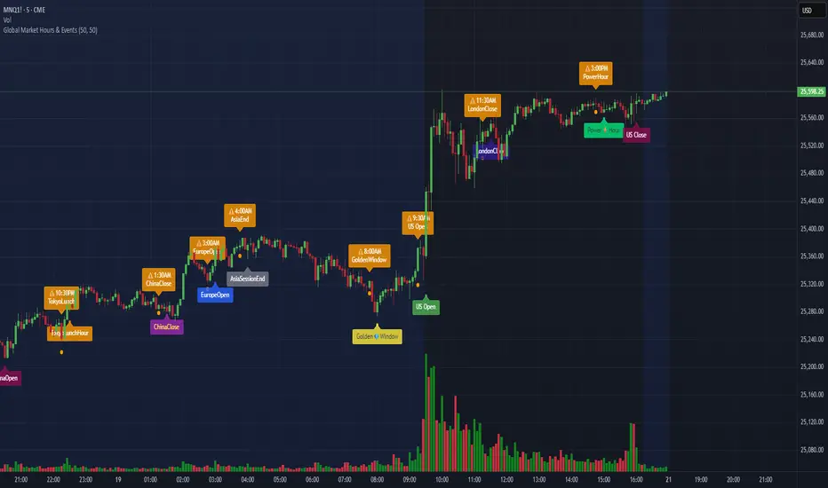
Market Sessions V2🔄 MAJOR UPDATE v2.0
✨ NEW FEATURES:
- Live Info Panel with session status, timer, range & change%
- Average range statistics (based on history period)
- Weekend mode highlighting (Fri US Close → Mon Asia Open)
- Pre-market & Post-market tracking for US session (table only)
- Auto/Manual session times with validation
🔧 IMPROVEMENTS:
- Accurate official exchange hours (TSE 09:00-15:30, LSE 08:00-16:30, NYSE 09:30-16:00, ASX 10:00-16:00)
- Automatic DST handling via native timezones
- Tokyo Lunch Break indicator (11:30-12:30 JST)
- Works on all timeframes with smart adaptation (boxes ≤4H, table always)
- Bar Replay compatible
🛡️ RELIABILITY:
- Input validation for manual time entries
- Graceful handling of higher timeframes
- Optimized memory management
📖 For Forex/Crypto traders: Sessions show continuous trading hours.
Tokyo lunch (11:30-12:30 JST) is indicated in table only.

Malama's Quantum Fusion Malama's Quantum Fusion is a unified trading system that integrates swing-based probability zones, multi-timeframe trend confirmation, and a reversal signal engine into a single indicator.
Originality & Concept: Unlike standard indicators that fire signals based on a single condition (like an RSI cross), this script uses a Weighted Superposition Model. It normalizes multiple independent data streams—Momentum, Volume, Trend, and Volatility—into a single 0-100% "Confidence Score." A signal is only generated when this score exceeds a statistical threshold, effectively filtering out false signals in choppy markets.
Underlying Calculations & Logic:
1. The "Probability Zone" Engine (The Context) The script calculates a dynamic probability score for every bar based on three weighted components:
Regime-Adjusted Oscillators: It calculates RSI (14) and MFI (14). Crucially, the script uses ADX to detect the market regime.
In Trends (ADX > 25): Oscillators are weighted for momentum (buying strength).
In Ranges (ADX < 20): Oscillators are weighted for mean reversion (buying oversold).
Wave Deviation: It measures the distance of price from a central 50-period EMA Wave. The further price deviates, the higher the "Reversion Probability" score.
Swing Pivots: It identifies local tops and bottoms (10-bar lookback). Proximity to these pivots adds to the Zone Score.
2. The Reversal Signal Engine (The Trigger) The "BUY" and "SELL" diamonds are not random; they require a strict confluence of events:
Candle Pattern: Price must close above the Fast EMA (9) while the Candle High > Previous High.
Trend Cloud: The move must align with the Dual-Supertrend Cloud (Fast Factor 1.5, Slow Factor 3.0).
3. Signal Filters (Safety Mechanisms) To prevent trading in poor conditions, the script applies five specific filters (customizable in settings):
Volume Spike Filter: Signals are blocked unless current Volume > (Average Volume * 1.5). This ensures institutional participation.
Chop Filter (ADX): Signals are blocked if ADX < 20, preventing trades during sideways "noise."
Risk Filter: Signals are blocked if the candle range (High - Low) exceeds a user-defined point threshold, preventing entries on overextended "exhaustion" candles.
Cloud Alignment: Trades must align with the Supertrend Cloud color (Green for Buys, Red for Sells).
Zone Proximity: Signals are only valid if price is within 2.0x ATR of a Key Support/Resistance Zone.
4. Multi-Timeframe (MTF) Trend Alignment To prevent trading against the dominant trend, the script pulls data from higher timeframes (e.g., Weekly trend for Daily charts) using non-repainting security calls. Signals are suppressed if they contradict the higher-timeframe Supertrend direction.
How to Use:
The Dashboard: Monitor the "Prob" (Probability) and "Conf" (Confidence) columns. A score > 75% indicates a high-probability reversal zone.
The Signal: Wait for a Diamond (◆) signal.
Green Diamond: Bullish Entry (Price broke resistance + Trend Aligned + High Probability Zone).
Red Diamond: Bearish Entry (Price broke support + Trend Aligned + High Probability Zone).
Risk Management: Use the dotted Stop Loss lines drawn at the recent Swing High/Low for trade invalidation.
Disclaimer: This script uses request.security for MTF data with lookahead=barmerge.lookahead_off to ensure no repainting occurs. All calculations are performed on confirmed closed bars.

SnR Fresh & Unfresh Level Detector by RWBTradeLabSnR Fresh & Unfresh Level Detector by RWBTradeLab
A clean, non-repainting Support/Resistance level tracker built for price action traders who want to see which levels are still “Fresh” vs “Unfresh” — based strictly on CLOSED candle behavior with breakout and rejection state changes + alerts.
What this indicator does
This script detects 4 SnR level types from 2-candle sequences (CLOSED candles only), then continuously updates each level’s status as Fresh ↔ Unfresh depending on market interaction.
Level Creation
All levels are created using 2 CLOSED candles only (no running candle logic):
A Level
Green → Red
Level = 1st Green candle Close
V Level
Red → Green
Level = 1st Red candle Close
Bullish Gap Level
Green → Green
Level = 1st Green candle Close
Bearish Gap Level
Red → Red
Level = 1st Red candle Close
When a level is created, it starts as: Fresh
Fresh vs Unfresh Logic (Dynamic, continuous process)
This indicator continuously updates the SAME level over time:
Fresh → Unfresh (Rejection)
A level becomes Unfresh when a candle touches the level (wick touch) but closes back on the opposite side (rejection confirmed).
Unfresh → Fresh (Breakout)
A level becomes Fresh again when a candle closes through the level (confirmed breakout).
✅ This means a level can change state multiple times:
Fresh → Unfresh → Fresh → Unfresh … (based on confirmed candle behavior)
Visuals on chart
Each detected level is drawn as a horizontal Ray extended to the right.
Labels are drawn in a clean centered-box style:
* Fresh Level label = Green background + White text
* Unfresh Level label = Red background + White text
Labels are placed at the start (creation candle) of the level, not in the middle.
Labels are automatically positioned above/below based on level type:
* A Level / Bearish Gap labels above
* V Level / Bullish Gap labels below
Alerts (bar-close only)
Built-in alerts trigger only on CONFIRMED candles:
* Fresh Created (new level created)
* Fresh → Unfresh (rejection confirmed)
* Unfresh → Fresh (breakout confirmed)
No repainting, no running-bar alerts.
Key settings
Candle Length (Closed bars only): Scans and keeps levels created within the last N closed candles (running candle excluded).
Default: 20 (Min 5 / Max 100)
Show Fresh Levels: On/Off
Show Unfresh Levels: On/Off
Show Text Labels: On/Off
Label Offset (ticks): Adjust label distance for a cleaner chart
Max Levels To Keep: Performance safety cap to prevent excessive objects
Non-repainting confirmation
All levels, state changes, and alerts are calculated on confirmed bars only.
No repainting, no running-bar signals.
Best use
Works on any market and timeframe. For higher reliability, combine with:
Higher timeframe structure
Supply & Demand zones
Trend context and liquidity sweeps
Confirmation candles around key levels
Disclaimer
This indicator is a level-detection and state-tracking tool, not financial advice. Trading involves risk; always use proper risk management and confirm levels with your own analysis.
Creator: RWBTradeLab
If you find this useful, please leave a like ⭐ and share your feedback.

Ash_TheTrader Algo : Smart Structure & Liquidity🚀 The "Code" to Market Structure: How to Find the Real Trend with "Ash_TheTrader Algo"
Why do 90% of traders fail? Because they try to catch falling knives instead of riding the wave.
They buy support in a downtrend. They sell resistance in an uptrend. They get crushed by the "Trend."
But seeing the real Market Structure in real-time is hard... until now.
I have engineered the Ash_TheTrader Algo to solve the biggest problem in trading: Directional Bias. It automates Institutional Market Structure (SMC) so you never trade against the flow of money again.
Here is how to use the "Structure & Zones" engine to trade like a pro.
---
🧠 THE ENGINE: How "Ash_TheTrader " Maps the Market
Retail traders look at price. Institutions look at Structure . This Algo visualizes the institutional roadmap:
1. The Roadmap (Smart Structure): It automatically detects BOS (Break of Structure) for trend continuation and CHoCH (Change of Character) for trend reversals. No more guessing if the trend has changed.
2. The Fortress (Smart Zones): It draws High-Timeframe (HTF) Supply & Demand zones. Crucially, these are Auto-Flipping —if a Supply Zone is broken, it turns into Demand instantly.
3. The Verification (Dashboard): It doesn't just show one timeframe. It checks if the LTF (Lower Timeframe) and HTF (Higher Timeframe) structures align.
---
📉 THE STRATEGY: The "Zone & Structure" Play
Stop taking random trades. Use this "Structure-First" checklist.
🟢 SETUP 1: The "Trend Continuation" Buy
Step 1: Check the Bias.
Look at the Dashboard. Is the HTF Trend 🟢 ? If yes, we are only looking for Buys. Do not fight the big money.
Step 2: The Pullback to the Wall.
Wait for price to drop into a Blue Zone (HTF Demand) or a Flipped Support Zone .
Patience is key. Let the price come to your fortress.
Step 3: The Structure Shift (The Trigger).
Once inside the zone, we need proof that buyers are stepping in.
▪️ Look for a Bullish CHoCH or BOS label to print.
▪️ Watch the Dashboard Pace turn Green (▲▲) .
👉 ENTRY: On the close of the candle that creates the BOS/CHoCH.
🛑 STOP LOSS: Below the recent Structural Low or the Blue Zone.
🎯 TAKE PROFIT: The next unmitigated Red Zone (Supply) or the Weak High.
---
🔴 SETUP 2: The "Structural Reversal" Sell
Step 1: Identify the Exhaustion.
Price rallies into a major Orange Zone (HTF Supply) . The Dashboard shows Pace is slowing down or hitting extreme exhaustion.
Step 2: The Break of the Floor.
Do not sell just because it touched the line. Wait for the algo to print a Bearish CHoCH .
This confirms that the uptrend structure has been broken and bears are in control.
Step 3: Dashboard Confirmation.
Check the Dashboard:
▪️ Is the LTF Trend flipping to Red? 🔴
▪️ Is the Volume validating the move?
👉 ENTRY: On the retest of the broken structure or immediately after the CHoCH.
🛑 STOP LOSS: Above the Structural High or the Orange Zone.
🎯 TAKE PROFIT: The next Blue Zone (Demand) or Weak Low.
---
⚡ PRO TIPS: MASTERING THE ZONES
▪️ The "Zone Flip" is Powerful: If price smashes through an Orange Supply Zone with a strong BOS , that zone will turn Blue . This "Flip" is often the highest probability entry for a retest trade.
▪️ Full Alignment = Full Risk: When the Dashboard shows HTF 🟢 AND LTF 🟢 , you have "Full Alignment." These are your A+ setups. Increase confidence here.
▪️ Don't ignore the Sweeps: Even when trading structure, keep an eye on the Sweep 🧹 labels. A Sweep of a low followed by a CHoCH is the strongest reversal signal in existence.
---
📥 HOW TO START
Market Structure is the language of the banks. This tool translates it for you.
1. Add "Ash_TheTrader Algo : Smart Structure & Liquidity" to your chart.
2. Go to Settings -> Visuals. Ensure "Show BOS / CHoCH" and "Show HTF Zones" are ON.
3. Study the Flow: Look at how price respects the Blue/Orange zones. Notice how the Trend colors on the Dashboard predict the next leg.
Stop guessing the direction. Let the Structure guide you.
Trade Smart, Stay Disciplined.
~ @Ash_TheTrader

Market Acceptance Envelope [Interakktive]The Market Acceptance Envelope (MAE) is a diagnostic tool that shows where price statistically belongs — not where it might go. Unlike traditional bands that expand with volatility, MAE expands with acceptance: regions where price rotates comfortably, efficiency drops, and the market agrees on fair value.
This is the anti-Bollinger thesis: bands should represent where price IS accepted, not where it MIGHT reach based on standard deviation.
█ USAGE
The filled corridor represents the current acceptance zone — where price has demonstrated rotational behavior with low directional efficiency. When price is inside the corridor, it's "home." When outside, it's exploring territory the market hasn't yet accepted.
For discretionary traders, MAE provides instant context: "Is price where it belongs, or is it extended?"
For systematic traders, the exported values (confidence, asymmetry, position) can inform position sizing and filter logic.
█ ACCEPTANCE CENTROID
Unlike traditional bands centered on a moving average, MAE uses an Acceptance Centroid — a time-weighted price level where acceptance behavior concentrates. The centroid is calculated by weighting price by:
• Inverse efficiency (low efficiency = high acceptance)
• Volatility stability (stable vol = higher weight)
• Dwell factor (time spent near level)
This means the centroid drifts toward where price actually rotates, not simply where it averages.
█ ASYMMETRIC BOUNDARIES
MAE calculates upper and lower boundaries independently. Markets rarely treat up and down equally — during uptrends, the upper boundary may be wider (more accepted upside exploration), while the lower boundary stays tight (quick rejection of dips).
This asymmetry is visible on the chart and exported as a metric (-1 to +1).
█ CONFIDENCE-BASED VISIBILITY
The corridor's opacity reflects acceptance confidence:
• High confidence → clearly visible corridor (price is in accepted rotation)
• Low confidence → faded corridor (trending/directional market, acceptance not established)
When the corridor fades, it's telling you: "Acceptance hasn't been earned here yet."
█ WHAT THIS INDICATOR IS
• A diagnostic acceptance envelope showing where price statistically belongs
• Asymmetric by design — upper and lower calculated independently
• Confidence-weighted visibility — fades when acceptance is not earned
• Non-repainting — uses closed-bar data only
█ WHAT THIS INDICATOR IS NOT
• NOT Bollinger Bands (no standard deviation around a mean)
• NOT Keltner Channels (no ATR-scaled envelope)
• NOT a signal generator — no touches = signals philosophy
• NO arrows, NO entries/exits, NO buy/sell recommendations
█ HOW IT WORKS
MAE uses an acceptance-weighted calculation approach:
1. ACCEPTANCE WEIGHT
Each bar receives a weight based on:
• Efficiency: (1 - efficiency) — low efficiency = rotational = high acceptance
• Volatility Stability: stable vol environment = higher weight
• Dwell Factor: price staying near central tendency = higher weight
2. ACCEPTANCE CENTROID
Weighted average of price using acceptance weights:
centroid = Σ(price × weight) / Σ(weight)
Smoothed adaptively — faster during drift, slower when stable.
3. ASYMMETRIC BOUNDARIES
Upper and lower distances calculated separately:
• rngUp = acceptance-weighted average of (price - centroid) when price > centroid
• rngDn = acceptance-weighted average of (centroid - price) when price < centroid
4. CONFIDENCE SCORE
Composite of average acceptance weight, volatility stability, and centroid stability.
Maps to corridor opacity: high confidence = visible, low confidence = faded.
█ SETTINGS
Market Acceptance Envelope — Core
• Acceptance Lookback (20): Bars to evaluate for acceptance conditions. Higher = smoother, slower response.
• Preset (Swing): Scalper = tight/fast, Swing = balanced, Position = wide/stable.
• Envelope Sensitivity (1.0): Width multiplier. Higher = wider corridor.
Market Acceptance Envelope — Visuals
• Show Corridor (true): Display the acceptance corridor.
• Show Centroid (false): Display the acceptance centroid line.
Market Acceptance Envelope — Data Window
• Show Data Window Values (false): Export MAE metrics for external use.
█ EXPORTED VALUES
When Data Window is enabled:
• mae_upper: Upper boundary value
• mae_lower: Lower boundary value
• mae_centroid: Acceptance centroid value
• mae_width: Corridor width (upper - lower)
• mae_asymmetry: Asymmetry ratio (-1 to +1, negative = lower wider)
• mae_confidence: Acceptance confidence (0-100)
• mae_position: Price position (-1 = below, 0 = inside, +1 = above)
█ SUITABLE MARKETS
Works on all markets: Stocks, Futures, Forex, Crypto, Indices.
Works on all timeframes. Higher timeframes show more stable acceptance zones.
█ DISCLAIMER
This indicator is for educational and informational purposes only. It does not constitute financial advice. Past performance does not guarantee future results. Always conduct your own analysis and use proper risk management. This is a diagnostic tool — it provides context, not signals.

Market State Intelligence [Interakktive]Market State Intelligence (MSI) is a diagnostic market-context indicator that reveals how the market is behaving — not where price "should" go.
MSI does not generate buy/sell signals. Instead, it classifies market conditions into clear behavioural regimes by continuously measuring:
- DRIVE (directional effort)
- OPPOSITION (absorption / resistance)
- STABILITY (structural persistence)
MSI is designed to answer three practical questions:
- What state is the market in right now?
- Is energy building, releasing, or decaying?
- Is participation aligned with price, or opposing it?
█ WHAT MSI DOES
MSI operates as a real-time regime classification engine that processes each closed bar through three independent measurement systems:
DRIVE — Directional Effort (0–100)
- Displacement efficiency (net progress vs total path)
- Range expansion quality (actual range vs expected ATR range)
- Body dominance (body vs candle range)
OPPOSITION — Absorption / Resistance (0–100)
- Wick pressure (rejection relative to attempt)
- Effort–result gap (high effort, low progress)
- Reversal density (counter-moves frequency)
STABILITY — Persistence (0–100)
- Condition persistence (how long conditions hold)
- Variance score (flip frequency)
- Follow-through consistency (reaction continuity)
These three forces feed a deterministic classifier with hysteresis (anti-flicker) to identify five regimes:
COMPRESSION — low drive, low opposition, higher stability (pressure building, direction unclear)
EXPANSION — high drive, low opposition (directional energy release)
TREND — medium-high drive, higher stability, low-medium opposition (healthy continuation)
DISTRIBUTION — medium drive, high opposition (effort absorbed; progress blocked)
TRANSITION — rapidly rising opposition, low stability (regime breakdown / uncertainty)
█ WHAT MSI DOES NOT DO
- No buy/sell signals, entries/exits, or performance claims
- No prediction of future direction
- No repainting: calculations use closed-bar data only
MSI is a market state layer intended to support your execution framework.
█ VISUAL SYSTEM
MSI uses a layered visual grammar designed to remain readable on live charts:
Regime Ribbon
A thin horizontal band showing the current regime via colour. Ribbon opacity reflects regime confidence (stronger confidence = more visible).
Pressure Envelope (core visual)
A soft corridor around price that expands with Drive and becomes more visible as Opposition increases. This visualises "pressure thickness" around current action (not a volatility band for entries).
Structural Memory
Faint background stains appear where regimes previously failed (e.g., expansion collapsing into absorption). These are behavioural context zones showing where market intention was rejected — not support/resistance.
Regime Change Markers (optional)
Subtle labels appear when regimes transition after confirmation. Useful for replay and education.
Effort Halo (optional)
Candle highlighting when Opposition materially exceeds Drive, indicating absorption/inefficiency.
█ HUD PANEL
The HUD displays:
- Current regime name + colour indicator
- A context gate showing whether conditions are aligned with long-bias or short-bias context (not an entry/exit system)
█ REGIME LEGEND
When enabled, displays:
- A one-line definition of the current regime
- Live Drive / Opposition / Stability values for interpretation
█ TIME-TO-DECISION METER
A visual pressure gauge that tends to fill during Compression (energy building) and drain during Expansion (energy releasing). It is a state-tracking meter, not a timing tool.
█ SETTINGS
MSI — Settings
- Preset Mode: Scalper / Swing / Position
- Analysis Mode (Minimal): ON = subtle visuals, OFF = full intensity
- Regime Ribbon, Structural Memory, HUD Panel, Time-to-Decision Meter, Effort Halo
MSI — Visual Options
- Show Regime Changes: Labels when regime transitions occur
- Show Regime Legend: Definition and live values display
- Panel Position: Move the entire panel anywhere on chart
MSI — Advanced (Tuning)
- Sensitivity (0.5–2.0)
- Smoothing (0.5–2.0)
- Memory Decay (0.5–2.0)
- Visual Intensity (Low / Medium / High)
█ PRESETS EXPLAINED
Scalper
Higher sensitivity + lower smoothing + faster memory decay. Best for 1m–15m monitoring.
Swing (default)
Balanced behaviour. Best for 15m–4H analysis.
Position
Lower sensitivity + higher smoothing + slower memory decay. Best for 4H–1D macro context.
█ STRUCTURAL MEMORY
When a regime fails (example: Expansion → Distribution), MSI creates a memory imprint:
- Fixed stain window (preset dependent)
- Strength decays over time
- Limited to a maximum number of imprints to reduce chart clutter
These zones represent behavioural rejection, not levels.
█ SUITABLE MARKETS
MSI is designed for Forex, Crypto, Indices, Stocks, and Commodities.
Works from intraday to Daily, with particularly strong readability on 15m–4H.
█ DISCLAIMER
This indicator is for educational and informational purposes only. It does not constitute financial advice, trading recommendations, or solicitation. Trading involves substantial risk. Always use proper risk management and make independent decisions.

BUY/SELL Multi-Factor Decision Engine (v8) WebhookBUY / SELL Multi-Factor Decision Engine (v8) — Webhook
Important Notice
This indicator is not financial advice, does not guarantee results, and does not eliminate losses.
It is not a bot, not an oracle, and does not replace experience, risk management, or human judgment.
It is a tool for reading, filtering, and organizing market information.
1. What is this indicator?
BUY / SELL Multi-Factor Decision Engine (v8) — Webhook is a technical analysis indicator that:
analyzes multiple indicators at the same time,
evaluates structure, momentum, pressure, and context,
generates BUY / SELL signals when sufficient intent exists,
displays two state semaphores (BAS and CTX),
concentrates complex information into a compact panel,
is highly configurable from the settings panel (almost the entire indicator is configurable, including parameters, thresholds, profiles, and tolerances, allowing significant modification of the indicator’s behavior),
can generate alerts and signals via Webhook.
It does not execute trades.
It does not promise consistent wins.
It does not eliminate risk.
2. What does it actually do?
This indicator does NOT work with simple rules such as:
“RSI above X = buy”
“Moving average crossover = entry”
It also does not wait for everything to be perfect at the same time.
It works as follows:
It evaluates market intent using several indicators simultaneously.
It builds a LONG probability and a SHORT probability.
Intent may exist even if some indicators are neutral.
When intent exceeds a minimum configurable threshold, a BUY or SELL is generated internally.
That signal is only shown if the market is moving enough (ATR filter).
Important note:
ATR does NOT participate in the BUY / SELL decision.
ATR only decides whether existing intent:
is shown on screen,
triggers an alert,
or is sent via Webhook.
In parallel, risk context (CTX) is evaluated and displayed as a warning.
CTX does not participate in the BUY / SELL decision; it only informs about risk.
All analyzed information (EMAs, MACD, RSI, CMF, ADX/DI, BBP, SMC, candles, patterns, sweeps, EQs) is displayed in a compact panel, including the direction they appear to indicate.
BUY / SELL is not an order; it is a visual synthesis of a complex reading.
3. Market Intent (main engine)
This is where BUY or SELL is born.
Intent is calculated using classic indicators, but they are not read as textbook values, rather as behavior.
The engine does not ask:
“Is it above or below X?”
It asks things like:
Is the market pushing or losing strength?
Is momentum accelerating or exhausting?
Is there real pressure or just a bounce?
Does structure support or contradict the move?
Because of this, the indicator may:
anticipate classic signals,
maintain intent while something is neutral,
fail,
arrive early or late.
This is normal in any probabilistic system.
Nothing in the market is certain.
BUY and SELL signals:
are not orders,
are not imperative instructions,
must not be interpreted as mandatory entries or exits,
and do not replace market reading or the trader’s own analysis.
BUY / SELL is:
a visual synthesis of a complex reading,
a probabilistic representation of intent,
a decision-support tool,
not a mandate or a guarantee.
4. Indicators that form intent (interpretation and weight)
The intent engine works on an accumulated score.
Each indicator adds evidence, not orders.
EMAs — weight: 2 points
Measure structure and dynamic direction.
Evaluates:
slope,
speed,
relationship between them.
LONG intent may exist before a classic crossover.
MACD — weight: 2 points
Measures momentum and acceleration.
Not used as a “magic crossover”.
Evaluates:
whether momentum accelerates or weakens,
whether it accompanies price.
RSI — weight: 1 point
Not used as overbought/oversold.
Interpreted as:
direction of pressure,
gain or loss of relative strength.
CMF (Chaikin Money Flow) — weight: 1 point
Evaluates money flow.
Helps distinguish:
supported moves,
empty moves.
ADX + DI — weight: 2 points
Evaluates:
whether there is real trend,
who dominates (buyers or sellers),
whether the move has a foundation.
BBP (Bull/Bear Power) — weight: 1 point
Evaluates buying vs selling pressure.
Helps detect:
control,
exhaustion.
SMC (BOS / CHOCH) — weight: 3 points
Evaluates market structure:
continuity (BOS),
change of character (CHOCH).
Not decorative.
It has the highest individual weight in the engine.
Important:
Bias does not have a 3-point weight.
SMC only adds 3 points when a BOS or CHOCH event appears in the panel.
While only Bias is present, it adds 0 points, because there is no event.
Therefore, the intent threshold depends on the other indicators until a BOS or CHOCH occurs.
Important
The engine does not require unanimity.
It requires sufficient intent (sum of points ≥ configured threshold).
5. BAS Semaphore (intent state)
The BAS semaphore summarizes the state of the intent engine:
🟢 Green → solid intent
🟡 Yellow → weak or transitioning intent
🔴 Red → deteriorated or risky intent
BAS:
is linked to BUY / SELL,
reflects intent quality,
does not automatically cancel a signal.
It helps evaluate trade health, not blind obedience.
6. Operability (ATR Gates)
ATR:
does NOT generate BUY or SELL,
does NOT decide direction.
ATR only answers:
Is the market moving enough for this intent to be operational?
Therefore intent may:
exist,
but not be shown,
not trigger alerts,
not be sent via Webhook.
This avoids:
trading dead ranges,
signal spam,
micro-moves without continuity.
ATR Profiles (timeframe)
Included ATR profiles:
Scalp (2m / 5m)
Intraday (15m / 30m)
Swing (1H – 4H)
Position (1D / 1W / 1M / 3M)
STANDARD (editable)
Profiles only adjust operability filtering.
They do not change direction or the intent engine.
Recommendation:
Use the profile matching your timeframe or edit STANDARD according to your criteria.
7. Engine Profiles
The indicator also includes Engine profiles.
The Engine STANDARD is editable by the user.
Predefined Engine profiles are NOT editable.
They are calibrated as coherent parameter sets.
This avoids common mistakes such as:
scalping EMAs with swing RSI,
mixing incompatible indicator ranges.
Modifying fixed profiles breaks internal coherence.
8. Context (CTX)
Context does NOT participate in BUY / SELL decisions.
It adds no points.
It subtracts no points.
It does not block signals.
It warns about risk.
Evaluates, among other things:
liquidity sweeps,
Equal Highs / Equal Lows (EQ),
candle types,
chart patterns (forming or confirmed).
CTX semaphore:
🟢 relatively clean environment
🟡 transition / caution
🔴 high-risk environment
A BUY with red CTX is not invalid, but riskier.
In CTX, fewer marks is generally better.
9. What is shown on screen
The indicator can show:
BUY / SELL
Compact panel with:
BAS
CTX
indicator readings
L / S labels on the chart
Labels:
L → Long
S → Short
10. Abbreviations (panel key)
Candles
Doji → Doji
LLDoji → Long-legged Doji
Eng → Engulfing
Maru → Dominant no-wick candle
Hammer → Hammer
InvHam → Inverted Hammer
Shoot → Shooting Star
Hang → Hanging Man
BD Slot (strength / indecision)
DD → strong indecision
D → indecision
BE↑ / BE↓ → bullish / bearish engulfing
B↑ / B↓ → dominant candle
Chart Patterns
H&S → Head & Shoulders
iH&S → Inverse H&S
DT / DB → Double Top / Bottom
RWdg / FWdg → Rising / Falling Wedge
RChnl / FChnl → Rising / Falling Channel
SymTri / AscTri / DescTri → Triangles
Comp → Compression
Stage:
F → Forming
C → Confirmed
11. Configuration (very important)
Parameters are not decorative.
Modifying:
EMAs
RSI
MACD
CMF
ADX / DI
BBP
ATR
intent threshold
profiles
context tolerances
changes the real behavior of the engine.
Important:
Adjusting a single parameter in isolation is generally not recommended.
If one value changes, the set should usually be adjusted to avoid incompatible ranges.
Example:
EMA 10/20 ≠ EMA 15/30 ≠ EMA 10/50
Same applies to all indicators.
12. BUY / SELL, Alerts and Webhook
The indicator does not execute trades.
It is used to:
trade manually,
receive alerts,
send signals to Telegram or other systems,
automate only if the user builds their own bot.
The indicator only sends structured information.
Execution is:
external,
user-decided,
user-responsibility.
13. How I use it (creator’s criteria)
I do not rely solely on the indicator, and no one should.
I still read:
each individual indicator,
candle patterns,
chart patterns,
sweeps,
EQs,
structure and overall context.
The indicator does not replace my reading — it confirms it.
I use it to:
consolidate scattered information,
decide faster,
reduce visual noise,
avoid impulsive entries.
It is support, not a substitute for judgment.
DISCLAIMER
Important Notice – read carefully
As stated throughout this document, BUY / SELL Multi-Factor Decision Engine (v8) — Webhook is a technical analysis tool and does not constitute financial advice, investment recommendations, or a guarantee of results.
This indicator:
does not predict the future,
does not guarantee profits,
does not eliminate losses,
does not reduce market risk,
and does not replace experience, human judgment, risk management, or the learning curve required to trade.
BUY / SELL Multi-Factor Decision Engine:
is not a bot,
is not an automated system,
is not an oracle,
does not execute trades,
and does not make decisions for the user.
BUY and SELL signals:
are not orders,
are not imperative instructions,
must not be interpreted as mandatory entries or exits,
and do not replace market reading or personal analysis.
BUY / SELL is:
a visual synthesis of a complex reading,
a probabilistic representation of intent,
a decision-support tool,
not a mandate or a guarantee.
Nature of the indicator and the market
This indicator reads information, not outcomes.
It interprets what the market — and specifically TradingView — shows at each moment: indicators, structure, patterns, candles, sweeps, EQs, momentum, and context.
That a LONG or SHORT intent forms, a BUY or SELL signal triggers, and the market later does not move in that direction does not mean the indicator failed.
This happens because:
the market may show intent and later invalidate it,
new orders may enter,
liquidity may change,
context may deteriorate.
This is exactly why even very experienced traders lose trades.
The indicator always interprets information the same way, but it has no more information than what is publicly available.
It does not see the future, hidden orders, or external events.
A failed signal is not an indicator error — it is the probabilistic and uncertain nature of the market.
Parameter configuration
Users may modify parameters, thresholds, profiles, and tolerances.
Doing so changes the actual behavior of the engine, not just appearance.
Modifying a single parameter in isolation is generally not recommended.
Changing one value often requires adjusting the whole set to avoid incoherent ranges.
The intent-based logic does not change, but results can be altered if ranges are modified inconsistently.
Alerts and Webhook usage
This indicator can generate alerts and send signals via Webhook to external systems (bots, servers, messaging platforms, execution systems).
The Webhook only transmits information generated when internal conditions are met.
The indicator does not execute trades, control external systems, or validate user actions.
Any automation, bot, script, server, or system receiving these signals:
is external to the indicator,
is built, configured, and operated by the user,
and operates under the user’s full responsibility.
The creator is not responsible for:
automated executions,
programming errors in external bots or scripts,
connectivity failures,
duplicate orders,
delays,
losses derived from automation,
or decisions made from Webhook signals.
Using Webhook does not turn this indicator into a bot or automated system.
Webhook is only a communication channel.
Final Statement
Neither this indicator, nor any other indicator, nor any bot:
predicts the future,
guarantees profits,
or prevents losses.
Anyone claiming otherwise is lying.
This indicator is designed as a support tool to:
organize information,
reduce noise,
improve market reading,
and help make more conscious decisions,
not to eliminate risk or replace human judgment.
The creator of BUY / SELL Multi-Factor Decision Engine (v8) — Webhook assumes no responsibility for any loss, economic damage, financial harm, or negative consequence resulting from the use of this indicator.
This includes, but is not limited to, use:
manual,
semi-automated,
automated,
via alerts,
via Webhook,
via bots, scripts, servers, APIs, or any external system.
Any decision made using this indicator:
is solely the user’s responsibility,
made under their own judgment,
and at their own risk.
Using this indicator implies explicit acceptance that:
trading involves risk,
losses are possible,
and the creator assumes no direct or indirect liability for adverse results, misinterpretation, incorrect execution, faulty automation, or trading decisions.

[uPaSKaL] Adaptive Swing StructureOverview :
Adaptive Swing Structure identifies and labels swing structure using HH / HL / LH / LL and can optionally draw wave connectors between successive swing points.
The goal is to provide a clean, practical view of market structure that remains readable across different market conditions.
Instead of relying only on a classic fixed-window pivot scan (left/right bars), this indicator uses an adaptive swing-detection approach designed to better match how traders visually interpret legs and structure.
Why this approach (vs. a simple pivot scan)?
Classic pivot scans (e.g., “pivot high/low with left/right bars”) are simple and widely used, but they often have practical limitations:
They depend heavily on a fixed window size (too sensitive in chop, too slow in trends)
They can mark pivots that are locally valid but not always representative of the broader leg
They may produce frequent structure changes during ranges, reducing readability
What you get with this indicator
A more stable swing structure view that adapts to price movement
Cleaner HH / HL / LH / LL labeling for context and decision-making
Optional wave connectors to visually follow the swing path
Visual comparison:
The screenshots below illustrate the difference in how structure can appear when using a classic pivot scan versus Adaptive Swing Structure.
Classic Pivot Points (High / Low):
Adaptive Swing Structure (This Indicator):
How to read the labels
This indicator labels swing structure using the standard notation:
HH = Higher High
HL = Higher Low
LH = Lower High
LL = Lower Low
How to interpret Wave Lines
When enabled, wave lines connect successive swing points to help you visually track the current swing path and structural transitions.
Inputs guide
Tracer Line Len
Main sensitivity control. Adjust this to fit the instrument and timeframe.
Higher values → fewer swing points, smoother structure (macro view)
Lower values → more swing points, more detail (micro view)
Show Wick (High / Low) Line
Shows the wick-based tracer (visual reference).
More sensitive to extremes and wick behavior
Useful when wicks matter (liquidity spikes / stop-runs)
Show Body (Open / Close) Line
Shows the body-based tracer (visual reference).
Filters wick noise and often looks smoother
Useful when you prefer structure based on candle bodies
Show Slope Flip Labels
Shows small markers that highlight swing turning moments (study/verification).
Helpful for understanding where structure updates
Optional and can be disabled for a cleaner chart
Wave Labels (WICK)
Shows HH/HL/LH/LL labels using wick-based swings.
More responsive to wick extremes
Wave Lines (WICK)
Connects wick-based swing points with wave lines.
Improves visual continuity of swings
Wave Labels (BODY)
Shows HH/HL/LH/LL labels using body-based swings.
Typically smoother and less sensitive to wick spikes
Wave Lines (BODY)
Connects body-based swing points with wave lines.
Cleaner wave path for body-based structure
Max Wave Labels Kept (per Wick / Body)
Limits the number of labels kept on the chart (older ones are removed first).
Reduces clutter
Helps maintain performance
Max Wave Lines Kept (per Wick / Body)
Limits the number of wave lines kept on the chart (older ones are removed first).
Keeps the chart readable
Helps maintain performance
History Window (map size / scan clamp)
Performance / stability control for how much recent history is considered.
Higher values → more history considered, higher CPU usage
Lower values → lighter execution, structure limited to more recent swings
Usage / Tuning
1) Find “your number” for each market
There is no universal best setting. The optimal Tracer Line Len depends on:
Instrument volatility
Your trading timeframe
Whether you want micro structure or macro structure
2) Build a simple baseline
Choose your chart timeframe (e.g., 4H).
Start with a moderate Len (e.g., 10–30).
Increase or decrease Len until the swing structure matches how you would manually map it.
3) Practical “timeframe scaling” intuition
You can use Len to “zoom out” or “zoom in” structure without changing your chart timeframe.
Example on 4H :
If Len = 20 produces the swing structure you want for 4H decisions, keep it as your baseline.
If you increase it to something like Len = 120 , the structure becomes much smoother and swing points appear less frequently.
This means:
4H with a smaller Len → focuses on 4H-level swings (more detail).
4H with a much larger Len → filters many local swings and highlights broader legs (more “higher-timeframe-like” context).
This is not a strict mathematical replacement for switching timeframes, but it is a practical and effective way to compress or expand structure density on the same chart.
4) Wick vs Body (which one to choose?)
WICK : Choose when extreme wicks matter to your reading of structure.
BODY : Choose when you want smoother structure and less sensitivity to wick spikes.
5) Suggested workflow for active traders
Use one preset for local structure (entries / short-term decisions).
Use a second preset with a larger Len for higher-level context (major swings / directional bias).

ORACLE v13: The Gamified Market HUDORACLE v13 is not just an indicator; it is a complete Trading HUD (Heads-Up Display) that translates complex market data into an intuitive, video-game-style interface. It turns abstract concepts like "volatility" and "support/resistance" into actionable game mechanics, allowing you to react faster and trade smarter.
⚔️ Key Features:
🛡️ Boss & Shield Mechanics (Support/Resistance):
Automatic detection of key levels visualized as "Bosses" (Resistance) and "Shields" (Support).
HP System: Watch price "damage" these levels in real-time. When "Boss HP" hits zero, a breakout is imminent.
🔮 The Bestiary (Market Conditions):
Instantly identifies the "Enemy Type" you are fighting:
🟢 SLIME: Squeeze zone (low volatility, prepare for a move).
👺 GOBLIN: Chop/Noise (high risk, avoid trading).
🐉 DRAGON: Strong Trend (ride the momentum).
👹 BERSERKER: Extreme Volatility (proceed with caution).
📈 Live Structure Mapping:
Real-time ZigZag overlays with automatic HH/LL/LH/HL labels.
Breakout Flash: Candles flash WHITE instantly when major structure or Boss levels are broken.
🎮 Combat Stats:
Combo Counter: Tracks consecutive directional candles.
Aggro Meter: Visualizes volume intensity.
Loot Drop Rate: innovative metric calculating the probability of a profitable move based on current ATR.
Momentum Bar: RPG-style health bar for trend strength.
Why use ORACLE? Most indicators just draw lines. ORACLE gives you Context. It tells you exactly what kind of market environment you are in so you never bring a knife to a Dragon fight. Perfect for scalpers and day traders who need instant situational awareness.
Settings: Fully customizable Lookback periods, ZigZag sensitivity, and Visual Themes.

VLB Cycle Market ToolThe VLB Dynamic Levels Tool provides a visual framework for observing price structure on XAUUSD.
It displays automatically generated levels based on a rules-based approach, allowing traders to study how price interacts with important reference areas on the chart.
The tool updates dynamically as market structure evolves, reflecting changes in price movement without requiring manual redrawing.
Its purpose is to offer a clear, consistent layout of structural levels that users can incorporate into their own market analysis.
Features:
Automatically displayed structural reference levels
Dynamic recalculation as new highs and lows form
Neutral, non-predictive visual layout
A consistent framework for studying price behavior
This tool does not generate trading signals or provide predictive information.
It simply organizes price structure into visual reference points that may assist users in their independent chart analysis.
Traders remain fully responsible for their own interpretation, timing, and risk management.
The VLB Dynamic Levels Tool is intended for those who prefer a clean and adaptable way to observe XAUUSD structure throughout changing market conditions.

VLB Dynamic Market Structure ToolAdaptive Structural Continuation Framework for XAUUSD
The VLB Dynamic Market Structure Tool is a proprietary, rules-driven market structure framework designed specifically to analyze price continuation behavior in XAUUSD under live market conditions.
This tool does not plot static support and resistance.
Instead, it provides a continuously adapting structural model that reorganizes itself around current price, allowing traders to observe acceptance, rejection, and expansion behavior between key structural zones.
Core Conceptual Foundation
The framework is built on three integrated components that work together as a single methodology:
1. Dynamic Price-Anchored Structural Range
Unlike traditional indicators that rely on fixed historical levels, this tool anchors its entire structural range to live market price.
As price migrates:
Levels that are no longer relevant are automatically removed
New forward-relevant levels are introduced
The framework re-centers itself around active price action
This ensures that the trader is always viewing current, actionable structure, without manual redrawing or chart repositioning.
2. Evenly Spaced Structural Reference Levels
Within the dynamically anchored range, price is organized into consistent structural intervals that frequently act as transition points in XAUUSD price behavior.
These levels serve as objective reference boundaries, allowing traders to:
Compare reactions across identical structural distances
Observe recurring price behavior in a normalized framework
Maintain consistency across different sessions and market conditions
The levels are contextual, not predictive.
3. Post-Break Acceptance & Expansion Zones
The framework distinguishes between:
Initial structural breaks that fail or retrace
Confirmed acceptance beyond a defined offset from the level
Expansion phases as price transitions toward the next structural interval
By visualizing this sequence, the tool allows traders to study continuation behavior only after confirmation, rather than reacting to first-touch or initial breakouts.
Adaptive Behavior (Why This Is Not Static S&R)
A defining feature of the VLB Dynamic Levels Tool is its continuous recalculation and real-time adaptation:
The visible structure evolves with price
The framework moves up or down as market conditions change
Historical clutter is intentionally removed to preserve clarity
The trader’s focus remains on the active trading environment
This adaptive behavior is integral to the methodology and cannot be replicated through manual drawing or static indicators.
Intended Use
This tool is designed for discretionary traders who:
Study market structure, acceptance, and momentum
Prefer confirmation-based continuation frameworks
Value rule-based consistency over subjective interpretation
Combine structural context with their own execution, fundamentals, and risk management
The indicator does not generate automated buy or sell signals and does not execute trades.
Important Disclosures
No performance or outcome is guaranteed
No predictive claims are made
All trading decisions remain the responsibility of the user
Summary
The VLB Dynamic Levels Tool provides a self-adjusting, structurally consistent framework for observing how XAUUSD price transitions between key zones in real time.
Its proprietary value lies in the integration of dynamic price anchoring, structural normalization, and post-break acceptance visualization, offering a methodical way to study continuation behavior in changing market conditions.
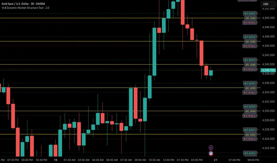
Simple ATR Volatility Context v1.0This indicator provides a simple visual view of market volatility using ATR expressed as a percentage of price. It is designed to help identify when a market transitions from low-activity (compression) to higher-activity (expansion).
What it does
Calculates ATR as a percentage of price
Highlights the chart when volatility exceeds a user-defined threshold
Helps distinguish between quiet markets and trade-worthy conditions
How to use it
Green background indicates elevated volatility
Neutral / muted background indicates low volatility
Use alongside your own trend, structure, or entry tools
What this is not
Not a buy or sell signal
Not predictive
No performance claims
This tool is intended for market context and awareness, not standalone trading decisions.

Infinity Algo Dashboard█ OVERVIEW
Infinity Algo Dashboard combines 4 powerful modules into one clean overlay: Multi-Timeframe Analysis, Order Blocks, Market Structure (BOS/CHoCH), and Adaptive Cloud Bands.
Monitor 8 timeframes simultaneously, spot supply/demand zones with volume metrics, track structure shifts in real-time, and assess volatility — all without cluttering your chart.
Includes 16+ built-in alert conditions and 17 color themes.
█ KEY FEATURES
✅ Multi-Timeframe Dashboard (8 TFs) — trend + volatility at a glance
✅ Algorithmic Order Blocks / Supply & Demand Zones with volume analysis
✅ Market Structure Labels (BOS / CHoCH) for regime detection
✅ Adaptive Cloud Bands for dynamic support/resistance
✅ 16+ Built-in Alert Conditions for automation
✅ 17 Color Themes including colorblind-friendly options
✅ Designed for crypto, forex, stocks, indices, and commodities
█ WHAT MAKES THIS INDICATOR DIFFERENT
📊 Multi-Timeframe Analysis
Most MTF dashboards just show moving average direction. This one shows trend state + volatility regime + volatility trend across 8 timeframes simultaneously. Spot alignment instantly.
🧱 Smart Order Blocks
Not just rectangles on a chart. These zones include volume metrics (Buy/Sell split), midlines, break detection, and automatic pruning of invalid zones.
📐 Market Structure That Makes Sense
BOS (Break of Structure) and CHoCH (Change of Character) labels derived from actual swing highs/lows — not arbitrary price levels.
☁️ Adaptive Cloud Bands
Volatility-aware envelope that auto-adjusts its period based on your timeframe. Expands in trending markets, contracts in consolidation.
█ MODULES EXPLAINED
1) Multi-Timeframe Dashboard
Monitors up to 8 user-selected timeframes simultaneously
Trend State: Bullish / Bearish / Overbought / Oversold
Volatility State: High / Low / Normal
Volatility Trend: Rising / Falling / Stable
Two visual styles: Pro Neutral (clean) or Semantic Heatmap (color-coded)
AVG row shows overall market bias across all timeframes
2) Order Blocks / Buy-Sell Zones
Algorithmic detection of swing-based supply/demand zones
Volume Metrics: Total volume + Buy/Sell % split inside each zone
Midline: Key level within the zone for precision entries
Break Labels: "Break Up" / "Break Down" when zones are invalidated
Exit Markers: Signals when price leaves a zone (Close or Wick trigger)
Smart Filtering: Show nearest only, hide overlaps, limit history
3) Market Structure (BOS/CHoCH)
BOS (Break of Structure): Trend continuation signal — confirms momentum
CHoCH (Change of Character): Early reversal warning — first sign of regime shift
Derived from pivot highs/lows using configurable sensitivity
Optional candle coloring based on structure bias
4) Cloud Bands (Adaptive Envelope)
Smoothed, volatility-aware channel (Keltner-style with enhancements)
Auto Mode: Period adjusts automatically based on your chart timeframe
Manual Mode: Set your own period for full control
Dynamic midline for trend bias assessment
Edge dots highlight when price touches band boundaries
Great for identifying breakouts vs. mean-reversion setups
█ USE CASES
📈 Trend Confirmation
Check the MTF Dashboard for alignment. When 6+ timeframes agree (Strong Bullish/Bearish), you have confluence. Use Order Blocks as entry zones in the direction of the trend.
📉 Reversal Hunting
Watch for CHoCH labels — they signal potential regime change before the crowd sees it. Combine with Order Blocks for well-defined reversal entries.
🎯 Precision Entries
Use Order Block midlines as entry targets. When price retraces to the midline of an unbroken zone aligned with higher-TF bias, you have a more selective setup.
⚡ Volatility Assessment
Cloud Bands show you the current volatility regime. Price outside bands = trending (ride it). Price inside bands = consolidation (fade the edges or wait).
🤖 Alert Automation
Set alerts for zone breaks, BOS/CHoCH events, MTF alignment shifts, or cloud breakouts. React to opportunities even when away from the screen.
█ HOW TO USE
Apply to your chart (any timeframe, any market)
Configure your 8 dashboard timeframes (e.g., 1m/5m/15m/1h/4h/1D/1W/1M)
Watch for MTF alignment — strong alignment = cleaner directional bias
Use Order Blocks as "areas of interest" — prefer zones aligned with HTF bias
Monitor BOS/CHoCH for structure shifts — CHoCH = warning, BOS = confirmation
Use Cloud Bands to assess volatility — outside = trending, inside = ranging
Set alerts for the events that matter to your strategy
█ ALERTS
16+ built-in alert conditions:
Order Blocks: Zone breaks, zone entries, zone exits
Market Structure: Bullish/Bearish BOS, Bullish/Bearish CHoCH
MTF Alignment: Strong bullish/bearish (6+), Full alignment (8/8)
MTF Bias Flip: When average bias crosses bullish/bearish threshold
Cloud Events: Breakout up/down, Midband cross up/down
█ WORKS ON
Crypto
Forex
Stocks
Indices
Commodities
█ REALISTIC EXPECTATIONS
Order Blocks are algorithmic approximations — not true order flow data
BOS/CHoCH labels update on confirmed swings — some lag is expected
MTF alignment doesn't guarantee direction — it shows current state
Always combine dashboard insights with your own analysis and risk management
█ LIMITATIONS
Order Blocks are derived from swing behavior + volume — not actual institutional order flow
Zones/labels can update on the realtime candle until the swing is confirmed
Performance may slow with max history on low timeframes — reduce settings if needed
MTF data updates on higher-TF bar closes — slight delay is normal
█ DISCLAIMER
This indicator is provided for educational and informational purposes only and does not constitute financial advice. Trading involves substantial risk of loss, and you are solely responsible for your own trading decisions.

Global Market Hours & Eventswww.tradingview.com
Global Market opens and closes and other related events,
15min warning ahead of time, visual indicator for warning and for the event
not over-crowded with the possibility to remove labels and have just a little circle marker.
Adjustements for labels and circles are in the settings
Activate Pane Label to identify