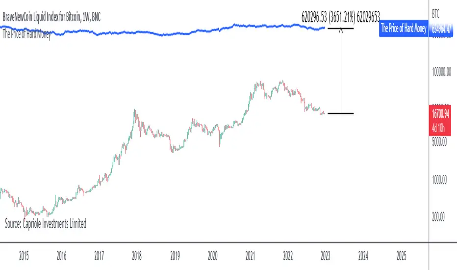
The Price of Hard MoneyIf we calculate “the price of hard money” (the market capitalization weighted price of gold plus Bitcoin); we get this chart.
Since 2017, Bitcoin’s share of hard money growth has been increasing, we can see it visibly on the gold chart by a widening delta between the price of hard money and the Gold price. We can also see some interesting technical behaviours.
In 2021, Hard Money broke out and held this breakout above the 2011 Gold high. Only later in 2022 did a correction of 20% occur – typical of Golds historic volatility in periods of inflation and high interest rates.
Hard Money is at major support and we have evidence for a fundamental shift in investor capital flows away from gold and into Bitcoin.
This Indicator is useful:
- To track the market capitalization of Gold (estimated), Bitcoin and combined market capitalization of Hard Money.
- To track the price action and respective change in investor flows from Gold to Bitcoin .
Provided Bitcoin continues to suck more value out of gold with time, this chart will be useful for tracking price action of the combined asset classes into the years to come.
Marketcap
Coin & market cap tableThis table was built specifically for the Crypto market.
It gives you a quick overview of the markets without having to scroll through numerous charts. The information is the overall markets daily change and the charts coins movement on a daily, weekly and monthly basis.
The weeks start on a Monday morning, the months start on the 1st of the month so this is last weeks data and last calendar months data.
It also gives you Bitcoins dominance. (Total2) you can change it to Bitcoin & Ethereum dominance (Total3)
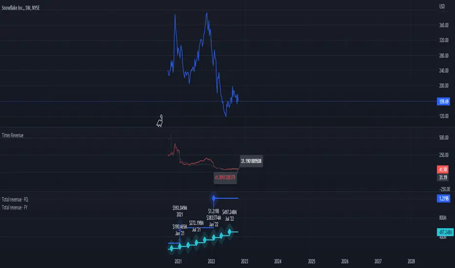
Times-Revenue (Fundamental Metric)Times-revenue is calculated by dividing the selling price of a company by the prior 12 months revenue of the company. The result indicates how many times of annual income a buyer was willing to pay for a company.
In color Red: it shows the last annual metric calculated
In color Gray: it shows the last 4 quarters annualized results
ADR% / ATR / Market CapDisplays the following values in a table in the upper right corner of the chart:
ADR%: Average daily range (in percent).
ATR: Average true range (hidden by default).
Market Cap: Total value of all a company's shares of stock.
All values are calculated based on daily bars, no matter what time frame you are currently viewing. Doesn't work for time frames >1D, which is why the table is not shown on weekly/monthly charts.
Credit to MikeC / TheScrutiniser and GlinckEastwoot for ADR% formula, and ArmerSchlucker for the original script which includes LoD Dist . instead of Market Cap.
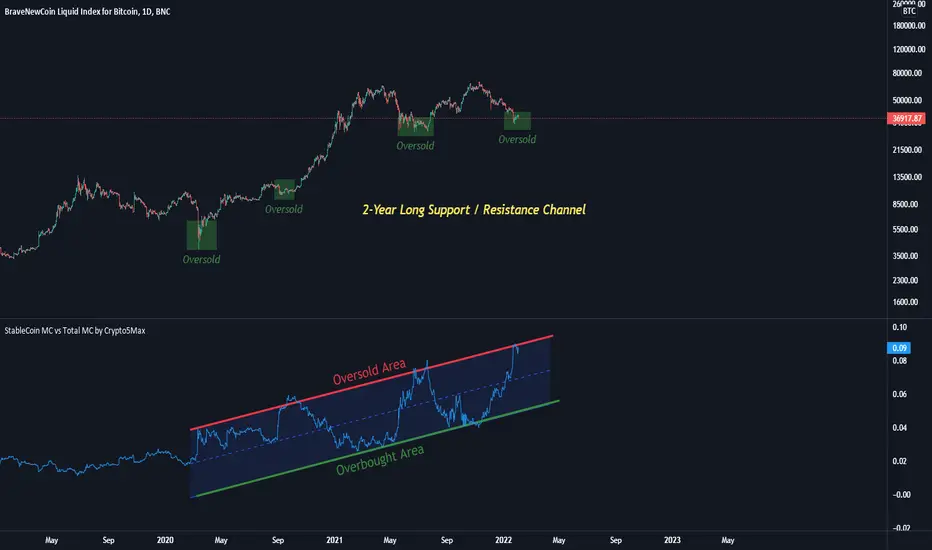
StableCoin MC vs Total MC by Crypto5Max In this indicator you will find the sum of all stable coins (market cap) divided by the total crypto market cap.
I believe there's a positive correlation between stable coins issuance and BTC's(and other coins) price appreciation. Or shortly put, to me the rising levels of stable coins represent increased levels of buying power (and adoption) waiting on the sidelines.
Here, I am taking the total market cap of all stable coins and dividing it by the total crypto market cap to get a ratio. Note, only ~85% of all stable coins are calculated (rest are not on TV), however, it should still be a fairly good representation. Some of the stable coins are already locked in smart contracts for yield farming and what not. I'd also say, there's interesting 2-year long channel that's developing currently. That said, take this indicator with a grain of salt as we still have a limited set of data.
Yours truly
Dominion - Bitcoin Altcoin Dominance [mutantdog]A simple and easy reference tool displaying a plot of the market cap dominance values for several significant cryptocurrencies.
The most widely used of these is bitcoin dominance (the top indicator shown above) which calculates the total market cap of bitcoin in relation to the total cryptocurrency market cap, displayed as a percentage. This is commonly used by traders to assess the strength of bitcoin in relation to the broader crypto market; increasing values being indicative of larger bitcoin moves and decreasing values often indicative of potential altcoin cycles. Likewise, ethereum dominance (the bottom indicator shown above) is frequently used as a means to indicate the strength of ethereum in relation to the broader crypto market.
Included options for marketcap dominance values are:
Bitcoin : CRYPTOCAP:BTC.D
Ethereum : CRYPTOCAP:ETH.D
Total DeFi (a composite of multiple top defi tokens): CRYPTOCAP:TOTALDEFI.D
Stablecoins (shows the combined dominance values for usdt and usdc): CRYPTOCAP:USDT.D + CRYPTOCAP:USDC.D
Flippening (shows the difference between bitcoin and ethereum dominance values): CRYPTOCAP:BTC.D - CRYPTOCAP:ETH.D
When used in combination with each other, these can provide a good overview of the general flow of capital within the crypto market.
Additional functionality:
up to three optional moving averages with a choice of SMA, EMA, WMA and RMA for each.
multi timeframe selector
alert condition presets for various moving average crosses.
Please be aware that, while useful as reference, dominance calculations are known to repaint frequently. As such the use of this indicator and its alerts should require caution.
NVTNetwork Value to Transactions Ratio (NVT) is defined as the ratio of market capitalization divided by transacted volume.
NVT Ratio can be thought of as an indicator that measures whether the blockchain network is overvalued or not.
If it is upper than red line, it means overvalued.
NVT Golden Cross targets to generate short or long signals by comparing the short-term trend of NVT and the long-term trend of NVT. If the short-term trend is way greater than the long-term trend is, the network can be interpreted as overpriced and will soon revert to mean value, meaning short signal. Similarly, the opposite case may imply a long signal.
Over the red line is short signal and under the green line is long signal.
You can find divergence in this indicator.
There are two sources
cryptocap
glassnode

Crypto Market Caps (BTC, ETH, TOTAL3)RSI based Crypto Market Caps (BTC, ETH, TOTAL3) Oscillator
This oscillator displays market caps for:
BTC : CRYPTOCAP:BTC -> in orange
ETH : CRYPTOCAP:ETH -> in gray
ALT (Total crypto excl. BTC & ETH): CRYPTOCAP:TOTAL3 -> in blue
In the settings you can edit:
The 3 market cap symbols
RSI length
All colours ;-)
Hope you enjoy!
Crypto Market Cap Oscillatorthis oscillator gives helps you to select the right buy or sell moment based on the market cap of the token of your choice
It is based on a base 100 oscillator
Black plot is BTC marketcap
Gray plot is total ALT marketcap
Coloured is based on the coin of your choice
The greener the plot, the best buy opportunity
The more red the plot, the best sell opportunity
Ticker SummaryTicker Summary provides at-a-glance summary information about a ticker near the current bar on the chart:
P/E ratio
Fwd P/E ratio
PEG ratio
Floating shares vs. total shares outstanding
% of trading volume that was short over the last 3 days
Average True Range (ATR) over last 14 days
There are a few less common items of information:
How many ATR multiples the ATR is extended over the last 10 bars. This gives an idea of how far the stock is currently extended.
"R-frequency", explained below.
An optional "ATR Reticule" is shown near the price. This is useful for traders that use ATR as a guideline for price targets and stop losses. On the left is the # of ATRs the stock is currently above the session open. On the right is the # of ATRs the stock is extended above the 10-bar moving average.
R-frequency: a measure of liquidity relevant to your own trading size. It is the frequency at which 1-R of your trading account is traded for a stock. Formula:
(1-R worth of shares) / (average dollar value traded per second), where:
"1-R worth of shares" is how many shares you would buy for a stop loss of -1 ATR, with max risk dollar value based on the Balance and Max Risk % indicator options.
"Average dollar value traded per second" is the 14-day average of (avg(high, low and close) * daily volume)
R-frequency of a second or less is very liquid. If the value is higher (for example, over 60 seconds) the stock is less liquid and you may have some trouble filling limit orders quickly.

3GBH - MoneyMeter (Stablecoins RSI)This indicator tracks the Market Caps of
- USDT
- USDC
- DAI
The data is presented on the RSI.
The intent of this indicator is to help determine whether money is flowing into the market or not.
If the major stablecoins are green, money is entering the market.
The opposite applies, if red, money is leaving the market.
This is another tool which may provide help to build confluence in your trading or analysis.
-----
Default length is set to 168 to see the momentum of the past 7 days on the 1-hour timeframe.

3GBH BTC DOM vs MCBitcoin Market Cap vs Dominance
- data normalized with RSI
Included in this indicator:
- RSI of BTC Market Cap
- RSI of BTC Dominance
- EMA of BTC Market Cap
- EMA of BTC Domiance
-----
Dominance influences the market. Is money flowing into Bitcoin?
-----
EMA's to help with Technical Analysis.
-----
User-friendly.
You can change all the inputs, they are labelled for ease-of-use.
You can toggle On/Off any or all of the options.

BTC/usd BTC/usdt Volume & AltcoinsMarketcap dominance BithanosIndex introduction:
Function 1 of this indicator:Display the average trading volume of the 8 major BTC spot exchanges.
Bitcoin trading volume select BTC /USD
VOLBITSTAMP
VOLCOINBASE
VOLGEMINI
VOLKRAKEN
Bitcoin trading volume select BTC /USDT
VOLHUOBI
VOLBINANCE
VOLOKEX
VOLBITFINEX
Average trading volume = ( BTC /USD trading volume aggregation + BTC /USDT trading volume aggregation) / 8
This indicator function 2:Display BTC /USD trading volume as a percentage of total trading volume .
BTC /USD trading volume ratio = BTC /USD trading volume aggregation / ( BTC /USD trading volume aggregation + BTC /USDT trading volume aggregation)*100%
This indicator function 3:Displays the percentage of the market value of altcoins in the total market value of the cryptocurrency market.
Market value of altcoins = total market value of altcoins / total market value of cryptocurrencies * 100%
Glossary:
"MA length volume moving average period"
"Adopt Vol MA Enable Volume Moving Average"
"Vol average BTC combin shows the average trading volume of the 8 largest BTC spot exchanges"
"Adopt Btc /Usd Vol% Enable Btc /Usd Vol %"
"Adopt ALTS marketcap% enabled altcoin market cap"
"EmaBoll for Vol% / Marketcap% The Bollinger Bands based on Ema's mid-rail can be used for the volume ratio or the market value ratio"
本指标功能1:显示8大BTC现货交易所均摊成交量。
比特币成交量选取 BTC /USD
VOLBITSTAMP
VOLCOINBASE
VOLGEMINI
VOLKRAKEN
比特币成交量选取 BTC /USDT
VOLHUOBI
VOLBINANCE
VOLOKEX
VOLBITFINEX
均摊成交量 = (BTC/USD 成交量聚合 + BTC /USDT 成交量聚合)/ 8
本指标功能2:显示BTC/USD 成交量 占总成交量百分比。
BTC /USD 成交量占比 = BTC /USD 成交量聚合 / (BTC/USD 成交量聚合 + BTC /USDT 成交量聚合)*100%
本指标功能3:显示 山寨币市值 占据 加密货币市场总市值 百分比。
山寨币市值 占比 = 山寨币总市值 / 加密货币总市值 * 100%
名词解释:
" MA length 成交量均线周期"
"Adopt Vol MA 启用成交量均线"
"Vol average BTC combin 显示8大BTC现货交易所均摊成交量"
"Adopt Btc /Usd Vol % 启用Btc/Usd成交量占比"
"Adopt ALTS marketcap % 启用山寨币市值占比"
"EmaBoll for Vol% / Marketcap% 基于Ema中轨的布林带 可用于成交量占比 或 市值占比"

Market Cap - simpleThis is a simple market cap indicator . it allows you to see the actual market cap of a stock, live, on the chart, right next to the stock price.
The indicator uses the data provided by Tradingview to calculate the market cap based on the simple calculation of outstanding shares times the price, at any given time.
The indicator can be used to compare the actual value of a stock at different times when sometimes you might discover that the market cap when the price is low is actually higher than the market cap when the price was high. That scenario might happen when the amount of outstanding shares has been changed as time goes by.
That conclusion is another nice benefit to having the indicator, on top of just having the Market Cap right in front of your eyes, always up-to-date, changing as the price is changing as well.
transparency= the higher the value, the more transparent the indicator will be. this feature allows you to see the indicator if you want to, but not letting it interrupting your chart.
Hope you enjoy it and good luck!

ETH Top Cap [jamesray]This script is modified from Top Cap , as published here.
Historically it matches market tops for ETH

Crypto Total Market Cap, Exclude Tether, (USD)Total cryptocurrency market capitalization without tether, with alerts for chosen value thresholds.
The rationale is that tether is a printed supply stablecoin with a fixed value; there is no need to include its value in a combined market cap. It's debatable if that's true, but that doesn't explain what this indicator is.
The second part of this indicator is highlighting when the aforementioned adjusted market cap is above or below certain values. They are round numbers; a psychological factor. A psyop, if you will.
Options to configure are the lower and upper bound and colors. The alerts must be manually turned on, as usual.

[5F] Bitcoin Hash Rate + Miners revenue-═════════════════════════-
📋 Description :
This script display the Bitcoin' Hash Rate and the Miners revenue based on the data provided by Quandl.
Hashrate is displayed in TH/s : trillion hashes per second with an moving average.
Miners revenue is calculated by : (the number of bitcoins mined per day + transaction fees) * market price
The dates of previous halving are also displayed.
🛠 Note :
There is a multiplier on the miners revenue that you can configurate. It's only used to bring the 2 curves closer together for better visibility but the multiplier don't affect the revenue's data.
You can choose between different types of moving average for the hashrate's signal : SMA, EMA, DEMA, TEMA, WMA, VWMA or TMA.
You can show and hide each elements of the indicator
Thanks to all Pinecoders who share their work with the community.
-═════════════════════════-

[5F] Total circulating Bitcoin-═════════════════════════-
📋 Description :
This script displays several informations about Bitcoin :
the maximum number of Bitcoin
number of mined BTC
number of unmined BTC
calcul them in %
shows the previous halving date
📆 Note : need to be in dayli resolution or higher
Thanks to all Pinecoders who share their work with the community.
-═════════════════════════-

[5F ] Number of Bitcoin wallets-═════════════════════════-
This is a simple script that displays the total number of Bitcoins wallets based on the data provided by Quandl.
Use it in dayli resolution minimum
Refresh every day
Thanks to all Pinecoders who share their work with the community.
-═════════════════════════-
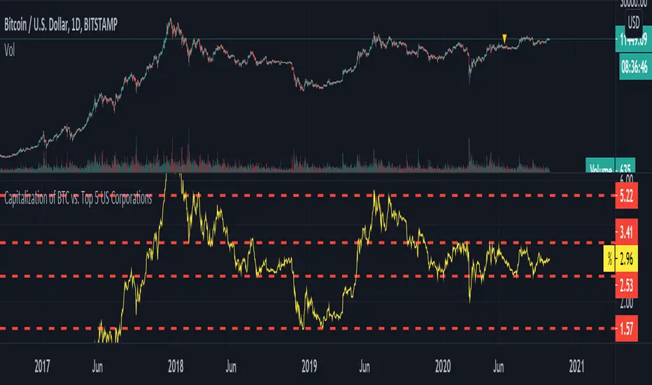
Capitalization of BTC vs. Top 5 US CorporationsThis script displays the capitalization of Bitcoin as a percentage of the capitalization of 5 large US corporations: Apple, Microsoft, Amazon, Google, Facebook. According to www.tradingview.com these are (at the current time) the largest US companies.
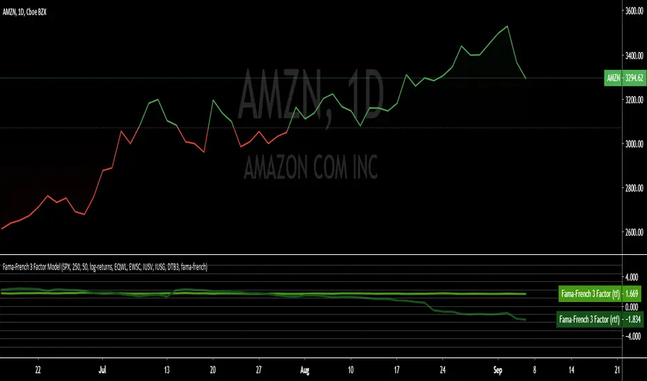
Fama-French 3 Factor ModelFama-French 3 Factor Model
Extension of the Capital Asset Pricing Model (CAPM)
CAPM
Ra = Rfr +
where,
Ra = Return of the Asset
Rfr = Risk-Free Rate
βa = Beta Coefficient of the Asset
Rm - Rfr = Market Risk Premium
Fama-French 3 Factor
r = rf + β1*(rm - rf) + β2(smh) +β3(hml)
r = Expected rate of return
rf = Risk-free rate
ß = Factor’s coefficient (sensitivity)
(rm – rf) = Market risk premium
SMB (Small Minus Big) = Historic excess returns of small-cap companies over large-cap companies
HML (High Minus Low) = Historic excess returns of value stocks (high book-to-price ratio) over growth stocks (low book-to-price ratio)
Small is set to $EWSC
Invesco S&P SmallCap 600® Equal Weight ETF
Big is set to $EQLW
Invesco S&P 100 Equal Weight ETF
High is set to $IUSV
iShares Core S&P US Value ETF
Low is set to $IUSG
iShares Core S&P US Growth ETF
returns selections
'returns'
'logarithmic returns' (use for realized (historical) returns)
'geometric returns' (compounded returns)
risk-free rate selections:
$DTB3
$DGS2
$DGS5
$DGS10
$DGS30
tf = primary time-frame
rtf = reference time-frame
RSI Season Tracker by KrisWatersSeason tracker identifies the momentum with tracking dominance and market capitalization data of Bitcoin , Altcoin and USDT .
With this indicator you can able to get know about Bitcoin, Altcoin and USDT dominance and market capitalization easily.
Backgrond Color Definations:
If the background color of indicator is ORANGE means that Bitcoin dominance is the most powerful. It is a good sign for Bitcoin.
If the background color of indicator is BLUE means that Altcoin dominance is the most powerful. It is a good sign for Altcoins.
If the background color of indicator is GREEN means that USDT dominance is the most powerful. It is a good sign for USDT.
Plus Sign (+) Meaning and Color Definations:
If ORANGE plus sign is visible on indicator means that market capitalization of Bitcoin is increasing. It is a good sign for Bitcoin.
If BLUE plus sign is visible on indicator means that market capitalization of Altcoin is increasing. It is a good sign for Altcoins.
If GREEN plus sign is visible on indicator means that market capitalization of Bitcoin and Altcoins are decreasing. It is not a good sign for both.
Light and Dark RSI Line Color Definations:
If the line of Bitcoin color is Orange means that, RSI value was increased compared with previous bar. It is one of the good sign of the momentum strength.
If the line of Bitcoin color is Yellow means that, RSI value was decreased compared with previous bar. It is not a good sign.
If the line of Altcoin color is Navy means that, RSI value was increased compared with previous bar. It is one of the good sign of the momentum strength.
If the line of Altcoin color is Blue means that, RSI value was decreased compared with previous bar. It is not a good sign.
If the line of USDT color is Green means that, RSI value was increased compared with previous bar. It is one of good the sign of the momentum strength.
If the line of USDT color is Lime means that, RSI value was decreased compared with previous bar. It is not a good sign.
Simple RSI rules are valid for this indicator.
RSI value is under 30 indicates that asset is OVERSOLD .
RSI value is upper 70 indicates that asset is OVERBOUGHT .
Important Notice: Dominance data is not correlated with price. For example; sometimes dominance is increasing but the price is not. And that's where the market capitalization comes in.
If the plus sign is not visible , you can get questioning for the movement. It is not a good sign at all.
If the plus sign is visible and RSI is increasing , It is a good sign for the strength of assets movement.
I recommended to use on DAILY timeframe . But you can use different timeframes as well.
Please leave comment below If you have any question or development idea.
