MP Universal FVG Detector🇺🇸 English Description
MP Universal FVG Detector
A clean and powerful indicator that automatically detects classic ICT 3-candle Fair Value Gaps on any market and any timeframe.
It highlights bullish and bearish imbalances with clear colored boxes, helping you quickly spot inefficient price zones where liquidity is likely to return.
Perfect for:
• Smart Money Concepts
• ICT/Inner Circle Trader setups
• Breaker / OB / Displacement traders
• Scalpers, day traders, swing traders
The indicator works with all assets: crypto, forex, stocks, indices, commodities — and on all timeframes.
🇺🇦 Опис українською
MP Universal FVG Detector
Чистий і потужний індикатор, який автоматично визначає класичні 3-свічкові Fair Value Gap (FVG) у стилі ICT на будь-якому ринку та будь-якому таймфреймі.
Він підсвічує бичачі та ведмежі дисбаланси кольоровими боксами, щоб ти легко бачив неефективні зони ціни, куди з великою ймовірністю повернеться ліквідність.
Підходить для:
• Smart Money Concepts
• ICT/Inner Circle Trader структур
• Breaker / Order Block / Displacement трейдерів
• Скальпінгу, внутрідеяльної та свінг-торгівлі
Працює з усіма активами: крипта, форекс, акції, індекси, товари — і на всіх таймфреймах.
樞軸點和水平

Haut & Bas Semaine Précédente – Depuis lundi (paramétrable)Clean and precise indicator that draws:
• The previous week’s high
• The previous week’s low
Lines start exactly on the Monday of the previous week and extend to the right (auto-updated every Monday).
Works perfectly on all timeframes (1 min, 5 min, 1H, 4H, daily…).
Fully customizable:
Colors
Style: Solid / Dashed / Dotted
Line width (1–5)
Perfect for intraday, swing trading or scalping — these levels are often strong support/resistance or breakout zones.
No labels, no plots, just the two clean lines. Lightweight and professional.

Camarilla Next Week & DayTrading Perspective:
This is useful for planning ahead - you can see where potential support/resistance might form next week as the current week's price action develops. The levels will adjust if the current week makes new highs/lows.
Visual Hierarchy:
Weekly = Thicker solid lines (major levels)
Daily = Thinner dotted/circle lines (intraday levels)
This gives you both short-term (daily) and longer-term (weekly) Camarilla levels on the same chart. You can turn either timeframe off if the chart gets too crowded!

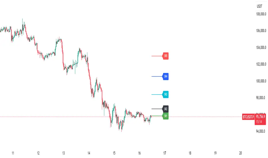
SRDynamic support and resistance lines designed for 15-minute, 30-minute, and other lower-timeframe analyses.
The movements of SR1 to SR5 also reflect shifts in market trend, providing a clear structural view of price behavior.
LE ScannerGENERAL OVERVIEW:
The LE Scanner is a multi-ticker dashboard that scans up to 20 tickers in real time and displays their current trend, price, volume, and key level conditions directly on your chart. It tracks how each ticker interacts with both the Previous Day’s High/Low (PDH/PDL) and Pre-Market High/Low (PMH/PML) to determine whether price is breaking above, below, or remaining inside those levels. The indicator automatically classifies each ticker as Bullish, Bearish, or Neutral based on these break conditions.
This indicator was developed by Flux Charts in collaboration with Ellis Dillinger (Ellydtrades).
What is the purpose of the indicator?:
The LE Scanner helps traders keep track of up to 20 tickers at once without switching between charts. It puts all the key information in one place, including price, daily percentage change, volume, and how each ticker is reacting around the previous day’s and pre-market highs and lows. The layout is simple and easy to read, with progress bars that show where price is relative to those levels. The goal is to save time and make it easier to understand market strength and weakness across your watchlist.
What’s the theory behind the indicator?:
The LE Scanner is built around the idea that key levels define bias. The previous day’s high and low show where the market traded most actively during the prior session, and the pre-market range reveals how price behaved before the open. When a ticker breaks both the previous day’s high and the pre-market high, it shows that buyers are in control. When it breaks both the previous day’s low and the pre-market low, sellers are in control. If neither side has full control, the bias is seen as neutral.
LE SCANNER FEATURES:
Multi-Ticker Dashboard
Key Level Tracking
Trend Classification
Sorting
Customization
Multi-Ticker Dashboard:
The LE Scanner can monitor up to 20 tickers at the same time. Each ticker has its own row in the dashboard showing:
Ticker Name
Current Price
Volume
Daily % Change
PDH Break
PDL Break
PMH Break
PML Break
Trend (bullish, bearish, or neutral)
You can enable or disable each ticker individually, so if you only want to track 5 or 10 tickers, you can simply toggle the rest off. Each ticker input lets you type in any valid ticker that’s available on TradingView.
Ticker Name:
Shows the ticker you selected in your input settings
Current Price:
Displays the latest price of that ticker based on your chart’s selected timeframe.
Volume:
Tracks the total trading volume for the current session.
Daily % Change:
Measures how much price has moved since the previous session’s close.
The remaining elements of the dashboard are explained in full detail throughout the remaining sections of this write-up.
Key Level Tracking:
The core of the LE Scanner is its ability to track and visualize how price interacts with four key levels for every ticker:
Previous Day High (PDH)
Previous Day Low (PDL)
Pre-Market High (PMH)
Pre-Market Low (PML)
These levels are updated automatically and compared to the current market price for each ticker inputted into the indicator. They show you whether the market is staying inside yesterday’s range or expanding beyond it.
🔹Previous Day High (PDH) & Previous Day Low (PDL)
The Previous Day High (PDH) marks where price reached its highest point during the last full trading session, while the Previous Day Low (PDL) marks the lowest point. Together, they define the previous day’s range and help traders understand where price is trading relative to that prior structure.
When the current price of a user-selected ticker moves above the PDH, it signals that buyers are taking control and that the ticker is now trading above yesterday’s range. In the dashboard, this change triggers a 🟢 icon under the “PDH Break” column. Once the PDH Break is confirmed, the opposite PDL Break column for that same ticker becomes blank.
When the current price of the user-selected ticker moves below the PDL, it shows that sellers are taking control and that the ticker is trading below yesterday’s range. In the dashboard, this change triggers a 🔴 icon under the “PDL Break” column. Once the PDL Break is confirmed, the opposite PDH Break column for that same ticker becomes blank.
🔹 Pre-Market High (PMH) & Pre-Market Low (PML)
The Pre-Market High (PMH) and Pre-Market Low (PML) show where price reached its highest and lowest points before the main trading session begins. On most U.S. exchanges, the pre-market session is from 4:00 AM to 9:29 AM Eastern Standard Time (EST), just before the New York session opens at 9:30 AM EST. These levels are important because they reflect how traders positioned themselves during the early morning hours. Many traders use the pre-market session to react to overnight news. The PMH and PML outline that entire pre-market range, showing where buyers and sellers fought for control and where the early balance between the two sides was established before the market opens.
When the current price of a ticker moves above the Pre-Market High, it means buyers are in control and that price has pushed through the top of the pre-market range. In the dashboard, this triggers a 🟢 icon under the “PMH Break” column. Once this break is confirmed, the opposite PML Break column for that ticker becomes blank.
When the current price moves below the Pre-Market Low, it means sellers are in control and that price has fallen beneath the pre-market range. In the dashboard, this triggers a 🔴 icon under the “PML Break” column. Once a PML Break is confirmed, the opposite PMH Break column for that ticker becomes blank.
🔹Progress Bars
The LE Scanner indicator includes progress bars that show how far the current price is from key levels.
When price is between the Previous Day High (PDH) and Previous Day Low (PDL), the progress bar measures price’s distance relative to those two points.
When price is between the Pre-Market High (PMH) and Pre-Market Low (PML), the bar tracks how far price is from those pre-market boundaries.
The closer price gets to either side, the more the bar fills, giving you a quick visual sense of how close a breakout or breakdown might be. A bar that’s nearly full means price is approaching one of the levels, while a shorter bar means it’s still far away from it. By seeing this relationship directly in the dashboard, you can see which tickers are getting ready to test key levels without flipping through multiple charts.
🔹PDH Progress Bar
The PDH progress bar measures how close price is to breaking above the previous day’s high.
When the bar is nearly full, it means the current price is trading just below yesterday’s high.
When the bar is low or mostly empty, it means price is far from the PDH and trading near the middle or lower end of the previous day’s range.
Once price breaks above the PDH, the progress bar is replaced with a green confirmation icon in the PDH Break column.
🔹Previous Day Low (PDL) Progress Bar
The PDL progress bar measures how close price is to breaking below the previous day’s low.
When the bar is nearly full, it means the current price is trading just above yesterday’s low.
When the bar is low or mostly empty, it means price is far from the PDL and trading near the middle or upper end of the previous day’s range.
Once price breaks below the PDL, the progress bar is replaced with a red confirmation icon in the PDL Break column.
🔹Pre-Market High (PMH) Progress Bar
The PMH progress bar shows how close price is to breaking above the pre-market high.
When the bar is nearly full, it means the current price is trading just below the pre-market high.
When the bar is low or mostly empty, it means price is far from the PMH and trading near the middle or lower end of the pre-market range.
Once price breaks above the PMH, the progress bar is replaced with a green confirmation icon in the PMH Break column.
🔹Pre-Market Low (PML) Progress Bar
The PML progress bar shows how close price is to breaking below the pre-market low.
When the bar is nearly full, it means the current price is trading just above the pre-market low.
When the bar is low or mostly empty, it means price is far from the PML and trading near the middle or upper end of the pre-market range.
Once price breaks below the PML, the progress bar is replaced with a red confirmation icon in the PML Break column.
Trend Classification:
The LE Scanner automatically classifies each user-inputted ticker as bullish, bearish, or neutral based on how price is interacting with its key levels.
Each trend type follows a specific set of conditions and is displayed in its own column under Trend on the dashboard.
🔹 Bullish Trend
A bullish trend occurs when price has broken above both the Previous Day High (PDH) and the Pre-Market High (PMH). This shows that buyers are in full control and that the ticker is trading firmly above the prior session’s and pre-market range.
When this condition is met, the Trend column displays a green background with an upward-facing triangle icon (▲).
🔹 Bearish Trend
A bearish trend occurs when price has broken below both the Previous Day Low (PDL) and the Pre-Market Low (PML). This indicates that sellers are in control and that the ticker is trading firmly below the prior session’s and pre-market range.
When this happens, the Trend column switches to a red background with a downward-facing triangle icon (▼).
🔹 Neutral Trend
A neutral trend occurs when price is trading inside the range, meaning it hasn’t broken above the PDH/PMH or below the PDL/PML. This indicates that neither bulls nor bears has clear control, and the ticker is consolidating between the prior session’s and pre-market range.
When this condition is active, the Trend column appears with a warning sign icon (⚠️). This helps distinguish tickers that are still forming setups from those that have already shown decisive strength or weakness.
Sorting:
The LE Scanner includes a built-in sorting feature that lets you reorder the dashboard in either descending or ascending order based on one of four metrics:
% Change
Volume
Price
Trend
Sorting is handled directly in the indicator settings, where you can toggle “Sort By” and then select your preferred Sort By criteria and Order (Ascending or Descending). When enabled, the dashboard automatically repositions every ticker to match the selected sorting method.
🔹 % Change Sorting
When you sort by % Change, the dashboard ranks tickers based on their daily percentage movement relative to the previous session’s close.
If you choose descending order, the biggest gainers appear at the top.
If you choose ascending order, the biggest decliners appear at the top.
🔹 Volume Sorting
When you sort by Volume, the dashboard arranges tickers based on their total traded volume for the current session.
If you choose descending order, the highest-volume tickers appear at the top.
If you choose ascending order, the lowest-volume tickers appear at the top.
🔹 Price Sorting
When you sort by Price, the dashboard arranges tickers by their current market price.
If you choose descending order, the highest-priced tickers appear at the top.
If you choose ascending order, the lowest-priced tickers appear at the top.
🔹 Trend Sorting
When you sort by Trend, the dashboard organizes tickers based on their directional classification.
If you choose descending order, bullish tickers appear first, followed by neutral and bearish.
If you choose ascending order, bearish tickers appear first, followed by neutral and bullish.
Customization:
The LE Scanner includes several settings that let you customize how the dashboard appears on your chart. All visual and positional elements can be adjusted to fit your personal layout preferences.
🔹 Dashboard Position
You can move the dashboard anywhere on your chart using the “Table Position” setting. Options include:
Bottom-Center
Bottom-Left
Bottom-Right
Middle-Center
Middle-Left
Middle-Right
Top-Center
Top-Left
Top-Right
🔹 Dashboard Size
The dashboard size can be adjusted to be larger or smaller. Users can choose between the following options:
Tiny
Small
Normal
Large
Huge
🔹 Color Customization
All color elements in the dashboard are customizable. You can change the following:
Background Color
Border Color
Frame Color
Text Color
Bullish Trend Color
Bearish Trend Color
Important Notes:
Because the LE Scanner tracks multiple tickers and updates all data in real time, it performs several background calculations at once. On rare occasions, this can cause the following issue:
Computation Error:
Scanning up to 20 tickers at the same time requires multiple request.security() calls. This process is resource-intensive and can sometimes trigger a calculation timeout message in TradingView. If this occurs, simply force the indicator to refresh by changing one of its settings (for example, toggling a ticker off and back on) or by removing and re-adding the indicator to your chart.
Uniqueness:
The LE Scanner is unique because it combines real-time multi-ticker tracking, sortable data, and visual feedback into one tool. It can track up to 20 tickers simultaneously, automatically sort them by % change, volume, price, or trend. The built-in progress bars provide a clear visual of how close price is to breaking key levels, while the trend classification instantly shows whether each ticker is bullish, bearish, or neutral.

TNT TRADER Sessions and Zones Premarket sessions and zone indicator full customization for premarket, yesterdays high and low , london, asia after hours etc.

Event High/Mid/LowEvent High/Mid/Low - Data Release Level Tracker
Automatically track and visualize high, low, and mid levels from major data events like FOMC announcements, CPI releases, NFP reports, and other market-moving data releases.
KEY FEATURES:
- Customizable event input - Add unlimited events using a simple text format
- Flexible time periods - Set custom duration for each event (15min, 30min, 60min, etc.)
- Visual clarity - Color-coded lines and optional background cloud between high/low
- Clean labels - Minimalist text labels without background boxes
- Fully customizable - Toggle lines, labels, and clouds on/off independently
HOW TO USE:
1. Add the indicator to your chart
2. Open settings and edit the "Event Dates" text area
3. Enter one event per line in this format: YYYY-MM-DD HH:MM Minutes Label
Example: 2025-01-29 14:00 30 Jan FOMC
Example: 2025-02-12 08:30 30 Feb CPI
4. The indicator will automatically capture and display the high, low, and mid levels
WHAT IT DISPLAYS:
- High line (teal) - Highest price during the event period
- Low line (pink) - Lowest price during the event period
- Mid line (yellow, dotted) - Midpoint between high and low
- Background cloud (optional) - Shaded area between high and low
- Event window highlighting - Orange background during active events
PERFECT FOR:
- Tracking key support/resistance levels from economic releases
- Planning entries/exits around FOMC, CPI, NFP, and other data
- Analyzing how price reacts to major announcements
- Identifying post-event trading ranges
SUPPORTED EVENTS:
Works with any scheduled economic release - FOMC, CPI, PPI, NFP, Retail Sales, GDP, and more. Simply input the date, time, duration, and a custom label.
IMPORTANT LIMITATIONS:
- Chart timeframe must be EQUAL TO OR SMALLER than event duration
- For 30-minute events: Use 30min, 15min, 5min, 1min charts (NOT 1H, 4H, Daily)
- For 60-minute events: Use 60min, 30min, 15min, 5min, 1min charts
- For 15-minute events: Use 15min, 5min, 1min charts
- If your chart timeframe is larger than the event duration, the indicator may not capture accurate high/low values
- Recommended: Use 5-minute or 1-minute charts for maximum accuracy on all event durations
NOTES:
- All times are in EST/EDT (America/New_York timezone)
- Comments starting with # are ignored, making it easy to organize and annotate your event list
- The indicator processes events only after the specified duration has elapsed

CTS Dashmatrix MTF by Tony-TechCTS Dashmatrix MTF by Tony-Tech
The CTS Dashmatrix MTF is a multi-timeframe trend and swing-structure dashboard designed to give traders a fast, accurate view of market conditions across key timeframes. It combines ADX trend direction and pivot-based swing analysis into a compact visual matrix that updates in real time.
This tool helps traders quickly identify:
Overall trend direction (Bullish or Bearish)
Swing structure shifts (Higher Lows, Lower Highs, reversals)
Multi-TF alignment from D1 → H4 → H1 → M15 → M5
Trend strength & directional confluence
The dashboard uses simple color logic:
Green = Bullish bias
Red = Bearish bias
Silver = Neutral swing
Whether you trade intraday or swing, the CTS Dashmatrix gives instant clarity on market bias at a glance. It is best used with price action, smart money concepts, or trend-following strategies.

CTSA - Clear Trend and Swing Alert by Tony-TechCTSA – Clear Trend & Swing Alert
CTSA (Clear Trend & Swing Alert) is a precision market-structure indicator designed for traders who want high-quality swing, trend, and continuation signals across Forex, Crypto, Indices, and Commodities.
The indicator automatically analyzes swing points, trend direction, momentum, volatility, volume, and EMA structure to generate optimized BUY and SELL alerts. It adapts to different asset classes and trading styles through an intelligent Preset Engine, providing ideal settings for Intraday, Swing, or Position trading.
CTSA identifies:
Trend Continuation Signals
Trend Pullback Entries
Reversal Opportunities
HH/HL/LH/LL Swing Structures
Smart Exits using Opposite Signals or Trend Flip
The dashboard provides an at-a-glance view of market conditions including trend status, swing type, RSI, ADX, volume strength, EMA bias, and ADR levels.
CTSA is built for traders who want clean, actionable alerts, strong confluence, and a simplified decision-making workflow—whether scalping M15 or swing-trading H1/H4.

Michael's FVG Detector═══════════════════════════════════════
Michael's FVG Detector
═══════════════════════════════════════
A clean and efficient Fair Value Gap (FVG) indicator for TradingView that helps traders identify market imbalances with precision.
───────────────────────────────────────
Overview
───────────────────────────────────────
Fair Value Gaps (FVGs) are price inefficiencies that occur when there's a gap between the wicks of candlesticks, indicating rapid price movement with minimal trading activity. These gaps often act as support/resistance zones where price may return to "fill the gap."
This indicator automatically detects and visualizes both bullish and bearish FVGs on any timeframe, making it easy to spot potential trading opportunities.
───────────────────────────────────────
Features
───────────────────────────────────────
Core Functionality
Automatic FVG Detection : Identifies Fair Value Gaps in real-time as they form
Bullish & Bearish FVGs : Detects both upward and downward price gaps
3-Candle Pattern : Uses classic FVG logic (current candle low > high from 2 bars ago for bullish, vice versa for bearish)
Gap Size Display : Shows the exact size of each FVG in ticks directly on the box
Confirmed Bars Only : Only draws FVGs on confirmed bars to prevent repainting
Customization
Color Settings : Fully customizable colors for bullish and bearish FVGs with transparency control
Text Color : Configurable color for the tick size labels
Default Styling : Comes with sensible defaults (20% transparency, dark gray labels)
Performance Optimization
Smart Cleanup : Automatically removes boxes outside the visible chart area
Efficient Rendering : Maintains optimal performance even on lower timeframes
No Repainting : Uses confirmed bars only for reliable signals
───────────────────────────────────────
How It Works
───────────────────────────────────────
Detection Logic
Bullish FVG:
Current bar's low is higher than the high from 2 bars ago
Creates an upward gap that price left behind during bullish momentum
Bearish FVG:
Current bar's high is lower than the low from 2 bars ago
Creates a downward gap that price left behind during bearish momentum
Visual Display
Each detected FVG is displayed as:
A semi-transparent colored box spanning the gap area
The box extends from bar -2 to the current bar
Gap size in ticks shown at the bottom-left of each box
Singular/plural formatting ("1 tick" vs "X ticks")
───────────────────────────────────────
Performance Notes
───────────────────────────────────────
Cleanup runs every 50 bars to maintain optimal performance
Only creates boxes on confirmed bars (no real-time repainting)
Efficiently manages memory by removing off-screen boxes
Suitable for both manual and automated trading strategies
───────────────────────────────────────
Disclaimer
───────────────────────────────────────
This indicator is for educational and informational purposes only. It is not financial advice. Always do your own research and risk management before making trading decisions.
───────────────────────────────────────
Author : Michael
Version : 1.0
License : Free for personal use
Last Updated : November 2025

MTF-CPR TableTable gives you CPR values based on Camarilla calculation with S&R 3 & 4 Levels...
Highlights the cell green when Price is in range and marks the Pivot Red when we have a Narrow CPR range...
Enjoy!!

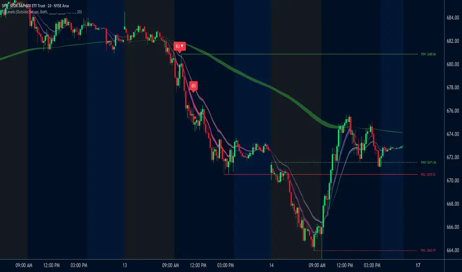
LE LevelsGENERAL OVERVIEW:
The LE Levels indicator plots yesterday’s high/low and today’s pre-market high/low directly on your chart, then layers signal logic around those levels and a set of EMA waves. You can choose “Inside” setups, “Outside” setups, or both. You can also pick entries that trigger at levels, entries that trigger off the EMA wave, or both.
This indicator was developed by Flux Charts in collaboration with Ellis Dillinger (Ellydtrades).
What is the purpose of the indicator?:
The purpose of the LE Levels indicator is to give traders a clear view of how price is behaving around key session levels and EMA structure. It follows the same model EllyD teaches by showing where price is relative to the Previous Day High and Low and the Pre-Market High and Low, then printing signals when specific reactions occur around those levels.
What is the theory behind the indicator?:
The theory behind the LE Levels indicator is based on the concept of inside and outside days. An inside day occurs when price trades within the previous day’s high and low, signaling compression and potential breakout conditions. An outside day occurs when price moves beyond those boundaries, confirming expansion and directional bias. When price trades above the PDH or PMH, it reflects bullish control and potential continuation if supported by volume and momentum. When price trades below the PDL or PML, it shows bearish control and possible downside continuation. The idea is to combine this logic with tickers that have catalysts or news, since these events often bring higher-than-normal volume.
LE SCANNER FEATURES:
Key Levels
Signals
EMA Waves
Key Levels:
The LE Levels indicator automatically plots four key levels each day:
Previous Day High (PDH)
Previous Day Low (PDL)
Pre-Market High (PMH)
Pre-Market Low (PML)
🔹How are Key Levels used in the indicator?:
The key levels are a crucial factor in determining if the trend is bullish, bearish, or neutral trend bias. The indicator uses the key levels as a condition for identifying inside or outside setups (explained below). After determining a trend bias and setup type, the indicator prints long and short entry signals based on how price interacts with the key levels and 8 EMA Wave. (explained below).
These levels define where price previously reacted or reversed, helping traders visualize how current price action relates to prior session structure. They update automatically each day and pre-market session, allowing traders to see if price is trading inside, above, or below prior key ranges without manually drawing them.
Please Note: Pre-market times are based on U.S. market hours (Eastern Standard Time) and may vary for non-U.S. tickers or exchanges.
🔹Previous Day High (PDH):
The PDH marks the highest price reached during the previous regular trading session. It shows where buyers pushed price to its highest point before the market closed. This value is automatically pulled from the daily chart and projected forward onto intraday timeframes.
🔹Previous Day Low (PDL):
The PDL marks the lowest price reached during the previous regular trading session. It shows where selling pressure reached its lowest point before buyers stepped in. Like the PDH, this level is retrieved from the prior day’s data and extended into the current session.
🔹Pre-Market High (PMH):
The PMH is the highest price reached between 4:00 AM and 9:29 AM EST, before the regular market open. It shows how far buyers managed to push price up during the pre-market session.
🔹Pre-Market Low (PML):
The PML is the lowest price reached between 4:00 AM and 9:29 AM EST, before the regular market open. It shows how far sellers were able to drive price down during the pre-market session.
🔹Customization Options:
Extend Levels:
Extends each plotted line a user-defined number of bars into the future, keeping them visible even as new candles print. This helps maintain a clear visual reference as the session progresses.
Extend PDH/L Left & Extend PMH/L Left:
These settings let you extend the Previous Day and Pre-Market levels back to their origin point, so you can see exactly where each level was formed on the prior trading day. This makes it easy to understand the context of each level and how it developed. When this option is disabled, the lines begin at the regular session open instead of extending backward into the previous day’s data.
Show Name / Show Price:
Enabling Show Name displays labels (PDH, PDL, PMH, PML) beside each line, while Show Price adds the exact price value. You can choose to show just the name, just the price, or both for a complete label format.
Line Color and Style:
Each level can be fully customized. You can change the line color and select between solid, dashed, or dotted styles to visually distinguish each level type.
At the bottom of the indicator settings, under the ‘Miscellaneous’ section, two additional options allow further control over how levels are displayed:
Hide Previous Day Highs/Lows:
When enabled, the previous day’s high and low levels aren’t shown. When disabled, users can view previous day levels without using replay mode. By default, this setting is enabled.
Disabled:
Enabled:
Hide Previous Pre-Market Highs/Lows:
When enabled, the previous pre-market high and low levels aren’t shown. When disabled, users can view previous pre-market levels without using replay mode. By default, this setting is enabled.
Disabled:
Enabled:
Signals:
The LE Levels indicator automatically prints long and short entry signals based on how price interacts with its key levels (PDH, PDL, PMH, PML) and the EMA Waves. It identifies moments when price either breaks out beyond prior ranges or retests those levels in alignment with momentum shown by the EMA Waves.
There are two types of setups (Inside and Outside) and two entry types ((L)evels and (E)MAs). Together, these settings allow traders to customize the type of structure the indicator recognizes and how signals are generated.
🔹What is an Inside Setup?
An Inside Setup occurs when the current trading session forms entirely within the previous day’s range, meaning price has not yet broken above the Previous Day High (PDH) or below the Previous Day Low (PDL). In the LE Levels indicator, inside setups are recognized when price trades within the previous day’s boundaries while also considering the pre-market range (Pre-Market High and Pre-Market Low).
Inside Setups have two main conditions, depending on directional bias:
Bullish Inside Setup:
Price trades above the Pre-Market High (PMH) and above the Previous Day Low (PDL), while still below the Previous Day High (PDH).
Bearish Inside Setup:
Price trades below the Pre-Market Low (PML) and below the Previous Day High (PDH), while still above the Previous Day Low (PDL).
🔹What is an Outside Setup?
An Outside Setup occurs when the current trading session extends beyond the previous day’s range, meaning price has broken above the Previous Day High (PDH) or below the Previous Day Low (PDL). This structure reflects expansion and directional control, showing that either buyers or sellers have taken price into new territory beyond the prior session’s boundaries.
In the indicator, an Outside Setup forms once price closes beyond both the previous day and pre-market boundaries, showing bias in one direction.
Bullish Outside Setup:
Price closes above both the PDH and the PMH, confirming buyers have pushed through every key resistance from the prior session and the pre-market.
Bearish Outside Setup:
Price closes below both the PDL and the PML, showing sellers have pushed price beneath all key support levels from the previous session and the pre-market.
🔹Entry Types: (L)evels and (E)MAs
Once a setup type (Inside or Outside) has been established, the LE Levels indicator generates trade signals using one of two entry confirmation methods: (L) for Key Level based Entries and (E) for EMA Wave based Entries. These determine how the signal prints and what triggers it within.
🔹(L)evels Entry:
The (L)evels entry type is built around how price reacts to the key levels (PDH, PDL, PMH, PML). It prints when price retests those levels during an active setup. The logic focuses on retests, where price returns to confirm a previous breakout or breakdown before continuing in the same direction.
Bullish Outside (L)evels Setup:
A Bullish Outside Setup forms when price breaks above both the PDH and PMH. Once this breakout occurs, the indicator waits for a pullback to one of those levels. For a signal to print, the 8 EMA Wave must also be near that level, showing momentum is supporting the structure. A small buffer is applied between price and the level so that even if price only comes close, without fully touching, the retest still counts. When price holds above the PDH or PMH with the 8 EMA nearby, the indicator prints an (L) ▲ entry.
Bearish Outside (L)evels Setup:
A Bearish Outside Setup forms when price breaks below both the PDL and PML. Once this breakdown occurs, the indicator waits for a pullback to one of those levels. For a signal to print, the 8 EMA Wave must also be near that area, confirming momentum is aligned with the move. A small buffer is included so that even if price comes close but doesn’t fully touch the level, the retest still qualifies. When price holds below the PDL or PML with the 8 EMA nearby, the indicator prints an (L) ▼ entry.
Bullish Inside (L)evels Setup:
A Bullish Inside Setup forms when price trades above the PMH but stays below the PDH and above the PDL. Once this condition is met, the indicator waits for a pullback to the PMH. For a signal to print, the 8 EMA Wave must also be near that level. A small buffer is applied so that even if price only comes close to the level, the retest still counts. When price holds above the PMH with the 8 EMA nearby, the indicator prints an (L) ▲ entry.
Bearish Inside (L)evels Setup:
A Bearish Inside Setup forms when price trades below the PML but stays above the PDL and below the PDH. Once this condition is met, the indicator waits for a pullback to the PML. For a signal to print, the 8 EMA Wave must also be near that level. A small buffer is applied so that even if price only comes close, the retest still counts. When price holds below the PML with the 8 EMA nearby, the indicator prints an (L) ▼ entry.
🔹(E)MAs Entry:
The (E)MA Entry type focuses on how price reacts to the 8 EMA Wave. It identifies when price first interacts with the EMAs, then confirms continuation once momentum resumes in the setup’s direction. The first candle that touches the EMA prints an (E) marker, and the confirmation signal triggers only after price breaks above or below that candle, depending on the bias.
Bullish Outside (E)MA Setup:
A Bullish Outside Setup forms when price is trading above both the PDH and PMH. Once this breakout occurs, the indicator waits for price to pull back and touch the 8 EMA Wave, which prints the initial (E) label. If price then breaks above that candle’s high, the continuation setup is confirmed.
Bearish Outside (E)MA Setup:
A Bearish Outside Setup forms when price is trading below both the PDL and PML. After the breakdown, the indicator waits for price to pull back to the 8 EMA Wave, marking the candle that touches it with an (E) label. If price then breaks below that candle’s low, the continuation setup is confirmed.
Bullish Inside (E)MA Setup:
A Bullish Inside Setup forms when price trades above the PMH but remains below the PDH and above the PDL. The indicator waits for price to retrace and touch the 8 EMA Wave, which prints the initial (E) label. If price then breaks above that candle’s high, the continuation setup is confirmed.
Bearish Inside (E)MA Setup:
A Bearish Inside Setup forms when price trades below the PML but remains above the PDL and below the PDH. Once price touches the 8 EMA Wave, the indicator prints an (E) marker. If price then breaks below that candle’s low, the continuation setup is confirmed.
🔹Signal Settings:
At the bottom of the indicator settings panel, three core controls define how signals are displayed and which setups the indicator actively scans for. These settings allow you to refine signal generation based on your trading approach and chart preference.
Setup Type:
This setting determines which structural conditions the indicator tracks.
Inside Setups: Signals only appear when price is trading within the previous day’s range (between PDH and PDL).
Outside Setups: Signals only appear when price breaks outside the previous day’s range (above PDH/PMH or below PDL/PML).
Both: Enables signals for both Inside and Outside setups.
Entry Type:
Controls how the indicator confirms entries.
(E)MAs: Prints signals based on price interacting with the 8 EMA Wave.
(L)evels: Prints signals based on price retesting key levels such as PDH, PDL, PMH, or PML.
Both: Allows both EMA and Level-based signals to appear on the same chart.
Signal Filters (Long, Short, and Re-Entry):
These toggles let you control which trade directions are active.
Long: Displays only bullish entries and ignores all short setups.
Short: Displays only bearish entries and ignores long setups.
Re-Entry: Enables or disables repeated signals in the same direction after the first valid setup has printed. When off, only the initial signal is shown until conditions reset.
EMA Waves:
The EMA Waves help identify potential entries and show directional bias. They’re made of grouped EMAs that form shaded areas to create a “wave” look. The color-coding on the waves allows users to view when price is consolidating, in a bullish trend, or in a bearish trend. The wave updates in real time as new candles form and does not repaint historical data.
🔹8 EMA Wave
The 8 EMA Wave is used directly in the indicator’s signal logic described earlier. It reacts fastest to price compared to the other EAM Waves and determines when (L) and (E) signals can trigger.
How It Works:
The wave is made from the 8, 9, and 10 EMAs and fills the space between them to create a “wave” look. The 8 EMA Wave continuously updates its color based on where price trades relative to the key levels (PDH, PDL, PMH, PML). The color changes are conditional and based solely on price position relative to key levels.
Price is above both PDH and PMH: The wave is bright green, and the top half is purple.
Price is between PDH and PMH: The wave is dark green, and the top half is purple.
Price is below both PDL and PML: The wave is bright red, and the bottom half is purple.
Price is between PDL and PML: The wave is dark red, and the bottom half is purple.
Price is between all four levels: The wave is gray to represent consolidation or neutral bias.
🔹8 EMA Wave Signal Function:
For (L)evels entries, the 8 EMA must be close to the key level being retested, with a small buffer that allows near touches to qualify.
For (E)MA entries, the first candle that touches the wave prints an (E), and the confirmation signal appears when price breaks that candle’s high or low.
🔹8 EMA Wave Customization:
Users can customize all colors for bullish, bearish, and neutral conditions directly in the settings. The purple overlay color cannot be changed, as it is hard-coded into the indicator. The 8 EMA Wave can also be toggled on or off. Turning it off only removes the visual display from the chart and does not affect signals.
🔹20 EMA Wave
The 20 EMA Wave measures medium-term momentum and helps visualize larger pullbacks. It reacts more slowly than the 8 EMA Wave, giving a smoother wave look. No signals are generated from it. It’s purely a visual guide for spotting potential pullback areas for continuation setups.
How It Works:
The wave is made from the 19, 20, and 21 EMAs and fills the space between them to create a shaded “wave.” The color updates continuously based on where price trades relative to the key levels (PDH, PDL, PMH, PML). The color changes are conditional and based only on price position relative to these levels.
Price is above both PDH and PMH: The wave is bright green, and the top half is blue.
Price is between PDH and PMH: The wave is dark green, and the top half is blue.
Price is below both PDL and PML: The wave is bright red, and the bottom half is blue.
Price is between PDL and PML: The wave is dark red, and the bottom half is blue.
Price is between all four levels: The wave is gray to represent consolidation or neutral bias.
🔹20 EMA Wave Use Case:
After 12:00 PM EST, the 20 EMA Wave is used to spot larger pullbacks that form later in the session. No signals are generated from it; it only serves as a visual guide for identifying potential continuation areas.
Bullish Continuation Pullback:
Bearish Continuation Pullback:
🔹20 EMA Wave Customization:
Users can customize all colors for bullish, bearish, and neutral conditions directly in the settings. The blue overlay color cannot be changed, as it is hard-coded into the indicator. The 20 EMA Wave can also be toggled on or off.
🔹200 EMA Wave
The 200 EMA Wave is used to determine long-term trend bias. When price is above it, the bias is bullish; when price is below it, the bias is bearish. It updates automatically in real time and is used to define the broader directional bias for the day.
How it Works:
The 200 EMA Wave is created using the 190, 199, and 200 EMAs, with the area between them shaded to form a “wave.”
🔹200 EMA Wave Use Case:
When price is above the 200 EMA Wave and both the 8 and 20 EMA Waves are stacked above it, the overall trend is bullish.
When price is below the 200 EMA Wave and both shorter-term waves are also below it, the overall trend is bearish.
🔹200 EMA Wave Customization:
Users can customize both colors that form the 200 EMA Wave. The entire wave can also be toggled on or off in the settings.
Uniqueness:
The LE Levels indicator is unique because it combines signal logic with a clear visual structure. It automatically detects inside and outside setups, printing (L) and (E) entries based on how price reacts to key levels and the EMA Waves. Each signal follows strict conditions tied to the 8 EMA and key levels. The color-coded EMA Waves make it simple to understand where price is in relation to the key levels and getting a quick trend bias overview.
EMA Crossover with Supertrend + Ribbon + Multi TFThis is a multi indicator all in one, incorporates several indicators in one. Stay on the right side of the trend with this indicator, has customizable everything, a fast and slow ema ribbon, a second ema ribbon for longer ema lengths, a customizable multi time frame trend table, a customizable supertrend, the vwap, 2 background trend color changes , one for the ema's and one for the supertrend, daily support and resistance lines, follow up bearish or bullish signals on every candle. I am sure you will be able to find this multi indicator very useful!

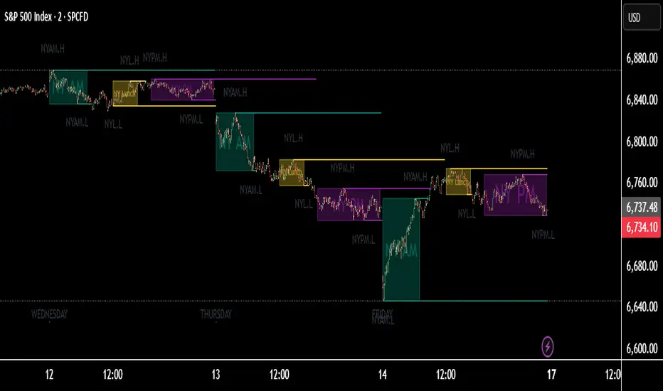
Session H/L + Mid + Quarters — Live EvolvingSession High and Low with quarter lines for stop progressions with lines projected back X days

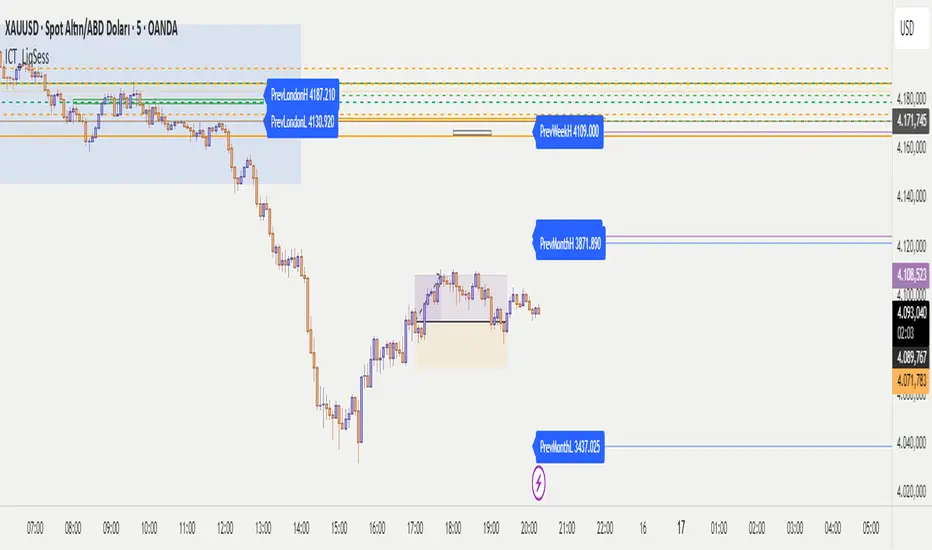
ICT - Liquidity & Sessions (Modular)ICT - Liquidity & Sessions (Modular)
A modular indicator for Inner Circle Trader (ICT) concepts, displaying liquidity zones, session levels, and key price levels.
Features:
Daily Levels:
Previous Day High/Low (PDH/PDL)
Previous Day Open/Close (PDO/PDC)
True Day Open (TDO) — NY 00:00
Current Day Open
Higher Timeframe Levels:
Previous Weekly High/Low
Previous Monthly High/Low
Session Analysis:
Session boxes: Asia, London, New York, Sydney, NY Lunch
Previous session High/Low for liquidity identification
Session open vertical lines
Session midlines (50% of session range)
Customization:
Toggle any level on/off
Customize colors, line styles, and widths
Adjustable session times (NY timezone)
Session box opacity control
Light mode option
Alerts:
Price crosses PDH/PDL
Price crosses Weekly/Monthly levels
Session open notifications
Performance:
Auto-cleanup of old lines/labels
Efficient drawing to prevent chart clutter
Modular design for easy customization
How to Use:
Add the indicator to your chart
Configure session times in the "Session Times (NY)" group
Enable/disable levels in the settings
Customize colors and styles to match your preference
Set up alerts for key level breaks
Perfect for:
ICT traders identifying liquidity zones
Session-based trading strategies
Multi-timeframe analysis
Identifying key support/resistance levels
Note: This indicator uses NY timezone for session calculations. Adjust session times in the settings to match your trading hours.