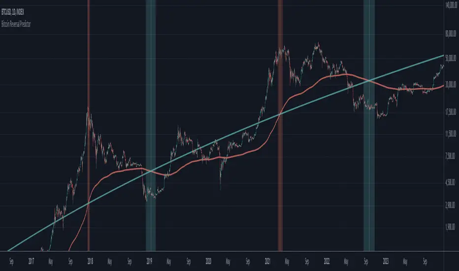
21DMA Structure Counter (EMA/SMA Option)21DMA Structure Counter (EMA/SMA Option)
Overview
The 21DMA Structure Counter is an advanced technical indicator that tracks consecutive periods where price action remains above a 21-period moving average structure. This indicator helps traders identify momentum phases and potential trend exhaustion points using statistical analysis.
Key Features
Moving Average Structure
- Configurable MA Type: Choose between EMA (Exponential Moving Average) or SMA (Simple Moving Average)
- 21-Period Default: Optimized for the widely-watched 21-period moving average
- Triple MA Structure: Tracks high, close, and low moving averages for comprehensive analysis
Statistical Analysis
- Cycle Counting: Automatically counts consecutive periods above the MA structure
- Historical Data: Maintains up to 2,500 historical cycles (approximately 10 years of daily data)
- Z-Score Calculation: Provides statistical context using mean and standard deviation
- Multiple Standard Deviation Levels: Displays +1, +2, and +3 standard deviation thresholds
Visual Indicators
Color-Coded Bars:
- Gray: Below 10-year average
- Yellow: Between average and +1 standard deviation
- Orange: Between +1 and +2 standard deviations
- Red: Between +2 and +3 standard deviations
- Fuchsia: Above +3 standard deviations (extreme readings)
Breadth Integration
- Multiple Breadth Options: NDFI, NDTH, NDTW (NASDAQ breadth indicators), or VIX
- Background Shading: Visual alerts when breadth reaches extreme levels
- High/Low Thresholds: Customizable levels for breadth analysis
- Real-time Display: Current breadth value shown in data table
Smart Reset Logic
- High Below Structure Reset: Automatically resets count when daily high falls below the lowest MA
- Flexible Hold Period: Continues counting during temporary weakness as long as structure isn't violated
- Precise Entry/Exit: Strict criteria for starting cycles, flexible for maintaining them
How to Use
Trend Identification
- Rising Counts: Indicate sustained momentum above key moving average structure
- Extreme Readings: Z-scores above +2 or +3 suggest potential trend exhaustion
- Historical Context: Compare current cycles to 10-year statistical averages
Risk Management
- Breadth Confirmation: Use breadth shading to confirm market-wide strength/weakness
- Statistical Extremes: Exercise caution when readings reach +3 standard deviations
- Reset Signals: Pay attention to structure violations for potential trend changes
Multi-Timeframe Application
- Daily Charts: Primary timeframe for swing trading and position management
- Weekly/Monthly: Longer-term trend analysis
- Intraday: Shorter-term momentum assessment (adjust MA period accordingly)
Settings
Moving Average Options
- Type: EMA or SMA selection
- Period: Default 21 (customizable)
- Reset Days: Days below structure required for reset
Visual Customization
- Standard Deviation Lines: Toggle and customize colors for +1, +2, +3 SD
- Breadth Selection: Choose from NDFI, NDTH, NDTW, or VIX
- Threshold Levels: Set custom high/low breadth thresholds
- Table Styling: Customize text colors, background, and font size
Technical Notes
- Data Retention: Maintains 2,500 historical cycles for robust statistical analysis
- Real-time Updates: Calculations update with each new bar
- Breadth Integration: Uses security() function to pull external breadth data
- Performance Optimized: Efficient array management prevents memory issues
Best Practices
1. Combine with Price Action: Use alongside support/resistance and chart patterns
2. Monitor Breadth Divergences: Watch for breadth weakness during strong readings
3. Respect Statistical Extremes: Exercise caution at +2/+3 standard deviation levels
4. Context Matters: Consider overall market environment and sector rotation
5. Risk Management: Use appropriate position sizing, especially at extreme readings
Disclaimer
This indicator is for educational and informational purposes only. It should not be used as the sole basis for trading decisions. Always combine with other forms of analysis and proper risk management techniques.
Compatible with Pine Script v6 | Optimized for daily timeframes | Best used on major indices and liquid stocks
在腳本中搜尋"Cycle"
Pi Cycle indicator for Bitcoin bull market cyclesA simple implementation of the Pi cycle indicator for BTC. Plots the 111 days SMA and 2*(350 days SMA).
When the 111 days MA reaches above the 350 one, we can consider the market got too high too fast.
Checked for the last cycles of BTC.
Dominant Cycle Adaptive MACDThis Indicator is based on classic MACD but with an exceptional smoothing.
This smoothing eliminates the noise of the classic MACD as you see in the Chart
Adaptive MACD is compiled using with two adaptive moving averages, one adaptive to the dominant cycle and the other adaptive to twice the dominant cycle. As the basic behind the MACD is the difference of two moving averages we cannot find much difference between the conventional MACD (12, 26) and the adaptive MACD. However the adaptive MACD is less prone for less whipsaws and it catches the trends very well at the same time the catches the turning points in time. The Adaptive MACD is definite one notch better than the conventional MACD.
Dominant Cycle Period is calculated using Ehler's Method {Mentioned in the code}
This is how the Adaptiveness Impacts the Price Chart
1. (12, 26 EMA) VS Adaptive Dominant Cycle EMA
2. See how the Adaptive Lengths {both FastLength and SlowLength changes with time!}
Enjoy!
Pi Cycle Bitcoin Top IndicatorThe script implements the Pi Cycle Top indicator
This indicator identifies tops in the bitcoin market cycle. Historically, the Pi Cycle Top indicator has called out tops in the price of bitcoin within three days.
The script is very easy to use and it is possible to change the following parameters:
the time interval (default value is day);
the days of long moving average (default value is 365)
the days of short moving average (default value is 111)
show the moving average plots
show the Pi Cycle Top label highlighting the cross-point
Recursive DifferenciatorIntroduction
Cycles can be spotted by using a wide range of methods, most of them will involve bandpass filtering, here i will show a method using recursion with the change() function.
The Indicator
As i explained in other indicators using recursion i posted rescaling the input is important, i will use the rsi of an exponential moving average as input. alpha control the amount of output the indicator will use as input, values closer to 0.5 will use more input resulting in more periodic results.
Lowering alpha when length is higher can help get more periodic results.
Conclusion
I have showed a new cycle indicator using recursion. Recursion with oscillators can highlights cycles in price thus being easier to predict.
Thanks for reading !
Pulse of Cycle Oscillator"Pulse of Cycle" Oscillator: Logic and Usage
What Is It and How Does It Work?
The "Pulse of Cycle" is an oscillator that measures the cycles of price rises and falls, helping you spot overbought and oversold conditions. Unlike classic indicators, it doesn’t focus on how much the price moves but tracks its direction (up or down) like a "pulse." Here’s the logic:
Price Movement:
If the price rises compared to the previous bar, it adds +1.
If the price falls, it subtracts -1.
If the price stays the same, it adds 0.
Decay Factor: Each step, the previous value is multiplied by a factor (e.g., 0.9) to shrink it slightly. This keeps the oscillator from growing too big and focuses it on recent price action.
Signals: The oscillator moves around zero. When it crosses certain levels (e.g., 5 and 10), it warns you about overbought or oversold zones:
Weak Signal: Above ±5, the market might be stretching a bit.
Strong Signal: Above ±10, a reversal is more likely.
In short, it tracks the "rhythm" of price streaks (consecutive ups or downs) and signals when things might be getting extreme.
How It Looks on the Chart
Line: The oscillator moves around a zero line.
Colors:
Blue: Normal zone (between -5 and +5).
Orange: Weak overbought (+5 and up) or oversold (-5 and down).
Red: Strong overbought (+10 and up).
Lime: Strong oversold (-10 and down).
Threshold Lines: You’ll see lines at 0, ±5, and ±10 on the chart to show where you are.
How to Use It?
Here’s how to trade with this oscillator:
Buy Opportunity (Long Position):
When?: The oscillator drops below -5 (weak) or -10 (strong), then starts moving back toward zero. This suggests the price has hit a bottom and might rise.
Example: It falls to -12 (lime), then rises to -8. You could buy, expecting a bounce.
Tip: Wait for a green candle to confirm if you want to be safer.
Sell Opportunity (Short Position):
When?: The oscillator rises above +5 (weak) or +10 (strong), then starts dropping back toward zero. This indicates the price might have peaked and could fall.
Example: It hits +11 (red), then drops to +7. You could sell, expecting a decline.
Tip: Look for a red candle to confirm the turn.
Neutral Zone: If it’s between -5 and +5, the market is balanced. You can wait for a clearer signal.
Practical Steps to Use
Add to TradingView:
Paste the code into Pine Editor and click “Add to Chart.”
Adjust Settings (Optional):
Decay (0.9): Lower to 0.7 for faster response, raise to 0.95 for smoother movement.
Thresholds (5 and 10): Change them (e.g., 4 and 8) based on your market.
Watch Signals:
Follow the color changes and threshold crossings.
Set Alerts:
Right-click the oscillator > “Add Alert” to get notified on overbought/oversold signals.
Things to Watch Out For
Confirmation: Pair it with support/resistance levels or candlestick patterns for stronger signals.
Market Type: Works best in range-bound (sideways) markets. In strong trends (all up or down), signals might mislead.
Risk: Always use a stop loss—below the last low for buys, above the last high for sells.
Summary
The "Pulse of Cycle" is a simple yet powerful tool that tracks price movement streaks. Use it to catch reversals at strong signals (-10/+10) or get early warnings at weak signals (±5). The colors and lines on the chart make it easy to see when to act.
Bitcoin Rainbow WaveBitcoin ultimate price model:
1. Power Law + 2. Rainbow Narrowing Bands + 3. Halving Cycle Harmonic Wave + 3. Wave bands
This powerful tool is designed to help traders of all levels understand and navigate the Bitcoin market. It works exclusively with BTC on any timeframe, but looks best on weekly or daily charts. The indicator provides valuable insights into historical price behavior and offers forecasts for the next decade, making it essential for both mid-term and long-term strategies.
How the Model Works
Power Law (Logarithmic Trend) : The green line represents the expected long-term price trajectory of Bitcoin based on a logarithmic regression model (power law). This suggests that Bitcoin's price generally increases as a power of 5.44 over time passed.
Rainbow Chart : Colored bands around the power law trend line illustrate a range of potential price fluctuations. The bands narrow esponentially over time, indicating increasing model accuracy as Bitcoin matures. This chart visually identifies overbought and oversold zones, as well as fair value zones.
Blue Zone : Below the power law trend, indicating an undervalued condition and a potential buying zone.
Green Zone : Around the power law trend, suggesting fair value.
Yellow Zone : Above the power law trend, but within the rainbow bands. Exercise caution, as the price may be overextended.
Red Zone : Far above the power law trend, indicating strong overbought conditions. Consider taking profits or reducing exposure.
Halving Cycle Wave : The fuchsia line represents the cyclical wave component of the model, tied to Bitcoin's halving events (approximately every four years). This wave accounts for the price fluctuations that typically occur around halvings, with price tending to increase leading up to a halving and correct afterwards. The amplitude of the wave decreases over time as the impact of halvings potentially lessens. Additional bands around the wave show the expected range of price fluctuations, aiding traders in making informed decisions.
Customizing Parameters
You can fine-tune the model's appearance by adjusting these input parameters:
show Power Law (true/false): Toggle visibility of the power law trend line.
show Wave (true/false): Toggle visibility of the halving cycle wave.
show Rainbow Chart (true/false): Toggle visibility of the rainbow bands.
show Block Marks (true/false): Toggle visibility of the 70,000 block interval markers.
Using the Model in Your Trading Strategy
Combine this indicator with technical analysis, fundamental analysis, and risk management techniques to develop a comprehensive Bitcoin trading strategy. The model can help you identify potential entry and exit points, assess market sentiment, and manage risk based on Bitcoin's position relative to the power law trend, halving cycle wave, and rainbow chart zones.
Adaptive Fisherized CMOIntroduction
Heyo, here is another no-repaint adaptive fisherized indicator.
I added Inverse Fisher Transform, Ehlers dominant cycle analysis and smoothing to the Chande Momentum Oscillator (CMO).
Usage
The CMO is a momentum oscillator which shows the usual movement of an asset.
I recommend to use it from a lower timeframe with a higher timeframe set.
Signals
(Signal mode will come soon.)
Zero Line
CMO crosses above zero line => enter long
CMO cross below zero line => ente short
Overbought/Oversold
CMO crosses above bottom band => enter long
CMO crosses under top band => enter short
MA (Maybe this signals will vary. Then, check update notes.)
CMO crosses above MA => enter long
CMO crosses below MA => enter short
Enjoy and share your experience with it!
More to read: CMO Explanationsp
Bandpass Cycle Indicator [Ehlers]This indicator is NOT used for entry and exit conditions when trading. Instead, it's purpose is to tell you what the state of the market is: trending or cyclical.
>WHO IS THIS FOR?
This is especially useful for strategies that use scalping or martingale betting to turn a profit. You don't want to be caught in a bullish trend with several open short orders. Algo traders welcome.
>HOW DOES IT WORK?
I'm glad you asked. It's based on Ehlers' work regarding signal filtering. Essentially, it uses a bandpass filter to reduce noise that is inherent in the market and display the underlying frequency.
First, we get rid of the high-frequency noise - think jitters, long wicks, etc... price action that usually effects EMAs and other MAs. We don't want any of that.
Next, we get rid of low-frequency noise - this is a little more difficult to picture, but we're essentially ignoring cycles (Elliot waves) from other longer time frames. We don't care if the Daily bars are just about to reverse if it doesn't affect our scalping strategy.
Finally, we find the root mean square (RMS) of the high and low points of our newly created signal (red) and plot them (black). These will act as triggers to tell us if a market is in cycle or trending.
>HOW DO YOU READ IT?
Background colors:
-Blue is cycle - you're safe.
-Red is trending down
-Green is trending up
Crossovers:
-Red above Upper Black: Uptrend
-Red below Lower Black: Downtrend
-Red in the middle: Cycle
>IS IT PREDICTIVE?
Momentum tends to pick up quickly and decline quickly, so if you'll often see a small Red or Green strip before a large price movement.
After long periods of cyclic movement (or consolidation), there isn't much momentum in the system, so any small price action will be considered a trend -> these small movements are picked up by other human traders and bots. Trading volume increases more and more until you have a swing in one direction.
So yes, it can be predictive due to the nature of signals and oscillation. Maybe not necessarily predictive of which direction price will go, but when volatility is about to increase.
Madrid SinewaveThis implements the Even Better Sinewave indicator as described in the book Cycle Analysis for Traders by John F. Ehlers .
In the example I used 36 as the cycle to be analyzed and a second cycle with a shorter period, 9, the larger period tells where the dominant cycle is heading, and the faster cycle signals entry/exit points and reversals.
Indicator: Schaff Trend Cycle (STC)Another new indicator for TV community :)
STC detects up and down trends long before the MACD. It does this by using the same exponential moving averages (EMAs), but adds a cycle component to factor instrument cycle trends. STC gives more accuracy and reliability than the MACD.
More info: www.investopedia.com
Feel free to "Make mine" this chart and use the indicator in your charts. Appreciate any feedback on how effective this is for your instrument (I have tested this only with BTC).
For people trading BTC:
-------------------------------
Try 3/10 or 9/30 for MACD (fastLength/slowLength). They seem to catch the cycles better than the defaults. :)
Ehlers Reflex Indicator [CC]The Reflex Indicator was created by John Ehlers (Stocks and Commodities Feb 2020) and this is a zero lag indicator that works similar to an overbought/oversold indicator but with the current stock cycle data. I find that this indicator works well as a leading indicator as well as a divergence indicator. Generally speaking, this indicator indicates a medium to long term downtrend when the indicator is below the line and a medium to long term uptrend when the indicator is above the line. Ehlers has created a few complementary indicators that I will release in the next few days but just keep in mind that this indicator focuses on the underlying cycle component while removing as much noise with no lag. I have color coded the lines to show strong signals with the darker colors and normal signals with the lighter colors. Buy when the line turns green and sell when it turns red.
Let me know if there are any other scripts you would like to see me publish!
VHF Adaptive Fisher Transform [Loxx]VHF Adaptive Fisher Transform is an adaptive cycle Fisher Transform using a Vertical Horizontal Filter to calculate the volatility adjusted period.
What is VHF Adaptive Cycle?
Vertical Horizontal Filter (VHF) was created by Adam White to identify trending and ranging markets. VHF measures the level of trend activity, similar to ADX DI. Vertical Horizontal Filter does not, itself, generate trading signals, but determines whether signals are taken from trend or momentum indicators. Using this trend information, one is then able to derive an average cycle length.
What is Fisher Transform?
The Fisher Transform is a technical indicator created by John F. Ehlers that converts prices into a Gaussian normal distribution.
The indicator highlights when prices have moved to an extreme, based on recent prices. This may help in spotting turning points in the price of an asset. It also helps show the trend and isolate the price waves within a trend.
Included:
Zero-line and signal cross options for bar coloring
Customizable overbought/oversold thresh-holds
Alerts
Signals
Bitcoin Price Temperature: Weekly TimeframeUse this oscillator at weekly timeframes:
The Bitcoin Price Temperature (BPT) is an oscillator that models the number of standard deviations the price has moved away from the 4-yr moving average. This seeks to establish a mean reversion model based on the cyclical nature of Bitcoin halving and investment cycles. The BPT bands then establish price levels that coincide with specific standard deviation multiples to identify fair and extreme valuations.
Coined By:
DilutionProof
Interpretation:
Values above 6 indicate extremely high price areas: (TOP OF THE MARKET)
Areas below 0.2 indicate extremely low price areas: (BOTTOM OF THE MARKET)
Bitcoin Daily Support/ResistanceA new indicator for tradingview.
Indicator Overview
The 2-Year MA Multiplier is intended to be used as a long term investment tool.
It highlights periods where buying or selling Bitcoin during those times would have produced outsized returns.
To do this, it uses a moving average (MA) line, the 2yr MA, and also a multiplication of that moving average line, 2yr MA x5.
Note: the x5 multiplication is of the price values of the 2yr moving average, not of its time period.
Buying Bitcoin when price drops below the 2yr MA (green line) has historically generated outsized returns. Selling Bitcoin when price goes above the 2yr MA x 5 (red line) has been historically effective for taking profit.
Why This Happens
As Bitcoin is adopted, it moves through market cycles. These are created by periods where market participants are over-excited causing the price to over-extend, and periods where they are overly pessimistic where the price over-contracts. Identifying and understanding these periods can be beneficial to the long term investor.
This tool is a simple and effective way to highlight those periods
MA 50/100/150 was historically good support and resistance. When we cross them we have a new trend that is established.
Nik Price CycleEvery script follow a pattern in their price cycle. This can be defined by division of price cycle. Division line will act as pivot point.Above this bar this any price movement is indication of bullish trend while below this line any price movement is indication of bearish trend. This Nik price signal will give great result in combination of magicsignal which is also one of our developed signal. Although we have included various calculation for analysis purpose in this indicator. i suggest to go in setting and uncheck all channel lines and shapes for getting clear picture of trend and entry point. for more details on how to use this indicator people can message us
HurstCycles PeaksOnly way I found to plot hurst cycles. I gave up on anything other than daily chart.
Published on request.
HurstCycles ThroughsOnly way I found to plot hurst cycles. I gave up on anything other than daily chart.
Published on request.
Schaff Trend Cycle (STC)The STC (Schaff Trend Cycle) indicator is a momentum oscillator that combines elements of MACD and stochastic indicators to identify market cycles and potential trend reversals.
Key features of the STC indicator:
Oscillates between 0 and 100, similar to a stochastic oscillator
Values above 75 generally indicate overbought conditions
Values below 25 generally indicate oversold conditions
Signal line crossovers (above 75 or below 25) can suggest potential entry/exit points
Faster and more responsive than traditional MACD
Designed to filter out market noise and identify cyclical trends
Traders typically use the STC indicator to:
Identify potential trend reversals
Confirm existing trends
Generate buy/sell signals when combined with other technical indicators
Filter out false signals in choppy market conditions
This STC implementation includes multiple smoothing options that act as filters:
None: Raw STC values without additional smoothing, which provides the most responsive but potentially noisier signals.
EMA Smoothing: Applies a 3-period Exponential Moving Average to reduce noise while maintaining reasonable responsiveness (default).
Sigmoid Smoothing: Transforms the STC values using a sigmoid (S-curve) function, creating more gradual transitions between signals and potentially reducing whipsaw trades.
Digital (Schmitt Trigger) Smoothing: Creates a binary output (0 or 100) with built-in hysteresis to prevent rapid switching.
The STC indicator uses dynamic color coding to visually represent momentum:
Green: When the STC value is above its 5-period EMA, indicating positive momentum
Red: When the STC value is below its 5-period EMA, indicating negative momentum
The neutral zone (25-75) is highlighted with a light gray fill to clearly distinguish between normal and extreme readings.
Alerts:
Bullish Signal Alert:
The STC has been falling
It bottoms below the 25 level
It begins to rise again
This pattern helps confirm potential uptrend starts with higher reliability.
Bearish Signal Alert:
The STC has been rising
It peaks above the 75 level
It begins to decline
This pattern helps identify potential downtrend starts.
2-Year MA Multiplier [UAlgo]The 2-Year MA Multiplier is a technical analysis tool designed to assist traders and investors in identifying potential overbought and oversold conditions in the market. By plotting the 2-year moving average (MA) of an asset's closing price alongside an upper band set at five times this moving average, the indicator provides visual cues to assess long-term price trends and significant market movements.
🔶 Key Features
2-Year Moving Average (MA): Calculates the simple moving average of the asset's closing price over a 730-day period, representing approximately two years.
Visual Indicators: Plots the 2-year MA in forest green and the upper band in firebrick red for clear differentiation.
Fills the area between the 2-year MA and the upper band to highlight the normal trading range.
Uses color-coded fills to indicate overbought (tomato red) and oversold (cornflower blue) conditions based on the asset's closing price relative to the bands.
🔶 Idea
The concept behind the 2-Year MA Multiplier is rooted in the cyclical nature of markets, particularly in assets like Bitcoin. By analyzing long-term price movements, the indicator aims to identify periods of significant deviation from the norm, which may signal potential buying or selling opportunities.
2-year MA smooths out short-term volatility, providing a clearer view of the asset's long-term trend. This timeframe is substantial enough to capture major market cycles, making it a reliable baseline for analysis.
Multiplying the 2-year MA by five establishes an upper boundary that has historically correlated with market tops. When the asset's price exceeds this upper band, it may indicate overbought conditions, suggesting a potential for price correction. Conversely, when the price falls below the 2-year MA, it may signal oversold conditions, presenting potential buying opportunities.
🔶 Disclaimer
Use with Caution: This indicator is provided for educational and informational purposes only and should not be considered as financial advice. Users should exercise caution and perform their own analysis before making trading decisions based on the indicator's signals.
Not Financial Advice: The information provided by this indicator does not constitute financial advice, and the creator (UAlgo) shall not be held responsible for any trading losses incurred as a result of using this indicator.
Backtesting Recommended: Traders are encouraged to backtest the indicator thoroughly on historical data before using it in live trading to assess its performance and suitability for their trading strategies.
Risk Management: Trading involves inherent risks, and users should implement proper risk management strategies, including but not limited to stop-loss orders and position sizing, to mitigate potential losses.
No Guarantees: The accuracy and reliability of the indicator's signals cannot be guaranteed, as they are based on historical price data and past performance may not be indicative of future results.
Wyckoff Method IndicatorThe Wyckoff Method Market Cycle Indicator is a powerful tool designed to help traders identify the current market phase based on the principles of the Wyckoff Method. This indicator analyzes price action and volume patterns to determine whether the market is in an accumulation, markup, distribution, or markdown phase.
The Wyckoff Method, developed by Richard D. Wyckoff, is a time-tested approach to understanding market dynamics and identifying potential trading opportunities. By studying the interaction between price and volume, the Wyckoff Method aims to provide insight into the actions of market participants and the potential direction of the market.
This indicator automatically detects the key market phases as defined by the Wyckoff Method:
Accumulation: This phase occurs when large institutional investors are quietly accumulating positions, often leading to a period of consolidation with low volatility and decreasing volume.
Markup: Following the accumulation phase, the markup phase is characterized by a breakout above the accumulation range, accompanied by increasing volume. This indicates a potential bullish trend.
Distribution: After a significant price advance, the distribution phase emerges. It is marked by high volatility and increasing volume as large investors begin to distribute their holdings to the public.
Markdown: The markdown phase follows the distribution phase and is characterized by a breakdown below the distribution range, accompanied by increasing volume. This suggests a potential bearish trend.
The indicator plots the detected market phases on the chart using the following signals:
Green triangle pointing upwards: Accumulation phase
Blue triangle pointing downwards: Markup phase
Red triangle pointing downwards: Distribution phase
Orange triangle pointing upwards: Markdown phase
By utilizing this indicator, traders can gain valuable insights into the underlying market structure and make more informed trading decisions. However, it is important to note that the Wyckoff Method Market Cycle Indicator should be used in conjunction with other technical analysis tools and risk management strategies.
The indicator provides two input parameters:
Lookback Period: The number of bars used to calculate the volatility and determine the market phases. The default value is 50.
Volume Condition Multiple: The multiple used to compare the current volume with the volume of the lookback period. The default value is 2.
Traders can adjust these parameters to suit their specific trading style and the characteristics of the asset being analyzed.
Please note that this indicator is intended for educational and informational purposes only. It does not constitute financial advice. Always conduct your own analysis and exercise proper risk management when trading.
Happy trading!
Ehlers Modified Relative Strength Index [CC]The Modified Relative Strength Index was created by John Ehlers (Cycle Analytics For Traders pgs 87-88) and this is a typical RSI that uses his roofing filter as the input. He smooths it with his own super smoother filter to provide signals. This indicator is extremely reactive and works in cycles so keep that in mind. I haven't been able to come up with clear buy and sell signals at this point so let me know if you any suggestions but I'm publishing the code to complete my goal of publishing all of his work one day. I will be publishing a bunch of Ehlers scripts in the next few weeks so stay tuned. What I recommend for buy and sell signals at this point are to buy when the indicator goes below the oversold line and starts going up and sell when the indicator goes below the oversold line a second time. Vice versa for sell signals.
Let me know if there are any other scripts you would like to see me publish!
Financial Astrology Venus DeclinationVenus crossing zero declination towards the south direction until the minima is reached seems to produce that the price change slows down and calms the volatility. This also coincides with few small corrections in ETHUSD, looks that Venus moving from South to North declination path produce much more strong trends.
This Venus declination pattern needs more research in others markets, I have analysed BTCUSD and was not able to see any clear cycle with Venus declination, will be great to get the participation from more financial astrologers that could research this declination cycle in other markets and share feedback with us.
Note: The Venus declination indicator is based on an ephemeris array that covers years 2010 to 2030, prior or after this years the declination is not available, this daily ephemeris are based on UTC time so in order to align properly with the price bars times you should set UTC as your chart reference timezone.