Multiple BTC RSIs in a single indicatorPlots in a single indicator the Bitcoin RSI of multiple exchanges. The selected exchanges are Bitmex, Binance and Coinbase. The reason is that these are the ones with the highest 24h volume (coinmarketcap) and have a ticker available in Trading View.
One drawback with this indicator is that it doesn't automatically adjusts its resolution when the Bitcoin chart is rendered across timeframes. You have to manually update the time resolution in the settings window for the indicator.
在腳本中搜尋"bitcoin"

Foreign Currency Psychological ResistanceThought it would be interesting to look into psychological barriers (round numbers) denominated in foreign currencies and see where those barriers show up on a USD chart.
I did a couple of quick and superficial Internet searches to get an idea of which USD pairs are being used the most to trade Bitcoin. My conclusion is that the most relevant currencies are the Chinese Renminbi and the Brazilian Real.
Based on that, I wrote this little indicator that uses the exchange rate from the USD pairs (USDCNY, USDBLR) and the round number targets to come up with the corresponding USD price levels.
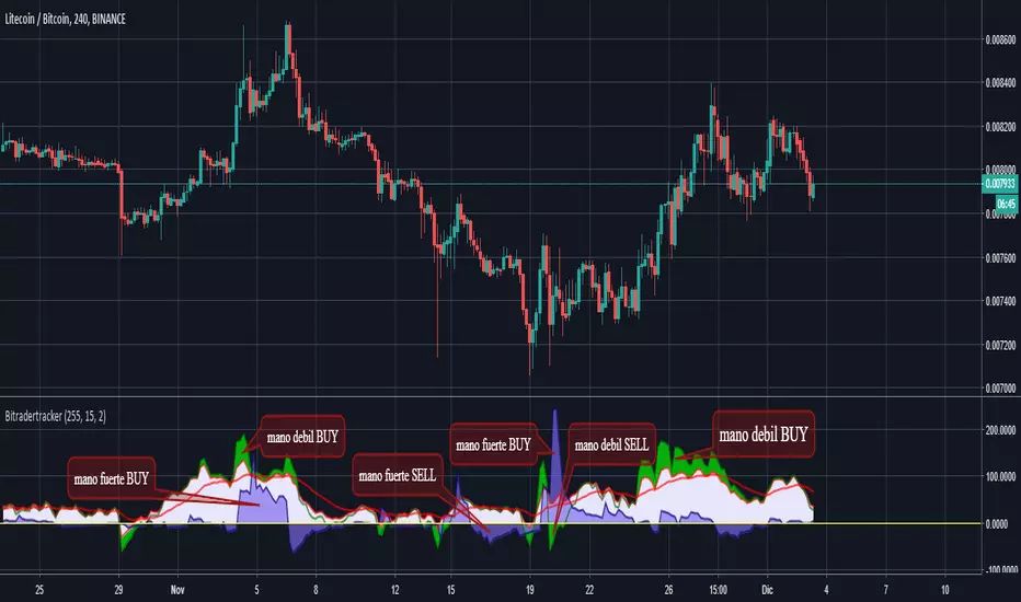
BitradertrackerEste Indicador ya no consiste en líneas móviles que se cruzan para dar señales de entrada o salida, si no que va más allá e interpreta gráficamente lo que está sucediendo con el valor.
Es un algoritmo potente, que incluye 4 indicadores de tendencia y 2 indicadores de volumen.
Con este indicador podemos movernos con las "manos fuertes" del mercado, rastrear sus intenciones y tomar decisiones de compra y venta.
Diseñado para operar en criptomonedas.
En cuanto a qué temporalidad usar, cuanto más grande mejor, ya que al final lo que estamos haciendo es el análisis de datos y, por lo tanto, cuanto más datos, mejor. Personalmente recomiendo usarlo en velas de 30 minutos, 1 hora y 4 horas.
Recuerde, ningún indicador es 100% efectivo.
Este indicador nos muestra en las áreas de color púrpura (manos fuertes) y en las áreas de color verde (manos débiles) y al mostrármelo gráficamente ya el indicador vale la pena.
El mercado está impulsado por dos tipos de inversores, que se denominan manos fuertes o ballenas (agencias, fondos, empresas, bancos, etc.) y manos débiles o peces pequeños (es decir, nosotros).
No tenemos la capacidad de manipular un valor, ya que nuestra cartera es limitada, pero podemos ingresar y salir de los valores fácilmente ya que no tenemos mucho dinero.
Las ballenas pueden manipular un valor ya que tienen muchos bitcoins y / o dinero, sin embargo, no pueden moverse fácilmente.
Entonces, ¿como pueden comprar o vender sus monedas las ballenas? Bueno, ellos hacen su juego: Tratan de hacernos creer que la moneda esta barata cuando nos quieren vender sus monedas o hacernos creer que la moneda es cara cuando quieren comprar nuestras monedas. Esta manipulación se realiza de muchas maneras, la mayoría por noticias.
Nosotros, los pequeños peces, no podemos competir contra las ballenas, pero podemos descubrir qué están haciendo (recuerde, son lentas, mueven sus monstruosas cantidades de dinero) debemos movernos con ellas e imitarlas. Mejor estar bajo la ballena que delante de ella.
Con este indicador puedes ver cuando las ballenas están operando y reaccionar ; porque el enfoque matemático que los sustenta ha demostrado ser bastante exitoso.
Cuando las manos fuertes están por debajo de cero, se dice que están comprando. Lo mismo ocurre con las manos débiles. Generalmente, si las manos fuertes están comprando o vendiendo, el precio está lateralizado. El movimiento del precio está asociado con las compras y ventas realizadas por la mano débil.
Espero que les sea de mucha utilidad.
Bitrader4.0
This indicator no longer consists of mobile lines that intersect to give input or output signals, but it goes further and graphically interprets what is happening with the value.
It is a powerful algorithm, which includes 4 trend indicators and 2 volume indicators.
With this indicator we can move with the "strong hands" of the market, track their intentions and make buying and selling decisions.
Designed to operate in cryptocurrencies.
As for what temporality to use, the bigger the better, since in the end what we are doing is the analysis of data and, therefore, the more data, the better. Personally I recommend using it in candles of 30 minutes, 1 hour and 4 hours.
Remember, no indicator is 100% effective.
This indicator shows us in the areas of color purple (strong hands) and in the areas of color green (weak hands) and by showing it graphically and the indicator is worth it.
The market is driven by two types of investors, which are called strong hands or whales (agencies, funds, companies, banks, etc.) and weak hands or small fish (that is, us).
We do not have the ability to manipulate a value, since our portfolio is limited, but we can enter and exit the securities easily since we do not have much money.
Whales can manipulate a value since they have many bitcoins and / or money, however, they can not move easily.
So, how can whales buy or sell their coins? Well, they make their game: They try to make us believe that the currency is cheap when they want to sell their coins or make us believe that the currency is expensive when they want to buy our coins. This manipulation is done in many ways, most by news.
We, small fish, can not compete against whales, but we can find out what they are doing (remember, they are slow, move their monstrous amounts of money) we must move with them and imitate them. Better to be under the whale than in front of her.
With this indicator you can see when the whales are operating and reacting; because the mathematical approach that sustains them has proven to be quite successful.
When strong hands are below zero, they say they are buying. The same goes for weak hands. Generally, if strong hands are buying or selling, the price is lateralized. The movement of the price is associated with the purchases and sales made by the weak hand.
I hope you find it very useful.
Bitrader4.0
Crypto Correlation Matrix Series [SHK]Hi everyone, Although everything's clear from the title but I should describe some basic points.
Currency Correlation is a statistical measure of how two securities move in relation to each other.
So this script is used to show if current pair (alt-coins) is moving in the same direction of bitcoin (or ethereum) or not. Consider that in crypto market most of alt-coins have correlation of +0.7 with bitcoin, So temporary changes in correlation may signal a reversal or sharp continuation for the alt-coin.
"1" : The alt coin is moving in same direction of Bitcoin (Or Ethereum).
"0" : The alt coin is moving in random direction compared to Bitcoin. (No movement relation)
"-1" : The alt coin is moving in opposite direction of Bitcoin.
Important Note: By default average of 15 bars back is measured to calculate the correlation by this script. Please test other periods and share the best options with us.
Comments are welcomed :)

BTC CorrelationA simple script to display how correlated the current ticker is to Bitcoin.
Inputs are the number of bars to check correlation for (default 10) and the the ticker to use for BTC comparison (default is BITFINEX:BTCUSD)
Values of 1 are highly correlated (i.e. bitcoin moves up, so does your current ticker), values of -1 are inversely correlated (i.e. bitcoin moves up, your current ticker moves down).
See: www.babypips.com for some more details on correlation

BCH BFX Short/Long PercentageA short/long percentage on the Bitcoin Cash/US Dollar pair on Bitfinex.

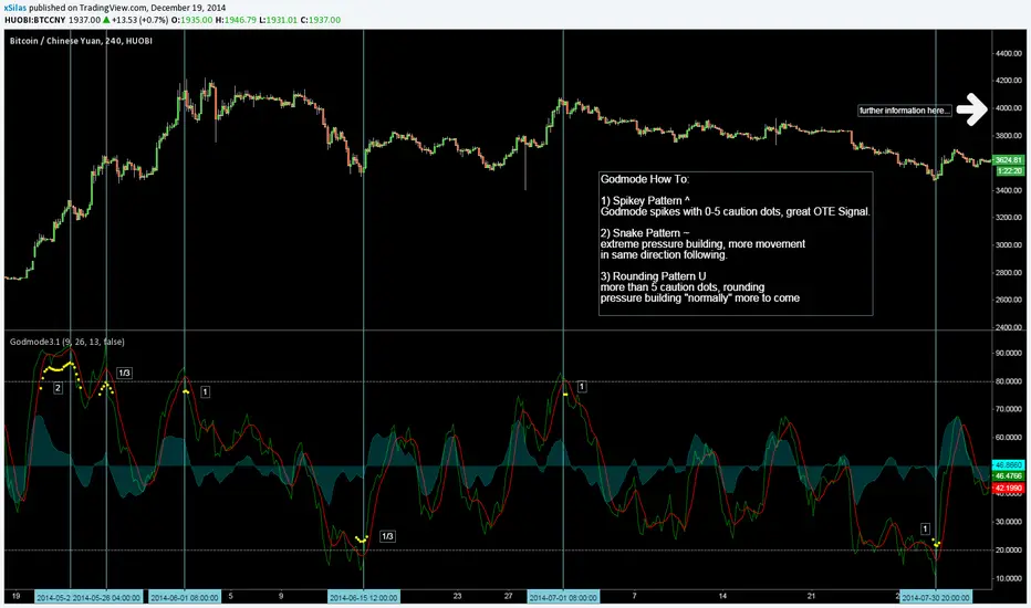
Godmode Oscillator, fresh bread generator, free to use!Greetings Mates,
!!! If you want to use this tool for free you have to to following steps:
1) say thanks to LEGION who coded the first version.
2) say thanks to LAZYBEAR cause we ripped some code snippets from him.
3) say thanks to Ni6HTH4wK who coded the latest version.
4) say thanks to xSilas who gave the idea.
5) I know i said its a FREE Tool and you dont need to donate me cause i have Godmode :), but lets have a litte thought on all the people that are a bit poorer than us. It would be really great if we get some DOLLARS for a great charity action for children.
6) Feel free to spend some Bitcoins to this Address: 1BNjs1Prsux8YQawVWYfiYoxzoKzfReckX
(i start and going to spend 1 BTC) (! the spended amount is revealed at the end!)
7) If you know said thankyou to everybody and may spend some dollars we can go on with Godmode trading.
8) Enjoy the Tool, merry Xmas and cheers for another great volatile bitcoin year :).
GODMODE OSCILLATOR, FRESH BREAD GENERATOR, FREE TO USE!Greetings Mates,
!!! If you want to use this tool for free you have to to following steps:
1) say thanks to LEGION who coded the first version.
2) say thanks to LAZYBEAR cause we ripped some code snippets from him.
3) say thanks to Ni6HTH4wK who coded the latest version.
4) say thanks to xSilas who gave the idea.
5) I know i said its a FREE Tool and you dont need to donate me cause i have Godmode :), but lets have a litte thought on all the people that are a bit poorer than us. It would be really great if we get some DOLLARS for a great charity action for children.
6) Feel free to spend some Bitcoins to this Address: 1BNjs1Prsux8YQawVWYfiYoxzoKzfReckX
(i start and going to spend 1 BTC) (! the spended amount is revealed at the end!)
7) If you know said thankyou to everybody and may spend some dollars we can go on with Godmode trading.
8) Enjoy the Tool, merry Xmas and cheers for another great volatile bitcoin year :).
---------------------------------------------------------
Godmode How To:
1) Spikey Pattern ^
Godmode spikes with 0-5 caution dots, great OTE Signal.
2) Snake Pattern ~
extreme pressure building, more movement
in same direction following.
3) Rounding Pattern U
more than 5 caution dots, rounding
pressure building "normally" more to come

Mission Control Dashboard (AI, Crypto, Liquidity) FASTCONCEPT Price is a lagging indicator. Liquidity is a leading indicator. "Mission Control Dashboard (AI, Crypto, Liquidity) FAST" is a sophisticated macroeconomic dashboard designed to audit the "plumbing" of the financial system in real-time. Unlike standard indicators that rely solely on price action, this tool pulls data from the Federal Reserve (FRED), Treasury Statements, Corporate Financials (10-K/10-Q), and On-Chain Stablecoin metrics to visualize the structural flows driving the market.
THE "UNIFIED FIELD" SOLVER One of the hardest challenges in cross-asset scripting is "Time Dilation"—synchronizing 24/7 Crypto markets (Bitcoin) with Mon-Fri Traditional markets (Stocks/Bonds).
Standard scripts fail on weekends, showing mismatched data.
This engine uses a Weekly Anchor system. It calculates all momentum and liquidity metrics based on "Week-to-Date" or "Month-Ago" anchors. This ensures that a "Liquidity Drain" looks identical whether you are viewing a Bitcoin chart on Saturday or an Apple chart on Monday.
THE CHRONOS LOGIC The dashboard is sorted by Time Sensitivity (Speed of impact), from fast-twitch tactical signals to slow-moving structural fundamentals.
1. TACTICAL (Reacts in 24–48h)
Stablecoin Flight: Measures the immediate flow of capital from Volatile Assets to Stablecoins (USDT/USDC). A spike (>0.5%) indicates fear/sidelining.
Liquidity Alpha: Calculates the efficiency of capital. It subtracts "Friction" (Dollar Strength + Yields) from "Flow" (Liquidity Beta). High Alpha means money is flowing easily into risk assets.
Alt Euphoria: Tracks the overheating of the Altcoin market (TOTAL3). Green indicates sustainable growth; Red (>45%) warns of a "blow-off top."
Retail FOMO: A sentiment gauge comparing Coinbase Stock ( NASDAQ:COIN ) performance vs. Bitcoin ( CRYPTOCAP:BTC ). When Retail outperforms the Asset, local tops often follow.
2. LIQUIDITY & MACRO (Reacts in 1–4 Weeks)
Debt Wall (10Y): The Rate-of-Change of the US 10-Year Treasury Yield. Spiking yields act as gravity on risk assets.
Liquidity Beta: The raw "Quantity of Money." Tracks the 4-week change in Net Liquidity (Fed Balance Sheet - TGA + Stablecoins).
TGA Balance: The Critical Monitor. Tracks the Treasury General Account. When the TGA rises (Red), the government is draining liquidity from the banking system. When it falls (Green), it releases cash.
Note: This script includes an auto-scaler to handle TGA data in both Billions and Millions.
3. STRUCTURAL (Reacts in 3–12 Months)
AI Capex (YoY & QoQ): The "Floor" of the 2025/2026 cycle. Tracks the Capital Expenditure of the Hyperscalers (MSFT, GOOGL, AMZN, META). As long as this remains high (>30%), the infrastructure boom supports the tech narrative.
PMI Manufacturing: Tracks the ISM Manufacturing cycle. Contraction (<50) often forces Fed intervention.
Micron Inventory: A lead indicator for the hardware cycle.
HOW TO USE
Status Colors: The traffic light system helps you assess risk at a glance.
🟢 GREEN (Healthy): Flow is positive, friction is low, fundamentals are strong.
🔴 RED (Danger): Liquidity is draining (TGA spike), yields are shock-rising, or FOMO is excessive.
Zero Configuration: The script auto-detects asset classes and scales units (Billions/Trillions) automatically.
DATA SOURCES
Federal Reserve Economic Data (FRED)
Daily Treasury Statement (DTS)
CryptoCap (TradingView)
Nasdaq/Corporate Financials
Disclaimer: This tool is for informational purposes only and does not constitute financial advice. Macro data feeds are subject to reporting delays.

AHR999 Index (Renewed)AHR999 Indicator
The AHR999 Indicator is created by a Weibo user named ahr999. It assists Bitcoin investors in making investment decisions based on a timing strategy. This indicator implies the short-term returns of Bitcoin accumulation and the deviation of Bitcoin price from its expected valuation.
When the AHR999 index is < 0.45, it indicates a buying opportunity at a low price.
When the AHR999 index is between 0.45 and 1.2, it is suitable for regular investment.
When the AHR999 index is > 1.2, it suggests that the coin price is relatively high and not suitable for trading.
In the long term, Bitcoin price exhibits a positive correlation with block height. By utilizing the advantage of regular investment, users can control their short-term investment costs, keeping them mostly below the Bitcoin price.

deKoder | Business Cycle vs BitcoinThis indicator overlays Bitcoin's detrended momentum with the US ISM Manufacturing PMI (a key business cycle proxy) to visually dissect the relationship between crypto cycles and broader economic health.
Inspired by ongoing debates in crypto macro analysis (e.g., "Is there a 4-year halving cycle, or is it just the business cycle?" ), it highlights potential lead-lag dynamics - challenging the popular view that PMI strictly leads Bitcoin rallies and tops.
Key Features
• BTC Momentum Wave (Yellow/Orange Line):
Detrended deviation from Bitcoin's long-term "fair value" (24-month SMA).
Formula: ((close / sma(close, 24)) * 100 - 100) * 0.15
- Positive (yellow): BTC overvalued relative to trend | bullish momentum
- Negative (orange): Undervalued relative to trend | bearish momentum
• PMI Wave (Teal/Red Line):
ISM Manufacturing PMI centered at zero (raw PMI - 50, scaled ×3 for alignment).
- Positive (teal): Expansion (>50 raw) — economic tailwinds.
- Negative (red): Contraction (<50 raw) — headwinds, often linked to risk-off in assets.
• S&P 500 Momentum (White Line, Optional):
Similar deviation for SPX, showing how equities bridge BTC's volatility and PMI's smoothness.
• Divergence Highlights (Bar & Background Colors):
- Teal/Green Zones : BTC momentum positive while PMI negative → BTC signaling early recovery (potential lead by 1-3+ months at bottoms).
- Maroon/Red Zones : BTC momentum negative while PMI positive → BTC warning of rollovers (early bear signals).
- Neutral: No color — aligned cycles.
• Overlaid SMA on Price Chart :
24-month SMA for BTC (teal when price above, red when below) — quick fair value reference.
How to Interpret: Does BTC Lead the Business Cycle?
The chart flips the common meme ( "No 4-year cycle, it's just the business cycle" ) by visually emphasising BTC's potential as a forward-looking signal .
Historical cycles (2013–2025) show:
• BTC Leads at Bottoms : E.g., 2018–2019 and 2022 troughs — BTC momentum crosses positive 2–4 months before PMI, as speculative traders price in liquidity easing/recoveries ahead of manufacturing data.
• Coincident or BTC-Led at Tops : Peaks align closely (e.g., 2017, 2021), with PMI rollovers often coinciding or slightly leading the initial BTC euphoria fade. BTC then rolls over before PMI confirms later.
• Why? Markets are anticipatory (6–12 months forward), while PMI is a lagged survey snapshot. BTC, as a high-beta risk asset, amplifies early sentiment shifts before they hit factory orders/employment.
Inputs & Customization
• BTC Source (Default: BITSTAMP:BTCUSD)
• Fair Value MA Length (Default: 24 months)
• Show S&P (Default: False)
• PMI Multiplier (Default: 3.0)
• BTC Momentum Multiplier (Default: 0.15)
• Cap BTC Momentum at ±100 (Default: True)
• Toggle Early Cross Arrows, Bar/Background Deviation Colors, Difference Histogram

BTC ETF Average Inflow Cost BasisConcept
Since the historic launch of Bitcoin Spot ETFs on January 11, 2024, institutional flows have become a major driver of price action. This indicator aims to visualize the aggregate Cost Basis (average entry price) of the major Bitcoin ETFs relative to the underlying asset.
It serves as an on-chain proxy for institutional positioning, helping traders identify critical support levels where ETF inflows have historically concentrated.
How it Works
The script aggregates daily volume data from the top Bitcoin ETFs (IBIT, FBTC, ARKB, GBTC, BITB) and compares it against the Bitcoin price (BTCUSDT).
ETF Cost Basis (Pink Line):
This is calculated as a Cumulative Volume-Weighted Average Price (VWAP), anchored specifically to the ETF launch date (Jan 11, 2024).
Formula: It accumulates (BTC Price * Total ETF Volume) and divides it by the Cumulative Total ETF Volume.
This creates a dynamic level representing the "breakeven" price for the aggregate volume traded through these funds.
True Market Mean (Gray Line):
This represents the simple cumulative average of the Bitcoin price since the ETF launch date. It acts as a neutral baseline for the post-ETF market era.
How to Use
Institutional Support: The Cost Basis line often acts as a strong dynamic support level during corrections. When price revisits this level, it suggests the market is returning to the average institutional entry price.
Trend Filter:
Price > Cost Basis: The market is in a net profit state relative to ETF flows (Bullish/Trend continuation).
Price < Cost Basis: The market is in a net loss state (Bearish/Capitulation risk).
Confluence: The intersection of the Cost Basis and the True Market Mean can signal pivotal moments of trend reset.
Features
Data Aggregation: Pulls data from 5 major ETFs via request.security without repainting (using closed bars).
Dashboard: Includes a table in the top-right corner displaying real-time values for Price, Cost Basis, and Market Mean.
Customization: You can toggle individual ETF Moving Averages in the settings (disabled by default due to price scale differences between BTC and ETF shares).
Disclaimer
This tool is for educational purposes only and attempts to estimate institutional cost basis using volume proxies. It does not represent financial advice.

BTC DCA Risk Metric StrategyBTC DCA Risk Strategy - Automated Dollar Cost Averaging with 3Commas Integration
Overview
This strategy combines the proven Oakley Wood Risk Metric with an intelligent tiered Dollar Cost Averaging (DCA) system, designed to help traders systematically accumulate Bitcoin during periods of low risk and take profits during high-risk conditions.
Key Features
📊 Multi-Component Risk Assessment
4-Year SMA Deviation: Measures Bitcoin's distance from its long-term mean
20-Week MA Analysis: Tracks medium-term momentum shifts
50-Day/50-Week MA Ratio: Captures short-to-medium term trend strength
All metrics are normalized by time to account for Bitcoin's maturing market dynamics
💰 3-Tier DCA Buy System
Level 1 (Low Risk): Conservative entry with base allocation
Level 2 (Lower Risk): Increased allocation as opportunity improves
Level 3 (Extreme Low Risk): Maximum allocation during rare buying opportunities
Buys execute every bar while risk remains below thresholds, enabling true DCA accumulation
📈 Progressive Profit Taking
Sell Level 1: Take initial profits as risk increases
Sell Level 2: Scale out further positions during elevated risk
Sell Level 3: Final exit during extreme market conditions
Sell levels automatically reset when new buy signals occur, allowing flexible re-entry
🤖 3Commas Integration
Fully automated webhook alerts for Custom Signal Bots
JSON payloads formatted per 3Commas API specifications
Supports multiple exchanges (Binance, Coinbase, Kraken, Gemini, Bybit)
Configurable quote currency (USD, USDT, BUSD)
How It Works
The strategy calculates a composite risk metric (0-1 scale):
0.0-0.2: Extreme buying opportunity (green zone)
0.2-0.5: Favorable accumulation range (yellow zone)
0.5-0.8: Neutral to cautious territory (orange zone)
0.8-1.0+: High risk, profit-taking zone (red zone)
Buy Logic: As risk decreases, position sizes increase automatically. If risk drops from L1 to L3 threshold, the strategy combines all three tier allocations for maximum exposure.
Sell Logic: Sequential profit-taking ensures you capture gains progressively. The system won't advance to Sell L2 until L1 completes, preventing premature full exits.
Configuration
Risk Metric Parameters:
All calculations use Bitcoin price data (any BTC chart works)
Time-normalized formulas adapt to market maturity
No manual parameter tuning required
Buy Settings:
Set risk thresholds for each tier (default: 0.20, 0.10, 0.00)
Define dollar amounts per tier (default: $10, $15, $20)
Fully customizable to your risk tolerance and capital
Sell Settings:
Configure risk thresholds for profit-taking (default: 1.00, 1.50, 2.00)
Set percentage of position to sell at each level (default: 25%, 35%, 40%)
3Commas Setup:
Create a Custom Signal Bot in 3Commas
Copy Bot UUID and Secret Token into strategy inputs
Enable 3Commas Alerts checkbox
Create TradingView alert: Condition → "alert() function calls only", Webhook → api.3commas.io
Backtesting Results
Strengths:
Systematically buys dips without emotion
Averages down during extended bear markets
Captures explosive bull run profits through tiered exits
Pyramiding (1000 max orders) allows true DCA behavior
Considerations:
Requires sufficient capital for multiple buys during prolonged downtrends
Backtest on Daily timeframe for most reliable signals
Past performance does not guarantee future results
Visual Design
The indicator pane displays:
Color-coded risk metric line: Changes from white→red→orange→yellow→green as risk decreases
Background zones: Green (buy), yellow (hold), red (sell) areas
Dashed threshold lines: Clear visual markers for each buy/sell level
Entry/Exit labels: Green buy labels and orange/red sell labels mark all trades
Credits
Original Risk Metric: Oakley Wood
Strategy Development & 3Commas Integration: Claude AI (Anthropic)
Modifications: pommesUNDwurst
Disclaimer
This strategy is for educational and informational purposes only. Cryptocurrency trading carries substantial risk of loss. Always conduct your own research and never invest more than you can afford to lose. The authors are not financial advisors and assume no responsibility for trading decisions made using this tool.

Debt-Cycle vs Bitcoin-CycleDebt-Cycle vs Bitcoin-Cycle Indicator
The Debt-Cycle vs Bitcoin-Cycle indicator is a macro-economic analysis tool that compares traditional financial market cycles (debt/credit cycles) against Bitcoin market cycles. It uses Z-score normalization to track the relative positioning of global financial conditions versus cryptocurrency market sentiment, helping identify potential turning points and divergences between traditional finance and digital assets.
Key Features
Dual-Cycle Analysis: Simultaneously tracks traditional financial cycles and Bitcoin-specific cycles
Z-Score Normalization: Standardizes diverse data sources for meaningful comparison
Multi-Asset Coverage: Analyzes currencies, commodities, bonds, monetary aggregates, and on-chain metrics
Divergence Detection: Identifies when Bitcoin cycles move independently from traditional finance
21-Day Timeframe: Optimized for Long-term cycle analysis
What It Measures
Finance-Cycle (White Line)
Tracks traditional financial market health through:
Currencies: USD strength (DXY), global currency weights (USDWCU, EURWCU)
Commodities: Oil, gold, natural gas, agricultural products, and Bitcoin price
Corporate Bonds: Investment-grade spreads, high-yield spreads, credit conditions
Monetary Aggregates: M2 money supply, foreign exchange reserves (weighted by currency)
Treasury Bonds: Yield curve (2Y/10Y, 3M/10Y), term premiums, long-term rates
Bitcoin-Cycle (Orange Line)
Tracks Bitcoin market positioning through:
On-Chain Metrics:
MVRV Ratio (Market Value to Realized Value)
NUPL (Net Unrealized Profit/Loss)
Profit/Loss Address Distribution
Technical Indicators:
Bitcoin price Z-score
Moving average deviation
Relative Strength:
ETH/BTC ratio (altcoin strength indicator)
Visual Elements
White Line: Finance-Cycle indicator (positive = expansionary conditions, negative = contractionary)
Orange Line: Bitcoin-Cycle indicator (positive = bullish positioning, negative = bearish)
Zero Line: Neutral reference point
Interpretation
Cycle Alignment
Both positive: Risk-on environment, favorable for crypto
Both negative: Risk-off environment, caution warranted
Divergence: Potential opportunities or warning signals
Divergence Signals
Finance positive, Bitcoin negative: Bitcoin may be undervalued relative to macro conditions
Finance negative, Bitcoin positive: Bitcoin may be overextended or decoupling from traditional finance
Important Limitations
This indicator uses some technical and macro data but still has significant gaps:
⚠️ Limited monetary data - missing:
Funding rates (repo, overnight markets)
Comprehensive bond spread analysis
Collateral velocity and quality metrics
Central bank balance sheet details
⚠️ Basic economic coverage - missing:
GDP growth rates
Inflation expectations
Employment data
Manufacturing indices
Consumer confidence
⚠️ Simplified on-chain analysis - missing:
Exchange flow data
Whale wallet movements
Mining difficulty adjustments
Hash rate trends
Network fee dynamics
⚠️ No sentiment data - missing:
Fear & Greed Index
Options positioning
Futures open interest
Social media sentiment
The indicator provides a high-level cycle comparison but should be combined with comprehensive fundamental analysis, detailed on-chain research, and proper risk management.
Settings
Offset: Adjust the horizontal positioning of the indicators (default: 0)
Timeframe: Fixed at 21 days for optimal cycle detection
Use Cases
Macro-crypto correlation analysis: Understand when Bitcoin moves with or against traditional markets
Cycle timing: Identify potential tops and bottoms in both cycles
Risk assessment: Gauge overall market conditions across asset classes
Divergence trading: Spot opportunities when cycles diverge significantly
Portfolio allocation: Balance traditional and crypto assets based on cycle positioning
Technical Notes
Uses Z-score normalization with varying lookback periods (40-60 bars)
Applies HMA (Hull Moving Average) smoothing to reduce noise
Asymmetric multipliers for upside/downside movements in certain metrics
Requires access to FRED economic data, Glassnode, CoinMetrics, and IntoTheBlock feeds
21-day timeframe optimized for cycle analysis
Strategy Applications
This indicator is particularly useful for:
Cross-asset allocation - Decide between traditional finance and crypto exposure
Cycle positioning - Identify where we are in credit/debt cycles vs. Bitcoin cycles
Regime changes - Detect shifts in market leadership and correlation patterns
Risk management - Reduce exposure when both cycles turn negative
Disclaimer: This indicator is a cycle analysis tool and should not be used as the sole basis for investment decisions. It has limited coverage of monetary conditions, economic fundamentals, and on-chain metrics. The indicator provides directional insight but cannot predict exact timing or magnitude of market moves. Always conduct thorough research, consider multiple data sources, and maintain proper risk management in all investment decisions.

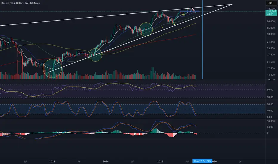
BTC -50% Crash to Recovery ZoneGeneral Overview This is a macro-analysis tool designed to visualize the true duration of Bitcoin’s "Suffering & Recovery Cycles." Unlike standard oscillators that only signal oversold conditions, this script highlights the entire timeline required for the market to flush out leverage and return to All-Time Highs (ATH).
Operational Logic The algorithm tracks Bitcoin’s historical All-Time High (ATH).
The Trigger: It activates automatically when the price drops 50% below the last recorded ATH.
The "Recovery Zone": Once triggered, the chart background turns red (indicating a "Drawdown" state). This zone remains active persistently, even during intermediate relief rallies.
The Reset: The zone deactivates only when the price breaks above the previous ATH, marking the official start of a new Price Discovery phase.
How to Read It
Red Background: We are officially in a Bear Market or Recovery Phase. The asset is technically "underwater." For the long-term investor with a low time preference, this visually defines the accumulation window.
Red Horizontal Line: Indicates the "Target." This is the exact price level of the old ATH that Bitcoin must reclaim to close the bearish cycle.
No Background Color: We are in Price Discovery. The market is healthy and pushing for new highs.
The Financial Lesson This indicator visually demonstrates a fundamental market truth: "Price takes the elevator down, but takes the stairs up." It shows that after a halving of value (-50%), Bitcoin may take months or years to recover previous levels, helping investors filter out the noise of short-term pumps that fail to break the macro-bearish structure.

Global Liquidity Proxy vs BitcoinGlobal Liquidity Proxy vs Bitcoin. Helps to understand the cycles with liquidty.
Adaptive MVRV & RSI Strategy V6 (Dynamic Thresholds)Strategy Explanation
This is an advanced Dollar-Cost Averaging (DCA) strategy for Bitcoin that aims to adapt to long-term market cycles and changing volatility. Instead of relying on fixed buy/sell signals, it uses a dynamic, weighted approach based on a combination of on-chain data and classic momentum.
Core Components:
Dual-Indicator Signal: The strategy combines two powerful indicators for a more robust signal:
MVRV Ratio: An on-chain metric to identify when Bitcoin is fundamentally over or undervalued relative to its historical cost basis.
Weekly RSI: A classic momentum indicator to gauge long-term market strength and identify overbought/oversold conditions.
Dynamic, Self-Adjusting Thresholds: The core innovation of this strategy is that it avoids fixed thresholds (e.g., "sell when RSI is 70"). Instead, the buy and sell zones are dynamically calculated based on a long-term (2-year) moving average and standard deviation of each indicator. This allows the strategy to automatically adapt to Bitcoin's decreasing volatility and changing market structure over time.
Weighted DCA (Scaling In & Out): The strategy doesn't just buy or sell a fixed amount. The size of its trades is scaled based on conviction:
Buying: As the MVRV and RSI fall deeper into their "undervalued" zones, the percentage of available cash used for each purchase increases.
Selling: As the indicators rise further into "overvalued" territory, the percentage of the current position sold also increases.
This creates an adaptive system that systematically accumulates during periods of fear and distributes during periods of euphoria, with the intensity of its actions directly tied to the extremity of market conditions.

M2 Liqudity WaveGlobal Liquidity Wave Indicator (M2-Based)
The Global Liquidity Wave Indicator is designed to track and visualize the impact of global M2 liquidity on risk assets—especially those highly correlated to monetary expansion, like Bitcoin, MSTR, and other macro-sensitive equities.
Key features include:
Leading Signal: Historically leads Bitcoin price action by approximately 70 days, offering traders and analysts a forward-looking edge.
Wave-Based Projection: Visualizes a "probability cloud"—a smoothed band representing the most likely trajectory for Bitcoin based on changes in global liquidity.
Min/Max Offset Controls: Adjustable offsets let you define the range of lookahead windows to shape the wave and better capture liquidity-driven inflection points.
Explicit Offset Visualization: Option to manually specify an exact offset to fine-tune the overlay, ideal for testing hypotheses or aligning with macro narratives.
Macro Alignment: Particularly effective for assets with high sensitivity to global monetary policy and liquidity cycles.
This tool is not just a chart overlay—it's a lens into the liquidity engine behind the market, helping anticipate directional bias in advance of price moves.
How to use?
- Enable the indicator for BTCUSD.
- Set Offset Range Start and End to 70 and 115 days
- Set Specific Offset to 78 days (this can change so you'll need to play around)
FAQ
Why a global liquidity wave?
The global liquidity wave accounts for variability in how much global liquidity affects an underlying asset. Think of the Global Liquidity Wave as an area that tracks the most probable path of Bitcoin, MSTR, etc. based on the total global liquidity.
Why the offset?
Global liquidity takes time to make its way into assets such as #Bitcoin, Strategy, etc. and there can be many reasons for that. It's never a specific number of days of offset, which is why a global liquidity wave is helpful in tracking probable paths for highly correlated risk assets.

Global M2 10-Week Lead (for bitcoin)This script displays a combined view of the Global M2 Money Supply, converted to USD and adjusted with a configurable forward lead (default 10 weeks). It is designed to help visualize macro liquidity trends and anticipate potential impacts on Bitcoin price movements across any timeframe.
🔹 Main Features:
- Aggregates M2 data from 18 countries and regions including the USA, Eurozone, China, Japan, and more.
- All M2 values are converted to USD using respective exchange rates.
- Customizable “Slide Weeks Forward” setting lets you project global liquidity data into the future.
- Works on all timeframes by adjusting the projection logic dynamically.
- Toggle each country’s data on or off to customize the liquidity model.
💡 Use Case:
Global liquidity is often a leading indicator for major asset classes. This tool helps traders and analysts assess macro-level trends and their potential influence on Bitcoin by looking at changes in M2 money supply worldwide.
💡 Inspired By:
This tool mimics the Global M2 10-Week Lead liquidity indicator often referenced by Raoul Pal of Real Vision and Global Macro Investor, used for macro analysis and Bitcoin movement prediction.
📊 Note:
All economic and FX data is sourced from TradingView’s built-in datasets (ECONOMICS and FX_IDC). Data availability may vary depending on your plan.
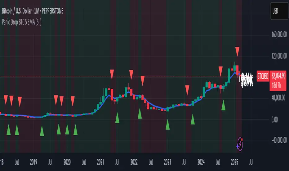
Panic Drop Bitcoin 5 EMA Buy & Sell SignalPanic Drop BTC 5 EMA
What It Does:
This indicator tracks Bitcoin’s price against a 5-period Exponential Moving Average (EMA) to deliver simple buy and sell signals. A green arrow below the candle signals a buy when Bitcoin closes above the 5-EMA, while a red arrow above signals a sell when it closes below. Perfect for spotting Bitcoin’s momentum shifts—whether you’re a newbie, crypto trader, or short on time.
Key Features:
Plots a customizable 5-EMA (default: blue line).
Buy () and Sell () signals on crossovers/crossunders.
Optional background highlight: green (above EMA), red (below).
Alerts for buy/sell triggers.
Fully adjustable: timeframe, colors, signal toggles.
How to Use It:
Add to your BTC/USD chart (works on any timeframe—daily default recommended).
Watch for green arrows (buy) below candles and red arrows (sell) above.
Customize via settings:
Adjust EMA period (default: 5).
Set timeframe (e.g., "D" for daily, "1H" for hourly).
Change colors or toggle signals/background off.
Set alerts: Right-click a signal > "Add Alert" > Select "Buy Signal" or "Sell Signal."
Trade smart: Use signals to catch Bitcoin dips (e.g., buy below $100K) or exits.
Why It’s Great:
Beginners: Clear arrows simplify decisions.
Crypto Traders: 5-EMA catches Bitcoin’s fast moves.
Busy Investors: Signals save time—no deep analysis needed.
Created by Timothy Assi (Panic Drop), eToro’s elite investor. Test it, tweak it, and trade with confidence!
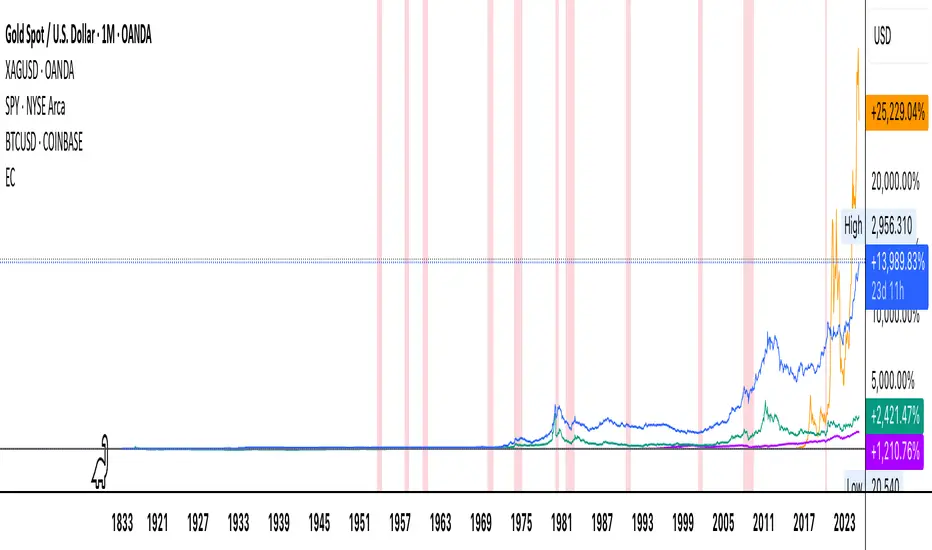
Economic Crises by @zeusbottradingEconomic Crises Indicator by @zeusbottrading
Description and Use Case
Overview
The Economic Crises Highlight Indicator is designed to visually mark major economic crises on a TradingView chart by shading these periods in red. It provides a historical context for financial analysis by indicating when major recessions occurred, helping traders and analysts assess the performance of assets before, during, and after these crises.
What This Indicator Shows
This indicator highlights the following major economic crises (from 1953 to 2020), which significantly impacted global markets:
• 1953 Korean War Recession
• 1957 Monetary Tightening Recession
• 1960 Investment Decline Recession
• 1969 Employment Crisis
• 1973 Oil Crisis
• 1980 Inflation Crisis
• 1981 Fed Monetary Policy Recession
• 1990 Oil Crisis and Gulf War Recession
• 2001 Dot-Com Bubble Crash
• 2008 Global Financial Crisis (Great Recession)
• 2020 COVID-19 Recession
Each of these periods is shaded in red with 80% transparency, allowing you to clearly see the impact of economic downturns on various financial assets.
How This Indicator is Useful
This indicator is particularly valuable for:
✅ Comparative Performance Analysis – It allows traders and investors to compare how different assets (e.g., Gold, Silver, S&P 500, Bitcoin) performed before, during, and after major economic crises.
✅ Identifying Market Trends – Helps recognize recurring patterns in asset price movements during times of financial distress.
✅ Risk Management & Strategy Development – Understanding how markets reacted in the past can assist in making better-informed investment decisions for future downturns.
✅ Gold, Silver & Bitcoin as Safe Havens – Comparing precious metals and cryptocurrencies against traditional stocks (e.g., SPY) to analyze their performance as hedges during economic turmoil.
How to Use It in Your Analysis
By overlaying this indicator on your Gold, Silver, SPY, and Bitcoin chart (for example), you can quickly spot historical market reactions and use that insight to predict possible behaviors in future downturns.
⸻
How to Apply This in TradingView?
1. Click on Use on chart under the image.
2. Overlay it with Gold ( OANDA:XAUUSD ), Silver ( OANDA:XAGUSD ), SPY ( AMEX:SPY ), and Bitcoin ( COINBASE:BTCUSD ) for comparative analysis.
⸻
Conclusion
This indicator serves as a powerful historical reference for traders analyzing asset performance during economic downturns. By studying past crises, you can develop a data-driven investment strategy and improve your market insights. 🚀📈
Let me know if you need any modifications or enhancements!
Crypto Fear & Greed Score [Underblock]Crypto Fear & Greed Score - Methodology & Functioning
Introduction
The Crypto Fear & Greed Score is a comprehensive indicator designed to assess market sentiment by detecting extreme conditions of panic (fear) and euphoria (greed). By combining multiple technical factors, it helps traders identify potential buying and selling opportunities based on the emotional state of the market.
This indicator is highly customizable, allowing users to adjust weight parameters for RSI, volatility, Bitcoin dominance, and trading volume, making it adaptable to different market conditions.
Key Components
The indicator consists of two primary sub-scores:
Fear Score (Panic) - Measures the intensity of fear in the market.
Greed Score (Euphoria) - Measures the level of overconfidence and excessive optimism.
The difference between these two values results in the Net Score, which indicates the dominant market sentiment at any given time.
1. Relative Strength Index (RSI)
The indicator utilizes multiple RSI timeframes to measure momentum and overbought/oversold conditions:
RSI 1D (Daily) - Captures medium-term sentiment shifts.
RSI 4H (4-hour) - Identifies short-term market movements.
RSI 1W (Weekly) - Helps detect long-term overbought/oversold conditions.
2. Volatility Analysis
High volatility is often associated with fear and panic-driven selling.
Low volatility in bullish markets may indicate complacency and overconfidence.
3. Bitcoin Dominance (BTC.D)
Bitcoin dominance provides insights into capital flow between Bitcoin and altcoins:
Rising BTC dominance suggests fear as investors move into BTC for safety.
Declining BTC dominance indicates increased risk appetite and potential market euphoria.
4. Buying and Selling Volume
The indicator analyzes both buying and selling volume, ensuring a clearer confirmation of market sentiment.
High buying volume in uptrends reinforces bullish momentum.
Spikes in selling volume indicate panic and possible market bottoms.
Calculation Methodology
The indicator allows users to adjust weight parameters for each component, making it adaptable to different trading strategies. The formulas are structured as follows:
Fear Score (Panic Calculation)
Fear Score = (1 - RSI_1D) * W_RSI1D + (1 - RSI_4H) * W_RSI4H + (1 - Dominance) * W_Dominance + Volatility * W_Volatility + Sell Volume * W_SellVolume
Greed Score (Euphoria Calculation)
Greed Score = RSI_1D * W_RSI1D + RSI_4H * W_RSI4H + Dominance * W_Dominance + (1 - Volatility) * W_Volatility + Buy Volume * W_BuyVolume
Net Fear & Greed Score
Net Score = (Greed Score - Fear Score) * 100
Interpretation:
Above 70: Extreme greed -> possible overbought conditions.
Below -70: Extreme fear -> potential buying opportunity.
Near 0: Neutral market sentiment.
Trend Reversal Detection
The indicator includes two moving averages for enhanced trend detection:
Short-term SMA (50-periods) - Reacts quicklier to changes in sentiment.
Long-term SMA (200-periods) - Captures broader trend reversals.
How Crossovers Work:
Short SMA crossing above Long SMA -> Potential bullish reversal.
Short SMA crossing below Long SMA -> Possible bearish trend shift.
Alerts for SMA crossovers help traders act on momentum shifts in real-time.
Customization and Visualization
The Net Score dynamically changes color: green for greed, red for fear.
Users can adjust weightings directly from settings, avoiding manual script modifications.
Reference levels at 70 and -70 provide clarity on extreme market conditions.
Conclusion
The Crypto Fear & Greed Score provides a powerful and objective measure of market sentiment, helping traders navigate extreme conditions effectively.
🟢 If the Net Score is below -70, panic may present a buying opportunity.
🔴 If the Net Score is above 70, excessive euphoria may indicate a selling opportunity.
⚖️ Neutral values suggest a balanced market sentiment.
By customizing weight parameters and utilizing trend reversal alerts, traders can gain a deeper insight into market psychology and make more informed trading decisions. 🚀

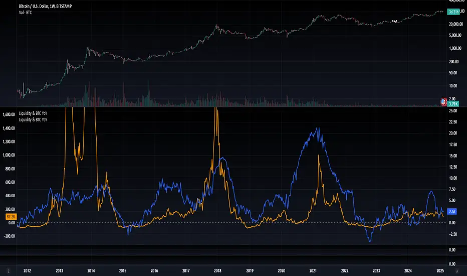
Blockchain Fundamentals: Liquidity & BTC YoYLiquidity & BTC YoY Indicator
Overview:
This indicator calculates the Year-over-Year (YoY) percentage change for two critical metrics: a custom Liquidity Index and Bitcoin's price. The Liquidity Index is derived from a blend of economic and forex data representing the M2 money supply, while the BTC price is obtained from a reliable market source. A dedicated limit(length) function is implemented to handle limited historical data, ensuring that the YoY calculations are available immediately—even when the chart's history is short.
Features Breakdown:
1. Limited Historical Data Workaround
- Functionality: limit(length) The function dynamically adjusts the lookback period when there isn’t enough historical data. This prevents delays in displaying YoY metrics at the beginning of the chart.
2. Liquidity Calculation
- Data Sources: Combines multiple data streams:
USM2, ECONOMICS:CNM2, USDCNY, ECONOMICS:JPM2, USDJPY, ECONOMICS:EUM2, USDEUR
- Formula:
Liquidity Index = USM2 + (CNM2 / USDCNY) + (JPM2 / USDJPY) + (EUM2 / USDEUR)
[b3. Bitcoin Price Calculation
- Data Source: Retrieves Bitcoin's price from BITSTAMP:BTCUSD on the user-selected timeframe for its historical length.
4. Year-over-Year (YoY) Percent Change Calculation
- Methodology:
- The indicator uses a custom function, to autodetect the proper number of bars, based on the selected timeframe.
- It then compares the current value to that from one year ago for both the Liquidity Index and BTC price, calculating the YoY percentage change.
5. Visual Presentation
- Plotting:
- The YoY percentage changes for Liquidity (plotted in blue) and BTC price (plotted in orange) are clearly displayed.
- A horizontal zero line is added for visual alignment, making it easier to compare the two copies of the metric. You add one copy and only display the BTC YoY. Then you add another copy and only display the M2 YoY.
-The zero lines are then used to align the scripts to each other by interposing them. You scale each chart the way you like, then move each copy individually to align both zero lines on top of each other.
This indicator is ideal for analysts and investors looking to monitor macroeconomic liquidity trends alongside Bitcoin's performance, providing immediate insights.