Daily, Monthly & Weekly Clouds (use on day chart)This indicator offers Ichimoku clouds for periods 1, 7, and 30. When used on the DAILY chart these correspond to the D, W & M time frames respectively.
The indicator just has the clouds right now because that's all I use. It doesn't have tenken, kijun or anything right now.
在腳本中搜尋"daily"


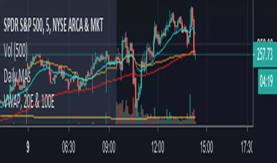
Daily Moving Averages - 20EMA, 100SMA and 200SMAThis prints the daily 20EMA, 100SMA and 200SMA onto any time frame you want.
Daily Simplistic Moving Average Strategy 10/22Indicates crossing over or under of the 10 and 22 SMA
Best used on the daily chart for crypto assets such as BTC & ETH
Daily OHLPlots the daily open high low for any chart on any market.
Work very well for all crypto exchanges.
When using for Traditional markets, please use data from Forex.com due to various exchanges running on different time zones.

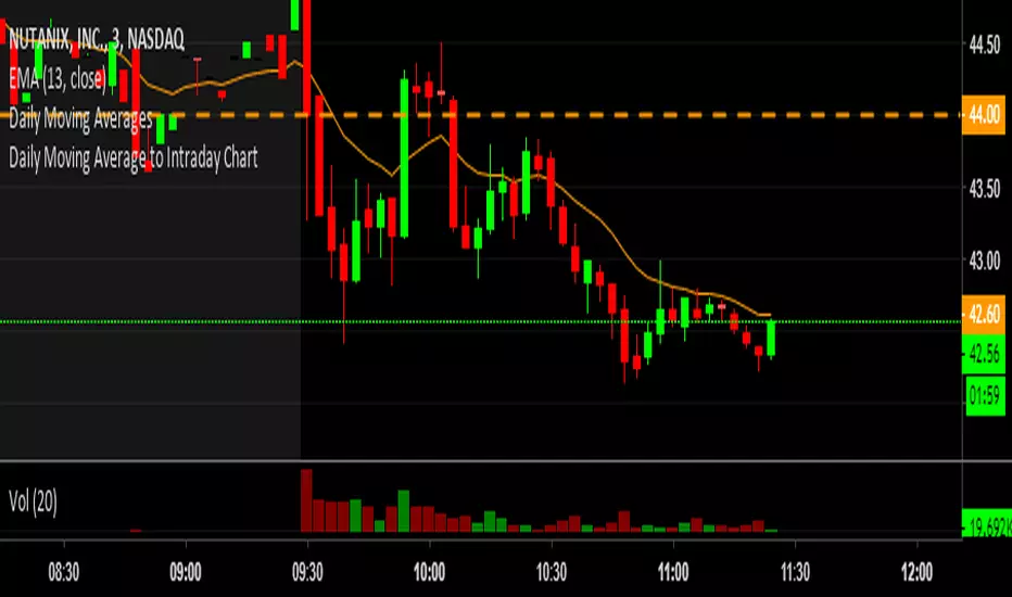
Daily Moving Average to Intraday ChartThis is going to include the 20EMA, 100SMA and 200SMA automatically into your intraday charts.

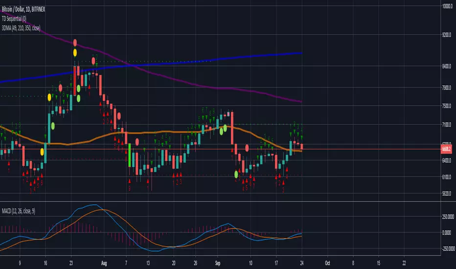
Daily Triple Moving AveragesDisplays triple moving average (SMA calculation method) intended for use daily time frames. Equivalent to 7,30, & 50 on weekly time frame.
Orange = 49
Purple = 210
Blue = 350
Daily Stop calculatorCalculates STOP LOSS points calculated by daily ATR.
Red line is for short direction.
Green line is for Long direction

Daily Auto Fibonacci ToolCalculates Fibonacci retracements based on daily highs/lows, and further beyond that if specified. The main difference between this and other auto Fibbing tools is ease of visibility.
Options:
Take highs/lows from a few days back or take highs/lows from each daily candle
Hide retracements before today
Show labels for each retracement level
Hide/Show retracement levels
Change colors quickly and uniformly (in script)
Retracements used:
-0.382 / 0 / 0.236 / 0.382 / 0.5 / 0.618 / 0.786 / 1 / 1.272

Daily Moving Averages (EMA)Adds Four configurable Daily Exponential Averages to a chart. Daily MA are generally good sources of support and resistance, and being able to see them in shorter timeframes can be useful


Daily Close repainting resultsit's a repainting script cheating on tester, on backtesting %100 correct but on forward testing it will only work % 15 correct and %85 wrong. I did another script showing real forward testing results of this script.

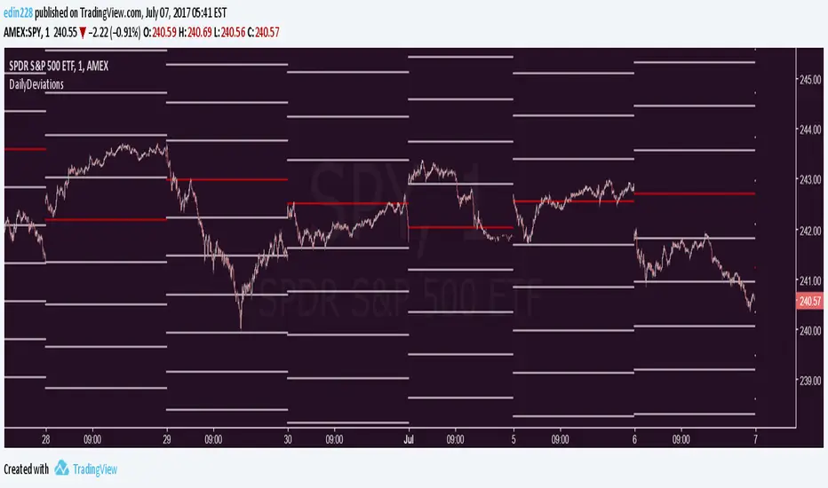
Daily Deviations Version 3Version 3 of Daily Deviations
Combines Lazy and Self Input version
HOW TO USE:
Select volatility index related to ticker. (Ex. Using SPY? Select VIX. Using QQQ? Select VXN. etc)
OR
Uncheck other volatility options and select "Use Custom Volatility" and input your own volatility.
Default setting is to use the previous close price as the "0 Level".
OR
Uncheck "Use Close Price" to enable a synthetic settlement price that is made by using the average of the daily open and close.
OR
Uncheck "Use Close Price" and select "Use Custom Settlement" and input your own settlement price.
Mess around and find the settings that you like the most.
Credits to /u/Living_Granger and /u/UberBotMan for the formulas and idea.

Pivots Daily Weekly Monthly YearlyDaily, Weekly, Monthly and yearly pivot lines
Just the pivot lines without the support and resistance lines


Daily Close Comparison Strategy (by ChartArt via sirolf2009)Comparing daily close prices as a strategy.
This strategy is equal to the very popular "ANN Strategy" coded by sirolf2009(1) which calculates the percentage difference of the daily close price, but this bar-bone version works completely without his Artificial Neural Network (ANN) part.
Main difference besides stripping out the ANN is that my version uses close prices instead of OHLC4 prices, because they perform better in backtesting. And the default threshold is set to 0 to keep it simple instead of 0.0014 with a larger step value of 0.001 instead of 0.0001. Just like the ANN strategy this strategy goes long if the close of the current day is larger than the close price of the last day. If the inverse logic is true, the strategy goes short (last close larger current close). (2)
This basic strategy does not have any stop loss or take profit money management logic. And I repeat, the credit for the fundamental code idea goes to sirolf2009.
(2) Because the multi-time-frame close of the current day is future data, meaning not available in live-trading (also described as repainting), is the reason why this strategy and the original "ANN Strategy" coded by sirolf2009 perform so excellent in backtesting.
All trading involves high risk; past performance is not necessarily indicative of future results. Hypothetical or simulated performance results have certain inherent limitations. Unlike an actual performance record, simulated results do not represent actual trading. Also, since the trades have not actually been executed, the results may have under- or over-compensated for the impact, if any, of certain market factors, such as lack of liquidity. Simulated trading programs in general are also subject to the fact that they are designed with the benefit of hindsight. No representation is being made that any account will or is likely to achieve profits or losses similar to those shown.
(1) You can get the original code by sirolf2009 including the ANN as indicator here:
(1) and this is sirolf2009's very popular strategy version of his ANN:

Daily ATR%If You are using a percentage of the Daily Average True Range in determining your stop placement,
this quick indicator is for You.
excerpt from investopedia.com/articles/trading/06/stopplacement.asp
ATR % Stop Method
The ATR% stop method can be used by any type of trader because the width of the stop is determined by the percentage of average true range (ATR). ATR is a measure of volatility over a specified period of time. The most common length is 14, which is also a common length for oscillators such as the relative strength index (RSI) and stochastics. A higher ATR indicates a more volatile market, while a lower ATR indicates a less volatile market. By using a certain percentage of ATR, you ensure that your stop is dynamic and changes appropriately with market conditions.
For example, for the first four months of 2006, the GBP/USD average daily range was around 110 to 140 pips. A day trader may want to use a 10% ATR stop - meaning that the stop is placed 10% x ATR pips from the entry price.In this instance, the stop would be anywhere from 11 to 14 pips from your entry price. A swing trader might use 50% or 100% of ATR as a stop. In May and June of 2006, daily ATR was anywhere from 150 to 180 pips. As such, the day trader with the 10% stop would have stops from entry of 15 to 18 pips while the swing trader with 50% stops would have stops of 75 to 90 pips from entry.
