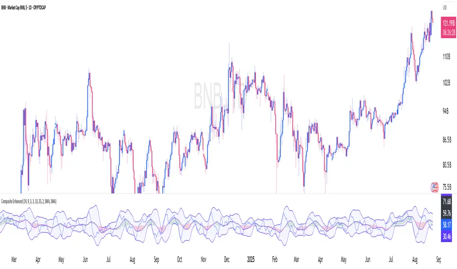
AIMS Wave TVUsing the Logic of the 10 Seconds Elliott Wave
You can Count Elliott Wave on the Histogram of this indicator instead of Price.
This is simpler and more accurate (subjectivity)
Please follow the link below to download FREE EBook which explains how to use this super duper indicator.
在腳本中搜尋"elliott"

AIMS Box TV [ Trade in line with the Structure of the Market] Introduction to AIMS Box
The Market has an underlying Unseen Structure that can be revealed by using this indicator.
The underlying structure of the Market is Elliott Wave. And the Underlying Structure of Elliott Wave is the Fractals. This BOX is based on the Fractals.
The AIMS Box is created using the fractals. The Upper and Lower Levels require a minimum of five bars with the top of the box being the upper Fractal; the bottom of the box, the lower Fractal
The AIMS Levels are the high and low of the AIMS Box – the upper and lower Fractals.
This indicator, by itself, provided the concept that revolutionised my trading.
AIMS Box can be used for
1. Calculating Risk Per Trade
2. To Find the Trend of the Market i.e. Stepping Up is Uptrend and Stepping Down is Down Trend.
3. The box lower levels are used for Trailing Stops for Buy Orders and Box High levels are used for Trailing Stop for Sell Trades.
Anatomy of the AIMS Box and the AIMS Levels
As mentioned earlier, the AIMS Boxes are formed using high and low Fractals. A new AIMS Box will be created whenever price makes a new high or low Fractal.
The bottom of the AIMS Box – the Lower AIMS Level - is created when a low Fractal is formed i.e. the low of a candle is lower than two candles to the left and two candles to the right.
The AIMS Level clearly shows support and resistance – where price approached a level and could not go further, forcing it to retrace on itself.
Pending Sell Order is set 1 pip below the lower AIMS Level (provided it’s a correct Setup).
The top of the AIMS Box – the Upper AIMS Level - is created when a high Fractal is formed i.e. the high of a candle is higher than two candles to the left and two candles to the right.
Pending Buy Order is set 1 pip + spread above the AIMS Box (provided it’s a correct Setup).
Benefits of this Indicator:
Objective information generated by the AIMS Box and its Levels
Crystal clear entry levels.
Stop-loss levels – clear support and resistance levels.
Money management information.
Position/lot size information.
Trailing stop-loss mechanism.
AIMS Box also generates the following additional information about the market:
The market always creates an AIMS Box before it turns around.
Every trend starts and ends with an AIMS Level.
Entries are always taken on the breakout of the AIMS Box.
We don’t take entries inside the AIMS Box on the timeframe that produced the Setup.
When price is inside the grey shaded zone, it is inside the AIMS Box; it is within the AIMS
How to Get Access to This Script?
Contact me using the link below to gain access.
Contrating diagonal scannerHello!, This script´s function is to find what in Elliott Wave theory are called ´´contracting diagonal´´. In order to do so( and this is what differentiates this script from the vast majority of scripts) we looked for programming the search of collinearity(or at least and approximation) inside the price chart, because points 1,3 and 5 should be near to the collinearity. As Elliott Wave theory is applied on every market, this scanner was made to be applied on every market also. Also, once the scanner detects a diagonal, it marks an entry point (which is the price at the exact moment that the diagonal is detected) along with an invalidation level defined for the rules of wave theory and finally a level of objective also defined by these rules.
for all those who want to have access, PM us to obtain access

Ranked TickThe NYSE TICK is, very simply, the number of stocks ticking down or up at any given time. It is, therefore, an internal indication of buying and selling pressure. By itself, it can be difficult to interpret. This “Ranked Tick” makes the TICK an oscillator that varies from 0 to 100. This indicator can be of great help in determining when the market is overbought or oversold.
This oscillator is a percentile ranking of the high + low of the current bar of the TICK compared to the recent values of the same sum over a certain number of bars, which the user can set as an input, the “Rank Length”. This indicator can be of great help in determining when the market is overbought or oversold.
It was conceived by SergioT for TradeStation, and he was gracious enough to share his TradeStation script with all the traders at elliottwavetrader.net. I transcribed it into Pine Script so that everyone at TradingView could also have it.
Trend Velocity & Quality
TR: Trend Velocity & Quality osilatörü klasik bir Rsi indikatörüne ek olarak trendin hızını ve kalitesini hassas bir biçimde ölçer. Rsi aslında teknik analizi zorlaştıran gergin bir indikatördür. Bu sebeple yanlış sinyaller almanıza ve trendin yönünü net analiz edememenize sebep olarak trade etmenizi zorlaştırır. Rsi Trend Velocity & Quality osilatörü içerdiği fonksiyonlar ile gergin olmayan daha sıkı duruşlar sergileyerek daha anlamlı eşikler üretir. Ayrıca aşırı gürültüye bağlı bozulma korkusu olmadan Rsi’ dan daha hızlı hareket ederek daha erken sinyal almanıza vesile olur. Yani özetle daha sıkı duruşlar, daha iyi eşikler, daha hızlı bir momentum göstergesi ve erken sinyaller üreten pürüzsüz bir osilatördür. Osilatörle ilgili daha fazla bilgi edinmek ve nasıl kullanıldığını öğrenmek için lütfen youtube videosunu izleyin.
Matematiksel Fonksiyon ;
Önce periyotluk Tipik Fiyat (Typical Price) Hesaplanır ve sonra Tipik Fiyat 100 ile çarpılırak Gecikmiş Tipik Fiyat bulunur ve bir önceki Gecikmiş Tipik Fiyat hesaplanır. Ardından bir önceki Gecikmiş Tipik Fiyattan mevcut Gecikmiş Tipik Fiyat çıkarılır ;
-----------------------------------------
Typical Price =
Latency TPC = 100 x Typical Price
Latency TPC = 100 x Typical Price
LagTP = Latency TPC – Latency TPC
-----------------------------------------
Daha sonra Laguerre Filtresi uygulanan fiyat için bir periyot belirlenirek hem Kümülatif Periyot hemde Multiline Fonksiyon kullanılarak iki farklı Kümülatif Tipik Fiyat hesaplanır. Bu genellikle saatlik ve altındaki grafikleri için 5 yada 8’ dir.
------------------------------------------------
Lenght = 8
Lenght C = 3 / (Lenght + 2)
Cumulative L = 1 - Lenght C
Cumulative TP = Cumulative L x Cumulative TP + Lenght C x LagTP
------------------------------------------------
En sonundada kümülatif fiyatlarla gecikmiş Tipik Fiyatlar kullanılarak Kümülatif RSI ve RSI T-V&Q hesaplanır.
Cumulative RSI = Lenght C x Cumulative TP + Cumulative L x Cumulative RSI
RSI T-V&Q = Cumulative TP x 1.618 - Cumulative RSI x 0.618
EN: The Trend Velocity & Quality oscillator precisely measures the speed and quality of the trend, in addition to a classic Rsi indicator. Rsi is actually a tense indicator that makes technical analysis difficult. For this reason, it makes it difficult for you to get false signals and trade the trend by not being able to analyze the direction of the trend clearly. Rsi Trend Velocity & Quality oscillator produces more meaningful thresholds with the functions it contains, showing tighter postures that are not tense. It also allows you to get signals earlier by moving faster than Rsi without fear of distortion due to excessive noise. In other words, it is a smooth oscillator that produces tighter postures, better thresholds, a faster momentum indicator and early signals. To learn more about the oscillator and how to use it, please watch the youtube tuttorial video.
Mathematical Function;
The Periodic Price is calculated first, and then the Typical Price is multiplied by 100 to find the Delayed Typical Price, and the previous Delayed Typical Price is calculated. The current Delayed Typical Price is then subtracted from the previous Delayed Typical Price;
-----------------------------------------
Typical Price =
Latency TPC = 100 x Typical Price
Latency TPC = 100 x Typical Price
LagTP = Latency TPC - Latency TPC
-----------------------------------------
Then, two different Cumulative Typical Prices are calculated by using both the Cumulative Period and the Multiline Function by determining a period for the price applied to the Laguerre Filter. This is usually 5 or 8 for hourly and below charts.
------------------------------------------------
Lenght = 8
Lenght C = 3 / (Lenght + 2)
Cumulative L = 1 - Lenght C
Cumulative TP = Cumulative L x Cumulative TP + Lenght C x LagTP
------------------------------------------------
Finally, Cumulative RSI and RSI T-V & Q are calculated using delayed Typical Prices with cumulative prices.
Cumulative RSI = Lenght C x Cumulative TP + Cumulative L x Cumulative RSI
RSI T-V & Q = Cumulative TP x 1.618 - Cumulative RSI x 0.618

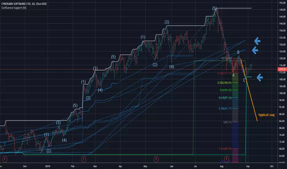
Confluence Zone Calculation for Support in Bullish TendsConfluence Zone Calculation for Support in Bullish Tends
(or Restance in bearish ones)
Ever wondered why sometimes the zag of an Elliot Wave zigzag is stopped after just a few points?
(Like in the given Chart where I draw a line for a typical zag action.)
It has often to do with confluence Zones. Most people think that the lower edge of a narrow range, repeated a few times, creates big support - confluence zones are stronger.
You can make them visible by getting fibonaccis from just one specific high to several different significant lows (for example the range lines mentioned above). The areas where significant lows and their fibos appear very close together are confluence zones. They can brake a falling price like a security net.
This script caluculates Confluence zones for you by using a second useful "secret": the secret that signifant lows test or create temporal rsi lows (vice-verse with highs).
The thicker (non-aqua clored)lines show actual lows, are corresponding with those rsi lows, the thinner are fibo lines deriving from them. (The white line stands for the high taken for the calculation.)
Note: Only those lines are valid which reach to the actual last bar.
Best practise is to let the script calculate,then redraw your lines of interest by hand and get rid of the rest of the spider web-like turmoil of lines by deleting the script from the chart.
Note further: I had to omit some calculations, because otherwise calculation time gets too long for TV and it stops with calculation Time out. (For your transparency I calculated all fibo codes but skipped some in "sline"-function; the number-suffix makes a jump when i omit a value ).
Note further further: Resistance confluence lines for bullish trends need a different script, because if you do it totally right vou in this case work from a single LOW of your interes t.
I hope it enriches your knowledge and is a help for your studies and tradings.
Feedback and Questions welcome
yoxxx
SMA/pivot/Bollinger/MACD/RSI en pantalla gráficoMulti-indicador con los indicadores que empleo más pero sin añadir ventanas abajo.
Contiene:
Cruce de 3 medias móviles
La idea es no tenerlas en pantalla, pero están dibujadas también. Yo las dejo ocultas salvo que las quiera mirar para algo.
Lo que presento en pantalla es la media lenta con verde si el cruce de las 3 marca alcista, amarillo si no está claro y rojo si marca bajista.
Pivot
Normalmente los tengo ocultos pero los muestro cuando me interesa. Están todos aunque aparezcan 2 seguidos.
Bandas de Bollinger
No dibujo la línea central porque empleo la media como tal.
Parabollic SAR
Lo empleo para dibujar las ondas de Elliott como postula Matías Menéndez Larre en el capítulo 11 de su libro "Las ondas de Elliott". Así que, aunque se puede mostrar, lo mantengo oculto y lo que muestro es dónde cambia (SAR cambio).
MACD
No está dibujado porque necesitaría sacarlo del gráfico.
Marco en la parte superior cuándo la señal sobrepasa al MACD hacia arriba o hacia abajo con un flecha indicando el sentido de esta señal.
RSI
Similar al MACD pero en la parte inferior.
Probablemente, programe otro indicador para visualizar en una ventanita MACD, RSI y volumen todo junto. El volumen en la principal hay veces que no te permite ver bien alguna sombra y los otros 2 te quitan mucho espacio para graficar si los tienes permanentemente en 2 ventanas separadas.
Bill Williams Trading Chaos Vol 1-NoviceThis is a revision of a script developed by tekolo. I hope tekolo takes a look. The concepts are here but I struggle with pine. I am very much a novice, but I tried to put information from the original book, Trading Chaos, Volume One by Bill Williams. There are too many plots to get this to wor. I made a lot of plot lines into comments to get it to run. I'm hoping someone with an interest in this material and some programming skills will be kind enough to take these thoughts and put them in a script that the Pine Editor would actually run. Thanks for taking a look. I do believe in these leading indicators. This is information included for Novice Level Trading in the Bill Williams book. There are more indicators developed in his material, but the jest is that Price is an end result of the marketplace. Market participation (Volume), Market Bias (Momentum), Increased Participation and Bias (Acceleration) all preceed the formation of the Trend. This along with Elliott Wave interpretation using his indicators as a basis for locating key points of the Elliott Wave, are most of what I understand about this interesting man's work. Again, I am a novice at all of this, but the leading indicators that result in price seem interesting. Thanks!

Trading Playbook Panel (SMC + EW + Sniper)🔥 What This Script Does
The indicator creates a visual floating panel containing:
1. HTF Bias Framework (H4 → H1 → M15)
Guides you through determining trend, liquidity direction, imbalance zones, and institutional order flow.
2. Valid Setup Models
Covers both:
Continuation setups (displacement → OTE → FVG entry)
Reversal setups (liquidity sweep → CHoCH → retest)
3. 5-Minute Sniper Entry Checklist
Ensures high-precision entries with:
Liquidity sweep
CHoCH
Displacement
FVG formation
Retest entry
Strict invalidation rules
This is the exact logic used in prop-firm and institutional trading models.
4. Stop-Loss & Invalidation Rules
Built with institutional logic:
SL beyond liquidity sweep
SL beyond invalidation swing
Works for both BUY and SELL setups.
5. Multi-Stage Take Profit Mapping
Including:
Internal liquidity
Equal highs/lows
Imbalance
Opposite OB
HTF draw
Designed for partials + runners.
6. Risk-Management System
A complete discipline structure:
0.5–2% risk per setup
Max daily loss
Max trades per day
Stop-after-loss rule
No chasing / no mid-range entries
7. Pre-Trade Checklist
A professional assessment framework to verify trade quality.
8. Trading Psychology Principles
Reinforces mindset, discipline, and patience.
⭐ Who This Script Is For
This tool is ideal for:
SMC traders
ICT style traders
Elliott Wave traders
Scalpers & intraday traders
Prop-firm challengers
Anyone wanting to follow a repeatable, rules-based system
It keeps you consistent, structured, and focused on the highest-probability setups.
🧠 Why This Script Works
Most traders lose because they:
Enter impulsively
Skip rules
Don’t analyze multi-timeframe structure
Enter without liquidity confirmation
Use random entry zones
This script eliminates that.
It forces a clear, step-by-step process:
1️⃣ Top-down bias
2️⃣ Liquidity location
3️⃣ Sweep → CHoCH → Displacement
4️⃣ Refined 5M entry
5️⃣ Strict SL & TP rules
It removes emotion and replaces it with pure process.
⚙️ Customizable
Move the panel anywhere on the chart
Change panel colors
Change text colors
Perfect for dark or light mode
🎯 Summary
This is not a trading signal indicator.
This is your rulebook, your discipline engine, and your playbook — right on your chart.
It keeps you aligned with the highest-probability setups used by advanced SMC and EW traders.
Use it before every trade.
Trade like a professional — every day.

DANGHIEU EMA 34/89/200 Ribbon (Scaled HTF)📘 Indicator Description – EMA 34/89/200 Ribbon (Scaled HTF)
The EMA 34/89/200 Ribbon (Scaled HTF) indicator is designed to replicate higher-timeframe EMAs directly on your current chart without switching timeframes.
Using a precise HTF Scaling Algorithm, the script converts EMAs from 1H, 2H, 4H, 6H, 12H, 1D, and even 1W into equivalent lengths on lower timeframes—allowing traders to perform true multi-timeframe trend analysis on a single chart.
The 34-EMA and 89-EMA form a dynamic trend ribbon that changes color based on the relationship between the two moving averages. This helps traders quickly identify trend direction, momentum strength, and potential market reversals. The indicator also includes optional crossover markers (X symbols) to highlight bullish and bearish crossovers for cleaner signal recognition. EMA200 is included as the long-term trend anchor.
This tool is ideal for scalpers, day traders, and swing traders who require higher-timeframe context while trading lower-timeframe entries.
🟦 How to Use the Indicator
1. Choose the Higher Timeframe to Simulate
Use the “HTF to Simulate” dropdown to select the timeframe you want to emulate (e.g., 4H, 2H, 1D, 1W).
The script automatically scales the EMA lengths so they match the selected HTF.
2. Read the Ribbon for Trend Direction
Green Ribbon → EMA34 above EMA89 → Bullish momentum
Red Ribbon → EMA34 below EMA89 → Bearish momentum
The ribbon expands when momentum strengthens and contracts during consolidation.
3. Use EMA Crossovers as Signal Zones
Optional X markers highlight crossover points:
Bullish Crossover → EMA34 crosses above EMA89
Bearish Crossover → EMA34 crosses below EMA89
These crossovers often align with trend shifts or early momentum changes.
4. EMA200 as Trend Filter
The EMA200 acts as the macro trend filter:
Price above EMA200 → only consider long setups
Price below EMA200 → only consider short setups
Combining ribbon trend + EMA200 alignment improves signal accuracy.
5. Multi-Timeframe Trading Strategy
This indicator is powerful for:
Scalping with HTF bias
Pullback entry on lower timeframe during HTF trend
Identifying trend exhaustion when the ribbon flips
Confirming wave structure (Elliott Wave, Dow Theory)
Spotting strong momentum phases and squeeze zones
Example workflow:
Select 4H as HTF simulation.
Trade on 15m or 5m chart.
Enter only when price aligns with the HTF ribbon + EMA200 trend.
Use EMA crossovers as confirmation signals.

Pattern DetectorPattern Detector
Identifies and summarizes common chart patterns on any symbol/timeframe. Shows a compact table of the most recent confirmed patterns (up to 6), optional candle coloring that matches table row colors, and optional targets for context. Designed for analysis support only.
What it detects
Triangles and wedges, flags and pennants, head & shoulders (and inverse), rectangles, channels, broadening formations, double/triple tops & bottoms, cup & handle (and inverse), rounding tops/bottoms, diamonds, bump & run, island reversals, staircase patterns, V patterns, gaps (up/down), pipe/spike patterns, harmonic ABCD, Elliott (simplified), three drives, Quasimodo, dead cat bounce, tower top/bottom, shakeout, and Wolfe waves.
Inputs
Lookback Mode: Auto or Manual (Manual Lookback bars)
Min Confidence to Confirm: threshold for confirmation
Display: Show Pattern Table, Show Pattern Numbers, Color Pattern Candles
Style: table row colors; bullish/bearish direction colors
Notes:
Candle coloring uses the table’s row colors and requires Show Pattern Table to be enabled.
Targets are approximate and for reference only.
Alerts
Pattern Confirmed
Pattern Target Reached
Important
Educational/information tool only; not a signal generator and not financial advice.
No performance guarantees. Use with other analysis and risk management.
Calculations update in real time; confirmations happen on closed bars. Detected patterns can change intrabar; use closed‑bar alerts for greater reliability.
Results may vary by symbol, timeframe, liquidity, and volatility.

Trend lines indicator by ForexBeeEnhanced 3-Swing Trendline Zones - Complete Feature Guide
WHAT THIS INDICATOR DOES
This indicator automatically draws trendline zones on your chart using a 3-point validation system. Instead of just connecting any two price points like basic trendline tools, it waits for three swing points to confirm the trendline is valid before drawing it.
FEATURE 1: SWING POINT DETECTION
What it detects:
Swing highs: Price points where the high is higher than surrounding candles
Swing lows: Price points where the low is lower than surrounding candles
These show up as small arrows on your chart labeled "SH" (swing high) and "SL" (swing low)
Settings that control this:
Swing Length : Default is 6, range 1-20
Higher numbers = fewer, more significant swing points
Lower numbers = more swing points, including minor ones
Example: Setting 5 means each swing point must be higher/lower than 5 candles on each side
How to use this setting:
On 1-minute charts: Use 5-10 to filter out noise
On daily charts: Use 2-3 for more sensitivity
Volatile markets: Increase the number
Quiet markets: Decrease the number
Please See the Below Images To See the difference of swing length of 6 and 8
Display control:
Show Swing Points : Turn the arrows on/off
Default: ON (you'll see the arrows)
Turn OFF if arrows clutter your chart
FEATURE 2: RETRACEMENT VALIDATION SYSTEM
What this does:
After finding two swing points, the system checks if the second swing represents a proper market retracement, not just random price movement.
How it works:
Finds the highest point between two swing lows (or lowest point between two swing highs)
Calculates how much the second swing retraced from this extreme point
Only accepts swings that retrace between your set percentages
Settings that control this:
Lower Limit % : Default 50%, range 0-100%
Upper Limit % : Default 90%, range 0-100%
These create a "valid retracement zone"
Why this matters:
Eliminates random trendlines that don't follow market structure
Ensures trendlines represent actual retracement patterns
Based on Elliott Wave and Fibonacci principles
FEATURE 3: ATR-BASED ZONE WIDTH
What ATR means:
Average True Range measures how much price typically moves in a given period. Instead of fixed-width trendlines, this creates zones that adapt to market volatility.
Settings that control this:
Zone Width (ATR Multiple) : Default 0.3, range 0.1-1.0
ATR Length : Default 14, range 1-50 periods
How zone width works:
Multiplier 0.1 = Very narrow zones (tight around trendline)
Multiplier 0.5 = Medium zones
Multiplier 1.0 = Wide zones (accommodates more price movement)
ATR Length explained:
14 periods = Uses last 14 candles to calculate average volatility
Shorter periods (7) = More sensitive to recent volatility changes
Longer periods (21) = Smoother, less sensitive to volatility spikes
Practical impact:
During high volatility: Zones automatically become wider
During low volatility: Zones automatically become narrower
Prevents false breakouts during normal market noise
Creates realistic support/resistance areas instead of precise lines
FEATURE 4: VISUAL ZONE SYSTEM
Active Uptrend Zones:
Green upper boundary line (solid, thick)
Lime green lower boundary line (solid, thick)
Green fill between lines (80% transparency)
These represent dynamic support levels
Active Downtrend Zones:
Blue upper boundary line (solid, thick)
Navy blue lower boundary line (solid, thick)
Red fill between lines (80% transparency)
These represent dynamic resistance levels
Broken/Expired Zones:
Gray/silver boundary lines (dashed, thick)
Original fill color maintained (green for uptrend zones, red for downtrend zones)
Shows historical trendlines that are no longer active
FEATURE 5: BREAK DETECTION SYSTEM
How breaks are detected:
The system monitors when price violates the zone boundaries, indicating the trendline structure has failed.
Settings that control this:
Use Wick Break : True/False toggle
TRUE: Break occurs when candle high/low touches zone boundary
FALSE: Break occurs when candle close price crosses zone boundary
Conservative vs Aggressive approach:
Wick Break = TRUE (Aggressive) :
- More sensitive, earlier signals
- May produce more false breaks during volatile periods
- Good for scalping and short-term trading
Wick Break = FALSE (Conservative) :
- Requires candle to close beyond zone
- Fewer false signals, more reliable breaks
- Better for swing trading and position trading
What happens when zone breaks:
Zone lines change from solid to dashed
Zone lines change color to gray/silver
Fill color remains original (green/red) for identification
Zone stops extending forward
Zone is removed from active monitoring
FEATURE 6: ZONE EXPIRATION SYSTEM
What expiration does:
Allows trendlines to automatically become inactive after a set number of bars, even if they haven't been broken.
Settings that control this:
Use Zone Expiration : True/False toggle
Zone Expiration (Bars) : Default 500, range 1-1000
FALSE: Zones run indefinitely until broken
TRUE: Zones expire after specified number of bars
Visual result:
Expired zones look identical to broken zones
Lines become dashed and gray/silver
Fill colors remain original (green/red)
FEATURE 7: MULTI-TIMEFRAME TREND ANALYSIS TABLE
What the table shows:
A small table on your chart that monitors trend conditions across four different timeframes simultaneously.
Settings that control this:
TF1, TF2, TF3, TF4 : Four customizable timeframes
Default: 4H, 8H, 1D, 1W
Table Position : 9 positions (top/middle/bottom + left/center/right)
Text Size : Tiny, Small, Normal, Large, Huge
How trend detection works:
Uptrend Pattern : Current candle's high AND low are both higher than previous candle's high AND low on specified timeframes
This creates higher highs and higher lows
Shows consistent buying pressure
Table displays green background with upward arrow (▲)
Downtrend Pattern : Current candle's high AND low are both lower than previous candle's high AND low on specified timeframes
This creates lower highs and lower lows
Shows consistent selling pressure
Table displays red background with downward arrow (▼)
Range/Sideways Pattern : Current candle creates either inside bar or outside bar
Inside bar: Current range smaller than previous candle
Outside bar: Current range larger than previous candle
Shows market indecision or consolidation
Table displays orange background with diamond symbol (◆)
No Clear Pattern : None of the above conditions are met
Table displays gray background with horizontal line (⎯)
How to interpret the table:
All timeframes green (uptrend): Strong bullish alignment
All timeframes red (downtrend): Strong bearish alignment
Mixed colors: Conflicting timeframes, exercise caution
Mostly orange: Market in consolidation phase
Tooltip explanations: Hover over each cell for detailed description
FEATURE 8: BACKGROUND COLOR SYSTEM
What background colors show:
Optional feature that colors your chart background based on the current timeframe's trend condition.
Settings that control this:
Show Background Colors : True/False toggle
Background Transparency : 80-98% range
Default: OFF (no background colors)
Color scheme:
Green background: Current timeframe showing uptrend
Red background: Current timeframe showing downtrend
Orange background: Current timeframe showing range/consolidation
No background: No clear trend pattern
Transparency levels:
80%: More visible background color
95%: Subtle background hint
98%: Very subtle background tint

Constance Brown Composite Index EnhancedWhat This Indicator Does
Implements Constance Brown's copyrighted Composite Index formula (1996) from her Master's thesis - a breakthrough oscillator that solves the critical problem where RSI fails to show divergences in long-horizon trends, providing early warning signals for major market reversals.
The Problem It Solves
Traditional RSI frequently fails to display divergence signals in Global Equity Indexes and long-term charts, leaving asset managers without warning of major price reversals. Brown's research showed RSI failed to provide divergence signals 42 times across major markets - failures that would have been "extremely costly for asset managers."
Key Components
Composite Line: RSI Momentum (9-period) + Smoothed RSI Average - the core breakthrough formula
Fast/Slow Moving Averages: Trend direction confirmation (13/33 periods default)
Bollinger Bands: Volatility envelope around the composite signal
Enhanced Divergence Detection: Significantly improved trend reversal timing vs standard RSI
Research-Proven Performance
Based on Brown's extensive study across 6 major markets (1919-2015):
42 divergence signals triggered where RSI showed none
33 signals passed with meaningful reversals (78% success rate)
Only 5 failures - exceptional performance in monthly/2-month timeframes
Tested on: German DAX, French CAC 40, Shanghai Composite, Dow Jones, US/Japanese Government Bonds
New Customization Features
Moving Average Types: Choose SMA or EMA for fast/slow lines
Optional Fills: Toggle composite and Bollinger band fills on/off
All Periods Adjustable: RSI length, momentum, smoothing periods
Visual Styling: Customize colors and line widths in Style tab
Default Settings (Original Formula)
RSI Length: 14
RSI Momentum: 9 periods
RSI MA Length: 3
SMA Length: 3
Fast SMA: 13, Slow SMA: 33
Bollinger STD: 2.0
Applications
Long-term investing: Monthly/2-month charts for major trend changes
Elliott Wave analysis: Maximum displacement at 3rd-of-3rd waves, divergence at 5th waves
Multi-timeframe: Pairs well with MACD, works across all timeframes
Global markets: Proven effective on equities, bonds, currencies, commodities
Perfect for serious traders and asset managers seeking the proven mathematical edge that traditional RSI cannot provide.
ATR Dashboard (Pane Only)🔧 Core Logic
ATR Source: Multi-timeframe ATR (default 1H while trading 5m/15m).
Threshold Rule:
TREND = ATR > (ATR_SMA × k)
NORMAL = otherwise
Sessions: Only evaluates during London (02:00–07:00 ET) and New York (07:00–11:30 ET) by default.
Smoothing: ATR compared against its SMA (default 10-period).
k Multiplier: Controls sensitivity (default 1.20).
🖥️ Visuals
✅ TREND: Green label (or green background if enabled).
⚪ NORMAL: Gray label.
⏸️ OUT OF SESSION: Dim label, so you don’t force trades off-hours.
📊 Optional panel shows ATR, ATR_SMA, and Threshold values in real time.
📊 Dashboard + Overlay Combo
Use this overlay on your chart TF for tactical entries.
Pair with an ATR Dashboard (pane) on a higher TF (like 1H) for the strategic backdrop.
Overlay TREND + Dashboard TREND → High conviction trending environment.
Overlay TREND but Dashboard NORMAL → Fragile breakout, trade smaller or pass.
Both NORMAL → Chop/range → stick to 1:1.4 BE rules.
⚖️ Trading Playbook Integration
NORMAL Mode (ATR below threshold)
50% partial at 1R.
BE @ 1:1.4.
Runner capped at 2R.
TREND Mode (ATR above threshold)
50% partial at 1R.
BE @ 1:1.6.
Remainder trails ATR ×1.5.
Reserve ~15% of trend trades as no-partials for fat-tail home runs (4R–6R+).
🔔 Alerts
ATR Trend ON (in session) → “ATR > Threshold → Switch to TREND BE (1:1.6).”
ATR Trend OFF (in session) → “ATR ≤ Threshold → Switch to NORMAL BE (1:1.4).”
Perfect for getting pinged the moment volatility regime flips.
📌 Tips
k = 1.20 → balanced (default).
k = 1.10–1.15 → more TREND calls (sensitive).
k = 1.30+ → only strongest trends count.
Run it with overlay ON chart TF for execution, and dashboard on HTF for context.
Best used during active London/NY sessions.
✅ This isn’t a signal generator. It’s a regime filter + risk manager.
It keeps you from chasing chop and helps you mechanically switch BE rules without hesitation.
⚡ Pro tip: Combine with a Trend Continuation HUD, Elliott Wave Convergence overlay, or a Bollinger+RSI/MFI reversal scanner for a full tactical playbook.

ATR Trend Switch (ATR > k*ATR_SMA) - Overlay + Session Windows🔧 Core Logic
ATR Source: Multi-timeframe ATR (default 1H while trading 5m/15m).
Threshold Rule:
TREND = ATR > (ATR_SMA × k)
NORMAL = otherwise
Sessions: Only evaluates during London (02:00–07:00 ET) and New York (07:00–11:30 ET) by default.
Smoothing: ATR compared against its SMA (default 10-period).
k Multiplier: Controls sensitivity (default 1.20).
🖥️ Visuals
✅ TREND: Green label (or green background if enabled).
⚪ NORMAL: Gray label.
⏸️ OUT OF SESSION: Dim label, so you don’t force trades off-hours.
📊 Optional panel shows ATR, ATR_SMA, and Threshold values in real time.
📊 Dashboard + Overlay Combo
Use this overlay on your chart TF for tactical entries.
Pair with an ATR Dashboard (pane) on a higher TF (like 1H) for the strategic backdrop.
Overlay TREND + Dashboard TREND → High conviction trending environment.
Overlay TREND but Dashboard NORMAL → Fragile breakout, trade smaller or pass.
Both NORMAL → Chop/range → stick to 1:1.4 BE rules.
⚖️ Trading Playbook Integration
NORMAL Mode (ATR below threshold)
50% partial at 1R.
BE @ 1:1.4.
Runner capped at 2R.
TREND Mode (ATR above threshold)
50% partial at 1R.
BE @ 1:1.6.
Remainder trails ATR ×1.5.
Reserve ~15% of trend trades as no-partials for fat-tail home runs (4R–6R+).
🔔 Alerts
ATR Trend ON (in session) → “ATR > Threshold → Switch to TREND BE (1:1.6).”
ATR Trend OFF (in session) → “ATR ≤ Threshold → Switch to NORMAL BE (1:1.4).”
Perfect for getting pinged the moment volatility regime flips.
📌 Tips
k = 1.20 → balanced (default).
k = 1.10–1.15 → more TREND calls (sensitive).
k = 1.30+ → only strongest trends count.
Run it with overlay ON chart TF for execution, and dashboard on HTF for context.
Best used during active London/NY sessions.
✅ This isn’t a signal generator. It’s a regime filter + risk manager.
It keeps you from chasing chop and helps you mechanically switch BE rules without hesitation.
⚡ Pro tip: Combine with a Trend Continuation HUD, Elliott Wave Convergence overlay, or a Bollinger+RSI/MFI reversal scanner for a full tactical playbook.

SmartWave ProA SmartWave Pro egy prémium kereskedési indikátor, amely a legfejlettebb piaci elemzési módszereket ötvözi egyetlen rendszerben. A jelzéseket a Smart Money Concepts (SMC), ICT (Inner Circle Trader), Pivot zónák, Elliott-hullám elmélet, Engulfing gyertyák, valamint a belső trend- és volatilitásszűrés kombinációja adja.

SCPEM - Socionomic Crypto Peak Model (0-85 Scale)SCPEM Indicator Overview
The SCPEM (Socionomic Crypto Peak Evaluation Model) indicator is a TradingView tool designed to approximate cycle peaks in cryptocurrency markets using socionomic theory, which links market behavior to collective social mood. It generates a score from 0-85 (where 85 signals extreme euphoria and high reversal risk) and plots it as a blue line on the chart for visual backtesting and real-time analysis.
#### How It Works
The indicator uses technical proxies to estimate social mood factors, as Pine Script cannot fetch external data like sentiment indices or social media directly. It calculates a weighted composite score on each bar:
- Proxies derive from price, volume, and volatility data.
- The raw sum of factor scores (max ~28) is normalized to 0-85.
- The score updates historically for backtesting, showing mood progression over time.
- Alerts trigger if the score exceeds 60, indicating high peak probability.
Users can adjust inputs (e.g., lengths for RSI or pivots) to fine-tune for different assets or timeframes.
Metrics Used (Technical Proxies)
Crypto-Specific Sentiment
Approximated by RSI (overbought levels indicate greed).
Social Media Euphoria
Based on volume relative to its SMA (spikes suggest herding/FOMO).
Broader Social Mood Proxies
Derived from ATR volatility (high values signal uncertain/mixed mood).
Search and Cultural Interest Proxied by OBV trend (rising accumulation implies growing interest).
Socionomic Wildcard
Uses Bollinger Band width (expansion for positive mood, contraction for negative).
Elliott Wave Position
Counts recent price pivots (more swings indicate later wave stages and exhaustion).
BK AK-SILENCER (P8N)🚨Introducing BK AK-SILENCER (P8N) — Institutional Order Flow Tracking for Silent Precision🚨
After months of meticulous tuning and refinement, I'm proud to unleash the next weapon in my trading arsenal—BK AK-SILENCER (P8N).
🔥 Why "AK-SILENCER"? The True Meaning
Institutions don’t announce their moves—they move silently, hidden beneath the noise. The SILENCER is built specifically to detect and track these stealth institutional maneuvers, giving you the power to hunt quietly, execute decisively, and strike precisely before the market catches on.
🔹 "AK" continues the legacy, honoring my mentor, A.K., whose teachings on discipline, precision, and clarity form the cornerstone of my trading.
🔹 "SILENCER" symbolizes the stealth aspect of institutional trading—quiet but deadly moves. This indicator equips you to silently track, expose, and capitalize on their hidden footprints.
🧠 What Exactly is BK AK-SILENCER (P8N)?
It's a next-generation Cumulative Volume Delta (CVD) tool crafted specifically for traders who hunt institutional order flow, combining adaptive volatility bands, enhanced momentum gradients, and precise divergence detection into a single deadly-accurate weapon.
Built for silent execution—tracking moves quietly and trading with lethal precision.
⚙️ Core Weapon Systems
✅ Institutional CVD Engine
→ Dynamically measures hidden volume shifts (buying/selling pressure) to reveal institutional footprints that price alone won't show.
✅ Adaptive AK-9 Bollinger Bands
→ Bollinger Bands placed around a custom CVD signal line, pinpointing exactly when institutional accumulation or distribution reaches critical extremes.
✅ Gradient Momentum Intelligence
→ Color-coded momentum gradients reveal the strength, speed, and silent intent behind institutional order flow:
🟢 Strong Bullish (aggressive buying)
🟡 Moderate Bullish (steady accumulation)
🔵 Neutral (balance)
🟠 Moderate Bearish (quiet distribution)
🔴 Strong Bearish (aggressive selling)
✅ Silent Divergence Detection
→ Instantly spots divergence between price and hidden volume—your earliest indication that institutions are stealthily reversing direction.
✅ Background Flash Alerts
→ Visually highlights institutional extremes through subtle background flashes, alerting you quietly yet powerfully when market-moving players make their silent moves.
✅ Structural & Institutional Clarity
→ Optional structural pivots, standard deviation bands, volume profile anchors, and session lines clearly identify the exact levels institutions defend or attack silently.
🛡️ Why BK AK-SILENCER (P8N) is Your Edge
🔹 Tracks Institutional Footprints—Silently identifies hidden volume signals of institutional intentions before they’re obvious.
🔹 Precision Execution—Cuts through noise, allowing you to execute silently, confidently, and precisely.
🔹 Perfect for Traders Using:
Elliott Wave
Gann Methods (Angles, Squares)
Fibonacci Time & Price
Harmonic Patterns
Market Profile & Order Flow Analysis
🎯 How to Use BK AK-SILENCER (P8N)
🔸 Institutional Reversal Hunting (Stealth Mode)
Bearish divergence + CVD breaking below lower BB → stealth short signal.
Bullish divergence + CVD breaking above upper BB → quiet, early long entry.
🔸 Momentum Confirmation (Silent Strength)
Strong bullish gradient + CVD above upper BB → follow institutional buying quietly.
Strong bearish gradient + CVD below lower BB → confidently short institutional selling.
🔸 Noise Filtering (Patience & Precision)
Neutral gradient (blue) → remain quiet, wait patiently to strike precisely when institutional activity resumes.
🔸 Structural Precision (Institutional Levels)
Optional StdDev, POC, Value Areas, Session Anchors clearly identify exact institutional defense/offense zones.
🙏 Final Thoughts
Institutions move in silence, leaving subtle footprints. BK AK-SILENCER (P8N) is your specialized weapon for tracking and hunting their quiet, decisive actions before the market reacts.
🔹 Dedicated in deep gratitude to my mentor, A.K.—whose silent wisdom shapes every line of code.
🔹 Engineered for the disciplined, quiet hunter who knows when to wait patiently and when to strike decisively.
Above all, honor and gratitude to Gd—the ultimate source of wisdom, clarity, and disciplined execution. Without Him, markets are chaos. With Him, we move silently, purposefully, and precisely.
⚡ Stay Quiet. Stay Precise. Hunt Silently.
🔥 BK AK-SILENCER (P8N) — Track the Silent Moves. Strike with Precision. 🔥
May Gd bless every silent step you take. 🙏

BK AK-Scope🔭 Introducing BK AK-Scope — Target Locked. Signal Acquired. 🔭
After building five precision weapons for traders, I’m proud to unveil the sixth.
BK AK-Scope — the eye of the arsenal.
This is not just an indicator. It’s an intelligence system for volatility, signal clarity, and rate-of-change dynamics — forged for elite vision in any market terrain.
🧠 Why “Scope”? And Why “AK”?
Every shooter knows: you can’t hit what you can’t see.
The Scope brings range, clarity, and target distinction. It filters motion from noise. Purpose from panic.
“AK” continues to honor the man who trained my sight — my mentor, A.K.
His discipline taught me to wait for alignment. To move with reason, not emotion.
His vision lives in every code line here.
🔬 What Is BK AK-Scope?
A Triple-Tier TSI Correlation Engine, fused with adaptive opacity logic, a volatility scoring system, and real-time signal clarity. It’s momentum dissected — by speed, depth, and rate of change.
Built to serve traders who:
Need visual hierarchy between fast, mid, and slow TSI responses.
Want adaptive fills that pulse with volatility — not static zones.
Require a volatility scoring overlay that reads the battlefield in real time.
⚙️ Core Systems: How BK AK-Scope Works
✅ Fast/Mid/Slow TSI →
Three layers of correlation: like scopes with zoom levels.
You track micro moves, mid swings, and macro flow simultaneously.
✅ Rate-of-Change Adaptive Opacity →
Momentum fills fade or flash based on speed — giving you movement density at a glance.
Bull vs. Bear zones adapt to strength. You feel the market’s pulse.
✅ Volatility Score Intelligence →
Custom algorithm measuring:
Range expansion
Rate-of-change differentials
ATR dynamics
Standard deviation pressure
All combined into a score from 0–100 with live icons:
🔥 = Extreme Heat (70+)
🧊 = Cold Zone (<30)
⚠️ = ROC Warning
• = Neutral drift
✅ Auto-Detect Volatility Modes →
Scalp = <15min
Swing = intraday/hourly
Macro = daily/weekly
Or override manually with total control.
🎯 How To Use BK AK-Scope
🔹 Trend Continuation → When all three TSI layers align in direction + volatility score climbs, ride with the trend.
🔹 Early Reversals → Opposing TSI + rapid opacity change + volatility shift = sniper reversal zone.
🔹 Consolidation Filter → Neutral fills + score < 30 = stay out, wait for signal surge.
🔹 Signal Confluence → Pair with:
• Gann fans or angles
• Fib time/price clusters
• Elliott Wave structure
• Harmonics or divergence
To isolate entry perfection.
🛡️ Why This Indicator Changes the Game
It's not just momentum. It’s TSI with depth hierarchy.
It’s not just color. It’s real-time strength visualization.
It’s not just volatility. It’s rate-weighted market intelligence.
This is market optics for the advanced trader — built for vision, clarity, and discipline.
🙏 Final Thoughts
🔹 In honor of A.K., my mentor. The man who taught me to see what others miss.
🔹 Inspired by the power of vision — because execution without clarity is chaos.
🔹 Powered by faith — because Gd alone gives sight beyond the visible.
“He gives sight to the blind and wisdom to the humble.” — Psalms 146
Every tool I build is a prayer in code — that it helps someone trade with clarity, integrity, and precision.
⚡ Zoom In. Focus Deep. Trade Clean.
BK AK-Scope — Lock on the target. See what others don’t.
🔫 Clarity is power. 🔫
Gd bless. 🙏

BK AK-47 Divergence🚨 Introducing BK AK-47 Divergence — Multi-Timeframe Precision Firepower for True Traders 🚨
After months of development, I’m proud to release my fifth weapon in the arsenal — BK AK-47 Divergence.
💥 Why “AK-47”? The Meaning Behind the Name
The AK-47 isn’t just a rifle. It’s the symbol of reliability, versatility, and raw stopping power. It performs in every environment — from the mud to the mountains — just like this indicator cuts through noise on any timeframe, any asset, any condition.
🔸 “AK” honors the same legacy as before — my mentor, A.K., whose discipline and vision forged my trading edge.
🔸 “47” signifies layered precision: 4 = structure, 7 = spiritual completion. Together, it’s the weapon of divine order that adapts, reacts, and strikes with purpose.
🔍 What Is BK AK-47 Divergence?
It’s a next-generation divergence detector — a smart hybrid of MACD, Bollinger Bands, and multi-timeframe divergence logic wrapped in a custom volatility engine and real-time flash alerts.
Designed for snipers in the market — those who only take the highest-probability shots.
⚙️ Core Weapon Systems
✅ MACD + BB Precision Overlay → MACD plotted inside dynamic Bollinger Bands — reveals hidden pressure zones where most indicators fail.
✅ Smart Histogram Scaling → Adaptive amplification based on volatility. No more weak histograms in strong markets.
✅ Full Multi-Timeframe Divergence Detection:
🔻 Current TF Divergence
🕐 Higher TF Divergence
⏱️ Lower TF Divergence
Each plotted with clean visual alerts, color-coded by direction and timeframe. You get instant divergence recognition across dimensions.
✅ Background Flash Alerts → When MACD hits BB extremes, the background lights up in red or green. Eyes instantly lock in on key moments.
✅ Advanced Pivot Lookback Control → New lookback system compares multiple pivot layers, not just the last swing. This gives true structural divergence, not just noise.
✅ Dynamic Fill Zones:
🔴 Oversold
🟢 Overbought
🔵 Neutral
Built to filter false signals and highlight hidden edge.
🛡️ Why This Indicator Changes the Game
🔹 Built for divergence snipers — not lagging MACD watchers.
🔹 Perfect for traders who sync with:
• Elliott Waves
• Fibonacci Time/Price Clusters
• Harmonic Patterns
• Gann Angles or Squares
• Price Action & Trendlines
🔹 Lets you visually map:
• Converging divergences (multi-TF confirmation)
• High-volatility histograms in low-volatility price zones (entry sweet spots)
• Flash-momentum warnings at BB pressure zones
🎯 How to Use BK AK-47 Divergence
🔹 Breakout Confirmation → MACD breaches upper BB with bullish divergence = signal to ride momentum.
🔹 Mean Reversion Reversals → MACD breaks lower BB + bullish div = setup for sniper long.
🔹 Top/Bottom Detection → Bearish divergence + MACD failure at upper BB = early reversal signal.
🔹 TF Sync Strategy → Align current TF with higher or lower divergences for laser-confirmed entries.
🧠 Final Thoughts
This isn’t just a divergence tool. It’s a battlefield reconnaissance system — one that lets you see when, where, and why the next pivot is forming.
🔹 Built in honor of the AK-legacy — reliability, discipline, and firepower.
🔹 Designed to cut through noise, expose structure, and alert you to what really matters.
🔹 Crafted for those who trade with intent, vision, and respect for the craft.
🙏 And most importantly: All glory to Gd — the One who gives wisdom, clarity, and purpose.
Without Him, the markets are chaos. With Him, we move in structure, order, and divine timing.
—
⚡ Stay dangerous. Stay precise. Stay aligned.
🔥 BK AK-47 Divergence — Locked. Loaded. Laser-focused. 🔥
May the markets bend to your discipline.
Gd bless. 🙏
RunRox - Entry Model🎯 RunRox Entry Model is an all-in-one reversal-pattern indicator engineered to help traders accurately identify key price-reversal points on their charts. It will be part of our premium indicator package and improve the effectiveness of your trading strategies.
The primary concept of this indicator is liquidity analysis, making it ideal for Smart Money traders and for trading within market structure. At the same time, the indicator is universal and can be integrated into any strategy. Below, I will outline the full concept of the indicator and its settings so you can better understand how it works.
🧬 CONCEPT
In the screenshot below, I’ll schematically illustrate the core idea of this indicator. It’s one of the patterns that the indicator automatically detects on the chart using a two-timeframe approach. We use the higher timeframe to identify liquidity zones, and the lower timeframe to capture liquidity removal and structure breaks. The schematic is shown in the screenshot below.
Our indicator includes three entry models in total , and I will discuss its functionality and features in more detail later in this post.
💡 FEATURES
Three entry models
PO3 HTF Bar
Entry Area
Optimization for each Entry Area
Filters
HTF FVG
Alert customization
Next, we will examine each entry model in detail.
🟠 ENTRY MODEL 1
The first model is the core one we’ll work with; all other models rely on its structure and construction. In the screenshot below, I’ll schematically show the complete model.
As shown in the screenshot above, we display higher-timeframe candles on the current chart to better visualize the entry model and keep the trader informed of what’s happening on the larger timeframe. The screenshot also highlights both the Long and Short models, as well as the Entry Area, which I will explain in more detail below.
The schematic model on the lower timeframe is shown in the screenshot above. It illustrates that after the Entry Model forms, we draw the Entry Area on the next candle and wait for a price pullback into this zone for the optimal trade entry. Statistically, before moving higher, the price typically revisits the Entry Area, covering the imbalances created by MSS; thus, the Entry Area represents the ideal entry point.
🟩 Entry Area
Once the Entry Model has formed, we focus on identifying the optimal pullback zone for taking a position. To determine which retracement area performs best, we conducted extensive historical backtesting on potential zones and selected those that consistently delivered the strongest results. This process yields Entry Areas with the highest probability of a successful reversal.
On the screenshot above, you can see an example of the Entry Area and which zones carry a higher versus lower probability of reversal. Zones rendered with greater transparency have historically delivered weaker results than the more opaque zones. The deeper-colored areas represent the optimal entry zones and can improve your risk-reward ratio by allowing you to enter at more favorable prices.
It’s important to remember that the entire Entry Area functions as a potential zone for scaling into a position. However, if your risk-to-reward ratio isn’t favorable, you can wait for the price to retrace to lower levels within the Entry Area and enter with a more attractive risk-to-reward.
🟢 Pattern Rating
Each entry model receives a rating in the form of green circles next to its name 🟢. The rating ranges from one to four circles, based on the historical performance of similar patterns. To calculate this rating, we backtest past data by analyzing candle behavior during the model’s formation and assign circles according to how similar patterns performed historically.
Example Ratings:
🟢 – One circle
🟢🟢 – Two circles
🟢🟢🟢 – Three circles
🟢🟢🟢🟢 – Four circles
The more green circles a model has, the more reliable it is—but it’s crucial to rely on your own analysis when identifying strong reversal points on the chart. This rating reflects the model’s historical performance and does not guarantee future results, so keep that in mind!
Below is a screenshot showing four model variations with different ratings on the chart.
⚠️ Unconfirmed Pattern
Entry Model 1 is designed so that, until the higher-timeframe candle closes, the pattern remains unconfirmed and is hidden on the chart. For traders who prefer to see setups as they form, there’s a dedicated feature that displays the unconfirmed pattern at the moment of its appearance - triggered by the Market Structure Shift - before the HTF candle closes. The screenshot below shows what the pattern looks like prior to confirmation.
‼️IMPORTANT: Until the pattern is confirmed and the higher-timeframe candle has closed, the model may disappear from the chart if price reverses and the HTF candle closes below the previous bar. Therefore, this mode is suitable only for experienced traders who want to see market moves in advance. Remember that the pattern can be removed from the chart, so we recommend waiting for the HTF candle to close before deciding to enter a trade.‼️
✂️ Filters
For the primary model, there are four filters designed to enhance entry points or exclude less-confirmed patterns. The filters available in the indicator are:
Bounce Filter
Market Shift Mode
Same Wave Filter
Only with Divergence
I will explain how each of these filters works below.
- Bounce Filter
The Bounce Filter identifies significant deviations of price from its mean and only displays the Entry Model once the asset’s price moves beyond the average level. The screenshot below illustrates how this appears on the chart.
The actual average-price calculation is more sophisticated than what’s shown in the screenshot, that image is just an illustrative example. When the price deviates significantly from the N-bar average, we start looking for the Entry Model. This approach works particularly well in range-bound markets without a clear trend, as it lets you trade strong deviations from the mean.
- Market Shift Mode
This filter works by detecting the initial impulse that triggered the liquidity sweep on the previous higher-timeframe candle, and then holding the Market Structure Shift level at that point after the sweep. If the filter is turned off, price may move higher following the liquidity removal, creating a new MSS level and potentially producing a false structure shift and entry signal on the formed model.
This filter helps you more accurately identify genuine shifts - but keep in mind that the model can still perform well without it, so choose the setting that best suits your trading style.
- Same Wave Filter
The Same Wave Filter removes entry models that form without a clear lower-timeframe structure when liquidity is swept from the previous higher-timeframe candle. In other words, if the prior HTF candle and the current one belong to the same impulse wave - without any retracements on the LTF - the model is filtered out.
Keep in mind that this filter may also exclude patterns that could have produced positive results, so whether to enable it depends on your trading system.
- Only with Divergence
The Only with Divergence filter detects divergence between the lows of successive candles and indicators like RSI. When the low that swept liquidity diverges from the previous candle’s low, the indicator displays a “DIV” label. Although RSI is cited as an example, our divergence calculation is more advanced. This filter highlights patterns where low divergence signals genuine liquidity manipulation and a likely aggressive price reversal.
🌀 Model Settings
Trade Direction: Choose whether to display models for Long or Short trades.
Fractal: Select between automatic fractal detection—which adapts the lower-timeframe (LTF) and higher-timeframe (HTF) candles—or Custom.
Custom Fractal: When Custom is selected, manually specify the LTF and HTF timeframes used to detect the patterns.
History Pattern Limit: Set the maximum number of patterns to display on the chart to keep it clean and uncluttered.
🎨 Model Style
You can flexibly customize the model’s appearance by choosing your preferred line thickness, color, and the other settings we discussed above.
🔵 ENTRY MODEL 2
This model appears under specific conditions when Model 1 cannot form. It’s a price-reversal model constructed according to different rules than the first model. The screenshot below shows how it looks on the chart.
This model forms less frequently than Model 1 but delivers equally strong performance and is displayed as a position-entry zone.
Like the Entry Area in Entry Model 1, this zone is calculated automatically and highlights the best entry levels: areas that showed the strongest historical results are rendered in a brighter shade.
🎨 Model Style
You can flexibly customize the style of Entry Model 2 - its color, opacity, visibility, and the average price of the previous candle.
🟢 ENTRY MODEL 3
Entry Model 3 is a continuation pattern that only forms after Entry Model 1 has completed and delivered the necessary price move to trigger Model 3.
Below is a schematic illustration of how Model 3 is intended to work.
🎨 Model Style
As with the previous models, you can flexibly customize the style of this zone.
⬆️ HTF CANDLES
One of the standout features of this indicator is the ability to plot higher-timeframe (HTF) candles directly on your lower-timeframe (LTF) chart, giving you clear visualization of the entry models and insight into what’s unfolding on the larger timeframe.
You can fully customize the HTF candles - select their style, the number of bars displayed, and tweak various settings to match your personal trading style.
HTF FVG
Fair Value Gaps (FVGs) can also be drawn on the HTF candles themselves, enabling you to spot key liquidity or interest zones at a glance, without switching between timeframes.
Additionally, you can view all significant historical HTF highs and lows, with demarcation lines showing where each HTF candle begins and ends.
All these options let you tailor the HTF candle display on your chart and monitor multiple timeframes’ trends in a single view.
📶 INFO PANEL
Instrument: the market symbol on which the model is detected
Fractal Timeframes: the LTF and HTF fractal periods used to locate the pattern
HTF Candle Countdown: the time remaining until the higher-timeframe candle closes
Trade Direction: the direction (Long or Short) in which the model is searched for entry
🔔 ALERT CUSTOMIZATION
And, of course, you can configure any alerts you need. There are seven alert types available:
Confirmed Entry Model 1
Unconfirmed Entry Model 1
Confirmed Entry Model 2
Confirmed Entry Model 3
Entry Area 1 Trigger
Entry Area 2 Trigger
Entry Area 3 Trigger
You also get a custom macro field where you can enter any placeholders to fully personalize your alerts. Below are example macros you can use in that field.
{{event}} - Event name ('New M1')
{{direction}} - Trade direction ('Long', 'Short')
{{area_beg}} - Entry Area Price
{{area_end}} - Entry Area Price
{{exchange}} - Exchange ('Binance')
{{ticker}} - Ticker ('BTCUSD')
{{interval}} - Timeframe ('1s', '1', 'D')
{{htf}} - High timeframe ('15', '60', 'D')
{{open}}-{{close}}-{{high}}-{{low}} - Candle price values
{{htf_open}}-{{htf_close}}-{{htf_high}}-{{htf_low}} - Last confirmed HTF candle's price
{{volume}} - Candle volume
{{time}} - Candle open time in UTC timezone
{{timenow}} - Signal time in UTC timezone
{{syminfo.currency}} - 'USD' for BTCUSD pair
{{syminfo.basecurrency}} - 'BTC' for BTCUSD pair
✅ USAGE EXAMPLES
Now I’ll demonstrate several ways to apply this indicator across different trading strategies.
Primarily, it’s most effective within the Smart Money framework - where liquidity and manipulation are the core focus - so it integrates seamlessly into your SMC-based approach.
However, it can also be employed in other strategies, such as classic technical analysis or Elliott Wave, to capitalize on reversal points on the chart.
Example 1
The first example illustrates forming a downtrend using a Smart Money strategy. After the market structure shifts and the first BOS is broken, we begin looking for a short entry.
Once Entry Model 1 is established, a Fair Value Gap appears, which we use as our position-entry zone. The nearest target becomes the newly formed BOS level.
In this trade, it was crucial to wait for a strong downtrend to develop before hunting for entries. Therefore, we waited for the first BOS to break and entered the trade to ride the continuation of the downtrend down to the next BOS level.
Example 2
The next example illustrates a downtrend developing with a Fair Value Gap on the 1-hour timeframe. The FVG is also displayed directly on the HTF candles in the chart.
The pattern forms within the HTF Fair Value Gap, indicating that we can balance this inefficiency and ride the continuation of the downtrend.
The target can simply be a 1:2 or 1:3 risk–reward ratio, as in our case.
📌 CONCLUSION
These two examples illustrate how this indicator can be used to identify reversals or trend continuations. In truth, there are countless ways to incorporate this tool, and each trader can adapt the model to fit their own strategy.
Always remember to rely on your own analysis and only enter trades when you feel confident in them.

BK AK-9I am incredibly proud to introduce my fourth indicator to the TradingView community:
BK AK-9 — a next-level momentum-volatility hybrid, built for traders who demand precision.
🔥 Why “AK-9”? The Meaning Behind the Name
This indicator is deeply personal to me.
The “AK” in the name represents the initials of my mentor — the man whose guidance shaped my journey in trading, discipline, and strategy.
His wisdom is woven into every line of code, every design choice, and every purpose behind this tool.
The “9” holds its own powerful meaning:
9 is the number of completion and breakthrough — the moment where preparation meets opportunity.
The AK-9 weapon itself is a suppressed variant of the legendary AK platform, built for stealth, precision, and maximum impact in close-quarters combat.
It’s quiet, adaptive, and deadly effective — just like this indicator cuts through market noise, adapts to volatility, and pinpoints moments of maximum opportunity.
✨ About the BK AK-9 Indicator
The BK AK-9 is not just an oscillator.
It’s a multi-layered trading weapon combining:
✅ RSI → Stochastic → Bollinger Bands on Stoch RSI → momentum measured inside volatility.
✅ Dynamic or Static Background Flash → when extremes hit, you get instant visual alerts.
✅ Color-coded %K zones →
🔴 Red: oversold
🟢 Green: overbought
🔵 Blue: neutral
✅ Volatility-adaptive bands → instead of relying on static levels, the bands expand and contract dynamically using standard deviation.
🛡️ Why This Indicator Matters
Pinpoints exhaustion zones statistically, not emotionally.
Confirms breakouts with volatility evidence, not just price action.
Filters noise and helps you wait for high-probability setups.
Gives you visual edge with color-coded momentum and background flash.
Perfect for:
🔹 Breakout traders confirming momentum surges.
🔹 Mean-reversion traders catching exhaustion pivots.
🔹 Swing traders using multi-layered momentum analysis.
🔹 Momentum traders hunting volatility-backed entries.
💥 How to Use BK AK-9
Breakout Confirmation → when Stoch RSI breaks above upper Bollinger Band (green zone, flash ON), ride the trend.
Mean Reversion Trades → when Stoch RSI drops below lower Bollinger Band (red zone, flash ON), look for reversals.
Noise Filtering → stay patient inside the blue zone, wait for extremes.
Advanced Sync → align it with Gann levels, harmonic patterns, Fibonacci clusters, or Elliott waves for maximum edge.
🙏 Final Thoughts
This isn’t just another tool — it’s a weapon in your trading arsenal.
🔹 Dedicated to my mentor, A.K., whose wisdom and legacy guide my work.
🔹 Designed around the number 9, the number of completion, transition, and breakthrough.
🔹 Built to help traders act with precision, discipline, and clarity.
But above all, I give praise and glory to Gd — the true source of wisdom, insight, and success.
Markets will test your patience and your skill, but faith tests your soul. Through every challenge, every victory, and every setback, Gd remains the constant.
This tool is simply another way to use the gifts He has given — to help others rise.
⚡ Stay Ready, Stay Sharp
The markets are a battlefield. But with the right tools, the right strategy, and the right mindset — you will always stay 10 steps ahead.
🔥 Stay locked. Stay loaded. Trade with precision. 🔥
Gd bless, and may He guide us all to wisdom and success. 🙏

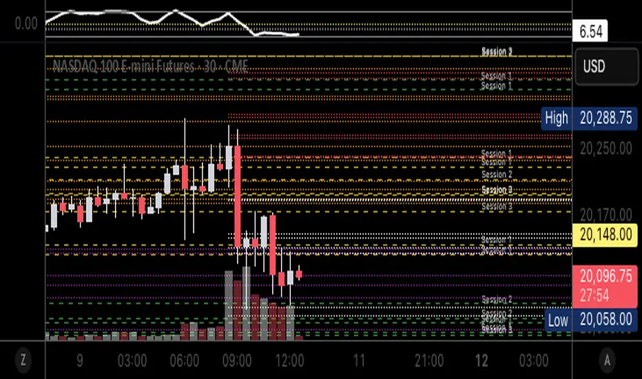
Autofib Extensions | DTDHello trader comuunity!
I'm introducing another script that is part of my main day-trading strategy. We all know regardless of what strategy we use, we need to know what levels offer the least amount of risk to our trade entry and a great tool to anticipate how far a move might go or what level a move may retrace to are the Fibonacci Retracement and Extensions. This indicator combines both together, but with a twist.
The main elements of the script are:
1. Multiple Session High and Lows | Developing my first script led me to understand that measuring key times during each session provides understanding of the market's continuity. I have provided 3 "sessions' a user can define according to CST time where the script saves the high and low of that session window to produce the retracement and extensions from those plots. Currently, the levels are always plotted from low to high (with the 0 mark being the high) and negative values provided so the levels are consistent. You can toggle each session on or off.
2. Coloring Key Retracements / Extensions | I use a dark background for my charts so the default colors help me distinguish from other another indicator I use. Feel free to adjust the colors to your preference. I consider 3 different colors because of their significance. Retracements that you want to see continue fall back into the .50 to .618 level (this I consider the "Golden Zone"). While basic Elliott Wave Theory states a wave is completed near the 1.618 level (this I consider "Major Extensions"). Everything isn't noise, but minor levels in a larger sequence.
______________
Script Limitations
All of my scripts are made with the help of ChatGPT so there are going to be limitations. One current one that I have made progress on, but not fully is when you are viewing a timeframe where the candle doesn't start when a session window starts. On smaller timeframes like the 7-minute this is not an issue. However, on the hourly, if your session window starts at the half hour which the 3rd session default window does, the lines will not produce. I will hopefully have this rectified in the near future. I will open the script since none of this work is original in nature and I would love to see how others can create a better product. Also, this is mainly a futures trading tool. If you are using this on stocks you will find it not as useful if the session window is too wide since the script waits until the session window closes to calculate the extension values.
Cheers,
DTD