TrendFireOverview
They say "Trend is your Friend". In my short trading timeline, I've realized the difficult part is making this friendship to happen. Although, not impossible.
Trend Fire is one of the trend following strategy amongst many strategies out there. But the unique part of Trend Fire lies in the implementation and its accuracy to identify healthy Trends. Trend Fire is a purely Mathematical Indicator and aims for generating more successful trade signals. It has a unique strategy to avoid sideways market, false signals, and calculation to find entry for Trends, hence, more quality of trades.
I started my trading journey by observing the market movement for a long time as a beginner trader. Over time, I've realized that profit maximization can happen only if I can properly identify long trend. The reason why I was fascinated with trend following strategies and keen to solve the problems that trend following has.
Approach
In most typical trend following strategy setup, Trend identification starts by using fast and long period moving average crossovers. The fact that, moving averages are lagging in nature, it fails to identify good trends and produce many false signals. Although, it generates signals for trend also along with the false signals.
My aim was to reduce the false signals that occurs during consolidation and gain more accuracy on detecting healthy trends. The reason why I've obtained several approaches -
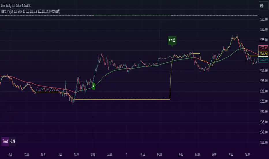
1. Moving Average Gap - during a consolidation period where lots of false signal generates in a crossover system, we can see that the distance/gap between the moving averages is very small, and in long trend the distance is large. So, a simple implementation was to limit the distance/gap by using a threshold to generate signals for trend outside the false signal threshold. This way, signals for long trend generates a few candles away but reduces false signal generation. For this Gap to work, a gap threshold of 20 works great to identify large trends and it is also a good entry point.
3. Volatility Adaptive moving average - As, this system is based on calculating distance/gap between MA's, the distance also doesn't always indicate proper momentum during a trend. The reason behind is that, 200 Moving average is also moving along the price during a trend and the distance/gap between moving averages vary according to the price. This also leads to generate false signals. So, it is more appropriate to replace 200 moving average with volatility adaptive moving average with a period of 1000, because adaptive moving average always reacts to the price and creates a larger distance/gap with price when there’s a trend in the market. Otherwise, it moves close with price in a sideways market. This nature of adaptability helps to reduce more false signals and gain more chances to take profitable trends.
This is also should be considered that no indicator system alone in trading is purely accurate. So, Trend Fire also is not an exception. There will be false signals, but the probability of getting false signal is less than the overall profits compared to any other moving average crossover system. The idea here is, maximizing your equity gradually over time rather than in a day and trade only when market is tradeable. Exactly how trading should be.
Usage
The usage of the indicator is simple. Once the indicator is applied in the mentioned currency pairs, it will show Buy/Sell signals along with Exit points in the chart.
The yellow line is the volatility adaptive moving average line which create distance during a trend and moves close to price when there is no trend. It is also used for trade exit indication, where the line meets with the price at the end of the trend and shows total pips gains/loss in a popup.
As, the indicator have built in adaptive and ATR base stop loss system, a good approach is to enable this in settings. So that, the loss will be minimum. The reason behind, by default the trades closed when a certain trend is over (When yellow line reaches close to the price after a gap) and this closing point not necessarily closes above/below signal. This is why Adaptive and ATR stop loss together make sure when trend reverses during a trend to take profit. Although, settings for Stop loss have been configured in the indicator, but if needed, settings can be changed for optimized results. It is also advisable to not to trade during a news alert as there are chances to generate false signal for high movement of the market.
Down-Sides
The indicator is dependent on the 1-minute time frame, larger time frames resulting in a signal overfitting condition. The indicator is set for only some selective currencies and commodities. So, its behavior might also change if the currency pair is out of scope. Below is the list of currencies which will work for now.
• EURUSD – FXCM
• GBPUSD – FXCM
• AUDUSD – OANDA
• USDCAD – OANDA
• GBPCAD – FXCM
• USDJPY – FXCM
• GBPJPY – OANDA
• EURJPY – OANDA
• CADJPY – FXCM
• AUDJPY – OANDA
• CHFJPY – OANDA
• EURAUD – FXCM
• GBPAUD – FXCM
• AUDCAD – OANDA
• EURGBP – FXCM
• EURCAD – OANDA
• XAUUSD – OANDA
• XAGUSD – OANDA
• USOIL – TVC
• BTCUSDT.P – BYBIT
More currency pair will be added in the future.
Settings
• Fast MA : Fast Moving Average
• Trend MA : Trend line Ema for determining Exit point
• Trend Threshold : Gap threshold between VAMA and Fast EMA
• VAMA : Volatility Adaptive Moving Average Length for calculation
• Enable Trend Coloring : Enable trend coloring on adaptive moving average line
• Enable Trailing Stop : Enable Adaptive and ATR trailing stop to exit trades
• Show Dashboard : Enable Trend and Signal value dashboard
• Position : Position of Dashboard in Chart
Alerts
Alert conditions are set for trade Entry and Exit scopes only and it does not mention Buy/Sell trade specifically in alerts for now. For that, you need to follow the chart after an alert as indicator shows Buy/Sell/Exit on chart. To create an alert based on the indicator follow these steps:
Go to the alert section (the alarm clock) -> create new alert -> select TrendFire in condition -> Below select TRADE ALERT and select date duration. In option select “once per bar close”, By default the message is set with ticker ID. Change the message if you want a personalized message.
Conclusion
As a programmer and problem solver, I have invested over a year to understand the market and tried to solve the problem that I faced as a trader. I wanted to develop an indicator that make sense and works logically in market. Also, the aim is to trade smartly with a strategy rather than biting in the bush randomly. Trade Fire is a result of countless failures and losses. I hope future contributions will grow this indicator to be more efficient down the line.
Thanks for reading…Happy Trading!
在腳本中搜尋"smart"
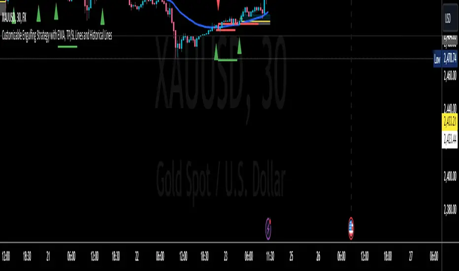
Engulfing with Fibonacci LevelsIndicator Explanation
The indicator identifies bullish and bearish engulfing patterns and plots Fibonacci levels based on these patterns. Here's a detailed explanation of the script:
1. Bullish Engulfing Pattern
A bullish engulfing pattern is identified when:
- The previous candle is bearish (`close < open `).
- The current candle is bullish (`close > open`).
- The low of the current candle is lower than the low of the previous candle (`low < low `).
- The current candle's close is higher than the previous candle's open (`close > open `).
When a bullish engulfing pattern is identified:
- Fibonacci levels are plotted from the low (0%) to the high (100%) of the bullish candle.
- A green dot is plotted below the bullish candle to indicate a buy signal.
2. Bearish Engulfing Pattern
A bearish engulfing pattern is identified when:
- The previous candle is bullish (`close > open `).
- The current candle is bearish (`close < open`).
- The high of the current candle is higher than the high of the previous candle (`high > high `).
- The current candle's close is lower than the previous candle's open (`close < open `).
When a bearish engulfing pattern is identified:
- Fibonacci levels are plotted from the high (0%) to the low (100%) of the bearish candle.
- A red dot is plotted above the bearish candle to indicate a sell signal.
3. Plotting Fibonacci Levels
For both bullish and bearish patterns, Fibonacci levels are plotted at:
- 0% (high for bullish, low for bearish)
- 50%
- 61.8%
- 79%
- 100% (low for bullish, high for bearish)
Smart Money Concept (SMC) Explanation
Bearish Signal
In the context of Smart Money Concepts (SMC), a bearish engulfing pattern can indicate:
- **Buy Side Liquidity Grab**: The high of the current bearish candle goes above the high of the previous bullish candle, potentially grabbing buy-side liquidity (stop losses of short positions or buy stops).
- **Break of Structure (BoS)**: The close of the bearish candle below the open of the previous bullish candle indicates a shift in market structure.
After identifying this bearish engulfing pattern, a smart money trader might:
1. Wait for the market to retrace 50% of the bearish candle.
2. Enter a sell trade around the 50% retracement level, anticipating a continuation of the downward move.
#### Bullish Signal
Similarly, a bullish engulfing pattern can indicate:
- **Sell Side Liquidity Grab**: The low of the current bullish candle goes below the low of the previous bearish candle, potentially grabbing sell-side liquidity (stop losses of long positions or sell stops).
- **Break of Structure (BoS)**: The close of the bullish candle above the open of the previous bearish candle indicates a shift in market structure.
After identifying this bullish engulfing pattern, a smart money trader might:
1. Wait for the market to retrace 50% of the bullish candle.
2. Enter a buy trade around the 50% retracement level, anticipating a continuation of the upward move.
The indicator helps traders identify key engulfing patterns that align with smart money concepts of liquidity grabs and breaks of structure. By plotting Fibonacci levels, it visually aids traders in waiting for optimal retracement levels (50%) to enter trades in the direction of the anticipated move. This approach leverages the idea that significant market participants often seek liquidity and cause structural shifts, providing entry opportunities for informed traders.
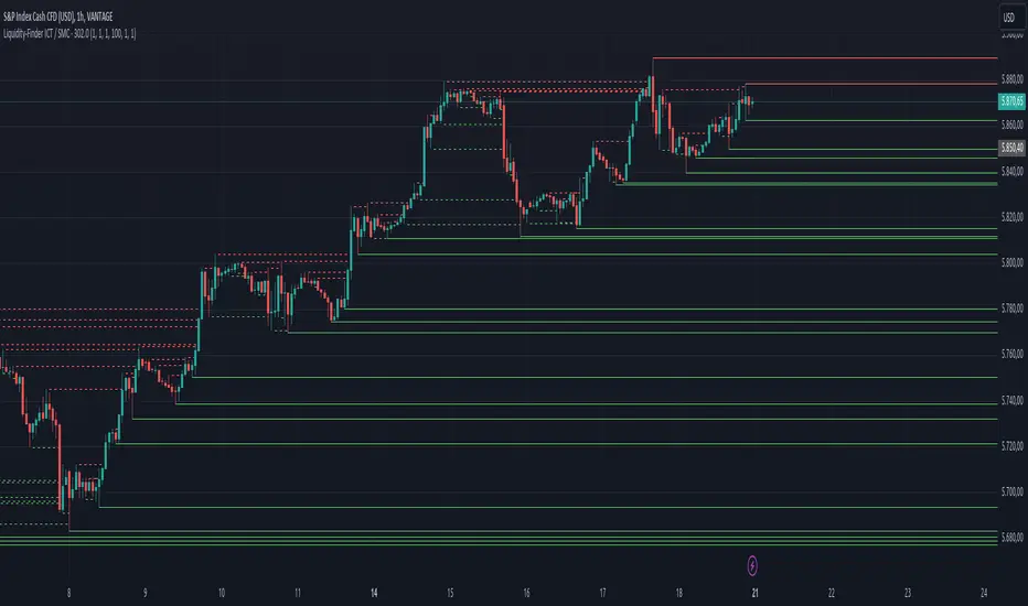
Liquidity-Finder ICT / SMCIn the context of ICT and the Smart Money Concept, liquidity is likely viewed as a crucial factor for determining the strength and sustainability of a market move. Smart Money is often associated with large institutional traders who have the ability to influence liquidity.
Liquidity Sweep:
A liquidity sweep in this context might involve Smart Money intentionally executing trades across various price levels to assess market depth and liquidity. This information can be used to identify potential areas of interest for Smart Money to initiate or exit positions without causing significant price disruptions.
Stop Hunt:
Stop hunting is a concept that Smart Money traders may employ to deliberately trigger stop orders in the market. By doing so, they can create temporary price movements that allow them to accumulate or liquidate positions at more favorable prices before the market reacts.
Smart Money Concept (SMC):
The Smart Money Concept revolves around the idea that large institutional traders (Smart Money) have superior information and resources compared to retail traders. Understanding the behavior of Smart Money, as taught in ICT and SMC, involves analyzing market dynamics, order flow, and liquidity to make more informed trading decisions.
Liquidating:
Liquidating refers to the process of selling or closing out existing positions. In the context of Smart Money, the term could imply that institutional traders are actively managing their positions, either taking profits or cutting losses strategically based on their analysis of market conditions.
The Indicator
The Indicator show open liquidity as solid lines and liquidates liquidity as dashed lines
Is able to send alerts for liquidity level was liquidated, liquidity level was dipped or the next close is on the other side
Moving Average [chkd]日本語の説明は英語の説明の後にあります。
========= English =========
Various analyses of moving averages have been introduced, but the key points to observe are often quite similar. To efficiently observe the following points, I have created this indicator:
The positional relationship between each moving average and candlestick
The slope (directionality) of the moving averages
Moving averages from different time frames
The positional relationship of moving averages is classified into stages:
Stage 1: Short-term MA > Medium-term MA > Long-term MA (Perfect Order)
Stage 2: Medium-term MA > Short-term MA > Long-term MA
Stage 3: Medium-term MA > Long-term MA > Short-term MA
Stage 4: Long-term MA > Medium-term MA > Short-term MA (Reverse Perfect Order)
Stage 5: Long-term MA > Short-term MA > Medium-term MA
Stage 6: Short-term MA > Long-term MA > Medium-term MA
The features of this indicator include:
Displaying multi-timeframe stages in a table
Showing the transition history of stages with dashed lines at the bottom
Selectable table size (compatible with PC and smartphones)
========= Japanese =========
移動平均線の分析は色々紹介されていますが、見るポイントはどれもよく似ています。
以下のポイントを効率よく見れるように、このインジを作成しました。
各移動平均線とローソク足の位置関係
移動平均線の傾き(方向性)
異なるタイムフレームの移動平均線
移動平均線の位置関係は、ステージとして分類しています。
stage1 : 短期MA > 中期MA > 長期MA (パーフェクトオーダー)
stage2 : 中期MA > 短期MA > 長期MA
stage3 : 中期MA > 長期MA > 短期MA
stage4 : 長期MA > 中期MA > 短期MA (逆パーフェクトオーダー)
stage5 : 長期MA > 短期MA > 中期MA
stage6 : 短期MA > 長期MA > 中期MA
移動平均線の分析で、非常にわかりやすいものに小次郎講師の大循環分析があります。
書籍や無料のyoutubeもあるので、併せてみてもらえるとこのインジの使い方のイメージが湧きやすくなると思います。
このインジでは以下の特徴があります。
マルチタイムのステージをテーブルで表示
ステージの変換履歴を下部の点線で表示
テーブルサイズは選択可(pc,スマホ対応)

Demand and Supply Zones Lite [Afnan]Are you looking to level up your trading game and spot potential turning points in the stock market? Introducing the Smart Money Demand and Supply Zones indicator, a powerful tool designed to identify opportunities created by the Smart money.
The Smart Money Demand and Supply Zones indicator is built upon the principles of Rally Base Rally (RBR), Rally Base Drop (RBD), Drop Base Rally (DBR), Drop Base Drop (DBD).
🔍 Key Details 🔍
The "Smart Money" concept refers to large institutional investors and professional traders who possess significant financial resources and expertise. The importance of smart money lies in their influence on market trends and price movements. Their actions and positions often serve as signals for retail traders and investors to make informed decisions.
Formation of Smart Money: Smart money is attracted to areas in the market where they can find favourable risk-to-reward opportunities.
1. Rally Base Rally (RBR) Zones: These zones occur after a rally (upward price movement), followed by a period of consolidation (base formation), and then another rally. Smart money often forms positions here as it suggests a strong uptrend continuation.
2. Rally Base Drop (RBD) Zones: In this case, there is a rally, followed by a base formation, but instead of another rally, the price drops. Smart money may position themselves here in anticipation of a potential trend reversal.
3. Drop Base Rally (DBR) Zones: These zones form when there is a drop in price, followed by a base formation, and then a rally. Smart money may take positions here, expecting a trend reversal to the upside.
4. Drop Base Drop (DBD) Zones: In this scenario, the price drops, then forms a base, but subsequently continues to drop. Smart money might take bearish positions here, anticipating further downward movement.
🚀 Pending Orders from Smart Money Zones: 🚀
When the price approaches these smart money zones, institutional investors often place remaining pending orders to enter the market.
By identifying RBR/DBR zones as potential buying opportunities and RBD/DBD zones as potential selling opportunities on price charts, retail traders can align their trades with smart money activities. Implementing proper risk management and confirming signals enhances the likelihood of successful trades by following the footsteps of institutional investors.
💡 Key Features of the Indicator 💡
This indicator includes the following features:
Customizable Zone Length: Adjust the number of base candles in a zone to suit your preferences and strategy.
Candle Body Size Customization: Personalize the body size of candles for fine-tuning visual representation.
Base Candle Selection: Choose between the body of the candle or narrow range candles as the base candle for zone plotting.
Colour Customization For Candles: Customize Drop, Base, Rally, and Zone colours to match your visual preferences.
Number of Zones: This feature is flexible, allowing you to customize the quantity of zones displayed on the chart for improved visibility.
Zone Colours: You have the option to personalize the colours for both fresh and tested zones based on your preferences.
Zone Strength Customization: Adjust candle sensitivity for better control.
Swing High and Swing Low: Enable or disable support and demand lines based on Swing High and Swing Low.
Wick of Candle: Customize zone plotting using the body or wicks of candles for flexible analysis.
Previous Zones: You can choose to display or disable previous zones on the chart that have been deleted and utilized before. This option helps you maintain a clutter-free chart while retaining valuable historical information.
Moving Averages: Utilize four (4) customizable Moving Averages to enhance analysis from any time frame.
💎 Employing a Top-Down Approach and Multiple Time Frame Analysis: 💎
Let's delve into the concept of adopting a top-down approach combined with multiple time frame analysis in trading scenarios. It is consistently recommended to trade with the trend because, as the saying goes, "the trend is your friend." If you identify a demand zone on the chart but the overall trend is downward, it's crucial to confirm the stock's trend in higher timeframes. Avoid purchasing from the demand zone in such a scenario as you would be going against the trend. To consider buying from the demand zone, ensure that the overall trend is upward by checking the higher timeframe.
Similarly, if the higher timeframe trend is upward but the price is approaching a higher timeframe supply zone, refrain from buying in the lower timeframe. If the price reaches a higher timeframe supply zone, there is a likelihood that the price will face rejection from this zone.
If the price is significantly extended from the EMA 20 on a higher timeframe, for instance, if you plan to trade on a 30-minute timeframe and the price is considerably extended from the daily EMA 20, consider trading from zones that are closer to the daily EMA 20. When the price is extended from the higher timeframe EMA 20, it implies that the price is expensive, and there may be a tendency for it to return to the EMA 20. Therefore, it is advisable to trade from zones that are closer to the higher timeframe EMA 20 and avoid zones that are extended from the higher timeframe EMA 20.
For instance, imagine you're considering purchasing a stock that has reached a demand zone known as Rally Base Rally (RBR). If you identify a corresponding demand zone in a higher time frame located at the same position, and concurrently observe that the intermediate time frame indicates an upward trend, your potential for a successful trade is enhanced.
Conversely, if you spot a buying zone in a lower time frame, but notice a supply zone in the higher time frame at that exact position, the likelihood of a profitable trade decreases significantly. In such cases, it's prudent to steer clear of the lower time frame zone. This emphasizes the critical significance of employing a top-down approach or conducting a multiple time frame analysis.
Note: By Doing top down approach you can easily follow the footprints of smart money in the stock market or any other market by using this indicator and make well-informed trading decisions.
Remember, don't make decisions based only on one time frame. Check the overall trend of the stock and look at buying and selling points on bigger time scales. If you only use one time scale, your chances of making successful trades will be lower.
💎 To execute these comprehensive analyses and optimize your trading outcomes, you can make use of my indicator called "Demand & Supply Zone Scoring: Rally Base & Drop Concept."💎
This indicator is thoughtfully crafted to assess the strength of trade setups based on demand and supply zones through a scoring mechanism. It serves as your guide for correct top-down and multiple time frame analysis, eliminating the possibility of overlooking any strategic parameters. To gain deeper insights, you can learn more about how to use this indicator in its description.
Lastly, Thank you for your support, your likes & comments." Feel free to ask if you have questions.
Let's conquer the markets together! 🚀
[AlbaTherium] Structure Mapping & Order Blocks Advanced - Beta An Insight into Structure Mapping and Order Block Identification with Smart Money Concepts
Introduction:
Structure Mapping & Order Blocks Advanced - Beta serves as a fundamental pillar in the realm of Smart Money Concepts . This indicator adeptly charts the market structure based on a refined version of SMC while identifying Order Blocks. All the concepts embedded in this method are meticulously defined, offering users the ability to chart the market structure with heightened confidence. With this indicator, there is no need for excessive questioning of the accuracy of your markings; it diligently strives to perform this task effectively. There are no hidden 'magic' properties underlying this indicator, ensuring that our users can independently verify each and every feature. It is this commitment to transparency that sets us apart and makes us unique in the market.
In this discussion, we delve into the intricacies of Break of Structure , Change of Character , and SMART MONEY TRAP . We also introduce the concepts of Extreme Order Blocks , Decisional Order Blocks , and Smart Money Trap Order Blocks .
Chapter 1: Understanding Structure Mapping:
Let's begin with some definitions:
- Inside bars are candles that lie within the range of a preceding candle.
- Pullbacks occur in an uptrend when the low of a preceding candle's range (excluding inside bars) is breached, and the price continues to rise.
- Inducements (IDM) are price levels defined as the low of the latest pullback before the most recent high. They often act as liquidity points that the market revisits before continuing its move.
- Break of Structure (BoS):
In an uptrend, after surpassing an IDM , the most recent high becomes a Confirmed structure high, or a Major High . If the price then closes above this Major High , a Bullish Break of Structure (Bullish BoS) is confirmed. Similarly, the lowest point between these movements becomes a Confirmed structure low or Major Low in a downtrend.
- Change of Character (ChoCh):
In an uptrend, if the price falls below a Major Low , it indicates a shift in market bias from Bullish to Bearish, or a Bearish Change of Character .
Example of a bullish ChoCh :
Chapter 2: The Significance of Order Blocks:
Order Blocks (OB) play a pivotal role in Smart Money Concepts during entry points. Understanding what they represent and how to identify them is essential. For a Bullish/Bearish Order Block to be confirmed, specific conditions, including price imbalance and breaching the previous candle's high or low, must be met. We will delve into the finer details of identifying and trading Order Blocks, with an emphasis on the fact that price often reacts from Decisional Order Blocks, Extreme Order Blocks , and Smart Money Trap Order Blocks .
- An OB is the initial candle range of a pullback that creates a Fair value gap .
These are zones where proactive traders enter the market, resulting in significant price changes indicated by Fair value gaps . It is believed that when the price revisits these zones in the future, it tends to bounce back. This property makes Order Blocks excellent potential entry points.
Order Blocks are categorized as follows:
- Extreme OB : The first and lowest OB between the Major Low and Major High.
- Decisional OB : The most recent OB lower than the current IDM.
- Smart Money Traps : All OBs between Extreme and Decisional OB.
- Demand above IDM / Supply below IDM
Chapter 3: Understanding SMART MONEY TRAP (SMT):
SMART MONEY TRAP is a concept that brings clarity to the distinction between Structure and Order Blocks within Smart Money Concepts and is a unique feature of this indicator. While many Smart Money Traders base their trades on Structure and Order Blocks, it's crucial to recognize that Order Blocks serve as an additional confirmation for buy or sell decisions. Blindly trading based on Order Blocks is not advisable. Instead, traders should exercise patience and await other confirmations like inducement or Liquidity sweep before executing trades on Order Blocks. We will illustrate how this concept works in practice.
In the example above, the market largely disregards all the SMT s and responds favorably to the Extreme OB . This presents a promising trading opportunity, with a stop loss placed below the OB and a take profit set at the fill of the Fair value gap.
Conclusion:
Structure Mapping & Order Blocks Advanced - Beta embodies the essence of Smart Money Concepts , serving as a powerful tool for traders. This indicator effectively combines the elements of structure mapping and Order Blocks to guide trading decisions. By comprehending the dynamics of Impulsive Moves and Corrections, distinguishing between Bearish and Bullish Order Flow, and mastering the identification and trading of Order Blocks while considering SMART MONEY TRAP, traders can gain a competitive edge in the dynamic landscape of financial markets.
This document serves as a comprehensive guide to Structure Mapping & Order Blocks Advanced - Beta, highlighting its significance within the Smart Money Concepts framework. It is essential to apply these concepts judiciously to enhance trading.

TradeMaster ProTrading effectively requires a range of techniques, experience, and expertise. From technical analysis to market fundamentals, traders must navigate multiple factors, including market sentiment and economic conditions. However, traders often find themselves overwhelmed by market noise, making it challenging to filter out distractions and make informed decisions. To address this, we present a powerful indicator package designed to assist traders on their journey to success.
The TradeMaster indicator package encompasses a variety of trading strategies, including the SMC (Supply, Demand, and Price Action) approach, along with many other techniques. By leveraging concepts such as price action trading, support and resistance analysis, supply and demand dynamics, these indicators can empower traders to analyze entry and exit positions with precision. Unlike other forms of technical analysis that produce values or plots based on historical price data, Price Action brings you the facts straight from the source - the current price movements.
The indicator package consists of three powerful indicators that can be used individually or together to maximize trading effectiveness.
⭐ About the Pro Indicator
The Pro indicator is the cornerstone of the package, offering a comprehensive range of functions. It's strength lies in our unique structure calculation, which is based on real price action data, capturing every ticks from small intraday fluctuations to the significant high timeframe movements. The Pro Indicator reflects our personal use and deep comprehension of Smart Money Concepts. It provides streamlined tools for tracking algorithmic trends with modern visualizations, without unnecessary clutter.
In the ever-evolving trading landscape, mainstream methods and strategies can quickly become outdated as they are widely adopted. Liquidity is constantly sought after, and the best source for this is exploring and exploiting trading strategies that are widely accepted and applied. Currently, one of these strategies is the SMC (Supply, Demand, and Price Action).
It's no coincidence that our educational materials incorporate concepts such as liquidity grabs (LG) and Smart Money Traps (SMT). As the application of SMC gains popularity among retail traders, trading with this approach becomes more challenging. Therefore, the recent focus has been on reforming the SMC methodology, as it is the only method that relies on real price movements and will always work when applied correctly.
▸ What does proper application of SMC entail?
Many SMC traders associate their key areas of interest with the market structure, which is generally considered acceptable. However, depending solely on a single foundation can lead to significant deviations, which may cause notable impacts on trading results. Moreover, if the basis for the market structure calculation is inaccurate, the consequences can be even more severe. It's akin to risking money on a lottery ticket, believing it will be a winner.
Our methodology is different, and it may ensure longevity in the financial markets. The structure remains crucial, but it is not the sole foundation of everything; instead, it serves as a validation tool. Each calculation, such as order blocks (OB), Fair Value Gaps (FVG), liquidity grabs (LG), range analysis, and more, is independent and unique, separate from the structure. However, validation must ultimately come from the structure itself.
We employ individual and high-quality filters: before a function calculation is validated by the structure, it must undergo rigorous testing based on its own set of validation conditions. This approach aims to enhance robustness and accuracy, providing traders with a reliable framework for making informed trading decisions.
▸ An example for structure validation: Order Block with "Swing Sensitivity"
These order blocks will only be displayed and utilized by the script if there is a swing structure validation with a valid break. In other words, the presence of a confirmed swing Change of Character (ChoCh) or Break of Structure (BoS) is essential for the Order Block to be considered valid and relevant.
This approach ensures that the order blocks are aligned with the overall market structure and are not based on isolated or unreliable price movements. Whether it's Fair Value Gaps (FVG), Liquidity Grabs (LG), Range calculations, or other functionalities, the same underlying principle holds true. The background structure calculation serves as a validation mechanism for the data and insights generated by these functions, ensuring they adhere to the specific criteria and rules established within our methodology. By incorporating this robust validation process, traders can have confidence in the reliability and accuracy of the information provided by the indicator, allowing them to make informed trading decisions based on validated data and analysis.
👉 Usage - the general approach:
Determine your trading style using the Pro Indicator and build your basic strategy. This indicator helps you understand your trading style, whether it's swing trading, scalping or another approach. By analyzing the Pro Indicator, you gain valuable information about potential market trends, entry and exit points, and overall market sentiment.
👉 Example of usage:
In the following chart, you'll notice how we've utilized the indicator to formulate a strategic trading approach. We've employed Order Blocks equipped with volume parameters to identify crucial market zones. Simultaneously, we've leveraged swing/internal market structures to gain insights into potential long and short-term market turnarounds. Lastly, we've examined trend line liquidity zones to pinpoint probable impulses and breakouts within ongoing trends.
Now we can see how the price descended to the order block with the highest volume, which we had previously marked as our point of interest for an entry. As the price closed below the median Order Block, we noted its mitigation. After an internal CHoCH, it's directing us towards the main Order Block as a target.
👉 Smart Money Concepts Functions
Market Structure: identifies and marks key structural changes in the market, in order to visually highlight shifts in market trends and patterns. This feature is designed to alert you of significant changes in the market's behavior, signaling a potential shift from accumulation to distribution phase, or vice versa. It helps traders adapt their strategies based on evolving market dynamics.
Order Blocks: pinpoints crucial zones where large institutional investors ("smart money") have shown strong buying or selling interest recently. Order blocks can serve as a tool for identifying key levels for potential trade entries or exits.
FVGs (Fair Value Gaps): detects discrepancies between the perceived market value and actual market price, revealing potential areas for price correction. With its mitigation settings, you can fine-tune the FVG detection according to the magnitude of value misalignment you consider significant.
Liquidity Grabs: helps track "smart money" footprints by identifying levels where large institutional traders may have induced liquidity traps. Understanding these traps can aid in avoiding false market moves and optimizing trade entries.
Automatic Fibonacci Tool: Simplifying the task of identifying key Fibonacci retracement and extension levels, this tool ties Fibonacci levels to the structure for you. It aids in recognizing significant support and resistance levels, providing a clearer understanding of potential price movements.
The Smart Money Concepts trading strategy - combined with these dynamic features - becomes a powerful analytical asset for any trader, providing in-depth insights into market dynamics, trends, and potential opportunities.
👉 Algorithmic trend and dynamic support and resistance
Trend Rainbow: This proprietary feature uses our unique TRMA** method to define short-term, medium-term, and long-term market trends. It incorporates state-of-the-art visualization techniques to render the trend information in an intuitive, easily interpretable manner. It's a 21st-century tool designed for the modern trader who values both precision and simplicity.
Multi-Timeframe Moving Averages: This feature allows traders to simultaneously monitor moving averages across multiple timeframes, providing a comprehensive perspective on market trends. It helps identify dynamic support and resistance zones, key levels where price movements are likely to slow down or reverse. This function not only aids in planning potential trade entries and exits, but also calculates the precise percentage distance to these levels. Can be as well crucial for risk management, enabling traders to set stop losses and profit targets based on solid, data-driven analysis. The Multi-Timeframe Moving Averages function is a versatile tool that combines strategic planning and risk control into a single, easy-to-use feature.
👉 Unlock the Hidden Market Dynamics
Market Sessions: This feature - by default - provides a clear representation of the four major global trading sessions. Each session is distinctly marked on your trading chart, helping you visualize the specific time periods when these markets are most active. Recognizing these sessions is critical for understanding market dynamics, as the opening and closing of major markets can lead to significant price movements. Whether you're a day trader looking to exploit intra-day volatility or a long-term investor wanting to understand broader market trends, the Market Sessions feature can be a useful tool in your trading toolkit.
Divergence Functions: allow the use of unique indicators along with our proprietary ones to detect potential price reversals. As each asset has a different market maker, divergences can vary greatly across different charts and timeframes. With our Divergence Ranking Table, you can quickly determine which divergences have the highest success rates and which are the least successful on a given chart. This feature allows you to adapt your strategies to the most effective signals, enhancing your trading decisions and boosting your potential profits.
Volume Profile with delta: This feature may give traders an edge by providing an in-depth view of market activity. It illustrates the amount of trading volume at different price levels, combined with the 'delta', which is the difference between buying and selling volume. This information allows you to see areas of high trading activity and understand whether the volume is pushing the price up or down. This real-time insight into the market's supply and demand can be instrumental in identifying key support and resistance levels, predicting potential reversals, and recognizing where the market is likely to move. Similarly to Fibonacci tool, Volume Profile can be tied to the current market structure.
👉 Improve Trading Decisions
Range: This innovative feature assists traders in determining discount, premium, and equilibrium zones. It provides a unique way of visualizing price areas where a security could be overbought or oversold (premium or discount zones), and where the price is expected to be fair and balanced (equilibrium zone). Distance from current price is displayed in percentage terms, which can assist traders with crucial data for risk management and strategic planning. The Range function helps you identify the most favorable price zones for entries and set your stop-loss and take-profit levels more accurately.
Previous OHLC: This functionality offers the capability to display the previous Open, High, Low, Close values. It is primarily set on the daily timeframe and serves as an important reference for traders. Having an overview of these key levels from the previous day gives you a solid foundation on which to base today's trading decisions. Recognizing these levels can help you predict potential turning points in the market, providing an advantage in your trading strategy.
Smart Money Zones: our secret weapon for swing traders. Similarly to order blocks, these zones can accurately identify crucial areas of strong buying or selling interest by large institutional investors. However while Order Blocks focus on recent price action, Smart Money Zones take the whole chart into consideration, resulting in more established support and demand zones.
The summary graph combines six unique indicators (Momentum, Trend Strength, Volume, Volatility, Asset Strength, and Sentiment) along with Structure and Sessions. These indicators use our TRMA** method to provide a comprehensive overview of market dynamics. By consolidating these indicators into a single graph, traders can gain valuable insights into the overall market landscape.
** TRMA (Trend Rainbow Moving Averages) is a complex but customizable moving average matrix calculation that is designed to measure market trend direction, strength and shifting.
⭐ Conclusion
We hold the view that the true path to success is the synergy between the trader and the tool, contrary to the common belief that the tool itself is the sole determinant of profitability. The actual scenario is more nuanced than such an oversimplification. Our aim is to offer useful features that meet the needs of the 21st century and that we actually use.
🛑 Risk Notice:
Everything provided by trademasterindicator – from scripts, tools, and articles to educational materials – is intended solely for educational and informational purposes. Past performance does not assure future returns.

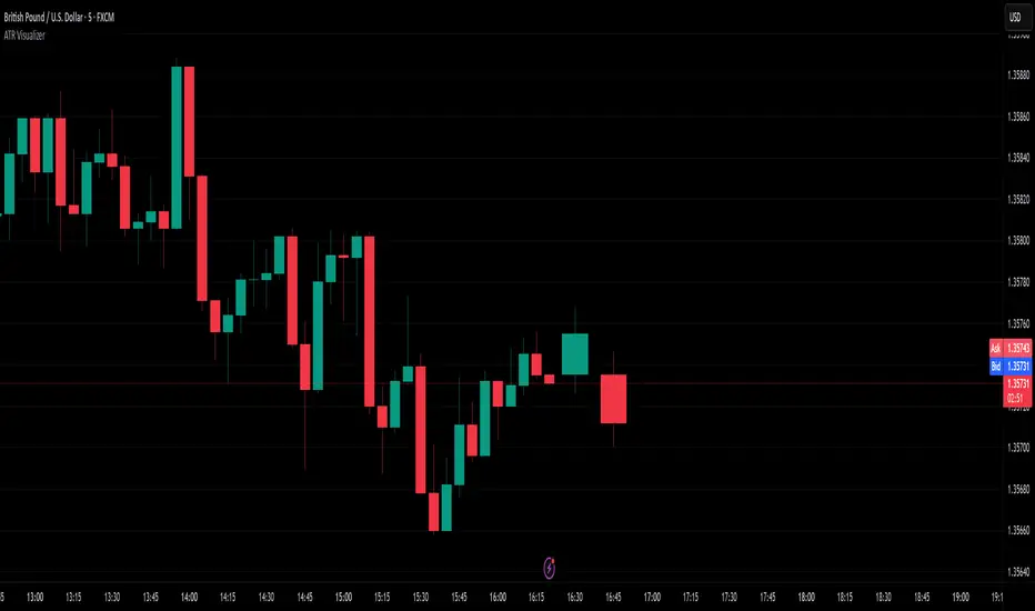
ATR VisualizerAdvance Your Market Analysis with the True Range Indicator
The True Range Indicator is a sophisticated screener meticulously developed to bolster your trading execution by presenting an exceptional understanding of the market direction. The centerpiece of this instrument is a distinctive candle configuration depicting the Average True Range (ATR) and the Bear/Bull range. However, it traverses beyond the conventional channels to offer specific market settings to boost your trading decisions.
User-Defined Settings
Broadly, the indicator offers five dynamic settings:
Bear/Bull Range
The Bear/Bull Range outlines the ATR for each candle type - bearish and bullish - and then smartly opts for the pertinent one based on the prevalent market circumstances. This feature aids in comparing the range of bullish and bearish candlesticks, which deepens your understanding of the price action and volatility.
Bearish Range
The Bearish Range isolates and computes the ATR for bearish candles solely. Utilizing this option spots the bear-dominated periods and provides insights about potential market reversals or downward continuations.
Bullish Range
Opposite to the Bearish Range, the Bullish Range setting tabulates the ATR exclusively for bullish candles. It assists in tracking the periods when bulls control, enlightening traders about the possibility of upward continuations or trend reversals.
Average Range
The Average Range provides an unbiased measure of range without prioritizing either bull or bear trends. This model is ideal for traders looking for a holistic interpretation of market behavior, regardless of direction.
Cumulative Average Range
Equally significant is the Cumulative Average Range which calculates the aggregate moving average of the true ranges for an expressed period. This setting is extremely valuable when evaluating the long-term volatility and spotting potential breakouts.
Dual Candle Configuration
Going a step ahead, the True Range Indicator uniquely offers the possibility to incorporate more than one candle estimate on your screen. This ensures simultaneous analysis of multiple market dynamics, thereby enhancing your trading precision multifold.
Concluding Thoughts
In essence, the True Range Indicator is an indispensable companion for traders looking to not only leverage market volatility but also make educated predictions. Equipped with an array of insightful market settings and the ability to display dual candle estimates on-screen, you can customize the functionality to suit your unique trading style and magnify your market performance dramatically.
OSPL Volume [Community Edition]NSE:BANKNIFTY1!
This indicator is based on the concepts popularized by @OptionsScalper123 "Siva" of OiPulse. His ideology Is that large moves come after high volume candles. For Nifty, high volume is considered to be a candle above 125k volume and for BankNifty it’s 50k.
This indicator allows you to cut the noise and focus only on the high volume candle. It shows high volume candle in a brighter shade and lower volume candles in a less visible shade.
You can set the minimum volume threshold limit for Nifty and BankNifty. The indicator smartly recognizes which index you are using it in and uses the respective threshold volume limit.
All colors are customizable.
Thanks for Siva for all the ideas and wonderful products he has given to the community
Thanks to all the wonderful Pinescipters for developing awesome indicators and keeping the source open.
The source code of this indicator is just a few lines. Hope you can use it in your projects and learn something from this just how I learned from other scripts.
Any changes or updates needed in this indicator, please suggest. I was thinking some kind of alerts can be added when volume crosses the threshold. Let me know.
Boost/like this indicator and comment if you find this useful. Cheers and happy trading!!!

Seasonal Open Interest° by toodegreesDescription:
The Open Interest (OI) is a valuable metric that gets released at the end of each trading day. This metric represents the number of outstanding futures contracts held by market participants for a given commodity or market
The concept of utilizing the OI data as a strategic trading tool was first introduced by Larry Williams :
Rise in Price + Rise in OI: strong trend – new money is coming into the market, showing aggressive buying activity
Rise in Price + Decline in OI: weakening trend – less money coming into the market, suggesting that the move is likely to reverse lower
Decline in Price + Decline in OI: strong trend – new money is coming into the market, showing aggressive selling activity
Decline in Price + Rise in OI: weakening trend – less money coming into the market, suggesting that the move is likely to reverse higher
The Inner Circle Trader (ICT) expanded on these ideas, by exposing Smart Money's behaviour:
Rise in Price + Rise in OI: shorts are being stopped out, and new sellers take their place – gradually, longs get stronger and shorts get weaker
Rise in Price + Decline in OI: Smart Money longs are taking profit and liquidating their positions, and weak shorts are exiting the market
Decline in Price + Decline in OI: longs are being stopped out, and new buyers take their place – gradually, shorts get stronger and longs get weaker
Decline in Price + Rise in OI: Smart Money shorts are taking profit and liquidating their positions, and weak longs are exiting the market
Further, ICT showed the importance of OI in consolidations at Institutional Support or Resistance levels:
Consolidation + Rise in OI: bearish sign due to Smart Money is playing the short side and accumulating positions
Consolidation + Decline in OI: bullish sign due to Smart Money covering their short positions
Last but not least, the Seasonal Open Interest shows us a historical reference point of how OI usually, but not always, develops over the trading year.
Depending on the narrative, a higher/lower OI than its Seasonal Tendency can provide an incredible edge by pointing traders towards what side Smart Money is taking.
The Open Interest Meter shows you a visual representation of how many Standard Deviations the Open Interest is deviating from its Seasonal Tendency.
You can also display this visually as a shaded area between the two metrics:
Features:
Plot Open Interest Data
Plot the Seasonal Open Interest for a specific year
See the OI vs. Seasonal OI in a tailored meter
Shade the area between the OI and the Seasonal OI based on their difference

BBD+1. BBD+ can be used on equities, futures, forex and crypto and also on different time frame (daily, weekly and hourly) as well, we advise only look for hourly chart or longer time frame.
2. Consist of fundflow candle, moving average line and triangle signal.
3. The indicator is easy to use and interpret the direction and strength of smart money.
4. Fundflow candle :-
− GREEN candle = smart money inflow > smart money outflow
Green candle above 0 value = opportunity ;
Green candle below 0 value = monitor/hold/rebound
− RED candle = smart money inflow < smart money outflow
Red candle above 0 value = monitor/hold/retracement ;
Red candle below 0 value = risk
− The longer candle indicate higher volume of smart money
5. Moving average line :-
− GREEN line = 5-days moving average (m5)
− BLUE line = 10-days moving average (m10)
− RED line = 20-days moving average (m20)
6. Triangle signal :-
− Arrow-UP triangle = Fundflow candle cross up GREEN line (5-days moving average)
− Arrow-DOWN triangle = Fundflow candle cross down GREEN line (5-days moving average)
7. Five (5) alert conditions are set to notify when desired condition was triggered, i.e.
(1) BBD+ cross-up m5
(2) BBD+ turn GREEN
(3) BBD+ turn RED
(4) BBD+ cross-up ZERO-axis
(5) BBD+ cross-down ZERO-axis
8. Background color indicate the color of smart money candle.
9. BBD+ is not advised to be used solely for the purpose of buy/sell, work best together with indicator TrendX+, DDX+ and MCDX+.

Volume spread analysis V1 (RT)Volume Spread Analysis is a method used by professional traders to identify the Smart money's activities (Institutional Traders) in the markets based on Price and Volume data. and it is considered to be one of the best technical analysis compared to all forms of trading since it is not prone to smart money manipulation but the method itself is to identify the smart money's activity in any markets.
Volume plays an important role in trading since it is used to identify the Smart trader's activity in the markets and it can play a crucial role when it comes to identifying accurate Chart patterns and levels with entries and exits.
Important Features included in this indicator:-
1. Volume Spread Analysis signals to identify SOS (Signal of strength) and SOW (Signal of weakness).
2. Potential Volume zones to identify important levels of Smart money.
3. Gap up and Gap Down Levels to identify the irregular gaps and corrections in the markets.
4. Added Historic signals and other parameter options in the settings.
5. Effort VS Result Option included.
6. Volume Waves, Also known as Cumulative Volume to identify Effort vs result and Buyers/Seller's Activity in the markets.
7. Multiple Options to change the colors of various indicators included.
8. The indicator also consists VWAP option which can be used as POC on Day Trading.
Please note that this indicator will be developed with time as we will constantly be adding more VSA signals in the upcoming days and we are constantly working on the quality of the indicator.
YouTube:- www.youtube.com
Feel Free to reach us via our WhatsApp number +91 9964982366 and provide us with your valuable feedback and ideas for the development of our indicators.
Support and Resistance Based Off Indicators V2Theory Behind It"
There have been hundreds of trading methods and theories that have been proposed by the trading community, each with a unique perspective on trading. One of the most popular theories is known as the Dow theory which was one of the first theories to theorise the concept known today as trends. Now the majority of today's trading strategies are based off the single concept known as "trends."
These concepts and theories have shaped many traders strategies and trading plans to this day. And with a new era of easy access trading, in which nearly anyone with a wifi connection, and computer, or smartphone an trade hundreds of markets brings a light to traders known as retail traders. Which according to Credit Suisse, have accounted for a third of all stock market activity in the United States at points this year. This means that Retail traders are now a community of “market players” that are knowledgeable investors who seek to learn and incorporate their own trading strategies into the market.
This newfound significance of retail traders in the market prompted me to consider a new concept, which I've dubbed the "retail theory." This theory combines the theory that intraday traders move market prices, and if we can figure out what the majority of these retail traders are doing, we can trade based on other traders rather than the actual financial instrument. This notion may be difficult to grasp, so let's break it down.
Let's say there are ten people who can pick any color from a bag. Out of the ten people, Yellow is the favorite colour of two people, blue is the favourite colour of one person, and red is the favourite colour of seven people. Let's pretend we had to bet on which colour the majority of those ten people would choose. While it's evident that we'd all bet on red to win because it's the most popular color, but how does this apply to the markets?
While traders, as we all know, use a variety of indicators to determine where to buy and sell. Some of the most popular indicators that majority of traders use are the moving averages, exponential moving averages, bollinger bands, fib levels, pivot points, vwap, etc. Now tt's impossible to say which indicators are preferred by the majority of traders, but if the majority of indicators align at a certain level, we may infer that the majority of traders will be looking to buy or sell at that level. This is where the indicators-based support and resistance indicator (I know, bad name, but I'm not that creative) comes into play. We can get a good indication of where the bulk of traders will be looking to add or sell by looking at the top indicators on the market and seeing if they are within range of each other. When this is combined with the basic theory of trends, we are able to gain a competitive advantage in the market that few traders have, known as an edge.
If you have any questions based on this theory let me know, but as I said before this theory is based on the concept that we are trading based off majority of what other traders think or are trading off of, not what we think
How It Works:
This indicator checks to see if other types of support and resistance indicators, such as the EMA, VWAP, FIb levels, and so on, are within range of one another. Simply put, when two indicators are within range of each other, a box will appear indicating where they are matching. The color of the box is determined by the number of indicators that line up within the same range, which can be adjusted with user input.
The user also has free range to change all input settings
How To Use:
This is a form of resistance and support indicator that should be used in conjunction with other technical tools. Each box color shows the number of indicators that are aligned with one another. A yellow box, for example, indicates that six or more indicators are within range of each other, but a white box indicates that only two indicators are within range of each other.
These boxes that appear should just be used as a type of support and resistance, but again you can see the strength of the support and resistance by the color.
Notes:
I came out with the concept version about a month ago, and since then it has been nothing but prefect for me. I found with 5 or more indicators line up within each other, then that area tends to be a key "dip buy" area for me. Also acts as a extremely powerful support or resistance if the indicator lines up with trendlines, or horizontal daily supports

Applied Volume Spread Analysis [VSA and VPA]Tried to work over Volume Spread Analysis concepts
The Script Helps one figure out the analysis of Price Volume as per the Tom William's book "Mastering the Markets"
with some of my modifications to find out volumetric level of judgement,
You can see The notifications of a pattern on the chart,
Also gray and black lines which you see are the volumetric derived price action levels!
Some definitions
Up Thrusts
Up-thrusts are designed to catch stops and to mislead as many traders as possible. They are normally seen after there has been weakness in the background. The market makers know that the market is weak, so the price is marked up to catch stops, encourage traders to go long in a weak market, AND panic traders that are already Short into covering their very good position
upthrust bar at high volume is a sure sign of weakness. One may even seriously consider ending the Longs AND be ready to reverse. Also note that when A wide spreaddown-bar that appears immediately after any up-thrust, tends to confirm the weakness (the market makers are locking in traders into poor positions). With the appearance of an upthrust you should certainly be paying attention to your trade AND your stops. On many upthrusts you will find that the market will 'test' almost immediately. A wide spread down bar following a Upthrust Bar.This confirms weakness. The Smart Money is locking in Traders into poor positions.
Strength Bar
The stock has been in a down Trend. An upbar with higher Volume closing near the High is a sign of strength returning. The downtrend is likely to reverse soon. when the volume is very much above average. This makes this indication more stronger.
Pseudo Up Thrust
A pseudo Upthrust. This normally appears after an Up Bar with above average volume. This looks like an upthrust bar closing down near the Low. But the Volume is normally Lower than average. this is a sign of weakness.If the Volume is High then weakness increases. Smart Money is trying to trap the retailers into bad position. A downbar after a pseudo Upthrust Confirms weakness. If the volume is above average the weakness is increased.
Low Volume Test applied
The previous bar was a successful Test of supply. The current bar is a upbar with higher volume. This confirms strength
Trend Change
The stock has been moving up on high volume. The current bar is a Downbar with high volume. Indicates weakness and probably end of the up move
Effort Up
Effort to Rise bar. This normally found in the beginning of a Markup Phase and is bullish sign.These may be found at the top of an Upmove as the Smart money makes a last effort to move the price to the maximum
Effort Down
Effort to Fall bar. This normally found in the beginning of a Markdown phase.
No Supply Bar
No Supply. A no supply bar indicates supply has been removed and the Smart money can markup the price. It is better to wait for confirmation
Stopping Volume
This will be an downbar during a bearish period closing towards the Top accompanied by High volume. A stopping Volume normally indicates that smart money is absorbing the supply which is a Indication that they are Bullishon the MArket.Hence we Can expect a reversal in the down trend.
No Demand Bar
Any up bar which closes in the middle OR Low, especially if the Volume has fallen off, is a potential sign of weakness. Things to Look Out for: \n if the market is still strong, you will normally see signs of strength in the next few bars, which will most probably show itself as a Down bar with a narrow spread, closing in the middle OR High. * Down bar on Low Volume.
How can you get Access
Just private message me!
Will be happy to help, use comment box for constructive comments only

LuxAlgo® - Signals & Overlays™Signals & Overlays™ is an all-in-one toolkit made up of more than 20+ features primarily focused on generating useful signals & overlays to fulfill any trader's technical analysis needs with relevant data.
Created directly with TradingView Pine Script Wizard, alexgrover - this is a first of its kind comprehensive script made fully from the ground-up to provide an all-in-one solution for traders.
Signals & Overlays™ can be used alongside other forms of technical analysis, however, it was also designed to be used as a stand-alone toolkit that can fit any trading style. Every feature included considers how not all technical indicators fit every market condition.
The ideal way to utilize this indicator is to explore through all of the features over time, pick & choose 2-3 features best suit your style of trading, and stick with those to create your own unique LuxAlgo trading strategy.
Providing Endless Possibilities Catering To All Trading Styles
Signals & Overlays™ works in any market for discretionary analysis & includes many features:
Beginner-friendly Presets to enable multiple features at once within one-click (locks other settings when enabled).
Confirmation Signals: Normal & Strong signals to help traders confirm trends (not to be followed blindly).
Contrarian Signals: Normal & Strong to help traders spot reversals (also not to be followed blindly).
Exit Signals: "x" marks that apply for both Confirmation Signals & Contrarian Signals to suggest potential take-profit areas during signals.
Signal Optimization Methods: Sensitivity / Agility, optimal sensitvity parameter displayed on dashboard, and Autopilot (dynamic setting).
Candle Coloring: Purple/Green/Red to visualize trends developing between 'normal' & 'strong'.
6+ Indicator Overlays that helps traders visualize trends, find reversal points, and get dynamic areas of support & resistance.
Filters within "Presets / Filters" to allow users to filter Confirmation Signals with Indicator Overlays & other metrics within LuxAlgo Premium.
A complete dashboard with highly actionable metrics such as Trend Strength, current volatility, volume analysis, etc.
Advanced Settings to display customizable TP/SL points, further enhance signal optimizations, & customize dashboard size/location.
Full Any Alert() Function Call Conditions included
Highly useful Filtered Alert Creator section to generate custom filtered signal alerts with Indicator Overlays & other metrics.
+ more. (Check the changelog below for current features)
🔶 USAGE
Basic Signals & Candle Coloring Demonstration
In the image below we can see a basic example of how these 2 core components function within Signals & Overlays™.
As explained earlier, the Confirmation Signals can generate normal labels as well as strong labels marked by the "+" symbol. These signals are directly correlated to the candle coloring in order to see the development of trends & navigate through different market conditions as best as possible.
The candle coloring comes especially in handy when using signals, whereas a positive sign for an uptrend to occur rather than a fake-out is to see candles consistently hold as green. This indicates the market is strong & is likely to continue an uptrend. Vice versa for sell signals & the candles holding as red.
Normal Confirmation Signals often occur with smaller trends, retracements within larger trends, or just as signals a user may not want to trust as much directly. In order to enhance your ability to trust signals more & find more actionable use cases out of LuxAlgo Premium, we recommend going to the settings menu of the indicator & activating some indicator overlays. These are covered in the next section.
🔶 INDICATOR OVERLAYS W/ SIGNALS
In the image below we have enabled the "Smart Trail" & "Reversal Zones" indicator overlays from within the settings of Signals & Overlays™. By using these overlays alongside the signals & candle coloring, users can find more confluence to create trading strategies or plans.
The Smart Trail provides an excellent area of dynamic support/resistance for traders, as well as an additional confluence for general trend following purposes alongside the Confirmation Signals.
The Reversal Zones are particularly useful for areas to immediately take profit on trades, however, during strong trends price may continue rising or falling through the Reversal Zones which makes a good use case of waiting for price to first exit the Reversal Zones before considering the next move in the market.
In the next image below we can see the market is generally ranging, making it more complicated for the standard Confirmation signals to perform greatly as they are meant to excel for finding developing trends. This image displays the Contrarian Signal Mode, Contrarian Gradient candle coloring, as well as the Trend Catcher Indicator Overlay to help us trade these market conditions specifically.
Paired with the Contrarian based candle coloring, these signals can be helpful to a trader looking to find confluent reversals. You can also see the Trend Catcher indicator overlay gives a hybrid approach to analyzing the underlying trend within this price action.
Some traders naturally are Contrarian in nature, so this signal mode may be of primary interest to them, however, most of the use cases will come from the standard Confirmation sigals paired with other overlays or regular technical analysis.
🔶 SIGNALS WITH AI CLASSIFICATION
Our toolkit is able to classify generated signals using a simple machine learning algorithm into four levels. These levels indicate if a signal will most likely indicate a trend continuation (level 3/4) or a reversal/retracement (1/2).
Users are able to filter out certain signals depending on their classification, only keeping signals of interest and potential filtering out false signals.
🔶 FILTERS
In the next image below we can see after resetting the Signals & Overlays™ indicator to it's defaults, we have simply enabled the "Smart Trail Filter" from within the Presets / Filters section at the top of the settings.
By doing this, we can filter out signals that are not aligned with the Smart Trail indicator overlay, which gives direct confluence in every signal that generates on the chart.
Applying filters to signals do not necessarily make them instantly "better" than using the indicator without them. Between every technical indicator, there are trade-offs. So while we can now use Confirmation signals & retests of the Smart Trail as great optimal entry points, at times the indicator may miss signals or retests of the Smart Trail.
The same is seen below with another one of the Filters within Signals & Overlays™; Trend Strength Filter.
We can see the indicator is using the Trend Strength metric to only generate Confirmation Signals that align with a trending market which can clean up a lot of noise during retracements as well as ranging markets.
However, the trade-off present now with this filter enabled is that at times the indicator will miss trends, in which we'd still need to be aware of the price action, candle coloring, or other forms of analysis to give us indications the market may start a new trend opposed to just relying on signals directly.
🔶 CONCLUSION
We believe that success lies in the association of the user with the indicator, opposed to many traders who have the perspective that the indicator itself can make them become profitable. The reality is much more complicated than that.
The aim is to provide an indicator comprehensive, customizable, and intuitive enough that any trader can be led to understand this truth and develop an actionable perspective of technical indicators as support tools for decision making.
You can see the Author's instructions below to get instant access to this indicator & our LuxAlgo Premium indicator suite.
🔶 RISK DISCLAIMER
Trading is risky & most day traders lose money. All content, tools, scripts, articles, & education provided by LuxAlgo are purely for informational & educational purposes only. Past performance does not guarantee future results.

Price alertThis indicator is an indicator for setting alerts.
Set alerts after adding them to the chart.
By setting an alert, you can notify the closing price to your smartphone or smartwatch.

Candles [Meguru] MobileMulti-currency Indication For mobile "Candles[Meguru]Mobile"
The display of exchanges and major currencies has been made selective. (I thought about the use with a smartphone etc. and made it possible to omit the trouble of character input. It is also possible to enter manually.)
モバイル向け多通貨表示インジ『Candles[Meguru]Mobile』
取引所やメジャーな通貨の表示を選択式にしました。(移動時・スマホなどでの利用を考え、文字入力の手間を省略できるよう作成しました。手入力での設定も利用できます。)
反転チャート・時足の固定も可能です。
複数表示することで、多通貨を同時に表示・監視することもできます。
詳細、購入などはこちらにて
note.mu
Explosive Signals Version 2.0 Power - Features:
+ Optimized trading methods for multiple time frames 5M 15M 1H 4H (including Margin and Exchange Trading).
+ EST_V2 can be used to track all financial markets (Crypto, Stock, Forex, ...)
+ EST_V2 can be used to track all altcoins trading pairs
+ The tool is based on the average formula, combined with trend-changing signal processing algorithms with calibrated parameters of the experienced team.
+ Real-time push alert system + Email + Popup on your desktop, laptop, tablet and smartphone => have time to enjoy trading live.
+ Our system runs 24/7.

Crypto Signal Warnings ( Margin/Exchange )Crypto Signal Alert is an intuitive and easy-to-use graphing buying tool that helps traders save time and maximize profits ^$$$^
- Features:
+ Optimized trading methods for multiple time frames 5M 15M 1H 4H (including Margin and Exchange Trading).
+ Build the rule of Stoploss / Takeprofit according to the risk management method according to the trader's strategy.
+ Real-time push alert system + Email + Popup on your desktop, laptop, tablet and smartphone => have time to enjoy trading live.
+ Our system runs 24/7.
*** Sign up for a 3-day trial here : goo.gl

@lpha Trader Auto Fib (with Custom Text)🔸Fibonacci Extension Levels (for take profit / projections):
Used to forecast where price may extend beyond the origin (swing measured from A to B, projected from point C):
Level Description Usage
1.000 Swing completion Often retested
1.272 TP1 (smart money) Frequently respected
1.414 TP1.5 Lesser-known but effective
1.618 Golden Extension Strong take-profit zone
1.707 Smart money spike Liquidity grab
2.000 Double move Strong but rare
2.272 TP2 Good for swing targets
2.414 TP2.5 Extended move
2.618 TP3 Exhaustion begins here
3.141 Market maker overdrive Algo targets (π level)
3.618 End of institutional move Often reversal zone
4.236 Final blow-off Extreme parabolic target
✅How to Use Them to Beat Market Makers
1. Combine Retracement + Extension:
o Measure the impulsive move using retracement.
o Enter around 0.618–0.786 retrace.
o Set targets at 1.272, 1.618, and 2.618 extension.
2. Use 0.705 for sniper entries:
o This level is rarely discussed but is often a true “bank entry level.”
3. Watch for liquidity above/below 0.886 / 1.618:
o Market makers often target stops around 0.886 for reversals.
o 1.618 is where institutions typically take profit and reverse.
4. Overlay with Smart Money Concepts:
o Look for CHoCH / BoS around Fib zones.
o Confirm with order blocks and imbalance/fair value gaps (FVGs).
5. ZigZag or Swing Detection:
o Use tools to auto-detect swings for Fib drawing (e.g., pivot-based).
o Don’t draw manually on noise — market makers trap retail this way.

Multi HTF High/Low LevelsThis indicator plots the previous high and low from up to four user-defined higher timeframes (HTF), providing crucial levels of support and resistance. It's designed to be both powerful and clean, giving you a clear view of the market structure from multiple perspectives without cluttering your chart.
Key Features:
Four Customizable Timeframes: Configure up to four distinct higher timeframes (e.g., 1-hour, 4-hour, Daily, Weekly) to see the levels that matter most to your trading style.
Automatic Visibility: The indicator is smart. It automatically hides levels from any timeframe that is lower than your current chart's timeframe. For example, if you're viewing a Daily chart, the 4-hour levels won't be shown.
Clean On-Chart Lines: The high and low for each timeframe are displayed as clean, extended horizontal lines, but only for the duration of the current higher-timeframe period. This keeps your historical chart clean while still showing the most relevant current levels.
Persistent Price Scale Labels: For easy reference, the price of each high and low is always visible on the price scale and in the data window. This is achieved with an invisible plot, giving you the accessibility of a plot without the visual noise.
How to Use:
Go into the indicator settings.
Under each "Timeframe" group, check the "Show" box to enable that specific timeframe.
Select your desired timeframe from the dropdown menu.
The indicator will automatically calculate and display the previous high and low for each enabled timeframe.
Sunmool's Next Day Model FVG AlertNY Killzone FVG Alert - ICT Fair Value Gap Detection Indicator
This comprehensive Pine Script indicator is specifically designed for traders following ICT (Inner Circle Trader) methodology and Smart Money Concepts. The indicator automatically detects Fair Value Gaps (FVG) that occur during the New York Killzone session, providing real-time alerts when these critical market imbalances are identified.
Key Features:
🎯 Fair Value Gap Detection
Automatically identifies bullish and bearish Fair Value Gaps using the classic 3-candle pattern
Filters gaps based on customizable minimum size thresholds to avoid insignificant imbalances
Provides visual representation through colored boxes and labels for easy identification
⏰ New York Killzone Focus
Specifically monitors the NY Killzone session (default: 7:00 AM - 10:00 AM EST)
Fully customizable session times to accommodate different trading preferences
Only detects FVGs when all three candles forming the gap occur within the killzone timeframe
📅 ICT Next Day Model Compliance
Automatically excludes Mondays from FVG detection as per ICT Next Day Model principles
Optional Monday exclusion can be toggled on/off based on trading strategy
Ensures alignment with professional ICT trading methodologies
🔔 Advanced Alert System
Three distinct alert conditions: Bullish FVG, Bearish FVG, and Combined alerts
Customizable alert messages for different notification preferences
Compatible with TradingView's full alert system including email, SMS, and webhook notifications
🎨 Visual Customization
Adjustable colors for bullish and bearish FVG boxes
Configurable box extension length for better visualization
Optional background highlighting during killzone sessions
Clean, professional chart presentation that doesn't clutter your analysis
📊 Technical Specifications
Works on all timeframes, though most effective on intraday charts (1m, 5m, 15m)
Timezone-aware calculations ensure accurate session detection globally
Efficient code structure minimizes processing load and chart lag
Compatible with other indicators and doesn't interfere with existing chart setups
🎯 Ideal For:
ICT methodology traders seeking automated FVG detection
Smart Money Concepts practitioners
Scalpers and day traders focusing on NY session
Traders looking to identify high-probability entry zones
Anyone interested in market structure and liquidity concepts
📈 Trading Applications:
Fair Value Gaps often serve as areas where price may return to "fill" the imbalance, making them excellent zones for:
Potential reversal areas
Take profit targets
Stop loss placement reference points
Market structure analysis
Confluence with other ICT concepts
⚙️ Customizable Parameters:
FVG minimum size filter
Killzone session start/end times
Visual display options
Alert preferences
Color schemes and styling options
This indicator brings institutional trading concepts to retail traders, helping identify the same market inefficiencies that smart money targets. By focusing specifically on the New York Killzone - one of the most liquid and volatile trading sessions - it provides high-quality signals during optimal market conditions.
Whether you're new to ICT concepts or an experienced trader looking to automate your FVG detection, this indicator provides the precision and reliability needed for professional trading analysis.

VSA Super Candles
🎯 Overview
This Pine Script was developed for VSA (Volume Spread Analysis) with a well-defined hierarchical priority system. The code identifies different types of market events based on volume, spread, and price behavior, painting candles with specific colors according to their importance.
🏗️ System Architecture
Priority System (Hierarchical)
🔴 Climatic Event (Red) - Maximum Priority
🟠 Big Boss (Orange) - Second Priority
🟣 Compression (Purple) - Third Priority
⚫ Normal (Gray) - Lowest Priority
📊 Event Types
🔴 Climatic Event (Red)
Characteristics:
Ultra-high volume (default: 310% of average)
Wide spread (above configured threshold)
"Wrong" close (opposite to bar direction)
Specific conditions:
Up bar that closes at low (Selling Climax)
Down bar that closes at high (Buying Climax)
VSA Concept: Represents extreme exhaustion of one side of the market, usually marking important reversal points.
🟠 Big Boss (Orange)
Characteristics:
Ultra-high volume (default: 250% of average)
Significant price displacement
Wide spread with real movement of candle body
Activated only when there's no Climatic Event
VSA Concept: Massive volume generating real displacement, indicating entry/exit of large players.
🟣 Compression (Purple)
Characteristics:
Average volume (between normal and high)
Signs of exhaustion or reversal
Differential: Horizontal volume analysis
Activation conditions:
Upthrust (higher high, closes down)
Minor selling climax (lower low, closes up)
Horizontal volume spike + average volume
VSA Concept: Support/resistance test with controlled volume, frequently precedes important movements.
⚫ Normal (Gray)
Characteristics:
Normal volume (default: 50% of average)
Normal displacement or automatic price exhaustion
Auto-activation: Detects exhaustion even with normal volume
🛠️ Technical Components
Storage Buffers
var bool buffer_climatico = array.new_bool()
var bool buffer_big_boss = array.new_bool()
var bool buffer_comprimido = array.new_bool()
var bool buffer_normal = array.new_bool()
Store event history
Limited to 100 values for optimization
Allow posterior statistical analysis
Horizontal Volume Analysis
Compares current volume with average of last 5 bars
Configurable multiplier factor (default: 1.5x)
Impact: Increases probability of identifying compressions
Automatic Exhaustion System
Up Exhaustion: Higher high + close lower than previous
Down Exhaustion: Lower low + close higher than previous
Works independently of volume
⚙️ Configurable Parameters
Parameter Default Description
Volume Average Length 60 Period for volume average
% Climatic Event 310% Threshold for climatic volume
% Big Boss 250% Threshold for Big Boss volume
% Normal Volume 50% Threshold for normal volume
Spread Threshold 0.7 Multiplier for wide spread
Close Position Threshold 0.3 Limit for "edge closes"
Horizontal Volume Factor 1.5 Multiplier for horizontal spike
📍 Visual Markers
Chart Symbols
🔴 Climatic Event: Red circles above/below bars
🟠 Big Boss: Orange circles indicating direction
⬆⬇ Compression: Purple arrows for reversals
H Horizontal Compression: Marks differentiated horizontal volume
Statistics Table
Position: Top right corner
Content:
Count of each event type (last 50 bars)
Current volume vs. average ratio
Update: Real-time on last bar
🎨 Color System
final_color = evento_climatico ? color.red :
big_boss ? color.orange :
comprimido ? color.purple :
vela_normal ? color.gray :
color.gray
Logic: The first true condition defines the color, respecting priorities.
🔄 Execution Flow
Basic Calculations: Average volume, spread, close position
Horizontal Analysis: Comparison with previous bars
Exhaustion Detection: Identification of reversal patterns
Priority Application: Sequential evaluation (Climatic → Normal)
Storage: Buffer updates
Visualization: Bar coloring and markers
📈 Implemented Improvements
Code Organization
Detailed comments in each section
Descriptive variable names
Clear and sequential IF/ELSE logic
Separation by functionality
Performance
Buffers with automatic cleanup
Optimized calculations
Limited history control
Advanced VSA Functionality
Hierarchical priority system
Horizontal volume analysis
Automatic exhaustion detection
Multiple types of climatic events
Usability
Configurable parameters
Real-time visual feedback
Performance statistics
Intuitive markers
🎓 Applied VSA Concepts
Volume Spread Analysis
Principle: Relationship between Volume, Spread, and Close reveals market intentions
Implementation: Each event type represents a specific VSA scenario
Smart Money vs. Retail
Climatic Event: Retail exhaustion, Smart Money entry
Big Boss: Direct Smart Money movement
Compression: Controlled testing/accumulation
Wyckoff Method
Absorption: Identified in compressions
Distribution/Accumulation: In climatic events
Mark-up/Mark-down: In Big Boss events
🚀 How to Use
Add the script to your TradingView chart
Configure parameters according to your timeframe and asset
Observe bar colors to identify events
Use markers for additional confirmation
Monitor the table for real-time statistics
📝 Important Notes
Script strictly respects priority hierarchy
Higher priority events always prevail
Horizontal analysis differentiates special compressions
Automatic exhaustion system captures subtle reversals
Performance optimized for real-time use
🔧 Installation
Open TradingView Pine Editor
Copy and paste the complete script
Click "Add to Chart"
Adjust parameters in the settings panel
Save to your indicator library
📊 Trading Applications
Entry Signals
Climatic Events: Look for reversal confirmations
Big Boss: Follow the displacement direction
Compression: Watch for breakouts after testing
Risk Management
Use event hierarchy to gauge market strength
Higher priority events suggest stronger moves
Normal events may indicate consolidation periods
Market Context
Trending Markets: Big Boss events show continuation
Range-bound Markets: Compressions at key levels
Reversal Points: Climatic events at extremes
🤝 Contributing
This script follows VSA principles and can be enhanced with:
Additional timeframe analysis
Alert system for key events
Backtesting capabilities
Custom color schemes
Version: Pine Script v6
Compatibility: TradingView
Author: Victor Eduardo Americo
