Multi Level ZigzagAt first I thought of doing double zig zag. Once developed I thought it is not much effort to make it multi level zigzag. This script is not same as multi-zigzag indicator (link in the end). In multi zigzag indicator we use zigzag based on different length and each zigzag has no relation to each other. In this script however, each zigzags are related to each other. We cannot just derive Zigzag 4 without deriving Zigzag 3. (Though we can hide each of them individually)
The logic is simple.
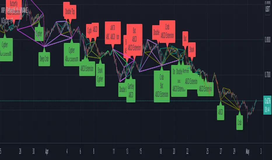
Zigzag1: This is the basic zigzag plotted based on given length.
Zigzag2, Zigzag2, Zigzag3 : These are built based on lower level zigzags.
For example, Zigzag2 is built based on Zigzag1 pivots. For calculation, we just use N*2 number of Zigzag1 pivots to derive the next level. Similarly Zigzag2 will become input for Zigzag 3 and Zigzag3 will become input for Zigzag4
Input parameters allow you to chose upto 4 levels of zigzag along with zigzag line color and length. Max array lines also defines how many lines back you want to calculate the zigzag pivots and display then in the stats. Lowering this number will not reduce the number of lines - but, it will limit possibility of calculating higher level zigzags. Stats table just highlight which pivots are applicable for which outer level.
Application: Can be used in pattern recognization scripts to improve accuracy.
Disclaimer: This is not working in intraday charts. Nothing I could do at this point of time. Use it only for daily + timeframes.
Related scripts:
Pine Script®指標