UK Sectors Comparison SMAProvides a chart showing SMA of UK equity indexes from CBOE www.cboe.com
Shows either percentage change from baseline, or absolute index values.
All configurable (including selected symbols), but the defaults are:
SMA 100,
Show Absolute Values = true
Baseline is set to CBOEEU:BUKAC
Sector indexes are:
UK Consumer Cyclicals = CBOEEU:BUKCONC
UK Mining and Minerals = CBOEEU:BUKMINP
UK Finance = CBOEEU:BUKFIN
UK Technology = CBOEEU:BUKTEC
UK Telecoms = CBOEEU:BUKTEL
UK Consumer Services = CBOEEU:BUKCONS
UK Healthcare = CBOEEU:BUKHLTH
UK Energy = CBOEEU:BUKENGY
UK Utilities = CBOEEU:BUKUTL
UK Business Services = CBOEEU:BUKBUS
UK Consumer Non-Cyclicals = CBOEEU:BUKCNC
UK Industrials = CBOEEU:BUKIND
UK Non-Energy Minerals = CBOEEU:BUKNIM
NOTE: takes a few seconds to load as it needs to request all the data
Check the tooltips in the settings for detailed help.
Sector

S&P Sector CorrelationScript for Macro:
This indicator shows the 9 day average of the correlation of the 11 S&P500 sectors with the security.
Recommend you use the indicator on SPX or SPY, but you can change the values to be compared.
GLHF
- DPT

[LanZhu] - Bursa Index/Sector Trend With PortfolioDescription
Hi all, this is a simple indicator that shows trend of both KLCI and sectors of Bursa . The sector finding is using my Bursa_Sector library. Besides, I have also included portfolio tracker which is by Mohamed3nan in this script.
Usage
Top Trend - Malaysia KLCI Index Trend
Bottom Trend - Any Bursa Sector Trend
Portfolio Table - Copy from Portfolio Tracker by Mohamed3nan

Sector PerformanceThis indicator shows real-time current day performance for 11 ETFs that divide the S&P 500 into eleven sector index funds. The list of different sector ETFs this indicator tracks is as follows -
1. SPY - S&P 500 Index
2. XLC - Communication Services
3. XLY - Consumer Discretionary
4. XLP - Consumer Staples
5. XLE - Energy
6. XLF - Financials
7. XLV - Health Care
8. XLI - Industrials
9. XLB - Materials
10. XLRE - Real Estate
11. XLF - Technology
12. XLU - Utilities
Acknowledgment - This indicator is adapted using the source code from another excellent performance indicator (). Thanks to BeeHolder (www.tradingview.com) for generously sharing the source code.

Comparison (Malaysia Index & Sector)This is just a simple tool for convenient to compare and showing a clear image of all sector and index in Malaysia. They are just in one indicator. From this indicator, you can predict momentum of each sector in Malaysia, which is currently in bull or bear trend.
STRUCTURE
In the setting, the first line with the option of the following index (Malaysia Index) :
1. FBMKLCI
2. FTSEMYX:FBMSCAP
3. FTSEMYX:FBMACE
4. FTSEMYX:FBM70
5. FTSEMYX:FBMT100
6. FTSEMYX:FBMFLG
7. FTSEMYX:FBMEMAS
8. FTSEMYX:FA40
9. FTSEMYX:FBMMSCS
10. FTSEMYX:FBMAPMYR
11. FTSEMYX:FBMMSCAP
The rest of lines is all of the following sector (Malaysia Sector):
1. Technology
2. Telecommunication
3. Health
4. Consumer Product
5. Industrial Product
6. Construction
7. Property
8. Plantation
9. Utilities
10. Transportation
11. Energy
12. REIT
13. Finance
The last line (Line 15) is provided for other stock/index which is not available in option to manually fill.
All sector and index price are smoothen by Moving Average (MA). The default moving average is Relative Moving Average (RMA) which is used in Relative Strength Index ( RSI ) Oscillator. But the range is different from RSI , it is from -100 to 100 instead of 0 to 100. In the end, result and interpretation are just the same as RSI . Green area indicates oversold area, while red area is overbought.
Other choice of Moving Averages are available to change.
The problem of putting all together is the script may take longer to process. It is just for convenient use.
Bottom-Up or Top-Down Invest?

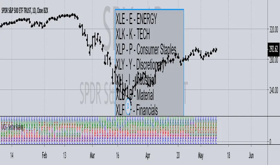
UCS - Sector RatingPreviously I have posted Index Rating Indicator to help gauge the strong and weak index.
Now Its the Sectors.
This should help you choose sectors / Stocks within sectors, regardless of being a trend trader or contrarian. i.e. Trading with Strength or Against it.
Notice, At the time of me posting it.
The rally is supported heavily by XLK (TECH) and XLV - (BioTECH). Weakness from there would push the market down. Some cases the sectors rotate as well.
All In All, I use this to quickly pick stocks that are from stronger sectors to play pullbacks, or huge rally to play contrarian.
------------------------- YES I play both sides ------------------
One Last Information
Markets are classified into 3 Segments, Cyclical, Sensitive and Stable.
Stable - XLU, XLP, XLV
Sensitive - XLI, XLK, XLB
Cyclical - XLF, XLY, XLE
Knowing where the market money is flowing gives you a good edge.
Later I will post the composition of Sectors and the Markets Combined Strength Index measured through Sectors soon I figure out a way to make it presentable.
- Enjoy trading.
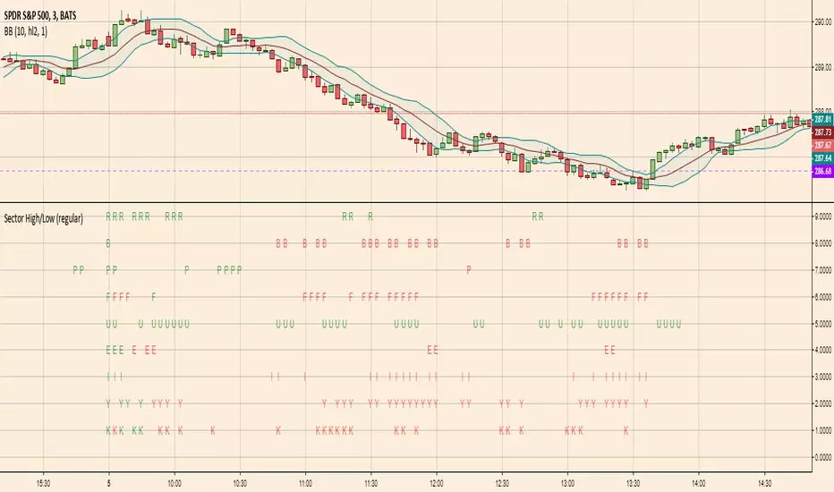
Sector High/LowHighlights which S&P SPDR Sector ETFs are at highs of day (green letter) or lows of day (red letter)
The first candle of the day is always all-green because by default the first candle of the day has the high of the day. So this indicator is more meaningful later in the day when sectors are making repeated highs/lows
Hersheys CoCo BarsThis is my latest attempt to show price movement differences between symbols. I want to see the buying and selling pressure... is that price movement going with the market or is it moving alone? It's VERY interesting to watch this indicator and see how things play out!
In my previous versions the arrows on the chart were too much clutter, while the single row of color under the chart was not enough info. Also, I removed the calculations to build a world index because the correlation between US and world markets is a hard nut to crack, plus it took many seconds to calculate.
So here is "CoCo Bars", which clearly show price moves with or against another symbol. The default symbol is the US index SPY. The coolest thing here is there are three rows of data in ONE INDICATOR! Many thanks to user rollas for helping with that code.
"CoCo" stands for correlation coefficient, which is what I was studying when I got the idea for this project.
GREEN bars in row #1 = Symbol up, US up, Symbol up more than US
RED bars in row #2 = Symbol down, US down, Symbol down more than US
In rows 1 and 2 the color intensity is based on the biggest difference, light, medium and dark colors.
green/red colors in bottom row are a 7 period average of the sum of price changes of both symbol and index, green = positive, red = negative
Enjoy, and good trading!
Brian Hershey
UCS - Index RatingStill Confused, What's Strong and Weak?
Here is a simple Indicator for those who needs it.
Make Sure to Define the character for the Index, go to setup and modify you like.

Hersheys CoCoThis is my variation of the Correlation Coefficient and I call it "Hershey's CoCo". The indicator identifies very specific Stock, Sector and Market pressures on whatever symbol you are evaluating.
If interested, follow me and send me requests to evaluate your stock or sector as I refine this tool.
***********************************************
Price movement does not happen in isolation.
Stocks are held by various "containers" that can be traded independently and can affect the price of each stock. The most important of those containers are Sector and Market, while others include Industry, MarketCap and others.
For example, Market is simply the top level representation of all stocks, or the sea that carries, or sinks, all ships. You can monitor this level by looking at various indexes, ETFs and/or Funds. I use "VTI", the Vanguard Total Stock Market ETF.
Sectors can be monitored using any number of containers, like Vanguard Sector Index Funds or ProShares Ultra Sector Indexes. I use the S&P SPDR Sector Funds. A list of those are listed below.
Most of the techniques and indicators that deal with correlation and sector/market comparisons are not very detailed. Many simply overlay one price series over another, while you tediously follow the price lines from left to right trying to judge movement.
Another critical piece missing from other compare tools is normalizing each data series. Hershey's CoCo does this, so you can have confidence that the alerts you see are based on accurate comparisons at every level.
***********************************************
So let's get to the details! Hershey's CoCo currently compares 2 containers, so for this discussion we'll do Stock to Sector. You'll see arrows above and below some ticks of the price chart, plus a faint red or green background color.
Very Bull = Blue Arrow = Stock and Sector prices are up, Stock price up more
Bull = Green Arrow = Stock and Sector prices are up, Sector price up more
Bear = Red Arrow = Stock and Sector prices are down, Sector price down more
Very Bear = Black Arrow = Stock and Sector prices are down, Stock price down more
Neutral = No Arrow = Stock and Sector price movement equal
Arrow Length = Strength (the longer the arrow the bigger the difference)
Green Background = Bull = Above zero Simple Moving Average of all arrow values
Red Background = Bear = Below zero Simple Moving Average of all arrow values
To review, the Blacks and Blues are the HEAVIEST pressure... the LONGER the STRONGER!
