Highs and Lows By ScalprHighs & Lows (HL) – Multi-Time-Frame Levels
What It Does
Highs & Lows plots the most important reference levels for up to four different time-frames at once. It displays divider lines that mark the start of each new period, opening lines showing the first price of the period, highs lines tracking the highest price reached, and lows lines tracking the lowest price reached in each period. Use it to read market structure at a glance, trade opening-range returns, gap fills, sweeps and other level-based setups.
Key Features
Multi-Time-Frame Engine
Choose from 4 Hour, 1 Hour, 30 minutes, 15 minutes, 10 minutes, 5 minutes, Daily, Weekly or Monthly for each of the four slots. Turn individual slots on/off from one global panel for easy management.
Per-Time-Frame Display Controls
For every active slot you can independently toggle divider lines, opening lines, highs lines, lows lines, and hide current opening to keep only completed periods visible.
Smart "Show Last X" Filters
Keep charts clean by limiting history. Control how many recent periods to show for lines and how many recent text labels to display. For example, show only the last 2 hours on a 1-hour chart.
Hide Swept Highs/Lows
Automatically hide any highs or lows that price has traded through, keeping your chart clean and focused only on unswept levels that remain relevant.
Text Labels
Add optional custom text for highs and lows like "H1" and "L1". Labels automatically position above highs and below lows with horizontal alignment options of left, center, or right. Adjust color, size and font weight to match your preferences.
Styling Freedom
Independent color, line style including solid, dashed, or dotted options, and width settings for each level type. Transparency is applied automatically when hiding current period information.
How to Use
Start by enabling the time-frame slots you need in Global Settings. In Multi-Time-Frame Settings, pick the interval for each slot and toggle which lines you want displayed. Fine-tune visibility using "Show Last X" in Time-Frame Lines to limit historical lines, and "Show Last X" in Text to limit labels. Adjust colors and widths in the Time-Frame Lines sections to match your chart theme.
Notes
The script is lightweight and deletes old objects in real time to maintain TradingView's limits. It works on any symbol and chart resolution with levels updating live. Text labels are purely textual with no background boxes to maximize clarity and reduce chart clutter.
Happy trading and stay level-headed!
Sentiment

GalihRidha ZoneX — Adaptive MTF S&R + Smart Money AreasWelcome to ZoneX: The new frontier of Support & Resistance for modern traders!
ZoneX is more than just S&R — it’s a hybrid price map that fuses classic pivots with institutional logic, visualizing the zones that really matter.
What Makes ZoneX Different?
Multi-Timeframe S&R:
Instantly spot the true key levels from higher timeframes, not just what everyone else sees on the current chart.
Smart Money Order Blocks:
Automatically highlights supply and demand zones where institutions accumulate or distribute — find the real “trap” areas and avoid getting faked out.
VWAP Bands:
See where the liquidity is thickest — these bands act as magnets for price, great for both reversals and breakouts.
Midline Channel:
Identify the market’s equilibrium — know when you’re in value and when you’re at the edge.
Previous High/Low:
Mark institutional magnets and classic stop-hunt zones, updated in real-time.
Ultra Customizable:
One-click to enable/disable any feature. Clean for minimalists, packed for pros.
How to Use ZoneX
Breakout?
Wait for price to clear a ZoneX band or order block with momentum — enter on the retest.
Reversal?
Fade wicks and exhaustion right in the highlighted zone — confirm with price action or volume.
Range/Balance?
Trade the ping-pong between ZoneX midline and outer bands — great for scalping and mean reversion.
Who’s It For?
Active traders who want an edge beyond standard S&R.
Institutional-mindset scalpers and swing traders.
Anyone who loves a clean chart but craves real market context.
Level up your chart, see what the big players see —
and never trade blind again. This is ZoneX.

Gabriel's Quick Table📊 Gabriel's Quick Table — Multi-Metric Market Scanner
Gabriel's Quick Table is a lightweight, customizable table overlay that displays key market metrics for intraday, swing, and options traders. It centralizes high-impact price, volume, and volatility data across multiple timeframes to quickly assess trade readiness, risk levels, and momentum without cluttering your chart.
🔍 Features
✅ ADR% (Average Daily Range %)
Measures price volatility by averaging the ratio of high/low over N days.
Helps spot compression/expansion setups.
✅ ATR (Average True Range)
Assists with stop-loss placement and measuring volatility strength.
User-defined ATR Length and timeframe.
✅ LoD Distance (% from Low of Day)
Identifies how far price has bounced off the intraday low.
Useful for reversal traders and support tests.
✅ % from 52-Week High
Calculates how far current price is from its long-term swing high.
Ideal for value reversion setups or breakout scanning.
✅ Relative Volume (RVOL)
Measures current volume versus average over N bars.
Highlights unusual activity or breakout potential.
✅ VWAP Distance
Shows how far price is from the volume-weighted average price.
Used by institutions and intraday traders to define fair value zones.
✅ Internal Bar Strength (IBS)
Normalized indicator showing whether price closed near the high or low of the candle.
Useful for fade vs. breakout setups.
✅ Open Interest % Change
Measures short-term change in OI, used in futures/options analysis.
Spikes may indicate buildup of positions or unwinding.
🚨 Built-In Alerts
Each core metric includes a customizable alert:
ADR%, ATR, RVOL, VWAP distance
Distance to 52-week high
OI % change
IBS thresholds
Use these to automate watchlist scanning or intraday alerts when your ideal trade conditions appear.
🧠 Smart Design
Multi-timeframe support for each input (e.g. Weekly 52W High + Intraday VWAP).
Minimalist table overlay that works even when multiple indicators are stacked.
Color-coded labels and values for intuitive scanning.
💡 Use Cases
Intraday traders looking for high-RVOL + VWAP bounce setups.
Swing traders waiting for price compression (low ADR%) or breakouts near 52W highs.
Futures and options traders tracking OI surges with volume confirmation.
Systematic traders using custom alert levels for automated signal generation.

TTT Sentiment IndicatorThis indicator plots the NYSE uptick vs. downtick volume ratios and can be used as a short-term sentiment indicator of buying pressure (FOMO) when UVOL/DVOL is high and selling pressure (panic selling) when DVOL/UVOL is high. These ratios are used informally by Chris Vermeulen of The Technical Traders as a contrarian indicator on a 30 minute chart.
This script isn't created, approved, or supported by The Technical Traders, but was created by a TTT subscriber to support the request of other subscribers. I'm not planning to upgrade or support this indicator or answer questions on how to use it. It's open source, so users can make their own copy and edit as they see fit.

Dynamic Spot vs Perps Premium (Area Plot)This is a script to give you an easy overall view on the spot perp premium which could indicate the momentum is drove by spot or perps

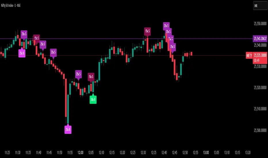
Delta Spike Detector [GSK-VIZAG-AP-INDIA]📌 Delta Spike Detector – Volume Imbalance Ratio
By GSK-VIZAG-AP-INDIA
📘 Overview
This indicator highlights aggressive buying or selling activity by analyzing the imbalance between estimated Buy and Sell volume per candle. It flags moments when one side dominates the other significantly — defined by user-selectable volume ratio thresholds (10x, 15x, 20x, 25x).
📊 How It Works
Buy/Sell Volume Estimation
Approximates buyer and seller participation using candle structure:
Buy Volume = Proximity of close to low
Sell Volume = Proximity of close to high
Delta & Delta Ratio
Delta = Buy Volume − Sell Volume
Delta Ratio = Ratio of dominant volume side to the weaker side
When this ratio exceeds a threshold, it’s classified as a spike.
Spike Labels
Labels are plotted on the chart:
10x B, 15x B, 20x B, 25x B → Buy Spike Labels (below candles)
10x S, 15x S, 20x S, 25x S → Sell Spike Labels (above candles)
The color of each label reflects the spike strength.
⚙️ User Inputs
Enable/Disable Buy or Sell Spikes
Set custom delta ratio thresholds (default: 10x, 15x, 20x, 25x)
🎯 Use Cases
Spotting sudden aggressive activity (e.g. smart money moves, traps, breakouts)
Identifying short-term market exhaustion or momentum bursts
Complementing other trend or volume-based tools
⚠️ Important Notes
The script uses approximated Buy/Sell Volume based on price position, not actual order flow.
This is not a buy/sell signal generator. It should be used in context with other confirmation indicators or market structure.
✍️ Credits
Developed by GSK-VIZAG-AP-INDIA
For educational and research use only.
EdgeXplorer - Liquidity ScopeLiquidity Scope by EdgeXplorer
Liquidity Scope is a real-time liquidity detection system developed for traders who want to track where the market is hunting stops, absorbing orders, and setting up traps — often before the average eye catches on. Built to identify the telltale behavior of liquidity sweeps and false breakouts, this tool highlights areas on the chart where price interacts with key swing points, including wicks, breaks, and retests.
⸻
🔍 What Does Liquidity Scope Do?
Liquidity Scope scans price action for swing highs and lows, tracks how price behaves around them, and visually plots zones where liquidity is likely being targeted. It tells you:
• When price wicks into a previous swing without breaking it (a liquidity probe),
• When price breaks past that level and returns (a potential retest),
• And when a sweep is complete or mitigated.
The result? A visual map of where liquidity was grabbed, where it hasn’t been yet, and where price might revisit — all drawn directly on your chart, in real time.
⸻
⚙️ How It Works – Technical Breakdown
Here’s the logic behind the engine:
1. Swing Detection
The script uses ta.pivothigh() and ta.pivotlow() to mark structural swing points, using your selected “Swings” length to define sensitivity.
2. Sweep Conditions
For each swing high or low:
• If price wicks into the level but fails to close beyond it → potential liquidity test.
• If price closes beyond the swing → it’s marked as broken.
• If price later retests the broken level from the other side → it’s tagged as a retest zone.
3. Visual Memory
Each swing level stores its own “memory state” (whether it was wicked, broken, retested, or mitigated), allowing the tool to update visuals live and avoid clutter.
4. Dynamic Zones
• When a sweep is detected, the tool draws a colored zone (box) at the sweep location, along with a supporting line.
• These zones extend forward until price clearly invalidates or mitigates them.
⸻
📈 Visual Components – What You See on the Chart
Element Meaning
Green Zones / Lines Bullish sweep: liquidity hunted below a swing low
Red Zones / Lines Bearish sweep: liquidity hunted above a swing high
Dotted Lines Wicks — price tested the level without breaking
Dashed Lines Retests — price returned to retest a broken level
Solid Lines Confirmed sweep levels with clean structure
Shaded Boxes Sweep zones extended into the future for monitoring
Faded Transparency Indicates mitigation or that the zone is cooling off
Every visual is tied to a logic branch in the code — nothing is decorative. Each shape or line has meaning tied to price behavior.
⸻
📊 Inputs & Settings Explained
Setting Description
Swings (len) Sets the pivot lookback range. Higher = fewer, stronger swing levels.
Options (opt) Controls what sweep types you want to see:
• Only Wicks → Focus on traps and fakeouts
• Only Outbreaks & Retest → Focus on confirmed moves
• Wicks + Outbreaks & Retest → See it all |
| Bull/Bear Colors | Customize how bullish vs. bearish sweeps are drawn |
| Extend Zones (extend) | When on, boxes stretch forward in time until price touches or invalidates them |
| Max Bars (maxB) | Sets how long (in bars) sweep zones will stay active before expiring |
⸻
🧠 How to Read It in Live Markets
Liquidity Scope doesn’t tell you what to do — it tells you what the market just did in relation to liquidity and structure.
Here’s how to use it:
• Green Zones (Bullish Sweeps):
Price just grabbed liquidity under a low. Watch for:
• A bounce → potential reversal
• A retest → possible long entry confirmation
• Red Zones (Bearish Sweeps):
Price swept above a high. Watch for:
• Immediate rejection → potential short zone
• Pullback and retest → trend continuation trap or fake breakout
• Wick Sweeps Only:
Often seen in range-bound markets or when market makers are testing stops.
• Retest Sweeps:
Often seen in trending markets, validating breakouts or signaling exhaustion.
⸻
🧪 Optional Use Cases & Strategy Tips
Here’s how traders on the EdgeXplorer platform use Liquidity Scope:
• 🔄 Smart Money Concepts: Use sweep zones alongside order blocks, FVGs, and breakers to confirm institutional movement.
• ⚠️ Trap Zones: Spot liquidity fakeouts where retail might be chasing early breakouts.
• 🎯 Entry/Exit Filtering: Use zones to validate entries only when price reacts cleanly around them — or exits when mitigation completes.
• 🧠 Confluence Layer: Combine with trend indicators or volume to add strength to directional bias.
⸻
🔒 Final Note on Use & Compliance
Liquidity Scope is a market behavior visualizer, not a signal generator. It helps you understand where the market might be trapping liquidity, but you are the strategy. Always pair with proper confirmation, risk management, and your own discretion.
All logic, structure, and assets in this script are © protected under ETAPX Inc. and the EdgeXplorer platform. Unauthorized sharing or monetization of this code is prohibited under company and platform policy.

WMA(10) Momentum Indicatorshows wma momentum. work in progress. Attempts to capture mementum changes and confirm current trend direction. i will be expanding on this.

🔒 Skrita Znanost - Povprečje🔒 Skrita Znanost – Povprečje
Ta indikator prikazuje dinamično povprečno ceno skozi celotno zgodovino trgovalnega para ter meri trenutno odstotno odstopanje cene od tega povprečja.
Namesto tradicionalnih drsečih povprečij, ki temeljijo na določenem številu svečnikov, ta indikator uporablja kumulativno povprečje od začetka grafikona. S tem omogoča edinstven pogled na to, kako se cena trenutno nahaja v primerjavi z dolgoročnim povprečjem.
🔸 Vizualni elementi:
Oranžna črta prikazuje povprečno ceno skozi celoten časovni obseg.
Na grafu se pojavi dinamična oznaka, ki prikazuje:
Natančno vrednost povprečne cene,
Trenutno odstopanje cene v odstotkih,
Besedno razlago: pozitivno odstopanje ↑, negativno odstopanje ↓ ali brez odstopanja.
📈 Uporaba:
Indikator je uporaben za prepoznavanje potencialnih skrajnosti – ko je cena izrazito nad ali pod dolgoročnim povprečjem, lahko to nakazuje na možen odboj, korekcijo ali nadaljevanje trenda.
This indicator displays a dynamic average price across the full historical range of the selected trading pair and calculates the current percentage deviation from that long-term average.
Unlike traditional moving averages based on a fixed number of candles, this tool uses a cumulative average from the beginning of the chart. This provides a unique perspective on where the price currently stands in relation to its entire historical performance.
🔸 Visual elements:
The orange line represents the cumulative historical average price.
A dynamic label on the chart displays:
The precise value of the average price,
The current deviation in percentage,
A textual note: positive deviation ↑, negative deviation ↓, or no deviation.
📈 Usage:
This indicator is particularly useful for identifying potential extremes – when the price is significantly above or below the historical average, it may signal a possible bounce, correction, or trend continuation.

Confluence checklistConfluences by Scalpr
Custom Confluences Checklist - Trading Setup Confirmation Tool
A clean and customizable confluence tracking indicator designed to help traders confirm high-probability setups by monitoring multiple technical factors simultaneously.
Key Features:
10 Fully Customizable Confluences - Name each confluence to match your trading strategy (Premium/Discount zones, Liquidity sweeps, Market structure, etc.)
Dynamic Dashboard - Only appears when confluences are active, keeping your chart clean
Visual Confirmation - Green checkmarks (✅) for each confirmed confluence with custom color coding
Flexible Display Options - Choose dashboard position (4 corners) and size (Small/Normal/Large)
Real-time Counter - Shows active confluence count in header
Professional Layout - Confluence names on left, checkmarks on right for easy scanning
How to Use:
Setup Phase - Enable and rename confluences in settings to match your analysis criteria
Analysis Phase - Check/uncheck confluences as market conditions align with your setup
Confirmation Phase - Use the dashboard as a visual checklist to confirm trade entries
Perfect For:
ICT traders tracking premium/discount, liquidity sweeps, and market structure
Multi-timeframe analysis confirmation
Setup validation before trade execution
Educational purposes for learning confluence-based trading

Multi SMA AnalyzerMulti SMA Analyzer with Custom SMA Table & Advanced Session Logic
A feature-rich SMA analysis suite for traders, offering up to 7 configurable SMAs, in-depth trend detection, real-time table, and true session-aware calculations.
Ideal for those who want to combine intraday, swing, and higher-timeframe trend analysis with maximum chart flexibility.
Key Features
📊 Multi-SMA Overlay
- 7 SMAs (default: 5, 20, 50, 100, 200, 21, 34)—individually configurable (period, source, color, line style)
- Show/hide each SMA, custom line style (solid, stepline, circles), and color logic
- Dynamic color: full opacity above SMA, reduced when below
⏰ Session-Aware SMAs
- Each SMA can be calculated using only user-defined session hours/days/timezone
- “Ignore extended hours” option for accurate intraday trend
📋 Smart Data Table
- Live SMA values, % distance from price, and directional arrows (↑/↓/→)
- Bull/Bear/Sideways trend classification
- Custom table position, size, colors, transparency
- Table can run on chart or custom (higher) timeframe for multi-TF analysis
🎯 Golden/Death Cross Detection
- Flexible crossover engine: select any two from (5, 10, 20, 50, 100, 200) for fast/slow SMA cross signals
- Plots icons (★ Golden, 💀 Death), optional crossover labels with custom size/colors
🏷️ SMA Labels
- Optional on-chart SMA period labels
- Custom placement (above/below/on line), size, color, offset
🚨 Signal & Trend Engine
- Bull/Bear/Sideways logic: price vs. multiple SMAs (not just one pair)
- Volume spike detection (2x 20-period SMA)
- Bullish engulfing candlestick detection
- All signals can use chart or custom table timeframe
🎨 Visual Customization
- Dynamic background color (Bull: green, Bear: red, Neutral: gray)
- Every visual aspect is customizable: label/table colors, transparency, size, position
🔔 Built-in Alerts
- Crossovers (SMA20/50, Golden/Death)
- Bull trend, volume spikes, engulfing pattern—all alert-ready
How It Works
- Session Filtering:
- SMAs can be set to count only bars from your chosen market session, for true intraday/trading-hour signals
Dynamic Table & Signals:
- Table and all signal logic run on your selected chart or custom timeframe
Flexible Crossover:
- Choose any pair (5, 10, 20, 50, 100, 200) for cross detection—SMA 10 is available for crossover even if not shown as an SMA line
Everything is modular:
- Toggle features, set visuals, and alerts to your workflow
🚨 How to Use Alerts
- All key signals (crossovers, trend shifts, volume spikes, engulfing patterns) are available as alert conditions.
To enable:
- Click the “Alerts” (clock) icon at the top of TradingView.
- Select your desired signal (e.g., “Golden Cross”) from the condition dropdown.
- Set your alert preferences and create the alert.
- Now, you’ll get notified automatically whenever a signal occurs!
Perfect For
- Multi-timeframe and swing traders seeking higher timeframe SMA confirmation
- Intraday traders who want to ignore pre/post-market data
- Anyone wanting a modern, powerful, fully customizable multi-SMA overlay
// P.S: Experiment with Golden Cross where Fast SMA is 5 and Slow SMA is 20.
// Set custom timeframe for 4 hr while monitoring your chart on 15 min time frame.
// Enable Background Color and Use Table Timeframe for Background.
// Uncheck Pine labels in Style tab.
Clean, open-source, and loaded with pro features—enjoy!
Like, share, and let me know if you'd like any new features added.

Floor and Roof Indicator with SignalsFloor and Roof Indicator with Trading Signals
A comprehensive support and resistance indicator that identifies premium and discount zones with automated signal generation.
Key Features:
Dynamic Support/Resistance Zones: Calculates floor (support) and roof (resistance) levels using price action and volatility
Premium/Discount Zone Identification: Highlights areas where price may find resistance or support
Customizable Signal Frequency: Control how often signals are displayed (every Nth occurrence)
Visual Signal Table: Optional table showing the last 5 long and short signal prices
Multiple Timeframe Compatibility: Works across all timeframes
Technical Details:
Uses ATR-based calculations for dynamic zone width adjustment
Combines Bollinger Bands with highest/lowest price analysis
Smoothing options for cleaner signal generation
Fully customizable colors and display options
How to Use:
Floor Zones (Blue): Potential support areas where long positions may be considered
Roof Zones (Pink): Potential resistance areas where short positions may be considered
Signal Crosses: Visual markers when price interacts with key levels
Signal Table: Track recent signal prices for analysis
Settings:
Length: Period for calculations (default: 200)
Smooth: Smoothing factor for cleaner signals
Zone Width: Adjust the thickness of support/resistance zones
Signal Frequency: Control signal display frequency
Visual Options: Customize colors and table position
Alerts Available:
Long signal alerts when price touches discount zones
Short signal alerts when price reaches premium zones
Educational Purpose: This indicator is designed to help traders identify potential support and resistance areas. Always combine with proper risk management and additional analysis.
This description focuses on the technical aspects and educational value while avoiding any language that could be interpreted as financial advice or guaranteed profits.
Intermarket Analysis ProIntermarket Analysis Pro Indicator
Overview
The Intermarket Analysis Pro is a sophisticated trading indicator designed for forex traders, integrating technical analysis with comprehensive macroeconomic insights. This tool features Exponential Moving Averages (EMA 10/20) for trend detection, a consolidated table combining timeframe biases, trading signals, and intermarket data, delivering a holistic view to optimize decision-making in volatile markets.
Usage Instructions
Installation: Access TradingView, navigate to the Pine Editor, paste the script, and save it as "Intermarket_Analysis_Pro". Apply it to your desired forex chart (e.g., EURUSD on a 5-minute timeframe).
Configuration:
EMA Settings: Select EMA Source as "close" for precise alignment with candle closes, adjust EMA 10 Period (default 10) and EMA 20 Period (default 20) to suit your strategy, and toggle Show EMA Value Labels or Show (B)/(S) Signal Labels for enhanced visibility.
Table Settings: Enable Show Combined Table, select Combined Table Position (e.g., "Bottom Right"), and choose Text Size (e.g., "Small") for optimal display.
Intermarket Parameters: Fine-tune Bias Threshold (default 0.3) and Score Change Threshold (default 10) to refine intermarket bias sensitivity.
Display Options: Switch between "Light" or "Dark" themes to match your chart environment.
Signal Interpretation:
EMA Indicators: A crossover of EMA 10 (orange) above EMA 20 (blue) signals a potential BUY, while a crossunder indicates a SELL. Confirm with "(B)" or "(S)" labels on the chart.
Combined Table: Analyze timeframe biases (e.g., "BULLISH" on 1m), logic signals (e.g., "BUY" on 5m), and intermarket trends (e.g., "EUR Rise (+30)") to align with market conditions.
Strategic Application: Utilize on lower timeframes (1m, 5m) for scalping or higher timeframes (1h, 4h) for swing trading. Ensure smooth scrolling to verify EMA and table synchronization with candles.
Alert Setup: Configure alerts for "Buy Signal" or "Sell Signal" on your preferred timeframe to receive real-time notifications.
Key Features
EMA 10/20: Provides customizable short-term trend analysis with optional value labels.
Unified Table: Merges SimpleBias (timeframe trends), Logic (trading signals), and Intermarket (global currency, index, and bond movements) into a single, scrollable interface.
Intermarket Insights: Evaluates 18 assets (e.g., DXY, SPX500, EUR, XAUUSD) for macroeconomic sentiment, updated hourly with color-coded change indicators.
Customization: Offers adjustable positions, sizes, and thresholds to adapt to individual trading preferences.
Market Context: Reflects current sentiment, such as a bullish EURUSD trend supported by weak NFP data and hawkish ECB policies (as of July 2025).
Best Practices
Timeframe Alignment: Match the chart timeframe with your analysis to ensure accurate EMA and table data representation.
Optimal Trading Hours: Maximize effectiveness during the NY session (08:00-17:00 EST) when intermarket activity is most pronounced.
Troubleshooting: If EMA lags during scrolling, disable labels or reduce additional indicators. Report discrepancies (e.g., "EMA 10 at 1.08840, candle at 1.08850") for further optimization.
Additional Notes
The Intermarket Analysis Pro is tailored for traders seeking to integrate global sentiment with technical signals. Test thoroughly on a demo account and adjust settings to align with your trading strategy. As of July 5, 2025, 04:04 AM WIB, the market indicates a bullish EURUSD outlook, with intermarket data reinforcing BUY opportunities on lower timeframes.


BANKNIFTY Contribution Table [GSK-VIZAG-AP-INDIA]1. Overview
This indicator provides a real-time visual contribution table of the 12 constituent stocks in the BANKNIFTY index. It displays key metrics for each stock that help traders quickly understand how each component is impacting the index at any given moment.
2. Purpose / Trading Use Case
The tool is designed for intraday and short-term traders who rely on index movement and its internal strength or weakness. By seeing which stocks are contributing positively or negatively, traders can:
Confirm trend strength or divergence within the index.
Identify whether a BANKNIFTY move is broad-based or driven by a few heavyweights.
Detect reversals when individual components decouple from index direction.
3. Key Features and Logic
Live LTP: Current price of each BANKNIFTY stock.
Price Change: Difference between current LTP and previous day’s close.
% Change: Percentage move from previous close.
Weight %: Static weight of each stock within the BANKNIFTY index (user-defined).
This estimates how much each stock contributes to the BANKNIFTY’s point change.
Sorted View: The stocks are sorted by their weight (descending), so high-impact movers are always at the top.
4. User Inputs / Settings
Table Position (tableLocationOpt):
Choose where the table appears on the chart:
top_left, top_right, bottom_left, or bottom_right.
This helps position the table away from your price action or indicators.
5. Visual and Plotting Elements
Table Layout: 6 columns
Stock | Contribution | Weight % | LTP | Change | % Change
Color Coding:
Green/red for positive/negative price changes and contributions.
Alternating background rows for better visibility.
BANKNIFTY row is highlighted separately at the top.
Text & Background Colors are chosen for both readability and direction indication.
6. Tips for Effective Use
Use this table on 1-minute or 5-minute intraday charts to see near real-time market structure.
Watch for:
A few heavyweight stocks pulling the index alone (can signal weak internal breadth).
Broad green/red across all rows (signals strong directional momentum).
Combine this with price action or volume-based strategies for confirmation.
Best used during market hours for live updates.
7. What Makes It Unique
Unlike other contribution tables that show only static data or require paid feeds, this script:
Updates in real time.
Uses dynamic calculated contributions.
Places BANKNIFTY at the top and presents the entire internal structure clearly.
Doesn’t repaint or rely on lagging indicators.
8. Alerts / Additional Features
No alerts are added in this version.
(Optional: Alerts can be added to notify when a certain stock contributes above/below a threshold.)
9. Technical Concepts Used
request.security() to pull both 1-minute and daily close data.
Conditional color formatting based on price change direction.
Dynamic table rendering using table.new() and table.cell().
Static weights assigned manually for BANKNIFTY stocks (can be updated if index weights change).
10. Disclaimer
This script is intended for educational and informational purposes only. It does not constitute financial advice or a buy/sell recommendation.
Users should test and validate the tool on paper or demo accounts before applying it to live trading.
📌 Note: Due to internet connectivity, data delays, or broker feeds, real-time values (LTP, change, contribution, etc.) may slightly differ from other platforms or terminals. Use this indicator as a supportive visual tool, not a sole decision-maker.
Script Title: BANKNIFTY Contribution Table -
Author: GSK-VIZAG-AP-INDIA
Version: Final Public Release

Momentum Regression [BackQuant]Momentum Regression
The Momentum Regression is an advanced statistical indicator built to empower quants, strategists, and technically inclined traders with a robust visual and quantitative framework for analyzing momentum effects in financial markets. Unlike traditional momentum indicators that rely on raw price movements or moving averages, this tool leverages a volatility-adjusted linear regression model (y ~ x) to uncover and validate momentum behavior over a user-defined lookback window.
Purpose & Design Philosophy
Momentum is a core anomaly in quantitative finance — an effect where assets that have performed well (or poorly) continue to do so over short to medium-term horizons. However, this effect can be noisy, regime-dependent, and sometimes spurious.
The Momentum Regression is designed as a pre-strategy analytical tool to help you filter and verify whether statistically meaningful and tradable momentum exists in a given asset. Its architecture includes:
Volatility normalization to account for differences in scale and distribution.
Regression analysis to model the relationship between past and present standardized returns.
Deviation bands to highlight overbought/oversold zones around the predicted trendline.
Statistical summary tables to assess the reliability of the detected momentum.
Core Concepts and Calculations
The model uses the following:
Independent variable (x): The volatility-adjusted return over the chosen momentum period.
Dependent variable (y): The 1-bar lagged log return, also adjusted for volatility.
A simple linear regression is performed over a large lookback window (default: 1000 bars), which reveals the slope and intercept of the momentum line. These values are then used to construct:
A predicted momentum trendline across time.
Upper and lower deviation bands , representing ±n standard deviations of the regression residuals (errors).
These visual elements help traders judge how far current returns deviate from the modeled momentum trend, similar to Bollinger Bands but derived from a regression model rather than a moving average.
Key Metrics Provided
On each update, the indicator dynamically displays:
Momentum Slope (β₁): Indicates trend direction and strength. A higher absolute value implies a stronger effect.
Intercept (β₀): The predicted return when x = 0.
Pearson’s R: Correlation coefficient between x and y.
R² (Coefficient of Determination): Indicates how well the regression line explains the variance in y.
Standard Error of Residuals: Measures dispersion around the trendline.
t-Statistic of β₁: Used to evaluate statistical significance of the momentum slope.
These statistics are presented in a top-right summary table for immediate interpretation. A bottom-right signal table also summarizes key takeaways with visual indicators.
Features and Inputs
✅ Volatility-Adjusted Momentum : Reduces distortions from noisy price spikes.
✅ Custom Lookback Control : Set the number of bars to analyze regression.
✅ Extendable Trendlines : For continuous visualization into the future.
✅ Deviation Bands : Optional ±σ multipliers to detect abnormal price action.
✅ Contextual Tables : Help determine strength, direction, and significance of momentum.
✅ Separate Pane Design : Cleanly isolates statistical momentum from price chart.
How It Helps Traders
📉 Quantitative Strategy Validation:
Use the regression results to confirm whether a momentum-based strategy is worth pursuing on a specific asset or timeframe.
🔍 Regime Detection:
Track when momentum breaks down or reverses. Slope changes, drops in R², or weak t-stats can signal regime shifts.
📊 Trade Filtering:
Avoid false positives by entering trades only when momentum is both statistically significant and directionally favorable.
📈 Backtest Preparation:
Before running costly simulations, use this tool to pre-screen assets for exploitable return structures.
When to Use It
Before building or deploying a momentum strategy : Test if momentum exists and is statistically reliable.
During market transitions : Detect early signs of fading strength or reversal.
As part of an edge-stacking framework : Combine with other filters such as volatility compression, volume surges, or macro filters.
Conclusion
The Momentum Regression indicator offers a powerful fusion of statistical analysis and visual interpretation. By combining volatility-adjusted returns with real-time linear regression modeling, it helps quantify and qualify one of the most studied and traded anomalies in finance: momentum.

Tsallis Entropy Market RiskTsallis Entropy Market Risk Indicator
What Is It?
The Tsallis Entropy Market Risk Indicator is a market analysis tool that measures the degree of randomness or disorder in price movements. Unlike traditional technical indicators that focus on price patterns or momentum, this indicator takes a statistical physics approach to market analysis.
Scientific Foundation
The indicator is based on Tsallis entropy, a generalization of traditional Shannon entropy developed by physicist Constantino Tsallis. The Tsallis entropy is particularly effective at analyzing complex systems with long-range correlations and memory effects—precisely the characteristics found in crypto and stock markets.
The indicator also borrows from Log-Periodic Power Law (LPPL).
Core Concepts
1. Entropy Deficit
The primary measurement is the "entropy deficit," which represents how far the market is from a state of maximum randomness:
Low Entropy Deficit (0-0.3): The market exhibits random, uncorrelated price movements typical of efficient markets
Medium Entropy Deficit (0.3-0.5): Some patterns emerging, moderate deviation from randomness
High Entropy Deficit (0.5-0.7): Strong correlation patterns, potentially indicating herding behavior
Extreme Entropy Deficit (0.7-1.0): Highly ordered price movements, often seen before significant market events
2. Multi-Scale Analysis
The indicator calculates entropy across different timeframes:
Short-term Entropy (blue line): Captures recent market behavior (20-day window)
Long-term Entropy (green line): Captures structural market behavior (120-day window)
Main Entropy (purple line): Primary measurement (60-day window)
3. Scale Ratio
This measures the relationship between long-term and short-term entropy. A healthy market typically has a scale ratio above 0.85. When this ratio drops below 0.85, it suggests abnormal relationships between timeframes that often precede market dislocations.
How It Works
Data Collection: The indicator samples price returns over specific lookback periods
Probability Distribution Estimation: It creates a histogram of these returns to estimate their probability distribution
Entropy Calculation: Using the Tsallis q-parameter (typically 1.5), it calculates how far this distribution is from maximum entropy
Normalization: Results are normalized against theoretical maximum entropy to create the entropy deficit measure
Risk Assessment: Multiple factors are combined to generate a composite risk score and classification
Market Interpretation
Low Risk Environments (Risk Score < 25)
Market is functioning efficiently with reasonable randomness
Price discovery is likely effective
Normal trading and investment approaches appropriate
Medium Risk Environments (Risk Score 25-50)
Increasing correlation in price movements
Beginning of trend formation or momentum
Time to monitor positions more closely
High Risk Environments (Risk Score 50-75)
Strong herding behavior present
Market potentially becoming one-sided
Consider reducing position sizes or implementing hedges
Extreme Risk Environments (Risk Score > 75)
Highly ordered market behavior
Significant imbalance between buyers and sellers
Heightened probability of sharp reversals or corrections
Practical Application Examples
Market Tops: Often characterized by gradually increasing entropy deficit as momentum builds, followed by extreme readings near the actual top
Market Bottoms: Can show high entropy deficit during capitulation, followed by normalization
Range-Bound Markets: Typically display low and stable entropy deficit measurements
Trending Markets: Often show moderate entropy deficit that remains relatively consistent
Advantages Over Traditional Indicators
Forward-Looking: Identifies changing market structure before price action confirms it
Statistical Foundation: Based on robust mathematical principles rather than empirical patterns
Adaptability: Functions across different market regimes and asset classes
Noise Filtering: Focuses on meaningful structural changes rather than price fluctuations
Limitations
Not a Timing Tool: Signals market risk conditions, not precise entry/exit points
Parameter Sensitivity: Results can vary based on the chosen parameters
Historical Context: Requires some historical perspective to interpret effectively
Complementary Tool: Works best alongside other analysis methods
Enjoy :)

Market Up and Low VolatilityThis indicator identifies uptrends in the customizable index (e.g. SP500) together with a customizable volatility index (e.g. VIX) being below a threshold such as 20.

Intra-bar Close/Open Gap [YuL]Just checking one idea: look at gaps between close and open bars on lower timeframe to try to estimate how much slippage exists there that may be a result of buying or selling pressure.
Perhaps it only useful in real time to see if situation of the current bar is changing.
Open to ideas and suggestions.

Intermarket Analisis V.1What is Intermarket Analysis?
Intermarket analysis looks at how various asset classes influence each other. The key idea is that markets are interconnected, and movements in one can signal or predict movements in another. For example:
Stocks and Bonds: Rising bond yields (e.g., US 10-year Treasury) often pressure stock prices downward.
Commodities and Forex: A rising US Dollar (USD) typically weakens gold (XAU/USD) prices due to their inverse relationship.
Forex and Equities: Strong economic data boosting equities might strengthen the USD.
This method helps you confirm trends, anticipate reversals, or avoid false signals in your EMA 10/20 crossover strategy.
Key Intermarket Relationships
USD Index (DXY) and Gold (XAU/USD):
Correlation: Inverse. When DXY rises (stronger USD), gold often falls, and vice versa.
Indicator: Track DXY on a separate chart. Use a 50-period SMA or RSI to spot overbought/oversold conditions in USD strength.
Application: If your EMA 10/20 gives a buy signal on gold but DXY is overbought (RSI > 70), it might be a false signal—wait for DXY to cool off.
US 10-Year Treasury Yields and Equities (e.g., S&P 500):
Correlation: Inverse. Higher yields increase borrowing costs, pressuring stocks.
Indicator: Use a 200-day EMA on yields (e.g., ^TNX) and compare with S&P 500’s 50-day EMA.
Application: If yields are trending up (above 200 EMA) while your EMA 10/20 signals a stock buy, consider it risky—cross-check with macro data.
Crude Oil (WTI/Brent) and Gold:
Correlation: Positive. Both are inflation hedges, so they often move together during economic uncertainty.
Indicator: Apply a MACD (12, 26, 9) on oil prices to confirm trend direction.
Application: If oil’s MACD shows a bullish crossover and your gold buy signal aligns, it strengthens the case for a trend.
Bond Yields and USD:
Correlation: Positive. Rising yields support a stronger USD.
Indicator: Use a Stochastic Oscillator (14, 3, 3) on DXY to spot momentum shifts.
Application: If Stochastic is overbought on DXY and yields are high, a gold sell signal from EMA 10/20 might be more reliable.
How to Apply Intermarket Analysis to Your EMA 10/20 Strategy
Your current strategy uses EMA 10/20 crossovers for entry/exit, with SL at swing low/high and no TP until an opposite crossover. Here’s how to integrate intermarket analysis:
Confirmation: Before acting on a buy signal (EMA 10 > EMA 20), check if DXY is weakening (e.g., below 50 SMA) or oil is rising (MACD bullish). This supports a gold uptrend.
Divergence Warning: If your EMA 10/20 buy signal occurs but DXY is trending up (strong USD) or yields are spiking, it might indicate a false breakout—hold off.
Macro Context: On July 02, 2025, 08:30 PM WIB, watch for upcoming US Jobless Claims (3-4 July). A weak report could boost gold and weaken USD, aligning with your buy signal.

IntermarketWhat is Intermarket Analysis?
Intermarket analysis looks at how various asset classes influence each other. The key idea is that markets are interconnected, and movements in one can signal or predict movements in another. For example:
Stocks and Bonds: Rising bond yields (e.g., US 10-year Treasury) often pressure stock prices downward.
Commodities and Forex: A rising US Dollar (USD) typically weakens gold (XAU/USD) prices due to their inverse relationship.
Forex and Equities: Strong economic data boosting equities might strengthen the USD.
This method helps you confirm trends, anticipate reversals, or avoid false signals in your EMA 10/20 crossover strategy.
Key Intermarket Relationships
USD Index (DXY) and Gold (XAU/USD):
Correlation: Inverse. When DXY rises (stronger USD), gold often falls, and vice versa.
Indicator: Track DXY on a separate chart. Use a 50-period SMA or RSI to spot overbought/oversold conditions in USD strength.
Application: If your EMA 10/20 gives a buy signal on gold but DXY is overbought (RSI > 70), it might be a false signal—wait for DXY to cool off.
US 10-Year Treasury Yields and Equities (e.g., S&P 500):
Correlation: Inverse. Higher yields increase borrowing costs, pressuring stocks.
Indicator: Use a 200-day EMA on yields (e.g., ^TNX) and compare with S&P 500’s 50-day EMA.
Application: If yields are trending up (above 200 EMA) while your EMA 10/20 signals a stock buy, consider it risky—cross-check with macro data.
Crude Oil (WTI/Brent) and Gold:
Correlation: Positive. Both are inflation hedges, so they often move together during economic uncertainty.
Indicator: Apply a MACD (12, 26, 9) on oil prices to confirm trend direction.
Application: If oil’s MACD shows a bullish crossover and your gold buy signal aligns, it strengthens the case for a trend.
Bond Yields and USD:
Correlation: Positive. Rising yields support a stronger USD.
Indicator: Use a Stochastic Oscillator (14, 3, 3) on DXY to spot momentum shifts.
Application: If Stochastic is overbought on DXY and yields are high, a gold sell signal from EMA 10/20 might be more reliable.
How to Apply Intermarket Analysis to Your EMA 10/20 Strategy
Your current strategy uses EMA 10/20 crossovers for entry/exit, with SL at swing low/high and no TP until an opposite crossover. Here’s how to integrate intermarket analysis:
Confirmation: Before acting on a buy signal (EMA 10 > EMA 20), check if DXY is weakening (e.g., below 50 SMA) or oil is rising (MACD bullish). This supports a gold uptrend.
Divergence Warning: If your EMA 10/20 buy signal occurs but DXY is trending up (strong USD) or yields are spiking, it might indicate a false breakout—hold off.
Macro Context: On July 02, 2025, 08:30 PM WIB, watch for upcoming US Jobless Claims (3-4 July). A weak report could boost gold and weaken USD, aligning with your buy signal.

BTC 4H Entrées/SortiesAnalysis: Input and output this script was created by ChatGPT. I allow myself to use this artificial intelligence, in order to find the most precise entry points and exit points possible in order to generate profits in complete transparency with you.

RAHA Strategy - LongThe RAHA Long Strategy is based on a unique average formula called RAHA – an acronym for:
Roni's Adjusted Hybrid Average – a formula developed by Aharon Roni Pesach.
What is RAHA?
This is an adjusted hybrid average that gives different weight to outliers:
The extreme values (particularly high or low) receive a lower weight.
The calculation is based on the standard deviation and average of the data.
This results in a more sensitive but stable average that does not ignore outliers – but rather considers them in proportion.
The RAHA Long Strategy identifies a positive trend and enters when clear technical conditions are met, such as an upward slope of RAHA 40, RAHA 10 crossing above RAHA 20, and the absence of a sequence of 3 green candles.
Entry is also made in the exceptional case of a green candle below the Bollinger Band.
The position size is determined by 1% of the capital divided by the stop.
The exit is carried out by a stop below the low, or under additional conditions above the profit target (TP).
אסטרטגיית הלונג RAHA מבוססת על נוסחת ממוצע ייחודית בשם RAHA – ראשי תיבות של :
Roni's Adjusted Hybrid Average – נוסחה שפיתח אהרון רוני פסח.
מהו RAHA?
מדובר בממוצע היברידי מתואם המעניק משקל שונה לנתונים חריגים:
הערכים הקיצוניים (גבוהים או נמוכים במיוחד) מקבלים משקל נמוך יותר.
החישוב מבוסס על סטיית התקן והממוצע של הנתונים.
כך מתקבל ממוצע רגיש אך יציב יותר, שאינו מתעלם מהחריגים – אלא מתחשב בהם בפרופורציה.
אסטרטגיית הלונג RAHA מזהה מגמה חיובית ומבצעת כניסה כשמתקיימים תנאים טכניים ברורים, כמו שיפוע עולה של RAHA 40, חציית RAHA 10 מעל RAHA 20, והיעדר רצף של 3 נרות ירוקים.
הכניסה מבוצעת גם במקרה חריג של נר ירוק מתחת לרצועת בולינגר.
גודל הפוזיציה נקבע לפי 1% מההון חלקי הסטופ.
היציאה מבוצעת לפי סטופ מתחת לנמוך, או בתנאים נוספים מעל יעד הרווח (TP).
