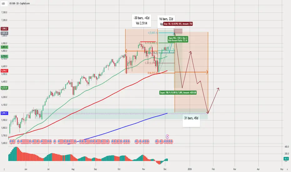
Technical Analysis of the Chart (US500 – Daily Timeframe)
1. Overall Trend
The US500 (S&P 500) is in a strong long-term uptrend, as shown by:
Price trading above the 50-day (green), 100-day (red), and 200-day (blue) moving averages.
Higher highs and higher lows throughout most of the year.
2. Current Market Structure
Sideways / Consolidation Phase
The chart highlights a consolidation box where the price has been moving sideways.
Multiple wicks and uneven peaks indicate market indecision.
The drawn Fibonacci retracement suggests the market has been reacting around the 0.382 and 0.618 levels, which are typical reversal zones.
3. Short-Term Bearish Setup
The highlighted red zone (trade setup) suggests:
A potential short position with:
Entry near recent highs.
Stop-loss above resistance.
Target significantly lower (near the 0.618 – 0.65 Fibonacci region).
The RR (Risk/Reward) ratio is shown as 12:16, which indicates the idea of a large move downward.
Bearish Projection
The brown/red line drawn forward shows:
Expected drop in price.
A possible relief bounce.
Followed by a deeper fall reaching the lower support area.
This move is expected within ~31 bars (45 days).
4. Key Support Levels
Main support zone highlighted at approximately 5991 – 6230.
The 200-day moving average (blue) is far below current levels, meaning:
The market could decline significantly while still staying in a long-term uptrend.
5. Volume & Momentum Indicators
The volume bars show decreasing momentum, which often precedes a reversal.
The histogram at the bottom suggests:
Weakening bullish momentum.
Possible bearish momentum building.
6. Forecast Path (Illustrated in the Chart)
The drawing suggests:
Short-term:
Sharp decline from current resistance.
Mid-term:
A corrective bounce upward.
Another leg down forming a deeper low.
Long-term:
Strong recovery upwards after bottoming.
This is a classic A-B-C corrective pattern.
7. Overall Interpretation
The chart shows the idea that the market may be topping after a strong uptrend.
A correction of around 6–10% could occur before the next major rally.
The setup drawn is speculative but follows common technical structures:
Resistance rejection
Fibonacci retracement
Corrective wave pattern
免責聲明
這些資訊和出版物並非旨在提供,也不構成TradingView提供或認可的任何形式的財務、投資、交易或其他類型的建議或推薦。請閱讀使用條款以了解更多資訊。
免責聲明
這些資訊和出版物並非旨在提供,也不構成TradingView提供或認可的任何形式的財務、投資、交易或其他類型的建議或推薦。請閱讀使用條款以了解更多資訊。