LiquidityPulse Volume-Weighted Price Movement OverlayLiquidityPulse Volume-Weighted Price Movement Overlay (VWPM)
-This is a non-repainting indicator.
What this indicator does
This overlay is designed to make directional pressure + participation + wick rejection readable directly on price.
It combines:
Volume-Weighted directional pressure (bull vs bear pressure on the current timeframe)
Wick rejection “heat bands” (strength of upper/lower wick pressure, with optional volatility adaptation)
Lower-timeframe (LTF) trend + wick context (auto-selected or manual LTFs)
Chart markers for:
VOL = participation spike aligned with the current pressure direction
EXH = exhaustion warning when trend direction is met with strong opposite-wick pressure
This script is intended as an overlay/structure companion to the separate Volume-Weighted Price Movement (Oscillator) script (pane-based), which focuses on oscillator-style pressure/participation metrics.
Image: Overlay indicator applied to price
How to read it on the chart
1) Pressure Cloud + Candle Tint
The cloud and optional candle tint reflect the current timeframe’s pressure direction:
Green = bullish pressure dominant
Red = bearish pressure dominant
Brightness/opacity scales with pressure strength (normalized by a lookback period).
2) Wick Pressure Heat Bands
The lower band represents bullish wick pressure (lower-wick rejection/absorption).
The upper band represents bearish wick pressure (upper-wick rejection/supply).
Brighter = stronger wick pressure relative to its recent baseline.
Optional Adaptive bands to volatility uses ATR to keep band scaling more consistent across changing volatility regimes.
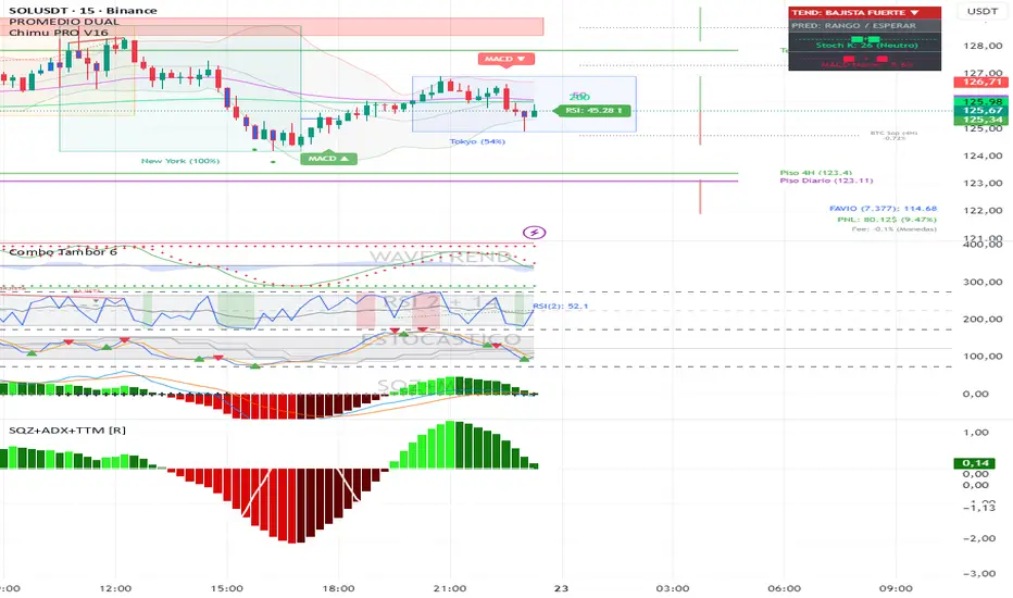
Image: Overlay + Oscillator working together
This chart highlights how volume participation and wick behaviour can be observed during periods of increased market interaction.
The arrows are used for visual reference only:
Red arrows indicate rising volume participation during the move.
Green arrows highlight increasing wick pressure, suggesting stronger rejection or absorption at those points.
3) VOL signal (Participation Spike)
A VOL marker appears when volume % of average exceeds your threshold and aligns with the current pressure direction.
This is a quick filter for:
“The current pressure direction is being supported by above-average participation.”
4) EXH signal (Exhaustion)
An EXH marker appears when the current trend is met with strong/extreme opposite wick pressure, e.g.:
Trend is Bullish but Bear wick becomes Strong/Extreme → possible bullish exhaustion / rejection risk
Trend is Bearish but Bull wick becomes Strong/Extreme → possible bearish exhaustion / absorption risk
Table (top-right)
You can toggle individual rows on or off in the settings. The table can display:
Trend (Chart)- Directional volume-weighted pressure on the chart timeframe (Bullish / Bearish, shown with ▲ ▼ icons)
Wick (Chart)- A real-time summary of wick pressure on the chart timeframe, reflecting how price is being rejected or absorbed within candles.
Possible states include:
Strong Bull – dominant lower-wick rejection (bullish absorption), shown with a green ▲
Strong Bear – dominant upper-wick rejection (bearish pressure), shown with a red ▼
Neutral – no meaningful wick imbalance, shown with a ●
Strong Both – elevated rejection on both sides, shown with a dual-pressure marker, often seen during volatility expansion or transitional conditions
Trend + Wick (Lower Timeframes)- Trend and wick context for two lower timeframes (auto-selected or manually chosen), allowing short-term behaviour to be viewed within the higher-timeframe structure
Core metrics- Bull Avg / Bear Avg, Bull–Bear Difference, Volume % Avg, and related participation statistics
Additional metrics- Further table rows can be enabled or disabled via the settings panel
How traders can use this indicator
Traders can use LiquidityPulse VWPM as a contextual tool to observe how price movement, volume participation, and wick behaviour interact.
Common use cases include:
Identifying periods where bullish or bearish pressure is dominant on the current timeframe
Observing wick rejection or absorption near highs/lows, especially during strong moves
Monitoring lower-timeframe trend and wick alignment within a higher-timeframe move
Noticing participation spikes (VOL) that confirm increased market involvement
Spotting exhaustion conditions (EXH) where strong opposing wick pressure appears against the prevailing trend
Image: This example highlights how the overlay can be used to monitor directional pressure on the chart timeframe while simultaneously observing trend and wick conditions from selected lower timeframes. The statistics table shows instances where lower-timeframe trend readings diverge from the chart-level pressure, alongside changes in wick behaviour. This allows traders to visually contextualise short-term shifts in participation and rejection within the broader structure.
Key settings (what they change)
Presets: Scalp / Intraday / Swing adjusts effective smoothing/normalization defaults to fit different trading speeds.
Lookback Period + Smoothing: These control how fast/slow the pressure model responds.
Lower values = faster response (more reactive/noisier)
Higher values = smoother response (slower/more stable)
Wick thresholds + Wick row mode: Strong / Extreme thresholds define when wick pressure is classified as Strong/Extreme relative to baseline.
Wick rows show can filter table wick rows to Extreme-only, Strong + Extreme, or Full.
Wick bands- Volatility Adapt: Adaptive bands to volatility (ATR-based) helps wick band height/offset remain visually consistent as volatility expands/contracts.
Adapt Strength controls how much the ATR regime affects the bands.
Visual controls: Transparency controls let you make the overlay more subtle or more prominent without changing calculations.
Why there is an Overlay and Oscillator version
This tool is intentionally split into two complementary indicators to preserve clarity and usability
Overlay version (this script): Focuses on price-level context, structure, wick pressure, lower-timeframe alignment, and event markers directly on the chart.
Oscillator companion version: Provides a dedicated pane for pressure balance, participation, and momentum acceleration metrics that benefit from oscillator-style visualisation.
Separating these views avoids overcrowding the price chart and allows each component to be interpreted more clearly in its appropriate context.
Disclaimer
This indicator is designed to visualise price–volume interaction, pressure, and wick behaviour.
It does not generate trade entries or exits signals and should be used as analytical context alongside a trader’s existing methodology and risk management only.
Candlestick analysis

PDH/PDL Breakout Pip MeasurerThe indicator tracks and measures daily breakout performance when price breaks the Previous Day's High (PDH) or Previous Day's Low (PDL). This indicator provides exact pip/point measurements of how far breakouts travel before hitting your stop-loss, with comprehensive statistics for strategy optimization.
Function
Tracks breakouts above PDH (Previous Day's High) and below PDL (Previous Day's Low)
Measures maximum distance price travels after breakout before stop-loss hit
Calculates exact pip/point gains for every breakout move
Provides statistical analysis of breakout performance over time
Identifies only first breakout of each day for clean signals
Performance Metrics
Exact pip measurement for every breakout move
Statistics table with Count, Average, Min, Max pips
Separate tracking for bullish and bearish breakouts
Historical performance accumulation over time
Active breakout monitoring in real-time
Settings
Adjustable pip multiplier - works with any instrument (Forex, indices, crypto)
Separate stop-loss settings for bull/bear breakouts
Visual control - show/hide levels, labels, table
Built-in alerts for breakout notifications

Wickless Candle Revisit TrackerWickless Candle Revisit Tracker
Identifies wickless candles (strong momentum candles) and tracks whether price revisits their opening level, providing statistical insights into price behavior patterns.
WHAT ARE WICKLESS CANDLES?
• Green wickless: Open = Low (no lower wick) - opened at the low and moved only upward
• Red wickless: Open = High (no upper wick) - opened at the high and moved only downward
These candles represent strong directional momentum, and their opening levels often act as support/resistance zones that price may revisit.
KEY FEATURES:
• Automatic Detection: Identifies wickless candles with configurable tolerance for broker spread
• Real-time Tracking: Monitors each wickless candle until price revisits its opening level
• Visual Indicators:
- Labels show "WL↑" or "WL↓" with bars count when revisited (or "N/A" if pending)
- Horizontal lines mark price levels (gray dashed = pending, green solid = revisited)
• Comprehensive Statistics Table:
- Total wickless candles detected
- Revisit rate percentage
- Min/Max/Average bars until revisit
- Pending count
• History Limit: Configure how far back to analyze (default: 500 bars)
• Customizable: Adjust colors, toggle labels/lines/table, reposition statistics
USE CASES:
• Identify potential support/resistance levels from momentum candles
• Measure how often price fills "fair value gaps" or inefficiencies
• Track mean reversion patterns after strong momentum moves
• Backtest the reliability of wickless candle levels as trading zones
SETTINGS:
• Wick Tolerance: Allow small wicks due to broker spread (e.g., 0.0001 for forex)
• History Limit: Number of bars to analyze (older candles are hidden)
• Visual Controls: Toggle labels, lines, and statistics table
• Color Customization: Adjust line colors for pending/revisited states
ALERTS:
Built-in alerts for wickless candle detection (green, red, or both).
Perfect for traders analyzing price inefficiencies, fair value gaps, and momentum-based support/resistance levels.

SVP + candle + Max volume [midst]
SVP + DALY CANDLE + MAX VOLUME
A comprehensive trading indicator that combines Session Volume Profile (SVP), Higher Timeframe (HTF) Candles, and Intrabar Max Volume Price Detection into one powerful tool. Perfect for traders who want to understand price action, volume distribution, and key levels all in one place.
KEY FEATURES
Session Volume Profile
• Real-time volume distribution across price levels for the current session
• Point of Control (POC) - identifies the price with the highest traded volume
• Value Area High (VAH) & Low (VAL) - shows where 70% of the volume occurred (customizable percentage)
• Color-coded volume bars - distinguish between up volume (bullish) and down volume (bearish)
• Value area highlighting - clearly see the most important price zones
Higher Timeframe Candle Display
• Visual daily (or custom timeframe) candle overlaid on your current chart
• OHLC labels - see Open, High, Low, and Close prices clearly marked
• Fully customizable colors - separate colors for bullish/bearish bodies, borders, and wicks
• Adjustable positioning - move the candle and labels to your preferred location
Max Volume Price Detection
• Identifies the exact price level with maximum volume within each bar
• Uses Lower Timeframe (LTF) data for precise volume analysis (Premium+ required)
• Simple mode fallback - works on all TradingView plans
• Previous max volume marker - displays previous bar's max volume as a reference dot
• Real-time calculation - updates as each bar forms
ATR Table
• Dynamic ATR-based stop levels - automatically calculates potential stop-loss levels
• Multiple smoothing methods - RMA, SMA, EMA, WMA
• Customizable multiplier - adjust for your risk tolerance
• Clean table display - shows ATR value, high stop, and low stop
PERFECT FOR
Day traders analyzing intrabar volume distribution
Swing traders wanting HTF context on lower timeframes
Volume profile traders looking for key support/resistance levels
Price action traders seeking high-probability entry zones
HOW TO USE
Volume Profile Analysis
POC often acts as a magnet for price. VAH/VAL are key support/resistance levels. High volume nodes indicate strong price acceptance, while low volume nodes suggest potential breakout zones.
HTF Candle Context
See daily range while trading on 5m-1h charts. Daily open often acts as pivot point. Daily high/low are key levels to watch.
Max Volume Price
Black line shows where most volume traded in each bar. Previous max volume (dot) helps identify institutional activity. Clusters of max volume create strong support/resistance. Can possibly indicate a Wick bounce
ATR Stops
Use ATR-based levels for logical stop placement. Adjust multiplier based on market volatility.
SETTINGS & CUSTOMIZATION
Positioning
Control the global offset to move both candle and profile together. Fine-tune with individual offsets for candle and profile spacing.
Volume Profile
Adjustable number of rows (50-500) for granular or simplified view. Customizable width and placement (left/right). Value Area percentage control. Full color customization for all volume components.
HTF Candle
Any timeframe selection (default: Daily). Full color customization for bull/bear candles. Adjustable candle width. Toggle OHLC labels on/off. Control label distance and line widths.
Max Volume Price
Choose between Simple (all plans) or LTF mode (Premium+). Auto or manual LTF resolution. Custom color and line width. Toggle current and previous markers independently.
TECHNICAL NOTES
Maximum 5000 bars lookback for volume calculations
Works on all timeframes
LTF max volume requires TradingView Premium or higher
Optimized for performance with efficient array operations
For best results, use on liquid instruments with reliable volume data
Most effective on intraday charts (5min-1hour) for day trading and scalping strategies
For Entertainment and information only
Created by midst

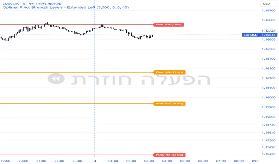
Pivot Edge ProOverview
Smart Pivot Analytics is a highly accurate technical analysis tool designed to identify and validate significant price levels. Unlike standard pivot indicators that only mark recent highs, this tool backtests each identified pivot against thousands of historical candlesticks to calculate its real-world “success rate.”
Key Features
Historical Backtesting: The indicator scans up to 4,900 historical columns to find every instance where price interacted with a specific pivot level.
Strength Score (%): Each level is assigned a percentage score based on its reversal rate. It calculates how many times the price has successfully reached and rejected the level, providing a statistical “hit rate.”
Dynamic Hit Counter: Displays the exact number of times a level has been tested (hit), helping traders distinguish between new levels and established “old” levels.
Smart Filtering: To keep the chart clean, the indicator automatically filters out weak levels and prevents “clutter” by merging levels that are too close together.
Infinite Left Projection: Lines extend left to infinity, allowing traders to see the historical significance of a level across the entire price history at a glance.
How to Trade with It
Red Levels (High Power > 75%): These are “Top Reaction Zones”. Expect a strong price rejection or significant breakout when these levels are tested.
Orange Levels (Medium Power): Suitable for profit targets or as secondary confirmation for entering a trade.
Encounter: Use these levels in conjunction with your existing strategy. When a high power pivot aligns with your entry signal, the probability of a successful trade increases significantly.
Technical Parameters
Lookback Period: Defines how far back in history the script calculates power.
Touch Radius: The "sensitivity" of the level (how close the price has to get to be considered a "hit").
Minimum Strength: A filter to show only the most reliable levels.
Box Theory [Interactive Zones] PyraTimeThis script combines Nicholas Darvas’s "Box Theory" with modern Supply and Demand (Premium/Discount) concepts. It automatically identifies the most recent Swing High and Swing Low to delineate the current trading range.
The purpose of this tool is to visualize market structure and help traders identify when price is relatively expensive (Premium) or cheap (Discount) within a defined range.
Visual Guide: What You Are Seeing
The Box: Represents the active trading range defined by the most recent significant Swing High and Swing Low.
Red Zone (Premium): The top 25% of the range. Mathematically, prices here are considered "expensive" relative to the current structure.
Green Zone (Discount): The bottom 25% of the range. Prices here are considered "cheap" relative to the current structure.
Grey Zone (Equilibrium): The middle 50% of the range. This is the area of fair value where price often consolidates.
Dashed Line (EQ): The exact 50% midpoint of the range.
Tutorial: How to Trade Using This Indicator
Method 1: Mean Reversion (Range Trading) This method applies when the market is moving sideways.
Identify Structure: Wait for a box to form.
Wait for Extremes: Do not trade when price is in the middle (Grey/White area). Wait for price to enter the Red or Green zones.
Entry Trigger:
Shorts: When price enters the Red Zone, look for a rejection (wicks leaving the zone) or a lower timeframe breakdown. Target the EQ (Midline) as your first take profit.
Longs: When price enters the Green Zone, look for support formation. Target the EQ (Midline) as your first take profit.
Method 2: Trend Continuation (Breakouts) This method applies when the market is trending strongly.
Breakout: Monitor the alerts. A close outside the box indicates a potential shift in market structure.
Retest: After a breakout up, the old "Red Zone" (Resistance) often flips to become new Support. Wait for price to pull back to the top of the old box before entering.
Configuration Guide (Settings)
Pivot Left/Right Bars (Sensitivity):
Default (20/20): Best for Swing Trading. It filters out market noise and only draws boxes based on major structural points.
Lower (5/5): Best for Scalping. It will create smaller, more frequent boxes but increases the risk of false signals.
Zone Percentage:
Default (25%): Standard deviation for Supply/Demand zones.
Alternative (15%): Use this for "sniping" entries at the absolute extremes of the range.
Multi-Timeframe (MTF):
Enable "Use Higher Timeframe" to see Daily or Weekly ranges while trading on lower timeframes (like the 15m or 1H). This helps keep your intraday trades aligned with the major trend.
Technical Note on "Lag" This indicator uses Pivots to draw the box. A pivot is only confirmed after a certain number of bars have passed (the "Pivot Right Bars" setting).
Example: If "Pivot Right Bars" is set to 20, the box will update 20 bars after the actual high or low occurred. This is necessary to confirm that the point was indeed a Swing High/Low. Do not treat the box lines as predictive; they are reactive to confirmed structure.

Squeeze + ADX + TTM [V6]Execution speed: The TradingView engine processes v6 scripts much faster.
Stability: By using standard functions like ta.sma or ta.linreg, the indicator is less prone to calculation errors on lower timeframes.
Clarity: I've reorganized the ADX calculation within a function to make it more readable if you decide to modify it later.
Price Range CHoCH Alert🎯 Smart Money Concept (SMC) indicator that monitors a specific price level and alerts only when price touches that level AND
subsequently creates a Change of Character (CHoCH).
Key Features:
• Set a custom price level to monitor
• Detects CHoCH/BOS based on pivot highs/lows
• Alerts ONLY when: Price touches level → CHoCH occurs
• Visual confirmation with level line and status table
• Configurable tolerance for precise level targeting
• Works for both bullish and bearish scenarios
Perfect for:
✓ Institutional level trading
✓ Key support/resistance breakouts
✓ Liquidity grab confirmations
✓ Structure break validation
Simply set your target price level and let the indicator watch for the perfect SMC setup!

The Strat Candle Labels & Color Inc F2D F2UThis script uses TheStrat candle numbers 1, 2D, 2U, 3 and places the text below or above. I have also now added the Failed 2D/2U labels. You can also change the text size. This also allows you to change the colors of the candles with two options for the 1 & 3 so you can color them in the direction they are going. For example a 1 that is green can be green and a 1 that is red can be red.

Gaps IdentifierThis indicator identifies up and down Gaps using previous period's close price to the next period's open price. Potentially useful for Gap rebound strategies.
(Will identify gaps 4%–11% by default; can change in settings)

MACD Classic MT5 Style (2 Lines + Histogram)MACD Classic MT5 Style (แบบ MetaTrader 5) มีความแตกต่างจาก MACD ทั่วไปที่ใช้กันใน TradingView พอสมควรครับ นี่คือคำอธิบายว่ามันทำงานอย่างไรและอ่านค่าอย่างไรครับ:
1. ความแตกต่างสำคัญ (Key Difference)
MACD ทั่วไป (Standard):
มี 2 เส้น (เส้น MACD และ เส้น Signal)
ฮิสโตแกรม (แท่งกราฟ) คือ ส่วนต่าง (Gap) ระหว่าง 2 เส้นนั้น
MACD แบบ MT5 (Classic MT5):
เส้น MACD จะถูกวาดออกมาเป็น แท่งกราฟ (Histogram) แทนที่จะเป็นเส้น
เส้น Signal จะเป็น เส้น (Line) สีแดงพาดผ่านแท่งกราฟ
สรุปคือ: ในแบบ MT5 แท่งกราฟคือตัวพระเอก (MACD) ส่วนเส้นคือตัวช่วยกรอง (Signal)
Here is the English translation of the explanation:
MACD Classic MT5 Style vs. Standard MACD
The "Classic MT5 Style" MACD differs significantly from the standard MACD typically found on TradingView. Below is an explanation of its mechanics and how to interpret it.
1. Key Differences
Standard MACD (TradingView Default):
Displays 2 Lines (MACD Line and Signal Line).
The Histogram represents the difference (gap) between those two lines.
MT5 Style MACD (Classic):
The MACD value is plotted as a Histogram (bars) instead of a line.
The Signal Line appears as a standard Line (usually red) overlaying the histogram.
In summary: In the MT5 style, the Histogram represents the actual MACD Line, while the separate line acts as the Signal filter.


The Strat: 3-2D Setup Label + Entry, Target & AlertsThis is an indicator that identifies the 3-2D setup based on TheStrat & will alert you if you have this on the chart. Once the 3-2D setup happens this will give you the entry, target and price labels. You can change the font size, label colors and add optional alerts.

3 EMA IndicatorThis indicator is a combination og three EMA's
This indicator is a combination og three EMA's
This indicator is a combination og three EMA's
This indicator is a combination og three EMA's
This indicator is a combination og three EMA's

The Strat Candle Types (1 / 2U / 2D / 3)This script uses TheStrat candle numbers 1, 2D, 2U, 3 and places the text below or above. You can also change the text size. This also allows you to change the colors of the candles with two options for the 1 & 3 so you can color them in the direction they are going. For example a 1 that is green can be green and a 1 that is red can be red.

Info Box with VPINfo box with turnover
it has all the % of SL
it also has VOlume and turnover with it
It is lighter version of prov

VSA Persistent Zones with Arrows Purpose
This indicator is designed to analyze trading volume relative to price movement using the VSA (Volume Spread Analysis) methodology. It aims to:
Identify key price zones where there is strong price movement with high trading volume.
Plot arrows on high-volume candles for quick visual identification.
Keep these zones persistent until broken by price, helping traders make decisions based on real support and resistance levels.

Ichimoku MTF Heatmap W/ adj alert placement W and D cloud ALERTShows green FLAG 50 bars back when Daily and Weekly Cloud metrics are ACTIVE.

virgin wick theorybased off of www.youtube.com strategy.
shows levels for the next HTF period to trade off of
make sure to check your htf to double check as the max lookback doesnt cover some levels occasionally

Engulfing Strategy Core Concept:
This is a price action trading strategy that identifies high-probability trade setups by combining multi-timeframe engulfing patterns with Current Market Price (CMP) validation.
How It Works:
H4 Setup Zone (Primary Timeframe)
Identifies Bullish or Bearish Engulfing patterns on the 4-hour timeframe
When detected, marks a zone at the high and low of the engulfed candle
This zone represents the initial setup area
M30 Trade Control Zone (Confirmation Timeframe)
Looks for Engulfing patterns on the 30-minute timeframe
These patterns must form within or near the H4 setup zone
Acts as a confirmation that the setup is valid
CMP Validation (Current Market Price)
Monitors where price is currently trading relative to the zones
Validates whether the pattern is still active or has been invalidated
Helps determine entry timing and stop loss placement
Trade Setup:
Bullish Setup: Red candle engulfed by green candles → Zone marked at red candle's high/low → Wait for M30 confirmation → Enter when CMP validates the pattern
Bearish Setup: Green candle engulfed by red candles → Zone marked at green candle's high/low → Wait for M30 confirmation → Enter when CMP validates the pattern

WN 5-20-50 SMA Setup (Discrete Lines = SL TP) Multiple Entries Pretty Simple Script as I got this idea from a YouTuber that showed us how to use AI to make TradingView Indicators.
When the 5 day Simple Moving Average Goes Above the 20 day Simple Moving Average it issues a BUY Signal when the Trend itself is over the 50 day Simple Moving Average.
When the 5 day Simple Moving Average Goes Below the 20 day Simple Moving Average it issues a SELL Signal when the Trend itself is under the 50 day Simple Moving Average.
The Green Cloud Represents price over the 50 day Simple Moving Average. BUY signals will only show up in the green cloud.
The Red Cloud Represents price under the 50 day Simple Moving Average. SELL signals will only show up in the green cloud.
The lines represent Stop Loss and two Take Profit Levels. Take Profit 1 is 1.5x the stop loss and Take Profit 2 is 3x the Stop Loss.
This version of the Script has multiple Trend signals for entries so you can scale into a trade when the Trend is being aggressive.

ProTradersNetwork-inefficiencyInefficiency Candles Colored, No matter the timeframe, ensures clear visibility of which candles had the most momentum.

BulletProof Long Wick Reversal Markers with LinesThis custom Pine Script indicator for TradingView identifies and marks potential reversal points on your chart based on long wick candles at swing highs (tops) and lows (bottoms). It focuses on candles where the wick is significantly longer than the body (e.g., shooting stars or hammers) and where the subsequent price reversal exceeds a minimum percentage move. Markers appear as colored circles (green for tops, red for bottoms), with horizontal lines extending from each marker to the current bar for easy reference as support/resistance levels.Key Features and InterpretationMarkers (Dots): Green circles at tops: Indicate a potential bearish reversal where price was pushed down after a long upper wick candle.
Red circles at bottoms: Indicate a potential bullish reversal where price was pushed up after a long lower wick candle.
These only appear if the wick-to-body ratio meets the threshold (default 2.0) and the reversal move is at least the minimum percentage (default 1%).
Lines: Horizontal lines extend from each marker to the current bar (updating in real-time). Use these as dynamic levels—e.g., a green top line might act as resistance, while a red bottom line could be support. Lines do not extend into the future blank space on the chart.
Time Filtering: By default, only markers from the last 7 days are shown to reduce clutter. Set to 0 to display all historical ones.
Best Used On: 1-hour charts as per your request, but it works on any timeframe. It's ideal for spotting reversals in trending markets or confirming entries/exits with other indicators.
