Pivots MTF -WinCAlgo/// 🇬🇧
Pivots MTF -WinCAlgo is a precision-engineered Price Action tool designed to declutter your chart while providing a comprehensive view of market equilibrium points across multiple timeframes.
Unlike standard Pivot indicators that often flood the screen with too many lines or restrict you to a single timeframe, this tool consolidates Daily, Weekly, Monthly, Quarterly, and Yearly central pivots into a clean, "Step-Line" visual format with an intelligent status dashboard.
It is built for traders who focus on Bias and Equilibrium rather than just S/R lines.
1. Multi-Timeframe Central Pivots (Step-Line Technology)
* Displays Daily (D), Weekly (W), Monthly (M), Quarterly (Q), and Yearly (Y) pivots simultaneously.
* Infinite History: Uses a specialized plot logic instead of limited lines, allowing you to see the pivot history as far back as data exists without gaps.
* Step-Line Visual: Levels remain flat and constant throughout their respective periods (e.g., the Daily pivot draws as a straight line from 00:00 to 23:59), creating a clear "ladder" of price levels.
2. Intelligent Status Dashboard (Auto-Sorting)
* Smart Sorting: The on-chart table automatically sorts all active pivot levels by price (Highest to Lowest). This creates an instant "Support & Resistance Ladder" regardless of the timeframe.
* Dynamic Coloring: Levels in the table light up Green (Support) if the price is above them, or Red (Resistance) if the price is below.
* Touched vs. Naked: The table tracks whether price has tested the level in the current period. "Naked" levels (untested) often act as strong magnets for price action.
3. Optional Deviations (S1 / R1)
* Includes a toggle for Deviations (S1 & R1) for each timeframe.
* Calculated using classic pivot logic based on the previous period's Close:
- R1 = (2 * Pivot) - Low
- S1 = (2 * Pivot) - High
* Deviations are drawn as dashed lines to distinguish them from the main trend bias.
4. Performance & Customization
* History Limit: Adjustable history depth for line objects to ensure maximum chart performance.
* Hybrid Design: Combines the infinite history of plot drawings with the precision of line objects.
* Visual Control: Fully customizable colors, line widths, and table position/size.
* Trend Bias: If price is holding above the Daily and Weekly central pivots, the immediate bias is Bullish.
* Targeting: Use "Naked" pivots shown in the table as high-probability take-profit targets or reversal zones.
* Confluence: Look for areas where a higher timeframe pivot (e.g., Monthly) overlaps with a lower timeframe pivot (e.g., Daily) to identify critical structural levels.
Developed by WinCAlgo. Feel free to use and incorporate into your strategies.
週期


Po3 Candle OpensMarks out the 9:30 / 9:45 / 10:00 / 10:15 / 10:30 candle opening.
You can turn off certain times in the settings, if not needed.
The colors are also customizable.

Time Exhaustion Counter PRO (Confirmed Exit / Clean)🔹 Short Description (Very Short)
Time-based exhaustion indicator that confirms exits using pivots and ATR filtering. Designed to avoid premature exits and reduce market noise.
🔹 Release Notes (Version 1.0)
Version 1.0 – Initial Release
Time-based exhaustion counting from confirmed pivots
Confirmed exit logic (target bars + opposite pivot)
Automatic presets by timeframe (crypto-friendly)
ATR-based pivot filtering to reduce noise
Clean chart design with optional debug tools

AI-Driven Multi-Timeframe Stochastic RSI Snapshot📊 AI-Driven Multi-Timeframe Stochastic RSI Snapshot Overview
The AI-Driven Multi-Timeframe Stochastic RSI Snapshot provides a clear, at-a-glance view of momentum alignment and directional bias across multiple timeframes.
It condenses Stochastic RSI readings from 1H, 4H, 1D, 1W, and 1M into a compact, color-coded table displayed directly on the price chart.
This indicator is designed for traders who want high-level market context without cluttering their charts or switching between timeframes.
How It Works
For each timeframe, the indicator evaluates:
Stochastic RSI %K and %D
Directional bias (Bullish, Bearish, or Neutral)
Momentum zone (Overbought, Oversold, or Mid-range)
Each timeframe contributes to an overall market bias calculation.
A directional signal is displayed only when alignment reaches a minimum confidence threshold, helping filter out weak or conflicting conditions.
Signal & Grading
When alignment is strong enough, the indicator displays:
A Bull or Bear signal
A grade (A+ to F) reflecting the quality of the multi-timeframe agreement
Higher grades indicate stronger alignment, particularly from higher timeframes, while lower grades signal mixed or low-confidence conditions.
How to Use
Use as a trend and bias filter before entering trades
Favor setups that align with higher-grade signals
Combine with price action, structure, or volatility tools for precise entries and exits
This indicator is best used for context and confirmation, not standalone entries.
Visuals & Customization
Clean, color-coded table for fast interpretation
Minimal chart footprint
Fully adjustable colors to match any chart theme
Disclaimer
This indicator is for educational and analytical purposes only.
Always apply proper risk management.

TZ - India VIX Volatility ZonesTZ – India VIX Volatility Zones is a long-term volatility analysis indicator designed to visually map important India VIX regimes using clearly defined horizontal zones and labels.
The indicator highlights how market volatility cycles between complacency, normal conditions, elevated risk, and panic phases. These zones are based on historical behavior of India VIX and help traders understand when risk is underpriced or overstretched.
This tool is especially useful for:
Index traders
Options sellers and buyers
Risk management and regime filtering
Long-term volatility study
How It Works
The script plots static, historically significant volatility zones on the India VIX chart and visually separates them using shaded bands and labels.
Volatility Zones Explained
1.Extreme Low Volatility (VIX 8–10)
Indicates market complacency and underpriced risk. Often precedes volatility expansion.
2.Low Volatility (VIX 10–13)
Stable market conditions with controlled movement.
3.Normal Volatility (VIX 13–18)
Healthy market behavior and balanced risk.
4.High Volatility (VIX 18–25)
Rising uncertainty and increased intraday swings.
5.Panic Zone (VIX 25–35+)
High fear environment, usually during major events or crises.
How Traders Can Use This Indicator
Identify volatility regimes before choosing option strategies
Avoid aggressive short-volatility trades during extreme zones
Prepare for volatility expansion during low-VIX phases
Use as a market risk context tool alongside price action
This indicator does not provide buy/sell signals. It is designed for contextual analysis and decision support.
Best Usage
Apply on India VIX (NSE:INDIAVIX)
Works best on Weekly and Monthly timeframes
Can be combined with index charts for volatility-based risk assessment
Disclaimer
This indicator is for educational and analytical purposes only.
It does not constitute financial advice or trade recommendations.
Users should apply proper risk management and confirm signals using additional analysis.

SLS CAPITAL The idea behind this indicator is to mark the high and low of the session along with the closing price of the previous day's session; the aim is to indicate where the correct liquidity is located.

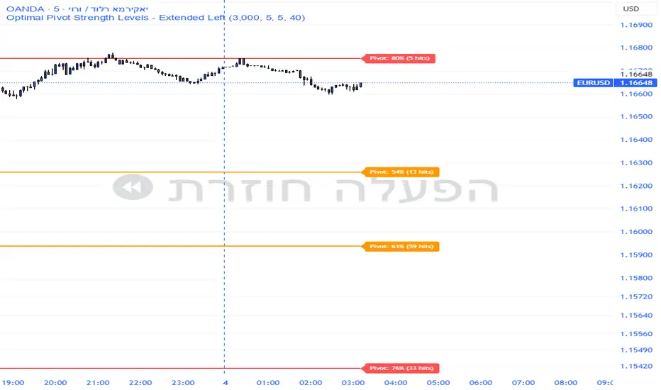
Pivot Edge ProOverview
Smart Pivot Analytics is a highly accurate technical analysis tool designed to identify and validate significant price levels. Unlike standard pivot indicators that only mark recent highs, this tool backtests each identified pivot against thousands of historical candlesticks to calculate its real-world “success rate.”
Key Features
Historical Backtesting: The indicator scans up to 4,900 historical columns to find every instance where price interacted with a specific pivot level.
Strength Score (%): Each level is assigned a percentage score based on its reversal rate. It calculates how many times the price has successfully reached and rejected the level, providing a statistical “hit rate.”
Dynamic Hit Counter: Displays the exact number of times a level has been tested (hit), helping traders distinguish between new levels and established “old” levels.
Smart Filtering: To keep the chart clean, the indicator automatically filters out weak levels and prevents “clutter” by merging levels that are too close together.
Infinite Left Projection: Lines extend left to infinity, allowing traders to see the historical significance of a level across the entire price history at a glance.
How to Trade with It
Red Levels (High Power > 75%): These are “Top Reaction Zones”. Expect a strong price rejection or significant breakout when these levels are tested.
Orange Levels (Medium Power): Suitable for profit targets or as secondary confirmation for entering a trade.
Encounter: Use these levels in conjunction with your existing strategy. When a high power pivot aligns with your entry signal, the probability of a successful trade increases significantly.
Technical Parameters
Lookback Period: Defines how far back in history the script calculates power.
Touch Radius: The "sensitivity" of the level (how close the price has to get to be considered a "hit").
Minimum Strength: A filter to show only the most reliable levels.
Drawdown % + STD Bands: Log-Scale Macro ToolDrawdown % + STD Bands: Log-Scale Macro ToolDescription: The exact indicator big-macro accounts use: tracks real-time drawdown from the rolling 252-period peak, then plots -1σ (blue) and -2σ (orange) bands on a clean percent scale. Built for weekly charts-shows if a stock, index, or crypto is statistically cheap (hit -1σ) or generational-buy territory (-2σ). Works flawlessly on SPX, Nasdaq, Bitcoin, Gold, Tesla... anything. How to Use (read it aloud like a voice memo): 1. Slap this under any chart, set to weekly timeframe . 2. Flip the price pane to log scale -zero negotiations. 3. Watch the thick red line: • Hovering 0 %? Bullish noise, chill. • Kissing blue (-10 % to -25 %)? Start loading-happens every 1-2 years. • Touching orange (-30 %+)? Panic sale finished. Buy like rent money's burning a hole. 4. Zoom out five-ten years; monthly works too if you want lazy vibes. Daily? Trash-too twitchy. Pro tip: Name your watchlist Panic Plays, drop this in, and ping me when MELI or GOOGL hits orange. I'll confirm if it's actually stupid-cheap.

Watchlist Auto Buy/Sell AlertsTrial for the best. This indicator is built to assess the chart and make it easier for traders to identify coins that are available for trading and minimize losses.

Balanced 0DTE Scalper [Clean]Balanced 0DTE Scalper is a professional-grade execution system designed specifically for the high-velocity world of 0DTE (Zero Days to Expiration) options trading on indices like SPY, QQQ, and IWM.
Unlike standard indicators that repaint or lag, this system uses Non-Repainting Multi-Timeframe Logic to align the institutional trend (15m) with precision entry triggers (5m). It is engineered to solve the two biggest killers of 0DTE traders: Theta Decay (holding too long) and Choppy Markets (trading without trend).
How It Works
1. The "Safety Belt" (15-Minute Trend Filter) Before any trade is taken, the system checks the confirmed 15-minute Trend and ADX (Strength).
No Repainting: It strictly uses the previous closed 15m bar to determine bias. Once a signal prints, it stays printed.
Regime Detection: It automatically blocks trades during low-volume "chop" (Low ADX) to save you from theta burn.
2. Precision Entry Triggers (5-Minute) Once the 15m trend gives the "Green Light," the system hunts for 5m setups using a confluence of:
EMA Crossovers: For immediate momentum.
VWAP Filter: Ensuring you are on the right side of institutional volume.
RSI Check: To avoid buying tops or selling bottoms.
3. Aggressive Risk Management (The "Profit Locker") 0DTE profits can vanish in seconds. This script manages the trade for you visually:
Dynamic Trailing Stop: Trails price based on candle Highs/Lows (not closes), allowing it to lock in profits at the peak of a spike.
Time Stop: If a trade stalls for 60 minutes (12 bars), the system triggers a "Time Exit." In 0DTE, time is money—if it's not working, get out.
Visual Levels: Automatically draws your Stop Loss, Target 1 (Conservative), and Target 2 (Runner) lines on the chart.
Features & Dashboard
Live Dashboard: Monitors Trend Bias, ADX Strength, RSI, and Open PnL in real-time.
On-Chart Tickets: Prints a "CALL OPEN" or "PUT OPEN" label with the exact Entry Price, Stop Loss, and Strike Suggestion.
Session Filters: Automatically avoids the first 10 minutes (Open Volatility) and the last 15 minutes (Close Chaos).
Settings Guide
Risk Mode:
Balanced (Default): The recommended blend of Trend + Momentum.
Conservative: Requires a very strong ADX trend. Fewer trades, higher win rate.
Aggressive: Ignores ADX strength. Good for FOMC/CPI days only.
Strike Suggestion: Automatically calculates the nearest Strike Price (ATM/OTM) for SPY/QQQ based on your settings.
Disclaimer
This tool is for educational purposes only. 0DTE options trading involves extreme risk of capital loss. Past performance (even with non-repainting logic) is not indicative of future results. Always manage your risk.

Stoch + RSI Super Buy SpotWhat does this indicator do?
This indicator helps you spot the moment when a price is likely to start bouncing,
before the bounce becomes obvious on the chart.
Most buy signals appear after price has already moved up.
This indicator is designed to show a signal just before the move begins.
What kind of situation does it look for?
The indicator looks for three conditions at the same time.
① Price has fallen a lot
The Stochastic line is near the bottom (0–20).
This means the market has recently dropped significantly.
② The market is weak, but not broken
The RSI line stays between 40 and 50.
This suggests selling pressure exists, but strength is still holding.
③ Downward movement starts to slow and turn up
The Stochastic line stops falling
and starts to move upward, even slightly.
👉 When all three happen together, the indicator marks a BUY timing.
Why does this signal appear earlier than others?
Many indicators wait for:
line crossovers, or
levels to be clearly broken
That often means the signal appears after the price has already risen.
This indicator:
does not wait for crossovers
instead, it detects the first change in direction
So the signal appears one step earlier.
How should you use this BUY signal?
This BUY mark means:
“The downtrend may be ending, and a rebound could be starting.”
It is best used as:
a preparation signal, or
a buy zone alert,
not as a guaranteed entry on its own.
When does this indicator work best?
After a strong decline
Near support levels
During consolidation after a drop
It is especially useful for catching early rebounds.
One-sentence summary
“An indicator that highlights early signs of a rebound while the price is still low.”

Dual MACD CrossWhat Is This Indicator?
This indicator is a visual tool for reading changes in market momentum.
Instead of giving buy or sell orders, it helps you see when the market’s short-term behavior starts to differ from its underlying direction. Think of it as a way to observe shifts in mood rather than make automatic decisions.
What Do the Lines Mean?
You will see three visual elements:
The thin green line represents the market’s short-term momentum.
It reacts quickly to recent price changes and shows what the market is doing right now.
The thicker white line represents the market’s reference trend.
It moves more slowly and reflects the broader, more stable direction of the market.
The yellow dotted line is the zero baseline.
It does not generate signals. Its only purpose is to help you visually judge whether momentum is generally positive (above zero) or negative (below zero).
How Should This Indicator Be Read?
The key is the relationship between the green and white lines.
When the green line is above the white line, short-term momentum is stronger than the market’s reference trend.
When the green line is below the white line, short-term momentum is weaker.
The indicator is not concerned with how high or low the lines are by themselves.
What matters is how they interact.
What Do the Triangle Markers Mean?
The small triangle markers highlight moments of transition.
An upward triangle appears when the green line crosses above the white line.
This suggests that short-term momentum is beginning to outperform the broader trend.
A downward triangle appears when the green line crosses below the white line.
This suggests that momentum is weakening relative to the broader trend.
These markers are attention points, not commands. They indicate potential change, not certainty.
Why Is the Zero Line Important?
The zero line provides context.
A crossover that happens above the zero line occurs while the market is already in a relatively strong state.
A crossover below the zero line happens in a weaker environment and may represent a failed move or an early attempt at reversal.
The same crossover can mean very different things depending on its position relative to zero.
What Is This Indicator Best Used For?
This indicator is best used to:
Observe early signs of trend changes
Compare short-term momentum versus underlying direction
Confirm what you are already seeing in price action or other indicators
It is not designed to:
Predict tops or bottoms precisely
Act as a standalone buy/sell system
Measure overbought or oversold conditions
A Simple Analogy
Imagine driving a car.
The green line is how hard you are pressing the accelerator.
The white line is your current speed.
The yellow zero line is the difference between moving forward or backward.
The triangles mark moments when acceleration begins to change the car’s actual movement.
The indicator helps you notice when effort starts to translate into direction.
The Right Way to Use It
This indicator does not tell you what to do.
It encourages you to ask better questions:
Is momentum starting to lead or lag?
Is this change supported by price structure?
Does the broader context confirm or contradict this signal?
Used this way, it becomes a tool for awareness, not prediction.
If you’d like, I can also provide:
A one-paragraph version for documentation
A training script for beginners
Or a minimal tooltip-style explanation for sharing with others

ICT ORB Killzones by MaxN (15 / 30m)Trading session London, Asia, New York
orb 15/30 min selectable breakout zones with buy/sell signals

HS:- HA+BIAS📝 Daily Bias + Heikin Ashi Step Line (Notes)
1️⃣ Indicator Purpose
Combines Daily Market Bias with Heikin Ashi Average
Displays HA average as a STEP LINE WITH BREAKS
HA line changes color based on bias
Works on any timeframe
Bias logic is always calculated from Daily data
2️⃣ Heikin Ashi Calculation
Uses Heikin Ashi candles internally
Does not change chart candles
Formula used:
HA Average = (HA Open + HA Close) / 2
Provides a smoother price reference than normal candles
3️⃣ Daily Reference Levels
Uses previous day:
High
Low
These levels define market structure
Fetched using Daily timeframe regardless of chart timeframe
4️⃣ Positive Bias Condition (Bullish)
Bias becomes POSITIVE only when both conditions are true:
Today Close > Previous Day High
Today Low > Previous Day Low
📌 Indicates strong bullish control
5️⃣ Negative Bias Condition (Bearish)
Bias becomes NEGATIVE only when both conditions are true:
Today Close < Previous Day Low
Today High < Previous Day High
📌 Indicates strong bearish control
6️⃣ Bias Hold Rule (Most Important)
Bias does NOT flip frequently
Bias remains unchanged until:
Both opposite conditions are satisfied
Prevents false signals during sideways markets
Bias Values:
+1 → Positive
-1 → Negative
0 → Neutral
7️⃣ Bias Memory Concept
Bias is stored using a state variable
Previous bias is carried forward when no condition is met
Ensures stable trend direction

Sector Rotation ULTIMATE: 7 Narrativas IndependientesSector Rotation ULTIMATE: Crypto Narrative Rotation (7 Independent Sectors)
Advanced indicator displaying the relative strength of major crypto sectors through 7 independently normalized lines (0-100):
• Layer1 (ETH, SOL, BNB, TON, etc.) - Pink
• Enterprise (XRP, HBAR, XLM, QNT, VET) - Yellow
• DeFi (UNI, AAVE, MKR, LDO, CRV, etc.) - Cyan
• Memecoins (SHIB, DOGE, PEPE, WIF, FLOKI, BONK) - Green
• AI (TAO, FET, ICP, GRT, etc.) - Orange
• L2 / Scalability (ARB, OP, MATIC, STRK) - Purple
• RWA + Infra (ONDO, LINK) - Brown
Each sector sums the dominance of its top coins (40 total) and is normalized independently so the lines cross constantly, revealing real capital rotations.
- Colored fills to visually highlight the leading sector
- Works perfectly on any timeframe (clean daily data, no intraday noise)
- Ideal for spotting altseason, sector rotations, and entry timing
Use on CRYPTOCAP:TOTAL. The definitive narrative oscillator for 2026!
#Crypto #Altcoins #SectorRotation #DeFi #Memecoins #AI #RWA

Magic 13 for China Stock MarketPrice Exhaustion Counter - 9/13 Signals
This indicator tracks consecutive closes relative to their 4-bar precedent, identifying potential trend exhaustion points.
KEY FEATURES:
- Counts consecutive higher/lower closes up to 9
- Extends counting to 13 for confirmation signals
- Customizable early warning display (counts 5-8)
- Background highlighting for approaching signals
- Clean, non-overlapping label placement
SIGNAL GUIDE:
- Counts 5-8 (orange): Early momentum warning
- Count 9 (purple/green badge): Primary exhaustion signal
- Counts 10-13 (green/purple): Extended momentum - stronger reversal potential
CUSTOMIZATION:
- Toggle early signals visibility
- Adjust label offset for clarity
- Enable/disable background hints
- All timeframes supported
Identifies high-probability reversal zones based on consecutive price action.

Lindsey Measured Move Price TargetsLindsey is a pivot-structure target tool that auto-maps a simple 3-point swing sequence (P1 → P2 → P3) and projects a symmetry-based target (P4), then prints it as a clean “🎯” balloon on your chart. It’s designed to give traders a fast, repeatable way to visualize where the next measured move could resolve—without cluttering the price action.
How it works
The script detects pivot highs/lows using your chosen Left/Right Swing Bars (pivot confirmation).
It tracks a three-point structure:
Bull case: P1 = pivot low, P2 = pivot high, P3 = higher pivot low
Bear case: P1 = pivot high, P2 = pivot low, P3 = lower pivot high
Once a valid P3 prints, it calculates a projected target:
Bull target: P4 = P2 + (P2 − P3)
Bear target: P4 = P2 − (P3 − P2)
The target is displayed as a right-shifted balloon, so you can keep it visible ahead of current candles.
How to operate it (practical workflow)
Set Swing Sensitivity
Left Swing Bars / Right Swing Bars control how “strict” pivots are.
Lower values = more signals (noisier). Higher values = fewer, cleaner structures.
Place the balloon where you want it
Balloon Right Offset (bars) moves the 🎯 label forward in time for readability.
Vertical Offset nudges the label up/down in price units to avoid overlapping candles or other tools.
Lock or keep it live
Turn Lock Target Balloon ON to keep the last target fixed on-chart.
Leave it OFF to always display the most recent valid projection.
Style it to your theme
Customize bull/bear balloon colors, text color, and P1/P2/P3 marker colors.
Why it’s useful (benefits)
Clear targets without guesswork: turns swing structure into a consistent measured-move projection.
Less chart noise: one readable target balloon instead of multiple lines and annotations.
Works across assets/timeframes: pivots adapt naturally to volatility and timeframe.
Trader-friendly controls: offset + vertical spacing + lock mode make it easy to integrate with existing layouts.
Notes / best practices
Pivots confirm after the right-side bars complete—so targets are intentionally non-repainting in structure detection, but they appear with that normal pivot confirmation delay.
For choppy ranges, increase pivot bars to reduce whipsaw targets; for trends, slightly lower them to catch more swing opportunities.

Infinity SignalInfinity Signal — Stochastic RSI Projection
Infinity Signal is a forward-looking Stochastic RSI projection indicator designed to help traders anticipate momentum transitions and potential %K/%D cross windows before they occur.
The indicator projects a previously observed Stochastic RSI momentum cycle into the future, optionally aligning it with current conditions for visual relevance. This allows traders to compare live momentum behavior with prior regimes and identify probable timing zones, rather than reacting after momentum has already shifted.
Live %K and %D remain fully visible for real-time context, while projected intersections highlight areas where momentum alignment may occur. Infinity Signal is built for anticipation, structure, and confluence, not as a standalone trading signal.
Key Benefits
Anticipates potential momentum shifts instead of reacting late
Highlights future timing windows, not fixed buy/sell signals
Keeps live momentum fully visible alongside projections
Encourages patience during consolidation and transition phases
Designed to integrate cleanly with price action and trend analysis
Bottom Line
Infinity Signal provides a context-driven view of momentum, helping traders prepare for what may come next rather than chasing what already happened.

Fractal HTF Lines The indicator “Fractal HTF Lines” draws time‑based vertical lines that mark where higher‑timeframe periods start on your chart. It adapts its behavior to the timeframe you are currently viewing.
4‑hour timeframe
On a 4‑hour chart, the indicator draws a vertical line on the first 4‑hour bar of each new trading day. This lets you quickly see where one day ends and the next begins without turning on session breaks.
Daily timeframe
On a daily chart, the indicator draws a vertical line on the first trading day of each new week. Visually, this separates weeks so you can see weekly structure while still trading and analyzing on the daily timeframe.
Weekly timeframe
On a weekly chart, the indicator draws a vertical line on the first trading week of each new month. That way you can identify monthly boundaries directly on the weekly chart and better align your analysis with monthly cycles.
Customization
The indicator includes settings to control:
Line color: You can choose any color from the palette.
Line width: You can adjust the thickness to make lines more or less prominent.
Line opacity: You can make lines more transparent or more solid, depending on how strong you want the visual emphasis.

ZLT - Date and Time MarkerPine Script v5 indicator called “DateTime Marker” that overlays on the chart and marks bars whose timestamp matches a user-defined schedule. When a bar “matches,” it can draw:
a vertical line through the bar,
a label with a time/date string, and
a triangle marker below the bar (always plotted on matches).
What you can configure
Marker Type (the matching rule)
You choose one of five modes:
Every Minute
Inputs: everyNMinutes (default 15), minuteOffset (default 0)
Match condition: minute % everyNMinutes == minuteOffset
Example with defaults: marks bars at :00, :15, :30, :45 each hour.
Hourly
Inputs: everyNHours (default 4), hourlyMinute (default 0)
Match condition: hour % everyNHours == 0 AND minute == hourlyMinute
Example with defaults: marks bars at 00:00, 04:00, 08:00, 12:00, 16:00, 20:00 (at minute 00).
Daily Time
Inputs: dailyHour (default 10), dailyMinute (default 0)
Match condition: hour == dailyHour AND minute == dailyMinute
Example with defaults: marks 10:00 every day.
Weekly Day & Time
Inputs: weekDay (default Tuesday), weeklyHour (default 16), weeklyMinute (default 0)
It converts the weekday name to Pine’s dayofweek number via getDayNumber().
Match condition: dayofweek == targetDay AND hour == weeklyHour AND minute == weeklyMinute
Example with defaults: marks Tuesday 16:00.
Monthly Date & Time
Inputs: monthlyDay (default 2), monthlyHour (default 23), monthlyMinute (default 0)
Match condition: dayofmonth == monthlyDay AND hour == monthlyHour AND minute == monthlyMinute
Example with defaults: marks the 2nd day of each month at 23:00.
Visual settings
showLine: whether to draw the vertical line.
lineStyle: Solid/Dashed/Dotted (mapped to Pine line styles by getLineStyle()).
lineColor, lineWidth: styling for the line (width is rounded to an integer because Pine line width is integer).
showLabel: whether to draw a label.
labelColor: background color of the label (text is forced white).
What happens when a bar matches
When isMatch becomes true on a bar:
Vertical line: line.new() at that bar’s bar_index, from low to high, extended extend.both (so it spans the full chart vertically).
Label: label.new() at the bar’s high, with mode-specific text:
Minute/Hourly/Daily: "HH:mm"
Weekly: "Tuesday HH:mm" (or whatever day selected)
Monthly: "Day 2 - HH:mm" (or chosen day)
Triangle marker: plotshape() draws a triangle up below the bar on every match (this happens regardless of showLine / showLabel).
Important practical implications
This uses the bar’s exchange/chart time (TradingView’s time, hour, minute, etc.), so results depend on the symbol/session and chart timezone settings.
On timeframes coarser than 1 minute, “Every Minute” still checks only the bar’s timestamp minute value; it won’t mark intra-bar minutes that don’t exist as separate bars.
Because it can create many objects (lines/labels), it sets max_labels_count=500. Lines are not capped here, so very dense marking can still clutter the chart.
If you tell me your intended use (e.g., “mark NY open,” “mark every 15m candle close,” “mark macro events weekly”), I can point out whether the current matching logic fits that precisely or needs adjustments (sessions, timezones, avoiding duplicates, limiting lines, etc.).

4MA / 4MA[1] Forward Projection with 4 SD Forecast Bands4MA / 4MA Projection + 4 SD Bands + Cross Table is a forward-projection tool built around a simple moving average pair: the 4-period SMA (MA4) and its 1-bar lagged value (MA4 ). It takes a prior MA behavior pattern, projects that structure forward, and wraps the projected mean path with four Standard Deviation (SD) bands to visualize probable future price ranges.
This indicator is designed to help you anticipate:
Where the MA structure is likely to travel next
How wide the “expected” future price corridor may be
Where a future MA4 vs MA4 crossover is most likely to occur
When the real (live) crossover actually prints on the chart
What you see on the chart
1) Live moving averages (current market)
MA4 tracks the short-term mean of price.
MA4 is simply the previous bar’s MA4 value (a 1-bar lag).
Their relationship (MA4 above/below MA4 ) gives a clean, minimal read on trend alignment and directional bias.
2) Projected MA path (forward curve)
A forward “ghost” of the MA structure is drawn ahead of price. This projected curve represents the indicator’s best estimate of how the moving average structure may evolve if the market continues to rhyme with the selected historical behavior window.
3) 4 Standard Deviation bands (predictive future price ranges)
Surrounding the projected mean path are four SD envelopes. Think of these as forecast corridors:
Inner bands = tighter “expected” range
Outer bands = wider “stress / extreme” range
These bands are not a guarantee—rather, they’re a structured way to visualize “how far price can reasonably swing” around the projected mean based on observed volatility.
4) Vertical projection lines (most probable cross zone)
Within the projected region you’ll see vertical lines running through the bands. These lines mark the most probable zone where MA4 and MA4 are expected to cross in the projection.
In plain terms:
The projected MAs are two curves.
When those curves are forecasted to intersect, the script marks the intersection region with a vertical line.
This gives you a forward “timing window” for a potential MA shift.
5) Cross Table (top-right)
The table is your confirmation layer. It reports:
Current MA4 value
Current MA4 value
Whether MA4 is above or below MA4
The most recent BUY / SELL cross event
When a real, live crossover happens on the actual chart:
It registers as BUY (MA4 crosses above MA4 )
Or SELL (MA4 crosses below MA4 )
…and the table updates immediately so you can confirm the event without guessing.
How to use it
Practical workflow
Use the projected SD bands as future range context
If price is projected to sit comfortably inside inner bands, the market is behaving “normally.”
If price reaches outer bands, you’re in a higher-volatility / stretched scenario.
Use vertical lines as a “watch zone”
Vertical lines do not force a trade.
They act like a forward “heads-up”: this is the most likely window for an MA crossover to occur if the projection holds.
Use the table for confirmation
When the crossover happens for real, the table is your confirmation signal.
Combine it with structure (support/resistance, trendlines, market context) rather than trading it in isolation.
Notes and best practices
This is a projection tool: it helps visualize a structured forward hypothesis, not a certainty.
SD bands are best used as forecast corridors (risk framing, range planning, and expectation management).
The table is the execution/confirmation layer: it tells you what the MAs are doing now.

Price Range CHoCH Alert🎯 Smart Money Concept (SMC) indicator that monitors a specific price level and alerts only when price touches that level AND
subsequently creates a Change of Character (CHoCH).
Key Features:
• Set a custom price level to monitor
• Detects CHoCH/BOS based on pivot highs/lows
• Alerts ONLY when: Price touches level → CHoCH occurs
• Visual confirmation with level line and status table
• Configurable tolerance for precise level targeting
• Works for both bullish and bearish scenarios
Perfect for:
✓ Institutional level trading
✓ Key support/resistance breakouts
✓ Liquidity grab confirmations
✓ Structure break validation
Simply set your target price level and let the indicator watch for the perfect SMC setup!
