Selected Times V3-EnDoes the stock drop every Wednesday? Do March months always move similarly? Does the 1st week of the month behave differently?
Do you ever say "it always makes this move in these months"? Don't you want to see more clearly whether it actually makes this move or not? Don't you want to see and test periodically repeating price patterns?
1. Problem
Some stocks or crypto assets exhibit systematic behaviors on certain days, weeks, or months. But it's hard to see - everything is mixed together on the chart. This indicator isolates the days/weeks/months you want and shows only them. Hides everything else.
2. How It Works
Three-layer filter: Day (Monday, Tuesday...), Week (1st, 2nd, 3rd week of the month), Month (January, February...). Select what you want, let the rest disappear. Example: Show only Thursdays of March-June-September. Or compare every 1st week of the month. View as candlestick, line, or column chart.
3. What's It Good For?
Test "end-of-month effect". Find "day-of-the-week anomaly". Analyze crypto volatility by days. See seasonality in commodities. Discover patterns specific to your own strategy. Past data doesn't guarantee the future but provides statistical advantage.
週期

5-Period Average of Returns (Close)This indicator calculates the 5-period average of returns of the closing price, providing a detrended, zero-centered oscillator ideal for cycle analysis and timing.
Key Features:
Detrended: Centers around zero to clearly reveal cyclical patterns.
Cycle-friendly: Highlights peaks and troughs for measuring dominant cycles.
Flexible: Can be applied to multiple timeframes (daily, weekly, intraday).
Zero Line Reference: Quickly identify directional shifts in average returns.
Foundation for Advanced Analysis: Can be combined with RSI, statistical bands, or multi-timeframe studies.
Use this indicator to:
Identify dominant cycles and their phase
Measure cycle length and rhythm
Assist in entry and exit timing based on average-return oscillations
Detrend price data for more precise technical and cyclical analysis

Session Highlighter with Kill Zones [Exponential-X]Session Highlighter with Kill Zones
Overview
This indicator provides comprehensive visualization of major forex trading sessions (Asian, London, and New York) with integrated kill zone detection and real-time session analytics. It helps traders identify optimal trading times by highlighting high-volatility periods and tracking session-specific price ranges.
What Makes This Original
While session indicators are common, this script uniquely combines several features that work together:
Kill Zone Integration: Highlights specific high-volatility windows within sessions (London: 02:00-05:00 EST, NY: 08:30-11:00 EST) when institutional activity typically peaks
Session Overlap Detection: Automatically detects and highlights when major sessions overlap (London-NY, Asian-London) with distinct visual cues
Real-Time Range Tracking: Calculates and displays percentage-based session ranges as they develop, not just historical data
Dynamic Statistics Dashboard: Live table showing current active session, session times, and comparative range percentages
Customizable Visual System: Flexible styling options including background shading, box overlays, and configurable line styles for session boundaries
How It Works
Session Detection Logic
The script uses timezone-normalized session detection based on EST/EDT times. It converts the current bar's timestamp to New York time and determines which session(s) are active using minute-based calculations. This approach ensures accurate session detection regardless of your chart's timezone settings.
Kill Zones
Kill zones represent periods within sessions when institutional traders are most active. The London kill zone (02:00-05:00 EST) captures pre-London open volatility, while the NY kill zone (08:30-11:00 EST) aligns with US economic data releases and market open activity.
Range Calculations
Session highs, lows, and opens are tracked from the first bar of each session and updated in real-time. Range percentages are calculated as: ((High - Low) / Low) × 100 , providing a volatility measure that's comparable across different instruments and price levels.
Visual System
Background shading: Color-coded zones for each session
Session boxes: Outline entire session ranges
H/L lines: Dynamic lines showing current session extremes
Open lines: Reference levels from session start
Overlap highlighting: Distinct colors when multiple sessions are active simultaneously
How to Use
Intraday Trading: Use kill zones to time entries during high-liquidity periods
Session Breakouts: Monitor for price breaks above/below session highs/lows
Range Trading: Trade between session boundaries during consolidation
Session Continuity: Observe how price behaves as sessions transition
Volatility Assessment: Compare current session ranges to typical values
Recommended Timeframes: Works on any timeframe, but most useful on 1m to 1H charts for intraday trading.
Settings Explained
Sessions Group
Toggle each major session on/off independently
Customize colors for visual clarity
Enable/disable overlap highlighting
Levels Group
Show/hide session high/low lines
Show/hide session open levels
Choose line styles (Solid/Dashed/Dotted)
Kill Zones Group
Toggle kill zone highlighting
Select which kill zones to display
Customize kill zone color intensity
Display Group
Show/hide statistics table
Show/hide session labels on chart
Important Notes
All times are displayed in EST/EDT
Session ranges reset at the start of each new session
Kill zones are session sub-periods, not separate sessions
Overlap colors override individual session colors when multiple sessions are active
The statistics table updates in real-time and shows percentage-based ranges for cross-instrument comparison
Session Times Reference
Asian Session: 19:00 - 04:00 EST (Tokyo open through early Sydney close)
London Session: 03:00 - 12:00 EST (Full European trading hours)
New York Session: 08:00 - 17:00 EST (US market hours)
London Kill Zone: 02:00 - 05:00 EST (Pre-London volatility spike)
NY Kill Zone: 08:30 - 11:00 EST (US open and news releases)
Alerts Available
The script includes six pre-configured alert conditions:
London Kill Zone start
NY Kill Zone start
London-NY Overlap start
Asian Session open
London Session open
NY Session open
Create alerts through TradingView's alert system to get notified when specific sessions or kill zones begin.
Disclaimer: This indicator is for informational purposes only. Session times and kill zones are based on typical market patterns but do not guarantee specific trading outcomes. Always use proper risk management.

Volatility High/Low Projection (PHOD / PLOD)AP Capital – Volatility + High/Low Projection
This indicator is designed to identify high-probability intraday turning points by combining daily range statistics, session behaviour, and volatility context into a single clean framework.
It is built for index, forex, and metals traders who want structure, not noise.
🔹 Core Features
1️⃣ Potential High of Day (PHOD) & Potential Low of Day (PLOD)
The indicator highlights likely intraday extremes based on:
Session timing (Asia, London, New York)
Current day volatility vs historical averages
Prior day expansion or compression behaviour
Each level is displayed with:
A clear label (PHOD / PLOD)
A forward-extending box acting as a live Point of Interest (POI)
Automatic invalidation when price breaks the zone
2️⃣ Volatility & Range Context (Info Panel)
A compact information panel in the top-right corner provides real-time context without cluttering the chart:
20-Day Average Range
% of the average range already used today
Range status (NORMAL / EXHAUSTED)
Average session ranges for:
Asia
London
New York
This allows traders to immediately assess whether price is:
Early in the day with room to trend
Statistically stretched and prone to reversal
Over-extended where breakout chasing is risky
3️⃣ Session-Aware Logic
The model respects how markets behave across the trading day:
Asia favours accumulation and potential lows
London provides expansion
New York often delivers distribution or exhaustion
This prevents random high/low marking and focuses only on structurally meaningful levels.
🧠 How to Use
Use PHOD / PLOD boxes as reaction zones, not blind entries
Combine with your own confirmation (structure break, momentum, volume, EMA reclaim, etc.)
Avoid chasing trades when the Range Status = EXHAUSTED
Particularly effective on 15m – 1h timeframes
⚠️ Important Notes
This indicator does not repaint
It is contextual, not a buy/sell signal generator
Best used as part of a complete trading plan
📈 Suitable Markets
XAUUSD (Gold)
Indices (NASDAQ, S&P 500, DAX)
Major FX pairs
📌 Disclaimer
This indicator is for educational and analytical purposes only.
It does not constitute financial advice. Trading involves risk.


Daily Vertical Linesadjust the time hour and minute base on ur timeframe.
please note that for asian beijing time you will need to deduct 1 hour

Victor aimstar past strategy -v1Introducing the ultimate all-in-one DIY strategy builder indicator, With over 30+ famous indicators (some with custom configuration/settings) indicators included, you now have the power to mix and match to create your own custom strategy for shorter time or longer time frames depending on your trading style. Say goodbye to cluttered charts and manual/visual confirmation of multiple indicators and hello to endless possibilities with this indicator.
What it does
==================
This indicator basically help users to do 2 things:
1) Strategy Builder
With more than 30 indicators available, you can select any combination you prefer and the indicator will generate buy and sell signals accordingly. Alternative to the time-consuming process of manually confirming signals from multiple indicators! This indicator streamlines the process by automatically printing buy and sell signals based on your chosen combination of indicators. No more staring at the screen for hours on end, simply set up alerts and let the indicator do the work for you.

Rectangle Breakout Patterns📊 Rectangle Breakout Pattern Detector (Support & Resistance)
This indicator is a dynamic tool designed to automatically identify and visualize Rectangle Continuation Patterns and Trading Ranges based on pure price action. It focuses on finding horizontal areas of long-term support and resistance where price is consolidating before an eventual breakout.
💡 What It Does
The core function of this indicator is to detect and plot the boundaries of significant consolidation areas on your chart. It follows a multi-step confirmation process:
Level Detection: It automatically identifies significant Pivot Highs and Lows.
Pattern Confirmation: It confirms Support and Resistance by counting the number of times price 'touches' a level (controlled by the Min Pivot Touches setting).
Visualization: Once confirmed, it draws a Box around the consolidation area. This box automatically extends to the right as long as the price remains contained, showing the active trading range.
This provides an objective, code-driven approach to a classic chart pattern often relied upon by technical analysts.

Daily contextThis indicator automatically marks the Previous Day’s High and Low, as well as the market’s midnight opening price.
These levels are updated at the start of each new trading day and remain visible throughout the entire session.
By providing key daily reference points, the indicator helps establish a clear market context and allows traders to immediately understand where price is positioned relative to the previous day’s range and the daily open.

ORB + FVG A+ PRO (All-in-One) [QQQ]Configurable ORB + FVG + filters (VIX, ORB range, relative volume) + A+ PRO (retest at the FVG edge + rejection) + anti-fakeout + orange reminder “CONFIRM POC/HVN (Volume Profile)” right when the A+ signal appears

Global M2 YoY % Change (USD) 10W-12W LEADthe base script is from @dylanleclair I modified it slightly according to the views on liquidity by professionals — average estimated lead time to price of btc, leading 10-12 weeks. liquidity and bitcoin’s price performance track pretty close and so it’s a cool tool for phase recognition, forward guidance and expectation management.

RRE ZonesLine Creation: Each FVG box now has a corresponding dashed line drawn through its center:
Uses a dashed style for clear visibility
Matches the FVG color (with 30% transparency)
Extends to the right like the box
Width of 1 pixel
Synchronized Cleanup: When FVG boxes are removed (either by reaching max count or being filled by price), their corresponding center lines are also deleted automatically.
The center lines help you:
Quickly identify the 50% level of each FVG
Use it as a potential target or entry level
Better visualize the gap's midpoint for trading decisions

RSI Dip Reversal Pro ScannerRSI Upside Reversal Scanner (High Accuracy)
This indicator is designed to detect early-stage upside reversals by identifying when RSI crosses upward from oversold levels while the price remains positioned in the lower portion of its recent range. It combines momentum shift with price location analysis to produce highly reliable reversal signals.
It uses 3 primary filters:
RSI Oversold Cross:
RSI must cross upward from the oversold threshold (default 30).
Price in Bottom Range:
Price must be located within the lower 40% of the last 20-bar range, indicating a discount zone.
Overbought Protection:
RSI must stay below the ceiling level (default 75) to prevent signals near top exhaustion.
When all criteria are met, the indicator plots a “GİRİŞ” (ENTRY) label below the candle.
This tool is ideal for:
Identifying accurate dip-buy zones
Capturing trend reversals early
Optimizing swing and scalp entries
Feeding systematic trading models or bots
It performs well on short- and mid-term timeframes.


Previous Day Week Month Highs & Lows [MHA Finverse]Previous Day Week Month Highs & Lows is a comprehensive multi-timeframe indicator that automatically plots previous period highs and lows across Daily, Weekly, Monthly, 4-Hour, and 8-Hour timeframes. Perfect for identifying key support and resistance levels that often act as magnets for price action.
How It Works
The indicator retrieves the highest high and lowest low from the previous completed period for each selected timeframe. Lines extend forward into current price action, allowing you to see when price approaches or breaks these critical levels in real-time. The indicator tracks the exact bar where each high and low occurred, ensuring accurate historical placement.
---
Key Features
Multi-Timeframe Levels:
• Current Daily, Previous Daily, 4H, 8H, Weekly, and Monthly highs/lows
• Fully customizable colors and line styles (Solid, Dashed, Dotted)
• Adjustable line width and extension length
Visual Enhancements:
• Price labels showing exact level values
• Range position percentage (distance from high/low)
• Optional period boxes highlighting timeframe ranges
• Day and date labels for reference
Trading Tools:
• Breakout markers when price crosses key levels
• Touch count tracking (how many times price tested each level)
• Time at level display (consolidation detection)
• Customizable thresholds for touch and time analysis
Alert System:
• Individual alerts for each timeframe: Daily High/Low Break, 4H High/Low Break, 8H High/Low Break, Weekly High/Low Break, Monthly High/Low Break
• Toggle switches to enable/disable alerts per timeframe
• Clear messages showing which level was broken and at what price
---
How to Use
Setup:
1. Enable your preferred timeframes in "Highs & Lows MTF" settings
2. Customize colors and styles to match your chart
3. Turn on visual features like price labels and range percentages
4. Set up alerts by creating specific alert conditions or using toggle switches
Trading Applications:
Breakout Trading: Watch for strong momentum when price breaks above previous highs or below previous lows
Support/Resistance: Use these levels as potential reversal points for entry/exit signals
Range Trading: Trade between previous highs and lows using the range position indicator
Stop Loss Placement: Place stops just beyond previous highs (shorts) or lows (longs)
Multiple Timeframe Confirmation: Combine timeframes for stronger signals (e.g., Daily near Weekly support)
---
Best Practices
• Use Weekly/Monthly for swing trading, Daily/4H/8H for day trading
• Combine with volume or momentum indicators for confirmation
• Multiple timeframe levels clustering together create high-probability zones
• The more touches a level has, the more significant it becomes
---
Disclaimer
This indicator is a technical analysis tool for identifying price levels based on historical data. It does not guarantee profits or predict future movements. Trading involves substantial risk. Always use proper risk management and never risk more than you can afford to lose.

Quality Detector (Buffett Style) + Beta [Solid]This indicator acts as an on-chart fundamental screener, designed to instantly evaluate the quality and financial health of a company directly on your price chart.
The concept is inspired by "Buffettology" principles: looking for large, profitable companies with low debt. Additionally, it includes a Beta calculation to assess market volatility risk.
The tool displays a panel in the bottom-right corner featuring four key metrics and a final verdict.
How it Works & Metrics Used
The script retrieves quarterly fundamental data ("FQ") and performs calculations to verify if the asset meets specific criteria.
1. Market Cap (Size)
What it is: The total market value of the company's outstanding shares.
Goal: To identify established, large-cap companies.
Default Threshold: Must be greater than $10 Billion.
2. ROE - Return on Equity (Quality)
What it is: A measure of financial performance calculated by dividing net income by shareholders' equity.
Goal: To find companies that are efficient at generating profits from shareholders' capital.
Default Threshold: Must be higher than 15%.
3. Total Debt to Equity (Health)
What it is: A ratio indicating the relative proportion of shareholders' equity and debt used to finance a company's assets.
Calculation: This script manually calculates this ratio by fetching TOTAL_DEBT and dividing it by TOTAL_EQUITY from fundamental data to ensure robustness across different symbols.
Goal: To ensure the company is not overly leveraged.
Default Threshold: Must be lower than 1.5.
4. Beta (Risk/Volatility)
What it is: A measure of a stock's volatility in relation to the overall market (S&P 500).
Calculation: It is calculated by comparing the asset's returns against SPY (S&P 500 ETF) returns over a 252-day period (approx. 1 trading year).
Goal: To understand if the stock is more volatile (Beta > 1) or less volatile (Beta < 1) than the market.
Note: Beta does not affect the final "Quality" score but serves as an extra risk indicator, highlighting in orange if Beta > 1.
The Verdict (Scoring System)
The indicator assigns a score from 0 to 3 based on the first three fundamental metrics (Size, ROE, and Debt/Equity).
If a metric passes the threshold, it gets a green background and +1 point.
If it fails, it gets a red background.
Final Verdict:
💎 QUALITY GEM: The company passed all 3 fundamental checks (Score = 3/3).
⚠️ DISCARD: The company failed one or more fundamental checks.
Settings
You can customize the thresholds to fit your own investment strategy in the indicator settings:
Minimum Market Cap (in Billions).
Minimum ROE (%).
Maximum Debt/Equity Ratio.
Disclaimer: This tool is for informational and educational purposes only. It relies on third-party fundamental data which may sometimes be delayed or unavailable. Do not base investment decisions solely on this indicator.

MTF Switch Level (Single TF)Multi-timeframe Switch Level (Single TF)
This indicator marks the most recent “switch level” created by breakout / breakdown behaviour on the current timeframe.
How it works
– After a bullish breakout (close above the previous bar’s high), the script sets a bearish switch level at that previous high.
– After a bearish breakdown (close below the previous bar’s low), it sets a bullish switch level at that previous low.
– A single horizontal line extends from the latest switch level.
– The line and “S” label turn bullish when price is above the level and bearish when price is below it.
– Optional alerts fire when price crosses the active switch level.
Use-cases
– Visualise where breakout traders are likely trapped.
– Define a simple “above = bullish / below = bearish” bias line.
– Combine with higher-timeframe analysis or other tools for context.
Inputs
– Enable/disable bullish and bearish switch conditions.
– Line length, colour, style, thickness.
– Label position and offsets.
– Alert conditions for crosses.
Disclaimer
This tool is for charting and educational purposes only and is not financial advice or a signal service. Always do your own research and risk management.

Continuation Model by XausThis report summarizes the historical performance of the Institutional Daily Bias Probability Model on
EURUSD daily data for the 2025 calendar year. The model combines three components: 1.
Continuation bias around the previous day's high/low (PDH/PDL). 2. Reversal bias based on failed
continuation, failed breakouts, and exhaustion. 3. Neutral bias to identify liquidity-building days when no
directional trades should be taken. A fixed 25-pip stop loss (0.0025) is assumed for R-multiple
calculations. Trades are only taken when Neutral score < 50 and either Continuation or Reversal score
is at least 70, with Neutral overriding, then Reversal, then Continuation.

FOMC Federal Fund Rate Tracker [MHA Finverse]The FOMC Rate Tracker is a comprehensive indicator that visualizes Federal Reserve interest rate decisions and tracks market behavior during FOMC meeting periods. This tool helps traders analyze historical rate changes and anticipate market movements around Federal Open Market Committee announcements.
Key Features:
• Visual FOMC Periods - Automatically highlights each FOMC meeting period with colored boxes spanning from announcement to the next meeting
• Complete Rate Data - Displays actual rates, forecasts, previous rates, and rate differences for every meeting from 2021-2026
• Multiple Color Modes - Choose between cycle colors for visual distinction or rate difference colors (green for hikes, red for cuts, gray for holds)
• Smart Filtering - Filter periods by rate hikes only, cuts only, no change, or surprise moves to focus on specific market conditions
• Performance Metrics - Track average returns during rate hikes, cuts, and holds to identify historical patterns
• Volatility Analysis - Measure and compare price volatility across different FOMC periods
• Statistical Dashboard - View total hikes, cuts, holds, surprises, and longest hold streaks at a glance
• Built-in Alerts - Get notified 1 day before FOMC meetings, on meeting day, or when rates change
How It Works:
The indicator divides your chart into distinct periods between FOMC meetings, with each period showing a labeled box containing the meeting date, actual rate, forecast, previous rate, and rate difference. Future meetings are marked as "UPCOMING" to help you prepare for scheduled announcements.
Use Cases:
- Analyze how markets typically react to rate hikes vs. cuts
- Identify volatility patterns around FOMC announcements
- Backtest strategies based on monetary policy cycles
- Plan trades around upcoming Federal Reserve meetings
- Study the impact of surprise rate decisions on price action
Customization Options:
- Adjustable box transparency and outlines
- Customizable label sizes and colors
- Toggle individual dashboards on/off
- Filter specific types of rate decisions
- Configure alert preferences
This indicator is ideal for traders who incorporate fundamental analysis and monetary policy into their trading decisions. The historical data provides context for understanding market reactions to Federal Reserve actions.

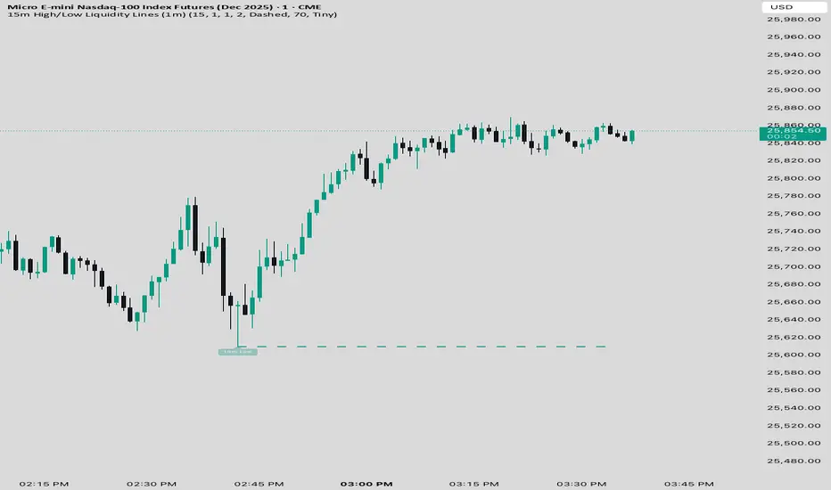
15 min Trailstop15m High/Low Liquidity Lines (1m) — Indicator Description
15m High/Low Liquidity Lines (1m) is a precision liquidity-mapping tool designed for intraday traders who understand the importance of higher-timeframe liquidity levels while executing on the 1-minute chart.
This indicator automatically detects confirmed 15-minute swing highs and swing lows using pivot logic. When a new 15m high or low forms:
✔ Liquidity Line Generation
A horizontal line is drawn exactly at the price level of the pivot.
The line is anchored to the exact 1-minute candle that produced the 15m high/low, ensuring perfect visual alignment.
The line extends only up to the current bar — not across the whole chart.
Optional text labels (“15m High”, “15m Low”) can be shown at the start of each line.
✔ Auto-Cleanup (Smart Liquidity Sweep Detection)
If price trades through the level, the corresponding line and label are:
Instantly deleted
Marking the level as taken/swept
Allowing the chart to stay clean and focused on active liquidity only
This mimics institutional liquidity logic: once the high or low is violated, the target is considered filled and removed.
✔ Alerts
The indicator includes built-in alerts that fire when:
A new 15m high is confirmed
A new 15m low is confirmed
This allows the trader to react immediately when fresh liquidity levels appear.
✔ Customization Options
You can fully tailor the visual representation:
Turn highs and/or lows on or off
Choose line style (solid, dashed, dotted)
Customize line color and thickness
Customize the label style, size, and transparency
Who Is This For?
This indicator is ideal for:
ICT-style traders
Liquidity-based scalpers
1-minute ES/NQ traders
Anyone who uses HTF liquidity levels to frame trades on the LTF
It provides a clean, automated method to track active 15-minute liquidity levels directly on the 1-minute chart with zero clutter and perfect alignment.
Stage 2 Pullback Swing indicatorThis scanner is built for swing traders who want high-probability pullbacks inside strong, established uptrends. It targets names in a confirmed Stage 2 bull phase (Weinstein model) that have pulled back 10–30% from a recent swing high on light selling volume, while still respecting fast EMAs.
Goal: find powerful uptrending stocks during controlled dips before the next leg higher.
What it looks for
Strong prior uptrend: price above the 50 and 200 SMAs, momentum positive over multiple timeframes
Confirmed Stage 2: price above a rising 30-week MA on the weekly chart
Pullback depth: 10–30% off recent swing highs—not too shallow, not broken
Pullback quality: range contained, no panic selling, trend structure intact
EMA behavior: price near EMA10 or EMA20 at signal time
Volume contraction: sellers fading throughout the pullback
Bullish shift: green candle back in trend direction
Why this matters
This setup hints at institutions defending positions during a temporary dip. Strong stocks pull back cleanly with declining volume, then resume the primary trend. This script alerts you when those conditions align.
Best way to use
Filter a strong universe before applying—quality tickers only
Pair with clear trade plans: risk defined by prior swing low or ATR
Trigger alerts instead of hunting charts manually
Intended for
Swing traders who want momentum continuation setups
Traders who prefer entering on controlled retracements
Anyone tired of chasing extended breakouts

Macro Timing Window Signal ⏱️ Macro Timing Window Signal – Check/X Indicator
This indicator displays a green check mark ✔️ or red X ✖️ in the top-right corner of the chart based on a repeating macro time cycle that divides every hour into active and inactive windows.
How it works:
• ✔️ Green Check (Active Macro Window):
Appears from xx:45 → xx:15 of the next hour (30-minute macro window).
• ✖️ Red X (Inactive Macro Window):
Appears from xx:16 → xx:44 (mid-hour cooldown window).
• Optional flash signal at the exact macro flip points (xx:45, xx:00, xx:15) to highlight transitions.
• Supports sound alerts so you never miss the start or end of a macro window.
This tool is designed for traders who incorporate macro-driven time cycles, liquidity sessions, or algorithmic delivery windows into their strategy.
The display is fixed on-screen, clean, and unobtrusive, ensuring instant recognition of the current macro state without cluttering the chart.

BTC - FRIC: Friction & Realized Intensity CompositeTitle: BTC - FRIC: Friction & Realized Intensity Composite
Data: IntoTheBlock
Overview & Philosophy
FRIC (Friction & Realized Intensity Composite) is a specialized on-chain oscillator designed to visualize the "psychological battlegrounds" of the Bitcoin network.
Most indicators focus on Price or Momentum. FRIC focuses on Cost Basis. It operates on the thesis that the market experiences maximum "Friction" when the price revisits the cost basis of a large number of holders. These are the zones where investors are emotionally triggered to react—either to exit "at breakeven" after a loss (creating resistance) or to defend their entry (creating support).
This indicator answers two questions simultaneously:
Intensity: Is the market hitting a Wall (High Friction) or a Vacuum (Low Friction)?
Valuation: Is this happening at a market bottom or a top?
The "Alpha" (Wall vs. Vacuum)
Why we visualize both extremes: This indicator filters out the "Noise" (the middle range) to show you only the statistically significant anomalies.
1. The "Wall" (Positive Z-Score Bars)
What it is : A statistically high number of addresses are at breakeven.
The Implication : Expect a grind. Price action often slows down or reverses here because "Bag Holders" are selling into strength to get out flat, or new buyers are establishing a floor.
2. The "Vacuum" (Negative Z-Score Bars)
What it is : A statistically low number of addresses are at breakeven.
The Implication : Expect acceleration. The price is moving through a zone where very few people have a cost basis. With no natural "breakeven supply" to block the path, price often enters Price Discovery or Free Fall.
Methodology
The indicator constructs a composite view using two premium metrics from IntoTheBlock:
1. The "Activity" (Friction Z-Score): We utilize the Breakeven Addresses Percentage. This measures the % of all addresses where the current price equals the average cost basis.
- Normalization: We apply a rolling Z-Score (Standard Deviation) to this data.
- The Filter: We hide the "Noise" (e.g., Z-Scores between -2.0 and +2.0) to isolate only the events where market structure is truly stretched.
2. The "Context" (Valuation Heatmap): We utilize the MVRV Ratio to color-code the friction.
Deep Value (< 1.0): Price is below the average "Fair Value" of the network.
Overheated (> 3.0): Price is significantly extended above the "Fair Value."
Credit: The MVRV Ratio was originally conceptualized by Murad Mahmudov and David Puell. It remains one of the gold standards for detecting Bitcoin's fair value deviations.
How to Read the Indicator
The chart is visualized as a Noise-Filtered Heatmap.
1. The Bars (Intensity)
Bars Above Zero: High Friction (Congestion). The market is fighting through a supply wall.
Bars Below Zero: Low Friction (Vacuum). The market is accelerating through thin air.
Gray/Ghosted: Noise. Routine market activity; no significant signal.
2. The Colors (Valuation Context) The color tells you why the friction is happening:
🟦 Deep Blue (The "Capitulation Buy"):
Signal: High Friction + Low MVRV.
Meaning : Investors are panic-selling at breakeven/loss, but the asset is fundamentally undervalued. Historically, these are high-conviction cycle bottoms.
🟥 Dark Red (The "FOMO Sell"):
Signal: High Friction + High MVRV.
Meaning : Investors are churning at high valuations. Smart money is often distributing to late retail arrivers. Historically marks cycle tops.
🟨 Yellow/Orange (The "Trend Battle"):
Signal: High Friction + Neutral MVRV.
Meaning : The market is contesting a level within a trend (e.g., a mid-cycle correction).
Visual Guide & Features
10-Zone Heatmap: A granular color gradient that shifts from Dark Blue (Deep Value) → Sky Blue → Grey (Neutral) → Orange → Dark Red (Top).
Noise Filter
A unique feature that "ghosts out" insignificant data, leaving only the statistically relevant signals visible.
Data Check Monitor
A diagnostic table in the bottom-right corner that confirms the live connection to IntoTheBlock data streams and displays the current regime in real-time.
Settings
Lookback Period (Default: 90): The rolling window used for the Z-Score calculation. Shortening this (e.g., to 30) makes the indicator more sensitive to local volatility; lengthening it (e.g., to 365) aligns it with macro cycles.
Noise Threshold (Default: 2.0): The strictness of the filter. Only friction events exceeding this Z-Score will be highlighted in full color.
Show Status Table : Toggles the on-screen dashboard.
Disclaimer
This script is for research and educational purposes only. It relies on third-party on-chain data which may be subject to latency or revision. Past performance of on-chain metrics does not guarantee future price action.
Tags
bitcoin, btc, on-chain, mvrv, intotheblock, friction, z-score, fundamental, valuation, cycle
