ORB FX REPLAY - FINAL SAFEHere is the description in English, written to sound professional and meet all the requirements for publishing on TradingView:
Script Description:
Title: ORB Strategy Backtest Pro - Ultra Compatibility
Description: This is an Opening Range Breakout (ORB) strategy specifically designed for professional backtesting. It is optimized to run smoothly on external platforms like FX Replay and TradingView's replay mode.
Key Features:
Custom Session: Automatically calculates the High and Low of a specific time window (default: 10:00 - 10:15 Bucharest/GMT+2).
Impulse Confirmation: Features a "Min Impulse" filter to ensure entries happen on strong momentum, avoiding "fake-outs" near the range boundaries.
Hard Target Management: Designed for "Set & Forget" backtesting. Once a trade is triggered, the script tracks it until it hits either the Stop Loss (SL) or the final Take Profit 3 (TP3).
Visual Projections: Draws clear, real-time lines for Entry, SL, and TP3 on the chart for easy visual tracking.
Automated Statistics: Includes a dynamic label system that tracks Total Trades, Win Count, and Loss Count based on the TP3/SL logic.
Optimized Code: Built using Pine Script v5 with a focus on stability and compatibility, avoiding complex tables that often cause errors on external engines.
週期

Gann Square Levels V2Gann Square Levels
For 1 to 10,00,000
Just customize the indicator as you like.


ORB Fusion Adaptive🎯 ORB Fusion Adaptive Strategy
Professional Opening Range Breakout Trading System
═══════════════════════════════════════════════════════════════════════════════
The first fully-automated, multi-instrument ORB strategy on TradingView.
💡 WHAT IT DOES:
Automatically trades Opening Range breakouts and failed breakout reversals with intelligent position sizing, professional risk management, and complete trade lifecycle tracking. Built for serious backtesting and live trading.
⚡ KEY FEATURES:
✓ Automated Entry & Exit (breakouts + reversals)
✓ Adaptive Position Sizing (3 modes: Fixed, Risk-Based, Risk-Based Initial)
✓ Multi-Instrument Support (Futures, Forex, Crypto, Stocks)
✓ Advanced Risk Management (daily limits, drawdown protection)
✓ ML-Powered Breakout Filtering (pContinue/pFail scoring)
✓ Failed Breakout Detection (high-probability reversals)
✓ Native Trailing Stops (Pine Script v5)
✓ Multi-Target Management (T1, T2, T3)
✓ Real-Time Performance Dashboard
✓ Comprehensive Backtesting (5+ years tested)
🎯 STRATEGY LOGIC:
Entry Signals
The strategy enters trades on two high-probability setups:
1. ORB Breakouts
• Detects when price breaks above/below Opening Range
• Confirms with volume (configurable threshold)
• ML filter scores probability of continuation
• Enters within 3 bars of breakout (no late entries)
• Stop placed at ORB midpoint or ATR-based
• Targets at Fibonacci extensions (1.0x, 1.618x, 2.5x ORB range)
2. Failed Breakout Reversals
• Monitors for breakouts that fail and reverse
• Confirms failure after price returns inside ORB
• Automatic reversal entry with tight stops
• Three profit targets (0.5x, 1.0x, 1.5x ORB range)
• Historical 65-75% win rate on reversals
Exit Management
• Stop Loss: Multiple methods (ATR, ORB Mid, ORB Opposite, Hybrid)
• Native Trailing Stop: Activates after configurable R-multiple profit
• Profit Targets: Single target or scaled exits at T1/T2/T3
• Daily Stop: Halts trading after max daily loss
• Drawdown Protection: Circuit breaker at max drawdown threshold
🔧 ADAPTIVE POSITION SIZING:
The strategy's most powerful feature - intelligent position sizing that adapts to your instrument and account:
Mode 1: Fixed
• Simple contract/lot size
• Best for: Testing, stable position sizing
• Use case: "Always trade 2 contracts"
Mode 2: Risk-Based (Current Equity)
• Size = (Current Equity × Risk%) / (Stop Distance × Point Value)
• Compounds with wins, reduces with losses
• Best for: Aggressive compounding
• Use case: Maximize geometric growth
Mode 3: Risk-Based (Initial Capital)
• Size = (Initial Capital × Risk%) / (Stop Distance × Point Value)
• No compounding - consistent risk exposure
• Best for: Professional risk management
• Use case: Live trading with stable risk
Multi-Instrument Intelligence
Auto-detects and calculates correctly for:
• Futures: Uses contract point value (ES $50/pt, NQ $20/pt, MES $5/pt, MNQ $2/pt)
• Forex: Uses pip value per lot (Standard/Mini/Micro/Nano)
• Crypto: Uses contract multiplier (1.0 BTC, 0.001 BTC, etc)
• Stocks: Uses $1 per share
Manual override available if auto-detect fails.
📊 RISK MANAGEMENT:
Multi-Layer Protection
• Per-Trade Risk: 0.5-2% of capital (configurable)
• Daily Risk Limit: Max 4% loss per day (halts trading)
• Max Drawdown Pause: Circuit breaker at 12% drawdown
• Position Size Limits: Min/max contracts enforced
• Max Stop Distance: ATR-based hard limit (prevents catastrophic losses)
Trailing Stop System
• Uses Pine Script's native trail_price and trail_offset
• Activates after configurable R-multiple profit (default 0.5R)
• Trail distance: ATR-based (tight 0.5 ATR to loose 2.0 ATR)
• Works reliably in backtesting AND live trading
• No manual stop management needed
🌍 GLOBAL MARKET SUPPORT:
Configurable Sessions
Unlike basic ORB indicators, this strategy works globally:
• US Equities: 9:30 AM ET default
• Forex London: Custom session 08:00-08:30 GMT
• Forex NY: Custom session 13:30-14:00 GMT
• Asian Markets: Custom session with Tokyo timezone
• Crypto: 24/7 support with custom ORB windows
Timezone support includes:
America/New_York, Europe/London, Asia/Tokyo, Asia/Hong_Kong, UTC, and more.
Session ORBs
• Asian Session ORB (Tokyo open)
• London Session ORB (Forex primary)
• NY Session ORB (US market hours)
Critical for Forex traders working multiple sessions.
📈 BACKTESTING CAPABILITIES:
Realistic Simulation
• Commission: Configurable (default $1 per order)
• Slippage: 2 ticks default (adjustable)
• Volume Confirmation: Prevents unrealistic fills
• RTH Filtering: Optional Regular Trading Hours only
• Bar Magnifier: Improved intrabar execution
Performance Metrics Dashboard
Real-time statistics displayed:
• Total Trades & Win Rate
• Net P&L & Profit Factor
• Current Drawdown
• Daily P&L tracking
• Position details (if in trade)
• Position sizing mode & current size
Historical Testing
• Supports 5000+ bars of history
• Test across multiple market conditions
• Bull markets, bear markets, range-bound periods
• Optimize by day type (trend vs rotation)
🎛️ CUSTOMIZATION OPTIONS:
ORB Settings
• Timeframe: 5, 15, 30, or 60 minutes
• Confirmation: Close, Wick, or Body
• Volume: On/off with multiplier threshold
• LTF Precision: Sub-minute high/low detection
• RTH Filter: Regular Trading Hours only option
Breakout Detection
• ML Filtering: Enable/disable with thresholds
• Failed Breakout: Sensitivity (2-10 bars)
• Failure Buffer: ATR-based confirmation
• Entry Window: Bars after signal (prevents late entries)
Stop Methods
• ATR: Tight dynamic stops (recommended)
• ORB Mid: Structural stop at midpoint
• ORB Opposite: Wide stop at opposite boundary
• Hybrid: Best of ATR and structural
Target Methods
• Single: One target, full exit
• Scaled: Partial exits at T1/T2/T3 (recommended)
• Trail Only: No fixed targets, trail to exit
🔬 OPTIMIZATION GUIDE:
For Futures (ES, NQ, MNQ, MES)
• ORB: 30 min
• Confirmation: Close
• Volume: ON (1.5x)
• Stop Method: ATR (1.0x multiplier)
• Position Mode: Risk-Based (Initial)
• Risk Per Trade: 1.5%
• Failed Breakouts: ENABLE
For Forex Majors
• ORB: 60 min (or 15 min at London open)
• Confirmation: Close
• Volume: OFF (tick volume unreliable)
• Stop Method: ATR (1.5x multiplier)
• Position Mode: Risk-Based (Initial)
• Risk Per Trade: 1.0%
• Custom Session: 0800-0900 GMT
• Timezone: Europe/London
For Crypto (BTC, ETH)
• ORB: 60 min
• Confirmation: Close
• Volume: OFF or ON (1.2x)
• Stop Method: ATR (2.0x wider stops)
• Position Mode: Fixed or Risk-Based
• Risk Per Trade: 2.0% (higher volatility)
• Custom Session: Define your preferred window
For Stocks/ETF
• ORB: 15-30 min
• Confirmation: Body (most conservative)
• Volume: ON (2.0x threshold)
• Stop Method: Hybrid
• Position Mode: Risk-Based (Initial)
• Risk Per Trade: 1.0%
• RTH Only: ENABLED
• Gap Analysis: ENABLED
💎 ADVANCED FEATURES:
Initial Balance Analysis
• First hour range tracking (A + B periods)
• IB extensions at 0.5x, 1.0x, 1.5x, 2.0x
• Day type classification (Trend/Normal/Rotation)
• Adjusts strategy behavior by day type
ORB Extensions
• Fibonacci targets: 1.272x, 1.5x, 1.618x, 2.0x, 2.618x, 3.0x
• Dynamic monitoring for take-profit zones
• Extension tracking in statistics
VWAP Integration
• Institutional benchmark reference
• Standard deviation bands (1σ and 2σ)
• Breakout alignment scoring
• Context for trade quality
Gap Analysis
• Overnight gap detection
• Gap fill target projection
• Gap fill rate statistics
• Direction bias from gap type
Comprehensive Statistics
• Bull/Bear breakout win rates
• Reversal win rate (typically 65-75%)
• Day type distribution
• Extension statistics
• Gap fill rate
• Real-time performance tracking
🎨 VISUAL FEEDBACK:
Enhanced Plots
• ORB levels (High/Low/Mid continuous lines)
• Entry markers (L for long, S for short, 🔥 for reversals)
• Extension levels with labels
• Session ORBs (Asian/London/NY)
• IB levels and extensions
• VWAP with bands
• Failed breakout markers
Color-Coded Momentum Boxes
• Blue: Inside ORB (consolidation)
• Green: Above ORB (bullish momentum)
• Red: Below ORB (bearish momentum)
• Orange: Failed breakout zones
• Variable intensity based on distance
Dynamic Dashboards
• Main Dashboard: ORB status, breakout info, setup details, market context
• Strategy Dashboard: Trades, Win%, P&L, Profit Factor, Daily P&L, Drawdown, Position info
• Narrative Dashboard: Plain-language market interpretation
Three Display Modes
• Simple: Clean chart, essential ORB only
• Standard: ORB + IB + Sessions + VWAP (recommended)
• Advanced: All features + statistics
🔔 ALERT SYSTEM:
Strategy Alerts
• Breakout Entry (with ML probabilities)
• Failed Breakout Entry (with targets)
• Stop Hit (position closed)
• Target Hit (T1, T2, T3 partials)
• Extension Reached (profit zone)
• IB Break (potential trend day)
All alerts include:
• Direction and setup type
• Entry price and position size
• Stop and target levels
• ML scores (if enabled)
• Setup grade (A+ to D)
• Win rate context
⏱️ TIMEFRAMES: 1m-15m optimal (works on all)
💎 INSTRUMENTS: Futures, Forex, Crypto, Stocks, Indices
🎓 SKILL LEVEL: Intermediate to Advanced
📚 WHAT'S INCLUDED:
Comprehensive Documentation
• 200+ lines of detailed tooltips
• Every setting fully explained
• Optimization guides by market
• Position sizing calculator explanations
• Risk management framework
• Best practices and common pitfalls
Ready-to-Use Configurations
• Default settings optimized for ES/NQ
• Recommended settings for each instrument type
• Conservative vs Aggressive profiles
• Scalping vs Swing configurations
Full Transparency
• All calculations shown in dashboard
• Position sizing visible in real-time
• Strategy performance metrics live
• No black boxes or hidden logic
🚨 RISK DISCLAIMERS:
CRITICAL INFORMATION - PLEASE READ:
• This is a trading strategy that executes real trades in backtesting
• Past performance does NOT guarantee future results
• All trading involves substantial risk of loss
• Never risk money you cannot afford to lose
• This is NOT financial advice - for educational purposes only
• Requires understanding of ORB methodology and risk management
• Test thoroughly on paper/demo account before live trading
• Position sizing must be configured correctly for your account
• Stop losses are NOT guaranteed in all market conditions
• Slippage and commissions will affect live results
• Volatile markets may trigger circuit breakers (drawdown pause)
Strategy-Specific Risks:
• Opening range breakouts can fail (hence the reversal system)
• Volume confirmation may limit signals in low-volume instruments
• Custom sessions must match your market's actual hours
• Multi-instrument support requires correct point value configuration
• Trailing stops may exit early in volatile conditions
• Daily limits may prevent recovery trades
• Backtesting results may not match live execution
Position Sizing Warnings:
• Risk-Based modes can size large positions if stops are tight
• Always set max position size limits appropriate for your account
• Verify point values are correct for your instrument
• Test with small size first
• Monitor position size in dashboard before every trade
🎓 WHO THIS IS FOR:
Best Suited For:
• Traders with ORB methodology knowledge
• Those seeking a fully-automated system
• Backtesting enthusiasts
• Multi-instrument traders
• Risk-conscious systematic traders
• Traders who understand position sizing
Not Recommended For:
• Complete beginners to trading
• Those seeking "set and forget" with zero monitoring
• Traders unwilling to backtest first
• Those who don't understand risk management
• Accounts under $5,000 (position sizing too small)
💡 PRO TIPS:
Backtesting Best Practices
• Start with 2+ years of data
• Include both bull and bear markets
• Test on same timeframe you'll trade (5-min for 5-min ORB)
• Account for commissions/slippage realistically
• Verify win rate >45% and profit factor >1.3
Position Sizing
• Use Risk-Based (Initial Capital) for most consistent results
• Start with 1% risk per trade, increase to 1.5-2% if comfortable
• Set max position size to prevent oversizing
• Verify point values are correct before live trading
• Monitor dashboard for actual size before each trade
Risk Management
• NEVER disable daily loss limit
• Keep max drawdown pause at 12% or lower
• Use ATR stop method for best R:R
• Enable trailing stops for trend capturing
• Take partial profits at T1 (at least 30-40%)
Failed Breakout Trading
• These are your highest win-rate setups (65-75%)
• Always enable this feature
• Use tighter stops on reversals than breakouts
• Don't chase if you miss the entry window
• Three targets allow you to scale out profitably
ML Filtering
• Dramatically improves breakout quality
• Reduce signals but increase win rate
• Start with default thresholds (pCont≥0.55, pFail≤0.35)
• Lower signals = higher quality in choppy markets
• Can disable for more signals in strong trends
⚙️ TECHNICAL DETAILS:
Strategy Engine
• Pine Script v5
• Native strategy.entry() and strategy.exit()
• Trailing stops use trail_price/trail_offset (no repainting)
• Proper position sizing with strategy.position_size
• Realistic fills with commission and slippage
• Bar magnifier for improved intrabar execution
Performance
• Optimized for 1-minute to 15-minute charts
• Supports 5000+ bars of history
• Efficient calculations (no arrays in hot loops)
• Max 500 visual objects (boxes/lines/labels)
• No repainting - all signals confirmed on bar close
Position Sizing Engine
• Auto-detects Futures, Forex, Crypto, Stocks
• Uses syminfo.pointvalue when available
• Falls back to manual configuration
• Proper rounding to exchange increments
• Min/max limits enforced
Risk System
• Per-trade risk percentage enforced
• Daily P&L tracking
• Drawdown from peak equity
• Circuit breakers halt trading when limits hit
• Resets daily for fresh start
🔄 VERSION HISTORY:
Current Version: 1.0 (Initial Release)
• Complete ORB breakout + reversal strategy
• Adaptive position sizing (3 modes)
• Multi-instrument support
• Advanced risk management
• Native trailing stops
• ML filtering integration
• Comprehensive backtesting
• Real-time performance dashboard
Planned Updates:
• Additional session templates (Tokyo, Sydney)
• More stop methods
• Enhanced ML model training
• Volatility regime detection
• Trade journal export
═══════════════════════════════════════════════════════════════════════════════
Trade the opening range with institutional precision.
Automated entries. Intelligent sizing. Professional risk management.
Test first. Trade smart. Scale safely.
Taking you to school. — Dskyz, Trade with insight. Trade with anticipation.

Relative Strength Table📊 RRG Quadrant Scanner - Options Trading Market Direction Tool
A powerful Relative Rotation Graph/Table (RRG) dashboard designed to help OPTIONS TRADERS identify market direction, select optimal strikes, and time entries with precision. Track up to 8 symbols against any benchmark to determine bullish/bearish bias and rotation momentum.
---
🎯 WHY OPTIONS TRADERS NEED THIS
Unlike stock traders who can hold losing positions indefinitely, options traders face:
❌ Time decay (theta)
❌ Directional risk (delta)
❌ Volatility changes (vega)
❌ Limited time to be right
This indicator solves these challenges by showing you:
✅ Which direction momentum is flowing (calls vs puts)
✅ Which symbols/sectors have strongest trends (high probability setups)
✅ When rotation is happening (timing entries/exits)
✅ Market breadth for directional confirmation
---
🔥 HOW RRG QUADRANTS GUIDE OPTIONS TRADING
🟢 LEADING QUADRANT (Top Right) - BULLISH BIAS
What it means:
• Strong uptrend vs benchmark
• Accelerating momentum
• High relative strength
Options Strategies:
✅ BUY CALLS (ITM/ATM for safer, OTM for aggressive)
✅ SELL CASH-SECURED PUTS (collect premium on strong stocks)
✅ BULL CALL SPREADS (defined risk directional plays)
✅ LONG CALL DIAGONALS (capture continued uptrend)
Direction Signal: STRONG BULLISH
• Multiple symbols in Leading = broad market strength
• Index options: favor call side
• Stock options: bullish strategies on individual leaders
---
🔵 IMPROVING QUADRANT (Top Left) - EARLY BULLISH
What it means:
• Currently underperforming BUT gaining momentum
• Early reversal signal
• Rotation from weak to strong
Options Strategies:
✅ BUY CALLS with longer expiry (give time to develop)
✅ BULL PUT SPREADS (defined risk as support builds)
✅ SELL PUTS at support (premium collection on improving stocks)
✅ CALENDAR SPREADS (benefit from time and momentum shift)
Direction Signal: EMERGING BULLISH
• Symbols moving Lagging → Improving = early buy signal
• Best for patient options traders
• Use longer DTE (45-60 days) to allow rotation to complete
• Watch for move into Leading quadrant for confirmation
---
🔴 LAGGING QUADRANT (Bottom Left) - BEARISH BIAS
What it means:
• Weak relative strength
• Declining momentum
• Persistent underperformance
Options Strategies:
✅ BUY PUTS (directional bearish play)
✅ BEAR CALL SPREADS (defined risk on weakness)
✅ SELL COVERED CALLS (if stuck in position)
✅ PUT DEBIT SPREADS (cheaper than naked puts)
Direction Signal: STRONG BEARISH
• Multiple symbols in Lagging = market weakness
• Avoid bullish strategies entirely
• Index options: favor put side
• Exit existing long calls immediately
---
⚫ WEAKENING QUADRANT (Bottom Right) - EARLY BEARISH
What it means:
• Currently strong BUT losing momentum
• Topping signal
• Rotation from strong to weak
Options Strategies:
✅ SELL CALLS (initiate bearish bias)
✅ BEAR PUT SPREADS (cheaper than naked puts)
✅ CLOSE LONG CALLS (take profits before decay accelerates)
✅ PROTECTIVE PUTS (if holding stock positions)
✅ SHORT STRADDLES/STRANGLES (if expecting range-bound)
Direction Signal: EMERGING BEARISH
• Symbols moving Leading → Weakening = profit-taking signal
• Close bullish positions EARLY
• Initiate bearish strategies
• Watch for move into Lagging for confirmation of downtrend
---
🎯 MARKET DIRECTION CONFIRMATION FOR INDEX OPTIONS
Trading NIFTY/BANKNIFTY/SPX Options? Use this way:
📊 Track These Symbols Against Benchmark:
• Major sectors: Finance, IT, Energy, Auto, Pharma
• Top stocks: RELIANCE, HDFCBANK, INFY, TCS, etc.
• Benchmark: NIFTY or BANKNIFTY
🟢 BULLISH INDEX BIAS (Buy Calls/Sell Puts)
When you see:
• 60%+ symbols in Leading + Improving quadrants
• Financial sector in Leading (indicates BANKNIFTY strength)
• IT sector in Leading (indicates NIFTY strength)
• Few symbols in Lagging
Strategy: Aggressive call buying, put selling, bull spreads
🔴 BEARISH INDEX BIAS (Buy Puts/Sell Calls)
When you see:
• 60%+ symbols in Lagging + Weakening quadrants
• Key sectors rotating to Weakening
• Broad-based weakness across watchlist
Strategy: Put buying, bear spreads, avoiding new longs
⚖️ NEUTRAL/ROTATION PHASE (Iron Condors/Strangles)
When you see:
• Symbols evenly distributed across quadrants
• No clear cluster in any one quadrant
• Conflicting signals between sectors
Strategy: Range-bound strategies, avoid directional bets, reduce position size
---
💡 OPTIONS TRADING USE CASES
🎯 Case 1: Earnings Play Setup
Before earnings, check if stock is in:
• Leading = bullish bias, buy calls
• Improving = emerging strength, cautious calls
• Weakening = avoid or buy puts
• Lagging = strong puts
🎯 Case 2: Weekly Options Direction
Monday morning setup:
• Check sector quadrants vs benchmark
• Leading sectors = focus call trades there
• Weakening sectors = focus put trades
• Adjust delta exposure based on quadrant distribution
🎯 Case 3: Spread Selection
For credit spreads:
• Sell puts on Leading/Improving symbols (bullish)
• Sell calls on Weakening/Lagging symbols (bearish)
• Iron condors when symbols are scattered (no clear direction)
🎯 Case 4: Portfolio Hedging
If holding calls:
• Watch symbols move Leading → Weakening = add protective puts
• If 50%+ watchlist enters Weakening = hedge entire portfolio
If holding puts:
• Watch symbols move Lagging → Improving = close puts early
• If broad rotation to Improving = exit bearish positions
🎯 Case 5: Theta Decay Management
Leading quadrant = hold calls longer (trend supports you)
Weakening quadrant = close calls early (decay + downside risk)
Improving quadrant = be patient with calls (need time to develop)
Lagging quadrant = hold puts or exit quickly if rotation starts
---
📈 SECTOR ROTATION FOR OPTIONS STOCK SELECTION
Instead of trading index options, use quadrants to pick individual stocks:
Setup Example - NSE Options:
Symbols: RELIANCE, HDFCBANK, INFY, TCS, SBIN, ICICIBANK, TATAMOTORS, BAJFINANCE
Benchmark: NIFTY
Monday Strategy Session:
1. Check which stocks are in Leading quadrant
2. Focus call trades ONLY on Leading stocks
3. Check which stocks are in Weakening/Lagging
4. Focus put trades on those
5. Ignore stocks in unclear quadrants (save capital)
This approach:
✅ Increases win rate (trading with momentum)
✅ Reduces losses (avoiding weak stocks)
✅ Improves timing (catch early rotations)
---
🔥 REAL TRADING SCENARIOS FOR OPTIONS
📊 Scenario 1: Strong Bullish Market
Quadrant Status:
• Leading: 5 symbols
• Improving: 2 symbols
• Weakening: 1 symbol
• Lagging: 0 symbols
Options Action:
✅ Aggressive call buying on index
✅ Bull call spreads on leading stocks
✅ Sell puts on improving stocks
✅ Avoid bearish strategies
✅ Larger position sizes (conviction high)
---
📊 Scenario 2: Rotation/Choppy Market
Quadrant Status:
• Leading: 2 symbols
• Improving: 2 symbols
• Weakening: 2 symbols
• Lagging: 2 symbols
Options Action:
⚠️ AVOID directional bets
✅ Iron condors/strangles (profit from range)
✅ Calendar spreads (volatility plays)
✅ Smaller position sizes
✅ Wait for clearer rotation signal
---
📊 Scenario 3: Bearish Reversal
Quadrant Status:
• Leading: 1 symbol
• Improving: 0 symbols
• Weakening: 3 symbols
• Lagging: 4 symbols
Options Action:
✅ Buy puts on index
✅ Bear call spreads on weakening stocks
✅ CLOSE all long calls immediately
✅ Sell covered calls if stuck in stocks
✅ Increase hedge positions
---
📊 Scenario 4: Early Recovery
Quadrant Status:
• Leading: 1 symbol
• Improving: 4 symbols (moving from Lagging)
• Weakening: 1 symbol
• Lagging: 2 symbols
Options Action:
✅ Buy calls with 45-60 DTE (give time to develop)
✅ Bull put spreads on improving stocks
✅ Small position sizes initially
✅ Scale in as symbols move to Leading
✅ Close remaining bearish positions
---
🎯 TIMING ENTRY/EXIT WITH QUADRANTS
📍 BEST CALL ENTRIES:
1. Symbol moves Improving → Leading (momentum confirmed)
2. 70%+ watchlist in Leading/Improving (broad strength)
3. Key sector enters Leading (focused strength)
📍 BEST PUT ENTRIES:
1. Symbol moves Weakening → Lagging (downtrend confirmed)
2. 70%+ watchlist in Weakening/Lagging (broad weakness)
3. Leading symbols suddenly drop to Weakening (reversal)
📍 EXIT SIGNALS:
Calls: Close when symbol enters Weakening
Puts: Close when symbol enters Improving
Both: Take profits at 50-70% max gain if rotation unclear
---
⚙️ SETUP FOR OPTIONS TRADERS
For NIFTY Options Traders:
• Symbols: Top 8 NIFTY stocks (RELIANCE, HDFCBANK, INFY, etc.)
• Benchmark: NIFTY
• Window: 20 periods
• Timeframe: Daily chart
• Use: Gauge NIFTY direction
For BANKNIFTY Options Traders:
• Symbols: Banking stocks (HDFCBANK, ICICIBANK, SBIN, KOTAKBANK, AXISBANK)
• Benchmark: BANKNIFTY
• Window: 20 periods
• Use: Gauge BANKNIFTY direction
For Stock Options Traders:
• Symbols: Your watchlist of optionable stocks
• Benchmark: Relevant sector index
• Window: 10-20 periods
• Use: Pick strongest/weakest for directional trades
---
🎓 OPTIONS TRADING RULES USING QUADRANTS
✅ Rule 1: Only buy calls on Leading/Improving stocks
✅ Rule 2: Only buy puts on Weakening/Lagging stocks
✅ Rule 3: Exit calls when stock enters Weakening
✅ Rule 4: Exit puts when stock enters Improving
✅ Rule 5: Use longer DTE when trading Improving/Weakening (rotation takes time)
✅ Rule 6: Use shorter DTE when trading Leading/Lagging (established trends)
✅ Rule 7: If 70%+ watchlist in one side = strong directional bias
✅ Rule 8: If symbols scattered = reduce position sizes, play neutral
---
🏆 ADVANTAGES FOR OPTIONS TRADERS
✅ HIGHER WIN RATE
Trade only symbols with clear momentum direction
✅ BETTER TIMING
Catch rotations early = maximize profit potential
✅ REDUCED THETA DECAY LOSSES
Don't hold calls on weakening stocks (double loss)
✅ CLEARER MARKET BIAS
Know if market is bullish/bearish/neutral
✅ PORTFOLIO ALIGNMENT
Match your delta exposure to market direction
✅ EARLY WARNING SYSTEM
Spot rotations before price breaks down/up
✅ RISK MANAGEMENT
Exit positions before momentum shifts against you
---
📚 COMBINING WITH OTHER ANALYSIS
This indicator works best when combined with:
📊 Technical Analysis
• Support/Resistance for strike selection
• Chart patterns for entry timing
• Volume for confirmation
📈 Volatility Analysis
• IV Rank for premium selling decisions
• VIX/India VIX for overall market risk
⏰ Time Analysis
• Check quadrants before weekly expiry
• Align DTE with expected rotation speed
💰 Greeks Management
• High delta on Leading symbols (directional confidence)
• Low delta on Improving symbols (early, needs time)
• Negative delta on Weakening/Lagging (bearish bias)
---
⚠️ WHAT THIS INDICATOR DOESN'T DO
❌ Doesn't predict exact option prices
❌ Doesn't tell you which strike to buy
❌ Doesn't replace risk management
❌ Doesn't account for news/events
❌ Doesn't consider implied volatility
❌ Doesn't guarantee winning trades
It DOES give you:
✅ Market direction bias
✅ Symbol selection edge
✅ Rotation timing awareness
✅ Risk/reward framework
---
🎯 BOTTOM LINE FOR OPTIONS TRADERS
Stop fighting momentum. Stop buying calls on weakening stocks. Stop holding positions through rotations.
Instead:
• Check quadrants BEFORE entering trades
• Buy calls only on Leading/Improving
• Buy puts only on Weakening/Lagging
• Exit when rotation signals change
• Adjust position size based on breadth
This simple framework can dramatically improve your options trading win rate and reduce catastrophic losses from holding through momentum reversals.
---
⭐ START TRADING WITH THE TREND
Add this RRG Quadrant Scanner and align your options trades with market rotation - not against it!

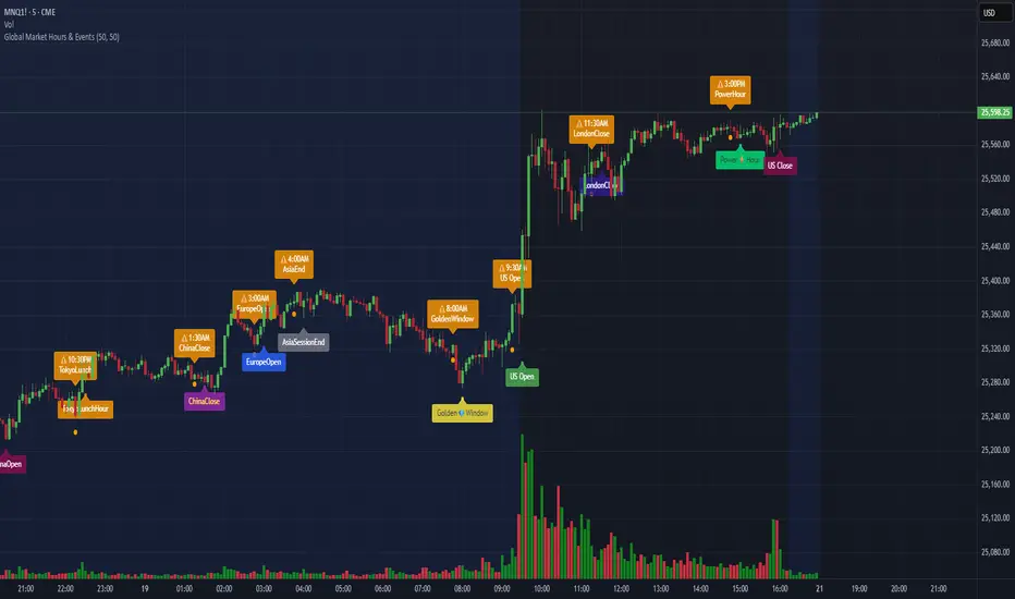
Global Market Hours & Eventswww.tradingview.com
Global Market opens and closes and other related events,
15min warning ahead of time, visual indicator for warning and for the event
not over-crowded with the possibility to remove labels and have just a little circle marker.
Adjustements for labels and circles are in the settings
Activate Pane Label to identify

V3 Valentini Pro Scalper [Dashboard]Gemini 3.0 pro's take on Fabio Valentini's world #1 strategy scalp 12/19/2025


Statistical Deviation per AssetINDICATOR: STATISTICAL DEVIATION PER ASSET (SDPA)
1. Overview
The Statistical Deviation per Asset (SDPA) is a quantitative analysis tool designed to measure the strength and exhaustion of price movements. Unlike standard oscillators (like RSI ), the SDPA calculates the actual percentage deviation from the most recent pivot point (High or Low) and compares it against historical performance averages specific to each asset.
---
2. Core Logic & Calculation
The script operates on a Mean Reversion principle. It assumes that every asset (Gold, Bitcoin, Ethereum, etc.) has a unique "volatility signature" depending on the timeframe.
* Dynamic Pivot Detection : The indicator identifies recent Swing Highs and Swing Lows using an adaptive lookback period.
* Real-Time Return Calculation : Once a pivot is confirmed, the script calculates the real-time percentage gain (from a Low) or loss (from a High).
* Zero-Indexed Histogram : This return is plotted as an oscillator centered around a Zero Line , representing the current trend's progress since the last reversal.
---
3. Adaptive Intelligence (Multi-Asset & Multi-TF)
The SDPA is pre-loaded with a statistical database. It automatically adjusts its sensitivity and thresholds based on:
1. The Selected Asset : Whether trading XAUUSD , Bitcoin , or Solana , the deviation thresholds adapt to the specific volatility of that instrument.
2. The Timeframe (TF) : The calculation period ( period ) and performance targets ( hausse_perf / baisse_perf ) change dynamically. For example, a 1-minute scalping setup uses a longer lookback (200) compared to a Daily swing setup (10).
---
4. Visual Anatomy
The interface is designed for instant "at-a-glance" interpretation:
* The Histogram :
* Green : Price is trending up since the last Swing Low .
* Red : Price is trending down since the last Swing High .
* Threshold Lines (The Statistical Averages) :
* Thick Line (60% Opacity) : Represents the Average Historical Deviation . When the histogram hits this line, the move is considered "statistically mature."
* Thin Line (70% Opacity) : Represents the Strong Deviation Zone (1.5x the average), indicating extreme momentum or potential exhaustion.
* Background Highlighting : The chart background colors automatically when the price exceeds historical averages, signaling a High-Probability Reversal Zone .
---
5. How to Trade with SDPA
* Trend Maturity : If the histogram exceeds the Bullish Average (Green line), the current move has reached its typical historical limit. Traders should look for take-profit opportunities or wait for a reversal.
* Impulse Strength : A rapid move from the Zero Line toward the thresholds confirms strong institutional interest.
* Mean Reversion : When the histogram reaches the Strong Zone (1.5x), the price is "overextended" statistically, offering a high reward-to-risk ratio for counter-trend setups.
---
6. Technical Parameters
* Asset Choice : Dropdown menu to select the specific asset.
* Colors : Customizable Bullish and Bearish colors to match any UI theme.
* Precision : Set to 4 decimal places to ensure accuracy across all asset types.

Look Back Calculator Custom Lookbacks with Individual Colors (Accurate on All Timeframes)
A clean, monochrome-grey indicator that displays historical closing price levels from user-defined lookback periods.
Key Features:
• 4 Custom Hourly Levels (e.g., 1.5h, 3h, 6h, 9h or any value you choose) – fully accurate on 15-minute and lower timeframes
• 4 Custom Daily Levels (e.g., 20d, 40d, 60d, 90d or any number of days)
• Independent toggle for each level
• Individual color selection for every vertical line
• Table column backgrounds match the selected vertical line colors
• Optional candle highlighting (background/border/both) at lookback bars
• Dashed vertical lines at lookback points (toggleable)
• Current price row with automatic spanning
• Time row shown only for daily levels (cleaner layout for intraday)
• Alerts on price crossing any enabled level (with dynamic messages)
• Compact mode for shorter labels
Perfect for support/resistance analysis, order flow, or ICT/SMC concepts. Works seamlessly on any timeframe, including 15min charts.


kushjahan - metrics calculatorthese details are vital for EV, regarding your scanning and positioning.


ICT Killzones & Sessions Pro |MC|ICT Killzones & Sessions Pro |MC|
Credits go to LuxAlgo for the great work 👍
This indicator has been further developed and enhanced with additional features.
This indicator highlights key market sessions and killzones directly on your chart, helping traders identify high-probability trading periods.
💎 Key features include 💎
🔸Display of major market sessions such as Asia, London, and New York (AM/PM) with customizable times and colors.
🔸Transparent session highlighting for visual clarity without cluttering the chart.
🔸Configurable vertical border lines with adjustable style, width, and color.
🔸Timeframe-based display limits to hide killzones on higher timeframes.
🔸Fully adjustable label size for easy identification of sessions.
🔸Customizable UTC offset to align sessions with your preferred timezone.
Designed for day traders and scalpers, it visually separates market sessions for better trade planning and timing.
Happy Trading!

JAM ALGO Scalping IntradayTrend & Momentum Indicator
SuperTREX is a trend-following trading indicator designed to identify BUY and SELL opportunities by combining RSI momentum, ATR-based SuperTrend logic, and an optional EMA trend filter.
The indicator focuses on clarity and stability, providing clean signals, visual trade zones, and a simple performance overview directly on the chart.
Key Features
Trend Detection
SuperTrend-style logic based on ATR volatility
Visual trend line with optional background coloring
Momentum Confirmation
RSI crossovers to detect momentum shifts
Helps filter low-quality or late entries
Optional EMA Filter
Trade in the direction of the broader trend
Can be enabled or disabled by the user
Flexible Trade Modes
LONG only
SHORT only
BOTH (default)
Visual Trade Management
Automatic Take Profit and Stop Loss zones
ATR-based or Percentage-based
TP / SL boxes projected forward from each entry
JAM ALGO Scalping Intraday - Fully customizable colors, opacity, and borders
Statistics Dashboard
Total number of trades
Wins and losses
Win rate
Average R per trade
The dashboard updates in real time and is fully customizable.
Alerts
BUY alerts
SELL alerts
Alerts are triggered only when conditions are met and do not repaint.
Reliability
No repainting
No security() calls
No lookahead bias
Pine Script v6 compatible
Designed for intraday and swing trading
Disclaimer
This indicator is a technical analysis tool, not financial advice.
Always apply proper risk management and confirm signals with market context.

Opening Price Lines Pro |MC|Opening Price Lines Pro |MC|
Credits go to tradeforopp for the great work 👍
This indicator has been further developed and enhanced with additional features.
💎 Features 💎
This indicator plots key opening prices, session times, and previous day high/low levels directly on the chart. It allows users to:
🔸Display multiple horizontal lines for daily and session open prices with customizable colors, styles, and label sizes.
🔸Show previous day high (PDH), low (PDL), and midline (50% level) for quick reference.
🔸Add vertical timestamp lines for major market sessions or custom times.
🔸Set cutoff times to limit line extensions and control the number of drawn lines on the chart.
🔸Adjust timezone offsets for accurate session and open price visualization.
🔸Fully customize label positions, offsets, colors, and line styles.
🔸Limit visibility based on timeframe and number of days for cleaner charts.
It’s designed to help traders quickly identify key levels and market sessions while maintaining a clean and organized chart layout.
Happy Trading!

BTC - BEAM: Adaptive Multiple (Open-Source)Title: BTC - BEAM: Adaptive Multiple Cycle Oscillator | RM
Overview & Philosophy
The BTC - BEAM (Bitcoin Economics Adaptive Multiple) is a premier macro-valuation tool designed to identify the "Logarithmic Pulse" of Bitcoin's 4-year cycles. Unlike standard oscillators that lose relevance as the network grows, BEAM uses an adaptive baseline that tracks Bitcoin’s fundamental growth curve with precision.
It identifies the harmonic distance between the current price and its multi-year mean, helping you spot the rare windows of deep capitulation and terminal euphoria.
Methodology
This edition is a hardened, gap-proof and Open-Source implementation of the canonical BEAM model.
1. The 1400-Day Anchor (200 Weeks):
The model is anchored to a 1400-day Simple Moving Average. On the Weekly chart, this aligns with the legendary 200-week moving average—the historical "floor" of the Bitcoin network. It represents one full halving cycle of data.
2. Daily-Lock Architecture:
Even when viewed on the 1W chart, the script performs its calculations using Daily data. This ensures that the oscillator captures the exact peak day of a cycle, providing a "high-resolution" signal within a "low-noise" weekly environment.
3. Logarithmic Normalization:
We calculate the natural logarithm of the price-to-mean relationship, scaled by a factor of 2.5: Score = ln(Price / 1400d MA) / 2.5 This creates a standardized "Multiple" that remains comparable across all Bitcoin eras.
How to Read the Chart (1W Context)
🟧 The BEAM Line (Orange): Tracks the "macro heat" of the market. On the 1W chart, look for the slope of this line to identify cycle acceleration.
🔴 The Cycle Ceiling (Score > 1.0): Historical Cycle Tops. When the weekly candle sustains in this zone, the market has reached a state of unsustainable mania. Every major blow-off top has been captured in this red corridor.
🟢 The Cycle Floor (Score < 0.1): Generational Accumulation. On the 1W chart, these zones appear as extended "green troughs." These are the only times in history where Bitcoin is fundamentally "too cheap" relative to its 4-year trend.
The Status Dashboard
The bottom-right monitor provides immediate cycle classification:
• BEAM Score: The exact logarithmic multiple.
• Cycle Regime: ACCUMULATION , NEUTRAL , or OVERHEATED .
Credits
BitcoinEcon: For the original concept of the BEAM adaptive model.
⚠️ RECOMMENDATION: While this indicator captures daily data, it is strongly recommended to be viewed on the Weekly (1W) Timeframe. The 1W chart filters market noise and perfectly reveals the long-term "Cycle Narrative."
Disclaimer
This script is for research and educational purposes only. Macro indicators provide structural context; they are not crystal balls. Always manage your risk according to your personal financial plan.
Tags
bitcoin, btc, beam, macro, cycle, halving, log-growth, valuation, on-chain, Rob Maths

Alpha Options System# Apex Options Sniper - Advanced Multi-Signal Day Trading System
## 🎯 Overview
**Apex Options Sniper** is a professional-grade, multi-signal trading indicator specifically engineered for high-probability day trading of weekly options. This comprehensive system combines 10+ technical indicators into a sophisticated scoring algorithm that identifies optimal entry points with institutional-level precision.
Perfect for traders of SPY, QQQ, and high-volume stocks, this indicator eliminates guesswork by providing clear BUY CALLS and BUY PUTS signals based on multiple technical confluences.
---
## 🚀 Key Features
### **Multi-Signal Confluence Engine**
- **10+ Technical Indicators** working in harmony
- **Weighted Scoring System** (0-30+ points) for signal strength
- **Real-time Signal Classification**: Strong vs Moderate signals
- **False Signal Reduction** through multi-confirmation requirements
### **Advanced Momentum Analysis**
- ✅ RSI with Divergence Detection (bullish & bearish)
- ✅ Stochastic Oscillator (oversold/overbought + crossovers)
- ✅ MACD with crossover and momentum confirmation
- ✅ Automatic divergence spotting for reversal trades
### **Sophisticated Trend Detection**
- ✅ Triple EMA System (9/21/50) with alignment scoring
- ✅ SuperTrend Indicator with trend flip alerts
- ✅ VWAP for institutional price levels
- ✅ Multi-timeframe trend confirmation
### **Professional Volume Analysis**
- ✅ Volume Spike Detection (vs 20-period average)
- ✅ OBV (On-Balance Volume) with divergence detection
- ✅ Order Flow Analysis (buy vs sell pressure)
- ✅ Relative volume ratio display
### **Advanced Pattern Recognition**
- ✅ Bollinger Band Squeeze detection (volatility expansion)
- ✅ BB breakout signals (major move initiation)
- ✅ Automatic Support & Resistance levels (pivot-based)
- ✅ Price reaction scoring at key levels
### **Built-in Risk Management**
- ✅ ATR-based Stop Loss calculations
- ✅ Customizable Risk:Reward ratios
- ✅ Position sizing recommendations
- ✅ Real-time profit target calculations
### **Comprehensive Visual Dashboard**
- ✅ Live scoring breakdown for all indicators
- ✅ Individual signal strength display
- ✅ Bull vs Bear score comparison
- ✅ Color-coded signal status
- ✅ Risk management metrics
---
## 📊 How It Works
### **Scoring System**
The indicator assigns points based on technical conditions:
| **Category** | **Max Points** | **Conditions** |
|-------------|---------------|----------------|
| Momentum (RSI/Stoch) | 8 | Oversold/overbought + divergences |
| MACD | 4 | Crossovers + momentum direction |
| Trend (EMAs) | 6 | EMA alignment + SuperTrend |
| Volume | 4 | Spikes + OBV divergences |
| Order Flow | 2 | Buy/sell pressure imbalance |
| Bollinger Bands | 2 | Squeeze + breakouts |
| Support/Resistance | 2 | Price at key levels |
| VWAP | 1 | Above/below institutional level |
### **Signal Thresholds**
- **🚀 STRONG CALLS**: Bull score ≥6, Net score ≥4
- **📈 CALLS**: Bull score ≥4, Net score ≥2
- **🔥 STRONG PUTS**: Bear score ≥6, Net score ≤-4
- **📉 PUTS**: Bear score ≥4, Net score ≤-2
### **Multi-Timeframe Filter**
Optional higher timeframe confirmation reduces false signals by ensuring the broader trend supports your trade direction.
---
## 🎮 How to Use
### **Installation**
1. Open TradingView Pine Editor
2. Paste the complete indicator code
3. Click "Add to Chart"
4. Customize settings to your preference
### **Recommended Settings**
**For SPY/QQQ Day Trading:**
- Timeframe: 1-minute or 5-minute
- Strong Signal Threshold: 6
- Moderate Signal Threshold: 4
- Multi-timeframe Confluence: ON
**For Individual Stocks:**
- Timeframe: 5-minute or 15-minute
- Increase SuperTrend multiplier to 3.5-4.0
- Enable all advanced features
**For Scalping:**
- Timeframe: 1-minute
- Use STRONG signals only (6+)
- Tight stop loss (1.0-1.5 ATR multiplier)
### **Best Trading Times**
- **9:30-11:00 AM EST** - Highest volume, strongest signals
- **2:00-4:00 PM EST** - Afternoon momentum plays
- Avoid 11:30 AM-1:30 PM EST (lunch chop)
---
## 📈 Signal Interpretation
### **What You'll See on Chart:**
**Visual Signals:**
- 🟢 **Green Triangle (CALLS)**: Bullish entry point
- 🟢 **Large Green Triangle (STRONG CALLS)**: High-confidence bullish entry
- 🔴 **Red Triangle (PUTS)**: Bearish entry point
- 🔴 **Large Red Triangle (STRONG PUTS)**: High-confidence bearish entry
- 💎 **Small Diamonds**: RSI/OBV divergences (reversal warning)
**Dashboard Information:**
- Individual indicator values and signals
- Real-time score breakdown
- Bull/Bear score totals
- ATR stop loss levels
### **Entry Rules:**
✅ **High Probability Trades (Take These):**
- Strong signal (6+ score)
- 3+ indicators confirming
- Volume spike present
- SuperTrend aligned
- Higher timeframe confirms
⚠️ **Moderate Trades (Smaller Position):**
- Moderate signal (4-5 score)
- 2+ indicators confirming
- Normal volume
- Mixed trend signals
❌ **Avoid These:**
- Conflicting signals (Bull score ≈ Bear score)
- Low volume
- During major news events
- Bollinger squeeze without breakout direction
---
## 🛡️ Risk Management Guide
### **Position Sizing:**
- **Strong Signals (6+)**: 3-5% of portfolio
- **Moderate Signals (4-5)**: 2-3% of portfolio
- **Low Conviction**: 1-2% or skip
### **Stop Loss Strategy:**
- Use ATR-based stops (displayed in dashboard)
- Default: 1.5x ATR from entry
- Weekly options: 30-50% premium loss maximum
- Never hold through stop loss hoping for recovery
### **Profit Targets:**
- **Quick Scalps**: 25-50% gain (15-30 min)
- **Day Trades**: 50-100% gain (same day exit)
- **Swing**: 100-200% gain (1-2 days max for weeklies)
- **Take partial profits** at first target, let rest run
### **Time Decay Management (Weekly Options):**
- Monday-Wednesday: Hold overnight acceptable on strong signals
- Thursday: Close by EOD unless very strong conviction
- Friday: Avoid holding overnight, theta decay accelerates
---
## 🔔 Alert Configuration
### **Recommended Alerts:**
**Essential Alerts:**
1. 🚀 Strong Buy Calls
2. 🔥 Strong Buy Puts
**Advanced Alerts:**
3. 💎 RSI Bullish Divergence
4. ⚠️ RSI Bearish Divergence
5. 🔶 Bollinger Band Squeeze
6. ✅ SuperTrend Bull Flip
7. ❌ SuperTrend Bear Flip
**Alert Setup:**
- Set frequency: "Once Per Bar Close"
- Enable for all devices
- Use webhook for automation (optional)
---
## 💡 Pro Trading Tips
### **Maximize Win Rate:**
1. **Wait for confluence** - Best trades have 3+ indicators aligned
2. **Respect the dashboard** - Check WHY it's signaling (which indicators)
3. **Volume is king** - Signals with volume spikes are significantly more reliable
4. **Use BB Squeeze** - When squeeze + signal = explosive directional move
5. **SuperTrend flips** - Major trend change confirmations, very powerful
6. **Watch for divergences** - Diamond markers = hidden reversal opportunities
### **Common Mistakes to Avoid:**
❌ Trading every signal (be selective)
❌ Ignoring volume (volume confirms everything)
❌ Fighting the higher timeframe trend
❌ Oversizing positions on moderate signals
❌ Holding weekly options too long (theta decay)
❌ Trading during lunch hour (11:30-1:30 EST)
### **Advanced Techniques:**
- **Divergence + Support/Resistance** = Highest probability reversals
- **BB Squeeze + EMA alignment** = Explosive trend continuations
- **SuperTrend flip + Volume spike** = Major trend change entries
- **Multiple timeframe analysis** - Check 5m signal on 1m chart for precision entries
---
## 📊 Indicator Components Explained
### **RSI (Relative Strength Index)**
- Measures momentum and overbought/oversold conditions
- Divergences signal potential reversals before they happen
- Score: 2-3 points for extremes and divergences
### **Stochastic Oscillator**
- Confirms momentum extremes
- Crossovers provide entry timing
- Score: 1-2 points
### **MACD (Moving Average Convergence Divergence)**
- Trend following momentum indicator
- Crossovers signal momentum shifts
- Score: 1-3 points based on signal strength
### **EMA System (9/21/50)**
- Dynamic support and resistance
- Alignment shows trend strength
- Price position relative to EMAs scores 1-2 points
### **SuperTrend**
- Volatility-based trend indicator
- Reduces whipsaws in choppy conditions
- Trend flips are major signals (2 points)
### **Bollinger Bands**
- Volatility measurement
- Squeeze = calm before the storm
- Breakouts = directional move initiation (2 points)
### **Volume Analysis**
- Confirms price movement legitimacy
- Spikes validate signals (2 points)
- OBV divergences predict reversals (2 points)
### **Order Flow**
- Buy vs sell pressure measurement
- Institutional footprint detection
- Score: 2 points for strong imbalances
---
## 🎓 Learning Path
### **Beginner (Week 1-2):**
- Use STRONG signals only
- Focus on high-volume stocks (SPY/QQQ)
- Trade only first hour of market
- Use paper trading first
### **Intermediate (Week 3-4):**
- Add moderate signals to your arsenal
- Learn to read the dashboard
- Understand why each signal triggers
- Start combining with support/resistance
### **Advanced (Month 2+):**
- Use divergence signals
- Trade BB squeeze breakouts
- Optimize settings for your style
- Develop your own confluence rules
---
## ⚙️ Customization Guide
### **Adjustable Parameters:**
**Momentum Settings:**
- RSI Length (default: 14)
- RSI Oversold/Overbought levels (30/70)
- Stochastic Length (14)
**Trend Settings:**
- EMA periods (9/21/50)
- SuperTrend ATR Length (10)
- SuperTrend Multiplier (3.0)
**Volume Settings:**
- Volume MA Length (20)
- Volume Spike Threshold (1.5x)
**Advanced Settings:**
- Bollinger Band Length (20)
- BB Standard Deviation (2.0)
- Pivot Lookback (10)
**Signal Thresholds:**
- Strong Signal Score (default: 6)
- Moderate Signal Score (default: 4)
**Risk Management:**
- ATR Length (14)
- Stop Loss Multiplier (1.5)
- Risk:Reward Ratio (2.0)
---
## 📈 Performance Optimization
### **For Volatile Markets (VIX > 25):**
- Increase SuperTrend multiplier to 4.0
- Raise signal thresholds (+1 point)
- Tighten stop losses (1.0-1.2 ATR)
### **For Ranging Markets:**
- Focus on RSI extremes and divergences
- Use BB squeeze signals
- Ignore moderate signals
- Wait for support/resistance confirmation
### **For Trending Markets:**
- Follow SuperTrend direction religiously
- Use EMA alignment signals
- Allow wider stops (2.0 ATR)
- Take partial profits, let winners run
---
## 🔍 Troubleshooting
**Too Many Signals:**
- Increase signal thresholds to 7/5
- Enable multi-timeframe filter
- Trade only STRONG signals
**Missing Signals:**
- Decrease thresholds to 5/3
- Disable multi-timeframe filter
- Check that all features are enabled
**Whipsaw in Choppy Markets:**
- Increase SuperTrend multiplier
- Require volume spike confirmation
- Avoid trading 11:30 AM-1:30 PM EST
---
## 🏆 Best Practices
✅ **Always check:**
1. Dashboard shows why signal triggered
2. Volume confirms the move
3. Not during news events
4. Adequate time until expiration
✅ **Risk Management:**
1. Never risk more than 2% per trade
2. Use stops religiously
3. Take profits at targets
4. Don't revenge trade
✅ **Journal Your Trades:**
1. Entry price and signal strength
2. Which indicators triggered
3. Exit price and profit/loss
4. What worked and what didn't
---
## 📞 Support & Updates
This indicator is designed to evolve with market conditions. Recommended to:
- Review settings monthly
- Backtest on your favorite instruments
- Adjust thresholds based on your risk tolerance
- Keep a trading journal to track performance
---
## ⚠️ Disclaimer
This indicator is a tool for technical analysis and should not be used as the sole basis for trading decisions. Options trading involves substantial risk and is not suitable for all investors. Past performance does not guarantee future results. Always:
- Do your own research and due diligence
- Never invest more than you can afford to lose
- Consider consulting with a financial advisor
- Practice with paper trading before using real money
- Understand options Greeks (Delta, Theta, Gamma, Vega)
- Be aware of earnings dates and major news events
**No indicator is 100% accurate. Use proper risk management and trade responsibly.**
---
## 📊 Version History
**v1.0 - Initial Release**
- Multi-signal confluence system
- 10+ technical indicators
- Advanced dashboard
- ATR-based risk management
- Comprehensive alert system
---
## 🎯 Final Thoughts
**Apex Options Sniper** transforms complex technical analysis into clear, actionable signals. By combining multiple proven indicators with sophisticated scoring logic, it helps traders identify high-probability setups while managing risk effectively.
**Success Keys:**
- Quality over quantity (be selective)
- Risk management is everything
- Volume confirms the signal
- Confluence increases probability
- Discipline beats emotion
**Trade smart. Trade with confidence. Trade with Apex Options Sniper.**
---
*For questions, suggestions, or to share your success stories, please comment below or send a message.*
**Happy Trading! 🚀📈**

EMA Strategy Flip/DCA + PnL (Aidan)This is a long only , trend focused EMA strategy designed for capital preservation and entries in sustained market movement, rather than short term trading.
At its core, the system is intentionally simple:
-Uses a dual EMA trend structure to identify bullish and bearish regimes
-Avoids unnecessary exits when price action is indecisive
-Emphasizes staying aligned with the larger market direction
All of these characteristics inherently work best on longer time frames, I typically use the 1D view but have also tested in the 1W and 4H views as well.
Philosophy 🧠
Markets do not move in clean, continuous trends. They alternate between:
-Expansion (breakouts/breakdowns)
-Compression (consolidation/chop)
Most traditional EMA crossover strategies fail because they:
-Overreact during consolidation
-Constantly flip positions
-Slowly bleed capital in sideways markets
This indicator attempts to solve that issue by filtering how sell signals are treated depending on market behavior, rather than blindly acting on every crossover. These are denoted by the "weak sell" indications which are defined by the length of each EMA expansion period.
HOW IT WORKS ⚙️
Buy Signals
Buy signals are generated when the EMA structure flips bullish.
On higher timeframes, these buys aim to align with broader market momentum, not short-term noise.
Weak Sell vs Strong Sell
Not every bearish EMA flip is treated equally. Short, flickering EMA flips (common in consolidation) are treated as “weak sells”, meaning the position is held. The length that defines each "weak sell" can be edited through settings under "flip-distance regime" if you so choose. I keep mine between 20-30 ticks.
Capital is not forced out of the market prematurely. Only when an EMA move shows sufficient trend persistence does the indicator issue a strong sell, fully closing the position.
DCA-Friendly by Design
One of the strengths of this indicator is that it can be used in a dollar-cost-averaging (DCA) mindset.
Some users may choose to:
-Simply buy on each buy signal
-Hold positions through weak sell periods
-Use strong sell signals as higher-confidence exits
This approach can be particularly effective for traders or investors with a long-term outlook who prefer gradual position building with less emotion on each buy. The amount of max tolerable DCA entries can be edited through settings (default 6)
Best Practices & Usage Notes
-This indicator performs best on 4H and 1D charts (be sure to note your "flip distance regime" in settings or the weak sell periods may be inaccurate)
-Blue chip and macro markets prove to yield the most consistent results during back testing, although I've seen impressive results on volatile markets as well.
-It is not designed for scalping or very low timeframes
-No indicator is perfect — not every buy or sell will be optimal
-For best results, it should be used alongside:
-Higher-timeframe trend analysis
-Market structure (higher highs / higher lows)
-Macro context or sector strength
-Your own risk management rules
Think of this tool as a framework, not a prediction engine. When used with discipline and proper context, it can serve as a reliable indicator for traders focused on sustainable growth rather than constant activity.
I am always open to suggestions on improvements; please feel free to comment below and let me know any ideas you might have for bettering the indicator, or if you just have questions I'll be happy to answer any!
Good luck out there!!
