Daily candle separation + NY open + First hour open Daily candle separation + NY open + First hour open
Dailychart

NeuraLine v1Neuraline is a daily market-regime indicator designed to help traders stay aligned with the dominant trend while avoiding noise, false flips, and emotional overtrading.
Instead of reacting to every small move, Neuraline focuses on structural trend confirmation, combining trend strength, regime persistence, and higher-timeframe context into one clean visual layer.
1. Anti-Flip Trend Logic
Neuraline uses a buffered EMA regime system with built-in hysteresis.
This means the indicator does not flip trend on every minor crossover, but only when price confirms a meaningful shift.
Result: fewer false signals, more stability.
2. Market Strength Filter (ADX)
Trend changes are only validated when market strength confirms the move.
This prevents signals during low-volatility, choppy conditions where most indicators fail.
3. Clear Market Regime: Bullish or Bearish
Neuraline always operates in one of two states:
• Bullish regime
• Bearish regime
No confusion. No over-analysis.
Every signal is contextualized within the current regime.
4. Higher-Timeframe Structure via 50 / 200 Moving Averages
The integrated 50 & 200 day moving averages provide long-term market context:
• MA lines automatically adapt their color based on bullish or bearish alignment
• A subtle ribbon highlights the structural zone between them
This makes it instantly clear whether price action is occurring within a healthy trend or against macro structure.
5. Minimal, Emotion-Free Signals
Buy and sell signals are only triggered on confirmed regime transitions, not on every fluctuation. Signals are displayed as clean, non-intrusive icons directly on the chart — no clutter, no noise.
6. Designed for Daily & Swing Traders
Neuraline is optimized for:
• Daily charts
• Swing trading
• Position management
• Market bias confirmation
It is not a scalping tool.
It is a decision-filter.

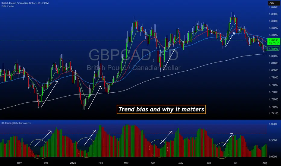
DeM Trend Bias Strength with Alerts (RB Trading)This tool is built to help users understand trend direction, exhaustion, and momentum shifts on the daily timeframe. It highlights when a market is transitioning from weakness to strength or strength to weakness by displaying color-coded bias bars. The script does not forecast future outcomes and should be used as an analytical aid.
Intended Usage
• Timeframe: Daily
• Instruments: Works on most FX pairs and liquid markets
• Style: Trend and bias evaluation
• Purpose: Identify early signs of momentum recovery within ongoing trends
How It Works
Bias Rotation Engine
The script measures directional pressure and smooths it into a bar display that changes color as conditions shift.
• Green bars show rising strength conditions
• Red bars show declining strength conditions
• Transitional periods often appear near market turning points and consolidation zones
This helps users visually separate healthy directional trends from weakening phases.
Trend Alignment Filter
The bars are designed to be interpreted alongside moving averages or broader trend tools. When the bars turn higher while price respects an upward structure, it often supports continuation themes. When the bars weaken during downward phases, it highlights potential areas where the trend retains control.
Identifying Exhaustion and Recovery
Repeated cycles in the bar display can highlight areas where:
• Downside pressure is fading before an upswing
• Upside pressure is fading before a pullback
• Consolidation is forming before a breakout
These transitions tend to align with moments shown in the image where the arrows mark bias shifts occurring before price acceleration.
How to Use It
• Wait for a clear color rotation before making any decisions
• Confirm with the daily trend and price structure
• Avoid using the tool by itself for entries
• Combine with support and resistance, moving averages, and candle structure
• Not intended for scalping or intraday signals
Why Daily Chart Works Best
The daily timeframe smooths out noise and gives the strength bars enough data to reveal genuine trend transitions. Higher timeframes also reduce false rotations that are common in lower timeframes.
Notes
The script does not predict or guarantee price movement. It processes historical inputs to help the user understand directional conditions. Each trader should apply their own risk plan and confirm levels before acting on any idea.
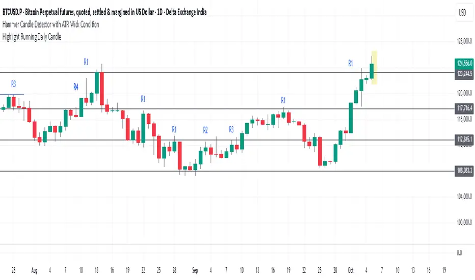
Daily Key Levels + VWAPThis indicator is daily price levels and previous day's VWAP for precision intraday trading decisions.

Highlight Running Daily Candlehighlights the currently forming Daily candle
with a shaded box extending slightly beyond the candle’s range.
Disappears as soon as the candle closes.
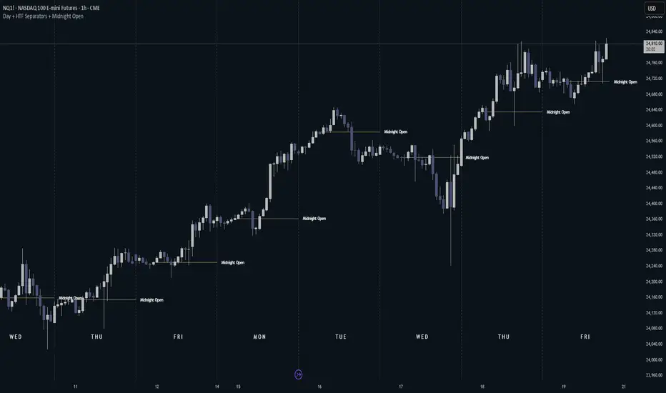
Day + HTF Separators + Midnight OpenOverview
The Day + HTF Separators + Midnight Open indicator is a versatile and easy-to-use tool for traders who want to track key price levels and time-based market events. It draws vertical lines to mark the start of each day, 4-hour period, and 1-hour period, adds labels to show the day of the week, and plots a horizontal line at a customizable hourly open price (defaulting to midnight, referred to as the "Time-Designated Open" or TDO). This indicator is perfect for day traders, swing traders, and anyone analyzing price action in Futures, forex, cryptocurrencies, or other markets on TradingView.
Designed for intraday charts (e.g., 1-minute, 5-minute, or 1-hour), this indicator offers extensive customization options, letting you toggle features, change colors, adjust line styles, and position labels. It’s built to be lightweight, ensuring smooth performance even on charts with lots of historical data.
Key Features
1. Daily Separators
What It Does: Draws a vertical line at the start of each new trading day to help you see daily boundaries clearly.
How It Works:
Places a vertical line at the beginning of each day, spanning the full price range of the opening moment.
Lines extend across the chart, making it easy to spot daily transitions.
Keeps up to 300 past daily lines visible, automatically managing older ones to stay within TradingView’s limits.
Customization:
Show/Hide: Always shown on intraday charts but tied to the "Show Days of Week Labels" setting for consistency.
Color: Choose any color (default: a medium gray).
Style: Pick Solid, Dashed, or Dotted lines (default: Dotted).
Why Use It: Helps you track daily price ranges, identify daily open/close levels, and plan trades around daily market cycles.
2. Day of the Week Labels
What It Does: Displays the day of the week (e.g., "MON" for Monday) at a specific hour each day, making it easy to know which day you’re analyzing.
How It Works:
Shows labels like "MON", "TUE", "WED", "THU", "FRI", "SAT", or "SUN" at the bottom of the chart.
Labels appear at a user-chosen hour (default: 5:00 AM) each day.
Only works on intraday charts (e.g., 5-minute or 1-hour).
Customization:
Show/Hide: Turn on/off with "Show Days of Week Labels" (default: on).
Color: Set the label text color (default: dark gray).
Hour: Choose any hour from 0:00 to 23:00 for label placement (default: 5:00 AM).
Why Use It: Great for traders who need to track specific days for events like economic releases or to spot weekly patterns in price action.
3. 4-Hour Separators
What It Does: Marks the start of each 4-hour period with a vertical line, ideal for aligning with higher timeframe trends.
How It Works:
Draws vertical lines every 4 hours, covering the price range of the starting moment.
Lines extend across the chart for clear visibility.
Stores up to 100 past 4-hour lines, reusing older ones for efficiency.
Customization:
Show/Hide: Enable/disable with "Show 4H Separator" (default: off).
Color: Choose any color (default: gray, slightly transparent).
Style: Select Solid, Dashed, or Dotted lines (default: Dotted).
Why Use It: Perfect for swing traders or those combining intraday trading with 4-hour chart analysis, such as identifying key support or resistance levels.
4. 1-Hour Separators
What It Does: Draws vertical lines to mark the start of each hour, helping short-term traders track hourly price movements.
How It Works:
Places a vertical line at the start of each hour, spanning the price range.
Lines extend across the chart and support up to 100 historical lines.
Customization:
Show/Hide: Enable/disable with "Show 1H Separator" (default: off).
Color: Pick any color (default: a light gray, slightly transparent).
Style: Choose Solid, Dashed, or Dotted lines (default: Dotted).
Why Use It: Ideal for scalpers or day traders focusing on hourly trends, session changes, or short-term price action.
5. Time-Designated Open (TDO) Lines
What It Does: Plots a horizontal line at the opening price of a chosen hour (default: midnight, 00:00) each day, with an optional label to mark the price level, helping you track key price points across multiple days.
How It Works:
Draws a horizontal line at the open price of the selected hour (e.g., midnight) in your chosen timezone (default: New York time).
Lines start at the chosen hour and extend to the current moment on the chart (or a few bars beyond, based on settings) or until 5:00 PM New York time (market close for Futures).
Supports up to 100 past TDO lines, keeping historical opens visible for comparison.
Adds a label (e.g., "TDO") at the end or start of the line, which is invisible by default due to full transparency.
Lines and labels only appear if both the main toggle and TDO-specific toggle are enabled.
Customization:
Show/Hide Line and Label: Turn on/off with "Enable Candle Open Line/Label" and the TDO-specific toggle (both default: on).
Show/Hide Label: Enable/disable the label separately with "Enable Candle Open Label" (default: on).
Hour: Select any hour from 00:00 to 23:00 (default: 00:00).
Label Text: Customize the label name (default: "TDO").
Line Color: Choose any color (default: light cyan).
Line Style: Pick Solid, Dashed, or Dotted (default: Solid).
Label Text Color: Set the label text color (default: gray, fully transparent).
Label Background Color: Choose the label background color (default: black).
Label Transparency: Adjust transparency for both label text and background (default: fully transparent, invisible).
Label Size: Select Tiny, Small, Normal, or Large (default: Small).
Label Position: Place the label at the right or left of the line with "Stick Label to Right" (default: right) and adjust spacing with "Label Padding" (default: 1 bar).
Line Length: Shorten the left side with "Enable Left-Side Trimming" (default: off) and set the trim length with "Left Trim Bars" (default: 8 bars). Extend the right side with "Line Padding" (default: 2 bars).
Timezone: Choose from New York, UTC, London, Paris, Tokyo, Shanghai, Singapore, or Sydney (default: New York).
Max History: Set how many past TDO lines to show (default: 100).
Multi-Day Plotting:
Plots a TDO line for the chosen hour (e.g., 00:00) each day, based on historical data.
Each line starts at the open price of that hour and extends to the current moment or 5:00 PM New York time (for Futures).
Past TDO lines stay visible, letting you compare daily open prices over time (up to 100 days, adjustable).
How to Use
Add to Your Chart:
Add the indicator to an intraday chart (e.g., 1-minute, 5-minute, or 1-hour) for any market (Futures, forex, crypto, etc.).
It works best on intraday timeframes to show all features.
Customize Settings:
Open the settings panel in TradingView.
Turn on/off features like daily separators, DOW labels, 1-hour/4-hour separators, or TDO lines.
Adjust colors, line styles, and label positions to fit your chart’s look.
Set the TDO hour (e.g., 00:00 for midnight or 03:00 for London open) and timezone to match your market.
Make TDO labels visible by reducing "Label Transparency" or changing "Label Text Color" to an opaque color.
Analyze the Chart:
Use daily separators to spot daily price ranges and key levels.
Check DOW labels to track specific days for trading events or weekly trends.
Use 1-hour/4-hour separators to align with short-term or higher timeframe strategies.
Monitor TDO lines to identify key opening price levels across days, useful for support/resistance or breakout trading.
Test and Adjust:
Toggle the main TDO switch or specific TDO toggle to hide/show the TDO line.
Reduce "Label Transparency" to 0 or change "Label Text Color" to make TDO labels visible.
Performance: The indicator is optimized to handle up to 300 daily lines, 100 4-hour lines, 100 1-hour lines, and 100 TDO lines, ensuring it runs smoothly on long charts.
Markets: Best for intraday charts. The 5:00 PM New York close is designed for futures; switch to UTC for forex or crypto.
Labels: TDO labels are invisible by default (fully transparent). Adjust "Label Transparency" or "Label Text Color" to make them visible.
Time Context: As of September 17, 2025, 6:08 PM EDT, TDO lines on stock charts stop updating at 5:00 PM New York time. Use historical data or change the timezone for continuous markets.
Limitations
Only works on intraday charts (e.g., 1-minute to 1-hour).
TDO lines stop at 5:00 PM New York time for Futures; adjust the timezone for 24/7 markets.
TDO labels are hidden by default (fully transparent); change transparency or color to see them.
Limited to 500 total lines and labels due to TradingView’s restrictions, managed automatically.
Feedback
If something isn’t working (e.g., missing lines or labels), please share:
The market and timeframe (e.g., EUR/USD, 5-minute).
Your settings (e.g., TDO hour, timezone, transparency).
A description or screenshot of the issue. This indicator is designed to make your trading easier with clear visuals for time-based analysis. Happy trading!
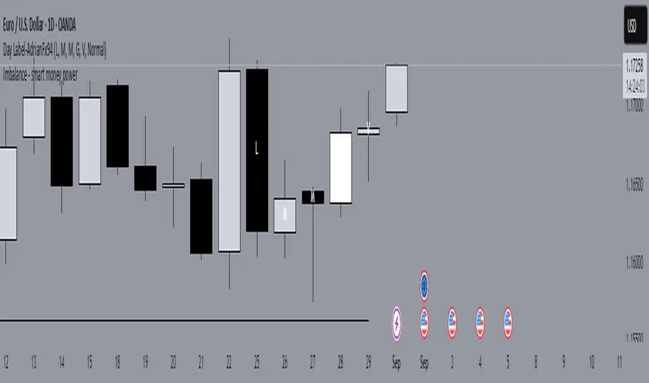
Day Label-WeeklyProfile-AdrianFx94This indicator is designed for Daily charts.
It writes a small label (like “L, M, G, V”) inside each candle’s body, exactly in the middle between the open and close.
Each label tells you which weekday closed that candle:
L → Monday
M → Tuesday
M/ME → Wednesday
G → Thursday
V → Friday
(Saturday and Sunday aren’t marked.)
Why it’s useful
It gives you a quick visual map of the week’s progression, day by day.
You immediately see the sequence of daily closes inside a week.
You can spot when the market trended cleanly through the week (labels step up or down neatly).
You notice when there’s choppy or balanced behavior (labels are mixed, up and down).
You can identify which day was the turning point or initiative day (a single label much higher or lower than the rest).
It’s a simple way to read the weekly profile of price action without having to remember which candle is which day.
Controls you have
You can change the letters (for example, instead of “L” you could write “Mo”).
You can change the text size, color, and add a background.
You can choose to show:
All weeks
Only this week
Only last week
That helps when you want to focus on a single week’s structure.
Important notes
It only works on Daily charts. On smaller timeframes it will just warn you.
The label sticks to the candle’s body, so even if you zoom or pan, it stays anchored where that day closed.
It’s not a volume profile or TPO — it’s purely about the closing position of each day.
👉 In short: this indicator is like a weekly diary on your chart — each candle is marked with the day of the week, so you can quickly analyze how the market behaved across past weeks, which days carried strength, and where momentum shifted.
This indicator shows a short label for each weekday directly inside the daily candle.
The nice part is: you can choose the letters yourself.
For example, if you are Italian, you might want:
Monday → L (Lunedì)
Tuesday → M (Martedì)
Wednesday → ME (Mercoledì)
Thursday → G (Giovedì)
Friday → V (Venerdì)
If you prefer English, you could set:
Monday → M
Tuesday → T
Wednesday → W
Thursday → Th
Friday → F
If you want very short codes, you could just write 1, 2, 3, 4, 5.
So the indicator is language-neutral — you adapt it to your country, your style, or even your personal system of marks.
Historical & Periodic Key LevelsHistorical & Periodic Key Levels
This indicator automatically plots historical key levels (ATH/ATL) and periodic closing levels (Daily, Weekly, Monthly, Yearly). It highlights major price zones frequently used in technical and institutional trading.
Key Features:
Dynamic ATH/ATL: tracks all-time high/low with date annotation.
Periodic Closes: previous D/W/M/Y closes with directional coloring.
Adaptive Colors: green/red based on bullish or bearish close.
Full Customization: toggle visibility, colors, line width, text alignment, and label text.
Smart Label Management: prevents overlap by cycling through label styles automatically.
Usage:
Identify strong support/resistance levels.
Monitor key closing prices across multiple timeframes.
Enhance swing trading and long-term analysis with institutional reference levels.
Inputs:
Levels Visibility: show/hide ATH, ATL, and periodic closes.
ATH/ATL Style Settings: line colors, label prefix, width, and text alignment.
Periodic Levels Style: label text (D/W/M/Y), line width, alignment, and bullish/bearish colors.
Notes:
Levels adjust automatically to the active chart timeframe.
Lower timeframe levels are hidden when redundant (e.g., daily close on daily chart).
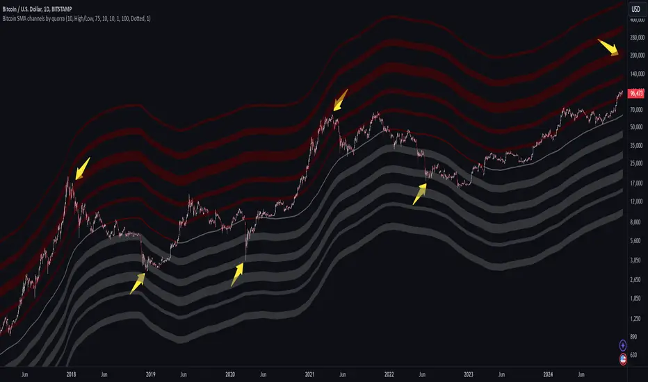
Bitcoin SMA channels - quorraThis indicator is specifically designed to identify potential Bitcoin bottom zones based on historical data and market trends. By analyzing price cycles and key support levels, it helps traders and investors make informed decisions. This tool is tailored for optimal use on higher timeframes like the daily chart. (Don't forget to ensure your chart is set to logarithmic)
1. Simple Moving Average (SMA) Calculation and Gradient Coloring
The script begins by calculating the 350-period SMA (sma350), which serves as the foundation for identifying the market's overall trend. To make the SMA visually intuitive, a gradient color function is implemented. This function changes the SMA's color based on whether the current price (close) is above or below the SMA.
If the price is above the SMA, the line appears in gray.
If the price is below the SMA, the line takes on a darker red shade.
This gradient coloring helps traders quickly gauge market sentiment and momentum, as the SMA effectively acts as a dynamic trend line.
2. Fibonacci-Based Multipliers for SMA Levels
The indicator computes several levels based on Fibonacci multipliers of the 350-period SMA. These levels provide additional layers of insight into potential support and resistance zones. The multipliers range from small values like 0.144 (indicating closer proximity to the SMA) to larger values like 9 (representing distant extensions).
These Fibonacci levels are plotted using hidden lines, ensuring that the chart remains uncluttered while still allowing for strategic visualization through filled zones. For instance:
Levels like SMA x 0.144 to SMA x 0.355 are closer to the SMA and are categorized as potential buy zones.
Levels like SMA x 2 to SMA x 9 extend further and are considered sell zones.
3. Filling Areas to Visualize Zones
To enhance the visual representation, the script uses fill() functions to color the regions between specific Fibonacci levels:
Buy Zones: These areas are filled with a semi-transparent gray color (#5a5a5a) to indicate levels where prices are likely to bounce upward.
Sell Zones: Conversely, these areas are filled with a semi-transparent red color (#5f0000), signaling regions where prices may encounter resistance and reverse downward.
This layered approach helps traders identify actionable price ranges without overwhelming them with excessive visual elements.
4. Pivot Points and Their Visualization
The script includes a pivot point system for identifying local highs and lows. Depending on the selected source (High/Low or Close/Open), it calculates pivot highs and lows over a specified period (prd).
Pivot highs (ph) are marked above bars using downward-facing labels.
Pivot lows (pl) are marked below bars using upward-facing labels.
The pivot points are adjustable via user inputs, allowing traders to fine-tune the detection of significant price swings.
5. Support and Resistance Channel Analysis
A key feature of this indicator is its ability to identify and display support and resistance (S/R) levels. The script calculates the maximum allowable width of an S/R channel as a percentage of the price range over a 300-bar window. It then groups pivot points within these channels to derive high and low boundaries.
Resistance Levels: Represented by the upper bounds of channels and highlighted with a red color.
Support Levels: Represented by the lower bounds of channels and highlighted with a gray color.
These levels are dynamically adjusted based on user-defined parameters such as channel width, maximum S/R levels, and strength.
6. Advanced Input Customization
The indicator provides several user-configurable inputs to adapt it to different trading strategies:
Pivot Period (prd): Determines the sensitivity of pivot point calculations.
Channel Width: Controls the percentage width of S/R zones.
Maximum S/R Levels: Sets the maximum number of S/R zones displayed.
Line Style and Color Settings: Allows customization of the visual appearance of lines and labels.
7. Strength Filtering for S/R Levels
To ensure the reliability of identified S/R levels, the script incorporates a filtering mechanism based on strength. Strength is determined by the number of pivot points that fall within a channel. Levels with insufficient strength are excluded, ensuring that only significant S/R zones are displayed.
8. Practical Applications
This indicator can be applied in various trading strategies:
Trend Identification: The SMA and its gradient coloring provide a clear indication of the market's prevailing trend.
Support/Resistance Trading: The Fibonacci levels and S/R zones help traders identify potential entry and exit points.
Risk Management: By visualizing key levels, the indicator assists traders in setting stop-loss and take-profit levels effectively.
This script combines multiple technical analysis techniques into a single, visually intuitive tool. It is particularly useful for Bitcoin traders seeking to enhance their decision-making process by leveraging both trend and level-based analysis.
Although this indicator is specifically designed for Bitcoin, it can also be applied to stocks or altcoins. It works best on longer timeframes, such as the daily chart. When the price reaches specific support levels, it may be wise to activate a DCA bot or confirm the bottom using other indicators. This approach helps enhance decision-making and ensures a more strategic entry or exit from positions.
52 Week High/Low FibonacciThe primary purpose of this indicator is to calculate and plot the 52-week high and low prices along with the Fibonacci retracement levels on the price chart. Fibonacci levels are commonly used in trading to identify potential support, resistance, and price reversal points.
First, the script initializes the Fibonacci levels and their corresponding colors, which will be used to plot the levels on the chart. Next, it calculates the 52-week high and low prices by finding the highest and lowest prices over the last 252 trading days, approximately equivalent to one year. Then, it identifies the overall trend direction by comparing the number of bars since the highest high and the lowest low. If the highest high is more recent, the trend is considered downwards; if the lowest low is more recent, the trend is upwards.
The script then plots the Fibonacci retracement levels on the chart, using horizontal lines at the respective price levels. It also creates labels for each level, displaying the percentage and the price value. Additionally, it draws a line connecting the 52-week high and low prices, providing a visual representation of the price range during the 52-week period.
Pros of this indicator include:
-Automatic calculation and plotting of Fibonacci levels, saving time for traders
-Clear trend identification based on 52-week high and low prices
-Visually appealing and easy-to-read chart representation with color-coded levels
-Provides insight into potential price reversal areas based on widely used Fibonacci levels
Cons of this indicator include:
-Only works on daily timeframes, limiting its usefulness for intraday and weekly traders
-Assumes that the trend will continue in the same direction, which may not always be accurate in real-world markets
-Does not provide explicit buy or sell signals, leaving the trading decision-making process up to the trader
-Solely relies on Fibonacci levels, which may not always be accurate; it is recommended to use other technical indicators or strategies alongside this indicator for a comprehensive trading approach
In conclusion, the '52 Week High Low Fibonacci' indicator is a valuable tool for traders interested in using Fibonacci levels for identifying potential price reversal points. By automatically calculating and plotting these levels based on 52-week high and low prices, the indicator provides a clear, color-coded visual aid, which can be especially helpful for traders who base their strategies on these levels.
However, it's worth noting that this indicator is limited to daily timeframes and doesn't provide explicit buy or sell signals, requiring traders to incorporate their own analysis and judgement in their decision-making process. The indicator also operates on the assumption of trend continuation, which may not always hold true.
While it's a beneficial tool, relying solely on this indicator for trading decisions may not be advisable. It's best used in conjunction with other indicators and trading strategies, providing a more balanced and comprehensive approach to trading in the financial markets. As always, risk management should be a key part of any trading strategy.
**YOUR INSIGHTFUL FEEDBACK OR SUGGESTIONS FOR REVISIONS TO THIS CODE ARE HIGHLY APPRECIATED. PLEASE FEEL FREE TO SHARE YOUR THOUGHTS TO FOSTER ITS CONTINUAL IMPROVEMENT**
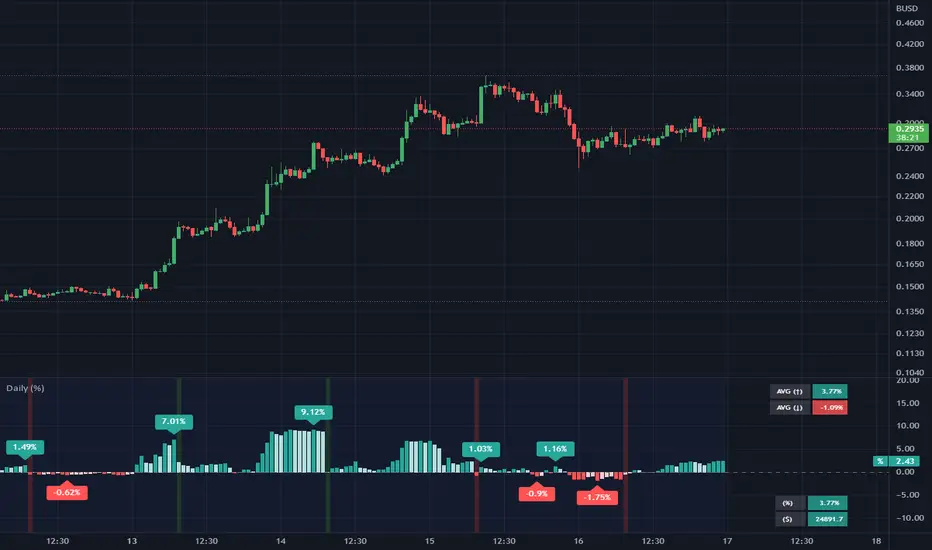
Daily (%) - Percentage Above / Below Daily [HODLER]It is a common observation in the world of cryptocurrency that the prices of most digital currencies tend to follow the price movements of Bitcoin. This means that when the price of Bitcoin increases, the prices of other cryptocurrencies usually increase as well, and when the price of Bitcoin decreases, the prices of other cryptocurrencies also tend to decrease, particularly when Bitcoin is near its daily level.
Of course, this is not unique to Bitcoin but also occurs with stocks. You can use this indicator on any asset you choose. Simply select the asset you want to track in the indicator's settings.
In the example chart, you can see CFXBUSD on a 45-minute timeframe chart with the indicator displayed below that tracks Bitcoin on a daily timeframe, as bitcoin was set as the asset in the settings of the indicator. In the lower right corner of the indicator, it will display the price of the asset "Bitcoin" and the percentage by which it is either above or below the daily price (which is calculated in the same way as on the TradingView watchlist).
This indicator can be very useful when trading other assets to closely monitor Bitcoin's (or any other chosen) activity. You can use it to check if the price is above the daily close and if it closed higher or lower than the last bar. Additionally, you can check if it closed above certain moving averages.
A useful feature of this indicator is that you can set an offset percentage for your visuals to adjust for whether the asset is up or down.
However, it is important to note that not all cryptocurrencies are directly correlated with Bitcoin's price movements, and some may even have unique factors that can cause them to behave differently in the market.
If you have any questions or suggestions regarding this indicator, I would greatly appreciate it if you could let me know in the comments.
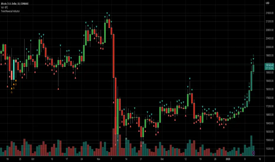
Daily Number/Trend Reversal IndicatorIndicator identifies potential price trend exhaustion.
Compares this period against the 4th prior period for the condition.
9 periods (or more) with the same condition is an indicator that the trend is ending soon.
Volume + VolatilityBefore I begin I want to mention:
1. This is a variation of the 'CCI & BB' made by matsu_bitmex (Link: ) and SigmaDraconis's 'On Balance Volume Oscillator + Bollinger Bands' (Link: )
2. While using this sometimes you may not notice the crossover so I've added the Line 'x' outside 'x' BB to only see if Line 3 and 4 crossed over
The indicator:
1. When the background is green and the 2 lines are going up it means uptrend
2. When the background is red and the 2 lines are going down it means downtrend
3. When there is a crossover and the background outside BB turns yellow, it means there is a lot of volatility or volume
How to use (Or how I use this):
1. All trades based on the yellow color MUST be during a trend
2. When the color changes to yellow for the 1st time in the direction of a trend it is advisable to enter
[MF] Auto Fibonacci LevelsDescription:
Automatically draw Fibonacci Pivot levels based on the previous (day's, week's or month's)
Range ( High-Low ). The HLC3 is used as the default Pivot level.
Unlike the "Auto Fibonacci Levels", this variation does not update
Levels on current day even if the price goes past the R3/S3 levels.
Timeframes: 1D, 1W, 1M
Range = (High - Low) - From previous Day, Week or month.
FIB LEVELS:
- Yellow = Pivot and Pivot Zone (HLC3 by default)
- red = R1,S1 Levels 0.236 * Range
- Green = R2,S2 Levels 0.368 * Range
- Lime = R3,S3 Levels 0.618 * Range
- Blue = R4,S4 Levels 0.786 * Range
- Gray = R5,S5 Levels 1.000 * Range
- Lime = R6,S6 Levels 1.236 * Range
- Red = R7,S7 Levels 1.382 * Range
- Blue = R8,S8 Levels 1.618 * Range
- Green = R9,S9 Levels 2.000 * Range
CLASSIC LEVELS:
- Yellow = Pivot and Pivot Zone (HLC3)
- Green = R1,S1 Levels (Pivot*2 - Low), (Pivot*2 - High)
- Lime = R2,S2 Levels ( Pivot + Range), ( Pivot - Range)
- Lime = R3,S3 Levels (High + 2*( Pivot - Low)), (Low - 2*(High - Pivot ))
- Blue = R4,S4 Levels (High + 3*( Pivot - Low)), (Low - 3*(High - Pivot ))
Refrences:
- Auto Daily Fib Levels R3.0 by JustUncleL
- Auto Fib by TheYangGuizi
- Monthly Dynamic Range Levels (Fibonaci) V0 by RicardoSantos
Modifications:
- Added next FIB Levels. (changes during the current cycle)
- Added FIB 0.236 Levels
- Added Option to change the colors of the Fib Levels
- Changed Default colors to the colors of Tradingview
- Upgraded to Version4 Pinescript
WMA Combo Crossover V2Before I begin I want to mention:
1. This is an upgrade of my indicator WMA Combo Crossover. (Link: www.tradingview.com)
2. The upgrade was inspired from the CCI and Bollinger Bands indicator by matsu_bitmex. (Link: www.tradingview.com)
3. I have combined the indictor with Bollinger Bands , coloring those sections as yellow, to increase winning trades as well as avoid losing trades by spotting potential reversals with the aid of news avoidance
4. This indicator is designed primarily for NNFX (No Nonsense Forex) though it can be used for any type of trading style
5. Also, I want to thank kurtisbu for helping me out. Thank you!
The indicator:
1. When WMA 25 is blue and is going upwards, it means there is an uptrend
2. When WMA 25 is red and is going down, it means there is a downtrend
3. During a trend, the color may switch to red and blue occasionally. When the color switches back to the direction of the trend, it can be used for re-entries
4. All trades based on the yellow color MUST be during a trend
5. When the color changes to yellow that means price is very volatile and only on the 1st candle is it advisable to enter a trade. (I have not backtested entering on the 2nd candle of a yellow color change)
6. During a trend, when the color changes to yellow and there is an incoming news event, then the chances of a reversal increase and I recommended avoid entering

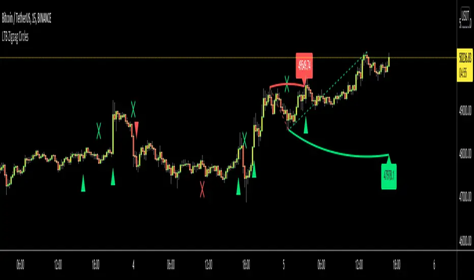
LTB Zigzag CirclesHello All,
Today I am here with a new idea and script, " LTB Zigzag Circles ". The idea is to create Circles using last 2 zigzag waves and to catch the breakouts earlier than horizontal lines. if a circle is broken then the script shows entry for Long/Short positions. and if broken circle reappears again then the position is closed. You can change Zigzag period as you wish and see the different results.
Here you can see how the script calculates and draws the Circles:
Below you can see how the script draws part of the circle on each bar:
Optionally the script can show levels:
P.S. I haven't tested it as a strategy, Result and Performance may change by Zigzag period, you need to find best Zigzag period according to your strategy. By the way, my Zigzag Circles idea can be improved, if you have any recommendation let me know please ;)
Enjoy!
Daily and Weekly Moving Averages on Daily ChartThis script is designed to be used on Swing and Position style approaches.
Based on moving averages that I use with the integration of a weekly moving average that is visible on the daily chart /all timeframes.
The moving averages are:
9EMA;
21EMA;
10 week SMA ;
50EMA;
150EMA;
and 200EMA.
Base script from CaptainBrett with Matt Caruso's chat with Richard Moglen showing me that this can be done on Tradingview. When searching for the script, I couldn't find it within the public library.
Please Enjoy

GBP/JPY Daily time FX Strategy ATR W% BaselineThis is a preety good strategy suited for long term trading.
It has been adapted and optimized in this case for GBP/JPY 1D time frame.
Its made of Kiojun baseline, together with ATR for stop loss and size calculation and Williams % R
For the purpose of this example we simulate that we have a leverage of 100x in order to be able to buy the ammount of lots required for our stop loss to be in same page with the risk % of our capital.
For entry we have for long, ascending R in the last 2 candles and crossover of close with KIOJUN baseline. For short the same but in reverse.
We exit if we reach the TP -100 points in this example, or SL , which is based on ATR of the last x days.
If you have any questions feel free to write me in private !

EOD TraderMy EOD (End of Day) system for trading on the daily timeframe with minimum stress. Just pair the built-in alerts with the bot of your choice and then let the indicator do the rest. It'll determine the current trend, filter out as much noise as possible and then take you from long to short.
There are options to toggle the following:
Auto fibonacci levels with alerts for the look-back period of your choosing
Auto support and resistance with alerts
Alerts for the price closing above/below the 50MA
A coloured background to show the trend direction (green = up, red = down)
The fib and support levels can be handy when trying to determine when best to take profit or even exit the trade entirely.
Important: I personally use Heikin Ashi candles with this script to further filter entries. An option is available within the script settings to toggle this on/off should you wish to do the same.
This is a premium script. Please DM me for access.

Simple and efficient PSAR swing strategyThis is a strategy build inside tradingview, which I found it works great with swing/position trading.
It works based on parabolic sar indicator, when indicator is below the candle, is an uptrend and when its its above is a downtrend.
At the same time it's very nice, because it has a sort of stop loss which is dynamic, because it triggers when candle crosses with indicator, so you dont have to worry about stop loss or take profit .
The key here of course, is going to be the risk management, if you want to success with it, never trade more than 2% of you capital, and if you want you can always apply a rule inside the code to close all position if x % amount of equity was going down, although I recommend have patience and let the system do its job.
I recommend this strategy to be used with charts like 1 day or 1 week. If you need and want I can convert it to an indicator that uses alerts (although with strategy as well can be made to send alerts).
PS. When you add this strategy on chart, inside is has different versions, if you use first version(1), it uses the system I explain above. If you use the last one, its based on risk management when the stop loss is the difference between psar and the candle, but it still needs some adjustments to make.
Overall first one is atm much more profitable, but I believe that the version with risk management can be much better, but it need much more adjustments to make which I dont have the time at the moment for it.
Enjoy it .

Daily Forex ArrowsArrows that will appear on the candles that follow one or more candle patterns, showing the possible market direction. It's best to enter when the new candle form, after the candle with the arrow appear. Daily chart it's the best on the backtests. Based with Forex markets.

B3 FisherTransformThis is the indicator from the trading strategy I posted recently. I do like Fisher Transform a lot on day bar charts. However, the smaller you go in bar interval, the less I feel it is as usable. At that point, any oscillator will usually do. When comparing the slope of the line and direction to the chart price action using day bars, I get a great sense of when to enter into a swing.
The indicator is often earlier to turn than other indicators, therefor, occasionally a trade may take a day to 3 days to start moving well in the desired direction, but it is never late which is very nice!
Use in conjunction with your support and resistance levels to find great entry points on reversals.
Use in conjunction with moving averages to find the reentry into a continuing trend.
Features include bar paint, zero line, and adjustable deviation values to target trend continuation and possible max oscillation reversal trades.
Enjoy! ~B3 d^.^b

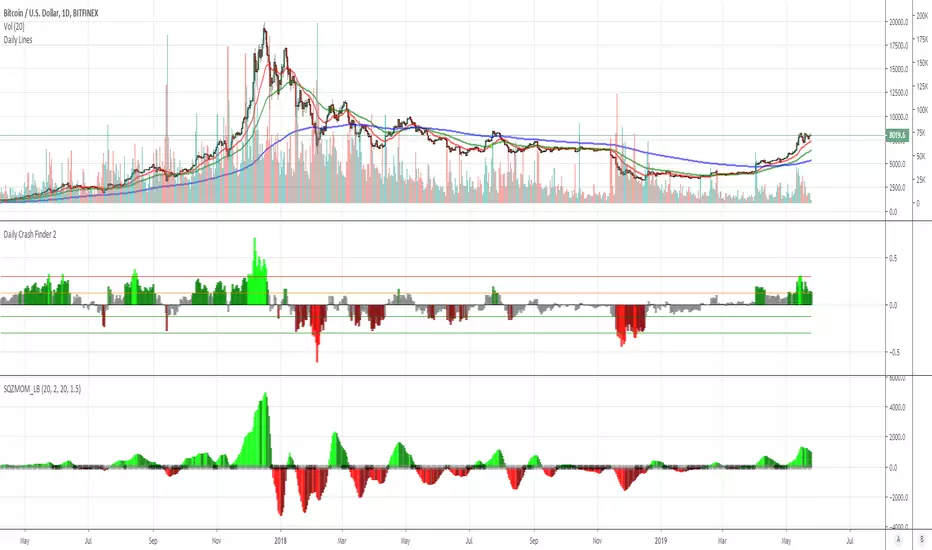
Daily Crash Finder 2this indicator shows buy and sell point for long time and works only daily period.
gray->notr
lime -> sell
green -> sell more
maroon -> buy
red -> buy more