VixTrixVixTrix - Because markets move in both directions.
VixTrix was born from a fundamental limitation in traditional volatility indicators: they only measure downside panic, completely missing the greed-driven extremes that form market tops.
How It Works:
Dual-Component Analysis:
vixBear = Panic selling intensity (distance from recent highs)
vixBull = FOMO buying intensity (distance from recent lows)
Oscillator = vixBear - vixBull = Net fear/greed imbalance
When the oscillator is positive, fear dominates (potential bottom forming). When negative, greed dominates (potential top forming).
Professional-Grade Filtering:
The magic happens with the symmetric RMS (Root Mean Square) bands. Unlike fixed percentage bands or standard deviation, RMS:
Creates mathematically symmetric positive/negative thresholds
Naturally adapts to changing volatility regimes
Provides statistical significance to extremes
VixTrix also adds selectable MA smoothing for the RMS calculation:
WMA (default): Balanced – middle-ground approach
VWMA: Volume-weighted – filters low-volume noise
EMA: Responsive – catches quick reversals
SMA: Stable – for swing trading
HMA: Fast and smooth – ideal for day trading
Signals require triple confirmation:
Statistical Extreme: Oscillator beyond RMS band
Price Action Confirmation: Correct candle color (bullish for bottoms, bearish for tops)
Momentum Continuation: Oscillator still moving toward extreme (exhaustion)
This multi-filter approach reduces premature entries and false signals while maintaining early positioning at potential reversal points.
Why This Matters for Your Trading:
In bull markets, traditional fear indicators sit near zero, giving no warning of impending tops.
VixTrix identifies when greed becomes excessive – when FOMO buying reaches statistical extremes that often precede corrections.
In range-bound markets, VixTrix excels at identifying overreactions in both directions, providing high-probability mean reversion opportunities.
During crashes, it captures the panic selling with the same precision as VixFix, but with better timing through its momentum confirmation.
VixTrix spots continuations through:
"No Signal" = Healthy Trend – Oscillator stays between RMS bands (no exhaustion)
Failed Extremes – Touches band but no triple confirmation = trend likely continues
Hidden Divergence – Price makes higher low while oscillator makes shallower low = uptrend continues
Controlled Emotions – Oscillator negative but not extreme in uptrends (greed present but not excessive)
Key Insight: When VixTrix doesn't give a signal during a pullback, institutions aren't panicking – they're just pausing before resuming the trend.
Green columns = Bullish exhaustion (potential bottoms)
Red columns = Bearish exhaustion (potential tops)
Golden RMS bands = Dynamic thresholds adapting to current volatility
Background highlights = Active signal conditions
The Result: A professional-grade oscillator that works in all market conditions – trending up, trending down, or ranging – by measuring the complete emotional spectrum driving price action.
Extremes
Volatility Radar [upslidedown]💎 Overview
Volatility Radar visualizes extreme volatility conditions in a clean, intuitive oscillator format.
Unlike traditional momentum oscillators, it transforms average true range (ATR) behavior into a directional volatility structure, making it easier to spot moments when markets may be shifting into expansion, compression, or potential pivot zones.
💎 How to Use
The oscillator highlights moments when the internal volatility condition becomes active as well as when that condition breaks. These events may coincide with structural turning points, breakout conditions, or volatility expansions. While not a prediction tool, Volatility Radar helps traders identify moments worth paying closer attention to.
💎 Signal Markers
■ Square icons on top/bottom identify when the Volatility Radar condition is ACTIVE
▲▼ Triangle icons on top/bottom identify when the Volatility Radar condition BREAKS
📌 Chart Example:
💎 Oscillator Trends
One of the core features of Volatility Radar is its ability to highlight positive or negative volatility trends. The oscillator automatically colors its components to reflect uptrending vs. downtrending volatility structure, making trend context easier to interpret at a glance.
📌 Chart Example:
💎 Histogram Trends
For users who prefer a more compact or traditional visual style, Volatility Radar includes an optional histogram display mode. This mode provides a clean representation of the detected trend and can be helpful for validating price-action concepts within the broader volatility context.
📌 Chart Example:
💎 Volatility Moving Average
The yellow moving average line offers a volatility moving average that can aid in determining longer term trend strength.
Interpret the trend direction by observing whether the average is increasing/decreasing or above/below the zero line.
Reversals may be observed when values move into oversold territories.
Trend continuation may occur during periods when the average is near the zero line.
Evaluate opportunities when the moving average is "touched" or "pinged" by the radar line (setting available to highlight these crosses).
📌 Chart Example:
💎 Backtesting Support
Volatility Radar outputs external signals designed for use with automated backtesting on TradingView. It integrates with @jason5480’s open-source Template Trailing Strategy and its supporting signal libraries.

Extreme Pressure Zones Indicator (EPZ) [BullByte]Extreme Pressure Zones Indicator(EPZ)
The Extreme Pressure Zones (EPZ) Indicator is a proprietary market analysis tool designed to highlight potential overbought and oversold "pressure zones" in any financial chart. It does this by combining several unique measurements of price action and volume into a single, bounded oscillator (0–100). Unlike simple momentum or volatility indicators, EPZ captures multiple facets of market pressure: price rejection, trend momentum, supply/demand imbalance, and institutional (smart money) flow. This is not a random mashup of generic indicators; each component was chosen and weighted to reveal extreme market conditions that often precede reversals or strong continuations.
What it is?
EPZ estimates buying/selling pressure and highlights potential extreme zones with a single, bounded 0–100 oscillator built from four normalized components. Context-aware weighting adapts to volatility, trendiness, and relative volume. Visual tools include adaptive thresholds, confirmed-on-close extremes, divergence, an MTF dashboard, and optional gradient candles.
Purpose and originality (not a mashup)
Purpose: Identify when pressure is building or reaching potential extremes while filtering noise across regimes and symbols.
Originality: EPZ integrates price rejection, momentum cascade, pressure distribution, and smart money flow into one bounded scale with context-aware weighting. It is not a cosmetic mashup of public indicators.
Why a trader might use EPZ
EPZ provides a multi-dimensional gauge of market extremes that standalone indicators may miss. Traders might use it to:
Spot Reversals: When EPZ enters an "Extreme High" zone (high red), it implies selling pressure might soon dominate. This can hint at a topside reversal or at least a pause in rallies. Conversely, "Extreme Low" (green) can highlight bottom-fish opportunities. The indicator's divergence module (optional) also finds hidden bullish/bearish divergences between price and EPZ, a clue that price momentum is weakening.
Measure Momentum Shifts: Because EPZ blends momentum and volume, it reacts faster than many single metrics. A rising MPO indicates building bullish pressure, while a falling MPO shows increasing bearish pressure. Traders can use this like a refined RSI: above 50 means bullish bias, below 50 means bearish bias, but with context provided by the thresholds.
Filter Trades: In trend-following systems, one could require EPZ to be in the bullish (green) zone before taking longs, or avoid new trades when EPZ is extreme. In mean-reversion systems, one might specifically look to fade extremes flagged by EPZ.
Multi-Timeframe Confirmation: The dashboard can fetch a higher timeframe EPZ value. For example, you might trade a 15-minute chart only when the 60-minute EPZ agrees on pressure direction.
Components and how they're combined
Rejection (PRV) – Captures price rejection based on candle wicks and volume (see Price Rejection Volume).
Momentum Cascade (MCD) – Blends multiple momentum periods (3,5,8,13) into a normalized momentum score.
Pressure Distribution (PDI) – Measures net buy/sell pressure by comparing volume on up vs down candles.
Smart Money Flow (SMF) – An adaptation of money flow index that emphasizes unusual volume spikes.
Each of these components produces a 0–100 value (higher means more bullish pressure). They are then weighted and averaged into the final Market Pressure Oscillator (MPO), which is smoothed and scaled. By combining these four views, EPZ stands out as a comprehensive pressure gauge – the whole is greater than the sum of parts
Context-aware weighting:
Higher volatility → more PRV weight
Trendiness up (RSI of ATR > 25) → more MCD weight
Relative volume > 1.2x → more PDI weight
SMF holds a stable weight
The weighted average is smoothed and scaled into MPO ∈ with 50 as the neutral midline.
What makes EPZ stand out
Four orthogonal inputs (price action, momentum, pressure, flow) unified in a single bounded oscillator with consistent thresholds.
Adaptive thresholds (optional) plus robust extreme detection that also triggers on crossovers, so static thresholds work reliably too.
Confirm Extremes on Bar Close (default ON): dots/arrows/labels/alerts print on closed bars to avoid repaint confusion.
Clean dashboard, divergence tools, pre-alerts, and optional on-price gradients. Visual 3D layering uses offsets for depth only,no lookahead.
Recommended markets and timeframes
Best: liquid symbols (index futures, large-cap equities, major FX, BTC/ETH).
Timeframes: 5–15m (more signals; consider higher thresholds), 1H–4H (balanced), 1D (clear regimes).
Use caution on illiquid or very low TFs where wick/volume geometry is erratic.
Logic and thresholds
MPO ∈ ; 50 = neutral. Above 50 = bullish pressure; below 50 = bearish.
Static thresholds (defaults): thrHigh = 70, thrLow = 30; warning bands 5 pts inside extremes (65/35).
Adaptive thresholds (optional):
thrHigh = min(BaseHigh + 5, mean(MPO,100) + stdev(MPO,100) × ExtremeSensitivity)
thrLow = max(BaseLow − 5, mean(MPO,100) − stdev(MPO,100) × ExtremeSensitivity)
Extreme detection
High: MPO ≥ thrHigh with peak/slope or crossover filter.
Low: MPO ≤ thrLow with trough/slope or crossover filter.
Cooldown: 5 bars (default). A new extreme will not print until the cooldown elapses, even if MPO re-enters the zone.
Confirmation
"Confirm Extremes on Bar Close" (default ON) gates extreme markers, pre-alerts, and alerts to closed bars (non-repainting).
Divergences
Pivot-based bullish/bearish divergence; tags appear only after left/right bars elapse (lookbackPivot).
MTF
HTF MPO retrieved with lookahead_off; values can update intrabar and finalize at HTF close. This is disclosed and expected.
Inputs and defaults (key ones)
Core: Sensitivity=1.0; Analysis Period=14; Smoothing=3; Adaptive Thresholds=OFF.
Extremes: Base High=70, Base Low=30; Extreme Sensitivity=1.5; Confirm Extremes on Bar Close=ON; Cooldown=5; Dot size Small/Tiny.
Visuals: Heatmap ON; 3D depth optional; Strength bars ON; Pre-alerts OFF; Divergences ON with tags ON; Gradient candles OFF; Glow ON.
Dashboard: ON; Position=Top Right; Size=Normal; MTF ON; HTF=60m; compact overlay table on price chart.
Advanced caps: Max Oscillator Labels=80; Max Extreme Guide Lines=80; Divergence objects=60.
Dashboard: what each element means
Header: EPZ ANALYSIS.
Large readout: Current MPO; color reflects state (extreme, approaching, or neutral).
Status badge: "Extreme High/Low", "Approaching High/Low", "Bullish/Neutral/Bearish".
HTF cell (when MTF ON): Higher-timeframe MPO, color-coded vs extremes; updates intrabar, settles at HTF close.
Predicted (when MTF OFF): Simple MPO extrapolation using momentum/acceleration—illustrative only.
Thresholds: Current thrHigh/thrLow (static or adaptive).
Components: ASCII bars + values for PRV, MCD, PDI, SMF.
Market metrics: Volume Ratio (x) and ATR% of price.
Strength: Bar indicator of |MPO − 50| × 2.
Confidence: Heuristic gauge (100 in extremes, 70 in warnings, 50 with divergence, else |MPO − 50|). Convenience only, not probability.
How to read the oscillator
MPO Value (0–100): A reading of 50 is neutral. Values above ~55 are increasingly bullish (green), while below ~45 are increasingly bearish (red). Think of these as "market pressure".
Extreme Zones: When MPO climbs into the bright orange/red area (above the base-high line, default 70), the chart will display a dot and downward arrow marking that extreme. Traders often treat this as a sign to tighten stops or look for shorts. Similarly, a bright green dot/up-arrow appears when MPO falls below the base-low (30), hinting at a bullish setup.
Heatmap/Candles: If "Pressure Heatmap" is enabled, the background of the oscillator pane will fade green or red depending on MPO. Users can optionally color the price candles by MPO value (gradient candles) to see these extremes on the main chart.
Prediction Zone(optional): A dashed projection line extends the MPO forward by a small number of bars (prediction_bars) using current MPO momentum and acceleration. This is a heuristic extrapolation best used for short horizons (1–5 bars) to anticipate whether MPO may touch a warning or extreme zone. It is provisional and becomes less reliable with longer projection lengths — always confirm predicted moves with bar-close MPO and HTF context before acting.
Divergences: When price makes a higher high but EPZ makes a lower high (bearish divergence), the indicator can draw dotted lines and a "Bear Div" tag. The opposite (lower low price, higher EPZ) gives "Bull Div". These signals confirm waning momentum at extremes.
Zones: Warning bands near extremes; Extreme zones beyond thresholds.
Crossovers: MPO rising through 35 suggests easing downside pressure; falling through 65 suggests waning upside pressure.
Dots/arrows: Extreme markers appear on closed bars when confirmation is ON and respect the 5-bar cooldown.
Pre-alert dots (optional): Proximity cues in warning zones; also gated to bar close when confirmation is ON.
Histogram: Distance from neutral (50); highlights strengthening or weakening pressure.
Divergence tags: "Bear Div" = higher price high with lower MPO high; "Bull Div" = lower price low with higher MPO low.
Pressure Heatmap : Layered gradient background that visually highlights pressure strength across the MPO scale; adjustable intensity and optional zone overlays (warning / extreme) for quick visual scanning.
A typical reading: If the oscillator is rising from neutral towards the high zone (green→orange→red), the chart may see strong buying culminating in a stall. If it then turns down from the extreme, that peak EPZ dot signals sell pressure.
Alerts
EPZ: Extreme Context — fires on confirmed extremes (respects cooldown).
EPZ: Approaching Threshold — fires in warning zones if no extreme.
EPZ: Divergence — fires on confirmed pivot divergences.
Tip: Set alerts to "Once per bar close" to align with confirmation and avoid intrabar repaint.
Practical usage ideas
Trend continuation: In positive regimes (MPO > 50 and rising), pullbacks holding above 50 often precede continuation; mirror for bearish regimes.
Exhaustion caution: E High/E Low can mark exhaustion risk; many wait for MPO rollover or divergence to time fades or partial exits.
Adaptive thresholds: Useful on assets with shifting volatility regimes to maintain meaningful "extreme" levels.
MTF alignment: Prefer setups that agree with the HTF MPO to reduce countertrend noise.
Examples
Screenshots captured in TradingView Replay to freeze the bar at close so values don't fluctuate intrabar. These examples use default settings and are reproducible on the same bars; they are for illustration, not cherry-picking or performance claims.
Example 1 — BTCUSDT, 1h — E Low
MPO closed at 26.6 (below the 30 extreme), printing a confirmed E Low. HTF MPO is 26.6, so higher-timeframe pressure remains bearish. Components are subdued (Momentum/Pressure/Smart$ ≈ 29–37), with Vol Ratio ≈ 1.19x and ATR% ≈ 0.37%. A prior Bear Div flagged weakening impulse into the drop. With cooldown set to 5 bars, new extremes are rate-limited. Many traders wait for MPO to curl up and reclaim 35 or for a fresh Bull Div before considering countertrend ideas; if MPO cannot reclaim 35 and HTF stays weak, treat bounces cautiously. Educational illustration only.
Example 2 — ETHUSD, 30m — E High
A strong impulse pushed MPO into the extreme zone (≥ 70), printing a confirmed E High on close. Shortly after, MPO cooled to ~61.5 while a Bear Div appeared, showing momentum lag as price pushed a higher high. Volume and volatility were elevated (≈ 1.79x / 1.25%). With a 5-bar cooldown, additional extremes won't print immediately. Some treat E High as exhaustion risk—either waiting for MPO rollover under 65/50 to fade, or for a pullback that holds above 50 to re-join the trend if higher-timeframe pressure remains constructive. Educational illustration only.
Known limitations and caveats
The MPO line itself can change intrabar; extreme markers/alerts do not repaint when "Confirm Extremes on Bar Close" is ON.
HTF values settle at the close of the HTF bar.
Illiquid symbols or very low TFs can be noisy; consider higher thresholds or longer smoothing.
Prediction line (when enabled) is a visual extrapolation only.
For coders
Pine v6. MTF via request.security with lookahead_off.
Extremes include crossover triggers so static thresholds also yield E High/E Low.
Extreme markers and pre-alerts are gated by barstate.isconfirmed when confirmation is ON.
Arrays prune oldest objects to respect resource limits; defaults (80/80/60) are conservative for low TFs.
3D layering uses negative offsets purely for drawing depth (no lookahead).
Screenshot methodology:
To make labels legible and to demonstrate non-repainting behavior, the examples were captured in TradingView Replay with "Confirm Extremes on Bar Close" enabled. Replay is used only to freeze the bar at close so plots don't change intrabar. The examples use default settings, include both Extreme Low and Extreme High cases, and can be reproduced by scrolling to the same bars outside Replay. This is an educational illustration, not a performance claim.
Disclaimer
This script is for educational purposes only and does not constitute financial advice. Markets involve risk; past behavior does not guarantee future results. You are responsible for your own testing, risk management, and decisions.

Adaptive Support & Resistance Levels [StabTrading]The Adaptive S&R Levels indicator is designed to study support and resistance levels by synthesizing multiple well-known techniques for identifying these zones. It aims to provide traders with reliable price levels that reflect the collective perspective of market participants, using historical price action and projective techniques for extreme conditions.
💡 Introduction: Identified Problem
Traders often draw support and resistance lines using varied methods, leading to inconsistencies in where these levels are placed on charts. This variability can reduce the effectiveness of individual levels, as price may not react strongly to zones that lack broad recognition. The Adaptive S&R Levels indicator addresses this by aggressively averaging multiple established techniques to create support and resistance lines that align with what most traders are likely to identify, increasing the probability of price reactions.
🚀 How it Works: Overview
The indicator employs a multi-technique algorithm to generate support and resistance levels, ensuring they represent a consensus of trader perspectives.
🚀 How it Works: Chart Levels Display and Styling
Support levels, displayed in green below the current price, and resistance levels, shown in red above the price, are plotted clearly on the chart. Levels are numbered sequentially (e.g., v1, v2) as they move further from the current price, providing a visual hierarchy of proximity. Extreme levels, labeled as "Extreme Support" or "Extreme Resistance," are plotted in a bolder color to distinguish them as the outermost boundaries, maintaining the same green (support) and red (resistance) color scheme for consistency.
🚀 How it Works: Historical Price Action Algorithm
For areas with available historical data, the algorithm analyzes price action using a variety of recognized methods for drawing support and resistance, such as pivot points, swing highs/lows, and volume-based zones. It calculates a weighted average of these techniques to produce a “regression fit” line that reflects the accumulation of levels traders might draw. By prioritizing areas where multiple methods converge, the indicator identifies zones likely to be significant to a wide audience, enhancing their relevance.
🚀 How it Works: Projective Techniques Algorithm
In scenarios without recent historical price action—such as all-time highs or lows—the indicator employs an alternative algorithm that combines projective techniques commonly used by traders. These include Fibonacci extensions, Measured Moves (price projections), Psychological Milestones (e.g., round numbers), Channel/Trendline Extrapolation, and Time-Based Targets (inspired by methods like Gann techniques). The algorithm seeks a confluence of these methods to draw support and resistance levels that align with what most traders would consider significant in such conditions. These levels maintain the same green (support) and red (resistance) color scheme, with numbering based on their distance from the price.
🚀 How it Works: Noise Parameter Adjustment
Users can adjust a noise parameter to control the number of displayed levels. Lower settings show more lines, reflecting a broader range of potential zones but with less confluence. Higher settings increase the required confluence of techniques, resulting in fewer lines that have a higher probability of eliciting a price reaction. This customization allows traders to tailor the indicator to their preferred timeframe or trading style.
🔥 Features
Confluence-Based Levels: Support and resistance lines are derived from a weighted average of multiple techniques, aiming to mirror the levels most traders would recognize.
Extreme Levels: Generates support and resistance in areas without historical price action, using techniques like Fibonacci extensions and Measured Moves.
Color-Coded Display: Green support levels appear below the current price, and red resistance levels appear above, with extreme levels in a bolder shade for distinction.
Adjustable Noise Parameter: Users can modify the confluence threshold to display more lines (lower settings) or fewer, higher-probability lines (higher settings).
📈 Implementing the System
1. Adjust Settings
Set the noise parameter based on your trading style (0.1 to 10).
Use lower values for more frequent levels, suitable for scalping or short-term analysis.
Use higher values for fewer, higher-confluence levels, ideal for swing trading or longer-term strategies.
Adjust for your timeframe: Settings tend to be lower on shorter timeframes and higher on longer timeframes.
2. Identify Levels
Monitor green support levels below the price for potential buying zones, noting their numbered proximity (v1, v2, etc.).
Observe red resistance levels above the price for potential selling or shorting zones, noting their numbered proximity.
Note extreme levels (labeled "Extreme Support" or "Extreme Resistance") in areas like all-time highs, which may act as key reversal points.
3. Evaluate Price Reactions
Track how price interacts with the plotted levels to assess their effectiveness, considering their proximity to price.
Observe performance in bullish, bearish, or ranging markets to understand the indicator’s behavior at different levels.
Test different noise parameter settings across various assets and timeframes to find the optimal balance for your approach.
4. Layering Trades with Levels
Use the numbered levels to layer into a trade: for example, enter a partial position at a closer support level (e.g., v1) and add to it at a further level (e.g., v2) if price continues to decline, spreading risk across multiple zones.
Layer out of a trade by taking partial profits at each resistance level as price rises (e.g., reduce position at v1, then v2), or fully exit at an "Extreme Resistance" level to maximize gains while managing exposure.
🔶 Conclusion
The Adaptive S&R Levels indicator provides a framework for studying support and resistance by averaging multiple trader-recognized techniques. With its ability to handle both historical and extreme price scenarios, numbered levels for visual hierarchy, and customizable noise settings, it offers a versatile tool for analyzing key price levels. Designed for educational use, it encourages traders to test and observe how these consensus-driven levels align with market behavior within broader analysis.

JaT - Max/Min Labels ProDescription:
The JaT - Max/Min Labels Pro is a powerful and customizable tool designed for traders who want clear, precise, and visually appealing identification of local price extremes. This indicator dynamically detects local maxima and minima based on user-defined sensitivity and displays their values as labels directly on the chart.
Key Features:
Dynamic Extremes Detection: Automatically identifies local highs and lows using a user-configurable lookback period and sensitivity setting.
Customizable Label Offset: Allows you to position labels further away from the bars for enhanced visibility.
Clear Visualization: Labels are color-coded for clarity:
Green for Highs: Transparent green text (50% opacity) displayed above the bar.
Red for Lows: Transparent red text (50% opacity) displayed below the bar.
Efficient Performance: Utilizes optimized Pine Script arrays to manage labels dynamically and avoid clutter.
User-Friendly: Simple configuration with adjustable parameters for lookback period, sensitivity, and label offset.
Parameters:
Lookback Period: Defines the range of bars to analyze for extremes.
Sensitivity: Adjusts the smoothing level for extreme detection using a moving average.
Label Offset: Controls the vertical distance of labels from the bar, ensuring they are easy to read without overlapping.
Who is it for?
This indicator is ideal for traders who rely on technical analysis to spot potential reversal points, breakout levels, or key support/resistance zones. Whether you're a day trader, swing trader, or long-term investor, the JaT - Max/Min Labels Pro provides an elegant and practical solution for enhancing your charting workflow.
How to Use:
Add the indicator to your chart.
Configure the settings to suit your trading style:
Adjust the Lookback Period to define how far back the indicator analyzes.
Set the Sensitivity to control how frequently highs and lows are detected.
Use the Label Offset to adjust label placement for better visibility.
Observe the dynamically generated labels highlighting price extremes.
Feel free to tweak or expand this description if you'd like to emphasize other features or include additional instructions. Let me know if there's anything else you'd like to add or adjust! 😊

Top G indicator [BigBeluga]Top G Indicator is a straightforward yet powerful tool designed to identify market extremes, helping traders spot potential tops and bottoms effectively.
🔵 Key Features:
High Probability Signals:
𝔾 Label: Indicates high-probability market bottoms based on specific conditions such as low volatility and momentum shifts.
Top Label: Highlights high-probability market tops using key price action dynamics.
Simple Signals for Potential Extremes:
^ (Caret): Marks potential bottom areas with less certainty than 𝔾 labels.
v (Inverted Caret): Signals potential top areas with less certainty than Top labels.
Midline Visualization:
A smoothed midline helps identify the center of the current range, providing additional context for trend and range trading.
Range Highlighting:
Dynamic bands around the highest and lowest points of the selected period, color-coded for easy identification of the market range.
🔵 Usage:
Spot Extremes: Use 𝔾 and Top labels to identify high-probability reversal points for potential entries or exits.
Monitor Potential Reversals: Leverage ^ and v marks for additional signals on potential turning points, especially during range-bound conditions.
Range Analysis: Use the midline and dynamic bands to determine the market's range and its center, aiding in identifying consolidation or breakout scenarios.
Confirmation Tool: Combine this indicator with other tools to confirm reversal or trend continuation setups.
Top G Indicator is a simple yet effective tool for spotting market extremes, designed to assist traders in making timely decisions by identifying potential tops and bottoms with clarity.

Moment-Based Adaptive DetectionMBAD (Moment-Based Adaptive Detection) : a method applicable to a wide range of purposes, like outlier or novelty detection, that requires building a sensible interval/set of thresholds. Unlike other methods that are static and rely on optimizations that inevitably lead to underfitting/overfitting, it dynamically adapts to your data distribution without any optimizations, MLE, or stuff, and provides a set of data-driven adaptive thresholds, based on closed-form solution with O(n) algo complexity.
1.5 years ago, when I was still living in Versailles at my friend's house not knowing what was gonna happen in my life tomorrow, I made a damn right decision not to give up on one idea and to actually R&D it and see what’s up. It allowed me to create this one.
The Method Explained
I’ve been wandering about z-values, why exactly 6 sigmas, why 95%? Who decided that? Why would you supersede your opinion on data? Based on what? Your ego?
Then I consciously noticed a couple of things:
1) In control theory & anomaly detection, the popular threshold is 3 sigmas (yet nobody can firmly say why xD). If your data is Laplace, 3 sigmas is not enough; you’re gonna catch too many values, so it needs a higher sigma.
2) Yet strangely, the normal distribution has kurtosis of 3, and 6 for Laplace.
3) Kurtosis is a standardized moment, a moment scaled by stdev, so it means "X amount of something measured in stdevs."
4) You generate synthetic data, you check on real data (market data in my case, I am a quant after all), and you see on both that:
lower extension = mean - standard deviation * kurtosis ≈ data minimum
upper extension = mean + standard deviation * kurtosis ≈ data maximum
Why not simply use max/min?
- Lower info gain: We're not using all info available in all data points to estimate max/min; we just pick the current higher and lower values. Lol, it’s the same as dropping exponential smoothing with alpha = 0 on stationary data & calling it a day.
You can’t update the estimates of min and max when new data arrives containing info about the matter. All you can do is just extend min and max horizontally, so you're not using new info arriving inside new data.
- Mixing order and non-order statistics is a bad idea; we're losing integrity and coherence. That's why I don't like the Hurst exponent btw (and yes, I came up with better metrics of my own).
- Max & min are not even true order statistics, unlike a percentile (finding which requires sorting, which requires multiple passes over your data). To find min or max, you just need to do one traversal over your data. Then with or without any weighting, 100th percentile will equal max. So unlike a weighted percentile, you can’t do weighted max. Then while you can always check max and min of a geometric shape, now try to calculate the 56th percentile of a pentagram hehe.
TL;DR max & min are rather topological characteristics of data, just as the difference between starting and ending points. Not much to do with statistics.
Now the second part of the ballet is to work with data asymmetry:
1) Skewness is also scaled by stdev -> so it must represent a shift from the data midrange measured in stdevs -> given asymmetric data, we can include this info in our models. Unlike kurtosis, skewness has a sign, so we add it to both thresholds:
lower extension = mean - standard deviation * kurtosis + standard deviation * skewness
upper extension = mean + standard deviation * kurtosis + standard deviation * skewness
2) Now our method will work with skewed data as well, omg, ain’t it cool?
3) Hold up, but what about 5th and 6th moments (hyperskewness & hyperkurtosis)? They should represent something meaningful as well.
4) Perhaps if extensions represent current estimated extremums, what goes beyond? Limits, beyond which we expect data not to be able to pass given the current underlying process generating the data?
When you extend this logic to higher-order moments, i.e., hyperskewness & hyperkurtosis (5th and 6th moments), they measure asymmetry and shape of distribution tails, not its core as previous moments -> makes no sense to mix 4th and 3rd moments (skewness and kurtosis) with 5th & 6th, so we get:
lower limit = mean - standard deviation * hyperkurtosis + standard deviation * hyperskewness
upper limit = mean + standard deviation * hyperkurtosis + standard deviation * hyperskewness
While extensions model your data’s natural extremums based on current info residing in the data without relying on order statistics, limits model your data's maximum possible and minimum possible values based on current info residing in your data. If a new data point trespasses limits, it means that a significant change in the data-generating process has happened, for sure, not probably—a confirmed structural break.
And finally we use time and volume weighting to include order & process intensity information in our model.
I can't stress it enough: despite the popularity of these non-weighted methods applied in mainstream open-access time series modeling, it doesn’t make ANY sense to use non-weighted calculations on time series data . Time = sequence, it matters. If you reverse your time series horizontally, your means, percentiles, whatever, will stay the same. Basically, your calculations will give the same results on different data. When you do it, you disregard the order of data that does have order naturally. Does it make any sense to you? It also concerns regressions applied on time series as well, because even despite the slope being opposite on your reversed data, the centroid (through which your regression line always comes through) will be the same. It also might concern Fourier (yes, you can do weighted Fourier) and even MA and AR models—might, because I ain’t researched it extensively yet.
I still can’t believe it’s nowhere online in open access. No chance I’m the first one who got it. It’s literally in front of everyone’s eyes for centuries—why no one tells about it?
How to use
That’s easy: can be applied to any, even non-stationary and/or heteroscedastic time series to automatically detect novelties, outliers, anomalies, structural breaks, etc. In terms of quant trading, you can try using extensions for mean reversion trades and limits for emergency exits, for example. The market-making application is kinda obvious as well.
The only parameter the model has is length, and it should NOT be optimized but picked consciously based on the process/system you’re applying it to and based on the task. However, this part is not about sharing info & an open-access instrument with the world. This is about using dem instruments to do actual business, and we can’t talk about it.
∞

Williams Fractals for ExtremesThis script, written in Pine Script (version 5), implements an indicator for the automatic detection and visualization of fractal extremes on the price chart. The core algorithm is based on Bill Williams' fractal theory and identifies local highs and lows, which are often used to determine potential reversal points and support/resistance levels in the market.
### Key Features:
#### Fractal Detection:
- The indicator identifies a fractal high if the middle candle in a sequence of five candles (two on the left and two on the right) has the highest value.
- A fractal low is identified if the middle candle in the same type of five-candle sequence has the lowest value.
#### Extreme Visualization:
- Fractal highs are displayed as red dots on the chart, signaling potential local peaks.
- Fractal lows are shown as green dots, indicating local troughs.
### Usage:
- The indicator is designed for use across all timeframes and can be applied to both cryptocurrency and traditional financial markets.
- Highlighted points allow traders to quickly spot key levels, aiding in identifying potential zones for trade entry or exit.
### Application in Trading:
#### Identifying Key Levels:
- Fractal highs and lows can serve as resistance and support levels. A breakout beyond a fractal in either direction may signal a continuation of movement in that direction.
#### Finding Reversal Points:
- Fractal extremes indicate potential market reversals, making them useful in counter-trend trading strategies.
#### Adaptability to Market Conditions:
- The indicator updates dynamically with the appearance of new candles, providing traders with real-time fractal extreme levels.
### Settings and Parameters:
- In its current version, the script does not include customizable settings as it implements the standard concept of Williams' fractals.

RSI + FIB HH LL StopLoss Finder/Contrarian TradesThis indicator is a multi-timeframe indicator that works in any timeframe.
It takes a price reading of the highest or lowest bar in the past based on Fibonacci numbers and plots it.
In addition, the RSI smoothed by a 5-day moving average can be used to detect signs that previous highs or lows will be reached in advance.
This gives insight into determining stop-loss values or entering the market in a contrarian manner.
This is an example of BTCUSDT 4Hour Chart
Here is BTCUSDT 1Hour Chart
For scalpers BTCUSDT 15min Chart Example
Fibonacci Number is 1, 1, 2, 3, 5, 8, 13, 21, 34, 55, 89, 144, 233, 377, 610, 987, 1597, ...
FIbonacci Ratio is 0.236, 0.382, 0.5, 0.618, 1, 1.618, 2.618, 4.236, ...

MTF Stationary Extreme IndicatorThe Multiple Timeframe Stationary Extreme Indicator is designed to help traders identify extreme price movements across different timeframes. By analyzing extremes in price action, this indicator aims to provide valuable insights into potential overbought and oversold conditions, offering opportunities for trading decisions.
The indicator operates by calculating the difference between the latest high/low and the high/low a specified number of periods back. This difference is expressed as a percentage, allowing for easy comparison and interpretation. Positive values indicate an increase in the extreme, while negative values suggest a decrease.
One of the unique features of this indicator is its ability to incorporate multiple timeframes. Traders can choose a higher timeframe to analyze alongside the current timeframe, providing a broader perspective on market dynamics. This feature enables a comprehensive assessment of extreme price movements, considering both short-term and longer-term trends.
By observing extreme movements on different timeframes, traders can gain deeper insights into market conditions. This can help in identifying potential areas of confluence or divergence, supporting more informed trading decisions. For example, when extreme movements align across multiple timeframes, it may indicate a higher probability of a significant price reversal or continuation.
To use the Multiple Timeframe Stationary Extreme Indicator effectively, traders should consider a few key points:
- Choose the Timeframes : Select the appropriate timeframes based on your trading strategy and objectives. The current timeframe represents the focus of your analysis, while the higher timeframe provides a broader context. Ensure the chosen timeframes align with your trading style and the asset you are trading.
- Interpret Extreme Movements : Pay attention to extreme movements that breach certain levels. Values above zero indicate a rise in the extreme, potentially signaling overbought conditions. Conversely, values below zero suggest a decrease, potentially indicating oversold conditions. Use these extreme movements as potential entry or exit signals, in conjunction with other indicators or confirmation signals.
- Validate with Price Action : Confirm the extreme movements observed on the indicator with price action. Look for confluence between the indicator's extreme levels and key support or resistance levels, trendlines, or chart patterns. This can provide added confirmation and increase the reliability of the signals generated by the indicator.
- Consider Volatility Filters : The indicator can be enhanced by incorporating volatility filters. By adjusting the sensitivity of the extreme differences calculation based on market volatility, traders can adapt the indicator to different market conditions. Higher volatility may require a longer lookback period, while lower volatility may call for a shorter one. Experiment with volatility filters to fine-tune the indicator's performance.
- Combine with Other Analysis Techniques : The Multiple Timeframe Stationary Extreme Indicator is most effective when used as part of a comprehensive trading strategy. Combine it with other technical analysis tools, such as trend indicators, oscillators, or chart patterns, to form a well-rounded approach. Consider risk management techniques and money management principles to optimize your trading strategy.
---------------------------------------------------------------------------------------------------------------------------------------------------------------
Remember that trading indicators, including the Multiple Timeframe Stationary Extreme Indicator, should not be used in isolation. They serve as tools to assist in decision-making, but they require proper context, analysis, and confirmation. Always conduct thorough analysis and consider market conditions, news events, and other relevant factors before making trading decisions.
It's recommended to backtest the indicator on historical data to assess its performance and effectiveness for your trading approach. This will help you understand its strengths and limitations, allowing you to refine and optimize your usage of the indicator.

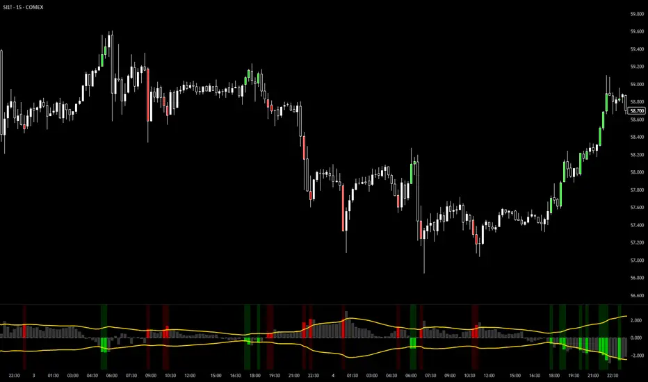
LNL Smart TICKLNL Smart TICK
This study is mostly beneficial for intraday traders. It is basically a user-friendly "colorful" representation of the $TICK chart with highlighted $TICK extremes. This indicator also includes: a simple trend gauge that can visualize the bias for the day, cumulative tick cloud which is showing the cumulative strength of either longs & shorts on the day.
$TICK Trend Gauge
Although it is just a exponential moving average. This average (default set on 20) works quite well as an overall gauge for the day. Whenever the gauge is green (above zero), any negative $TICK values below -500 can offer great pullback opportunities. Same applies for the red gauge. 20 EMA is below zero ? Great time to fade any +500 or +1000 tick readings. Obviously the gauge can be ajdusted to any number based on personal style.
$TICK Extremes (little triangles)
These little triangles are triggered anytime $TICK jumps above or below the pre-set values of +1000 or -1000. By just simply observing the $TICK triangles during the day can tell you how much volaility or pressure there is. Sometimes there will be 20 green triangles and only 2 red ones. That obviously mean there is a strong bearish pressure. But there will be days when you are not going to see any triangles at all which can mean there is either a low volatility or the price is stuck in the indecisive market.
Cumulative $TICK Cloud
Cumulative $TICK by itself is a great study for day traders. It is basically running "counting" $TICK that is adding the previous $TICK values from previous bars. Cumulative $TICK can create a direct picture of the current market sentiment. It is not just a simple green / red line but a cloud that can really show you the depth on the $TICK. Some days, the cloud will be quite wide which is a good sign for the strength to one side, but sometimes the cloud will be so narrow it will practically disappear. This would be telling you the exact opposite - not much conviction to any side. Of course the depth as well as the color of the cloud can change during the day.
$TICK & Cumulative $TICK Tables
By just looking at these tables. You can immidiately tell the state of the current $TICK. They both can be red or green. It all depends whether the values are positive or negative. The tables are just a little visual addition to the whole $TICK study.
Hope it helps.
LNL Keltner CandlesLNL Keltner Candles
This indicator plots mean reversion (reversal) arrows with custom painted candles based on the price touch or close above or below keltner channel limits (upper & lower bands). This study was created primarily for swing trading & higher time frames such as daily and weekly. Lower time frames might result in more false signals.
Mean Reversal Arrows:
1. Reversal Arrow Up - If the price drops below the lower band extremes, reversal up is the trigger for a bullish mean reversion.
2. Reversal Arrow Down - Once the price reach the higher band extremes, reversal down is the trigger for a bearish mean reversion.
The Concept of Mean Reversion:
There are just two types of moves in any market: The market is either expanding from the mean or retracing back to the mean. These reversions & epxansions are happening across all types of markets. The goal of this study is to catch the powerful mean reversion from extremes back to the mean. Once the candles light up green / red, it is time to look for the reversal (purple) arrow which triggers the mean reversion setup. Mean reversion is not about catching the next big swing turn to new highs or lows. It is all about the base hits = the mean. So the target here is always the average price. The idea here is to catch the average market ebbs & flows, not the next home run.
What Do I Mean by Mean?
Mean is usually the average price from the last 20-30 bars. Basically something like a 20 MA or Keltner Channel or Bollinger Band midline are really good visual representators of the mean (average price).
Hope it helps.

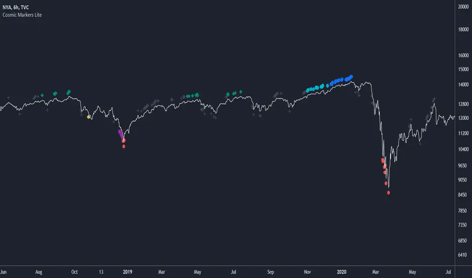
Cosmic Markers LiteThis marker-only indicator traces highest and lowest bars using 5 different periods (the first 3 in aggregation and the rest as is) for a total of 10 support and resistance signals of varying strength. Use Cosmic Markers Lite on its own or add on top of existing chart patterns or other line indicators.
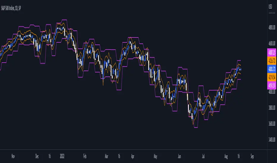
Daily/Weekly ExtremesBACKGROUND
This indicator calculates the daily and weekly +-1 standard deviation of the S&P 500 based on 2 methodologies:
1. VIX - Using the market's expectation of forward volatility, one can calculate the daily expectation by dividing the VIX by the square root of 252 (the number of trading days in a year) - also know as the "rule of 16." Similarly, dividing by the square root of 50 will give you the weekly expected range based on the VIX.
2. ATR - We also provide expected weekly and daily ranges based on 5 day/week ATR.
HOW TO USE
- This indicator only has 1 option in the settings: choosing the ATR (default) or the VIX to plot the +-1 standard deviation range.
- This indicator WILL ONLY display these ranges if you are looking at the SPX or ES futures. The ranges will not be displayed if you are looking at any other symbols
- The boundaries displayed on the chart should not be used on their own as bounce/reject levels. They are simply to provide a frame of reference as to where price is trading with respect to the market's implied expectations. It can be used as an indicator to look for signs of reversals on the tape.
- Daily and Weekly extremes are plotted on all time frames (even on lower time frames).
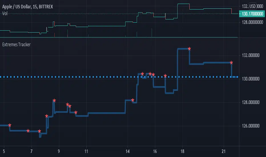
Extremes Tracker v1.0The close graph is plotted (func. plot) and the points of extremes (func. pivothigh and pivotlow) are marked on it (func. plotchar)
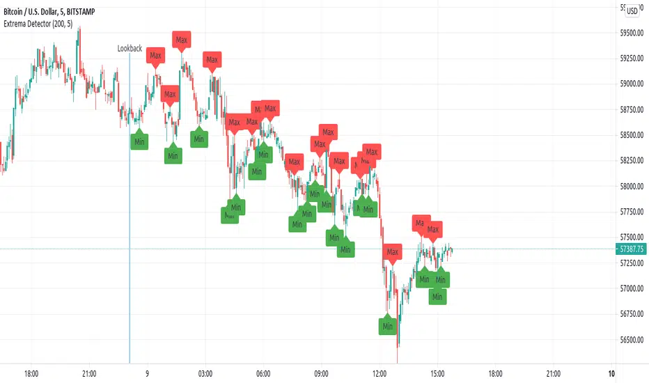
Extrema DetectorDetermines local maximums and minimums points in the chart.
Parameters:
lookback : number of candlesticks to look.
extrema_finder_sensivity : If lower, more extreme points will be found (may over-find).
Brief algorithm description:
Computes a Simple Moving Average (length= extrema_finder_sensivity ), and searches for its local extremes.
Given some SMA extreme, it looks the previous extrema_finder_sensivity candlesticks to find the highest (or lowest value).
Notes:
Is a lagged indicator: determining if the current candlestick have reach a maximum can be delayed to, at most extrema_finder_sensivity -further candlesticks.
Indicator: Near Close Channel [xQT5]My personal version of Donchain Channels, where I little modified a code for more a dynamic and realistic behavior of extremes.
Enjoy it!

Extremes (Expo) Extremes (Expo)
DESCRIPTION
This Extreme (Expo) indicator identifies areas where the market is extreme. The length of the extreme calculation can be changed and gives you the flexibility to choose how sensitive the indicator should be. A longer length means that the indicator only identifies bold extremes. A shorter length is more sensitive and thus identifies all extremes in the market.
When the market is in an extreme mode, keep your trade until the extreme mode ends.
Postive extreme is when the price is above the positive extreme lines. (Keep your long trade until the positive extreme ends).
Negative extreme is when the price is below the negative extreme lines. (Keep your short trade until the negative extreme ends).
The Extremes (Expo) can be used to visualize the trend. Price crossing indicates a directional change. Price can also bounce off the extremes lines, which can act as dynamic support and resistance. It is often used in combination with other signals and analysis techniques.
TREND
The indictor has a Trend- feature that can be switched on which identifies trend shifts as well as trend direction.
A positive trend is when all three trendlines are green, and when the price is at least above one of these three lines.
A Negative trend is when all three trendlines are red, and when the price is at least under one of these three lines.
When the color of the trend lines changes color it indicates that the trend might shift direction. When all three trendlines have shifted color a trend is established.
PULLBACK
A bonus feature that is added to the trend-setting is that it can detect pullbacks in trends. This is visualized by that one of the three trendlines change color. For instance, say that all 3 lines are red (negative trend) and one of these lines changes color to green it can be regarded as a pullback in the negative trend.
HOW TO USE
1. Use the indicator to identify extreme areas.
2. Use the indicator to identify trends.
3. Use the indicator to identify trend shifts.
4. Use the indicator to identify pullbacks in trends.
INDICATOR IN ACTION
EXTREMES
BTCUSD
BTCUSD
TESLA
WALL STREET
TREND & PULLBACK
WALL STREET
EURUSD
I hope you find this indicator useful , and please comment or contact me if you like the script or have any questions/suggestions for future improvements. Thanks!
I will continue to work on this indicator, so please share your experience and feedback with me so that I can continuously improve it. Thanks to everyone that have contacted me regarding my scripts. Your feedback is valuable for future developments!
ACCESS THE INDICATOR
• Contact me on TradingView or use the links below
-----------------
Disclaimer
Copyright by Zeiierman.
The information contained in my scripts/indicators/ideas does not constitute financial advice or a solicitation to buy or sell any securities of any type. I will not accept liability for any loss or damage, including without limitation any loss of profit, which may arise directly or indirectly from use of or reliance on such information.
All investments involve risk, and the past performance of a security, industry, sector, market, financial product, trading strategy, or individual’s trading does not guarantee future results or returns. Investors are fully responsible for any investment decisions they make. Such decisions should be based solely on an evaluation of their financial circumstances, investment objectives, risk tolerance, and liquidity needs.
My scripts/indicators/ideas are only for educational purposes!

Volume Weigthed Extreme DeviationThis indicator calculates extreme deviation areas of the difference of zero-lag fast and slow exponential moving averages with volume (for Volume Weighted version). Here is a connection between the distance of prices to their respective moving averages (default periods are 50/200) and standard deviations (default period is 20) . Like in the academic literature, the idea behind this indicator depends on that prices tend to exhibit “reversal to the mean” attributes. By using both volume and standard deviation of moving averages, volatility is considered in calculations too.
The red zones are the “Extreme Zones” which signals and warns about possible incoming reversal. Because the indicator is semi non-directional, it is suggested to use it with a momentum indicator such as TTI , TPI or RSI . Using of momentum indicators becomes safer using it with ExDev/VoWExDev
The green zone is the “Trade Safe” areas which indicates that if the price and indicator moves in same directions, the price is trending or market has relatively greater volume (for Volume Weighted version) than past periods. On the other hand, if the indicator floats in gray “No Trade” zone, the market is in ranging mode probably. Signal line (black dashes, default is 55) can be used for new orders. In a scenario in which price and the indicator moves together in same direction and then indicator starts to change direction, indicates a possible trend reversal approaches in coming periods. Waiting for both momentum and ExDev/VoWExDev extreme zones would be a good strategy. Seeking for divergences between momentum and opposite ExDev ExDev/VoWExDev extreme zone is the best long/short strategy developed so far.
Notes:
VoWExDev refers to Volume Weighted Extreme Deviation
Multiplier adjusts the wave frequency of the indicator. Higher multiplier lowers the wave frequency of the indicator and vice versa.
Look Back is the calculation period of the standard deviation.
These two indicators are suitable for all markets for all time periods if there is enough back data to calculate. There would be significant differences between two versions due to volume as expected. For the markets lack of volume data, ExDev version is suggested to use.
Türkçe:
Bu indikatör, hacim ağırlıklı gecikmesiz üssel hareketli ortamaların birbirlerinden aşırı saptığı bölgeleri hesaplamaktadır. Fiyatın hareketli ortamaladan uzaklaşmasının standart sapması hesaplanarak aşırılık bölgeleri indikatör üzerinde gösterilmektedir. Bu indikatör, akademik çalışmalarda da bahsedilen “fiyat ortalamaya dönme eğilimindedir” teorisi üzerine geliştirilmiştir. Hareketli ortamala farklarının standart sapmasının hesaplanması ve hacim ile ilişkilendirilmesi ile volatilitede göz önünde bulundurularak indikatör hesaplamasına dahil edilmiş oldu.
İndikatördeki kırmızı bölgeler “Aşırılık Bölgelerini” gösterir ve muhtemel bir trend dönüşünün yaklaştığını sinyaller ve uyarır. İndikatör, fiyat yönünden yarı bağımsız hareket ettiği için TTI ,TPI ya da RSI gibi herhangi bir momentum indikatörü ile kullanılması önerilir. Momentum indikatörlerinin kullanılması bu indikatör ile birlikte daha güvenli hale gelmektedir.
Yeşil alan “Güvenli İşlem” bölgesini göstermektedir. Fiyat ve indikatör aynı yönde giderken piyasanın trendde olduğunu ve hacim ağırlıklı versiyonda da geçmiş dönemlere göre hacimin de göreceli olarak yükseldiğini göstermektedir. Diğer bir taraftan eğer indikatör gri “İşlem Yapma” bölgesinde dalgalanıyorsa piyasa muhtemelen yatay harekete geçmiştir. Sinyal çizgisi (kesik siyah çizgi, bazı 55) yeni işlemlere giriş için kullanılabilir. Fiyat ve indikatörün aynı yönde hareket ettiği ve indikatörün fiyattan önce yön değiştirmeye başladığı senaryoda indikatör, yaklaşan periyodlarda trendin dönebileceğini göstermektedir. Böyle bir senaryoda ExDev/VoWExDev ve momentum indikatörlerinin ikisinin de aşırılık bölgesine girmesinin beklenmesi iyi bir strateji olabilir. Momentum indikatörlerinde uyumsuzluk olduğu anlarda da indikatör aşırılık bölgesinde ise ve iki indikatörün birbirine göre de uyumsuz olduğu senaryolar şu ana kadar geliştirilmiş en başarılı stratejidir.
Notlar:
VoWExDev hacim ağırlıklı aşırı sapma indikatörünü tanımlamaktadır.
Multiplier/Çarpan, indikatörün dalga frekansını ayarlamaktadır. Çarpan yükseldikçe indikatör frekansı düşer veya tersi.
Look Back, standart sapmanın hesaplama periyodudur.
Bu indikatörler, eğer yeterli geçmiş veri varsa her piyasayda her zaman periyodunda kullanılabilir. Hacimden dolayı iki versiyon arasında bariz farklar olabilir ve bu beklenen bir şeydir. Hacim verisinin olmadığı marketlerde ExDev versiyonunun kullanılması önerilir.
Örnek stratejiler için/ For sample strategies:
kriptomuhtar.com/dersler/asiri-sapma-ve-hacim-agirlikli-asiri-sapma/

B3 Donchian CloudsThis is the Donchian Channel expressed with a percentage cloud. Default 12.5% of the range will be filled at each edge, this helps to show reversal possibilities as price returns to the area between the clouds. This offers a usage to essentially fade the turtle trader system. That system is loosely based on the playing of the breakouts of the the channel... as you can see the that last turtle trade long in YM1! was and is off the charts awesome. I will look for the fall out of the cloud to short the market.
