Anchored OBV + A/DAnchored OBV + A/D is a single-pane indicator that allows On-Balance Volume (OBV) and Accumulation/Distribution (A/D) to be plotted together using a period-anchored approach.
OBV and A/D are cumulative by nature, which makes their full-history absolute values arbitrary and often incomparable when plotted side-by-side . This script addresses that limitation by anchoring each indicator to a user-defined period (daily, weekly, monthly, etc.) and plotting their relative change from that baseline rather than their raw values. The result is a comparison that preserves each indicator’s internal structure (trends, inflections, and divergences) while minimizing scale conflicts.
How it Works
At the start of each selected anchor period, the script records the current OBV and A/D values as baselines. All subsequent values are plotted as changes relative to those baselines:
- Percent mode measures the % change from the baseline.
- Delta mode measures the absolute change from the baseline.
Optional anchor markers and a zero line make it easy to see when resets occur and how each indicator behaves relative to the period’s starting point.
Advantages vs using OBV and A/D separately
- Direct visual comparison: Both indicators are on the same anchored scale, making relative movement immediately readable.
- Preserved analytical structure: Trends, inflections, and divergences remain intact; time-based shape is not distorted.
- Cleaner workflow: One indicator, one pane, and less chart clutter.
Interpretation
- Values above zero indicate net accumulation or positive volume pressure since the anchor.
- Values below zero indicate net distribution or negative volume pressure since the anchor.
- Trend confirmation: Rising price accompanied by rising anchored OBV and A/D suggests healthy participation.
- Price Divergence: Price making new highs or lows while one or both indicators fail to confirm can indicate weakening participation or a potential change in behavior.
- OBV vs A/D Interaction: When both move together, volume and close-location effects broadly agree. When they diverge, it highlights differences between net up/down volume (OBV) and intrabar accumulation/distribution (A/D).
Warnings!
- Percent mode can become visually unstable when baseline OBV or A/D values are near zero due to division effects inherent in percent-change calculations.
- It is not recommended to interpret structure across periods as each period is relative to a different baseline. Structure is not preserved across periods - only within each individual period.
Credits
This script is inspired by Multi-Ticker Anchored Candles (MTAC) by @SamRecio . MTAC's anchored-baseline concept and open-source nature provided an important conceptual foundation for adapting the same idea to OBV and A/D. Many thanks to @SamRecio for publishing his work openly.
能量潮指標(OBV)

OBV 3 MA Delta V2 + VWOBV Momentum
OBV 3 MA Delta – Adaptive OBV for Different Market Structures
Most traders use traditional OBV as a universal tool across all markets.
However, after extensive testing, I realized this assumption is fundamentally flawed.
👉 Each market has a different relationship between price and volume.
Crypto, equities, indices, and futures do NOT distribute volume the same way.
________________________________________
The Core Problem with Traditional OBV
Classic OBV relies on a binary logic:
• If price closes up → add full volume
• If price closes down → subtract full volume
This works reasonably well in some markets, but fails in others:
• In Crypto (BTC, ETH) → strong volatility, momentum-driven volume
• In Equity Indices (S&P 500) → smoother trends, institutional volume absorption
As a result:
• OBV can lag,
• miss early divergences,
• or completely flatten important volume signals.
________________________________________
What This Indicator Does Differently
This indicator introduces multiple OBV calculation modes, allowing OBV to adapt to the market structure instead of forcing one formula everywhere.
Calculation Modes Included
OBV Close
Uses price change × price level × volume
→ More sensitive to real price effort, especially effective for crypto markets
OBV Standard
Classic OBV logic
→ Kept for comparison and backward compatibility
VWOBV % (Volume-Weighted OBV by % Price Change)
Volume is weighted by percentage price movement, not just direction
→ Excellent for indices and large-cap markets
VWOBV Momentum
Measures volume-weighted price acceleration, not just accumulation
→ Highlights hidden institutional momentum that standard OBV often misses
________________________________________
BTC vs S&P 500 — Why One OBV Is Not Enough
Bitcoin (BTCUSDT)
Using OBV Close, bearish divergence appears early and clearly, well before price breaks down.
Traditional OBV also shows divergence, but later and weaker.
S&P 500
With classic OBV, divergence is shallow and often unclear.
However, when switching to VWOBV % or VWOBV Momentum,
the divergence becomes deep, structured, and visually obvious.
👉 Same indicator, same settings — different market, different behavior.
This clearly demonstrates:
OBV must adapt to the market, not the other way around.
________________________________________
Additional Features
• Optional Heikin Ashi smoothing (auto-disabled on higher timeframes)
• Flexible reset modes (daily, weekly, monthly, custom bars, specific date)
• 3 Moving Averages on OBV for structure & trend confirmation
• Clean visuals, minimal clutter
• Designed for comparison & experimentation, not black-box signals
________________________________________
Final Thoughts
This indicator is not claiming one OBV formula is “the best”.
Instead, it provides a framework:
• Test how price and volume interact in your market
• Choose the OBV model that reflects that behavior
• Use divergences as context, not blind signals
Enjoy and happy trading!
DISCLAIMER
This script is intended for informational and educational purposes only. It does not constitute financial, investment, or trading advice. All trading decisions made based on its output are solely the responsibility of the user
M.KHOA

On Balance Volume (with Candles)OBV+ is an enhanced On Balance Volume indicator that visualizes volume flow either as a line or candlestick-style OBV bars. It shows whether volume is accumulating or distributing, and includes optional moving-average smoothing and Bollinger Bands on OBV to identify trend direction, consolidation, and breakout strength.
Use-Cases
This indicator is especially useful for:
Bullish setup:
Price sideways + OBV rising → accumulation
Bearish setup:
Price rising + OBV flat/falling → distribution
Breakout confirmation:
Price breakout + OBV breaking BB → high conviction move
Options selling filter:
Flat OBV + compressed BB → range-bound market

SNIPER Initial Balance V1SNIPER INITIAL BALANCE V1
### What It Does
Draws the first hour's high/low range with extensions and breakout signals.
### IB Times (Auto-Selected)
| Market Type | IB Period (ET) |
|-------------|----------------|
| Index (ES/NQ/YM) | 9:30 - 10:30 |
| Gold (GC/MGC) | 8:30 - 9:30 |
| Energy (CL) | 9:00 - 10:00 |
### Levels Drawn
| Level | Style | Purpose |
|-------|-------|---------|
| IB High | Solid | Resistance |
| IB Low | Solid | Support |
| IB Mid | Dashed | Mean reversion |
| 50% Ext | Dotted | Target 1 |
| 100% Ext | Dotted | Target 2 |
| 1SD (1.28x) | Dashed | 80% range |
| 2SD (2.0x) | Dashed | 95% range |
### Signals
| Signal | Meaning | Action |
|--------|---------|--------|
| `IB↑` | Breakout above IB High | Look for long |
| `IB↓` | Breakout below IB Low | Look for short |
| `RT↑` | Retest long entry | **BEST ENTRY** - Go long |
| `RT↓` | Retest short entry | **BEST ENTRY** - Go short |
| `FK` | Fakeout warning | **AVOID** - Don't enter |
### Entry Requirements (All Must Be True)
- ✅ Close above/below level (not just wick)
- ✅ Volume ≥ 1.3x average
- ✅ Body ≥ 60% of candle
- ✅ Minimal adverse wick
### Quick Trade Plan
```
LONG: Wait for RT↑ → SL below IB Low → TP at 50% or 100% ext
SHORT: Wait for RT↓ → SL above IB High → TP at 50% or 100% ext
```
---

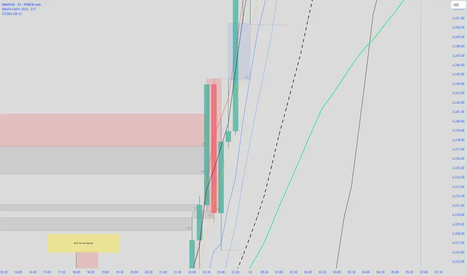
CODEX OB V1CODEX OB V1 is a multi-purpose Smart Money Concepts (SMC) indicator that automatically detects and visualizes key institutional trading elements such as Order Blocks, Fair Value Gaps, Rejection Blocks, Break of Structure, Pivots, High Volume Bars, and several qualitative SMC signals.
This tool helps traders identify institutional footprints and displacement-based setups with high clarity.
Momentum & Flow PanelA lower-panel indicator for institutional flow analysis:
RSI with automatic divergence detection
Money Flow Index (MFI) - volume-weighted momentum
Chaikin Money Flow (CMF) - accumulation/distribution
OBV trend analysis
Stochastic RSI
Force Index
Composite Scores: Momentum (0-100) + Flow (0-100) → Combined Assessment

AI ALGO SETUP by A+AI ALGO SETUP by A+.
This Setup helps the Intraday Trader have an Edge in the Market

On Balance Volume ModA/D doesnt take into account the opening price, it just sees the difference in high to close wik vs close to low wik and adds volume
however if the closing price is above the opening price then arguably there was more buying action than selling
so adjusting A/D formula so that if close > open then it adds to volume not subtract
Effectively this becomes something in bw OBV and A/D
also we need not worry about gaps, since no tradding happens in gaps, so just a gap up / gap down doesnt have any accumulation / distribution effect

Stat Map Pro: Z-Score + RSI + Vol + Div StatMap Ultimate is a multi‑factor statistical mapping tool designed to give traders a deeper view of market extremes, momentum, and hidden divergences. By combining Z‑Score analysis, RSI momentum signals, volume spikes, and divergence detection, this indicator helps you spot high‑probability turning points and confluence setups with clarity.
🔑 Key Features
- Z‑Score Candles: Price is normalized against its statistical mean, showing how far OHLC values deviate from equilibrium. This makes overbought/oversold zones (+2σ / ‑2σ) visually clear.
- RSI Integration: Candle coloring adapts to RSI momentum, highlighting bullish/ bearish bias and extreme conditions (OB/OS).
- Volume Spike Detection: Borders and wicks turn gold when volume exceeds a customizable threshold, signaling strong participation.
- Divergence Mapping: Automatic detection of bullish and bearish divergences between price and Z‑Score pivots, plotted directly on the chart.
- Confluence Signals: Simple circle markers highlight extreme setups where Z‑Score and RSI align, helping traders identify potential reversals.
🎯 How to Use
- Watch for Z‑Score extremes (+2σ / ‑2σ) combined with RSI OB/OS for potential turning points.
- Use gold volume spikes to confirm strong market interest.
- Pay attention to divergence labels (Bull Div / Bear Div) for early reversal clues.
- Combine signals for high‑confidence entries/exits in your trading strategy.
⚡ Why It’s Powerful
Stat Map Pro transforms raw price, momentum, and volume data into a unified statistical framework. Instead of relying on a single indicator, you get a multi‑layered confluence map that highlights when markets are stretched, exhausted, or primed for reversal.

CVD Smart ReversalCVD Smart Reversal - Indicator Description
═══════════════════════════════════════════════════════════════
🎯 OVERVIEW
Advanced reversal detection system based on Cumulative Volume Delta (CVD) analysis with intelligent quality filtering. Each signal is rated 1-5 stars based on multiple confirmation factors.
═══════════════════════════════════════════════════════════════
🌟 KEY FEATURES
1. Quality Score System (⭐1-5)
• 5 independent criteria evaluate each signal
• Filter weak setups - show only 3+ star signals
• Higher scores = higher probability setups
2. Adaptive Thresholds
• Automatically adjusts to market volatility
• High volatility = stricter criteria
• Works across all market conditions
3. Volume Context Analysis
• Compares current vs historical volume
• Calculates buy/sell pressure (requires >60%)
• Filters reversals with weak volume
4. Multi-Timeframe Confirmation (Optional)
• Validates signals on higher timeframe
• Ensures trading with the trend
• Reduces counter-trend entries
5. Smart Signal Management
• Minimum 5-bar spacing between signals
• Automatic label cleanup (max 20)
• Clean chart, no clutter
═══════════════════════════════════════════════════════════════
📊 HOW IT WORKS
CVD Calculation:
Custom volume delta calculation using intrabar polarity estimation.
Signal Detection:
Combines CVD reversal, candlestick patterns (Hammer, Shooting Star, Engulfing, Pin Bar), and divergence analysis.
Quality Scoring:
Each signal scores 0-5 points based on:
• CVD strength (statistical deviation)
• Pattern quality (professional recognition)
• Divergence presence
• Volume context (ratio + pressure)
• Trend confirmation (MTF or acceleration)
═══════════════════════════════════════════════════════════════
🎮 USAGE MODES
Sniper Mode (High Quality):
• Min Score: 4-5 stars
• MTF: ON
• Result: 2-5 signals/day, highest win-rate
Active Mode (Balanced):
• Min Score: 3 stars
• MTF: OFF
• Result: 5-15 signals/day, good balance
Scalping Mode (High Frequency):
• Min Score: 2 stars
• Divergence: Weak
• Result: Many signals, fast execution needed
═══════════════════════════════════════════════════════════════
💡 BEST PRACTICES
• Use on liquid markets with reliable volume data
• Combine with key support/resistance levels
• Pay attention to quality scores - 4-5★ have significantly higher success
• Enable MTF confirmation for intraday trading
• Use stricter settings during high-impact news events
═══════════════════════════════════════════════════════════════
⚙️ DEFAULT SETTINGS
• Quality Filter: ON
• Minimum Score: 3 stars
• MTF Confirmation: OFF
• Volume Analysis: ON
• Divergence Strength: Medium
These settings provide 5-15 quality signals per day on active instruments.
═══════════════════════════════════════════════════════════════
🔔 ALERTS
Four alert types available:
• Strong Bullish Reversal (4-5★ only)
• Strong Bearish Reversal (4-5★ only)
• Regular Bullish Reversal (all qualified)
• Regular Bearish Reversal (all qualified)
═══════════════════════════════════════════════════════════════
⚠️ LIMITATIONS
• Requires volume data (not suitable for markets without volume)
• MTF confirmation adds lag by design
• Lower timeframes may need adjusted settings
• Quality filter reduces signal frequency by design
═══════════════════════════════════════════════════════════════
🎯 ORIGINALITY
This indicator combines multiple unique elements:
• Multi-factor quality scoring (not found in other CVD tools)
• Adaptive volatility-based thresholds
• Volume pressure calculation with directional filter
• Integrated MTF confirmation within scoring system
• Smart label management with automatic cleanup
The quality scoring system transforms CVD analysis from binary signals into a ranked opportunity system, allowing traders to prioritize setups based on confluence strength.
═══════════════════════════════════════════════════════════════
📈 DISPLAY ELEMENTS
• Background highlighting on signal bars
• Triangle markers at entry points
• Labels showing CVD, Delta, Divergence, Quality Score, Volume flag
• Real-time info panel with CVD metrics
• Clean visual presentation
═══════════════════════════════════════════════════════════════
✅ SUITABLE FOR
• Crypto (BTC, ETH, etc.)
• Stocks (AAPL, TSLA, SPY, etc.)
• Futures (ES, NQ, CL, etc.)
• Forex (brokers with volume data)
• All timeframes (1m to 1D)
═══════════════════════════════════════════════════════════════

HTF BIAS FILTER🧭HTF Bias Filter Indicator: 5 in 1 indicator
Technical Overview
The Bias Filter is a comprehensive multi-timeframe tool designed to confirm directional bias using five key indicators before entering a trade. It plots higher-timeframe Moving Averages directly on the chart and provides an immediate status summary via a static dashboard.
The more confluence on the dashboard, the greater the probability of the direction of the trade.
1. 📊 Display Components
A. Plotted Lines
The indicator uses the request.security function to draw Moving Averages from higher timeframes onto your current chart:
1H EMA 21 (Purple): The 21-period Exponential Moving Average calculated on the 1-Hour (60 min) chart. Plotted using a step-line style.
4H EMA 50 (Red): The 50-period Exponential Moving Average calculated on the 4-Hour (240 min) chart. Plotted using a step-line style.
B. Directional Dashboard
A fixed-position summary table is anchored to the bottom-right corner of the chart, providing a quick glance at the current status of all five filters.
2. 🎨 Colour Logic
Each of the five indicators is assigned a colour based on its current directional signal. The more indicators that show the same colour (confluence), the stronger the signal and the higher the likelihood of a high-probability trade.
🟢 Green indicators are signaling UP/BUY (Bullish momentum or trend).
🔴 Red indicators are signaling DOWN/SELL (Bearish momentum or trend).
⚫ Gray indicators are signaling Mixed or flat directions (neutral or undecided).
Note: The dashboard's main header color is determined by a strict confluence logic (All four 4H filters must align for Green/Red), while individual indicator colors follow the simple rules above.
3. 📋 Indicator Breakdown and Logic
The dashboard provides the direction of five different filters.
3.1. Higher-Timeframe (HTF) Trend Indicators
These two signals determine the immediate slope and direction of the primary Moving Averages:
4H EMA 50:
Timeframe: 4-Hour (240 min)
Logic: Compares the current EMA value to the value two bars ago on the 4H chart.
Output: UP ↑, DOWN ↓, or FLAT ⏸
1H EMA 21:
Timeframe: 1-Hour (60 min)
Logic: Compares the current EMA value to the value two bars ago on the 1H chart.
Output: UP ↑, DOWN ↓, or FLAT ⏸
3.2. 4-Hour Confluence Filters
These three indicators provide supplementary confirmation on Volume, Price Position, and Momentum, all calculated on the 4-Hour (240 min) chart:
4H OBV (Smoothed):
Timeframe: 4-Hour (240 min)
Logic: Direction is based on the current value of the 21-bar smoothed On-Balance Volume (OBV) compared to its value nine bars ago.
Output: UP ↑, DOWN ↓, or FLAT ⏸
4H ATR DIR (EMA Proxy):
Timeframe: 4-Hour (240 min)
Logic: Determines the price position by comparing the current Close price against the 4H EMA 50.
Output: BUY 🟢 (Close > EMA 50), SELL 🔴 (Close < EMA 50), or FLAT ⏸️ (Close = EMA 50).
4H RSI (14):
Timeframe: 4-Hour (240 min)
Logic: Momentum check comparing the 14-period Relative Strength Index (RSI) value against the 50 level.
Output: BUY 🟢 (RSI > 50), SELL 🔴 (RSI < 50), or FLAT ⏸️ (RSI = 50).

On Balance VolumeThis indicator provides an implementation of the classic On Balance Volume (OBV) momentum indicator, enhanced with a built-in divergence detection engine.
Key Features:
Full Divergence Suite (Class A, B, C): The primary feature is the integrated divergence engine. It automatically detects and plots all three major types of divergences:
Regular (A): Signals potential trend reversals.
Hidden (B): Signals potential trend continuations.
Exaggerated (C): Signals weakness at double tops/bottoms.
Divergence Filtering and Visualization:
Price Tolerance Filter: Divergence detection is enhanced with a percentage-based price tolerance (pivPrcTol) to filter out insignificant market noise, leading to more robust signals.
Persistent Visualization: Divergence markers are plotted for the entire duration of the signal and are visually anchored to the OBV level of the confirming pivot.
Note on Confirmation (Lag): Divergence signals rely on a pivot confirmation method to ensure they do not repaint.
The Start of a- divergence is only detected after the confirming pivot is fully formed (a delay based on Pivot Right Bars).
The End of a divergence is detected either instantly (if the signal is invalidated by price action) or with a delay (when a new, non-divergent pivot is confirmed).
Multi-Timeframe (MTF) Capability:
MTF OBV Line: The OBV line itself can be calculated on a higher timeframe, with standard options to handle gaps (Fill Gaps) and prevent repainting (Wait for...).
Limitation: The Divergence detection engine (pivDiv) is disabled if a timeframe other than the chart's timeframe is selected. Divergences are only calculated on the active chart timeframe.
Integrated Alerts: Includes 12 comprehensive alerts that trigger on the start and end of all 6 divergence types (e.g., "Regular Bullish Started", "Regular Bullish Ended").
DISCLAIMER
For Informational/Educational Use Only: This indicator is provided for informational and educational purposes only. It does not constitute financial, investment, or trading advice, nor is it a recommendation to buy or sell any asset.
Use at Your Own Risk: All trading decisions you make based on the information or signals generated by this indicator are made solely at your own risk.
No Guarantee of Performance: Past performance is not an indicator of future results. The author makes no guarantee regarding the accuracy of the signals or future profitability.
No Liability: The author shall not be held liable for any financial losses or damages incurred directly or indirectly from the use of this indicator.
Signals Are Not Recommendations: The alerts and visual signals (e.g., crossovers) generated by this tool are not direct recommendations to buy or sell. They are technical observations for your own analysis and consideration.

OBV (Delta or regular)This is a quite simple script to apply some choices to OBV.
You can choose to use regular OBV values or you can choose to use delta OBV values.
Delta OBV values calculates the delta between selling volume and buying volume per bar to find discrepancies.
You can make the OBV a smoothed line or just keep the normal rigid line. Rigid line is default.
A secondary smoothed OBV line is added automatically with color change if the OBV is above or below the smoothed line.
You can set your desired MA from SMA, EMA, VWMA and WMA, The same will be applied to both lines if chosen to smooth them both.
Both lines are editable from the styles tab (visibility, color and line type)
If you for some reason don't want color change on the secondary line, chose the same color for both color 1 and 2.
Simple delta OBV example:
If a red bar has a long lower wick, OBV will calculate the entire bar towards bearish volume, while the delta will check if there's more buying or selling happening in total. Some times you'll be able to catch divergences in the volume which implies a reversal might be in the making.
For instance more selling on a green candle making the OBV drop instead of increasing or vise versa.
Hopefully someone finds is useful.

Divergences: Price × RSI × OBV The Triple Confirmation Divergence indicator is a sophisticated momentum and volume-based tool designed to identify high-probability trend exhaustion points and potential reversals. It moves beyond traditional single-indicator divergence analysis by synthesizing signals from three core pillars of technical analysis: Price Action, Momentum, and Volume Flow.
This indicator works better on the time frames: 1H, 4H, 1D, 1W and 1M.

CMF, RSI, CCI, MACD, OBV, Fisher, Stoch RSI, ADX (+DI/-DI)Eight normalized indicators are used in conjunction with the CMF, CCI, MACD, and Stoch RSI indicators. You can track buy and sell decisions by tracking swings. The zero line is for reversal tracking at -20, +20, +50, and +80. You can use any of the nine indicators individually or in combination.

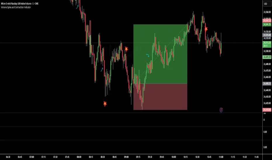
Volume Spike and Contraction IndicatorSimple script to map volume contractions and spikes with emojis and plots above or below depending on the flow of the signal
OBV Cloud v1.0 [PriceBlance]🌐 English
OBV Cloud v1.0 – Free & Open-Source
OBV Cloud v1.0 integrates On-Balance Volume (OBV) with a Cloud model and enhanced trend filters.
It helps traders quickly identify:
Money Flow Trend: OBV Cloud acts as a dynamic support/resistance zone.
Trend Filters: EMA9 (short-term) and WMA45 (medium-term) directly applied on OBV.
OBV–Price Divergence: Detects both regular and hidden bullish/bearish divergences.
Trend Strength: Measured with ADX calculated on OBV.
OBV Cloud is suitable for both swing and day trading, allowing traders to spot breakouts, reversals, or sustained trends through volume-based analysis.

Bullish Breakout - SBStep 1 – Chart Setup
Timeframe: 5-minute
Studies to add:
VWAP (Session VWAP)
EMA 9 & EMA 20 (trend filter)
Bullish Breakout – Clean v6.1
⚙️ Step 2 – Indicator Settings (scalping mode)
Resistance lookback: 15
Volume confirmation: ON, multiplier = 1.2–1.3 (lighter requirement, more signals).
RSI filter: ON, threshold = 55 (looser than intraday swing).
MACD filter: ON
HTF filter: ON → timeframe = 15m, EMA = 50 (so trades align with short-term trend).
Retest check: ON (safer signals).
ATR stop/targets: ON → ATR length 14, Stop = 1.0×ATR, T1 = 0.7×ATR, T2 = 1.4×ATR.
Visuals: Stealth Mode ON (just arrows + compact label).
🎯 Step 3 – Entry Rules
Wait for a green breakout arrow under a 5m bar.
Confirm conditions:
Price is above VWAP.
EMA 9 > EMA 20 (micro trend bullish).
Optional: RSI > 55 and volume above SMA×1.2.
Enter at close of breakout bar.
Aggressive: enter right on arrow.
Conservative: enter only if teal retest dot confirms.
🛡️ Step 4 – Risk/Exit Plan
Stop loss: red ATR line (~1×ATR below entry).
Target 1 (T1): yellow ATR line (~0.7×ATR above entry).
Target 2 (T2): green ATR line (~1.4×ATR above entry).
Management:
Sell 70% at T1, move stop to entry.
Let 30% run to T2 or trail with EMA 9.
🔔 Step 5 – Alerts
Set TradingView alerts for:
Bullish Breakout (green arrow)
Breakout Retest Confirmed (teal dot)
So you don’t miss quick setups during the session.
⚡ Extra Scalping Tips
Focus on liquid tickers (ORCL, MSFT, AAPL, NVDA, etc.) — tight spreads, good volume.
Trade first 2–3 hours after market open for best volatility.
Avoid scalping right before big news (FOMC, earnings).
Don’t overstay: average 10–30 minutes per trade.

Nirvana True Duel전략 이름
열반의 진검승부 (영문: Nirvana True Duel)
컨셉과 철학
“열반의 진검승부”는 시장 소음은 무시하고, 확실할 때만 진입하는 전략입니다.
EMA 리본으로 추세 방향을 확인하고, 볼린저 밴드 수축/확장으로 변동성 돌파를 포착하며, OBV로 거래량 확인을 통해 가짜 돌파를 필터링합니다.
전략 로직
매수 조건 (롱)
20EMA > 50EMA (상승 추세)
밴드폭 수축 후 확장 시작
종가가 상단 밴드 돌파
OBV 상승 흐름 유지
매도 조건 (숏)
20EMA < 50EMA (하락 추세)
밴드폭 수축 후 확장 시작
종가가 하단 밴드 이탈
OBV 하락 흐름 유지
진입·청산
손절: ATR × 1.5 배수
익절: 손절폭의 1.5~2배에서 부분 청산
시간 청산: 설정한 최대 보유 봉수 초과 시 강제 청산
장점
✅ 추세·변동성·거래량 3중 필터 → 노이즈 최소화
✅ 백테스트·알람 지원 → 기계적 매매 가능
✅ 5분/15분 차트에 적합 → 단타/스윙 트레이딩 활용 가능
주의점
⚠ 횡보장에서는 신호가 적거나 실패 가능
⚠ 수수료·슬리피지 고려 필요
📜 Nirvana True Duel — Strategy Description (English)
Name:
Nirvana True Duel (a.k.a. Nirvana Cross)
Concept & Philosophy
The “Nirvana True Duel” strategy focuses on trading only meaningful breakouts and avoiding unnecessary noise.
Nirvana: A calm, patient state — waiting for the right opportunity without emotional trading.
True Duel: When the signal appears, enter decisively and let the market reveal the outcome.
In short: “Ignore market noise, trade only high-probability breakouts.”
🧩 Strategy Components
Trend Filter (EMA Ribbon): Stay aligned with the main market trend.
Volatility Squeeze (Bollinger Band): Detect volatility contraction & expansion to catch explosive moves early.
Volume Confirmation (OBV): Filter out false breakouts by confirming with volume flow.
⚔️ Entry & Exit Conditions
Long Setup:
20 EMA > 50 EMA (uptrend)
BB width breaks out from recent squeeze
Close > Upper Bollinger Band
OBV shows positive flow
Short Setup:
20 EMA < 50 EMA (downtrend)
BB width breaks out from recent squeeze
Close < Lower Bollinger Band
OBV shows negative flow
Risk Management:
Stop Loss: ATR × 1.5 below/above entry
Take Profit: 1.5–2× stop distance, partial take-profit allowed
Time Stop: Automatically closes after max bars held (e.g. 8h on 5m chart)
✅ Strengths
Triple Filtering: Trend + Volatility + Volume → fewer false signals
Mechanical & Backtestable: Ideal for objective trading & performance validation
Adaptable: Works well on Bitcoin, Nasdaq futures, and other high-volatility markets (5m/15m)
⚠️ Things to Note
Low signal frequency or higher failure rate in sideways/range markets
Commission & slippage should be factored in, especially on lower timeframes
ATR multiplier and R:R ratio should be optimized per asset

[DEM] On Balance Volume On Balance Volume is an enhanced version of the classic OBV indicator that transforms volume-price momentum into a histogram format with dynamic color coding to visualize trend strength and direction changes. The indicator calculates traditional On Balance Volume by accumulating volume based on price direction, then applies user-selectable smoothing (SMA, EMA, RMA, WMA, or VWMA) followed by dual RMA filtering with fast (14-period) and slow (80-period) parameters to create a momentum oscillator. The final output displays the difference between fast and slow lines as colored columns, where lime indicates strengthening upward momentum, red shows intensifying downward momentum, fuchsia represents weakening upward momentum, and green signals weakening downward momentum. This approach provides traders with a clear visual representation of volume-based momentum shifts while filtering out noise through multiple layers of smoothing, making it easier to identify significant changes in buying and selling pressure compared to traditional OBV displays.

Bias + VWAP Pullback — v4 (PA + BOS/CHOCH)Simple idea: I identify the trend (bias) from the larger timeframe, and only trade pullbacks to the VWAP/EMA during liquidity (London/New York). When the trend is clear, gold moves strongly, and its pullbacks to the balance lines provide clear opportunities.
Timeframe and Sessions (Cairo Time)
Analysis: H1 to determine the trend.
Implementation: 5m (or 1m if professional).
Trading window:
London Opening: 10:00–12:30
New York Opening: 16:30–19:00
(avoid the rest of the day unless there is exceptional traffic).
Direction determination (BIAS)
On H1:
If the price is above the 200 EMA and the daily VWAP is bullish and the price is above it → uptrend (long-only).
If the price is below the 200 EMA and the daily VWAP is bearish and the price is below it → bearish trend (short-only).
Determine your levels: yesterday's high/low (PDH/PDL) + approximate Asia range (03:00–09:30).
Entry Rules (Setup A: Trend Continuation)
Asia range breakout towards Bias during liquidity window.
Wait for a withdrawal to:
Daily VWAP, or
EMA50 on 5m frame (best if both cross).
Confirmation: Confirmation low/high on 5m (HL buy/LH sell) + clear impulse candle (Body is greater than average of last 10 candles).
Entry:
Buy: When the price returns above VWAP/EMA50 with a confirmation candle close.
Sell: The exact opposite.
Stop Loss (SL): Below/above the last confirmation low/high or ATR(14, 5m) x 1.5 (largest).
Objectives:
TP1 = 1R (Close 50% and move the rest Break-even).
TP2 = 2.5R to 3R or at an important HTF level (PDH/PDL/Bid/Demand Zone).
Entry Rules (Setup B: Reversion to VWAP – “Mean Reversion”)
Use with extreme caution, once daily maximum:
Price deviation from VWAP by more than ~1.5 x ATR(14, 5m) with rejection candles appearing near PDH/PDL.
Reverse entry towards the return of VWAP.
SL small behind rejection top/bottom.
Main target: VWAP. (Don't get greedy — this scenario is for extended periods only.)
News Filtering and Risk Management
Avoid trading 15–30 minutes before/after strong US news (CPI, NFP, FOMC).
Maximum daily loss: 1.5–2% of account balance.
Risk per trade: 0.25–0.5% (if you are learning) or 0.5–1% (if you are experienced).
Do not exceed two consecutive losing trades per day.
Don't chase the market after the opportunity has passed — wait for the next pullback.
Smart Deal Management
After TP1: Move stop to entry point + trail the rest with EMA20 on 5m or ATR Trailing = ATR(14)×1.0.
If the price touches a strong daily level (PDH/PDL) and fails to break, consider taking additional profit.
If VWAP starts to flatten and breaks against the trend on H1, stop trading for the day.
Quick Checklist (Before Entry)
H1 trend is clear and consistent with 200EMA + VWAP.
Penetrating the Asia range towards Bias.
Clean pull to VWAP/EMA50 on 5m.
Confirmation candle and real push.
SL is logical (behind swing/ATR×1.5) and R :R ≥ 1:2.
No red news coming soon.
Example of "ready-made" settings
EMA: 20, 50, 200 on 5m, 200 only on H1.
VWAP: Daily (reset daily).
ATR: 14 on 5m.
Levels: PDH/PDL + Asia Band (03:00–09:30 Cairo).
Gold Notes
Gold is fast and sharp at the open; don't get in early — wait for the draw.
Fakeouts are common before news: it is best to call with the trend after the price returns above/below VWAP.
Don't expect 80% consistent wins every day — the advantage comes from discipline, filtering out bad days, and only withdrawing when you're on the right track.
تعتبر شركة الماسة الألمانية أحد المؤسسات العاملة بالمملكة العربية السعودية ولها تاريخ طويل من الخدمات الكثيرة والمتنوعة التى مازالت تقدمها للكثير من العملاء داخل جميع مدن وأحياء المملكة حيث نقدم أفضل ما لدينا من خلال مجموعة الشركات التالية والتي من خلالها ستتلقي كل ما تحتاج إلية في كل المجال المختلفة فنحن نعمل منذ عام 2015 ولنا سابقات اعمال فى مختلف المجالات الحيوية التى نخدم من خلالها عملائنا ونوفر لهم أرخص الأسعار وبأعلى جودة من الممكن توفرها فى المجالات التالية :-
خدمات تنظيف المنازل والفلل والشقق
خدمات عزل الخزانات تنظيف غسيل صيانة اصلاح
خدمات جلي البلاط والرخام والسيراميك
خدمات نقل العفش عمالة فلبينية مدربة
خدمات مكافحة الحشرات بجدة
كل هذة الخدمات وأكثر نوفرها لكل المتعاقدين بأفضل الطرق مع توفير خطط وبرامج متنوعة لأتمام العمل المسنود إلينا بأفضل وأحدث الطرق الحديثة والعصرية سواء فى شركات النظافة بجدة ومكة المكرمة أو شركات نقل العفش بجدة عمالة فلبينية وباقى الخدمات مثل جلي وتلميع الرخام بمكة وجدة ولا ننسي شركة مكافحة حشرات بجدة التى ساعدت آلاف المواطنين على تنظيف منازلهم من الحشرات بأفضل مبيدات حشرية.

Triple Confirmation StrategyTriple Confirmation Strategy (TCS)
This indicator combines three different technical tools to provide more reliable entry signals:
RSI + Moving Average crossover → momentum confirmation
MACD line & signal crossover → trend direction signal
OBV + EMA crossover → volume-based confirmation
A signal is valid only if all three conditions occur within a given number of bars (default: 5). Optionally, it can be set to trigger only when the third confirmation happens at the current bar.
✨ Features
BUY / SELL markers on the chart
Alertcondition support → alerts can be set instantly
Grouped settings (RSI, MACD, OBV, Logic)
Diagnostic overlay (WSCD-style): RSI, MACD, and OBV visualized on a normalized –100…100 scale for easier monitoring
🎯 Usage
Suitable for both intraday and swing trading with default settings.
Parameters are fully customizable (lookback periods, bar window, diagnostic overlay).
Signals should not be used as a standalone trading system but are most effective when combined with broader context and other forms of analysis.

Triple Confirmation StrategyTriple Confirmation Strategy (TCS)
Ez az indikátor három különböző technikai eszközt kombinál a megbízhatóbb belépési jelek érdekében:
RSI + mozgóátlag keresztezés → momentum konfirmáció
MACD line & signal keresztezés → trendirány jelzés
OBV + EMA keresztezés → volumen alapú megerősítés
Egy jelzés akkor érvényes, ha mindhárom feltétel adott gyertyák számán belül (alapértelmezés: 5) teljesül. Opcionálisan beállítható, hogy csak akkor jelezzen, amikor a harmadik konfirmáció éppen megtörténik.
✨ Funkciók
BUY / SELL jelölés a chartra
Alertcondition támogatás → riasztás azonnal beállítható
Csoportosított beállítások (RSI, MACD, OBV, Logika)
Diagnosztikai overlay (WSCD-stílus): az RSI, MACD és OBV normalizált görbékkel –100…100 skálán vizuálisan is nyomon követhető
🎯 Használat
Alapbeállításokkal intraday és swing kereskedéshez is alkalmas.
A paraméterek szabadon állíthatók (ablakhosszok, gyertyaszám, diag overlay).
A jelek nem önálló kereskedési rendszerként, hanem kontextusban, más elemzésekkel együtt használva a leghatékonyabbak.
Triple Confirmation Strategy (TCS)
This indicator combines three different technical tools to provide more reliable entry signals:
RSI + Moving Average crossover → momentum confirmation
MACD line & signal crossover → trend direction signal
OBV + EMA crossover → volume-based confirmation
A signal is valid only if all three conditions occur within a given number of bars (default: 5). Optionally, it can be set to trigger only when the third confirmation happens at the current bar.
✨ Features
BUY / SELL markers on the chart
Alertcondition support → alerts can be set instantly
Grouped settings (RSI, MACD, OBV, Logic)
Diagnostic overlay (WSCD-style): RSI, MACD, and OBV visualized on a normalized –100…100 scale for easier monitoring
🎯 Usage
Suitable for both intraday and swing trading with default settings.
Parameters are fully customizable (lookback periods, bar window, diagnostic overlay).
Signals should not be used as a standalone trading system but are most effective when combined with broader context and other forms of analysis.