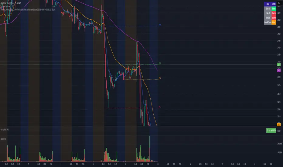
ATR Anchored Range %b by TradeSeekersAll time highs got you spooked to enter with no levels in sight?
Stuck in a multi-week range and wondering where the heck the pivots are!?
Wondering if you're longing the top or shorting the potential bottom and about to get smoked, sending you back to burger flipping?!
Fret not trading friends!
I've been crafting the ultimate map for scalpers, slingers, swingers, swindlers, swashbucklers -and traders too.
Why should I care about this, what's an ATR!?
Nearly any trader that's entered the markets has heard of ATR, perhaps even taken a stab at trying to calculate the flux capacity of a weekly ATR on a lower timeframe. Continually calculating things manually sucks!
Ok, so you haven't heard of ATR? It's the average true range... what's the true range!? It's simply the low subtracted from the high (high - low) of any given candle.
How is ATR useful?
The theory is simple, if the ATRs on the daily timeframe for a stock are 5, then traders may have a reasonable expectation that any day in the near future the stock will mostly move +/- 5 pts. This +/- 5 can be used as a possible daily high and low for traders to use.
But ATR changes as time passes, with every billionaire X post, viral cat meme, fed announcement or government shutdown the market makes it's move. This means without this tool, traders need to run the standard lame (sorry) ATR indicator and then hand draw a bunch of important levels (barf).
I'm convinced and ready to join the ATR army, what do I do?
Glad to have you aboard sailor, slap this indicator on your layout - it'll initially display a bottom panel, say nice things to it.
Usage
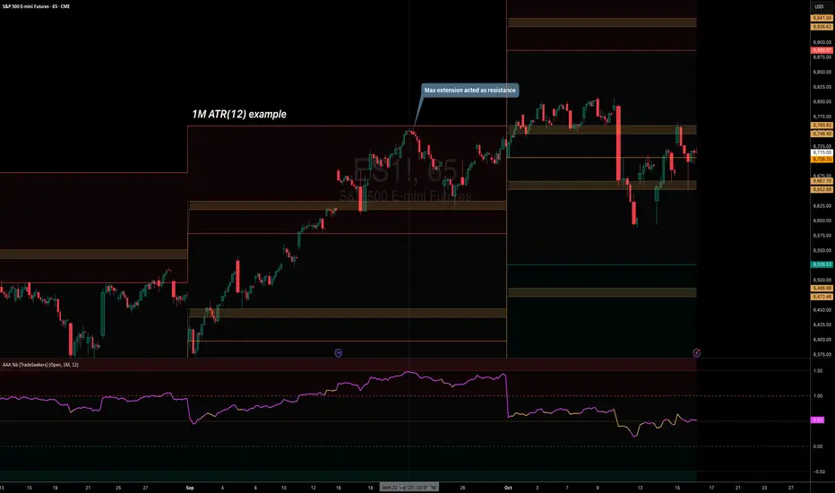
The lower panel provides a %b plot representative of the current price relative to the timeframe and period ATR. (Defaults to 1D timeframe and 20 - 20 trading days in a month yo)
This %b plot is a map for price against the key ATR based levels and resets each time the timeframe change occurs.
Keep reading! (maybe grab a snack, you're doing great)
If you want to see what the indicator sees, how it maths the math, open the settings and check the "overlay" option... it's amazing, I know.
Main base of operations
This will be the gray area between first red and green lines, imagine this is a future candle for the timeframe anchored. The red would represent the candle high (red means stop/overbought), and the green would represent the candle low (green means go/oversold).
Regardless of the timeframe anchored, this area always represents the area the ATR indicates will be the building area of the current candle being formed. Traders should expect most of the trading to occur within this area.
The mid line
Don't diddle in the middle, this by default is the open price and it's the ultimate bias filter for bull or bear riders.
Extension areas
Beyond the gray area is the extension zone, this provides a whole ATR from the mid line to the extension.
Assembling a trade plan
There are just a couple of key concepts to master in order to become the ultimate ATR samurai warrior, capable of slicing through even the messiest liquidity.
Above the midline and holding, but still within the gray area? Could be a great long entry with targets to upper levels. The same holds true for below open and holding while still being within the lower gray area.
As price makes it's ascension or decline towards the ends of the initial gray ATR range, consider managing trades here. If it's suspected, due to a strong hold of the midline, that the range low or high is the midline, then continue to manage trades towards the extension zones.
Timeframes and periods oh my
The tooltips already provide some hints, but not everyone goes around clicking and hovering everything in sight (maybe I'm the only one that does that?).
There's a thoughtful approach to the default values, I like to consider the big market participants with my day trades, swings trades and beyond.
By default I've chosen the daily timeframe and a period of 20, one for each trading day of the calendar month.
It's no large leap to consider alternatives, what about 1W timeframe and a period of 4 (1 month) or 52 (1 year)?
The possibilities are nearly infinite, comment on any particular favorite combos.
An Italian Special Bonus!!!
...sorry, it's not pizza....
First, did you know the famous Italian Fibonacci's real name was actually Leonardo? I'm not sure how I feel about that. Fun fact, my ancestors are Italian.
Alright, you may have guessed that the special bonus is the mythical Fibonacci inspired "Golden Pocket", maybe it's a foreshadowing of your pockets - one can only hope.
Use this feature to show the commonly referenced Fibonacci levels within each major ATR range. I've seen some totally mathematical epic-ness with these hence the addition.
Once key ATR levels have been hit look for reversals back to golden pockets (you tricksy hobbits) for potential entry back towards the prior hit ATR level.
The %b turns gold if you have the feature enabled and of course the overlay displays them also, how fun!
Final thoughts
I hope you have as much fun using this indicator as I do, it has brought much joy to my trading experience. If you don't have fun with it, well I hope you had fun reading about it at least.
100% human crafted and darn proud of it
- SyntaxGeek
樞軸點和水平
Daily LevelsThis indicator allows one to paste price levels from an outside source and draws lines at those levels. A level can be a line (1 price level) or a price range. It can also be identifies as a Major Level or a minor level. Individual notes can be entered at each level by placing the text in brackets (this type "{ }"). Text cannot include parentheses and dashes. Separate each day's levels with a date in brackets. Date format and bracket type bust be like this: . The lines for each level is drawn from 6pm on the prior date to 4:45pm of the date.
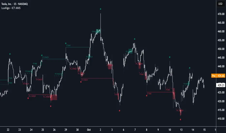
ICT Anchored Market Structures with Validation [LuxAlgo]The ICT Anchored Market Structures with Validation indicator is an advanced iteration of the original Pure-Price-Action-Structures tool, designed for price action traders.
It systematically tracks and validates key price action structures, distinguishing between true structural shifts/breaks and short-term sweeps to enhance trend and reversal analysis. The indicator automatically highlights structural points, confirms breakouts, identifies sweeps, and provides clear visual cues for short-term, intermediate-term, and long-term market structures.
A distinctive feature of this indicator is its exclusive reliance on price patterns. It does not depend on any user-defined input, ensuring that its analysis remains robust, objective, and uninfluenced by user bias, making it an effective tool for understanding market dynamics.
🔶 USAGE
Market structure is a cornerstone of price action analysis. This script automatically detects real-time market structures across short-term, intermediate-term, and long-term levels, simplifying trend analysis for traders. It assists in identifying both trend reversals and continuations with greater clarity.
Market structure shifts and breaks help traders identify changes in trend direction. A shift signals a potential reversal, often occurring when a swing high or low is breached, suggesting a transition in trend. A break, on the other hand, confirms the continuation of an established trend, reinforcing the current direction. Recognizing these shifts and breaks allows traders to anticipate price movement with greater accuracy.
It’s important to note that while a CHoCH may signal a potential trend reversal and a BoS suggests a continuation of the prevailing trend, neither guarantees a complete reversal or continuation. In some cases, CHoCH and BoS levels may act as liquidity zones or areas of consolidation rather than indicating a clear shift or continuation in market direction. The indicator’s validation component helps confirm whether the detected CHoCH and BoS are true breakouts or merely liquidity sweeps.
🔶 DETAILS
🔹 Market Structures
Market structures are derived from price action analysis, focusing on identifying key levels and patterns in the market. Swing point detection, a fundamental concept in ICT trading methodologies and teachings, plays a central role in this approach.
Swing points are automatically identified based exclusively on market movements, without requiring any user-defined input.
🔹 Utilizing Swing Points
Swing points are not identified in real-time as they form. Short-term swing points may appear with a delay of up to one bar, while the identification of intermediate and long-term swing points is entirely dependent on subsequent market movements. Importantly, this detection process is not influenced by any user-defined input, relying solely on pure price action. As a result, swing points are generally not intended for real-time trading scenarios.
Instead, traders often analyze historical swing points to understand market trends and identify potential entry and exit opportunities. By examining swing highs and lows, traders can:
Recognize Trends: Swing highs and lows provide insight into trend direction. Higher swing highs and higher swing lows signify an uptrend, while lower swing highs and lower swing lows indicate a downtrend.
Identify Support and Resistance Levels: Swing highs often act as resistance levels, referred to as Buyside Liquidity Levels in ICT terminology, while swing lows function as support levels, also known as Sellside Liquidity Levels. Traders can leverage these levels to plan their trade entries and exits.
Spot Reversal Patterns: Swing points can form key reversal patterns, such as double tops or bottoms, head and shoulders, and triangles. Recognizing these patterns can indicate potential trend reversals, enabling traders to adjust their strategies effectively.
Set Stop Loss and Take Profit Levels: In ICT teachings, swing levels represent price points with expected clusters of buy or sell orders. Traders can target these liquidity levels/pools for position accumulation or distribution, using swing points to define stop loss and take profit levels in their trades.
Overall, swing points provide valuable information about market dynamics and can assist traders in making more informed trading decisions.
🔹 Logic of Validation
The validation process in this script determines whether a detected market structure shift or break represents a confirmed breakout or a sweep.
The breakout is confirmed when the close price is significantly outside the deviation range of the last detected structural price. This deviation range is defined by the 17-period Average True Range (ATR), which creates a buffer around the detected market structure shift or break.
A sweep occurs when the price breaches the structural level within the deviation range but does not confirm a breakout. In this case, the label is updated to 'SWEEP.'
A visual box is created to represent the price range where the breakout or sweep occurs. If the validation process continues, the box is updated. This box visually highlights the price range involved in a sweep, helping traders identify liquidity events on the chart.
🔶 SETTINGS
The settings for Short-Term, Intermediate-Term, and Long-Term Structures are organized into groups, allowing users to customize swing points, market structures, and visual styles for each.
🔹 Structures
Swings and Size: Enables or disables the display of swing highs and lows, assigns icons to represent the structures, and adjusts the size of the icons.
Market Structures: Toggles the visibility of market structure lines.
Market Structure Validation: Enable or disable validation to distinguish true breakouts from liquidity sweeps.
Market Structure Labels: Displays or hides labels indicating the type of market structure.
Line Style and Width: Allows customization of the style and width of the lines representing market structures.
Swing and Line Colors: Provides options to adjust the colors of swing icons, market structure lines, and labels for better visualization.
🔶 RELATED SCRIPTS
Pure-Price-Action-Structures.
Market-Structures-(Intrabar).
Fish OrbThis indicator marks and tracks the first 15-minute range of the New York session open (default 9:30–9:45 AM ET) — a critical volatility period for futures like NQ (Nasdaq).
It helps you visually anchor intraday price action to that initial opening range.
Core Functionality
1. Opening Range Calculation
It measures the High, Low, and Midpoint of the first 15 minutes after the NY market opens (default 09:30–09:45 ET).
You can change the window or timezone in the inputs.
2. Visual Overlays
During the 15-minute window:
A teal shaded box highlights the open range period.
Live white lines mark the current High and Low.
A red line marks the midpoint (mid-range).
These update in real-time as each bar forms.
3. Post-Window Behavior
When the 15-minute window ends:
The High, Low, and Midpoint are locked in.
The indicator draws persistent horizontal lines for those values.
4. Historical Days
You can keep today + a set number of previous days (configurable via “Previous Days to Keep”).
Older days automatically delete to keep charts clean.
5. Line Extension Control
Each day’s lines extend to the right after they form.
You can toggle “Stop Lines at Next NY Open”:
ON: Yesterday’s lines stop exactly at the next NY session open (09:30 ET).
OFF: Lines extend indefinitely across the chart.

Session Opens by TradeSeekersIt doesn't get much simpler than this indicator for futures traders wanting to track four key session open prices.
Sessions
1. ETH open - extended hours starts
2. Midnight open - new calendar day starts
3. CME open - Chicago exchange opens, data releases
4. RTH open - regular trading hours, volume cometh
Usage
All four of these prices / areas are important for futures traders to pay attention to.
RTH opens far below ETH sometimes will retrace, CME and RTH together can act as a powerful range.
Midnight open sometimes has little importance for the day, but then again it's provided beautiful bounces. Again each level I find to be impactful nearly every session, so I like to keep them close by in an understated manner.
Timezone
If you're not EST, adjust the timezone string accordingly (refer to TradingView docs for string formats).
Proximity Detection
Also, I added proximity detection that aims to keep level collisions from occurring. If a particular session open isn't shown it may be due to being exactly the same price as another open or it's too close to another open.
The proximity sensitivity can be adjusted in settings. The on chart appearance doesn't impact the alerting capability.
Aesthetics
I don't like boring charts so I added a fun "glow" effect, I went with a palette that reminded me of clear sky colors at those times of day (if you're EST).
Alerting
Alerting can be done with just a single alert, first open the indicator config and uncheck any session opens you don't want to be alerted on (why!?), and then use the standard alert menus in TradingView to set the alert on "Any alert() function call".
Why does this beautiful indicator exist?
While there are a handful of indicators that plot open prices with some overlap to this one, I didn't see any that alerted automatically without much fuss.

CB Charts - GEX NQ/MNQ
Last Updated: 2025-10-14 12:59:34 PST
*DISCLAIMER: Only intended for NQZ2025/MNQZ2025 charts.
This indicator plots horizontal levels based on batched GEX levels for NQZ2025/MNQZ2025. The batched data is derived from contracts expiring: 0DTE, 1DTE, EoW, EoM, Next Week, Next Month and 3-months out. Labels are available for a high-level view of which levels are which. Hovering (or long-pressing on mobile TV) over the labels will display the nominal values and Rank. This script is manually updated and may not be always updated.
When and what to use:
- Most respected levels come from 1DTE, EoW and EoM.
- 0DTE is included for when this script becomes intraday updated. (CURRENTLY NOT UPDATED INTRADAY)
- Next Week setting is best used only for Friday and Sunday trading
- Next Month setting is best for weeks close to the end of the current month
Powered by the Camels of Wallstreet

Institutional Compression Breakout (ICBO Algo) [@darshakssc]The ICBO Algo is a smart intraday trading tool that detects institutional compression zones followed by breakout confirmation. It combines candle range analysis, volume compression, EMA filtering, and ATR-based Risk/Reward zones to highlight high-probability trade setups with visual clarity.
This script is designed for educational and research purposes only, fully aligned with TradingView’s Pine Script policy and publishing guidelines.
🔍 Key Features
🌀 Compression Zone Detection
Identifies low-range, low-volume candles often formed before institutional breakouts.
📈📉 Breakout Signals
Triggered after confirmed price + EMA breakout post-compression.
📊 Dashboard Panel
Displays breakout phase, current R:R ratio, and zone status in real-time.
🟢🔴 Buy/Sell Labels with Emojis
Clean and non-intrusive labels for immediate action recognition.
🔔 Alerts Included
Receive real-time push, email, or webhook alerts for breakout signals.
⚙️ How It Works
Compression Phase:
When the candle range and volume are significantly lower than the moving average, the script flags it as a compression zone.
Breakout Confirmation:
A breakout signal is confirmed when the price breaks the previous high/low and is above/below the trend EMA.
Entry Logic:
📈 Buy: Price > previous high + above EMA after compression
📉 Sell: Price < previous low + below EMA after compression
⚠️ Disclaimer
This script is intended for educational and research purposes only. It does not constitute financial advice or recommendations of any kind. Always use proper risk management. Past performance does not guarantee future results.

Falcon Imbalance TradesIn this indicator, I am using ATR + Volume to find breakouts. These candles where I am getting these breakouts, I am creating a box for price action. If candle breaks above it, it gives us a buy signal. Similarly for downside.
The logic is to find imbalance so that we can avoid sideways market and focus on trending or impulsive move.
I hope you enjoy this indicator. Drop comments for any questions.
Orderblocks & BreakersThis indicator identifies potential orderblocks and breakers based on recent swing highs and lows. It is built to offer a structured, customizable, and noise-controlled view of how price interacts with supply and demand levels.
The script applies pivot-based swing detection to identify swing highs and lows.
Bullish Orderblocks: The script Identifies and stores the last down candle before a swing high is breached and confirms and plots the orderblock with a market structure break (close above the swing high).
Bearish Orderblocks: The script Identifies and stores the last up candle before a swing low is breached and confirms and plots the orderblock with a market structure break (close below the swing low).
When price later closes through an existing orderblock, it is reclassified as a Breaker and recolored accordingly. (all colors can be changed in the settings)
What Makes It Different
Unlike most orderblock tools that simply mark every swing-based block, this version introduces:
1. Chop Control – automatically hides breakers that price repeatedly closes through (2 closes after the orderblock becomes a breaker), keeping only relevant zones visible.
2. Recent Block Filtering – limits how many of the recent orderblocks or breakers are displayed, preventing chart clutter.
3. Dynamic Updating – orderblocks automatically convert to breakers when price closes beyond them, with clear color changes.
These features make it easier to study cleaner price structure without manually managing old or invalid zones. The optional Chop Control filter can reduce overlapping or repeatedly invalidated zones to keep the chart clearer.
Customizable Parameters
- Swing detection length (shorter means more aggressive pivot detection, longer means less aggressive so less highs/lows detected)
- Number of recent blocks to display
- Visibility toggles for orderblocks or breakers
- Color and transparency controls for each type
Alerts
Alerts can be set to trigger when price tests any defined zone.
Purpose
This indicator is designed as a price structure visualization and study tool.
It may assist in understanding how price interacts with previously active regions, but it does not produce signals or trade recommendations.
FVG Volume Profile [ChartPrime]⯁ OVERVIEW
FVG Volume Profile is a smart volume analysis tool that identifies Fair Value Gaps (FVGs) and overlays a volume profile inside each gap using data from lower timeframes. The indicator automatically selects the best time resolution or allows for manual control, giving traders deeper insight into the volume structure within each imbalance. POC levels and total volumes gives a full microstructure view inside every FVG.
⯁ KEY FEATURES
Fair Value Gap Detection (Bullish & Bearish)
Detects price gaps where inefficiency exists using a 3-bar structure.
-Bullish Gaps: Low > High with confirming middle bar.
-Bearish Gaps: High < Low with confirming middle bar.
Only significant gaps (filtered by standard deviation) are plotted to avoid noise.
Multi-Timeframe Volume Profiling
Pulls granular candle and volume data from a lower timeframe —
In Auto Mode, uses a resolution ~10x lower than the current chart.
In Manual Mode, lets the user select a custom timeframe.
This ensures accurate intra-gap volume distribution.
Dynamic Volume Binning
Each FVG is divided into vertical volume bins based on the Resolution input.
Each bin displays relative volume intensity as a horizontal box, scaled by percentage of the max bin volume.
Point of Control (PoC) Line & Label
The bin with the maximum volume inside each FVG is marked with:
A horizontal line (PoC) extending from the left to right side.
A label showing the absolute volume of that bin.
Color-coded to match bullish or bearish FVGs.
Total Volume Label Inside FVG
Each FVG displays the total volume sum from its profile:
For bullish FVGs , shown in the bottom-right corner.
For bearish FVGs , shown in the top-right corner.
Auto-Removal of Invalid Gaps
If price fully closes the gap (crosses its bounds), the FVG, profile, and PoC are deleted automatically.
This keeps the chart clean and focused only on active zones.
Toggleable Volume Profile Display
User can show or hide the volume profiles within FVGs using the "Display" toggle under the "FVG Volume Profile" group.
Only the PoC and FVG boxes remain visible if toggled off.
Volume Resolution Customization
Control the number of bins used for each FVG profile.
Higher resolution = more bins and finer volume analysis. (default 15)
Auto Timeframe Validation Warning
If the selected lower timeframe isn’t actually lower than the chart's, the script shows a visible warning label prompting adjustment.
Helps prevent calculation errors.
⯁ USAGE
Use this tool to identify active imbalance zones (FVGs) with embedded volume context.
Look for PoC positioning inside gaps — near top may indicate absorption or reversal zones.
Combine with price action at the PoC level for precision entries.
Hide volume profile for a cleaner view while retaining key POC and FVG boxes.
Use resolution controls to zoom into fine-grained profiles inside large gaps.
Consider Auto mode for seamless multi-timeframe analysis, or switch to Manual for full control.
⯁ CONCLUSION
FVG Volume Profile transforms raw imbalance detection into actionable insight by embedding lower-timeframe volume structure inside each Fair Value Gap. With PoC highlights, total volume labels, and customizable bin resolution, this indicator is essential for traders who want to understand not just where the gap is — but what volume did inside it .

Quarter Levels — Auto Recentering NQ onlyQuarter Levels — Auto Recentering (PERMANENT) + Big Offset Labels
What it is
This tool paints true horizontal key levels that traders naturally anchor to: the 00 / 25 / 50 / 75 quarter levels (black), the 35 / 65 / 90 reaction levels (red), and the 10 / 80 sweep/edge levels (purple).
Lines are infinite horizontals and the grid auto-recenters ±200 points around current price each new bar. Labels on the right show the last two digits (e.g., 25, 35, 50, 65, 75, 80, 90), so you instantly know which level you’re at.
Why it helps
Markets often “snap” to simple numbers. These levels create a clean scaffold for intraday structure, pullbacks, and rotations—without clutter or lagging math.
Color Legend
Black — 00 / 25 / 50 / 75:
Core quarter levels. Expect frequent pauses, re-tests, and rotations.
Use: default S/R map; bias for mean-reversion inside ranges.
Red — 35 / 65 / 90:
“Continuation / reaction” levels. Price often accelerates through these once momentum takes.
Use: breakout guides and precise take-profit targets.
Purple — 10 / 80:
Sweep / edge levels. Price often wicks into these and rejects.
Use: fade the last push, or confirm a sweep before a reversal.
How it works
The script draws the levels as extend.both horizontals (not derived from candle points).
Every new bar, it rebuilds the grid around close ± 200 pts (editable in code: RANGE_POINTS).
Prices are snapped to tick (syminfo.mintick) so lines lock to the Y-axis.
Labels show only the offset (two-digit number) to keep the chart clean.
Setup & Customization
No inputs required.
If you want tweaks, open the code and edit at the top:
RANGE_POINTS – widen/narrow the vertical coverage.
LABEL_OFFSET – push labels further to the right.
LABEL_SIZE – size.small / normal / large.
Color & width constants (per group).
Practical Use (playbook)
Use this grid as a price map, not a signal generator. Combine it with your execution tools.
1) In Range Conditions
Fade to Black: When price rotates inside a range, look for exhaustion into black levels (00/25/50/75).
Plan: wait for rejection (wick + failed follow-through), enter back toward the mid/next quarter. Stop just beyond the level; first target the next red or black.
Purple Sweeps: Watch quick spikes into 10/80 that immediately fail.
Plan: fade the sweep with tight risk; scale out at 25/75; hold a runner to 50.
2) In Trend / Momentum
Red Rails (35/65/90): When momentum is strong, price often steps through red levels cleanly.
Plan: use them as continuation targets or trail anchors. If pullback holds above a prior red level, consider continuation with stop below that level.
Quarter-to-Quarter Ladders: In clean trends, expect quarter-to-quarter traversals (00→25→50→75→00…).
Plan: add on pullbacks to 25 or 50 with trend confirmation (e.g., 9/21 EMA stack or anchored VWAP hold).
3) Confluence (AI-logic suggestions)
Pair the grid with any two of:
VWAP / Anchored VWAP: Rejections at a quarter level + VWAP = higher quality entry.
EMAs (9/21/50/200): Use as directional filter. Only take longs at quarters when fast EMAs > slow EMAs.
Liquidity cues: Prior high/low, session O/H/L, or liquidity pools aligning with a quarter level.
Orderflow / footprint: Aggressive delta through a red level? Expect follow-through to the next black or red.
Volatility (ATR): If ATR expands, lean more on red levels (continuations). In compression, lean more on black and purple (fades).
Risk & Management Tips
Stops: Just beyond the level you’re trading against. Let the level “be wrong” to prove you wrong.
Targets: Next red or black line. Scale at the first, hold a small runner to the next.
Session awareness: Levels interact differently in Asia/EU/US. In US RTH, expect sharper responses at red and purple.
Timeframes: Works across all. Intraday (1–15m) for entries; 1h/4h daily for context.
Do not chase: If you miss the touch, wait for the next level; the map is dense by design.
Limitations
This indicator does not generate buy/sell signals; it supplies a stable structure.
In runaway trends, price can cut through multiple lines—use trend filters and risk caps.
Auto-recentering means the visible band travels with price; if you need static levels far away, increase RANGE_POINTS.
Troubleshooting
No labels? Make sure max_labels_count isn’t hit and SHOW_LABELS = true.
Labels too close to price? Increase LABEL_OFFSET.
Too many lines? Reduce RANGE_POINTS or hide a color group in code.
Credits / License
Created by: TRC — The Refuge Camp
License: Free to use on TradingView with attribution.
If you fork or embed, please credit “TRC — The Refuge Camp” and link back to the original post/profile.
Quick Start (TL;DR)
Add the script.
Trade the map:
Fade purple/black in ranges.
Target red/black in trends.
Combine with VWAP/EMAs or your orderflow tool for confirmation.
Respect stops just beyond the level; scale at the next line.
Happy trading, and welcome to the Quarter-Level grid.

First week of the yearA very simple indicator that marks a channel on the candlestick for the first week of the year.
The channel can serve as an entry/exit point with a medium and long term focus.
Note: This indicator should be observed exclusively on the weekly timeframe.
Mean Reverting Suite [OmegaTools]Overview
The Mean Reverting Suits (MR Suite) by OmegaTools is an advanced analytical and visualization framework designed to identify directional exhaustion, statistical overextensions, and conditions consistent with mean-reversion dynamics. It integrates three pillars into a single display: a composite momentum-normalized oscillator, a percentile-based extension model with volume contextualization, and a dynamic structural mapping engine built on confirmed pivots. The indicator does not generate signals or prescribe trade actions; it provides objective context so users can evaluate market balance and the likelihood that price is departing from its recent statistical baseline.
Core logic
The composite oscillator blends MFI on two horizons and RSI on HL2, then averages them to produce a stabilized mean-reversion gauge. Candle and bar colors are mapped by a dual gradient centered at 50. Readings above 50 progressively shift from neutral gray toward the bearish accent color to reflect increasing momentum saturation; readings below 50 shift from the bullish accent color toward gray to reflect potential accumulation or temporary undervaluation. This continuous mapping avoids rigid thresholds and conveys the strength and decay of momentum as a smooth spectrum.
The percentile-based extension model measures the persistence of directional bias by tracking how many bars have elapsed since the last opposing condition. These rolling counts are compared to the 80th percentile of their own historical distributions stored in arrays. When a current streak exceeds its respective percentile, the environment is labeled as statistically extended in that direction. Background shading communicates this information and is modulated by relative volume, computed as live volume divided by a blended average of SMA(30) and EMA(11). Higher opacity implies greater liquidity participation during the extension.
The structural mapping module uses confirmed pivot highs and lows at the chosen length to create persistent horizontal levels that extend forward and automatically maintain themselves until price invalidates or refreshes them. These levels represent market memory zones and assist in reading where reactions previously formed. The engine updates in real time, ensuring the framework continuously reflects the prevailing structure.
Standard deviation and z-score overlay
The updated version introduces a mean and dispersion layer. A simple moving average of HL2 over twice the length provides the reference mean. Dispersion is estimated as the moving average of the absolute deviation between close and the mean over five times the length. The z-score is computed as the distance of price from the mean divided by this dispersion proxy. Visual arrows highlight observations where the absolute z-score exceeds two standard deviations, offering a concise view of statistically unusual departures from the local mean. This layer complements the percentile extension model by adding an orthogonal measure of extremity based on distributional distance rather than run length.
Visualization
Candle bodies and borders inherit the oscillator’s gradient color, creating an immediate sense of directional pressure and potential momentum fatigue. The chart background activates when the extension model detects a statistically rare streak, using blue tones for bearish extension and red tones for bullish extension, with intensity scaling by relative volume. Horizontal lines denote active pivot-based levels, automatically extending, truncating, and refreshing as structure evolves. The z-score arrows appear only when deviations exceed the ±2 threshold, keeping the display focused on noteworthy statistical events.
Inputs and configuration
Length controls the sensitivity of all modules. Lower values make the oscillator and pivot detection more reactive; higher values smooth readings and widen structural context. Bullish and Bearish colors are user-selectable to match platform themes or accessibility requirements.
Interpretation guidance
A strong red background indicates an unusually extended bullish run in the presence of meaningful volume; a strong blue background indicates an unusually extended bearish run in the presence of meaningful volume. Candle gradients near deep bearish tones suggest oscillator readings well above 50; gradients near deep bullish tones suggest oscillator readings well below 50. Pivot lines mark the most recently confirmed structural levels that the market has reacted to. Z-score arrows denote points where price has moved beyond approximately two standard deviations of its local mean, signaling statistically uncommon distance rather than directional persistence. None of these elements are directives; they are objective descriptors designed to improve situational awareness.
Advantages
The framework is adaptive by design and self-normalizes to each instrument’s volatility and rhythm through percentile logic and dispersion-based distance. It is volume-aware, visually encoding liquidity pressure so that users can distinguish thin extensions from structurally significant ones. It reduces chart clutter by unifying momentum state, statistical extension, standard deviation distance, and structural levels into a single coherent view. It is asset- and timeframe-agnostic, suitable for intraday through swing horizons across futures, equities, FX, and digital assets.
Usage notes
MR Suite is intended for analytical and educational purposes. It does not provide trading signals, risk parameters, or strategy instructions. Users may employ its context alongside their own methodologies, risk frameworks, and execution rules. The indicator’s value derives from quantifying how unusual a move is, showing how much liquidity supports it, and anchoring that information to evolving structural references, thereby improving the clarity and consistency of discretionary assessment without prescribing actions.

Market Structure Signals (HH/HL/LH/LL) - PreciseShows higher highs, higher lows, lower highs and lower lows for an easier visual understanding of price structure

3-6-9 Times v3.2 (rdt)3-6-9 Times v3.1 Indicator Overview
Core Concept
This indicator identifies specific times/dates where the digital root (sum of digits reduced to a single number) equals 3, 6, or 9, which are considered significant in numerology and certain trading methodologies.
How It Calculates Roots:
For Intraday Timeframes (minutes, hours):
Formula: Hour + First Minute Digit + Last Minute Digit → Reduce to single digit
For Daily/Weekly/Monthly Timeframes:
Uses Month + Day calculations with similar digit reduction logic.
Key Features:
1. Break Filter (Default: ON)
Only displays labels after a swing high/low is broken
Prevents clutter by filtering out times that don't coincide with price action
Configurable pivot length (default: 2 bars)
Optional directional filter: green candles must break highs, red candles must break lows
2. Root Selection
Toggle individual roots (3, 6, or 9) on/off
Each root has customizable color
Default colors: Blue (3), Green (6), Red (9)
3. Display Options
Marking Style: Labels, Vertical Lines, or Both
Label Text Format:
Root Only (default) - shows just "3", "6", or "9"
Time/Date Only - shows the actual time/date
Root + Time/Date (separate lines) - shows both
Label Background: Toggle colored box behind text (default: OFF)
Chart Background: Toggle colored background highlight (default: OFF)
Text Color: Customizable (default: black)
4. Session Filter:
Set specific hours/minutes for when to display signals
Default: 00:00 to 23:59 (all day)
Useful for focusing on specific trading sessions
5. Hour Offset
Manual adjustment for timezone/DST issues
Range: -12 to +12 hours
Helps align calculations with your preferred timezone
6. Label Placement
Green candles: Label appears above the bar
Red candles: Label appears below the bar
7. Alerts
Four alert conditions available:
Any 3-6-9 root hit
Specific Root 3 hit
Specific Root 6 hit
Specific Root 9 hit
Typical Use Case
Traders use this to identify potential reversal or continuation points when:
A 3/6/9 time occurs
Price breaks a recent swing high/low
Combining this timing signal with other technical analysis
The indicator helps identify "energetic" time windows that may correlate with increased volatility or directional moves.
3-6-9 Times v3.1 (rdt)3-6-9 Times v3.1 Indicator Overview
Core Concept
This indicator identifies specific times/dates where the digital root (sum of digits reduced to a single number) equals 3, 6, or 9, which are considered significant in numerology and certain trading methodologies.
How It Calculates Roots:
For Intraday Timeframes (minutes, hours):
Formula: Hour + First Minute Digit + Last Minute Digit → Reduce to single digit
For Daily/Weekly/Monthly Timeframes:
Uses Month + Day calculations with similar digit reduction logic.
Key Features:
1. Break Filter (Default: ON)
Only displays labels after a swing high/low is broken
Prevents clutter by filtering out times that don't coincide with price action
Configurable pivot length (default: 2 bars)
Optional directional filter: green candles must break highs, red candles must break lows
2. Root Selection
Toggle individual roots (3, 6, or 9) on/off
Each root has customizable color
Default colors: Blue (3), Green (6), Red (9)
3. Display Options
Marking Style: Labels, Vertical Lines, or Both
Label Text Format:
Root Only (default) - shows just "3", "6", or "9"
Time/Date Only - shows the actual time/date
Root + Time/Date (separate lines) - shows both
Label Background: Toggle colored box behind text (default: OFF)
Chart Background: Toggle colored background highlight (default: OFF)
Text Color: Customizable (default: black)
4. Session Filter:
Set specific hours/minutes for when to display signals
Default: 00:00 to 23:59 (all day)
Useful for focusing on specific trading sessions
5. Hour Offset
Manual adjustment for timezone/DST issues
Range: -12 to +12 hours
Helps align calculations with your preferred timezone
6. Label Placement
Green candles: Label appears above the bar
Red candles: Label appears below the bar
7. Alerts
Four alert conditions available:
Any 3-6-9 root hit
Specific Root 3 hit
Specific Root 6 hit
Specific Root 9 hit
Typical Use Case
Traders use this to identify potential reversal or continuation points when:
A 3/6/9 time occurs
Price breaks a recent swing high/low
Combining this timing signal with other technical analysis
The indicator helps identify "energetic" time windows that may correlate with increased volatility or directional moves.

3-6-9 Times v3.0.4Showing the 3-6-9 times on charts to show possible reversals and SMR in price. Work on all time frames. Uses simple logic of add HR to MM, then reducing to one root number of 3, 6 or 9.

DWMCOverview
Welcome to the OmniPivot Range Analyzer: DWM, an exclusive PineScript tool crafted for traders who utilize Central Pivot Range (CPR) analysis. This indicator delivers precise Daily, Weekly, and Monthly CPR levels, complete with support/resistance zones, historical CPR width tracking, and a powerful trading strategy. Designed for traders seeking an edge, this script offers unparalleled flexibility and insight for intraday, swing, or long-term trading.
Key Features
Multi-Timeframe CPR: Seamlessly plots CPR (Pivot, BC, TC) for Daily, Weekly, Monthly, or custom timeframes on any chart.
Support/Resistance Levels: Visualizes up to three levels of support (S1-S3) and resistance (R1-R3) for robust price analysis.
CPR Width: Tracks CPR width as a percentage in a table, revealing market volatility and breakout potential.
How to Use
Trading: Use CPR levels as key support/resistance zones. Leverage the breakout strategy for automated signals or manual confirmation.
Best Practices: Combine with other indicators (e.g., RSI, volume) and backtest the strategy thoroughly.
Get Started
To use the OmniPivot Range Analyzer: DWM, apply the script to your chart and explore its settings. For questions or support, contact the creator directly via TradingView. Thank you for being part of this exclusive release!
Disclaimer
This script is for educational and informational purposes only. Trading carries risks, and past performance does not guarantee future results. Always perform your own analysis and consult a financial advisor before trading.

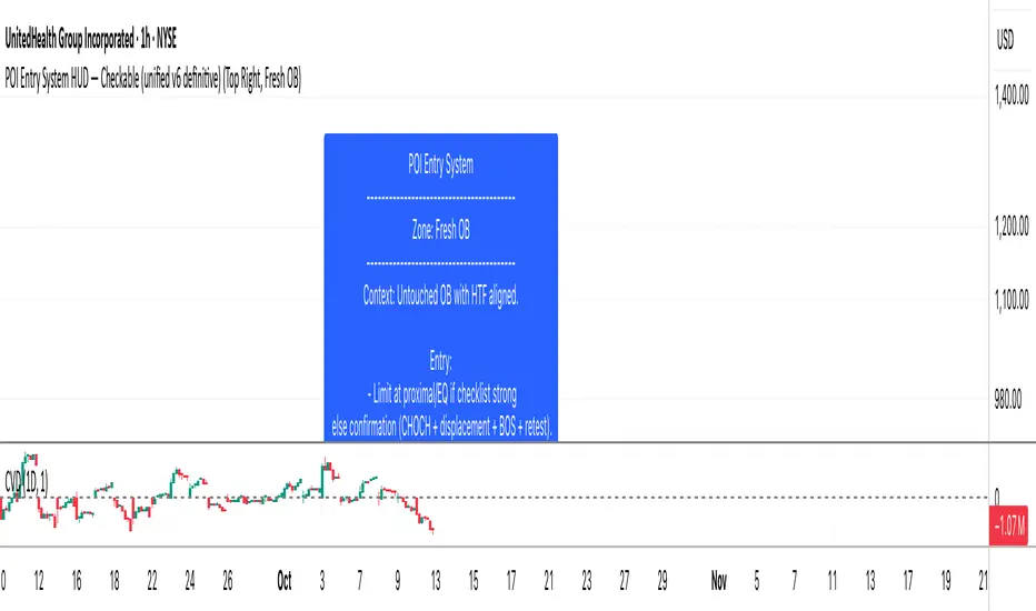
SMC POI Entry System HUDEntry, RR, Exit, of supply and demand zones taught in smart money trading. 12 types of zones and setups around Flips, Order Blocks, High Probability, and Extreme Demand Zones. Includes Checklist for Entry, Exit Rules, Take Profit Targets, Stop Loss spots, and Context

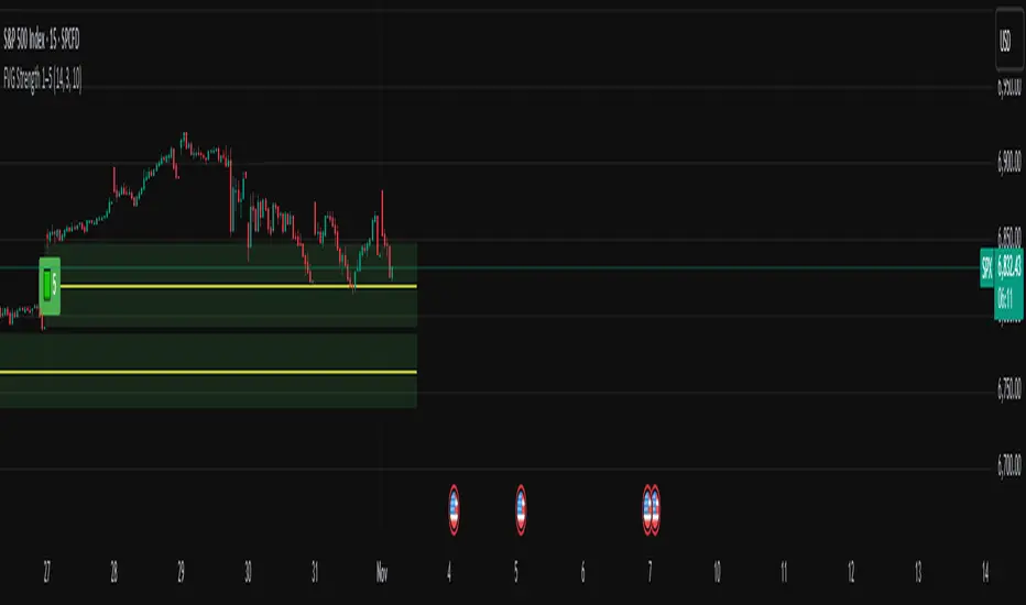
FVG Strength Detector (1–5)shows you fair value gaps with a rating score of 5 strongest to 1 weakest so if u see a 4 thats a good area
Pivot Breakout with Trend ZonesOverview
Pivot Breakout with Trend Zones is a technical analysis indicator that identifies key pivot points and trend direction through dynamic candle coloring. It helps traders visualize breakouts and ongoing trends in real-time.
Key Features
🔍 Pivot Point Detection
Automatically identifies significant high and low pivot points
Customizable left/right bar parameters for sensitivity adjustment
Displays pivot levels as cross-style lines with offset positioning
🎨 Smart Candle Coloring
White candles: Breakout above pivot high (bullish signal)
Black candles: Breakout below pivot low (bearish signal)
Teal candles: Uptrend continuation
Coral Red candles: Downtrend continuation
Optional color fill toggle for customization
📊 Trend Identification
Automatically tracks trend direction after breakouts
Maintains trend state until opposite breakout occurs
Clear visual distinction between breakout and trend-following phases
Input Parameters
Pivot Settings
Left Bars (High/Low): Number of bars to the left of pivot
Right Bars (High/Low): Number of bars to the right of pivot
Display Options
Enable Candle Color Fill: Toggle color visualization on/off
Line Offset: Adjust pivot line positioning (-50 to 0 bars)
How It Works
Pivot Calculation: Uses TradingView's built-in pivothigh() and pivotlow() functions to detect significant turning points
Breakout Detection: Monitors when price closes beyond pivot levels, triggering trend changes
Trend Management: Once a breakout occurs, the indicator maintains the trend direction until a counter-breakout signals reversal
Visual Feedback: Provides immediate color-coded feedback for quick market analysis
Use Cases
Swing Trading: Identify entry points at pivot breakouts
Trend Following: Stay in trades during trend continuation phases
Market Structure: Visualize support/resistance levels and trend changes
Risk Management: Use pivot levels for stop-loss placement
Ideal For
Traders looking for clear visual trend identification
Technical analysts monitoring breakout opportunities
Anyone seeking to combine pivot analysis with trend following strategies
This indicator provides a clean, intuitive way to spot trend changes and follow market momentum with immediate visual feedback through candle coloring.
Premarket, Previous Day H/L + EMA Trend TableThis script includes EMAs, Previous Day High and Low, Premarket High and Low