RiskCraft - Advanced Risk Management SystemRiskCraft – Risk Intelligence Dashboard
Trade like you actually respect risk
"I know the setup looks good… but how much am I actually risking right now?"
RiskCraft is an open-source Pine Script v6 indicator that keeps risk transparent directly on the chart. It is not a signal generator; it is a risk desk that calculates size, frames volatility, and reminds you when your behaviour drifts away from the plan.
Core utilities
Calculates professional-style position sizing in real time.
Reads volatility and market regime before position size is confirmed.
Adjusts risk based on the trader’s emotional state and confidence inputs.
Maps session risk across Asian, London, and New York hours.
Draws exactly one stop line and one target line in the preferred direction.
Provides rotating education tips plus contextual warnings when risk escalates.
It is intentionally conservative and keeps you in the game long enough for any separate entry logic to matter.
---
Chart layout checklist
Use a clean chart on a liquid symbol (e.g., AMEX:SPY or major FX pairs).
Main RiskCraft dashboard placed on the right edge.
Session Risk box on the left with UTC time visible.
Floating risk badge above price.
Stop/target guide lines enabled.
Education panel visible in the bottom-right corner.
---
1. On-chart components
Right-side dashboard : account risk %, position size/value, stop, target, risk/reward, regime, trend strength, emotional state, behavioural score, correlation, and preferred trade direction.
Session Risk box : highlights active session (Asian, London, NY), current UTC time, and risk label (High/Med/Low) per session.
Floating risk badge : keeps actual account risk percent visible with colour-coded wording from Ultra Cautious to Very Aggressive.
Stop/target lines : exactly one dashed stop and one dashed target aligned with the preferred bias.
Education panel : rotates core principles and AI-style warnings tied to volatility, risk %, and behaviour flags.
---
2. Volatility engine – ATR with context 📈
atr = ta.atr(atrLength)
atrPercent = (atr / close) * 100
atrSMA = ta.sma(atr, atrLength)
volatilityRatio = atr / atrSMA
isHighVol = volatilityRatio > volThreshold
ATR vs ATR SMA shows how wild price is relative to recent history.
Volatility ratio above the threshold flips isHighVol , which immediately trims risk.
An ATR percentile rank over the last 100 bars indicates calm versus chaotic regimes.
Daily ATR sampling via request.security() gives higher time-frame context for intraday sessions.
When volatility spikes the script dials position size down automatically instead of cheering for maximum exposure.
---
3. Market regime radar – Danger or Drift 🌊
ema20 = ta.ema(close, 20)
ema50 = ta.ema(close, 50)
ema200 = ta.ema(close, 200)
trendScore = (close > ema20 ? 1 : -1) +
(ema20 > ema50 ? 1 : -1) +
(ema50 > ema200 ? 1 : -1)
= ta.dmi(14, 14)
Regimes covered:
Danger : high volatility with weak trend.
Volatile : volatility elevated but structure still directional.
Choppy : low ADX and noisy action.
Trending : directional flows without extreme volatility.
Mixed : anything between.
Each regime maps to a 1–10 risk score and a multiplier that feeds the final position size. Danger and Choppy clamp size; Trending restores normal risk.
---
4. Behaviour engine – trader inputs matter 🧠
You provide:
Emotional state : Confident, Neutral, FOMO, Revenge, Fearful.
Confidence : slider from 1 to 10.
Toggle for behavioural adjustment on/off.
Behind the scenes:
Each state triggers an emotional multiplier .
Confidence produces a confidence multiplier .
Combined they form behavioralFactor and a 0–100 Behavioural Score .
High-risk emotions or low conviction clamp the final risk. Calm inputs allow normal size. The dashboard prints both fields to keep accountability on-screen.
---
5. Correlation guardrail – avoid stacking identical risk 📊
Optional correlation mode compares the active symbol to a reference (default AMEX:SPY ):
corrClose = request.security(correlationSymbol, timeframe.period, close)
priceReturn = ta.change(close) / close
corrReturn = ta.change(corrClose) / corrClose
correlation = calcCorrelation()
Absolute correlation above the threshold applies a correlation multiplier (< 1) to reduce size.
Dashboard row shows the live correlation and reference ticker.
When disabled, the row simply echoes the current symbol, keeping the table readable.
---
6. Position sizing engine – heart of the script 💰
baseRiskAmount = accountSize * (baseRiskPercent / 100)
adjustedRisk = baseRiskAmount * behavioralFactor *
regimeAdjustment * volAdjustment *
correlationAdjustment
finalRiskAmount = math.min(adjustedRisk,
accountSize * (maxRiskCap / 100))
stopDistance = atr * atrStopMultiplier
takeProfit = atr * atrTargetMultiplier
positionSize = stopDistance > 0 ? finalRiskAmount / stopDistance : 0
positionValue = positionSize * close
Outputs shown on the dashboard:
Position size in units and value in currency.
Actual risk % back on account after adjustments.
Risk/Reward derived from ATR-based stop and target.
---
7. Intelligent trade direction – bias without signals 🎯
Direction score ingredients:
EMA stack alignment.
Price versus EMA20.
RSI momentum relative to 50.
MACD line vs signal.
Directional Movement (DI+/DI–).
The resulting Trade Direction row prints LONG, SHORT, or NEUTRAL. No orders are generated—this is guidance so you only risk capital when the structure supports it.
---
8. Stop/target guide lines – two lines only ✂️
if showStopLines
if preferLong
// long stop below, target above
else if preferShort
// short stop above, target below
Lines refresh each bar to keep clutter low.
When the direction score is neutral, no lines appear.
Use them as visual anchors, not auto-orders.
---
9. Session Risk map – global volatility clock 🌍
Tracks Asian, London, and New York windows via UTC.
Computes average ATR per session versus global ATR SMA.
Labels each session High/Med/Low and colours the cells accordingly.
Top row shows the active session plus current UTC time so you always know the regime you are trading.
One glance tells you whether you are trading quiet drift or the part of the day that hunts stops.
---
10. Floating risk badge – honesty above price 🪪
Text ranges from Ultra Cautious through Very Aggressive.
Colour matches the risk palette inputs (High/Med/Low).
Updates on the last bar only, keeping historical clutter off the chart.
Account risk becomes impossible to ignore while you stare at price.
---
11. Education engine & warnings 📚
Rotates evergreen principles (risk 1–2%, journal trades, respect plan).
Triggers contextual warnings when volatility and risk % conflict.
Flags when emotional state = FOMO or Revenge.
Highlights sub-standard risk/reward setups.
When multiple danger flags stack, an AI-style warning overrides the tip text so you can course-correct before capital is exposed.
---
12. Alerts – hard guard rails 🚨
Excessive Risk Alert : actual risk % crosses custom threshold.
High Volatility Alert : ATR behaviour signals danger regime.
Emotional State Warning : FOMO or Revenge selected.
Poor Risk/Reward Alert : risk/reward drops below your standard.
All alerts reinforce discipline; none suggest entries or exits.
---
13. Multi-market behaviour 🕒
Intraday (1m–1h): session box and badge react quickly; ideal for scalpers needing constant risk context.
Higher time frames (1D–1W): dashboard shifts slowly, supporting swing planning.
Asset classes confirmed in validation: crypto majors, large-cap equities, indices, major FX pairs, and liquid commodities.
Risk logic is price-based, so it adapts across markets without bespoke tuning.
15. Key inputs & recommended defaults
Account Size : 10,000 (modify to match actual account; min 100).
Base Risk % : 1.0 with a Maximum Risk Cap of 2.5%.
ATR Period : 14, Stop Multiplier 2.0, Target Multiplier 3.0.
High Vol Threshold : 1.5 for ATR ratio.
Behavioural Adjustment : enabled by default; disable for fixed risk.
Correlation Check : optional; default symbol AMEX:SPY , threshold 0.7.
Display toggles : main dashboard, risk badge, session map, education panel, and stop lines can be individually disabled to reduce clutter.
16. Usage notes & limits
Indicator mode only; no automated entries or exits.
Trade history panel intentionally disabled (requires strategy context).
Correlation analysis depends on additional data requests and may lag slightly on illiquid symbols.
Session timing uses UTC; adjust expectations if you trade localized instruments.
HTF ATR sampling uses daily data, so bar replay on lower charts may show brief data gaps while HTF loads.
What does everyone think RISK really means?
個人檔案管理

SmartDCA by TradeAkademiSmartDCA is an advanced position-management strategy built to deliver consistent results even as market conditions shift. Its price-action–driven structure, intelligent DCA scaling model, and multiple entry options provide a powerful automation framework suitable for both beginners and professional traders. With flexible TP/DCA configurations and safety modules such as Smart Take Profit, Risk Reset Exit, and Fail Safe Stop, positions scale more efficiently, risks are managed proactively, and capital remains protected at every stage. SmartDCA is a fully customizable, modern trading engine that offers high adaptability across different assets and timeframes.
The strategy supports five entry methodologies:
ta_default – Opens positions on breakout confirmations based on the selected period’s local highs and lows.
ta_volatility – Uses the same breakout logic while filtering entries that would place the target level outside the system’s defined safety zone.
ta_safety – Extends the volatility model with an additional candle-quality filter, avoiding structurally weak entries and behaving more conservatively.
rsi_based – Generates entries when RSI drops below 30 or rises above 70.
ema_based – Opens positions based on directional shifts in the moving average.
SmartDCA is fully configurable: entry logic, DCA percentage and multiplier, take-profit (TP) settings, maximum DCA steps, order-size mode, and directional preferences can all be tailored to fit any asset, market condition, or timeframe .
Default parameters are optimized for the 30-minute chart.
The strategy also includes three optional protective mechanisms:
Smart Take Profit – Closes profitable trades early when price approaches the target within a configurable proximity, reducing exposure to potential reversal signals.
Risk Reset Exit – After a defined DCA step, the position is closed at breakeven once price returns to the average entry level.
Fail Safe Stop – If the maximum DCA step is reached and recovery fails to occur, the trade is closed at a controlled loss.
All protection modules can be enabled individually and configured to activate only after specific DCA levels, allowing SmartDCA to remain adaptive yet controlled under varying market dynamics.

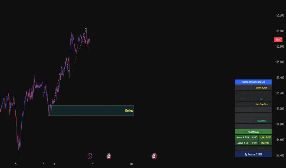
Universal_Position Size Calculator_by PaulinusFTMO Position Size Calculator - Professional Risk Management Tool
The ultimate position sizing calculator designed specifically for FTMO traders and professional risk managers.
🎯 What Does This Indicator Do?
This powerful calculator automatically determines the exact lot size you should trade based on your account size, risk tolerance, and stop loss distance. No more manual calculations or guesswork - just enter your trade parameters and get instant, accurate position sizing.
✨ Key Features
📈 Two Calculation Methods:
Entry/Stop Price Method: Enter your exact entry and stop loss prices - perfect for planned trades
Stop Loss Pips Method: Simply enter your stop loss distance in pips - ideal for quick calculations
💰 Complete Risk Management:
Calculates precise position size in lots
Shows actual dollar risk amount
Displays potential profit based on your risk:reward ratio
Automatic risk percentage calculation
Real-time updates as you adjust parameters
🌍 Multi-Asset Support:
Cryptocurrencies: BTC, ETH, XRP, LTC, BCH, BNB, ADA
Forex Pairs: All major and cross pairs (EUR/USD, GBP/USD, USD/JPY, etc.)
Commodities: Gold (XAU/USD), Oil (USOIL)
Indices: US30, US100, SPX500
🎨 Professional Interface:
Clean, easy-to-read table display
Customizable position (9 locations on chart)
Adjustable text size (Tiny, Small, Normal, Large)
Toggle detailed breakdown on/off for simplified view
Visual entry, stop loss, and take profit lines on chart
🔧 FTMO-Optimized:
Pre-configured with accurate FTMO contract specifications
Built-in contract sizes for all supported instruments
Minimum lot size requirements automatically applied
Perfect for FTMO Challenge and Verification phases
📋 How To Use
Method 1: Entry/Stop Price
Select your trading pair
Enter your account balance
Set your risk percentage (typically 1-2% for FTMO)
Choose your risk:reward ratio (e.g., 1:2, 1:3)
Enter your planned entry price
Enter your stop loss price
Get instant position size in lots!
Method 2: Stop Loss Pips
Select your trading pair
Enter your account balance
Set your risk percentage
Choose your risk:reward ratio
Enter your stop loss distance in pips
Get instant position size in lots!
📊 What You'll See
Essential Information (Always Visible):
Trading Pair
Account Balance
Risk Percentage
Risk Amount in Dollars
Target Profit Ratio
POSITION SIZE IN LOTS ⬅️ Your main result
Detailed Breakdown (Optional):
Entry Price / Stop Loss / Take Profit
Stop Loss Distance in pips
Contract Size
Actual Risk Amount
Potential Profit in Dollars
🎓 Perfect For:
✅ FTMO Challenge traders
✅ Prop firm traders
✅ Professional risk managers
✅ Swing and day traders
✅ Anyone who wants consistent position sizing
✅ Traders working on passing funded accounts
💡 Why Use This Calculator?
Eliminate Calculation Errors: No more spreadsheets or manual math - get accurate results instantly.
Stay Consistent: Maintain proper risk management on every single trade.
Save Time: Calculate position sizes in seconds, not minutes.
Protect Your Capital: Never risk more than your intended percentage.
Maximize Efficiency: Focus on trading, not calculating.
⚠️ Important Notes
This calculator uses standard FTMO contract specifications
Always verify lot sizes with your broker before placing trades
Recommended risk per trade: 1-2% for FTMO accounts
The calculator rounds to minimum lot sizes automatically
Visual lines only appear when using Entry/Stop Price method
🔒 Professional Tool
This is a protected indicator with clean, optimized code designed for serious traders who value accuracy and efficiency.
📝 Settings Guide
Table Position: Choose where the calculator appears on your chart
Table Text Size: Adjust for your screen and preference
Calculation Method: Switch between price-based or pip-based calculations
Account Balance: Your total account size
Risk Per Trade: Percentage you're willing to risk (0.1% - 5%)
TP Risk:Reward Ratio: Your target profit ratio (e.g., 2 = 1:2 RR)
Show Detailed Breakdown: Toggle extra information on/off
🚀 Start Trading With Confidence
Stop guessing your position sizes. Start using professional risk management today.
⭐ If this indicator helps your trading, please leave a review and share it with fellow traders!
By Paulinus © 2025
SOFR - IORB Spread (pct pts & bps)Tracks short-term funding conditions by measuring the spread between the Secured Overnight Financing Rate (SOFR) and the Fed’s Interest on Reserve Balances (IORB). When SOFR persistently trades above IORB, it signals cash scarcity and stress in overnight funding markets. This indicator is best used as a risk-regime and plumbing health check, not as a directional trading signal. Calm readings allow trends to persist; sustained spikes often precede periods of volatility and forced deleveraging.

Universal Lot Size Calculator (Forex, Index, Metals)Multi-functional lot size calculator with support for various instruments
🎯 MAIN FEATURES:
Universal — works with Forex, indices, metals, and custom instruments
Auto-detect — automatically detects instrument type by ticker
Precise position sizing - considering risk and currency conversions
Currency conversion — automatic conversion between deposit currencies
Advanced visualization — entry, stop-loss, take-profit lines
Smart table — convenient display of all parameters
⚙️ SETTINGS GROUPS:
📈 Instrument Settings
Instrument Type — selection: Auto, Forex, Index, Metals, Custom
Custom Contract Size — manual contract size configuration
Use Manual Exchange Rate — manual rate for currency conversion
💰 Account & Risk Settings
Deposit Currency — account currency (USD, EUR, GBP, CHF, JPY)
Account Size — deposit amount
Risk in % — risk percentage from deposit
🎯 Price Levels
Entry Price — entry price
Stop Price — stop-loss price
Target Price — take-profit price
Color settings for each line
📊 Risk/Reward Settings
Manual Target Price — manual TP setting
Show R Levels — display profit levels in R multiples
Show only last R level — show only the last R level
Number of R Levels — number of R levels (1-10)
🎨 Line Styles & Table Appearance
Line style settings (solid, dashed, dotted)
Line width
Table position and size
Color schemes
📈Supported instrument types:
Forex — standard lot 100,000
Indices — E-mini futures (US100=20, SP500=50, US30=5, DAX=25)
Metals — Gold=100 oz, Silver=5000 oz
Custom — user-defined contract size
📱 KEY FEATURES:
- Auto instrument detection:
Indices: US100, SP500, US30, DAX
Metals: XAUUSD (Gold), XAGUSD (Silver)
Forex: all currency pairs
- Smart table with key parameters:
Instrument type and contract size
Account size and risk
Entry/exit prices
Calculated lot size
- Visual elements:
Dynamic level lines
Labels with profit/loss calculations
R-levels for target prices
- Currency conversion:
Automatic rate fetching
Support for USD, EUR, GBP, CHF, JPY
Manual rate setting when needed
⚠️ IMPORTANT NOTES:
Contract sizes may vary between brokers
For CFD brokers use Custom type with Contract Size = 1
During weekends currency rates may be unavailable — use manual rate
When trading in different currencies verify conversion accuracy
🚀 HOW TO USE:
Select instrument type (Auto for auto-detection)
Set deposit size and account currency
Define risk percentage (1-100%)
Specify prices for entry, stop-loss, and take-profit
Use calculated lot to open positions
⚠️ RESETTING CALCULATIONS:
To reuse the calculator with new price levels, you need to:
Right-click on the indicator's table/chart
Select "Reset Points" from the context menu
OR manually update all three price levels (Entry, Stop Loss, Take Profit) in the settings

MPT Efficient FrontierAMEX:VT
Efficient Frontier: The Tool for Creating a "Superb" Portfolio
The Efficient Frontier is a vital concept in the world of investment that helps investors build a Portfolio—a collection of investment assets—that provides the best possible return for a given level of acceptable risk. This concept stems from the Modern Portfolio Theory (MPT), developed by Nobel laureate in Economics, Harry Markowitz.
What is the Efficient Frontier?
Imagine all the possible investment combinations you can put together. Each portfolio combination has a different level of risk (measured by volatility or Standard Deviation) and a different expected return.
When you plot all these possible portfolios on a graph, with the horizontal axis representing Risk and the vertical axis representing Return, you get a cloud of points (portfolios).
The Efficient Frontier is the curve that sits on the upper-most and left-most boundary of this cloud of points.
"Upper-most" means that the portfolios on this line provide the maximum return for that specific level of risk.
"Left-most" means that the portfolios on this line have the lowest risk for a given return.
Simply put, a portfolio lying on the Efficient Frontier is considered "Efficient" because no other portfolio exists that can offer a higher return at the s ame level of risk, or lower risk at the same level of return.
How to Use the Efficient Frontier
Investors use the Efficient Frontier to help them decide on the optimal portfolio for their needs. The key steps are:
1. Data Collection and Generating Possible Portfolios
Collect Data: Use historical data (or future projections) for the assets you are interested in (e.g., stocks, bonds, funds) to calculate their Expected Return, Risk (Standard Deviation), and, most importantly, the Correlation between the different assets.
Simulate Portfolios: Use computers or mathematical programs to simulate thousands or tens of thousands of different asset mix proportions to find all possible portfolio points.
2. Finding the "Minimum Variance Portfolio" (MVP)
The Minimum Variance Portfolio (MVP) is the point on the frontier with the absolute lowest risk (the far-left point on the curve). Investors with a very low risk tolerance might focus on this portfolio.
3. Finding the "Optimal Portfolio" for You
Once the Efficient Frontier is established, investors must select the point on the line that aligns with their personal Risk Tolerance.
Risk-Averse Investors: Will choose points on the left side of the curve (low risk and moderate return).
Risk-Tolerant Investors: Will choose points on the right side of the curve (high risk and high return).
Visualization Elements:
🔴 Red/Orange/Yellow/Green Dots => Each dot represents 1 portfolio combination. Plotted according to Risk (X-axis) and Return (Y-axis).
Color Coding by Sharpe Ratio => 🟢 Green: Sharpe > 2
🟡 Yellow: Sharpe 1-2
🟠 Orange: Sharpe 0-1
🔴 Red: Sharpe < 0
⬤ Large Yellow DotRepresents the MAX SHARPE RATIO—the Optimal Portfolio! Lying on the Efficient Frontier curve. Labeled with " Efficient Frontier".
❶❷❸❹ Colored Circles => Represents the Individual Assets (e.g., Blue, Red, Green, Purple).
■ Blue Square => Represents the Current Portfolio location.
Four Data Tables
1. Optimal Weights Table => Compares Current vs. Optimal weights for each asset. Weights Comparison: Green = Should increase weight. Red = Should decrease weight.
Max Sharpe (Current and Optimal).
2.Performance Comparison => Return, Risk, Sharpe for Current vs. Optimal portfolios.Improvement Metrics: Return (percent increase), Risk (percent decrease), Sharpe (percent improvement).Recommendation: 🚀 REBALANCE! (Score > 20); Consider (5-20); Maintain (< 5).
3.Correlation Matrix => Displays the Correlation between all assets. Helps assess Diversification.
4.Asset Statistics => Provides detailed statistics for Each Individual Asset.

Daily Dollar Cost Averaging (DCA) Simulator & Yearly PerformanceThis indicator simulates a "Daily Dollar Cost Averaging" strategy directly on your chart. Unlike standard backtesters that trade based on signals, this script calculates the performance of a portfolio where a fixed dollar amount is invested every single day, regardless of price action.
Key Features:
Daily Accumulation: Simulates buying a specific dollar amount (e.g., $10) at the market close every day.
Yearly Breakdown Table: A detailed dashboard displayed on the chart that breaks down performance by year. It tracks total invested, average entry price, total holdings, current value, and PnL percentage for each individual year.
Global Stats: The bottom row of the table summarizes the total performance of the entire strategy since the start date.
Breakeven Line: Plots a yellow line on the chart representing your "Global Average Price." When the current price is above this line, the total strategy is in profit.
How to Use:
Add to chart (Works best on the Daily (D) timeframe).
Open settings to adjust your Daily Investment Amount and Start Year.
The table will automatically update to show how a daily investment strategy would have performed over time.

Position Size Calculator - Fixed Risk Per BarThis indicator calculates the max contracts allowed per bar based on your determined fixed risk.

Dual Account Position Size CalculatorA quick and easy to use position sizing calculator for use on the daily TF only. inputs for two different account sizes and risk %. Calculates risk to low of day (plus a small buffer which can be changed based on ATR). Shows # of shares to buy, stop loss, portfolio %.
Will show on smaller timeframes , but be aware that the stop level will no longer be low of day, so it will not calculate properly. Always use on the daily.

Monthly DCA & Last 10 YearsThis Pine Script indicator simulates a Monthly Dollar Cost Averaging (DCA) strategy to help long-term investors visualize historical performance. Instead of complex timing, the script automatically executes a hypothetical fixed-dollar purchase (e.g., $100) on the first trading day of every month. It visually marks entry points with green "B" labels and plots a dynamic yellow line representing your Global Break-Even Price, allowing you to instantly see if the current price is above or below your average cost basis. To provide deep insight, it generates a detailed performance table in the bottom-right corner that breaks down metrics year-by-year—including total capital invested, shares/coins accumulated, and Profit/Loss percentage—along with a grand total summary of the entire investment period.

Weekly DCA & Yearly TableThis Pine Script indicator simulates a Weekly Dollar Cost Averaging (DCA) strategy directly on your TradingView chart. It automatically calculates a hypothetical portfolio where a fixed dollar amount (default $100) is invested every Friday (or the last trading day of the week) starting from a user-defined year. Visually, it marks every purchase with a green "B" label and plots a yellow line representing your Global Break-Even Price, allowing you to see exactly where your average entry lies relative to current price action. To track performance, it generates a detailed table in the bottom-right corner that breaks down your investment year-by-year, showing total capital invested, "coins" or shares accumulated, average buy price per year, current value, and profit/loss percentage, along with a grand total summary for the entire period.

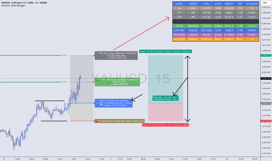
Precision Trade Manager🔥Precision Trade Manager is a complete execution - planning and trade-management system for TradingView.
It gives you full control over entry, stop-loss, position sizing, risk %, multi-TP planning (1–5), live tracking, realized profit, floating P&L, RR, and account % change — all directly on your chart.
Because this tool has many features and workflows, the TradingView description is too short to explain everything properly.
For that reason, please read the two PDF guides below before using the indicator.
They explain exactly how the tool works, how to set it up correctly, and how to avoid mistakes when planning or managing trades.
📘 PDF 1 — Quick Start Guide (Read First)
drive.google.com
This guide explains the core workflow step-by-step:
✔ How to add the tool to the chart
✔ How to configure assets, contract size, account balance, and trading costs
✔ How to set Entry, SL, and your risk %
✔ How to set TP1–TP5 using RR mode or manual mode
✔ How partials work
✔ How LIVE TRACKING mode works
✔ How to reset and prepare your next trade
This PDF teaches you the correct operational flow, so you understand how Precision Trade Manager behaves on the chart and why certain features exist.
Reading this first prevents confusion and ensures you use the tool correctly.
📙 PDF 2 — Feature Overview & Visual Examples
drive.google.com
This PDF gives a full breakdown of everything the tool is capable of:
✔ Real-time dashboard metrics (pips, lots, RR, profit, % account)
✔ Partial TP tracking with green checkmarks and locked profit
✔ Floating vs. locked mode
✔ Pip/point/currency conversions across Gold, Forex, Indices, and Crypto
✔ Example charts for US30, EURUSD, and XAUUSD
✔ A direct comparison against the TradingView Long/Short tool
This document is visual. It shows real examples of the tool in action so you understand what to expect once you’re using it live on your chart.

It is highly recommended to look through this PDF before your first trade. It will help you understand the dashboard, interpret every metric, and recognize the benefits versus the default TradingView tools.
(The tool has many (!) tooltips, hower mouse over each. To get a clear description of what each function/button/box do)
JRien Position Sizer (Real-Time) — ATR / LOD / Manual % $ RiskReal time position sizing based on real time potential entry price and calculations based on max risk. Usable on multi timeframes. You can also input manually your entry and stop based on your own discretion. I usually use a spreadsheet to calculate these things but wanted a way to see this in real time without needing to type out Entry, ATR, Stops, etc - TradingView has all this information already so why not just have it automatically update!
4 Stop Types:
ATR Based Stop
Based on the stocks ATR (mainly used on daily charts but options if you use other timeframe ATR) and uses a multiple of that ATR to base the plot. Many traders use less than 0.6ATR to base your stop as a rule and max entry 60% from LOD as another rule.
Manual Percent Stop
You're able to input your desired % stop and this will dynamically move with the current entry (last) price.
Manual Price Stop
You're able to input your desired price $ stop and this will dynamically move with the current entry (last) price.
Low of Day (LOD) Stop
Calculates your position based on if you were to have your stop at LOD and also calculates % of ATR away from LOD. Many swing traders use LOD for their stop so this moving dynamically with the current LOD and automatically calculating this is useful.
Calculates:
Entry (Last)
ATR (14 | D)
ATR Stop Price
Manual Stop Percent
Manual Stop Price
Final Stop
Risk per Share ($)
Shares by Risk
Shares by Stake
Final Shares
Final Position Cost
Potential Stop Loss
LOD Price
Loss at LOD
LOD Risk % of Account
LOD dist as % of ATR
Customizable table - can hide items, change color and size.
Also an option to hide historical data - so plots start at market open!
Let me know if any calculations are incorrect, good luck!
- JRien


CapitalFlowsResearch: Sensitivity AnalysisCapitalFlowsResearch: Sensitivity Analysis — Driver–Price Beta Gauge
CapitalFlowsResearch: Sensitivity Analysis is built to answer a very specific macro question:
“How sensitive is this price to moves in that driver, right now?”
The indicator compares bar-to-bar changes in a chosen “price” asset with a chosen “driver” (such as an equity index, yield, or cross-asset benchmark), and from that relationship derives a rolling measure of effective beta. That beta is then converted into a “band width” value, representing how much the price typically moves for a standardised shock in the driver, under current conditions.
You can choose whether the driver’s moves are treated in basis points, absolute terms, or percent changes, and optionally smooth the resulting band with a configurable moving average to emphasise structural shifts over noise. The two plotted lines—current band width and its moving average—form a simple yet powerful gauge of how tightly the price is currently “geared” to the driver.
In practice, this makes Sensitivity Analysis a compact tool for:
Tracking when a contract becomes more or less responsive to a key macro factor.
Comparing sensitivity across instruments or timeframes.
Framing expected move scenarios (“if the driver does X, this should roughly do Y”).
All of this is done without exposing the detailed beta or volatility math inside the script.

Position Size Tool [Riley]Automatically determine number of shares for an entry. Quantity based on a stop set at the low of day for long positions or a stop set at the high of the day for short positions. As well as inputs like account balance risk per trade. Also includes a user-defined maximum for percentage of daily dollar volume to consume with entry.

Multi-Entry Fibonacci CalculatorMulti-Entry Fibonacci Calculator
This tool is a comprehensive trade calculator designed for discretionary traders who plan to scale into positions. It automates the complex task of position sizing across up to three separate entries while ensuring your total risk exposure remains fixed. By inputting your desired entry, stop loss, and initial profit target levels, the script calculates the precise quantity for each entry and provides a dynamic, real-time view of your trade's vitals.
The primary goal of this script is to allow for disciplined risk management in multi-entry trade plans. Whether you are averaging into a position or adding on pullbacks, this tool ensures your total predefined risk is never exceeded, even if all entries are filled.
Key Features
Multi-Entry Position Sizing: Automatically calculates the share/contract size for up to three entries based on their distance from the stop loss and user-defined weights.
Fixed Risk Management: Define your total risk as a percentage of your account. The script ensures that a full stop-out across all filled entries will result in a loss equal to this predefined amount.
Dynamic Take Profit: The take-profit level automatically adjusts based on your current average entry price to preserve the original target profit amount in dollars.
Real-Time Info Panel: A customizable on-chart panel displays all critical trade data, including current quantity, average price, projected P&L, and trade status.
Visual Trade Plan: Plots all your defined price levels (entries, stop loss, take profit) directly on the chart with informative labels.
Trade State Tracking & Alerts: The script monitors the price and will trigger alerts when entries are hit, or when the stop loss or take profit levels are reached.
How to Use
Configure Account & Risk: In the settings, enter your "Account Size" and the "Risk per Trade (%)" you are willing to take on the entire position.
Set Trade Direction: Choose either "LONG" or "SHORT".
Input Price Levels: Manually enter the prices for your entries (Entry 1, 2, 3), your "Stop Loss Price," and an "Initial TP Reference." The initial TP is used to calculate the target profit in dollars.
Distribute Position Weight: Assign weights to each entry (e.g., 50% for Entry 1, 30% for Entry 2, 20% for Entry 3). The total should sum to 100.
Monitor the Trade: Use the info panel and on-chart visuals to track the trade's progress. The script will show your average price as entries are filled and update the dynamic take-profit level accordingly.
Understanding the Calculations
Weighted Position Sizing: The script calculates sizes for each entry so that if all entries are filled and the stop loss is hit, your total loss will equal your predefined risk amount. It intelligently allocates size based on the distance of each entry from the stop loss and the weight you assign to it.
Dynamic Take Profit: The "Initial TP Reference" is used only to calculate a target profit in dollars based on your first entry's size. The script then calculates a dynamic TP line on your chart. This line adjusts based on your average entry price as positions are filled, ensuring that if price reaches this level, you will realize your original target dollar profit, regardless of how many entries were filled.
On-Chart Elements
Price Lines: Blue lines for entries, a red line for the stop loss, and a green line for the dynamic take profit.
Labels: Display the calculated quantity for each entry, the total risk amount at the stop loss, and the target profit amount at the take profit.
Average Price: Yellow circles plot your live average entry price as the position is built.
Info Panel: A comprehensive table showing live trade status, current quantity, average price, and projected profit/loss. The panel changes color to green on a TP hit and red on an SL hit.

BTC Fear & Greed Incremental StrategyIMPORTANT: READ SETUP GUIDE BELOW OR IT WON'T WORK
# BTC Fear & Greed Incremental Strategy — TradeMaster AI (Pure BTC Stack)
## Strategy Overview
This advanced Bitcoin accumulation strategy is designed for long-term hodlers who want to systematically take profits during greed cycles and accumulate during fear periods, while preserving their core BTC position. Unlike traditional strategies that start with cash, this approach begins with a specified BTC allocation, making it perfect for existing Bitcoin holders who want to optimize their stack management.
## Key Features
### 🎯 **Pure BTC Stack Mode**
- Start with any amount of BTC (configurable)
- Strategy manages your existing stack, not new purchases
- Perfect for hodlers who want to optimize without timing markets
### 📊 **Fear & Greed Integration**
- Uses market sentiment data to drive buy/sell decisions
- Configurable thresholds for greed (selling) and fear (buying) triggers
- Automatic validation to ensure proper 0-100 scale data source
### 🐂 **Bull Year Optimization**
- Smart quarterly selling during bull market years (2017, 2021, 2025)
- Q1: 1% sells, Q2: 2% sells, Q3/Q4: 5% sells (configurable)
- **NO SELLING** during non-bull years - pure accumulation mode
- Preserves BTC during early bull phases, maximizes profits at peaks
### 🐻 **Bear Market Intelligence**
- Multi-regime detection: Bull, Early Bear, Deep Bear, Early Bull
- Different buying strategies based on market conditions
- Enhanced buying during deep bear markets with configurable multipliers
- Visual regime backgrounds for easy market condition identification
### 🛡️ **Risk Management**
- Minimum BTC allocation floor (prevents selling entire stack)
- Configurable position sizing for all trades
- Multiple safety checks and validation
### 📈 **Advanced Visualization**
- Clean 0-100 scale with 2 decimal precision
- Three main indicators: BTC Allocation %, Fear & Greed Index, BTC Holdings
- Real-time portfolio tracking with cash position display
- Enhanced info table showing all key metrics
## How to Use
### **Step 1: Setup**
1. Add the strategy to your BTC/USD chart (daily timeframe recommended)
2. **CRITICAL**: In settings, change the "Fear & Greed Source" from "close" to a proper 0-100 Fear & Greed indicator
---------------
I recommend Crypto Fear & Greed Index by TIA_Technology indicator
When selecting source with this indicator, look for "Crypto Fear and Greed Index:Index"
---------------
3. Set your "Starting BTC Quantity" to match your actual holdings
4. Configure your preferred "Start Date" (when you want the strategy to begin)
### **Step 2: Configure Bull Year Logic**
- Enable "Bull Year Logic" (default: enabled)
- Adjust quarterly sell percentages:
- Q1 (Jan-Mar): 1% (conservative early bull)
- Q2 (Apr-Jun): 2% (moderate mid bull)
- Q3/Q4 (Jul-Dec): 5% (aggressive peak targeting)
- Add future bull years to the list as needed
### **Step 3: Fine-tune Thresholds**
- **Greed Threshold**: 80 (sell when F&G > 80)
- **Fear Threshold**: 20 (buy when F&G < 20 in bull markets)
- **Deep Bear Fear Threshold**: 25 (enhanced buying in bear markets)
- Adjust based on your risk tolerance
### **Step 4: Risk Management**
- Set "Minimum BTC Allocation %" (default 20%) - prevents selling entire stack
- Configure sell/buy percentages based on your position size
- Enable bear market filters for enhanced timing
### **Step 5: Monitor Performance**
- **Orange Line**: Your BTC allocation percentage (target: fluctuate between 20-100%)
- **Blue Line**: Actual BTC holdings (should preserve core position)
- **Pink Line**: Fear & Greed Index (drives all decisions)
- **Table**: Real-time portfolio metrics including cash position
## Reading the Indicators
### **BTC Allocation Percentage (Orange Line)**
- **100%**: All portfolio in BTC, no cash available for buying
- **80%**: 80% BTC, 20% cash ready for fear buying
- **20%**: Minimum allocation, maximum cash position
### **Trading Signals**
- **Green Buy Signals**: Appear during fear periods with available cash
- **Red Sell Signals**: Appear during greed periods in bull years only
- **No Signals**: Either allocation limits reached or non-bull year
## Strategy Logic
### **Bull Years (2017, 2021, 2025)**
- Q1: Conservative 1% sells (preserve stack for later)
- Q2: Moderate 2% sells (gradual profit taking)
- Q3/Q4: Aggressive 5% sells (peak targeting)
- Fear buying active (accumulate on dips)
### **Non-Bull Years**
- **Zero selling** - pure accumulation mode
- Enhanced fear buying during bear markets
- Focus on rebuilding stack for next bull cycle
## Important Notes
- **This is not financial advice** - backtest thoroughly before use
- Designed for **long-term holders** (4+ year cycles)
- **Requires proper Fear & Greed data source** - validate in settings
- Best used on **daily timeframe** for major trend following
- **Cash calculations**: Use allocation % and BTC holdings to calculate available cash: `Cash = (Total Portfolio × (1 - Allocation%/100))`
## Risk Disclaimer
This strategy involves active trading and position management. Past performance does not guarantee future results. Always do your own research and never invest more than you can afford to lose. The strategy is designed for educational purposes and long-term Bitcoin accumulation thesis.
---
*Developed by Sol_Crypto for the Bitcoin community. Happy stacking! 🚀*


90% Buying Power Position Size Helper90% Buying Power Position Size Helper — Script Description
This tool calculates a recommended share size based on your available buying power and the current market price. TradingView does not provide access to live broker balances, so this script allows you to manually enter your current buying power and instantly see how many shares you can buy using a chosen percentage of it (default: 90%).
How It Works
• Enter your Buying Power ($)
• Choose the Percent to Use (e.g., 90%).
• The script divides the selected portion of your buying power by the current price of the symbol.
• A small display in the chart corner shows the recommended number of shares to buy.
Formula
shares = floor((buying_power * percent_to_use / 100) / price)
What It’s For
• Day traders who size positions based on account buying power
• Traders who want a quick way to calculate share size per trade
• Anyone who sizes entries using a fixed percentage of their account
What It Doesn’t Do
Due to TradingView limitations, the script cannot:
• Read your live buying power or broker balance
• Auto-fill orders or submit trades
• Retrieve real account data from your broker
You simply update the buying power input whenever your account changes, and the script does the rest.
Why It’s Useful
• Keeps you consistent with position sizing
• Reduces manual math during fast trading
• Prevents oversizing or undersizing trades
• Helps maintain discipline and risk control

Macro Monte Carlo 10000 Prob with BootstrapMacro Monte Carlo 10000 Prob with Bootstrap — by Wongsakon Khaisaeng
1) Core Concept: Monte Carlo as a Macro-Probabilistic Lens on Future Price Paths
The Macro Monte Carlo 10000 Prob with Bootstrap indicator is designed to view future price evolution through a probabilistic and statistically grounded lens. Instead of predicting a single deterministic outcome, it generates thousands of simulated future price paths (Monte Carlo Paths) to estimate the range of possible outcomes. By analyzing the lowest and highest values reached within each simulated path, the indicator provides a macro-level understanding of how far price could realistically decline or rally within a specified forecast horizon. This approach shifts the focus from price forecasting to probability distribution estimation, enabling more robust decision-making for systematic traders, risk managers, and options strategists.
2) Historical Data Foundation: Extracting Log Returns as the Statistical Engine
Before any simulation takes place, the indicator constructs a historical library of logarithmic returns (log returns) derived from the asset’s recent price history. The user defines the lookback window (e.g., 1000 bars), allowing the system to characterize how returns behaved across various market regimes. Log returns are used because they preserve mathematical properties essential for multiplicative price processes, making them highly suitable for probabilistic modeling. This historical dataset forms the core statistical engine from which blocks of returns will later be sampled and recombined to create forward-looking scenarios.
3) Simulation Methodology: Block Bootstrap to Preserve Market Structure
Unlike traditional Monte Carlo methods that randomize every return independently, this indicator employs Block Bootstrap—a technique that samples consecutive clusters of returns rather than isolated points. By using these blocks (e.g., 24 bars per block), the simulation preserves vital market characteristics such as volatility clustering, trending behavior, and short-term autocorrelation. Each simulated path is built by sequentially appending multiple randomly selected return blocks until the forecast horizon is reached. This method produces realistic price trajectories that reflect the inherent temporal structure of financial markets rather than artificially smoothed or over-randomized paths.
4) Macro Perspective: Tracking Path-Level Minimums and Maximums
For each simulated price path, the indicator tracks two critical values:
(1) the lowest price reached within the entire future path, and
(2) the highest price reached within the same horizon.
This macro approach focuses on the extremes—how deep a drawdown could extend, or how high a rally could potentially reach—rather than the shape of the trajectory itself. The method reflects practical concerns in risk management and trading:
How low could price fall before my stop is hit?
How high could price rise before a take-profit trigger?
By generating thousands of such paths, the indicator builds a statistical distribution of future minimums and maximums across all simulations.
5) Percentile Bands: Converting Thousands of Paths into Statistical Insight
Once all minimum and maximum values are collected, the indicator calculates key percentiles of these distributions (e.g., 10th, 50th, 90th). These percentiles represent probabilistic thresholds:
The 10th percentile of minimums suggests a price level below which only 10% of simulated future paths ever fell.
The 90th percentile of maximums indicates a level reached by only the strongest 10% of simulated rallies.
User-defined percentile settings are then applied to generate Band Low and Band High, which are plotted on the chart at the final bar. These levels form a probabilistic corridor showing where future price movements are statistically likely—or unlikely—to reach within the chosen horizon. This creates a forward-looking “probability envelope” that adapts to volatility, market structure, and historical dynamics.
6) Touch Probabilities: Estimating the Likelihood of Hitting Key Price Levels
A defining feature of the indicator is the calculation of Touch Probabilities—the probability that price will hit a certain lower or upper level at least once within the simulation window.
The lower touch level defaults to 90% of the current spot price (unless overridden).
The upper touch level defaults to 110% of spot.
The indicator then measures the percentage of paths in which:
the path’s minimum falls below or equal to the lower level → P(Touch ≤ X)
the path’s maximum rises above or equal to the upper level → P(Touch ≥ Y)
This mirrors advanced risk-management methods in trading, especially in options pricing, where the central question is often: Will price breach a barrier within a given timeframe?
These probabilities can guide decisions related to hedging, position sizing, stop-loss design, or probability-based expectations for take-profit scenarios.
7) Visual Output: Probability Bands and a Structured Summary Table
To help traders interpret results visually, the indicator plots Band Low and Band High as horizontal forward-looking reference levels at the most recent bar. This provides a quick visual sense of the statistical “territory” price is expected to explore under randomized future paths.
Additionally, a structured summary table is displayed on-chart, presenting:
symbol
number of paths, horizon, block length
spot price
percentile metrics for min/max distributions
Band Low / Band High
touch probabilities
sample counts and lookback window
This table transforms the complex underlying simulation into a clear, interpretable snapshot ideal for systematic analysis and trading decisions.
8) Practical Interpretation: A Probability-Driven Tool for Systematic Decision-Making
The purpose of this indicator is not to generate trading signals but to provide a statistical foundation for evaluating risk and opportunity. Systematic traders can use the information to answer practical questions such as:
“Is the expected downside risk greater than the upside opportunity?”
“What is the probability that price reaches my take-profit before my stop?”
“How wide should my volatility-adjusted stop-loss realistically be?”
“Does the market currently favor expansion or contraction in price range?”
The tool can also assist in options strategies (e.g., barrier options, credit spreads), portfolio risk assessment, or position sizing in trend-following and mean-reversion systems. In short, it provides a macro-probability framework that enhances decision quality by grounding expectations in simulated statistical reality rather than subjective bias.

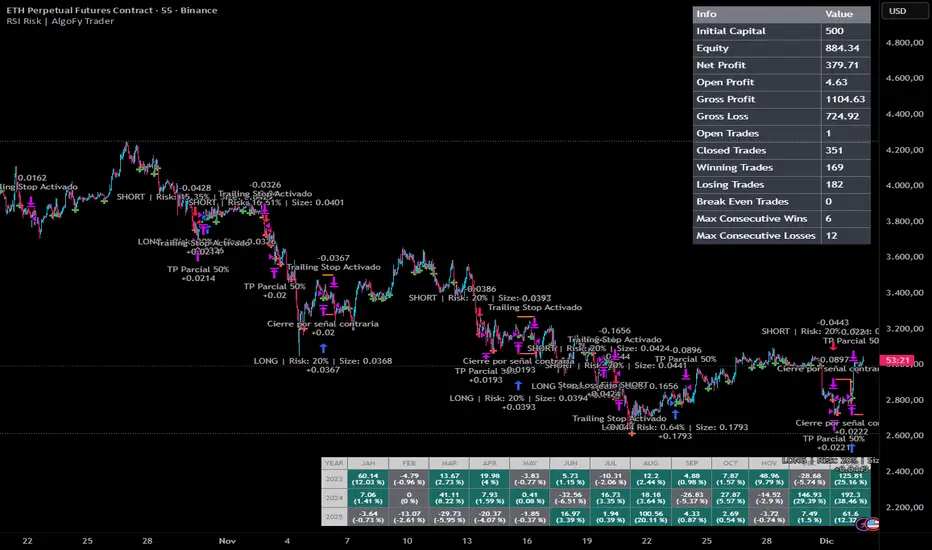
RSI Risk | AlgoFy TraderRSI Risk | AlgoFy Trader
Overview
The RSI Risk | AlgoFy Trader is a trading system that combines RSI-based entry signals with automated capital management. This strategy identifies potential momentum shifts while controlling risk through calculated position sizing.
Key Features
Dynamic Risk Management:
Fixed Risk Per Trade: Users set maximum risk percentage per trade.
Automatic Position Sizing: Calculates position size based on stop-loss distance.
Capital Protection: Limits each trade's risk to user-defined percentage.
RSI Entry System:
Momentum Detection: Uses RSI crossovers above/below defined thresholds.
Clear Signals: Provides long/short entries on momentum transitions.
Multiple Exit Layers:
Dynamic Stop Loss: Stop based on recent price structure.
Fixed Safety Stop: Optional percentage-based stop loss.
Partial Take Profit: Optional early profit-taking.
Trailing Stop: Optional dynamic profit protection.
Performance Tracking:
Trade Statistics: Tracks win/loss streaks and performance metrics.
Monthly Dashboard: Shows monthly/yearly P&L with equity views.
Trade Details: Displays risk percentage and position size.
How It Works
Signal Detection: Monitors RSI for crossover events.
Risk Calculation: Determines stop-loss based on recent volatility.
Position Sizing: Calculates exact position to match risk percentage.
Example:
Account: $10,000 | Risk: 2% ($200 max)
Stop loss at 4% distance
Position size: $5,000
Result: 4% loss on $5,000 = $200 (2% of account)
Recommended Settings
Risk: 1-2% per trade
Enable fixed stop at 3-4%
Consider trailing stop activation
This script provides disciplined RSI trading with automated risk control, adjusting exposure while maintaining strict risk limits.
Hierarchical Hidden Markov ModelHierarchical Hidden Markov Models (HHMMs) are an advanced version of standard Hidden Markov Models (HMMs). While HMMs model systems with a single layer of hidden states, each transitioning to other states based on fixed probabilities, HHMMs introduce multiple layers of hidden states. This hierarchical structure allows for more complex and nuanced modeling of systems, making HHMMs particularly useful in representing systems with nested states or regimes. In HHMMs, the hidden states are organized into levels, where each state at a higher level is defined by a set of states at a lower level. This nesting of states enables the model to capture longer-term dependencies in the time series, as each state at a higher level can represent a broader regime, and the states within it can represent finer sub-regimes. For example, in financial markets, a high-level state might represent a general market condition like high volatility, while the nested lower-level states could represent more specific conditions such as trending or oscillating within the high volatility regime.
The hierarchical nature of HHMMs is facilitated through the concept of termination probabilities. A termination probability is the probability that a given state will stop emitting observations and transition control back to its parent state. This mechanism allows the model to dynamically switch between different levels of the hierarchy, thereby modeling the nested structure effectively. Beside the transition, emission and initial probabilities that generally define a HMM, termination probabilities distinguish HHMMs from HMMs because they define when the process in a sub-state concludes, allowing the model to transition back to the higher-level state and potentially move to a different branch of the hierarchy.
In financial markets, HHMMs can be applied similiarly to HMMs to model latent market regimes such as high volatility, low volatility, or neutral, along with their respective sub-regimes. By identifying the most likely market regime and sub-regime, traders and analysts can make informed decisions based on a more granular probabilistic assessment of market conditions. For instance, during a high volatility regime, the model might detect sub-regimes that indicate different types of price movements, helping traders to adapt their strategies accordingly.
MODEL FIT:
By default, the indicator displays the posterior probabilities, which represent the likelihood that the market is in a specific hidden state at any given time, based on the observed data and the model fit. These posterior probabilities strictly represent the model fit, reflecting how well the model explains the historical data it was trained on. This model fit is inherently different from out-of-sample predictions, which are generated using data that was not included in the training process. The posterior probabilities from the model fit provide a probabilistic assessment of the state the market was in at a particular time based on the data that came before and after it in the training sequence. Out-of-sample predictions, on the other hand, offer a forward-looking evaluation to test the model's predictive capability.
MODEL TESTING:
When the "Test Out of Sample" option is enabled, the indicator plots the selected display settings based on models' out-of-sample predictions. The display settings for out-of-sample testing include several options:
State Probability option displays the probability of each state at a given time for segments of data points not included in the training process. This is particularly useful for real-time identification of market regimes, ensuring that the model's predictive capability is tested on unseen data. These probabilities are calculated using the forward algorithm, which efficiently computes the likelihood of the observed sequence given the model parameters. Higher probabilities for a particular state suggest that the market is currently in that state. Traders can use this information to adjust their strategies according to the identified market regime and their statistical features.
Confidence Interval Bands option plots the upper, lower, and median confidence interval bands for predicted values. These bands provide a range within which future values are expected to lie with a certain confidence level. The width of the interval is determined by the current probability of different states in the model and the distribution of data within these states. The confidence level can be specified in the Confidence Interval setting.
Omega Ratio option displays a risk-adjusted performance measure that offers a more comprehensive view of potential returns compared to traditional metrics like the Sharpe ratio. It takes into account all moments of the returns distribution, providing a nuanced perspective on the risk-return tradeoff in the context of the HHMM's identified market regimes. The minimum acceptable return (MAR) used for the calculation of the omega can be specified in the settings of the indicator. The plot displays both the current Omega ratio and a forecasted "N day Omega" ratio. A higher Omega ratio suggests better risk-adjusted performance, essentially comparing the probability of gains versus the probability of losses relative to the minimum acceptable return. The Omega ratio plot is color-coded, green indicates that the long-term forecasted Omega is higher than the current Omega (suggesting improving risk-adjusted returns over time), while red indicates the opposite. Traders can use omega ratio to assess the risk-adjusted forecast of the model, under current market conditions with a specific target return requirement (MAR). By leveraging the HHMM's ability to identify different market states, the Omega ratio provides a forward-looking risk assessment tool, helping traders make more informed decisions about position sizing, risk management, and strategy selection.
Model Complexity option shows the complexity of the model, as well as complexity of individual states if the “complexity components” option is enabled. Model complexity is measured in terms of the entropy expressed through transition probabilities. The used complexity metric can be related to the models entropy rate and is calculated as the sum of the p*log(p) for every transition probability of a given state. Complexity in this context informs us on how complex the models transitions are. A model that might transition between states more often would be characterised by higher complexity, while a model that tends to transition less often would have lower complexity. High complexity can also suggest the model captures noise rather than the underlying market structure also known as overfitting, whereas lower complexity might indicate underfitting, where the model is too simplistic to capture important market dynamics. It is useful to assess the stability of the model complexity as well as understand where changes come from when a shift happens. A model with irregular complexity values can be strong sign of overfitting, as it suggests that the process that the model is capturing changes siginficantly over time.
Akaike/Bayesian Information Criterion option plots the AIC or BIC values for the model on both the training and out-of-sample data. These criteria are used for model selection, helping to balance model fit and complexity, as they take into account both the goodness of fit (likelihood) and the number of parameters in the model. The metric therefore provides a value we can use to compare different models with different number of parameters. Lower values generally indicate a better model. AIC is considered more liberal while BIC is considered a more conservative criterion which penalizes the likelihood more. Beside comparing different models, we can also assess how much the AIC and BIC differ between the training sets and test sets. A test set metric, which is consistently significantly higher than the training set metric can point to a drift in the models parameters, a strong drift of model parameters might again indicate overfitting or underfitting the sampled data.
Indicator settings:
- Source : Data source which is used to fit the model
- Training Period : Adjust based on the amount of historical data available. Longer periods can capture more trends but might be computationally intensive.
- EM Iterations : Balance between computational efficiency and model fit. More iterations can improve the model but at the cost of speed.
- Test Out of Sample : turn on predict the test data out of sample, based on the model that is retrained every N bars
- Out of Sample Display: A selection of metrics to evaluate out of sample. Pick among State probability, confidence interval, model complexity and AIC/BIC.
- Test Model on N Bars : set the number of bars we perform out of sample testing on.
- Retrain Model on N Bars: Set based on how often you want to retrain the model when testing out of sample segments
- Confidence Interval : When confidence interval is selected in the out of sample display you can adjust the percentage to reflect the desired confidence level for predictions.
- Omega forecast: Specifies the number of days ahead the omega ratio will be forecasted to get a long run measure.
- Minimum Acceptable Return : Specifies the target minimum acceptable return for the omega ratio calculation
- Complexity Components : When model complexity is selected in the out of sample display, this option will display the complexity of each individual state.
-Bayesian Information Criterion : When AIC/BIC is selected, turning this on this will ensure BIC is calculated instead of AIC.
