Cava Signals Backtesting v2Cava Signals Backtesting Strategy v2 (BTC)
This Pine Script strategy is designed for backtesting trading signals on BTC, built upon the Cava Signals v2 framework. It integrates multiple technical indicators to identify potential buy and sell opportunities, incorporating volume analysis, momentum, and trend-following mechanisms. The strategy supports customizable parameters for trade entry, exit, take-profit, stop-loss, and DCA (Dollar-Cost Averaging) logic, optimized for BTC trading. Ideal for traders looking to test and refine their approach in a backtesting environment, this script offers flexibility to adapt to various market conditions while focusing on disciplined trade management. Always backtest thoroughly and validate performance before live use.
個人檔案管理

Risk-On / Risk-Off Composite (Elliot) – Macro+Vol Upgrade v2drop-in upgrade of indicator that adds three optional macro components with adjustable weights:
Inverted VIX (risk-on when down → we use 100/VIX)
Inverted MOVE (bond vol; risk-on when down → we use 1/MOVE)
Inverted DXY (USD; risk-on when down → we use 1/DXY)

Risk-On / Risk-Off CompositeReal-time Risk-On / Risk-Off Composite from your four ratios:
SPY / TLT (equities vs long bonds)
HYG / LQD (high-yield vs IG credit)
HG / GOLD (copper vs gold)
BTC / GOLD (speculative vs defensive)
It:
normalizes each ratio with a z-score (so they’re comparable),
lets you weight them,
plots a composite line + histogram (up = risk-on, down = risk-off),
shows a small heat-table for each sub-signal,
and includes alert conditions for Risk-On / Risk-Off flips.

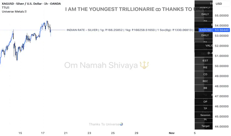
Universe Metals 🌏Live Indian rates for Gold & Silver — powered by Universe 🌏
Universe Metals 🌏 is a refined real-time tracker that brings Gold (XAU) and Silver (XAG) to life in Indian Rupees (₹) — combining precision, purpose, and a touch of gratitude.
Designed especially for MCX, COMEX, and international bullion traders, it automatically detects Gold or Silver charts and instantly converts live USD prices into Indian rates using the latest USDINR feed.
💎 For Gold: Displays 24K and 22K prices per gram and per sovereign (8g).
⚪ For Silver: Displays live 1 gram, 1 kilogram, and 1 sovereign equivalents.
Simple. Elegant. Minimal. Yet powerful — built for traders who value both clarity and meaning in their charts.
Features:
Auto-detects Gold & Silver charts (XAU / XAG / MCX)
Converts USD rates to INR in real time
Clean design with customizable toggles
CCT Gold Synthetic Market Cap🌎 Gold Synthetic Market Cap
Overview
The Gold Synthetic Market Cap indicator transforms the Gold Spot price (XAU/USD) into a synthetic market capitalization chart, allowing traders and analysts to visualize gold’s total estimated valuation as a global asset — similar to how cryptocurrencies are evaluated by total market cap.
This tool uses the current XAU/USD price multiplied by the total amount of gold ever mined (~210,000 metric tons), automatically converting the result into trillions of US dollars (USD T).
The outcome is a precise and dynamic representation of gold’s real-time market value — displayed as full OHLC candles in a separate chart panel.
🧠 Core Concept
Gold’s price per ounce doesn’t tell the full story of its global valuation.
By converting it to market capitalization, we can compare it to other asset classes such as:
Bitcoin’s total market cap (CRYPTOCAP:BTC)
Global equities and ETFs
Precious metals or commodities benchmarks
This indicator bridges the gap between price analysis and macro asset valuation, offering a quantitative visualization of gold’s total monetary footprint.
⚙️ Technical Mechanics
Base Symbol: OANDA:XAUUSD (or any gold pair available on your chart)
Conversion Constant:
210,000 tons × 32,150.7 oz/ton = 6.76 × 10⁹ ounces
Calculation:
MarketCap = (XAUUSD × total_ounces) / 1e12
Displayed Units: Trillions of USD (USD T)
Chart Type: Full OHLC candles (plotcandle)
Each candle represents the daily/weekly/monthly change in gold’s total market value.
🎛️ User Controls (Inputs)
Toggle Function
Show Average Line? Displays a 21-period SMA (in trillions) for trend-following analysis.
Show Info Table? Adds a small info table at the bottom-right corner showing the current market cap value.
Show Market Cap Label? Displays a live label above the last candle showing the latest market cap value.
Normalize Scale? Adjusts scaling for better visual fit. Leave enabled to avoid flat or off-screen candles.
📈 How to Use
1 - Add the indicator to your Gold Spot chart (XAUUSD).
2 - When added, TradingView automatically creates a separate panel below the main price chart.
3 - You can hide the original XAUUSD chart to focus solely on the synthetic market cap.
4 - Maximize the indicator panel (double-click or use the arrow icon) to view the synthetic market cap in full-screen mode.
Apply any drawing tools, trendlines, or visual overlays directly on this panel (they won’t affect the base chart).
Optionally, compare it side by side with Bitcoin Market Cap (CRYPTOCAP:BTC) for macro-level correlation studies.
🪙 Practical Applications
Compare Gold’s global valuation to Bitcoin, equities, or global M2 supply.
Analyze macro rotation trends between risk-off and risk-on assets.
Estimate how much capital is stored in physical gold versus digital assets.
Integrate into broader multi-asset dashboards for portfolio allocation analysis.
💡 Suggested Workflow
Keep the normalize toggle enabled (default).
Maximize the lower panel for a full synthetic chart view.
Combine this tool with the F!72 SuperTrade or MarketMonitor indicators for contextual macro insight.
Use a weekly or monthly timeframe for clearer long-term structure visualization.
📊 Notes
This indicator uses public XAU/USD pricing and does not require any external API.
Works seamlessly with any TradingView theme (light or dark).
Best viewed with logarithmic scale off, as values are already represented in trillions.
Compatible with all resolutions and broker feeds that support XAUUSD.
🔬 Example Interpretation
If Gold trades around $4,000/oz,
the total market cap is approximately:
4,000 × 32,150.7 × 210,000 ≈ 27 Trillion USD
If Gold rises to $5,000/oz,
the global valuation crosses 33.9 Trillion USD —
a move equivalent to adding the entire market cap of all major tech stocks combined.
🧭 Final Recommendation
This script is designed as an analytical overlay, not a trading signal tool.
It complements technical analysis by providing macro context — showing where gold stands as a global store of value in relation to other capital markets.
For best experience:
Use higher timeframes (1W or 1M)
Maximize the indicator panel
Keep Normalize Scale = ON
⚠️ Disclaimer
This indicator is a visualization and educational tool.
It does not provide financial advice or investment recommendations.
Always perform your own research before making financial decisions.
Author: Central Crypto Traders
Version: 1.0 (October 2025)
Type: Informational Overlay
License: Open for personal and educational use

Conviction Ratio | viResearchConviction Ratio | viResearch
Conceptual Foundation and Innovation
The Conviction Ratio by viResearch is a trend strength indicator designed to measure the conviction behind market movements by analyzing price returns over a defined period. It reflects how consistently and powerfully an asset has trended within that time window. The higher the ratio, the stronger and more confident the trend.
This approach provides a clear and intuitive way to gauge whether recent price action is supported by genuine momentum or merely short-term noise. By quantifying return intensity, the indicator helps traders identify assets that are trending with conviction versus those moving without sustained direction.
Technical Composition and Calculation
The Conviction Ratio evaluates an asset’s performance by comparing its current price level to past values over a customizable lookback period. It measures how much the market has advanced or declined, translating that movement into a normalized ratio that reflects overall trend conviction.
A rising ratio indicates strong and accelerating trend strength, while a falling or negative ratio suggests fading momentum or potential reversal. This dynamic view helps traders visually assess whether a trend is strengthening, weakening, or entering a transition phase.
Features and User Inputs
To accommodate different trading styles and timeframes, the indicator offers several adjustable settings:
Period (Days): Defines how far back the indicator measures return performance, allowing users to analyze short-term bursts or longer-term trends.
Start Date: Sets the beginning of the analysis window, useful for backtesting or focusing on a specific time period.
The Conviction Ratio line changes color dynamically to reflect market conviction:
Aqua: Positive ratio, indicating strong upward trend strength.
Pink: Negative ratio, signaling weak or declining market conviction.
Practical Applications
The Conviction Ratio can be applied across all asset classes — equities, cryptocurrencies, forex, and commodities — to identify where the strongest trends are forming. It’s particularly useful for:
Measuring Trend Strength: Quickly determine how strong or sustained a trend is within the chosen timeframe.
Identifying Momentum Shifts: Spot when market conviction is increasing or fading, signaling potential trend continuation or reversal.
Comparative Analysis: Compare multiple assets to find which ones are trending with greater conviction and consistency.
Advantages and Strategic Value
The Conviction Ratio offers a simple yet powerful way to quantify trend quality. Instead of relying on price direction alone, it evaluates the strength and persistence behind that movement. This makes it an ideal tool for trend followers, momentum traders, and portfolio managers seeking to align with assets showing genuine directional confidence.
Its normalized structure ensures consistency across different volatility environments, making it suitable for both discretionary and systematic trading strategies.
Visual Cues and Interpretation
The indicator plots a smooth, color-coded ratio line centered around zero, with key reference levels at +1.0 and –1.0.
Ratios above +1.0 indicate strong, confident uptrends.
Ratios below +1.0 suggest weakening or unstable market conditions.
Ratios below 0 represent unprofitable or negative-return periods.
Sharp declines in the ratio, even from high positive levels, can serve as early warning signals of weakening momentum or potential trend reversal.
By tracking both the level and the rate of change of the ratio, traders can detect when market conviction starts to fade — often before price itself shows clear reversal signs.
Summary and Usage Tips
The Conviction Ratio | viResearch provides traders with a clean, data-driven way to interpret market strength. By focusing on return-based trend conviction, it highlights where the market is moving with genuine confidence and warns when conviction begins to erode.
Use it to confirm breakout strength, identify fading rallies, or monitor early signs of trend exhaustion. The higher the ratio, the stronger the conviction — but when it starts falling sharply, take note. It might be your first signal that the trend is losing strength.
Note: Historical results are for reference only and do not guarantee future performance.

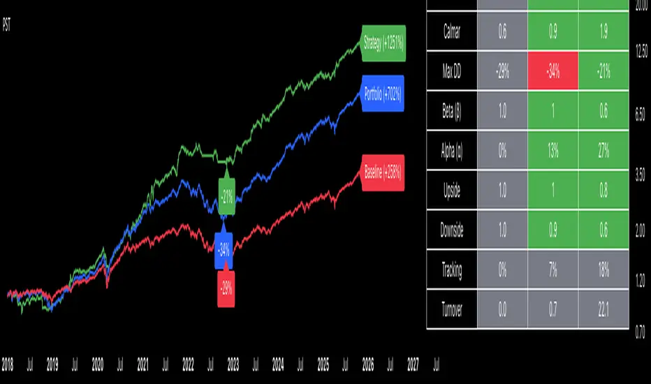
Portfolio Strategy TesterThe Portfolio Strategy Tester is an institutional-grade backtesting framework that evaluates the performance of trend-following strategies on multi-asset portfolios. It enables users to construct custom portfolios of up to 30 assets and apply moving average crossover strategies across individual holdings. The model features a clear, color-coded table that provides a side-by-side comparison between the buy-and-hold portfolio and the portfolio using the risk management strategy, offering a comprehensive assessment of both approaches relative to the benchmark.
Portfolios are constructed by entering each ticker symbol in the menu, assigning its respective weight, and reviewing the total sum of individual weights displayed at the top left of the table. For strategy selection, users can choose between Exponential Moving Average (EMA), Simple Moving Average (SMA), Wilder’s Moving Average (RMA), Weighted Moving Average (WMA), Moving Average Convergence Divergence (MACD), and Volume-Weighted Moving Average (VWMA). Moving average lengths are defined in the menu and apply only to strategy-enabled assets.
To accurately replicate real-world portfolio conditions, users can choose between daily, weekly, monthly, or quarterly rebalancing frequencies and decide whether cash is held or redistributed. Daily rebalancing maintains constant portfolio weights, while longer intervals allow natural drift. When cash positions are not allowed, capital from bearish assets is automatically redistributed proportionally among bullish assets, ensuring the portfolio remains fully invested at all times. The table displays a comprehensive set of widely used institutional-grade performance metrics:
CAGR = Compounded annual growth rate of returns.
Volatility = Annualized standard deviation of returns.
Sharpe = CAGR per unit of annualized standard deviation.
Sortino = CAGR per unit of annualized downside deviation.
Calmar = CAGR relative to maximum drawdown.
Max DD = Largest peak-to-trough decline in value.
Beta (β) = Sensitivity of returns relative to benchmark returns.
Alpha (α) = Excess annualized risk-adjusted returns relative to benchmark.
Upside = Ratio of average return to benchmark return on up days.
Downside = Ratio of average return to benchmark return on down days.
Tracking = Annualized standard deviation of returns versus benchmark.
Turnover = Average sum of absolute changes in weights per year.
Cumulative returns are displayed on each label as the total percentage gain from the selected start date, with green indicating positive returns and red indicating negative returns. In the table, baseline metrics serve as the benchmark reference and are always gray. For portfolio metrics, green indicates outperformance relative to the baseline, while red indicates underperformance relative to the baseline. For strategy metrics, green indicates outperformance relative to both the baseline and the portfolio, red indicates underperformance relative to both, and gray indicates underperformance relative to either the baseline or portfolio. Metrics such as Volatility, Tracking Error, and Turnover ratio are always displayed in gray as they serve as descriptive measures.
In summary, the Portfolio Strategy Tester is a comprehensive backtesting tool designed to help investors evaluate different trend-following strategies on custom portfolios. It enables real-world simulation of both active and passive investment approaches and provides a full set of standard institutional-grade performance metrics to support data-driven comparisons. While results are based on historical performance, the model serves as a powerful portfolio management and research framework for developing, validating, and refining systematic investment strategies.
Blick Trades Position Size CalculatorThe Blick Trades Position Size indicator is a comprehensive Position Size Calculator designed for futures traders on TradingView. It automatically detects the asset type (Gold, Nasdaq, or ES futures - both regular and micro contracts) and calculates the optimal number of contracts to trade based on your risk amount and stop loss price.
The indicator features a "Maximize Risk" option that intelligently switches between regular and micro contracts to get as close as possible to your target risk amount, plus support for limit orders with custom entry prices. It displays visual elements on the chart including entry and stop loss lines with live risk calculations, and uses an asset-specific display system so you can control which charts show the indicator (preventing parameter confusion when switching between different futures contracts).
The calculator handles all the complex math automatically - just input your risk amount and stop loss, and it tells you exactly how many contracts to trade while showing your precise dollar risk in real-time.

Ultimate Risk Management Toolkit [ T W K ] :Smart Levels is Smart Trades!
All Trading View users and Stock market Enthusiast, get charged with the all new ( never seen before ) " Ultimate Risk Management Toolkit ⚙📏⚙ " .
Inputs and Features:
1: Drag the Bar-Time vertical line to the desired Entry candle ( manually ) for R:R management and controlling emotional trading.
2: Target, Entry, and SL line style, Width input.
3: Manual specific level Entry and Stop-Loss, input option.
4: Three types of Auto / Manual ' R:R ' risk reward ratio, targets with proper Entry, Stop-Loss points, and Stop-Loss level.
5: Three types of Entry options to fix Emotional trading habit.
6: Trailing Stop-Loss input option ( can be utilize as profit locking/booking ).
It will give more Power to manage your trades with proper R:R ( Auto / manual ) ratio, defined Entry and controlled Stop-Loss Levels.
Compatible with All Devices (Laptop / Mobile / Tablet / PC).
✅ HOW TO GET ACCESS :
Add to favorite and enjoy the true Trading View's sprit of community growth, without any limitations.
If you like any of my Invite-Only indicators, kindly DM and let me know!
⚠ RISK DISCLAIMER :
All content provided by "@TradeWithKeshhav" is for informational & educational purposes only.
It does not constitute any financial advice or a solicitation to buy or sell any securities of any type. All investments / trading involve risks. Past performance does not guarantee future results / returns.
Regards :
Team @TradeWithKeshhav
Happy trading and investing!

Position Size ToolPosition Size Tool
What it does:
Shows a small on-chart table that converts per-ticker dollar amounts into share counts (shares = amount ÷ current price) for up to 4 configurable tickers.
Inputs (indicator settings)
Ticker 1–4 — select the symbol (TradingView will show the exchange-qualified form like BATS:TQQQ in the settings).
Ticker N $ Amount — dollar amount to convert into shares for that ticker.
Show Ticker N — toggle each row on/off.
Table Text Color — color of the table text.
Table Position — screen location (Top/ Middle/ Bottom × Left/Center/Right).
Font Size — Small / Medium / Large.
Show Empty Top Row — optional spacer row.
What the table displays
Left column: the ticker symbol only (the script strips the exchange prefix for display, so BATS:TQQQ appears as TQQQ in the table).
Right column: the calculated share count, formatted to two decimal places (or "—" if price is not available or zero).
Table updates on the chart’s timeframe using live/last bar prices.
How to use
Add the indicator to a chart.
Open the indicator’s settings panel.
In Ticker 1–4, type/select the symbols you want (you may see the exchange prefix there; that’s TradingView’s UI).
Enter the dollar amounts for each ticker.
Use Show Ticker N to hide/show rows.
Adjust text color, font size, and table position as desired.
Notes
The settings field will always show the exchange-qualified symbol (TradingView behavior); the script strips the exchange only for the on-chart display.
If the selected symbol has no price data on the chart/timeframe, the table shows "—".
Shares are computed as amt ÷ current close from the requested symbol and timeframe.
Example of how to use this tool:
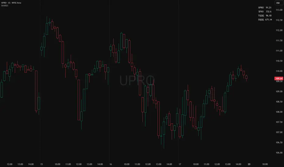
Monitor an index and execute trades on leveraged derivative products. This tool will determine the quantity of shares that can be purchased with a pre-determined dollar amount. Ex: Monitor SPX for entry/exit signals and execute trades on UPRO/SPXU/SPXL/SPXS.
Input a ticker and a dollar amount for position size, shares that can be purchased will be calculated based on the current asset price.
This tool can be helpful for those that use multiple platforms simultaneously to monitor and execute trades.
Jensen Alpha RS🧠 Jensen Alpha RS (J-Alpha RS)
Jensen Alpha RS is a quantitative performance evaluation tool designed to compare multiple assets against a benchmark using Jensen’s Alpha — a classic risk-adjusted return metric from modern portfolio theory.
It helps identify which assets have outperformed their benchmark on a risk-adjusted basis and ranks them in real time, with optional gating and visual tools. 📊
✨ Key Features
• 🧩 Multi-Asset Comparison: Evaluate up to four assets simultaneously.
• 🔀 Adaptive Benchmarking: TOTALES mode uses CRYPTOCAP:TOTALES (total crypto market cap ex-stablecoins). Dynamic mode automatically selects the strongest benchmark among BTC, ETH, and TOTALES based on rolling momentum.
• 📐 Jensen’s Alpha Calculation: Uses rolling covariance, variance, and beta to estimate α, showing how much each asset outperformed its benchmark.
• 📈 Z-Score & Consistency Metrics: Z-Score highlights statistical deviations in alpha; Consistency % shows how often α has been positive over a chosen window.
• 🚦 Trend & Zero Gates: Optional filters that require assets to be above EMA (trend) and/or have α > 0 for confirmation.
• 🏆 Leaders Board Table: Displays α, Z, Rank, Consistency %, and Gate ✓/✗ for all assets in a clear visual layout.
• 🔔 Dynamic Alerts: Get notified whenever the top alpha leader changes on confirmed (non-repainting) data.
• 🎨 Visual Enhancements: Smooth α with an SMA or color bars by the current top-performing asset.
🧭 Typical Use Cases
• 🔄 Portfolio Rotation & Relative Strength: Identify which assets consistently outperform their benchmark to optimize capital allocation.
• 🧮 Alpha Persistence Analysis: Gauge whether a trend’s performance advantage is statistically sustainable.
• 🌐 Market Regime Insight: Observe how asset leadership rotates as benchmarks shift across market cycles.
⚙️ Inputs Overview
• 📝 Assets (1–4): Select up to four tickers for evaluation.
• 🧭 Benchmark Mode: Choose between static TOTALES or Dynamic auto-selection.
• 📏 Alpha Settings: Adjustable lookback, smoothing, and consistency windows.
• 🚦 Gates: Optional trend and alpha filters to refine results.
• 🖥️ Display: Enable/disable table and customize colors.
• 🔔 Alerts: Toggle notifications on leadership changes.
🔎 Formula Basis
Jensen’s Alpha (α) is estimated as:
α = E − β × E
where β = Cov(Ra, Rb) / Var(Rb), and Ra/Rb represent asset and benchmark returns, respectively.
A positive α indicates outperformance relative to the risk-adjusted benchmark expectation. ✅
⚠️ Disclaimer
This script is for educational and analytical purposes only.
It is NOT a signal. 🚫📉
It does not constitute financial advice, trading signals, or investment recommendations. 💬
The author is not responsible for any financial losses or trading decisions made based on this indicator. 🙏
Always perform your own analysis and use proper risk management. 🛡️

Risk ModuleThis indicator provides a visual reference for position sizing and approximate stop and target placement. It supports trade planning by calculating equalized risk per trade and maintaining consistent exposure across different markets.
For more information about the concept, see the post Position Sizing and Risk Management .
Fixed Fractional Risk
The indicator calculates the number of shares that can be traded to maintain consistent monetary risk. The formula is based on the distance between the current price and stop reference, adjusting position size proportionally. A closer stop results in a larger position size, while a wider stop results in a smaller one.
Position Size = (Account Size × Risk %) ÷ (Entry Price – Stop Price)
Stop and Target
Stop placement is derived from volatility using the Average True Range (ATR). The target is plotted as a multiple of the stop distance, defining the risk-to-reward relationship in R units.
Stop = Price ± ATR × Multiplier
Target = Price ± (R × Risk Distance)
Chart Elements
The stop and target levels are plotted above and below the current price, with the stop marked by a red dot and the target by a green dot. The information table displayed on the chart shows the number of shares to trade, stop level, and target level.
Setup and Configuration
This configuration only needs to be set once, but can be adjusted later if preferred.
1. Start by setting the account size and risk percentage per trade to define the monetary amount risked on each trade. These values form the basis for position size calculation.
2. Set the ATR multiplier to determine stop distance, common values range between 1 and 3 ATR. Lower values place stops closer to price, increasing sensitivity but risking short-term noise. Higher values widen the stop, which reduces noise impact but extends time in risk.
3. Set the R-multiple to determine target distance relative to the stop. A value of 1 represents a 1:1 risk-to-reward relationship. Lower values reduce potential reward but tend to increase win rate, whereas higher values increase potential reward but tend to reduce win rate. The selection depends on system characteristics and trade expectancy.
When the parameters are defined, the indicator displays the stop, target, and calculated position size on the chart. All that remains is to enter the trade with the number of shares shown in the table and place bracket orders at the plotted stop and target levels.
Settings Overview
Account Size / Risk %: Defines account capital and per-trade exposure.
ATR Multiplier: Adjusts stop distance relative to volatility.
R Multiple: Sets target distance relative to stop (risk-reward ratio).
Position: Choose Long or Short direction.
Table Position: Controls information table placement and scale.

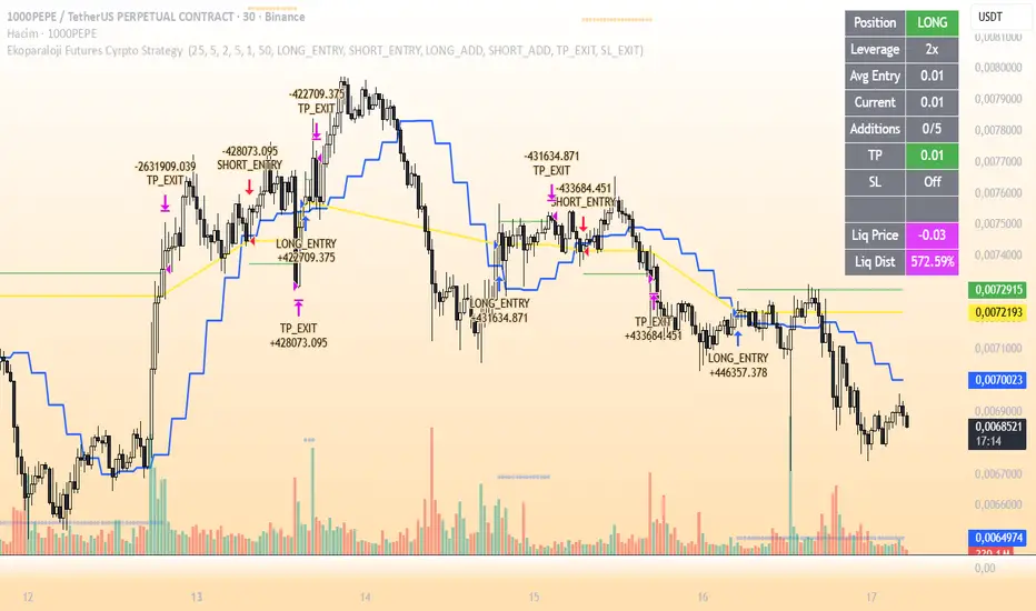
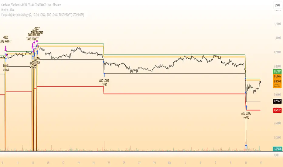
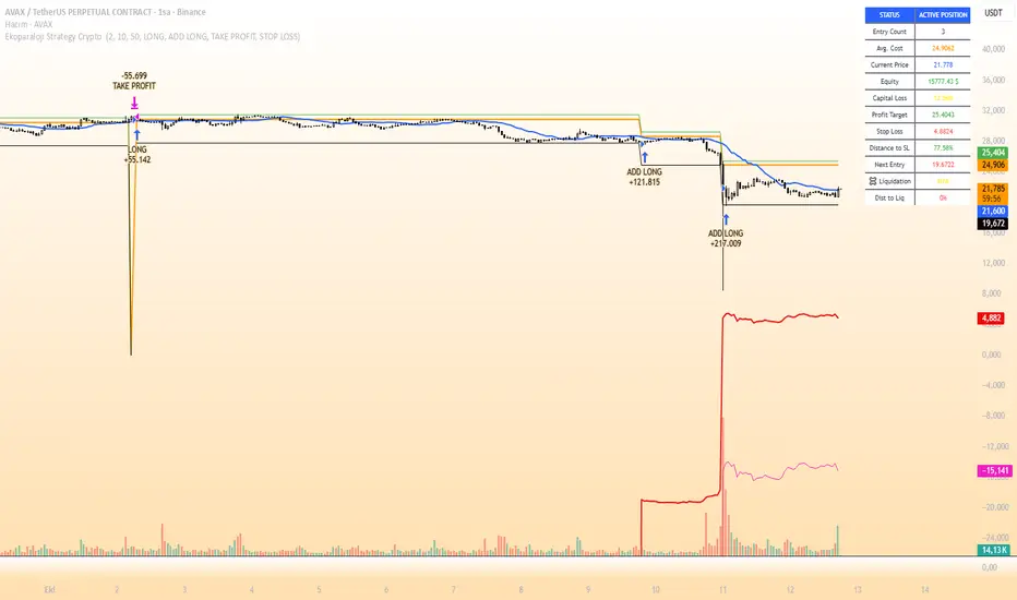
Ekoparaloji Futures Cyrpto Strategy Ekoparaloji Futures Crypto Strategy - Ladder Averaging System
This strategy uses a ladder position entry (pyramiding) approach and average cost reduction principle for crypto futures markets.
Key Features:
Dynamic ladder entry system
Profit-taking mechanism based on average price
Adjustable leverage support (1x-125x)
Long and Short position management
Optional stop-loss protection
Liquidation distance tracking
Advantages:
✓ Optimizes average cost during price fluctuations
✓ User-controlled risk-reward ratio
✓ Adapts to different market conditions
✓ Provides detailed visual feedback
✓ Increases profit potential through pyramiding strategy
Risks:
⚠ High leverage usage increases liquidation risk
⚠ Losses can accumulate during trend continuation
⚠ Pyramiding adds capital requirements
⚠ May produce unexpected results in sideways markets
⚠ Past performance does not guarantee future results
Recommended Usage:
This strategy is optimized for testing particularly on 30-minute and 1-hour timeframes. It may produce different results across various crypto pairs and market conditions.
Important Warning:
This strategy is for educational and research purposes. Extensive testing on demo accounts is strongly recommended before using in live trading. Leveraged trading involves high risk and you can lose all your capital.
📩 Message me to test the strategy and get access.
Happy Trading! 🚀
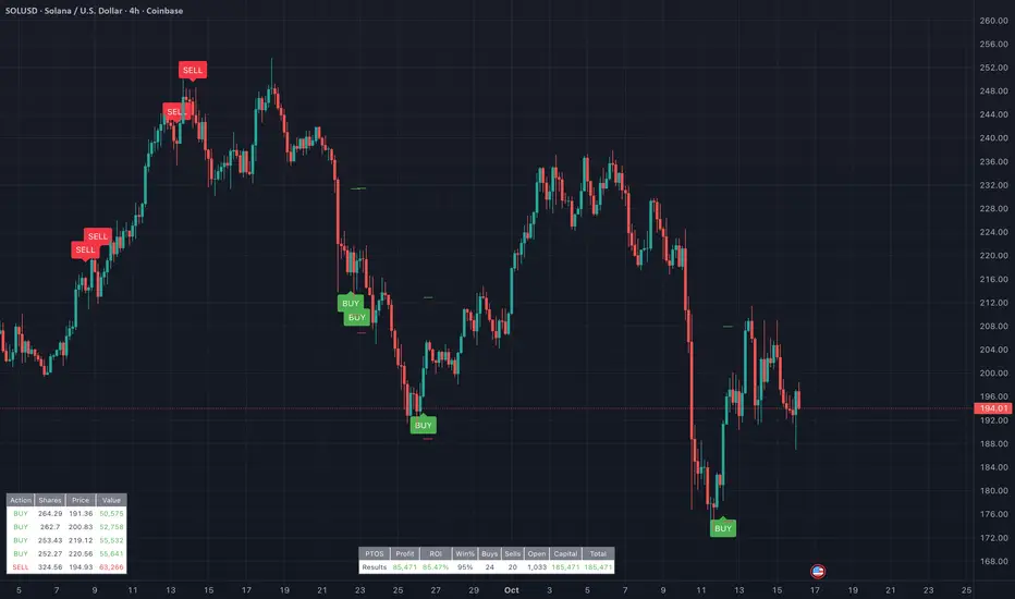
PairTradingSignalsPair Trading Signals (PTS)
This indicator implements a mean-reversion strategy for pairs trading, focusing on divergences between the chart's primary symbol (e.g., QQQ for tech exposure) and a user-specified inverse or correlated secondary symbol (default: SPY for broad market proxy). It generates long-only entry and exit signals on the primary asset based on statistical deviations in their relative pricing, without requiring short positions or direct trading of the secondary symbol.
Core Concepts
Pairs Mean Reversion: The strategy exploits temporary mispricings in cointegrated assets. When the primary asset becomes "cheap" relative to the secondary (oversold spread), it enters a long position expecting convergence. Exits occur when the spread reverts to neutral or overbought levels.
Spread & Z-Score: The raw spread is calculated as Primary Close - (Hedge Ratio × Secondary Close), with a fixed hedge ratio of 1.5 to approximate relative volatility (e.g., beta adjustment). This is normalized to a Z-score over a lookback period, measuring deviations in standard deviations from the historical mean. Bounds (default ±2.0) define oversold/overbought thresholds—common in statistical arbitrage for 95% confidence intervals assuming normality.
ATR-Based Risk Controls: Entry levels incorporate Average True Range (ATR, default 14-period RMA smoothing) to set dynamic take-profit (TP = Entry + Upper Bound × ATR) and stop-loss (SL = Entry - |Lower Bound| × ATR) levels, scaling to volatility.
Signal Logic
Buy (Long Entry): Triggers when the Z-score crosses above the lower bound (-2.0) after entering an oversold state (Z < lower bound). This signals undervaluation of the primary relative to the secondary.
Sell (Exit): Triggers when the Z-score crosses below the upper bound (2.0) after entering an overbought state (Z > upper bound). Optional strict TP/SL enforcement closes positions at predefined levels.
Signals appear as labeled shapes (green BUY below bar, red SELL above). Short horizontal boxes mark TP (green) and SL (red) for visual reference.
Backtesting & Performance Metrics
Simulation Period: Trades only within user-defined start/end dates (default: Jan 2020–Dec 2030).
Position Sizing: Fixed allocation based on initial capital × entry percentage (default 100%), capped by available equity to enforce risk limits. Supports full compounding if desired via code tweak.
Metrics Table: Displays net profit, ROI (including/excluding unrealized P&L), win rate, trade counts, closed capital, total equity, and open position details (shares or current value). Recent trades logged in a separate table.
Equity Floor: Prevents capital from going below zero, simulating real-world drawdown limits.
Usage Guidelines
Symbol Setup: Apply to the primary asset's chart (e.g., QQQ). Set "Inverse Ticker" to a negatively or positively correlated pair (e.g., SPY for market hedge).
Parameter Tuning: Increase lookback (20+) for smoother signals; widen bounds (±3.0) for fewer, higher-conviction trades. Lower entry % reduces risk.
Best Practices: Use on daily/4H timeframes for swing trades. Combine with overall market trend filters. Backtest across regimes (e.g., bull/bear) to validate.
Limitations: Assumes mean reversion holds; performs poorly in trending divergences. No commissions/slippage modeled—adjust initial capital accordingly.
This approach draws from classic pairs trading literature (e.g., Gatev et al.'s distance method), adapted for single-asset execution via Z-score thresholds. For optimal results, ensure the pair exhibits cointegration (test via Engle-Granger if customizing).
Volume MatrixVolume Matrix (VM) is a comprehensive volume and position-sizing toolkit designed to help traders interpret market participation and manage trade risk efficiently.
It combines volume analytics, risk-adjusted position sizing, and stock-specific financial data — all in a clear, visual, and automated format directly on TradingView charts.
The indicator integrates capital management, episodic volume spikes, and market capitalization data into a single, intuitive framework, giving traders an edge in both decision-making and discipline.
⚙️ Core Components & Features
🧩 1. Position Sizing & Risk Management
A dynamic risk table helps traders determine how much to trade and how much to risk per position, adapting automatically based on user inputs:
- Capital (CP): Total account size (₹ or $).
- Risk Mode (R): Choose between Percentage of capital or fixed Currency value.
- Lot Size Mode: Optional toggle to align quantities with F&O lot sizes (India-based).
- Standard Stop-Loss (SSL): Displays position quantities for three custom stop-loss levels (e.g., 0.75%, 1%, 1.25%).
- % Distance Metrics: D: Distance from day’s low/high (helps assess stop distance). DH: Distance from mid-body (useful for candle risk assessment). Auto-adjusts based on whether the trader is in Long, Short, or Both mode.
📈 Helps answer:
“How much quantity should I trade at my desired risk level?”
🔶 2. Volume Visualization
- Plots volume bars with default up/down coloring.
- Green for bullish bars.
- Red for bearish bars.
- Designed for quick visual differentiation of buying/selling pressure.
🚀 3. Episodic Pivot (EP) Detector
Identifies high-volume breakout or capitulation days, often marking significant turning points or trend initiations.
- Highlights bars where volume exceeds a custom threshold (in millions).
- Marks them visually with an orange triangle under the candle.
-Best used on daily charts to spot institutional footprints.
📊 Helps answer:
“Is today’s volume large enough to signal major institutional activity?”
🧾 4. Data Metrics Table
Displays fundamental and contextual data about the asset:
- Market Capitalization (MC): Auto-calculated using outstanding shares × price.
- Free Float (FF): Value of tradable shares in currency or Cr (INR).
- Industry × Sector × F&O Status: Shows the company’s industry and sector classification. Displays FC (Futures Contract) or NFC (Non-F&O stock).
- Customizable appearance: Choose between text/value display, text color, and background color. Flexible positioning and size control to suit any chart layout.
📚 Helps answer:
“What type of stock is this, how big is it, and does it trade in futures?”
🪄 5. User Interface Customization
- Modular UI grouped by functionality (Risk, Direction, Metrics, Volume, etc.).
- Flexible table position & size (Top/Bottom/Middle & Tiny–Huge).
- All elements are toggleable, giving full control over displayed data.
- Built to ensure visual clarity on any chart background.
| Trading Goal | How Volume Matrix Supports It |
| ------------------------------ | -------------------------------------------------------------- |
| **Risk Management** | Calculates optimal trade size and risk exposure automatically. |
| **Position Sizing Discipline** | Enforces consistent sizing across trades using SSL levels. |
| **Volume Confirmation** | Highlights institutional participation via Episodic Pivots. |
| **Stock Context Awareness** | Shows market cap, sector, and float value instantly. |
| **Efficiency** | Reduces manual work — no need for calculators or spreadsheets. |
💡 In Short
Volume Matrix simplifies trade planning, brings transparency to risk, and connects volume with context — all in one elegant visual tool.
Perfect for:
- Discretionary traders refining entries and sizing.
- Swing traders watching for volume-based pivots.
- Analysts who want price-volume fundamentals at a glance.
Livermore's Pyramiding Trading - 3Commas [SwissAlgo]
📊 J. LIVERMORE'S PYRAMIDING TRADING - 3Commas Integrated
A Trading Approach Inspired by Jesse Livermore's Position Building Principles
━━━━━━━━━━━━━━━━━━━━━━━━━━━━━━━━━━━━━━━━━━━
DISCLAIMER
This indicator is an educational tool based on historical trading principles. Past performance is not indicative of future results. Trading involves substantial risk of loss. Only trade with capital you can afford to lose. You are responsible for all trading decisions.
━━━━━━━━━━━━━━━━━━━━━━━━━━━━━━━━━━━━━━━━━━━
📚 WHO WAS JESSE LIVERMORE?
Jesse Livermore (1877-1940) was one of the greatest traders in history.
His core insight: "Most traders do everything backward."
♦ "They deploy all capital at once" → Livermore entered with a small fraction of his capital (he started with a 'test position' to validate his trade idea and waited for market confirmation to deploy more, building positions in steps = "pyramiding")
♦ "They average down" (DCA) → Livermore added to trades showing good results only, and never to losing trades, as the trend kept aligning with his trade idea
♦ "They use arbitrary % stops" → Livermore exited when structure appeared broken (he trailed his stop loss to try to protect unrealized profit - if any)
♦ "They take profits too early or set arbitrary TP%" → Livermore let trades showing positive results run until proven wrong (trial take profit)
💬 "I always made money when I was sure I was right before I began. What beat me was not having enough brains to stick to my own game."
— Jesse Livermore
This indicator tries to translate his principles into a SYSTEMATIC FRAMEWORK :
BO = Base Order (first order, base of the pyramid)
PO = Pyramid Orders (additional layers of capital deployed as long as the 'tape' does not invalidate the trade idea)
♦ Test First (BO - 20%) - Small entry to test your idea. If wrong, lose small. If right, can consider pyramiding into strength.
♦ Build Position Size (PO1-3 - 80%) - Add only as trend unfolds favorably (the indicator uses specific Fibonacci levels to track milestones - 0.618, 1.0, 1.272 - and looks for strong confluence among price, volume, trend, momentum, break of resistance/support levels to suggest and trigger actions: entries, exit)
♦ Attempt to Protect Capital - Dynamic stops: the indicator trails the stop loss, to try to protect potential gains from previous steps (if any)
♦ Discipline - Trades fire only when ALL conditions align
━━━━━━━━━━━━━━━━━━━━━━━━━━━━━━━━━━━━━━━━━━━
🎯 INDICATOR FEATURES
You map 3 points on the chart → The indicator generates a systematic trading plan structure based on your wave analysis.
✓ Auto-detects trade direction: Uptrend wave (A➚B➘C) = Long signals | Downtrend wave (A➘B➚C) = Short signals
✓ Entry/exit prices: BO, PO1, PO2, PO3, and dynamic EXIT (trailing stop)
✓ Real-time condition monitoring: Live ✓/✗ checks for each order (price closes + volume + trend + pivot breaks + candle quality + sequence)
✓ Visual trade execution: Green labels mark entries (BO/PO1/PO2/PO3), red labels mark EXIT
✓ Optional 3Commas automation: JSON webhooks for hands-free execution via Signal Bots
⏰ Recommended Timeframes: 1H, 4H, Daily
(Lower timeframes like 15m/5m produce excessive noise and false signals)
💬 "Watch the market leaders, the stocks that have led the charge. That is where the action is and where the money is made."
— Jesse Livermore
━━━━━━━━━━━━━━━━━━━━━━━━━━━━━━━━━━━━━━━━━━━
⚙️ SETUP IN 3 STEPS
🟡 STEP 1: Map Your Wave (Points A → B → C)
Identify a completed wave pattern:
For LONGS:
♦ Point A = Swing low (wave start)
♦ Point B = Swing high (impulse end)
♦ Point C = Pullback low (retrace end - where next wave may begin)
For SHORTS:
♦ Point A = Swing high (wave start)
♦ Point B = Swing low (impulse end)
♦ Point C = Pullback high (retrace end - where next wave may begin)
How to set points:
Settings → Enter dates manually OR drag the vertical lines directly on the chart (easier - just click and drag the pre-mapped A/B/C lines)
Requirements (auto-validated by code):
✓ All dates must be in the past (Point C = completed retrace, not forming)
✓ Clear impulse A→B (minimum 5% move)
✓ Clear retrace B→C (minimum 3% pullback)
───────────────────────────────────────────
🟡 STEP 2: Set Budget & Allocation
Settings → "TRADE PARAMETERS"
♦ Total Budget: $10,000 (example - capital for THIS trade only, not your entire account)
♦ Allocation (must total 100%):
BO = 20% ($2,000) - test position
PO1 = 25% ($2,500) @ Fib 0.618
PO2 = 30% ($3,000) @ Fib 1.0
PO3 = 25% ($2,500) @ Fib 1.272
💬 "It was never my thinking that made big money for me. It was always my sitting. Men who can both be right and sit tight are uncommon."
— Jesse Livermore
───────────────────────────────────────────
🟡 STEP 3: Monitor Your Trade Plan Table
The table (top-right corner) has 4 sections that guide your execution:
BUDGET DEPLOYMENT
♦ Trigger prices for each order (BO auto-calculated at 0.5 Fib between B-C)
♦ Dollar amount per entry
♦ Fibonacci level assigned to each PO
ENTRY/EXIT CONDITIONS
Each column (BO, PO1, PO2, PO3) shows live status (✓ or ✗) for:
♦ Price: 2 consecutive closes (BO) | 3 consecutive closes (POs)
♦ Volume: OBV directional alignment OR volume spike above average
♦ Trend: Normal or Strong Bull/Bear (no entries in Uncertain trend)
♦ Pivot: Nearest resistance (longs) or support (shorts) broken
♦ Clean Candle: Momentum without reversal wicks <30% (POs only)
♦ Sequence: Prior order must have fired first (POs only - no skipping levels)
TRIGGERED?
Shows execution status for each order (✓ = fired, ✗ = waiting)
If using 3Commas: ✓ confirms JSON alert was sent to your bot for real execution
VALIDATIONS
✓ Green = All checks passed, setup is valid
⚠️ Yellow = Warning (e.g., budget doesn't equal 100%, deep retrace)
✗ Red = Error (e.g., dates in wrong order, invalid wave structure)
⚠️ Wait for ALL ✓✓✓✓✓ (or ✓✓✓✓✓✓) to align in a column before that order fires at bar close
💬 "The game of speculation is the most uniformly fascinating game in the world. But it is not a game for the stupid, the mentally lazy, the person of inferior emotional balance, or the get-rich-quick adventurer."
— Jesse Livermore
━━━━━━━━━━━━━━━━━━━━━━━━━━━━━━━━━━━━━━━━━━━
📊 CHART VISUALS - READING THE INDICATOR
Fibonacci Extension Lines
After mapping A-B-C, horizontal lines extend to the right:
♦ Solid green/red lines = Active PO entry levels (0.618, 1.0, 1.272)
♦ Dotted gray lines = Reference Fib levels used for exit tracking (2.0, 2.618, 3.0, etc.)
♦ Labels on right = Show level and price: "Fib 0.618 / $67,324 "
Entry/Exit Price Lines
♦ Thick green line (longs) / red line (shorts) = BO entry price with direction label
♦ Dashed red line = Current EXIT price (your trailing stop loss - appears after BO fires and moves as price extends)
Trade Execution Labels
Visual confirmation when orders fire on the chart:
♦ Green labels (below/above candles) = BO, PO1, PO2, PO3 entries executed
♦ Red label = EXIT triggered (position closed)
Trend Strength Indicator (EMA Line)
The thick colored line shows real-time trend status:
♦ Bright lime = Strong bullish trend
♦ Light green = Normal bullish trend
♦ Bright red = Strong bearish trend
♦ Light red = Normal bearish trend
♦ Gray = Uncertain/weak trend (no entries fire in this state)
Entries require at least Normal trend strength aligned with your trade direction.
💬 "I never argue with the tape. Getting sore at the market doesn't get you anywhere."
— Jesse Livermore
━━━━━━━━━━━━━━━━━━━━━━━━━━━━━━━━━━━━━━━━━━━
🔧 ENTRY LOGIC - TECHNICAL DETAILS
💬 "The big money was never made in the buying or the selling. The big money was made in the waiting."
— Jesse Livermore
───────────────────────────────────────────
🟢 BASE ORDER (BO) - TEST POSITION
BO Price Calculation
Auto-calculated at the 0.5 Fibonacci retracement between Point B and Point C
Formula: (Price B + Price C) / 2
Why this level?
♦ Midpoint between impulse end (B) and retrace end (C)
♦ Breakout above/below suggests retrace may be complete
♦ Designed to help position BO below all Fib extensions (to control sequence issues)
───────────────────────────────────────────
BO Entry Conditions - ALL 5 Must Align:
1️⃣ PRICE: 2 Consecutive Closes Beyond BO
♦ Longs: close > BO AND close > BO
♦ Shorts: close < BO AND close < BO
♦ Why: Designed to confirm breakout commitment and filter fakeouts
2️⃣ TREND: Normal OR Strong Trend Aligned
♦ Detection: 18-period EMA + ADX/DMI + higher timeframe slope
♦ States: Strong Bull/Bear (ADX>30), Normal Bull/Bear (price vs EMA), Uncertain
♦ Confirmation: Requires 3 consecutive bars in the same state (to reduce flip-flop)
♦ BO accepts: Normal OR Strong (you're testing early, basic alignment sufficient)
3️⃣ PIVOT: Nearest Resistance/Support Broken
♦ Storage: 60 most recent pivot highs/lows (dynamic lookback per timeframe)
♦ Longs: Nearest pivot HIGH above BO → must break with 2 closes
♦ Shorts: Nearest pivot LOW below BO → must break with 2 closes
♦ Price Discovery: If no pivot exists beyond BO = auto-pass
♦ Why: Aims to confirm momentum has overcome previous rejection zones
4️⃣ VOLUME: OBV Aligned OR Spike
♦ Directional OBV: OBV > 20-EMA (longs) OR OBV < 20-EMA (shorts)
♦ OR Volume Spike: Current volume > 20-period SMA
♦ Why: Checks for institutional participation signals
5️⃣ VALIDATIONS: Setup Valid (✅)
♦ Dates valid (A < B < C, all in past)
♦ Wave structure valid (min 5% impulse, min 3% retrace)
♦ Budget allocation = 100%
♦ Prices detected at all points
⚠️ BO fires once per bar close. Flag set permanently until trade resets.
───────────────────────────────────────────
🔺 PYRAMID ORDERS (PO1-3) - PYRAMIDING INTO STRENGTH
💬 "Never buy a stock because it has had a big decline from its previous high. The big money was never made in the stock market by buying on declines."
— Jesse Livermore
PO Price Calculation
Fixed Fibonacci extensions from Point C:
Formula: Price C ± (Impulse Range × Fib Level)
Where: Impulse Range = |Price B - Price A|
Default Levels:
♦ PO1 @ Fib 0.618 (Golden Ratio)
♦ PO2 @ Fib 1.000 (Full impulse repeat)
♦ PO3 @ Fib 1.272 (Fibonacci sequence extension)
───────────────────────────────────────────
PO Entry Conditions - ALL 6 Must Align (STRICTER):
1️⃣ PRICE: 3 Consecutive Closes Beyond PO
♦ Longs: close > PO AND close > PO AND close > PO
♦ Shorts: close < PO AND close < PO AND close < PO
♦ Why: Higher conviction needed when adding capital (3 vs 2 closes for BO)
2️⃣ TREND: Same as BO
Normal OR Strong trend must remain aligned with trade direction
3️⃣ PIVOT: Per-Level Pivot Break
♦ Each PO checks its OWN nearest pivot (not shared with BO)
♦ Same 2-close break requirement
♦ PO3 Exception: Price discovery allowed (no pivot required if already profitable)
4️⃣ VOLUME: Same as BO
Sustained confirmation required (not weakening)
5️⃣ CLEAN CANDLE: <30% Reversal Wick (NEW)
♦ Filter: Uses ATR(14) - candles < ATR auto-pass (consolidation noise)
♦ Longs: Upper wick < 30% of candle range (no rejection at top)
♦ Shorts: Lower wick < 30% of candle range (no rejection at bottom)
♦ Why: Don't pyramid into weakness/rejection - only add on clean momentum
♦ Not checked for BO: Test position tolerates some wick risk
6️⃣ SEQUENCE: Prior Order Fired
♦ PO1 requires: BO fired
♦ PO2 requires: PO1 fired
♦ PO3 requires: PO2 fired
♦ Why: No skipping levels - disciplined building only
───────────────────────────────────────────
⚙️ KEY DIFFERENCE:
BO (20% capital) = Lighter requirements, testing your idea early
POs (80% capital) = Stricter requirements, adding only to confirmed winners
♦ BO: 2 closes | POs: 3 closes
♦ BO: No candle check | POs: Clean candle required
♦ BO: Independent | POs: Sequential (must follow order)
♦ BO: No price discovery | PO3: Allows price discovery when profitable
💬 "Profits always take care of themselves, but losses never do. The speculator has to ensure himself against considerable losses by taking the first small loss."
— Jesse Livermore
━━━━━━━━━━━━━━━━━━━━━━━━━━━━━━━━━━━━━━━━━━━
🚪 EXIT LOGIC - TECHNICAL DETAILS
🔴 EXIT PHILOSOPHY
The indicator uses TWO INDEPENDENT EXIT TRIGGERS (whichever fires first):
1) Structural Breakdown
Price breaks through the EXIT level with confirmation
2) Trend Reversal
Trend flips against your position AND price breaks EXIT level
Why two methods?
♦ Structure = price-based protection (hard stop)
♦ Trend = momentum-based exit (early warning when market character changes)
♦ Combined: Exit either when proven wrong (structure) or when conditions no longer favor your direction (trend)
───────────────────────────────────────────
🔴 EXIT PRICE CALCULATION
The EXIT price (your stop loss) adjusts dynamically based on position size:
BEFORE PO3 Fires (Fixed Stops):
♦ BO only = Stop at Point C (small position, tight stop near entry)
♦ PO1 fired = Stop at Fib 0.5 (moved to breakeven zone)
♦ PO2 fired = Stop at Fib 0.786 (protecting partial profits)
AFTER PO3 Fires (Trailing Stops):
♦ Tracking: Monitors the highest Fib reached (longs) or the lowest Fib reached (shorts)
♦ Placement: EXIT moves 1-2 Fib levels below the highest (longs) or above the lowest (shorts)
♦ Example: Price reaches Fib 2.618 → EXIT trails up to Fib 2.0
♦ Purpose: Designed to protect accumulated profits while allowing room for normal pullbacks
💬 "It never was my thinking that made the big money for me. It was always my sitting. Men who can both be right and sit tight are uncommon."
— Jesse Livermore
───────────────────────────────────────────
🔴 EXIT CONDITIONS
Exit Speed (Based on Risk Exposure):
♦ Full position (PO3 fired) = 1 close required (fast exit - more capital at risk)
♦ Partial position (BO/PO1/PO2 only) = 2 closes required (confirmation - less urgency)
METHOD 1: Structural Breakdown
Price violates the EXIT level with clean momentum:
For Longs:
♦ Price closes BELOW EXIT level (1 or 2 closes depending on position size)
♦ Clean candle required (lower wick < 50% of range - no false breakdown)
For Shorts:
♦ Price closes ABOVE EXIT level (1 or 2 closes depending on position size)
♦ Clean candle required (upper wick < 50% of range - no false breakout)
Why clean candle check?
Designed to reduce exits on wicks/fakeouts. If there's a large reversal wick (>50%), it suggests buyers/sellers are defending the level - not a true breakdown.
METHOD 2: Trend Reversal
Market character shifts against your position:
For Longs:
♦ Trend shifts from Bull → Normal Bear OR Strong Bear
♦ AND price breaks below EXIT level (same close requirements)
For Shorts:
♦ Trend shifts from Bear → Normal Bull OR Strong Bull
♦ AND price breaks above EXIT level (same close requirements)
Why this matters?
♦ Proactive exit before structural stop is hit
♦ If the trend that confirmed your entries reverses, the setup is invalidated
♦ Livermore principle: Exit when market proves you wrong, don't wait for max pain
───────────────────────────────────────────
⚠️ EXIT BEHAVIOR
♦ Fires once per bar close (same as entries)
♦ Resets all tracking after exit (ready for fresh trade setup)
♦ Clears flags: boSignalFired, po1/po2/po3SignalFired, highestFib/lowestFib tracking
♦ If using 3Commas: Sends exit_long or exit_short JSON (market order closes 100% position)
💬 "I never argue with the tape. Getting sore at the market doesn't get you anywhere."
— Jesse Livermore
━━━━━━━━━━━━━━━━━━━━━━━━━━━━━━━━━━━━━━━━━━━
🤖 3COMMAS AUTOMATION (OPTIONAL)
💬 "There is the plain fool, who does the wrong thing at all times everywhere, but there is also the Wall Street fool, who thinks he must trade all the time."
— Jesse Livermore
Automation designed to help remove emotion and support disciplined execution.
───────────────────────────────────────────
⚡ QUICK SETUP IN 5 STEPS
STEP 1: Create Your Signal Bots
You need 2 SEPARATE BOTS (one for Longs, one for Shorts):
Go to 3Commas → Bots → Create Bot → Select "Signal Bot"
Basic Settings:
♦ Bot Name: "Livermore Long - " (example: "Livermore Long - BTCUSDT")
♦ Exchange: Your connected exchange
♦ Trading Pair: Must match TradingView chart exactly
♦ Strategy: Custom Signal
♦ Direction: LONG (for first bot) or SHORT (for second bot)
♦ Max Active Deals: 1
⚠️ CRITICAL SETTINGS:
Entry Orders:
♦ Toggle ON: "Entry Orders"
♦ Volume per Order: "Send in webhook, quote"
♦ Why: This lets the indicator control exact $ amounts per order (BO=$2K, PO1=$2.5K, etc.)
♦ If you skip this: Orders will use wrong sizes and break your allocation plan
Exit Orders:
♦ Toggle ON: "Exit Orders"
♦ Volume per Order: "100 Position %"
♦ Why: Closes your entire position when EXIT signal fires
♦ Toggle OFF: "Take Profit" (managed by indicator)
♦ Toggle OFF: "Stop Loss" (managed by indicator)
Click "Start Bot" for both Long and Short bots.
───────────────────────────────────────────
STEP 2: Get Your Bot Credentials
For EACH BOT (Long and Short):
♦ Open the bot → Click "Orders" tab
♦ Scroll down to "Webhook Messages" section
♦ Copy these 3 values:
bot_uuid (long string like: a362cbcf-7e68-4379-a83d-ae6e47dba656)
secret (very long token starting with: eyJhbGciOiJ...)
webhook URL (refer to 3commas to get exact webhook - signal bots)
Note: The secret is usually the same for both bots, but the bot_uuid is different.
───────────────────────────────────────────
STEP 3: Enter Credentials in Indicator
Back in TradingView:
♦ Open indicator Settings
♦ Find section: "1️⃣ INTEGRATE 3COMMAS"
♦ Paste:
Long = Your Long bot UUID
Short = Your Short bot UUID
Secret = Your secret token (same for both)
♦ Click "OK"
The indicator now has everything needed to build JSON payloads.
───────────────────────────────────────────
STEP 4: Create TradingView Alert
This alert bridges TradingView → 3Commas. ONE ALERT HANDLES ALL SIGNALS (BO, PO1, PO2, PO3, EXIT).
How to create:
♦ Right-click chart → "Add Alert" (or click clock icon)
♦ Condition: Select this indicator from dropdown
♦ Trigger: "Any alert() function call"
♦ Alert Name: "Livermore Pyramiding - "
♦ Message: Leave default (indicator sends its own JSON)
♦ Webhook URL: Paste your 3Commas webhook URL from Step 2
♦ ⚠️ Alert Frequency: "Once Per Bar Close" (CRITICAL - controls duplicate orders)
♦ Expiration: Open-ended (or set specific date)
♦ Click "Create"
───────────────────────────────────────────
STEP 5: Test Before Going Live
🧪 NEVER TEST WITH REAL CAPITAL FIRST. Use one of these methods:
Test 1: Check Bot Status
♦ 3Commas → Bots → Both bots show "Active" (green)
♦ Click into each bot → Orders tab → Should say "Waiting for signal"
Test 2: Verify Alert Active
♦ TradingView → Alerts panel (bell icon)
♦ Your alert should show "Active" status
Test 3: Paper Trade / Tiny Position
♦ Use 3Commas paper mode if available, OR
♦ Set Total Budget to $10-50 for first real test
♦ Map a wave that's about to trigger
♦ Watch if orders actually appear on 3Commas
Test 4: Check JSON Format
♦ When alert fires → TradingView Alerts → Click your alert
♦ Look at "History" or "Log"
♦ Verify JSON has: bot_uuid, secret, action, price, amount
───────────────────────────────────────────
🛠️ COMMON ISSUES & SOLUTIONS
✗ Problem: Orders not appearing on 3Commas
Possible causes:
♦ Wrong webhook URL → Must be exact 3Commas URL (check for typos)
♦ Bot paused → Check bot status must be "Active" (green)
♦ Wrong bot UUID → Verify you copied Long UUID for longs, Short UUID for shorts
♦ Secret mismatch → Double-check secret is correct
♦ Exchange API issues → Verify exchange connection in 3Commas settings
How to debug:
♦ 3Commas → Your Signal Bot → Orders tab
♦ Look for "Rejected Signals" section
♦ Should show error messages if webhook failed
───────────────────────────────────────────
✗ Problem: Orders executing at wrong prices
Possible causes:
♦ Limit order not filled → Price gapped through your level before order filled
♦ Slippage on exits → Exits use market orders (intentional - speed over exact price)
♦ Exchange minimums → Some exchanges have minimum order sizes
Solution:
♦ Entries use limit orders (wait for exact price - may not fill if price gaps)
♦ Exits use market orders (prioritize fast execution when structure breaks)
♦ This is INTENTIONAL DESIGN following Livermore's principle: exit when proven wrong
───────────────────────────────────────────
✗ Problem: PO orders firing out of sequence or skipping
Possible causes:
♦ Alert not set to "Once Per Bar Close" → Change alert frequency setting
♦ Multiple alerts running → Delete old/duplicate alerts for this indicator
♦ Conditions changed mid-bar → Indicator only fires at bar close (protective feature)
Solution:
♦ Keep only 1 active alert per indicator instance
♦ Always use "Once Per Bar Close" frequency
♦ Wait for full bar to close before signals can fire
───────────────────────────────────────────
✗ Problem: Bot not closing position on EXIT
Possible causes:
♦ Exit order setting wrong → Check bot settings
♦ Wrong JSON action → Should be "exit_long" or "exit_short"
♦ No position open → Can't close what doesn't exist
Solution:
♦ Verify: Bot Settings → Exit Orders → Volume per Order = "100 Position %"
♦ Check alert history for correct JSON payload
♦ If stuck: Manually close position in 3Commas, then fix settings
♦ Delete and recreate alert if JSON format is wrong
───────────────────────────────────────────
🔒 SECURITY BEST PRACTICES
♦ Never share bot UUID or Secret - Treat them like passwords
♦ Use restricted API keys - Limit to specific pairs, disable withdrawals
♦ Start small - Test with $10-50 first, scale up only after success
♦ Monitor first trades - Don't set-and-forget immediately
♦ Delete old alerts - If you change A/B/C points, delete old alert and create new one
───────────────────────────────────────────
📊 PREFER MANUAL TRADING?
Skip 3Commas entirely and use the indicator for planning only:
♦ Watch Trade Plan table for ✓✓✓✓✓ alignment
♦ Manually place limit orders at displayed prices
♦ Manually move stop loss as EXIT price updates
♦ Manually close when EXIT signal fires
Benefits: Full control, no API concerns, can override based on context
Drawbacks: Must watch chart constantly, emotions can interfere, may miss signals
───────────────────────────────────────────
✅ FINAL CHECKLIST BEFORE LIVE TRADING
✓ Both Signal Bots created (Long + Short)
✓ Entry Orders: Volume = "Send in webhook, quote"
✓ Exit Orders: Volume = "100 Position %"
✓ Take Profit and Stop Loss disabled in bots
✓ Bot UUIDs and Secret entered in indicator
✓ TradingView alert created with correct webhook
✓ Alert frequency = "Once Per Bar Close"
✓ Alert status shows "Active"
✓ Tested with small amounts successfully
✓ Trade Plan table shows ✅ (no validation errors)
✓ Understand your risk per trade
Once all checked: You're ready for automated pyramiding execution.
━━━━━━━━━━━━━━━━━━━━━━━━━━━━━━━━━━━━━━━━━━━
💡 KEY REMINDERS - BEFORE YOU TRADE
💬 "The speculator's chief enemies are always boring from within. It is inseparable from human nature to hope and to fear."
— Jesse Livermore
───────────────────────────────────────────
⚠️ COMMON MISTAKES (AVOID THESE)
Mapping Incomplete Waves
♦ Point C must be in the PAST (completed retrace, not currently forming)
♦ Don't map a wave that's still developing - wait for confirmation
♦ Minimum requirements: 5% impulse (A→B), 3% retrace (B→C)
Ignoring Validation Warnings
♦ Never create alerts when status shows ✗ (red) or ⚠️ (yellow)
♦ Fix all errors first: dates in order, budget = 100%, valid wave structure
♦ Common issues: dates in future, Point C above B (longs) or below B (shorts)
Premature Manual Entries
♦ Don't enter just because price touched the level
♦ Wait for ALL ✓✓✓✓✓ (or ✓✓✓✓✓✓) to align in Trade Plan table
♦ Patience pays - partial confluence = partial edge = higher risk of losing trades
Wrong Timeframe Selection
♦ Avoid: 15m, 5m, 1m (too much noise, false signals)
♦ Use: 1H, 4H, Daily (cleaner structure, better confluence)
♦ Lower timeframes require faster decisions and produce more whipsaws
Over-Risking Capital
♦ Trade budget ≠ Account size
♦ Never risk capital you can't afford to lose
♦ One bad trade should NOT destroy your account
───────────────────────────────────────────
✅ LIVERMORE PRINCIPLES IN ACTION
Confirmation > Prediction
♦ Don't predict where price will go
♦ Wait for price to INDICATE direction via pivots + volume + trend
♦ Test first (BO 20%), build only when confirmed (POs 80%)
💬 "A man must believe in himself and his judgment if he expects to make a living at this game."
Pyramid on Strength, Never Weakness
♦ Add only when: 3 closes + clean candles + volume + pivot breaks
♦ Never average down (DCA into losers)
♦ If BO wrong, take small loss fast - don't hope and add more
💬 "Never buy a stock because it has had a big decline from its previous high."
Respect Market Structure
♦ Pivots = where smart money previously acted (support/resistance)
♦ Breaking them = momentum overcoming barriers
♦ Entering before pivot break = entering into known rejection zones
Trend is Your Friend
♦ Never pyramid against the trend
♦ If trend shifts to Uncertain or reverses → no new entries
♦ Exit when trend proves you wrong (don't fight it)
💬 "I never argue with the tape. Getting sore at the market doesn't get you anywhere."
Discipline > Emotion
♦ Can't "almost" have all conditions met
♦ Either 100% aligned (all ✓) or you wait
♦ No exceptions, no "this time is different"
♦ Automation designed to help remove emotion - consider using 3Commas
💬 "It never was my thinking that made the big money for me. It always was my sitting."
───────────────────────────────────────────
🎯 FINAL THOUGHT
This indicator is a SYSTEMATIC FRAMEWORK, not a magic solution. It translates Livermore's century-old principles into actionable rules:
♦ Test small, build big
♦ Add to winners, cut losers fast
♦ Let structure guide exits
♦ Stay disciplined when emotions scream
The market will test your patience, discipline, and conviction. The indicator aims to reduce guesswork - but YOU still need to:
♦ Find valid wave structures
♦ Choose appropriate market conditions
♦ Size positions properly
♦ Accept losses as part of the game
💬 "The game of speculation is the most uniformly fascinating game in the world. But it is not a game for the stupid, the mentally lazy, the person of inferior emotional balance, or the get-rich-quick adventurer."
— Jesse Livermore

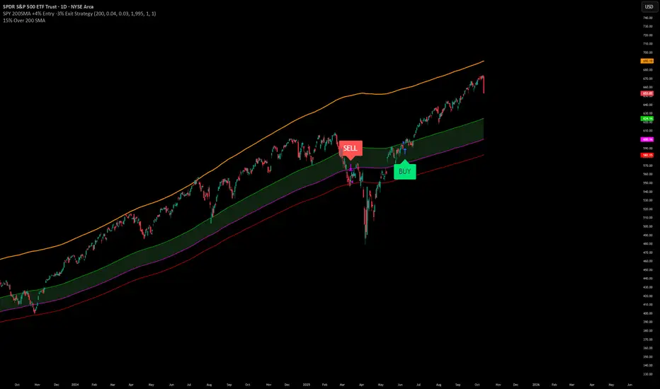
SPY200SMA (+4%/-3%) TQQQ/QQQ STRATEGYSummary of the Improved Strategy: When the price of AMEX:SPY is +4% above the 200SMA BUY NASDAQ:TQQQ and when the price of SPY drops to -3% under the SPY 200SMA SELL everything and slowly DCA into NASDAQ:QQQ over the next 6-12 months or until price returns to +4% above the SPY 200SMA at which point you will go back into 100% TQQQ.
Note: (if the price of QQQ goes 30% above the 200SMA of QQQ deleverage to QQQ or Sell to protect yourself from dot com level event)
More info and stats -https://www.reddit.com/r/LETFs/comments/1nhye66/spy_200sma_43_tqqqqqq_long_term_investment/
Ekoparaloji Cyrpto StrategyEkoparaloji Crypto Strategy - User Information Document
📊 Strategy Overview
This strategy provides long-term position management in cryptocurrency markets using the averaging down (pyramiding) technique. The basic logic is to controllably grow positions as prices decline and exit when specific profit targets are reached.
🎯 Key Features
✅ Automatic Entry System
Market direction is determined using a proprietary trend identification algorithm
Trades are only opened in uptrends
Initial position opens automatically when specific conditions are met
📈 Pyramiding Mechanism
New positions are automatically added as price decreases
Up to 10 positions can be added maximum
Each addition occurs at predetermined decline levels
Risk management through dynamic position sizing
💰 Profit and Loss Management
Take Profit: All positions close when the specified percentage above average cost is reached
Stop Loss (Optional): Protects a specified percentage of total capital
A certain ratio of available capital is used in each trade
📊 Visual Tracking System
The following information is displayed in real-time on the chart:
✅ Average cost level
✅ Profit target level
✅ Stop loss level (if active)
✅ Next pyramiding level
✅ Liquidation (capital reset) level
✅ Trend indicator
🛡️ Risk Management Features
1. Dynamic Capital Protection
Automatic exit when losses exceed a specified percentage of total capital
Complete loss scenario can be previewed through liquidation level calculation
2. Position Control System
Protection preventing multiple trades on the same bar
Double trigger prevention mechanism
Maximum position limit
3. Time Filter
Optional trading within a date range
Ideal for testing on historical data
📱 Information Panel
Information table always visible in the upper right corner of the strategy:
When Position is Open:
Number of active positions
Average cost
Current price
Total capital status
Capital loss percentage
Profit target
Stop loss level and distance
Next entry level
Liquidation level and distance
When No Position:
Market trend (Uptrend/Downtrend)
Ready to trade?
Reason for waiting
Initial position size
Target profit percentage
⚙️ Adjustable Parameters
Customizable by user:
💵 Capital Amount: Base amount to be used for each position
📊 Profit Target: Profit percentage at which to exit
🛑 Stop Loss: Usage status and maximum loss percentage
📅 Time Filter: Start and end dates for testing
💬 Trade Comments: Custom labels for each trade
📘 Understanding Leverage Effect
1. What is the Leverage Effect?
Although there's no real leverage in the spot market, when Capital Amount is increased, capital usage works like leverage:
Capital Amount 5% (1.0x): 100% capital usage with full pyramiding = All your money in trades
Capital Amount 10% (2.0x): 200% capital usage with full pyramiding = Attempting to open trades worth 2x your capital
Capital Amount 15% (3.0x): 300% capital usage with full pyramiding = Attempting to open trades worth 3x your capital
⚠️ IMPORTANT: If your capital runs out in the spot market, you cannot open new positions, therefore it's recommended to keep Capital Amount at 5% or below!
⚠️ Important Warnings
Pyramiding Risk: If price continues to decline, position grows and risk increases
Capital Requirements: Up to 10 positions can be added, requiring sufficient capital
Trend Dependency: Only works in uptrends
Backtest Results: Past performance is not a guarantee of future results
Real Trading Risks: Slippage, commissions, and market conditions can affect results
🎓 How to Use
Add the strategy to your chart
Adjust parameters according to your risk appetite
Examine past performance by backtesting
Optionally set up alerts to activate notifications
Test with paper trading first
This strategy is for educational purposes. Do your own research and only trade with capital you can afford to lose.
Disclaimer: This strategy is not financial advice. All investment decisions are the user's responsibility.
Happy trading! 📊
Days Without -x% Move (Within x Days)Days Without X% Move
This indicator tracks consecutive days without a significant price drop, helping traders monitor market stability and potential risk buildup.
How It Works:
- Monitors a rolling window (default: 3 days) for the maximum drawdown
- Resets the counter when price drops by the specified percentage (default: 15%)
- Counts consecutive days where the threshold hasn't been breached
- Higher values indicate extended periods without significant corrections
Key Features:
- Configurable Drop Threshold: Set the percentage drop that resets the counter
- Adjustable Window: Define the lookback period for measuring drawdowns
- Wick Analysis: Option to include or exclude wicks in calculations
- Visual Display: Red area plot shows the current streak length
Use Cases:
- Risk management: Identify when markets are "overdue" for a correction
- Market regime analysis: Compare calm vs volatile periods
- Position sizing: Adjust exposure based on streak length
- Entry timing: Higher streak values may indicate increased correction risk

Ekoparaloji Strategy Crypto Ekoparaloji Crypto Strategy - User Information Document
📊 Strategy Overview
This strategy provides long-term position management in cryptocurrency markets using the averaging down (pyramiding) technique. The basic logic is to controllably grow positions as prices decline and exit when specific profit targets are reached.
🎯 Key Features
✅ Automatic Entry System
Market direction is determined using a proprietary trend identification algorithm
Trades are only opened in uptrends
Initial position opens automatically when specific conditions are met
📈 Pyramiding Mechanism
New positions are automatically added as price decreases
Up to 10 positions can be added maximum
Each addition occurs at predetermined decline levels
Risk management through dynamic position sizing
💰 Profit and Loss Management
Take Profit: All positions close when the specified percentage above average cost is reached
Stop Loss (Optional): Protects a specified percentage of total capital
A certain ratio of available capital is used in each trade
📊 Visual Tracking System
The following information is displayed in real-time on the chart:
✅ Average cost level
✅ Profit target level
✅ Stop loss level (if active)
✅ Next pyramiding level
✅ Liquidation (capital reset) level
✅ Trend indicator
🛡️ Risk Management Features
1. Dynamic Capital Protection
Automatic exit when losses exceed a specified percentage of total capital
Complete loss scenario can be previewed through liquidation level calculation
2. Position Control System
Protection preventing multiple trades on the same bar
Double trigger prevention mechanism
Maximum position limit
3. Time Filter
Optional trading within a date range
Ideal for testing on historical data
📱 Information Panel
Information table always visible in the upper right corner of the strategy:
When Position is Open:
Number of active positions
Average cost
Current price
Total capital status
Capital loss percentage
Profit target
Stop loss level and distance
Next entry level
Liquidation level and distance
When No Position:
Market trend (Uptrend/Downtrend)
Ready to trade?
Reason for waiting
Initial position size
Target profit percentage
⚙️ Adjustable Parameters
Customizable by user:
💵 Capital Amount: Base amount to be used for each position
📊 Profit Target: Profit percentage at which to exit
🛑 Stop Loss: Usage status and maximum loss percentage
📅 Time Filter: Start and end dates for testing
💬 Trade Comments: Custom labels for each trade
📘 Understanding Leverage Effect
1. What is the Leverage Effect?
Although there's no real leverage in the spot market, when Capital Amount is increased, capital usage works like leverage:
Capital Amount 5% (1.0x): 100% capital usage with full pyramiding = All your money in trades
Capital Amount 10% (2.0x): 200% capital usage with full pyramiding = Attempting to open trades worth 2x your capital
Capital Amount 15% (3.0x): 300% capital usage with full pyramiding = Attempting to open trades worth 3x your capital
⚠️ IMPORTANT: If your capital runs out in the spot market, you cannot open new positions, therefore it's recommended to keep Capital Amount at 5% or below!
⚠️ Important Warnings
Pyramiding Risk: If price continues to decline, position grows and risk increases
Capital Requirements: Up to 10 positions can be added, requiring sufficient capital
Trend Dependency: Only works in uptrends
Backtest Results: Past performance is not a guarantee of future results
Real Trading Risks: Slippage, commissions, and market conditions can affect results
🎓 How to Use
Add the strategy to your chart
Adjust parameters according to your risk appetite
Examine past performance by backtesting
Optionally set up alerts to activate notifications
Test with paper trading first
This strategy is for educational purposes. Do your own research and only trade with capital you can afford to lose.
Disclaimer: This strategy is not financial advice. All investment decisions are the user's responsibility.
Bubble ChartBubble Chart- Visual Market Intelligence
⸻
⚡ Quick Start - Here is how you get started in 30 seconds
Default view (Y-axis: None) = market heatmap
X-axis always = performance
Bubble size = importance (your choice of metric)
Hover any bubble for details
Switch timeframes to change the measurement window
Pick any stock ticker to see their friends
Pick one of the 143 etfs listed below and see their top constituents
That's it. Everything else is deeper cuts of data
⸻
Overview
The Bubble Chart is a market-wide visual map designed to instantly reveal how thousands of stocks and ETFs are performing relative to their peers, all in a single glance.
It dynamically builds relationships between ~3,400 stocks and 143 ETFs , each with its own “friends list” of most-connected tickers. It’s a bit unlike all the other indicators, which you’ll see shortly. It’s a very Tops Down, then Sideways view of the market.
The 144 ETFs covered in the Bubble Chart indicator are listed here in this watchlist: www.tradingview.com
Each bubble represents a security.
X-axis → performance (% change)
Y-axis → variable (you choose the insight)
Bubble size → market cap, relative weight, or %volume
Color → relative performance (green up, red down)
Border → sector color
Your current chart’s timeframe determines the measurement window:
Intraday chart → today so far
Daily chart → week-to-date (WTD)
Weekly chart → month-to-date (MTD)
Monthly chart → year-to-date (YTD)
Everything is relative to that timeframe’s performance window — making it as useful for morning scans as for long-term sector rotations. I recommend starting with an intraday chart. The bubbles represent the day so far on this timeframe.
⸻
📦 Version Differences
Bubble Chart Lite (Free):
✓ All features and dimensions
✓ Up to 5 bubbles displayed
✓ Perfect for tracking top movers
Bubble Chart (Invite-Only):
✓ All features and dimensions
✓ Up to 38 bubbles displayed
✓ See actual market breadth and structure
✓ Indicator name: “Bubble Chart”
✓ Available under the indicator “Bubble Chart” (Invite-Only) — details on my profile
⸻
📊 Y-Axis Options
1. “None” - Heatmap Mode
By default, the Y-axis is set to “None”.
In this mode, the chart functions as a market heatmap, with:
Left-to-right representing relative performance (% change)
Bubble color indicating gain/loss
Bubble size reflecting your chosen metric (Market Cap, Weight, or %Volume)
Up-down randomized just for bubble separation
Think of it as a fancy heatmap with extra context — sector coloring, bubble sizing, and tooltips that surface live data.
Perfect for a quick snapshot of the day’s winners and losers across your selected universe.
⸻
1. %Turnover
This measures conviction behind each move.
Turnover = current money flow vs. average money flow over your lookback window.
A large % move with low turnover = a weak move with little backing.
A moderate % move with high turnover = strong participation, higher conviction.
This is my personal favorite morning setup — it instantly reveals where real buying and selling pressure is emerging as the session unfolds.
A horizontal line across your selected ticker acts as a benchmark, so you can compare others’ conviction levels relative to it.
Any %turnover score >100 means more money than average is flowing in and out of this name. In the example above, ELS, AMT, SUI, and PSA were positive on the day and saw more than the average amount of money being transacted on these tickers today. Do the same for the negative (KIM, ESS, HST, etc), and you know where the money is going. Below 100, the move lacked conviction.
⸻
2. %ATR
Measures range expansion or compression relative to average volatility.
A stock can move big in price but stay inside a tight range → no expansion.
A stock can move little but break its typical volatility boundary → range expansion.
Expansion often signals momentum continuation; compression after large moves can precede turnarounds or consolidations.
This view helps you spot early volatility inflection points.
In the example above, in XLRE, you can see there are a lot of companies that are experiencing a range expansion to the downside. These stocks are now short setup stocks, as the power is pretty overwhelming (number of top companies as well as magnitude over the 100 index). However, there are 3 Stocks that are doing something completely different than the rest. AMT, SBAC, and CCI are experiencing range expansion (volatility) to the upside. These may become the new leaders. You would have to inspect each ticker to see what’s going on.
⸻
3. ROC(5) Z-Score
Z-Score quantifies how far a data point deviates from its mean, measured in standard deviations.
Here it’s applied to 5-period Rate of Change (ROC5).
A high positive Z-Score = performance far above its historical average.
A low (negative) Z-Score = deeply oversold vs. history.
Use this view to identify stretched momentum or mean-reversion candidates:
Stocks high on the Y-axis and green = extended upside momentum
Stocks high but red = potential reversal zones
Stocks low and red = extreme washouts that may soon rebound
This makes it a powerful stock-picking lens for traders who look for reversions or contrarian entries.
The following is the XLU and its 5 top holdings. Looked at on the daily timeframe, which means the ROC(5) score is for its weekly ROC (see timeframe discussion above).
What you can see here is most stocks are within their normal acceleration band. However BIIB is very close to -200. This is uncommon.As you can see from the chart of BIIB with it’s ROC(5) graphed below it, this does indicate a short term turn, and is a high probability long setup.
⸻
4. RSI(15) Z-Score
Similar to the ROC version, but based on RSI(15).
It contextualizes RSI against its own historical distribution, not the fixed 0–100 scale.
When RSI’s Z-Score is above +100 → historically overbought.
Below -100 → historically oversold.
A stock with a high RSI Z-Score but negative performance may be starting to roll over.
A stock with a low RSI Z-Score but positive performance could be beginning a rebound.
This lens is especially powerful for early spotting of turning points in swing and position trades.
In this view, we can see a bunch of stocks that are at or below their -200 Z-Score which suggests RSI is going to increase soon. Taking a look at KKR, we see that it is indeed an area where we might want to look for a short term bounce. .
⸻
5. %52-Week High / %52-Week Low
These two let you visualize positioning within the broader yearly range.
%52-Week High:
Shows how close each ticker is to its highs. Stocks near the top may be in breakout mode.
%52-Week Low:
Shows distance from the lows. Watching these can highlight potential recovery trades — many reversals start when beaten-down stocks begin to cluster and climb from their lows.
Are you really going to want to mess around with VZ? Other companies are winning the race
⸻
⚙️ Bubble Size Options
Market Cap-
Larger companies = larger bubbles.
Ideal for weighting visibility by overall size of influence in the market or sector.
ETF/Friend Weight-
Scales bubbles by their relationship weight to the target ETF or stock.
This helps identify which peers or constituents exert the most pull within the current context.
%Volume-
This scales by relative volume to average volume.
Big bubbles here mean unusual activity, perfect for spotting where participation is surging.
⸻
👥 Friends — Relationship Mapping
Every ticker on the chart has its own “friends list.”
These aren’t arbitrary. They’re discovered through a multi-stage algorithm that analyzes co-occurrence of holdings across ETFs and sectors, roughly like social network analysis for stocks. This is what allows a chart of one stock to intelligently surface others that behave like it, whether through shared ETFs, sector overlap, or statistical co-presence.
Why Friends Matter: When you load AAPL, the chart doesn't just show random stocks. It shows AAPL's "friends", the tickers most connected to it through:
Shared ETF holdings
Sector relationships
Statistical co-movement
This means you're seeing AAPL's context, not just AAPL. Example: AAPL up 2% might look strong, but if all its friends are up 3-4%, AAPL is actually lagging. The chart reveals this instantly.
In this friendship look, you can see companies that are in better (and worse) shape for the month (we are looking at it on the “W” timeframe). If I didn’t own ORCL, INTC, or MU (hidden use tooltip), I should start looking at them.
⸻
Common Setups - do these today
Morning Momentum Scan: - Y-axis: %Turnover - Bubble Size: %Volume - Look for: Top-right quadrant (high performance + high conviction)
Reversal Hunting: - Y-axis: RSI(15) Z-Score - Look for: Red bubbles above +100 (overbought rolling over) Green bubbles below -100 (oversold bouncing)
Sector Rotation: - Y-axis: None (heatmap mode) - Bubble Size: Market Cap - Look for: Color clustering by sector (border colors)
⸻
🧩 Data Sources
ETF Constituents:
ETF holdings are derived from information filed with the SEC’s EDGAR database, specifically N-PORT-P filings. These filings are public records submitted by ETF issuers.
Because EDGAR data can vary in structure and naming conventions, additional parsing, fuzzy matching, and ticker reconciliation logic were applied. Some inconsistencies may remain, and minor inaccuracies are possible.
EDGAR filings can also lag slightly behind real-time changes to ETF portfolios; however, for this visualization tool, that level of latency does not materially affect its purpose or insights.
Exchange & Share Count Data:
Information on exchanges and outstanding shares primarily comes from the SEC Company Facts API.
When unavailable, supplemental values are inferred from public SEC filings such as 8-K, 10-Q, and 10-K reports, and the SEC Company Submissions API for general company metadata.
All such data is publicly accessible through the SEC’s online systems.
I will update the SEC information on the ETFs once every 3 months to ensure etf constituent accuracy.
Sector & Industry Classification:
Sector and industry classifications were developed through a custom workflow that combines automated and human-reviewed methods.
An internal AI system analyzed each company’s publicly available website information to summarize business activities and assign one of 144 custom-defined industry categories.
Results were cross-checked by multiple independent classification models, and any uncertain outputs were manually reviewed for accuracy.
To improve interpretive consistency, publicly available information from StockAnalysis.com was also referenced (not republished) to inform final classifications.
Their content was used in accordance with their stated policy allowing limited reference with attribution — no full content or proprietary data was reproduced.
⸻
🚀 How to Use It
Load the Bubble Chart on any stock, ETF, or futures symbol.
Choose your Y-axis insight — start with “None” for the heatmap.
Adjust bubble size to highlight capital weight or activity.
Switch timeframes to shift context (today, this week, month, or year).
Hover bubbles for details: sector, turnover, z-scores, %volume, and more.
⸻
❓ Frequently Asked Questions
Q: Why do I only see 5 bubbles?
A: You're using Bubble Chart Lite. The full version shows up to 39 bubbles simultaneously for complete market breadth..
To get access:
Find the "Bubble Chart" (invite-only) indicator on TradingView
Read the description for access instructions
Or visit my TradingView profile for details
Q: Can I customize which tickers appear?
A: The indicator automatically selects the most relevant tickers based on the current chart's symbol and the friends algorithm. This ensures you're seeing context, not random stocks.
Q: What timeframe should I use?
A: Any timeframe works. The chart adapts: - Intraday = today's performance - Daily = week-to-date - Weekly = month-to-date - Monthly = year-to-date
Q: How often does the friends list update?
A: Friends relationships are recalculated periodically as ETF holdings change (once every 3 months). The relationships are stable enough that daily changes are minimal.
Q: Does this work on crypto/forex?
A: Currently optimized for US equities and ETFs. Other asset classes may show limited friends data.
Q: The chart looks cluttered. Help?
A: Start with Y-axis: None and Bubble Size: Market Cap. You can also choose to pick less number of bubbles which will clear up the chart
⸻
The Bubble Chart is a market topology engine that visualizes participation, conviction, volatility, and sentiment in real time.
Whether you’re scanning morning momentum, identifying exhausted moves, or exploring ETF ecosystems, it gives you a spatial view of where the action really is.

Make & Track An Index — Custom Weighted (by Quinn Millegan)Fixed pinescript security call issue limiting to 40 calls
Uptrick: Relative Strength Rotation SystemIntroduction
The Uptrick: Relative Strength Rotation System is an indicator engineered to implement a regime-aware tactical allocation strategy across a predefined set of user-specified assets. It visualizes a simulated equity curve produced by a closed, managed rotation engine. The system is designed to identify relative strength relationships dynamically and rotate into stronger-performing assets, while offering an optional fallback into a defensive state when market conditions are deemed unfavorable by the logic.
Overview
This indicator allocates capital by continuously evaluating the relative strength between all asset pairs within the selected group. Unlike simplistic momentum models or rank-based selectors, this system uses internally calculated scores that compare each asset across multiple dimensions, forming a comprehensive decision matrix. These scores are evaluated through a regime-aware layer that determines whether the system should remain invested or move into an idle allocation. The rotation logic is implemented through a rebalancing structure that maintains exposure to a single asset at any time, or transitions into a fallback asset such as cash or PAXG based on internal conditions. Outputs include a dynamically colored equity curve, context-sensitive labels, and optional overlays comparing buy-and-hold performance of the selected assets.
Originality
The indicator utilizes a scoring matrix based on custom asset-to-asset comparative ratios, resulting in a relational framework that evaluates assets in the context of each other rather than in isolation. Each asset is analyzed through multiple statistical dimensions, including trend strength and normalized deviation using Z-score calculations. These metrics form the foundation of an adaptive matrix used to derive consensus leadership. A key differentiator lies in the optional routing of idle allocations to PAXG—a tokenized gold asset—offering a non-cash defensive alternative that introduces both diversification and risk modulation not typically seen in rotation models. The engine also includes an override layer that filters decisions through market state awareness, adding tactical discipline during ambiguous or bearish regimes. Taken together, these features form a self-contained rotation mechanism with multiple embedded controls and fallback logic, all of which are abstracted from the user.
Inputs and Features
Exponential Length (EMA Length)
Specifies the smoothing length used by one of the internal scoring models. Lower values allow for more responsive asset comparisons, while longer values smooth out short-term volatility in score changes.
Z Score
Controls the statistical lookback length used for normalized relative comparisons. This Z-score is a cornerstone of the system’s comparative matrix, standardizing inter-asset ratio behaviors to detect statistically significant deviations from recent behavior. It allows the rotation engine to isolate and prioritize sustained leadership across assets, regardless of price volatility.
Rebalance Every N Bars
Sets how frequently the system evaluates potential changes in leadership. This controls the cadence of reallocation and can be tuned for faster or slower responsiveness.
When Bearish / Neutral, go to
Lets the user select how the system behaves during non-confirmed or bearish conditions. It can either route to a flat cash-equivalent state or into a user-defined defensive asset (such as PAXG), introducing an added layer of optional protection.
Cash Filter
Activates an override that forces the system into an idle state during unfavorable market regimes, even if a leader is otherwise present. This regime-aware mechanism adds another layer of conditional control to mitigate exposure risk.
Start Date
Defines the point in history from which the equity simulation begins. All calculations and equity values prior to this point are excluded.
Asset Inputs (Asset 1 to Asset 4)
Allow the user to specify up to four assets to be evaluated within the rotation universe. These may include crypto, forex, or other tradable symbols supported by TradingView.
PAXG Fallback Asset
Specifies the asset used as a fallback when the idle state is active and the defensive mode is set to PAXG rather than cash.
Color Settings
Users can customize the chart color palette for each asset and idle condition for enhanced clarity.
HODL Curve Toggles
Enable buy-and-hold equity curves for each input asset to be plotted for direct performance comparison with the system’s output.
Simple Mode
Reduces visual noise by simplifying the chart’s appearance and removing optional elements.
Background Color and Shadow Equity Fill
Offer additional styling options that reflect the system's current allocation, enhancing chart readability.
COLORED EQUITY CURVE - PAXG
COLORED EQUITY CURVE - CASH
SYSTEM
Current System Text Color
Allows further customization of label text for visibility across different asset themes.
Summary
The Uptrick: Relative Strength Rotation System is a rotation engine that leverages a proprietary scoring matrix to simulate tactical asset allocation. It analyzes inter-asset behavior through pairwise ratio metrics and statistically normalized scoring methods, enabling it to identify leadership dynamics within a defined universe. The inclusion of PAXG as a defensive fallback, regime-aware cash filtering, and customizable rebalancing cadence gives the system adaptability beyond traditional relative strength models. Users are provided with transparent visual feedback through an equity curve, contextual labels, buy-and-hold overlays, and real-time equity statistics. The system is not designed to disclose its internal mechanics, but it enables full visualization of its output and decisions for comparative analysis.
Disclaimer
This script is intended solely for educational and informational purposes. It does not constitute financial advice, trading signals, or an offer to buy or sell any financial instrument. Trading and investing carry risk, and past performance does not guarantee future outcomes. Users should perform their own research and consult a licensed financial advisor before making trading decisions.
