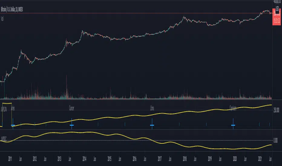
Sessions ALL + 5 Custom (Redcrabice)I created a simple script that show the most 5 important sessions. i know that there are many other "sessions" scripts out there but most of them doesnt do what i want and some even lag alot because of the amount of codes. so i decided to create a simple browser friendly script that show 5 most important sessions. asia , frankfurt, london , newyork open and newyork along with 5 custom session for your own liking.
this is 1/3 series and indicator that i use along with my other indicators.
this code is based on my 90min cycle indicator and not a "repaint" as some people might say.
have a lovely trading journey.
sign
REDCRABICE
在腳本中搜尋"Cycle"
RVL Unreal Edge (concept build)Designed with a purpose, this script was intended for use by bots automating trading of XLM using a 6hr timeframe.
However the script has turned out to be a fantastic indicator on its own, and much of the power behind it is derived from John Ehler's incredible CG oscillator.
John Ehler was an electrical engineer, a Raytheon employee who began trading in the 1970's. He is best known for his work creating super-smoothing algorithms and methods of analysing cycle length and behaviour in price action, and his work in the field of zero-lag indicators - indicators that don't follow the price action, but are in fact capable of leading it actionably, and responding with essentially zero lag.
By approaching the price action as a sine wave with demonstrably a fractal nature, Ehler's makes a number of important advancements. His CG indicator is derived from calculations typically used to derive the centre of gravity in a physical object. It effectively works as a band-pass filter and is possibly one of the very best leading indicators avaliable.
Financial Astrology Mercury Helio HarmonicsMercury Helio Harmonics indicator represent the tropical zodiac energy forces that develop through the course of Mercury in the heliocentric zodiac wheel. The waves indicates the strength of cardinal energy (initiator) and it's harmonics. In Financial Astrology, Mercury represents the commerce, negotiations, transactions and trading, is very important cycle for trading.
Note: The Mercury Helio Harmonics indicator is based on an ephemeris array that covers years 2010 to 2030, prior or after this years the data is not available, this daily ephemeris are based on UTC time so in order to align properly with the price bars times you should set UTC as your chart timezone.
Financial Astrology Jupiter DeclinationJupiter moving from South declination minima toward the North maxima and during all the travel from North maxima to zero declination produced the strong bullish long term trend, this coincide with other planets declinations observations, in general, we noted that when a planet is in North declination (above zero boundary) this strengthen the planet force and produces more strong price effects.
This Jupiter declination pattern needs more research in others markets, will be great to get the participation from more financial astrologers that could research this declination cycle in other markets and share feedback with us.
Note: The Jupiter declination indicator is based on an ephemeris array that covers years 2010 to 2030, prior or after this years the declination is not available, this daily ephemeris are based on UTC time so in order to align properly with the price bars times you should set UTC as your chart reference timezone.
Financial Astrology Sun DeclinationExtreme Sun declinations occurs at the solstices of summer and fall which correspond to the entry of Sun into Cancer and Capricorn respectively. At this extreme points we can observe that many markets tend to produce corrections. Is very interesting to see that when Sun reach the lowest and highest declination extremes. this events correlates very close to price corrections, is not an infalible rule, don't repeat for all observations but in many occurrences during all the historical data that we have of BTCUSD since 2010 have happened.
Is very likely that this same pattern repeats in others markets so will be great to get the participation of other financial astrologers that could research this cycle and share feedback with us.
Note: The Sun declination indicator is based on an ephemeris array that covers years 2010 to 2030, prior or after this years the declination is not available, this daily ephemeris are based on UTC time so in order to align properly with the price bars times you should set UTC as your chart reference timezone.

Retrograde Planets█ OVERVIEW
Retrograde Planets is a TradingView script that highlights the retrograde cycles for all the planets including : Mercury, Venus, Mars, Jupiter, Saturn, etc etc..
A lot of Time-Theory/Gann traders use these cycles to gauge volatility and trend of the market. This script can highlight all the previous retrograde cycles of any planet of your choice.
The settings are easy and simple, you will just need to select the planet and activate it from the setting. And of course, you can change the color of the highlighted area.
Retrograde Planets can also project the future retrograde cycles and highlights them for you a year in advance ( 365 days ).
█ Future Plans and upgrades to this script may include :
1. Advance labeling.
2. Statistics box.
And more! Feel free to contact me with any feature that you would like to see in this script
█ How to use :
1. Open the settings.
2. Choose the planet.
3. Enable the Cycles using the checkbox.
Give the script a few seconds and you should be set.
This script is coded as an addon to the Gann ToolBox package/scripts.

Cyclical volatility index v1This indicator is used to measure the volatility of the cycle in question.
It is very useful for clearly reading impulsive phases or corrective phases
Calculate average volatility and current volatility
The labels improve the visualization.
It is fully customizable in shapes and colors
C and the ability to disable labels
For any bugs contact the creators

Quad centered moving averages v1This indicator includes four centered moving average!
The missing periods have been reconstructed with a very complex approximation and projection technique!
The hatched areas are approximations of the missing periods projected into the future.
It is possible to set the centering of the averages through the variable "Approximation Lenght" and the ratio between the main average and the underlying in "Period Partition".
Practical example of setting:
"Approximation Lenght" equal to 2 means that the centering will be of half a period.
"Period Partition" makes sure to cascade all averages by dividing them by the same number.
//Once decided the Main Cycle (default 256) we will get the 4 averages:
-red to 128
-orange 64
-yellow 32
-white 16
This is a great tool for cyclical analysis.
It is not possible, due to the pinescript v4 language limit, to set the average under 35 periods and over 1070 periods.
For any bugs contact the creators
BEAMThe BEAM indicator helps identifying promising times during a cycle for buying and selling Bitcoin or other crypto currencies. It can also be used with gold or silver after adjusting its parameters, but does not work very well with stocks.
Disclaimer: This is not financial advice. For educational purposes only.

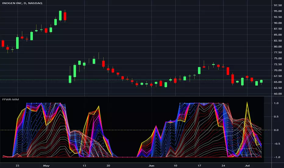
Financial Freedom WaveRipper - Momentum MulticatorIn the Spirit of '76 commemorating this day on July 4th, this is my third indicator released using Pine Script version 4.0, something I contributed to often in a small role, and will continue to do, in my free time. Without revealing my American secret sauce ingenuity excessively, this indicator uses a high performance momentum algorithm that blows most momentum algorithms out the water. It's characteristics display blatantly the swift momentum at which directional high speed wind driven swells create rip tides in an asset. Not being drug out to sea and quickly going "under water" so to speak, is best mitigated by very timely, accurate information. Regarding the use of this script, the bright yellow line has a damping factor of 4 and the longest adjustable damping factor is 66.
My idea initially was... while there is great "one liner indicators" to use, I thought, why not multi-line "multicators" with little to adjust concerning dominant cycle fluctuations in the market. And voila, another radical experiment, turned visually compelling, similar to tumultuous ocean waves and how incredibly fast turning points can wax and wane, yet be anticipated. Living in America, I was once again determined to attain a replica of "Old Glory" in this companion multicator as well. It's embedded artwork makes it an articator too. Which is why I waited to release this sibling appropriately on July 4th too, a day of celebration of freedom, an empowering idea that has reached dessimenation world wide to so many other nations and peoples.
I once again would personally like to thank the talented individuals at TV for providing a platform that embraces an initial free membership, which I first obtained myself, for people like me to freely code in Pine with mathemagical ideas and mental wizardry, creating ultimately, inventions like this eye candy display above.
Features List Includes:
"Source" Selection
Enable/disable dark background for enhanced visibility
Longest period adjustment providing any adjustable period setting
A subtly adjustable multiplier tweak
Minimalized enable/disable adjustment for the theme
This is not a freely available indicator, FYI. To witness my Pine poetry in action, properly negotiated requests for unlimited access, per indicator, may ONLY be obtained by direct contact with me using TV's "Private Chats" or by "Message" in my member name above. The comments section below is solely just for commenting and other remarks, ideas, compliments, etc... If you do have any questions or comments regarding this indicator, I will consider your inquiries, thoughts, and ideas presented below in the comments section, when time provides it. As always, "Like" it if you like it, and also return to my scripts list occasionally for additional postings. Have a profitable future everyone!
ALMA Hurst Cycles - Potential Pivot points.Experiment in finding potential pivots using using multiple period volatility measurements (ATR) and ALMA.
------------------------------------------------------------------------------------------------------------------------------------
Warning!!! Must be tuned to obtain a good price fit for your time frame and instrument (and probably general market conditions). Default settings are only eyeball fit for XBTUSD 5M
So proper write up for a change :p
So a single ATR measurement say ATR(5) doesn't give much information alone, it doesn't give us direction for example. However if we plot a MA (in this case the Arnaud Legoux MA) and plot bands which are a multiple of the ATR around the MA we get a potential trading range based on recent volatility.
The assumption being that if volatility remains approximately the same AND if price moves beyond this ATR range it is highly probable to result in a reversion to the mean. Having reached the limit of recent volatility, available buying/selling pressure is exhausted and price pivots from that point back to the mean.
Now, if we plot multiple MA's of different lengths, they alone don't tell us too much alone either. But we also find reversions to the mean occurring between say a long and short MA. The short MA will rise above/below the long MA, return to the mean etc creating crossovers.
So we combine the two concepts. Three different length MAs with corresponding ATR lengths. The smallest band cycles above/below the median of the medium band (diverging from and reverting to the mean) and the medium band cycles above/below the median of the large band.
We want to find extreme points where a pivot is probable. The small band "bounces" or cycles back and forth within the medium band and the medium band "bounces" or cycles back and forth within the large band. Approximate short, medium and long trading ranges relative to MAs.
So for example and theoretically when the small band cycles to the top of the medium band AND the medium band cycles to the top of the large band and the price has risen above all of them, there is a high probability of there being a reversal.
So here's the interesting bit. There is far more going on than is immediately apparent. If you take the bands and normalize them (ie you pulled the median, upper and lower bands so they're straight horizontal lines), the price's position relative to the bands would give you something very, very close to an RSI.
The bands effectively give you three different length RSI's. When price exceeds all three bands is roughly equivalent to seeing the confluence of overbought/sold on three different length RSI's.
However unlike RSI, we also get an approximate trading range and price levels that that RSI would have to reach to indicate it is overbought/sold that takes into account recent volatility.
------------------------------------------------------
Caveats :
Similar to RSI downsides. Multi leg pumps/dumps can remain overbought/sold and give false signals.
Extended, narrow and declining ranges/ squeezes don't require much change in price action to trigger false signals.
Performs the best when ranging.
------------------------------------------------------
Signals and Bar Colors :
Bar colors (optional in settings) :
Green - Short MA > Medium MA > Long MA
Red - Short MA < Medium MA < Long MA
Three "tiered" signals:
Large triangles. High probabilty pivot. Price exceeded all bands at the top/bottom.
Medium triangles. Price exceeded the small and medium bands, DIDN'T exceed the large band AND the small band HAS exceeded the medium band.
Small triangles. Price exceeded the small and medium bands, DIDN'T exceed the large band AND the small band DIDN'T exceed the medium band.

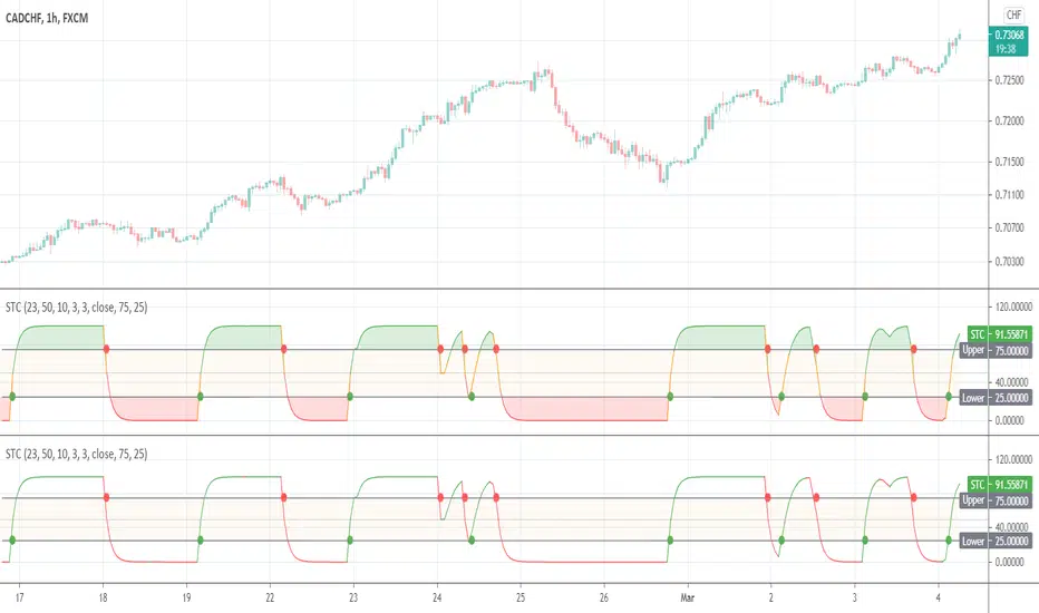
Schaff Trend CycleThis indicator was originally developed by Doug Schaff in the 1990s (published in 2008).
TMA cycle3ma cycles has 6 stages
green>lime>yellow>red>orange>aqua>green>...
trade on green and red zone:)

Ehlers Cyber Cycle⭐ Ehlers Cyber Cycle
Description (Copy/Paste for Publishing)
The Ehlers Cyber Cycle is a classic digital signal–processing (DSP) oscillator developed by John F. Ehlers, designed to extract the true cyclic component from price while minimizing lag.
This simplified implementation uses the Cyber Cycle formula (price minus smoothing) along with a fast trigger line to generate clean, low-lag reversal signals.
How It Works
• Price is smoothed using a 6-period EMA
• Cyber Cycle = raw cycle component = price – smooth
• A 3-period EMA trigger line acts as a confirmation filter
• Signals are generated on Cyber/Trigger crossovers
• Zero line helps identify positive/negative cycle states
Features
✔ Low-lag cycle oscillator
✔ Automatic buy/sell crossover signals
✔ Zero-line state shift detection
✔ Extremely lightweight and responsive
✔ Works on all assets and timeframes
✔ Perfect for mean-reversion or cycle-based timing
Use Cases
• Reversal timing
• Cycle confirmation
• Early trend detection
• Filtering noise in choppy markets
• Combining with Ehlers-based indicators (Fisher Transform, Roofing Filter, MESA, etc.)
A clean, fast, and accurate cycle tool for traders who want a simple Ehlers oscillator with strong signal clarity.

[S]Hurst Cycle Channel Clone Oscillator [LazyBear] — v6 CleanHurst Cycle Channel Clone Oscillator — v6 Clean
Overview
This is a modernized and refactored version of LazyBear's popular Hurst Cycle Channel Clone Oscillator, updated to Pine Script v6 with improved readability, proper input grouping, and enhanced code structure. This indicator helps traders identify cyclical price movements and potential reversal points based on J.M. Hurst's cycle analysis principles.
What It Does
The indicator creates two normalized oscillators that measure price position relative to dynamic channel envelopes:
Fast Oscillator (Red): Tracks short-term cycle movements based on current price position
Slow Oscillator (Green): Tracks medium-term cycle momentum based on the short cycle's midpoint
Both oscillators are normalized between 0.0 and 1.0, making overbought/oversold conditions easy to identify:
Above 1.0 = Overbought territory (purple histograms)
0.5 = Neutral midpoint
Below 0.0 = Oversold territory (purple histograms)
Key Features
✓ Dual-Timeframe Cycle Analysis: Combines short and medium cycle lengths for comprehensive market rhythm detection
✓ ATR-Based Dynamic Channels: Automatically adjusts to market volatility
✓ Clear Visual Signals: Histogram bars highlight extreme overbought/oversold conditions
✓ Customizable Parameters: Adjust cycle lengths and multipliers to match your trading style
✓ Built-in Alert Conditions: Get notified on key crossover events
✓ Optional Bar Coloring: Visual price bar colors based on oscillator position
How to Use
Basic Interpretation:
Fast crosses below 0.0 → Potential BUY opportunity (oversold)
Fast crosses above 1.0 → Potential SELL opportunity (overbought)
Fast crosses Slow → Momentum shift indication
Purple histograms → Extreme conditions requiring attention
Best Practices:
Use in conjunction with price action and trend analysis
Look for divergences between price and oscillator
Pay attention when both oscillators reach extremes simultaneously
Adjust cycle lengths to match the asset's dominant cycle period
Settings
Cycle Lengths:
Short Cycle Length (default: 10) — Fast oscillator sensitivity
Medium Cycle Length (default: 30) — Slow oscillator smoothing
Multipliers:
Short Cycle Multiplier (default: 1.0) — Controls short channel width
Medium Cycle Multiplier (default: 1.8) — Controls medium channel width
Alerts:
Pre-configured alert conditions for all major crossover events
Credits
Original indicator by LazyBear
This is a clean refactor maintaining the original logic while improving code quality and Pine Script version compliance.

DominantCycleCollection of Dominant Cycle estimators. Length adaptation used in the Adaptive Moving Averages and the Adaptive Oscillators try to follow price movements and accelerate/decelerate accordingly (usually quite rapidly with a huge range). Cycle estimators, on the other hand, try to measure the cycle period of the current market, which does not reflect price movement or the rate of change (the rate of change may also differ depending on the cycle phase, but the cycle period itself usually changes slowly). This collection may become encyclopaedic, so if you have any working cycle estimator, drop me a line in the comments below. Suggestions are welcome. Currently included estimators are based on the work of John F. Ehlers
mamaPeriod(src, dynLow, dynHigh) MESA Adaptation - MAMA Cycle
Parameters:
src : Series to use
dynLow : Lower bound for the dynamic length
dynHigh : Upper bound for the dynamic length
Returns: Calculated period
Based on MESA Adaptive Moving Average by John F. Ehlers
Performs Hilbert Transform Homodyne Discriminator cycle measurement
Unlike MAMA Alpha function (in LengthAdaptation library), this does not compute phase rate of change
Introduced in the September 2001 issue of Stocks and Commodities
Inspired by the @everget implementation:
Inspired by the @anoojpatel implementation:
paPeriod(src, dynLow, dynHigh, preHP, preSS, preHP) Pearson Autocorrelation
Parameters:
src : Series to use
dynLow : Lower bound for the dynamic length
dynHigh : Upper bound for the dynamic length
preHP : Use High Pass prefilter (default)
preSS : Use Super Smoother prefilter (default)
preHP : Use Hann Windowing prefilter
Returns: Calculated period
Based on Pearson Autocorrelation Periodogram by John F. Ehlers
Introduced in the September 2016 issue of Stocks and Commodities
Inspired by the @blackcat1402 implementation:
Inspired by the @rumpypumpydumpy implementation:
Corrected many errors, and made small speed optimizations, so this could be the best implementation to date (still slow, though, so may revisit in future)
High Pass and Super Smoother prefilters are used in the original implementation
dftPeriod(src, dynLow, dynHigh, preHP, preSS, preHP) Discrete Fourier Transform
Parameters:
src : Series to use
dynLow : Lower bound for the dynamic length
dynHigh : Upper bound for the dynamic length
preHP : Use High Pass prefilter (default)
preSS : Use Super Smoother prefilter (default)
preHP : Use Hann Windowing prefilter
Returns: Calculated period
Based on Spectrum from Discrete Fourier Transform by John F. Ehlers
Inspired by the @blackcat1402 implementation:
High Pass, Super Smoother and Hann Windowing prefilters are used in the original implementation
phasePeriod(src, dynLow, dynHigh, preHP, preSS, preHP) Phase Accumulation
Parameters:
src : Series to use
dynLow : Lower bound for the dynamic length
dynHigh : Upper bound for the dynamic length
preHP : Use High Pass prefilter (default)
preSS : Use Super Smoother prefilter (default)
preHP : Use Hamm Windowing prefilter
Returns: Calculated period
Based on Dominant Cycle from Phase Accumulation by John F. Ehlers
High Pass and Super Smoother prefilters are used in the original implementation
doAdapt(type, src, len, dynLow, dynHigh, chandeSDLen, chandeSmooth, chandePower, preHP, preSS, preHP) Execute a particular Length Adaptation or Dominant Cycle Estimator from the list
Parameters:
type : Length Adaptation or Dominant Cycle Estimator type to use
src : Series to use
len : Reference lookback length
dynLow : Lower bound for the dynamic length
dynHigh : Upper bound for the dynamic length
chandeSDLen : Lookback length of Standard deviation for Chande's Dynamic Length
chandeSmooth : Smoothing length of Standard deviation for Chande's Dynamic Length
chandePower : Exponent of the length adaptation for Chande's Dynamic Length (lower is smaller variation)
preHP : Use High Pass prefilter for the Estimators that support it (default)
preSS : Use Super Smoother prefilter for the Estimators that support it (default)
preHP : Use Hann Windowing prefilter for the Estimators that support it
Returns: Calculated period (float, not limited)
doEstimate(type, src, dynLow, dynHigh, preHP, preSS, preHP) Execute a particular Dominant Cycle Estimator from the list
Parameters:
type : Dominant Cycle Estimator type to use
src : Series to use
dynLow : Lower bound for the dynamic length
dynHigh : Upper bound for the dynamic length
preHP : Use High Pass prefilter for the Estimators that support it (default)
preSS : Use Super Smoother prefilter for the Estimators that support it (default)
preHP : Use Hann Windowing prefilter for the Estimators that support it
Returns: Calculated period (float, not limited)
Medium Term Weighted Stochastic (STPMT) by DGTLa Stochastique Pondérée Moyen Terme (STPMT) , or Mᴇᴅɪᴜᴍ Tᴇʀᴍ Wᴇɪɢʜᴛᴇᴅ Sᴛᴏᴄʜᴀꜱᴛɪᴄꜱ created by Eric Lefort in 1999, a French trader and author of trading books
█ The STPMT indicator is a tool which concerns itself with both the direction and the timing of the market. The STPMT indicator helps the trader with:
The general trend by observing the level around which the indicator oscillates
The changes of direction in the market
The timing to open or close a position by observing the oscillations and by observing the relative position of the STPMT versus its moving average
STPMT Calculation
stpmt = (4,1 * stoch(5, 3) + 2,5 * stoch(14, 3) + stoch(45, 14) + 4 * stoch(75, 20)) / 11.6
Where the first argument of the stoch function representation above is period (length) of K and second argument smoothing period of K. The result series is then plotted as red line and its moving average as blue line. By default disabled gray lines are the components of the STPMT
The oscillations of the STPMT around its moving average define the timing to open a position as crossing of STMP line and moving average line in case when both trends have same direction. The moving average determines the direction.
Long examples
█ Tʜᴇ CYCLE Iɴᴅɪᴄᴀᴛᴏʀ is derived from the STPMT. It is
cycle = stpmt – stpmt moving average
It is indicates more clearly all buy and sell opportunities. On the other hand it does not give any information on market direction. The Cycle indicator is a great help in timing as it allows the trader to more easily see the median length of an oscillation around the average point. In this way the traders can simply use the time axis to identify both a favorable price and a favorable moment. The Cycle Indicator is presented as histogram
The Lefort indicators are not a trading strategy. They are tools for different purposes which can be combined and which can serve for trading all instruments (stocks, market indices, forex, commodities…) in a variety of time frames. Hence they can be used for both day trading and swing trading.
👉 For whom that would like simple version of the Cycle indicator on top of the main price chart with signals as presented below.
Please note that in the following code STMP moving average direction is not considered and will plot signals regardless of the direction of STMP moving average. It is not a non-repainting version too.
here is pine code for the overlay version
// © dgtrd
//@version=4
study("Medium Term Weighted Stochastic (STPMT) by DGT", "STPMT ʙʏ DGT ☼☾", true, format.price, 2, resolution="")
i_maLen = input(9 , "Stoch MA Length", minval=1)
i_periodK1 = input(5 , "K1" , minval=1)
i_smoothK1 = input(3 , "Smooth K1", minval=1)
i_weightK1 = input(4.1 , "Weight K1", minval=1, step=.1)
i_periodK2 = input(14 , "K2" , minval=1)
i_smoothK2 = input(3 , "Smooth K2", minval=1)
i_weightK2 = input(2.5 , "Weight K2", minval=1, step=.1)
i_periodK3 = input(45 , "K3" , minval=1)
i_smoothK3 = input(14 , "Smooth K3", minval=1)
i_weightK3 = input(1. , "Weight K3", minval=1, step=.1)
i_periodK4 = input(75 , "K4" , minval=1)
i_smoothK4 = input(20 , "Smooth K4", minval=1)
i_weightK4 = input(4. , "Weight K4", minval=1, step=.1)
i_data = input(false, "Components of the STPMT")
//------------------------------------------------------------------------------
// stochastic function
f_stoch(_periodK, _smoothK) => sma(stoch(close, high, low, _periodK), _smoothK)
//------------------------------------------------------------------------------
// calculations
// La Stochastique Pondérée Moyen Terme (STPMT) or Medium Term Weighted Stochastics calculation
stpmt = (i_weightK1 * f_stoch(i_periodK1, i_smoothK1) + i_weightK2 * f_stoch(i_periodK2, i_smoothK2) + i_weightK3 * f_stoch(i_periodK3, i_smoothK3) + i_weightK4 * f_stoch(i_periodK4, i_smoothK4)) / (i_weightK1 + i_weightK2 + i_weightK3 + i_weightK4)
stpmt_ma = sma(stpmt, i_maLen) // STPMT Moving Average
cycle = stpmt - stpmt_ma // Cycle Indicator
//------------------------------------------------------------------------------
// plotting
plotarrow(change(sign(cycle)), "STPMT Signals", color.green, color.red, 0, maxheight=41)
alertcondition(cross(cycle, 0), title="Trading Opportunity", message="STPMT Cycle : Probable Trade Opportunity\n{{exchange}}:{{ticker}}->\nPrice = {{close}},\nTime = {{time}}")

[blackcat] L2 Ehlers Cyber CycleLevel: 2
Background
John F. Ehlers introuced Cyber Cycle Indicator in his "Cybernetic Analysis for Stocks and Futures" chapter 4 on 2004.
Function
Trading the Cyber Cycle Indicator is straightforward. Buy when the at this point. Sell when the Cycle line crosses under the Trigger line. You are at the bottom of the cycle at this point. Sell when the Cycle line crosses under the Trigger line. You are at the top of the cycle in this case. To be sure, there are crossings at other than the cyclic turning points. Many of these can be eliminated by discretionary traders using their experience or others of their favorite tools. One of the more interesting aspects of the Cyber Cycle is that it was developed simultaneously with the Instantaneous Trendline. They are opposite sides of the same coin because the total frequency content of the market being analyzed is in one indicator or the other. This is important because the conventional methods of using moving averages and oscillators can be dispensed with.
Key Signal
Cycle ---> Cyber Cycle fast line
Cycle (2) ---> Cyber Cycle slow line
Pros and Cons
100% John F. Ehlers definition translation of original work, even variable names are the same. This help readers who would like to use pine to read his book. If you had read his works, then you will be quite familiar with my code style.
Remarks
The 24th script for Blackcat1402 John F. Ehlers Week publication.
Readme
In real life, I am a prolific inventor. I have successfully applied for more than 60 international and regional patents in the past 12 years. But in the past two years or so, I have tried to transfer my creativity to the development of trading strategies. Tradingview is the ideal platform for me. I am selecting and contributing some of the hundreds of scripts to publish in Tradingview community. Welcome everyone to interact with me to discuss these interesting pine scripts.
The scripts posted are categorized into 5 levels according to my efforts or manhours put into these works.
Level 1 : interesting script snippets or distinctive improvement from classic indicators or strategy. Level 1 scripts can usually appear in more complex indicators as a function module or element.
Level 2 : composite indicator/strategy. By selecting or combining several independent or dependent functions or sub indicators in proper way, the composite script exhibits a resonance phenomenon which can filter out noise or fake trading signal to enhance trading confidence level.
Level 3 : comprehensive indicator/strategy. They are simple trading systems based on my strategies. They are commonly containing several or all of entry signal, close signal, stop loss, take profit, re-entry, risk management, and position sizing techniques. Even some interesting fundamental and mass psychological aspects are incorporated.
Level 4 : script snippets or functions that do not disclose source code. Interesting element that can reveal market laws and work as raw material for indicators and strategies. If you find Level 1~2 scripts are helpful, Level 4 is a private version that took me far more efforts to develop.
Level 5 : indicator/strategy that do not disclose source code. private version of Level 3 script with my accumulated script processing skills or a large number of custom functions. I had a private function library built in past two years. Level 5 scripts use many of them to achieve private trading strategy.

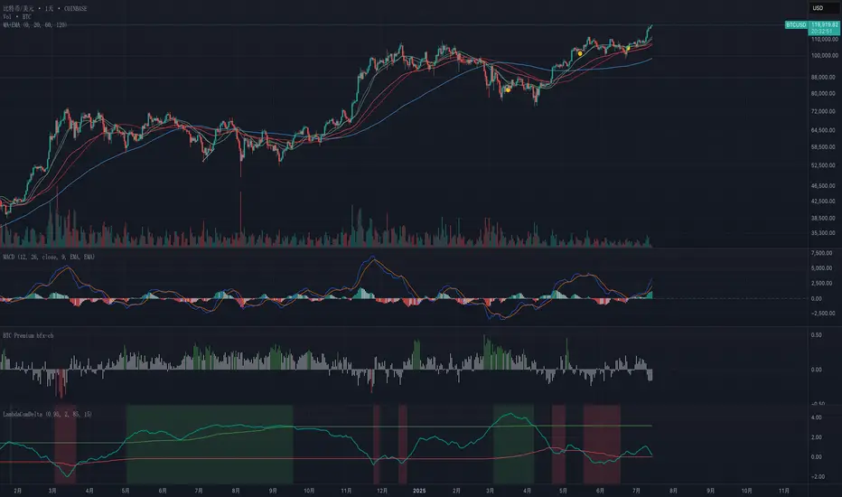
Exponential-Decay Cumulative Spread (Cycle-Tuned)## Indicator Overview
**Exponential-Decay Cumulative Spread (Cycle-Tuned)** – short title **LambdaCumDelta** – tracks the percentage spread between CEXs BTC spot prices.
By clipping outliers, applying an exponential-decay running sum, and comparing that sum to rolling percentile bands, the script flags potential **cycle bottoms** and **cycle tops** whenever the cumulative spread stays beyond extreme thresholds for three consecutive bars.
---
### Core Logic
1. **Price Spread**
`spread_pct = (cexA – cexB) / cexB × 100`.
2. **Outlier Suppression**
* Calculates the **90-day standard deviation σ** of `spread_pct`.
* Uses a **clip coefficient `k_clip`** (0.5–5.0) to cap the spread at `±k_clip × σ`, damping single-day anomalies.
3. **Exponential-Decay Sum**
* Applies a decay factor **λ** (0.50–0.999):
```
CumΔₜ = spread_clipₜ + λ × CumΔₜ₋₁
```
* Larger λ → longer memory half-life.
4. **Rolling Percentile Bands**
* Uses a **365-bar window** to derive dynamic percentile thresholds.
* Upper / Lower bands are set by **perc\_hi** and **perc\_lo** (e.g., 85 % and 15 %).
5. **Signal Definition**
* **Bullish** (cycle bottom): `CumΔ` above the upper band for **3 straight bars**.
* **Bearish** (cycle top): `CumΔ` below the lower band for **3 straight bars**.
---
### Chart Elements
| Plot | Style | Meaning |
| --------------- | ----------------- | ----------------------------------- |
| **CumΔ** | Teal thick line | Exponential-decay cumulative spread |
| Upper Threshold | Green thin line | Rolling upper percentile |
| Lower Threshold | Red thin line | Rolling lower percentile |
| Background | Faded green / red | Bullish / bearish signal zone |
---
### Key Inputs
| Input | Default | Purpose |
| -------------------- | ------- | ------------------------------- |
| **Decay factor λ** | 0.95 | Memory length of CumΔ |
| **Clip coefficient** | 2.0 | Multiple of σ for outlier cap |
| **Upper percentile** | 85 | Cycle-bottom trigger percentile |
| **Lower percentile** | 15 | Cycle-top trigger percentile |
---
### Practical Tips
1. **Timing bias**
* Green background often precedes mean-reversion of the spread – consider scaling into longs or covering shorts.
* Red background suggests stretched positive spread – consider trimming longs or lightening exposure.
2. **Combine with volume, trend filters (MA, MACD, etc.)** to weed out false extremes.
3. Designed for **daily charts**; ensure both exchange feeds are synchronized.
---
### Alerts
Two built-in `alertcondition`s fire when bullish or bearish criteria are met, enabling push / email / webhook notifications.
---
### Disclaimer
This script is for educational and research purposes only and is **not** financial advice. Test thoroughly and trade at your own risk.
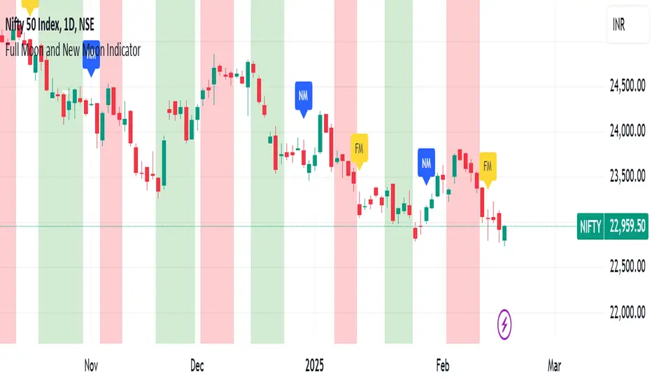
Full Moon and New Moon IndicatorThe Full Moon & New Moon Indicator is a custom Pine Script indicator which marks Full Moon (Pournami) and New Moon (Amavasya) events on the price chart. This indicator helps traders who incorporate lunar cycles into their market analysis, as certain traders believe these cycles influence market sentiment and price action. The current script is added for the year 2024 and 2025 and the dates are considered as per the Telugu calendar.
Features
✅ Identifies and labels Full Moon & New Moon days on the chart for the year 2024 and 2025
How it Works!
On a Full Moon day, it places a yellow label ("Pournami") above the corresponding candle.
On a New Moon day, it places a blue label ("Amavasya") above the corresponding candle.
Example Usage
When a Full Moon label appears, check for potential trend reversals or high volatility.
When a New Moon label appears, watch for market consolidation or a shift in sentiment.
Combine with candlestick patterns, support/resistance, or momentum indicators for a stronger trading setup.
🚀 Add this indicator to your TradingView chart and explore the market’s reaction to lunar cycles! 🌕
Roberts Pi Cycle Top and Bottom Indicator BTCIndicator Overview
The Pi Cycle Top Indicator has historically been effective in picking out the timing of market cycle highs to within 3 days.
It uses the 111 day moving average (111DMA) and a newly created multiple of the 350 day moving average, the 350DMA x 2.
This updated indicator is based on the original x2 Daily Simple Moving Average Pi Cycle Top Indicator for BTCUSD but with the addition of a 3rd 350 SMA
Standard Pi Cycle SMA = 350*2 SMA + 111 SMA
Updated Pi Cycle SMA = 350*2 SMA + 111 SMA + 350 SMA
How It Can Be Used / How to Read:
Chart should be used on BTCUSD only
Chart should be set to Daily Timeframe only
Buy signal RED SMA crosses up over WHITE SMA
Sell Signal RED SMA crosses up over GREEN SMA (a vetical yellow line will indicate the cycle top)

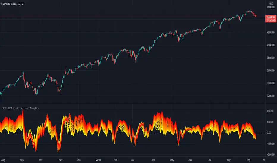
TASC 2021.10 - Cycle/Trend AnalyticsPresented here is code for the "Cycle/Trend Analytics" indicator originally conceived by John Ehlers. This is another one of TradingView's first code releases published in the October 2021 issue of Trader's Tips by Technical Analysis of Stocks & Commodities (TASC) magazine.
This indicator, referred to as "CTA" in later explanations, has a companion indicator that is discussed in the article entitled MAD Moving Average Difference , authored by John Ehlers. He's providing an innovative double dose of indicator code for the month of October 2021.
Modes of Operation
CTA has two modes defined as "trend" and "cycle". Ehlers' intention from what can be gathered from the article is to portray "the strength of the trend" in trend mode on real data. Cycle mode exhibits the response of the bank of calculations when a hypothetical sine wave is utilized as price. When cycle mode is chosen, two other lines will be displayed that are not shown in trend mode. A more detailed explanation of the indicator's technical functionality and intention can be found in the original Cycle/Trend Analytics And The MAD Indicator article, which requires a subscription.
Computational Functionality
The CTA indicator only has one adjustment in the indicator "Settings" for choice of modes. The default mode of operation is "trend". Trend mode applies raw price data to the bank of plots, while the cycle mode employs a sinusoidal oscillator set to a cycle period of 30 bars. These are passed to multiple SMAs, which are then subtracted from the original source data. The result is a fascinating display of plots embellished with vivid array of gradient color on real data or the hypothetical sine wave.
Related Information
• SMA
• color.rgb()
Join TradingView