在腳本中搜尋"momentum"
Up/Down RangeMeasuring the difference between the highs and lows from the average, this measure can serve as a proxy for the volatility, just like the ATR.
However, it breaks the range into an upward and a downward moving component, so it also gives information about the current trend direction.
In fact, I turned it into a momentum indicator here:
Stochastic Momentum IndexStochastic Momentum Index
William Blau "Momentum, Direction, and Divergence",
John Wiley and Sons, Inc. 1995, ISBN 0-471-02729-4, page 29:
SM(q) = close - 0.5*(HH(q) + LL(q))
SMI(q, r, s) = 100*(EMA(EMA(SM(q), r)), s)/(0.5*EMA(EMA(HH(q)-LL(q)), r), s)

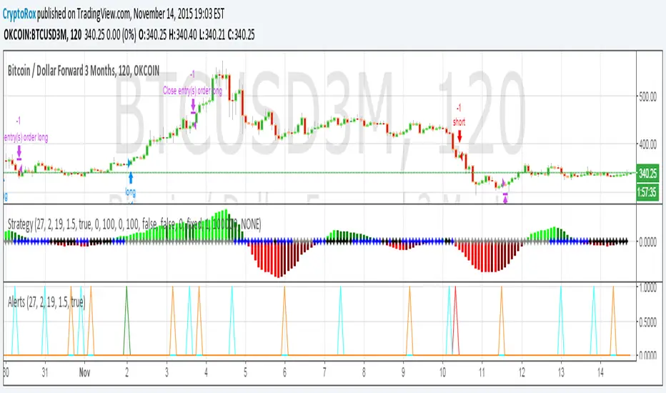
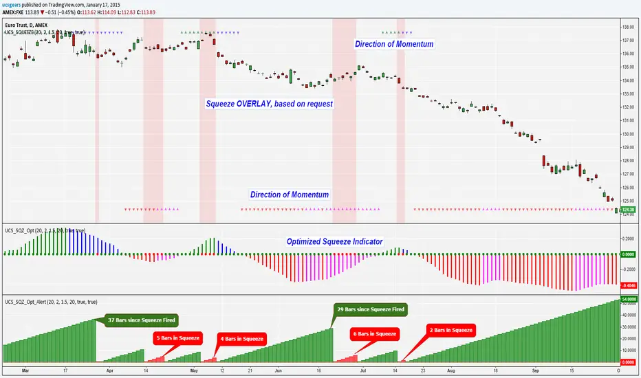
UCS Squeeze Momentum Overlay with AlertsAll credit to the great ucsgears. His original indicator is on this page:
I just remixed the visuals and added alerts when price is released from the squeeze. I find it works well on lower timeframes for Forex and Bitcoin. Suggestions for other instruments and timeframes are welcome! When adding alerts use 'On Condition' to get the fastest alerts.
Best used in conjunction with the USC_SQZ_Opt Ooscillator from this page:
Possibly useful tip: the squeeze code here is great for identifying ranging markets, and can be used with other indicators to stop alerts firing in choppy markets.

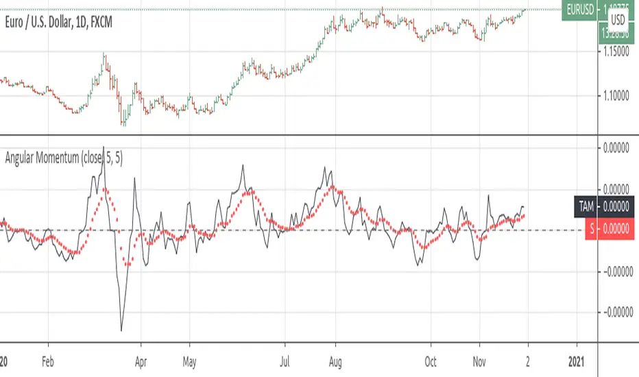
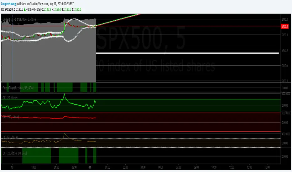
Angular MomentumEXPERIMENTAL:
Returns a smoothed non lagging(peaks are convergent time wise) angular motion.
Spyfrat Momentum StudySpyfrat Momentum Study
--> using the following
1) RSI
2) Boellinger Band
3) PSAR Measurement Algorithm

Squeeze Momentum with different time frameSqueeze Momentum from LazyBear with the option to change time frame

Relative Vigour Index (RVI). EhlersRelative Vigor Index - RVI
------------------------------------
An indicator used in technical analysis that measures the conviction of a recent price action and the likelihood that it will continue. The RVI compares the positioning of a security's closing price relative to its price range, and the result is smoothed by calculating an exponential moving average of the values.
The RVI indicator is calculated in a similar fashion to the stochastic oscillator, but the vigor index compares the close relative to the open rather than to the low.
Traders expect the RVI value to grow as the bullish trend gains momentum because in this type of environment, a security's closing price tends to be at the top of the range while the open is near the low of the day.
Usage Example: www.investopedia.com

BUY & SELL PRESSURE XeLMod V2BUY & SELL PRESSURE Oscillator
Ver. 2.0 XelMod
WHAT'S THIS?
This is an UPDATED version of a previous script already posted.
List of changes from previous script:
Separated as Column Histogram just the Regressive (Rate-Of-Change) Force of the indicator which gives a faster response of the trend.
Default period is now set to 81, as better Oscillator swing lagging.
This is an excelent momentum indicator very similar to ADX but in a candle weighting distribution rather than ranges.
For additional reference:
Karthik Marar BUY AND SELL PRESSURE INDICATORS.
Cheers!
Any feedback will be welcome...
@XeL_Arjona

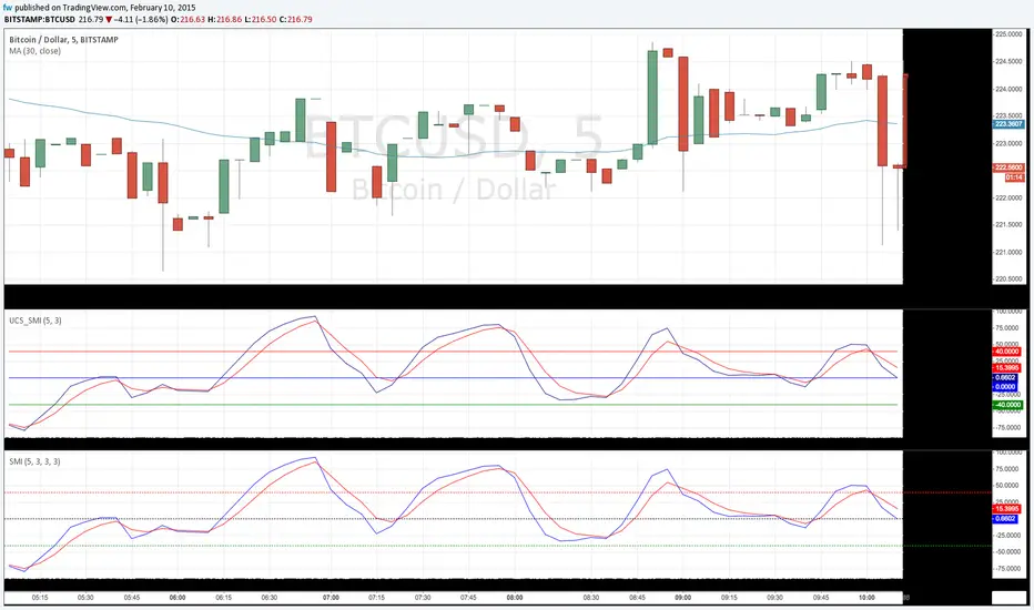
SMI BarsUses SMI (Stochastic Momentum Index) to set bar colors:
When SMI above overbought, bar color is red.
When SMI is between 0 and overbought, bar color is maroon
When SMI is between oversold and 0, bar color is green
When SMI is below oversold, bar color is lime.
When SMI crosses above or below 0, bar color is orange.

Squeeze Momentum Alert ScriptThis is the alert script for the squeeze momentum strategy found here...
Long on Green,
Short on Red,
Close Longs on Aqua,
Close Shorts on Orange.

Zweig Market Breadth Thrust Indicator [LazyBear]The Breadth Thrust (BT) indicator is a market momentum indicator developed by Dr. Martin Zweig. According to Dr. Zweig a Breadth Thrust occurs when, during a 10-day period, the Breadth Thrust indicator rises from below 40 percent to above 61.5 percent.
A "Thrust" indicates that the stock market has rapidly changed from an oversold condition to one of strength, but has not yet become overbought. This is very rare and has happened only a few times. Dr. Zweig also points out that most bull markets begin with a Breadth Thrust.
All parameters are configurable. You can draw BT for NYSE, NASDAQ, AMEX or based on combined data (i.e., AMEX+NYSE+NASD). There is also a "CUSTOM" mode supported, so you can enter your own ADV/DEC symbols.
More info:
Definition: www.investopedia.com
A Breadth Thrust Signal: www.mcoscillator.com
A Rare "Zweig" Buy Signal: www.moneyshow.com
Zweig Breadth Thrust: recessionalert.com
List of my public indicators: bit.ly
List of my app-store indicators: blog.tradingview.com

UCS_Squeeze_OptimizationSqueeze Momentum Indicator - Optimized
All Updates from Version 3 + Squeeze Optimized further.
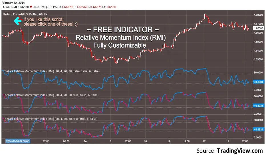
FREE INDICATOR: Relative Momentum Index (RMI)RMI, as requested by glaz
Description:
The Relative Momentum Index was developed by Roger Altman and was introduced in his article in the February, 1993 issue of Technical Analysis of Stocks & Commodities magazine.
While your typical RSI counts up and down days from close to close, the Relative Momentum Index counts up and down days from the close relative to a close x number of days ago. The result is an RSI that is a bit smoother.
Usage:
Use in the same way you would any other RSI. There are overbought and oversold zones, and can also be used for divergence and trend analysis .
Grab the source code here: pastebin.com
Installation video by @ChrisMoody here : vimeopro.com
░░░░░░░░░░░░░░░ Feel free to follow me to keep up with my latest scripts! ░░░░░░░░░░░░░░░
░░░░░░░░░░░░ PLEASE THUMB UP OR STAR IF YOU LIKE THIS INDICATOR! ░░░░░░░░░░░░
I'd like as many people as possible to get it :)
WaveTrend with Crosses [LazyBear]LazyBear's wavetrend oscillator enhanced with wavetrend cross visualization on the indicator as well as with bar color highlights.

Indicator: ElliotWave Oscillator [EWO]This oscillator has to be used in conjunction with other EW tools (certainly cannot be the main indicator).
EWO has:
- Higher values during third waves' up
- Lower but still Positive values during the first and fifth waves up
- Negative values during the biggest corrections or downtrend impulse waves.
Personally, I am still trying to figure out EW, so do not use this. Just wanted to publish this for the EW masters out there who can put this to good use.
Appreciate any comments/feedback.

Indicator: Chande's QStick IndicatorQStick from Tushar Chande (more info => www.investopedia.com)
This numerically identify trends in candlestick charting. It is calculated by taking an 'n' period moving average of the difference between the open and closing prices. A Qstick value greater than zero means that the majority of the last 'n' periods have been up, indicating that buying pressure has been increasing
I added more markings to clearly highlight the divergences (marked them in the chart above).
Appreciate any comments/feedback.

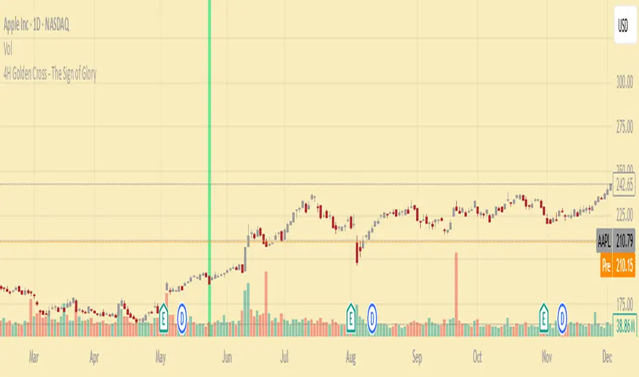
4H Golden Cross - The Sign of GloryCalculates the golden cross on the 4-hour timeframe
Displays the result on any timeframe
Draws a green vertical beam (a vertical line or background stripe) on the bar where the golden cross happened, so it’s clearly visible regardless of your chart timeframe
This is used to see the effectiveness of the 4h golden cross without having to change timeframes continually