Bitcoin vs. S&P 500 Performance Comparison**Full Description:**
**Overview**
This indicator provides an intuitive visual comparison of Bitcoin's performance versus the S&P 500 by shading the chart background based on relative strength over a rolling lookback period.
**How It Works**
- Calculates percentage returns for both Bitcoin and the S&P 500 (ES1! futures) over a specified lookback period (default: 75 bars)
- Compares the returns and shades the background accordingly:
- **Green/Teal Background**: Bitcoin is outperforming the S&P 500
- **Red/Maroon Background**: S&P 500 is outperforming Bitcoin
- Displays a real-time performance difference label showing the exact percentage spread
**Key Features**
✓ Rolling performance comparison using customizable lookback period (default 75 bars)
✓ Clean visual representation with adjustable transparency
✓ Works on any timeframe (optimized for daily charts)
✓ Real-time performance differential display
✓ Uses ES1! (E-mini S&P 500 continuous futures) for accurate comparison
✓ Fine-tuning adjustment factor for precise calibration
**Use Cases**
- Identify market regimes where Bitcoin outperforms or underperforms traditional equities
- Spot trend changes in relative performance
- Assess risk-on vs risk-off periods
- Compare Bitcoin's momentum against broader market conditions
- Time entries/exits based on relative strength shifts
**Settings**
- **S&P 500 Symbol**: Default ES1! (can be changed to SPX or other indices)
- **Lookback Period**: Number of bars for performance calculation (default: 75)
- **Adjustment Factor**: Fine-tune calibration to match specific data feeds
- **Transparency Controls**: Customize background shading intensity
- **Show/Hide Label**: Toggle performance difference display
**Best Practices**
- Use on daily timeframe for swing trading and position analysis
- Combine with other momentum indicators for confirmation
- Watch for color transitions as potential regime change signals
- Consider using multiple timeframes for comprehensive analysis
**Technical Details**
The indicator calculates rolling percentage returns using the formula: ((Current Price / Price ) - 1) × 100, then compares Bitcoin's return to the S&P 500's return over the same period. The background color dynamically updates based on which asset is showing stronger performance.
Sentiment

Signal Vision - Divergence vs ES1!Signal Vision – Divergence vs ES1!
This TradingView indicator tracks the divergence between a chart’s RSI and the ES1 RSI. It plots an oscillator showing the difference between the two RSIs, helping identify when the asset is overperforming or underperforming the S&P 500 futures.


Myfxschool V1Introducing the MyFXSchool Leading Indicator™, a next-generation market prediction tool designed exclusively for traders who want accuracy, clarity, and early trend identification. Built using advanced price-action logic, institutional order-flow concepts, and dynamic volatility algorithms, this indicator gives you a true leading advantage—not just lagging signals.

Volatility Meter & Entry LineIndicator Name: Volatility Meter & Entry Line
Created by: Texas Trading Strategies
Overview
The "Volatility Meter & Entry Line" is a comprehensive, multi-factor technical analysis tool designed to help traders assess current market conditions and identify potential trading opportunities. It synthesizes three key market dimensions—momentum (RSI), market noise (Choppiness Index), and volatility (ATR)—into a single, easy-to-understand composite score. This score visually informs you whether the market is in a favorable state for trading or if it's better to avoid choppy, low-opportunity environments. Additionally, it plots a dynamic support/resistance line based on recent price wicks to aid in entry and exit planning.
⚠️ IMPORTANT: FINANCIAL RISK & LEGAL DISCLAIMER
PLEASE READ THIS CAREFULLY BEFORE USING THIS INDICATOR.
1. No Financial Advice: I am NOT a licensed financial advisor, broker, or certified financial planner. The indicator I have created and any accompanying descriptions are provided for EDUCATIONAL AND INFORMATIONAL PURPOSES ONLY. This is NOT financial advice. You should not construe any information provided here as a recommendation to buy, sell, or hold any financial instrument or asset class.
2. High Risk of Loss: Trading in financial markets (including stocks, forex, cryptocurrencies, futures, and CFDs) carries a HIGH LEVEL OF RISK and may not be suitable for all investors. There is a possibility you could sustain a loss of some, all, or in some cases (e.g., leveraged products), more than your initial investment. You should be aware of all the risks associated with trading and seek advice from an independent, qualified financial advisor if you have any doubts.
3. No Guarantee of Profit or Accuracy: Past performance is NOT indicative of future results. No representation is being made that any account will or is likely to achieve profits or losses similar to those discussed. The signals and metrics generated by this indicator are based on historical data and mathematical formulas. They are NOT guarantees of future market behavior and are inherently lagging. The indicator can and will produce losing signals.
4. Your Responsibility: You are solely responsible for your own trading decisions and for evaluating the merits and risks associated with the use of any information from this indicator. It is your responsibility to backtest and forward-test any strategy, understand its limitations, and only trade with capital you can afford to lose.
By using this indicator, you acknowledge that you have read, understood, and agree to this disclaimer and accept full responsibility for your own trading actions.
Detailed Indicator Description & Components
1. The Core Components (Inputs & Calculations)
RSI (Relative Strength Index): Measures the speed and change of price movements. It identifies overbought (typically above 70) and oversold (typically below 30) conditions. Your indicator allows you to adjust these thresholds.
Choppiness Index (CI): A volatility indicator designed to determine if a market is trending (low CI values) or ranging/choppy (high CI values). A value below 38.2 often suggests a trend, while a value above 61.8 suggests a choppy market. Your Choppy Market Threshold input allows for customization.
ATR-based Volatility Score: The Average True Range (ATR) is normalized as a percentage of the current price (atrPercent). This value is then compared to your High Volatility Threshold to create a VolatilityScore from 0 to 100. Higher scores indicate more volatility, which can be favorable for certain trading strategies.
2. The Composite Trading Signal (The "Meter")
This is the heart of the indicator. It combines the three components above into a single tradeScore (0-100) and categorizes the market condition.
GOOD TO TRADE (Lime Color): Triggered when tradeScore >= 70.
What it means: The market is likely exhibiting a favorable combination of high volatility (opportunity), extreme RSI readings (potential momentum exhaustion for reversals or breakouts), and low choppiness (a trending or clean-moving market).
MODERATE (Yellow Color): Triggered when 40 <= tradeScore < 70.
What it means: Market conditions are mixed. There may be some opportunity, but it's not as clear. This could be a period of consolidation or a weakening trend. Caution is advised.
CHOPPY / AVOID (Red Color): Triggered when tradeScore < 40.
What it means: The market is likely in a low-volatility, highly choppy, or directionless state. Trading in these conditions often leads to whipsaws and small, frustrating losses. The indicator suggests it's best to avoid entering new positions or to be extremely selective.
3. The Wick Line (For Entries & Exits)
What it is: A dynamic line that connects recent swing highs (the tops of candle wicks), effectively acting as a moving resistance line.
How to use it:
In an uptrend, a break above this line can confirm bullish strength.
In a downtrend or during a pullback, this line can act as resistance. A price rejection (e.g., a long wick touching the line) in a "GOOD TO TRADE" market could signal a short entry or a point to exit a long position.
The concept can be mirrored to plot a support line from swing lows (ta.pivotlow) for a more complete picture (this would require additional code).
How to Use This Indicator in Your Trading
Context First: Use the "Meter" for market context. Do not take trades when the meter is red ("CHOPPY/AVOID") unless you have a very high-conviction, proven strategy for such environments.
Signal Confirmation: Wait for the meter to turn green or yellow BEFORE looking for specific entry setups. This filters out low-quality market noise.
Entry Trigger: Use the "Wick Line" (resistance/support) or your own preferred entry method (e.g., candlestick patterns, break of structure) to time your entry, but only when the overall marketCondition is favorable.
Risk Management is Paramount: ALWAYS use a stop-loss. The indicator does not provide stop-loss levels. You must determine your risk management based on the ATR, the Wick Line, or support/resistance levels.
Remember: This indicator is a FILTER, not a crystal ball. Its purpose is to improve the odds of your trades by ensuring you are only trading when market conditions align with the strategy's logic. It should be one component of a complete trading plan that includes rigorous risk management.

Atlas 8 Currency Session Momentum (6H, London)This indicator calculates real-time currency strength for the 8 major currencies (USD, EUR, GBP, JPY, AUD, NZD, CAD, CHF) using a balanced multi-pair engine and a 6-hour momentum reset.
🔍 How it works
The indicator computes the relative strength of each currency by averaging the percentage change of 7 major cross-pairs for each currency.
A currency's value increases when pairs where it is the base appreciate, and decreases when pairs where it is the quote depreciate.
This creates a symmetric and stable strength calculation similar to institutional relative-value models.
🕒 Session-based Momentum Reset
The global trading day is split into 4 × 6-hour blocks:
• 00:00–06:00 Tokyo
• 06:00–12:00 London
• 12:00–18:00 New York
• 18:00–24:00 Late US/Asia pre-open
At each new 6-hour session, all strength lines reset to 0.
This highlights fresh intraday momentum generated by liquidity transitions between sessions.
🎯 What the indicator shows
• Relative strength of all 8 currencies
• Smooth momentum curves using EMA smoothing
• Vertical dividers at each new session
• Background color for each session
• Real intraday build-up of strength/weakness (not cumulative from previous day)
This tool is designed for intraday traders who follow cross-currency momentum during session transitions (Tokyo → London → NY).
🧭 How to use it
• Look for the strongest vs weakest currency after each session reset
• Identify fresh trends during London and NY opens
• Confirm currency-pair bias using strength divergence
• Track momentum exhaustion when lines flatten or converge

Multi-Ticker Anchored CandlesMulti-Ticker Anchored Candles (MTAC) is a simple tool for overlaying up to 3 tickers onto the same chart. This is achieved by interpreting each symbol's OHLC data as percentages, then plotting their candle points relative to the main chart's open. This allows for a simple comparison of tickers to track performance or locate relationships between them.
> Background
The concept of multi-ticker analysis is not new, this type of analysis can be extremely helpful to get a gauge of the over all market, and it's sentiment. By analyzing more than one ticker at a time, relationships can often be observed between tickers as time progresses.
While seeing multiple charts on top of each other sounds like a good idea...each ticker has its own price scale, with some being only cents while others are thousands of dollars.
Directly overlaying these charts is not possible without modification to their sources.
By using a fixed point in time (Period Open) and percentage performance relative to that point for each ticker, we are able to directly overlay symbols regardless of their price scale differences.
The entire process used to make this indicator can be summed up into 2 keywords, "Scaling & Anchoring".
> Scaling
First, we start by determining a frame of reference for our analysis. The indicator uses timeframe inputs to determine sessions which are used, by default this is set to 1 day.
With this in place, we then determine our point of reference for scaling. While this could be any point in time, the most sensible for our application is the daily (or session) open.
Each symbol shares time, therefore, we can take a price point from a specified time (Opening Price) and use it to sync our analysis over each period.
Over the day, we track the percentage performance of each ticker's OHLC values relative to its daily open (% change from open).
Since each ticker's data is now tracked based on its opening price, all data is now using the same scale.
The scale is simply "% change from open".
> Anchoring
Now that we have our scaled data, we need to put it onto the chart.
Since each point of data is relative to it's daily open (anchor point), relatively speaking, all daily opens are now equal to each other.
By adding the scaled ticker data to the main chart's daily open, each of our resulting series will be properly scaled to the main chart's data based on percentages.
Congratulations, We have now accurately scaled multiple tickers onto one chart.
> Display
The indicator shows each requested ticker as different colored candlesticks plotted on top of the main chart.
Each ticker has an associated label in front of the current bar, each component of this label can be toggled on or off to allow only the desired information to be displayed.
To retain relevance, at the start of each session, a "Session Break" line is drawn, as well as the opening price for the session. These can also be toggled.
Note: The opening price is the opening price for ALL tickers, when a ticker crosses the open on the main chart, it is crossing its own opening price as well.
> Examples
In the chart below, we can see NYSE:MCD NASDAQ:WEN and NASDAQ:JACK overlaid on a NASDAQ:SBUX chart.
From this, we can see NASDAQ:JACK was the top gainer on the day. While this was the case, it also fell roughly 4% from its peak near lunchtime. Unlike the top gainer, we can see the other 3 tickers ended their day near their daily high.
In the explanations above, the daily timeframe is used since it is the default; however, the analysis is not constrained to only days. The anchoring period can be set to any timeframe period.
In the chart below, you can observe the Daily, Weekly, and Monthly anchored charts side-by-side.
This can be used on all tickers, timeframes, and markets. While a typical application may be comparing relevant assets... the script is not limited.
Below we have a chart tracking COMEX:GCV2026 , FX:EURUSD , and COINBASE:DOGEUSD on the AMEX:SPY chart.
While these tickers are not typically compared side-by-side, here it is simply a display of the capabilities of the script.
Enjoy!

Karapuz Daily Context EngineKarapuz Daily Context Engine is designed for traders who want to understand the day’s context in advance and see how the market shapes its structure even before European liquidity hits the chart. It blends Asian session analysis with fractal structure, helping you quickly grasp the market’s intraday dynamics and potential directional bias.
The indicator automatically highlights the Asian session, reads its range, and compares it to the previous one. Based on this comparison, it generates a color-coded state — a daily sentiment marker that instantly shows whether buyers or sellers are taking the initiative.
The Asia box fills with color one hour before the Frankfurt open, giving you early access to the emerging context and making this tool perfect for your morning preparation.
Fractals act as clean structural cues, helping you identify key local highs and lows without cluttering the chart.
Key Features:
Intelligent detection and analysis of the Asian session.
Color-based daily context generated by comparing the current and previous Asian ranges.
True daily context that refreshes every new trading day.
Early visualization — session shading appears 1 hour before Frankfurt opens.
Adjustable fractals (3/5 bars) for clean structural insights.
Minimalistic, sharp visual design optimized for fast chart reading.
For contact or questions, you can reach me on Telegram: @KarapuzGG

Ghost Protocol [Bit2Billions]Ghost Protocol — Institutional RSI Intelligence Engine
*A unified RSI-based momentum-mapping system built on original logic, designed for professional-grade trend, reversal, and volatility analysis.*
Ghost Protocol is a momentum framework engineered to give traders a single, coherent view of trend strength, equilibrium shifts, reversals, volatility states, and momentum pressure across all time horizons.
It is not a mashup of public RSI indicators. Every module is built on proprietary RSI engines, ensuring consistency, originality, and practical trading value.
The script is designed to solve a frequent trader problem: RSI tools producing conflicting or isolated signals.
Ghost Protocol consolidates candles, divergences, adaptive zones, trend indexing, cloud states, and multi-timeframe momentum context into one synchronized ecosystem.
Ghost Protocol is driven by three custom systems:
1. Proprietary RSI Divergence Engine (Ghost Divergence Core)
This engine identifies momentum turning points using:
* Displacement-weighted RSI swing logic
* Real-time regular & hidden divergence validation
* Multi-layer swing scoring
* Pre-confirmation “Ghost Candidate” modeling
These outputs form the foundation for reversal detection, momentum shifts, and early trend-exhaustion signals.
This is not based on standard pivot matching or public divergence scripts.
2. Adaptive RSI Architecture (Volatility-Responsive Layer)
This system evaluates RSI behavior in a dynamic, market-adaptive sequence:
* Volatility-adjusted RSI zones
* Dynamic OB/OS thresholds
* Percentile-indexed trend strength
* Auto-drawn RSI support/resistance trendlines
This ensures RSI interpretation is not static or fixed, but evolves through continuously adaptive logic.
3. Momentum Cloud & Trend Pressure Engine
All RSI clouds, trend states, and regime changes respond to the Adaptive Layer, producing contextual momentum reading rather than isolated signals.
This includes:
* RSI Ichimoku-style cloud (equilibrium + displacement modeling)
* Real-time momentum shift structure
* Multi-timeframe relative trend index
* Pressure gradients & continuation/exhaustion bias
The result is a full RSI ecosystem—not a blend of unrelated tools.
Why This Script Has Genuine Value
TradingView requires originality, consistency, and practical use.
Ghost Protocol delivers this through:
✔ A unified RSI ecosystem
All modules connect to the same internal RSI engines, so the chart tells one consistent momentum story.
✔ Proprietary decision-making logic
Divergence detection, RSI zones, clouds, and trendlines use original formulas rather than built-ins or public logic.
✔ A visual-first trading workflow
All visuals are structured for institutional-style clarity:
* Trend continuation vs. exhaustion
* Divergence confirmation hierarchy
* Momentum pressure vs. equilibrium shift
* Cloud-based regime transitions
✔ Designed for traders who rely on narrative momentum reading
Ghost Protocol replaces:
* Manual divergence drawing
* RSI zone calibration
* Trendline plotting on RSI
* OB/OS state interpretation
* Multi-timeframe RSI comparison
* Momentum shift detection
* Volatility-adjusted trend reading
All in one coherent tool.
Key Components & Intent
RSI Candles (Standard & Heiken-Ashi)
Purpose: show momentum transitions with visual clarity and divergence readability.
Divergence Engine
Detects:
* Regular divergences
* Hidden divergences
* Pre-divergence Ghost Candidates
Purpose: identify trend exhaustion before price shows it.
Adaptive RSI Zones
Zones react to:
* Volatility
* Recent displacement
* Trend direction
Purpose: avoid static “fixed OB/OS” readings and provide more realistic thresholds.
RSI Ichimoku Cloud
Outputs include:
* Bull/bear cloud bias
* Momentum compression/expansion
* Equilibrium shifts
Purpose: reveal regime transitions inside RSI behavior.
RSI Trendlines
Auto-draws momentum support/resistance on RSI swings.
Purpose: structural RSI mapping.
Relative Trend Index
Evaluates trend consistency across multiple timeframes.
Dashboard Metrics
Shows:
* Volatility overview
* Volume analysis
* VWAP vs price
* EMA-9 sentiment
* EMA-9/21 cross (5m–Weekly)
* EMA-50 trend (5m–Weekly)
* RSI OB/OS percentages
* Price OB/OS percentages
* Relative Trend
* ATR state & ATR trailing stop
Purpose: provide a consolidated, multi-layer reading at a glance.
Visual Design (Clutter-Free Standard)
* Only real-time labels appear; historical labels stay hidden for clarity.
* Consistent, structured line styles:
* RSI trendlines: solid green/red
* Regular divergence: dashed green/red
* Hidden divergence: dotted green/red
* Momentum signals: solid green/red
This color structure helps traders read momentum quickly.
Recommended Use
* Best on: 15m, 1H, 4H, Daily, Weekly
* Works across: crypto, forex, indices, liquid equities
* Pivot-style modules may show noise in illiquid markets
Performance Notes
* Heavy modules may draw many objects → disable unused tools
* Refresh chart if buffer limits are approached
* Internal handling of TradingView object rules
License
* Proprietary script © 2025
* Independently developed
* Redistribution, sharing, resale, or decompilation prohibited
* Similarities to public tools result only from shared market concepts
Respect & Transparency
Built using widely-recognized RSI concepts, but extended with proprietary logic.
Developed with respect for the TradingView community.
Any overlaps can be addressed openly and constructively.
Disclaimer
For educational and research use only.
Not financial advice.
Always test responsibly and manage risk.
FAQs
* Source code is intentionally private
* Modules can be toggled
* Alerts can be configured manually
* Works on all major markets and timeframes
About Ghost Trading Suite
Author: BIT2BILLIONS
Project: Ghost Trading Suite © 2025
Indicators: Ghost Matrix, Ghost Protocol, Ghost Cipher, Ghost Shadow
Strategies: Ghost Robo, Ghost Robo Plus
Pine Version: V6
The Ghost Trading Suite is designed to simplify and automate many aspects of chart analysis. It helps traders identify market structure, divergences, support and resistance levels, and momentum efficiently, reducing manual charting time.
The suite includes several integrated tools — such as Ghost Matrix, Ghost Protocol, Ghost Cipher, Ghost Shadow, Ghost Robo, and Ghost Robo Plus — each combining analytical modules for enhanced clarity in trend direction, volatility, pivot detection, and momentum tracking.
Together, these tools form a cohesive framework that assists in visualizing market behavior, measuring momentum, detecting pivots, and analyzing price structure effectively.
This project focuses on providing adaptable and professional-grade tools that turn complex market data into clear, actionable insights for technical analysis.
Crafted with 💖 by BIT2BILLIONS for Traders. That's All Folks!
Changelog
v1.0 – Initial Release
* Added RSI Candles (Standard & Heiken-Ashi) for enhanced trend and divergence clarity.
* Implemented Divergence Engine to highlight both regular and hidden divergences automatically.
* Introduced Live Ghost Candidates to visualize forming divergence setups.
* Added Adaptive RSI Zones for dynamic overbought and oversold thresholds.
* Integrated Trend Index using percentile volatility sampling for directional bias.
* Added RSI Ichimoku Cloud for equilibrium and momentum zone visualization.
* Implemented RSI Trend Lines for auto support/resistance on RSI.
* Added Momentum Shift Visualization and real-time momentum tracking.
* Introduced Relative Trend Index for multi-timeframe trend strength analysis.
* Developed Dashboard Module displaying volatility, volume, EMA trends, RSI/price overbought-oversold percentages, relative trend, and ATR-based metrics.

Coach Cardave (Empowerment) — Strat Combos + Failed 2UP/2DOWN Strat combos and failed 2UP/2DOWN reversals, plus 1/3-3/1 showing how Coach Cardave times high-probability entries using liquidity, multi-timeframe analysis, and momentum shifts.
By using you’ll understand how failed 2s flip the script, convert traps into opportunity, and produce the “Small Bags Daily → Big Bags Weekly” consistency that defines the Empowerment trading style.


Fear & Greed Index Mod [ASM] Fear & Greed Index modification.
Green and red background shows sentiment and market regime.
Green - all clear, Red to be cautious
Arrows show Extreme Greed and Extreme Fear. And call for a contrarian trade, but use with confluene of your trading style and system.
Cheers!

US EU Airlines Basket V2This is a decision engine, not a standard, off-the-shelf indicator full of screaming moon shots, but a multi-faceted system that aggregates data from an entire sector (US and EU Airlines) and combines it with macroeconomic factors (USD and Oil prices) and standard technical tools (Moving Averages, RSI, Volume, Supply/Demand Zones). This system draws from current sentiment with a lookback to match similar fundamental data historically to provide a potential price movement range estimation within the current viewable timeframe.
💡 Overview of the Indicator
The script, titled "US & EU Airlines Basket Analysis - DUAL SENTIMENT (Anchored Projection)," is an effort to create a holistic trading signal specifically for the airline industry.
It uses a "Basket Analysis" approach, which means it calculates the aggregate sentiment of a group of related stocks rather than just the stock it's currently plotted on. The core idea is that the overall health of the airline sector (US vs. EU) is a stronger signal than the analysis of a single airline stock.
🏗️ Core Structure and Ideas
The script's structure is modular and highly sophisticated, incorporating several distinct trading concepts:
Dual Basket Sentiment (The Core Idea)
It pulls 7 eu airline stocks and 7 us airline stocks
• Anchored Plot: The most innovative visualization feature is the Dual Combined Sentiment Plot. It plots the two regional sentiment scores as lines that are vertically "anchored" to a percentage of the visible chart range
2. Multi-Factor Sentiment Aggregation
The final sentiment index for US and EU is not purely based on MA crosses but is a weighted score incorporating multiple indices and commodities/oil and currency weighted factors, which is a sign of robust and well-thought-out logic.
How to use:
Observe the two sentiment EU US lines (they’re self explanatory and the backbone of the system).
Discoverable factors: global trends, local Country trends, fragmented market trends.
Tags EU US (w for weak) (m for medium) (s for strong) numbers 1 to 7 occur in any instance on a bar where one of the 7 stocks of a basket experienced a heavy buying or selling event.
🟡 Yellow Bars (Inverse Correlation)
The yellow bars signal a period where the airline basket and the price of oil are moving in a strong inverse direction (as expected).
• Condition: They appear when one of two inverse scenarios is met on the specified oil_inflection_timeframe (default is Daily):
1. Oil Rises significantly (above oil_change_threshold) AND the Airlines Fall significantly (below -airline_change_threshold).
2. Oil Falls significantly (below -oil_change_threshold) AND the Airlines Rise significantly (above airline_change_threshold).
🔵 Blue/Cyan Bars (Direct Correlation)
The blue/cyan bars signal a period where the airline basket and the price of oil are moving in a strong direct direction, which is an unusual/non-traditional relationship.
• Condition: They appear when the movement of the two assets is in the same strong direction:
1. Oil Rises significantly AND the Airlines Rise significantly.
2. Oil Falls significantly AND the Airlines Fall significantly.
White bar right side of screen: This is a standard lookback average bar with customisable lookback length in setting.
Blue and yellow horizontal lines right side..
Blue is US with estimated price range based on us sentiment line, also accompanied by a derived lookback dotted line “US LB”
Green horizontal line is EU estimated price range based on EU sentiment line also accompanied by a derived lookback dotted line “EU LB”.
The dotted line of EU and US simply displays to the user how far back we are looking in relation to the right side solid blue and green horizontal price estimate lines.
Grey box: Definitive market conditions in % if the air sector is moving neutral with or against the petrodollar.

Nifty 3m Multi-Filter System (Non-Repainting Trend Signals)Nifty Intraday swing trading in Index options can be used for 3m/5m/15m timeframes for small profits.

Market Direction 1Market Direction 1 is a multi-timeframe bias-mapping tool designed to display the current and previous daily directional conditions directly on intraday charts. The script compares the relationship between recent highs, lows, opens, and closes to determine whether the market is showing a bullish bias, bearish bias, or consolidation relative to prior daily ranges.
The indicator plots levels based on the detected bias and allows full customization of color, style, extension, and history depth for bullish, bearish, and consolidation conditions. It can optionally display a compact on-chart table summarizing both the Daily bias and the bias of the active timeframe when applicable.
This tool assists with visual market-state recognition and provides a structured view of directional context. It does not generate trading signals or suggest trading decisions.

BSSSv2BSSSv2 is a market-structure-based tool designed to highlight potential liquidity zones and liquidity voids on the chart. It detects recurring pivot-based price levels using a custom zigzag structure and marks buyside and sellside liquidity areas with dynamic boxes and lines. The script also tracks breaches of these zones and visually updates levels as new structure forms. Optional liquidity-void visualization is included for users who want to study displacement or imbalance behavior.
This tool is intended for chart analysis and helps traders observe how price interacts with liquidity-related areas. It does not provide trade signals or recommendations.

NSE Sector & Index ScannerDescription
Unlock the full picture of the Indian Stock Market with this all-in-one Sector & Index Scanner.
This robust indicator is designed for traders who need a bird's-eye view of market rotation and sector performance. It eliminates the noise and focuses on what matters: Trend, Momentum, and Volume.
🚀 Key Features
1. Comprehensive Sector Dashboard
Track 30+ Indices: Covers everything from Major Indices (Nifty 50, Bank Nifty) to specific sectors (Auto, IT, Pharma, Defence) and thematic indices (PSE, MNC, Commodities).
Dual-Timeframe Analysis:
21D % (Monthly Trend): Identify the dominant trend.
Day % (Intraday Action): Spot immediate price action and breakouts.
Relative Strength (RS): Instantly see which sectors are outperforming the Benchmark (Nifty 50).
2. Smart Volume Detection
Volume Icons (⚡): A lightning bolt icon appears next to the "Day %" when volume is 1.5x higher than the average, signaling institutional participation.
3. Market Breadth Gauge
Real-time Health Check: Visualizes the percentage of sectors that are Bullish, Neutral, or Bearish.
Market Bias: Auto-detects the overall market mood (e.g., "SIDEWAYS (Positive Bias)", "BULLISH").
4. Dynamic Sorting & Visuals
Auto-Sorting: Automatically ranks sectors from Strongest to Weakest.
Heatmap Coloring: Intuitive background colors (Green/Red) help you spot leaders and laggards instantly.
Top Leaders Label: Displays the top 3 performing sectors directly on the chart for quick reference.
🛠️ Settings & Customization
Momentum Lookback: Adjust the period for trend calculation (Default: 21 days).
Chart Display Mode: Switch between plotting "Sectors" lines or the "Market Breadth" histogram.
Benchmark: Change the RS comparison symbol (Default: NIFTY).
📋 How to Use
Add the indicator to your chart (works best on Daily timeframe).
Use the Table to identify the strongest sectors (Green top rows).
Look for Volume (⚡) confirmation on sectors moving today.
Check RS to ensure you are trading the leaders, not the laggards.
Use Market Breadth to gauge if the overall environment supports long or short positions.

Nifty Participants - Top 10 📌 Nifty Participants – Top 10 (Indicator Description)
This indicator displays the top 10 weighted stocks from the NIFTY index and shows how each stock is contributing to the index movement in real time.
For each participant, the script calculates price change, percentage change, RSI, VWAP position, volume spike, previous day levels, and their estimated participation based on weightage.
A dynamic table is plotted on the chart with color-coded cells for bullish, bearish, and neutral conditions. Users can customize which columns to display (LTP, Change, Change %, Share, RSI, VWAP, Volume Spike, Previous Day High/Low) and select the timeframe for calculations. The index itself appears as the first row for quick comparison.
Volume spikes are highlighted when current volume exceeds a configurable multiple of the average volume. RSI and VWAP columns also use adaptive coloring to quickly show strength or weakness.
All weightages are user-editable, and the table automatically limits output to the selected number of rows. This makes it an ideal real-time market breadth and contribution tracker for intraday and positional traders.

Technology Stocks RSPSTechnology Stocks RSPS Indicator - TradingView Description
Overview
The Technology Stocks RSPS (Relative Strength Portfolio System) indicator is a sophisticated portfolio allocation tool designed specifically for technology sector stocks. It calculates relative strength positions and provides dynamic allocation recommendations based on technical price momentum analysis.
Key Features
- Relative Strength Analysis: Compares 15 major technology stocks and the XLK sector ETF
against each other and gold as a baseline
- Dynamic Portfolio Allocation: Automatically calculates optimal position sizes based on relative
performance
- Visual Portfolio Performance: Tracks cumulative portfolio returns with color-coded
performance indicators
- Customizable Table Display: Shows real-time allocation percentages and optional cash values
for each position
- Technical Momentum Filtering: Uses normalized indicators to identify strength and filter out
weak positions
Included Assets
Sector ETF: XLK
Major Tech Stocks: AAPL, MSFT, NVDA, AVGO, CRM, ORCL, CSCO, ADBE, ACN, AMD, IBM, INTC, NOW, TXN
Benchmark: Gold (TVC:GOLD)
How It Works
The indicator calculates a relative strength score for each asset by comparing it against:
Gold (baseline commodity)
All other technology stocks in the pool
The XLK sector ETF
Assets with positive relative strength receive portfolio allocations proportional to their strength scores. Weak or negative performers are automatically filtered out (allocated 0%).
Visual Elements
Red Area: Aggregate strength of major technology stocks
Navy Blue Area: Overall technical positioning index (TPI)
Performance Line: Cumulative portfolio return (blue = cash-heavy, red = equity-heavy)
Allocation Table: Bottom-left display showing current recommended positions
Important Limitations
This indicator primarily uses technical data and has significant limitations:
❌ No fundamental economic data (ISM, CLI, etc.)
❌ Limited monetary data - missing critical components:
comprehensive monetary data
Funding rates
Detailed bond spreads analysis
Collateral data
❌ No sentiment indicators
❌ No options flow or derivatives data
❌ No earnings or valuation metrics
The indicator focuses purely on price-based relative strength and technical momentum. Users should combine this tool with fundamental analysis, economic data, and proper risk management for complete investment decisions.
Settings
Plot Table: Toggle allocation table visibility
Use Cash: Enable to display dollar amounts based on portfolio size
Cash Amount: Set your total portfolio value for cash allocation calculations
Use Cases
Sector rotation within technology stocks
Relative strength-based portfolio rebalancing
Technical momentum screening for tech sector
Dynamic position sizing based on price trends
Technical Notes
The script avoids for-loops to reduce calculation errors and noise
Uses semi-individual calculations for each asset
Requires the Unicorpus/NormalizedIndicators/1 library for normalized momentum calculations
Maximum lookback: 100 bars
Disclaimer: This indicator is a technical tool only and should not be used as the sole basis for investment decisions. It does not incorporate fundamental, economic, or comprehensive monetary data. Always conduct thorough research and consider your risk tolerance before making investment decisions.

CE-PE Options Price Tracker - Call, Put, PCR, Calendar SpreadThis advanced TradingView indicator provides a real-time, side-by-side visualization of both Call and Put option price action for Indian derivatives—including Nifty
, BankNifty
, Sensex
, and major commodities.
Designed for active option traders, it simplifies scanning for directional bias, volatility, and premium flows at any user-selected strike.
Key Features:
Dual Option Candle Visualization: Instantly visualize both Call and Put prices as candlesticks for any selected strike—compare price action, structure, and momentum with clarity.
Premium Differential Tracking (C-P Diff): Analyze market skew and sentiment with live premium difference between Call and Put options.
Put-Call Ratio (PCR) Widget: Real-time PCR analysis and signal (Bullish/Bearish/Neutral) with custom threshold levels, helping you track sentiment shifts and trading triggers.
Calendar Spread Analysis: Easily spot arbitrage and hedging opportunities between near and next expiry dates for both Call and Put—coloured expansion/contraction signals keep you focused on volatility premium flows.
Volatility Panel: Live volatility calculation on both calls and puts, along with Buy/Sell signals to alert you of trend or momentum shifts based purely on option volatility.
User-Friendly Controls: Pick underlying, strike, expiry (including next expiry) and custom colour themes in seconds.
Visual Alerts: Candle and shape signals for key option price trend events and PCR reversals.
How to Use:
Apply this indicator to any Indian index or commodity options chart on TradingView.
Select the underlying, expiry, and strike to monitor.
All signals and premium data update in real time—supporting scalping, swing, or statistical strategies.
Best Suited For:
Directional option traders
Arbitrage and calendar spread specialists
PCR sentiment and volatility signal followers
Active intraday and expiry scalpers
Anyone wanting a fast options dashboard with intuitive dashboard-style visuals
Note:
This tool is designed for study and analysis only. Options trading involves significant risk.
Always combine technical analysis with risk management and consult a financial advisor if needed.

Market Sentiment [NeuraAlgo]
Market Sentiment
This indicator provides a real-time view of market momentum and sentiment by analyzing bullish and bearish impulses using price and volatility-based calculations. It visualizes trends on the chart and offers a dashboard with key statistics.
1.Status Calculation
The Status measures bullish momentum by identifying strong upward impulses.
Equation:
Status Source = Average of lows where(Low - High ) > ATR
For each bar, it checks if the current low minus the high from two bars ago exceeds the Average True Range (ATR) .
All lows that satisfy this condition are collected.
The average of these lows forms the Status Source , representing the level of strong buying pressure.
This helps traders visualize where significant bullish activity is concentrated and gauge upward momentum.
2.Status Source Calculation
Similarly, bearish impulses are detected by checking if highs fall below lows from two bars ago beyond ATR thresholds. The corresponding levels form the reference for selling pressure.
3. Trend Strength and States
Strength is Quantifies how far the price is from bullish or bearish reference levels as a percentage.
Trend States
Stability Phase (Gray): Market is quiet, minimal momentum.
Positive Flow (Green): Bullish pressure dominates; buyers are in control.
Negative Flow (Red): Bearish pressure dominates; sellers lead.
State Transition: Market is shifting; momentum is building.
4. Visuals
Bar colors indicate trend state: green for bullish, red for bearish, gray for neutral.
Filled zones highlight bullish and bearish reference levels for intuitive trend analysis.
5. Dashboard
An optional dashboard displays:
Sentiment: Visual gradient representing bullish or bearish dominance.
Status: Current trend state in concise, human-readable terms.
6. Purpose:
This indicator is designed to identify the current market status and the behavior of the asset by analyzing bullish and bearish impulses. It helps traders understand whether the market shows signs of stability, growth, or decline based on the asset’s price action and volatility.
Understand the asset behavior
Healthy asset behavior
Weak asset behavior
Market Sentiment combines price action, ATR-based volatility, and impulse tracking to provide a clear and actionable view of market conditions. The BullLine equation ensures that only meaningful bullish moves are highlighted, giving traders a reliable reference for momentum and potential entry points.

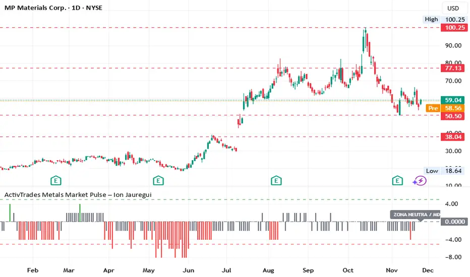
ActivTrades Metals Market Pulse – Ion JaureguiThe ActivTrades Metals Market Pulse Indicator is a market analysis tool designed to assess overall risk sentiment in the metals market. Rather than generating trade signals, it provides a snapshot of the prevailing environment, helping traders and analysts understand whether conditions favor risk-taking or caution.
How it Works:
The indicator combines two key metal market metrics:
Metals Performance:
Compares the performance of industrial metals with precious metals relative to their 50-day moving averages.
Stronger industrial metal performance indicates higher market risk tolerance (Risk-On), while stronger precious metal performance suggests increased risk aversion (Risk-Off).
Trend Momentum:
Uses a Bloomberg-style scoring system based on the relative position of each metal to its 50-day SMA.
Scores range visually from -5 to +5 to indicate overall market sentiment.
Risk Sentiment Index:
Each metal contributes to the total score, creating an index that oscillates between Risk-On (high risk appetite) and Risk-Off (heightened caution), with a neutral zone for mixed conditions.
Visual Output:
Results are displayed as a colored histogram for easy interpretation of metals market sentiment.
Labeled zones include:
Extreme Risk-On: Industrial metals strongly outperform precious metals.
Extreme Risk-Off: Precious metals strongly outperform industrial metals.
Neutral Zone / Mixed: No clear dominance; the market is balanced or sideways.
Purpose and Use:
Helps traders, analysts, and investors gauge prevailing risk appetite in the metals market.
Provides context for strategic positioning and risk management without offering direct trade recommendations.
*******************************************************************************************
The information provided does not constitute investment research. The material has not been prepared in accordance with the legal requirements designed to promote the independence of investment research and such should be considered a marketing communication.
All information has been prepared by ActivTrades ("AT"). The information does not contain a record of AT's prices, or an offer of or solicitation for a transaction in any financial instrument. No representation or warranty is given as to the accuracy or completeness of this information.
Any material provided does not have regard to the specific investment objective and financial situation of any person who may receive it. Past performance and forecasting are not a synonym of a reliable indicator of future performance. AT provides an execution-only service. Consequently, any person acting on the information provided does so at their own risk. Political risk is unpredictable. Central bank actions can vary. Platform tools do not guarantee success.
INDICATORS:
RISK ADVICE: The information and publications are not meant to be, and do not constitute, financial, investment, trading, or other types of advice or recommendations supplied or endorsed by ActivTrades. This script intends to help follow the trend and filter out market noise. This script is meant for the use of international users. This script is not meant for the use of Spain users.
Gold Thai CompassGold Thai Compass Indicator
Calculates Thai Gold Price (96.5%) by converting XAU/USD with the USD/THB exchange rate in real time
Displays the calculated gold_price_thb directly on the chart with a clean right-aligned label for easy price reading
Includes customizable reference lines — add, remove, rename, recolor, and adjust each line independently
Supports multiple editable lines (e.g., 4 levels) with price labels displayed beside each line
Provides user-friendly input settings (e.g., custom price sources, spread/adjustment options)
Updates dynamically with live market data — suitable for trading, analysis, and Thai gold price tracking
Designed for TradingView (Pine Script) and optimized for clarity and usability
Optional visibility controls to show/hide labels and reference lines for a cleaner chart layout
