ATR Support LineOverview
ATR Support Line is a higher-timeframe-aware overlay that builds a single dynamic support line by anchoring a smoothed price baseline and offsetting it with an Average True Range (ATR) multiple. It is designed to track constructive trends while adapting to current volatility. The tool can render using higher-timeframe (HTF) data with optional closed-bar confirmation to avoid repainting, or live interpolation for more responsive visuals.
Core logic (concepts, not implementation)
• Compute an anchor from price using a selectable moving-average family (SMA / EMA / ZLEMA).
• Measure volatility using ATR and apply a configurable multiplier.
• Form the support line by offsetting the anchor downward by the ATR multiple.
• Timeframe handling: either use the chart timeframe or request an explicit HTF for calculation.
• Rendering modes:
– Closed-bar mode : interpolate inside the previous HTF bar for non-repainting behavior.
– Live mode : interpolate inside the current HTF bar for more timely responsiveness (can visually “breathe” intrabar).
Inputs
• Anchor smoothing: MA type (SMA / EMA / ZLEMA) and anchor length.
• Volatility: ATR length and multiplier.
• Timeframe: optional calculation timeframe (HTF) distinct from the chart timeframe.
• Confirmation: toggle to use closed HTF values (non-repainting) vs. live interpolation.
How to read it
• Price holding above the ATR Support Line indicates constructive conditions; orderly pullbacks toward the line can be normal trend behavior.
• Persistent closes above the line indicate strength; reactions into the line often resolve higher in constructive regimes.
• Persistent closes below the line warn of deterioration; consider reducing risk until price reclaims the level.
• On HTF rendering with closed-bar confirmation, use closes on that HTF for signal confirmation.
• In live mode, treat intrabar pierces as potential noise until confirmed by the close.
Practical use cases
• Trend context: define a trailing “line in the sand” for long-bias frameworks.
• Risk framing: size down or tighten exposure when price loses the support line.
• Confluence: combine with structure (HH/HL vs. LH/LL), volume, or market-wide risk gauges.
• Multi-TF workflow: calculate on HTF for bias, execute on lower TFs for entries/exits.
Best practices
• Align confirmations with the timeframe used for calculation (especially in closed-bar mode).
• Pair with clear invalidation rules (e.g., daily/weekly closes below the line).
• Start with conservative multipliers on noisier assets; adjust ATR length/multiplier to match instrument volatility.
Technical notes
• Non-repainting option : closed-bar HTF mode finalizes values on HTF close; lower-TF plotting uses interpolation only for continuity (no look-ahead).
• Live option : interpolates within the current HTF bar for responsiveness; expect intrabar breathing.
• Works on any time-based chart; results are most interpretable on liquid instruments.
Who it is for
• Traders who want a single, disciplined, volatility-adjusted support line with HTF awareness.
• Systematic users who prefer clear, reproducible rules for trend context and risk boundaries.
Limitations & disclosures
• Closed-source; for educational and analytical use only.
• Not financial advice. Markets involve risk; past performance does not guarantee future results.
Release notes
• Added selectable anchor MA (SMA / EMA / ZLEMA) and explicit HTF calculation with two rendering modes (closed-bar non-repainting vs. live).
• Interpolation refined for smooth visuals while respecting HTF closes in confirmation mode.
Originality & why closed-source
This is not a reimplementation of public open-source scripts. The integration of anchor smoothing choices, volatility offset, HTF calculation, and dual rendering modes (closed-bar non-repainting vs. live interpolation) is designed to maintain trend fidelity with practical control over responsiveness. The interaction of these components is proprietary and the source is closed to protect the implementation.
Integration, not a mashup
ATR Support Line is a single, self-contained framework. It does not merely merge indicators; its components are purpose-built to produce one coherent, volatility-aware, single-line support with a clear reading protocol (hold above = constructive; loss = caution).
Indicator, not a strategy
This publication is an indicator overlay, not a trading strategy. It includes no backtests, position logic, performance claims, or risk assumptions. Use it as analytical context within your own risk management.
Comparison to common tools
Compared to static moving-average baselines or classic volatility bands, ATR Support Line emphasizes (1) a single actionable support level, (2) explicit volatility adjustment via ATR, and (3) HTF-aware rendering with an optional non-repainting confirmation mode.
支撐和阻力

Axel AltsOverview
Axel Alts is a higher-timeframe-aware overlay that forms a two-line support band for altcoins using a sticky, threshold-and-step progression. It draws an Upper Support (mid) and a Lower Support (low) derived from evolving local lows, with smoothed transitions and an optional halving-cycle bear-window background.
The goal is disciplined context: identify controlled pullbacks into support in constructive regimes and avoid emotional chasing. All core settings are fixed for consistent behavior across symbols.
Core logic (concepts, not implementation)
• Two baseline levels are computed as fractional distances from the current base and then smoothed.
• A sticky mechanism advances each line toward its target only when deviation is material, and in capped steps. This reduces whipsaw and preserves structure.
• Visual easing smooths transitions so curves remain stable and readable.
• Rendering accounts for higher-timeframe structure and uses interpolation on lower timeframes for visual continuity; values do not look ahead and finalize on higher-timeframe closes.
• An optional bear-window background is derived from halving dates to flag a more cautious phase between the late part of one cycle and the run-up to the next.
Inputs
• Parameters are locked (lengths, fractions, sticky thresholds/steps, easing radii, bear-window bounds). No user-tweakable inputs—this prevents overfitting and improves repeatability.
How to read it
• The zone between Upper Support and Lower Support is the preferred “controlled pullback” area in constructive regimes.
• Persistent closes above Upper Support indicate strength; orderly reactions into the band can be constructive.
• Sustained closes below Lower Support warn of deterioration; be cautious with aggressive longs until recovery.
• The bear-window background suggests a more conservative stance on risk and size.
• Confirmations are best taken on daily/weekly closes; short-term pokes through the band are often noise.
Practical use cases
• Altcoin rotation: prioritize names holding the band; de-prioritize those persisting below it.
• Dollar-Cost Averaging (DCA) context: scale within the band during favorable regimes.
• Risk framing: tighten or reduce exposure on breaks below Lower Support or during the bear window.
• Confluence: combine with volume/volatility tools and market-wide risk gauges.
Best practices
• Rely on daily/weekly closes for confirmation.
• Pair with market structure (HH/HL vs. LH/LL) and higher-timeframe support/resistance.
• Consider broader cycle context (e.g., halving windows) before scaling risk.
Technical notes
• Non-repainting: values finalize on the close of the higher timeframe used by each calculation.
• Interpolation on lower timeframes is for continuity only; it is not forward-looking.
• Bear-window boundaries are fixed and derived from publicly known Bitcoin halving dates.
• The fill between lines is fixed in the current configuration.
Who it is for
• Traders who want a fixed-rules, repeatable context for alt pullbacks and trend health.
• Systematic users who prefer deterministic, non-tunable overlays for portfolio discipline.
Limitations & disclosures
• Closed-source; for educational and analytical use only.
• Not financial advice. Markets involve risk; past performance does not guarantee future results.
Release notes
• Includes sticky progression for both support lines with eased transitions.
• Improved visual continuity on lower timeframes while respecting higher-timeframe structure.
• Added halving-based bear-window highlighting (bounds are fixed).
Originality & why closed-source
This is not a reimplementation of public open-source scripts. Axel Alts integrates (1) sticky threshold-and-step progression, (2) dual support lines built from fractional levels off evolving lows with separate smoothing, (3) visual easing for stability, and (4) a halving-based bear window. The interaction of thresholds/steps, smoothing, and the regime window is proprietary and tuned to retain structure while limiting lag. The source is closed to protect this implementation.
Integration, not a mashup
Axel Alts is a single, self-contained framework. It does not merely merge indicators; its components are designed to work together to form a unified support band with a clear reading protocol (hold within the band, caution below, close-based confirmations, optional bear-window context).
Indicator, not a strategy
This publication is an indicator overlay, not a trading strategy. It includes no backtests, position logic, performance claims, or risk assumptions. Use it as analytical context within your own risk management.
Comparison to common tools
Compared to standard moving-average channels or volatility bands, Axel Alts emphasizes (1) structure retention via sticky thresholds/steps, (2) smoother visuals through eased transitions, and (3) explicit cycle context via the halving-based bear window.

5-min Strat Strategy V2 (With Stop Loss)README: 5-min Strat Strategy V2 – $7,500 Stop Loss Version
✅ Description
This is a rules-based intraday trading strategy developed for use on futures contracts like MNQ (Micro Nasdaq) or MES (Micro S&P). It focuses on momentum-based breakout entries above pre-market highs, during regular trading hours, and uses EMAs to define trend alignment.
⚙️ Strategy Components
✅ Trade Type
Long-Only strategy
Entry and exit based on EMAs, price position, and time windows
✅ Time Frame
Built for 5-minute charts
✅ Symbols
Optimized for MNQ (Micro Nasdaq Futures)
Works on MES or other U.S. index futures with similar structure
📅 Time Windows
Pre-Market Hours (PMH/PML): 04:00 – 09:30 AM EST
Regular Trading Hours (RTH): 09:30 AM – 4:00 PM EST
Auto Exit Time: 4:59 PM EST (to comply with prop firm rules)
📌 Entry Conditions (Long)
48 EMA > 200 EMA (Bullish alignment)
Price > Locked Pre-Market High
Green Candle (close > open)
During RTH (9:30–16:00 EST)
Cooldown: Must wait 4 candles after last entry
Max Trades per Day: 3
💥 Exit Conditions
Primary Exit: Close below the 48 EMA
Max Loss Exit: Stop loss set to $7,500 per trade
EOD Exit: All positions are closed at 4:59 PM EST
💰 Risk Management
Contracts: 6 Micro contracts per trade
Stop Loss: Dynamic point-based SL calculated based on:
MNQ point value = $20/point per contract
30 contracts = $120/point
Max SL points = $7,500 / $120 = 62.5 points
📊 Key Variables for Logging
Parameter Value
Max Stop Loss $7,500
Position Size 30 Micro Contracts - ***Varies depending on account size***
Cooldown Bars 4 (20 min)
Max Daily Trades 3
Strategy Version V2 – $7.5K SL

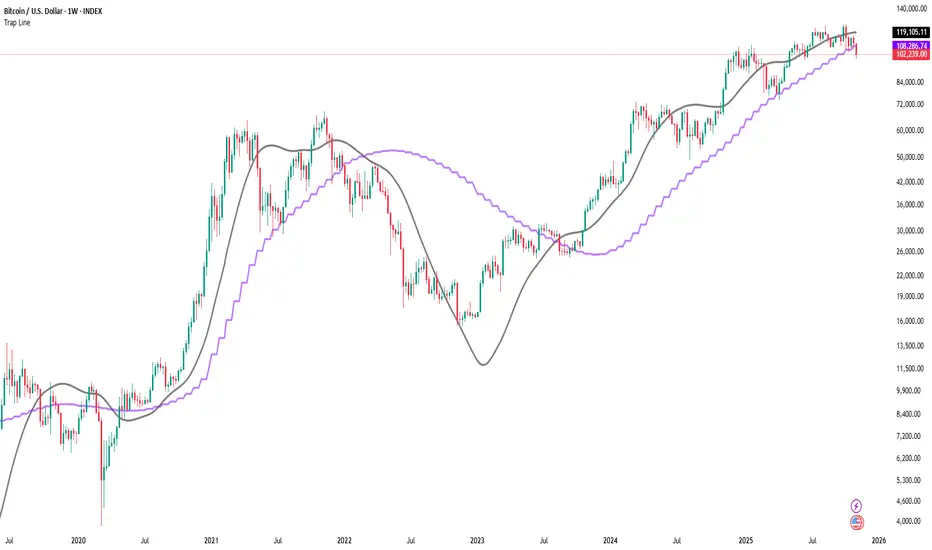
Trap LineOverview
Trap Line is a higher-timeframe trend framework designed to define market regimes using smoothed weekly (1W) and three-week (3W) baselines. Price trading above the line reflects a bullish regime; price below the line reflects a bearish one. The goal is regime discipline—stay aligned with the dominant higher-timeframe direction and avoid late, emotional entries. All parameters are fixed to ensure consistent behavior across symbols.
Core logic (concepts, not full code)
• Computes a Hull-type moving average on 1W and 3W closes (with optional linear-regression pre-filtering) and projects them onto lower timeframes via interpolation.
• Produces a smooth, lag-reduced structural baseline that tracks the weekly trend path.
• Observing price vs. the baseline highlights potential trap zones—temporary breaches that often fail without a confirmed weekly close.
• The 3-Week Trap Line adds a macro confirmation layer and is hidden by default in the Style tab to keep charts clean.
Inputs
• Parameters (length, smoothing type, regression toggle, interpolation mode) are fixed to prevent overfitting and preserve repeatability.
How to read it
• Above the line => bullish regime.
• Below the line => bearish regime.
• A confirmed weekly close through the line suggests a regime transition.
• A weekly close above the line with a green candle supports bullish continuation; a weekly close below the line with a red candle supports bearish continuation.
• Intraweek deviations near the line are often noise and may fade.
Practical use cases
• Weekly bias filter for swing/position frameworks.
• Regime confirmation across related assets or sectors.
• Portfolio overlay: favor long exposure in bullish regimes; reduce risk in bearish regimes.
• Combine with volume or ATR-based tools to assess trend quality.
Best practices
• Wait for the weekly close before declaring regime flips.
• Avoid overreacting to intraweek moves around the baseline.
• Combine with structure analysis (HH/HL vs. LH/LL) and higher-timeframe S/R.
• Use standard time-based candles; avoid interpreting signals on Heikin Ashi, Renko, Kagi, Point & Figure, or Range charts.
Technical notes
• Built on locked higher-timeframe data (1W and 3W).
• Interpolation is used to render HTF structure smoothly on lower charts.
• Non-repainting : values finalize when the higher timeframe closes; lower-TF plotting is interpolated, not forward-looking.
Who it is for
• Traders who want a consistent, rules-based higher-timeframe bias filter.
• Systematic users who prefer fixed-parameter baselines for regime context.
Limitations & disclosures
• Closed-source; educational and analytical use only.
• Not financial advice. Markets involve risk; past performance does not guarantee future results.
Release notes
• Includes the 3-Week Trap Line (3W). It is hidden by default in the Style tab; enable it if you want an additional macro confirmation layer.
• Fixed-parameter design (no user-tweakable inputs) for consistent behavior across symbols.
• Non-repainting values finalize on 1W/3W candle close.
Originality & why closed-source
This is not a reimplementation of public open-source scripts. Trap Line uses a specific combination of higher-timeframe Hull smoothing, optional linear-regression pre-filtering, and lower-timeframe interpolation designed to expose trap zones (temporary regime breaches that often fail without a confirmed weekly close). The integration and thresholds are proprietary and tuned to retain weekly structure with reduced lag. The source is closed to protect this implementation.
Integration, not a mashup
Trap Line is a single, self-contained framework. It does not merely merge other indicators; its components are integrated to produce a unified higher-timeframe baseline (1W/3W) with a defined reading protocol (above/below line, weekly-close confirmation, optional candle-color confirmation).
Indicator, not a strategy
This publication provides an indicator overlay , not a trading strategy. It includes no backtests, position logic, performance claims, or risk assumptions. Use it as an analytical bias filter within your own risk management.
Comparison to common tools
Compared to standard MAs or SuperTrend-style bands, Trap Line prioritizes (1) higher-timeframe structure fidelity, (2) reduced lag via HMA-type smoothing, and (3) explicit weekly-close confirmation to avoid premature regime flips. The optional 3-Week line acts as a macro confirmation layer and is hidden by default in the Style tab.
The 5-min StratOverview
The 5-min Strat Indicator V1 is a precision tool designed for intraday futures trading on instruments such as MNQ, MES, and other U.S. equity index futures. It marks out critical levels from Pre-Market and Regular Trading Hours (RTH) to support breakout, reversal, and trend-following strategies.
This indicator includes:
Previous Day High (PDH) and Low (PDL) from RTH session only (9:30 AM to 4:00 PM EST)
Pre-Market High (PMH) and Low (PML) from 4:00 AM to 9:30 AM EST
48 EMA and 200 EMA
Clean, right-aligned labels for each key level
⏱️ Intended Timeframe
✅ 5-minute timeframe ONLY
❌ Not designed for 1-min, 15-min, or higher timeframes
Built using 5-min data to precisely define Pre-Market and RTH levels
🌐 Markets
Futures contracts like:
MNQ (Micro Nasdaq)
MES (Micro S&P)
NQ, ES (standard contracts)
Can be adapted for stocks or ETFs, but built around futures session logic
📌 Key Sessions
Pre-Market Session: 04:00 AM to 09:30 AM EST
PMH/PML captured in real time
Locked after 09:30 AM
Regular Trading Hours (RTH): 09:30 AM to 4:00 PM EST
PDH/PDL captured only from this time window
Locks at end of day and displays the next session
🚨 Non-Negotiables / Must-Know Constraints
Feature Constraint
Timeframe Must be used on 5-minute charts
Timezone All sessions are based on EST (New York)
Symbol Type Built and tested for futures like MNQ/MES
Pre-Market Lock PMH/PML are only locked after 9:30 AM EST
RTH Data PDH/PDL ignore overnight sessions — only 9:30–16:00
Labels Automatically reset each day and appear on the price axis
🎯 Usage Tips
Combine with price action at these levels for breakouts or fades
Use the EMAs for directional bias
Great for layering onto automated strategy logic (strategy version available)

Auto Fib Retracement-custom lines📈 Auto Fib Retracement (with Custom Line Thickness)
This indicator provides an automatic application of Fibonacci Retracement and Extension levels based on key Pivot points on the chart. It uses advanced logic to identify relevant momentum based on user-defined parameters, ensuring dynamic and accurate level drawing without the need for manual measurement.
Key Features of the Indicator ✨
Automatic Drawing: Fibonacci levels are automatically drawn based on the last significant Pivot swing detected by the indicator.
Fibonacci Retracement and Extension: Displays classic retracement levels (such as 0.382, 0.5, 0.618) and extensions (such as 1.272, 1.618, 2.618, etc.), with the option to individually toggle the visibility of each level.
Custom Line Width (New Feature): This is the key added functionality! For every Fibonacci level, an option has been included to individually adjust the line thickness (width). This allows traders to visually highlight (bold) critical support/resistance levels (like 0, 0.618, 1, etc.) to make them more noticeable on the chart.
Pivot Customization: Control the sensitivity of Pivot detection using the "Deviation" and "Depth" parameters.
Line Extension: Options to extend the Fibonacci lines to the left, right, or both sides.
Detail Display: Ability to show/hide Fibonacci values (levels) and prices on the labels.
⚙️ Input Parameters
This indicator offers complete control over how the Fibonacci levels are displayed:
Deviation: A multiplier that affects how much the price must deviate from the previous pivot for a new pivot to be formed. Increasing the value makes the indicator less sensitive; decreasing it makes it more sensitive.
Depth: The minimum number of bars considered when calculating the pivots.
Reverse: Option to reverse the drawing direction (from top to bottom or vice-versa).
Extend Left/Right: Controls the extension of the Fibonacci lines.
Level Settings (0, 0.236, 0.382, 0.5, 0.618, etc.):
Checkbox: Turn the display of each individual Fibonacci level on or off.
Value: Customize the Fibonacci value (e.g., you can change 0.618 to 0.65).
Color: Adjust the line color.
Line Width: Crucial option! Allows you to set the line thickness from 1 to 5. Use this to emphasize the most important levels.
Background Transparency: Adjust the transparency of the background fill between the Fibonacci levels.
How to Use It 💡
This tool is ideal for traders who use Fibonacci Retracement to determine potential areas of support and resistance, profit targets (extensions), and entry zones. Use the Custom Line Width option to visually set apart the key levels you believe have the most significant impact on the market (e.g., 0, 0.5, 0.618, and 1).

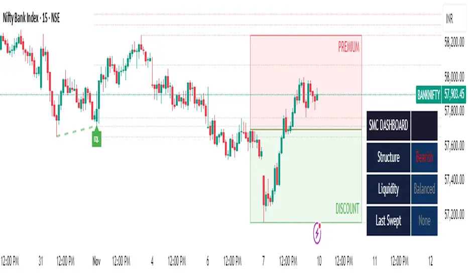
SMC Clean: Structure + LiquidityThis indicator provides Smart Money Concepts (SMC) tools designed to help traders analyze market structure, liquidity pools, and institutional trading zones. It combines several popular SMC methods into one powerful, customizable tool, with a clean and controlled chart display.
Features and How it Works:
Swing Highs and Lows: The indicator identifies confirmed swing highs and swing lows using a lookback period (default: 15 bars). These points form the basis for market structure analysis.
Equal Highs/Equal Lows (EQH/EQL): When price action creates repeated swing highs or lows within a defined tolerance, the tool automatically marks these areas as potential liquidity pools. These are levels where multiple stop orders may accumulate, sometimes leading to significant market moves.
Liquidity Lines & Sweeps: Liquidity lines highlight unswept highs and lows, making it easy to see where price may hunt liquidity. When price crosses a swing high/low and closes back, a sweep label is shown (optional).
BOS/CHOCH Detection:
Break of Structure (BOS): Signals a continuation of the current trend if price closes beyond the previous swing point.
Change of Character (CHOCH): Highlights when price reverses and breaks a key swing from the opposite direction, hinting at a potential trend change or shift in market regime.
Only confirmed swing points are considered to avoid repainting.
Premium & Discount Zones Explained:
After a new confirmed swing high and swing low, the area between them forms a “range.”
The premium zone is the upper half (from midpoint to swing high): this is typically considered where price is “expensive” or overvalued for the current swing, and is often watched for potential sell setups.
The discount zone is the lower half (from swing low to midpoint): this is where price is “cheap” or undervalued for the current swing, commonly monitored for potential buy setups.
Colored boxes mark these zones on your chart for instant reference.
Dashboard (Movable Position):
A visually enhanced dark-themed dashboard shows the current market structure (Bullish/Bearish), liquidity bias (Buy-Side, Sell-Side, or Balanced, based on unswept levels), and last swept side (i.e., which liquidity pool was last taken by price).
Dashboard position can be set anywhere on your chart for best visibility.
Customization Options:
Enable/disable any feature individually for a cleaner chart.
Control colors, transparency, and swing sensitivity via user settings.
How to Use:
Add the indicator to your chart and adjust settings to fit your trading style.
Use swing lines and dashboard to determine current market structure and bias.
Watch equal highs/lows and liquidity lines for possible sweep events.
Use the premium/discount zones to locate optimal areas for trade entries—with institutional logic, buy when price reaches the discount (lower) zone, and look for sales in the premium (upper) zone.
Use BOS/CHOCH signals as objective confirmations of trend or regime changes. Always interpret signals in context of broader price action.
Important Notes:
This indicator is educational and analytical—NO signals are guaranteed.
All calculations are non-repainting and use only confirmed price data (no lookahead).
No claims of predicting future price movement or performance are made.
Disclaimer:
This tool is for technical analysis education only. It is not a financial advice nor a guaranteed trading system. Please test all signals and concepts before using in live markets.
RBD Market ProfileA Market Profile visually shows how much time (or how many bars) price spent at each price level within a session — helping identify areas of “fair value” (where price spent most time) and extremes (where price barely traded).
It divides each trading session (for example, a day, week, or month depending on input) into price segments, counts how many bars closed within each segment, and then identifies:
POC (Point of Control): price level with the highest frequency (most traded or visited).
VAH (Value Area High): upper boundary of the zone that contains 70% (or user-defined percentage) of all activity around the POC.
VAL (Value Area Low): lower boundary of that same 70% activity zone.
Finally, it plots lines for:
VAH (green line)
VAL (red line)
POC Upper & Lower (white lines)
Session Open (blue dashed line)
How to use this Market Profile:
Determine Key Areas of Support/Resistance by the VAH and VAL
VAH: Responsive Sellers and Initiative Buyers
VAL: Responsive Buyers and Initiative Sellers
POC: Can be used as Fair Value

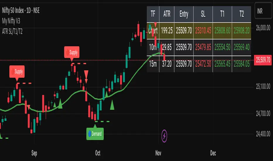
ATR-Based Volatility SL/Target Planner (MTF Table)✅ ATR SL & Target Planner (MTF Table – Chart, 10m, 15m)
This indicator provides a clean multi-timeframe ATR table showing:
✅ ATR (Chart / 10m / 15m)
✅ Entry price (manual or auto)
✅ ATR-based Stop-Loss
✅ Target 1 & Target 2
✅ MTF level comparison
✅ High-contrast color-coded SL (Red) + Targets (Green)
✅ Selected timeframe highlighted automatically
Designed for intraday traders, positional traders, and volatility-based strategies.
✅ How to Use It
✅ 1. Choose Entry Mode
Manual Entry ON → Type your entry price
Manual Entry OFF → Last candle close is used
The script calculates ATR(14) on:
Current chart timeframe
10-minute timeframe
15-minute timeframe
Then it uses standard volatility-based formulas:
Stop-Loss = Entry ± (ATR × SL Multiplier)
Target 1 = Entry ± (ATR × T1 Multiplier)
Target 2 = Entry ± (ATR × T2 Multiplier)
Direction depends on Long/Short mode.
You can switch which ATR timeframe becomes active (affecting plotted lines + alerts).
✅ Why This Indicator Is Useful
This script solves 3 common problems:
✅ 1. “How wide should my stop-loss be?”
ATR automatically adjusts the SL to market volatility.
✅ 2. “Which timeframe ATR should I trust?”
You can compare Chart, 10m, and 15m in one panel.
✅ 3. “The table is too big in other indicators.”
This is compact, clean, color-coded, and readable.
Happy Trading :)
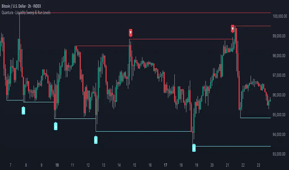
Quantura - Liquidity Sweep & Run LevelsIntroduction
“Quantura – Liquidity Sweep & Run Levels” is a structural price-action indicator designed to automatically detect swing-based liquidity zones and visualize potential sweep and run events. It helps traders identify areas where liquidity has likely been taken (sweep) or released (run), improving precision in market structure analysis and timing of entries or exits.
Originality & Value
This tool translates institutional liquidity concepts into an automated visual framework. Instead of simply marking highs and lows, it dynamically monitors swing points, tracks their breaches, and identifies subsequent reactions. The indicator is built to highlight the liquidity dynamics that often precede reversals or continuations.
Its originality lies in:
Automatic identification and tracking of swing highs and lows.
Real-time detection of broken levels and liquidity sweeps.
Distinction between “Run” and “Sweep” modes for different market behaviors.
Persistent historical visualization of liquidity levels using clean line structures.
Configurable signal markers for bullish and bearish sweep confirmations.
Functionality & Core Logic
Detects swing highs and lows using a user-defined Swing Length parameter.
Stores and updates all swing levels dynamically with arrays for efficient memory handling.
Draws horizontal lines from each detected swing point to visualize potential liquidity zones.
Monitors when price breaks a swing level and marks that event as “broken.”
Generates signals when the market either sweeps above/below or runs away from those levels, depending on the chosen mode.
Provides optional visual signal markers (“▲” for bullish sweeps, “▼” for bearish sweeps).
Parameters & Customization
Mode: Choose between “Sweep” (detects liquidity grabs) or “Run” (detects breakout continuations).
Swing Length: Sets the sensitivity for detecting swing highs/lows. A higher value focuses on larger structures, while smaller values detect micro liquidity points.
Bullish Color / Bearish Color: Customize color themes for sweep/run lines and signal markers.
Signals: Enables or disables visual up/down markers for confirmed events.
Visualization & Display
Horizontal lines represent potential liquidity levels (unbroken swing highs/lows).
Once broken, lines automatically stop extending, marking the moment liquidity is taken.
Depending on the selected mode:
“Sweep” mode identifies false breaks or stop-hunt behavior.
“Run” mode highlights breakouts that continue the trend.
Colored arrows indicate the direction and type of liquidity reaction.
Clean, non-intrusive visualization suitable for overlaying on price charts.
Use Cases
Detect liquidity sweeps before major reversals.
Identify breakout continuations after liquidity runs.
Combine with Supply/Demand or FVG indicators for multi-layered confirmation.
Validate liquidity bias in algorithmic or discretionary strategies.
Analyze market manipulation patterns and institutional stop-hunting behavior.
Limitations & Recommendations
This indicator identifies structural behavior but does not guarantee trade direction or profitability.
Works best on liquid markets with clear swing structures (e.g., crypto, forex, indices).
Signal interpretation should be combined with confluence tools such as volume, order flow, or structure-based filters.
Excessively small swing settings may cause over-signaling in volatile markets.
Markets & Timeframes
Optimized for all major asset classes — including crypto, Forex, indices, and equities — and for intraday to higher-timeframe structural analysis (5-minute up to daily charts).
Author & Access
Developed 100% by Quantura. Published as a Open-source script indicator. Access is free.
Compliance Note
This description fully complies with TradingView’s Script Publishing Rules and House Rules . It avoids performance claims, provides transparency on methodology, and clearly describes indicator behavior and limitations.
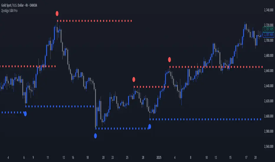
ZynAlgo S&R ProZynAlgo S&R Pro identifies confirmed swing highs and swing lows, marks them on the chart, and draws single horizontal liquidity lines that extend from each confirmed swing until the next swing of the same type occurs. The tool can optionally recolor candles based on whether the current close is above or below the previous close. It also exposes alert conditions for new swing points and for when price reaches the most recent buy-side or sell-side liquidity line.
Important: This is a visual analysis tool. It does not open, manage, or close positions. It is provided for educational and informational purposes only.
How it works (under the hood)
Swing detection (confirmed):
The script uses ta.pivothigh/ta.pivotlow with symmetric left/right bars defined by Left bar & Right bar. A swing is considered only after the bar is confirmed.
Swing markers:
When enabled, confirmed swing highs/lows are marked with small circles above/below bars. The offset equals the left/right length to align with the confirmed pivot location.
Liquidity lines:
On each swing high, the script ends (anchors) the previous buy-side line at the pivot’s bar, then creates a new dotted/dashed/solid horizontal line at that swing price and extends it forward.
On each swing low, it does the same for sell-side lines.
Between swing events, the most recent buy-side and sell-side lines continue extending to the current bar.
Alerts:
Swing High / Swing Low Created — fires on confirmation of a new swing.
Buy Side Liquidity Raid — when price crosses over the most recent swing-high line.
Sell Side Liquidity Raid — when price crosses under the most recent swing-low line.
Optional candle coloring:
If enabled, candles can be recolored by comparing current close to the previous close, with independent toggles for body, borders, and wicks.
Inputs & recommended tooltips (copy-friendly)
Swing High/Low Setting
Left bar & Right bar (len_l)
Tooltip: “Bars to the left/right required to confirm a pivot. Larger values = fewer but stronger swing points (default: 20).”
Show Swing High Swing Low (flg_shsl)
Tooltip: “Plot small circles at confirmed swing highs (red) and swing lows (blue).”
(Note: i_labelcolor_price is present but unused in visible drawings—safe to ignore or reserve for future use.)
Liquidity Pools Settings
Show Liquidity Pools (flg_lq)
Tooltip: “Draw a horizontal line at each confirmed swing. The line extends forward until the next swing of the same type appears.”
Line Width (i_width)
Tooltip: “Thickness of liquidity lines (1–6).”
Line Style (i_linestyle)
Tooltip: “Choose solid, dashed, or dotted style for liquidity lines.”
Buy Side Liquidity Color (i_linecolor_bs)
Tooltip: “Color for swing-high liquidity lines (default: red).”
Sell Side Liquidity Color (i_linecolor_ss)
Tooltip: “Color for swing-low liquidity lines (default: blue).”
Candles
Color bars based on previous close (use_prev_close)
Tooltip: “If enabled, candle colors are based on whether close > previous close (Up) or not (Down).”
Up Color / Down Color
Tooltip: “Colors used for up vs. down determination.”
Body / Borders / Wick (apply toggles)
Tooltip: “Choose which candle parts to recolor.”
Alerts available (names as shown in the Create Alert dialog)
Swing High
Triggers when a new swing high is confirmed. Select this condition to be notified about newly formed swing highs.
Swing Low
Triggers when a new swing low is confirmed.
Buy Side Liquidity Raid
Triggers when price crosses above the most recent swing-high liquidity line (crossover(high, LSH)).
Sell Side Liquidity Raid
Triggers when price crosses below the most recent swing-low liquidity line (crossunder(low, LSL)).
Quick start (suggested workflow)
Add to chart: Apply ZynAlgo S&R Pro to your symbol and timeframe.
Choose sensitivity: Adjust Left bar & Right bar. Higher values focus on more significant swing points; lower values react faster.
Toggle visuals:
Enable Show Swing High Swing Low to see swing markers.
Enable Show Liquidity Pools to draw/extend liquidity lines. Pick the line style, width, and colors you prefer.
(Optional) Candle colors: Turn on Color bars based on previous close and choose which parts to color.
Set alerts:
Open Create Alert → Condition: ZynAlgo S&R Pro → choose Swing High, Swing Low, Buy Side Liquidity Raid, or Sell Side Liquidity Raid as needed.
Practical notes & limitations
Confirmed swings only: Pivots are plotted after confirmation (i.e., once the required left/right bars are complete). This avoids repainting the pivot location.
One active line per side: Only the most recent buy-side and sell-side liquidity lines extend to the right; prior lines are ended when a new swing of the same side appears.
Timeframes & instruments: Parameter sensitivity can vary across markets/timeframes. Consider tuning Left bar & Right bar to match volatility.
No orders are placed: This indicator does not execute trades or manage positions.
Compliance & fair-use guidance
No performance promises: This tool does not guarantee profitable results and should not be described as “signals,” “guaranteed,” “best,” or similar claims. It is an analysis aid that visualizes historical swing points, liquidity levels, and optional candle coloring.
Educational intent: Use it to support your chart review and alerting workflow; combine with your own judgment and risk controls.
Alerts are informational: Alerts reflect the conditions described above and do not constitute financial advice.
Change log (summary of core features)
Swing detection with configurable left/right bars; optional swing markers.
Auto-extending buy-side/sell-side liquidity lines with customizable style/width/colors.
Four alert conditions (new swing highs/lows and liquidity raids).
Optional candle recoloring with separate toggles for body/borders/wicks.
Dynamic Line Management
Unlike static support/resistance tools, ZynAlgo S&R Pro automatically manages the lifecycle of each liquidity line — removing outdated levels the moment new structure forms.
This ensures the chart always reflects the most relevant active zones.
Structure + Liquidity Integration
By combining price structure (swing points) with liquidity visualization, it bridges the gap between classic S&R and modern liquidity-based interpretation — a fusion rarely found in lightweight indicators.
Noise-Free Design
The script plots only the most essential elements: confirmed swings, active liquidity lines, and optional candle color context.
It avoids overlapping labels, text clutter, or unnecessary metrics — ideal for traders who prefer clarity and precision.
Non-Repainting Logic
All pivots are confirmed only after the required right-side bars are closed, ensuring all swing points and lines remain fixed once plotted.
This gives confidence in backtesting and visual analysis without misleading signals.
Lightweight & Efficient
Despite tracking multiple dynamic lines, the algorithm is optimized for performance (using arrays and efficient bar updates), making it suitable for both high- and low-timeframe analysis.
Adaptable Across Market Types
Equally applicable to forex, crypto, indices, and commodities, the algorithm’s sensitivity parameter lets users adjust to volatility differences between instruments.
Purely Analytical
The tool does not provide trade signals or predictions.
Its design supports price-action interpretation, liquidity mapping, and structure confirmation — helping traders read context rather than react to noise.
🔶 RISK DISCLAIMER
Trading is risky & most day traders lose money. All content, tools, scripts, articles, & education provided by ZynAlgo are purely for informational & educational purposes only. Past performance does not guarantee future results.
Smart Liquidity & OTE Analysis Tool # Smart Liquidity & OTE Analysis Tool
## OVERVIEW
This indicator is designed for traders who utilize institutional trading concepts, specifically liquidity sweeps and optimal trade entry (OTE) zones, combined with session-based market structure analysis. It identifies potential market manipulation points where stop losses are likely clustered, and highlights high-probability entry zones based on Fibonacci retracements.
The tool combines four main analytical components that work synergistically to identify trading opportunities aligned with smart money behavior.
---
## CORE CONCEPTS & METHODOLOGY
### 1. TRADING SESSIONS ANALYSIS
**What it does:**
The indicator tracks three major forex trading sessions with customizable time zones:
- **Asian Session** (Default: 01:00-13:00 UTC+4) - Typically characterized by range-bound price action
- **London Session** (Default: 11:00-20:00 UTC+4) - High volatility period with increased institutional activity
- **New York Session** (Default: 17:00-00:00 UTC+4) - Overlaps with London creating peak liquidity
**How it works:**
- Automatically highlights active sessions with colored background boxes
- Draws session high/low lines which often act as intraday support/resistance
- Identifies session overlaps (e.g., London-NY overlap) where volatility and liquidity are highest
- Color-codes the price bars during overlaps to alert traders to increased opportunity periods
- Displays real-time session status (🟢 Open / 🔴 Closed) for quick reference
**Trading Application:**
Session highs and lows frequently become liquidity targets. The indicator helps traders anticipate when price might sweep these levels before continuing in the original direction. Session overlaps are prime times for major moves as multiple institutional players are active simultaneously.
---
### 2. EXTERNAL LIQUIDITY SWEEPS
**What it does:**
Identifies when price "sweeps" or breaks beyond significant swing highs and lows where stop losses are typically clustered. These sweeps often precede reversals or continuations after liquidity is collected.
**How it works:**
- Scans the previous 20 bars (configurable) to identify swing high and low points
- Marks these levels as "buyside liquidity" (above highs) or "sellside liquidity" (below lows)
- Monitors price action using three detection methods:
* **Wick Break:** Any candle wick extending beyond the liquidity level
* **Close Break:** Candle body closing beyond the level (stronger confirmation)
* **Full Retrace:** Price breaks the level then closes back inside the range (classic liquidity grab)
- Uses an ATR-based buffer to avoid false signals from minor price spikes
- Confirms sweeps only after a configurable number of confirmation bars to reduce repainting
**The Logic Behind It:**
Institutional traders need liquidity to fill large orders. Stop losses clustered above swing highs and below swing lows provide this liquidity. When these levels are swept, it often indicates smart money is entering positions in the opposite direction, causing reversals.
**Visual Representation:**
- Blue horizontal lines mark buyside liquidity zones (above price)
- Gray horizontal lines mark sellside liquidity zones (below price)
- Labels indicate when liquidity has been swept (✓) or remains active
- Historical zones are maintained for context (configurable display limit)
---
### 3. INTERNAL LIQUIDITY DETECTION
**What it does:**
Identifies equal highs (EQH) and equal lows (EQL) within recent price action - levels that have been tested multiple times without breaking. These represent internal liquidity pools that price often revisits before making larger moves.
**How it works:**
- Examines the most recent 8 bars (configurable) for price levels that occur multiple times
- Uses an ATR-based threshold (default 0.1% of ATR) to determine if highs or lows are "equal"
- Requires minimum 3 occurrences (configurable) of the same level to qualify as internal liquidity
- Tracks both the creation and sweeping of these internal levels
- Differentiates between wick breaks and close breaks for sweep confirmation
**The Concept:**
Unlike external liquidity at swing points, internal liquidity represents recent stop clusters and pending orders within the current price structure. Identifying these levels helps traders anticipate short-term price targets and potential reversal points before larger directional moves.
**Why This Matters:**
Price often needs to clear internal liquidity before making sustained moves to external liquidity levels. This creates a "roadmap" of where price is likely to go in sequence, improving trade timing.
**Visual Representation:**
- Cyan lines mark internal buyside liquidity (equal highs)
- Orange lines mark internal sellside liquidity (equal lows)
- Dashed or solid lines based on user preference
- Labels show when internal levels are swept
---
### 4. OPTIMAL TRADE ENTRY (OTE) ZONES
**What it does:**
Calculates and displays Fibonacci retracement zones (0.618-0.786) from recent swing points, representing "discount" or "premium" areas where institutional traders often enter positions after a liquidity sweep or structure break.
**How it works:**
- Identifies swing highs and lows using a 10-bar lookback period (configurable)
- Calculates three key Fibonacci levels:
* **0.618** - The "golden ratio" retracement (most significant)
* **0.705** - Mid-point between 0.618 and 0.786
* **0.786** - Deep retracement level (square root of 0.618)
- Optionally requires a structure break before displaying OTE zones
- Dynamically extends zones as new price action develops
- Tracks whether price has entered the zone (✅) or exited without filling (❌)
- Displays up to 2 most recent zones (configurable) to avoid chart clutter
**The Methodology:**
OTE zones represent areas where price is at a "discount" (for longs) or "premium" (for shorts) relative to the recent swing. After a liquidity sweep or structure break, institutional traders often wait for retracements into these zones before entering, as it offers better risk-to-reward ratios.
**Combining with Liquidity:**
The most powerful setups occur when:
1. External liquidity is swept
2. Price retraces into an OTE zone
3. Internal liquidity is present as a target
This confluence suggests smart money activity and high-probability trade opportunities.
**Visual Representation:**
- Shaded blue zone between 0.618 and 0.786 levels
- Three horizontal lines showing key Fibonacci levels with different colors/styles
- Labels (🎯) indicate bullish or bearish OTE zones
- Entry (✅) and exit (❌) status for each zone
---
## WHY THESE FEATURES WORK TOGETHER
This indicator combines these four components because they represent different stages of institutional trading behavior:
1. **Session Timing** - Identifies WHEN institutional activity is highest
2. **Liquidity Sweeps** - Shows WHERE smart money is collecting liquidity
3. **OTE Zones** - Highlights WHERE institutional entries likely occur after sweeps
4. **Internal Liquidity** - Provides SHORT-TERM targets for profit-taking or add-ons
Rather than using each concept in isolation, this integration creates a complete market structure framework. For example:
- A buyside liquidity sweep during London open →
- Followed by a retrace into a bullish OTE zone →
- With internal sellside liquidity as the initial target
This sequence represents a complete high-probability trade setup aligned with smart money principles.
---
## ANTI-REPAINTING FEATURES
**The Repainting Problem:**
Many indicators that identify patterns on historical data repaint their signals when live trading, showing signals that weren't actually there in real-time. This creates a false sense of accuracy.
**Our Solution:**
- **Confirmation Bars Setting:** Signals only appear after X bars have confirmed the pattern (default: 2 bars)
- **Marked Confirmation:** Labels show "C" when using confirmed signals
- **Trade-off:** More confirmation = less repainting but slightly delayed signals
- **User Control:** Traders can toggle between real-time signals (faster but may repaint) and confirmed signals (delayed but reliable)
---
## KEY CUSTOMIZATION OPTIONS
### Master Controls
- Toggle each major feature on/off independently
- Combine only the features relevant to your trading style
### Display Settings
- Adjust lookback periods for each component
- Control number of historical zones displayed
- Customize colors, line styles, and transparency
- Show/hide labels and session names
- Configure text sizes for different screen setups
### Detection Sensitivity
- **Sweep Detection:** Choose between wick breaks, close breaks, or full retraces
- **ATR Buffer:** Add distance requirements to confirm sweeps (reduces false signals)
- **Equal Level Threshold:** Adjust how close levels must be to qualify as "equal"
- **Confirmation Bars:** Balance between signal speed and reliability
### Alert System
- Session open/close notifications
- Liquidity sweep alerts
- OTE zone entry alerts
- Configurable alert frequency and types
---
## HOW TO USE THIS INDICATOR
### Basic Setup
1. Add the indicator to your chart (works on all timeframes, though 5M-1H recommended for intraday)
2. Enable the features you want to use via Master Controls
3. Adjust colors and transparency to match your chart preferences
4. Configure alert preferences if using notifications
### Trading Workflow
**Step 1: Identify the Session**
- Determine which trading session is active or approaching
- Note session highs/lows as potential liquidity targets
- Be especially alert during session overlaps
**Step 2: Watch for Liquidity Sweeps**
- Monitor external liquidity lines (swing highs/lows)
- When price sweeps liquidity, anticipate a potential reversal
- Stronger sweeps (close breaks + full retraces) are more significant
**Step 3: Wait for OTE Retracement**
- After a sweep, wait for price to retrace into the OTE zone (0.618-0.786)
- Bullish OTE after sellside sweep = potential long
- Bearish OTE after buyside sweep = potential short
**Step 4: Use Internal Liquidity as Targets**
- Look for internal liquidity in the direction of your trade
- These serve as initial profit targets
- External liquidity serves as extended targets
**Step 5: Manage Confirmation Settings**
- For live trading, use confirmed signals (2+ confirmation bars)
- For backtesting or analysis, you may use real-time signals
- Note that confirmed signals appear with "C" marking
### Example Trade Scenarios
**Bullish Setup:**
1. London session opens (increased volume)
2. Price sweeps sellside liquidity below Asian low
3. Price retraces into bullish OTE zone (0.618-0.786 of the sweep move)
4. Target internal buyside liquidity, then external buyside liquidity
**Bearish Setup:**
1. NY session overlap with London (peak liquidity)
2. Price sweeps buyside liquidity above recent high
3. Price retraces into bearish OTE zone
4. Target internal sellside liquidity, then session lows
---
## BEST PRACTICES
### What This Indicator Does Well
✓ Identifies high-probability institutional trading zones
✓ Provides clear visual roadmap of likely price targets
✓ Reduces chart clutter with configurable history limits
✓ Works across multiple timeframes and instruments
✓ Minimizes repainting with confirmation settings
### What This Indicator Doesn't Do
✗ Does not provide entry/exit arrows (intentional - requires trader discretion)
✗ Does not guarantee winning trades (no indicator does)
✗ Does not work in isolation (combine with price action/market context)
✗ Does not replace risk management (always use stop losses)
### Recommended Complementary Analysis
- Price action patterns (engulfing candles, pinbars at OTE zones)
- Volume profile or footprint charts for order flow confirmation
- Higher timeframe trend context (don't fade strong trends)
- Economic calendar awareness (avoid major news events)
---
## TECHNICAL NOTES
### Performance Optimization
- Uses max_bars_back limitation to reduce memory usage
- Automatic cleanup of old zones to prevent slowdown
- Efficient array management with configurable display limits
- Suitable for both intraday and swing trading timeframes
### Timeframe Recommendations
- **1-5 Minute:** Scalping with tight internal liquidity targets
- **15-30 Minute:** Intraday trading with session-based setups
- **1-4 Hour:** Swing trading with multi-session analysis
- **Daily:** Position trading using weekly liquidity levels
### Instrument Compatibility
Works on all liquid instruments:
- Forex pairs (optimal due to clear sessions)
- Stock index futures (ES, NQ, etc.)
- Cryptocurrency (24/7 markets - use custom session times)
- Individual stocks (less pronounced session effects)
---
## EDUCATIONAL RESOURCES
To better understand the concepts used in this indicator:
**Liquidity Concepts:**
- Study institutional order flow and stop loss hunting
- Learn about market microstructure and liquidity provision
- Understand the difference between retail and institutional trading
**Fibonacci/OTE:**
- Research Fibonacci retracements in trending markets
- Study the mathematical significance of the golden ratio (0.618)
- Practice identifying retracement entries on historical charts
**Session Trading:**
- Analyze volume profiles during different forex sessions
- Study typical price behavior during session overlaps
- Understand timezone conversions for your local trading hours
---
## VERSION HISTORY & UPDATES
This script represents a complete integration of multiple smart money concepts into a single, cohesive tool. Future updates will be published using the Update feature rather than creating separate scripts for minor variations.
---
## DISCLAIMER
This indicator is for educational and informational purposes only. It does not constitute financial advice or trading recommendations. All trading involves risk, and past performance does not guarantee future results. Always practice proper risk management and never risk more than you can afford to lose.
The concepts presented here (liquidity sweeps, OTE zones, session analysis) are widely discussed trading theories. This indicator is an interpretation and visualization of these concepts, not a guarantee of their effectiveness.
---
## SETTINGS SUMMARY
**Master Controls:** Enable/disable each major feature independently
**Repainting Controls:** Adjust confirmation requirements for signals
**Trading Sessions:** Customize session times, colors, and display options
**External Liquidity:** Configure detection sensitivity and visual styling
**Internal Liquidity:** Adjust lookback periods and threshold sensitivity
**OTE Zones:** Select which Fibonacci levels to display and entry requirements
**Alerts:** Configure notifications for sessions, sweeps, and entries
---
## SUPPORT & FEEDBACK
If you find this indicator helpful, please leave a like and comment with your feedback. For questions about specific settings or concepts, refer to the tooltips in the indicator settings panel - each parameter includes a detailed explanation.
Remember: The best indicator is the one you understand and can apply consistently within your trading plan. Take time to practice with this tool on demo accounts before risking real capital.

Volumemetrix Variance StrategyThe “Volumemetrix Variance Strategy” is an advanced Pine Script strategy designed to identify trade entries and exits using a combination of volume profile analysis, candle structure, and volatility filters. It constructs a dynamic volume profile over a specified lookback period to identify critical price levels such as the Point of Control (PoC), Value Area High (VAH), and Value Area Low (VAL). These levels represent zones of high trading activity that often act as support and resistance. The script smooths and adjusts these levels across different timeframes to align short-term market structure with higher-timeframe trends. It incorporates a variety of filters to exclude doji candles, detect continuation or rejection patterns, and confirm alignment with higher timeframe candle direction (e.g., 4-hour bullish or bearish bias).
Trade logic is built around detecting crossovers and breakouts relative to the PoC and value areas. The system can trigger entries based on several configurable behaviors: breakout, retake, bounce, reversal, or rejection near key volume zones. It supports flexible entry conditions for long, short, or both sides of the market, as well as a range of customizable settings for time-based trading restrictions, end-of-day position closures, and alert-based data capture. For execution, the script includes integrated risk management—users can specify take-profit and stop-loss levels, enable moving (trailing) stops, and even apply a “power curve” model to dynamically adjust trailing stops using exponential decay logic that adapts to price progress.
Overall, the Volumemetrix Variance Strategy is a hybrid between a quantitative volume-based strategy and a volatility-adaptive trade manager. It combines fixed range volume profiling with multi-timeframe confirmation, candle pattern validation, and adaptive exit logic. Its architecture allows for detailed trade automation, alert generation for external systems, and real-time control over parameters such as ATR scaling, entry delay, or bar confirmation. The result is a high-granularity framework for both backtesting and live execution that seeks to capture statistically favorable setups around liquidity concentration zones.

dO / wO / mO + MA 50/200 + PrevDay H/L Description
This indicator plots key reference levels used by professional traders:
Daily Open (dO)
Weekly Open (wO)
Monthly Open (mO)
Previous Day High (pdH) and Previous Day Low (pdL)
Moving Averages: 50 & 200 SMA
Each level is drawn as a clean dotted white line with a fixed label directly on the price chart.
All levels can be individually toggled on or off via checkboxes in the settings panel.
The pdH/pdL lines start exactly from the candles that created them, providing clear structure for breakout, retracement, and liquidity analysis.
The 50/200 SMA are included for long-term trend context.
This tool is designed for traders who rely on multi-timeframe structure and precision levels for both intraday and swing strategies.
Features
Toggle visibility for dO, wO, mO, pdH, and pdL
Accurate placement of previous day levels
Lightweight and responsive
Clean minimal visual design
Supports any symbol and timeframe
Usage Notes
Perfect for confluence-based trading:
Combine pdH/pdL with session opens to identify key liquidity zones
Use SMA 50/200 for directional bias
Works on crypto, forex, indices, and equities

Breakout Boxes [ChartPrime]⯁ OVERVIEW
The Breakout Boxes indicator identifies key structural levels by detecting and aligning two consecutive pivots — forming confirmation zones where potential breakouts are most likely to occur. Once two pivots align within a defined ATR range, the indicator constructs a Breakout Box around that area, tracking volume distribution and breakout strength. When price breaks above or below these boxes, breakout labels (⯁ BreakUp / BreakDn) are displayed to confirm trend continuation.
⯁ KEY FEATURES
Pivot-Based Detection: Uses a customizable pivot length to identify market swing highs and lows.
Two-Pivot Alignment Logic: A breakout box is only created when two pivot highs or lows form near the same level, confirming structural alignment and increasing breakout reliability.
Dynamic Box Generation: Builds upper and lower boxes once pivot alignment is confirmed, adapting automatically to new structures.
Volume Distribution Analysis: Each box measures total traded volume and separates it into bullish and bearish components, showing buy/sell percentages inside the range.
The volume data is calculated in real time as long as the box remains active and unbroken, allowing traders to monitor live accumulation or distribution before a breakout occurs.
Breakout Confirmation Signals: Labels appear when price decisively breaks above the upper box (⯁ BreakUp) or below the lower one (⯁ BreakDn).
Adaptive ATR Scaling: Box size dynamically adjusts to volatility, maintaining consistent proportions across assets and timeframes.
Color-Coded Visualization: Upper (bearish) boxes use pink tones; lower (bullish) boxes use green, both with transparent fill for volume clarity.
Automatic Box Resetting: Previous boxes close when a new pivot pair forms, ensuring only the most relevant structure is active.
⯁ USAGE
Watch for Two Pivot Alignments — the indicator only activates when structural confluence exists, reducing false breakout signals.
Upper Boxes represent resistance formed by two aligned swing highs; a breakout above indicates potential bullish continuation.
Lower Boxes represent support formed by two aligned swing lows; a breakdown below indicates bearish continuation.
Analyze the Volume Ratio inside each box — higher buy volume in upper boxes supports bullish breakouts, while higher sell volume in lower boxes supports bearish moves.
Use this tool alongside trend indicators or higher timeframe context to confirm the direction of breakouts.
⯁ CONCLUSION
The Breakout Boxes indicator refines breakout analysis by requiring two aligned pivots to validate structural zones. By combining pivot confluence with volume distribution and adaptive ATR scaling, it provides a precise, data-backed visualization of breakout strength and direction — a powerful tool for structure-based trading confirmation.

ScalpMaster – Breaker BlocksIdeal for scalpers📈and intraday traders who rely on breaker-block reactions and market-structure shifts to refine entries and exits.
Add it to your chart, enable alerts for Signal UP and Signal DN, and combine with your own bias or higher-timeframe analysis.
✅ Automatic breaker-block detection (+BB / –BB)
✅ Real-time signal UP / signal DN
✅ Market-structure swing and PD Array visualization
✅ Optional take-profit targets (R:R zones)
✅ Alert conditions for every signal event
✅ Works on any timeframe & asset

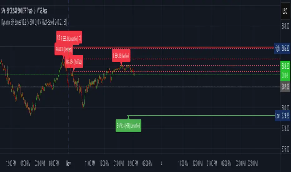
Dynamic S/R Zones (Verified Pivots)Dynamic S/R Zones V1.2
Overview
Dynamic S/R Zones V1.2 is a Pine v6 structure visualizer that highlights nearby Support/Resistance zones from confirmed swing pivots on the current chart and an optional higher timeframe (HTF). It can also plot simple Fibonacci guide levels (33% / 50% / 66%) between the most recent swing points. All HTF requests use lookahead_off to avoid forward-looking data, and S/R anchors are derived from verified pivots to minimize repainting. Optional “touch-verified” coloring flips a level’s display once price trades through it.
This tool is an illustrative S/R map for chart review and education.
How it works
Verified Pivots (Non-Repainting):
• Minor S/R uses ta.pivothigh/ta.pivotlow with a symmetric lookback (“Pivot Strength”).
• Lines anchor only on confirmed pivots, so once drawn they remain stable.
• A de-dup buffer filters out levels that are too close together.
HTF Major Zones:
• HTF OHLC is requested via request.security(..., lookahead=barmerge.lookahead_off).
• The same pivot logic runs on the HTF series; lines appear after the HTF bar closes.
• Major lines can be shown alongside (or instead of) minor lines.
Touch-Verified Coloring (optional):
• When a level is touched (high ≥ level ≥ low), it flips from neutral to a side color:
– Support (price above) ≈ green; Resistance (price below) ≈ red.
• The verification state is persistent for that line.
Fibonacci Guides (optional):
• Draws 33% / 50% / 66% between the last opposing swing high/low.
• Verification/coloring modes:
Pivot-Based: uses the most recent swing direction.
HTF Trend-Based: uses a fast/slow EMA comparison on a user-selected HTF.
Bounce/Reject Mode: color on touch regardless of trend interpretation.
• One arrow per bar (optional) indicates a newly verified fib touch.
What it displays
• Minor S/R lines from current-TF verified pivots (non-repainting anchors).
• Major S/R lines from HTF pivots (confirmed on HTF close).
• Optional labels that state level type, price, HTF tag, and Verified/Unverified status.
• Optional Fibonacci guide lines with labels, plus single-arrow confirmations.
• Coloring that reflects touch verification and current side (support/resistance).
Why it’s original
• Focuses on confirmed structure (minor + HTF) with de-duplication for clarity.
• Offers hybrid fib verification (pivot-based, HTF-trend-based, or bounce/reject) to let users study structure from multiple perspectives without asserting signals.
• Maintains persistent verification per level and avoids lookahead on HTF for stable, review-friendly visuals.
• Provides a compact workflow for scanning: minor structure, HTF context, then fib context.
Configuration & usage notes
• Pivot Strength: Higher values = stricter confirmation (fewer lines, more stable).
• Lookback Range: Prunes older lines; increase for broader context.
• HTF for Major S/R: Daily/4H/Weekly etc.; lines confirm on that timeframe’s close.
• Min Distance Between Levels: Helps reduce clutter from nearby duplicates.
• Touch-Verified Coloring: Enable for quick support/resistance side cues.
• Fibs: Choose coloring mode (Pivot-Based, HTF Trend-Based, or Bounce/Reject).
• HTF Trend TF / EMAs: Only affect coloring when using HTF trend mode for fibs.
• Performance: Labels and line counts can be tuned down on very long histories.
Limitations & assumptions
• Pivot detection depends on chart timeframe, liquidity, and chosen pivot length.
• HTF lines update after the HTF bar closes (by design, to avoid lookahead).
• Optional Realtime pivots for fibs (if enabled) are provisional and can shift until a swing verifies.
• Coloring and arrows are descriptive—they do not imply entries, exits, or probabilities.
Legal Disclaimer
These tools visualize calculations on historical data for charting and educational use only. They are not signals, recommendations, or promises of future results. Markets involve risk, and past results do not guarantee future outcomes. Provided “as is,” without warranties. Consider consulting a qualified professional before making decisions.
R Dominant Range [CRT] by Sergi SernaR Dominant Range identifies the most influential R range located to the left of the current price action. It highlights the dominant zone that still impacts market behavior, helping traders understand which range is controlling the current structure.

xontrades1uae Iiquidity Money | by Bu-Rashid
This indicator detects potential institutional exit points and reversal zones using a powerful confluence model combining:
Volume spike analysis (institutional activity)
CVD trend flips (smart money flow reversal)
Price–CVD divergence (hidden accumulation/distribution)
Liquidity sweep detection (stop-run exhaustion)
When these elements align, the indicator highlights possible Exit Flow zones, signaling where smart capital may be closing or reversing positions.
It’s optimized for XAU/USD (Gold) and NAS100 (Nasdaq) on 5-minute and 15-minute charts, with customizable strictness for traders who prefer early or confirmed signals.
Recommended use:
Apply as a confirmation layer alongside your main strategy to identify exhaustion points and institutional exits before trend reversals.
— Developed and engineered by Bu-Rashid (XonTrades1UAE)

LucciThis indicator identifies trade setups based on session liquidity levels and price structure analysis during New York trading sessions.
Unlike basic support/resistance indicators, this system tracks untested session extremes and monitors their interaction with price. It combines break-and-retest mechanics with bounce detection at key liquidity zones, providing multiple entry methodologies within a single framework.
METHODOLOGY:
The system maps high/low points from each trading session (Asia: 6PM-3AM, London: 3AM-8AM, NY: 8AM-5PM EST) and monitors price behavior around these levels. It identifies two primary setup types: momentum continuation after level breaks and reversal bounces at untested extremes. Visual differentiation shows which levels remain untested (darker) versus swept levels (lighter).
SETUP IDENTIFICATION:
Break & Retest Signals:
- Detects breaks of NY Open range (15-minute candle at 8:00 AM EST)
- Waits minimum bars after break before validating retest
- Triggers when price returns to level within tolerance zone
Bounce Signals:
- Identifies approaches to untested session highs/lows
- Optional wick confirmation for reversal validation
- Signals when price rejects from liquidity zone
CONFIGURATION OPTIONS:
Entry Parameters:
- Min Bars After Break: 1-10 (delay before retest valid)
- Retest Tolerance: 0.1-10 points (precision of level test)
- Bounce Zone: 0.5-5 points (distance from level)
- Wick Confirmation: On/off reversal filter
Risk Management:
- Risk Reward Options: 1:3, 1:5, or Custom (1:1 to 1:10)
- Stop Loss: Configurable in points
- Max Daily Signals: 1-5 trade limiter
- Trading Hours: Customizable active window
Visual Elements:
- Session Levels: Orange (Asian), Yellow (London), Blue (NY)
- Signal Markers: Triangles (B&R), Diamonds (Bounce)
- TP/SL Lines: Automatic calculation and display
- Info Table: Shows bias, untested levels, daily signals
OPTIMAL USAGE:
Trading Windows:
- 9:30-11:00 AM EST: Primary trading window
- First touch of untested levels: Highest probability
- 15-minute timeframe: Recommended for futures
- Volume filter: Optional quality enhancement
Signal Prioritization:
- Untested levels provide stronger reactions
- Multiple confirmations increase probability
- Respect market structure and session context
- Combine with volume for filtering
TECHNICAL SPECIFICATIONS:
- Multi-timeframe: Uses 15-minute data for NY Open
- Session-based: Resets levels at session transitions
- Alert system: Detailed messages with levels
- Position tracking: Manages active trades visually
IMPORTANT NOTES:
This tool maps liquidity zones based on session extremes and price structure. No trading system guarantees profits. Combine with market context and proper risk management. Designed for active intraday trading on liquid instruments.
The indicator provides objective level identification while requiring trader discretion for optimal results.

RSI Multi-Timeframe S/R - MehtaMulti-Timeframe Dynamic Support & Resistance Indicator
This tool automatically detects key support and resistance levels across multiple timeframes — including 1-Day, 15-Minute, and 5-Minute charts — using a refined momentum-based algorithm with trend and volume confirmation.
It’s designed to help traders quickly identify confluence zones where intraday and higher-timeframe structures align, improving timing and risk management.
Key Features
Detects dynamic support and resistance zones with a built-in strength filter.
Uses multi-timeframe confirmation to reduce false levels.
Integrates volume-based reliability checks.
Automatically updates only the latest active levels to keep charts clean.
Includes a touch counter panel that tracks how often price interacts with each level (a proxy for zone strength).
Color & Structure Guide
🟩 Support Zones: Indicate potential accumulation areas.
🔴 Resistance Zones: Indicate potential supply or reaction areas.
Solid lines = Higher timeframe (stronger zones)
Dotted lines = Lower timeframe (shorter-term zones)
Best Use
Combine with your price-action or volume analysis to confirm reactions.
Particularly useful in spotting multi-timeframe overlaps — where the strongest reactions tend to occur.
Touch Counter: A handy table on the chart tracks how many times the price has tested each level, helping you gauge its strength.
Combine with Your Strategy: This indicator works best when combined with your existing price action analysis, candlestick patterns, or other confirmation indicators.
STRONG DISCLAIMER & RISK WARNING
PLEASE READ THIS CAREFULLY BEFORE USING THE INDICATOR.
No Financial Advice: This indicator is a technical analysis tool for educational and informational purposes only. It is NOT financial, investment, or trading advice. The creator of this script is not a registered financial advisor.
Not a Guarantee: Past performance is not indicative of future results. The signals and levels generated by this indicator are based on historical data and mathematical formulas and are not a guarantee of future price movement. There is a high risk of loss in trading.
Use at Your Own Risk: You are solely responsible for any trading decisions you make and the resulting profits or losses. Always conduct your own due diligence and consult with a qualified financial professional before engaging in any trade.
Backtest First: It is highly recommended to backtest this indicator and understand its behavior in different market conditions (trending, ranging, volatile) before using it with real capital.
Lagging Nature: Like most technical indicators, this tool is lagging. It reflects past and current market data, which may not accurately predict future price action.
By using this indicator, you acknowledge that you understand and accept these risks entirely.
Feel free to leave feedback, report bugs, or suggest improvements in the comments below!
Happy Trading!

Malama's Heat MapOverview
Malama's Heat Map is an overlay indicator that visualizes historical liquidity as a dynamic heatmap aligned with the price chart, using volume as a proxy to map activity across time (X-axis) and price levels (Y-axis). It constructs a grid of up to 5000 cells via a matrix, distributing bar volume into discrete price bins to highlight concentration zones, creating a color-graded visualization from cool (low activity) to hot (high liquidity). This aids in identifying "Type II" fair value areas, support/resistance from past volume clusters, or potential imbalances without order book access. Built for v6 compatibility with efficiency in mind—computations run solely on the last bar, includes object limit enforcement, and offers two intra-bar volume distribution methods for flexible approximation.
Core Mechanics
The indicator generates a trailing heatmap through binning, accumulation, and box-based rendering:
Grid Setup: Configurable lookback (bars back, default 100) sets horizontal time span; bins (price divisions, default 50) define vertical resolution, limited to 5000 total cells to prevent errors. Bin height dynamically = max(mintick, (lookback high - low) / bins).
Y-Axis Stabilization: Anchors boundaries to the prior bar's high/low (if available) for a flicker-free view during live bar updates. All historical bar data (high/low/close/volume) is clipped to these bounds.
Volume Distribution Proxy:
Even: Divides bar volume equally across spanned bins (straightforward uniform spread).
POC Weighted (Inverse): Treats bar close as POC proxy; applies inverse distance weighting (1/(|bin - POC bin| + 1), normalized) to emphasize volume near the estimated control point, simulating clustered intra-bar trading.
Matrix Building: On last bar only, loops backward over lookback bars (newest right-aligned). For each, computes low/high bin indices, distributes volume per selected method into the matrix (columns=time, rows=price bins from low to high).
Scaling & Palette: Extracts max matrix value for relative normalization (0-1); maps to a 5-tier stepped color scheme (user-customizable: blue 90% transp. low → red 50% transp. high) for non-linear intensity.
Rendering: Clears old boxes, then iterates matrix to draw only non-zero cells as thin boxes: X spans one bar width (left=historical index from bar_index, right=next bar), Y fills bin height. Borderless for seamless heatmap effect.
The result is a right-leaning, chart-scrolling visualization emphasizing recent liquidity buildup.
Why This Adds Value & Originality
While session-based volume profiles exist, this heatmap captures ongoing multi-bar liquidity evolution ("Type II" style), revealing horizontal value areas or gaps dynamically. Originality shines in the custom inverse-weighting for POC realism (no ta.* dependencies), matrix-driven persistence for quick redraws, and stabilization to eliminate repaints—issues plaguing similar scripts. v6 adaptations (e.g., custom clamp, matrix recreation on input change) ensure broad compatibility without bloat. It condenses complex liquidity scanning into one tool: spot red "hot" bands as magnets, blue voids as FVGs. Unlike generic heatmaps, the proxy options and limit-aware design scale across timeframes/assets (e.g., forex vs. crypto), reducing the need for layered indicators.
How to Use
Setup: Apply as overlay. Defaults suit ~4-day 1H view; tune lookback/bins (e.g., 50x100 for intraday fine-detail, but watch 5000 cap—errors auto-flag excesses). Select "POC Weighted" for nuanced clustering, "Even" for simplicity. Customize palette (e.g., desaturate for dark themes).
Reading the Heatmap:
X-Axis (Time): Left=older (fainter context), right=recent focus; tracks evolving liquidity trails.
Y-Axis (Price): Bottom=range low, top=high; vertical density shows price-level attraction.
Colors: Faint blue (sparse volume, possible inefficiencies) → vivid red (dense activity, likely SR). Horizontal streaks = sustained value zones.
Trading Insights: Price wicking into red? Anticipate fills/reversals. Blue gaps post-break? Targets for retraces. Ideal on 5M–Daily; layer with candlesticks off for purity.
Example: In BTCUSD 4H, a yellow-red band at $60K from prior consolidation → treat as dynamic support for longs on dips.
Tips
Balance settings: High bins = sharper verticals but cap lookback (e.g., 80x60=4800 cells). Test on volatile pairs first.
"POC Weighted" excels in ranging markets; switch to "Even" for trending (avoids close-bias skew).
For deeper analysis, screenshot/export or pair with divergence tools; add manual alerts via box counts if extended.
Efficiency: Last-bar only keeps it snappy; refresh on input tweaks.
Limitations & Disclaimer
Visualization is historical/proxy-based—lagging by one bar, no forward projection or tick-level precision (close-as-POC is estimate). Clipping may trim outlier wicks; low-volume bars dilute globally. Stepped colors are relative (max scales per redraw), potentially compressing extremes. Exceeds 5000 cells? Runtime error halts—no fallback resize. Not real liquidity (volume ≠ depth); best as visual aid, not quantitative. Updates post-close only. Backtest zones on specific symbols—correlation ≠ causation. Not advice; trade responsibly. Ideas in comments!

Multi-timeframe Pivot PointThis indicator is a lightweight indicator designed to display higher timeframe pivot levels on your chart.
It helps traders quickly identify key support and resistance zones derived from higher timeframes (such as daily or weekly pivots) while analyzing lower timeframes (e.g., 15m or 1h charts).
Calculation Logic
This indicator uses the classic pivot point formula, calculated from high, low, and close values:
PP = (High + Low + Close) / 3
R1 = 2 * PP - Low
S1 = 2 * PP - High
R2 = PP + (High - Low)
S2 = PP - (High - Low)
R3 = R1 + (High - Low)
S3 = S1 - (High - Low)
Additionally, it includes breakout levels:
HBOP = PP + PP + (High - Low) - Low
LBOP = PP + PP - (High - Low) - High
