In Pine Script®, scripts cannot place plot() calls directly within if or for statements — or in any other local scopes. The compiler needs to know about all plots during script compilation.
However, scripts can plot values conditionally, by changing the series or color of the plot.
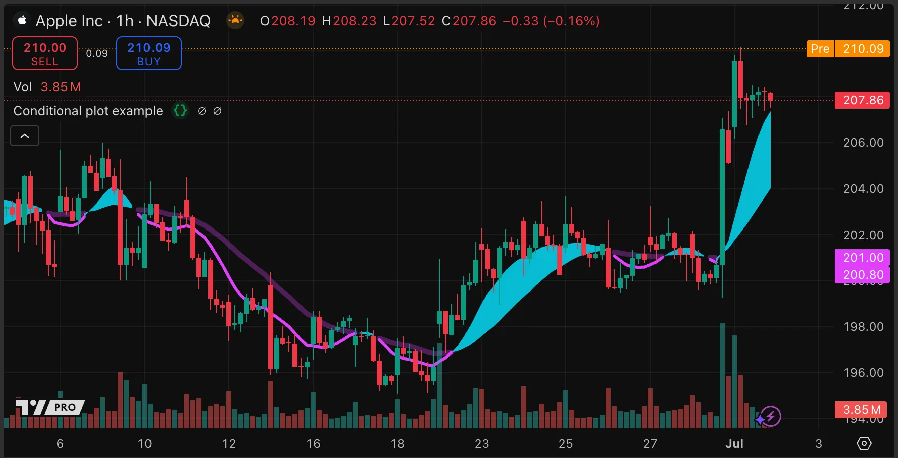
Our example script plots two ALMA moving averages only when the shorter average is below the longer one. It fills between the two averages on every bar, but the fill color is na unless the shorter average is above or equal to the longer one.
//@version=6
indicator("Conditional plot example", "", true)
// Calculate two ALMAs.
float ma1 = ta.alma(close, 21, 0.85, 6)
float ma2 = ta.alma(close, 50, 0.85, 6)
// Calculate whether the MAs are in bullish or bearish order.
var bool areBullCrossed = false
if ma1 > ma2
areBullCrossed := true
else
areBullCrossed := false
// Plot the MAs to the Data Window for use in the fill.
p1 = plot(ma1, "MA 1: Conditional fill", display = display.data_window, editable = false)
p2 = plot(ma2, "MA 2: Conditional fill", display = display.data_window, editable = false)
// Fill the MAs with color only when the MAs are in bullish order.
fill(p1, p2, areBullCrossed ? color.aqua : na)
// Plot the MAs only when they are in bearish order.
plot(not areBullCrossed ? ma1 : na, "MA 1: Conditional plot", color.fuchsia, 3, plot.style_linebr)
plot(not areBullCrossed ? ma2 : na, "MA 2: Conditional plot", color.new(color.fuchsia, 70), 5, plot.style_linebr)
Note that:
The script updates the Boolean variable that describes whether the moving averages are in bullish order — and thereby controls the plots and fill — in a local scope. However, the script declares it in the global scope so that the fill() and plot() calls can use it.
The moving averages are each plotted twice. The plots that display in the Data Window must be assigned to variables so that the fill() function call can reference them. The fill() function cannot use the later plots, which display on the chart, because they have na values when the fill color is not na.
We use plot.style_linebr as the argument for the style parameter of the plot() function so that the plot does not span bars with an na plot value.
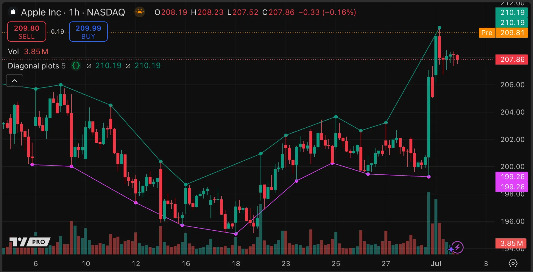
The plot() function connects consecutive data points with straight lines.
The default value of the style argument for the plot() function is plot.style_line. This style of plot connects the plotted points on either side of bars that have na series values to each other with a line. If the points are at different heights, the lines are diagonal.
The functions ta.pivotlow() and ta.pivothigh() return na for all bars except those with identified pivots. The following example script draws diagonal lines joining pivot highs and lows using plot().
//@version=6
indicator("Diagonal plots", overlay = true)
// User input to define the number of bars to look back and forwards to define pivots.
int pivotBarsInput = input.int(5, "Pivot Bars")
// Find the value of pivot lows and highs. The value is `na` if the current bar is not a pivot.
float pivotLow = ta.pivotlow(pivotBarsInput, pivotBarsInput)
float pivotHigh = ta.pivothigh(pivotBarsInput, pivotBarsInput)
// Define the offset for the plot. Negative offset values plot on bars earlier than the current bar.
pivotOffset = -1 * pivotBarsInput
// Join the pivot values with plotted lines.
plot(pivotLow, "Pivot Low", color.fuchsia, offset = pivotOffset)
plot(pivotHigh, "Pivot High", color.teal, offset = pivotOffset)
// Place a circle on each pivot to emphasize the points being connected, offsetting it back to the pivot bar.
plot(pivotLow, "Pivot Low", color.fuchsia, 3, plot.style_circles, offset = pivotOffset)
plot(pivotHigh, "Pivot High", color.teal, 3, plot.style_circles, offset = pivotOffset)
Note that:
The ta.pivotlow() and ta.pivothigh() functions confirm pivot highs and lows only after a specified number of bars, so the script must offset the plotted lines by the same number of bars. Plot offsets cannot change during script execution.
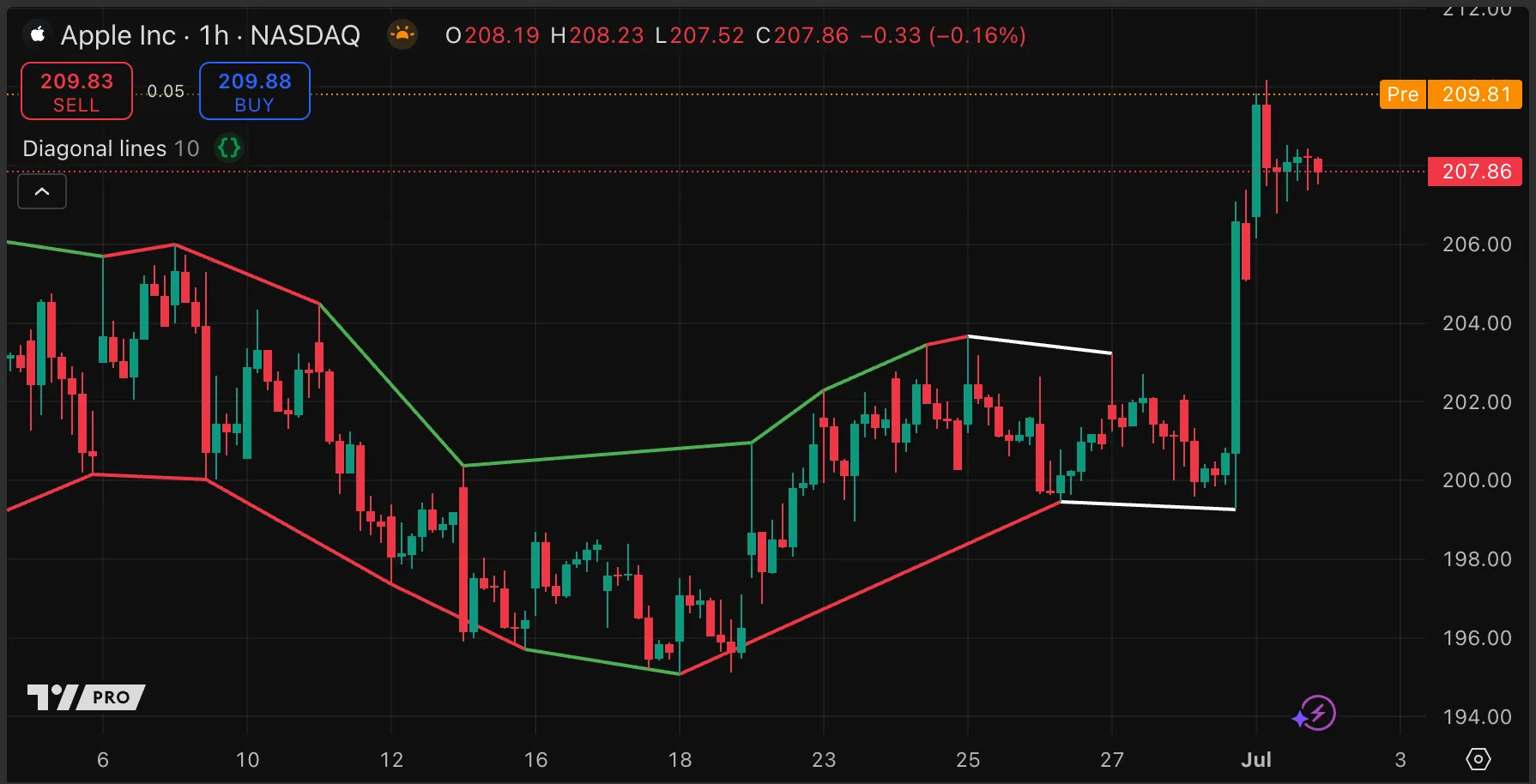
Line objects provide more flexibility than plots. The plot() function can plot a line, symbol, or area only at the bar on which the script is executing (or at a fixed offset from it). In contrast, line objects can be created on any bar. Similarly, whereas plots are fixed once the bar closes, line properties can be updated at any time.
The following example script demonstrates these advantages. Like the example script in the previous section, Using plots, this script draws lines between pivot highs and lows. In this case, however, the pivot highs and lows are confirmed an unpredictable number of bars afterwards, so plots are completely unsuitable for drawing lines between them. Line drawings are suitable because scripts can offset lines an arbitrary and dynamic number of bars into the past. The script below also retroactively changes the color of drawn lines, which are initially white, depending on whether the next line of the same type slopes up or down. Such updates are not possible with plots.
//@version=6
indicator("Diagonal lines", overlay = true, max_lines_count = 500)
int lookbackInput = input.int(defval=10, title="Lookback Bars", minval=1)
enum PivotState // Stores the state of the pivot detection.
none // Start from zero.
hadPivot // Have we found a pivot?
hadCounter // Have we had a down candle for a high or a up candle for a low?
var PivotState highState = PivotState.none, var PivotState lowState = PivotState.none // Create state objects.
updatePivotState(PivotState state, bool foundPivot, bool counterCandle, bool newExtreme, bool isConfirmedPivot) =>
if newExtreme // Start again if we make a new high/low.
PivotState.none
else
switch state // Progress the state when we get the right events.
PivotState.none => foundPivot ? PivotState.hadPivot : state
PivotState.hadPivot => counterCandle ? PivotState.hadCounter : state
PivotState.hadCounter => isConfirmedPivot ? PivotState.none : state
=> state // Default: persist.
// Calculate the events.
float highestHigh = ta.highest(high, lookbackInput)
float lowestLow = ta.lowest( low, lookbackInput)
bool foundHigh = high[1] == highestHigh[1] and high < highestHigh[1]
bool foundLow = low[1] == lowestLow[1] and low > lowestLow[1]
bool newHigh = high >= highestHigh
bool newLow = low <= lowestLow
// Update the state.
bool isConfirmedHigh = highState == PivotState.hadCounter and close > open
bool isConfirmedLow = lowState == PivotState.hadCounter and close < open
highState := updatePivotState(highState, foundHigh, close < open, newHigh, isConfirmedHigh)
lowState := updatePivotState(lowState, foundLow, close > open, newLow, isConfirmedLow)
// Store the price and bar index of the pivots.
var float pivotHighPrice = na, var float pivotLowPrice = na
var int pivotHighBarIndex = na, var int pivotLowBarIndex = na
if foundHigh
pivotHighPrice := high[1]
pivotHighBarIndex := bar_index[1]
if foundLow
pivotLowPrice := low[1]
pivotLowBarIndex := bar_index[1]
// Store the current and previous high and low points.
var chart.point prevHighPivot = na, var chart.point highPivot = na
var chart.point prevLowPivot = na, var chart.point lowPivot = na
var line pivotHighLine = na, var line pivotLowLine = na
// Draw the lines
drawPivotLine(chart.point prevPivot, line prevLine, int barIndex, float price) =>
if not na(prevPivot)
line.set_color(prevLine, price < prevPivot.price ? color.red : color.green)
newLine = line.new(x1=prevPivot.index, y1=prevPivot.price, x2=barIndex, y2=price, color=color.white, width=2)
newLine
if isConfirmedHigh
prevHighPivot := highPivot // Shift current to previous
highPivot := chart.point.from_index(pivotHighBarIndex, pivotHighPrice)
pivotHighLine := drawPivotLine(prevHighPivot, pivotHighLine, pivotHighBarIndex, pivotHighPrice)
if isConfirmedLow
prevLowPivot := lowPivot // Shift current to previous
lowPivot := chart.point.from_index(pivotLowBarIndex, pivotLowPrice)
pivotLowLine := drawPivotLine(prevLowPivot, pivotLowLine, pivotLowBarIndex, pivotLowPrice)
Note that:
This script creates custom pivots using a combination of a lookback similar to that used in Williams Fractals and price confirmation. Potential pivots require a candle in the counter-trend direction followed by a candle in the trend direction in order to confirm. This means that the candle on which pivots confirm cannot be predicted, unlike Williams pivots.
Because the pivot is an arbitrary number of bars back from the confirming candle, we cannot plot circles to highlight the pivots, as we did for the script example in the previous section.
We use an enum to store the state of the pivot confirmation process. This, together with a set of explicit rules for changing the state, forms a simple state machine. Such constructs can be easier to debug than maintaining and resetting multiple persistent global variables that depend on each other.
Scripts can create only a certain number of lines. The limit is set by the max_lines_count parameter of the indicator() or strategy() declaration. The default is 50, and the maximum is 500 per script.
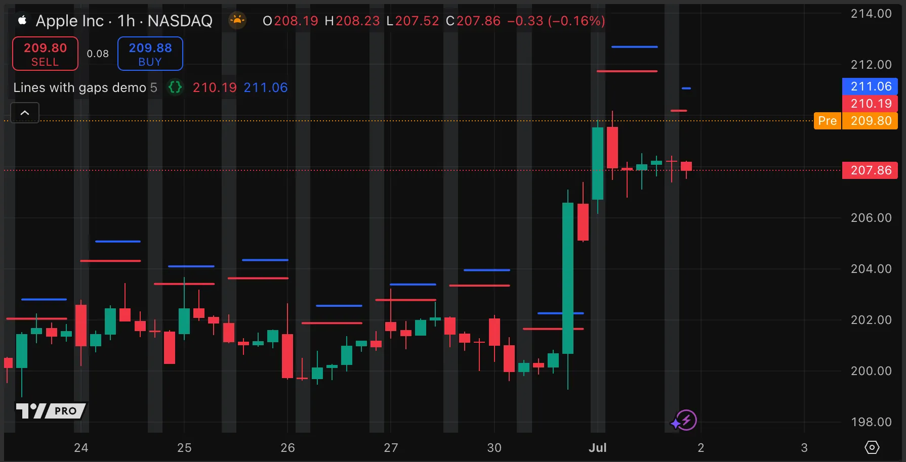
Scripts can plot lines with gaps on specific bars by setting the argument of either the series parameter or color parameter of the plot() function to na for some bars.
Note that this is different to plotting dashed lines using linestyle = plot.linestyle_dashed in the plot() call, which plots a line with gaps at regular intervals that do not correspond to particular bars.
Using na values for the color or series enables scripts to omit a plot on an arbitrary selection of bars. These two methods have different effects:
An nacolor value omits the plotted line from the most recent bar with a non-na value to the first bar with an na value. The size of the gap is equal to the number of consecutive bars with na values.
An naseries value omits the plot point for each bar with an na value, effectively increasing the size of the gap by one bar.
The following example script shows the effect of these two methods. It plots two straight lines above the chart bars, one using each method. At a configurable interval, the series or color argument is na, and the background color changes for that bar.
//@version=6
indicator("Lines with gaps demo", "", true)
var float lowerPlot = na, var float upperPlot = na
bool change = bar_index % input.int(5, minval = 2, title = "Bar interval") == 0
float atr = ta.atr(14)
if change
lowerPlot := high + atr
upperPlot := high + (1.5 * atr)
plot(lowerPlot, "Plot with Varying Color", color = change ? na : color.red, linewidth = 2, style = plot.style_line)
plot(change ? na : upperPlot, "Plot with Varying Series", color = color.blue, linewidth = 2, style = plot.style_linebr)
bgcolor(change ? color.new(color.gray, 80) : na)
Note that:
The style for the plot with naseries values must be plot.style_linebr in order to show gaps. The default value of plot.style_line fills in the gaps.
To plot a line based on start and stop criteria, consider the following structured approach:
Define start and stop conditions.
Control variables for when and where to plot.
Choose a plotting style. Use na for either the series or color parameter of the plot() function. See the section How can I plot a line with gaps? above for examples.
Optionally, use debug. For example, plot logical states using the plotchar() function.
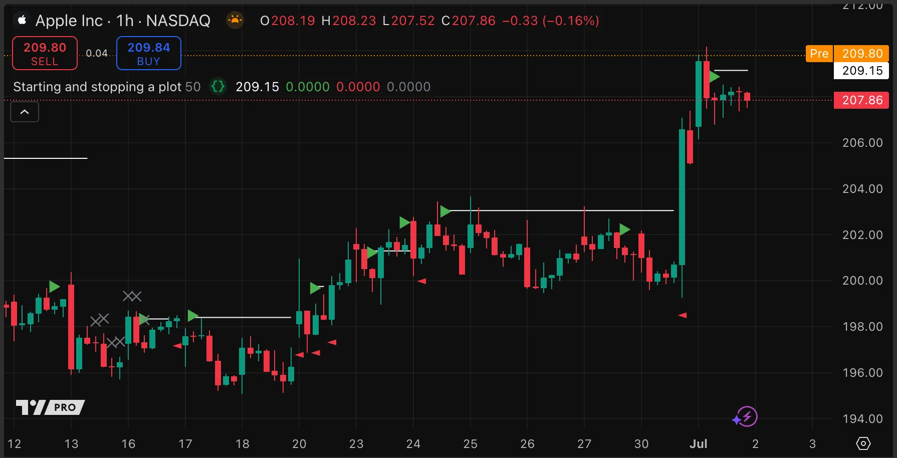
In the following example script, the start condition is the detection of a new pivot. The start condition turns on the doPlot Boolean flag that controls when to plot, and captures the value to plot in the savedValue “float” variable. The stop condition is price closing above the pivot level. The script uses a bar timer as an extra stop condition. Either stop condition turns off the flag and resets the plot value to na. The script plots debug characters for all logical conditions.
//@version=6
indicator("Starting and stopping a plot", overlay = true)
// Set the maximum number of bars for a line.
int expiryBarsInput = input.int(50, "Maximum bars to plot line", minval = 0)
var bool doPlot = false // Whether to plot the line.
var float savedValue = na // The value to plot.
var int timerStart = na // The bar on which the line started.
// Define conditions for the start and end of the line plot.
bool startCondition = not na(ta.pivothigh(close, 5, 2))
bool closeAboveLevel = ta.crossover(close, savedValue)
bool hasExpired = not (bar_index < timerStart + expiryBarsInput)
bool stopCondition = closeAboveLevel or hasExpired
float atr = ta.atr(14)
if startCondition and not doPlot // If this is the start of a *new* plot,
savedValue := high + (atr /2) // set the value to plot,
timerStart := bar_index // and start the timer.
// Start, stop, or persist the state that controls the plot.
doPlot := startCondition ? true : stopCondition ? false : doPlot
// Plot the line if `doPlot` is true.
plot(doPlot ? savedValue : na, "Saved Value", color.white, style = plot.style_linebr)
// Debug: Plot the logical events.
plotchar(startCondition, "startCondition", "►", location.abovebar, color.green, size = size.tiny)
plotchar(closeAboveLevel, "closeAboveLevel", "◄", location.belowbar, color.red, size = size.tiny)
plotchar(hasExpired, "hasExpired", "✕", location.abovebar, color.gray, size = size.tiny)
Note that:
The order in which scripts turn conditions on and off is important when dealing with persistent states, both in terms of the order in the script and within ternary conditions.
Support is a horizontal zone on a chart where analysts consider that a declining price is likely to turn upwards. Conversely, resistance is a horizontal area from which a rising price is likely to turn downwards. Trend lines are usually diagonal lines that function as support or resistance.
Different analysts — and different Pine scripts — understand and implement support, resistance, and trend lines differently. In the sections below, we provide some simple examples.
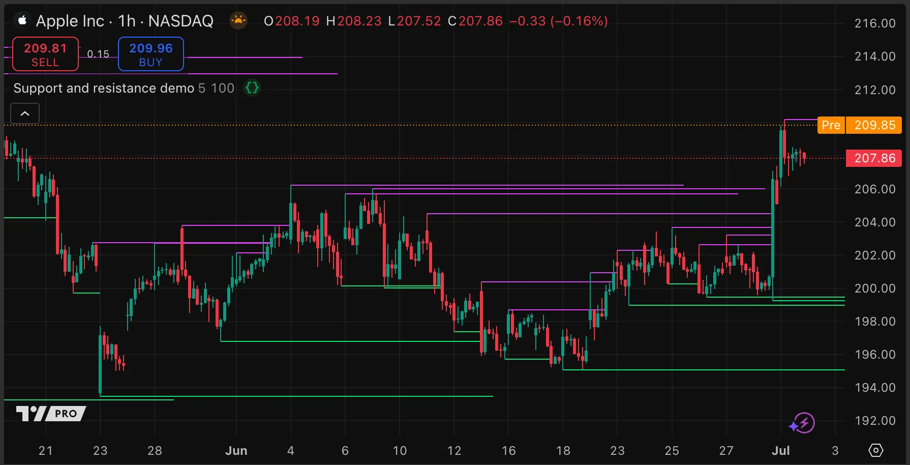
The following example script tracks levels of support and resistance until price action breaks them. The script uses the ta.pivot*() built-in functions to detect pivot highs and lows, then draws horizontal lines from these points. This script visualizes lows as support (green lines) and highs as resistance (red lines) for simplicity. If the close of a bar crosses a line, the script stops extending that line:
//@version=6
indicator("Support and resistance demo", "", true, max_lines_count = 500)
color hiPivotColorInput = input.color(color.fuchsia, "High pivot color")
color loPivotColorInput = input.color(color.lime, "Low pivot color")
int pivotSizeInput = input.int(5, "Pivot lookback/look forward")
int maxLineLengthInput = input.int(100, "Maximum line length", minval = 2)
// @function Extends every line in `lineArray` until price crosses it or it exceeds `maxLength` in length.
// @param lineArray (array<line>) An array storing the lines to check.
// @param maxLength (int) The maximum length a line can have.
// @returns (void) The function has no explicit return.
checkLinesForBreaches(array<line> lineArray, int maxLength) =>
// If there are no lines, the `from` value is `na` and we do not loop.
int fromValue = lineArray.size() > 0 ? lineArray.size() - 1 : na
// We loop the array in reverse to avoid errors even when we remove the first element in the array.
for i = fromValue to 0
// Check each line crosses and length.
line eachLine = lineArray.get(i)
float linePrice = eachLine.get_price(bar_index)
bool lineWasCrossed = math.sign(close[1] - linePrice) != math.sign(close - linePrice)
bool lineIsTooLong = bar_index - eachLine.get_x1() > maxLength
// Set the rightmost point of each line to the current bar.
eachLine.set_x2(bar_index)
// Set lines inactive if they have been crossed or are too long.
if lineWasCrossed or lineIsTooLong
// Stop the line from extending to the right.
eachLine.set_extend(extend.none)
// Remove the line from the array. The line stays on the chart but does not extend on further bars.
lineArray.remove(i)
// Arrays of active lines.
var array<line> hiPivotLines = array.new<line>()
var array<line> loPivotLines = array.new<line>()
// Detect new pivots and record their values.
float hiPivot = ta.pivothigh(pivotSizeInput, pivotSizeInput)
float loPivot = ta.pivotlow(pivotSizeInput, pivotSizeInput)
// Create new lines on new pivots and add to arrays.
x1 = bar_index - pivotSizeInput
if not na(hiPivot)
hiPivotLines.push(line.new(x1, hiPivot, bar_index, hiPivot, extend = extend.right, color = hiPivotColorInput))
if not na(loPivot)
loPivotLines.push(line.new(x1, loPivot, bar_index, loPivot, extend = extend.right, color = loPivotColorInput))
// Extend lines if they are still active.
checkLinesForBreaches(hiPivotLines, maxLineLengthInput)
checkLinesForBreaches(loPivotLines, maxLineLengthInput)
Note that:
When price crosses a line, it becomes inactive. The script no longer updates inactive lines and does not extend them to the right.
We store lines in one of two arrays, and remove lines from their array if they become inactive. Removing an object from an array does not delete the object.
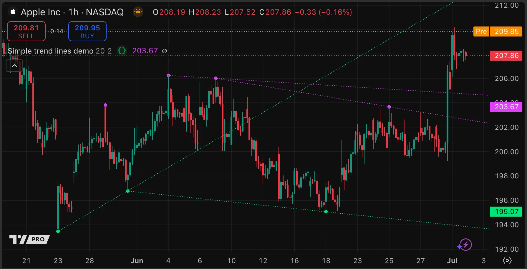
The following example script uses the ta.pivot*() built-in functions to detect pivot highs and lows, and then draws lines that connect the two most recent pivots of the same type. The lines extend indefinitely to the right. If the script draws a new line that causes the total number of lines to exceed a specified maximum number, it deletes the oldest line:
//@version=6
indicator("Simple trend lines demo", overlay = true, max_lines_count = 500)
int pivotSizeInput = input.int(20, "Pivot lookback/look forward", minval = 1, maxval = 50)
int maxLinesInput = input.int(2, "Quantity of lines to track per pivot", minval = 0, maxval = 50)
color loTrendColorInput = input.color(color.lime, "Low pivot")
color hiTrendColorInput = input.color(color.fuchsia, "High pivot")
// @function Draws a line from the previous pivot when a new pivot of the same type occurs.
// Keeps the number of lines under a specified number by deleting excess lines.
// @param lineArray (array<line>) An array to store and manage the line objects.
// @param pivotValue (float) The pivot price when a pivot is found.
// @param pivotSize (simple int) The size of the pivot lookback/look forward.
// @param maxLinesCount (simple int) The maximum number of lines to keep.
// @param lineColor (color) The color for the line.
// @returns (void) The function has no explicit return.
queueLine(array<line> lineArray, float pivotValue, simple int pivotSize, simple int maxLinesCount, color lineColor) =>
var array<chart.point> pointArray = array.new<chart.point>(2, chart.point.new(na, na, na))
if not na(pivotValue)
pointArray.push(chart.point.from_index(bar_index - pivotSize, pivotValue))
if pointArray.size() > 2
pointArray.shift()
chart.point firstPoint = pointArray.first()
chart.point secondPoint = pointArray.last()
line ln = line.new(firstPoint, secondPoint, extend = extend.right, color = lineColor, style = line.style_dotted)
lineArray.push(ln)
if lineArray.size() > maxLinesCount
line.delete(lineArray.shift())
// Initialize two empty arrays for the high and low trend lines on the first bar.
var array<line> hiLinesArray = array.new<line>()
var array<line> loLinesArray = array.new<line>()
// Detect new pivots.
float hiPivot = ta.pivothigh(pivotSizeInput, pivotSizeInput)
float loPivot = ta.pivotlow(pivotSizeInput, pivotSizeInput)
// Draw new lines between the two most recent pivots when a pivot occurs, and add them to the line array.
// The number of lines is limited to the specified number, after which lines are removed from the array *and* deleted.
queueLine(hiLinesArray, hiPivot, pivotSizeInput, maxLinesInput, hiTrendColorInput)
queueLine(loLinesArray, loPivot, pivotSizeInput, maxLinesInput, loTrendColorInput)
// Visually highlight the pivot points with a dot.
plot(hiPivot, "Pivot High", hiTrendColorInput, 3, plot.style_circles, offset = -pivotSizeInput)
plot(loPivot, "Pivot Low", loTrendColorInput, 3, plot.style_circles, offset = -pivotSizeInput)
Note that:
For simplicity, we do not deactivate lines when price crosses them. For an example of how to do this, see the example script from the previous section, Plotting support and resistance.
We store the lines in arrays, which makes it easier to manage them. In this script, unlike in the example script in the previous section, we delete the line object at the same time as we remove it from the array.
The strategic use of color in indicator plots helps comprehension, pattern and trend recognition, and differentiation of categories or values. For example, different hues can represent different data thresholds, and gradients can indicate increases or decreases in values. When a script transforms numbers into colors in an intelligent way, it enhances the user’s ability to spot anomalies, trends, and significant data points. Here are some Pine features that script authors can use to work with colors:
Predefined colors
Without needing to specify hexadecimal or RGB (Red Green Blue) values, programmers can use predefined color constants, such as color.red. In the Pine Editor, clicking the automatically generated color swatch next to a color constant opens up a color picker; choosing a different color from the picker updates the code that defines the color.
Custom colors
For a more personalized appearance, programmers can create custom colors, either by specifying a hexadecimal code, or by using the color.rgb() function to specify the RGB values. For the hexadecimal and RGB equivalents of the built-in color constants, see the table in the Constant colors section.
Transparency settings
The color.new() function can create colors with a specific transparency. The transp parameter can even take series values, meaning that a single color declaration can provide a color with dynamic transparency.
Conditional coloring
Scripts can assign different colors to variables based on logical conditions. Programmers can use conditional colors to color plots, fills, shapes, drawings, or the chart background differently on different bars.
Gradient transitions
The color.from_gradient() function creates color gradients that can highlight shifts in data values while ensuring a smooth transition between colors. For detailed guidance and innovative examples on implementing gradients, consult the Color Gradient Framework by PineCoders.
Fills
Scripts can create shaded areas between lines, plots, or hlines, as well as within boxes and polylines. Fills can be especially useful for highlighting ranges, zones, or contrasts.
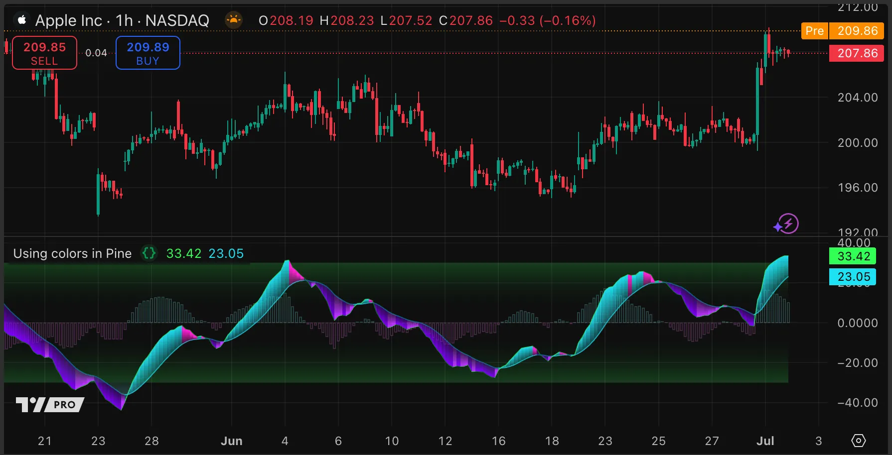
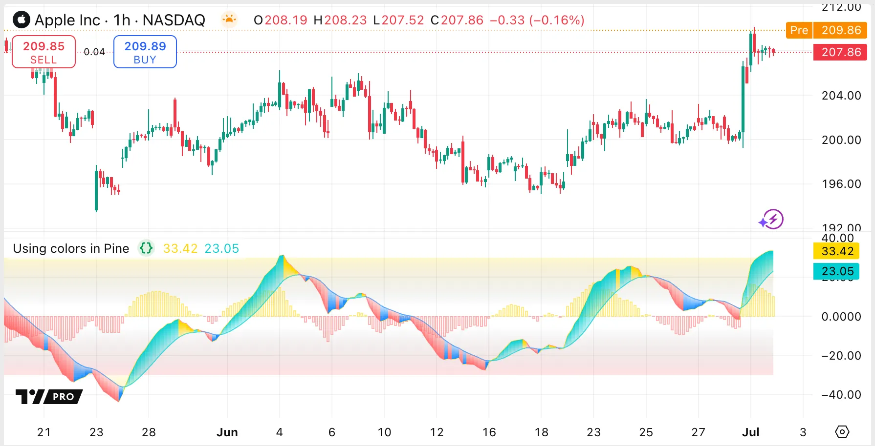
In our example script below, we use various color display techniques such as conditional colors, fills, and gradients to depict areas of rising or falling values, as well as overbought and oversold levels. The script automatically recognizes whether the user’s chart background is light or dark, and adjusts the color scheme accordingly. For a light theme, it captures the ambiance of a day at the beach with coastal teal and coral hues, while for a dark theme, it reflects the vibrant neon hues of city nightlife:
//@version=6
indicator("Using colors in Pine", explicit_plot_zorder = true)
float tsi = ta.tsi(close, 13, 23) * 100, float tsl = ta.ema(tsi, 13) // Calculate TSI and its EMA.
// @function Determines if a given background color corresponds to a light theme based on its brightness level.
// @param bgColor (color) The background color to check. Optional. Default value is the chart's background color.
// @returns (bool) True if the background color is "light" (has a brightness greater than 0.5), otherwise false.
isLightTheme(color bgColor = chart.bg_color) =>
float r = color.r(bgColor)
float g = color.g(bgColor)
float b = color.b(bgColor)
float brightness = (r + g + b) / (3 * 255)
bool isLight = brightness > 0.5
var bool isLightTheme = isLightTheme()
// Define color schemes based on whether the theme is light or dark.
color tsiDnUpColor = isLightTheme ? #1E90FF : #BA33FF, color tsiDnDnColor = isLightTheme ? #FF6B6B : #8100FF
color tsiUpUpColor = isLightTheme ? #00CED1 : #1FE0F3, color tslBullColor = isLightTheme ? #00CED1 : #1FE0F3
color tslBearColor = isLightTheme ? #1E90FF : #0088A3, color tsiBullColor = isLightTheme ? #FFD700 : #33FF57
color tsiBearColor = isLightTheme ? #FF6B6B : #00940D, color tsiUpDnColor = isLightTheme ? #FFD700 : #FF21D4
color bullBgColor = isLightTheme ? #FFD700 : #80FFFF, color bearBgColor = isLightTheme ? #FF6B6B : #FF80FF
color obFillColor = isLightTheme ? #FFD700 : #33FF57, color osFillColor = isLightTheme ? #FF6B6B : #33FF57
// Find the direction of the TSI, signal line, and trend. Calculate the difference for histogram values.
bool tsiIsBull = tsi >= tsi[1], bool tslIsBull = tsl >= tsl[1], bool trendIsBull = tsi >= tsl
float diff = tsi - tsl
// Get line and fill colors based on trend and plot direction.
color tsiColor = tsiIsBull ? tsiBullColor : tsiBearColor, color tslColor = tslIsBull ? tslBullColor : tslBearColor
color fillColor = trendIsBull ? tsiIsBull ? tsiUpUpColor : tsiUpDnColor : tsiIsBull ? tsiDnUpColor: tsiDnDnColor
// Create invisible horizontal lines at +30 and -30 and fill areas between them with a gradient.
h1 = hline( 30, color = color(na)), h2 = hline(-30, color = color(na))
fill(h2, h1, 30, 5, color.new(obFillColor, 80), color(na))
fill(h2, h1, -5, -30, color(na), color.new(osFillColor, 80))
// Define colors and transparency for the histogram bar based on trend direction and theme and plot the bar.
color barBgColor = isLightTheme ? trendIsBull ? bullBgColor : bearBgColor : chart.bg_color
color barBdColor = trendIsBull ? bullBgColor : bearBgColor
int barBdTransp = isLightTheme ? 50 : 80
int barBgTransp = isLightTheme ? 90 : 0
float barHi = math.max(0, 0 + diff)
float barLo = math.min(0, 0 + diff)
plotcandle(barLo, barLo, barHi, barHi,
color = color.new(barBgColor, barBgTransp),
bordercolor = color.new(barBdColor, barBdTransp),
wickcolor = color(na),
display = display.pane)
// Plot the TSI and its EMA
p1 = plot(tsi, "TSI", color.new(tsiColor, 30))
p2 = plot(tsl, "Signal", color.new(tslColor, 30))
p3 = plot(tsl > 30 ? 30 : na, display = display.none)
p4 = plot(tsl < -30 ? -30 : na, display = display.none)
// Fill between the signal line and overbought or oversold levels with a gradient.
fill(p2, p3, 80, 30, bearBgColor, color.new(bearBgColor, 90))
fill(p2, p4, -30, -80, color.new(bullBgColor, 90), bullBgColor)
// Fill the cloud between the TSI and signal line with a gradient.
fill(p1, p2, tsi, tsl, fillColor, color.new(fillColor, 70))
Note that:
TSI and signal plots use distinct colors for each plot, with different colors for rising and falling values.
We implement horizontal lines to demarcate overbought and oversold zones and fill between them with a color gradient. This gives the areas an appearance of scaled severity as the plots travel through them.
We fill between the signal line and the overbought and oversold levels with another gradient if the plot exceeds either, to further emphasize potential irregularities.
The script uses the plotcandle() function to create bordered column bars painted in bullish or bearish hues based on the trend’s direction, serving as a visually distinct histogram that depicts the distance between the TSI and signal line.
We use a four-color fill between the TSI and signal line to clarify trend direction and changes in trend. For instance, an upward trend with a declining TSI features a distinct color from the general rising trend hue.
By default, new scripts display in a separate pane. To make a script display in the main chart pane instead, use overlay = true in the strategy() or indicator() declaration statement:
indicator("My Script", overlay = true)
The default value of the overlay parameter is false. If a programmer changes the value of the overlay parameter after an indicator was already added to the chart, they need to remove the indicator and add it to the chart again for the change to take effect.
Note that users of an indicator can move scripts from a separate pane to the chart pane and vice-versa using the “Move to” option from the “More” script menu, regardless of the value of the overlay parameter.
Advatages of drawing vertical lines include that lines can be drawn on past or future bars. Each script can draw up to a maximum of 500 lines.
If a script draws a line that has both its x coordinates at the same bar, different y coordinates, and extends in both directions, the line is vertical. The following example script draws vertical lines every 10 bars:
//@version=6
indicator("Vertical line demo", overlay = true, max_lines_count = 500)
float atr = ta.atr(5)
if bar_index % 10 == 0
line.new(bar_index, open, bar_index, open + atr, extend = extend.both, color = color.silver)
Histogram plots that join a very large number and a very low number appear as vertical lines. Advantages of using histogram plots include that there is no limit on the number of lines.
With this method, unlike using line drawings, the user must right-click the price scale and select “Scale price chart only” to avoid distorting the chart vertically. Scripts can plot histograms, like all types of plot, only on the bar where the script is executing or at a fixed offset.
The following example script plots a very large number, 10e20, every 10 bars, and sets the base of the histogram to its negative value:
Coloring the background for a single bar displays as a vertical line. Advantages of this method include simplicity, no limit on the number of lines, and no need to adjust the price scale. Disadvantages include no control of the width of the line — it is always exactly one bar wide, and the width scales with the number of bars that display on the chart. Scripts can change background color only on the bar on which the script is currently executing; offsetting the change is not possible.
Scripts can toggle the display of horizontal levels plotted using hline() in several ways. Conditionally setting the argument of the price or color parameter to na shows or hides the level in a similar way that setting the series or color to na does for plotted lines, as described in the entry How do I plot a line using start/stop criteria? above.
Additionally, the display parameter of the hline() function can take an input value as its argument. This parameter controls where the line displays.
The following example script demonstrates all of these methods:
//@version=6
indicator("Toggle `hline()` using `na` values", overlay = false)
bool showHlineInput1 = input.bool(true, "Show line 1")
h1 = hline(price = showHlineInput1 ? 70 : na, color = chart.fg_color)
bool showHlineInput2 = input.bool(true, "Show line 2")
h2 = hline(price = 50, color = showHlineInput2 ? chart.fg_color : color(na))
bool showHlineInput3 = input.bool(true, "Show line 3")
h3 = hline(price = 30, color = chart.fg_color, display = showHlineInput3 ? display.all : display.none)
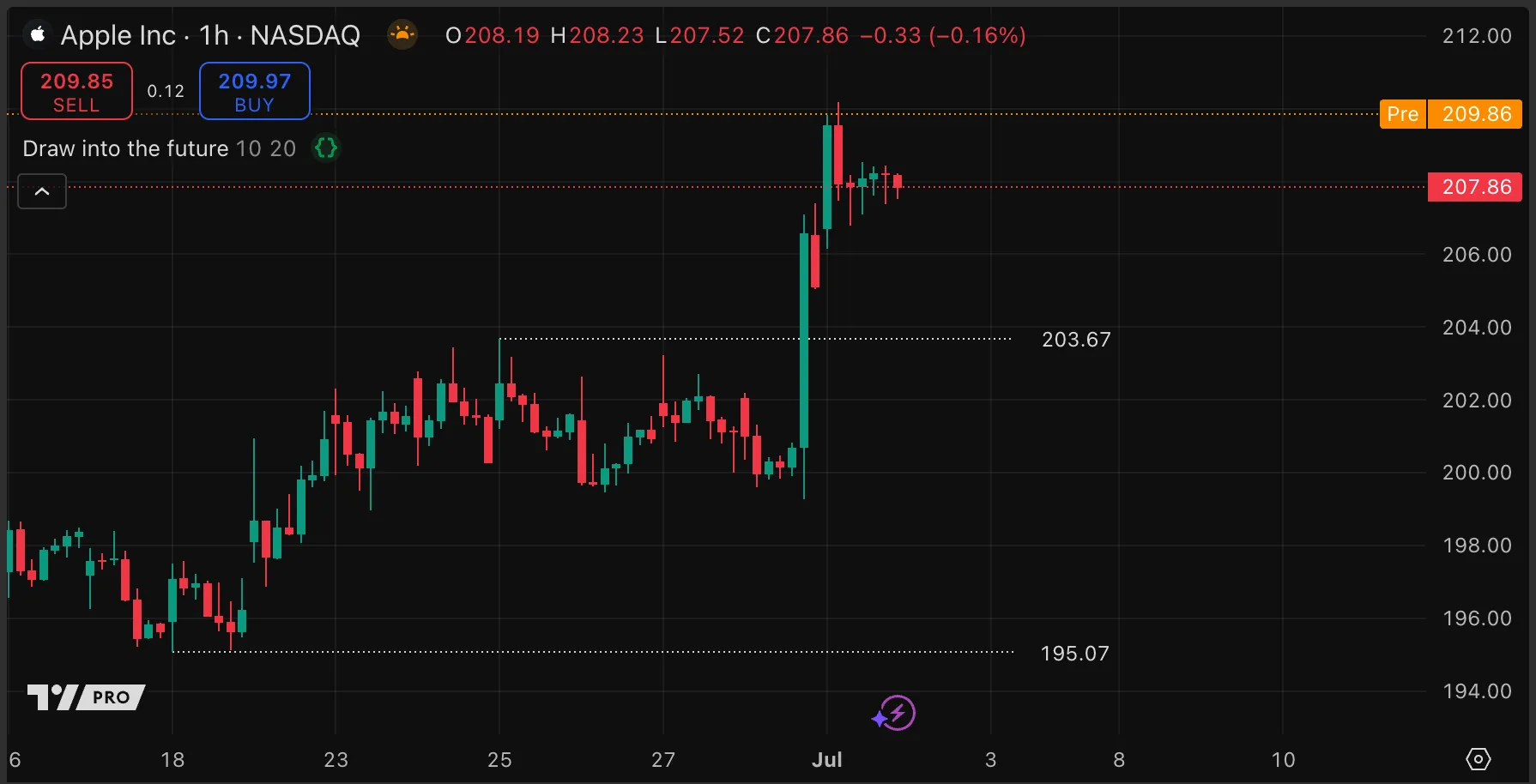
Individual plotted lines and shapes cannot be drawn into the future — only the entire series can be offset. By contrast, scripts can extend any drawn lines or boxes, or position drawn labels, at an arbitrary distance beyond the last data point. There are two ways to achieve this: using bar_index and using xloc.bar_time.
The bar_index built-in variable represents the sequential number of the current bar, starting from zero for the first bar in the chart history and incrementing by 1 for each subsequent bar. Drawing objects with their xloc parameter set to xloc.bar_index can use a bar_index as their x coordinates. If the xloc parameter is not specified, it defaults to xloc.bar_index.
To project a certain number of bars into the future or past, simply add or subtract that number from the current bar_index. For instance, bar_index + 20 positions the object 20 bars into the future.
The following example script draws lines and labels on the most recent pivot high and low, and extends the lines into the future beyond the last bar:
//@version=6
indicator("Draw into the future", overlay = true)
int offsetInput = input.int(10, "Offset bars", maxval = 500)
int pivotLengthInput = input.int(20, "Pivot lookback/look forward", minval = 2)
// Initialize the drwaing objects.
var line hiLine = line.new( na, na, na, na, color = chart.fg_color, style = line.style_dotted)
var line loLine = line.new( na, na, na, na, color = chart.fg_color, style = line.style_dotted)
var label hiLabel = label.new(na, na, na, color = color(na), textcolor = chart.fg_color, style = label.style_label_left)
var label loLabel = label.new(na, na, na, color = color(na), textcolor = chart.fg_color, style = label.style_label_left)
// Calculate the pivots on every bar.
float pivotHighPrice = ta.pivothigh(pivotLengthInput, pivotLengthInput)
float pivotLowPrice = ta.pivotlow(pivotLengthInput, pivotLengthInput)
// Update the drawings when we get a pivot.
if not na(pivotHighPrice)
line.set_xy1(hiLine, bar_index - pivotLengthInput, pivotHighPrice), line.set_y2(hiLine, pivotHighPrice)
label.set_y(hiLabel, pivotHighPrice)
label.set_text(hiLabel, str.tostring(pivotHighPrice, format.mintick))
if not na(pivotLowPrice)
line.set_xy1(loLine, bar_index - pivotLengthInput, pivotLowPrice), line.set_y2(loLine, pivotLowPrice)
label.set_y(loLabel, pivotLowPrice)
label.set_text(loLabel, str.tostring(pivotLowPrice, format.mintick))
// Update the position of the labels and the right end of the lines on the last bar.
if barstate.islast
hiLine.set_x2(bar_index + offsetInput)
loLine.set_x2(bar_index + offsetInput)
hiLabel.set_x(bar_index + offsetInput)
loLabel.set_x(bar_index + offsetInput)
Note that:
We update the properties of the drawings each time we get a pivot. In this section, we call the setting functions for the lines and labels in the normal way.
On the last bar of the dataset, we adjust the x2 point of both lines and the x point of the labels to extend into the future by the user-defined offset amount. In this section, for demonstration purposes, we call the same setting functions as methods by using dot notation syntax.
Drawing objects can also be positioned based on UNIX time values, by using xloc.bar_time for an object’s xloc parameter. The time values can be timestamps, or a bar’s open time, or any other calculated time.
By using time to position objects, there is no limitation as to how far into the future objects can display. Any valid timestamp positions the object accordingly.
There are some challenges to this method, however:
Project a specific number of bars into the future using time can be complex. Failing to account for weekends and market holidays can lead to discrepancies in non-24/7 markets. For instance, trying to project 10 hourly bars ahead on a Friday evening might inadvertently position the object during a non-trading weekend slot.
Bar time is based on UNIX time. When using raw date values, it’s important to consider both the exchange’s time zone and the user’s local settings. Discrepancies can arise due to time zone differences, leading to objects displaying in unexpected positions on the chart. This can be particularly confusing if users of the script are located in various time zones or if the script is used on symbols from exchanges in different regions.
For help in displaying objects a specific number of time units into the future, refer to the Time Offset Calculation Framework by Pinecoders.
The quickest and easiest method to limit the number of drawings displayed is to use the built-in *.all array for the drawing type. These arrays automatically contain all drawings of that type that currently display on the chart.
The *.all arrays are read-only. Scripts cannot change the arrays directly by pushing or shifting elements, but they can update or delete elements in the arrays. The following example script keeps a maximum of 10 labels on the chart. It gets the first label’s ID via the array.first() function and then deletes that label with the label.delete function.
//@version=6
indicator("Limit labels using *.all", overlay = true)
const int LABEL_LIMIT = 10
label.new(bar_index, high, str.tostring(high))
if label.all.size() > LABEL_LIMIT
label.all.first().delete()
Note that:
The items in the array are in the order that they were drawn, so if a script displays drawings in a different order than it creates them, using a *.all array gives unpredictable results.
Only built-in drawing types have *.all arrays available, so if a script uses objects of user-defined types as containers for several drawings, using an array as a queue instead is the only option.
When the script deletes a label, the label is also automatically removed from the label.all array. By contrast, if a script adds drawings to an array manually, it must both remove the object from the array and delete it. In this case, array.shift() is usually the best choice, because it removes the first value from an array and returns it for further manipulation.
A more flexible method to keep only the last n number of drawings is to use an array as a queue. Each time the script adds a new element to the array, it removes the oldest element. This is possible because each element in an array has a unique index, and array indexes always begin at zero. If we remove element 0 from an array with several elements, the element that was at index 1 is now at index 0, the element at index 2 moves down to index 1, and so on.
The following example script uses this behavior to keep a queue of labels and a queue of vertical lines to a defined user-configurable length. We demonstrate two different methods of managing the size of arrays:
For labels, we create an array of the correct size, and always remove the same number of objects as we add. This method is simpler, but it requires programmers to ensure that objects are always added and removed in the same quantities (for example, by using a function to add and remove elements).
For lines, we create an empty array, append lines to it, and only delete the oldest element if the array exceeds the maximum size. This more robust method is especially suitable for larger arrays, because the size of the array becomes meaningful: it corresponds to the number of — for example — lines drawn on the chart.
//@version=6
indicator("Limit drawings using arrays", overlay = true)
int drawingQtyInput = input.int(5, "Quantity of drawings to show", minval = 0, maxval = 50)
int drawingIntervalInput = input.int(4, "Draw every n bars", minval = 1, maxval = 10)
// Create a label array sized according to the user-selected quantity.
var array<label> labelsArray = array.new<label>(drawingQtyInput)
if bar_index % drawingIntervalInput == 0 // Every n bars
// Draw a label and add it to the *end* of the array
labelsArray.push(label.new(bar_index, high, str.tostring(high), style = label.style_label_down,
color = color.new(chart.fg_color, 30), textcolor = chart.bg_color))
// Remove the oldest label and delete it.
label.delete(labelsArray.shift())
// Create an *empty* line array.
var array<line> linesArray = array.new<line>()
// Every n bars (offset -1 from the labels), draw a vertical line and add it to the *end* of the array.
if (bar_index + 1) % drawingIntervalInput == 0
linesArray.push(line.new(bar_index, high, bar_index, low, color = chart.fg_color, extend = extend.both, width = 3))
// If the array is larger than the number of drawings to display, remove the oldest line and delete it.
if linesArray.size() > drawingQtyInput
line.delete(linesArray.shift())
Geometric shapes can illustrate patterns, mark zones of interest, or create other visual aids for technical analysis. Scripts can use two main methods for drawing shapes: polylines and lines.
Polylines offer an efficient method for constructing complex shapes on a chart. To draw a shape with polylines, follow these steps:
Create an array containing objects of type chart.point that define the vertices of your desired shape.
Pass this array to the polyline.new() function. This function draws sequential lines between the points in the order they appear in the array.
Choose between straight or curved lines, enabling the creation of a diverse range of shapes.
This method is particularly useful for joining many points with a single object. A single polyline object can join up to 10,000 points, and one script can contain up to 100 polyline objects.
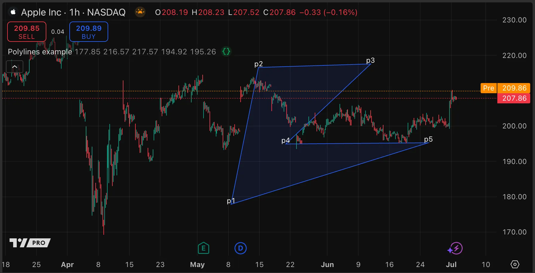
The following example script creates five sets of interactive points by placing price and time inputs inline. When the user adds the script to the chart, the script prompts them to place five points on the chart. The script adds the points to an array and passes the array to the polyline.new() function, which connects the points with lines, constructing a shape.
//@version=6
indicator("Polylines example", overlay = true)
//@variable If `true`, the connections in the polyline are curved lines.
bool curvedInput = input.bool(false, "Curve Polyline")
//@variable If `true`, connects the first point in the polyline to the last point.
bool closedInput = input.bool(true, "Close Polyline")
//@variable The color of the space filled by the polyline.
color fillcolor = input.color(color.new(color.blue, 90), "Fill Color")
// Time and price input pairs for the polyline's points.
int p1x = input.time( 0, "p1", confirm = true, inline = "p1")
float p1y = input.price(0, " ", confirm = true, inline = "p1")
int p2x = input.time( 0, "p2", confirm = true, inline = "p2")
float p2y = input.price(0, " ", confirm = true, inline = "p2")
int p3x = input.time( 0, "p3", confirm = true, inline = "p3")
float p3y = input.price(0, " ", confirm = true, inline = "p3")
int p4x = input.time( 0, "p4", confirm = true, inline = "p4")
float p4y = input.price(0, " ", confirm = true, inline = "p4")
int p5x = input.time( 0, "p5", confirm = true, inline = "p5")
float p5y = input.price(0, " ", confirm = true, inline = "p5")
if barstate.islastconfirmedhistory
//@variable An array of `chart.point` objects for the new polyline.
var array<chart.point> points = array.new<chart.point>()
// Push new `chart.point` instances into the `points` array.
points.push(chart.point.from_time(p1x, p1y))
points.push(chart.point.from_time(p2x, p2y))
points.push(chart.point.from_time(p3x, p3y))
points.push(chart.point.from_time(p4x, p4y))
points.push(chart.point.from_time(p5x, p5y))
// Add labels for each `chart.point` in `points`.
label l1p1 = label.new(points.get(0), "p1", xloc.bar_time, color = na)
label l1p2 = label.new(points.get(1), "p2", xloc.bar_time, color = na)
label l2p1 = label.new(points.get(2), "p3", xloc.bar_time, color = na)
label l2p2 = label.new(points.get(3), "p4", xloc.bar_time, color = na)
label l3p1 = label.new(points.get(4), "p5", xloc.bar_time, color = na)
// Create a new polyline that connects each `chart.point` in the `points` array, starting from the first.
polyline.new(points, curvedInput, closedInput, xloc.bar_time, fill_color = fillcolor)
Note that:
The five sets of time and price inputs are paired to form interactive points because they share matching inline arguments.
Lines are simpler than polylines. A line in Pine Script is straight connection between two points. Here’s how to use lines for drawing shapes:
Determine the start and end points for each line, recognizing that every edge of your shape must be delineated separately.
For each side of the shape, input the precise starting and ending coordinates to create individual line segments.
Ensure that the end of one line meets the start of the next, to form a closed shape.
An advantage of using separate lines is that scripts can customize the style of each line separately. Additionally, arrays are optional for line management — as opposed to mandatory for polylines — which can result in simpler code in some cases. For large, complex shapes, however, polylines are more convenient.
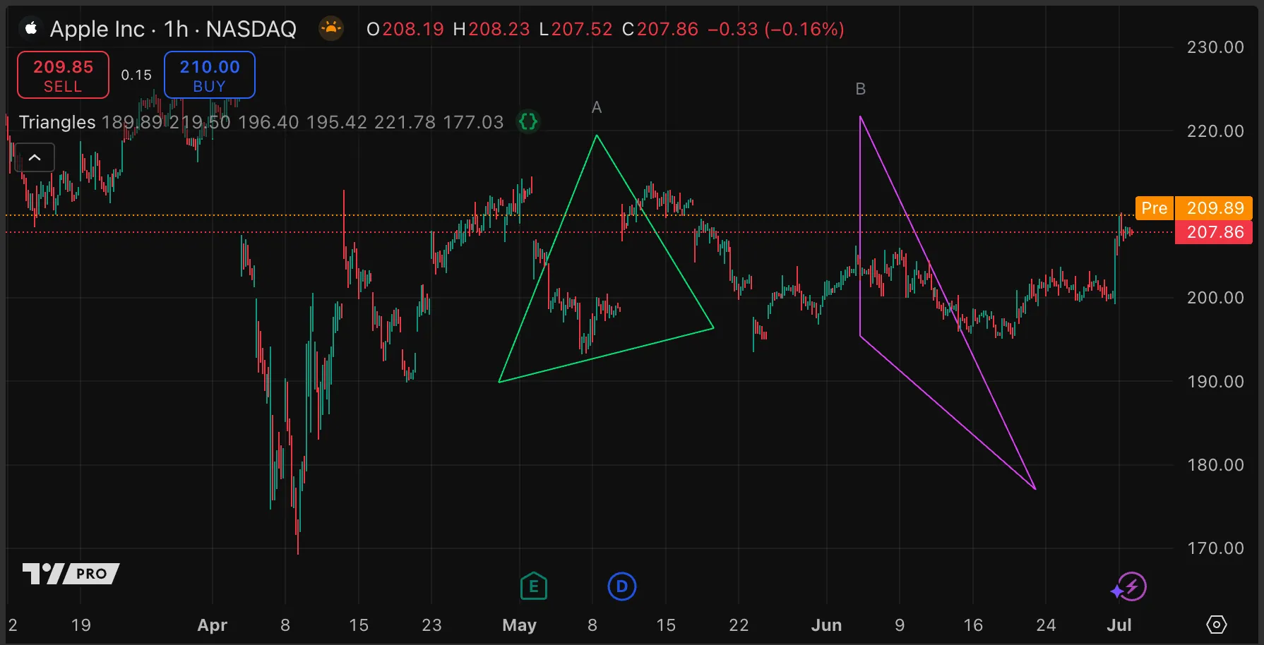
The following example script creates six sets of interactive points by pairing price and time inputs, using the same inline arguments. When the script is added to the chart, it prompts the user to click six points on the chart (because the inputs use confirm = true). The script joins the points and creates two triangles.
//@version=6
indicator("Triangles", "", true)
// Create interactive point inputs using pairs of inputs with the same `inline` argument, and the `confirm` parameter.
string GRP1 = "Triangle A"
int x1AInput = input.time( 0, "Point 1", inline = "A1", group = GRP1, confirm = true)
float y1AInput = input.price(0, "", inline = "A1", group = GRP1, confirm = true)
int x2AInput = input.time( 0, "Point 2", inline = "A2", group = GRP1, confirm = true)
float y2AInput = input.price(0, "", inline = "A2", group = GRP1, confirm = true)
int x3AInput = input.time( 0, "Point 3", inline = "A3", group = GRP1, confirm = true)
float y3AInput = input.price(0, "", inline = "A3", group = GRP1, confirm = true)
string GRP2 = "Triangle B"
int x1BInput = input.time( 0, "Point 1", inline = "B1", group = GRP2, confirm = true)
float y1BInput = input.price(0, "", inline = "B1", group = GRP2, confirm = true)
int x2BInput = input.time( 0, "Point 2", inline = "B2", group = GRP2, confirm = true)
float y2BInput = input.price(0, "", inline = "B2", group = GRP2, confirm = true)
int x3BInput = input.time( 0, "Point 3", inline = "B3", group = GRP2, confirm = true)
float y3BInput = input.price(0, "", inline = "B3", group = GRP2, confirm = true)
// @function Constructs a triangle on the chart using three vertices and a specified line color.
// @param vx1 (int) The bar time of the first vertex.
// @param vy1 (float) The price of the first vertex.
// @param vx2 (int) The bar time of the second vertex.
// @param vy2 (float) The price of the second vertex.
// @param vx3 (int) The bar time of the third vertex.
// @param vy3 (float) The price of the third vertex.
// @param lineColor (color) The color of the triangle's edges.
// @param labelName (string) The text to display in the label at the triangle's peak.
// @returns (label) The label to plot the text for the triangle.
drawTriangle(int vx1, float vy1, int vx2, float vy2, int vx3, float vy3, color lineColor, string name) =>
line.new(vx1, vy1, vx2, vy2, xloc = xloc.bar_time, color = lineColor)
line.new(vx2, vy2, vx3, vy3, xloc = xloc.bar_time, color = lineColor)
line.new(vx1, vy1, vx3, vy3, xloc = xloc.bar_time, color = lineColor)
array<int> xValues = array.from(vx1, vx2, vx3)
array<float> yValues = array.from(vy1, vy2, vy3)
float yMax = array.max(yValues)
int xMax = array.get(xValues, array.indexof(yValues, yMax))
label.new(xMax, yMax, name, xloc = xloc.bar_time, color = color(na), textcolor = color.gray)
// We draw the shapes only once for efficiency.
if barstate.isfirst
drawTriangle(x1AInput, y1AInput, x2AInput, y2AInput, x3AInput, y3AInput, color.lime, "A")
drawTriangle(x1BInput, y1BInput, x2BInput, y2BInput, x3BInput, y3BInput, color.fuchsia, "B")
The usual way to color the chart background is by calling the bgcolor() function, which colors the chart background for the bar on which it is called. The background for a particular bar cannot be changed on later bars, and bars cannot be colored retroactively, using this method.
To color the entire chart background based on a condition detected on the last bar, one workaround is to use a table sized to the visible area of the chart, and color the background of the cell. See this example in the page on tables.