EKG Pulse +EKG Pulse – Multi-Layer Trend & Session Analyzer
Description:
EKG Pulse is an advanced trading indicator that combines trend clouds), Momentum trend flips, EMA slope detection, and session high/low tracking to give clear visual signals for intraday and swing trading. It also calculates potential trade ranges, stop-loss, and profit targets dynamically, adapting to volatility and historical session behavior.
How to Use:
Trend Identification: Use the Trend cloud and EMA slope to determine the main trend (bullish/bearish).
Trade Signals: Look for Momentum flips aligned with Trend Cloud for buy/sell signals (triangles appear on the chart).
Candle Colors: Follow Momentum-based candle coloring to visually track bullish (green) or bearish (red) momentum.
Session Ranges: Monitor session boxes and previous day’s levels for support/resistance zones.
ATR & Ticks Table: Use the table to manage risk with suggested stop-loss (SL) and multiple profit targets (TP1, TP2, TP3), scaled by your account size and instrument’s tick value.
Breakout Status: The session analyzer highlights SAFE, WAIT, or HOLD conditions based on volatility and breakout likelihood.
Benefits:
Provides multi-layer trend confirmation for safer entries.
Visual buy/sell alerts reduce guesswork.
Dynamic risk management with ATR-based SL/TP calculation.
Session boxes help identify key intraday levels.
Historical breakout analysis improves timing for breakout trades.
Works on multiple assets and timeframes with auto tick mapping.
Forecasting

Sz Pivot Dz Aj.New live&noon updateMulti-session pivot zones (Noon / Live / Aj.New) for gold (XAUUSD), based on 22–27 Oct 2025 configuration.
default
Session 1 27/10/68 Noon 11.00 waiting
Session 2 24 Live24/10/68
Session 3 24 Noon 11.00
Session 5 23 Noon 11.00
Session 6 22 Live 22/10/68
Credit to AJ. New
Coding by Line ID : b-sure.engineering
B-sure engineering and supply co.,ltd. Chiang rai Thailand

Pattern DetectorPattern Detector
Identifies and summarizes common chart patterns on any symbol/timeframe. Shows a compact table of the most recent confirmed patterns (up to 6), optional candle coloring that matches table row colors, and optional targets for context. Designed for analysis support only.
What it detects
Triangles and wedges, flags and pennants, head & shoulders (and inverse), rectangles, channels, broadening formations, double/triple tops & bottoms, cup & handle (and inverse), rounding tops/bottoms, diamonds, bump & run, island reversals, staircase patterns, V patterns, gaps (up/down), pipe/spike patterns, harmonic ABCD, Elliott (simplified), three drives, Quasimodo, dead cat bounce, tower top/bottom, shakeout, and Wolfe waves.
Inputs
Lookback Mode: Auto or Manual (Manual Lookback bars)
Min Confidence to Confirm: threshold for confirmation
Display: Show Pattern Table, Show Pattern Numbers, Color Pattern Candles
Style: table row colors; bullish/bearish direction colors
Notes:
Candle coloring uses the table’s row colors and requires Show Pattern Table to be enabled.
Targets are approximate and for reference only.
Alerts
Pattern Confirmed
Pattern Target Reached
Important
Educational/information tool only; not a signal generator and not financial advice.
No performance guarantees. Use with other analysis and risk management.
Calculations update in real time; confirmations happen on closed bars. Detected patterns can change intrabar; use closed‑bar alerts for greater reliability.
Results may vary by symbol, timeframe, liquidity, and volatility.

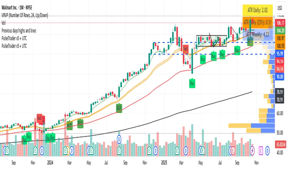
PulseTrader: Daily Momentum Catcher v6 TF + UTCtimeframe awareness (monthly / weekly / daily / intraday logic) into your full strategy script
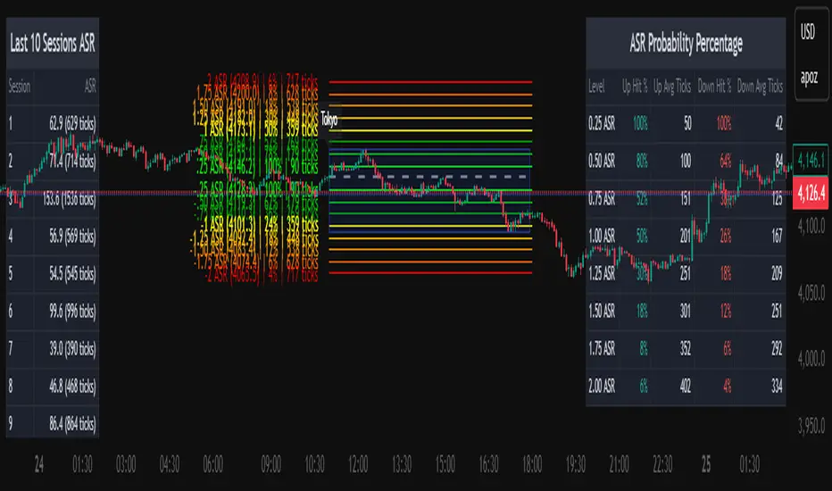
Average Daily Session Range PRO [Capitalize Labs]Average Daily Session Range PRO
The Average Daily Session Range PRO (ADSR PRO) is a professional-grade analytical tool designed to quantify and visualize the probabilistic range behavior of intraday sessions.
It calculates directional range statistics using historical session data to show how far price typically moves up or down from the session open.
This helps traders understand session volatility profiles, range asymmetry, and probabilistic extensions relative to prior performance.
Key Features
Asymmetric Range Modeling: Separately tracks average upside and downside excursions from each session open, revealing directional bias and volatility imbalance.
Probability Engine Modes: Choose between Rolling Window (fixed-length lookback) and Exponential Decay (weighted historical memory) to control how recent or historic data influences probabilities.
Session-Aware Statistics: Calculates values independently for each defined session, allowing region-specific insights (e.g., Tokyo, London, New York).
Dynamic Range Table: Displays key metrics such as average up/down ticks, expected range extensions, and percentage probabilities.
Adaptive Display: Works across timeframes and instruments, automatically aligning with user-defined session start and end times.
Visual Clarity: Includes clean range markers and labels optimized for both backtesting and live-chart analysis.
Intended Use
ADSR PRO is a statistical reference indicator.
It does not generate buy/sell signals or predictive forecasts.
Its purpose is to help users observe historical session behavior and volatility tendencies to support their own discretionary analysis.
Credits
Developed by Capitalize Labs, specialists in quantitative and discretionary market research tools.
Risk Warning
This material is educational research only and does not constitute financial advice, investment recommendation, or a solicitation to buy or sell any instrument.
Foreign exchange and CFDs are complex, leveraged products that carry a high risk of rapid losses; leverage amplifies both gains and losses, and you should not trade with funds you cannot afford to lose.
Market conditions can change without notice, and news or illiquidity may cause gaps and slippage; stop-loss orders are not guaranteed.
The analysis presented does not take into account your objectives, financial situation, or risk tolerance.
Before acting, assess suitability in light of your circumstances and consider seeking advice from a licensed professional.
Past performance and back-tested or hypothetical scenarios are not reliable indicators of future results, and no outcome or level mentioned here is assured.
You are solely responsible for all trading decisions, including position sizing and risk management.
No external links, promotions, or contact details are provided, in line with TradingView House Rules.
Global M2 Overlay 5 DaysTrading + Offset -AlexBank🌍 This indicator visualizes the Global M2 Money Supply — a combined estimate of the total liquid money circulating in major economies worldwide — directly overlaid on your active chart (for example, XAU/USD).
It allows traders to see how global liquidity evolves in relation to asset prices such as gold, Bitcoin, or equities.
In simple terms, M2 reflects how much liquid capital exists in the global financial system.
When M2 expands, liquidity increases — which can fuel asset price growth.
When M2 contracts, liquidity tightens — often signaling risk-off periods or deflationary pressures.
⚙️ This indicator aggregates national M2 data from multiple economies (United States, Eurozone, China, Japan, UK, etc.), converted to USD equivalents via live FX rates, giving a global view of liquidity trends.
Indicator Features
🧭 Overlay on any chart — plots the global M2 line directly on top of your active asset (e.g. XAU/USD, BTC/USD), allowing direct visual comparison.
⏩ Day offset control — shift the M2 curve forward or backward in time (in real trading days) to test how global liquidity leads or lags asset prices.
Example: shifting +90 days means the M2 data appears 90 trading days later (not calendar days, since weekends are excluded).
📅 5-day trading week logic — automatically converts real days into trading days, ensuring accurate offsets that match market calendars.
📊 Optional moving average — smooths the M2 line to better visualize long-term liquidity trends.
🎚️ Manual scaling (optional) — adjust the height of the M2 curve to visually align it with your charted asset’s price range (does not affect data values).
💡 How to Use
1/ Apply the indicator to your preferred chart (e.g., Gold / XAUUSD).
2/ Adjust the time offset parameter to see how changes in global liquidity precede or follow price movements.
3/ Use on DAILY TimeFrame for clear visibility
Enjoy !

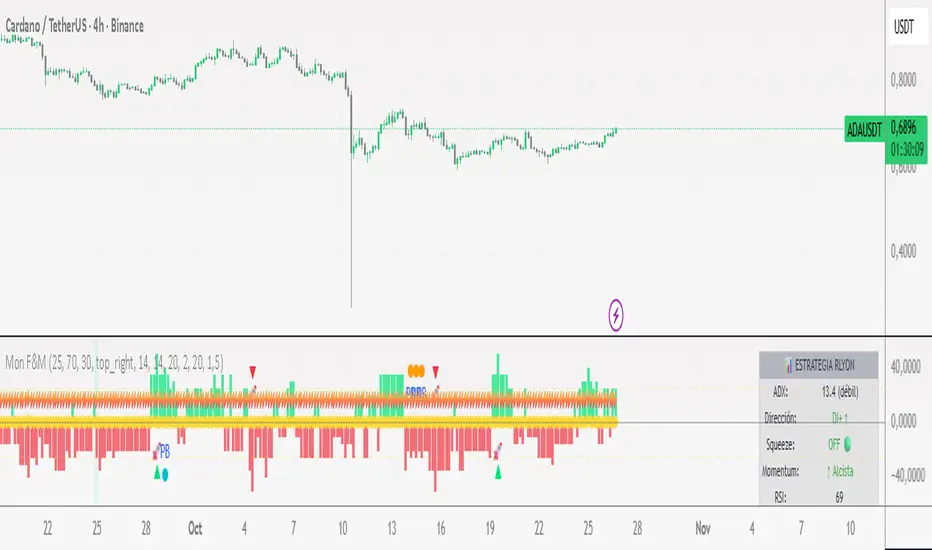
📊 Monitor F&M - RLYONSCRIPT OBJECTIVE
It's a confluence system that combines four key indicators to identify high-probability trading setups. It basically tells you when and where to enter the market with greater confidence.
🔧 THE 4 BASE INDICATORS
1. ADX (Average Directional Index)
What it measures: The strength of the trend (not the direction)
How to use it:
ADX ≥ 25 = STRONG trend ✅
ADX < 25 = Weak or sideways trend
What it does: Filters trades. You only look for entries when there is real strength in the market.
2. DI+ and DI- (Directional Indicators)
What it measures: The direction of the trend.
How to use it:
DI+ > DI- = Bullish trend 📈
DI- > DI+ = Bearish trend 📉
What it does: Defines whether you are looking for buys or sells.
3. TTM Squeeze (Bollinger Bands + Keltner Channels)
What it measures: Volatility compression and explosion.
States:
Squeeze ON 🔴: Volatility compressed (like a tightened spring).
Squeeze OFF 🟢: Volatility released (the spring is released = strong movement).
Transition 🔵: Changing state.
Momentum: The green/red histogram shows the direction of the movement.
Green rising = Strong bullish trend.
Red falling = Strong bearish trend.
4. RSI (Relative Strength Index)
What it measures: Whether the price is overbought or oversold.
Zones:
RSI > 70 = Overbought ⚠️ (be careful with purchases)
RSI < 30 = Oversold ✅ (bullish opportunity zone)
RSI 40-60 = Neutral zone/ideal for pullbacks
🎯 THE 2 MAIN STRATEGIES
STRATEGY 1: MOMENTUM (The strongest) 🚀
BUY setup:
✅ Squeeze released (changed from ON to OFF)
✅ Momentum green AND growing
✅ ADX ≥ 25 (strong trend)
✅ RSI not overbought (< 70)
SELL setup:
✅ Squeeze released (changed from ON to OFF)
✅ Momentum red AND Decreasing
✅ ADX ≥ 25 (strong trend)
✅ RSI not oversold (> 30)
When to trade: When you see the triangle 🚀 on the chart
STRATEGY 2: PULLBACK (Established trend) 📈📉
BUY setup:
✅ DI+ > DI- (established uptrend)
✅ ADX ≥ 25 (strong trend)
✅ RSI between 40-55 (healthy pullback)
✅ Momentum starting to turn upward
SELL setup:
✅ DI- > DI+ (established downtrend)
✅ ADX ≥ 25 (strong trend)
✅ RSI between 45-60 (healthy pullback)
✅ Momentum starting to turn downward
When to trade: When you see the "PB" circle in the graph
LGS - Sessions - New York, London, AsiaThis indicator allows you to display market sessions and configure different time frames.

BATIK SMC🌀 BATIK SMC — Smart Money Concepts by YB Pips
BATIK SMC is a professional-grade Smart Money Concepts system refined under the Batik Syndicate methodology.
It combines institutional structure logic with precision-engineered visualization tools for traders who operate with discipline and intent.
🧭 Core Functions
Market Structure: automatic detection of BOS (Break of Structure) & CHoCH (Change of Character)
Order Blocks: internal & swing OB identification with real-time mitigation updates
Fair Value Gaps (FVG): dynamic detection across multiple timeframes
Equal Highs / Lows: liquidity points & sweep detection
Premium / Discount Zones: clear equilibrium mapping for high-RR setups
Smart Candle Coloring: visualize real-time trend bias directly on chart
Custom Alerts: receive instant BOS, CHoCH, OB breakout, and FVG notifications
💎 Why BATIK SMC
Developed for traders who follow structure, liquidity, and imbalance — not indicators.
It retains full Smart Money logic while carrying the signature Batik visual identity and philosophy:
“Trade where institutions position themselves — not where the crowd reacts.”

KayeDinero TrendSetter v6 - KultureMetricsScript 4 the Kulture and the Swingers
KayeDinero TrendSetter v6 – KultureMetrics is a professional-grade, multi-confirmation trading framework that combines trend, volatility, and momentum analysis into a unified signal system.
It’s optimized for equities, indices, and crypto on intraday to swing-term timeframes.
⚙️ Core Logic
The indicator merges three high-probability systems:
Simple Moving Average (SMA): defines directional bias and major trend breakouts.
Keltner Channels (KC): captures overbought/oversold volatility extremes and mean-reversion zones.
Stochastic Oscillator (STOCH): refines timing by identifying short-term momentum shifts within broader trends.
These signals are filtered by a higher-timeframe trend alignment filter (HTF), ensuring that long trades align with higher-level bullish momentum and short trades align with bearish structure.
💡 Risk & Money Management
Automatically calculates ATR-based stop loss and reward-to-risk (R:R) targets.
Dynamically computes position size based on your chosen risk % per trade.
Optional visualizations for stop and target levels (color-coded line breaks).

Liquidity ToolkitKey Points:
Liquidity Toolkit is your liquidity companion for monitoring and anticipating price action.
Liquidity Toolkit combined the power of the Liquidity Status indicator with the potency of Price Triggers.
Liquidity Status indicates if the current current liquidity environment is bullish or bearish.
Price triggers highlight price levels where supports, resistances, and trend-changes are likely to occur.
Together, they create a comprehensive and actionable view of the market.
Summary
The Liquidity Toolkit (TK) is designed as a one-stop-shop indicator by combining novel liquidity metrics with traditional and impactful price measurements. In combination, TK grants unparalleled views of the market through effective yet simple displays.
The TK indicator contains two separate by synergistic algorithms: the Liquidity Status algorithm, which measures liquidity to determine if outlooks are bearish or bullish; and the Price Triggers algorithm which analyzes price-action to determine points of support and resistances.
Example 1 :
Example 2 :
Example 3 :
Details
Liquidity Status
Liquidity Status (LS) measures liquidity and produces either `Bullish` or `Bearish` indications depending on the current liquidity status.
Bullish indications indicate that the overall flow of liquidity is supportive of bullish price and bearish indications indicate that the overall flow of liquidity is supportive of bearish price action.
LS is displayed in two ways:
Candle-Coloring: if candles are green, liquidity status is bullish and if candles are red, liquidity status is bearish.
Text Display: Bearish and/or Bullish is displayed via text as well.
Price Triggers
Price Triggers (PT) measure price action and report their findings on several timeframes:
1-Minute
5-Minute
60-Minute
1-Day
1-Week
TK graphs the PTs based on the chart interval – only the higher PTs are display (i.e.: On the 1-Hour chart, the 5-, and 1-Min PTs will not be displayed).
Example 4
In additional to showing price-levels of support and resistance, Price Triggers also display the relative strength of these supports and resistances by displaying the Trigger Strengths. These represent areas of influence.
Opportunities often arise when PTs squeeze each other, often forcing spot to make a large move – as can be seen below:
Example 5
Frequently Asked Questions
How can I get access to the Liquidity Toolkit?
Please see the Author’s Instructions section at the top of the page for more details and information.
How can I get additional information on the indicators used?
Please see the Author’s Instructions section at the top of the page for more details and information.
I added the Liquidity Toolkit but I do not see all of the PT lines – where are they?
Depending on the chart interval, not all PT lines will be displayed. Those lower than the chart’s timeframe are hidden for clarity.
I added Liquidity Toolkit but the chart’s candles are not being filled by LS.
The chart will try to color over LS’ candles if you do not disable them. To disable, go to the Chart Settings then to Symbol and de-select Body, Borders and Wick.

Devils Mark Plus Volume Imbalance Multi TimeframeFollowing the success of the devil marks multi timeframe indicator I decided to add volume imbalance. Devils mark code remains unchanged here.
Functionality of the Devils mark remains the same as in when a candle prints without a wick at either end it indicates an area of price imbalance and it is assumed that the market will want to re-balance this level at some point in the future.
The same can be said for volume imbalances where 2 adjacent candles bodies don't meet. Again it it assumed the market will come back at some point to readdress this imbalance. Once mitigated the volume imbalance will be removed by the indicator.
These areas are best used to add confluence to trade ideas and shouldn't be used to formulate trade ideas on their own.
A table is included for easy reference.
Please note that data for timeframes lower than the current timeframe will not be shown. It is also worth noting that data on much higher timeframes than the current chart timeframe may not be shown due to data restrictions. If in doubt go up a timeframe !
I hope you find this indicator useful.

Reactive Curvature Smoother Moving Average IndicatorSummary in one paragraph
RCS MA is a reactive curvature smoother for any liquid instrument on intraday through swing timeframes. It helps you act only when context strengthens by adapting its window length with a normalized path energy score and by smoothing with robust residual weights over a quadratic fit, then optionally blending a capped one step forecast. Add it to a clean chart and watch the single colored line. Shapes can shift while a bar forms and settle on close. For conservative use, judge on bar close.
Scope and intent
• Markets: major FX pairs, index futures, large cap equities, liquid crypto
• Timeframes: one minute to daily
• Purpose: reduce lag in trends while resisting chop and outliers
• Limits: indicator only, no orders
Originality and usefulness
• Novelty: adaptive window selection by minimizing normalized path energy with directionality bias, plus Huber weighted residuals and curvature aware penalty, finished with a mintick capped forecast blend
• Failure modes addressed: whipsaws from fixed length MAs and outlier spikes that pull means
• Testable: Inputs expose all components and optional diagnostics show chosen length, directionality, and energy
• Portable yardstick: forecast cap uses mintick to stay symbol aware
Method overview in plain language
Base measures
• Range span of the tested window and a path energy defined as the sum of squared price increments, normalized by span
Components
Adaptive window chooser: scans L between Min and Max using an energy over trend score and picks the lowest score
Robust smoother: fits a quadratic to the last L bars, computes residuals, applies Huber weights and an exponential residual penalty scaled down when curvature is high
Forecast blend: projects one step ahead from the quadratic, caps displacement by a multiple of mintick, blends by user weight
Fusion rule
• Final line equals robust mean plus optional capped forecast blend
Signal rule
• Visual bias only: color turns lime when close is above the line, red otherwise
What you will see on the chart
• One colored line that tightens in trends and relaxes in chop
• Optional debug overlays for core value, chosen L, directionality, and energy
• Optional last bar label with L, directionality, and energy
• Reminder: drawings can move intrabar and settle on close
Inputs with guidance
Setup
• Source: price series to smooth
Logic
• Min window l_min. Typical 5 to 21. Higher increases stability, adds lag
• Max window l_max. Typical 40 to 128. Higher reduces noise, adds lag ceiling
• Length step grid_step. Typical 1 to 8. Smaller is finer and heavier
• Trend bias trend_bias. Typical 0.50 to 0.80. Higher favors trend persistence
• Residual penalty lambda_base. Typical 0.8 to 2.0. Higher downweights large residuals more
• Huber threshold huber_k. Typical 1.5 to 3.0. Higher admits more outliers
• Curvature guard curv_guard. Typical 0.3 to 1.0. Higher reduces influence when curve is tight
• Forecast blend lead_blend. 0 disables. Typical 0.10 to 0.40
• Forecast cap lead_limit. Typical 1 to 5 minticks
• Show chosen L and metrics show_debug. Diagnostics toggle
Optional: enable diagnostics to see length, direction, and energy
Realism and responsible publication
• No performance claims. Past results never guarantee future outcomes
• Shapes can move while bars are open and settle on close
• Use on standard candles for analysis and combine with your own risk process
Honest limitations and failure modes
• Very quiet regimes can reduce energy contrast, length selection may hover near the bounds
• Gap heavy symbols can disrupt quadratic fit on the window edges
• Excessive forecast blend may look anticipatory; use low values and the cap

FDT Pro FDT Pro – The all-in-one futures trading kit used by serious traders.
INSTITUTIONAL TOOLS, RETAIL PRICE: $0
• Daily VWAP + Standard Deviation Bands (±1, ±2 SD)
• 9 & 20 EMA – Fast & slow trend confirmation
• Daily Volume Profile – POC, VAH, VAL (70% Value Area)
• Volume Delta – Real-time buying vs selling pressure
• Cumulative Delta – Net order flow tracking
• Auto-reset every session (RTH/ETH compatible)
• Zero runtime errors – mobile & desktop tested
• Pine Script v6 – future-proof
WORKS ON:
✓ /ES, /NQ, /CL, /GC, /SI, /BTC, /ETH
✓ 1m to 1D timeframes
✓ Scalping, day trading, swing trading
HOW TO USE:
1. Add to chart
2. Save as Template → "FDT Pro"
3. Apply to any futures contract in 1 click
NO PREMIUM. NO TRIAL. NO BS.
Built for traders who refuse to pay for edge.
FDT Pro – Because your P&L shouldn’t fund someone else’s indicator.
HOW IT WORKS
FDT Pro – TOOL LEGEND
YELLOW LINE → VWAP
Daily fair value. Price above = bullish bias.
ORANGE CIRCLES → ±1 SD
68% of price action. Mean reversion zones.
RED CIRCLES → ±2 SD
95% extremes. Breakout or reversal levels.
AQUA LINE → EMA 9
Fast momentum. Entry timing.
PINK LINE → EMA 20
Trend filter. Avoid counter-trend trades.
YELLOW THICK LINE → POC
Price of Control. Strongest support/resistance.
BLUE BOX → VALUE AREA (70%)
Where 70% of volume traded. "Fair price" zone.
LABEL (POC/VAH/VAL) → KEY LEVELS
POC = Control | VAH = Top of value | VAL = Bottom
GREEN/RED BARS → VOLUME DELTA
Green = buying pressure | Red = selling pressure
PURPLE LINE → CUMULATIVE DELTA
Net order flow. Divergence = reversal setup.
HOW TO TRADE:
• Buy dips to POC/VAL if delta turns green
• Short rallies to POC/VAH if delta turns red
• Break above VAH = long | Below VAL = short
• Use VWAP as dynamic stop or target
NO PREMIUM. NO ERRORS. NO LIMITS.

Fib OscillatorWhat is Fib Oscillator and How to Use it?
🔶 1. Conceptual Overview
The Fib Oscillator is a Fibonacci-based relative position oscillator.
Instead of measuring momentum (like RSI or MACD), it measures where price currently sits between the recent swing high and swing low, expressed as a percentage within the Fibonacci range.
In other words:
It answers: “Where is price right now within its most recent dynamic range?”
It visualizes retracement and extension zones numerically, providing continuous feedback between 0% and 100% (and beyond if extended).
🔶 2. What the Script Does
The indicator:
Automatically detects recent high and low levels using an adaptive lookback window, which depends on ATR volatility.
Calculates the current price’s position between those levels as a percentage (0–100).
Plots that percentage as an oscillator — showing visually whether price is near the top, middle, or bottom of its recent range.
Overlays Fibonacci retracement levels (23.6%, 38.2%, 50%, 61.8%, 78.6%) as reference zones.
Generates alerts when the oscillator crosses key Fib thresholds — which can signal retracement completion, breakout potential, or pullback exhaustion.
🔶 3. Technical Flow Breakdown
(a) Inputs
Input Description Default Notes
atrLength ATR period used for volatility estimation 14 Used to dynamically tune lookback sensitivity
minLookback Minimum lookback window (candles) 20 Ensures stability even in low volatility
maxLookback Maximum lookback window 100 Limits over-expansion during high volatility
isInverse Inverts chart orientation false Useful for inverse markets (e.g. shorts or inverse BTC view)
(b) Volatility-Adaptive Lookback
Instead of using a fixed lookback, it calculates:
lookback
=
SMA(ATR,10)
/
SMA(Close,10)
×
500
lookback=SMA(ATR,10)/SMA(Close,10)×500
Then it clamps this between minLookback and maxLookback.
This makes the oscillator:
More reactive during high volatility (shorter lookback)
More stable during calm markets (longer lookback)
Essentially, it self-adjusts to market rhythm — you don’t have to constantly tweak lookback manually.
(c) High-Low Reference Points
It takes the highest and lowest points within the dynamic lookback window.
If isInverse = true, it flips the candle logic (useful if viewing inverse instruments like stablecoin pairs or when analyzing bearish setups invertedly).
(d) Oscillator Core
The main oscillator line:
osc
=
(
close
−
low
)
(
high
−
low
)
×
100
osc=
(high−low)
(close−low)
×100
0% = Price is at the lookback low.
100% = Price is at the lookback high.
50% = Midpoint (balanced).
Between Fibonacci percentages (23.6%, 38.2%, 61.8%, etc.), the oscillator indicates retracement stages.
(e) Fibonacci Levels as Reference
It overlays horizontal reference lines at:
0%, 23.6%, 38.2%, 50%, 61.8%, 78.6%, 100%
These act as support/resistance bands in oscillator space.
You can read it similar to how traders use Fibonacci retracements on charts, but compressed into a single line oscillator.
(f) Alerts
The script includes built-in alert conditions for crossovers at each major Fibonacci level.
You can set TradingView alerts such as:
“Oscillator crossed above 61.8%” → possible bullish continuation or breakout.
“Oscillator crossed below 38.2%” → possible pullback or correction starting.
This allows automated monitoring of fib retracement completions without manually drawing fib levels.
🔶 4. How to Use It
🔸 Visual Interpretation
Oscillator Value Zone Market Context
0–23.6% Deep Retracement Potential exhaustion of a down-move / early reversal
23.6–38.2% Shallow retracement zone Possible continuation phase
38.2–50% Mid retracement Neutral or indecisive structure
50–61.8% Key pivot region Common trend resumption zone
61.8–78.6% Late retracement Often “last pullback” area
78.6–100% Near high range Possible overextension / profit-taking
>100% Range breakout New leg formation / expansion
🔸 Practical Application Steps
Load the indicator on your chart (set overlay = false, so it’s below the main price chart).
Observe oscillator position relative to fib bands:
Use it to determine retracement depth.
Combine with structure tools:
Trend lines, swing points, or HTF market structure.
Use crossovers for timing:
Crossing above 61.8% in an uptrend often confirms breakout continuation.
Crossing below 38.2% in a downtrend signals renewed downside momentum.
For range markets, oscillator swings between 23.6% and 78.6% can define accumulation/distribution boundaries.
🔶 5. When to Use It
During Retracements: To gauge how deep the pullback has gone.
During Range Markets: To identify relative overbought/oversold positions.
Before Breakouts: Crossovers of 61.8% or 78.6% often precede impulsive moves.
In Multi-Timeframe Contexts:
LTF (15M–1H): Detect intraday retracement exhaustion.
HTF (4H–1D): Confirm major range expansions or key reversal zones.
🔶 6. Ideal Companion Indicators
The Fib Oscillator works best when contextualized with structure, volatility, and trend bias indicators.
Below are optimal pairings:
Companion Indicator Purpose Integration Insight
Market Structure MTF Tool Identify active trend direction Use Fib Oscillator only in trend direction for cleaner signals
EMA Ribbon / Supertrend Trend confirmation Align oscillator crossovers with EMA bias
ATR Bands / Volatility Envelope Validate breakout strength If oscillator >78.6% & ATR rising → valid breakout
Volume Oscillator Confirm retracement strength Volume contraction + oscillator under 38.2% → potential reversal
HTF Fib Retracement Tool Combine LTF oscillator with HTF fib confluence Powerful multi-timeframe setups
RSI or Stochastic Measure momentum relative to position RSI divergence while oscillator near 78.6% → exhaustion clue
🔶 7. Understanding the Settings
Setting Function Practical Impact
ATR Period (14) Controls volatility sampling Higher = smoother lookback adaptation
Min Lookback (20) Smallest window allowed Lower = more reactive but noisier
Max Lookback (100) Largest window allowed Higher = smoother but slower to react
Inverse Candle Chart Flips oscillator vertically Useful when analyzing bearish or inverse scenarios (e.g. short-side fib mapping)
Recommended Configs:
For scalping/intraday: ATR 10–14, lookback 20–50
For swing/position trading: ATR 14–21, lookback 50–100
🔶 8. Example Trade Logic (Practical Use)
Scenario: Uptrend on 4H chart
Oscillator drops to below 38.2% → retracement zone
Price consolidates → oscillator stabilizes
Oscillator crosses above 50% → pullback ending
Entry: Long when oscillator crosses above 61.8%
Exit: Near 78.6–100% zone or upon divergence with RSI
For Short Bias (Inverse Setup):
Enable isInverse = true to visually flip the oscillator (so lows become highs).
Use the same thresholds inversely.
🔶 9. Strengths & Limitations
✅ Strengths
Dynamic, self-adapting to volatility
Quantifies Fib retracement as a continuous function
Compact oscillator view (no clutter on chart)
Works well across all timeframes
Compatible with both trending and ranging markets
⚠️ Limitations
Doesn’t define trend direction — must be used with structure filters
Can whipsaw during choppy consolidations
The “lookback auto-adjust” may lag in sudden volatility shifts
Shouldn’t be used standalone for entries without structural confluence
🔶 10. Summary
The “Fib Oscillator” is a dynamic Fibonacci-relative positioning tool that merges retracement theory with adaptive volatility logic.
It gives traders an intuitive, quantified view of where price sits within its recent fib range, allowing anticipation of pullbacks, reversals, or breakout momentum.
Think of it as a "Fibonacci RSI", but instead of momentum strength, it shows positional depth — the vibrational location of price within its natural swing cycle.

GS Pro FiboAutomatically draws dynamic Fibonacci retracement levels based on latest zigzag swings with auto zones (TP/Entry/SL). Designed for Gold Station – GS Pro community.

Supports and ResistancesThis tool is ideal for traders who want to focus on key price levels for entry, exit, or stop-loss decisions. By customizing the violation and exception settings, users can filter out weaker levels and focus on more significant support and resistance zones.


Peter Brandt's 3-Day Trailing StopPeter Brandt's 3-day trailing stop rule is a trend-following exit strategy where a sell signal is triggered after a stock has reached a new high, followed by a close below the low of that high day, and then a break below the low of the next day, which is called the "setup day". The rule can be reversed to exit a short position. For long positions, Day 1 is the "high day" with a new price high, Day 2 is the "setup day" where the price closes below the low of Day 1, and Day 3 is the "trigger day" where a sell is executed if the price falls below the low of the setup day.
Long exit signal
Day 1: High Day: — The stock makes a new high.
Day 2: Setup Day: — The stock closes below the low of Day 1. At this point, the exit signal is now active.
Day 3: Trigger Day: — A sell to close is triggered when the price breaks below the low of the "setup day" (Day 2).
Short exit signal
Day 1: Low Day: — The stock makes a new low.
Day 2: Setup Day: — The stock closes above the high of Day 1.
Day 3: Trigger Day: — A buy to close is triggered when the price breaks above the high of the "setup day" (Day 2).

Integrated Volatility Intelligence System (IVIS)"Integrated Volatility Intelligence System (IVIS)", shorttitle="VolMind™: Adaptive Volatility Intelligence for Modern Markets"

Dynamic ~ CVDDynamic - CVD is a smart, time-adaptive version of the classic Cumulative Volume Delta (CVD) indicator, designed to help traders visualize market buying and selling pressure across all timeframes with minimal manual tweaking.
Overview
Cumulative Volume Delta tracks the difference between buying and selling volume during each bar. It reveals whether aggressive buyers or sellers dominate the market, offering deep insight into real-time market sentiment and underlying momentum.
This version of CVD automatically adjusts its EMA smoothing length based on your selected timeframe, ensuring optimal sensitivity and consistency across intraday, daily, weekly, and even monthly charts.
Features
Dynamic EMA Length — Automatically adapts smoothing parameters based on the chart timeframe:
1–59 min → 50
1–23 h → 21
Daily & Weekly → 100
Monthly → 10
CVD Visualization — Displays cumulative delta to show the ongoing buying/selling imbalance.
CVD‑EMA Curve — Offers a clear trend signal by comparing the CVD line with its EMA.
Adaptive Color Logic — EMA curve changes color dynamically:
Green when CVD > EMA (bullish pressure)
Gray when CVD < EMA (bearish pressure)
How to Use
Use Dynamic - CVD to gauge whether the market is accumulating (net buying) or distributing (net selling).
When CVD rises above its EMA, it often signals consistent buying pressure and potential bullish continuation.
When CVD stays below its EMA, it highlights sustained selling pressure and possible weakness.
The dynamic EMA makes it suitable for scalping, swing trading, and longer-term trend analysis—no need to manually adjust settings.
Best For
Traders looking to measure real buying/selling flow rather than price movement alone.
Market participants who want a plug‑and‑play CVD that stays accurate across all timeframes.
Anyone interested in volume‑based momentum confirmation tools.
Disclaimer
This script is provided for educational and analytical purposes only. It does not constitute financial advice or a recommendation to buy or sell any asset. Past performance is not indicative of future results. Always perform your own analysis and consult a licensed financial advisor before making investment decisions. The author is not responsible for any financial losses or trading outcomes arising from the use of this indicator.
