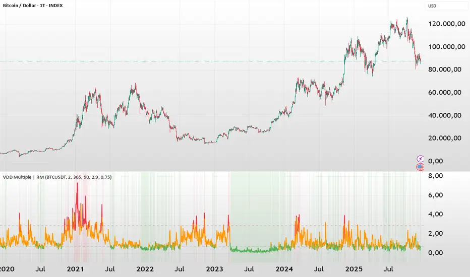
EMA Tutorial - 1Buy when in downtrend and close above EMA_50
Buy when in uptrend and below EMA_50
adjust ema length and risk reward for other stocks. Works good with nifty. Need to perform stress test on it
在腳本中搜尋"Cycle"
Countdown, Trading Volume, Price, Time Period"Volume and Price Countdown Code: This code will display colors according to the closing status of different timeframes."
Swing High/Low ExtensionsSwing High/Low — Extensions (2 Plots + Drawings + Touch Signal)
What it does
This indicator finds Swing Highs/Lows using a symmetric length (same bars left & right), then creates horizontal extension levels that run to the right and stop at the first price touch (“extend until future intersection”).
It outputs:
Two plots showing the most recent active High/Low extension (great for alerts & strategy logic).
Line drawings for every detected swing (historical levels stay on the chart and end at the touch bar).
A hidden TouchSignal used to color bars and trigger alerts without distorting the price scale.
The design mirrors Sierra Chart’s “Swing High and Low” with “Extend Swings Until Future Intersection”, but implemented natively in Pine.
How it determines swings
Uses ta.pivothigh() / ta.pivotlow() with length bars left and right.
A swing is confirmed only after there are length bars to the right of the center.
How extensions/lines end
High extensions end when High ≥ level.
Low extensions end when Low ≤ level.
The corresponding line drawing is frozen on the touch bar; the most recent active line continues to extend each new bar.
Inputs
Swing Strength (Bars Left = Right) – symmetric pivot length.
Offset as Percentage – 1 = +1%; positive values push levels outward (High up / Low down), negative pull them inward.
Draw “Extend…Until Future Intersection” Lines – toggle line drawings on/off.
Line Width (Plots + Drawings) – thickness for plots and drawings.
HighExt Color / LowExt Color – colors for the two plots and drawings.
Touch Color – color to paint bars on the touch bar (doesn’t affect scale).
HighExt/LowExt Line Style – choose line style (Solid/Dashed/Dotted) for drawings.
Color Bars on Touch? – enable/disable bar coloring.
Bar Color on High Touch / Low Touch – separate bar colors for each side.
Bar Color Transparency (0..100) – opacity for the bar painting.
Plots
HighExt – latest active high extension only.
LowExt – latest active low extension only.
(Internally there is also a hidden “TouchSignal” plot used for bar coloring & alerts; it’s not displayed to keep the chart scale clean.)
Alerts
Three built-in alertconditions:
Any Extension Touched — triggers when either side is hit.
High Extension Touched — only high level touch.
Low Extension Touched — only low level touch.
Create alerts from the indicator’s “More” (⋯) menu → Add alert → choose one of the conditions.
Styling
Drawings use your selected style (Solid/Dashed/Dotted), color, and width.
Existing historical lines adopt new styles when the script recalculates.
Bar coloring highlights the exact touch candle; disable it if you prefer clean candles.
Notes & tips
Scale-safe: the TouchSignal is hidden (display=none), so it won’t distort the Y-axis.
Performance: TradingView limits scripts to ~500 line objects; this script uses max_lines_count=500. If you hit the cap on long histories, either increase timeframe or disable drawings and rely on the two plots + alerts.
Works on any symbol/timeframe; levels are rounded to the instrument’s minimum tick.
Intended use
For discretionary levels, alerting, and rule-based entries that react to first touch of recent swing extensions. Not financial advice—use at your own risk.
NF_PLASMA_SURGE 🧩 NF_PLASMA_SURGE (NightFury Systems)
Author: Lachin M. Akhmedov (aka NightFury)
⚙️ A volumetric impulse oscillator detecting real candle energy through body density, directional momentum, and normalized volatility thrust.
🧠 Core Concept:
Not another RSI. Not another MACD.
NF_PLASMA_SURGE isolates true directional impulse by measuring the physics of price:
Body Energy → how much of each candle’s range is real movement.
Volume Thrust → amplifies strong participation only.
Volatility Normalization → filters emotional spikes and fake momentum.
⚡ Outputs:
Toxic Green = Real buy impulse (surge ignition)
Red Inferno = Real sell impulse (energy drain)
⚡ marks = Charged bursts detected (|z| > threshold)
💫 Synergy:
Designed to integrate with NF_CYBER_FURY as its ignition companion —
Cyber powers the reactor; Plasma lights the core.
🧩 Recommended Stack:
NF_CYBER_FURY + NF_PLASMA_SURGE = The NightFury Reactor System
OPEX VIXEX datesUpdated ohlocracy's OPEX script till 2030
These dates are for standard equity, index, and ETF options expiration managed by OCC, with monthly expirations usually on the third Friday and weekly expirations on other Fridays, except holidays which cause adjustments to Thursdays or nearby trading days.
Quarterly options expiration dates in the US stock market are on the last trading day of the quarter, usually the last business day of March, June, September, and December.
These dates are the last trading day of each quarter, accounting for weekends and holidays when the market is closed. When the last calendar day falls on a weekend, the expiration is set to the last prior trading day.
The VIX monthly expiration is on the Wednesday prior to the stock market monthly opex (third Friday). When holidays affect these days, the expiration shifts to the business day before.
Timebender – 369 PivotsTimebender – 369 Pivots is a clean visual study that marks swing highs and lows with numeric “369-sequence” digits derived from time.
Each digit is automatically color-coded into Accumulation (1 – 3), Manipulation (4 – 6), and Distribution (7 – 9) phases, helping traders identify rhythm and symmetry in market structure.
Labels float above or below bars for clear visibility and never overlap price, allowing smooth zoom and multi-timeframe use.
This base model focuses on clarity, precision, and efficient plotting — no toggles, no clutter — a stable foundation for future Timebender builds.
Timebender - Fractal CloseTimebender – Fractal Close displays which higher-timeframe candles (Daily, Weekly, Monthly) are scheduled to close within the next 24 hours — helping traders anticipate potential volatility and liquidity shifts around key session or higher-TF closes.
It automatically scans:
• Daily: 1D → 11D
• Weekly: 1W → 3W
• Monthly: 1M → 12M
The detected timeframes are shown in a compact on-chart table that can be positioned anywhere (top, middle, bottom — left, center, or right). You can also customize text color, background, and font size for visual clarity.
Use it to align intraday setups with higher-timeframe structure, or to prepare for major session transitions as multiple fractal closes converge.
Timebender - 90 Minute KillzonesTimebender – 90 Minute Killzones
This indicator divides each trading day into sixteen 90-minute blocks based on New York Time.
Each zone is color-coded by session:
🔴 Asian
🟢 London
🔵 New York AM
🟣 New York PM
It helps visualize recurring intraday rhythms and session overlaps without adding signals or bias.
Includes an optional Daily Close Line (18:00 NYT) to mark the end of the trading day, now zoom-safe and toggleable.
Built for structure, clarity, and visual balance — nothing more, nothing less.
Session times for London (UTC 07:00–16:00 UTC)Session times for London (UTC 07:00–16:00 UTC). Shows the trading hours for the London Session Mon-Fri
Wyckoff Stage Approximator (MTF Alerts)Wyckoff Stage Approximator (MTF Context)
This indicator is a powerful tool designed for traders who use a top-down, multi-timeframe approach based on Wyckoff principles. Its primary function is to identify the market's current stage—consolidation (Stage 1) or trend (Stage 2)—on a higher Context (C) timeframe and project that analysis onto your lower Validation (V) and Entry (E) charts.
This ensures you are always trading in alignment with the "big picture" trend, preventing you from taking low-probability trades based on lower-timeframe noise.
Core Concept: Top-Down Analysis
The script solves a common problem for multi-timeframe traders: losing sight of the primary trend. By locking the background color to your chosen Context timeframe (e.g., 15-minute), you are constantly reminded of the market's true state.
🟡 Yellow Background (Stage 1): The Context timeframe is in consolidation. This is a time to be patient and wait for a clear directional bias to emerge.
🟢 Green Background (Stage 2 - Markup): The Context timeframe is in a confirmed uptrend. This is your green light to look for bullish pullback opportunities on your lower timeframes.
🔴 Red Background (Stage 2 - Markdown): The Context timeframe is in a confirmed downtrend. This is your signal to look for bearish rally opportunities.
How It Works
The indicator uses a combination of moving averages and trend strength to objectively define each stage:
Trend Alignment: It checks if the 5 EMA, 10 EMA, and 20 EMA are properly stacked above or below the 50 SMA to determine the potential trend direction.
Trend Strength: It uses the ADX to measure the strength of the trend. A trend is only confirmed as Stage 2 if the ADX is above a user-defined threshold (default is 23), filtering out weak or choppy moves.
Stage Definition: Any period that is not a confirmed, strong Stage 2 Markup or Markdown is classified as a Stage 1 consolidation phase.
Key Features
Multi-Timeframe (MTF) Projection: Select your master "Context" timeframe, and its analysis will be displayed on any chart you view.
Customizable Inputs: Easily adjust the moving average lengths and ADX threshold to fit your specific strategy and the asset you are trading.
Clear Visual Cues: The intuitive background coloring makes it easy to assess the market environment at a glance.
Stage Transition Alerts: Set up specific alerts to be notified the moment your Context timeframe shifts from a Stage 1 consolidation to a Stage 2 trend, ensuring you never miss a potential setup.
How to Use This Indicator
Add the indicator to your chart.
In the settings, set the "Context Timeframe" to your highest timeframe (e.g., "15" for 15-minute).
Create alerts for the "Stage 1 -> Stage 2" conditions.
When you receive an alert, it signals that a potential trend is beginning on your Context chart.
Switch to your lower Validation and Entry timeframes. The background color will confirm the higher-timeframe trend, giving you the confidence to look for your specific entry patterns.
Disclaimer: This tool is designed for confluence and environmental analysis. It is not a standalone signal generator. It should be used in conjunction with your own price action, volume, or order flow analysis to validate trade entries.
MANOLES MINDSETBEST STRATEGY AT SUPPORTS “This indicator combines Bollinger Bands, RSI, Stochastic RSI, MACD, and a Moving Average to identify potential buy/sell points. It also includes alert conditions for trade signals.”
Crypto Black swan theory 加密黑天鵝事件標記Only displayed on the daily K-line.
Open source code.
Can be copied and modified.
只在日K顯示
開源程式碼
可以自己複本出去改
三维资金流向(多色版)1️⃣ Colors Correspond to Capital Flow
Based on your multi-color logic:
Green bars → BTC-only inflow
Blue bars → Major altcoins-only inflow
Yellow bars → BTC + major altcoins inflow simultaneously
Red bars → USDT inflow (risk-off / capital retreat)
On the chart, you can observe:
Red bars densely appearing → BTC and alt prices often consolidate or decline, indicating market funds are retreating to safety.
Green bars concentrated → BTC is generally in an uptrend, indicating capital is mainly flowing into BTC.
Blue bars appearing → Major altcoins may rise while BTC is flat, showing that altcoins are absorbing funds.
Yellow bars appearing → BTC and altcoins rise together, usually signaling an overall bullish market.
2️⃣ Observed Patterns
Capital flow vs price movement:
Green + Yellow bars concentrated → BTC shows clear upward movement
Blue bars concentrated → Altcoins rise noticeably
Red bars → Both BTC and altcoins may decline or consolidate
Capital rotation phenomenon:
Red → Green → Yellow → Blue → Can be seen as a rotation of USDT → BTC → BTC+Alt → Alt
This indicates that at different stages, the market rotates between risk-off, major assets, and altcoins.
Volatility:
Tall, frequently alternating bars → Market volatility is high
Short bars → Capital flow is weak, market tends to move sideways
Europe & US Session Highlighter
Bitcoin trading volumes peak during the Europe-US session overlap (13:30–17:00 UTC), driven by institutional activity and market news. This indicator helps traders:
- Focus on high-liquidity periods for better trade execution.
- Avoid low-volume, high-volatility periods outside major sessions.
- Plan entries and exits during Bitcoin’s most active hours.
How to Use:
- Apply the indicator to any Bitcoin intraday chart (e.g., 1M, 5M, 15M).
- Look for blue (London), green (NY), or purple (overlap) backgrounds to identify active sessions.
MTF TR HelperThe “MTF TR Helper” is a TradingView indicator that displays TC888’s Time Rotation (TR) slots for the London and New York sessions. It’s designed for intraday traders who want precise timing references based on TC888’s method.
It marks expert-level (orange) and sweetspot (green) TR timings directly on the chart using small visual cues. These slots help identify potential points of interest during active market hours. The script is optimized for lower timeframes and automatically filters out markers on higher timeframes to reduce clutter.
Key Features:
• 🔶 Orange lines = Expert TR slots (per TC888)
• 🟢 Green lines = Sweetspot TR slots (per TC888)
• ⚪ Dots = Hourly rotation points, including new 4-hour bars
• 📈 Works best on 1m and 5m charts; adapts visibility based on timeframe
• 🕒 Built on London and New York time zone references
This tool follows the timing logic of TC888, offering a clean and practical way to stay aligned with key session-based rotations.
Bitcoin Buy HODL Sell Indicator - MonthlyWMA16 (monthly)
EMA200 (weekly)
These are the indicators you need for BTCs bull / bear market recognition.
Green candles = bull market
Red candles = beginning of bear market
Purple candles = End of bear market
by Stockmoney Lizards
kashinath_HTFThis can be very useful if you want to analyze two different timeframes without the need to switching between the different timeframes.
Advantage RSI PredictorThe Relative Strength Index (RSI) is a widely used momentum oscillator that measures the speed and change of price movements, typically on a scale from 0 to 100, to identify overbought (above 70) or oversold (below 30) conditions. However, its reliance on historical data limits its ability to predict future price movements. To overcome this, an advanced indicator—termed the Advanced RSI Predictor (ARP)—can be developed to provide predictive bands for RSI levels, enhancing its forecasting potential.The ARP leverages machine learning techniques, such as Long Short-Term Memory (LSTM) networks, combined with traditional RSI calculations to forecast future RSI values and establish confidence intervals or bands. These bands represent a range within which the RSI is likely to fluctuate over a specified period, offering traders a probabilistic perspective on momentum shifts. The indicator starts with the standard RSI computation, using a 14-period lookback as a foundation, but enriches this by incorporating additional inputs like moving averages, volatility measures (e.g., Bollinger Bands width), and trading volume. These features are processed through an LSTM model trained on historical price and RSI data to predict future RSI trajectories.The output includes upper and lower predictive bands, typically set at a 95% confidence level, surrounding a central forecasted RSI line. For example, if the current RSI is 45, the ARP might project a band from 40 to 50 over the next five days, indicating potential momentum stability or a range for overbought/oversold thresholds. The bands adapt dynamically to market conditions—narrowing during stable trends and widening during volatile periods—using real-time data updates. This adaptability allows traders to anticipate breakouts or reversals before they manifest on the price chart.Validation can be strengthened through backtesting against historical data, ensuring the ARP’s bands align with significant market turns. This indicator proves especially valuable in trending markets, where traditional RSI levels (e.g., 70 or 30) may falter, offering a sophisticated tool for informed trading or investment decisions.
Balance of Risks (with Strength & Scale)This helps outline higher time frame tilt, to help assess probabilities


